Open Research Online
The Open University’s repository of research publications
and other research outputs
In the mood: the dynamics of collective sentiments on
Journal Item
How to cite:
Charlton, Nathaniel; Singleton, Colin and Greetham, Danica Vukadinovi´
c (2016).
In the mood: the dynamics
of collective sentiments on Twitter. Royal Society Open Science, 3(6), article no. 160162.
For guidance on citations see FAQs.
c
2016 The Authors
Version: Version of Record
Link(s) to article on publisher’s website:
http://dx.doi.org/doi:10.1098/rsos.160162
Copyright and Moral Rights for the articles on this site are retained by the individual authors and/or other copyright
owners. For more information on Open Research Online’s data policy on reuse of materials please consult the policies
page.
rsos.royalsocietypublishing.org
Research
Cite this article:Charlton N, Singleton C, Vukadinović Greetham D. 2016 In the mood: the dynamics of collective sentiments on Twitter.R. Soc. open sci.3: 160162. http://dx.doi.org/10.1098/rsos.160162 Received: 7 March 2016 Accepted: 12 May 2016 Subject Category: Mathematics Subject Areas: mathematical modelling/computer modelling/simulation Keywords:
evolving networks, Twitter communities, dynamics of collective emotions, communicability, agent-based modelling
Author for correspondence:
Nathaniel Charlton
e-mail:[email protected]
One contribution to a special feature ‘City analytics: mathematical modelling and computational analytics for urban behaviour’.
In the mood: the dynamics
of collective sentiments
on Twitter
Nathaniel Charlton
1,2
, Colin Singleton
1,2
and Danica
Vukadinović Greetham
2
1CountingLab Ltd, Reading, UK
2Centre for the Mathematics of Human Behaviour, Department of Mathematics
and Statistics, University of Reading, Reading, UK
We study the relationship between the sentiment levels of Twitter users and the evolving network structure that the users created by @-mentioning each other. We use a large dataset of tweets to which we apply three sentiment
scoring algorithms, including the open source SENTISTRENGTH
program. Specifically we make three contributions. Firstly, we find that people who have potentially the largest communication reach (according to a dynamic centrality measure) use sentiment differently than the average user: for example, they use positive sentiment more often and negative sentiment less often. Secondly, we find that when we follow structurally stable Twitter communities over a period of months, their sentiment levels are also stable, and sudden changes in community sentiment from one day to the next can in most cases be traced to external events affecting the community. Thirdly, based on our findings, we create and calibrate a simple agent-based model that is capable of reproducing measures of emotive response comparable with those obtained from our empirical dataset.
1. Introduction
It has been noticed long before the Internet that emotions
appear to be contagious [1]. While different mechanisms
were proposed to explain this phenomenon, from complex
cognitive processes [2], to automatic mimicry and synchronization
of facial, vocal, postural and instrumental expressions with
those around us [3], it is not yet clear how reverberating
or inhibiting is online social media regarding contagion of emotions. Agent-based modelling was used to model dynamics
of sentiments in online forums [4,5] and to look at the
recent rise of the 15M movement in Spain [6]. It has been
shown in [7] that positive and negative affects [8] that are
sometimes used to describe positive and negative mood are not complementary and follow different dynamics in a social
2016 The Authors. Published by the Royal Society under the terms of the Creative Commons Attribution License http://creativecommons.org/licenses/by/4.0/, which permits unrestricted use, provided the original author and source are credited.
2
rsos
.ro
yalsociet
ypublishing
.or
g
R.
Soc
.open
sc
i.
3
:1
60162
...network. Furthermore, it was conjectured in [9] that the people with the potentially largest reach to all
the others in a smaller social network over a week belong to the group with the smallest negative affect at the beginning of that period. In this work, we investigate whether similar conclusions can be discovered for large online social networks, using automatic sentiment detection algorithms, and to what extent we can develop a good model of collective sentiments dynamics. Our contributions are threefold:
— Firstly, we apply dynamic communicability, a centrality measure for evolving networks, to a
snowball-sampled Twitter network, allowing us to identify the ‘top broadcasters’, i.e. those users with potentially the highest communication reach in the network. We find that people with the highest communicability broadcast indices show different patterns of sentiment use compared with ordinary users. For example, top broadcasters send positive sentiment messages more often, and negative sentiment messages less often. When they do use positive sentiment, it tends to be stronger.
— Secondly, by using a number of community detection algorithms in combination, we were able to identify and monitor structurally stable (over a time scale of months) ‘communities’ or ‘sub-networks’ of Twitter users. Users within these communities are well connected and send messages to each other frequently compared with how frequently they send messages to users not in the community. We find that each such community has its own sentiment level, which is also relatively stable over time. We find that when the sentiment in a community temporarily shows a large deviation from its usual level, this can typically be traced to a significant identifiable event affecting the community, sometimes an external news event. Some of the communities we followed retained all their users over the period of monitoring, but the others lost a varying (but relatively small) proportion of their users. We find correlations between the loss of users and the conductance and initial sentiment of the communities.
— Finally, an agent-based model (ABM) of online social networks is presented. The model consists of a population of simulated users, each with their own individual characteristics, such as their tendency to initiate new conversations, their tendency to reply when they have been sent a message, and their usual sentiment level. The model allows for sentiment contagion, where users’ sentiment levels change in response to the sentiment of the messages they receive. We demonstrate that this model, when its parameters are fitted to data from a real Twitter community, accurately reproduces various aspects of that community.
Appendix A describes the data we have made available to support this article.
2. Data
The data analysed in this work consists of posts (‘tweets’) from Twitter. Twitter provides a platform for users to post short texts (up to 140 characters in length) for viewing by other users. Twitter users often direct or address their public tweets to other users by using mentions with the @ symbol. Suppose there are two users with usernames Alice and Bob. Alice might greet Bob by tweeting: ‘@Bob Good morning, how are you today?’. Bob might reply with ‘I am feeling splendid @Alice’. Note that although mentions are used to address other users in a tweet, the tweet itself is still public and the messages may be read and commented on by other users.
We commissioned a digital marketing agency to collect Twitter data for our experiments. This was done in two stages:
(i)Snowball sampling of a large set of users. We began with a single seed user. For the seed user, and each time we added a user to our sample, we retrieved that user’s last 200 public tweets (or all their tweets if they had posted fewer than 200 since account creation), and identified other users they had mentioned. These users were then added to the sample, and so on. In this manner, 669 191 users were sampled and a total of 121 805 832 tweets collected. Limiting the history collected to the last 200 tweets enabled us to explore a larger subgraph of the Twitter network, and ensured that we would be able to find sufficiently many interesting communities for study. Informally speaking, our snowballed dataset was broad at the expense of being shallow. (ii)Obtaining a detailed tweet history for selected interesting groups of users. Once we had identified
interesting communities of users for study (as we will describe in §4.1), containing altogether 10 000 distinct users, we retrieved a detailed tweet history for these users. We downloaded each user’s previous 3200 tweets (a limit imposed by Twitter’s application programming interface, or
3
rsos
.ro
yalsociet
ypublishing
.or
g
R.
Soc
.open
sc
i.
3
:1
60162
...API) obtaining altogether 22 469 713 tweets. Note that the period covered by 3200 tweets varies considerably depending on the tweeting frequency of the user: heavy users may post 3200 tweets in just a few days, whereas for some light users 3200 tweets extended all the way back to the year 2006. We also monitored the users ‘live’ for a further period of 30 days, logging all their tweets posted during this time, yielding a further 3 216 136 tweets. Informally speaking, this part of our dataset was deep (but at the expense of being narrower).
Using sentiment analysis programs, we assigned three sentiment measures to each tweet, named and described as follows:
(MC) This sentiment score was provided by the marketing company’s highly tuned proprietary algorithm. The algorithm involves recognizing words and phrases that typically indicate positive or negative sentiment, but its exact details are not published, as it is commercial intellectual
property. The score for each tweet is an integer ranging from−25 (extremely negative) through
0 (neutral) up to+25 (extremely positive).
(SS) This sentiment score was produced by the SENTISTRENGTHprogram (http://sentistrength.wlv.ac.uk/)
[10]. SENTISTRENGTHprovides separate measures of the positive and negative sentiment of each tweet; we derive a single measure analogous to (MC) by subtracting the strength of the negative
sentiment from the strength of the positive sentiment. The (SS) measure ranges from−4 to+4.
(L) This sentiment score was produced by the LIWC2007 program (http://www.liwc.net/) [11].
Like SENTISTRENGTH, LIWC produces separate measures posemoandnegemo of positive and
negative emotion; by subtractingnegemofromposemowe derived a single real-valued measure
ranging from−100 to+100.
Although all three sentiment classifiers are the result of extensive development effort, none of them is perfect; this is to be expected given the subtlety of human language. Thus, we think of the sentiment as a very ‘noisy’ signal. The work described in this paper takes averages over large numbers of tweets and users, so our results do not depend on the exact score of particular individual tweets; we require only that on average the sentiment scores reflect the kind of sentiments expressed by users.
3. Communicability and sentiment
In this section, we investigate how users with the highest potential communication reach tend to use
sentiment in their messages. We usedynamic communicability, a centrality measure for evolving networks,
to assignbroadcast scoresto users; these scores are one method of quantifying communication reach that
has been investigated in the literature. Our investigation is motivated by the finding, in three small
observed social network studies [9], that the individuals with large broadcast scores, in general, had
very low levels of negative affect at the beginning of the studies.
3.1. Broadcast scores
In this subsection, we briefly describe the measure we used to quantify potential communication reach.
The measure, calleddynamic communicability[12], is a centrality measure for evolving networks based
on Katz centrality [13]. Katz centrality in static networks counts all possible paths from and to each
vertex, penalizing progressively longer paths. Let an evolving network be represented by a sequence of
adjacency matricesAt, wheret=1,. . .,nis the time step. Then dynamic communicability counts all the
possible time-respecting paths over the evolving network: such a path can make for example one hop at
time stept=1 and the next hop at time stept=3, but not vice versa. The formal definition we use for a
dynamic communicability matrix is
Q= n
t=1
(I−αAt)−1,
whereIis identity matrix,α <(ρ(At))−1is a penalizing factor andρ(At) is the largest eigenvalue1ofAt.
Whenαis small, short paths in the network are valued highly relative to long paths; whenαis larger,
long paths are given a relatively larger weight. Here we use one ‘snapshot’Atfor each day.
1Note thatα <(ρ(A
t))−1,∀t=1,. . .,n, for the inverse to exist. For computational reasons, (I−αAt)−1=∞i=0αiAitis often approximated with a finite truncation of theifirst summands, which then also allows to relax the penalizing constraint toα <1.
4
rsos
.ro
yalsociet
ypublishing
.or
g
R.
Soc
.open
sc
i.
3
:1
60162
... 2 500 000 2 000 000 1 500 000 1 000 000 500 000 0 –4 –3 –2 –1 0 (SS) sentiment measure no. tweets 1 2 3 4Figure 1.Histogram of the (SS) sentiment measure scores for the tweets in the mentions network we analysed.
Qis a square matrix, with rows and columns representing vertices or individuals in the network. The
kth row and column sums each represent a measure of communicability for the vertex (user)k. The row
sum represents thebroadcastindex while the column sum measures thereceiveindex. As the respective
names suggest, they measure how well the vertexkis able to broadcast and receive messages over the
network.
3.2. Extracting a ‘mentions’ network to analyse broadcast scores
Using the @-mentions in the tweets we collected, we extracted an evolving social network to use for our investigation. This process was rather involved, for two reasons:
(i) Because the snowball sampling data collection process itself took several weeks, and because we collected only the last 200 tweets for each user, the time period for which we had data was not the same for all users. Thus, we needed to balance the desire for an evolving network covering a longer period with the desire to have complete data for as many users as possible for that time period.
(ii) We wanted to focus our analysis on ordinary human users of Twitter, so we wanted to screen out outlier users such as celebrities and bots. Celebrity accounts tend to be mentioned by a vast number of users, and some types of bot mechanically mention huge numbers of users. Including these accounts could cause the network structure to become degenerate, with a path of length two existing between most pairs of users via an intermediate celebrity or bot.
We extracted an evolving mentions network for the 7-day period from 9th October to 15th October 2014, consisting of 6 052 615 edges between 285 168 users. These edges came from 4 389 362 tweets (one tweet can mention multiple users, giving rise to more than one edge). Details of the extraction and filtering steps are given in appendix B. We calculated a broadcast score for each user, using a range
of values ofα: 0.15, 0.3, 0.45, 0.6, 0.75 and 0.9.
The distribution of the (SS) scores for all the tweets in our one-week network is shown infigure 1. The
mean sentiment was mildly positive for all three measures: 0.297 for (SS), 0.823 for (MC) and 3.669 for (L). The limitations of the sentiment scoring algorithms explain the high proportion of tweets assigned a
zero score (as shown, for example, infigure 1). Some of these are genuinely tweets with a neutral tone,
but some are tweets where the algorithm cannot detect any sentiment, so we think of the zero score as indicating ‘neutral or not detected’ sentiment. At the level of individual tweets, Pearson’s correlation coefficients between the three sentiment measures (MC), (SS) and (L) are as follows:
. . . . (MC) and (SS): 0.585 . . . . (MC) and (L): 0.524 . . . . (SS) and (L): 0.564 . . . .
5
rsos
.ro
yalsociet
ypublishing
.or
g
R.
Soc
.open
sc
i.
3
:1
60162
...Although the correlations at the individual tweet level are moderate, we will later see in §4.2 that when we aggregate to groups of tweets, such as all the tweets sent within a particular community, the correlations become very strong.
3.3. Broadcast scores versus average sentiment
We now compare broadcast scores with users’ sentiment use. For this we need user-level sentiment attributes, but the three sentiment scoring algorithms that we used assign a sentiment score to each tweet. Therefore, we aggregated the sentiment scores of each user’s outgoing edges within the network, to get the following seven attributes (for each of the three measures):
— Mean sentiment: the mean of the sentiment scores for the user’s outgoing edges.
— Mean absolute sentiment: for (MC) this is the mean of the absolute values of the sentiment scores for the user’s outgoing edges; for (SS) and (L), where separate positive and negative components were available, we summed the two components’ absolute values for each edge, and then took the mean across the user’s outgoing edges.
— Positive sentiment fraction: the fraction of the user’s outgoing edges having a sentiment score greater than zero.
— Zero sentiment fraction: the fraction of the user’s outgoing edges having a zero sentiment score (indicating a neutral sentiment or that no sentiment could be identified by the scoring system). — Negative sentiment fraction: the fraction of the user’s outgoing edges having a sentiment score
less than zero.
— Average positive sentiment strength: the sum of the user’s sentiment scores over the outgoing edges with positive scores only, divided by the count of the user’s outgoing edges (this count includes all outgoing edges the user sent, not just those with a positive score).
— Average negative sentiment strength: the sum of the absolute values of the user’s sentiment scores over the outgoing edges with negative scores only, divided by the count of the user’s outgoing edges (this count includes all outgoing edges the user sent, not just those with a negative score).
The purpose of the two sentiment strength attributes is to take into account not only how often a user expresses positive or negative sentiment, but also how extreme that sentiment is when it is expressed.
Users with no outgoing edges on the first day of our studied 7-day evolving network are at a disadvantage in terms of broadcast scores, because their messages have only six (or fewer) days to propagate through the network, rather than seven. So for the rest of this section we report on just the 153 691 users who tweeted within the network on the first day.
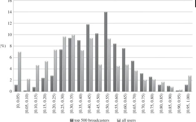
In figures2and3, we compare the means of the above attributes for the top 500, 1000 and 5000
broadcasters with the means over all users, using (SS) andα=0.75. We see that:
— Top broadcasters send messages with positive sentiment more frequently, and neutral and negative sentiment less often.
— When we additionally account for the extremity of the sentiment that is used as well as the frequency, top broadcasters use more positive sentiment, and less neutral and negative sentiment.
The differences are most pronounced for the top 500 broadcasters; as we move from the top 500 to the top 1000 and then top 5000, the means for the top broadcasters gradually become closer to the means for the whole population of users. But even for the top 5000 broadcasters there are still substantial differences. To confirm the statistical significance of this finding, we have used randomization testing to estimate
(one-sided)p-values2which are shown as annotations in figures2and3.
Note that this does not mean that every user in the top 500 has a higher positive sentiment fraction
(i.e. uses positive sentiment more frequently) than the average user.Figure 4shows the distribution of
2To explain how these are produced, we shall sketch the calculation of thep-value for one of the attributes, the negative sentiment fraction as shown infigure 3. The average across all users is 0.142, whereas for the top 500 broadcasters it is only 0.119. We randomly generated 100 000 subsets of the 153 691 users and calculated the means for those subsets. From this we estimate how the mean of the attribute is distributed for randomly chosen sets of size 500. From this distribution, we calculate thep-value as the probability that a randomly selected set of 500 users would have a mean equal to 0.119 or more extreme (smaller). This probability is very close to zero (0.00022). Informally, this means we can be very confident that the relationship we have found—that the top broadcasters use negative sentiment less often—has not simply happened ‘by chance’; the odds of that are less than 3 in 10 000.
6
rsos
.ro
yalsociet
ypublishing
.or
g
R.
Soc
.open
sc
i.
3
:1
60162
... p < 0.00001 p < 0.00001 p< 0.00001 p = 0.00001 p < 0.00001 p < 0.00001 p < 0.00001 p< 0.00001 p< 0.00001 p = 0.00077 p = 0.0071 p = 0.00324 top 500 broadcastersnegative sentiment strength positive sentiment strength
mean absolute sentiment/10 mean sentiment
aggregate user sentiment measure using (SS)
v
alue of sentiment measure for outgoing edges
0.5 0.4 0.3 0.2 0.1 0 0.6 0.7 0.8 top 1000 broadcasters top 5000 broadcasters all users
Figure 2.The means of the (SS) sentiment attributes for the top 500, 1000 and 5000 broadcasters (forα=0.75) compared with the mean values across all users. (The mean absolute sentiment values have been divided by 10 for easier viewing.)
p < 0.00001 p < 0.00001 p< 0.00001 p < 0.00001 p < 0.00001 p < 0.00001 p = 0.00022 p = 0.00192 p = 0.00011 top 500 broadcasters
negative sentiment fraction zero sentiment fraction
positive sentiment fraction
aggregate user sentiment measure using (SS)
fraction of outgoing edges
0 0.05 0.10 0.15 0.20 0.25 0.30 0.35 0.40 0.45 0.50 top 1000 broadcasters top 5000 broadcasters all users
Figure 3.The means of the (SS) sentiment fraction attributes for the top 500, 1000 and 5000 broadcasters (forα=0.75) compared with the mean values across all users.
positive sentiment fraction for the top 500 broadcasters, and for all users, using (SS). The distributions overlap, of course, in particular there are a few top broadcasters with low positive sentiment fractions. Nevertheless, one can clearly see that the distributions are not the same: the distribution for the top 500 broadcasters is, in general, shifted towards the higher end of the horizontal axis, showing that on average top broadcasters use positive sentiment more often.
Although we have shown the results for (SS) andα=0.75, with one exception the same pattern of
results was found for all tested values ofα, and also using the other sentiment measures (MC) and (L)
7
rsos
.ro
yalsociet
ypublishing
.or
g
R.
Soc
.open
sc
i.
3
:1
60162
... (%) 16 14 12 10 8 6 4 2 0 [0, 0.05) [0.05, 0.10) [0.10, 0.15) [0.15, 0.20) [0.20, 0.25) [0.25, 0.30) [0.30, 0.35) [0.35, 0.40) [0.40, 0.45) [0.45, 0.50) [0.50, 0.55) [0.55, 0.60) [0.60, 0.65) [0.65, 0.70) [0.70, 0.75) [0.75, 0.80) [0.80, 0.85) [0.85, 0.90) [0.90, 0.95) [0.95, 1.00)top 500 broadcasters all users
Figure 4.Distribution of positive sentiment fraction for the top 500 broadcasters (forα=0.75), and for all users, using (SS).
0.50 0.45 0.40 0.35 0.30
sentiment fraction based on (SS)
0.25 0.20 0.15 0.10 0.05 01 10 000 20 000 30 000 40 000 50 000 60 000 70 000
broadcast score rank
80 000 90 000 100 000 110 000 120 000 130 000 140 000 150 000
positive sentiment fraction negative sentiment fraction
Figure 5.The relationship between sentiment fractions (as a moving average over a window of 1000 points) and broadcast score rank, forα=0.75 based on (SS).
(SS) andα=0.15, the ‘negative sentiment strength’ and ‘negative sentiment fraction’ attributes for the
top 5000 broadcasters were very nearly equal to the mean over all users.
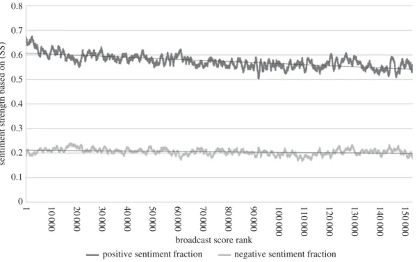
In addition to investigating the sentiment use of the top broadcasters, we looked for general trends
relating sentiment use to broadcast rank.Figure 5plots moving averages of the (SS) sentiment fraction
8
rsos
.ro
yalsociet
ypublishing
.or
g
R.
Soc
.open
sc
i.
3
:1
60162
... 0.8 0.7 0.6 0.5 0.4sentiment strength based on (SS)
0.3 0.2 0.1 01 10 000 20 000 30 000 40 000 50 000 60 000 70 000
broadcast score rank
80 000 90 000 100 000 110 000 120 000 130 000 140 000 150 000
positive sentiment fraction negative sentiment fraction
Figure 6.The relationship between sentiment strengths (as a moving average over a window of 1000 points) and broadcast score rank, forα=0.75 based on (SS).
see that from rank 1 to about rank 9000 the positive sentiment fraction decreases sharply; after this it decreases slowly in an approximately linear way. The fraction of tweets with negative sentiment
appears approximately constant at this scale.Figure 6plots similar moving averages for the sentiment
strength attributes. The average strength of positive sentiment declines sharply to begin with and then slowly, whereas the average strength of negative sentiment is approximately constant. Although the local fluctuations were different, the graphs had the same general shape for all the values of
α∈ {0.3, 0.45, 0.6, 0.75, 0.9}tested.
4. Sentiment and evolution of communities on Twitter
In this section, we describe how we identified meaningful communities or ‘sub-networks’ of Twitter users, and we present the results of our analysis of how these communities evolved over time, including how their sentiment evolved.
The existence of communities has been observed in all kinds of real-world networks and identifying them has been the subject of considerable research effort in recent years, much of which can be traced
back to a seminal paper of Girvan & Newman [14]. In the vast literature on community detection
(e.g. [15]), a community is often taken to be a group of users with two characteristics:
(i) The community is densely connected internally, i.e. people within the same community talk to each other a lot.
(ii) There are relatively few links crossing from the community to the outside world, i.e. people talk to fellow members of their community more often than they talk to non-members.
4.1. How we detected communities and selected a subset for further study
Because we wanted to find communities that would endure over time, we needed to take a longer period of data than the 7 days we analysed in §3. We can imagine online discussions that spring up,
rage feverishly for a few days and then largely disappear,3and that is not what we wanted to find. Yet,
as described in §2, we had only the last 200 tweets per user, so we needed to limit ourselves to a period where the data was most complete. We extracted a mentions network from 22 September 2014 (inclusive)
3We suspect, for example, that the much-reported discussion of ‘What colour is the dress?’ fits into this category; see:http://
9
rsos
.ro
yalsociet
ypublishing
.or
g
R.
Soc
.open
sc
i.
3
:1
60162
...until the end of our snowball-sampled data, 6 November 2014, a period of 46 days. The process for creating the network was the same as described for the 7-day network, described in appendix B. The resulting network consisted of 491 417 users with 31 299 836 edges between them, coming from 22 594 048 tweets. For the first 40 days, the daily average was 776 k edges; for the last 6 days, when data collection was coming to an end, the daily average was only 40 k edges. The network has an average of 63.7 outgoing edges per user, corresponding to 46.0 tweets per user, and each user mentioned an average of 30.9 distinct recipients.
With the dataset chosen, we turn to the question of algorithms. Discovering communities by algorithms requires one to first formulate a precise definition of how ‘good’ a given division of a social network into communities is. The most widely used formula for quantifying the ‘goodness’ of a division
is called modularity [16], and it compares the fraction of edges that lie within a community in the network
with the expected fraction of edges that would lie within the community if the edges were placed at random. Many different versions of modularity have been proposed in the last decade. As we look at relatively unbalanced divisions (trying to identify small portions of a large network), we considered
instead a different measure called conductance [17] which takes values from 0 to 1. Groups of users that
are well connected internally but well separated from the rest of the network have values close to 0, and groups with few internal connections but lots of connections to the rest of the network have values close to 1.
There is also a variant of conductance, called weighted conductance, that takes into account the weights on edges, rather than just their presence or absence. We use the number of messages exchanged between two users (in either direction) as the weight of the edge between them. Thus, weighted conductance depends not only on which users have corresponded with which others but also on how
often. IfWijis the weight of the edge from userito userj,Sis a community andS¯denotes the remaining
users, the weighted conductance ofSis
i∈S,j∈ ¯SWij
min (a(S),a(S¯)),
wherea(S)=i∈Sj∈VWij(withVbeing the set of all vertices, i.e. all users).
We used the following three algorithms to identify communities:
— The Louvain method on unweighted graphs, described in [18], as implemented in Python in the
library [19] and in C++by Lefebvre and Guillaume.4
— The Louvain method on weighted graphs, using the C++ implementation.
— The k-clique-communities method5presented in [20] as implemented in the NetworkX Python
library.
Using these three methods with different parameters, we produced a list of 98 078 candidate communities. For each community we calculated:
— the size of the community (number of nodes),
— the number of internal edges (mentions between users),
— the number of internal edges (mentions) per node (this gives a measure of how much activity there is inside the community),
— the conductance and the weighted conductance of the community within the whole network,
— the mean sentiment of edges within the community, using the (MC) measure,6
— whether the community consisted of a single connected component (good candidate communities will of course be connected; however, very infrequently the Louvain method can generate disconnected communities, by removing a ‘bridge’ node during its iterative refinement of its communities),
— the fraction of internal mentions with non-zero sentiment (some of our candidate communities were composed mainly of users speaking a non-English language, and we used this measure to filter them out; tweets in other languages are likely to be assigned a zero sentiment score, because the sentiment scoring algorithm does not find any English words with which to gauge the sentiment),
4This code is freely available fromhttps://sites.google.com/site/findcommunities/.
5This algorithm, and some refinements to it, are also implemented in the CFINDERprogram, freely available fromhttp://www.
cfinder.org/.
6Owing to time constraints and the large number of tweets involved in community detection, we decided not to calculate the (SS) and (L) scores at this stage.
10
rsos
.ro
yalsociet
ypublishing
.or
g
R.
Soc
.open
sc
i.
3
:1
60162
...— some statistics summarizing the role played in the community by recently registered users; and — a breakdown of the frequency of participation of users in the community. (For each user in the community, we counted how many distinct days they had been active on Twitter in our data, and then calculated the percentage of these days on which they had posted within the candidate community. We calculated the average across all users in the community, and also split the users up into five bins.)
Based on the above statistics, we short-listed a subset of communities and performed a manual inspection of a sample of the tweets within the community, to assess the topics talked about and a visualization of
the community, using the program VISONE(http://visone.info/html/about.html) for this subset.
In the end, we selected 18 communities to monitor and study.Table 1shows most of the statistics
listed above for these 18 communities, in size order. In each numerical column, the highest six values are highlighted in italics and the lowest six values are highlighted in bold (recall that for conductance and weighted conductance, lower values indicate a more tightly knit community). The ‘Algorithm’ column contains ‘L’ for the Louvain method, ‘W’ for the weighted Louvain method and ‘K’ for the k-clique-communities method. We chose six k-clique-communities from each algorithm.
Table 2 shows frequency of participation, with communities ranked by the third column, which
gives the average user participation. This is expressed as a percentage: the percentage of days on which the user was active on Twitter (in our dataset) that they were active in the community. The rightmost five columns show, for each community, how the users’ participation levels break down into five bins. Bins with disproportionately many users in them (i.e. with values more than 0.2) are highlighted in italics. We can see that with the exception of community 4 (weddings), every community has at least a 20% ‘hard core’ of users, who are active in the community nearly every day they are active on Twitter.
Once we had selected the communities of interest, we collected a more detailed tweet history for each participating user, as described in §2.
4.2. Analysing the endurance of the communities
We analysed how well our communities endured over time. We examined a 28-day period starting on 22 September 2014 (which we will call the ‘autumn period’) and a 28-day period starting on 2 February 2015 (which we will call the ‘spring period’), and compared how many users in each community were active (mentioned or were mentioned by other users) within the community. Would the same users still be
tweeting each other in the spring, or would the communities have dissolved over time?Figure 7shows
a log–log plot of the results.
We see that the communities persisted well from autumn to spring. In three of them, communities 14 (human resources), 17 (friends chatting) and 18 (friends chatting), all the original users were still active in the community. These are three out of the four smallest communities. The other 15 communities lost between 6.5% (for community 16, nursing) and 39.3% (for community 7, Islam) of their users, with an average loss of 18.6%. We can see differences in the communities produced by the three algorithms here: the six produced by k-clique-communities lost an average of 3.8% of their users, compared to 16.4% for the Louvain method and 26.3% for weighted Louvain.
Let us sayuser loss factorto mean the number of users active in the 28-day autumn period divided by
the number active in the later 28-day spring period. When the user loss factor is 1, then the community has retained all its users; the higher the value, the more users the community has lost. We looked to see
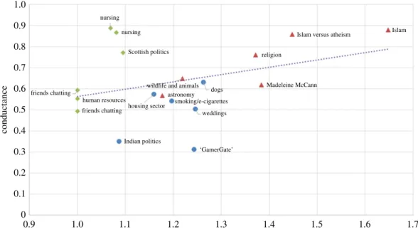
whether the conductance, sentiment or size of communities is related to their endurance. Infigure 8,
one can see that conductance is a predictor of what proportion of users will stop participating in the community, with correlation coefficient 0.42. When conductance is lower (so that the community is more densely connected internally and better separated from the rest of the network) then fewer users stopped participating on average.
Similarly, the community sentiment is a predictor of community endurance, as shown infigure 9:
the more positive the initial sentiment (measured in the autumn period), the fewer users stopped
participating on average. For (SS) (as shown infigure 9) the correlation coefficient is−0.60; for (MC)
it is−0.48 and for (L) it is−0.58. On the other hand, community size was not correlated to user loss
factor; the correlation coefficient was 0.07.
We noted in §3.2 that the correlations between the three sentiment measures (MC), (SS) and (L) at the
individual tweet level were only moderate. The following shows the correlations between thecommunity
11
rsos
.ro
yalsociet
ypublishing
.or
g
R.
Soc
.open
sc
i.
3
:1
60162
... Ta bl e 1. Se lec ted summar y sta tistics for the 18 co mmunities w e selec ted ,i n siz e or der . ∗Th e communit y mark ed as not connec ted had eigh tn odes separ at ed fr om the re st . no . in ternal m ean fr ac tion of in ternal co mmunit y no . in ternal m en tions w eigh te d sen timen t men tions with number nodes m en tions per node co nduc tanc e conduc tanc e (MC ) co nnec ted? algorithm non-z er o sen timen t con ve rsa tion topic 18 22 24 15 109 . 8 0.5 9 0 . 26 1 . 05 ye s K 0 . 62 friends cha tting ... ... ... ... ... ... ... ... ... 17 28 3036 108 . 4 0 . 49 0 . 22 0.46 ye s K 0 . 44 friends cha tting ... ... ... ... ... ... ... ... ... 16 62 6017 97 . 00 . 89 0 . 75 1 . 36 ye s K 0 . 59 nursing ... ... ... ... ... ... ... ... ... 14 71 62 51 88.0 0 . 55 0 . 35 1 . 12 ye s K 0.53 human resour ces ... ... ... ... ... ... ... ... ... 3 73 666 9 91 . 4 0 . 54 0 . 27 0 . 13 ye s L 0 . 49 smoking and e-cigar ett e industr y ... ... ... ... ... ... ... ... ... 10 101 8492 84.1 0.62 0.35 − 0 . 12 ye s W 0.54 Madeleine M cC ann ... ... ... ... ... ... ... ... ... 15 107 9600 89 . 70 . 87 0 . 75 1 . 31 ye s K 0 . 57 nursing ... ... ... ... ... ... ... ... ... 7 118 4475 37 . 9 0 . 88 0 . 67 − 0 . 02 ye s W 0 . 55 Islam ... ... ... ... ... ... ... ... ... 91 54 5761 37 . 4 0 . 86 0 . 66 0 . 00 ye s W 0.54 Islam versus atheism ... ... ... ... ... ... ... ... ... 13 161 17 600 109 . 30 . 77 0 . 65 0 . 05 ye s K 0.51 Sc ottish politics ... ... ... ... ... ... ... ... ... 11 387 17 151 44 . 3 0 . 76 0 . 50 0.2 2 ye s W 0.51 re ligion (plus misc .o ther) ... ... ... ... ... ... ... ... ... 17 31 62 799 85.9 0 . 31 0 . 29 0 . 14 ye s L 0 . 41 ‘G am er Ga te ’ ... ... ... ... ... ... ... ... ... 4 790 24 83 1 31 . 40 . 50 0.38 2 . 03 ye s L 0 . 62 w eddings ... ... ... ... ... ... ... ... ... 5 829 45 064 54.4 0.63 0.42 1.02 ye s L 0.52 dogs ... ... ... ... ... ... ... ... ... 6 872 35 230 40 . 4 0.57 0.42 1 . 33 ye s L 0 . 56 housing sec to r ... ... ... ... ... ... ... ... ... 8 1736 76 966 44.3 0.65 0.48 0.76 yes W 0 . 50 wildlife and animals ... ... ... ... ... ... ... ... ... 2 2449 107 520 43 . 90 . 35 0 . 26 0.53 ye s L 0 . 45 Indian politics and issues ... ... ... ... ... ... ... ... ... 12 254 3 123 749 48.7 0.57 0.38 0.55 no ∗ W 0 . 43 astr onom y (plus m isc .other) ... ... ... ... ... ... ... ... ...12
rsos
.ro
yalsociet
ypublishing
.or
g
R.
Soc
.open
sc
i.
3
:1
60162
... Ta bl e 2. Figur es for fr equenc y of par ticipa tion, w ith communities ra nk ed by av er age user par ticipa tion (the thir d column). fr ac tion of users w ith par ticipa tion (d ay s) in giv en ra nge ave ra ge co mmunit y par ticipa tion 80–100% 60–80% 40–60% 20–40% 0–20% number co nv ersa tion to pic (d ay s) in % par ticipa tion par ticipa tion par ticipa tion par ticipa tion par ticipa tion 17 friends cha tting 89 0 . 82 0.11 0.07 0.00 0.00 ... ... ... ... ... ... ... ... ... 1‘ Ga m er Ga te ’ 83 0 . 71 0.13 0.07 0.05 0.04 ... ... ... ... ... ... ... ... ... 18 friends cha tting 81 0 . 55 0 . 36 0.09 0.00 0.00 ... ... ... ... ... ... ... ... ... 13 Sc ottish politics 80 0 . 54 0 . 32 0.09 0.03 0.01 ... ... ... ... ... ... ... ... ... 15 nursing 72 0 . 39 0 . 38 0.12 0.07 0.03 ... ... ... ... ... ... ... ... ... 16 nursing 71 0 . 48 0 . 24 0.15 0.11 0.02 ... ... ... ... ... ... ... ... ... 10 Madeleine M cC ann 67 0 . 49 0.15 0.12 0.13 0.12 ... ... ... ... ... ... ... ... ... 14 human resour ces 66 0 . 30 0 . 34 0 . 30 0.06 0.01 ... ... ... ... ... ... ... ... ... 2 Indian politics and issues 62 0 . 34 0 . 22 0.19 0.17 0.09 ... ... ... ... ... ... ... ... ... 3 smoking and e-cigar ett e industr y 62 0 . 41 0 . 21 0.10 0.12 0.16 ... ... ... ... ... ... ... ... ... 12 astr onom y (plus m isc .other) 58 0 . 29 0 . 21 0.19 0.17 0.13 ... ... ... ... ... ... ... ... ... 6 housing sec tor 57 0 . 26 0 . 21 0 . 24 0.19 0.10 ... ... ... ... ... ... ... ... ... 8 w ildlife and animals 55 0 . 30 0.16 0.17 0.19 0.17 ... ... ... ... ... ... ... ... ... 5 dogs 54 0 . 30 0.16 0.17 0.17 0 . 20 ... ... ... ... ... ... ... ... ... 11 re ligion (plus misc .o ther) 54 0 . 26 0.19 0.19 0.20 0.16 ... ... ... ... ... ... ... ... ... 9 Islam ve rsus at heism 49 0 . 21 0.14 0 . 23 0 . 24 0.18 ... ... ... ... ... ... ... ... ... 7 Islam 48 0 . 20 0.13 0 . 20 0 . 27 0.19 ... ... ... ... ... ... ... ... ... 4 w eddings 42 0.11 0.17 0 . 22 0 . 25 0 . 25 ... ... ... ... ... ... ... ... ...13
rsos
.ro
yalsociet
ypublishing
.or
g
R.
Soc
.open
sc
i.
3
:1
60162
... 10 000Indian politics astronomy
wildlife and animals housing sector weddings ‘Gamergate’ dogs Scottish politics nursing human resources friends chatting friends chatting
nursing Madeleine McCann Islam
Islam versus atheism religion smoking/e-cigarettes 10 000 1000 1000 100 100 10
no. users acti
v
e in 28-day spring period
10
no. users active in 28-day autumn period 1
1
Louvain weighted Louvain k-clique-communities
Figure 7.The communities we studied endured strongly over a 19-week period.
correlation coefficient correlation coefficient
measures (autumn) (spring)
(MC) and (SS) 0.971 0.954 . . . . (MC) and (L) 0.972 0.929 . . . . (SS) and (L) 0.985 0.948 . . . .
Thus at the community level, the three measures are very similar.
4.3. Dynamics of sentiments in communities
Here, we analyse the changes in sentiment/mood of our communities over time (or the lack thereof,
as it generally turns out).Figure 10plots the mean (SS) sentiment of each community over the autumn
period against the mean (SS) sentiment over the spring period. We see that the sentiments persisted very strongly: the correlation between the autumn sentiment and spring sentiment is 0.982. The corresponding correlation under the (MC) measure was 0.982, and under (L) was 0.960.
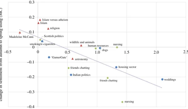
We looked for explanations for the (small) changes in sentiments that did occur. On the vertical axis
offigure 11, we show the change in mean sentiment between the autumn period and spring period using
(MC); a positive number means that the sentiment became more positive over time. On the horizontal axis, we show the mean sentiment during the autumn period. What we find is that when the sentiment is initially at the negative end of the spectrum, it tends to increase slightly; on the other hand, if the sentiment is initially at the positive end, it tends to decrease slightly.
In fact, the sentiment in 16 of the 18 communities moved slightly towards a moderate (MC) value of
0.4 (which is approximately where the line of best fit cuts the horizontal axis infigure 11). This could
be because extreme sentiment in a community is ‘whipped up’ by external events and then, once those events are over, tends to dissipate naturally with time.
We point out, however, that there is probably also an element of statistical ‘regression to the mean’ occurring. We did not choose our communities at random: we chose five of them because they were
among those with the most extreme sentiment in the autumn period.7 This introduces a bias and
14
rsos
.ro
yalsociet
ypublishing
.or
g
R.
Soc
.open
sc
i.
3
:1
60162
... 1.0 0.9 0.8 0.7 0.6 0.5 0.4 conductance 0.3 0.2 0.1 0 0.9 1.0 1.1user loss factor (no. users active in 28-day autumn period divided by number active in later 28-day spring period)
1.2 1.3 1.4 1.5 1.6 1.7
Indian politics astronomy wildlife and animals
housing sector weddings ‘GamerGate’ dogs Scottish politics nursing nursing human resources friends chatting friends chatting Madeleine McCann Islam Islam versus atheism
religion
smoking/e-cigarettes
Louvain weighted Louvain k-clique-communities
Figure 8.Communities with higher conductance tended to lose more of their users over time.
1.2 1.0 0.8 0.6 0.4 0.2 0 –0.2 –0.4 –0.6 –0.8 0.90
mean community sentiment based on (SS)
1.00 1.10
user loss factor (no. users active in 28-day autumn period divided by number active in later 28-day spring period)
1.20 1.30 1.40 1.50 1.60 1.70
Indian politics
astronomy
wildlife and animals housing sector weddings ‘GamerGate’ dogs Scottish politics nursing human resources friends chatting friends chatting nursing Madeleine McCann Islam Islam versus atheism
religion smoking/e-cigarettes
Figure 9.Communities with more negative sentiment, measured by (SS), tended to lose more of their users over time.
makes it more likely for the sentiment in these five communities to become more moderate by the spring period (which it does, in all five cases). This bias is unavoidable when one disproportionately
selects communities with extreme sentiment for study. The correlation coefficient infigure 11is−0.71.
The relationship was less apparent using the other sentiment measures, though still present, with
15
rsos
.ro
yalsociet
ypublishing
.or
g
R.
Soc
.open
sc
i.
3
:1
60162
... 1.2 1.0 0.8 0.6 0.4 0.2 0 –0.2 –0.4 –0.6 –0.5 –0.3 –0.1 0.1 0.3 0.5 0.7 0.9 1.1mean sentiment over 28-day spring period based on (SS)
mean sentiment over 28-day autumn period based on (SS)
Indian politics astronomy wildlife and animals
housing sector weddings ‘GamerGate’ dogs scottish politics nursing human resources friends chatting friends chatting nursing line of equality y= 0.878x + 0.0146 Islam Islam versus atheism religion smoking/e-cigarettes
Louvain weighted Louvain k-clique-communities
Figure 10.Graph showing that community sentiment was very stable over the 19-week period. The solid line shows where the autumn and spring sentiments are equal.
0.3 0.2 0.1 0 –0.1 –0.2 –0.3 –0.4 –0.5 0 0.5 1.0 1.5 2.0 2.5
change in sentiment from autumn to spring using (MC)
mean sentiment over 28-day autumn period based on (MC)
Indian politics astronomy wildlife and animals
housing sector weddings ‘GamerGate’ dogs Scottish politics religion nursing human resources friends chatting friends chatting nursing Islam
Islam versus atheism
Madeleine McCann
smoking/e-cigarettes
Louvain weighted Louvain k-clique-communities
Figure 11.Graph showing that the sentiment in 16 of the 18 communities became more moderate over time. This plot uses the (MC) measure.
The robustness of the weekly sentiment measures suggests that only a limited amount of data, say for two or three weeks, is needed to give a good idea of the sentiment of a Twitter community, and if a drastic change in sentiment does occur within a community, this is a rare event and may indicate that something important has happened to or within the community.
16
rsos
.ro
yalsociet
ypublishing
.or
g
R.
Soc
.open
sc
i.
3
:1
60162
... 1.2 1.0 0.8 0.6 0.4 community sentiment (MC) community sentiment (SS) community sentiment (L)22 Sep 201429 Sep 201406 Oct 201413 Oct 201420 Oct 201427 Oct 201403 Nov 201410 Nov 201417 Nov 201424 Nov 20141 Dec 20148 Dec 2014 15 Dec 2014 22 Dec 201429 Dec 20145 Jan 201512 Jan 201519 Jan 201526 Jan 20152 Feb 20159 Feb 201516 Feb 201523 Feb 2015
0.2 0 0.6 0.4 0.2 0 –0.2 –0.4 5.0 4.0 3.0 2.0 1.0 0
Figure 12.The daily mean sentiment in community 2 (Indian politics) from 22 September 2014 to 1 March 2015. Five interesting events are identified.
Looking at the daily average sentiment in each community, that is, looking at a higher resolution,
more detail is evident.Figure 12 shows the daily mean sentiment in community 2 (Indian politics),
also for the period 22 September 2014 to 1 March 2015. Large day-to-day variations can be seen, and we have noticed that often such abrupt changes can be traced to real events affecting the community.
Infigure 12, we have highlighted five dates where the sentiment measures show spikes or troughs.
By examining the tweets sent on those dates we identified the significant event that drove the sentiment change:
— 24 September 2014: India’s Mars Orbiter Mission space probe entered orbit around Mars, and people celebrated.
— 23 October 2014: the beginning of the Diwali festival.
— 16 December 2014: gunmen affiliated with the Tehrik-i-Taliban conducted a terrorist attack in the northwestern Pakistani city of Peshawar.
— 1 January 2014: New Year’s Day.
— 7th January 2015: gunmen attacked the offices of the French satirical weekly newspaper Charlie Hebdo in Paris.
17
rsos
.ro
yalsociet
ypublishing
.or
g
R.
Soc
.open
sc
i.
3
:1
60162
...5. An agent-based model of sentiments dynamics in communities
It has been discovered time after time that the collective behaviour of populations of interacting individuals is difficult to understand, challenging to predict and sometimes even seemingly paradoxical. In order to be able to predict the likely evolution of sentiment within a community and to explore its dynamics under various change scenarios, such as the departure of particular users or the arrival of a new vocal user, we built an ABM of our Twitter communities. This includes modelling the sentiment of individuals in the network, and how sentiment spreads from one user to another.
The agents in the model represent Twitter users, and they are arranged in a static undirected graph; only pairs of agents connected by an edge are able to exchange messages. The simulation proceeds in discrete time steps; the number of these steps per day is a parameter of the model. At each time step the following things happen:
— Each agent performs an action which consists of sending a burst of messages to all/some/none of its neighbours, influenced by the agent’s current state.
— Each agent evolves into a new state, influenced by the actions of other agents in this step, i.e. influenced by the messages it has received this step.
Specifically, an action by an agent consists of: a subset of neighbours who will be messaged at this time step; for each neighbour messaged, the number of messages sent to them at this time step; for each neighbour messaged, a sentiment for the messages sent to them at this time step. The state of an agent consists of two variables. The first is a real number representing the current sentiment level of the agent, on the same scale as the sentiment scores used for messages. The second is a record of who sent a message to the agent recently: this is the subset of the agent’s neighbours who sent the agent a message at the previous time step; these are candidates for the agent to reply to. In addition to its evolving state, each
agentAhas a set of constant characteristics that influence its behaviour but do not evolve:
(i) an initiation probability P(init,A) which controls the tendency of the agent to initiate new
conversations with other users when it has received no messages recently;
(ii) areply probability P(reply,A) which controls the tendency of the agent to reply to messages it has
received;
(iii) a propagation probability P(prop,A) which controls the tendency of the agent to propagate
messages, that is, to message some other userB after being prompted by a message from a
different userCin the previous time step;
(iv) abaseline sentiment level S(baseline,A): this is the sentiment level the agent starts off with, and to
which it may reset from time to time (as described below); and
(v) aneutral sentiment level S(neutral,A): when the agent receives messages with sentiment higher
than this level, the agent’s sentiment will be raised, and when the agent receives messages with sentiment lower than this level, the agent’s sentiment will be lowered.
The model also has six global parameters: the number of iterations (discrete time steps) per day, the mean
number of messages per burst, acontagion of sentiment factor, asentiment reset probability, asentiment noise
leveland aneighbour frequency threshold. The details of the global parameters, how the agents decide to send messages and how the agents’ sentiments evolve are given in appendix C.
The process of using this model to simulate a real Twitter community is then as follows. First, we construct the graph from the historical data for the community, connecting the users that have exchanged
more messages than the neighbour threshold. We set the baseline sentimentS(baseline,A) for each agent
Aby computing the mean sentiment of messages sent by each user, and we set the neutral sentiment
S(neutral,A) of each agent to the mean sentiment of all messages sent in the community. To estimate the
initiation probabilityP(init,A) for each agentA, we split the historical data into windows, with length
determined by the number of iterations per day. We count the number of opportunitiesAhad to initiate a
conversation (i.e. how many windows there were in whichAreceived no messages), and also how many
times out of theseAactually initiated a conversation. The reply and propagate probabilitiesP(reply,A)
andP(prop,A) are set similarly.
To perform a simulation run of the model, we set all the agents to their initial state, and then we evolve the system for the required number of steps, recording the messages that were sent for later analysis. The initial state of each agent is that the agent has received no messages to consider replying to, and its current sentiment is equal to its baseline sentiment. The required number of steps is the number of days
18
rsos
.ro
yalsociet
ypublishing
.or
g
R.
Soc
.open
sc
i.
3
:1
60162
...in the real data multiplied by the number of iterations per day (so that the time period of the simulation matches that of the real data).
5.1. Calibration
We now describe how we calibrated our model to our Twitter data. The purpose of the six global parameters is to make our ABM ‘tuneable’, so that we can fine-tune it to match the behaviour observed in different kinds of online community. Calibrating the model to a particular community means finding the values of the six parameters that maximize the match between the model and the real data, i.e. the parameter values that make the simulation runs of the model most closely resemble the real data. In our case, the specific metrics that we use to compare the simulated data with the real data are: the activity levels (number of messages sent per day) of each individual user, and the day-to-day volatility of this, as well as the sentiment of the whole network, and its day-to-day volatility. Comparing the real data and
simulated data in this way is an instance of themethod of simulated moments.
We therefore propose the following functionρ to score a particular simulation run (smaller scores
mean a better match):
ρ=α N i=1 |Ci − ˆCi| +β N i=1 |std(Ci)−std(Cˆi)| +γ|Ec − ˆEc| +δ|std(Ec)−std(Eˆc)|.
Here N is the number of users. We denote with Ci, std(Ci) the average and standard deviation,
respectively, of the number of messages sent each day by useriin real data , and with ˆCi, std(Cˆi) the
corresponding values in the simulation run. Similarly,Ec, std(Ec) denote the average and standard
deviation of daily community sentiment and ˆEc, std(Eˆc) those values in the simulation run. The
relative sizes of the constantsα,β,γ andδare set to reflect how we prioritize the various aspects of the
comparison between the real and simulated data. We have usedα=1,β=0.1, γ=10 andδ=100, which
means that we are putting a lot of emphasis on matching the volatility of daily community sentiment, and less emphasis on matching the level of daily community sentiment. Conversely for the number of messages sent per day by each agent, we prioritize matching the level over matching the volatility.
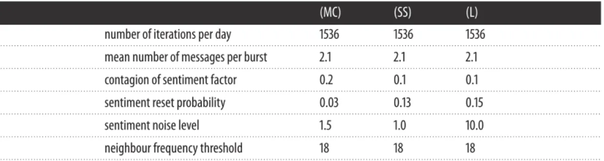
We chose to model a small community so that we could trace through the simulations, in order to understand them better. We concentrated on modelling community 17 (friends chatting) which has 28 users. We calibrated the model for each of the three sentiment measures (MC), (SS) and (L). Each calibration was performed with an iterative grid search: we used five successive grid searches, each time zooming in on the area of the parameter space that appeared most promising in the previous search. The initial ranges searched for each parameter are given in appendix D. Because the simulation runs are randomized we performed 50 simulation runs for each combination of parameters tested, taking the mean of the resulting 50 scores as the score for the choice of parameters. The parameters found by the repeated grid search were as follows:
(MC) (SS) (L)
number of iterations per day 1536 1536 1536
. . . .
mean number of messages per burst 2.1 2.1 2.1
. . . .
contagion of sentiment factor 0.2 0.1 0.1
. . . .
sentiment reset probability 0.03 0.13 0.15
. . . .
sentiment noise level 1.5 1.0 10.0
. . . .
neighbour frequency threshold 18 18 18
. . . .
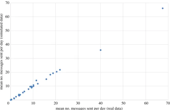
Figure 13compares the mean daily count of messages sent for each user, in the real data and averaged
over 500 simulation runs. As we can see, the match is extremely close.Figure 14similarly compares the
standard deviation (variability) of the daily count of messages sent for each user, in the real data and averaged over 500 simulation runs. The match is less good here, which reflects the fact that when setting
the constantsαandβin the scoring function, we chose to prioritize matching the means instead of the
standard deviations. The sentiment statistics of the real data are matched closely by the simulated data (again averaged over 500 simulation runs), particularly for (MC):
19
rsos
.ro
yalsociet
ypublishing
.or
g
R.
Soc
.open
sc
i.
3
:1
60162
... 70 70 60 60 50 50 40 40 30 30mean no. messages sent per day (simulated data)
mean no. messages sent per day (real data) 20
20 10
10 0
Figure 13.The mean daily count of messages sent by each user, in the real data and averaged over 500 simulation runs.
(MC) (SS) (L)
mean daily sentiment in real data 0.479 0.325 3.24
. . . .
mean daily sentiment in simulation 0.469 0.320 3.17
. . . .
standard deviation of daily sentiment in real data 0.160 0.101 0.971
. . . .
standard deviation of daily sentiment in simulation 0.161 0.097 0.932
. . . .
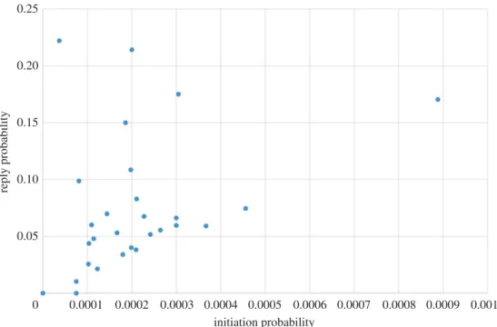
Finally, in figure 15 we plot the initiation probability P(init,A) of each agent against the reply
probabilityP(reply,A); recall that these are set from the historical data of the community. We include
this plot to emphasize the lack of correlation between the two. This confirms that users really do appear to play different roles in the community, with some initiating relatively often but not replying much, and others replying readily while initiating but little.
5.2. Predicting the effects of introducing a new user
We now consider a scenario where a new user joins the network and becomes the neighbour of any three existing community members that we choose. Which three community members should our new user befriend? For illustration, we explore four possible choices:
(i) Befriend the three users with the most positive sentiment (ii) Befriend the three users with the most negative sentiment (iii) Befriend the three users with the highest reply probabilities (iv) Befriend the three users with the lowest reply probabilities
For the purposes of this example, we assume that our user will be vocal but with sentiment matched to the prevailing sentiment of the existing community: the new user’s initiation (resp. reply, propagation) probability is set to three times the maximum initiation (resp. reply, propagation) probability found in the existing community. Also, the new user’s baseline sentiment level is set to the existing community
sentiment level. Figures16,17,18and19show how our four choices of neighbours affect four aspects
20
rsos
.ro
yalsociet
ypublishing
.or
g
R.
Soc
.open
sc
i.
3
:1
60162
... 14 12 10 8 6 4 2 0 5 10standard deviation of no. messages sent per day (real data)
standard deviation of no. messages sent per
day (simulated data)
15 20 25 30 35 40
Figure 14.The standard deviation (variability) of the daily count of messages sent by each user, in the real data and averaged over 500 simulation runs. 0.25 0.20 0.15 0.10 reply probability 0.05 0 0.0001 0.0002 0.0003 0.0004 0.0005 initiation probability 0.0006 0.0007 0.0008 0.0009 0.0010
Figure 15.Comparing the initiation probability and reply probability for each agent.
sentiment level and the standard deviation (variability) of the daily sentiment levels (all averaged over 100 simulation runs and using (MC)). The results highlight again the role of network structure: if our new user befriends the three most positive users, then the community sentiment goes up, and if he befriends the three most negative users, the community sentiment goes down. Similarly, choosing the users with the highest or lowest reply probabilities as neighbours has a markedly different effect on activity levels. Validating our model’s predictions about the effects of new users on real data is beyond the scope of this paper; it is a challenging research task in itself and is left as future work.
21
rsos
.ro
yalsociet
ypublishing
.or
g
R.
Soc
.open
sc
i.
3
:1
60162
... 45 40 35 30 25 20 15increase in activity level (messages sent per day)
10
5
neighbours are three users with most positive
sentiment
neighbours are three users with highest reply probabilities
neighbours are three users with lowest reply probabilities neighbours are three
users with most negative sentiment 0
Figure 16.The effect on the increase in community activity level of four options for the neighbours of the newly introduced user.
36 35 34 33 32 31 30 29
standard deviation of daily commumity activity level
(no. messages sent)
neighbours are three users with
most positive sentiment unmodified model community neighbours are three users with highest reply probabilities
neighbours are three users with lowest reply probabilities neighbours are three users with most negative sentiment
Figure 17.The effect on the standard deviation (variability) of daily community activity level of four options for the neighbours of the newly introduced user.
6. Discussion
Despite the deluge of data on human communication, dynamics of collective mood is still mainly an uncharted area. While different theories of emotion contagion exist in the literature, we are still far off being able to predict the occurrences, intensity and durations of collective compassion, happiness or outrage on Twitter. Here we presented findings from one large Twitter dataset. While we are conscious of some serious limitations of our approach—the lack of representativeness of Twitter users, and the noisy nature of sentiment scores—we believe that our methodology can be generalized to other datasets of human interactions which allow for sentiment scoring.
22
rsos
.ro
yalsociet
ypublishing
.or
g
R.
Soc
.open
sc
i.
3
:1
60162
... 0.015 0.010 0.005 0change in community sentiment compared to unmodified
model community –0.005
–0.010
–0.015
neighbours are three users with most positive
sentiment
neighbours are three users with highest reply probabilities
neighbours are three users with lowest reply probabilities neighbours are three
users with most negative sentiment
Figure 18.The effect on community sentiment level of four options for the neighbours of the newly introduced user.
0.162 0.160 0.158 0.156 0.154 0.152 0.150 0.148 0.146
standard deviation of daily commumity sentiment
neighbours are three users with most positive
sentiment unmodified model
community
neighbours are three users with highest reply probabilities
neighbours are three users with lowest reply probabilities neighbours are three users with most negative sentiment
Figure 19.The effect on the standard deviation (variability) of daily community sentiment level of four options for the neighbours of the newly introduced user.
Looking to wider socio-economic horizons and smart cities opportunities, social media is slowly
but steadily becoming an important channelto run policy information and education campaigns on a mass
scale. Additionally, it has become an exclusive channel to get the attention of some socio-demographic groups, especially in the younger population, who decreasingly consume traditional media such as local newspapers and television.
For these reasons, a data-driven model of collective sentiment captured through social media is one of the most important tools that social data analytics can offer to a city leadership. It allows gauging