Methods for Exploring and Cleaning Data
Louise A. Francis, FCAS, MAAA
Abstract
Motivation. Much of the data that actuaries work with is dirty. That is, the data contain errors, miscodings, missing values and other flaws that affect the validity of analyses performed with such data.
Methods. This paper will give an overview of methods that can be used to detect errors and remediate data problems. The methods will include outlier detection procedures from the exploratory data analysis and data mining literature as well as methods from research on coping with missing values. The paper will also address the need for accurate and comprehensive metadata.
Conclusions. A number of graphical tools such as histograms and box and whisker plots are useful in highlighting unusual values in data. A new tool based on data spheres appears to have the potential to screen multiple variables simultaneously for outliers. For remediating missing data problems, imputation is a straightforward and frequently used approach.
Availability. The R statistical language can be used to perform the exploratory and cleaning methods described in this paper. It can be downloaded for free at http://cran.r-project.org/.
Keywords. data quality, data mining, ratemaking, exploratory data analysis.
1. INTRODUCTION
The frequency of poor data quality is one of the most vexing problems for actuaries. Countless hours are expended detecting data problems, remediating the problems and revising analyses after data problems have been revealed. Data quality problems are not unique to the insurance industry. Olson describes data quality problems as nearly universal (Olson, 2003). In his words “In just about any organization, the state of information quality is at the same low level”1. Olson cites two explanations for this unfortunate situation: 1) the
pervasiveness of rapid system implementation and change and 2) methods for assuring data quality have not developed nearly as rapidly as the ability to collect, store and process data. Olson estimates that the cost of data quality problems is 15% - 20% of operating profits2.
Insurance companies collect vast amounts of data and use this data to make key decisions, such as the price to charge for an insurance policy and the amount of liability for claim obligations that will appear on the company’s financial statements. These data driven decisions are key to the profitability of insurance companies. Insurance companies often
1 Olson, p10. 2 Olson, p9.
aggregate much of the useful detail out of their data. Pricing and reserving functions are performed on large groupings of businesses. Thus, there are missed opportunities to improve the company’s profitability through better use of its data. As a consequence, such efforts to assure data reliability as do exist are focused primarily on assuring the accuracy of large aggregates of financial amounts. For example, it is considered important that the incurred and paid losses that are allocated to a given accident year at a given valuation date for a given line of insurance are correctly stated (even though all too often they are not). Almost no attention is focused on assuring that the values recorded for infrequently referenced fields, such as injury type or return to work date, are complete or accurate. As a result, an insurance company may not be able to monitor the effectiveness of new initiatives, such as programs which aim to return injured workers to work sooner than in the past. These data quality issues also hamper effort to build analytical models focused on finding complex patterns in data, such a fraud analysis requiring injury and treatment information.
In recent years, insurance companies have started to explore the use of advanced analytical techniques in order to more accurately price and reserve the insurance exposures, as well as predict fraud, model catastrophes and other unique exposures, market policies and support other management decisions. These analyses make heavy demands on data and typically involve large databases – often millions of records and hundreds of variables. The data quality problems are magnified for these large scale analytical projects. This is because the projects utilize data not frequently used for other business functions and therefore data quality issues become a challenge to the modeling effort. Analysts devote significant resources to finding, fixing or otherwise remediating data problems. A rule of thumb is that more than 80% of the time devoted to analytical projects is expended on processing and cleaning up messy data (Dasu and Johnson, 2003).
In this paper a number of methods will be presented which can be used to detect and remediate data quality problems. The focus will be on two areas: 1) detecting data errors and 2) finding and adjusting for missing data. The methods presented in the paper are focused on projects using large databases, but they may also be applied to databases of more modest size.
1.1 Research Context
The actuarial literature on data quality is relatively sparse. The American Academy of Actuaries (AAA) standard of practice #23 on data quality provides a number of important guidelines for assuring the validity of data when performing an actuarial analysis. The standard provides guidelines for reviewing data for completeness, accuracy and relevance to the analysis. The Casualty Actuarial Society (CAS) committee on Management Data and Information and the Insurance Data Management Association (IDMA) also produced a white paper on data quality (CAS committee on Management Data and Information, 1977). The white paper states that evaluating the quality of data consists of examining the data for:
• Validity,
• Accuracy,
• Reasonableness,
• Completeness.
These same concerns apply to data supplied to an analyst performing a large analytical project. A typical actuarial review of data consists of balancing totals from the data to published financial reports and inspecting the data for obviously erroneous values, such as negative amounts for financial variables like paid losses. The data quality white paper describes a number of more extensive activities that could be performed to assure the overall integrity of the data systems serving all the different business users within an insurance company. These include data edits to detect impermissible values in the data and periodic data audits to measure the extent of data quality problems.
This paper is focused on data quality issues arising when data is supplied by an external (or internal) source not under the control of the analyst that must be screened for data quality problems prior to use in a project.
A somewhat extensive literature that is relevant to data quality exists in statistical journals and publications. This includes the tools of exploratory data analysis, pioneered by Tukey (Hartwig and Dearing, 1979 discuss Tukey’s contribution), and graphical analysis of data, popularized by Chambers and Cleveland (Chambers et al., 1983, Cleveland, 1993). Exploratory data analysis techniques are particularly useful for detecting outliers. While outliers, or extreme values, may represent legitimate data, they are often the result of data
glitches and coding errors.
Another aggravating data quality issue is that of incomplete or missing data. In recent years the literature on methods for remediating missing data has been growing. Rempala and Derrig (Rempala and Derrig, 2003) presented the expectation maximization procedure for estimating missing values. Francis (Francis, 2003) described how the MARS data mining procedure creates surrogate variables to use when values are missing. This paper will not cover the EM or MARS approaches, but will review several of the most common methods for “plugging in” values where data is missing. Some of these methods, such as replacing a missing value with the mean of that variable, have been used for decades while others such as data imputation have been developed more recently. In this paper, procedures for detecting and remediating missing data problems will be presented.
1.2 Objective
Data quality is a ubiquitous and daunting problem for analysts of insurance data. A goal of this paper is to raise awareness of the data quality problem in the insurance industry. Because the users of insurance data will frequently be required to do the best they can with data that has quality issues, this paper present some methods for screening data and detecting data problems. Only a few key exploratory and data cleaning methods will be presented in this paper, but the reader is referred to literature in the references section of this paper for further information. Dasu and Johnson (Dasu and Johnson, 2003), in particular, provide a more thorough introduction to procedures that include those in this paper and cover a large number of other approaches, which can be easily implemented.
Many of the exploratory methods presented in this paper are intended to detect outliers, or erroneous values. Missing data is also an important data quality issue; therefore this paper presents methods for detecting and remediating missing data.
1.3 Outline
The remainder of the paper is structured as follows.
• Section 2 is the background and methods section.
o Section 2.1 will introduce the data set used to illustrate the methods in this paper.
o Section 2.2 will discuss methods for detecting unusual values in quantitative data. This section will present some well-known visual and numerical summaries of data, which can be used to detect unusual values. It will also introduce the concept of data spheres.
o Section 2.3 will present methods for detecting unusual values in categorical data. This section will introduce the concept of data cubes. It will illustrate the exploration of categorical data with tabular summaries of the data.
o Section 2.4 will present methods for finding and remediating incomplete data.
o Section 2.5 will discuss inappropriate use of insurance data that can arise when censorship, or the presence of incomplete data, is not considered. o Section 2.6 discusses metadata.
• A summary of the paper’s results and conclusions will be presented in Section 3.
2. BACKGROUND AND METHODS
Inaccurate and incomplete data are universal problems for data analysts. Methods for detecting inaccurate data have existed for many years but are not widely used in the actuarial profession. Methods for addressing incomplete data have also been incorporated into statistical software for many years. However, recent advances have significantly improved the arsenal of tools available for addressing this issue. This paper will illustrate the use of exploratory techniques for detecting data problems and missing values techniques for remediating incomplete data.
A sample database has been created to illustrate the data exploration and data cleaning procedures presented in this paper. The example is based on a sample of actual data used for a large data analysis project, but original values in the data have been modified. The size of the sample data, approximately 35,000 records, is considerably smaller than that used in many large-scale analyses, but its size allows the illustration of many useful techniques for exploring and cleaning data.
2.1 An example using personal auto data
In order to provide an example of data exploration and data cleaning approaches, a 35,284 record database of personal automobile insurance policies was created. The data is representative of data utilized for an actual analysis; however the example data is somewhat smaller in size than data used in an actual large-scale analytical project. The data are intended to be representative of policy and claims data encountered in the personal automobile line of business. Each record represents data for a policyholder. The data elements presented below could be used for underwriting, ratemaking and other insurance applications. The fields in the data are:
Date of birth License date Age Number of vehicles Number of drivers Marital status Territory Vehicle symbol
Model Year (of the vehicle) Class code
Business Type (New, Renewal, Targeted or preferred)
Policy type (Liability, Liability and Physical damage, Physical damage) Policy inception date
Number of claims Incurred losses Paid losses
Paid allocated loss adjustment expenses Ultimate claims
Ultimate losses and expenses Subrogation
Earned premium Written premium Earned exposures Written exposures Zip Code
Two major kinds of variables occur in the automobile insurance data 1) categorical (or alphanumeric) variables and 2) quantitative (or numeric variables). Each value on a categorical variable conveys qualitative information that is useful in describing characteristics of the policyholder or classifying the policyholder into one of a number of categories. Examples are gender and the territory where the policyholder’s car is garaged. However, the values on a categorical variable, such as “female” or “male” do not have any numeric or ordinal information. On the other hand, quantitative variables such as driver age or paid losses contain quantitative content. An age of 50 years is greater than age of 20 years, and it is greater by 30 years. Losses of $10,000.00 are greater than losses of $100.00 and exceed them by 10,000%. The numeric variables not only convey ordinal information, but measure relative relationships (it matters which one is higher and by how much). Different techniques are utilized to explore and clean the different kinds of variables. Some of the most commonly used of the techniques are described below.
2.2 Numeric variables
Common errors with numeric data include negative values in financial fields that can have only positive values and values that exceed the possible range for that variable, such as a driver age of 10 in a state where the minimum age for driving is 16. Such errors often appear as outliers, i.e., as extremely small or large values that are outside the range of most of the data. A number of graphical displays assist in the detection of outliers. Once an outlier is determined to exist, it can be investigated and its validity determined. In insurance data, legitimate extreme values are a fairly common occurrence. For instance, because insurance loss distributions are heavy-tailed, extreme values, of more than 3 standard deviations from the mean of the distribution, occur far more frequently than would be expected if data were normally distributed.
Two very useful graphical tools are discussed below: histograms and box and whisker plots.
2.2.1 Histograms
According to Chambers et al., “There is no single statistical tool that is as powerful as a well chosen graph”3. Often graphical summaries of data are very revealing and helpful in
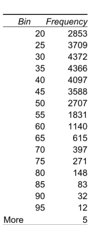
detecting outliers. One of the most commonly used and understood graphical summaries of the values of numeric variables is the histogram. The capability of producing histograms is widely available. For instance, using Microsoft Excel’s data analysis toolpak, a histogram can be easily created. The user specifies a bin range and the column of data for which a distribution is being created (see Figure 1). For instance, Table 1 presents the bin ranges, which might be specified for the driver age variable. The bin ranges specify the intervals that the data is grouped into. Since the first interval in Table 1 is 20, the total count of drivers with ages less than or equal to 20 will be summarized in the first bin. The second bin interval is 25, so the number of drivers with ages greater than 20 and less than or equal to 25 will appear in that bin. Once the count of records in each bin is summarized, a graph of the distribution of records in each interval can be created. The y-axis of the graph generally displays either the total count of records in the interval or the percent of total records in the interval. It is common to select evenly spaced intervals, but there are occasions where varying bin widths are preferable.
Figure 1
3 Chambers et, al., p1.
Table 1 Bin Frequency 20 2853 25 3709 30 4372 35 4366 40 4097 45 3588 50 2707 55 1831 60 1140 65 615 70 397 75 271 80 148 85 83 90 32 95 12 More 5 Figure 2 16 33 51 68 85 Age 0 20 40 60 80 16 23 30 37 44 51 57 64 71 78 85 Age 0 5 10 15 20 16 24 31 39 47 54 62 70 77 85 Age 0 10 20 30 40
Three histograms of age for a sample of 220 records. In Figure 2, the top left illustration has four bins and the top right graph has 40 bins. The bottom figure has 9 bins as determined by equation 2.1.
A relatively small sample from the automobile insurance database was used to produce the histograms in Figure 2, in order to illustrate issues relating to how the records underlying the graph are grouped. When a small number of bins (wide bins) is selected, a much cruder image is created. However too many bins may result in a noisy image, and makes the overall shape of the distribution difficult to determine. A rule for selecting the width of the
histogram bins (also known as window width) is (Venibles and Ripley, 1999):
1 3 3.5 h N σ = (2.1) h is window width
is the standard deviation of the variable N is the number of records
σ
This window width rule was derived under the assumption that the data has a normal distribution. For the data in Figure 2 (a sample of 220 records), with a standard deviation of 15, the rule yields the following window width:
1 3 3.5*15 8.7 220 h= = (2.2)
By dividing the range of values (the maximum value minus the minimum value) by the window width h, the number of bins can be determined. The range of values in the data is 84 (100 – 16). Dividing this by the window width of 8.7 yields between 9 and 10 intervals.
The formula above provides a rule for determining the window width for equi-spaced histograms. An alternative to an equi-spaced histogram is an equi-depth histogram. (Dasu and Johnson, 2003). In an equi-depth histogram the same percentage of records are used for each bin, therefore each bin contains the same mass.4
4 In using equi-depth bins, the analyst might wish to divide by the bin width, creating a meaningful measure of density. This would avoid having all the bars the same size.
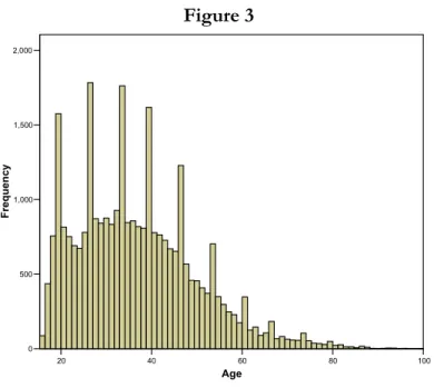
Figure 3 20 40 60 80 100 Age 0 500 1,000 1,500 2,000 Fr eq uen cy
Figure 3 presents a histogram of the age variable, for the full data set of about 35,000 records. It should be noted that many of the widely available statistical packages default to a rule such as equation (2.1) for determining the number of bins to use for grouping records used in a histogram5. Figure 3 shows that there are a few very old drivers in the data. The
analyst might wish to investigate the validity of these extreme values.
The figure also indicates that there are periodic jumps in the frequencies of age. Some survey research (Carter and Bradley., Heitjan) indicates that ages are sometimes under or over-reported and that “rounding” of ages may occur. That is, there may be some rounding at certain ages, such as ages ending in 0 or 5. The age data was examined in more detail for systematic patterns indicating underreporting or over-reporting at some ages. Figure 4 presents the graphical results of examining the age data in greater detail. This graph, which shows the frequency of records at every age reported in the data, displays no large jumps. A more careful review of the binning procedure resulting from application of formula (2.1) indicates they applying the rule to ages reported in years results in periodic grouping of the frequencies for two years together, roughly doubling the counts compared to the
5 Note that most statistical software automatically selects the scale (minimum and maximum values for each axis) as well as the number of bins using default rules. The users are allowed to choose other options if they do not like the default rules.
surrounding ages. Thus, the analyst needs to exercise care when applying of any rule for binning data, as features specific to that variable can produce unexpected results.
Figure 4 ency 16 18 20 22 24 26 28 30 32 34 36 38 40 42 44 46 48 50 52 54 56 58 60 62 64 66 68 70 72 74 76 78 80 82 84 86 88 90 92 96 Age 0 200 400 600 800 1,000 Frequ
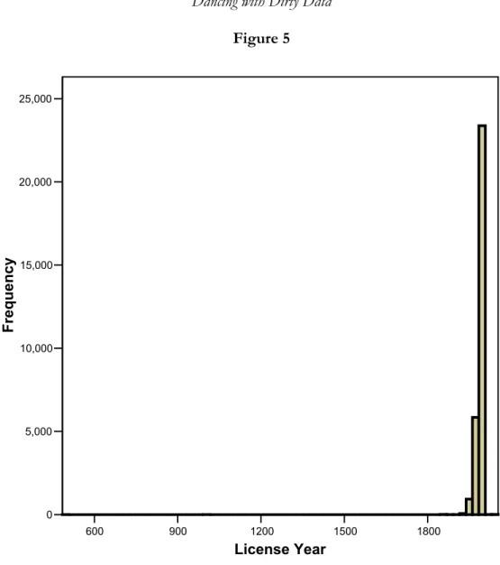
The next example illustrates an instance where the histogram helps to detect an obvious data glitch. A histogram of the variable license year is presented in Figure 5. The graph takes an unusual shape: most of the observations are clustered in the right hand of the graph, but a very small percentage of the mass lies in the extreme left. It can quickly be surmised from the graph that at least one record contains erroneous values on this variable, i.e., a license date that is prior to the year 600. To find the outlier observation(s), the data was sorted by ascending order on the license year variable. Table 2 presents the 18 lowest observations on this variable. All have license years prior to 1900, clearly impossible values.
Figure 5 600 900 1200 1500 1800 License Year 0 5,000 10,000 15,000 20,000 25,000 Frequency
Table 2
Policy ID Licensed Date Licensed Year Date of Birth Birth Year Age
28319 7/1/0490 490 7/4/1972 1972 30 08861 2/1/1000 1000 12/31/1983 1983 20 00043 1/1/1857 1857 7/19/1966 1966 36 01203 1/1/1857 1857 8/21/1965 1965 38 02003 1/1/1857 1857 10/14/1975 1975 28 03132 1/1/1857 1857 6/6/1947 1947 56 04114 1/1/1857 1857 5/21/1961 1961 42 04839 1/1/1857 1857 8/28/1970 1970 33 05338 1/1/1857 1857 10/3/1978 1978 25 05339 1/1/1857 1857 10/3/1978 1978 25 05424 1/1/1857 1857 2/23/1949 1949 54 05946 1/1/1857 1857 6/22/1976 1976 27 06028 1/1/1857 1857 9/13/1980 1980 23 06175 1/1/1857 1857 2/16/1965 1965 38 06386 1/1/1857 1857 5/27/1980 1980 23 34079 1/1/1857 1857 8/21/1965 1965 39 34930 1/1/1857 1857 10/2/1985 1985 19 04342 6/19/1890 1890 6/19/1963 1963 40
The license date value for all records with a value below 1900.
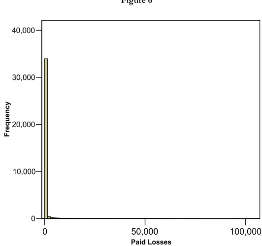
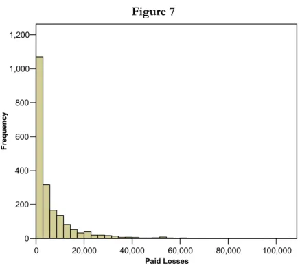
Figure 6 illustrates another issue that arises when visually screening data with histograms. This graph displays a distribution for paid losses (per policyholder, not claimant) where the number of bins has been determined according to equation 2.1. For this graph, the overwhelming majority of the records are displayed on the left side of the graph at the origin, with almost no perceptible mass at other values. This occurs because approximately 90% of the records are those of policyholders who have not reported a claim; therefore there is a large mass point for the histogram at zero. This histogram is relatively uninformative with respect to drawing useful conclusions about the important characteristics of the paid loss distributions. One approach to dealing with data that has a mass point at zero is to filter the paid loss data and remove from the graph those observations with a zero value. When filtering data, records we are not interested in are removed from the statistics and charts being produced. However, the records remain in the data for use on other procedures and charts. Many analytic tools, including Microsoft Excel, provide the user with the capability of filtering data.
Figure 6 0 50,000 100,000 Paid Losses 0 10,000 20,000 30,000 40,000 F req ue nc y
Histogram of paid losses including all records
Figure 7 0 20,000 40,000 60,000 80,000 100,000 Paid Losses 0 200 400 600 800 1,000 1,200 Fre que ncy
Histogram of paid losses for filtered data.
The features of the paid loss data displayed in Figure 7, based on filtered data, are more informative than those of Figure 6. At this point nothing seems amiss with this data. There appear to be many records with relatively modest paid loss amounts and a few records with large amounts, but nothing that is unexpected or unusual for paid loss amounts. In the next section a procedure is presented which highlights key features of a distribution that may not be obvious from the histogram.
2.2.2 Box and whisker plots
One of the most useful graphical displays for exploring and cleaning data is the box and whisker plot first introduced by Tukey. The box and whisker plot provides a one-dimensional summary of key features of numeric data. The basic components of the box and whisker plot are illustrated in Figure 8. The key components of the plot are 1) a box, 2) two whiskers extending from the box and 3) outliers.
Figure 8 -20 0 20 40 60 80 Normal ly Distribute d Age +1.5*midspread median Outliers 75th Percentile 25th Percentile
Key features of the box and whisker plot are the median, the edges at the 25th and 75th percentiles, the whiskers and the outliers
The (edges) top and bottom of the box are defined by the 75th and 25th percentiles of the
distribution plotted. A line through the middle of the box denotes the 50th percentile or
median value. (The width of the box carries no meaning). A line extends both from the top and bottom of the box. These lines are referred to as the whiskers. For this graph, the lines denote the points 1.5 midspreads above and below the box edges (the midspread is the difference between the 75th and 25th percentile). Different rules can be utilized to determine
the length of the whiskers. Another rule commonly used is for the whiskers to have a length 1.5 or 2 times the standard deviation of the distribution. In Figure 8, points beyond the 1.5 times the midspread boundary are individually displayed (the circles with lines through them). These points may be considered outliers. The points denoted as outliers depict records that the analyst might want to investigate.
Figure 9 displays the box and whisker plots for the age field in the auto data. This data is not normally distributed. Because the data is right skewed, the whisker for the upper portion
of the distribution is larger than the whisker for the lower portion of the distribution. Moreover, only the right tail displays extreme values. This graph, like the histogram, indicates there are some records with very high values that an analyst might want to investigate. Figure 9 0 20 40 60 80 100 Ag e
Box and whisker plot of age from auto data
Figure 10 displays a box and whisker plot for filtered paid loss data (that is, the paid losses were filtered to remove zero values). Because the distribution of paid losses is very heavy tailed, the top whisker is much longer than the bottom whisker. In addition, the box enclosing the interquartile range is extremely small and important statistics such as the median of the data cannot be read from the graph. While the many circles at the top of the graph indicate a relatively large number of extreme values, such values are normal for insurance financial variables. A more useful plot with more ability to identify real outliers could be constructed on rescaled or transformed data. In order to make the graph interpretable, a display on a log scale using a base of 10 is reasonable.
Figure 10 -10000 10000 30000 50000 70000 90000 110000 Pa id Los s
Box and whisker plot of paid losses. Data are on untransformed scale.
The box and whisker plot displayed in Figure 11 provides a much more interpretable summarization of the paid loss distribution than Figure 10. If an error is introduced by introducing a value well outside the range of the data (in this case the paid losses on one record was recoded to $10 million), the box and whisker plot can be used to detect the outlier. This is shown in Figure 12, where a point is plotted at the top of the graph, which is orders of magnitude higher than all the remaining data.
Figure 11 101 102 103 104 105 Pa id L os s Figure 12 101 102 103 104 105 106 107 Pai d Loss
Box and whisker plot without (Figure11) and with (Figure 12) outlier on paid loss data.
2.2.3 Descriptive statistics
A quick way to screen numeric data for invalid values is to produce summary tables of descriptive statistics. Such tables can usually be quickly prepared using commonly available statistical packages. Descriptive statistics output displays the most important statistics characterizing a distribution. Some of the most common statistics displayed are the mean, median, minimum and maximum. The analyst can quickly review the descriptive statistics tables for an indication that the data contain inappropriate values.
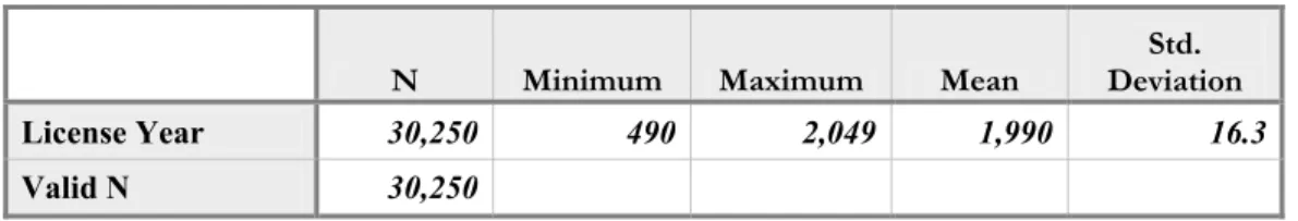
Table 3 displays descriptive statistics for the license year variable. The statistics for the minimum and maximum values both indicate problematic values for this variable. Table 4 displays descriptive statistics for age and indicates a policyholder of age 100 years, an extremely high value for this variable. Table 5 presents descriptive statistics for the paid loss variable. The minimum for this variable indicates a suspicious (negative) value. These are three examples of how simple summaries of numeric variables may give an indication of unusual values.
Table 3
N Minimum Maximum Mean Deviation Std.
License Year 30,250 490 2,049 1,990 16.3
Valid N 30,250
Descriptive statistics for license year Table 4
N Minimum Maximum Mean Deviation Std.
Age 30,242 16 100 36.9 13.2
Valid N 30,242
Descriptive statistics for age
Table 5
N Minimum Maximum Mean
Std. Deviation
Paid Losses 35,284 -1,000.00 106,940.00 364.57 2769.8
Valid N 35,284
Descriptive statistics for paid losses
2.2.4 Data Spheres
The data exploration methods described above are based upon screening variables one at a time. Dasu and Johnson (Dasu and Johnson, 2003) recently introduced the concepts of data spheres for simultaneously screening a number of variables for outliers. Their logic is that records with typical values for data are near the “center” of the data and records containing outliers are a large distance from the “center” of the data.
To illustrate the concept of data spheres, a plot was created using the latitude and longitude for the zip code associated with each record. This information was obtained by incorporating into the original data, geographical data obtained from a third party vendor. The latitude and longitude data were standardized so that the mean of each variable is zero and the standard deviation is one. Figure 13 displays a circular plot of the latitude and longitude data. This plot indicates that most of the records lie within the 2nd innermost circle of the data, but a few points lie along the perimeter. Those points along the perimeter represent geographic outliers. In fact, the tabulation of records in Table 6 indicates that most policyholders are located in one state, but a small percent are in other states.
Figure 13
Circular plot of latitude and longitude
Table 6
State Frequency Percent Valid Percent Cumulative Percent
26 .1 .1 .1 CA 1 .0 .0 .1 FL 2 .0 .0 .1 MA 2 .0 .0 .1 NC 1 .0 .0 .1 NJ 9 .0 .0 .1 NY 3 .0 .0 .1 PA 35,240 99.9 99.9 100.0 Total 35,284 100.0 100.0
Dasu and Johnson (Dasu and Johnson, 2003) introduce the Mahalanobis depth as a way to measure how far a given record is from the center of the data. The statistic is:
1 ( ) ' − ( ) = − MD x µ Σ x µ− (2.3)
where is a vector of variables, is a vector of means of the variables, is the variance-covariance matrix of
x µ
Σ x
This formula indicates that the Mahalanobis depth measures the squared deviation of each variable on each record from its mean. The squared deviation is adjusted to unit variance using the variance-covariance6 matrix. A simple way to compute the MD is as
follows:
• Compute the mean of each variable in the data
• Compute the standard deviation of each variable in the data
• For each record in the data
o For each numeric variable on the record
6 The variance-covariance matrix, which is similar to the correlation matrix (shown in Table 18), is a matrix displaying the covariance between each pair of variables. The diagonal of the matrix contains the covariance of each variable with itself, which is its variance.
Compute the difference between the value for the variable and the mean of the variable and divide by the standard deviation of the variable,
Square the result.
o Sum the squared deviations of each variable for the record to derive the Mahalanobis depth
A computation using the algorithm above would ignore correlations between the variables that are accounted for in formula (2.3).
Using numeric variables in the automobile insurance data, a Mahalanobis depth was computed for each record. Since those records with a small value for this variable can be thought of as close to the center of the data and those with high values as on the perimeter of the data, the MD statistic can be used to “layer” the data. That is, the data can be ranked based on the MD value and grouped into quantiles. Table 7 displays the average MD statistic for data grouped into 20 quantiles.
Table 7 Mahalanobis Depth 1 .78 2 1.11 3 1.35 4 1.59 5 1.83 6 2.08 7 2.33 8 2.59 9 2.89 10 3.22 11 3.61 12 4.03 13 4.59 14 5.32 15 6.41 16 8.03 17 9.52 18 11.26 19 13.31 Quantiles of Mahalanobis Depth 20 28.39
Average Mahalanobis depth for 20 quantiles of the auto data
The analyst might choose to examine more carefully those records that are the furthest from the center of the data, i.e., those with the highest MD statistic. Table 8 presents a printout of 10 records, which were in the highest 1% of records on the MD statistic. Looking at the records in the table, the MD statistic seems to have identified records with unusual values on one or more variables. For the first, second, and fourth records, the number of drivers on the policy is six while the seventh record shows a negative value on the number of cars variable. The 6th record displays the year 490 as the license year while the last record shows a value of 2039 for this variable. This example indicates that the MD statistic has potential value for screening a large number of numeric variables for unusual
values that may be data errors.
Table 8
Policy ID Mahalanobis Depth Mahalanobis Age Percentile of License Year Number of Cars of DriversNumber Model Year Incurred Loss
22244 59 100 27 1997 3 6 1994 4,456 6159 60 100 22 2001 2 6 1993 0 22997 65 100 NA NA 2 1 1954 0 5412 61 100 17 2003 3 6 1994 0 30577 72 100 43 1979 3 1 1952 0 28319 8,490 100 30 490 1 1 1987 0 27815 55 100 44 1976 -1 0 1959 0 16158 24 100 82 1938 1 1 1989 61,187 4908 25 100 56 1997 4 4 2003 35,697 28790 24 100 82 2039 1 1 1985 27,769
Listing of records with high Mahalanobis depth values
2.3 Categorical data: data cubes
The exploratory techniques described above can be applied only to numeric data. The techniques used to screen categorical data typically involve partitioning data. When exploring categorical data, the analyst typically uses data cubes, a topic that is covered in depth by Dasu and Johnson (Dasu and Johnson, 2003). Data cubes help us slice the data into chunks and see what is in the chunks. The data is partitioned into one-dimensional or multidimensional groupings. Frequency tables, cross tabulations and pivot tables are examples of data cubes. The partitions or cubes are then examined for unusual values.
Figure 14
Example of a data cube from auto data
Figure 14 illustrates a simple data cube. The figure displays the percentage of records in the data for each combination of business type and gender. In actual practice, the concept of data cubes is implemented by “slicing and dicing” the data into one-way or multi-way tabulation that reveal the structure of the data.
One of the most useful techniques for examining categorical variables is the one dimensional frequency table. Frequency tables list the values for the variables and the number of records containing the value. By reviewing such tables one can often detect impermissible values for the variable examined or learn other useful information about how the data is coded.
Tables 9 through 12 present the results of one-dimensional tabulations for some categorical variables in the data. Some observations can be made. There appear to be no data issues with the business type variable. However we note that about 14% of the records
are missing a value for the gender variable. (Missing values will be addressed in more detail in section 2.4). We also note that marital status has the following codes: M, S, and D (which presumably denote married, single and divorced). In addition to these codes we find the codes ‘1’, ‘2’ and ‘4’. The coding of this variable appears to be inconsistent. Sometimes marital status is coded into a numeric code and sometimes it is coded into a character code. Since the analyst will want a consistent coding scheme, it will be necessary to contact the supplier of the data to learn the definition of the numeric codes.
Table 9 Business Type Frequency Percent N7 3607 10.2 R 25179 71.4 T 6498 18.4 Total 35284 100 Table 10 Gender Frequency Percent 5,054 14.3 F 13,032 36.9 M 17,198 48.7 Total 35,284 100 7 N= New, R=Renewal, T=Targeted
Table 11 Marital Status Frequency Percent 5,053 14.3 1 2,043 5.8 2 9,657 27.4 4 2 0 D 4 0 M 2,971 8.4 S 15,554 44.1 Total 35,284 100
Reviewing the class code table below codes reveals that some class codes are very sparsely populated. It may be helpful to consolidate the data from sparsely populated cells into one “all other” category before conducting an analysis.
Table 12 Class Code
Code Frequency Percent
1 17,646 50 2 5 0 3 938 2.7 4 5,694 16.1 5 2,994 8.5 6 238 0.7 7 1 0 8 135 0.4 9 218 0.6 10 1 0 11 1,281 3.6 12 2 0 13 827 2.3 14 85 0.2 15 73 0.2 16 1,656 4.7 17 1,581 4.5 18 1,846 5.2 19 13 0 20 50 0.1 Total 35,284 100
Using macros or the command language for statistical software, the process of creating tabulations of the categorical variables can be automated.
2.4 Missing data
In large insurance databases, missing data is the rule rather than the exception. It is also not uncommon for some data to be missing on databases used for smaller analytical projects. Missing data complicates an analysis by reducing the number of records containing completely valid information that can be used. At a minimum, the uncertainty about parameter estimates will be increased, even when measures can be taken to adjust the data containing the missing values. It is not uncommon for the majority of records to be missing data on variables that are presumably in the database and available to the analyst. If a sufficient percentage of records on a given variable are missing a value, that variable may have to be discarded from the analysis. In some extreme circumstances, the missing data
problem may be so severe that an analysis cannot be undertaken.
2.4.1 Detecting missing values
When an error is detected on a variable and its correct value cannot be determined, it is common to recode the value to missing. In addition, the original data may arrive with missing values on many variables. The analyst should screen each variable to be used in an analysis to determine the extent of the missing data problem. Most statistical software packages have default coding for missing values such as the period (.) or ‘NA’. In addition, a coder may have used a specific value such as ‘99’ as a code indicating a missing value. Missing data for character variables often takes the form of a blank field. Thus, it is necessary to completely understand the protocol for coding missing values that was used in assembling the data.
Tables 13 through 15 illustrate some of the issues that arise when screening for missing data. Table 13 shows the output of SPSS8’s frequency procedure and indicates that 5,042
records are missing a value for age and 5,034 records are missing a value for license year. The table also indicates that no records are missing for business type or gender. However, Tables 14 and 15, frequency tables of the values present for the business type and gender variables, indicate 14.3% of the records show a blank value for the gender variable, while all records contain one of the three legitimate values (‘N’, ‘R’ or ‘T’) for business type. In tabulating missing values for character data such as gender, it will be necessary to look at a listing of all possible values for the variable, and count those with a blank value as missing.
8 SPSS is a vendor of statistical software. While the illustrations in this paper can be performed with free software such as R, the author found it convenient to use commercial software for some of the exploratory data analysis.
Table 13
BUSINESS
TYPE Gender Age License Year
Valid 35,284 35,284 30,242 30,250 N Missing 0 0 5,042 5,034 25 27.00 1,986.00 50 35.00 1,996.00 Percentiles 75 45.00 2,000.00
Example of tabulation of missing values from statistical software Table 14
BUSINESS TYPE
Frequency Percent Valid Percent Cumulative Percent N 3,607 10.2 10.2 10.2 R 25,179 71.4 71.4 81.6 T 6,498 18.4 18.4 100.0 Valid Total 3,5284 100.0 100.0 Table 15 Gender
Frequency Percent Valid Percent Cumulative Percent 5,054 14.3 14.3 14.3 F 13,032 36.9 36.9 51.3 M 17,198 48.7 48.7 100.0 Valid
Total 35,284 100.0 100.0
Table 16
Variable Percent Missing
Age 14% License year 14% Number of vehicles 0% Number of Drivers 0% Marital status 14% Territory 0% Vehicle symbol 39% Model Year 0% Class code 0% Business Type 0% Policy type 0% Number of claims 0% Incurred losses 0% Paid losses 0%
Paid allocated loss adjustment expenses 0%
Ultimate claims 0%
Ultimate losses and expenses 0%
Subrogation 0% Earned premium 0% Written premium 0% Earned exposures 0% Written exposures 0% Zip Code 0%
Missing data percentages
Table 16 shows the missing value statistics for the variables in the data.
In addition to screening data supplied by others for missing values, the analyst needs to be alert to missing values he/she creates when performing calculations. Some functions, such as the log function will take on a missing value for some values supplied to it (in the case of the log function, most software codes the log of zero as a missing value). Most statistical software produces a log, which records the history of calculations completed and their results. Cody (Cody, 1999) recommends reviewing the logs of the statistical software the analyst is using for statements that missing values are being created as a result of transformations performed.
2.4.2 Types of missing values
The literature classifies missing data into three categories: 1) missing completely at random, 2) missing at random and 3) informative missing. (Allison 2002, Harrell, 2001). The category that missing data is assigned to has consequences for the strategies the analyst uses to address the missing data.
When data is missing completely at random for a variable, the fact that data is missing is completely independent of the values on any variables in the data. Under this assumption, a missing value on the age variable (which is missing in about 14% of the auto data) is unrelated to any potential dependent variables such as frequency of an accident or incurred loss ratio, as well as any potential independent variable such as territory, or class code. When data is missing at random, the probability of a missing value on a variable may be correlated with the values on other variables, but the value for the dependent variable is random after controlling for the other variables. For instance, if a value for age is more likely to be missing for single drivers, and the marital status is available on every record, an unbiased estimate of the age of a driver can be computed using age and marital status data from records where the age information is present. When data is informative missing on a variable, its true value is related to the value of the variable. Thus if age is systematically missing on very young drivers or very old drivers, the data is informative missing. This is also referred to as nonignorable non-response (Harrell, 2001).
2.4.3 Simple methods for missing values
One of the most common approaches to missing values is referred to as casewise or listwise deletion. This approach involves eliminating all records with missing values on any variable. Many statistical packages use this as the default solution to missing values. However, eliminating all records with missing values may result in discarding a large proportion of the data – data, which may contain valuable information that is useful to the analysis. For the auto data in this paper, in excess of 38% of the data would be discarded under this approach. Harrell points out that estimates based on casewise deletion of missing data are imprecise, biased or both. The imprecision results from the loss of a significant proportion of the data causing larger confidence intervals to apply to estimates based on the remaining data. Unless the data is missing completely at random the estimates will also be
biased. If the value of a dependent variable such as claim frequency is, on average, higher or lower when the age variable is missing, a fitted model will be biased when all records missing values for age are deleted from the data. Table 17 indicates that frequencies in the auto data are lower on records missing a value for the age variable.
Table 17 Claim Frequency Missing .04 Present .10 Age Missing Total .09
Claim frequency vs. missing on age variable
Another approach that can be used for some statistical procedures such as linear regression is pairwise deletion of cases. For example, a linear regression can be estimated using only the means and covariances of the variables in the data. Each mean can be computed using all the records with values for the variable. The covariance between any two variables can be computed from all the records with a value for both variables. Pairwise deletion would eliminate only the records not containing the values on both variables from the computation of their covariances, but those records would be available for computing the covariances of other variables. That is, since each covariance is an estimate of how two particular variables co-vary, both variables must be present on a record for it to be used to compute their covariance. If data is present for those two variables but missing for a third, the record can still be used for part of the overall model estimation. Once the summary statistics have been computed, the regression parameters are estimated using these summary statistics. Allison (Allison, 2002) notes that pairwise deletion makes more use of the available data, therefore more efficient estimates (with smaller confidence intervals) are obtained when using this approach. However, Allison also notes that unless the data are missing completely at random, the estimates may be biased. Allison also points out that confidence intervals obtained using pairwise deletion are often under or overstated, depending on the rule used to determine the number of observations in the calculation of standard errors.
Another approach used to adjust data for missing values involves the use of dummy variables. A binary variable is created which is 0 if values are present for a given variable and 1 if values are missing. The dummy variable then becomes an independent variable in an analysis. Allison (Allison, 2002) points out that this approach is often biased. The method is equivalent to using the mean of the dependent variable for the missing values compared to the mean of data that do not contain missing values as a parameter estimate. When data are not completely missing at random, the result is likely to be a biased estimate.
2.4.4 Imputation
Imputation is a common alternative to the simple approaches listed above. It is used to “fill in” a value for the missing data using the other information in the database. A simple procedure for imputation is to replace the missing value with the mean or median of that variable. Another common procedure is to use simulation to replace the missing value with a value randomly drawn from the records having values for the variable.
Harrell points out that if a numeric predictor variable is independent of all other predictor variables, its mean or median can be substituted for the missing value (Harrell, 2001). It should be noted that the variability of the data will be understated, when a constant value is substituted for some of the missing values.
Since it is missing a value for a significant portion of the data, imputation will be illustrated using the age variable. The first step is to assess whether this variable is independent of the other predictor variables (in which case there would be no point in using them to estimate a value for age when it is missing).
A quick evaluation of the independence among numeric variables can be performed using the correlations between the variables. The correlation is a measure of the strength of a linear relationship between two variables9. Its value varies between -1 and 1. A correlation
of zero indicates that a linear relationship does not exist between the variables. A correlation of 1 indicates a strong positive linear relationship between the variables and a correlation of -1 indicates a strong negative relationship between the variables. Most analytic software, including Microsoft Excel, have the capability of producing a correlation matrix. The matrix
9 This correlation measure is sometimes referred to as the Pearson correlation.
displays the bivariate correlation of each pair of variables included in the correlation matrix request. The correlation procedure used for this paper also displays a test of the significance of the correlation. Table 18 displays a correlation matrix for selected numeric variables in the auto data. The table suggests that there is a relatively strong correlation between age and license year. There is a more modest correlation between age and model year. The test statistic indicates that both of these correlations are significant. The correlation measure used in this example only measures linear relationships and may miss or understate nonlinear dependencies between variables. It also does not provide a measure of dependencies between numeric variables and categorical variables or between categorical and categorical variables.
Table 18 – Correlation Matrix
Age Drivers License Year ModelYear No of Vehicles
Age Pearson Correlation 1.000 -0.005 -0.483 -0.056 0.006
Sig. (2-tailed) . 0.370 0.000 0.000 0.263
N 30,242 30,242 30,226 30,237 30,242
Drivers Pearson Correlation -0.005 1.000 -0.027 0.061 0.235
Sig. (2-tailed) 0.370 . 0.000 0.000 0.000
N 30,242 35,284 30,250 35,279 35,284
License Year Pearson Correlation -0.483 -0.027 1.000 0.031 -0.009
Sig. (2-tailed) 0.000 0.000 . 0.000 0.135
N 30,226 30,250 30,250 30,245 30,250
ModelYear Pearson Correlation -0.056 0.061 0.031 1.000 -0.073
Sig. (2-tailed) 0.000 0.000 0.000 . 0.000
N 30,237 35,279 30,245 35,279 35,279
No of Vehicles Pearson Correlation 0.006 0.235 -0.009 -0.073 1.000
Sig. (2-tailed) 0.263 0.000 0.135 0.000 .
N 30,242 35,284 30,250 35,279 35,284
The eta coefficient, η, is used to measure dependencies between numeric and categorical variables. It is typically used in conjunction with the analysis of variance (ANOVA) procedure, which is a common procedure for modeling a numeric dependent variable that has only categorical predictors (see Iversen and Norpoth, 1987). The formula for eta is:
between total SS SS η= (2.4)
where SS denotes the sum of squared deviations10
As an example, Figure 15 indicates that there may be a dependency between age and the marital status variable. The eta coefficient measuring the correlation between age and marital status is 0.152. The F-statistic displayed with the output in Table 19 from an ANOVA indicates that the differences in age between categories of the marital status
10 SS total is the total sum of the squared errors of the variable about its mean, while SS between is the sum of squared errors accounted for by the difference in mean valued between groups.
variable are statistically significant. Figure 15 Married Single Marital Status 34 36 38 40 42 Mean of Ag e Table 19 ANOVA Output
Sum of Squares df Mean Square F Sig.
Between Groups 120.158,896 1 120.158,896 704,985 .000
Within Groups 5.150.923,322 30,221 170,442
Total 5.271.082,218 30,222
Measures of Association
Eta Squared Eta
Age * Marital Status .151 .023
ANOVA table showing test of statistical significance and correlation measure for age vs. marital status
Since the data indicate that age is correlated with other variables, using the other variables in the data for imputation of the missing values seems reasonable. One of the simplest procedures for imputation is linear regression. That is, regression is used to fit the model:
Age = a + b1*X1 + b2*X2 +… + bn Xn (2.5)
where X1 through Xn are the other predictors in the data, including categorical variables11.
Table 20 presents some output from the regression model12. Note that some variables,
which are correlated with age (license year) could not be used because almost all records missing age are also missing license year. The predictor variables in the model are class code, coverage type, model year, number of vehicles and number of drivers. The regression had an R2 of approximately 0.6, indicating that about 60% of the variance in age was explained by the model. Had the missing data been categorical (for instance if the analyst were imputing missing values for gender instead of age), logistic regression instead of linear regression could be used.13
11 Categorical variables are included in the model through the use of dummy variables. A dummy variable is a binary variable that is either zero or one. Each value (minus one base category) of a categorical variable is a separate zero-one dummy variable. See Hardy (1993) for a more complete discussion of using dummy variables in regression. Most statistical software including that used for this paper automatically codes the dummy variables.
12 A General Linear Model procedure was used to perform the analysis. This procedure is a generalization of linear regression and ANOVA.
13 In logistic regression the dependent variable is binary. More advanced models using polytomous logistic regression are used when the dependent variable has more than two categories. See Hosmer and Lemshow (1989)
Table 20
Tests of Between-Subjects Effects Dependent Variable: Age
Type III Sum of Squares df Mean Square F Sig.
Source Corrected Model 3,218,216 24 134,092 1,971.2 0.000 Intercept 9,255 1 9,255 136.0 0.000 ClassCode 3,198,903 18 177,717 2,612.4 0.000 CoverageType 876 3 292 4.3 0.005 ModelYear 7,245 1 7,245 106.5 0.000 No of Vehicles 2,365 1 2,365 34.8 0.000 No of drivers 3,261 1 3,261 47.9 0.000 Error 2,055,243 30,212 68 Total 46,377,824 30,237 Corrected Total 5,273,459 30,236
This illustration of imputation used a simple model to estimate missing values on a variable from the other variables in the data. A more complex method such as regression trees (Harrell, 2001, Gou, 2003) or MARS (Francis, 2003) could model complex structures in the data such as nonlinearities and interactions and might produce a more accurate estimate for the missing value. However, a detailed discussion of prediction methods is outside the scope of this paper.
Another approach for developing models when missing values are present uses the maximum likelihood method. The approach requires an assumption about the distribution of the data. For instance, the analyst might assume the data is from the multivariate normal distribution14, and incorporate a specification for the missing data into the model. The
estimation procedure finds the parameters that maximize the likelihood of the model given the data in the sample. Expectation maximization (Allison, 2002) is a common procedure based on the maximum likelihood approach that is used to estimate models in the presence of missing data. The maximum likelihood procedure will not be illustrated in this paper. An excellent introduction to the application of the EM approach to insurance problems is presented by Rempala and Derrig (Rempala and Derrig, 2003).
14 Insurance data are typically positively skewed, as well as heavy tailed, so multivariate normality likely does not apply.
When the value of a variable is imputed, the statistics measuring confidence intervals for parameter estimates will typically be understated, because the “expected” value from a model is substituted for the missing value. This “expected” value will be missing a random component that is present in actual data when the values are present for the variable. Random imputation (Allison, 2002) addresses this concern by substituting the model’s fitted value plus a random “error” term for the simple fitted value. The “error” term is typically simulated from a probability distribution that approximates to the distribution of the model’s residuals, such as the normal distribution15. The new data with the imputed values will then
have variability that more closely resembles the variability in data that do not have missing values.
2.5 The censorship problem: Using appropriate numeric data under
censorship
Both the AAA standards of practice and the CAS and IDMA white paper on data quality cite appropriateness of the data as a key data quality concern. A common error relating to the appropriate use of insurance data results from ignoring censorship of insurance variables. Many insurance finance variables collected and used for analytical studies, which reside in insurance databases contain incomplete or censored values.
Insurance data is typically grouped into cohorts of similarly aged information based on when a policy covering an exposure is written (policy year) or when an incident giving rise to an accident occurred (accident year).16 This means that as of any given point in time after the
inception of an accident or policy period, only a portion of the final reported claims counts and paid loss amounts are known. This is a consequence of lags inherent in the reporting and settlement process for claims. Figure 15 on the next page, from the CAS Loss Reserve Seminar (Taylor, 2003) illustrates some of the lags affecting insurance data, which cause insurance data to be incomplete. That is, some claims are not reported for a number of weeks and in some cases a number of years after the incident causing the claim occurred. While most personal automobile insurance claims are reported within a year of their occurrence, there are some lines of business, such as professional and products liability, 15 For many statistical models, errors are assumed to be from a normal distribution, but other distributions are likely to be more appropriate for insurance variables. Bootstrapping residuals from the sample of actual residuals is a distribution free way to randomly generate the residual term in random imputation.
16 Data can also be grouped according to other date variables, such as when the claim was reported.
where decades may pass before a claim is reported. There are additional lags in the investigation and settlement of claims. Claims that are litigated might take many years to reach their ultimate or final settlement value. When analyzing data grouped by policy year, there are additional lags because policies usually are sold throughout the year, and for policies sold in December, accidents may occur as late as December of the following year
Figure 16, (Taylor, 2003) illustrates how financial values evolve over time for a hypothetical sample of insurance data. The figure illustrates how it can take many years for the final settlement values for all the claims in a given accident year to be known. Until the year is very mature and all claims are settled, the analyst must work with incomplete, or censored, data and make appropriate adjustments. Figure 17 illustrates the development over time of cohorts of paid losses organized by accident year. The more recent the accident year, the more immature the paid loss data is and the less that is known about the “ultimate” or final settlement value of the claims.
Figure 16
Life Cycle of a Claim Reserve
8/1/02 Accident entered
into records as $1,000 Formula Reserve 7/11/02 Accident reported Claims in Transit 10/5/02 Individual reserve established $10,000 Case Reserve 1/1/03 Estimate revised $25,000 Case Reserve 8/18/03 Settlement agreed $30,000 Case Reserve 8/25/03 Payment sent $30,000 Case Reserve 9/2/03
Claim draft clears Claim Closed $ 0 Case Reserve 7/8/02
Accident occurs Pure IBNR
Figure 17
29
29
Cumulative Paid Losses ($000 Omitted) Accident Development Stage in Months
Year 12 24 36 48 60 72 1997 3,780 6,671 8,156 9,205 9,990 10,508 1998 4,212 7,541 9,351 10,639 11,536 1999 4,901 8,864 10,987 12,458 2000 5,708 10,268 12,699 2001 6,093 11,172 2002 6,962
Development of Paid Losses
Development of Paid Losses
Actuarial Configuration
Goal: Estimate the total ultimately paid Final Total Cost ??? ??? ??? ??? ??? ???
While casualty actuaries are familiar with the impact of performing analyses with data that is not fully mature, other users of insurance data all too often are not. A concrete example, which the author actually observed, involved a benchmarking analysis. Benchmarking generally involves the comparison of one entity’s performance against that of a standard or base. The standard is often “the industry’, or other companies selling the same product. Sometimes it is a selected group of competitors. The example of inappropriate use of property and casualty insurance data involves a benchmarking tool that was sold to insurance companies, insurance brokers and third party administrators in the mid 1990’s. The purpose of the tool was to enable a company to compare the average severity of its settled claims with those of its competitors. A typical user would compare calendar period (typically calendar year) closed claim severities for a given company with the average calendar year severities of all the other companies in the database. When the analyst was benchmarking the claims of a new company or program, it was easy to “prove” that the program was better than the industry, as their claims data consisted only of immature claims whose average severities would be considerably lower than an industry portfolio consisting of a more seasoned mixed of claims whose average maturities, and therefore average severities would be higher.
Tables 21 and 22 help illustrate how the censorship problem affects calendar year comparisons. Table 21 displays a hypothetical distribution of claims settlement by development age. In this table, assume that the development age denotes the length of time in years since an accident occurred. Development age 1 refers to all claims that settle within one year of the occurrence of an accident. Column 2 of the table shows the average closed claim severity for all claims, which settled at a given age. Table 22 displays the effect of comparing a company that has been in business for only one year to an industry benchmark composed of companies, which have been in business for many years. For simplicity, we assume no impact from inflation in the illustration. The new company, because its claims inventory is immature and is composed only of the claims settled quickly for modest amounts, has an average severity that appears to be much better than the industry, even though its claims settle for exactly the same amount as similarly aged industry claims.
Table 21
Age (Years) Closed Claim Severity Percent of Claims
1 500 25% 2 1,000 50% 3 5,000 15% 4 10,000 10% Distribution of claims and average settlement amounts by age.
Table 22
New Company
Accident Year Age Severity Percent
2003 1 500 100% Average Severity 500
Industry
Accident Year Age Severity Percent
2003 1 500 25% 2002 2 1,000 50% 2001 3 5,000 15% 2000 4 10,000 10% Average Severity 2,375
Illustration of a naïve comparison of a new company or program to a mature industry sample.
Several strategies are available to address the problem of censorship in insurance data. The first strategy is to sample only records with the same “as of dates”, i.e., use similarly aged data. That is, the study data in the example above might consist only of claims with a settlement age of one year. A drawback of this approach is that only a portion of the sample will make it into the study and these claims may not be representative of the values that would be observed on a more mature body of data. If only mature claims are used in the study, important patterns occurring only in recent data may not be detected.
The second alternative is to adjust all values to an ultimate basis17, using a standard
actuarial procedure such as development. Using this approach, an unbiased estimate of summary statistics, such as average ultimate severities or ultimate loss ratios will be obtained when comparing one group to another from the data. A drawback of this approach when it
17 Ultimate values are actuarial estimates of the final settlement value