Western University Western University
Scholarship@Western
Scholarship@Western
Electronic Thesis and Dissertation Repository
4-20-2015 12:00 AM
Interactive Visualization for Deep Organizational data
Interactive Visualization for Deep Organizational data
Arash KhosraviThe University of Western Ontario Supervisor
Prof. Kamran Sedig
The University of Western Ontario Graduate Program in Computer Science
A thesis submitted in partial fulfillment of the requirements for the degree in Master of Science © Arash Khosravi 2015
Follow this and additional works at: https://ir.lib.uwo.ca/etd
Part of the Graphics and Human Computer Interfaces Commons
Recommended Citation Recommended Citation
Khosravi, Arash, "Interactive Visualization for Deep Organizational data" (2015). Electronic Thesis and Dissertation Repository. 2776.
https://ir.lib.uwo.ca/etd/2776
This Dissertation/Thesis is brought to you for free and open access by Scholarship@Western. It has been accepted for inclusion in Electronic Thesis and Dissertation Repository by an authorized administrator of
Interactive Visualization for
Deep Organizational data
(Thesis Format: Monograph)
By
Arash Khosravi
Graduate Program in Computer Science
A thesis submitted in partial fulfillment
of the requirements for the degree of
Master of Science
The School of Graduate and Postdoctoral Studies
The University of Western Ontario
London, Ontario, Canada
ii
Abstract
During the last decade, there has been a growing interest in investigating how and why
people use organizational data to solve problems, make decisions, and perform other
cognitive activities, especially in the social network, healthcare, and education domains.
Working with organizational data is challenging because of the complex and multi-structured
nature of it. One way to support cognitive activities with organizational data is through the
use of interactive visualization tools that provide different representations and mechanisms
for interacting with deep layers of the data. In this research, we have deep organizational data
which is mainly about collaborations inside universities. The thesis goal is making an
interactive visualization tool to support complex cognitive activities with this database. The
generated visualization tool has an expandable and reusable structure as well as innovative
representations and interactions designed to allow navigating through the data intuitively.
Keywords
visualization tool, interactive visualization, organizational data, multi-layer data, deep data,
hierarchical data, representation, interaction, interactivity.
iii
Acknowledgments
I would like to thank
… my wife, Maedeh, for her love and support which allowed me to achieve my goal.
… my parents, for their faith in my abilities and all their encouragement.
… my supervisor, Dr. Kamran Sedig, for his overwhelming support and guidance that
brought this thesis to completion.
iv
Table of Contents
Abstract ... ii
Acknowledgments... iii
Table of Contents ... iv
List of Tables ... vi
List of Figures ... vii
Chapter 1 ... 1
1 Introduction ... 1
1.1 Statement of the problem ... 2
1.2 Approach ... 3
1.3 Organization ... 4
Chapter 2 ... 5
2 Background and Literature Review ... 5
2.1 Distributed Cognition... 5
2.2 Information Space ... 8
2.2.1 Data and Information ... 8
2.2.2 Data Types ... 10
2.2.3 Data Structures ... 11
2.3 Visualization ... 12
2.3.1 Hierarchical Visualizations ... 13
2.3.2 Relational Visualizations ... 20
2.3.3 Temporal Visualizations ... 25
2.4 Tasks and Activities ... 25
2.5 Interaction design ... 26
v
3 Solution ... 28
3.1 Research considerations ... 28
3.2 Structure ... 31
3.3 Visualizations ... 36
3.4 Interactions ... 48
Chapter 4 ... 52
4 Design and Implementation ... 52
4.1 Web based technologies ... 52
4.2 Database ... 54
4.3 Software structure ... 57
4.4 Visualization modules ... 58
Chapter 5 ... 61
5 Evaluation ... 61
5.1 Interactive visualizations’ evaluation ... 61
5.2 Evaluation Techniques ... 62
5.3 SciencePriorities evaluation ... 64
Chapter 6 ... 66
6 Summary and Conclusions ... 66
6.1 Conclusions ... 67
6.2 Future Work ... 68
Bibliography ... 70
vi
List of Tables
vii
List of Figures
Figure 1 Information processing in mental space ... 7
Figure 2 Hierarchical structure for Data, Information, Knowledge, and Wisdom ... 9
Figure 3 Data type classification ... 11
Figure 4 Node-Link layout... 14
Figure 5 Icicle tree representation ... 14
Figure 6 Treemap layout ... 15
Figure 7 Circular Treemap ... 16
Figure 8 Radial node-link layout ... 17
Figure 9 Radial icicle ... 18
Figure 10 3D hyperbolic tree ... 19
Figure 11 Example of relational node-link layout (arc diagram) ... 20
Figure 12 Relational circular layout ... 21
Figure 13 Force-Link layout ... 22
Figure 14 Parallel sets layout ... 23
Figure 15 An example of matrix representation ... 24
Figure 16 Compare a complex visualization (left) and a visualization consisting of multiple simple representation (right) ... 33
Figure 17 The visualization tool structure with advance and simple representations ... 35
viii
Figure 19 Focus on a part of matrices ... 40
Figure 20 Enlarging matrix interaction ... 41
Figure 21 Follow a column in the full matrix (highlighted column) ... 42
Figure 22 Visualizing same data with different filters ... 44
Figure 23 Recursive selection of elements ... 45
Figure 24 Different arranging for one matrix ... 47
Figure 25 The ability to add or remove representation spaces via interactions ... 49
Figure 26 Multi representations for the same data... 50
Figure 27 Visualization tool's client-server structure ... 54
Figure 28 Suggested database structure ... 56
Figure 29 Loading a same module multiple times ... 60
1
Chapter 1
1
Introduction
Computers have an important role in the modern and overpopulated world we are living
in today. Computers are beside us from the morning that we check our daily calendar
with our smart phone until the night that we set the to-do list for tomorrow. Our smart
computers are generating a large amounts of data every day. With reducing the value of
sensors and the appearance of computers in all businesses, it is not a big surprise that
most of our daily actions are stored in databases. For example, every time we fill a form
(regardless of registering in an online website or in a hospital) we create some data or if
we have our smart phone in our pocket, we generate data with every walk that we take.
An important question can be what is the point of gathering this amount of data? These
data can support human cognitive activities. Human cognition is not limited to the human
mind itself. It works in conjunction with other people and objects. Cognitive tools are a
sub-category of these objects which can have a leading role in forming human cognition.
We can classify data types to different categories. Organizational data is a category of
data that mainly concerns about organizations’ central characteristics and internal
relations of elements in the database (Liebig, 2009). During the last decade, there has
been a growing interest in researching organizational data especially in social network,
2
gather with our computers can be more efficient if we use a good cognitive tool to
support human mind thinking. In addition, it is important to note that the external
representation of the cognitive tool is a crucial factor to determine the power of the tool
to support cognitive activities (Hegarty, 2002). Therefore, in this research, we investigate
on deep organizational data and make a cognitive tool (data visualization tool) to support
cognitive activities that are related to this kind of data.
1.1
Statement of the problem
It is a part of human social nature that people establish some relations with each other and
form groups. These links can be based on different aspects of human relations such as
friendship, same work place, shared article, or anything else that can relate two persons to
each other. With the help of computers, we can store these relations in our databases as
organizational data. Elements of these databases are not isolated and have interrelations
with other objects. These relations can have some hierarchical structures and form deep
layers of collaborations (Deep Organizational data). Universities are good example of this
kind of data. Faculties of each university have some co-relations with each other. One
layer deeper, we have departments that form some clusters together. In the next step,
professors make different kind of collaboration such as publishing shared article,
co-supervising students, and applying for same grants. On the other hand, we can extend
3
and then connections between provinces/states and so on. There have been always this
question that how can we get better understanding of this deep data and find hidden
layers of it to support our cognitive activities/tasks. Predicting future clusters and
suggesting new collaborations based on previous relations are practical examples of using
deep organizational data. This research is about making a cognitive tool to support
navigating through the deep organizational data space for high level cognitive activities.
1.2
Approach
When we talk about cognitive tools, it is not necessarily a computer software to work
with it. Cave painting was one of the first cognitive tools that human being used to
support his/her limited memory. Our vision is the main source of information that
represent the world around us. We use visualizations to solve our daily problems
regularly even though we do not notice that we are using them. We will be able to do this
by representing abstractions of objects, structures, concepts or thoughts in our
visualizations. Therefore, we consider visualization as a powerful cognitive strategy to
support cognitive activities (Rieber, 1995). Visualizations use high bandwidth and
capabilities of the brain vision to identify borders, patterns, relationships, and meanings
which lead to further explorations (Steele & Iliinsky, 2011).
With the ability of computers, we no longer have to visualize our information space in
4
representations in monitors. In addition, visualizing a large amount of data at the same
time cannot be useful to support high level cognitive activities. As a result, we need an
interactive system to let the user interact with the cognitive tool (from now on, we mean
interactivevisualization tool) and navigate through the information space (Sedig et al.,
2005).
1.3
Organization
Chapter 2 presents the background of Distributed Cognition, Cognitive Activities, and
Mental Model. In addition, we perform a literature review on visualization, interactions,
and organizational data based on our research problem domain. Our solution to the
problem is placed in Chapter 3. This chapter describes the solution and why it can
support cognitive activities in the problem domain. Chapter 4 discusses the design of our
cognitive tool and talks about interactions in the main structure of the tool. Moreover, this
chapter provides more information about the implementation details such as the database
structure, web based technologies, and visualization modules. Last but not least, Chapter
5 presents the usability and general conclusion. Also, Chapter 6 has a section about
5
Chapter 2
2
Background and Literature Review
Before we discuss our solution in Chapter 3, we provide a literature review based on the
problem domain in this chapter.
2.1
Distributed Cognition
The human mind is not an isolated system. When we think about a subject in our mind,
everything around us may have an influence in the way we think about that subject.
Previous research in cognitive science indicates that the environment has a significant
role in human cognition (Clark, 2008). Distributed Cognition is a theory that describes a cognitive system as a distribution between internal and external representations, among a
group of individuals (socially distributed) or through time in a way that results of
previous events can affect current cognitions (temporally distributed) (Hollan et al.,
2000) (Zhang & Patel, 2006). Regarding this theory, visualization tools are not just an
external tool to work with, but, they are part of the cognition process. This view to the
cognition system is being used more and more during the last decade in designing and
evaluating visualization tools (Sedig & Liang, 2008) (Ware, 2010) (Sedig et al., 2014).
Sedig and colleagues proposed five categories for a visualization tool based on the
distributed cognition theory which are Mental space, Visualization space, Interaction
space, Information Space, and Computing space (Sedig et al., 2012). Mental space refers
to the internal operations inside the human mind. These operations update the mental
6
theory, internal operations are not the only way to change the mental model. External
operations (i.e. interactions between external representation and internal representations)
are as important as internal operations. Therefore, changes in the mental model is an
emergent process which is related to many internal and external events (Cowley et al., 2010) (Sedig & Parsons, 2013) (Kirsh, 2013). Although, we are not going to focus on this area in our research, it is crucial to have a good understanding of mental space for future
steps.
When we want to research, design, and evaluate a visualization tool, it is very important
to know what happens in the user mind after seeing the external representation. There is a
bridge between the human internal mental space and the external world that we call it
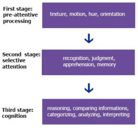
perceptual processing of information (Parsons & Sedig, 2014). We can divide the human
mind information processing into three stages (Figure 1). The first stage is pre-attentive
processing which works independent of prior knowledge and conscious cognitive
processing. This step distinguishes simple features of external representation such as
texture, length, width, hue, motion, and orientation (Healey, & Enns, 2012). This mental processing step is a powerful tool that almost every human being has it and works
without any conscious and it is important for every effective visualization tool to use this
step appropriately. After pre-attentive processing step, selective attention is the second
stage in the mental mind information processing. In this step the human mind select part
of the external representation and pay more attention to it. Unlike pre-attentive step, prior
knowledge has an important role in selective attention step. Actions such as recognition,
7
Figure 1 Information processing in mental space
Adapted from (Parsons & Sedig, 2014)
Last but not least, cognition step occurs after pre-attentive processing and selective
attention. Performing conscious tasks is the main factor of this stage and it is the main
step that can change the internal representation of the human mind. Activities such as
reasoning, comparing information, categorizing, analyzing, and interpreting are examples
of last step. In this research, our focus is on the external representation (Section 2.3), and
8
2.2
Information Space
To design and evaluate an efficient visualization tool, it is very important to understand
what we are dealing with. Different information spaces require different approach and
techniques in visualization. In this article, our focus is on deep organizational data
structures. In this Section, we perform a literature review about information space, data
types, and data structures.
2.2.1 Data and Information
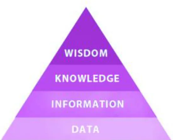
Information can be anything from a numerical value to a quantity or a person. Data is any
piece of information that we are able to collect and store. As an example, name of our
friends in our mind is an information that we have. But, if we make an excel file in our
computer and write all of our friends name on it, then we have the data about our friends
name. It is important to note that this definition for data and information is not unique
and there are various interpretations for vocabulary in this domain such as data,
information, knowledge, understanding, and wisdom. For instance, Bellinger and colleagues (2004) define data as symbols (“It simply exists and has no significance beyond its existence”), information as data that is more useful because of relational
connections between data elements, and knowledge as collections of data and information
that can answer to “how” questions. Also, this hierarchical structure continues to the wisdom at the top level. In this research, we define data as information that we could collect and store in databases. Therefore, the difference between data and information is
not about their usefulness or relations. In addition, there is not a hierarchical relation
between them. We can work with the data in our computers to support our cognitive
activities. Computational visualizing and analyzing are two examples of working with the
9
Figure 2 Hierarchical structure for Data, Information, Knowledge, and Wisdom
(We do not use this structure in this article)
When we want to design and evaluate a visualization tool, an important question is what
kind of data we are going to use? Classification of data is a challenging topic and there
have been many research on this field. But, still there is not any general agreement on this
concept. Generally, we can divide data into two main forms. The first form are data
entities or data values which are objects of interest stored in the database. Second form
are relations and collaborations between those data entities that we call them data
structures (Ware, 2012). Entities may have numbers of properties which we call them
attributes. It is possible that an entity in one database be property in another database and
vice versa. The border between entities and attributes are their independent values in the
database domain. For example, when we want to talk about fruits, color is an attribute of
fruits. But, when we talk about colors themselves and their properties, color is an entity
10
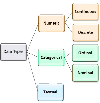
2.2.2 Data Types
The data that we store as attributes of entities can be classified into three different types:
numerical (also known as quantitative), categorical, and textual. For numerical data type,
as it is obvious by its name, we can perform numerical operations on them and the data
have quantitative value (e.g. we can add or subtract their values). Discrete and continuous
are two sub-types of numerical data. Numbers of publication in each department is an
example of discrete value and students’ height is an instance for the continuous data type.
The second data type is categorical which represent values that can be sorted into
categories. Categorical data types can be ordinal or nominal. For example, professors’
rank is an ordinal data type (assistant professor, associate professor, full professor) and
professors’ department is a nominal data type. We can convert quantitative data to ordinal
by classifying the quantitative range. Textual data type is about the data that is not
quantitative and it is not limited to numbers of categories. Publications title or professors
11
Figure 3 Data type classification
2.2.3 Data Structures
Meirelles (2013) divides data structures into six main categories which are hierarchical
structure (trees), relational structure (networks), temporal structure (timeline and flows),
spatial structure (maps), Spatio-Temporal structure, and textual structure. In this research,
our focus is on organizational structures which are a combination of hierarchical
structure, relational structure, and temporal structure. For instance, the data that we have
in this research, describes Western University in an organizational structure. The
University consists of faculties which are new organizations themselves. Each faculty has
numbers of departments. In this step, we can look at the departments as new
organizations. Professors, Students, Staffs are members of the department organization.
This description, presents the hierarchical structure of the university. In addition, if we
12
structures. Professors apply for grants, supervise graduate students, and write new
articles. When two professors apply for the same grant, co-supervise a new student, or
publish a shared paper, they make a new relational link. These links can establish new
groups (new organizations) with their own characteristics inside departments. Moreover,
we have collaborations between departments, faculties, and universities at deeper levels.
Last but not least, if we want to describe the temporal structure of our data, all of those
grants, publications and supervisions have “begin date” and some of them have “end
date”. This temporal structure allows us to navigate through the information space during
the time and present some of the reasons for forming current organizations and predict
future organizations based on the current motions.
It is important to note that because of the confidential and sensitive nature of these data,
we altered some of the labels and values in screenshots and none of their contents should
be assumed to be accurate.
2.3
Visualization
Visualization is a cognitive activity in which human beings construct an internal mental
representation of the world. This cognitive activity is inside the human mind and cannot
be displayed in the external world. Regarding the distributed cognition theory, external
representations such as information on computer monitor or piece of paper can facilitate
the visualization cognitive activity (Mazza, 2009). It is common among authors in this
domain to use the visualization term (which is a cognitive activity) to refer to external
visual representations. This article follows the same approach and most of times when we
13
In this research, we design and evaluate a visualization tool to support working with deep
organizational data that we have described it in the Section 2.1. In this section we classify
visualizations and perform a literature review about previous visualization works in this
domain.
2.3.1 Hierarchical Visualizations
Hierarchy is one of the main characteristics of the organizational data. Hierarchical
structures are widely used to present complex relations and visualizing them is one of the
most mature and active branches in information visualization (Chen, 2006). There is much research that list famous hierarchical visualizations (e.g. Nouanesengsy & Li, 1997). In my thesis, I divide hierarchical visualizations into three main categories: Cartesian systems, Polar systems, and other geometries. We provide more information about these categories and discuss famous representations in each group.
The American Heritage Dictionary (2011) defines the Cartesian system as “A coordinate system in which the coordinates of a point are its distances from a set of perpendicular lines that intersect at an origin, such as two lines in a plane or three in space”. Node-link layout which also called simple tree in hierarchical structures, is the most famous
14
Figure 4 Node-Link layout
Icicle tree, is another example of Cartesian hierarchical representations (Kruskal &
Landwehr, 1983). This layout uses area to show the entities as well as location to
represent relations. This layout has an ability to show one of the entity properties with the
rectangle width. Using area and location instead of glyph and lines has an advantage to
use the monitor space more efficiently than node-link layout. However, if we want to
represent deep hierarchical data, then the layout will be too large and hard to browse. In
addition, Icicle layout is not as intuitive as node-link tree and requires more mental
processing.
15
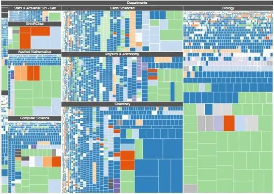
Treemap is an alternative way to represent hierarchical structures. Each entity is assigned
a rectangle area and its children (sub-entities) are located inside the parent rectangle.
Also, the area of rectangles can encode a property of the data. This layout uses area to
shows entities and Location to represent hierarchical links in an intuitive way. Compare
to other hierarchical structure representations, treemap is a new technology and is able to
represent a large number of multi-level hierarchical relations. The important point about
treemap is the rectangle shape of it which makes it perfect for computer monitors
(because of rectangle shapes of monitors). In this research, treemap was one of our main
candidates to represent our organizational data but this layout is not useful in showing
colonies and the relations inside them which is one of the most important factors in
organizational data types. Therefore, although we get benefit of the treemap layout in part
of the visualization tool, we do not use it as the main representation.
16
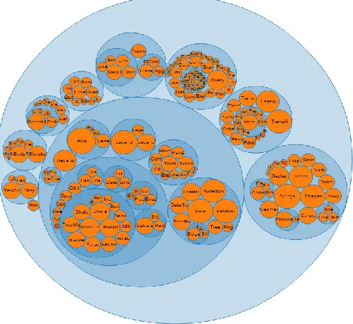
Circle pack (also called circular treemap) is a hierarchical structure layout similar to
treemap that represents entities with circle instead of rectangles. Circle pack is able to
encode one of the entity properties with circle area or circle radius. The most important
advantage of circle pack over treemap is comparing area of circles is much easier than
rectangles for human vision. In addition, the circle pack layout display the hierarchical
relations in a more intuitive way than treemap. However, there is the famous problem of
confusing circle area and circle radius (Cairo, 2012). Moreover, this layout does not match with the rectangle shape of monitors and cannot use the available space effectively because it has many empty spaces between circles. Another advantage of circle pack is the ability to use circle glyphs instead of child node circles; therefore, this layout will be able to encode multi-dimensional properties of the child nodes (Fischer et al., 2012).
Figure 7 Circular Treemap
17
Polar system representations works with polar coordination which means each point on a
plane is determined by a distance from a fixed point and an angle from a fixed direction.
The main difference between cartesian and polar system layouts is that the polar
representations expand in all directions in the circle form while cartesian representations
mainly expand in one direction. Both representations have their advantages and
disadvantages but cartesian systems have been developed and used more widely.
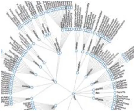
Radial node-link is an example of representations in polar system. It is similar to
cartesian node-link but expands in the polar system. This layout uses lines to represent
relations and encodes entities with glyphs. This representation is a better candidate when
we have a circle or square shape area and we want to display our hierarchical data in it
because normal node-link representations tend to be rectangles especially if we have
large numbers of children in our hierarchical structures.
Figure 8 Radial node-link layout
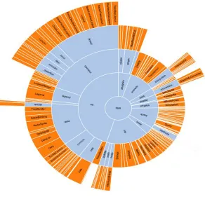
Another example of radial system representations is radial icicle (also called sunburst and
multilevel pie chart) (Stasko & Zhang, 2000). This layout is similar to the icicle diagram
18
each circle represents a layer of hierarchical structure. There are different kinds of radial
icicle trees with their advantages and disadvantages but the main purpose of all of them is
represent the hierarchical structure in polar space with using area to represent entities and
location to represent relations. This layout is able to use angle to encode one the
properties which is not an advantage compare to its twin that is able to use length for the
same purpose. However, radial icicle is a better option in the circle or square shape
spaces.
Figure 9 Radial icicle
(Source: http://storiesthroughdata.blogs.lincoln.ac.uk)
There are numbers of representations that use other geometric systems to visualize
datasets. 3D hyperbolic tree (also called three dimension node-link) is an example of this
19
are glyphs for entities and lines for relations but, put these elements in a three dimension
space (Munzner, 1997 & 1998). Although these kinds of layout attracted many interests at the beginning, after a while their usage decreased dramatically because of the two
dimension aspect of monitors’ screen. Cone tree, is another example of this category that had a plan to “maximize effective use of available screen space and enable visualization of the whole structure” (Robertson et al., 1991) but, it is completely abandoned and it does
not have any usage these days.
20
2.3.2 Relational Visualizations
The organizational data that we have, contains a large variety of elements in different
hierarchical levels such as universities, departments, faculties and etc. The patterns of
connections among those elements is the relational structure of our database. In the
relational visualization, we are concerned about quality and quantity of relations between
elements not within them. As an example, we are interested on shared publications
between professors not about number of publications for each professor. It is important to
note that properties of individual entities are part of the organizational data and they are
important in this research. But, they are not the main focus in relational visualizations.
Node-link layout which is a representation in hierarchical structure can be used for
relational structures too. The location of entities in the hierarchical structure is based on
their hierarchy level in the dataset; however, in the relational structures there is not a
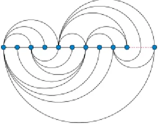
hierarchical structure and a simple method is placing entities in a line (Arc diagram)
(Wattenberg, 2002). This layout uses arcs instead of lines to represent relations between
entities. Arc diagram is suitable to visualize small numbers of entities and relations but if
we increase number of entities and links between them, then it becomes too hard to read.
21
Another type of relational node-link representations is circular layout. This layout put the
entities around a circle instead of a single line and represents relations between entities
with ether straight or curved lines. There are different methods to arrange entities around
the circle and the most famous one is placing entities in an order to minimize link
crossings (Baur & Brandes, 2005). This layout can reduce the complexity of large datasets especially with minimizing link crossings but it is not effective at representing
communities and groups.
22
Force-link layout is one of the most famous and mature representations in relational
structure visualizations. This layout is part of the node-link representations family which
means representing entities with glyphs and relations with lines. But, it uses a physical
system to determine positions of entities. One of the approaches is assuming entities are
charged particles that repel each other and links are springs that can attract entities to
each other. This layout is widely used to represent relational data but it will be too
complex with increasing the number of entities and relations. There is some research
about readability of force-link layout compare to with other relational visualizations such
as matrices that state “node-link diagrams (force-link layouts) are well suited for small
graphs, and matrices are suitable to large or dense graphs. Path related tasks remain
difficult on both representations and require an appropriate interaction that helps perform
them.” (Ghoniem et al., 2004 &2005). In addition, the running time and processing load of this layout is higher than other representations. In this research, force-link layout is
part of our solution when we want to show small communities in deep levels of our
database but it is not a good candidate for the overview of data.
23
Parallel Sets (also called Sankey diagram) is an alternative way to represent relational
databases which is perfect to displays flows and their quantities. This layout uses line-sets
to visualize entities as well as flow-sets between those lines-sets to represent relations.
The width of line-sets represents a quantitative property of that entity and the width of
flow-sets represent the amount of that quantitative property that moved to new state
(Figure 14). Typically, parallel sets are used to show flows of a system and they can be
valuable visualizations with appropriate interactions (as an example see Riehmann et al., 2005). In this research, Parallel sets are a potential candidate to visualize at least part of our deep organizational data but we keep it as a future work because of other
visualizations that can fit better with our data.
Figure 14 Parallel sets layout
Matrix is one of the oldest and still usable representations that is able to visualize
relational data structures. Unlike node-link layouts, matrix does not become complex and
24
overlapping or link crossing in them. Ghoniem and colleagues (2005) have discussed readability of different relational representations and conclude that matrices have superior readability with regard to many tasks (compare to other relational representations) and “wider use of this representation will result in a greater familiarity and will consequently improve its readability”. Henry & Fekete (2008) have some research on matrix to
enhance it such as adding curved lines between matrix elements (entities) to support path following tasks (Henry & Fekete, 2007) and representing the database with multi
matrices and connect outside relations with curved lines (Henry et al., 2007) (also see:
Henry & Fekete, 2006); however, their main focus is on representations and they do not provide strong interactions to support it. In this research, we follow their path to improve
matrix representation and interactions for organizational data structures.
25
2.3.3 Temporal Visualizations
It is in the nature of any organization to change over time. In databases with temporal
structure, the relations between entities as well as properties of entities change during the
time. There are a large variety of visualizations that focus on representing temporal
structure. As an example, timeline is the most famous representation for this kind of data.
However, in this research, we decided to focus on hierarchical and relational structures in
the representation part and support the temporal aspect of the data with proper
interactions. Therefore, we do not discuss temporal visualizations in detail and we will
provide more information about interactions that can support temporal structures in
Section 2.5.
2.4
Tasks and Activities
An effective cognitive tool cannot be made without considering the cognitive activities
that possible users want to do with it. Most of the time, performing a cognitive activity
will lead to new cognitive activities and it makes a chain of cognitive activities that the
human mind can do at the same time or asynchronously. This means that cognitive
activities are not solid operations that happen in our mind. They have overlaps with each
other and they are complex, embedded and emergent (Sedig & Parsons, 2013) (Green & Maciejewski, 2013). Sedig and Parsons (2013) provide a list of complex cognitive activities such as sense-making, reasoning, problem solving, and planning along their
characteristics and details. In this research, we do not limit our cognitive tool boundaries
to any specific cognitive activity, because considering the large variety of interactions
that we have in our tool (we provide more information about interactions in Section 2.4),
26
When we talk about an activity, we can divide it into chain of sub-activities that the user
perform to achieve his goal. In addition, we can divide those sub-activities into group of
tasks and sub-tasks. For example, when we want to make a plan for a vacation in the next
month (planning activity), a sub-activity can be find a day for the vacation. For this
purpose, we should check our calendar (browsing) and then find an empty place in the
calendar (finding). These are tasks and sub-tasks that are necessary for our sub-activity.
One lever deeper, each task can be divided into numbers of interactions such as selecting,
assigning, filtering, composing, arranging, inserting, collapsing, and translating. In our
example, when we want to browse our calendar, maybe we do some arranging and
filtering to achieve our goal simply. In the last step, performing any interaction requires
some events such as clicking, swiping, pinching, and pressing. It is important to pay
attention to all of these steps in designing and evaluating a cognitive tool. In this
research’s visualization tool, one of our considerations is making an intuitive design
based on touch screen events to let the user navigate through deep layers of information
space intuitively.
2.5
Interaction design
Interaction consists of an action and a reaction. In the interactive visualization tools’
domain the action is performed by the user and the reaction is the change that appears in
the computer monitor (in this domain, we skip other output methods of computers such as
sound). The user perceives the computer reaction and it changes his/her mental mind.
After that, the next action takes place based on the user activity. This recursive process
continues until the user achieves to his/her goal.
Interactions are not just an additional part of the visualizations to improve their power.
They are an essential part of the interactive visualization tools as a whole and it is not
27
for interactions is crucial in designing and evaluating visualization tools because of their
complexity and extensively. Sedig and Parsons (2013) provide a comprehensive list of 32
interactions that can occur in visualizations. In this research, we use 14 of them which are
Arranging (changing order of objects), Cloning (copying objects or representations),
Drilling (bring out more details on demand), Filtering (hide unwanted objects),
Navigating (move through representations and/or around them), Selecting (choose a
subset of current elements), Transforming (change the geometric form of elements),
Translating (convert representations into alternative representations that are
informationally same), Animating/Freezing (generate or stop motion of elements),
Collapsing/Expanding (enlarge and shrink elements), and Inserting/Removing (add or
remove new elements to the screen). The details of these interactions in our visualization
tool is available in Chapter 3.
The term interactivity is different than the interaction. Interactivity is concerned about the
quality of interactions. Sedig and colleagues (2012) divide interactivity into two main
levels which are macro level and micro level interactivities. The macro level interactivity
is concerned about the ways that different interactions works together. As an example of
this level, an important question about interactions can be if all interactions are available
at any time or some of them unlock after other interactions. The micro level interactivity
provides more information about the quality of an individual interaction. For instance, the
flow interactivity is “discrete” if an interactions appears at an instance in time and it can
be “continues” if it occurs over a span of time. Another example of micro level
interactivity is “spread” that concerns about the sequence of an interaction. Lets assume
that the user perform an interaction on a representation. If the result of this interaction
only changes that representation the spread interactivity is “self-contained” and it affects other representations then the spread interactivity is “propagated”. This framework that
we use in researching and designing our interactive visualization tool, is generic and
comprehensive; therefore, with the aid of it, we can improve the researching and
28
Chapter 3
3
Solution
In this research, we have deep organizational data in an educational domain which is
about professors, students, departments, faculties, universities, grants, sponsors, awards,
publications, etc. The problem that we want to provide a solution for is to make a
cognitive tool to support complex cognitive activities with the aforementioned data. In
our research domain, the cognitive tool that we want to make is an interaction
visualization tool. Before we start talking about our suggested visualization tool, it is
important to have a discussion about considerations that we had in our mind, because we
believe that providing a solution without talking about limitations and borders, cannot be
useful for future reference. Section 3.1 presents the research considerations that we have.
After that, Section 3.2 describes the structure of our suggested visualization tool. Last but
not least, Section 3.3 and Section 3.4 provide more information about our visualizations
and interactions.
3.1
Research considerations
One of the concepts that we mentioned in Chapter 2 is design for information. When we
want to design and evaluate a visualization tool, it is important to know what kind of data
29
Elsevier to complete our database; therefore, it follows that the final information space
derives from those data sources instead of a single database. Important entities that we
have in our organizational data are publication, professor, grant, and student. Table 1
provides important properties of the main entities and their data type.
Entity Main properties (data type)
Publication
Type (Categorical)
Year (Ordinal)
Professor
Research chair (categorical)
Department (categorical)
Rank (categorical)
Grant
Program (categorical)
Begin date (ordinal)
End date (ordinal)
Department (categorical)
Student
Department (categorical)
Year (ordinal)
Academic Level (categorical)
30
In addition, there is a multi-level hierarchical structure in the database. This hierarchical
structure is one of the main properties of the organizational data and one of our main
considerations is designing a visualization tool to let the user navigate through the
hierarchical structure of our database. The list below represents the hierarchical structure
of our database:
University o Faculty
Department Student
o Publication Professor
o Publication o Grant
Program
Sponsor
Hierarchical Structure of the database
Moreover, we have other kinds of relations in the database such as relations between
professor and publication entities (when a professor publish a paper), between student
and professor entities (when a professor supervise a student), between professor and grant
entities (when a professor apply for a grant), and between student and publication entities
(when a student publish a paper). These relations are as important as hierarchical
31
Another consideration in our visualization tool is the ability to support a large variety of
users with different devices. We have to make a visualization that works with large
screen touchable monitors. On the other hand, we have to consider small tablets such as
IPad in our research. In Chapter 2, we have provided the list of current representations
with their advantages and disadvantages for different data structures. Moreover, we have
talked about interactions to support those representations. But, most of those
representations and interactions are not useful for different screen sizes at the same time.
In addition, while we have to consider mouse and keyword as the main input sources on
computers, we have to support touch screen events as the main input sources of tablets
and touchable monitors. For example, “mouse over” which is an important event in
interactions, cannot be used on touchable devices. In Section 3.2, regarding all of the
aforementioned considerations and limitations in this research, we describe the structure
of the suggested visualization tool.
3.2
Structure
An interactive visualization tool is not an external tool to help perform complex cognition
activities, but, it is a part of the cognition process itself. Most of research in the
visualization domain, focus on representations and interactions in their work; however,
we think that the structure of the visualization tool has a crucial impact in the usability of
32
tool without knowing what the users wants to do with it. Therefore, we have to define
some possible tasks based on the organizational data that we have. There is a
considerable variety of possible tasks that our users can do and almost all of them require
viewing multiple types of data at the same time. For instance, one of the possible tasks
based on available data is finding the relation between number of publications and funds
(it can be categorized into analytical reasoning or sense making cognitive activity). The
user wants to see rise and fall of funds and find the relation between this element and
number/quality of publications. This specific task requires representing a substantial
number of elements and details such as total number of publications at different hierarchy
levels (university, faculties and departments) over time, total amount of annual research
funding over time in detail, and quality of papers published at different hierarchy levels.
One solution is making a particular visualization for this task; however, it will be a
complex visualization considering the substantial number of elements and details to
represent. In addition, considering the number of possible tasks in this research requires
us to research and develop too many complex visualizations. Certainly, this is not a good
solution neither from the research/development point of view, because of the large
number of complex and distinct visualizations to develop, nor from the user perspective,
because he/she has to learn how to work and interact with variety of visualizations.
An alternative solution is putting a number of simple representations beside each other to
create a more complex visualization (see picture). This solution suggests numbers of
representations to the user based on a task that he/she wants to do, however, to support
33
some interactions. Each representation comes with some specific interactions
(self-contained interactivity) and there are some general interactions that affect all of the
representations such as filtering, arranging, inserting and removing (propagated
interactivity).
Figure 16 Compare a complex visualization (left) and a visualization consisting of multiple simple representation (right)
In contrast to complex visualizations, most of the representations provided by this
solution are common representations with which the user has probably had some
experience; therefore, the user can work with the visualization easily. In addition,
34
before, it does not require a long time to learn how to work with the tool. Moreover,
because of consistency in the visualizations’ structure for different tasks, once the user
has gained some experience with the visualization tool, he/she can perform a wide variety
of tasks in support of cognitive activities with the same structure but different
representations and interactions. It can save a considerable amount of time because
he/she does not have to learn a new complex visualization for every new task.
Nevertheless, it is not possible to visualize deep levels of organizational data with this
solution. Some of the complex cognitive activities in our problem domain requires the
ability to navigate through deep layers of the database which is not achievable with
parallel simple representations. Therefore, this solution cannot be an acceptable structure
for our research despite all of the valuable facilities of it.
Our solution to this problem is combining advantages of both mentioned structures. The
visualization tool structure consists of two main parts: basic visualizations and advanced
ones. Advanced visualizations are designed to support complex cognitive activities while
simple representations are more efficient on simple tasks. The visualization tool which
we call Science Priorities can support up to four parallel representations with their own
interactions at the same time. All of the representations are resizable to let the user
achieve the best state for his/her work. Section 3.4 describes interactions of the main
35
Figure 17 The visualization tool structure with advance and simple representations
This structure is designed to handle an unlimited number of advanced visualizations.
However, in this thesis, we research, design, and evaluate only one advanced
visualization (we call it Matrix-link). Because of the high edge technology that we used
to implement this structure, it is possible to add new visualizations to the tool with few
difficulties (Chapter 4 provides more information about implementation technologies).
Currently, our colleagues in the Insight lab are researching and designing more advanced
visualizations for this structure. In the Section 3.3, we describe the Matrix-link
36
organizational data. Interactions of this representation are discussed at the same section
because interactions and representations are not two different world that the researcher
should connect them together. Interactions and representations are two part of the
visualization tool puzzle and should be beside each other to make a complete meaning.
3.3
Visualizations
In this section we discuss representations and interactions of Matrix-link, the only
advanced visualization that is designed and implemented in our visualization tool
(Science Priorities). As we described in Section 3.1, the main entities of our
organizational data are publications, professors, grants, and students. The main goal of
Matrix-link visualization is providing an intuitive representation that let the user work
with the relational structures between our main entities and go deeper or shallower in the
hierarchical structure between entities. We assume that two professors are related to each
other in three conditions:
1- They co-supervise a graduate student.
2- Two professors have a shared article. It means there is a publication (conference paper,
book chapter, journal article, and etc.) that both professors’ names are in the author list.
37
This is our base definition to define relational structure between professors. We use the
same relational base for collaborations between departments, faculties, or universities at
higher hierarchical levels. The collaboration weight is the number of collaborations
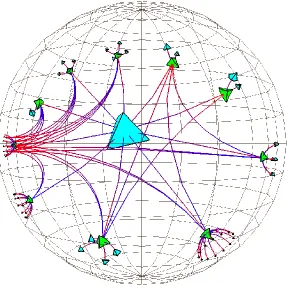
between two elements. Regarding the literature review in Chapter 2, force-link layout and
matrix are two potential representations that are able to represent this
relational-hierarchical data. But, the problem is we have more than two hundred professors and ten
departments only in the faculty of science of one university and there are thousands of
collaboration between these professors. Force-link layout cannot represent a large
number of relations because the final layout will be a hairball. There have been some
works to improve force layout to represent thousands of relations (for example: Hadany & Harel, 2001 and Gajer et al., 2004) but those methods provide an overview of the data and they cannot be useful for representing the data details. In addition, matrix will be too
large and unreadable after representing around hundred elements. There are number of
research in information visualization domain to improve abilities of matrices (Henry & Fekete, 2008). But none of them are designed to combine hierarchical structures with relational structures. That is why we generated Matrix-link visualization. We have
noticed that a large number of collaborations are within the hierarchical elements instead
of between them. For example, let’s say we have ten thousand collaborations in the
hierarchical level of universities. If we scale our data, we can say that there are less than
one thousand collaborations between universities and more than nine thousand links are
within universities. The same situation applies to deeper hierarchical levels which means
38
on their hierarchical level and represent their internal collaborations with matrices. For
example, in the department level, we create a matrix for each department and represent
collaborations between professors of that department inside that matrix (professors are
next hierarchical level of departments). After that, we use collaborations between
departments to generate a force-link layout to find appropriate location for their matrices
in the representation space. It is important to note that Matrix-link in this example, does
not represent relations between professors of different departments. Matrices represent
collaborations between professors of same department and lines represent collaboration
between higher hierarchical elements which are departments in this example. Figure 18
can clarify the idea.
39
The location of matrices are calculated based on the force-link layout. With this layout,
we can make sure that there are more collaborations between matrices that are closer to
each other. However, it is possible to arrange matrices in a different way to support a
specific activity. Matrices are connected to each other with weighted lines that represents
number of collaborations between them. These collaborations have three types which are
awards, publications, and co-supervisions. It is possible to filter connection lines to just
see one or two of collaborations types by activating/deactivating connection types in the
top-right menu of the representation. This interaction allows user to remove unimportant
relations and find connected groups for specific kinds of collaborations. In addition, we
can hide/unhide number of matrices with their associated connection links to focus on
remaining matrices and increase the readability. The top menu of the representation, color
code matrices and let us hide/unhide them. Also, this action is available with right click
on matrices (touch hold for touchscreen devices) and select hide in the popped up menu
40
Figure 19 Focus on a part of matrices
Another interaction in this visualization is the ability to enlarge matrices to see more
details. In the first view, it is possible to see the general relational structure within
matrices. After enlarging a matrix, all of the matrices that are related to the enlarged
matrix will be highlighted and other matrices will fade; therefore, the user can focus on
the selected matrix and its collaborations. Moreover, sub-elements of the enlarged matrix
(i.e. next elements in the hierarchical structure) appear in the representation space. This
interaction (drilling), allows the representation to avoid complexity and represent detailed
41
Figure 20 Enlarging matrix interaction
The encoding of collaborations in matrices is simple and easy to perceive. The relation
type is encoded with location, and color and relation weight is encoded with color
saturation. In non-directional relations, it is possible to remove half of the matrix because
of the duplication. In this research, although we define our collaborations with the
non-directional basis, we decide to use the full square matrix because the user can follow a
column or row quickly and find collaborations of specific element which is not available
42
collaborations between professors. For instance, in the co-supervision collaboration, we
can assume that the first supervisor is the source of the relation and the second supervisor
is the target.
Figure 21 Follow a column in the full matrix (highlighted column)
Moreover, it is possible to select a matrix and go deeper into it to see the next hierarchical
level. For example, assume that matrices are representing universities. In this example,
matrix elements are faculties of those universities such as faculty of science, faculty of
engineering, and faculty of art. The user can select one of the matrices (e.g. Western
43
the matrix-link representation for this university. It means in the next representation,
matrices will be faculties of the selected university and the elements of matrices will
represent departments of those faculties. This interaction is recursive and it is possible to
select one of those faculties to create matrix-link of that faculty which means matrices
will represent selected faculty’s departments and elements of the matrices will be the
departments’ professors. This interaction lets the user navigate through hierarchical
structure of the database freely.
Matrix-link visualization uses a new layout to represent organizational data. But, the most
important element of this visualization is using a large variety of innovative interactions
to support different cognitive activities. One of the main interactions of this visualization
is the ability to select a number of matrices at the same time and request the deeper
representation. In this case, the Matrix-link representation opens a new space on top of
itself and uses the force-link layout to represent collaborations between elements of the
selected matrices. The new force-link layout color codes elements based on their higher
hierarchical level. For example, if we select number of departments and request this
force-link layout, then elements of the force-link layout are professors of the selected
departments and their color are based on the departments. In addition, this layout encodes
the collaboration type with the color hue as well as the collaboration weight with the
links width. Location of elements and the distance between them represents possible
communities between them. It is possible to add or remove specific collaboration type
links. This interaction is different than a simple filtering because location of elements
changes based on these links and it will visualize new communities in the data which was
not visible in the first view. In Figure 22, both visualizations use the same data but the
top screenshot represents collaboration groups based on shared publications and
44
Figure 22 Visualizing same data with different filters
Another interaction in the force-layout is the ability to freeze/un-freeze some elements in
the representation space. The user can give a definite location to some elements to find
45
especially when we combine it with the previous interaction (add/remove collaboration
types). Moreover, the user can select numbers of elements in this representation to make
a new representation for them. In this case, the visualization tool generates a new
force-link layout and represents elements that are related to the selected ones with their
relations. It is important to note that this interaction is accessible from the matrix-link
layout too. The user can select number of elements in the enlarged matrices and apply the
same interaction on them. This interaction is recursive and can be repeated until the user
arrives at the community that he/she is interested in (see Figure 23).
46
In addition, it is possible to hide some of the elements based on their higher hierarchical
level. For example, in the professors’ collaborations level, it is possible to hide professors
of some departments to increase the readability and focus on the other departments. Last
but not least, it is possible to change the order of elements in the matrices. The elements
can be arranged by name or collaboration count. This interaction is not adding or
removing anything to the representation screen but it has an important role in
understanding the relational structure within matrices. Figure 24 represents the same
matrix with different element’s arranging. This force-link layout is designed to support
relational structure of our organizational data while the main layout focus on the
hierarchical structure of the data. But they are not two separate visualizations. They are
two layouts of one visualization (matrix-link) that the user can transfer from one to
47
48
3.4
Interactions
We divide interaction of this visualization tool into three main categories. The first
category is about interactions that are designed for an individual visualization such as
interactions that we discussed in Section 3.3. The second category involves interactions
that are outside visualizations and cannot change a visualization directly such as cloning
a visualization (we call them structure interactions). And the third category are
interactions that cannot be in any of the previous categories. It means these interactions
can affect a representation while they are not limited to that specific visualization such as
a global time filtering which can change all of the visualizations at the same time. In this
section, we provide more information about interactions of second and third categories.
The most significant interaction in the tool’s structure is inserting/removing
visualizations (bipolar interaction) which means users can add or remove visual
representations freely up to four representations at the same time. We notice that showing
more than four representation at the same time cannot be useful because the size of each
representation screen will be too small and system performance will decrease
considerably. In addition, with increasing the number of representations that are visible at
the same time, we increase the chance of distracting the user from his/her main cognitive
activity. This interaction will be performed through drag and drop which makes it
intuitive. Also, supporting touch-screen’s features is a high priority in our visualization
49
achieve the best result for his/her work. Figure 25 depicts the visualization tool structure
after drag and drop number of representations.
50
There are number of other interactions that can support the idea of working with multiple
representations beside each other. For instance, Arranging, which lets the user change the
order of visual representations or swap their positions through drag and drop, and
Cloning, which makes a copy of a representation in another place.
Beside those interactions, each simple representation has some specific interactions for
itself (self-contained interactivity). The most important interaction in this category is
translating which represents the same data in different representation. The ability to see
different representations of the same data beside each other can facilitate cognitive
activities such as problem solving, decision making, learning, reasoning, sense making,
and understanding (Sedig & Parsons, 2013).
51
There are some interactions that the user can apply to all of the representations at the
same time (propagated interactivity). Global filtering is the most significant one in this
category which lets the user see a subset of existing elements in different visual
representations. We do not implement them in this visualization tool for two reasons. The
first reason is applying these interactions to visualizations individually provides the
ability to represent the same data and same visualization with two different filters at the
same time which is not possible in interactions with propagated interactivity. In addition,
our implementation technology looks at the visualizations as independent modules and
we do not want to change representations from outside of their modules. In the next
chapter, we provide more information about implementation and technologies that we
52
Chapter 4
4
Design and Implementation
In designing our interactive visualization tool, our approach is human-centered. This
means we have to understand the end users and their activities. We have to think about
four main elements which are: users, activities, context, and technologies (Benyon, 2010). In previous chapters, we have described the problem and the deep organizational data that we have. In addition, we have discussed the users, their cognitive activities, and
the context in which those cognitive activities occur. Moreover, we have described our
solution which is an interactive visualization tool with its own representations and
interactions. This chapter provides more information about the implementation process
and the technologies that we used to support our visualization tool.
4.1
Web based technologies
In this research, one of our main requirements is the ability to work with multi devices
from a large touchable screen on a wall, to a medium size laptop on a table, to a small
tablet in the user hand. These devices use different operating systems, therefore, we have
decided to avoid native programs and have used a general platform that can run on any
device. Currently, the only platform that works with all of above devices is a web based