Rehabilitation Engineering Research
'
, , :
Erik Hallengren
Ingrid Hed
A Simplified User
Interface for Mobile
Phones
Sammanfattning
Dagens mobiltelefoner blir allt mindre samtidigt som den inbyggda funktionaliteten ökar. Detta leder till att mobiltelefonerna blir mer komplexa och många personer, inte minst personer med fysiska eller kognitiva begränsningar, får svårare att använda dem. För dessa människor är behovet att kunna kommunicera med sin omgivning stort, vilket leder till problem då dagens mobiltelefoner inte är anpassade efter deras behov.
Det övergripande målet med detta examensarbete var att utveckla en mer användarvänlig mobiltelefon för människor med särskilda behov genom att förändra och förhoppningsvis förbättra användargränssnittet. För att kunna lyckas med det var målgruppen tvungen att begränsas och definieras. Vi var också tvungna att ta reda på vad svårigheterna med dagens mobiltelefoner är, hur vi skulle kunna göra dem enklare att använda och slutligen implementera några utav förslagen i en prototyp för att sedan testa den. Under arbetets gång har kontakter med människor i vår målgrupp skapats för att med deras hjälp få reda på svårigheterna med moderna mobiltelefoner, få idéer på hur man skulle kunna förenkla användandet och utvärdera den slutliga prototypen.
Den slutliga målgruppen består av äldre personer, teknikovana personer och personer med kognitiva begränsningar. De idéer och förslag som implementerades i prototypen verkade underlätta delar av funktionaliteten i telefonen för testdeltagarna. Efter testningen och utvärderingen av prototypen anser vi att det är möjligt att göra en mobiltelefon som är mer lättanvänd för målgruppen, även om det är svårt att utveckla en mobiltelefon som passar alla människor.
Abstract
The trend among mobile phones of today is that they are getting smaller at the same time as they are stuffed with more and more functions. As a consequence the phones become more complex and difficult to handle for many users, particularly for people with some kind of physical or cognitive limitation. Still these persons have a need and desire to be able to communicate with their surroundings.
The overall goal for this thesis was to develop a prototype of a mobile phone more usable for people with special needs by making changes in the user interface software. In order to succeed with the objective the exact target group had to be determined. We also had to find out what the difficulties are with the mobile phones of today, how to make them more user-friendly for the target group and finally implement some of the ideas in a prototype and test it. During the course of the thesis contacts have been made with people in the target group to determine the problems, get ideas and evaluate the final prototype.
The final target group for this thesis includes elderly people, people not used to technology, and persons with light cognitive limitation. The ideas and suggestions that were implemented and tested did seem to make parts of the functionality in the phone easier to understand and use for the test participants. After the testing and evaluation of the prototype it is our opinion that it is possible to make a mobile phone that better suits the persons in our target group, even if it is difficult to make a mobile phone that fits all people.
Preface
During these five months that we have been working on this master thesis, we have met many wonderful and helpful people and therefore we would like to take this opportunity to thank everyone.
First of all we want to thank our supervisor at Sony Ericsson, Mikael Floberg, for always knowing who to turn to, how to solve problems and most importantly for taking time to listen to us. We would also like to thank our supervisor at Certec, Arne Svensk, for all his ideas, knowledge, connections and very supportive comments. Another person we would like to thank for ideas and for making the project possible to carry out is Daniel Helgesson at Sony Ericsson. We hope to meet the expectations of all of you.
All the people at the department of User Interface Design at Sony Ericsson in Lund, thank you for putting up with our questions, our computer problems in the beginning and for making us feel welcome.
This thesis could not have been performed without our amazing test persons and we thank you for working with us, for being so co-operative, for having such wonderful personalities and always laughing and smiling with us. With that, we also give thanks to people at HSO, FUB, Hjärnkraft, the local support and information office in Lund, and the four years’ programs at the high school of Vipeholm in Lund.
Without all of you, this thesis would have been impossible to execute and we humbly thank you.
Table of contents
1 Introduction ... 5 1.1 The problem... 5 1.2 The aim ... 5 2 Technical background ... 7 2.1 Z1010 ... 8 2.2 Technical limitations ... 8 3 Theoretical background ... 9 3.1 Text... 93.2 Images and symbols ...11
3.3 Sound and voice ...12
3.4 Menu orientation ...14
4 The users and the task ... 15
4.1 Target groups and their needs and desires...15
4.2 The final target group ...18
4.3 Investigations and tests ...20
4.4 Test results ...21
4.5 Possible solutions...23
5 Prototyping... 25
5.1 The theme...25
5.2 The start position ...26
5.3 The phonebook ...27 5.4 Messages ...33 5.5 My items ...35 5.6 Insecurity ...36 5.7 Pressing keys...38 6 Prototype test... 39
6.1 The choice of method ...39
6.2 The test procedure ...40
6.3 Results...40
7 Conclusions... 43
7.1 Future work ...43
7.2 Evaluation of results...44
7.3 The aim versus the results ...46
8 References... 47
Glossary ... 49
Appendix A ... 51
A.1 The initial test questionnaire...51
A.2 Answers to the initial test questionnaire...55
Appendix B ... 57
B.1 The prototype test questionnaire ...57
1 Introduction
This master thesis was conducted during the spring of 2004 at Sony Ericsson Mobile Communications in Lund, Sweden. The thesis extended over 20 weeks and was supervised partly by the department of User Interface Design at Sony Ericsson Mobile Communications and partly by the department of Certec, the Division of Rehabilitation Engineering Research at the Department of Design Sciences in Lund. The report includes aims with the thesis, limitations, results and also suggestions for improvements.
1.1 The problem
The development of the cellular phones today is proceeding rapidly. There seems to be a striving for even smaller phones and at the same time increased functionality. This is apparently the consumers’ desire. However, a decrease in size and an increase in functionality lead to an increase in complexity of the phones. This is a problem, not only for persons who lack an interest for or are unaccustomed to technology, but also for persons who have trouble with the kind of logical thinking that is required in order to be able to navigate through the different functions of the telephone.
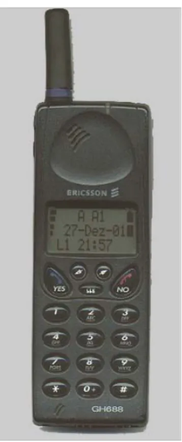
Figure 1 Ericsson 688. Launched in 1996. [18]
Many of these persons would have great use of the primary functions of the cellular phones, such as calling and sending messages, but considering the selection of phones on the market it would be difficult if not even impossible for them.
1.2 The aim
The overall objective for this thesis was to create a cellular phone that is easy to use and understand for persons that have difficulties with or are unaccustomed to technology in general and cellular phones in particular. However, this target group is very large and includes for instance persons with cognitive limitations, low vision, reduced hearing, elderly people and children. It is easily realized that it is very difficult to satisfy all needs and desires. As there are also other limiting factors it was appropriate to investigate which parts of the target group it was reasonable to aim at, i.e. for which persons can the usage of a cellular phone be facilitated?
From this, it was to be investigated in which way it can be made easier for these persons to use a cellular phone. The shaping of the menu system, the usage of voice and speech, pictures and symbols and the choice of functions are some examples of what was to be investigated.
When a good theoretical model of the ideal cellular phone for these people was made, as much as possible of the model would be implemented and the created prototype would be tested and evaluated by the voluntary test persons.
2 Technical
background
As the development of technology has progressed, aids for people with different disabilities have been invented. These aids have included everything from glasses and walking sticks, to wheel chairs and the Braille alphabet. The idea is that a person may be
handicapped without the aid, but with the aid he or she is not. Figure 2Isaac.
There are however, groups of people with disabilities that are more difficult to support. One example of this is persons with cognitive limitations. Yet, the last decades the knowledge of cognitive limitations has increased and hence also the interest in helping these people and creating new aids for them.
Figure 3 The security phone by Nevada Teknik and Henrik Trolle.
In 1993 at Certec, a project was conducted where Isaac, a portable electronic assistant for people with cognitive limitations, was developed and it is shown in figure 2. Isaac has a touch screen, camera and telephone and there are functions as a telephone book with pictures, a calendar and a diary with pictures so that even persons with speech difficulties can tell anyone about his or her day. Isaac is also equipped with GPS and the idea was to always know the position of the owner of Isaac, in case that person would get lost. This was a function that was desired by many people but it was not even permitted to be tested due to reasons of integrity violations. [13]
In figure 3, another example of a mobile phone for people with special needs is shown. This security phone, in Swedish called a “trygghetsanpassad GSM mobiltelefon”, was developed by Henrik Trolle and a company called Nevada Teknik. The phone is based on Nokia 3110 and has only 3 keys which, when pressed, go to 1, 2, or 3 telephone numbers. These numbers can for instance go home, to school, and to the transportation service, and symbols for these 3 numbers can be put on the shell next to the corresponding key as in figure 3. By changing back to the original shell, the phone has all basic functions and in that way, the phone numbers corresponding to the 3 keys can be substituted. When the user wants to answer an incoming call, he or she presses the big key under the display. This key is also pressed when the user has chosen one of the 3 numbers to phone in order for the phone to actually call the intended person.
2.1 Z1010
Figure 5 Z1010's key pad. [17]
Z1010, shown in figures 4 and 5, was launched in April 2004 and became the first 3G mobile phone from Sony Ericsson. Z1010 allows the user to make video calls, take pictures and videos, play music in different formats, such as MP3, and much more. The telephone has dual displays, twin cameras, polyphonic sound – 24 voices, WAP2.0, Bluetooth long range, IrDA, USB true connector and a slot for Sony Memory stick to make it possible to store as much information (pictures, music files, games) as desired.
Figure 4 Z1010 with opened (to the left) and closed (to the right) clam shell. [17]
Z1010 is a clam shell telephone and it weighs in at 144 gram. Navigation in menus is managed by the five way navigation keys, and actions are executed by the two soft keys or by the centre navigation key. The key pad of Z1010 is shown in figure 5. The most commonly used action is in general located to the left soft key. All other functions are located to the right soft key and are usually available through a “More” list.
2.2 Technical limitations
The appearance of the telephone is very important and affects the inclusions and exclusions of the target group. The cellular phones of today are small and have small keys which for many people are hard to see and press.
Concerning limitations, there was mainly one thing that limited the scope of this thesis and that was that changes in the hardware of the telephone could not be made. It would have been preferred that things such as the size and appearance of keys could have been changed but that was impossible. It would also have been better if a phone with touch screen could have been used, but the choice of phone was in the hands of the company and was therefore not possible either.
Since this project started before Z1010 was launched, the prototype was developed on a not yet finished software containing bugs that lived throughout the project. Many of these bugs did not affect the result of the tests because they don’t appear when the telephone is used in small scale. Other bugs, mainly related to the camera, limited the scope of the final tests.
3 Theoretical
background
In this chapter different theories and guidelines are presented in addition to reflections of our own about how a graphical user interface should be constructed. We have chosen to concentrate on the parts that we were able to influence in this project.
3.1 Text
In mobile phones, there is not much text and therefore it is naturally even more important that those few words are obvious, so the user can find it easy to see, read and understand. Things that play a great role for the readability of a text are for example the size and font of the letters, and the colour and placement of the text on the screen.
3.1.1 Size
When dealing with the size of the text, there are a couple of things to take into consideration. Should all words be of the same size? Should all letters be of the same size? How much space is available for each word? Should any space be left for a picture or a symbol?
Many people have troubles with their vision and then it is natural to desire as big letters as possible and there are recommendations that point to a font size of at least 10 or 12 [12]. It is also recommended that both upper and lower case letters should be used in order to increase the readability [12]. However, if the letters are big and there are perhaps more texts on the screen, there will be nothing else but words on the whole screen, making it hard for anyone to distinguish between the pieces of information.
3.1.2 Typefaces
Which typeface a text has matters much more than one can imagine. Typefaces called serif, like Times New Roman which this text has, are very good for texts printed on paper but are difficult to read on screens [12]. The difference between serif and sans serif typefaces is shown in figure 6. Here follows other examples of typefaces, the two first being examples of typefaces that are difficult to read.
Figure 6 The difference between Serif and sans Serif typefaces [14].
1. This text is written in Impact.
2. This text is written in Haettenschweiler.
Preferably, text that is shown on a display should be written in sans serif like Arial, which is shown above [12]. This typeface has a good space between letters which Haettenschweiler does not have. The letters are also equally thick everywhere which letters written in Haettenschweiler are not. Arial has neither too thick nor too thin letters which is the problem with two of the above.
Since much of what is written on the display of a mobile telephone is numbers, it is also important that the numbers are easy to read. Numbers are difficult to read when they are too thick or have bent tails. For example are the digits 35690 easier to read than 35690.[12]
3.1.3 Placement
The placement of text on a screen is everything but obvious. If the text should indicate that the user should press one of the soft keys, the text could be placed as close to that particular key as possible or the text could clearly express which key should be pressed although it may be placed in the middle of the display. The disadvantage with the latter alternative is that it involves more text but at the same time the instruction is clearer and easier to understand. It is not intuitive for everyone to press the upper left key if the instruction is in the lower left corner of the display.
When it comes to the order of texts, the rule is to have the text which carries the most important information first so that the user should not have to look through several texts before he or she reaches the important information [11].
Another problem with the placement of texts is in the very first menu. There, the text corresponding to a choice is always in the top of the display even when one has encircled a choice in the bottom of the display. In this case, it is not obvious to look in the other end of the display in order to receive the information in writing.
There are no direct guidelines for how to place text on a display in order for it to be as functional as possible. The only thing that can be done is to look at every single case separately and be as flexible as one can be. The disadvantage with this approach is that if the different situations are solved and treated differently, there is no continuity that follows through the graphical user interface of the telephone and this could be confusing in itself.
3.1.4 Colours
Colours can both help and upset the user. If good combinations of colour are used, the text can become clearer and easier to read but if the wrong colours are used, the readability of the text can decrease.
Some colours even have a meaning of its own, like red, for example, which signifies warning or stop. However, letting one colour represent information on its own is limiting and therefore colour should be used in combination with texts and images. [11]
There is more that should be avoided, though. Combinations of green, blue and purple should not be used since the colours are too similar, both in contrast and in colour, and also too dark, which makes it difficult to distinguish between them. Another combination that should rather not be used is the combination of red and green, as persons who are colour blind cannot tell the difference. [1]
Recommended colours for a text and its background are black and white or black and yellow since the contrast between black and white or yellow is very big. However, it does not matter if it is the background or the text that is black. The recommended contrast ratio between a text and an image is 3:1. [12]
3.2 Images and symbols
Something that can help people understand the meaning of a text is to add images and symbols. The use of pictures in cellular phones is increasing and it can be seen in for example the very first menu in Z1010, shown in figure 7, where all the twelve choices are represented by a symbol. Yet, the usage of pictures can be increased even more by for instance pictures in the phonebook or images of the keys of the phone on the display. The possibilities are many.
Figure 7 The start menu in the original Z1010.
Just as with texts, it is very important with colour, shape and size of a picture. The same recommendations regarding colour apply here as well. Particularly the shape is important when dealing with symbols since it has to be conspicuous and distinct. A symbol or an image cannot include too many things because that will make it blurred and hard to see. For the same reason the picture cannot be too ornate. [1]
The very best symbols to use are those who are old and established that everyone recognizes and also knows what they represent [1]. Something important to keep in mind when choosing symbols is to try to avoid choosing a symbol that does not quite represent its contents. One example is in the menu of the T610 where there is a symbol representing the entertainment or game choice and the symbol is two cards and one die, shown in figure 8. This would be perfect if there were games containing cards and dice but there are none. A person expecting these types of games could then be disappointed.
Figure 8 The entertainment icon in T610.
3.3 Sound and voice
For people with low vision it can be a tremendous help to have different sounds carrying information as a complement to the visual information. It is for instance good that one can hear the fire alarm go off, a car approaching when walking in traffic and also water boiling when one is making dinner. There are countless examples of sound containing information. This is also why it is important to give information in as many ways as possible in a mobile telephone and therefore also through sound.
The cellular phones of today make a lot of noise but is it information-carrying noise? Many phones make a beeping sound when a key is pressed which is good because then the user knows that he or she has really pressed a key. However, it is often the same sound for several keys which cause confusion since the user doesn’t know which key that has been pressed. Therefore, it would be better if there were different sounds for each key in order to ensure the user that he or she has pressed the desired key. It would be even better if instead there was a voice saying which key was pressed because then the user would not have to memorize which key makes which noise and it would also make it easier for a first time user.
To try to orient oneself in a menu full of information-carrying pictures when one has trouble seeing is not easy either. A voice giving instructions would certainly make this a little less difficult. In this case, the most important information has to be at the end of the voice instruction given, in opposite to a written instruction [11]. The problem is, however, that this implies that there would be a lot of instructions and when the user after a while has learned how it works and what options there are, he or she would perhaps find it irritable that the phone is never quiet.
Probably, a very good alternative would be to completely control the phone by talking to it and saying what you want and then be given some sort of feedback through a voice on what the telephone is doing. This is called voice control and is nowadays a common feature in the cell phones on the market. However, the technology behind voice control can still be improved. It does not work for all voices and if a voice command is recorded in a silent environment, it does not work in a noisier environment like a car. The user also has to say the command in the same way every time. But as voice control is being improved all the time, it is a technology that can help not only persons with low vision but also persons with reduced mobility as well as people with reading difficulties.
Issues that have to be discussed are volume and repetition of sounds. Since it is easy for the user to miss the instruction or the information-carrying sound, repetition is necessary in order to give the user a second chance to receive the information. But how long should the waiting time for the sound to be repeated be? If it is too long, the user can become irritated because he or she has to wait and if it is too short, the user can get irritated due to hearing the message or noise several times before pressing a key. What is the perfect time between repetitions that does not cause irritation?
The same problem arises with the volume of sound. If it is too loud, everyone within a certain distance from the user can hear what he or she is doing and this can cause embarrassment. If it is not loud enough, the user cannot hear the instructions and then the information does not reach the user which was the whole point with the sound or voice instruction. Also, should all sounds be equally loud? Should the sounds be low frequency or high frequency signals?
The problem that everyone within a certain distance from the user can hear what he or she is doing can be solved by letting the user wear a headset. However, this could have the effect that the user doesn’t hear or listen to what is going around him or her. It could be difficult if the user is wearing the headset all the time and doesn’t hear a car approaching in traffic. If the user does learn when he or she should and shouldn’t be wearing the headset, it means that the headset is another thing to keep track of and this could be complicating in itself. A headset could therefore both be a solution as well as another device causing trouble.
Unfortunately, both the desired volume and repetition time is individual and has to be chosen by the user. This increases the
number of choices in the telephone and hence also the complexity which is the opposite of the aim of this thesis. However, one thing that is known is that people with reduced hearing have trouble hearing frequencies above 2000 Hz [9].
3.4 Menu orientation
In order for the user to find a desired function in an application it is necessary to use a menu structure. The design of menus is varying in different applications. Text- and icon-based are the most common ways to design a menu but there also exist auditory menus.
An interactive on-screen structure should be no more than three levels deep for a novice user and not more than five levels deep even for an experienced user [8]. The fewer levels in a menu structure the easier it will be for the user to find the desired function.
When deciding the number of levels in a structure it has to be considered how to make it easy to handle for the end-user. As a consequence of fewer levels in the structure the number of alternatives in each level will increase, which may confuse the user. In opposite, if a larger amount of levels is chosen, the number of alternatives in each level will decrease, but there is a greater risk to choose an undesired alternative. That is due to the fact that it is more difficult to choose one obvious phrase or picture that will fit all of the contents below that alternative. Broad-shallow structures are preferred to narrow-deep [7].
Direct access or shortcuts can be a good solution to quickly and easily reach some of the functions. But direct access and shortcuts should only be an option for the most commonly used or important functions. This is due to the constraint in the number of physical keys or amount of screen area that can be provided. [8]
For more seldom used functions it is therefore necessary to use indirect access via a menu structure. For a user interface with a high number of functions, such as a mobile phone, text-based navigation, soft keys, and animated navigation techniques is recommended for every day users [8].
4 The users and the
task
In order for this thesis to be carried out at all, we had to go out and meet people in the target group and talk to them concerning their thoughts about the existing cellular phones and what they think the phones should be like. By doing this, we received a better picture and understanding of what is difficult with the phones of today and hence what needed to be altered.
When working with and talking to persons with different disabilities it is important to know how to interpret what they are saying and to understand what they mean. Due to the fact that we had no previous experience with this, we had great use of one of our supervisors, Arne Svensk at Certec, who has many years of experience in this area.
4.1 Target groups and their
needs and desires
There are many different people that would probably have great use of a more simplified cellular phone but the needs and desires vary considerably. It is unrealistic to think that this thesis work can satisfy all needs especially when taking into consideration that the thesis is restricted to only include working with the software of the telephone.
To be able to reach as many people as possibly, the start out point included a very wide target group. During the progress of the project, it would be evident which people share needs and desires, and hopefully one change or improvement that is developed for some people can also be beneficial to others.
To get information of the needs, desires and difficulties of the people in the different parts of the target group, we made informal interviews with a number of people. We talked to both people who are included in the target group, people who work with, have daily contact with or have a lot of experience with the targeted people and to people who work in organizations which unite all these persons. Some of these organizations are HSO, Hjärnkraft and FUB. The information gathered through these interviews and talks is summarized in the chapters 4.1.1 to 4.1.7.
4.1.1 Elderly people
The technical interest and knowledge among elderly people vary greatly. Many have grown up in an environment without technical objects and they find that they have managed just fine. Therefore they consider that they do not to need to start using technical objects now. Also, they often feel that it is hard for them to learn something new.
Many of them also have troubles with processing new information due to problems with sight, hearing and motoric skills. However, there is a need to always be able to be reached and to reach others in case of an emergency for example. A cellular phone for elderly people needs to be big enough with big keys and clear instructions. The user has to feel safe and secure with the phone and it cannot be too intimidating.
4.1.2 Persons with cognitive limitations
For persons with cognitive limitations, reaching people in their environment is important. Just like elderly people, it is of great importance to be able to reach others in case of an emergency. This instils a sense of security. Some of these persons have trouble remembering, decreased motoric skills and difficulties with the logical thinking that is required in order to handle the mobile phones of today.
The type of phone these people need is one that is easy to use both when pressing keys and when using the interface on the display. It is also important that there are not too many options to choose between since that will confuse the user.
4.1.3 Persons not interested in or not used to technology
Many people today feel that the new technology is difficult and complicated and this decreases the interest in new technology. It is important that the object fulfils a certain meaning or purpose in order for the person to buy, learn and use the product. These new telephones are stuffed with functions not related to telecommunication at all and some people think that it is a good way of getting more for the money. But for others this just leads to more confusion.
The more functions that are put into a mobile phone, the harder it is to locate and use the functions that one is actually interested in. This part of the target group needs a telephone that is easy to use and gives a sense of security. The phone can have a limited number of functions in order to minimize the number of key strokes that is required in order to execute a certain function.
4.1.4 Children
Children are eager to learn new things and fortunately it is easy for them to do so. However, in order for them to acquire new knowledge the teaching process has to be on their terms, but this goes for everyone else as well. Children may have a need for a mobile phone but above all do many parents have a need to be able to reach their children. This means that in order for the child to feel that it is worth bringing along wherever he or she goes, the phone has to be important for the child. This can be done by integrating enjoyments such as games and a camera. Since all children cannot read, the interface of the cellular phone cannot be based on text alone but preferably on pictures, images and animations which make the phone easier to understand and more fun to use.
4.1.5 People with low vision
People with low vision constitute a very wide group with very different needs. There are those who have a clear sight but are colour-blind. These people are not in need of a simplified mobile phone as long as colour is not used as a single carrier of information. Those colours which after all are used to convey information should have a distinct contrast to the background and relatively each other.
For people with reduced sight it is important with big and clearly marked keys, displays, texts and pictures. Sounds and voice commands can be used in order to clarify information to and from the phone.
People who are blind do obviously not need a display at all but it is nevertheless important that more information is conveyed through sound and touch. The keys have to be big and even more importantly easy to differentiate. Feedback from pressing keys has to be easy to either feel or to hear through different sounds. Preferably all keys should give away a specific sound in order for the user to feel secure about what is happening. Also the use of voice control would probably make a great difference for this group of people.
4.1.6 Persons with reduced hearing
A hearing reduction can mean anything from just a minor reduction in hearing to complete deafness and the needs vary greatly. A person with a slight hearing reduction can use a hearing aid and then have no trouble at all. A deaf person, however, has no use of a hearing aid but has to use sign language and sometimes lip
reading. There is obviously no trouble with text, though, since all people, deaf or not, can read.
Mobile phones were for a long time not of any interest for deaf people but as functions as SMS, MMS, fax, and vibrators were developed the situation changed. Many deaf persons and persons with reduced hearing use cellular phones today simply due to these functions. The older generation of persons with hearing reductions perhaps want to use mobile phones, as well as the younger generation, and they have as most elderly people a need for a more simplified cellular phone.
4.1.7 People with reduced mobility
The group of people with reduced mobility is very wide. Mobility reductions can for instance involve problems with walking, handling objects and speaking. For many of these people using a mobile phone is not a problem. But for those who find it difficult using cell phones, the problem is most often that the keys and the phones are too small. However, many of them do not have troubles with handling menus and functions and have therefore no need of a simplified telephone, but rather one that is physically easier to use.
4.2 The final target group
The aim of this master thesis was to find out more exactly which difficulties people with disabilities have when using a modern Sony Ericsson mobile telephone. We were to try to find out in which way it was possible to facilitate their needs. Finally we were going to implement a prototype where we hoped to solve some of the discovered difficulties. This prototype would also be tested by persons included in the target group.
When designing the prototype we were restricted to work with the software in an existing mobile phone, Z1010. This set a limit for which needs and which parts of the target group that we were possible to assist. It would be difficult to help e.g. persons with reduced mobility by changing the software. For these persons the difficulties with a modern mobile phone come with the actual physical design of the phone. The time limit of this project also set a limit for what and how much we would be able to accomplish. The aim was to support as many persons as possible with the prototype. To do so the focus had to be on the parts of the target group that have common needs that could be facilitated in this project.
People with low vision differ from the other parts of the target group in the sense that improvement of the graphical design will make little or no enhancement for them. Therefore, we chose to not focus on this part of the target group. However, some of these persons may find the prototype helpful if the graphical design is made much clearer, with bigger text and more distinct pictures and symbols.
People with reduced hearing constitute a group of people that differ from the other parts of the target group in that sense that enhanced usage of voice and speech will not increase the usability. Some of these persons might find the prototype easier to use if the graphical user interface is simplified, even if that is not the obvious requirement for these persons. This thesis will not focus on people with reduced hearing because they are not in need for a specifically simplified mobile telephone.
Children are not in urgent need of a simplified mobile phone since they learn new things easily. Very young children, not yet able to read, could be helped if the graphical and auditory interfaces were improved but children in general are not included in the final target group.
Elderly people, persons with light cognitive limitations and persons who are not interested or used to technology appear to have similar needs, these being needs of a more simplified user interface, a feeling of security, a minimized number of options and fewer key strokes. These people’s requirements are not setting a limit to what can be changed in our prototype nor are they limited by the things that cannot be changed, such as the design of the hardware. With this in mind we chose to let these persons constitute the final target group in this master thesis.
Unfortunately it seems to be common that a person with one disability also have other limitations. Among e.g. elderly people it is common with low vision, reduced hearing and reduced mobility. Due to this fact we realize that it is hard to make a perfect mobile phone for the final target group, but we hoped to accomplish a more user-friendly phone for some of these users. If we would succeed in making a more user-friendly mobile phone for some of the persons in the final target group, it would be more user-friendly for everyone, even for people that do not belong to the final target group.
4.3 Investigations and tests
In order to gain a clearer view of the final target group, we tried to come in contact with different people and organisations. The idea was to find out more about the persons and their relations to the mobile phones of today in order for us to see what is difficult, what is easy, what they would like to have and which functions that can be removed.
Every one of the test persons had to answer the same questions. The questionnaire included questions that were personal, technical in a general sense, specific questions regarding cellular phones and finally a usability test was conducted on Sony Ericsson’s T610 which was the phone that was available at the time. In addition to the test group, we interviewed people who work with some people in the test group.
4.3.1 The test group
The persons interviewed and tested came among others from organisations and associations such as HSO, FUB, Hjärnkraft and Papegojlyckan’s pool club. In addition to this, persons were interviewed and tested that thought themselves to be inexperienced with technology in general and mobile phones in particular.
At a total, 12 persons were interviewed and tested, 3 of them being inexperienced to technology in general and to mobile phones in particular, 3 of them being elderly, and 6 of them having cognitive limitations. The exact ages and limitations of the test persons are listed in appendixes A2 and B2.
4.3.2 The shaping of the test
The interviews were constructed so that the persons could answer the questions and test T610 one at a time in order for them not to influence each other. At the tests, both of us were present. A person was interviewed by one of us while the other was writing down the answers and also making observations and taking notes. Afterwards, the interview was discussed and evaluated in the absence of the interviewed person and complementary notes were taken. The persons interviewed were however very willing to tell us more over and above the questions and lots of complementary notes were taken.
The test consisted of both a more personal part and a part where the test participants tried out T610. The personal part was
only included to give us as testers a better and more complete picture of the test person and the answers to that part will not be included in this report since they were given in confidence and with trust. The results of the rest of the test will be both explained in this chapter as well as reported in Appendix A.
4.4 Test results
Figure 9T610. [16]
As T610, shown in figure 9, is a very advanced and small cellular phone with very small keys, it was expected that the persons tested would find this very difficult and the expectations were confirmed. However it could not be predicted exactly how difficult this would be and it was surprising to find that there were persons who did not even want to touch the phone because they knew it would be too difficult for them.
Some of the tested persons were very reluctant and did not want to try anything and could not comment on anything but the physical appearance of the mobile phone. Those persons who after all were persuaded to try T610 most often found that it was not at all as difficult as they had suspected and some even thought that the camera was really fun to use.
4.4.1 The joystick and the keys
Many of the persons tested had troubles with manoeuvring the joystick as it had several functions. It is possible to both steer the joystick in four different directions and press it in order to activate the command chosen on the display. The joystick is also very sensitive and most people found it too easy to press and steer the joystick too much. Many people pressed the joystick instead of steering it and the reverse.
T610 has as most cellular phones of today so called soft keys. Many of the test persons had troubles with understanding that in order to activate a command written in the lower left corner of the display, they had to press the upper left key. They also had problems with understanding that they had to look at the display in order to understand what key to press. Moreover they could not understand that they had to press the joystick to be able to see the menu. If the number of key strokes required was too large, problems arose since the person thought that he or she had done too much and hence got lost in the menu. Exactly how many key strokes that made it difficult for the test persons is difficult to say because it is different for each individual and it also differs for each situation and task.
These particular soft keys have replaced the old system with either yes- or no-keys or with a red phone and a green phone. But for many of the tested persons it is easier with one approving and one rejecting key. Many of the persons found that the approving key should be on the left and the rejecting key should be on the right side. Now, T610 has four keys where the approving keys are right above the rejecting keys, which is a very confusing system for many people.
4.4.2 Pictures, symbols and sound
Concerning the icons in the menu, most people thought that some of the icons, such as the camera and the letter representing messages, were easy to understand while the other icons were hard to understand. However, they thought that the pictures were very nice and they could understand the pictures representing the few things they would find useful.
One thing that everyone wanted was to have pictures in the phonebook instead of text and also more sounds and voice messages as a complement to the text in the display. Many people thought that a more extensive use of voice control would be nice because that would mean that they would not have to deal with the menu system at all. About half of the test persons wanted to be able to take pictures but everyone wanted to have pictures in the phonebook which indicates that they are not aware of how the pictures of the people in the phonebook end up in the phonebook.
4.4.3 Feedback
One wish most people had was that the phone should give more feedback so that one knows that a command is really being executed. Many are uncertain that messages are sent and arrive and some are even uncertain that they really have pressed the key that they wanted to press. Something that would make things easier for many of these persons is the use of short numbers like just having to press “1” instead of a whole number. This would mean that the person does not have to memorize all numbers or look in the phonebook every time one wants to dial that specific number.
4.4.4 Comments on the testing
Many of the problems that arose during testing, for example not understanding a symbol or wanting to press the wrong key, are things that the user will learn gradually. It would however be easier to learn if the manuals were easier to understand and maybe even
had explanatory pictures and sketches. Older manuals are in general easier to understand.
Some of the problems with T610 would also disappear since the prototype was to be implemented on Z1010 instead. As an example, the keypad of Z1010 is about twice the size of T610.
4.5 Possible solutions
As a result of the initial tests and interviews this section will show what demands and expectations our test group has on a mobile phone. In some cases we will also give proposals on how to improve the existing mobile phone Z1010 with the persons interviewed in mind.
The people in the test group are only interested in very few functions. It is not as important to be reachable in their everyday life as to always be able to reach people that are important to them if something unforeseen would occur. To be able to make a phone call in a simple way was the only thing that all of the interviewed agreed to be important and some of them considered that to be the only necessity. The procedure of making a call by using the existing phonebook in T610 was difficult for many of them because the number of consecutive key strokes required were too many on T610. One can however, by pressing the joystick downwards, get directly to the contact list. This will eliminate a few key strokes, but the problem is to know and remember that the short cut exists which will be a problem for some of the people in the test group. None of the people tested found the short cut.
In modern mobile phones, such as T610, Z1010 and many others, a hierarchic phonebook is used which forces the user to make one more key stroke in order to reach the desired number. Our impression after the interviews is that it would be more user-friendly to have exactly one number to each contact in a simplified mobile phone.
Many of the persons interviewed enjoyed using the integrated camera in T610. Most of them had no trouble understanding how to use it and it was easy to reach the function with only one key stroke when using the short cut key on the side of the phone.
Many of them believed that the phonebook would be easier to use if there were pictures of the contacts as a complement to the written names. In some cases it would be even easier to use if it was
possible to record a voice saying the contact’s name when highlighted.
Many of the persons interviewed had problems typing letters and words on the phone. For these people it would be a relief if it was possible to choose to take a picture and/or record a sample of the name instead of typing the name of the person they were adding to the phonebook. The problem with this proposal is that it might be even more difficult to add a person to the phonebook since it would be necessary to answer a number of questions in order to find out which combination of media to be used for the contact.
SMS and MMS were two popular functions among the younger subset of the persons interviewed but many of them considered typing to be too difficult. Using a dictionary, such as the function T9 in Sony Ericsson’s telephones, seemed to be more difficult for some of them since the exact spelling of the word must be known to the user. It can also be confusing if the spelling is correct but another word is selected by the dictionary.
Since many of the persons tested had problems using soft keys it would be interesting to have the key and its respective phrase or background on the display in the same colour to make the relation between them more obvious. It would also be interesting to change the mapping of the keys so that the approving keys were on the left and the rejecting keys on the right. The placement of the keys might be a matter of habit but many of the persons interviewed seemed to be used to that arrangement.
To make the navigation in the menu as easy as possible we wanted to remove all icons and functions not desired by the target group. Perhaps it would be a good idea to let the user decide which functions and icons to keep. Another alternative is to let the icons in the menu, not used for a certain period of time, disappear automatically. It would be interesting to give the user the option to bring them back to the menu in a later section of time. In that way the remaining icons could be bigger and plainer and the user would not be confused by the icons that are hardly ever used. We also wanted to make the texts bigger and in some cases add a redundant voice message to further increase the comprehension for the user. Maybe the menu could be the start position to further reduce the necessity of key strokes.
5 Prototyping
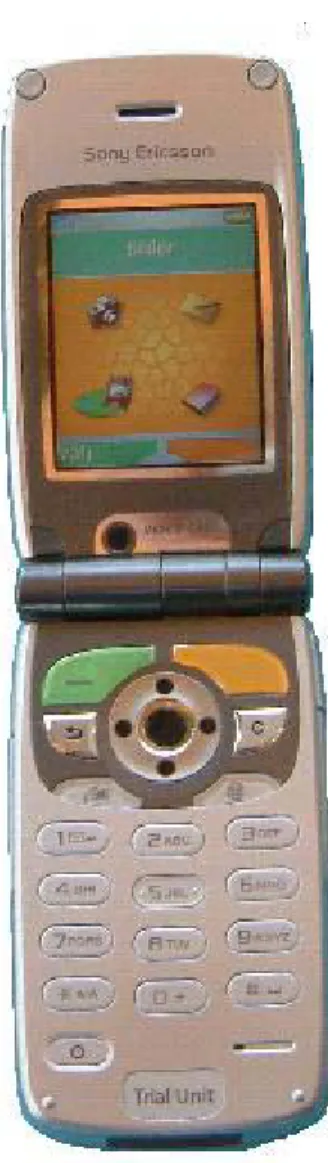
What follows in this chapter are descriptions of what have been implemented in the prototype, shown in figure 10, and short and simple explanations of how it was implemented. Exactly all changes made will not be enumerated since there are so many, but the main and large types of changes will be accounted for. Moreover, the reasons behind each idea and implementation will be elucidated.
In this report, the figures showing only the display of the phone are simulated; they are not photographs of the display of an actual telephone. This means that the small icons in the top of the figures will not be visible in the real prototype.
5.1 The theme
A theme is a set of pictures and a description of both which colours that should be used for the texts as well as where to use the different pictures. There are different pictures for standby, menu, soft key, highlighted text and many more. The original Z1010 comes with a number of different themes, but still we wanted to make one of our own.
The main reason for introducing a new theme was to map the colours of the physical soft keys to the background of the text on the display corresponding to each soft key. In the initial tests we found that the connection between the display and the key pad sometimes was too weak for our test group and it mainly concerned the text on the display corresponding to the physical soft keys. In order to make the relation more obvious, the two physical soft keys were given different colours, green and orange, and the background of the corresponding texts on the display were sat to the same colours. The shape of the backgrounds to the soft key texts on the display were made to look like the shape of the physical soft keys to further increase the relation between them. This is shown in figure 10.
Figure 10The prototype.
In all menus the left soft key is used to select the highlighted text or icon. To make it more obvious for the user which action will be executed when pressing the left, green soft key, the highlighted text’s background and the highlighted icon were coloured green as well. The main menu has a header that displays the name of the current highlighted icon, e.g. “Camera” when the
camera icon is highlighted. The header was coloured green too since the left soft key is used to select the current highlighted icon.
5.2 The start position
The start position is the first thing the user sees when opening the clam shell and looking at the display. The start position in the original Z1010 is called “standby”, and consists of nothing more than an image of the user’s choice. This is shown in figure 11. Current time, date and operator are displayed on top of the image. From this position the user can make a phone call to a known number by using the key pad, look at information of previous calls by using the left soft key, perform various of actions in the “More” list activated by the right soft key, activate a number of functions via different short cuts and finally go to the menu with the centre navigation key.
In the prototype developed by us in this thesis work the menu is the new start position. There are three main reasons for this.
• Every action made by a short cut from the original start position can be made from the menu, but many of the actions in the menu can not be reached directly from the standby position. By letting the menu be the start position, one keystroke is reduced for every action not made through a short cut.
• When a user looks at the menu, he or she can directly see what is possible to do with the phone, if the icons and the corresponding texts are explicit enough, which is not the case with the standby position. The user will not find the menu if he or she doesn’t know that the menu exists, which is often the case with the people in the test group. [4]
Figure 11 ”Standby” in the
original Z1010. • It is not desirable to make the users dependent of
shortcuts since this makes it necessary for them to remember which shortcut corresponds to which action. The start position was changed to the menu by creating and giving the menu focus directly after standby was created in the start procedure of the telephone. In the original menu state it was not possible to make a phone call by pressing the keypad, instead the keypad was mapped to the icons in the menu e.g. pressing key “1” would activate the top left icon. This function was removed. Instead the digit signals generated by key strokes were captured in the menu and then sent to standby, which gets focus, to let standby take care of the new call. When a call is ended in any way, the menu gets back the focus.
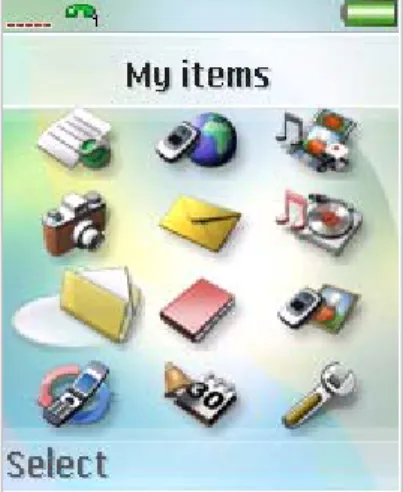
In the original menu there are twelve icons, shown in figure 7, with different actions. The image on the display of the new start position in the prototype is shown in figure 12. In this prototype the number of actions is reduced to four. The remaining actions are “Camera”, “Phonebook”, “Messages”, and “My objects”, containing pictures and videos. These remaining actions were chosen from the result of our initial tests where the persons interviewed let us know which functions were desired. The idea is to not let the undesired icons distract the user. At the same time the remaining icons become more distinct, a little bit bigger and there will be more space between them.
Each action corresponds to an icon. It is very important that the icons tell the user what he or she can expect if executing one of them. From the initial tests we found out that all the remaining icons but one, used for “My objects”, were easy to understand. The original icon for “My objects” represented a file folder. The file folder icon was changed to an image of a picture since the action “My objects” will show pictures and videos. Also, the name “My objects” was replaced by “Pictures” which better represents what will be reached through this action.
Figure 12 The new start position in the prototype.
5.3 The phonebook
Figure 13 Adding a new contact in the original Z1010.
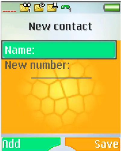
The initial tests with people that belong to the final target group showed that the most important thing was that it is easy to call and manage new phone numbers.
In the original Z1010, each contact in the phonebook consists of a name and one or more telephone numbers, making the phonebook hierarchal. This means that after the user, when adding a new contact, has written a telephone number, a window is shown on the display where the user chooses which kind of number it is, i.e. if it is a home number, a cell phone number, a fax number and so on. Then, the user returns to the state where he or she can add another number if desired. If the user wants to save the contact, he or she has to press the upper right key on the keypad. This means that the number of key strokes is high and for the people in the test group it is also confusing to return to the previous state when they think that they are done and want to exit and return to the start position of the phone.
At this state, shown in figure 13, where the user can add name and number of a contact, the user can also add ring tones, pictures, e-mail, information about the company he is working at, and
other information, by using the left and right navigation keys to activate another so called tab. For the people in the test group, it is confusing to see all the small icons in the top of the display, if they see them at all, because they don’t know what the icons mean and activate or why they are there. Moreover, they do not know how to reach these actions. Due to these reasons, the people in the test group cannot use the functions found in the other tabs.
In this prototype, shown in figure 14, the tabs and their functions have been removed. Moreover, after one phone number has been written and the user presses the left soft key, which corresponding text on the display says “Ok”, a window is shown with the question “Save before closing?”. The user can then press the left soft key for “Yes” and the right soft key for “No”. This means that there can only be one phone number saved to each name, i.e. the phonebook is non hierarchal. This in turn means that when the user is calling someone from the phonebook, he or she doesn’t have to choose which phone number to call after choosing the name. In this prototype, the user only has to select the name and this reduces the number of key strokes and the complexity.
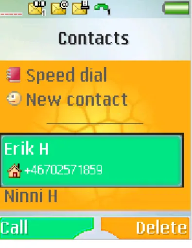
In the original version of Z1010, the phonebook consists of “Options”, “New contact”, the names and numbers of the contacts, and a “More” option on the right soft key. When “Options” is chosen, actions like “Speed dial”, “My card”, “Groups”, “SIM numbers”, “Special numbers”, and “Advanced” are found. However, the only useful action for the target group is “Speed dial” which is necessary for the persons in the test group who have trouble remembering names and numbers and who don’t want to look through the phonebook to call an important number. The problem is that if these persons want to make a contact to a speed dial number, they cannot find the “Speed dial” choice because the word “Options” doesn’t say anything about speed dialling. All of this can be seen in figures 17, 18 and 19 which show the structural diagrams of the original phonebook and the phonebook in the prototype.
Figure 14 Adding a new contact in the prototype.
Figure 15 The original
phonebook menu. In this prototype, the word “Options” has been replaced by
“Speed dial” and when selected, the action that is normally executed is by-passed and the user arrives directly at the “Speed dial” function. When the user is finished, he or she returns straight to the phonebook.
This shortcut decreases the amount of key strokes by two and even more importantly, the “Speed dial” function can be seen and reached immediately from the phonebook, as seen in figure 16.
The “More” option mentioned earlier is shown when a name in the phonebook is highlighted. It causes confusion because the user cannot tell from the word “More” what to expect to find if he or she was to press the right soft key. The options in the “More” list are “Make a video call”, “Send message”, “Edit before call”, “View and edit”, “Send contact”, “Delete contact”, and “Default”.
The first option to make a video call would be desired by the test group but after the initial tests it was concluded that this would be too difficult and abstract for them. To send a message from the phonebook is not desired because the people in the test group would choose “Messages” from the start menu instead. To edit and send contacts together with the default choice are things that were found unnecessary but to be able to delete a contact was an option that these persons wanted to keep. Therefore the “More” list has been replaced by the “Delete” option, reducing the number of key strokes. The text “Delete contact” has also been shorted to “Delete” in order to make it easier to read and understand. These differences between the original Z1010 and the prototype can be seen in figures 15 and 16.
Figure 16 The phonebook menu in the prototype.
Figure 17 The original phonebook 1(2). PREVIOUS PREVIOUS PREVIOUS Return (PREVIOUS) Return P A FOCUS CHANGE [Select]/ PREVIOUS 1 TRUE [OK]/ PREVIOUS 1 [Default] [Send contact] [View & edit] [Edit before call] [Send message]
11
[Make video call] [Send DTMF tones] [Select] [Go [Send [Call] [Add] DELETE FOCUS CHANGE PREVIOUS ACCEPT/ PREVIOUS ACCEPT/ PREVIOUS ACCEPT ACCEPT/ PREVIOUS If no answer or user busy ACCEPT ACCEPT/ PREVIOUS ACCEPT/ PREVIOUS If no answer or user busy ACCEPT ACCEPT/ PREVIOUS ACCEPT/ PREVIOUS FALSE Options: Select New contact: Add Phone number:Call E-mail: Send to
More Send DTMF tones Make video call Send message Edit before call View & edit Send contact Delete Contact Default 1 1 A 1 1 A A 1 1 A 1 1 12 10 9 8 7 6 5 4 3 11 2 More contacts allowed? 12 10 9 8 7 6 13 5 4 3 2 P 1 Edit contact Edit before call External send message WAP session establishment External send message Edit contact MO call Sending a number as DTMF MO call Send item Select Default • +4640123456 • +464119988877 • +46706546789 • +4645367845 OK
Cannot add more contacts More Add/Call Contacts • Options • New contact Erik Hallengren Ninni Hed
[Help] FOCUS CHANGE [Help] [Help] PREVIOUS 13 PREVIUOS 13 PREVIUOS 13 FOCUS CHANGE [OK] ACCEPT/ PREVIOUS ACCEPT/ PREVIOUS ACCEPT/ PREVIOUS ACCEPT/ PREVIOUS ACCEPT/ PREVIOUS ACCEPT/ PREVIOUS ACCEPT/ PREVIOUS ACCEPT/ PREVIOUS ACCEPT/ PREVIOUS ACCEPT/ PREVIOUS ACCEPT/ PREVIOUS ACCEPT/ PREVIOUS ACCEPT/ PREVIOUS ACCEPT/ PREVIOUS ACCEPT/ PREVIOUS ACCEPT/ PREVIOUS ACCEPT/ PREVIOUS ACCEPT/ PREVIOUS ACCEPT/ PREVIOUS [Select]= Sync. order [Select]= Delete all contacts [Select]= Send all contacts [Select]= Copy to SIM [Select]= Copy from SIM [Select]= Memory [Select]= Auto save on SIM [Select]= My phonebook [Select]= Ask to save [Select]= SOS numbers [Select]= Service numbers [Select]= My numbers [Select]= Info numbers [Select]= Fixed dialling [Select]= Sync. contacts [Select]= Advanced [Select]= SIM numbers [Select]= Goups [Select]= My card [Select]= Speed dial [Select]= Special numbers FOCUS CHANGE PREVIOUS 1 Synch contacts is visible if a synch account exists 15 14 13 13 13 13 13 14 14 14 14 14 15 15 15 15 13 15 15 15 15 15 Send complete phonebook Copy to SIM My phonebook Auto store question activation/ deactivation Synchronization name order Delete all from
phone
Copy from SIM Memory status Backup to SIM PIM integrated synch OK Synchronize will launch a secure back-up of your phonebook to the network Info Select Advanced Ask to save My phonebook Auto save on SIM Memory status Copy from SIM Send all contacts Delete all contacts Sync. order List of emergency call numbers Service numbers Information numbers My numbers Fixed dialling SIM numbers Groups My business card Speed dial Info Select Special numbers Fixed dialling My numbers Info numbers Servce numbers SOS numbers Info Select Options Speed dial Sync. Contacts My card Groups Special numbers Advanced
PREVIOUS • Speed dial • New contact Erik Hallengren Ninni Hed Contacts Add/Call Delete
Cannot add more contacts OK MO call Edit contact P 2 3 4 1 [Select] More contacts allowed? 2 3 Speed dial: Select
New contact: Add Phone number: Call
[Call] PREVIOUS [Add] FOCUS CHANGE FALSE 1 A 1 ACCEPT/ PREVIOUS ACCEPT If no answer or user busy TRUE A P Return Return (PREVIOUS) Speed dial 1 ACCEPT/ PREVIOUS
Figure 19The prototype phonebook.
4 [OK]/
PREVIOUS 1
Figure 21 The messages main menu in the prototype.
5.4 Messages
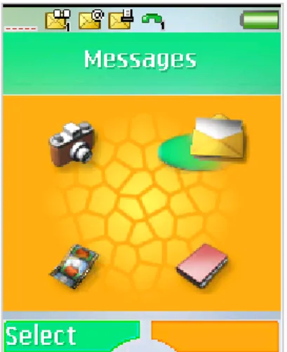
In the original version of Z1010, the “Messages” option in the start menu shows 10 choices: “Write new”, “Inbox”, “My friends”, “Call voicemail”, “Email”, “Unsent items”, “Templates”, “Sent items”, ”Saved items”, and “Settings”. This is shown in figure 20.
During the initial tests, most of the persons did not care much for messaging because they thought it was too difficult. However, they also felt that they would like to be able to handle it, but only to read messages that they receive and sometimes to write messages by themselves. This means that all choices except the first two can be removed and this has been done when developing the prototype as seen in figure 21.
Figure 20 Options in “Messages” in the original Z1010.
When selecting “Write new”, the user can choose between writing a text message, i.e. an SMS, and writing a picture message, i.e. a MMS. If the user chooses to write either a picture message or a text message, a window representing a white sheet of paper is shown on the display where the user can start writing. All of this has not been changed in the prototype, but when writing a text message, the “More” list that is shown when pressing the right soft key has been altered. In the original version, the actions that can be selected in the “More” list are “Add symbol”, “Add item”, “Spell word”, “Text format”, “Writing language”, “Dictionary (T9)”, “Word suggestions”, “My words”, and “Help”.
In the prototype, everything has been removed except “Add symbol” and “Text format”. However, there was one more function that was desired to stay and that was the sub function “Picture” where a picture can be selected and added, which was located in “Add item”. Therefore, “Add item” has not been completely removed but only by-passed so that “Picture” is still a selectable function. This is shown in figure 22.
When the user has finished writing a text message in the original Z1010, he or she has to press the left soft key with the corresponding text “Continue” and from there choose the number or person he or she wants to send it to. However, the word “Continue” is a bit confusing since it doesn’t state what the user will continue with when selecting “Continue”. Therefore, the word has been replaced by the word “Send” which is exactly what will happen when selected.
Figure 22 The “More” list activated by the right soft
If the user chooses to write a picture message instead, the original Z1010 will show a text “Add” corresponding to the left soft key and a text “More” corresponding to the right soft key, shown in figure 23. When selecting “Add”, the items that can be added are “Picture”, “Text”, “Sound”, “Video”, “Camera picture”, “Video recording”, “Sound recording”, and “Page”. The “More” option will show the functions “Send”, “Preview”, “Preview page”, “Background”, “Insert item”, “Page timing”, “Delete page”, and “Make a call”.
Figure 25 Prototype options in the “More” list activated by the right soft key.
Among all of these possible actions, the ones that were desired to keep were “Picture”, “Text”, and most importantly “Send”. However, since “Send” is something that is normally to the left, the “Send” option replaced the whole “Add” option in this prototype. Also “Picture” and “Text” changed places and were moved so that they are now a part of the “More” list still corresponding to the right soft key. This is illustrated in figure 24.
Figure 23Writing an MMS in the original Z1010.
If the user instead of writing a new message chooses to check the inbox, the original Z1010 will show all messages and by pressing the left soft key, the user can read a specific message. The right soft key will activate another “More” list, this time containing the actions “Reply”, “Call”, “Forward”, “Save message”, “Delete”, “Delete all messages”, and “List options”. In the prototype, only the option “Delete” remains since the only things that the persons in the test group want to do with incoming messages are to read them and to delete them. If the user wants to reply, he or she rather goes back to “Write new” and goes from there instead of remembering that there is a “Reply” option in a “More” list.
Figure 24Writing an MMS in the prototype.
The “More” lists never include the same options and therefore it is difficult for these test persons to remember where they can find which function and therefore they rather ignore the “More” lists. It is also important to keep the “Delete” option on the right side corresponding to the right soft key since that is sort of a negative function and as stated earlier in this report, all negative functions should be to the right and all more positive functions to the left. This is important both because the tested persons thought that it was more natural, without any specific reason, and also because it is important to be consistent because then it is easier to remember and less confusing.

![Figure 5 Z1010's key pad. [17]](https://thumb-us.123doks.com/thumbv2/123dok_us/10655925.2953455/10.892.113.304.125.391/figure-z-s-key-pad.webp)
![Figure 6 The difference between Serif and sans Serif typefaces [14].](https://thumb-us.123doks.com/thumbv2/123dok_us/10655925.2953455/11.892.590.835.826.953/figure-difference-serif-sans-serif-typefaces.webp)