Theses, Dissertations and Culminating Projects
1-2018
Prediction Intervals for Functional Data
Nicholas RiosMontclair State University
Follow this and additional works at:https://digitalcommons.montclair.edu/etd Part of theMultivariate Analysis Commons
This Thesis is brought to you for free and open access by Montclair State University Digital Commons. It has been accepted for inclusion in Theses, Dissertations and Culminating Projects by an authorized administrator of Montclair State University Digital Commons. For more information, please [email protected].
Recommended Citation
Rios, Nicholas, "Prediction Intervals for Functional Data" (2018).Theses, Dissertations and Culminating Projects. 1. https://digitalcommons.montclair.edu/etd/1
ABSTRACT
Title of Thesis: PREDICTION INTERVALS FOR FUNCTIONAL DATA
Nicholas Rios, Master of Science, 2018
Thesis directed by: Dr. Andrada E. Ivanescu
Department of Mathematical Sciences
The prediction of functional data samples has been the focus of several functional data analysis endeavors. This work describes the use of dynamic function-on-function regression for dynamic prediction of the future trajectory as well as the construction of dynamic prediction intervals for functional data. The overall goals of this thesis are to assess the efficacy of Dynamic Penalized Function-on-Function Regression (DPFFR) and to compare DPFFR prediction intervals with those of other dynamic prediction methods. To make these comparisons, metrics are used that measure prediction error, prediction interval width, and prediction interval coverage. Simulations and applications to financial stock data from Microsoft and IBM illustrate the usefulness of the dynamic functional prediction methods. The analysis reveals that DPFFR prediction intervals perform well when compared to those of other dynamic prediction methods in terms of the metrics considered in this paper.
PREDICTION INTERVALS FOR FUNCTIONAL DATA
A THESIS
Submitted in partial fulfillment of the requirements for the degree of Master of Science in Statistics
by
NICHOLAS RIOS Montclair State University
Montclair, NJ 2018
Contents
1. Introduction to Functional Data ... 9
1.1. Dynamic Prediction ... 10
1.2. Literature Review ... 12
2. Research Goals ... 14
3. Comparison of Methods for Dynamic Prediction ... 14
3.1. Dynamic Penalized Function-on-Function Regression (DPFFR) ... 15
3.2. BEnchmark DYnamic (BENDY) ... 17
3.3. Dynamic Linear Model (DLM) ... 20
3.4. Dynamic Penalized Functional Regression (DPFR) ... 21
3.5. Dynamic Functional Linear Regression (dynamic_FLR) ... 21
3.6. Penalized Least Squares (dynupdate) ... 22
4. Metrics ... 23
4.1. Integrated Mean Prediction Error (IMPE) ... 24
4.2. Average Width (AW) ... 24
4.3. Average Coverage (AC) ... 25
4.4. Central Processing Unit Time (CPU) ... 26
5. Numerical Results ... 27
5.1. Simulation Design ... 27
5.2. Construction of Dynamic Prediction Intervals ... 30
5.3. Simulation Results... 44
5.3.1. Increasing the Sample Size ... 44
5.3.2. Changing the Data Structure ... 45
5.3.3. Increasing the Confidence Level ... 46
5.3.4. Changing the Cutoff Point, R... 47
5.3.5. Adding Scalar Covariates ... 48
7. Conclusions ... 67
8. Further Discussion ... 67
9. Appendix ... 69
List of Figures
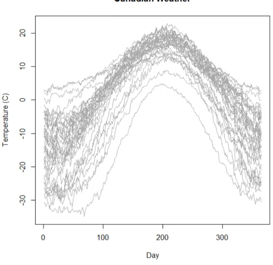
Figure 1. Depicted are the functional data curves for average daily temperatures for n = 35 locations in Canada.
Figure 2. Depicted above is a prediction interval for the Microsoft (MSFT) stock highs in a fixed year, r = 5.
Figure 3. Illustrated are a sample of 50 Simulated Curves with r = 8. Figure 4. Illustrated are a sample of 50 Simulated Curves with r = 11.
Figure 5. Depicted is a prediction interval for BENDY, with r = 8, n = 25, setting A. Model (4) is used.
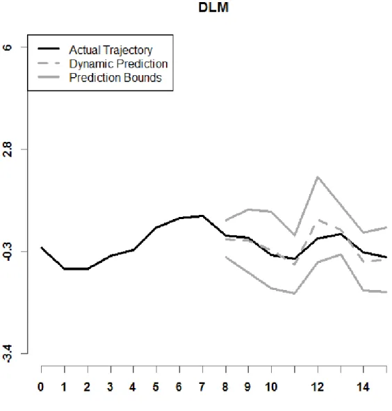
Figure 6. Shown above is a prediction interval for DLM, with r = 8, n = 25, setting A. Model (4) is used.
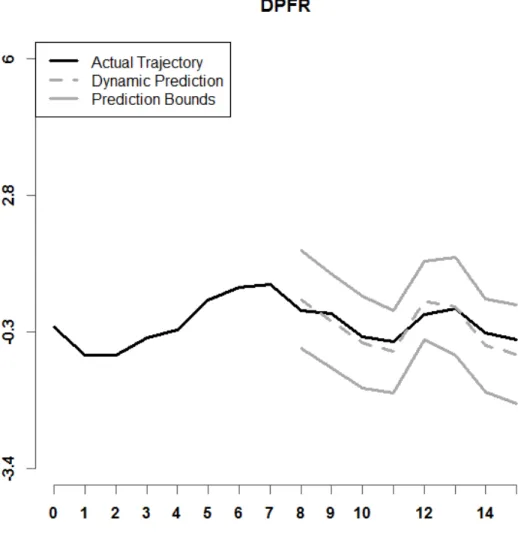
Figure 7. Depicted is a prediction interval for DPFR, with r = 8, n = 25, setting A. Model (4) is used.
Figure 8. Illustrated is a prediction interval for DPFFR, with r = 8, n = 25, setting A. Model (4) is used.
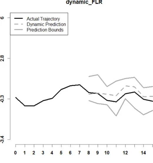
Figure 9. Shown above is a prediction interval for dynamic_FLR, with r = 8, n = 25, and Setting A. Model (4) is used.
Figure 10. Shown above is a prediction interval for dynupdate, with r = 8, n = 25, and Setting A. Model (4) is used.
Figure 11. Shown above is a prediction interval for BENDY, with r = 8, n = 25, and Setting A. Model (1) is used.
Figure 12. Depicted is a prediction interval for DLM, with r = 8, n = 25, and Setting A. Model (1) is used.
Figure 13. Depicted is a prediction interval for DPFR, with r = 8, n = 25, and Setting A. Model (1) is used.
Figure 14. Illustrated is a prediction interval for DPFFR, with r = 8, n = 25, and Setting A. Model (1) is used.
Figure 15. Shown above is a prediction interval for dynamic_FLR, with r = 8, n = 25, and Setting A. Model (1) is used.
Figure 16. Depicted is a prediction interval for dynupdate, with r = 8, n = 25, and Setting A. Model (1) is used.
Figure 17. Shown is the raw data for MSFT Stock Highs over n = 29 years for each month. Figure 18. Shown is the raw data for IBM Stock Highs over n = 29 years for each month. Figure 19. Illustrated are the first three principal components for Microsoft (MSFT) data.
Figure 20. Depicted is a graph of the IMPE, by month, when the cutoff point r = 4. Figure 21. Depicted is a graph of the IMPE, by month, when the cutoff point r = 5.
Figure 22. Depicted is a graph of a DPFFR prediction of the MSFT stock high for a specific year, when r = 4.
Figure 23. Depicted is a graph of a DPFFR prediction, for a different curve, of the MSFT stock highs when r = 5.
Figure 24. Depicted is a graph of mean prediction interval width for each of the three methods, with cutoff point r = 7 (August).
Figure 25. Depicted is a graph of prediction interval coverage for three dynamic prediction methods, for cutoff point r = 7 (August).
Figure 26. Shown above is a graph of a DPFFR prediction interval for the Intramonthly Stock Returns for IBM for a given year, when r = 7 and C = 95% confidence.
Figure 27. Shown above is a graph of a dynamic_FLR prediction interval for the Intramonthly Stock Returns for IBM for a given year, when r = 7 and C = 95% confidence. Figure 28. Shown above is a graph of a dynupdate prediction interval for the Intramonthly Stock Returns for IBM for a given year, when r = 7 and C = 95% confidence.
Prediction Intervals for Functional Data
1. Introduction to Functional Data
Functional data are realizations of functions that are observed over a continuum, such as time. We assume that the observed data are generated by some underlying stochastic process, and we can observe the data over a discrete set of time points (Ramsay and Silverman, 2005). Various methods exist for analyzing functional data over a given set of time points. In formal notation, each curve is denoted as 𝑌𝑌𝑖𝑖(𝑡𝑡), with 𝑖𝑖= 1,2, … ,𝑛𝑛. Here,
𝑡𝑡 is a time point, with 𝑡𝑡= 1,2, … ,𝑀𝑀. As an example, an individual curve could represent monthly stock highs for a year. In this case, 𝑌𝑌𝑖𝑖(𝑡𝑡) represents the stock high for month 𝑡𝑡 for year 𝑖𝑖. For instance, 𝑌𝑌1(2) would indicate the monthly stock high for month 2 (February) for year 1 in the dataset.
Another example of functional data is the Canadian Weather dataset. This dataset is provided in R’s FDA package (Ramsay and Silverman, 2005; Ramsay et al., 2017). Daily temperatures (in degrees Celsius) were recorded at 35 locations in Canada over the years 1960 to 1994. An average daily temperature was then calculated for each day of the year. In this example, 𝑌𝑌𝑖𝑖(𝑡𝑡) represents the average daily temperature for day 𝑡𝑡 at location 𝑖𝑖. Here,
𝑡𝑡 = 1,2, … , 365 and 𝑖𝑖= 1,2, … ,35. This dataset also contains information on the average
Figure 1. Depicted are the functional data curves for average daily temperatures for n=35 locations in Canada.
Figure 1 shows the average daily temperature for each day of the year for each of the 35 locations in Canada. It can be observed that the average daily temperature increases towards the middle of the year, and then decreases at the end of the year.
1.1. Dynamic Prediction
The focus of this thesis is dynamic prediction, and specifically, prediction intervals used for dynamic prediction. Methods of dynamic functional prediction have a primary focus to predict the trajectory in the future based on known historical data. Formally, we
can call the cutoff point r, and say that we are predicting the trajectory of a curve 𝑌𝑌𝑖𝑖(𝑡𝑡̃) for
𝑡𝑡̃ ∈{𝑟𝑟+ 1,𝑟𝑟+ 2, … ,𝑀𝑀}, based on the historical data on the curves 𝑌𝑌𝑖𝑖(𝑡𝑡) for 𝑡𝑡 ∈
{1,2, … ,𝑟𝑟}. Once the prediction for a specific curve is obtained, upper and lower bounds
for the predicted trajectory of that curve can be computed to make a prediction interval. All analyses for this thesis were run in R (R Core Team, 2016).
Figure 2. Depicted above is a prediction interval for the Microsoft (MSFT) stock highs in a fixed year, r = 5.
As an illustrated example of dynamic prediction, Figure 2 displays a dynamic prediction and a prediction interval of the stock highs for Microsoft for a fixed year (Microsoft Historical Prices, 2016), with cutoff point r = 5. In this example, the stock high
is the highest price that a stock obtains in a given month. The time points are months 𝑡𝑡 =
1,2, … ,12, and the original dataset has n = 29 curves, with each curve corresponding to one
year from 1987 to 2015. The true trajectory of the stock highs is shown as a solid black curve, the dynamic prediction is shown as a dashed gray curve, and the prediction interval bounds are depicted as solid gray curves. The dynamic prediction method being used here is using historical data from the curves up to the month of May (r = 5) to generate the dynamic prediction of the stock highs for each month after May. It can be observed that this prediction interval contains the true trajectory of the stock highs for this year.
There are already several methods in the functional data analysis literature that are used for dynamic prediction. One is called dynamic functional linear regression (Shang, 2015, Section 4.6), implemented in software as the function dynamic_FLR in the ftsa (Hyndman and Shang, 2017) package in R. It only uses the historical data on the samples of curves of interest and cannot include other predictors. This method extracts the functional principal components of the curves, and conditions on the estimated eigenfunctions to obtain the dynamic forecast based on a dynamic functional regression model (Hyndman and Shang, 2017; Shang, 2015; Shang and Hyndman, 2016). Another method uses penalized least squares (Shang, 2015, Section 4.4) for dynamic prediction, where the estimated eigenfunctions are also used as predictive information. The penalized least squares method is available in R as the dynupdate function of the ftsa R package.
A large volume of research already exists on the topic of prediction for functional data analysis. A method for estimating functional data curves while accounting for uncertainty in functional principal components analysis was developed (Goldsmith et al., 2013). Predictions from scalar-on-function regression were proposed based on cross validation and ensemble prediction (Goldsmith and Scheipl, 2014). A semi-functional partial linear regression model was developed to predict future observations (Aneiros-Pérez and Vieu, 2008). Several methods of creating simultaneous prediction intervals were compared and analyzed in the context of a French electricity consumption function-valued dataset (Antoniadis et al., 2016). These methods demonstrate that there are a wide range of methods for analyzing functional data, however, dynamic prediction is not discussed. These papers also indicate that there might be a variety of applications in need of analysis that involve prediction in functional data scenarios. A good example of a functional data scenario that involves prediction is spectrometric data. Data gathered from a Teactor Infrared Spectrometer was used to predict the fat content of meat using absorbance as a predictor in the context of functional regression (Goldsmith and Scheipl, 2014). Another application of prediction in functional data analysis is atmospheric ozone concentration. Regression for functional data was used in an application to predict future ozone concentrations based on historical functional data on ozone, nitrogen dioxide, and sulfur dioxide levels (Aneiros-Pérez and Vieu, 2008). In this application, chemical measurements of ozone, nitrogen dioxide, and sulfur dioxide were taken every hour over 124 days in 2005 in Madrid, Spain, and these chemical measurements were used as predictors of future ozone concentration in 7 non-functional regression models and 7 regression models that are classified as either functional or semi-functional (Aneiros-Pérez and Vieu, 2008).
2. Research Goals
A main goal of this thesis is to assess the efficacy of the dynamic predictions and dynamic prediction intervals produced by Dynamic Penalized Function-on-Function Regression (DPFFR). DPFFR will be compared with other dynamic prediction methods (BEnchmark DYnamic, Dynamic Linear Model, Dynamic Penalized Functional Regression, Dynamic Functional Linear Regression, and Penalized Least Squares) in terms of prediction error, prediction interval width, and prediction interval coverage. These metrics will be evaluated for several different simulated datasets. In addition, this research intends to apply these dynamic prediction algorithms to real financial stock data and see the prediction performance when applied to real data. R software is used for the implementations of methods for dynamic prediction intervals.
The next section describes the six dynamic prediction methods that will be used to construct dynamic predictions and prediction intervals. Section 4 describes the metrics that will be used to compare the dynamic predictions and prediction intervals. Section 5 explains how functional data curves were simulated, and it also provides a numerical analysis of the performance of the six dynamic prediction methods in simulations. Section 6 details the application of three dynamic prediction methods (DPFFR, Dynamic Functional Linear Regression, Penalized Least Squares) to real financial stock data and provides the resulting analysis.
There are a variety of methods that have been developed for dynamic prediction, in the context of functional datasets. All prediction methods listed in this paper are implemented using leave-one-out cross validation. When predicting the future trajectory of a curve, that curve’s historical functional data is left out of the data set used to generate the model fit used for predictions. So, when predicting 𝑌𝑌𝑖𝑖(𝑡𝑡̃) (for fixed 𝑖𝑖), the corresponding historical functional data 𝑌𝑌𝑖𝑖(𝑡𝑡) is excluded when obtaining the model fit. Methods that will be discussed and compared in this paper include DPFFR, BENDY, DLM, DPFR, and the methods of Shang (2016) and Hyndman and Shang (2017) denoted as dynamic_FLR and dynupdate, respectively.
3.1. Dynamic Penalized Function-on-Function Regression (DPFFR)
A main goal of this thesis is to study Dynamic Penalized Function-on-Function Regression (DPFFR) and compare the prediction intervals of DPFFR with those of other methods. DPFFR makes predictions based on historical data from the curves of interest and available useful covariates. DPFFR is used to make dynamic predictions within penalized regression (Wood, 2006) in the framework of function-on-function regression (Ivanescu et al., 2015). The model we study is given below.
𝑌𝑌𝑖𝑖(𝑡𝑡̃) =𝑊𝑊𝑖𝑖1𝛾𝛾1+𝑊𝑊𝑖𝑖2𝛾𝛾2+𝜁𝜁(𝑡𝑡̃) +∫ 𝑌𝑌Τ 𝑖𝑖(𝑡𝑡)β(t̃, t)𝑑𝑑𝑡𝑡+∫ 𝑍𝑍Τ 𝑖𝑖(𝑡𝑡)𝛿𝛿(t̃, t)𝑑𝑑𝑡𝑡+𝜖𝜖𝑖𝑖(t̃). (1)
Here, the 𝑌𝑌𝑖𝑖(𝑡𝑡̃) are the functional responses over time domain 𝑡𝑡̃ ∈{𝑟𝑟+ 1,𝑟𝑟+ 2, … ,𝑀𝑀}, which is the future time domain where we want to make predictions. Scalar covariates
𝑊𝑊𝑖𝑖1,𝑊𝑊𝑖𝑖2 have scalar effects on the predicted responses given by coefficients 𝛾𝛾1 and 𝛾𝛾2,
respectively. The model term 𝜁𝜁(𝑡𝑡̃) is the functional intercept. Functional predictors
respectively. Both are observed at time points 𝑡𝑡 ∈{1,2, … ,𝑟𝑟}. Model parameters β(t̃, t) and
𝛿𝛿(t̃, t) are bivariate functional parameters that are larger in magnitude when the data they are paired with at time t is useful for making predictions at time t̃. The term 𝜖𝜖𝑖𝑖(t̃) is an error term. The integrals in the model are taken are over the domain 𝑡𝑡 ∈{1,2, … ,𝑟𝑟}.
For example, 𝑌𝑌𝑖𝑖(𝑡𝑡̃) could be the energy consumption of a city for the second half of the year, with measurements taken daily. Then 𝑌𝑌𝑖𝑖(𝑡𝑡) would be the available daily energy consumption for the first half of the year that can be used to obtain dynamic predictions for
𝑌𝑌𝑖𝑖(𝑡𝑡̃). Moreover, 𝑍𝑍𝑖𝑖(𝑡𝑡) may be the temperature recorded for the first half of the year,
measured daily, as temperature would be a useful functional predictor for energy consumption. Parameter β(t̃, t) would be larger when the energy consumption in the past is useful for making predictions in the future, and likewise, 𝛿𝛿(t̃, t) would be larger when the temperature in the first half of the year is useful for predicting the energy consumption for the future part of the year.
The goals of DPFFR are:
1. To fit the DPFFR model to functional data and estimate the model parameters. 2. To obtain predictions 𝑌𝑌�𝑖𝑖(𝑡𝑡̃) as an estimate for the future trajectory𝑌𝑌𝑖𝑖(𝑡𝑡̃).
3. To obtain prediction intervals, upper and lower bounds.
Model (1) is a function-on-function regression model for dynamic prediction, where the response variable is a functional dataset. Functional predictors are used to predict the functional responses in a dynamic functional regression framework. The model parameters are estimated by applying a penalized least squares criterion with the aim of obtaining estimators for the smooth functional parameters that minimize the criterion. The
penalization ensures that the resulting functional parameter estimates are smooth functional estimators. Once these model parameters are estimated, they can be used to make predictions for 𝑌𝑌𝑖𝑖(𝑡𝑡̃) and compute the estimated variability associated with 𝑌𝑌𝑖𝑖(𝑡𝑡̃), which lets us construct prediction intervals.
More specifically, we employ functional regression that uses smoothing penalties in a functional regression approach based on penalized splines. Parameters 𝜁𝜁(𝑡𝑡̃),β(t̃, t) , and
𝛿𝛿(t̃, t) are assumed to be functional. We choose a large number of splines basis functions to represent the DPFFR functional parameters and apply the penalties 𝜆𝜆𝜁𝜁𝑃𝑃(𝜁𝜁), 𝜆𝜆𝛽𝛽𝑃𝑃(𝛽𝛽), and 𝜆𝜆𝛿𝛿𝑃𝑃(𝛿𝛿). If we denote by 𝑓𝑓𝑖𝑖,𝑡𝑡̃(𝛾𝛾1,𝛾𝛾2,𝜁𝜁,𝛽𝛽,𝛿𝛿) the mean of the 𝑌𝑌𝑖𝑖(𝑡𝑡̃), the penalized criterion to be minimized is shown below
� ��𝑌𝑌𝑖𝑖(𝑡𝑡̃)− 𝑓𝑓𝑖𝑖,𝑡𝑡̃(𝛾𝛾1,𝛾𝛾2,𝜁𝜁,𝛽𝛽,𝛿𝛿)�� 2
+𝜆𝜆𝜁𝜁𝑃𝑃(𝜁𝜁) +𝜆𝜆𝛽𝛽𝑃𝑃(𝛽𝛽) +𝜆𝜆𝛿𝛿𝑃𝑃(𝛿𝛿) 𝑖𝑖,𝑡𝑡̃
.
This is a penalized least squares criterion and corresponds to a residual sum of squares criterion specific for the setting of dynamic penalized functional regression. The penalized criterion is in alignment with popular penalization techniques for functional data, such as the criterion in Goldsmith et al., (2011, 2012).
3.2.BENchmark DYnamic (BENDY)
BENDY is the BENchmark DYnamic method of dynamic prediction. This model predicts the individual response 𝑌𝑌𝑖𝑖(𝑡𝑡̃) in the future time domain 𝑡𝑡̃ by using the first and last observations 𝑌𝑌𝑖𝑖(1) and 𝑌𝑌𝑖𝑖(𝑟𝑟) from the historical data curves and the first and last observations 𝑍𝑍𝑖𝑖(1) and 𝑍𝑍𝑖𝑖(𝑟𝑟) from a functional covariate. It can also account for several scalar covariates. In this method, the following model is considered:
𝑌𝑌𝑖𝑖(𝑡𝑡̃) =𝑊𝑊𝑖𝑖1𝛾𝛾1+𝑊𝑊𝑖𝑖2𝛾𝛾2+𝜁𝜁(𝑡𝑡̃) +𝑌𝑌𝑖𝑖(1)𝛽𝛽(𝑡𝑡̃, 1) +𝑌𝑌𝑖𝑖(𝑟𝑟)𝛽𝛽(𝑡𝑡̃,𝑟𝑟) +𝑍𝑍𝑖𝑖(1)𝛿𝛿(𝑡𝑡̃, 1)
+𝑍𝑍𝑖𝑖(𝑟𝑟)𝛿𝛿(𝑡𝑡̃,𝑟𝑟) +𝜖𝜖𝑖𝑖(𝑡𝑡̃). (2)
In model (2), 𝑌𝑌𝑖𝑖(𝑡𝑡̃) is taken as a scalar response that is being predicted by the BENDY method at each point from the grid of 𝑡𝑡̃. This makes BENDY different from DPFFR, since BENDY is used to predict a scalar response at each 𝑡𝑡̃ in turn, while DPFFR is used to predict a functional response (i.e. the entire future curve having domain 𝑡𝑡̃). The 𝑊𝑊𝑖𝑖1 and
𝑊𝑊𝑖𝑖2 terms are scalar covariates, 𝜁𝜁(𝑡𝑡̃) is an intercept term, and 𝜖𝜖𝑖𝑖(𝑡𝑡̃) is an error term.
Observations from 𝑌𝑌𝑖𝑖(𝑡𝑡) and 𝑍𝑍𝑖𝑖(𝑡𝑡) are taken as covariates in the BENDY model. For instance, 𝑌𝑌𝑖𝑖(1) is the first observation from the historical data curves, and likewise, 𝑌𝑌𝑖𝑖(𝑟𝑟) is the 𝑟𝑟𝑡𝑡ℎ (the last) observation from the historical data curves. Similarly, 𝑍𝑍𝑖𝑖(1) and 𝑍𝑍𝑖𝑖(𝑟𝑟) are the first and 𝑟𝑟𝑡𝑡ℎ observations from the covariates. BENDY differs from other dynamic prediction models because it only uses the first and the 𝑟𝑟𝑡𝑡ℎ points from the historical data and covariates to make predictions, whereas other dynamic prediction methods (such as DLM, DPFR, and DPFFR) use all of the historical data from time points 1,2, … ,𝑟𝑟 available to make predictions.
In R, the linear model (lm) method is used to fit the BENDY model at each time point
𝑡𝑡̃ in turn. The resulting model fit, together with the predictive information from the
𝑖𝑖𝑡𝑡ℎsample are used to find prediction intervals with confidence level 𝐶𝐶 = 100(1− 𝛼𝛼)% of
the following form:
𝑌𝑌�𝑖𝑖(𝑡𝑡̃) ±𝑡𝑡𝑑𝑑𝑓𝑓∗ 𝑀𝑀𝑀𝑀𝑀𝑀∗ �𝑉𝑉𝑉𝑉𝑟𝑟�𝑌𝑌�𝑖𝑖(𝑡𝑡̃)�+𝑉𝑉𝑉𝑉𝑟𝑟{𝜖𝜖𝑖𝑖(𝑡𝑡̃)},
where 𝑌𝑌�𝑖𝑖(𝑡𝑡̃) is the predicted value from the BENDY model, 𝑉𝑉𝑉𝑉𝑟𝑟�𝑌𝑌�𝑖𝑖(𝑡𝑡̃)� is the variance of the prediction at time point 𝑡𝑡̃ ∈{𝑟𝑟+ 1, … ,𝑀𝑀}, and 𝑉𝑉𝑉𝑉𝑟𝑟{𝜖𝜖𝑖𝑖(𝑡𝑡̃)} is the variance of the error.
The critical value is 𝑡𝑡𝑑𝑑𝑓𝑓∗ 𝑀𝑀𝑀𝑀𝑀𝑀, which is a quantile of the t-distribution with the same degrees of freedom as the mean squared error, MSE, and corresponds to the confidence level C. Note that the BENDY method uses data on all curves except the left-out curve to fit the BENDY linear model, for a total of n-1 curves. In practice, 𝑉𝑉𝑉𝑉𝑟𝑟{𝜖𝜖𝑖𝑖(𝑡𝑡̃)} is estimated as shown below 𝑀𝑀𝑀𝑀𝑀𝑀= 𝑑𝑑𝑓𝑓1 𝑀𝑀𝑀𝑀𝑀𝑀� 𝑒𝑒𝑖𝑖 2 𝑛𝑛−1 𝑖𝑖=1 ,
where 𝑒𝑒𝑖𝑖2 =�𝑌𝑌�𝑖𝑖(𝑡𝑡̃)− 𝑌𝑌𝑖𝑖(𝑡𝑡̃)�2is the square of the 𝑖𝑖𝑡𝑡ℎ sample residual difference between the fitted BENDY model and the observed data 𝑌𝑌𝑖𝑖 at time point 𝑡𝑡̃. The degrees of freedom for the MSE is given by 𝑑𝑑𝑓𝑓𝑀𝑀𝑀𝑀𝑀𝑀, which is given as the number of curves minus the number of model parameters (Kutner et al., 2004, Chapter 6). The variance of the predictions is estimated by taking into account the estimated variance of the model parameters in a BENDY model.
Let 𝑋𝑋 be the design matrix that contains the historical data on all n curves. Then 𝑋𝑋 has the form: 𝑋𝑋= ⎣ ⎢ ⎢ ⎢ ⎡11 𝑊𝑊𝑊𝑊11 𝑊𝑊12 𝑌𝑌1(1) 𝑌𝑌1(𝑟𝑟) 𝑍𝑍1(1) 𝑍𝑍1(𝑟𝑟) 21 𝑊𝑊22 𝑌𝑌2(1) 𝑌𝑌2(𝑟𝑟) 𝑍𝑍2(1) 𝑍𝑍2(𝑟𝑟) ⋮ ⋮ ⋮ ⋮ ⋮ ⋮ ⋮ 1 𝑊𝑊𝑛𝑛−1,1 𝑊𝑊𝑛𝑛−1,2 𝑌𝑌𝑛𝑛−1(1) 𝑌𝑌𝑛𝑛−1(𝑟𝑟) 𝑍𝑍𝑛𝑛−1(1) 𝑍𝑍𝑛𝑛−1(𝑟𝑟) 1 𝑊𝑊𝑛𝑛,1 𝑊𝑊𝑛𝑛−1,2 𝑌𝑌𝑛𝑛(1) 𝑌𝑌𝑛𝑛(𝑟𝑟) 𝑍𝑍𝑛𝑛(1) 𝑍𝑍𝑛𝑛(𝑟𝑟) ⎦ ⎥ ⎥ ⎥ ⎤ .
Then the design matrix used for the prediction is 𝑋𝑋−𝑖𝑖, where row 𝑖𝑖 corresponds to the historical data on the 𝑖𝑖𝑡𝑡ℎ curve that is being predicted. The design matrix 𝑋𝑋−𝑖𝑖 will have 𝑛𝑛 − 1 rows.
Let the matrix 𝑋𝑋𝑖𝑖 be the prediction matrix containing the historical data (up to time point r) from the 𝑖𝑖𝑡𝑡ℎ curve that pertains to the predicted response 𝑌𝑌�𝑖𝑖(𝑡𝑡̃), and let 𝑋𝑋𝑖𝑖′ denote
the transpose of 𝑋𝑋𝑖𝑖. The prediction matrix for the 𝑖𝑖𝑡𝑡ℎ curve is a 1-row vector that takes the following form:
𝑋𝑋𝑖𝑖 = [1 𝑊𝑊𝑖𝑖1𝑊𝑊𝑖𝑖2 𝑌𝑌𝑖𝑖(1) 𝑌𝑌𝑖𝑖(𝑟𝑟) 𝑍𝑍𝑖𝑖(1) 𝑍𝑍𝑖𝑖(𝑟𝑟)].
Then it follows that
𝑉𝑉𝑉𝑉𝑟𝑟� �𝛽𝛽̂�= 𝑀𝑀𝑀𝑀𝑀𝑀 ∗(𝑋𝑋−𝑖𝑖′ ∗ 𝑋𝑋 −𝑖𝑖)−1, 𝑉𝑉𝑉𝑉𝑟𝑟� �𝑌𝑌�𝑖𝑖(𝑡𝑡̃)�=𝑋𝑋𝑖𝑖 ∗ 𝑉𝑉𝑉𝑉𝑟𝑟� �𝛽𝛽̂� ∗ 𝑋𝑋𝑖𝑖′.
BENDY is implemented in R by using the linear model (lm) routine for model fitting. Prediction intervals and predictions are obtained with the predict.lm function in R.
3.3. Dynamic Linear Model (DLM)
DLM stands for Dynamic Linear Model. This model is similar to BENDY in the sense that DLM also predicts a scalar response instead of a functional response, but DLM uses all of the data points of interest from the historic data to make its predictions. The model for DLM is as follows: 𝑌𝑌𝑖𝑖(𝑡𝑡̃) =𝑊𝑊𝑖𝑖1𝛾𝛾1 +𝑊𝑊𝑖𝑖2𝛾𝛾2+𝜁𝜁(𝑡𝑡̃) +� 𝑌𝑌𝑖𝑖(𝑡𝑡) 𝑟𝑟 𝑡𝑡=1 𝛽𝛽(𝑡𝑡̃,𝑡𝑡) +� 𝑍𝑍𝑖𝑖(𝑡𝑡)𝛿𝛿(𝑡𝑡̃,𝑡𝑡) 𝑟𝑟 𝑡𝑡=1 +𝜖𝜖𝑖𝑖(𝑡𝑡̃). (3)
DLM treats 𝑌𝑌𝑖𝑖(𝑡𝑡̃) as a scalar response, 𝑊𝑊𝑖𝑖1 and 𝑊𝑊𝑖𝑖2 are scalar covariates, 𝜁𝜁(𝑡𝑡̃) is an intercept, and 𝜖𝜖𝑖𝑖(𝑡𝑡̃) is an error term. 𝛽𝛽(𝑡𝑡̃,𝑡𝑡) is a parameter that assumes larger values when the historical data 𝑌𝑌 at time 𝑡𝑡 is more useful for predicting the response. Likewise, the parameter 𝛿𝛿(𝑡𝑡̃,𝑡𝑡) would be larger when the 𝑍𝑍 covariate data at time 𝑡𝑡 is more useful for predicting the response. Both 𝛽𝛽(𝑡𝑡̃,𝑡𝑡) and 𝛿𝛿(𝑡𝑡̃,𝑡𝑡) are estimated for each pair (𝑡𝑡̃,𝑡𝑡).
In a similar fashion to DPFFR, DLM incorporates all of the historical data from
𝑡𝑡 = 1 to 𝑡𝑡 =𝑟𝑟 and other covariates to make predictions, but DLM differs from DPFFR because instead of integrating 𝑌𝑌𝑖𝑖(𝑡𝑡)𝛽𝛽(𝑡𝑡̃,𝑡𝑡) over the domain, DLM sums them over a
discrete set of points to get a scalar response. Furthermore, in DPFFR, 𝛽𝛽(𝑡𝑡̃,𝑡𝑡) and 𝛿𝛿(𝑡𝑡̃,𝑡𝑡) are taken to be smooth surfaces, but the DLM model requires no such assumption. It should also be noted that DLM uses functional covariates 𝑍𝑍𝑖𝑖(𝑡𝑡) in its model as well, making it similar to BENDY and DPFFR in this regard. In R, the lm method is used to fit the DLM model. This can be applied to create prediction intervals by using a similar methodology as presented in the BENDY model while talking into account the extended DLM model.
3.4. Dynamic Penalized Functional Regression (DPFR)
DPFR represents the method of Dynamic Penalized Functional Regression. The model for DPFR is the same as model (1) for DPFFR, with the exception that the response 𝑌𝑌𝑖𝑖(𝑡𝑡̃) is taken to be a scalar, not a function. So, to generate the whole predicted trajectory of a curve, DPFFR only needs to be run once, whereas DPFR would need to be executed one time for each point in the future time domain 𝑡𝑡̃ in order to construct the entire curve. This implies that the parameters 𝛽𝛽(𝑡𝑡̃,𝑡𝑡) and 𝛿𝛿(𝑡𝑡̃,𝑡𝑡) would be re-fitted for each time point of 𝑡𝑡̃ by using methodology for penalized scalar-on-function regression (Goldsmith et al. 2011). The DPFR model integrates the historical functional data over time domain for 𝑡𝑡, while the DLM model uses a summation over a discrete set of time points 𝑡𝑡 ∈{1,2, … ,𝑟𝑟}. This is because the form of the DPFR functional model parameters is assumed to be a smooth function of 𝑡𝑡.
3.5. Dynamic Functional Linear Regression (dynamic_FLR)
Dynamic Functional Linear Regression, denoted as dynamic_FLR (Shang, 2015, Section 4.6), is a dynamic prediction method that only uses historical data on the curves of
interest to make predictions; therefore, it does not rely on any covariates. This is an aspect that makes dynamic_FLR different from DPFFR.
This method conditions on the functional principal components of the provided historical data, and uses this information to obtain dynamic predictions (Shang, 2015; Shang and Hyndman, 2016). In a similar fashion to DPFFR, the method can be used when the prediction of 𝑌𝑌𝑖𝑖(𝑡𝑡̃) is a function or a scalar response. For the numerical implementations in this thesis, the predictions for 𝑌𝑌𝑖𝑖(𝑡𝑡̃) were requested to be a function, so one execution of dynamic_FLR is sufficient to obtain predictions for the trajectory of an entire future curve. Calling the dynamic_FLR method provided in R’s ftsa library (Hyndman and Shang, 2016) will implement this method. The dynamic_FLR method is also used to create dynamic predictions and prediction intervals.
3.6. Penalized Least Squares (Dynupdate)
Another method for dynamic prediction is Penalized Least Squares (Shang, 2015, Section 4.4), which is implemented in R as the dynupdate method of the ftsa package. Dynupdate is similar to dynamic_FLR because both of these methods do not use additional covariates to make predictions, and both methods provide a prediction at the discretized time points for the functional response (similar to DPFFR). Similar to dynamic_FLR, the response 𝑌𝑌𝑖𝑖(𝑡𝑡̃) may also be taken to be a scalar in other implementations, even though in the implementations we considered the prediction was required to be a function. The model for dynupdate is as follows:
𝑌𝑌�𝑖𝑖(𝑡𝑡̃) =𝜇𝜇̂(𝑡𝑡̃) +� 𝛽𝛽̂𝑘𝑘𝑃𝑃𝑃𝑃𝑀𝑀 𝐾𝐾 𝑘𝑘=1
where 𝜇𝜇̂(𝑡𝑡̃) denotes an estimate of the mean function, 𝜙𝜙�𝑘𝑘(𝑡𝑡̃) is the 𝑘𝑘𝑡𝑡ℎ eigenfunction at time point 𝑡𝑡̃ (according to Functional Principal Components Analysis) corresponding to the 𝑌𝑌�𝑖𝑖(𝑡𝑡̃) process, and 𝛽𝛽̂𝑘𝑘𝑃𝑃𝑃𝑃𝑀𝑀 is a penalized least squares estimate of the coefficients. See Section 6.1 for more details on Functional Principal Components Analysis. Quadratic penalties are used by dynupdate (Hyndman and Shang, 2017) to estimate the regression coefficients 𝛽𝛽̂𝑘𝑘𝑃𝑃𝑃𝑃𝑀𝑀.
The table below summarizes the six dynamic prediction methods that were considered in this thesis.
Table 1. Summary of dynamic prediction methods.
Method Response
Type for
𝑌𝑌𝑖𝑖(𝑡𝑡̃)
Covariates in Model Uses Penalized
Criterion to Estimate Parameters DPFFR Function 𝑊𝑊𝑖𝑖1,𝑊𝑊𝑖𝑖2,𝑌𝑌𝑖𝑖(𝑡𝑡),𝑍𝑍𝑖𝑖(𝑡𝑡) Yes BENDY Scalar 𝑊𝑊𝑖𝑖1,𝑊𝑊𝑖𝑖2,𝑌𝑌𝑖𝑖(1),𝑌𝑌𝑖𝑖(𝑟𝑟),𝑍𝑍𝑖𝑖(1),𝑍𝑍𝑖𝑖(𝑟𝑟) No DLM Scalar 𝑊𝑊𝑖𝑖1,𝑊𝑊𝑖𝑖2,𝑌𝑌𝑖𝑖(𝑡𝑡),𝑍𝑍𝑖𝑖(𝑡𝑡) No DPFR Scalar 𝑊𝑊𝑖𝑖1,𝑊𝑊𝑖𝑖2,𝑌𝑌𝑖𝑖(𝑡𝑡),𝑍𝑍𝑖𝑖(𝑡𝑡) Yes dynamic_FLR Function or Scalar
Uses functional principal components from 𝑌𝑌𝑖𝑖(𝑡𝑡)
No
dynupdate Function or
Scalar
Uses functional principal components from 𝑌𝑌𝑖𝑖(𝑡𝑡)
Yes
Four metrics were used in this thesis to compare the various methods of dynamic prediction and prediction intervals. They were the Integrated Mean Prediction Error (IMPE), the Average Width (AW), the Average Coverage (AC), and the CPU time. In simulations and the applications, all of these metrics were computed for all considered methods of dynamic prediction and prediction intervals. Once the predicted future trajectory and the prediction interval upper and lower bounds are obtained for all 𝑛𝑛 curves in a given dataset using the leave one-curve out cross-validation technique, we computed the following metrics.
4.1. Integrated Mean Prediction Error (IMPE)
The IMPE is defined as
𝐼𝐼𝑀𝑀𝑃𝑃𝑀𝑀=1𝑛𝑛 ∗𝑀𝑀 − 𝑟𝑟 � � �𝑌𝑌1 𝑖𝑖(𝑡𝑡̃)− 𝑌𝑌�𝑖𝑖(𝑡𝑡̃)� 2 𝑀𝑀 𝑡𝑡̃=𝑟𝑟+1 𝑛𝑛 𝑖𝑖=1 ,
where 𝑀𝑀 is the number of time points, 𝑟𝑟 is the cutoff point, and 𝑛𝑛 is the number of curves. The time points for the predicted curve are 𝑡𝑡̃ ∈{𝑟𝑟+ 1,𝑟𝑟+ 2, … ,𝑀𝑀}, and the summation begins at point 𝑟𝑟+ 1 and ends at time 𝑀𝑀. 𝑌𝑌𝑖𝑖(𝑡𝑡̃) is the observed value of curve 𝑖𝑖 at time point 𝑡𝑡̃, and 𝑌𝑌�𝑖𝑖(𝑡𝑡̃) is the predicted value of curve 𝑖𝑖 at time point 𝑡𝑡̃. The IMPE is a sum of squared differences between observed and predicted values. The lower the IMPE is, the less error the method has in predicting the trajectories of the future curves. The prediction error is only averaged over the future time domain 𝑡𝑡̃ because that is the time domain where predictions are made.
For a given prediction interval method, the mean width (MW) of the dynamic prediction interval corresponding to the 𝑖𝑖𝑡𝑡ℎ curve is given below
𝑀𝑀𝑊𝑊𝑖𝑖 = 𝑀𝑀 − 𝑟𝑟 � �𝑈𝑈𝐵𝐵1 𝑖𝑖(𝑡𝑡̃)− 𝐿𝐿𝐵𝐵𝑖𝑖(𝑡𝑡̃)� 𝑀𝑀
𝑡𝑡̃=𝑟𝑟+1
,
where 𝑡𝑡̃ ∈{𝑟𝑟+ 1,𝑟𝑟+ 2, … ,𝑀𝑀}, and 𝑟𝑟 is the cutoff point. 𝑈𝑈𝐵𝐵𝑖𝑖(𝑡𝑡̃) is the upper bound of the level C prediction interval for the 𝑖𝑖𝑡𝑡ℎ curve at time point 𝑡𝑡̃. Likewise, 𝐿𝐿𝐵𝐵𝑖𝑖(𝑡𝑡̃) is the lower bound of the level C prediction interval for the 𝑖𝑖𝑡𝑡ℎ curve at time point 𝑡𝑡̃. The MW can be thought of as the average of the widths of each prediction interval generated by a dynamic prediction method. To obtain a grand mean width (referred to as the Average Width, or AW) for the entire sample of n curves, one can take the average of the mean widths across all curves. The formula for the AW is given below
𝐴𝐴𝑊𝑊 =1𝑛𝑛 ∗𝑀𝑀 − 𝑟𝑟 � � �𝑈𝑈𝐵𝐵1 𝑖𝑖(𝑡𝑡̃)− 𝐿𝐿𝐵𝐵𝑖𝑖(𝑡𝑡̃)� 𝑀𝑀 𝑡𝑡̃=𝑟𝑟+1 𝑛𝑛 𝑖𝑖=1 .
It is preferred that the AW be consistently small at the nominal level, so that upper and lower prediction bounds will be precise and useful in practice.
4.3. Average Coverage (AC)
The mean coverage based on a dynamic prediction interval for the 𝑖𝑖𝑡𝑡ℎ curve is given below
𝑀𝑀𝐶𝐶𝑖𝑖 =𝑀𝑀 − 𝑟𝑟 � 𝐼𝐼1 {𝑌𝑌𝑖𝑖(𝑡𝑡̃)∈[𝐿𝐿𝐵𝐵𝑖𝑖(𝑡𝑡̃),𝑈𝑈𝐵𝐵𝑖𝑖(𝑡𝑡̃)]} 𝑀𝑀
𝑡𝑡̃=𝑟𝑟+1
where 𝐼𝐼 is the indicator function which is equal to 1 when 𝑌𝑌𝑖𝑖(𝑡𝑡̃) falls within the level C prediction interval, and is equal to 0 otherwise. The mean coverage will always take on a value between 0 and 1, and it can be interpreted as the proportion of observed values that actually fell between the lower and upper bounds of the prediction interval. The goal of this metric is to evaluate if the prediction intervals are providing appropriate lower and upper bound estimates for the trajectory of the functional curves, given a nominal level. If a method produced prediction intervals that always contained the actual observed value, then the mean coverage would be 1 (indicating 100% coverage). The overall mean coverage (referred to as the Average Coverage, or AC) for a particular method can be determined by taking the average of the mean coverages across all curves in the dataset. The formula for the AC is given below
𝐴𝐴𝐶𝐶 =𝑛𝑛 ∗1 𝑀𝑀 − 𝑟𝑟 � � 𝐼𝐼1 {𝑌𝑌𝑖𝑖(𝑡𝑡̃) ∈[𝐿𝐿𝐵𝐵𝑖𝑖(𝑡𝑡̃),𝑈𝑈𝐵𝐵𝑖𝑖(𝑡𝑡̃)]} 𝑀𝑀 𝑡𝑡̃=𝑟𝑟+1 𝑛𝑛 𝑖𝑖=1 .
The AC is the average of the MC, which is calculated for each curve, across all 𝑛𝑛 curves.
4.4. Central Processing Unit Time (CPU)
The fourth metric considered was the Central Processing Unit time. The CPU time is defined as the average amount of time, in seconds, that it takes to execute one iteration of a dynamic prediction method for all n curves. It is generally preferred that the CPU time is small.
5. Numerical Results
R was used to simulate functional data curves. The data are simulated for the context of dynamic functional regression with 𝑀𝑀 = 16 time points, 𝑛𝑛= {25, 50} curves, and cutoff points 𝑟𝑟= {8, 11}. This resulted in several different simulated functional datasets. Confidence levels 𝐶𝐶= {90,95,99} were considered for the construction of prediction intervals. The method of generating these data sets is detailed below.
5.1. Simulation Design
We begin with a simulation study where the functional responses 𝑌𝑌𝑖𝑖(𝑡𝑡̃) are generated from two functional predictors and no scalar covariates. The model used is:
𝑌𝑌𝑖𝑖(𝑡𝑡̃) =𝜁𝜁(𝑡𝑡̃) +∫ 𝑌𝑌Τ 𝑖𝑖(𝑡𝑡)β(t̃, t)𝑑𝑑𝑡𝑡+∫ 𝑍𝑍Τ 𝑖𝑖(𝑡𝑡)𝛿𝛿(t̃, t)𝑑𝑑𝑡𝑡+𝜖𝜖𝑖𝑖(t̃). (4)
The data were also simulated according to the DPFFR model (1). The data are first simulated according to model (4), a model with two functional predictors and no scalar covariates, by creating several realizations of functional random variables in R, and using these to generate the functional responses for the model. The bivariate parameter 𝛽𝛽(𝑡𝑡̃,𝑡𝑡) was generated using the following formula:
𝛽𝛽(𝑡𝑡̃,𝑡𝑡) = cos�216𝑡𝑡̃𝜋𝜋�sin�216𝑡𝑡𝜋𝜋�.
There are two settings (denoted as setting A and setting B) for the simulation that determine the parameter 𝛿𝛿(𝑡𝑡̃,𝑡𝑡).
Setting A. 𝛿𝛿(𝑡𝑡̃,𝑡𝑡) =√𝑡𝑡 sin� 2𝑡𝑡�𝜋𝜋 16� 4.2 Setting B.𝛿𝛿(𝑡𝑡̃,𝑡𝑡) =√𝑡𝑡𝑡𝑡̃ 4.2
Setting A uses a combination of a sine and polynomial function to generate 𝛿𝛿(𝑡𝑡̃,𝑡𝑡), while Setting B uses a combination of polynomials to generate 𝛿𝛿(𝑡𝑡̃,𝑡𝑡). The functional intercept is 𝜁𝜁(𝑡𝑡̃) =𝑒𝑒−(𝑡𝑡̃−12.5)2. The formulas for 𝛽𝛽(𝑡𝑡̃,𝑡𝑡),𝛿𝛿(𝑡𝑡̃,𝑡𝑡), and 𝜁𝜁(𝑡𝑡̃) are similar to those presented in Ivanescu et al., 2015. The errors 𝜖𝜖𝑖𝑖(𝑡𝑡̃) were generated as 𝑁𝑁(0,0.222) random variables. A similar variance of the error terms was considered in the literature, see Goldsmith et al., 2013. The historical functional data were taken to be
𝑌𝑌𝑖𝑖(𝑡𝑡) =∑ �𝜌𝜌𝑖𝑖,𝑘𝑘1sin�
2𝑘𝑘𝑘𝑘𝑡𝑡
10 �+𝜌𝜌𝑖𝑖,𝑘𝑘2cos(2𝑘𝑘𝜋𝜋𝑡𝑡)�
10
𝑘𝑘=1 ,
where 𝜌𝜌𝑖𝑖,𝑘𝑘1 and 𝜌𝜌𝑖𝑖,𝑘𝑘2are generated as 𝑁𝑁(0, 1
𝑘𝑘2) random variables that are independent across the curves 𝑖𝑖, where 𝑘𝑘 = 1, … ,10 (Goldsmith et al., 2011). The functional covariates are given by
𝑍𝑍𝑖𝑖(𝑡𝑡) =∑40𝑘𝑘=1�2√2𝑘𝑘𝑘𝑘� 𝑈𝑈𝑖𝑖,𝑘𝑘sin�𝑘𝑘𝑘𝑘𝑡𝑡16�,
where 𝑈𝑈𝑖𝑖,𝑘𝑘 are 𝑁𝑁(0,1) random variables.
The second round of simulations used model (1),
𝑌𝑌𝑖𝑖(𝑡𝑡̃) =𝑊𝑊𝑖𝑖1𝛾𝛾1+𝑊𝑊𝑖𝑖2𝛾𝛾2+𝜁𝜁(𝑡𝑡̃) +�𝑌𝑌𝑖𝑖(𝑡𝑡)β(t̃, t)
Τ 𝑑𝑑𝑡𝑡+�𝑍𝑍Τ 𝑖𝑖(𝑡𝑡)𝛿𝛿(t, t)̃ 𝑑𝑑𝑡𝑡+𝜖𝜖𝑖𝑖(t̃)
which includes two scalar covariates 𝑊𝑊𝑖𝑖1 and 𝑊𝑊𝑖𝑖2. The scalar covariates were generated as
𝑊𝑊𝑖𝑖1= 𝐼𝐼{𝑈𝑈[0,1]≥ 0.75} and 𝑊𝑊𝑖𝑖2~𝑁𝑁(0,0.12), where 𝐼𝐼 is the indicator function that returns
1 if a standard uniform random variable is greater than or equal to 0.75. The corresponding scalar effects were simulated as 𝛾𝛾1 = 1,𝛾𝛾2 = −0.5 (Ivanescu et al., 2015).
In Figures 3 and 4, two sets of n = 50 curves are depicted in gray lines that were simulated using the methods previously discussed. Three of the curves have been highlighted to illustrate samples of simulated dynamic functional samples. In Figure 3, the
historical curves 𝑌𝑌𝑖𝑖(𝑡𝑡) have been generated starting from time point 0 up to time point r = 8. Then, model (4) was used to generate the curves from time points 𝑟𝑟+ 1 to 15, using the simulated 𝑌𝑌𝑖𝑖(𝑡𝑡) and other model components as outlined in model (4), for the time points beyond r = 8. Figure 4 illustrates simulated data for the case when r = 11.
Figure 3. Illustrated are a sample of 50 Simulated Curves with r = 8. Three curves have been highlighted (using a black curve, gray curve, and a dashed curve) for illustrative purposes.
Figure 4. Illustrated are a sample of 50 Simulated Curves with r = 11. Three curves have been highlighted (using a black curve, gray curve, and a dashed curve) for illustrative purposes.
5.2. Construction of Dynamic Prediction Intervals
After generating the dynamic predictions 𝑌𝑌�𝑖𝑖(𝑡𝑡̃), we construct approximate 𝐶𝐶 =
𝑌𝑌�𝑖𝑖(𝑡𝑡̃) ±𝑡𝑡𝑀𝑀−𝑟𝑟∗ ∗ �𝑉𝑉𝑉𝑉𝑟𝑟�𝑌𝑌�𝑖𝑖(𝑡𝑡̃)�+𝑉𝑉𝑉𝑉𝑟𝑟{𝜖𝜖𝑖𝑖(𝑡𝑡̃)}.
The data were analyzed and methods are compared using the metrics defined in the Section 4. The metrics of interest are the Integrated Mean Prediction Error (IMPE), the mean prediction interval width, and the average coverage. The IMPE is the mean of the squared residuals corresponding to all curves, taken over the time points where predictions were actually made. To measure the mean prediction interval width, we average the width of each prediction interval over the 𝑛𝑛 curves and 𝑀𝑀 − 𝑟𝑟 time points. The interval coverage was assessed in numerical simulations when taking 100 simulated datasets, where
𝑉𝑉𝑉𝑉𝑟𝑟{𝜖𝜖𝑖𝑖(𝑡𝑡̃)} was known, since it is specified that 𝜖𝜖𝑖𝑖(𝑡𝑡̃) ~ 𝑁𝑁(0,0.222).
The following pages contain figures which depict dynamic predictions and prediction intervals (for a specified curve) for all six dynamic prediction methods that were considered, with data simulated using Model (4) and setting A, with n = 25 curves and cutoff point r = 8.
Figure 5. Depicted is a prediction interval for BENDY, with r = 8, n = 25, setting A. Model (4) is used.
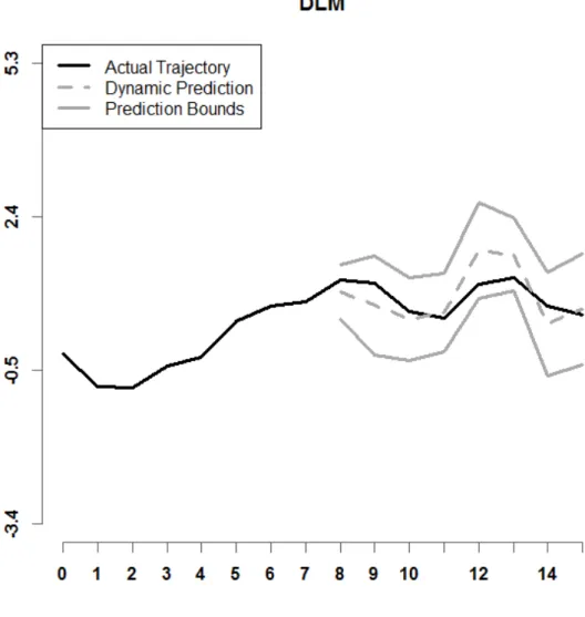
Figure 6. Shown above is a prediction interval for DLM, with r = 8, n = 25, setting A. Model (4) is used.
Figure 7. Depicted is a prediction interval for DPFR, with r = 8, n = 25, setting A. Model (4) is used.
Figure 8. Illustrated is a prediction interval for DPFFR, with r = 8, n = 25, setting A. Model (4) is used.
Figure 9. Shown above is a prediction interval for dynamic_FLR, with r = 8, n = 25, and Setting A. Model (4) is used.
Figure 10. Shown above is a prediction interval for dynupdate, with r = 8, n = 25, and Setting A. Model (4) is used.
Examples of prediction intervals for all six dynamic prediction methods examined in this paper are shown in Figures 5 through 10. Model (4) is used. The lower and upper bounds are depicted as solid dark grey curves. The historical functional data for a specified sample 𝑖𝑖 is shown as a solid black curve. The predicted trajectory is depicted as a dashed dark grey curve. It can be observed that the prediction interval for DPFFR has a stable width that contains the true trajectory of the curve. For this particular curve, it can also be
observed that the true trajectory of the curve was contained within all of the prediction intervals, except for the prediction interval generated by dynupdate.
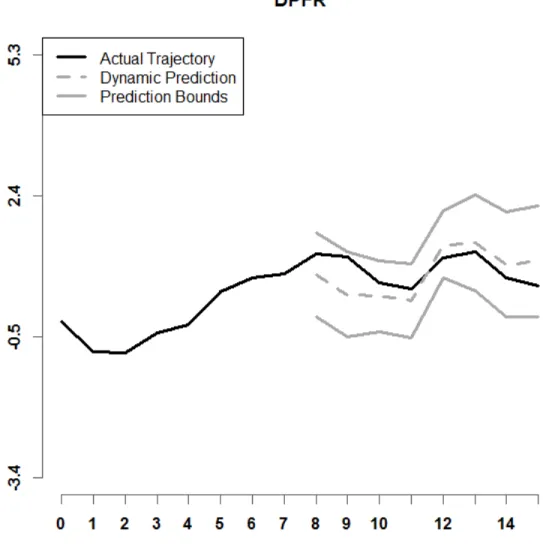
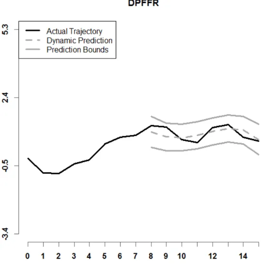
The next set of figures depict prediction intervals for all six dynamic prediction methods for a simulated dataset using model (1) and setting A, with n = 25 curves and cutoff point r = 8.
Figure 11. Shown above is a prediction interval for BENDY, with r = 8, n = 25, and Setting A. Model (1) is used.
Figure 12. Depicted is a prediction interval for DLM, with r = 8, n = 25, and Setting A. Model (1) is used.
Figure 13. Depicted is a prediction interval for DPFR, with r = 8, n = 25, and Setting A. Model (1) is used.
Figure 14. Illustrated is a prediction interval for DPFFR, with r = 8, n = 25, and Setting A. Model (1) is used.
Figure 15. Shown above is a prediction interval for dynamic_FLR, with r = 8, n = 25, and Setting A. Model (1) is used.
Figure 16. Depicted is a prediction interval for dynupdate, with r = 8, n = 25, and Setting A. Model (1) is used.
Figures 11 through 16 display examples of prediction intervals for all six dynamic prediction methods for one simulated dataset, using model (1), which includes two functional predictors and two scalar covariates. It can be seen in Figure 14 that the width of the DPFFR prediction interval is consistently narrow, and the DPFFR prediction interval contains the true trajectory of the curve. In Figure 16, the lower prediction interval bound for dynupdate partially overlaps with the true trajectory of the curve, which indicates that
in this case, the prediction interval was close to not containing the true trajectory of the curve. The other prediction intervals shown all contained the true trajectory of the curve.
5.3. Simulation Results
For every combination of simulation settings, model (4) was used to generate 100 simulated datasets. The number of curves 𝑛𝑛, cutoff point 𝑟𝑟, confidence level 𝐶𝐶=
100(1− 𝛼𝛼)%, and data structure setting were changed across the different simulation
scenarios. The results for specific cases are summarized in the tables below, which show the metrics of interest for each case. All simulated cases can be viewed in the Appendix.
5.3.1. Increasing the Sample Size
The number of curves 𝑛𝑛 was varied across the different simulation scenarios that were considered in this thesis. The table below displays the metrics for a simulated case where the number of curves was increased from 𝑛𝑛 = 25 to 𝑛𝑛= 50.
Table 2. Simulation Results for increasing the number of curves from n = 25 to n = 50. Results are for setting A, C = 95%, r = 8. Model (4) is used.
n = 25 n = 50
Method IMPE AC AW CPU IMPE AC AW CPU
BENDY 0.15 0.95 1.58 0.97 0.14 0.95 1.46 1.77 DLM 0.16 0.95 1.76 1.38 0.07 0.95 1.10 2.53 DPFR 0.19 0.89 1.36 5.72 0.13 0.90 1.19 10.92 DPFFR 0.09 0.94 1.16 7.38 0.09 0.94 1.09 14.08 Dynamic_FLR 0.17 0.97 2.28 12.24 0.14 0.96 1.87 29.79 dynupdate 0.10 0.69 0.63 21.04 0.12 0.70 0.70 70.10
It can be observed in Table 2 that, for this case, as the number of curves increased, the IMPE either decreased or remained the same for all dynamic prediction methods except dynupdate. Similarly, as the number of curves increased, the AW of the prediction intervals decreased for most of the dynamic prediction methods. Additionally, as the number of curves increased, the CPU time for each dynamic prediction method increased, which makes sense, as increasing the number of curves would cause the methods to take longer to run. Similar results were noticed when examining other simulated cases; in the other cases observed in this thesis, when the number of curves increased, the IMPE, AW, and CPU responded as described here. Other cases may be viewed in the Appendix (Table A1 for IMPE, Tables A2 – A4 for some other cases).
5.3.2. Changing the Data Structure
The data structure was also varied across the different simulation scenarios A and B.
Table 3. Simulation Results for changing the data structure from Setting A to Setting B. Results are for n=25, C = 95%, r = 8. Model (4) is used.
Setting A Setting B
Method IMPE AC AW CPU IMPE AC AW CPU
BENDY 0.15 0.95 1.58 0.97 0.59 0.95 3.16 0.88 DLM 0.16 0.95 1.76 1.38 0.16 0.95 1.76 1.25 DPFR 0.19 0.89 1.36 5.72 0.37 0.82 1.57 5.05 DPFFR 0.09 0.94 1.16 7.38 0.09 0.94 1.15 5.71 Dynamic_FLR 0.17 0.97 2.28 12.24 2.34 0.95 7.15 8.97 dynupdate 0.10 0.69 0.63 21.04 1.61 0.84 3.70 12.52
Table 3 shows that for this simulated case, when the data structure is changed from Setting A to Setting B, the IMPE increases for all methods except DPFFR, which has the same IMPE in both data structures. When the data structure is changed from Setting A to Setting B, the AW also increases for most methods, except for DPFFR. The AC remains at a similar level for BENDY, DLM, DPFFR, and dynamic_FLR for both Setting A and Setting B. For n = 25 curves, changing the setting did not greatly impact the CPU time. These trends were noticed in the simulated cases that were checked in this thesis, and more detailed tables on these simulated cases can be found in the Appendix (Table A1 for IMPE, Tables A2 – A4 for AC, AW, and CPU for other cases).
5.3.3. Increasing the Confidence Level
The confidence level was varied throughout the different simulation scenarios that were considered. It was of interest to see if any of the metrics changed when the confidence level C increased.
Table 4. Simulation Results for changing the confidence level from C=90% to C=95%. Results are for n=25, Setting A, r = 11. Model (4) is used.
C = 90% C = 95% Method AC AW AC AW BENDY 0.90 2.35 0.94 2.84 DLM 0.90 2.94 0.95 3.97 DPFR 0.84 1.15 0.92 1.47 DPFFR 0.95 1.00 0.99 1.27 Dynamic_FLR 0.92 2.81 0.96 3.35 dynupdate 0.56 0.79 0.63 0.93
Table 4 displays the AC and AW from a simulated case with n = 25 curves, Setting A, and r = 11. It can be seen that in this simulated case, when the nominal coverage level increased, the AW increased for all methods. Since the AW of the prediction intervals increased, there was a corresponding increase in the AC, as wider intervals would have greater coverage. Changes in the nominal coverage level did not have any impact on the IMPE. These trends are also observable in all of the other cases that were simulated for the purpose of this thesis, and more detailed tables on these simulated cases for model (4) can be found in Tables A2-A4 in the Appendix.
5.3.4. Changing the Cutoff Point, R
Two values for the cutoff point were considered for simulations. Several cases were simulated with r = 8, and the remaining cases were simulated with r = 11. It was of interest to see how the metrics changed when the cutoff point r increased.
Table 5. Simulation Results for increasing the cutoff point from r = 8 to r = 11. Results are for n=50, C = 95%, Setting B. Model (4) is used.
r = 8 r = 11
Method IMPE AC AW IMPE AC AW
BENDY 0.55 0.95 2.95 2.38 0.95 6.13 DLM 0.07 0.95 1.10 0.09 0.95 1.20 DPFR 0.25 0.82 1.31 0.49 0.79 1.58 DPFFR 0.09 0.94 1.08 0.06 0.99 1.21 Dynamic_FLR 2.01 0.95 6.53 6.58 0.95 11.76 dynupdate 1.71 0.86 4.12 5.82 0.92 8.87
Table 5 displays the IMPE, AC, and AW from a simulated case with n = 50 curves, Setting B, and C = 95%. In this simulated case, when the cutoff point increased from r = 8 to r = 11, the IMPE increased for all methods, except DPFFR. The AC for DPFFR and dynupdate increased when r increased for this case. It should also be noted that the AW of the prediction intervals increased when the cutoff point increased from r = 8 to r = 11. This case is an example of a pattern that was noticed throughout the simulated cases. Throughout the cases that were simulated, when the cutoff point was increased from r = 8 to r = 11, the AW tended to increase, and the AC for DPFFR tended to increase as well. For the detailed metrics on the model (4) simulated cases, see Tables A1-A4 in the Appendix.
5.3.5. Adding Scalar Covariates
Simulations were also conducted for model (1), which includes the two scalar covariates 𝑊𝑊𝑖𝑖1 =𝐼𝐼{𝑈𝑈[0,1]≥ 0.75} and 𝑊𝑊𝑖𝑖2~𝑁𝑁(0,0.12) in addition to the two functional predictors 𝑌𝑌𝑖𝑖(𝑡𝑡) and 𝑍𝑍𝑖𝑖(𝑡𝑡). Model (1) is given by:
𝑌𝑌𝑖𝑖(𝑡𝑡̃) =𝑊𝑊𝑖𝑖1𝛾𝛾1+𝑊𝑊𝑖𝑖2𝛾𝛾2+𝜁𝜁(𝑡𝑡̃) +�𝑌𝑌𝑖𝑖(𝑡𝑡)β(t̃, t)
Τ 𝑑𝑑𝑡𝑡+�𝑍𝑍Τ 𝑖𝑖(𝑡𝑡)𝛿𝛿(t̃, t)𝑑𝑑𝑡𝑡+𝜖𝜖𝑖𝑖(t̃). (1)
It was of interest to see how the metrics changed when the scalar covariates were added to the model. The table below compares metrics between model (4), which has two functional covariates and no scalar covariates, and model (1), which has two functional covariates and two scalar covariates.
Table 6. Simulation Results for adding scalar covariates to the model. Results are for n=25, r=11, C = 95%, Setting A.
Model (4) Model (1)
Method IMPE AC AW IMPE AC AW
BENDY 0.52 0.94 2.84 0.57 0.95 3.00 DLM 0.55 0.95 3.97 3.93 0.95 26.66 DPFR 0.19 0.92 1.47 0.52 0.81 1.89 DPFFR 0.07 0.99 1.27 0.07 0.99 1.30 Dynamic_FLR 0.48 0.96 3.35 0.74 0.95 4.02 dynupdate 0.27 0.63 0.93 0.43 0.64 1.22
When the scalar covariates were considered, there were some changes in the metrics reported. In this simulated case, adding the scalar covariates to the simulation model resulted in an increase in the IMPE for all methods except DPFFR, as Table 6 indicates. When the scalar covariates were added to the model, the AW increased as well; in general, the increase widths can be observed in the tables in the Appendix. The increase in AW for DPFFR was relatively small, while other methods showed a more substantial increase. Adding the scalar covariates did not have any significant impact on the AC for most of the methods. The exceptions to this are DPFR and dynupdate. For all cases simulated in this thesis, the coverage for DPFR decreased when the scalar covariates were added.
Adding the covariates to the model did not have a large impact on the patterns that were observed when changing the sample size, data structure, confidence level, and cutoff point. When 𝑛𝑛 increased from 25 to 50, the IMPE decreased for all methods, and the AW
decreased for all methods except dynupdate. When the data structure was changed from setting A to setting B, the AW increased for BENDY, dynamic_FLR, and dynupdate, while it remained relatively similar for the other methods. Going from setting A to setting B increased the AC of dynupdate, but had little impact on the AC for the other methods. When the confidence level increased from 90% to 95%, the AC and AW of the prediction intervals increased as expected. When 𝑟𝑟 increased from 8 to 11, the IMPE increased for all methods except DPFFR, which decreased. Overall, DPFFR had very low IMPE in the model (1) and model (4) cases, it maintained consistent AW, and it had AC that was close to the desired confidence level. For almost all simulated cases, DPFFR had a CPU time that was lower than those of dynamic_FLR and dynupdate, yet slightly larger than the CPU time for DPFR. Among the dynamic prediction methods that treat the predicted response as a function (DPFFR, dynamic_FLR, and dynupdate), DPFFR performed comparatively well in these simulated cases and was preferred. For detailed metrics on the model (1) simulated cases, see Tables A5-A8 in the Appendix.
6. Application to Financial Stock Data
The dynamic prediction methods were used to analyze data on monthly stock highs from two well-known companies: Microsoft (abbreviated as MSFT) and IBM. The data from Microsoft (Microsoft Historical Prices, 2016) and IBM (IBM Historical Prices, 2016) were obtained from an online database provided by Yahoo Finance. The monthly high stock price is the maximum value that the stock was known to have for a given month. From 1987 to 2015, the monthly high stock price for IBM and MSFT for each month was recorded, resulting in 12 data points per year for 29 years. Therefore, for this application, the sample size is n = 29, and the number of points M for the time domain is 12. This type
of data is known as time series functional data (Shang and Hyndman, 2016). At the outset of this application, the response 𝑌𝑌𝑖𝑖(𝑡𝑡) is taken to be the MSFT stock high during month 𝑡𝑡 of year 𝑖𝑖. Note that for the DPFFR method, the IBM monthly stock highs were taken to be the functional covariates 𝑍𝑍𝑖𝑖(𝑡𝑡).
Figure 17. Shown is the raw data for MSFT Stock Highs over n = 29 years for each month.
Figure 17 displays the raw data on Microsoft stock highs. The black curve is the mean curve (Ramsay and Silverman, 2005; Ramsay et al., 2017), which displays the average MSFT stock high for each month. The mean curve remains relatively constant as the
months progress, while individual curves display variability with respect to the mean functional curve. Figure 18 displays the same information for the IBM stock highs. The mean function for the IBM stock highs shows a slight increase after month 7.
Figure 18. Shown is the raw data for IBM Stock Highs over n = 29 years for each month.
The variance of the IBM and MSFT data was analyzed using Functional Principal Components Analysis (FPCA). FPCA can be used to obtain estimates of the functional data curves, denoted as 𝑌𝑌�𝑖𝑖(𝑡𝑡). Once the estimates are known, the error terms can be estimated as 𝜖𝜖̂𝑖𝑖(𝑡𝑡) =𝑌𝑌�𝑖𝑖(𝑡𝑡)− 𝑌𝑌𝑖𝑖(𝑡𝑡), and then the variance of the error terms can be estimated. FPCA was used in this study to obtain an estimate of 𝑉𝑉𝑉𝑉𝑟𝑟{𝜖𝜖𝑖𝑖(𝑡𝑡̃)}, so that prediction intervals could be obtained. This method considers the covariance V at two time points t and s, and states that the covariance can be decomposed in the following manner:
𝑉𝑉(𝑡𝑡,𝑠𝑠) = � 𝑑𝑑𝑘𝑘𝜉𝜉𝑘𝑘(𝑡𝑡)𝜉𝜉𝑘𝑘(𝑠𝑠) 𝐾𝐾
𝑘𝑘=1
,
where the 𝑑𝑑𝑘𝑘 are eigenvalues and the 𝜉𝜉𝑘𝑘 are eigenfunctions. Here, 𝐾𝐾 is the number of functional principal components that the covariance is decomposed into. Each 𝑑𝑑𝑘𝑘 gives the amount of variation in the direction of 𝜉𝜉𝑘𝑘(𝑡𝑡), and 𝑑𝑑𝑘𝑘
∑ 𝑑𝑑𝑘𝑘 yields the proportion of variance explained by the 𝑘𝑘𝑡𝑡ℎ functional principal component.
Then, by the Karhunen-Loève Theorem, the functional samples can be reconstructed as:
𝑌𝑌𝑖𝑖(𝑡𝑡) =𝜇𝜇(𝑡𝑡) +� 𝑓𝑓𝑘𝑘 ∞ 𝑘𝑘=1
𝜉𝜉𝑘𝑘(𝑡𝑡),
where 𝜇𝜇(𝑡𝑡) is the mean function, and the coefficients 𝑓𝑓𝑘𝑘 and eigenfunctions 𝜉𝜉𝑘𝑘(𝑡𝑡) are obtained from the covariance decomposition in FPCA. In practice, it is sufficient to select the first K principal components, if most of the variance is explained by them, since a finite number of principal components is needed for estimation of the curves. Once K is selected, the curves 𝑌𝑌𝑖𝑖(𝑡𝑡) may be estimated as:
𝑌𝑌�𝑖𝑖(𝑡𝑡) =𝜇𝜇̂(𝑡𝑡) +� 𝑓𝑓𝑘𝑘 𝐾𝐾 𝑘𝑘=1
𝜉𝜉̂𝑘𝑘(𝑡𝑡).
After the FPCA breakdown for variance was performed, it was revealed that the first functional principal component explained 97.7% of the variance, the second component explained 1.5% of the variance, and the third component explained 0.6% of the variance (Ramsay and Silverman, 2005; Ramsay et al., 2017; Goldsmith et al., 2017). Together, the first three components explain 99.8% of the variance. Since the first functional principal component explains so much of the variance, it would be sufficient to include only the first principal component or only the first two principal components, but for completeness, the first three principal components were provided.
Figure 19. Illustrated are the first three principal components for Microsoft (MSFT) data (PC1, PC2, and PC3, respectively).
PC1 was a main vertical shift depicted in the above figure. It represents a relatively constant vertical shift in the MSFT stock highs from year to year. PC2 contrasts the beginning of the year with the end of the year. PC3 represents a minor (0.6% of variability explained) seasonal effect on the monthly stock highs.
6.2. Results in Data Analysis
Methods DPFFR, dynamic_FLR (Shang, 2015; Shang and Hyndman, 2016), and dynupdate (Shang, 2015; Shang and Hyndman, 2016) were used on this data to predict the monthly stock highs for Microsoft after two cutoff points (r = {4,5}) in this application. These three dynamic prediction methods were selected because it was of interest to treat the predicted monthly stock highs for Microsoft as functions. The results were analyzed using the metrics outlined in the Methods section. The results are summarized in Table 7.
Table 7. IMPE for three dynamic prediction methods, with r = {4,5}.
Method IMPE DPFFR 324.256 (r = 4) 379.758 (r = 5) dynamic_FLR 436.981 (r = 4) 517.657 (r = 5) dynupdate 797.374 (r = 4) 814.085 (r = 5)
Figure 20. Depicted is a graph of the IMPE, by month, when the cutoff point r = 4.
Results of the application indicate that the IMPE was lower for DPFFR than the other two methods (Figure 20). Additionally, the IMPE seems to increase for months towards the end of the year. One can observe that for all months after month 5 (May), the IMPE of DPFFR is less than or equal to the IMPE for the other two methods (Figure 21). The IMPE is smaller at months close to the cutoff point r.
Figure 21. Depicted is a graph of the IMPE, by month, when the cutoff point r = 5.
The next two figures depict dynamic predictions for the MSFT stock highs in a specific year using DPFFR, for cutoff points r = 4 and r = 5. In Figure 22 and Figure 23, we display some examples of dynamic predictions where the predicted trajectories of the MSFT stock highs according to DPFFR are indicated by dashed lines. DPFFR dynamic predictions were close to the actual trajectories.
Figure 22. Depicted is a graph of a DPFFR prediction of the MSFT stock high for a specific year, when r = 4.
Figure 23. Depicted is a graph of a DPFFR prediction, for a different curve, of the MSFT stock highs when r = 5.
The Intramonthly Stock Returns are a measure of stock performance (Shang, 2015) and were considered for analysis. For this phase of the analysis, the IBM stock highs from 1987 to 2015 were predicted (with the MSFT stocks as predictive information for DPFFR). To perform this kind of analysis, the following transformation (Shang, 2015) is applied to the data:
𝑅𝑅𝑖𝑖(𝑡𝑡) = 100∗ �ln�𝑌𝑌𝑖𝑖(𝑡𝑡)� −ln�𝑌𝑌𝑖𝑖(1)��.
𝑅𝑅𝑖𝑖(𝑡𝑡) is the return for the IBM stock in year 𝑖𝑖 and month 𝑡𝑡. The return can be
thought of as the increase in the value of a stock relative to its price during the first month of the year. Here, 𝑌𝑌𝑖𝑖(𝑡𝑡) is the IBM stock high during month 𝑡𝑡 of year 𝑖𝑖.𝑌𝑌𝑖𝑖(1) is the IBM stock high during the first month of year 𝑖𝑖. Note that it only makes sense to consider 𝑅𝑅𝑖𝑖(𝑡𝑡) over the domain 𝑡𝑡 ∈{2,3, … ,𝑀𝑀}, as 𝑅𝑅𝑖𝑖(1) = 0.
Table 8. Average Coverage (AC), Average Width (AW), and CPU Time for three dynamic prediction methods, C = 95% confidence, n = 29 curves, with cutoff point r = 7.
Method AC AW CPU Time
DPFFR 0.897 46.446 10.40
dynamic_FLR 0.940 54.198 11.90
Dynupdate 0.897 41.780 25.31
DPFFR has a faster run time than dynamic_FLR and dynupdate. As far as coverage is concerned, DPFFR performs just as well as dynupdate, and it is relatively similar to dynamic_FLR. The prediction intervals for dynamic_FLR had the largest width out of the three methods. DPFFR had an actual coverage relatively close to the nominal level of 95% for this data.
Figure 24. Depicted is a graph of mean prediction interval width for each of the three methods, with cutoff point r = 7 (August).
Figure 25. Depicted is a graph of prediction interval coverage for three dynamic prediction methods, for cutoff point r = 7 (August).
The width of DPFFR is relatively constant throughout the months. In September DPFFR had coverage that was greater than the coverage of the other methods, while in November, DPFFR had the lowest coverage. In October, DPFFR and dynupdate have the same mean coverage (the icons overlap). The methods all have mean coverages at or above 0.85 during September, October, and December.
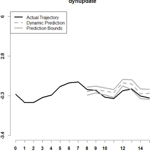
Figure 26. Shown above is a graph of a DPFFR prediction interval for the Intramonthly Stock Returns for IBM for a given year, when r = 7 and C = 95% confidence.
Figure 27. Shown above is a graph of a dynamic_FLR prediction interval for the Intramonthly Stock Returns for IBM for a given year, when r = 7 and C = 95% confidence.
Figure 28. Shown above is a graph of a dynupdate prediction interval for the Intramonthly Stock Returns for IBM for a given year, when r = 7 and C = 95% confidence.
Figures 26 – 28 show prediction intervals for the Intramonthly Stock Returns for MSFT in the year 2000. The black lines in each panel indicate the actual stock returns. The dashed gray lines indicate the dynamic predictions that each of the methods obtained, and the solid gray lines are the lower and upper bounds of the prediction intervals by the respective methods. Note that the prediction interval for DPFFR maintains a consistent width and the actual monthly stock highs are included in the DPFFR prediction interval.