A Dissertation by
DEREK ROBERT OVERBY
Submitted to the Office of Graduate Studies of Texas A&M University
in partial fulfillment of the requirements for the degree of DOCTOR OF PHILOSOPHY
December 2011
A Dissertation by
DEREK ROBERT OVERBY
Submitted to the Office of Graduate Studies of Texas A&M University
in partial fulfillment of the requirements for the degree of DOCTOR OF PHILOSOPHY
Approved by:
Chair of Committee, John Keyser Committee Members, Selma Childs
Frank Shipman Jim Wall
Vinod Srinivasan Head of Department, Duncan Walker
December 2011
ABSTRACT
View-Dependent Visualization for Analysis of Large Datasets. (December 2011) Derek Robert Overby, B.S., Texas A&M University;
M.S., Texas A&M University
Chair of Advisory Committee: Dr. John Keyser
Due to the impressive capabilities of human visual processing, interactive visualiza-tion methods have become essential tools for scientists to explore and analyze large, com-plex datasets. However, traditional approaches do not account for the increased size or latency of data retrieval when interacting with these often remote datasets. In this disser-tation, I discuss two novel design paradigms, based on accepted models of the information visualization process and graphics hardware pipeline, that are appropriate for interactive visualization of large remote datasets. In particular, I discuss novel solutions aimed at improving the performance of interactive visualization systems when working with large numeric datasets and large terrain (elevation and imagery) datasets by using data reduction and asynchronous retrieval of view-prioritized data, respectively.
First I present a modified version of the standard information visualization model that accounts for the challenges presented by interacting with large, remote datasets. I also provide the details of a software framework implemented using this model and discuss several different visualization applications developed within this framework.
Next I present a novel technique for leveraging the hardware graphics pipeline to provide asynchronous, view-prioritized data retrieval to support interactive visualization of remote terrain data. I provide the results of statistical analysis of performance metrics to demonstrate the effectiveness of this approach.
evaluating these systems using controlled user studies and expert evaluation. The results of these qualitative and quantitative evaluation mechanisms demonstrate improved visual analysis task performance for large numeric datasets.
ACKNOWLEDGMENTS
I would like to acknowledge all my friends and colleagues, who have inspired and assisted with portions of this work. Contributions by Blake Stoker, Eric Landreneau, Larkin O’hern, and Abhishek Bhor are especially appreciated.
NOMENCLATURE
bpp bits per pixel
CADRG Compressed Arc Digital Raster Graphics
CC COP Currency
CIB Controlled Image Base CMV coordinated multiple view COP Common Operating Picture DTED Digital Terrain Elevation Data EMS electro-magnetic spectrum FBO frame buffer object
GEF Graphical Editing Framework GPGPU general-purpose GPU
GPU graphics processing unit HSCB human social-cultural behavior LOD level-of-detail
MCR Message Completion Rate
MILCs Multi-dimensional In-depth Long-term Case studies NGA National Geospatial-Intelligence Agency
ProDV Process-Oriented Data Visualization RPF Raster Product Format
RTCA real-time casualty assessment SA situational awareness
SAGAT Situational Awareness Global Assessment Technique SART Situational Awareness Rating Technique
SDK software development kit SoS Speed-of-Service
STV Spatio-Temporal Visualizer TLM topographic line map TSA team situational awareness
VDPM view-dependent progressive mesh VTK Visualization Toolkit
TABLE OF CONTENTS
CHAPTER Page
I INTRODUCTION . . . 1
A. Problem Statement . . . 1
B. Approach . . . 3
1. A Framework for Interactive Visualization Systems . . . . 3
2. View-Prioritized Data Retrieval . . . 4
3. Applications . . . 5
a. Glyph Visualization for Interactive Analysis of Temporal Data . . . 6
b. Interactive Analysis of Situational Awareness Data . . 6
C. Summary . . . 7
II BACKGROUND . . . 9
A. Information Visualization . . . 10
1. Reference Models . . . 10
2. Evaluation of Visualization Techniques . . . 12
3. Visual Analytics . . . 13
B. Visualization Techniques . . . 14
1. Glyph Visualization . . . 14
2. Temporal Visualization . . . 15
3. Existing Visualization Systems . . . 16
C. Terrain Rendering . . . 18
D. Graphics Hardware . . . 20
E. Situational Awareness . . . 22
III A FRAMEWORK FOR INTERACTIVE VISUALIZATION OF LARGE NUMERIC DATASETS . . . 24
A. Approach . . . 24 1. User Environment . . . 28 2. Requirements . . . 29 3. Framework . . . 29 4. Framework Components . . . 30 5. Dataflow Interface . . . 33 6. Visualization Interface . . . 34
7. Implementation Summary . . . 34
B. Case Studies . . . 35
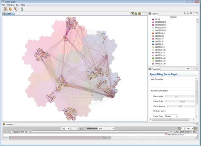
1. Network Analysis . . . 36
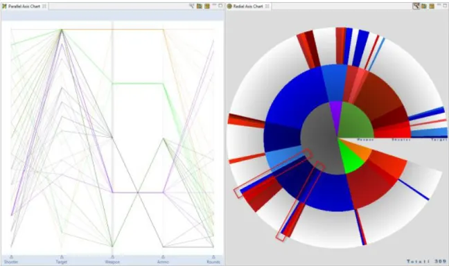
2. Engagement Analysis . . . 39
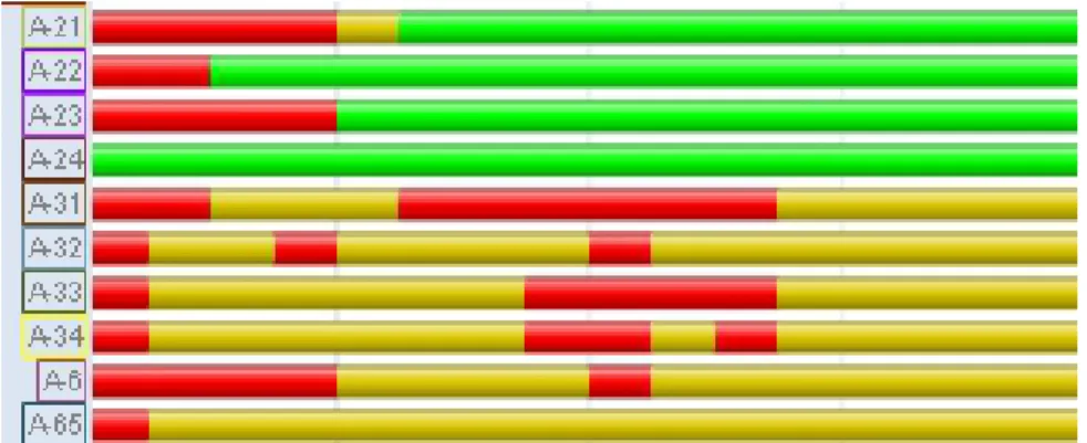
3. Sensor Performance Analysis . . . 42
a. Temporal Anomalies and Pattern Recognition . . . . 43
b. Data Collection Analysis . . . 43
4. Geospatial Analysis . . . 43
5. COP Currency . . . 45
C. Evaluation . . . 46
1. Individual Visualization Evaluation . . . 48
2. Expert Training Evaluation . . . 48
3. Expert Opinion . . . 49 D. Collaborative Analysis . . . 50 1. Annotations . . . 50 2. Content Sharing . . . 51 3. Evaluation . . . 51 E. Ongoing Work . . . 52
IV ASYNCHRONOUS VIEW-DEPENDENT STRATEGY FOR SPATIAL DATA . . . 53
A. Problem Description . . . 54
B. Proposed Method . . . 55
C. Implementation . . . 57
1. RPF/DTED Data Structures . . . 58
a. Raster Product Format . . . 58
b. Digital Terrain Elevation Data . . . 58
c. Retrieval Latency . . . 59
2. Scene Layout . . . 59
3. Texture Memory Objects . . . 60
a. Elevation Data . . . 60 b. Raster Data . . . 62 4. Indexing Techniques . . . 62 a. Mipmap Indexing . . . 63 5. Loading Indexes . . . 64 6. Rendering . . . 66 7. Processing Output . . . 68 8. Prioritization functions . . . 69
CHAPTER Page a. Memory Management . . . 70 D. Results . . . 71 1. Performance . . . 72 E. Ongoing Work . . . 84 V APPLICATIONS . . . 86
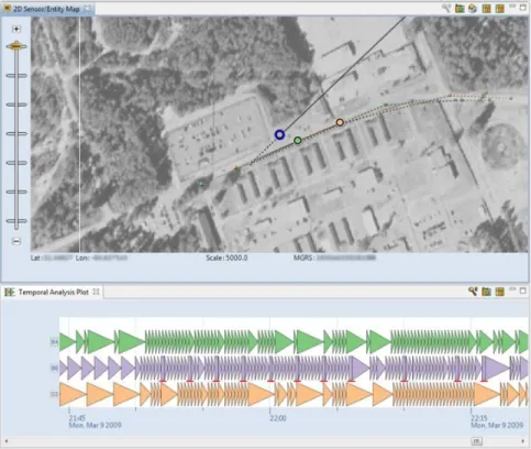
A. Glyph Visualization for Temporal Analysis of Spatial Sensor Activity . . . 86 1. Proposed Method . . . 89 a. Input Data . . . 89 b. Design Rationale . . . 90 c. Rendering Details . . . 91 d. Interaction . . . 94 2. Implementation . . . 95
a. Input Data Format . . . 95
3. Evaluation . . . 96
a. Temporal Analysis . . . 96
b. Spatial and Temporal Analysis . . . 98
4. Results . . . 99
a. Scoring Method . . . 99
b. Experimental Evaluation . . . 100
c. Temporal Analysis Study . . . 101
d. Spatial and Temporal Analysis Study . . . 101
e. Anomaly Detection . . . 102
f. Expert Opinion . . . 105
g. Summary . . . 106
5. Future Work and Conclusion . . . 107
B. Situational Awareness . . . 109 1. Proposed Method . . . 111 a. Temporal Metric . . . 111 b. Spatial Metric . . . 112 2. Implementation . . . 114 a. Data Processing . . . 115 b. Visualization . . . 115 c. Interaction . . . 119 3. Analysis . . . 120 a. Temporal Analysis . . . 120 b. Spatial Analysis . . . 121
c. System Performance Analysis . . . 122 4. Results . . . 126 5. Conclusion . . . 127 VI CONCLUSIONS . . . 128 A. Statement of Contributions . . . 128 B. Future Work . . . 129 REFERENCES . . . 133 APPENDIX A . . . 143 VITA. . . 147
LIST OF FIGURES
FIGURE Page
1 A depiction of the information visualization reference model,
origi-nally proposed by Jock Mackinlay, Stuart Card, and Ben Shneiderman [8]. 11 2 A simplified depiction of the data state model, originally proposed by
ed Chi [10]. . . 12 3 The major traditional components of a fixed-function graphics pipeline. . . 21 4 The proposed framework is based on a modification of the existing
information visualization model. . . 25 5 The ProDV framework architecture definesdata sources, data
oper-ators, processing modules, cached intermediate data, and
visualiza-tionsto provide a simple visual abstraction of the visualization pipeline. . 31 6 ProDV Dataflow Editor interface. . . 33 7 An example interactive network analysis application similar to one
built by domain experts using ProDV to validate data collected during
a distributed simulation. . . 37 8 Network cluster analysis application built using ProDV. . . 38 9 Example of kinetic engagement analysis using a parallel coordinate
plot and a radial chart. . . 40 10 Non-kinetic engagement analysis. . . 41 11 Example of custom temporal pattern analysis visualization showing
temporal activity patterns exhibited by a network of spatial sensors. . . 42 12 Data collection system analysis results shown in an interactive state plot. . 44 13 Spatial sensor performance analysis application. . . 45 14 COP currency visualization. . . 47
15 The proposed method leverages the architecture of the graphics hard-ware pipeline to efficiently view-prioritize data requests by aligning index data into texture memory and rendering data indices into an off-screen frame buffer object (FBO) by simply swapping out the
frag-ment program but not swapping texture memory. . . 56 16 DTED memory structure. . . 61 17 RPF memory structure. . . 63 18 A 24-bit index is split into three 8-bit components in order to be stored
in multiple mipmap levels. . . 65 19 This separate texture memory object is similar in structure to the
elevation texture object shown in Figure 16. . . 66 20 In this example the application is currently retrieving the set of
viewable imagery tiles for a cartographic map over the viewable area. . . . 71 21 In this experiment I vary the latency of tile retrieval by querying a
local database. . . 73 22 In this experiment I vary the latency of tile retrieval by querying a
remote database accessed via an Ethernet LAN. . . 74 23 In this experiment I vary the latency of tile retrieval by querying a
remote databases accessed via a network with artificial latency. . . 75 24 In this experiment I rendered a DTED1 resolution terrain grid
(ap-proximately 1.4 million vertices). . . 78 25 In this experiment I rendered a DTED2 resolution terrain grid
(ap-proximately 13 million vertices).. . . 79 26 In this experiment I rendered a 1:25K resolution topographic line map
(TLM).. . . 81 27 In this experiment I rendered 1:1m resolution satellite imagery. . . 82 28 Example of our terrain rendering application embedding within a
FIGURE Page 29 Temporal activity patterns exhibited by a network of spatial sensors. . . . 87 30 Example of existing methods similar in capability to our domain
experts’ previous analysis technique. . . 88 31 Details of our row-based glyph rendering method. . . 92 32 Example of the proposed method at different scales. . . 93 33 Example of the simplified version of our method used for evaluative
comparison. . . 98 34 Example showing an expected coordinated failure due to system
maintenance on the first seven rows compared to erratic failures on
the bottom row. . . 103 35 Spatial anomaly (shown by diverging path) and temporal pattern (red
marks have been added to highlight below second row). . . 104 36 Example of sensor activity patterns in a line graph (a) and our method
(c) shown next to an interactive map (b). . . 106 37 Variation in temporal patterns produced by three different types of
sensors attached to the same individual. . . 107 38 Example showing five days of data from 102 sensors of three different types.108 39 The COP currency temporal metric is shown in this example in the
line graph at the bottom of the coordinated view. . . 113 40 The geospatial display at the top of this coordinated view shows the
violation areas identified by the spatial metric. . . 114 41 Data structure for computing COP currency metrics. . . 116 42 Interactive line graph showing temporal COP currency metric. . . 117 43 This COP currency visualization example shows a group of
44 COP currency spatial metric visualization examples in which areas with both sender and receiver COP currency threshold violations are
highlighted in red. . . 119 45 In this example we see a local decrease in COP currency (selected
brown unit is highlighted for readability) in (a) in which only one individual system seems to experience a dramatic failure to maintain
accurate SA data. . . 121 46 In this example we observe a group of five individuals involved in a
coordinated activity. . . 123 47 Custom visualization of spatial sensor reporting activity aids in the
identification of sensors in motion.. . . 124 48 In this example, an observation group is stationed to the left while a
LIST OF TABLES
TABLE Page
I Visualization System Capability Comparison . . . 27
II Latency Experiment Results . . . 76
III Geometry Experiment Results . . . 80
IV Resolution Experiment Results . . . 83
V Temporal Study Results . . . 101
CHAPTER I
INTRODUCTION
The visualization and analysis of large, complex datasets is a challenge for many researchers and scientists. Due to the impressive capabilities of human visual processing, interactive visualization methods have become essential tools for scientists to explore and analyze these datasets. However, traditional approaches to implementing visualization software are often not designed to deal effectively with either the size or latency of data retrieval when interacting with large (often remote) datasets. And while reference models for the design of visualization systems do exist, these models do not account for dealing with large remote datasets that have become prevalent in so many scientific domains. In this dissertation I will discuss two novel design paradigms, based on accepted models of the information visualization process and graphics hardware pipeline, that are appropriate for interactive visualization of large remote datasets. In particular, I discuss novel solutions aimed at improving the performance of interactive visualization systems when working with large numeric datasets and large terrain (elevation and imagery) datasets by using data reduction and asynchronous retrieval of view-prioritized data, respectively. I also present the details of three visualization applications implemented using the proposed techniques, and the results of evaluating these applications using controlled user studies, statistical analysis of performance metrics, and expert evaluation.
A. Problem Statement
In many government, academic, and industrial domains today the task of extracting timely and relevant information from large datasets poses great challenges to many applications.
In the military community large datasets are routinely collected during testing and training events involving both simulation and sensor data collected over long periods of time, in addition to large amounts of network data. However many currently used visualization applications do not account for the need to interact with large, remote datasets. Therefore novel techniques that improve interaction when working with such datasets are needed.
While traditional methods can provide us the ability to visualize these datasets, the ability to maintain interactive rates for direct manipulation interactions using standard visualization methods often decreases as the size of the dataset increases. Also, the latency of retrieving the data may be unknown and may exhibit a large degree of variation, depending on the network environment. I this dissertation I explore modifications to existing visualization models aimed at optimizing visualization implementations when dealing with two specific classes of large datasets. This exploration is important because such models are used in the design and development of many modern visualization systems. I will focus my effort on the exploration of visualization system design within two distinct contexts that I have encountered in my work: large [several gigabytes (GB)] numeric datasets (often empirical data collected by electronic sensors) and extremely large [several terabytes (TB)] terrain imagery datasets, which are often by necessity stored remotely. Each visualization can usually optimize storage of its required data in a data structure that is significantly smaller than the source dataset. Therefore in this work I will discuss a modified design model that will enable multiple complex visualization techniques to be used by domain experts in the analysis of different types of numeric data. This approach allows the data reduction process to be specified by the user using an interactive dataflow model, and multiple interactive visualization techniques to be applied by efficiently segmenting reduced data. Second, when working with extremely large remote datasets (as is often the case with high-resolution terrain and imagery data), view-based prioritization of the retrieval of data is important to optimize both the visual representation
of the data and the use of limited local memory resources. Therefore I also propose and explore a technique that allows the modern graphics pipeline (often provided by accelerated graphics hardware) to easily view-prioritize remote data interactively and asynchronously load large amounts of terrain imagery.
B. Approach
My discussion of this research is organized into three main branches, corresponding to Chapters III–V. First, I will discuss a proposed framework for interactive visualization applications that allows visualization techniques to be applied to large datasets by requiring a data reduction model to be specified so that visualization algorithms can operate interactively using minimized blocks of numeric data. I will also describe and discuss how this proposed framework is implemented in an interactive visual programming environment that has been used to develop custom interactive visualization applications in a variety of domains. I will next describe the design of an interactive terrain visualization application that is optimized by efficiently computing a view-dependent prioritization of remote data. By loading data asynchronously, interactive exploration is not hindered by dataset size or latency. Finally, in order to demonstrate the success of practical applications using these techniques, I present the result of developing two novel interactive visualization techniques implemented with the proposed visualization framework, as well as user evaluation results and expert opinion.
1. A Framework for Interactive Visualization Systems
Researchers in the Visual Analytics community have developed custom software applica-tions for a variety of domains. In this section I will discuss work performed in conjunction with a U.S. government customer. The goal of this effort was to provide useful visual
ana-lytics capabilities to several distinct groups of data analysts. I developed a novel adaptation of the information visualization model that improves the performance and flexibility of cus-tom interactive visualization applications. I will show how the implementation framework based on this model, which includes an interactive visual programming environment, was used to develop several successful visualization applications. I will discuss the design of our approach, the observed results of experts using our software in several analysis cases, the development of a user-specified visual analysis requirements, and results of this work using multiple evaluation methodologies.
2. View-Prioritized Data Retrieval
Many efforts in science and technology have collected and archived massive amounts of data. While commercial entities have certainly collected vast amounts of imagery via satellite, certain spatial analysis tasks require much higher-resolution terrain topology and imagery. Analysis of near-earth RF propagation models is but one example; others exist within the domains of disaster recovery, military operations planning, and excavation operations. The introduction of commercially-available sensors that can provide such high-resolution data for a small area, as well as increased commercial satellite imagery and terrain resolution for certain areas makes this work particularly relevant. In this work I use high-resolution terrain data from the National Geospatial-Intelligence Agency (NGA) to support scientific analysis of various geospatial datasets. I will discuss use of the highest resolution data openly available to government agencies in the form of Digital Terrain Elevation Data (DTED) and Controlled Image Base (CIB) satellite imagery.
Previous work in the development of view-dependent visualization methods has provided a wide variety of level-of-detail mesh simplification algorithms designed to reduce the overall count of input geometry to the graphics processing pipeline. These methods have been employed to implement effective interactive visualizations of large 3D
environments and CAD models containing large numbers of polygons. Prior work has provided solutions to many challenges to this approach, including silhouette preservation [44], and imperceptible simplification [46]. However, scientific visualization methods usually seek to eliminate visual simplification methods whenever possible to ensure the highest accuracy possible in the visual representation of scientific data. Other recent methods have provided efficient GPU-based terrain rendering implementations [75, 14]; however, these methods do not account for the use of a remote terrain database that must be queried at runtime, and require significant pre-processing of data.
I present a new approach that defines a strategy to efficiently allocate and index segments of video memory for asynchronous retrieval of texture data at full resolution in order to best support accurate scientific visual analysis. This method allows the visualization application to efficiently allocate video memory, retrieve the highest-priority data (defined by the interactive view), and load the data asynchronously while minimizing the impact to the main rendering thread. I will demonstrate the efficiency of this method by conducting a statistical analysis of performance metrics collected from the visualization implementation based on the proposed technique.
3. Applications
I will discuss two interactive visualization applications implemented using the proposed visualization software framework. The first visualization application is designed to enable interactive analysis of temporal patterns in spatial sensor activity. The second visualization application is designed to enable interactive analysis of situational awareness data in a distributed system. The success of these custom visualization applications also serve to demonstrate the effectiveness of the proposed visualization framework.
a. Glyph Visualization for Interactive Analysis of Temporal Data
As distributed sensor networks become more common, methods that enable quick recog-nition and proficient analysis of pattern irregularities from these sensors will become more important. This portion of my work aims to improve visual recognition of temporal patterns within a network of spatial sensors.
This technique can be applied to a wide range of applications, but is inspired by interaction with colleagues who collect and analyze large datasets produced by networks of spatial sensors. The primary challenge was to provide a quick and thorough overview of daily recorded sensor activity with emphasis on highlighting anomalous behavior. During initial interviews with domain experts, several specific analytical tasks were identified: users should be able to quickly and accurately identify failure patterns within the sensor network and investigate the temporal and spatial context of these failures; users should be able to easily recognize expected patterns such as coordinated movements; users should be able to identify and investigate the context of spatial reporting anomalies to support analysis of sensor problems. I will discuss the design and development of the visualization technique with these user-defined analysis goals in mind. Because it is difficult to compare the use of this method to existing techniques, I will present evaluation of this work using a series of small user studies, as well as collecting expert opinion from users within the application domain.
b. Interactive Analysis of Situational Awareness Data
Situational awareness is made up of the information a person currently has available about his surroundings and relevant peers [18]. Situational awareness data is often provided using electronic equipment designed to display real-time data from networks of spatial sensors. Because this information is usually delivered over a wireless network in a rapid
decision-making environment, the latency of information delivery over the network can have a direct effect on human situational awareness and therefore decision-making. To be more specific, situational awareness data that is inaccurate can have a negative impact on decision-making involving coordinated activities if, for example, a user’s perception of his peers’ locations is incorrect.
In working with analysts attempting to evaluate and compare the performance of various digital systems designed to provide situational awareness (SA) data, I proposed a set of custom visual metrics to support overview and detailed performance analysis of the data collected during test exercises. These exercises were designed to test actual users of the equipment in real-world scenarios involving coordinated activities so that the accuracy of different individuals’ SA data can be compared and analyzed (e.g., comparison of team leader vs. team member during convoy). The goal of this work was to compute the proposed metrics and provide interactive software to analyze the impact of network latency at specific times relating to decision-making efforts in the exercise.
C. Summary
To summarize the contributions I will present in this work:
• I propose a novel methodology to ensure interactive performance of visualization systems designed to enable visual analysis of large numeric datasets.
• I propose a novel technique to improve interactive three-dimensional rendering of high-resolution terrain data designed to support accurate visual analysis of scientific data.
• I propose a novel visualization technique to improve analysis of temporal patterns exhibited by a network of spatial sensors.
• I propose a novel metric and visualization technique to improve performance analysis of digital situational awareness systems.
All of these contributions focus on improving interactive visual analysis of large datasets using computational visualization methods. These contributions are necessary to ensure that new and existing visualization techniques can be effectively applied to large, remote datasets that are common in many research domains.
CHAPTER II
BACKGROUND
There are several areas within the broader field of Computer Graphics that I will address as background work for this dissertation. First, the majority of this work has been heavily influenced by previous efforts in the distinct but related fields of Information Visualization and Visual Analytics. I will begin by reviewing seminal and related works in these areas, with specific focus given to the visualization reference models that have been contributed by these communities. Second, because part of this work focuses on specific implementations of interactive visualization applications, I will discuss the major relevant works contributed from several segments of the broader visualization community that focus on glyph-based visualization techniques and interactive visualization of temporal data. This is important because while distinct visualization applications are rarely similar enough for direct comparison, it is helpful to understand the origins and limitations of previous approaches that are often combined to create new techniques. Also, I will discuss some existing visualization applications that are similar in specific aspects to the approach presented here. I will review major contributions to techniques for optimization of terrain visualization applications such as level-of-detail (LOD) simplification algorithms. I will provide a brief overview of the recent evolution of graphics processing unit (GPU) hardware, which due to its programmability, high degree of parallelism, and optimized hardware implementations, has enabled the development of many hardware-accelerated visualization and computational techniques. Finally, I will discuss prior work in defining and evaluating situational awareness (SA), which is relevant to a specific analytical technique presented in this work.
A. Information Visualization
In this section I will discuss relevant prior work in Information Visualization, specifically the primary reference models and evaluation techniques that have been contributed by researchers in this community.
1. Reference Models
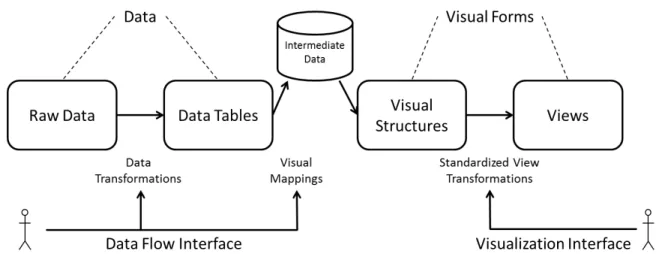
Abstractions of the information visualization process are often evaluated in terms of the visualization reference model, originally proposed by Card et al. [8], that classifies human interactions with visualization systems as one of several classes: data transformations, visual mappings, or view transformations. This seminal model, depicted in Figure 1, has been referenced heavily within the information visualization community. The primary contribution of the information visualization reference model, as it has come to be known, has been the standardized categorization of novel interaction techniques into these three major classes. I will appropriately describe the contributions of this work in reference to this model, with modifications.
Around the same time that the information visualization reference model was pro-posed, another model that focuses on the multiple states of data throughout the visualiza-tion and interactive analysis process was presented by Chi [10]. This model has been used extensively in this community as a taxonomy by which to characterize the state of data and the transformations applied to data at each state by users of interactive visualization applications. A simplified depiction of this model, called thedata state model, is shown in Figure 2. The data state model has been used to taxonomize (and therefore provide some grounds for comparison) of visualization techniques according to the state of data that they interface with. Both of these visualization reference models have been influential in the design and development of interactive visualization software.
Fig. 1. A depiction of the information visualization reference model, originally proposed by Jock Mackinlay, Stuart Card, and Ben Shneiderman [8]. This model has been widely referenced in the visualization research, and is often used to aid in the categorization of visualization techniques asdata transformations, visual mapping operations, or view transformations.
Several notable software toolkits have also contributed practical models of visualiza-tion components, including the well-know Visualizavisualiza-tion Toolkit (VTK) [63], and prefuse (intentionally not capitalized by its authors) [30]. prefuse provides a Java-based library of popular information visualization techniques such as fish-eye lenses, which are used to provide user-controlled scaling of two-dimensional information renderings, and hyperbolic trees, which are used to optimize layout of large hierarchical structures for visual display. The broader goal of information visualization and visual analytics research is to facilitate understanding of how interactive software can better enable users of visualization software to perform complex analytical tasks.
Recent work has explored collaboration impacts the design and implementation of methods meant to aid in visual analysis of large collections of data. For example, two applications with obvious need for collaboration are visual analysis of astrophysics and intelligence data. Work by Heer and Agrawala [29] has sought to formalize
Fig. 2. A simplified depiction of the data state model, originally proposed by ed Chi [10]. This model is often used to taxonomize visualization techniques by the state of data that they interface with.
various approaches to this issue and identify numerous important features required to support collaborative analysis in interactive visualization environments. Evaluation of the effectiveness of different approaches to support collaborative analysis has seen very little attention, however.
2. Evaluation of Visualization Techniques
There have been many case studies that demonstrate how particular tools have been successful in enabling domain experts to more effectively explore and analyze data. One recent example is the work of Tesone and Goodall, where a coordinated multiple view (CMV) visualization was applied to analysis activities within the information assurance (IA) domain [67]. Lam et al discussed the benefits gained by analysts of large collections of web search activity using their Session Viewer software [38]. Exactly how to quantitatively measure the contribution of such work is not always clear; and therefore not many recent studies such as these have included verifiable, experimental results validating their effectiveness.
Recently, Shneiderman and Plaisant have provided much needed guidance on the way forward for evaluating the effectiveness of domain-specific visual analytics applications [65]. They suggest that Multi-dimensional In-depth Long-term Case studies (MILCs) can be used to evaluate the success of information visualization and visual analytics research by
qualitatively measuring the success of specific analytic goals self-reported by expert users over long periods.
The results of these works suggest that reported success of domain experts attempting specific analytic goals within their own operational environments might provide additional insight into the utility of a specific approach, compared with traditional task-based user studies often conducted with students instead of domain experts. Also, self-reported analytic insights over more generous time periods can be used to more effectively determine how well domain experts are able to integrate a new technique into an existing analysis process.
3. Visual Analytics
The recently-emerged field of Visual Analytics is defined as “the science of analytical reasoning facilitated by interactive visual techniques” [13]. The goals of this research are enumerated in a seminal publication edited by the late Jim Thomas, among others. Some of the primary challenges enumerated by this research agenda include supporting the process of human decision-making by enabling users to “detect the expected and discover the unexpected” in large, complex datasets composed of heterogeneous and often conflicting data. Work in this field has become particularly relevant due to the prevalence of situations in many domains that require human decision-makers to rapidly ingest information from large collections of data to make critical decisions in emergencies. Researchers in this field have contributed many novel visual analysis techniques in domains such as computer security (sometimes referred to as cyber-security) [34] [47] and biological studies [2].
B. Visualization Techniques
In this section we briefly review related work in glyph visualization techniques and interactive visual analysis methods focused on interactive display of data for temporal pattern recognition, as well as existing visualization applications often used by developers and end-users to perform analytical tasks.
1. Glyph Visualization
Within the fields of scientific and information visualization, there has been significant exploration of the use of iconic-based representations of information. Often these visualization techniques seek to simplify visual display of multi-variate data by aggregating multiple attributes into a glyph representation. For example, a circular glyph can be used to represent a data element on a map. Obviously the center of the circle is used to represent the object’s location, but the radius, color, texture, outline, or any other visual attributes can be used to represent other dimensions of data. An example of this is work by Ribarsky that explored user-specified glyph generation in the context of multivariate spatial data [61]. Some of the basic concepts used to map glyph properties to data attributes were formalized by Post et al. [59]. Based on this, one of the visualization techniques I will present maps temporal data attributes to the scale and texture of a glyph, while glyph shape is manipulated to depict temporal aggregations. Ebert et al. have published results on using procedural generation of glyphs to aid in the analysis of various multivariate datasets, including document collections and fluid flow [16]. Glyphs have also been applied to flow visualization, as in an application of glyph-based visualization of turbulence within incompressible flow by Kirby et al. [36]. Other research has focused on addressing additional challenges with perception or other domain-specific analysis issues, including uncertainty [73]. My work builds on these previous efforts by exploring a custom glyph
designed to facilitate rapid visual inspection of temporal activity patterns exhibited by spatial sensors.
2. Temporal Visualization
Considerable work has been done examining different visual representations and interac-tion methods to support visual analysis of temporal data. By temporal data, I mean data that has a temporal value for each record (where data is, in general, a sequence of records). Because of the large variety of domains in which custom temporal visualization techniques have been developed, I will focus on seminal work in this area and interactive temporal visualization techniques that are similar in application to the work presented in this disser-tation. Much of this work has focused on developing techniques to support domain-specific analytical goals. Early work by Plaisant et al. explored using timelines and glyphs to repre-sent temporal events within a patient’s medical history [58] in order to improve recognition of specific patterns of past medical events when performing medical diagnosis. More re-cent work by Wang et al. [71] evaluated a custom glyph-based visualization technique used to infer causal relationships between events in electronic health records. In the network se-curity domain, Keim’s CircleView technique was developed to aid in the visual analysis of large amounts of dynamic temporal data using intuitive circular graphs [35]. Another method, Spiral, focused on highlighting periodic patterns in temporal data, such as the seasonal behavior patterns of primates [9]. Weaver et al. employed several visualization techniques to explore recurring temporal event patterns within hotel visitation records [72]. As the average size of real-world datasets have continued to increase, researchers have explored various approaches to enhance the capabilities of visual interfaces accordingly. Research exploring interaction mechanisms for temporal analysis of large molecular biology datasets using interactive visual queries has been contributed by Hochheiser [31]. Other work examined use of aggregation to facilitate temporal analysis of large collections
of public safety data [26]. A custom visualization technique presented in this dissertation makes similar use of aggregation to reduce overplotting when visualizing large amount of data at various scales. Recent work by Bak et al. proposes the use of growth ring maps to display temporal and spatial attributes of data to aid in the analysis of a large volume of mouse movement data during experiments [2]. While this approach was shown to be quite effective at enabling scientists to track which areas of the experimental setup were most visited by the mice and behavioral aspects related to a disease could be discerned, this approach was not directly applicable to my work because the sequence of occurrence is not indicated using this technique.
Finally, a comparison by Aigner et al. of several common techniques for analyzing temporal data indicated that event-based visualization techniques could be used to empha-size relevant information within large datasets [1]. A task-based evaluation of a specific application, the Spatio-Temporal Visualizer (STV), has been presented by Chung et al. [11]. This application was designed to allow law enforcement experts to identify crime patterns within spatial and temporal dimensions of historical data.
The techniques presented here build on the core concepts of temporal visualization to produce a novel visualization technique for a domain-specific analysis task. The details of this novel technique are presented in Chapter V.
3. Existing Visualization Systems
There are some existing visualization systems that are available that employ similar techniques to the work presented here or provide similar capabilities. Although it is not appropriate to make direct comparison between visualization implementations designed for different applications, we note that none of the existing systems provided integrated data caching capabilities necessary for improving interactive visualization performance when dealing with large datasets.
• VisIt is a free visualization tool and software development kit (SDK) designed by Lawrence Livermore National Laboratory for parallel visualization applications of scientific data [39]. However, while VisIt was designed to handle very large datasets and provides capabilities for rapidly developing custom visualizations and interfaces, it is primarily a visualization developer tool, not an end-user tool appropriate for data analysts.
• LabView is a visualization toolkit that provides a visual programming environment that does provide end-users the capability to configure interactive visualization applications using a variety of data processing and visualization functions [51].
• prefuse (the title is intentionally not capitalized) is a Java-based visualization software development kit that provides several popular interactive information visualization techniques, such as hyperbolic trees, fish-eye lenses, and force-directed node graphs [6]. While prefuse does provide interactive visualization techniques that can be integrated into other visualization applications, it does not provide any data reduction capabilities.
• The Visualization Toolkit (VTK) is another popular software development kit that provides many functions that are useful in the creation of interactive visualization applications [37]. Like prefuse and VisIt, however, VTK does not provide an end-user interface and is designed primarily to support developers of visualization software.
• RapidMiner is an open-source end-user interactive visualization tool that provides interactive data mining capabilities [60]. However while RapidMiner also provides some visualization capabilities, it does not have the capability to develop and integrate custom visualization capabilities.
• KNIME, pronounced [naim], is a data analysis and visualization suite developed at the University of Konstantz that provides a visual programming environment for end-users and is integrated with the Java-based data mining package, Weka [68].
• KnowledgeFlow, developed at the University of Leiden in the Netherlands, also provides a visual interface to the data mining and analysis capabilities provided by Weka, and provides a few interactive visualization features but does not allow integration of custom visualization techniques [40].
C. Terrain Rendering
Interactive terrain rendering, which is often a major component of immersive three-dimensional environments, has seen much attention in the visualization community. Many approaches to building efficient terrain rendering applications have focused on employing LOD mesh simplification algorithms due to the fact that, in most cases, terrain geometry can be represented as a connected mesh of elevation points. In many cases, terrain geometry is organized in a regular grid structure as a result of the data collection mechanisms used to sense elevation along the physical surface of the Earth, primarily satellite-based sensors. Also, terrain databases that store this mesh data are often large if they cover a significant area or are high-resolution (for the purpose of this work, a terrain mesh consisting of elevation postings at a 30-meter interval would be considered high-resolution). Therefore, terrain rendering applications must efficiently retrieve data from a remote database at runtime. In this section I will review relevant prior work in this area.
Previous work in the development of terrain visualization methods has provided a wide variety of LOD mesh simplification algorithms designed to simplify the terrain geometry (i.e., reduce the number of vertices) input to the graphics processing pipeline. These methods have been employed to implement effective interactive visualizations of large 3D
environments and CAD models containing large numbers of polygons. Early work by Lindstrom et al. proposed an algorithm for rendering continuous LOD terrain meshes by projectingdelta valuesfor each potential merge operation on the original mesh into screen space and comparing to a threshold [41]. Later work by Lindstrom added efficient memory management approaches and asynchronous refinement [42]. Duchaineau et al. presented the Real-time Optimally Adapting Meshes (ROAM) approach that introduced incremental triangle stripping (which optimizes hardware rendering performance) and priority-based simplification of terrain organized into binary trees [15].
A very similar model was also proposed by Evans et al. that employs right-triangulated irregular networks to simplify terrain meshes [23]. While both approaches use similar simplification techniques, the author claims that RTINs are potentially more memory efficient since they store more triangle data than actual vertex data. There have been several incremental refinements to these initial approached to rendering large terrain models [57], but in general the view-dependent progressive mesh (VDPM) approach employed by all these techniques has become widely accepted. Hugues Hoppe also extended such initial work by defininggeomorphsto introduce temporal continuity when interactively adjusting mesh level-of-detail (i.e., reducing visible ’popping’ of the mesh) [33].
As the accuracy of spatial sensors have increased over the past decade, more recent efforts have by necessity focused on quantifying the trade-offs in memory usage and mesh approximation error [3] and optimizing memory clustering algorithms [4] when using these existing techniques. As I will discuss later, compared to all these existing techniques the approach I will present differs in that the goal is to efficiently retrieve the highest resolution texture data available and render this along a full-resolution mesh surface. Certainly any of these previous techniques can be integrated with our method to locally simplify the mesh in order to improve interactive rendering performance; however, due to the drastically increased performance of modern graphics hardware this may not be necessary.
Additional prior work has provided solutions to many challenges to the LOD approach to terrain rendering, including silhouette preservation [44], and imperceptible simplification [46]. Both of these techniques are aimed at reducing the visible error in a simplified terrain mesh by measuring and minimizing the unavoidable difference between a full-resolution mesh and a simplified mesh. Other recent methods have provided efficient GPU-based terrain rendering implementations [14, 75], however these methods do not account for the use of a remote terrain database that must be queried at runtime.
D. Graphics Hardware
Recent advances in graphics hardware implementations and the effects of these advances in performance and functionality on the community’s model of the graphics pipeline are certainly relevant to this work. This is because I will present a novel approach that leverages the advantages of the programmable graphics pipeline to efficiently prioritize the retrieval of high-resolution data from a remote database during interactive rendering. The implementation of this approach requires an understanding of the architecture and capabilities of the modern graphics hardware pipeline.
Initially, hardware implementations of the graphics pipeline were fixed-function. That is, each major component of the traditional graphics pipeline, shown in Figure 3, was defined statically and could not be altered by developers. However, the introduction of programmable vertex and fragment processors allowed developers of visualization applications to begin experimenting with dynamic implementations of these components. This enabled developers to create interactive hardware-accelerated implementations of non-traditional surface shading models that previously could only be implemented using offline rendering applications (such as Renderman). Later, the increased processing power provided by the stream processing model of many-core GPUs enabled researchers to begin
Fig. 3. The major traditional components of a fixed-function graphics pipeline. The programmable components of the pipeline are shown with dashed outlines. The framebuffer output shown in the figure is what is shown on the user’s monitor. exploring how traditional and non-traditional rendering techniques could be parallelized and therefore optimized for such hardware [56]. Effort has certainly been made to leverage this programmability to increase performance and visual quality of scientific visualization and volume rendering applications, since scientific datasets often exhibit direct two- or three-dimensional spatial mappings and are therefore well suited for GPU implementations [22]. Researchers in the information visualization community [49] have also explored how the advantages offered by modern graphics hardware can be used to improve the interactivity of techniques such as parallel coordinates and scatter plots [25], and multi-value data glyphs [17].
This increased processing power also led to the exploration of general-purpose GPU (GPGPU) applications, designed to increase the efficiency of non-rendering algorithms using the stream model [45]. Some have argued that according to Moore’s Law, GPU-based implementations of parallelizable algorithms have become more cost-effective than CPU implementations [56].
Several programming languages dedicated to the programmable graphics pipeline have matured over the past decade. These include Cg from nVidia [48], GLSL [62], and
Microsoft’s HLSL [53], each of which have similar base capabilities but differ slightly in syntax and implementation of high-level functions. In addition to these languages, which are focused on rendering applications, other languages have also been developed to enable GPGPU applications not designed to produce visual output to the framebuffer but instead produce numerical results. Most notably these include CUDA from nVidia [52], the Stream Computing SDK from ATI [5], and Brook from Stanford [7].
E. Situational Awareness
Finally, in this section I will review seminal work in the area of situational awareness, since prior work in this area is relevant to a particular visual analysis application presented in this dissertation.
Situational awareness in the context of decision-making operations is defined as “what information is important for a particular job or goal” [19]. Situational awareness, while a necessary aspect of any coordinated operation, is difficult to quantify and therefore analyze for impact on decision-making. Initial contributions by Endsley included a model of situational awareness consisting of three levels: perception, comprehension, and projection [18]. For the purpose of this work, we will be primarily focused on the accuracy of data that is presented to the user during SA Level 1 (perception).
Work by Endsley et al. goes on to define team situational awareness (TSA) [18], as well as qualitative evaluation mechanisms for such [20]. The study of situational awareness has roots in these human cognition studies by Endsley et al. [21] in which the visual attention and resulting situational awareness of air traffic controllers was measured by questionnaires designed to evaluate the operator’s mental model at specific times during a defined process—perception, comprehension, and projection [18]. Other research efforts in visualization applications for improving SA have examined the use of various image
generation techniques (such as “blobby shading” and use of Delaunay triangulation) to aggregate complex and cluttered visual features to improve SA [32]. Still other efforts have focused more on the “theater-wide situational awareness covering a large geographic area containing many military units” [24], as opposed to this work that focuses on measuring the accuracy of SA data locally for each participant. A key novel contribution of this work is a quantitative metric that provides insight into the analysis of SA and therefore decision-making.
There have also been efforts to provide interactive visualization techniques that enable situational awareness within various contexts, such as emergency response, network intrusion detection, and biosurveillance [43]. These techniques often make use of qualitative SA metrics such as the Situational Awareness Global Assessment Technique (SAGAT) and the Situational Awareness Rating Technique (SART), both of which rely on both objective and subjective questionnaires, respectively, designed to evaluate a person’s comprehension (SA Level 2) and projection (SA Level 3) of various aspects of the situation at multiple points in a decision-making process [21].
CHAPTER III
A FRAMEWORK FOR INTERACTIVE VISUALIZATION OF LARGE NUMERIC DATASETS
Researchers in the Visual Analytics community have developed custom software applica-tions for a variety of domains in order to support the needs of expert analysts and decision-makers. In this chapter I will discuss work performed in conjunction with a U.S. govern-ment customer. The goal of this effort was to provide useful visual analytics capabilities to several distinct groups of domain experts within this community. This approach allowed these capabilities to be delivered in a manner that enables the domain experts to learn and apply the necessary skills in their own environment. I will discuss how we have provided guided training sessions to introduce domain experts to each analysis case presented here, including analysis of network performance, anomalous sensor activity, and engagement results. Through long-term interactions with these experts, we have begun to observe ana-lysts using skills from prior training sessions to propose new analytic requirements. I will discuss the design of this approach, the observed results of experts using the software in several analysis cases, the development of a user-specified visual analysis requirement, and results of this work using three different evaluation methodologies.
A. Approach
The proposed approach to developing a visualization application to work in a dynamic environment containing many types of large datasets is based on the existing model of in-formation visualization initially proposed by Card et al. The existing model, shown earlier in Figure 1, does distinguish the difference between data transformation operations and view transformation operations, however it does not account for performance considera-tions based on the size of the input data for applicaconsidera-tions involving large datasets.
Fig. 4. The proposed framework is based on a modification of the existing information visualization model. In the proposed model, data transformation and reduction op-erations are configured using one user interface, and interactive view transformation operations are controlled using another visualization interface. In this model data processing and visualization techniques can be developed and configured indepen-dently and reduced data is cached to increase performance when working with large datasets.
Therefore, I propose a novel modification to the existing model that ensures that interactive visualization software applications are not overloaded with dense volumes of data that can significantly impact rendering performance. In the proposed model, shown in Figure 4, data transformation and reduction operations are configured using one user interface, and interactive view transformation operations are controlled using another visualization interface. This allows us to standardize and simplify the user interface for each of these tasks independently, which can improve the user experience. But more importantly, in this model data processing and visualization techniques can be developed and configured independently and data is pre-processed, reduced, and cached to increase interactive rendering performance when working with large datasets.
implementations designed for different applications, it is necessary to at least provide a capabilities-based comparison with other similar systems. In order to conduct this comparison, it was necessary to first identify the primary system requirements by which each system is evaluated.
Visual programming environment A visual programming environment is required to allow users without advanced programming skills to be able to easily create customized visualization applications.
Multiple visualization techniques Users we spoke with were interested in usingmultiple types of visualizationssince they were responsible for analysis of multiple data types (e.g., temporal and spatial data).
Coordinated multiple views Coordinated multiple views are often provided to enable effective analysis when using multiple visualization techniques.
Custom visualizations The development and integration ofcustom visualizationsenables complex data to be explored in new ways. This was quite important as several new visualization capabilities that these users required had already been identified (e.g., sensor performance analysis).
Unified visualization interface Aunified visualization interfaceis desirable because this feature simplifies software training for new users, and trained users can apply existing skills to new visualization methods.
Data reduction and caching Data reduction is required to ensure that large numeric datasets do not limit the performance of interactive visualization software. This can be accomplished by providing numeric aggregation algorithms or other custom data processing routines.
Table I. Visualization System Capability Comparison
ProDV prefuse VTK VisIt LabView RapidMiner KMINE KnowledgeFlow
Visual Programming Environment Y N N Y N Y Y Y
Multiple Visualization Methods Y Y Y Y Y Y Y Y
Coordinated Views Y N N Y N N Y N
Custom Visualizations Y Y Y Y Y N Y N
Unified Visualization Interface Y N N N N N N N
Data Reduction Y N N Y N Y Y Y
Data Caching Y N N N N N N N
End-User System Y N N N N Y Y N
Data caching Data caching reduced overall computational cost of working with large datasets, and also enables other useful features such as collaborative analysis.
End-user system And finally, while many systems provide excellent visual analysis capabilities, those that are not designed as end-user systems (i.e., systems that do not require advanced programming skills or detailed Computer Science knowledge) are difficult for many users to operate.
The results of the capabilities-based comparison are shown in Table I. While most other systems do provide multiple visualization techniques and some also provide a visual programming environment, few provide support for coordinating multiple views. Also, only two of the other systems are for end-users, whereas the rest are primarily tools for software developers. And most notably, none of the other systems provides mechanisms for both data reduction and caching, which are necessary when building interactive visualizations of large datasets. The implementation of the proposed framework, called Process-Oriented Data Visualization (ProDV), provided all the required features.
1. User Environment
In work with a government client, the primary goal was to provide interactive visualization software to support visual analysis. The user’s operating environment consisted of constantly varying forms of data that required integration and visual analysis for both anomaly detection and metric evaluation over long periods. While various commercial packages exist to provide some of the basic visualization capabilities used, the degree of customization required and the government software certification needs made it more advantageous to develop a novel visualization environment. In this section I discuss the approach to delivering flexible visual analytics capabilities to a government customer in a dynamic environment. In later sections I will discuss more specific analysis cases in detail. The primary user for this work was a U.S. government organization responsible for testing and performance evaluation of new equipment and systems based on predefined requirements. The results of these evaluations are used to support purchasing decisions. Large-scale testing activities often compare performance of equipment from different manufacturers. Each test defines specific performance metrics designed to evaluate the stated requirements. For example, networking equipment might be evaluated for performance using metrics such as Speed-of-Service (SoS) or Message Completion Rate (MCR), but depending on the implementation these metrics might be evaluated at the Application layer for some tests (using software log data) and at the Transport layer for others (using recorded network traffic data). Spatial and temporal sensors are most often evaluated in terms of the number of detected failures or anomalies in a given time.
Although analysis requirements are usually specified explicitly before testing begins, it is common practice in this environment to capture and record all forms of electronic data available over extended periods of time. Therefore many of the datasets they need to perform analysis on are large collections of multimodal data. Sanitized versions of these
datasets have been used for this work, and are typically on the order of several gigabytes. In some cases, these users are interested in applying these techniques to unsanitized datasets that may be several hundred gigabytes or more.
2. Requirements
Based on this understanding of the environment, it became clear that any visual analysis capabilities provided should not only provide all the basic information visualization interactions (i.e., zoom and filter, details on demand) [64], but also should be easily customizable by domain experts to account for changing evaluation requirements and input data format or semantics. In particular, the experts need to be able to define and incorporate new visualization or analysis tools themselves to address new evaluation criteria, rather than just use a preselected set of information. Users also need to be able to import data from a wide variety of different sources (e.g., different types of sensors stored in different database formats), and combine these sources into a CMV visualization.
3. Framework
We began by defining a framework architecture that defines common objects and the interfaces between them, which is referred to as the Process-Oriented Data Visualization (ProDV) framework. In order to be effective in the user’s operational environment, this framework needed to be based on a simple abstraction that could be represented visually and easily understood by domain experts. The majority of domain experts were quite familiar with the equipment domain (e.g., networking), but were not familiar with computational algorithms or data structures beyond common RDBMS objects. They were accustomed to using common tabular computation tools such as Microsoft Excel.
4. Framework Components
The framework components defined in this abstraction are based on an understanding of the average domain user’s conceptual model of the visualization process. We extracted this model from early interviews with data analysts and compared the objects/functions most identified by domain experts with formal reference models that have been defined in the visualization community. Key insights forming the basis of this abstraction included:
• Users were knowledgeable about the semantics and format of the data.
• Users had an idea of how they would like to visualize data (e.g., using a graph or a map).
• Users understood that data needed to be processed and had a vague idea of how that might happen, but did not fully understand any of the specific data structures or algorithms used.
• Users understood that data might need various transformation operations.
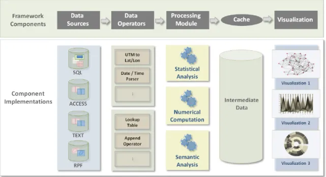
From these basic observations gleaned from experience interviewing a range of potential users, we arrived at the framework based on this simple abstraction shown in Figure 5. As shown in the figure, the ProDV framework defines data sources, data operators, processing modules, cached data and visualizations as the primary objects in our abstraction of the visualization process. In terms of the visualization reference model this framework divides the workspaces that transformations are conducted in. Only data transformations and visual mappings are manipulated while interacting with framework components, while only view transformations can be manipulated from within the visualization environment.
Data sources Data sourcesprovide tuple records (records with multiple typed fields) from a variety of different sources. SQL databases, structured text files, and local database
Fig. 5. The ProDV framework architecture definesdata sources,data operators,processing modules, cached intermediate data, and visualizations to provide a simple visual abstraction of the visualization pipeline. The addition of cached intermediate data allows visualization applications to maintain interactive rates when working with large datasets.
files (like Microsoft Access) are common examples; however data sources can be defined from more custom data formats as well. For example, Raster Product Format (RPF) data, which provides standardized geo-rectified raster data, can also be used to provide tile data as records.
Data operators Data operators perform common data transformation or simple data aggregation tasks. Operators can represent simple data casting operations (e.g., parsing text as an integer), or be more complex such as a multiplexer or look-up-table that has an internal data structure.
Processing modules Processing modules encapsulate algorithms that generate reduced intermediate data structures from input data. Examples include simple numerical
computations such as summation, statistical analysis, or multi-pass clustering algorithms. Many of our current processing modules perform and store computations at multiple resolutions, so that visualization controls can allow users to quickly change scale for different analysis tasks. Any of these objects can also define any number of user parameters.
Cached data While the general framework seems intuitive, one explicit design decision I will mention is the decision to not identify to users the specific details of intermediate data structures created by processing modules and stored as cached data. We have chosen to hide the details of visual mappings that exist between those data structures and the visualizations, since most users interviewed not familiar with the data structures that would be used (e.g., hash maps, trees, and heaps). Although it is difficult to evaluate this choice in a controlled experiment, I believe it simplified the user interface and enabled analysts with a broader range of skills to interact with the framework. User interface controls were provided for advanced users who did wish to manipulate visual mappings.
Visualizations A selection of interactive visualizationsmake up the final component of the framework. Each visualization defines a unique rendering method designed to be viewed in a standalone window. Several visualizations can be used to create coordinated multiple view layouts, as is common in visual analytics applications. Each visualization must define its own generic routine for building a render cache containing all the data needed to render the current view. Each visualization can contribute multiple view mappings that define how its render cache can be assembled from the data structures created by different processing modules. This architecture loosens the coupling between the processed data and the rendering algorithms, giving greater flexibility in the design of each.
5. Dataflow Interface
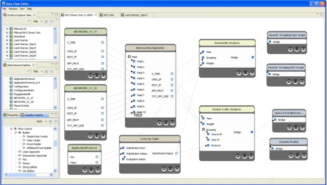
In order to simplify user configuration of the framework components, we developed a visual interface based on a visual programming environment we were familiar with, Eclipse. The visual interface was implemented using the Eclipse Graphical Editor Framework (GEF) and allows the user to connect and configure the data access and transformation components of the system, as shown in Figure 6.
Fig. 6. ProDV Dataflow Editor interface. Example shows two similar data sources (green) appended and connected to a look-up-table using operators (brown). Two processing modules (yellow) provide cached data to four different visualizations (blue).
Windows containing user-defined data sources and framework components are shown on the left. Input and output field names and types are displayed and can be connected using common drag-and-drop interactions. Simple error messages are provided when the specified data model is invalid due to type matching errors or invalid or inaccessible data
source configurations.
Once the user saves a connected group of components, referred to as a product, it can be launched in a separate window (similar to launching a new application in a software development environment). While the user can always adjust the data access or transformation configuration specified in the dataflow editor, any current cached data will be invalidated by this change since the state of the cached data and the product configuration are tightly coupled. When changes are made, the user will be prompted to close the current interactive visualization and any cached data will be cleared and recomputed using the new configuration.
6. Visualization Interface
Interactive visualizations created using the ProDV framework share a basic set of interac-tions. In order to promote consistency among interactions defined by our visualizations, we have defined a standard set of tools based on well-known information-seeking interactions: Select, Pan, Zoom, and Query. Each visualization can define hover, click, double-click, and drag mouse interactions using each tool, and only one tool can be used at a time. The Query tool provides mouse coordinates in screen-space, and any text returned by the visualization is displayed in a tooltip. Any other user parameters for a visualization can be adjusted in an auto-generated Properties tab, which shows user-adjustable properties for the current visualization or any selected object.
7. Implementation Summary
The implementation of the proposed method provided by ProDV meets the seven previ-ously enumerated requirements for a visualization system designed to handle interaction with large numeric datasets.
![Fig. 1. A depiction of the information visualization reference model, originally proposed by Jock Mackinlay, Stuart Card, and Ben Shneiderman [8]](https://thumb-us.123doks.com/thumbv2/123dok_us/631092.2576036/28.918.163.782.140.381/depiction-information-visualization-reference-originally-proposed-mackinlay-shneiderman.webp)