BMC Medical Informatics and Decision
Mak-ing (2001) 1:2
Research article
Identifying patient preferences for communicating risk estimates: A
descriptive pilot study
Jennifer M Fortin
1
, Linda K Hirota
2
, Barbara E Bond
3
,
Annette M O'Connor
4
and Nananda F Col*
1
Address: 1Decision Systems Group, Brigham and Women's Hospital, Harvard Medical School, Boston, Massachusetts, US, 2Graduate School for Health Studies/Nursing, Simmons College, Boston, Massachusetts, US, 3Department of Social Work, New England Medical Center, Boston, Massachusetts, US and 4Faculty of Health Sciences, University of Ottawa, Ottawa, Canada
E-mail: Jennifer M Fortin - [email protected]; Linda K Hirota - [email protected]; Barbara E Bond - [email protected]; Annette M O'Connor - [email protected]; Nananda F Col* - [email protected]
*Corresponding author
Abstract
Background: Patients increasingly seek more active involvement in health care decisions, but little is known about how to communicate complex risk information to patients. The objective of this study was to elicit patient preferences for the presentation and framing of complex risk information.
Method: To accomplish this, eight focus group discussions and 15 one-on-one interviews were conducted, where women were presented with risk data in a variety of different graphical formats, metrics, and time horizons. Risk data were based on a hypothetical woman's risk for coronary heart disease, hip fracture, and breast cancer, with and without hormone replacement therapy. Participants' preferences were assessed using likert scales, ranking, and abstractions of focus group discussions.
Results: Forty peri- and postmenopausal women were recruited through hospital fliers (n = 25) and a community health fair (n = 15). Mean age was 51 years, 50% were non-Caucasian, and all had completed high school. Bar graphs were preferred by 83% of participants over line graphs, thermometer graphs, 100 representative faces, and survival curves. Lifetime risk estimates were preferred over 10 or 20-year horizons, and absolute risks were preferred over relative risks and number needed to treat.
Conclusion: Athough there are many different formats for presenting and framing risk information, simple bar charts depicting absolute lifetime risk were rated and ranked highest overall for patient preferences for format.
Published: 1 August 2001
BMC Medical Informatics and Decision Making 2001, 1:2
Received: 5 May 2001 Accepted: 1 August 2001
This article is available from: http://www.biomedcentral.com/1472-6947/1/2
Background
With the rising trend towards consumerism in health, patients are increasingly encouraged to become involved in making decisions about their health. Marketing cam-paigns for prescription drugs are now being directed to-wards patients, with advertisements appearing in the popular press suggesting that patients discuss medica-tions and treatment opmedica-tions with their doctors. A recent study examining the effect of drug advertisements on consumer behavior found that 19% of study participants asked for a prescription, and 35% asked a physician for information about a drug after seeing a drug advertise-ment [1]. In order for patients to be effective participants in the decision making process, they need information on the effects of treatment on their health risks that they can use to make health care decisions. The challenge to clinicians is how to present risk information to patients that they can use in a format that they prefer.
Several studies have examined how presentation, [2–4] wording, [5] and framing [6,7] affect physicians' inter-pretations of numeric data as well as their willingness to initiate treatment [8]. However, few studies have exam-ined the effect on patients of framing risk data with dif-ferent metrics, such as relative or absolute risk and the number needed to treat (NNT). Relative risk describes the ratio of the risk of disease in one group compared to that in another and does not take into consideration a person's baseline risk. Absolute risk describes the differ-ence between the risks of disease in two populations and varies according to baseline risk. A derivative of absolute risk is the NNT with a specific therapy to prevent one ad-verse outcome (the inad-verse of the difference in absolute risk). Framing the benefits of treatment in relative rather than absolute terms may emphasize the short-term ben-efits of a treatment [6,9]. Conversely, framing the risks of treatment in relative rather than absolute terms may em-phasize its risks [10]. Comparing relative and absolute risk reduction and NNT as methods to inform patients about preventive therapies, Hux et al illustrated that the metric used to present data can affect a patient's percep-tion of a therapy's effectiveness [11].
In addition to consideration of which metric is used to describe risks, the time horizon over which risks or ben-efits occur may affect risk interpretation. Typically, risks framed in relative terms are not explicit about the time frame involved and may be erroneously interpreted as accruing immediately. On the other hand, risks framed in absolute terms or as the NNT tend to report a specific time frame and hence may be interpreted as being de-layed in onset. In addition to issues related to compre-hension, patients may prefer to have risks presented over specific time periods.
While most framing studies focused on a treatment's ef-fect on a single outcome over a single time horizon, pa-tients often need to decide on treatments that affect multiple outcomes, both beneficial and harmful. For ex-ample, the decision of whether or not to use hormone re-placement therapy (HRT) after menopause involves weighing the benefits of treatment (immediate symptom relief, [12] decreased future risk of hip fracture [13] and possible decreased risk of coronary heart disease [14,15]) against its risks (increased future risk of breast cancer [15]). Framing effects appear to be smaller when both the beneficial and harmful effects of a treatment are includ-ed, [16] but little information is available to guide clini-cians about how to explain complex risk information to their patients.
Most studies exploring risk communication and deci-sion-making have focused on the use of different metrics. However, data can be described using a variety of differ-ent graphical formats as well. Survival curves are com-monly used in the scientific literature and can also be used to help patients understand risk information when deciding between two treatments [2]. Figures using 100 faces or ovals to represent populations with and without a condition, displayed in a random [17] or consolidated [18] fashion, have gained increasing popularity in the lay press, as have simple bar charts.
The choice of graphical formats may affect patient per-formance on cognitive tests, [19–23] accuracy of com-prehension, and speed of processing probabilistic information. Vertical bars, horizontal bars, numbers, and 100 consolidated ovals performed better than either pie charts or 100 random ovals when testing simplified cognitive tasks (e.g., identifying the larger of two quanti-ties) [24]. The type of visual graphic used to present in-formation can also introduce bias in risk perception, with risk perceived to be less when using a bar graph ver-sus a stick figure [25].
hori-zons, multiple outcomes comparisons, and metrics. The specific example tested was deciding on HRT among a population of peri-and postmenopausal women.
Methods
Peri- and postmenopausal women were recruited for participation through hospital fliers and advertisements. Focus groups were convened to discuss decision-making issues about HRT as well as patient preference for risk presentation. Recruitment ceased when convergence was reached on the broader topics addressed. Of the 37 women who responded to fliers and ads, 25 participated in 8 focus group sessions held at New England Medical Center from March through May 1999. No information was obtained on women who did not attend a focus group. Each 2-hour session was conducted by 2 facilita-tors (NFC, LKH) and was audio taped. All tapes were transcribed and reviewed for subjective evaluation. Be-cause most of the focus group participants were Cauca-sian, 15 non-Caucasian women were recruited to participate in one-on-one interviews through a commu-nity health fair.
All participants were asked to evaluate different ways of communicating risk estimates for coronary heart dis-ease, hip fracture, and breast cancer, both with and with-out HRT. All risk estimates were derived from a Markov model [28] that used individual risk factors to predict fu-ture disease risk. Risk estimates were based on a hypo-thetical 50-year old woman's risk factor profile and were displayed over 10-year, 20-year and lifetime horizons. All graphical presentations depicted identical numerical risk levels, differing only in the metrics and formats used. To avoid "group think" resulting from focus group discussions, participants were asked to privately record their preferences on a worksheet before the group dis-cussion convened. These worksheets were collected after the discussions and data were extracted and analyzed. Specific reasons for participants' preferences were elicit-ed using open-endelicit-ed questions.
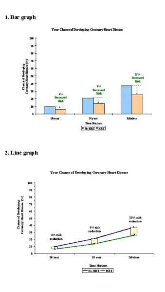
Graphic format
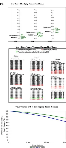
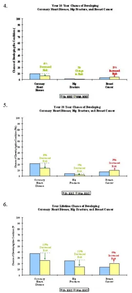
We identified the following graphic formats as being the most commonly used in the scientific and popular press, and therefore the most recognizable to patients: bar graphs, line graphs, thermometer graphs, 100 represent-ative faces displayed in a consolidated fashion, and sur-vival curves (Figures 1, 2). The sursur-vival curve was atypical in that its y-axis presented a patient's chance of not developing a disease instead of the more standard "chance of survival". This modification was made to keep the data presented consistent with data presented in the other graphical formats since survival was not presented in the other graphs (the chance of not developing a dis-ease is the closest equivalent to survival, which is the
chance of not dying). Pie charts were not included be-cause this format did not readily lend itself to describing risks over time. Participants were sequentially presented with all graphic formats and each was briefly explained. Participants were asked to rate how much they liked each graph on a likert scale of 1 to 5, with 1 corresponding to "not at all" and 5 corresponding to "extremely", and then to rank order the graphs according to preference.
Time horizons
Participants were also asked to rank order their prefer-ences for risk estimates over 10-year, 20-year, or lifetime horizons, presented using bar graphs predicting a wom-an's risk for developing heart disease, hip fracture and breast cancer.
Multiple Outcomes
Participants' preferences for risk displays about multiple clinical outcomes were elicited by asking participants to choose between 2 sets of 3 graphs. In Set A, each of three diseases was displayed separately over 3 time horizons (Figure 3). In Set B, the same three diseases were dis-played together over one time horizon; this was repeated for the other two time horizons (Figure 4). Note that the exact same data were presented in each set, differing only in format.
Metrics
Preferences for absolute vs. relative risk estimates were obtained by asking participants to choose between risk estimates for heart disease framed in either absolute or relative terms, both graphically and textually. Finally, participants evaluated the concept of NNT presented with two written explanations. The first explanation (re-ferred to as "1 in x") was worded "If 8 women just like you took lifelong HRT, it would prevent one of the 8 from having heart disease. If 9 women took lifelong HRT, it would prevent one of the 9 from having a hip fracture. If 17 women took lifelong HRT, it would cause one of the 17 to develop breast cancer. There is no way of knowing in advance who these women might be." The alternative ex-planation (referred to as "x out of 100") was worded "If 100 women just like you were to take lifelong HRT, treat-ment would prevent 12 of them from developing heart disease and 11 of them from developing a hip fracture. However, treatment would cause 6 of them to develop breast cancer. There is no way of knowing in advance who these women might be."
college vs. ≥ 2 years college). Statistical comparisons within subgroups were not performed due to the small sample size.
Results
Study participants included a diverse group of 40 peri-and post-menopausal women (Table 1). Half of our sam-ple identified themselves as non-Caucasian. All partici-pants had at least some high school education; most (60%) had an annual household income of less than $50,000.
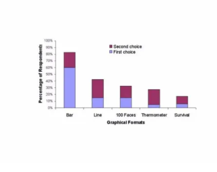
The mean preference rating for the bar graph exceeded those of the four other graphs in this set (Table 2). Most respondents (83%) ranked the bar graph as being their first or second most preferred graph, with more than half of all respondents (60%) selecting the bar graph as their first choice (Figure 5). The bar graph was consistently rated highest when the sample population was stratified according to race, income and educational status. Sub-group analyses are shown in Table 2, recognizing that these analyses are limited considering the small sample size.
Most respondents preferred receiving risk estimates over multiple time horizons vs. at one time point. When asked to prioritize, a majority preferred receiving lifetime risk estimates instead of 10 or 20-year time horizons (Table 3a). There was no clear preference for the type of presen-tation comparing risks for multiple disease outcomes over different time horizons (Table 3b). Respondents preferred risk estimates framed in absolute rather than relative terms for both graphical and textual displays (Table 3c); this finding was consistent across racial, in-come, and educational sub-groups. Participants consist-ently stated that they wanted graphical and textual explanations of absolute risks provided together. In de-scribing NNT, respondents preferred the written expla-nation which rescaled data from "1-in x" to "x out of 100" (Table 3d).
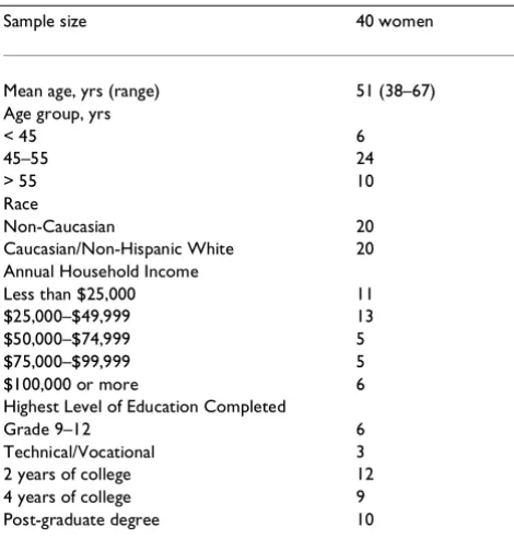
Table 1: Demographic Characteristics of Sample Population
Sample size 40 women
Mean age, yrs (range) 51 (38–67) Age group, yrs
< 45 6
45–55 24
> 55 10
Race
Non-Caucasian 20
Caucasian/Non-Hispanic White 20 Annual Household Income
Less than $25,000 11
$25,000–$49,999 13
$50,000–$74,999 5
$75,000–$99,999 5
$100,000 or more 6
Highest Level of Education Completed
Grade 9–12 6
Technical/Vocational 3
2 years of college 12
4 years of college 9
Post-graduate degree 10
Table 2: Mean Preference Ratings of Graphical Displays of Risk Information (SD)
Display† Overall Non-Caucasian Caucasian Lower income Higher income Lower education Higher education (n = 40) (n = 20) (n = 20) (n = 24) (n = 16) (n = 9) (n = 31)
1. Bar graph 4.0‡(1.0) 3.5(1.1) 4.4 (0.7) 4.0(1.0) 3.9(1.0) 3.4(1.2) 4.1 (0.9) 2. Line graph 3.1 (0.9) 3.2(0.9) 3.0 (0.9) 3.0(1.0) 3.2(0.8) 2.9(1.1) 3.1 (0.9) 3. Thermometer 2.6(1.1) 2.7(1.0) 2.5(1.1) 2.6(1.1) 2.6(1.1) 2.4 (0.9) 2.7(1.1)
graph
4. 100 faces 2.4(1.5) 2.6(1.5) 2.2(1.5) 2.8(1.5) 1.8(1.3) 3.3(1.1) 2.1 (1.5) 5. Survival curves § 2.5(1.1) 2.3(1.1) 2.9(1.0) 2.6(1.2) 2.4 (0.9) 2.6(1.1) 2.5(1.1)
†Lower income reflects annual household income below $49,999; higher income reflects annual household income above $50,000. Lower education
Discussion
Whereas no single format for communicating risk esti-mates was favored by all respondents, the majority of our sample population preferred a bar graph over a line graph, a thermometer graph, 100 faces, and a survival curve. Focus group participants remarked that the bar graph was "real basic" and "simplistic, I could deal with that". Respondents also commented that this graph type "shows the information clearer" than other graph choic-es. We could not exclude the possibility that participants preferred formats that were more familiar to them, but no one explicitly reported that as being a consideration.
There was a smaller difference in mean preference rating among non-Caucasian than among Caucasian respond-ents. It is possible that this was due to the fact that these discussions were conducted 1-on-1 as opposed to focus group discussions. However, this is not likely as the 1-on-1 discussions were time-constrained and highly focused.
The largest difference in graph preferences amongst the sub-groups was the tendency of women who were non-Caucasian, of lower income, or of lower educational sta-tus to give the 100 faces figure a higher ranking than did women who were Caucasian, had higher incomes, or higher educational levels. However, this finding was based on limited sub-group analyses. Whereas some par-ticipants saw the 100 faces as being "more exact...there's actual happy faces you can count", others remarked that it was "too much, too busy" and "simple".
The majority of our participants indicated that they would like to have their risk estimates presented over all three time horizons. Arguments for having all three time horizons included "obviously I want a healthy lifetime, but whatever I do to fight these diseases, if I fight them within the next ten years, that's going to stand me in good stead for the rest of my life". However, when asked to prioritize which single time horizon they preferred, more than half preferred a lifetime estimate, with one re-spondent commenting "I chose lifetime. I like to see it all". This finding is consistent with those of Mazur et al. who found that patients were more influenced by the end-points of survival curves rather than the area or shape of the survival curve. [2] This may denote a prefer-ence for risk data to be presented as a lifetime estimate instead of as points in time along an axis. Although phy-sicians tend to report risks using intermediate data (such as 5-year survival estimates) when recommending treat-ments, [4] patients may be more interested in long-term benefits and risks.
There was no clear consensus about whether graphs should display one disease outcome over many time ho-rizons or many disease outcomes for one time horizon, even though slightly more respondents favored the lat-ter. Respondents who wanted to see risk information as three disease outcomes over one time horizon per graph argued that they liked everything "all on one sheet", and that "I might get breast cancer, but I wouldn't get this or I wouldn't get that...sometimes it comes to a trade-off." Arguments for presenting one disease outcome at a time over many time horizons included "I would want to look at my results...specifically just my osteoporosis risk...and this is my heart disease and this is my cancer." Small sample size limited the ability to explore whether a wom-an's concern for a single (vs. multiple) disease predicted her presentation preferences.
Also consistent with recent research, respondents pre-ferred data framed in absolute rather than relative terms. Whereas physicians may find relative risk estimates to be valuable in deciding whether to recommend a treatment, [29] framing data as absolute risk may be more informa-tive and help patients who are making decisions about Table 3: Preferences for Risk Information Presentations
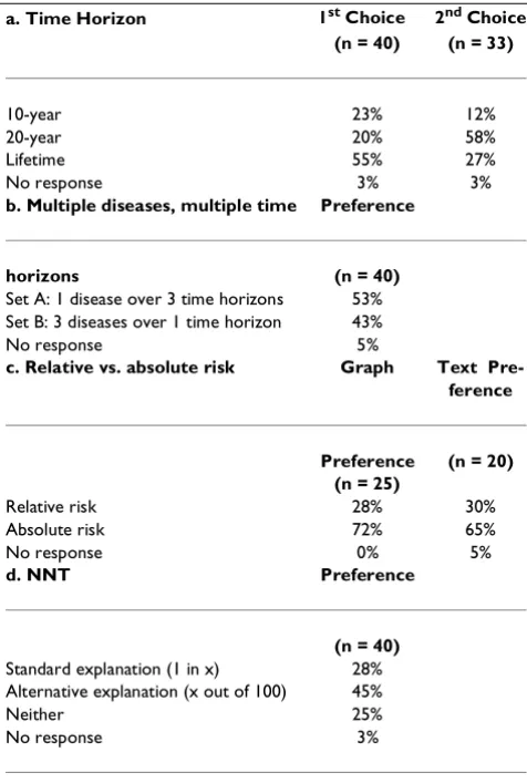
a. Time Horizon 1st Choice 2nd Choice (n = 40) (n = 33)
10-year 23% 12%
20-year 20% 58%
Lifetime 55% 27%
No response 3% 3%
b. Multiple diseases, multiple time Preference
horizons (n = 40)
Set A: 1 disease over 3 time horizons 53% Set B: 3 diseases over 1 time horizon 43%
No response 5%
c. Relative vs. absolute risk Graph Text Pre-ference
Preference (n = 20) (n = 25)
Relative risk 28% 30%
Absolute risk 72% 65%
No response 0% 5%
d. NNT Preference
(n = 40)
Standard explanation (1 in x) 28% Alternative explanation (x out of 100) 45%
Neither 25%
No response 3%
Figure 1
Figure 2
Figure 3
Figure 4
treatment options [29]. Focus group participants re-marked that the graph presenting relative risk was "too alarming because the risks appeared bigger". Also, one respondent commented that she would "just want to know that the example is 100%," referring to the absolute risk graph presented on a 100% scale as opposed to the 40% scale used in the relative risk graph.
Few respondents preferred their risk estimates to be pre-sented as NNT. Although this concept may be useful to physicians because it accounts for differences in baseline risks, [30] it did not find favor among our study partici-pants who remarked that the concept was "confusing" and often asked focus group leaders for clarification. This finding is consistent with results by Cook et al who found that explaining risk estimates in terms of NNT during patient rounds can be time consuming and sub-ject to patient misinterpretation [31].
Limitations
The present study included a small, self-selected popula-tion of women who were more likely to be interested in health-related activities. Our sample size was small be-cause focus groups and 1-on-1 interviews were originally conducted to discuss HRT and decision-making issues. When convergence was reached on these broader topics, we ceased recruitment and analyzed data from these re-spondents. While these results may not be generalizable to all women, our sample included a diverse group of women with respect to race, income, and educational background. Recognizing that focus group discussions might lead to "group think", we control for this by asking participants to privately write down their personal pref-erences before they were discussed.
A formal analysis of patient comprehension for each presentation format was beyond the scope of the present study; however data on this topic has been previously re-ported [24]. While responses from focus group partici-pants reflected how well they felt they could understand the information in various formats, no formal testing of comprehension was performed. Analyzing comprehen-sion of each format at this stage was not feasible consid-ering the additional time burden it would have imposed on our study participants (focus group sessions lasted a full 2 hours). Presentation formats that are not under-standable may be misinterpreted; formats that are unap-pealing may be ignored. Therefore, future studies might test both comprehension and patient preferences simul-taneously to develop future risk communication tools.
The graphical presentations utilized were hypothetical in that they did not present each individual's personal risk estimates, but those of a theoretical woman. It is unlikely that patients' preferences for risk estimate presentations would have been different had they been shown their own risk estimates. Not all possible graph types were presented to study participants, although we attempted to include the most common graph types from the scien-tific and popular press. Although we did not systemati-cally study the reasons for participants' stated preferences, participants were asked open-ended ques-tions to understand these preferences. Finally, since sci-entific literature traditionally presents 5-year survival data, it might be difficult to compare our data, based on 10-year, 20-year and lifetime horizons, to that in the cur-rent literature.
Conclusions
Patients preferred health risks to be framed in absolute terms, using bar graphs, and calculated over their ex-pected lifetime. There was no clear preference for pre-senting a treatment's effect on multiple outcomes. The NNT is not an easily understood concept for patients, but if used to discuss multiple outcomes, it should be re-scaled to "x out of 100". The results of these analyses should help physicians present risk/benefit information to patients in a clear and useful manner.
Competing interests
None.
References
1. Bell RA, Kravitz RL, Wilkes MS: Direct-to-consumer prescription drug advertising and the public.JGIM 1999, 14:651-657 2. Mazur DH, Hickam DH: Interpretation of graphic data by
pa-tients in a general medicine clinic.JGIM 1990, 5:402-405 3. Mazur DJ, Merz JF: How the manner of presentation of data
in-fluences older patients in determining their treatment pref-erences.JAGS 1993, 41:223-228
4. Mazur DJ, Hickam DH: Patients' and physicians' interpretations of graphic data displays.Med Decis Mak 1993, 13:59-63
Figure 5
5. Woloshin S, Schwartz LM, Black WC, Welch HG: Women's per-ceptions of breast cancer risk: How you ask matters.Med De-cis Mak 1999, 19:221-229
6. Malenka DJ, Baron JA, Johansen S, Wahrenberger JW, Ross JM: The framing effect of relative and absolute risk.JGIM 1993, 8 :543-548
7. McGettigan P, Sly K, O'Connell D, Hill S, Henry D: The effects of information framing on the practices of physicians.JGIM 1999,
14:633-642
8. Hux JE, Levinton CM, Naylor CD: Prescribing propensity: Influ-ence of life-expectancy gains and drug costs.JGIM 1994, 9 :195-201
9. Forrow L, Taylor WC, Arnold RM: Absolutely relative: How re-search results are summarized can affect treatment deci-sions.Amer J Med 1992, 92:121-124
10. Bucher HC, Weinbacher M, Gyr K: Influence of method of re-porting study results on decision of physicians to prescribe drugs to lower cholesterol concentration.BMJ 1994, 309 :761-764
11. Hux JE, Naylor CD: Communicating the benefits of chronic preventive therapy: Does the format of efficacy data deter-mine patients' acceptance of treatment?Med Decis Mak 1995,
15:152-157
12. Barrett-Connor E: Hormone replacement therapy. BMJ 1998,
317:457-461
13. Grady D, Rubin SM, Petitti DB, Fox CS, Black D, Ettinger B, et al:
Hormone therapy to prevent disease and prolong life in postmenopausal women.Ann Intern Med 1992, 117:1016-1037 14. Hulley S, Grady D, Bush T, Furberg C, Henington D, Riggs B,
Vitting-hoff E: Randomized trial of estrogen plus progestin for sec-ondary prevention of coronary heart disease in postmenopausal women.JAMA. 1998, 280:605-613
15. Colditz GA, Hankinson SE, Hunter DJ, Willett WC, Manson JE, Stampfer MJ, Hennekens C, Rosner B, Speizer FE: The use of estro-gens and progestins and the risk of breast cancer in post-menopausal women.N Engl J Med 1995, 332:1589-1593 16. Nikolajevic-Sarunac J, Henry DA, O'Connell DL, Robertson J: Effects
of information framing on the intentions of family physicians to prescribe long-term hormone replacement therapy.JGIM
1999, 14:591-598
17. O'Connor AM, Tugwell P, Wells GA, Elmslie T, Jolly E, Hollingworth G, al et: A decision aid for women considering hormone ther-apy after menopause: Decision support framework and eval-uation.Patient Educ Counsel. 1998, 33:267-279
18. Lenert LA, Cher D: Use of meta-analytic models to support shared decision making over the WWW.JAMIA. 1999, 6 :412-419
19. Dickson GW, DeSanctis G, McBride DJ: Understanding the effec-tiveness of computer graphics for decision support: a cumu-lative experimental approach.Communications of the ACM. 1986,
29:40-7
20. Lucas HC, Nielson NR: The impact of the mode of information presentation on learning and performance.Manage Sci. 1980,
26:982-93
21. Bradt B: Informational needs and selected variables in pa-tients receiving brachytherapy.Oncol Nurs Forum. 1991, 18 :1221-7
22. Powers M, Lashley C, Sanchez P, Shneiderman B: An experimental comparison of tabular and graphic data presentation.Int J Man-Machine Studies. 1984, 20:545-66
23. Tullis TS: An evaluation of alphanumeric, graphic and color in-formation displays.Human Factors. 1981, 23:531-50
24. Feldman-Stewart D, Kocovski N, McConnell BA, Brundage MD, Mackillop WJ: Perception of quantitative information for treatment decisions.Med Decis Making. 2000, 20:228-238 25. Schapira M, Nattinger A, Eparvier : Identification of a risk
magni-tude bias associated with type of graphic format used to present probabilistic information.Med Decis Making. 2000 26. Lipkus IM, Hollands JG: The visual communications of risk.JNCI
Monographs. 1999, 25:149-163
27. Weinstein ND, Sahdman PM: Some criteria for evaluating risk
Risk Anal. 1993, 13:103-114
28. Col NF, Eckman MH, Karas RH, Pauker SG, Goldberg RJ, Ross EM, Orr RK, Wong JB: Patient-specific decisions about hormone replacement therapy in postmenopausal women.JAMA 1997,
277:1140-1147
29. Dupont WD, Plummer WD: Understanding the relationship be-tween relative and absolute risk.Cancer 1996, 77:2193-2199 30. Chatellier G, Zapletal E, Lemaitre D, Menard J, Degoulet P: The
number needed to treat: a clinically useful monogram in its proper context.BMJ 1996, 312:426-429
31. Cook RJ, Sackett DL: The number needed to treat: a clinically useful measure of treatment effect.BMJ 1995, 310:452-4
Pre-publication history
The pre-publication history for this paper can be ac-cessed here:
http://www.biomedcentral.com/content/backmatter/ 1472-6947-1-2-b1.pdf
Publish with BioMed Central and every scientist can read your work free of charge
"BioMedcentral will be the most significant development for disseminating the results of biomedical research in our lifetime."
Paul Nurse, Director-General, Imperial Cancer Research Fund
Publish with BMC and your research papers will be:
available free of charge to the entire biomedical community
peer reviewed and published immediately upon acceptance
cited in PubMed and archived on PubMed Central
yours - you keep the copyright
[email protected] Submit your manuscript here:
http://www.biomedcentral.com/manuscript/