710 | P a g e
QUALITY CONTROL TOOLS FOR CONTINUOUS
IMPROVEMENT
Yogesh K. More
1, Prof.J.N.Yadav
21
Mechanical Engineering Department, SITRC, Sandip Foundation, Nashik, (India)
2
Assist.Prof.Mechanical Engineering Department, SITRC, Sandip Foundation, Nashik, (India)
ABSTRACT
The main aim of this paper is to understand the basic concept of Quality, Quality Control Tools to improve the
quality as well as maintain the quality. Quality Control Tools are very important tool and they are widely used
in various industries like Automobile, Production etc. The main seven quality control tools are Check Sheet,
Pareto Diagram, Histogram, Cause and effect diagram, Control Chart, Run-Chart and Scatter-Diagram are
generally used to improve the quality. All of these tools together can improve process and analysis that can be
very helpful for quality improvements. These tools make quality improvements process easier, simple to
implement.
Keyword: Cause-and-effect diagram, Check Sheet, Control Chart, Histogram, Pareto Diagram, Run-Chart, Scatter-Diagram, Quality, Quality Control Tools.
I.
INTRODUCTION
Quality improvement is a very essential topic in today‟s life. It can be express in many ways. Quality is the features and characteristics of product or services that can full fill the customer requirement or customer need. These can be achieving by using Quality Control Tools. The seven quality control tools are simple tools used for solving the problems related to the quality control. These tools were either developed in Japan or introduced to Japan by the Quality Gurus such as Deming and Juran. Kaoru Ishikawa of Japan had suggested seven simple tools that can be used for documentation, analysis and organization of data needed for quality control. These tools can solve most of problems in the industry. All this tools are important tools and widely used in manufacturing field, automobile field and various field where quality is important factor.,
1.1 Benefits of Quality Control:- Improve Quality. Cost reduction.
711 | P a g e
II.
QUALITY CONTROL TOOLS
Quality tools can be used in all department of production process, from the start of product development up to product marketing and customer support. The seven Quality Control Tools are simple statistical tools used to monitor the overall operation. The following are the basic quality control tools used for the continuous improvement in the manufacturing process. The Seven Quality Control Tools are as follows.
2.1 Check Sheets
The check sheet is a form of document used to collect data in real time at the location where the data is generated. The data it captures can be quantitative or qualitative. When the information is quantitative, the check sheet is sometimes called a „Tally sheet‟ [1]. The defining characteristic of a check sheet is that data are recorded by making marks on it. A typical check sheet is divided into regions, and marks made in different regions have different significance. Data are read by observing the location and number of marks on the sheet.
2.1.1Types of check sheet
Defective item check sheet. Defective location check sheet. Defective cause check sheet. Check-up confirmation check sheet.
2.1.2 Check Sheet Procedure
1. Decide what event or problem will be observed. Develop operational definitions. 2. Decide when data will be collected and for how long.
3. Design the form. Set it up so that data can be recorded simply by making check marks or Xs or similar symbols and so that data do not have to be recopied for analysis.
4. Label all spaces on the form.
5. Test the check sheet for a short trial period to be sure it collects the appropriate data and is easy to use. 6. Each time the targeted event or problem occurs, record data on the check sheet. [2]
712 | P a g e
2.2 Flow Chart
A flowchart is a type of diagram that represents an algorithm, workflow or process, showing the steps as boxes of various kinds, and their order by connecting them with arrows. This diagrammatic representation illustrates a solution model to a given problem. [4] The first structured method for document process flow, the "flow process chart", was introduced by Frank and Lillian Gilbreth to members of the American Society of Mechanical Engineers (ASME) in 1921 in the presentation "Process Charts: First Steps in Finding the One Best Way to do Work"[5]. In the early 1930s, an industrial engineer, Allan H. Mogensen began training business people in the use of some of the tools of industrial engineering at his Work Simplification Conferences in Lake Placid, New York. Flowcharts are used in analyzing, designing, documenting or managing a process or program in various fields. Flowcharts are used in designing and documenting simple processes or programs. Like other types of diagrams, they help visualize what is going on and thereby help understand a process, and perhaps also find flaws, bottlenecks, and other less-obvious features within it. There are many different types of flowcharts, and each type has its own repertoire of boxes and notational conventions. A flowchart is described as "cross-functional" when the page is divided into different organizational units. A symbol appearing in a particular "lane" is within the control of that organizational unit. This technique allows the author to locate the responsibility for performing an action or making a decision correctly, showing the responsibility of each organizational unit for different parts of a single process. [6]
2.2.1 Flowchart Basic Procedure
Materials needed: sticky notes or cards, a large piece of flipchart paper or newsprint, marking pens. 1. Define the process to be diagrammed. Write its title at the top of the work surface.
2. Discuss and decide on the boundaries of your process: Where or when does the process start? Where or when does it end? Discuss and decide on the level of detail to be included in the diagram.
3. Brainstorm the activities that take place. Write each on a card or sticky note. Sequence is not important at this point, although thinking in sequence may help people remember all the steps.
4. Arrange the activities in proper sequence.
5. When all activities are included and everyone agrees that the sequence is correct, draw arrows to show the flow of the process.
6. Review the flowchart with others involved in the process (workers, supervisors, and suppliers, customers) to see if they agree that the process is drawn accurately. [7]
713 | P a g e
Fig. 2:- Flow Chart [8]
2.3 Histogram
A Histogram shows history representation of the distribution of numerical data. It is an estimate of the probability distribution of a data (continuous variable and quantitative variable) and was first introduced by Karl Pearson [9]. To construct a histogram, the first step is to "bin" the range of values that is, divide the entire range of values into a series of intervals and then count how many values fall into each interval. The bins are usually specified as consecutive, non-overlapping intervals of a variable. The bins (intervals) must be adjacent, and are often of equal size. [10]
714 | P a g e
However, bins need not be of equal width; in that case, the created rectangle is defined to have its area proportional to the frequency of cases in the bin. Histograms give a rough sense of the density of the underlying distribution of the data, and often for density estimation: estimating the probability density function of the underlying variable. The total area of a histogram used for probability density is always normalized to 1. If the length of the intervals on the x-axis is all 1, then a histogram is identical to a relative frequency plot. [11] The histogram is one of the seven basic tools of quality control. Histograms are sometimes confused with bar charts. A histogram is used for continuous data, where the bins represent ranges of data, while a bar chart is a plot of categorical variables. Some authors recommend that bar charts have gaps between the rectangles to clarify the distinction. But it is not required to give the gap between them.Fig. 3:- Histogram [12]
2.4 Pareto Chart
A Pareto chart is given by, Vilfredo Pareto, is a type of chart that contains both bars and a line graph, where individual values are represented in descending order by bars, and the cumulative total is represented by the line.The left vertical axis is the frequency of occurrence, but it can alternatively represent cost or another important unit of measure. The right vertical axis is the cumulative percentage of the total number of occurrences, total cost, or total of the particular unit of measure. Because the reasons are in decreasing order, the cumulative function is a concave function. [13] The purpose of the Pareto chart is to highlight the most important among a (typically large) set of factors. In quality control, it often represents the most common sources of defects, the highest occurring type of defect, or the most frequent reasons for customer complaints, and so on. Wilkinson (2006) devised an algorithm for producing statistically based acceptance limits (similar to confidence intervals) for each bar in the Pareto chart [13]. A Pareto chart is a bar graph. The lengths of the bars represent frequency or cost (time or money), and are arranged with longest bars on the left and the shortest
715 | P a g e
2.4.1 Pareto Chart Procedure
1. Decide what categories you will use to group items.
2. Decide what measurement is appropriate. Common measurements are frequency, quantity, cost and time. 3. Decide what period of time the Pareto chart will cover: One work cycle? One full day? A week? 4. Collect the data, recording the category each time. (Or assemble data that already exist.)
5. Subtotal the measurements for each category.
6. Determine the appropriate scale for the measurements you have collected. 7. Mark the scale on the left side of the chart.
8. Construct and label bars for each category. Place the tallest at the far left, then the next tallest to its right and so on. If there are many categories with small measurements, they grouped as “other.”[14]
Fig. 4: Pareto Chart [15]
2.5 Cause and Effect Diagram
Cause and Effect Diagram (also called fishbone diagrams, herringbone diagrams, or Fishikawa) are causal diagrams created by Kaoru Ishikawa (1968) that show the causes of a specific event [16]. Common uses of the Cause and Effect Diagram are product design and quality defect prevention to identify potential factors causing an overall effect. Each cause or reason for imperfection is a source of variation. Causes are usually grouped into major categories to identify these sources of variation. [17]
716 | P a g e
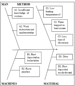
The 5 M‟s are, Machine Method Material Man Power Measurement [17]
2.5.1 Cause–and–Effect Diagram Procedure
1. Agree on a problem statement (effect). Write it at the center right of the flipchart or whiteboard. Draw a box around it and draw a horizontal arrow running to it.
2. Brainstorm the major categories of causes of the problem. If this is difficult use generic headings: o Methods
o Machines (equipment) o People (manpower) o Materials
o Measurement o Environment
3. Write the categories of causes as branches from the main arrow.
4. Brainstorm all the possible causes of the problem. Ask: “Why does this happen?” As each idea is given, the facilitator writes it as a branch from the appropriate category. Causes can be written in several places if they relate to several categories.
5. Again ask “why does this happen?” about each cause. Write sub–causes branching off the causes. Continue to ask “Why?” and generate deeper levels of causes. Layers of branches indicate causal relationships.
6. When the group runs out of ideas, focus attention to places on the chart where ideas are few. 7. And in these ways cause and effect diagram can be draw. [18]
717 | P a g e
2.6 Scatter Diagram
The scatter diagram graphs pairs of numerical data, with one variable on each axis, to look for a relationship between them. It is very helpful for giving the relationship between the two quantities and both the quantity may be different from each other. In which one quantity is lies on the X-axis and another quantity lies on the Y-axis. If the variables are correlated, the points will fall along a line or curve. The better the correlation, the tighter the points will meets the line. If there is no correlation between them, then all points are scattered.
2.6.1 Scatter Diagram Procedure
1. Collect pairs of data where a relationship is suspected.
2. Draw a graph with the independent variable on the horizontal axis and the dependent variable on the vertical axis. For each pair of data, put a dot or a symbol where the x-axis value intersects the y-axis value. (If two dots fall together, put them side by side, touching, so that you can see both.)
3. Look at the pattern of points to see if a relationship is obvious. If the data clearly form a line or a curve, You may stop. The variables are correlated. You may wish to use regression or correlation analysis now.
Otherwise, complete steps 4 through 7.
4. Divide points on the graph into four quadrants. If there are X points on the graph, o Count X/2 points from top to bottom and draw a horizontal line.
o Count X/2 points from left to right and draw a vertical line.
o If number of points is odd, draw the line through the middle point.
5. Count the points in each quadrant. Do not count points on a line.
6. Add the diagonally opposite quadrants. Find the smaller sum and the total of points in all quadrants. A=points in upper left + points in lower right
B = points in upper right + points in lower left Q = the smaller of A and B
N = A + B
7. Look up the limit for N on the trend test table. o If Q is less than the limit, the two variables are related.
718 | P a g e
Fig. 6:- Scatter Diagram. [21]2.7 Control Chart
The control chart is a graph used to study how a process changes over time. Data are plotted in time order. A control chart always has a central line for the average, an upper line for the upper control limit and a lower line for the lower control limit. These lines are determined from historical data. The control chart was invented by Walter A. Shewhart while working for Bell Labs in the 1920s. [22]
2.7.1 Control Chart Basic Procedure
1. Choose the appropriate control chart for your data.
2. Determine the appropriate time period for collecting and plotting data. 3. Collect data, construct your chart and analyze the data.
4. Look for “out-of-control signals” on the control chart. When one is identified, mark it on the chart and investigate the cause. Document how you investigated, what you learned, the cause and how it was corrected. [23]
If the process is in control then all the points will fall between the control limits and if the process is not in control then all the points will fall out of control limits. The purpose of control charts is to allow simple detection of events that are not control in actual process change. This simple decision can be difficult where the process characteristic is continuously varying. The control chart provides statistically objective criteria of change. When change is detected and considered good its cause should be identified and possibly become the new way of working, where the change is bad then its cause should be identified and eliminated.
2.7.2 Uses of Control Chart
• It helps the process perform consistently and predictably. • It can minimise the variation in output.
719 | P a g e
2.7.3 There are many types of control chart and data required to that are as follows
Process is in Control.
Fig. 7:- Control Chart [24]
Process is not in Control.
Fig. 8:- Control Chart [24]
Chart Data Required
X-chart Variables
R-chart Variables
s -chart Variables
p-chart Variables
np-chart Attributes
c-chart Attributes
720 | P a g e
III.
CASE STUDY
INTRODUCTION
Quality improvement is a continuous process which assumes the implementation of quality control tools. Quality, productivity and cost of operation relatively dependent on each other [2]. The main goal of quality management is customer satisfaction by delivery of defect free products at minimum cost. By application of quality tools cost of Rs.12677.57 saved per year. Jha et al. (2013) conducted a case study to reduce the scrap in automotive assembly lines using quality control tools [6]. It results in huge saving in cost to the company. The study conducted by Fouad and Mukattash (2010) in steel industry helps to reduce majority of problems related to the quality [3]. In this research, the rejection of bicycle Rims has been reduced by application of quality control tools in Bicycle Rim manufacturing industry located in Ludhiana. The study will be highly beneficial for bicycle industry. The Continuous process improvement requires appropriate quality control tools and is of matter of facts collected with precisions. [1] Implemented the QC tools in Cement Industry to control the quality of ready mix cement.[3]proposed key ingredient for successful quality management by application of statistical process control and seven basic quality control tools. [4] Implemented Quality Control Tools to reduce the rejection of casting components in an automobile industry. This study results in reduce from 10% to 8.23% and saving of Rs. 27.7 Lakhs per year. [7] Planned a study to reduce the rejection of castings using Quality control tools (QC) in North India. The study results in annual saving of Rs. 10 lakhs. [5] Conducted a study aimed to find out the causes of quality related problems.Quality tools like cause and effect diagram, histogram, Pareto diagram and check sheet were used in the study. The major causes of rejection i.e. seal ring pore, latex coating damage and mating ring chip were controlled by appropriate action and defects were reduced from 9.6% to 7.9%.
PROBLEM
There are many quality related problems which were observed during the work in industry. The Rejection Observed was 9.45% which was alarming due to some critical manufacturing defects. The temperature of water for coating the chromium is (550 C- 600 C) but the actual coating temperature was below the specified range. Raw material was also rusty. The time of chromium plating (5 minutes) was less them actual time (8-10 minutes) required for ensuring the effectiveness of coating. Boiler tubes also to be cleaned for ensuring the proper heat transfer to water to raise the water to desired temperature without overheating the tubes of the boilers. Unskilled handling of components leads to non-circular shape of rim. Material should also be Cleaned and rust free before butt welding to ensure a sound welded joint. Misaligned welded joint was also a problem in manufacturing. Due to all these reasons there are many defects in rim which includes corrosion in storage conditions, scratches/ marks, incorrect hole alignment,dents, weld gaps, weld breakage, incorrect cross section geometry, non-circularity in shape.
SOLUTION
721 | P a g e
data was collected with accuracy and precision and some standard working procedure were proposed for chemical coating, stacking and material handling and remedies were also proposed. Quality tools i.e. Pareto chart, Cause and Effect Diagram were used in the study. The main conclusions of the study are summarized as below.1. Rejection of the rims has been reduced from 9.45% to7.75% for overall production of the components. 2. Saving of Rs. 3.54 lakhs per year.
3. Material handling and stacking process are alsonstandardized.
4. By proper regular cleaning of boiler tubes the higherefficiency can be obtained and saving in fuel (up to 10%) can be achieved.
5.
QUALITY CONTROL TOOLS USES
722 | P a g e
Fig. 10:- Pareto Chart of Defects.
Fig.11:- Cause and Effect Diagram for Defects.
IV. CONCLUSIONS
These seven quality control tools are easy to implement.
Seven quality tools are mainly useful for troubleshooting the problems related to quality control. It helpful for continuous improvement in manufacturing process.
723 | P a g e
These tools are mostly use to reduce the cost of product and cost of scrap. These tools are very useful to interpret the data in lower time and lower human effort.
V. REFERANCES
Referance Paper and Internate Sites Refers
[1]. John R. Schultz (2006). "Measuring Service Industry Performance: Some Basic Concepts". Performance Improvement. International Society for Performance Improvement. 45: 3.
doi:10.1002/pfi.2006.4930450405. Retrieved 2011-10-06
[2].http://asq.org/learn-about-quality/data-collection-analysis-tools/overview/check-sheet.html
[3]. http://www.cqeacademy.com/cqe-body-of-knowledge/continuous-improvement/quality-control-tools/check-sheet/
[4]. SEVOCAB: Software Systems Engineering Vocabulary. Term: Flow chart. Retrieved 31 July 2008. [5]. Frank Bunker Gilbreth, Lillian Moller Gilbreth (1921) Process Charts. American Society of Mechanical
Engineers.
[6]. https://en.wikipedia.org/wiki/Flowchart#cite_note-2
[7]. http://asq.org/learn-about-quality/process-analysis-tools/overview/flowchart.html [8]. https://www.edrawsoft.com/template-manufacturing-workflow.php
[9]. Pearson, K. (1895). "Contributions to the Mathematical Theory of Evolution. II. Skew Variation in Homogeneous Material". Philosophical Transactions of the Royal Society A: Mathematical, Physical and
Engineering Sciences. 186: 343–414. Bibcode: 1895RSPTA.186..343P. doi:10.1098/rsta.1895.0010
[10]. Howitt, D. and Cramer, D. (2008) Statistics in Psychology. Prentice Hall [11]. https://en.wikipedia.org/wiki/Histogram#cite_note-2
[12]. https://en.wikipedia.org/wiki/Histogram [13]. https://en.wikipedia.org/wiki/Pareto_chart
[14]. http://asq.org/learn-about-quality/cause-analysis-tools/overview/pareto.html
[15]. https://www.qualitydigest.com/inside/quality-insider-article/improvement-projects-services.html [16]. Ishikawa, Kaoru (1968). Guide to Quality Control. Tokyo: JUSE.
[17]. https://en.wikipedia.org/wiki/Ishikawa_diagram#cite_note-1
[18]. http://asq.org/learn-about-quality/cause-analysis-tools/overview/fishbone.html [19]. http://www.conceptdraw.com/How-To-Guide/cause-and-effect-diagram [20]. http://asq.org/learn-about-quality/cause-analysis-tools/overview/scatter.html
[21].http://excellence.ca/en/knowledge-centre/articles/graphing-marathon-measures-3-scatter-diagram
724 | P a g e
[23].http://asq.org/learn-about-quality/data-collection-analysis-tools/overview/control-chart.html[24]. http://iso9001-2008awareness.blogspot.in/2012/02/control-chart.html
CASE STUDY
[1]. Paliska G, Pavletic D and Sokovic M (2008), “Application of Quality Engineering tools in process Industry,” Advanced Engineering Journal, Vol.2, No.1, pp.73-86
[2]. Mandavgade N.K. and JajuS.B. (2009),”Optimization of Cost by Using 7 QC tools,” International Journal of Engineering Studies, Vol.1, No.3, pp. 149-160
[3]. Fouad H.K., Mukattash A (2010), Statistical Process Control: A Practical guide for Jordanian Industrial Organizations, “Jordan Journal of Mechanical and Industrial Engineering”, Vol. 4, No. 6, pp. 693-700. [4].Pal J (2012),”Implementation of Quality Control Tools in an Automobile Organization to Reduce the
rejection of Casting Components,” International Conference on Research and Innovations in Mechanical Engineering, pp.613-622.
[5]. Bhosale D.S, Shilwant S.C. and Patil S.R. (2013),”Quality improvement in manufacturing processes using SQC tools,” International Journal of Engineering Research, Vol. 3, No.3, pp. 832-837.
[6]. Jha M, Tyagi R.K., Gupta G (2013),”Reduction of rejected components in an automobile assembly line using quality tools,” European Journal of Applied Engineering and Scientific Research and Technology, Vol. 2, No. 3, pp. 13-17.
![Fig. 2:- Flow Chart [8]](https://thumb-us.123doks.com/thumbv2/123dok_us/7771820.1279982/4.595.73.517.63.597/fig-flow-chart.webp)
![Fig. 3:- Histogram [12]](https://thumb-us.123doks.com/thumbv2/123dok_us/7771820.1279982/5.595.179.420.272.518/fig-histogram.webp)
![Fig. 4: Pareto Chart [15]](https://thumb-us.123doks.com/thumbv2/123dok_us/7771820.1279982/6.595.153.444.293.509/fig-pareto-chart.webp)
![Fig. 6:- Scatter Diagram. [21]](https://thumb-us.123doks.com/thumbv2/123dok_us/7771820.1279982/9.595.185.430.88.295/fig-scatter-diagram.webp)
![Fig. 8:- Control Chart [24]](https://thumb-us.123doks.com/thumbv2/123dok_us/7771820.1279982/10.595.125.474.104.501/fig-control-chart.webp)