Chris Wilson
School of Geography and Geosciences
University of St Andrews
St Andrews KY16 9AL
UK
Email: [email protected]
Published in June 2011 edition of
Population and Development Review
This version differs from the published work due to small final editorial
Introduction and background
Is the world converging to a single demographic regime? Or are groups of countries
following distinct paths through the process of demographic transition? The answers to these
questions are pivotal to our understanding of the nature and mechanisms of population
change. They are also key elements for deriving the assumptions underlying population
projections. Following an exploratory investigation by Wilson (2001), interest in global
demographic convergence has continued through the last decade. More attention has been
given to mortality (Bloom and Canning 2007; Clark 2010; Goesling and Firebaugh 2004;
Mayer-Foulkes 2003; McMichael et al. 2004; Moser et al. 2005; Neumayer 2004). The focus
on mortality may arise in part because life expectancy is one component in the calculation of
the widely used human development index, proposed by the United Nations, and is often used
in other calculations of the quality of life (Becker et al 2005; Gidwitz et al. 2010; Kenny
2005; Konya and Guisan 2008; Mayer-Foulkes 2010; Molina 2010; Neumayer 2003). It is
also the case that studying life expectancy (an increasing variable with no logical limit) is a
natural extension of economists’ interest in convergence in income. Fertility change, and its
implications, has also been examined through the lens of convergence, (Lee and Reher 2011;
Reher 2004, 2007; Wilson 2004; and especially Dorius 2008). However, convergence in total
fertility (the main variable of interest) is potentially more difficult to interpret than life
expectancy, as the TFR is a decreasing variable with a logical limit, zero, and ade facto
lower limit to date of around one. Thus convergence in fertility must, of its nature, be an
asymptotic process.
Perhaps the most intriguing aspect of much of the work on convergence is the
ambiguous nature of the conclusions. In mortality it seems that convergence was modest at
any time, and has been replaced by divergence since the 1980s (Moser et al. 2005), and in
fertility the only definite statistical evidence for convergence is found after 1990 (Dorius
2008). However, the limited degree of convergence that emerges from sophisticated analyses
seems to run contrary to the more mundane evidence from simple time-trends in total fertility
or life expectancy, which suggests that both the health and fertility transitions are in full
swing. In this brief note my aim is to consider the implications of the studies of convergence
published over the last 10 years and to sketch out a context within which I believe analysis of
convergence, and the ambiguous statistical evidence for it, can best be viewed. I address
mortality and fertility in turn, though some of the methodological points are relevant to both.
Rather than repeat the calculations made by the various scholars who have studied
various world regions have followed. When presented in this way, the data suggest that five
distinct regional histories can be traced in mortality, and three in fertility, and that global
convergence has moved more rapidly and unambiguously in fertility than in mortality. In
common with most analyses in the literature, here I use the comprehensive estimates of life
expectancy and total fertility since 1950 made by the United Nations Population Division as
part of their biennial population projections (United Nations 2009).
In answering the basic questions posed at the outset, demographers are able to draw
on an extensive literature, theoretical, methodological and empirical, within economics,
where convergence lies at the heart of modern economic growth theory (Barro and
Sala-i-Martin 1992, 2004). The classic methods used in economics refer to two distinct but related
measures: beta- and sigma-convergence. Beta convergence is said to occur when countries
that are laggards in the demographic transition (i.e. with lower life expectancy or higher
fertility at the start of a time period) show more movement towards convergence than those
further along the process of transition. Sigma-convergence occurs if the variance of the
variable under study, usually life expectancy or total fertility, diminishes over time. In
addition to these core indicators, scholars have also used a wide range of other measures of
dispersion to search for evidence of convergence. A potentially valuable dimension for
demography is the attention given in economics to “convergence clubs”, groups of countries
that show common trends, even if they differ from more general patterns of convergence.
This interest in diverse experiences has led to the hunt for multiple equilibria, sometimes
referred to as “twin peaks” when only two distinct distributions are expected (Quah 1996,
1997). The method of choice for the study of convergence in the presence of multimodality
has been “kernel density estimates” proposed by Silverman (1981). Bloom and Canning
(2007) have provided an example of the potential of this method for studying health
transition, though as yet no systematic study of fertility in this way has been published. In
short, the researcher interested in studying convergence has no lack of statistical tools fit for
Mortality
When considering the progress of the health transition, we see that the world is not a single
demographic system. Rather, it is cut by deep faults into a number of blocs, each with its own
distinctive trajectory of life expectancy. I have chosen here to divide the nations of the world
into five groups: the USSR and its successor states, the rest of the developed world (i.e. the
rest of Europe, North America, Japan and Australasia), Southern Africa (i.e. South Africa and
its English-speaking neighbours), the rest of Sub-Saharan Africa (i.e. East, Middle and West
Africa) and finally, the rest of the developing world. More sub-divisions could easily be
proposed, whose mortality history differs in some degree from the rest of the world.
However, I have chosen here to apply Occam’s razor with some determination, and present
what I see as two mainstream (and converging) stories (for the developed and developing
world) and three clearly different time tracks. I suggest that this five-way grouping captures
the most significant dimensions of global mortality change that are relevant to the issue of
convergence.
A note on the precise definitions of the five regions is needed here. The United
Nations’ estimates do not present a USSR grouping, so it was reconstructed from its
successors’ histories. I have chosen to focus on the USSR and the Post-Soviet states, even
though during the Communist era many other countries in Eastern and Central Europe also
saw life expectancy stagnate. However, in the two decades since the collapse of the Berlin
Wall most have begun to converge fairly rapidly with Western Europe. Only the Post-Soviet
States remain so strikingly divergent from the mainstream of health improvement. I also use a
slightly different definition of Southern Africa from the United Nations, including
Zimbabwe, whereas the UN places that country in Eastern Africa. I made the switch because
Zimbabwe’s trajectories in both life expectancy and total fertility manifestly have more in
common with its neighbours to the south than those to its north. With Zimbabwe added, the
Southern Africa group contains the countries where the reduction in life expectancy
occasioned by the spread of HIV/AIDS is greatest.
The five groups of nations are of very different size. The smallest, Southern Africa,
amounted to only 18 million people in 1950, rising to 71 million by 2010; it is now growing
at around one per cent a year. The USSR’s population at the start of the UN’s data in 1950
was 181 million, and that of its successor states 283 million (and declining) at the end of the
study period. East, Middle and West Africa had a population a little below that of the USSR
to begin with (156 million) but reached almost 750 million in 2010; it is growing at around
million by 2010, and is growing at 0.35 per cent per year. This leaves the rest of the world, by
far the largest group, with 1,517 million in 1950 and 4,773 million in 2010 (i.e. between 60
and 70 per cent of the global total). It is growing at around 1.25 per cent a year.
In creating the five regions used in the mortality analysis each country’s life
expectancy is taken into accountpro ratato its population. Thus the estimates presented here
are weighted averages of the components nations in each region. Appendix 1 gives more
detailed information on the population of each region over time.
Figures 1 and 2 present life expectancy at birth in each five-year period since 1950 for
females and males for the five world regions, along with the highest life expectancy for any
individual country in each period in the UN’s data (see Appendix 2). The two graphs show
essentially the same broad features, though a number of differences emerge in the details. The
Other Developed and Other Developing trends correspond to the mainstream health
transition; both rise steadily and, albeit slowly, are converging. Since the gains in life
expectancy in recent decades have been close to linear for both groupings, as a rough and
ready indicator of convergence, we can compare the slopes of the two lines. If we consider
only the values after 1970 (the rise in life expectancy for the Other Developing category
through the 1960s was uniquely rapid), the female life expectancies would converge in about
65 years, while for males it would take a little over 90 years. This extrapolation is not
intended, of course, to be a forecast; the future is sure to hold many surprises. However, the
simple comparison of trends does provide an indication of the relatively sedate pace at which
the mainstream of health transition is advancing. Yet this is the good news in Figures 1 and 2,
because in none of the three other groupings is there any evidence that convergence is
underway at all.
Looking first at Africa we can see that the gap in life expectancy between EMW
Africa and the Other Developed category has remained roughly constant. In 1950-55 the gap
was 28.4 years for males (64.1 versus 35.7) and 30.3 years for females (68.6 versus 38.3); by
2005-10 the gap was 25.6 for males (76.1-50.5) and 29.3 for females (81.9-52.7). At this rate,
the gap between the majority of Sub-Saharan Africa and the developed world would not close
for centuries; for Southern Africa the situation is even worse. After four decades when the
gains in life expectancy roughly paralleled the rest of the developing world, the last 20 years
have seen the most striking, sustained reversal yet observed in life expectancy, as HIV/AIDS
30 40 50 60 70 80
1950-55 1960-65 1970-75 1980-85 1990-95 2000-05
Y
e
a
[image:6.595.73.509.81.710.2]rs
Figure 1: Life expectancy for females, world regions and maximum national value, 1950-55 to 2005-10
EM&W Africa
Other Developing
Soviet and Post-Soviet
Other Developed
Data source: United Nations (2009)
S Africa Maximum
Other Developing S Africa
30 40 50 60 70 80
1950-55 1960-65 1970-75 1980-85 1990-95 2000-05
Y
e
a
[image:6.595.81.511.402.707.2]rs
Figure 2: Life expectancy for males, world regions and maximum national value, 1950-55 to 2005-10
EM&W Africa Other Developing
Soviet & Post-Soviet
Other Developed
Data source: United Nations (2009)
For Southern Africa hope may lie in the future, if antiviral medication becomes
generally available, extending the lives of people living with HIV, but the recent past speaks
only of divergence rather than convergence. In consequence of the mortality reversals in
Southern Africa and limited gains elsewhere in Sub-Saharan Africa, by 2005-10 countries in
these regions made up the overwhelming majority of those anywhere in the world with high
mortality. Taking the two sexes together, there are 40 countries in the world where life
expectancy falls short of 60 years; 39 are in Sub-Saharan Africa, accompanied only by
Afghanistan, the lowest of all at 43.8.
The experience of the USSR and Post-Soviet States is also deeply unsettling for any
notion of an inevitable health transition, with no sign of any convergent dynamic since the
1960s, and a stagnating life expectancy moving them ever further away from the leaders in
health transition. It is easy to forget now, after decades of decline, that in the late-1950s and
1960s the European parts of the Soviet Union enjoyed life expectancy comparable with many
countries in Western Europe. The turn-around for males is especially striking. In 1960-65, for
example, Ukraine had a male life expectancy of 67.4, similar to that in France (67.2). By
2005-10 French males had an almost 15-year advantage over their Ukrainian counterparts
(77.6 versus 62.8). Russia was never quite so advanced in the health transition as Ukraine,
but in 1960-65 life expectancy for males was 64.1; a value it has not equalled since.
In contrast with the situation 50 years ago, today the Post-Soviet States find
themselves closer to the opposite end of the spectrum of life expectancies. By 2005-10 male
life expectancy for Russia was 58.45; 42 of the 49 countries falling below this value were in
Sub-Saharan Africa, the others being Afghanistan, Cambodia, East Timor, Haiti,
Kazakhstan, Myanmar and Papua New Guinea. At just 61.9, the overall male life expectancy
for the Post-Soviet States is now well below that for the Other Developing group of nations
(66.4), while female e(0) remains somewhat ahead (73.0 versus 70.1).
How does the consideration of Figures 1 and 2 help us interpret measures of
convergence in mortality? Clearly, we cannot speak of truly global convergence, but the fact
that by far the most populous grouping of countries, the Other Developing category, is
converging with the rich world suggests that there is reason to see convergence as a general
(though not universal) process. However, it is also clear that understanding the exceptions is a
key requirement for any assessment of convergence. In this regard, the experience of EMW
Africa is especially significant, as it now constitutes a much larger fraction of the world’s
cent). Given that the life expectancy gap between EMW Africa and the Other Developed
stayed roughly constant, this means that the low tail of the distribution of life expectancy
remained as far away as ever from the high end. Moreover, the percentage of the world’s
population living in EMW Africa has been growing. In such a situation, many statistical
indices will indicate at best a weak degree of convergence, even if the majority of countries
are closing the gap on the global leaders. Thus, even before the stagnation of life expectancy
in the USSR and the onset of the HIV/AIDS crisis in Southern Africa, we can expect at best
tentative statistical evidence of convergence, with divergence predominating more recently.
Fertility
Compared with the diverse experience seen in the health transition, the story of fertility
decline over recent decades is relatively simple. Figure 3 presents just three regions, rather
than the five chosen to portray trends in life expectancy, along with the lowest value of total
fertility in any country in each five-year period (see Appendix 2). Because their fertility
trends over time are similar, Southern Africa has been included with the rest of the
developing world, while the USSR is subsumed into the developed world category. Only the
East, Middle and West Africa grouping is presented separately. Before 1970 there was no
significant downward trend to fertility in either the EMW Africa group or the rest of the
developing world. Until the 1970s the only developing countries to have seen marked fertility
decline were exceptional cases (mostly the more economically advanced countries of East
Asia and Latin America). In 1965-70 the TFR for the Other Developing grouping was 5.7,
against 2.4 for the developed world. The gap between these two groupings (which together
constitute the lion’s share of the world’s population) has shrunk steadily over the four
subsequent decades, with the TFRs in 2005-10 being 2.3 and 1.6. In fact, there are reasons to
suspect that the gap in fertility may be even smaller. Few developing countries have accurate
and complete birth registration, with only intermittent censuses and surveys to use as the
basis for estimating trends. So there is inevitably an aspect of estimation involved in
assessing recent levels, and The United Nations have tended to overestimate fertility in the
recent past (O’Neill et al. 2001). In part this arises because the estimates of past trends are
intended to splice smoothly on to future levels; thus fertility decline is seen as having a
“smooth landing” rather than an abrupt point of inflection when the assumed long-run level
of fertility is reached. Some scholars have also suggested that the UN’s estimates of fertility
in China are probably too high (Zhang and Zhao 2006). But even if the UN’s estimates are
(roughly 1 child less per 12 years) then we can expect the Other Developing and Developed
categories to have converged within 10 years. Given that fertility is rising or stable in much
of the rich world, but falling in the bulk of developing countries, we may see the gap closed
even sooner. Over a slightly longer time frame, we cannot exclude the possibility of a
reversed differential, with high fertility in the rich world than in the poor.
0 1 2 3 4 5 6 7 8
1950-55 1960-65 1970-75 1980-85 1990-95 2000-05
T
F
[image:9.595.90.509.196.462.2]R
Figure 3: Total fertility, world regions and minimum national value, 1950-55 to 2005-10
Developed World
EM&W Africa
Other Developing
Data source: United Nations (2009)
Minimum
Already there is considerable overlap between the distributions of fertility in
developing and developed countries. Fertility is lower in Iran and North Korea than in the
United States, lower in Tunisia and Lebanon than in France, lower in Barbados and Trinidad
and Tobago than in the United Kingdom. Given this dramatic narrowing of the gap between
fertility in most parts of the world, how are we to interpret the finding in Dorius (2008) that
most indices of convergence suggest that there was no global convergence before the 1990s?
The answer, as suggested by Dorius, lies in the third trajectory in Figure 3, that of the bulk of
Sub-Saharan Africa. Fertility there remained high, and even increased, until 1990. With the
high tail of the global fertility distribution fixed in this way, measures of convergence are
essentially bound to indicate divergence. Only in the last 20 years, as fertility has fallen in the
last large exception to decline, do the global measures indicate convergence. Fertility in
EMW Africa is still high (5.25), and 35 of the 39 highest national TFRs are to be found there,
slower than that seen for the rest of the developing world as a whole since 1970. It implies
that EMW Africa will fall to the current level of the developed world in a little over 50 years.
The speed and generality of the fertility decline stand is sharp contrast to the
ambiguous picture of convergence seen in mortality. Nowhere do we see departures from the
general fertility trends comparable with the stagnation in life expectance in the USSR and
Post-Soviet States, let alone the massive drop in life expectancy suffered by Southern Africa.
Although there have been pauses and plateaux in national TFRs, both in the historical
transition in Europe and the contemporary developing country experience, none has involved
the scale of divergence seen in mortality. There seems every reason to view fertility transition
as a genuinely global phenomenon (Reher 2004). In this context, it is time for demographers
to pay serious attention to the issue of post-transitional fertility in developing countries; much
of the developing world is, or soon will be, “post-transitional”. Unfortunately, in spite of a
great deal of research over many decades, the determinants of post-transitional fertility are far
from being well understood. Moreover, the existing literature on both the causes and the
implications of very low fertility is overwhelmingly concerned with developed countries,
especially Europe. This leaves us facing several fundamental and unanswered questions. How
far will fertility fall in the developing world? What can the countries now entering the era of
low fertility learn from the experience of Europe, East Asia, and other well established
regions of low fertility? How will individuals, families, societies and governments in the
developing world adapt to this new fertility regime? These questions have scarcely been
posed to date, and never investigated in depth; they set a new research agenda for fertility
studies.
Conclusion – A “main sequence” of demographic transition
A famous graph in astronomy, the Hertzsprung-Russell Diagram, plots the colour or spectrum
of a star against its magnitude or luminosity. Most stars fall along a diagonal line that is
known as the “main sequence”, but some types of star (red giants, white dwarves etc.) occupy
positions away from the main diagonal. Inspired by this diagram, Figure 4 presents the paths
followed over time by the five world regions used to decompose mortality trends; total
fertility is plotted on the horizontal (with a reversed scale) and life expectancy on the vertical.
The figure conveniently encapsulates the different trends in each region, but removes the
dimension of time, showing instead the combination of life expectancy and total fertility
found in each five-year period. The mass of the developing world’s population, in the Other
fertility, and then embarks on a long and almost linear track across the diagram, as both
mortality and fertility fall. Southern Africa largely parallels the trend of the Other Developing
category, but then falls away dramatically. EMW Africa shows an initial rise in both life
expectancy and fertility, and then begins its transit across the diagram, though it is still only
in the early stages of both the health and fertility transitions. The striking divergence between
the Soviet and Post-Soviet experience and that of the remainder of the developed world is
also immediately apparent.
1 2
3 4
5 6
7
e
(0
)
[image:11.595.90.504.250.504.2]TFR
Figure 4: Paths of total fertility versus life expectancy (both sexes), world regions, 1950-55 to 2005-10
EM&W Africa
S Africa
USSR and Post-Soviet
Other Developed
Other Developing
Data source: United Nations (2009)
80
70
60
50
40
30
Of course, the Other Developing grouping is immense and its smoothness could mask
a more heterogeneous pattern within smaller aggregations. Figure 5, presenting the five
regions of which the Other Developing group is composed, shows that this is not the case; the
similarity of trends could scarcely be clearer. The lines for Latin America (including the
Caribbean) and the composite of North Africa and West Asia (i.e. mostly the Islamic nations
from Morocco to Iran) are so close as to be barely distinguishable for much of the graph,
though the Latin America line advances further. Similarly, South-Central Asia (i.e. mostly the
Indian Sub-continent) and South-East Asia show a remarkable degree of overlap, though the
former has moved less far. Of the five regions, only East Asia (i.e. overwhelmingly China)
has a distinctly different time track, with an abrupt initial rise in life expectancy (the effects
of the Great Leap Forward famine are somewhat masked because it falls into two
30 40 50 60 70
1 2
3 4
5 6
7
e
(0
)
[image:12.595.84.497.117.355.2]TFR
Figure 5: Paths of total fertility versus life expectancy (both sexes), world regions, 1950-5 to 2005-10
E Asia
E Asia
SC Asia
SE Asia N Africa & W Asia
L America
Data source: United Nations (2009)
In short, figures 4 and 5 suggest that it makes sense to view most demographic change
over the past half century as falling along a “main sequence” of demographic transition. The
principal differences between the regions of the developing world lie in when they enter this
main sequence and how rapidly they move along it. The figures also reiterate the exceptional
nature of the HIV/AIDS crisis in Southern Africa and the health crisis in the Soviet and
Post-Soviet States. The similarity between the different lines in Figure 5 is a particularly striking
finding. The regions are highly diverse in culture and in the level of socio-economic
development; they also differ in the date at which fertility transition began and in the tempo
of their transitions, yet they follow very similar trajectories. This finding suggests that the
health and fertility transitions are more tightly connected than is often appreciated.
This paper has painted the global demographic scene with the very broadest of
brushes; consideration of smaller units of aggregations yields a more nuanced picture of
change. Yet there is value in reminding ourselves of the powerful similarities that exist in the
demographic transition (Dyson 2010). The overwhelming majority of humanity is engaged in
a process of demographic convergence. There is good reason to view the fertility transition as
a truly global process, with no evidence of significant reversals and only a few countries still
to embark upon it. Within a decade or so, we can expect fertility for the large majority of the
transformation and there is disturbing evidence of its fragility, with stagnation and reversals
affecting hundreds of millions of people.
Acknowledgements
I received helpful comments on an earlier version of the paper from Shawn Dorius, David
Reher, Vladimir Shkolnikov and two anonymous referees.
References
Barro, Robert J. and Xavier Sala-i-Martin. 1992. “Convergence,”The Journal of Political
Economy100: 223–25.
———2004.Economic Growth, 2nd ed., Cambridge: MIT Press.
Becker, Gary S., Tomas J. Philipson, and Rodrigo R. Soares. 2005.“The quantity and quality
of life and the evolution of world inequality,”The American Economic Review95: 277–291.
Bloom, David E. and David Canning. 2007. “Mortality traps and the dynamics of health
transitions,”Proceedings of the National Academy of Sciences104: 16044-16049.
Clark, Rob 2011. “World health inequality: convergence, divergence and development”
Social Science and Medicine72, 617-624.
Dorius, Shawn F. 2008. “Global convergence? A reconsideration of changing intercountry
inequality in fertility,”Population and Development Review34: 519-537.
Dyson, Tim. 2010.Population and Development: the Demographic Transition. London and
New York: Zed Books.
Gidwitz, Zachary, Martin Philipp Heger, José Pineda and Francisco Rodríguez. 2010.
Understanding Performance in Human Development: A Cross-National Study. Human
Development Research Paper 2010/42. New York: United Nations Development Programme.
Goesling, Brian and Glenn Firebaugh. 2004.“The trend in international health inequality,”
Kenny, Charles. 2005.“Why are we worried about income? Nearly everything that matters is
converging,”World Development33: 1–19.
Konya, Laszlo and Maria-Carmen Guisan. 2008. “What does the human development index
tell us about convergence?,”Applied Econometrics and International Development8, 19-40.
Lee, Ron and David Reher (eds.) 2011.Demographic transition and its Consequences
Supplement toPopulation and Development Review, volume 37.
Mayer-Foulkes, David. 2003. “Convergence clubs in cross-country life expectancy
dynamics,” in Rolph van der Hoeven and Anthony F. Shorrocks (eds.)Perspectives on
Poverty and Growth, Tokyo: United Nations University Press, 144-171.
———2010.Divergences and Convergences in Human Development. Human Development Research Paper 2010/20. New York: United Nations Development Programme.
Anthony McMichael, Martin McKee, Vladimir Shkolnikov and Tapani Valkonen. 2004.
“Mortality trends and setbacks: Global convergence or divergence?”The Lancet, 363,
1155-1159.
Molina, George Gray and Mark Purser. 2010.Human Development Trends since 1970: a
Convergence Story. Human Development Research Paper 2010/02. New York: United
Nations Development Programme.
Moser, Kath, Vladimir M. Shkolnikov and David A. Leon. 2005. “World mortality
1950-2000: divergence replaces convergence from the late 1980s,”Bulletin of the World Health
Organization83(3): 202-209.
Neumayer, Eric. 2003.“Beyond income: Convergence in living standards, big time,”
Structural Change and Economic Dynamics14: 275–296.
———. 2004.“HIV/AIDS and cross-national convergence in life expectancy,”Population and Development Review30: 727–742.
O’Neill, Brian, Deborah Balk, Melanie Brickman, Markos Ezra. 2001. “A Guide to Global
Quah, Danny T. 1996. “Twin peaks: growth and convergence in models of distribution
dynamics,”Economic Journal106(437): 1045-55
———. 1997. “Empirics for growth and distribution: Stratification, polarization and convergence clubs,”Journal of Economic Growth2: 27-59.
Reher, David S. 2004. “The Demographic transition revisited as a global process,”
Population, Space and Place10: 19-41.
———. 2007. “Towards long-term population decline: A discussion of relevant issues”,
European Journal of Population23, 189-207.
Silverman, B. W. 1981. “Using kernel density estimates to investigate multimodality,”
Journal of the Royal Statistical Society Series B43: 97-99.
United Nations, 2009.World Population Prospects: the 2008 Revision. New York: United
Nations Population Division, Department of Economic and Social Affairs.
Wilson, Chris. 2001.“On the scale of global demographic convergence 1950–2000,”
Population and Development Review27: 155–171.
———. 2004.“Fertility below replacement level,”Science304(5668): 207–209.
Zhang, Guangyu and Zhongwei Zhao. 2006. “Re-examining China’s fertility puzzle: Data
collection and quality over the last two decades,”Population and Development Review32(2),
Appendix 1 – Data organisation
All data used in this paper are taken from the United Nations’World Population Prospects –
2008 Revision(United Nations 2009). However, the groupings of countries used in the paper
differ in some cases from those used by the United Nations. The five groups used here in the
analysis of mortality are defined as follows:
USSR and Post-Soviet States: Kazakhstan, Kirghizstan, Tajikistan, Turkmenistan, Uzbekistan
(from South-Central Asia); Armenia, Azerbaijan, Georgia (from West Asia); Belarus,
Estonia, Latvia, Lithuania, Moldova, Russia, Ukraine (from Europe).
Southern Africa: In addition to Southern Africa as defined by the UN, I include Zimbabwe.
East, Middle and West Africa: The same as the UN’s definition except for Zimbabwe which
is moved from East to Southern Africa.
Other Developed: The UN’s “More Developed” category minus the European members of
the USSR and Post-Soviet States.
Other Developing: The UN’s “Less Developed” category minus East, Middle, Southern and
West Africa, and minus the Asian members of the USSR and Post-Soviet States.
For the analysis of fertility, the USSR and Post-Soviet States are included in the
Developed category, and Southern Africa is included with the Other Developing grouping.
Table A1.1 gives the population in each of the five regions used here from 1950 to
2010, while Table A1.2 presents the same information as percentages of the global total. The
life expectancy and total fertility rates presented for each region in the paper are weighted
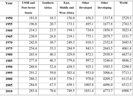
Table A1.1: Population (millions) in World Regions, 1950-2010 Year USSR and
Post-Soviet
States
Southern
Africa
East,
Middle and
West Africa
Other
Developed
Other
Developing
World
1950 181.0 18.3 156.0 656.3 1517.8 2529.3
1955 196.8 20.7 173.1 695.1 1677.8 2763.5
1960 214.3 23.5 194.1 734.6 1856.9 3023.4
1965 230.9 26.8 219.1 775.1 2079.7 3331.7
1970 242.8 30.7 249.3 810.3 2352.8 3685.8
1975 254.4 35.3 284.9 843.3 2643.5 4061.4
1980 265.4 40.3 329.0 872.1 2930.9 4437.6
1985 277.4 46.3 379,4 897.2 3246.0 4846.2
1990 288.8 52.4 438.5 925.1 3585.5 5290.5
1995 291.2 59.0 503.4 953.0 3906.6 5713.1
2000 288.2 63.8 576.1 978.0 4209.2 6115.4
2005 284.8 67.5 658.1 1005.8 4496.0 6512.3
2010 283.4 70.6 749.5 1031.4 4773.7 6908.7
Table A1.2: Percentage of World Population in Regions, 1950-2010 Year USSR and
Post-Soviet
States
Southern
Africa
East,
Middle and
West Africa
Other
Developed
Other
Developing
World
1950
7.2 0.7 6.2 25.9 60.0 100.0
1955
7.1 0.7 6.3 25.2 60.7 100.0
1960
7.1 0.8 6.4 24.3 61.4 100.0
1965
6.9 0.8 6.6 23.3 62.4 100.0
1970
6.6 0.8 6.8 22.0 63.8 100.0
1975
6.3 0.9 7.0 20.8 65.1 100.0
1980
6.0 0.9 7.4 19.7 66.0 100.0
1985
5.7 1.0 7.8 18.5 67.0 100.0
1990
5.5 1.0 8.3 17.5 67.8 100.0
1995
5.1 1.0 8.8 16.7 68.4 100.0
2000
4.7 1.0 9.4 16.0 68.8 100.0
2005
4.4 1.0 10.1 15.4 69.0 100.0
2010
4.1 1.0 10.8 14.9 69.1 100.0
Appendix A2 – Maximal values in the United Nations’ data
Figures 1 and 2 in the paper include lines for the highest life expectancy for females and
males in any country in each five-year period in the United Nations’ data. Similarly, Figure 3
shows the lowest national total fertility rate in each period. These values are listed in Table
[image:19.595.67.538.258.558.2]A2.1.
Table A2.1: Highest male and female life expectancy and lowest total fertility rate in United Nations’ data, 1950-55 to 2005-10
Period Female life expectancy Male life expectancy Total fertility rate
Country e(0) Country e(0) Country TFR
1950-55 Norway 74.5 Norway 70.9 Luxembourg 1.98
1955-60 Norway 75.5 Netherlands 71.4 Latvia 1.95
1960-65 Iceland 76.1 Sweden 71.6 Hungary 1.82
1965-70 Norway 76.7 Sweden 71.9 Latvia 1.81
1970-75 Norway 77.6 Sweden 72.1 Finland 1.62
1975-80 Iceland 79.3 Iceland 73.4 Luxembourg 1.49
1980-85 Iceland 79.8 Japan 74.1 Denmark 1.43
1985-90 Japan 81.3 Japan 75.5 Hong Kong 1.31
1990-95 Japan 82.5 Japan 76.3 Spain 1.27
1995-2000 Japan 83.9 Hong Kong 77.2 Hong Kong 1.08
2000-05 Japan 85.7 Iceland 79.3 Macao 0.84
2005-10 Japan 86.2 Iceland 80.2 Macao 0.95