© 2019, IRJET | Impact Factor value: 7.34 | ISO 9001:2008 Certified Journal
| Page 584
APPLICATION OF LEAN SIX SIGMA PRINCIPLES
Divyendu
1
B. Tech Undergraduate, Delhi Technological University, New Delhi, India
---***---
Abstract - This paper deals with the principle of Lean Six Sigma principles on Dip-Spin Antirust Coating Process of Aum Dacro Pvt. Ltd. I initiated the project with a brainstorming session on the methodology of evaluating the process i.e. the DMAIC approach and the sampling plan to be adopted, to prioritizing the critical to quality (CTQs) and finalizing the timeline. In the Define Phase, I defined the problem and objectives, established the project boundaries, focused on the CTQs and observed the process. In the Measure Phase, I collected comprehensive data related to every aspect of the process, primarily the number of defectives produced. I began the Analyze Phase by interviewing the plant manager and held extensive brainstorming sessions in which I came up with a Cause and Effect (Ishikawa diagram), outlining possible causes for the defects occurring in the production line. Then I narrowed down the scope of our project to the three major possible causes and ran an analysis using the Response Surface Methodology on Design Expert software. This analysis gave me a regression model, delineating the factors that were statistically significant along with the interaction effect of those factors that were of statistical significance. In the Improve Phase, I brainstormed with the business owners to come up with technically feasible and economically viable solutions to improve the process, coming up with novel solutions to error proof the process. Since the Control Phase generally has long timeline of about 6-12 months, this phase is out of the scope of my project.Key Words: Lean Six Sigma, Dip Spin Anti Rust Coating process, DMAIC, Critical to Qualities(CTQs), Define phase, Measure phase, Analyse phase, Ishikawa diagram, Regression analysis.
1. INTRODUCTION
1.1 SIX SIGMA
Six Sigma Methodology is a statistical approach to pin pointing factors that negatively affect a process and working on improving the process capability by reducing the variation inherent in the process. Bill Smith introduced and championed this approach while working at Motorola during 1986, saving the company billions of dollars over the next decade. Jack Welch recognized the power of this approach and made it central to the strategic planning efforts at General Electric. The DMAIC approach of Six Sigma doctrine is highly versatile and can be applied to not only manufacturing processes but also business processes of Service and Information Technology industries, making it highly utilized across a spectrum of companies across the globe. According to the six-sigma doctrine, a process that produces no more than 3.4 defectives per million pieces produced, in case of manufacturing processes, or 3.4 defectives per million instances, in case of service industries.
1.2 LEAN MANUFACTURING
Lean Manufacturing is, as is apparent from its name, manufacturing process with limited resources. To substantiate, Lean focusses on reducing the amount of resources utilized during a manufacturing process with primary focus on waste reduction. Lean Manufacturing was championed by Toyota in the early 1990s has been widely adopted by corporations throughout the world to save billions of dollars, thereby lowering costs and thus gaining considerable competitive advantage over their competitors.
1.3 SIX SIGMA AND LEAN MANUFACTURING
The concepts of Lean are purely subjective and can be applied anywhere, provided you have the pre-requisite
© 2019, IRJET | Impact Factor value: 7.34 | ISO 9001:2008 Certified Journal
| Page 585
1.4 DMAIC APPROACHDMAIC, referred to as Define, Measure, Analyze, Improve and control is a set of tools used to make a business process more efficient. It stabilizes and optimizes the process. The DMAIC betterment cycle is an extensive tool used to drive Six sigma and lean manufacturing projects. Nevertheless, DMAIC is not exclusive to Six Sigma and can be used as a basic tool for other improvement application, resulting in a cost saving and more effective process. All of the DMAIC process steps mentioned above are used it the respective order.
1.5 DEFINE
In this step, goal of the project is defined. External and internal customer deliverables are studied. It emphasizes on the selection of high-impact projects as well as the thorough understanding of all the key factors and methods affecting the process.
Define the following:
Problem being faced by the organization
Customer(s) experience
Voice of the customer (VOC) and Critical to Quality (CTQs) — what are the critical process outputs?
1.6 MEASURE
In this phase, data is collected with a purpose to objectively establish current baselines as the basis for improvement.
The data collected from the measure phase will be used during analyze stage and thereafter will be used to compare the data collected at the conclusion of this project to determine whether significant improvement was made using six sigma methodology. The team decides on quantities to be measured and ways to measure it.
1.7 ANALYZE
In this step, the data collected in the measure phase is analyzed. The objective of this step is to identify and select root causes to be eliminated. With the help of root cause analysis (like fishbone diagram) a variety ff root causes are identified for the particular problem. Then the top root causes (generally 2-3) are selected though multi-voting system for further validation. Following which, a data collection plan is formulated and data is collected to validate the root causes selected. This process is repeated until root causes can be identified. Generally complex analysis tools are used; however the use of basic tools is also appropriate depending on the complexity of the issue.
Steps which can be followed include:
Brainstorming Potential causes
Prioritizing causes
Finding the Root causes and prioritizing them
Identifying the relation between process inputs and outputs.
Analyzing data to understand the magnitude of significance of each root cause. Significance can be studied using
p-values and statistical tools like pareto chart, histogram etc.
Detailed process maps are created to map the root causes in the process and the factor contributing to its occurrence
1.8 IMPROVE
In this phase, a solution is identified for the given problem. The solution is tested and justified in part or on whole.
© 2019, IRJET | Impact Factor value: 7.34 | ISO 9001:2008 Certified Journal
| Page 586
solutions that are likely and apparent can also be thought of and studied. The purpose of this step is to find the effective solution and deploy improvements.1.9 CONTROL
In this step the improvements as studied in the previous stage is monitored to ensure continued and sustainable
benefits. The purpose of this step is to sustain gains. Control plan is created and records are updated and maintained.
2. Literature Review
The purpose of the work presented in this paper is to capture the current state of Six Sigma in Aum Dacro coatings
as well as to document the current practices of Six Sigma through a systematic approach. After referring various online portals and manuals, here presenting a literature survey.
In the literature of the practitioners, the definitions of Six Sigma are wider. To Pande et al. (2000, p. 3), Six Sigma can be defined as “a flexible system for improved performance and leadership”. To Rotondaro (2002, p. 18), “Six Sigma is a working philosophy to achieve, maximize and maintain the commercial success, through the understanding of customer
needs”. For Harry and Schroeder (2000), Six Sigma is a strategy that relies on its ability to fulfill its goals. Harry and
Schroeder (2000) also mention that the Six Sigma is a strategic initiative and can be considered by itself as a vehicle for other strategic initiatives.
KPMG lean six sigma Green belt certification (2017), explicitly covers the various domains involved in six sigma methodology. The objective of this certification is to answer various questions like “What is six sigma?”, “What is DMAIC approach?” “What are the main enablers and barriers to its application?” The training aims at helping individuals learn how to improve business productivity by eliminating waste and reducing process variations using the DMAIC- Define, Measure, Analyze Improve and Control approach.
The certification also includes introduction to Critical to quality (CTQs), project charter, ANOVA and concepts like Ishikawa Diagram.
Ibrahim Alhuraish* , Christian Robledo, Abdessamad Kobi University of Angers, LARIS Systems Engineering Research Laboratory (May 2017), studied the differences between lean manufacturing and six sigma in terms of their critical success factors. . Specifically, for organizations that have successfully implemented six sigma, skills and expertise ranked highest in importance. In contrast, for organizations that have successfully implemented lean manufacturing, employee involvement and culture change ranked highest.
While for Zu et al. (2008), the roles in Six Sigma is directly linked with the existence and importance of Green
Belts and Black Belts, Schroeder et al. (2008) describe the need for these figures as “ improvement specialists”, but proposes a broader definition for the logic of roles in Six Sigma, including the performance of the company's leadership as support and strategic alignment by creating a system of roles that allow real autonomy in changes of process, in which the authors define as “ parallel-meso structure”.
Schroeder et al. (2008) mention the importance of the projects which are chosen for leadership, thus ensuring high commitment of the leaders and thus avoiding projects that do not generate significant impacts to the organization.
3. Methodology
3.1 DESIGN-EXPERT SOFTWARE (BY STAT-EASE INC)
Design–Expert is a statistics based software package given by Stat-Ease Inc. which is dedicated specifically to perform and execute design of experiments (DOE). This software offers screening, comparative tests, categorization, optimization, vigorous parameter design and combined designs.
© 2019, IRJET | Impact Factor value: 7.34 | ISO 9001:2008 Certified Journal
| Page 587
making it feasible to comprehend a multi-dimensional surface. There is an optimization feature which can be used to calculate the optimum operating parameters for a process.3.1.1 Design of experiments
The design of experiments is the plan of a procedure which intends to portray the changeability of data under
[image:4.595.112.480.291.480.2]specific conditions which are hypothesized to indicate the said variation. The term indicates the design of an experiment which introduces conditions that directly affect the variation, but it may also be used to refer a design experiment in which naturally occurring variability influences the data selected for observation. In its most basic form, changes are incorporated in the experiments to observe and analyze the varied results that are represented by one or more independent variables, also described as "input variables" or "predictor variables". The change in one or more dependent variables, also referred to as "output variables" or "response variables" comes from the change in one or more independent variables. The experimental design also has the ability to identify control variables which must be held constant in order to prevent external factors from affecting the outcome of the process. The Design of Experiment aids in the selection process of the dependent and independent control variables and also contributes in executing the experiment with complete influence of the resource constraints under statistically optimized conditions.
Fig. 3.1: DESIGN OF EXPERIMENTS
3.1.1 Various facilities available after data input
After selecting the DOEs, we get different sets of values for the variables we have chosen. In this case we will be studying the effect of Temperature, Viscosity, and Specific gravity on excess coating. We will be taking a sample size of 400 for each of the varying values of the three variables and find out the number of defectives thus produced.
3.1.2.1 Effects
1) Half normal and normal plots
The least square estimations method is used to estimate the effect of the main effect relative to other main effects.
The Half-Normal plots are a graphical tool which is used to determine which of the process factors have a significant effect on the outcome and which ones are unimportant i.e. have no such effect on the outcome.
Thus, the unimportant factors have a normal distribution about the zero while the important factors are normally distributed about their own effect values.
A half-normal probability plot is given as:
Vertical Axis: Ordered arrangement of absolute value of the estimated effect of the main factors and their available interactions. If n data points have been collected without repetition, then typically (n-1) effects will be estimated plotted.
© 2019, IRJET | Impact Factor value: 7.34 | ISO 9001:2008 Certified Journal
| Page 588
medians from a halfnormal distribution are drawn. They depend only on the half-normal distribution and the number of items plotted = (n-1).From the half-normal probability plot, we can analyze the following:
Identifying the Important Factors:
Determining the important factors which significantly affect the process is the most important aim of the half-normal probability plot of effects. As discussed above, the estimated effect of an unimportant factor will be on or close to an estimated zero line, while the estimated effect of an important factor will typically be displaced well off the line.
Ranked List of Factors (including interactions):
This is a minor objective of the half-normal probability plot and is better done using the effects plot. To determine the ranked list of factors from a half-normal probability plot, simply scan the vertical axis effects
Which effect is largest? The factor identifier associated with this largest effect is the "most important factor". Which effect is next in size? The factor identifier associated with this next largest effect is the "second most
important factor".
Continue for the remaining factors.
2) Pareto chart
The Pareto chart is a graphical representation, which is a part of the quality control tool, used to manage model selection for two-level factorial designs. Its principle dictates that 80% of the failures come from 20% of the causes. This tool wholly recommends corrective measure based on present data.
It is usually recommended that we use the Half-Normal Plot of Effects to choose the statistically significant effects.
One more significant effect is usually found out using the pareto chart, which is also its primary use.
When we perform a hypothesis test in statistics, there is a “p-value” that helps us to determine the significance of our results. Hypothesis tests are used to verify the validity of a claim which is made about the population. This claim, in essence, is called the null hypothesis.
The p-value is quantified as a number between 0 and 1 and interpreted as given below:
A small p-value (typically ≤ 0.05) symbolizes strong evidence against the null hypothesis, so we reject the null
hypothesis.
A large p-value (> 0.05) symbolizes for weak evidence against the null hypothesis, so we cannot reject the null
hypothesis.
P-values very close to the cutoff (0.05) are considered to be marginal (could go either way).
For example, suppose a fast food establishment claims their delivery times (DT) are 30 minutes or less on an average but we believe it’s more than that. Hence, we conduct a hypothesis test because according to us, the null hypothesis, Ho, is that the mean DT is max 30 minutes, is incorrect. Our alternative hypothesis (Ha) would be that the mean time is greater than 30 minutes. We then take some random samples of delivery times and run the hypothesis test which concludes a p-value of 0.001 which is much less than 0.05.A probability of 0.001 means that we will incorrectly reject the establishment’s claim of a DT less than or equal to 30 minutes. Since we usually reject the null hypothesis at p-value less than 0.05, we conclude that the fast food establishment is wrong and that their DT is in fact more than 30 minutes on an average.
3) ANOVA
© 2019, IRJET | Impact Factor value: 7.34 | ISO 9001:2008 Certified Journal
| Page 589
ANOVA is a type of statistical hypothesis testing used extensively in the analysis of experimental data. A test result is termed statistically significant if it is unlikely to have occurred by chance, assuming the truth of the null hypothesis. A statistically significant result occurs when a probability (p-value) is less than a pre-specified threshold (significance level), justifies the rejection of the null hypothesis.A One-way or Two-way refers to the number of independent variables i.e. One-way has a single independent variable and Two-way has two (multiple) independent variables in the ANOVA test.
In the application of ANOVA, all group is random samples from the same population is the null hypothesis. Example: Studying the effect of different treatments on similar samples of patients. Here, all treatments have the same effect will be the null hypothesis. Rejecting the null hypothesis would mean that the differences in the effects observed between different groups is unlikely to be due to random chance.
While performing ANOVA, we adjust factors and measure responses in an attempt to determine an effect. Factors are assigned to experimental units by a combination of randomization to ensure the validity of the results keeping the weighing impartial. Responses show variability that is partially the result of the effect and partially random error.
3) MODEL GRAPHS
A variety of plots and graphs are provided by Design expert to show how the response varies with changes in the control. We use the view menu to change the type of plot. In this the contour and 3D plots are applicable only for continuous control variables. If you have 3 or more controls, you’ll obtain a plot of two of the controls with the remaining variables held at fixed settings. You can change the variables that are plotted and you can also change the settings of the fixed variables.
Some of the available plots are:
-One Factor: Main affects plot showing the average effect of shifting a single control, while holding the other controls constant.
-Interaction Plot: Plot showing how the effect of changing one control varies with changes in a second control
-Contour plots: Two dimensional projections of the three dimensional response surface plot.
3-D Surface graphs: Surface plots with rotational view which help obtain a better perspective.
Cube: Gives the numerical response values at each combination of three of the controls. Any further controls are
held at fixed settings.
4. Case Study
4.1 LEAN SIX SIGMA ON AUM DACRO COATINGS (IMT Manesar)
Aum Dacro Coatings is a Dip-Spin Coating unit for " GEOMET AND DACROMET COATING" It is in Technical
Collaboration with M/s. Nippon Dacro Shamrock Co. Ltd, Japan, through their Indian Arm M/s. Grauer & Weil (I) Limited.
It has 3 coating lines that are: DACROMET, GEOMET, and And TOP COAT.
4.2 DEFINE PHASE
PROJECT STATEMENT Application of Lean Six Sigma principles on Dip-Spin Antirust Coating Process of Aum Dacro Pvt. Ltd., for the part M202.577-wheel bolt (Part Code: Ma 434)
OBJECTIVE
To reduce the number of defective parts sent for reworking by 30th April 2018 while keeping resource utilisation at
the minimum.
PROJECT CHARTER TABLE 4.2.1 : PROJECT CHARTER
Project Code ME-407 Version 1.0 Date 18-09-2017
© 2019, IRJET | Impact Factor value: 7.34 | ISO 9001:2008 Certified Journal
| Page 590
Problem StatementApplication of Lean Six Sigma principles on Dip-Spin Antirust Coating Process of Aum Dacro Pvt. Ltd., for the part M641-Screw.
Project Objective
To reduce the number of defective parts sent for reworking by 30th April 2018 while keeping resource utilization at the
minimum.
Scope
The project will monitor the coating process only for the part M202.577-wheel bolt (Part Code: Ma 434)
The team will observe the process only for the part M202.577-wheel bolt (Part Code: Ma 434)
The team will collect data only for the part M202.577-wheel bolt (Part Code: Ma 434)
The team will interact with the staff only during the breaks
The team will visit the plant twice a week to ensure proper data collection methods are being followed by the staff
The team will not act to hamper/interrupt the coating process at any point during the project Project Schedule (Mention start and end dates)
Define Phase 18
th Sept 2017 –
30th Sept 2017 Improve Phase 1
st Mar 2018 - 30th Apr
2018 Measure
Phase 1
st Oct 2017 – 31st
Oct 2017 Control Phase Out of Scope
Analyze
Phase 1
st Dec 2017 – 1st
Mar 2018 Case study Presentation 25th May 2018
Resource Estimation
Resource Required Value (in INR)
Several hours of availability of business owners and plant
manager during the project NIL
1 hour walkthrough session for the team by the Plant Manager NIL
Access to data collection tools and machines NIL
Sponsor: Aum Dacro Pvt. Ltd. Member: Divyendu
4.5 CRITICAL TO QUALITY (CTQs)
CTQs or critical-to-quality(s) are key measurable characteristics of a product or process which need to be in optimum range of the specified limits for performance standards and for maintaining customer level satisfaction. CTQs are used to quantify the subjective problems voiced by the customers into measurable terms that are used for the regression analysis during analyze phase in a six-sigma project.
4.5.1 CTQs defined in the process
EXCESS COATING
Increase (as compared to the optimal value) in the thickness of the coating film which causes problem in the tightening of the components, mismatch of the tolerances etc. E.g.: Tightening problem of an engine bolt which leads to the damaging of the entire engine itself.
INSUFFICIENT COATING
Insufficient (as compared to the optimal value) film coating on the component results in a decrease in its corrosion resistant factor as measured by the Salt Spray test life (optimal value 720) leading to component failure.
MIXING OF COMPONENTS
The process involves coating of several types of parts for which the company takes in different components and
© 2019, IRJET | Impact Factor value: 7.34 | ISO 9001:2008 Certified Journal
| Page 591
LOW VOLUME DISPATCHED4.6 MEASURE PHASE
Measure Phase follows the Define Phase in a Six Sigma Process. The purpose of the Measure Phase is to collect all
the necessary data in order to properly conduct the data driven approach of Six Sigma Methodology. The data collected during Measure Phase is used to conduct a thorough root cause analysis, using various statistical tools such as hypothesis testing and regression analysis, during the Analyze Phase. The main task that needs to be performed in Measure Phase is:
Develop a data collection plan: While developing the data collection plan we should ask ourselves the following questions:
a. What data should we collect?
(This refers to the CTQs that we are targeting.)
b. What is the type of data we are collecting?
c. Is the data continuous or discreet?
d. How should we collect this data?
(This refers to the sampling methodology to be used.)
e. How much data should we collect?
(This refers to the optimum sample size for the project.)
TYPES OF DATA:
Continuous Data: The type of data that is measurable, such as time, weight, length, is called Continuous Data. Continuous data generally has an SI unit with it.
Discreet Data: The type of data that is not measurable but countable, such as number of people attending a meeting, true-false type of data, is called Discreet Data. Discreet Data generally does not have any SI unit with it.
Identifying the type of data correctly is of paramount importance as all the statistical tools used during the course
of a six-sigma project change according to the type of data that has been collected.
4.6.1 Sampling methodology
Choice of Sampling Methodology largely depends upon the type of variation occurring in the process.
TYPES OF VARIATION: A process can show two different types of variation:
Piece to piece variation: When the variation occurring in the process changes from work-piece to work-piece that
is being produced. This variation can be natural or be due to some assignable cause
Time to time variation: When the variation occurring in the process changes from time to time i.e. work pieces
being produced during the morning have different mean from the work pieces being produced in the afternoon. This type of variation generally occurs due to some assignable cause
There are two approaches to sampling methodology:
Process based
© 2019, IRJET | Impact Factor value: 7.34 | ISO 9001:2008 Certified Journal
| Page 592
Process based Sampling Methodology:Process based sampling is of 2 types:
Systematic Sampling: When the study population has been pre-arranged according to some pre-decided ordering
scheme and then elements are selected at regular intervals, it is called systematic sampling. It is also known as ‘interval sampling’.
Rational sub-grouping: Rational sub-groups are composed of items which are produced under essentially the
same conditions and the parameters such as mean and range are computed differently for each sub-group. The sub-group provides a snapshot of the process at that moment in time, providing much more insight into the process.
Population based Sampling Methodology:
Population based sampling is of 2 types:
Random Sampling: In this method we select units randomly in such a way that all the units in the population have
equal probability of being picked.
Stratified Random Sampling: This method is used when the population can be easily sub-divided into strata such
as male and female. In this method, the number of units selected from each strata should be in such a way that the ratio of nits from each strata in the sample is the same as that of the population.
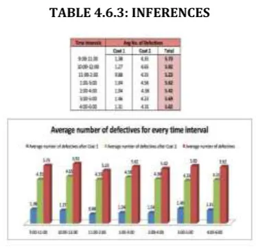
In order to decide upon the type of sampling plan we should follow, we collected data on how many defectives are being produced every hour. This helped us figure out whether the variation was piece to piece variation or time to time variation. According to the data we collected, as shown below, the variation occurring in the process is piece to piece
variation. Thus, we can use population-based sampling methods for our sampling plans. For our project at Aum
Dacro Pvt. Ltd, we have used Random Sampling Methodology to collect all the requisite data.
[image:9.595.203.390.494.676.2]4.6.2 Inferences from the data collected
TABLE 4.6.3: INFERENCES
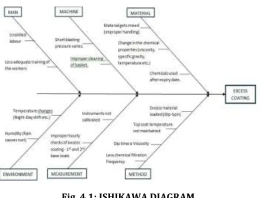
4.6.3 Ishikawa diagram
© 2019, IRJET | Impact Factor value: 7.34 | ISO 9001:2008 Certified Journal
| Page 593
To draw an Ishikawa diagram, the head represents the Defect, with the causes extending as the bones of the fish skeleton. We conduct the Root cause analysis to find out the various causes contributing in the defect present. Root causes generally are found through customer surveys, brain-storming sessions and interviewing employees of the organization, then they are categorized into various headers on the Ishikawa Diagram. [image:10.595.169.430.177.375.2]In case of Aum Dacro Coatings, where our main objective is to find out the root causes of excess coating on the wheel bolt, we use the 5Ms Technique which is usually used in the manufacturing industry.
Fig. 4.1: ISHIKAWA DIAGRAM
In a fishbone diagram, the aim is to synthesize and organize the causes of an issue, in this case Excess Coating, to reveal the elements that have the greatest impact on the issue at hand. One or two causes generally have a greater impact and guides us to the key issue.
In the problem at hand to find out the root causes of the excess coating on the wheel bolts, through brainstorming
we find out that Temperature, Viscosity and pH are the key causes that needs to be dealt with. In order to find out the
extent of the effect that these parameters have on the coating procedure we use software, Design Expert.
4.7 ANALYZE
Analyze Phase follows the Measure Phase in the DMAIC Approach followed under the Six Sigma Methodology. The
main purpose of Analyze Phase is to find out the Critical Root Causes that affect CTQ we are working on. In the Analyze Phase, we utilize a plethora of statistical tools to work on the extensive data we collected during the Measure Phase to figure out which causes have a significant effect on the CTQ that we are working on, and thus should be higher up on the priority list of root causes, those which do not have a significant effect on the CTQ, and thus should be lower in the priority list, and those which do not have any effect on the CTQ, and thus should be removed from the priority list. Most used statistical tools during the Analyze Phase are given below:
1. Hypothesis Testing: Hypothesis Testing is used to figure out which of the probable causes actually have an effect
on the CTQ we are working on. There are many different hypothesis tests that can be used depending upon the type of data we have collected, i.e. continuous or discreet.
2. Regression Analysis: Regression Analysis is used to develop an equation that depicts the relationship between the
CTQ and the causes that affect the CTQ, those we identified using hypothesis testing. Regression Analysis allows us to figure out which causes have a critical effect on the CTQ and which do not by using the forward addition or backward elimination methods.
3. Analysis of Variance: Analysis of Variance or ANOVA table always accompanies the regression model. This table
includes p-values for the individual factors and R2 values for the entire regression model. R2 values depict the reliability of the regression model and p-values depict the level of significance of individual factors.
4.7.1 Analyze Phase at Aum Dacro Pvt. Ltd.
At the commencement of Analyze Phase at Aum Dacro Pvt. Ltd., we had a long discussion with the production
© 2019, IRJET | Impact Factor value: 7.34 | ISO 9001:2008 Certified Journal
| Page 594
experience, have the most effect on the number of work pieces sent for rework. According to them, the biggest factor that influenced the number of work pieces sent for rework was Human Error. Other technical factors that heavily affected the number of work pieces sent for rework were Temperature of the work pieces, Viscosity of the chemicals being coated, Specific Gravity of the chemicals being coated, Quantity of work pieces loaded into the machines at one time (not more than 35kgs).Since, the quantity of work pieces loaded onto a machine is another example of human error affecting the process capability, which can be easily fixed by proper training or error proofing the process, we decided to leave this factor out of our analysis thereby limiting the scope of our project to only temperature, viscosity and specific gravity.
In order to reduce the time and effort required to perform hypothesis testing on all individual factors and then running a regression analysis to figure out their relationship with the CTQ, we decided to use Response Surface Methodology of Design Expert Software to combine Hypothesis Testing and Regression Analysis to figure out the critical root causes that need to be improved upon in the Improve Phase of the Six Sigma Methodology.
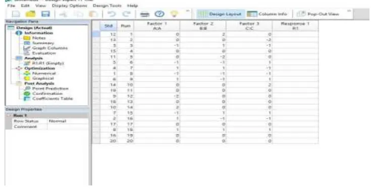
[image:11.595.33.566.377.521.2]Design Expert Software allowed us to dramatically reduce the amount of data that we needed to collect by forming a Design of Experiments (DOE) in which five different levels were set for the three factors (temperature, viscosity, specific gravity) in such a way that at least three of the levels set were outside the optimum range of values that these factors can take. Then 20 different experiments were run with a sample size of 400 work pieces each. Each experiment run had different value for the three factors, thereby maintaining randomness in the experiments. After collecting the data on the number of work pieces sent for rework after each experiment, these values were put in the Design Expert Software and analysis was done.
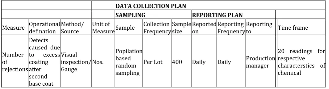
TABLE 4.7: DATA COLLECTION PLAN
DATA COLLECTION PLAN
SAMPLING REPORTING PLAN
Measure Operational defination Method/ Source Unit of Measure Sample Frequency Collection Sample size Reported on Reporting Frequency Reporting to Time frame
Number of rejections
Defects caused due
to excess
coating after second base coat
Visual inspection/
Gauge Nos.
Popilation based random sampling
Per Lot 400 Daily Daily Production manager
© 2019, IRJET | Impact Factor value: 7.34 | ISO 9001:2008 Certified Journal
| Page 595
Fig. 4.2.1: DESIGN OF EXPERIMENTSLEVEL TABLE
-2 -1 0 1 2
Temperature (˚C) 8˚ 12˚ 16˚ 20˚ 24˚
Viscosity (seconds) 50 sec 60 sec 70 sec 80 sec 90 sec
Specific Gravity 1.34 1.36 1.38 1.4 1.42
READINGS AS PER CONTROL PLAN Temperature Range:
16-24˚C Viscosity Range: 50s - 70s Specific Gravity Range: 1.36- 1.4
[image:12.595.86.508.414.550.2]
© 2019, IRJET | Impact Factor value: 7.34 | ISO 9001:2008 Certified Journal
| Page 596
Fig. 4.2.3: FIT SUMMARY OF THE REGRESSION MODELANOVA FOR QUADRATIC MODEL
Response 1: #defectives
Source Sum of Squares df Mean Square F-value p-value
Model 38877.17 9 4319.69 840.72 < 0.0001 significant
A-Temperature 2185.56 1 2185.56 425.37 < 0.0001
B-Viscosity 28645.56 1 28645.56 5575.16 < 0.0001
C-Specific Gravity 798.06 1 798.06 155.32 < 0.0001
AB 406.13 1 406.13 79.04 < 0.0001
AC 36.13 1 36.13 7.03 < 0.0242
BC 1.13 1 1.13 0.2190 0.6499
A² 985.72 1 985.72 191.85 < 0.0001
B² 6445.72 1 6445.72 1254.50 < 0.0001
C² 985.72 1 985.72 191.85 < 0.0001
Residual 51.38 10 5.14
© 2019, IRJET | Impact Factor value: 7.34 | ISO 9001:2008 Certified Journal
| Page 597
Pure Error 19.33 5 3.87
Cor Total 38928.55 19
Factor coding is Coded.
Sum of squares is Type III - Partial
The Model F-value of 840.72 implies the model is significant. There is only a 0.01% chance that an F-value this large could occur due to noise.
P-values less than 0.0500 indicate model terms are significant. In this case A, B, C, AB, AC, A², B², C² are significant model terms. Values greater than 0.1000 indicate the model terms are not significant. If there are many insignificant model terms (not counting those required to support hierarchy), model reduction may improve your model.
The Lack of Fit F-value of 1.66 implies the Lack of Fit is not significant relative to the pure error. There is a 29.63% chance that a Lack of Fit F-value this large could occur due to noise. Non-significant lack of fit is good -- we want the model to fit.
FIT STATISTICS
Std. Dev. 2.27 R² 0.9987
Mean 93.35 Adjusted R² 0.9975
C.V. % 2.43 Predicted R² 0.9927
Adeq Precision 119.0550
The Predicted R² of 0.9927 is in reasonable agreement with the Adjusted R² of 0.9975; i.e. the difference is less than 0.2.
Adeq Precision measures the signal to noise ratio. A ratio greater than 4 is desirable. Your ratio of 119.055 indicates an adequate signal. This model can be used to navigate the design space.
FINAL EQUATION IN TERMS OF ACTUAL FACTORS
#defectives = +70.23373 -11.68750 T +42.31250 V +7.06250 SG +7.12500 T*V
+2.12500 T*SG -0.375000 V*SG +6.26136 T2 +16.01136 V2 +6.26136 SG2
Where, T=Temperature
V= Viscosity
SG= Specific Gravity
The equation in terms of actual factors can be used to make predictions about the response for given levels of each factor. Here, the levels should be specified in the original units for each factor. This equation should not be used to determine the relative impact of each factor because the coefficients are scaled to accommodate the units of each factor and the intercept is not at the centre of the design space.
The equation in terms of actual factors can be used to make predictions about the response for given levels of each factor. Here, the levels should be specified in the original units for each factor. This equation should not be used to determine the relative impact of each factor because the coefficients are scaled to accommodate the units of each factor and the intercept is not at the centre of the design space.
© 2019, IRJET | Impact Factor value: 7.34 | ISO 9001:2008 Certified Journal
| Page 598
Factors that were found to be statistically significant were:
Temperature (with p-value< 0.0001), viscosity (with p-value< 0.0001) and specific gravity (with p-value< 0.0001).
Interaction effect between temperature-viscosity (with p-value< 0.0001) and temperature-specific
gravity (with p-value= 0.0242).
Squared effects of temperature (with p-value< 0.0001), viscosity (with p-value< 0.0001) and specific gravity (with p-value< 0.0001).
The regression model had a p-value< 0.0001 and F-value= 840.72, implying that the model was statistically significant. There is only a 0.01% chance that an F-value this high could be generated due to noise.
Lack of Fit had a p-value= 0.2963 (>0.05), thereby making it statistically not significant.
Value of R2= 0.9987, adjusted R2= 0.9975, predicted R2= 0.9927 depict that the data is closely fitted to regression line, thereby making the model highly reliable.
The regression equation generated is given below:
#𝐷𝑒𝑓𝑒𝑐𝑡𝑖𝑣𝑒𝑠 = 70.52273 − 11.68750 × 𝐴 + 42.31250 × 𝐵 + 7.06250 × 𝐶 + 7.12500 × 𝐴 × 𝐵 + 2.12500 × 𝐴 ×
𝐶 − 0.375000 × 𝐵 × 𝐶 + 6.26136 ×𝐴2 + 16.01136 × 𝐵2 + 6.26136 × 𝐶2
Where A- temperature, B- viscosity, C- specific gravity
[image:15.595.191.429.425.597.2]Several graphical representations can be drawn using the design expert software, some of which have been plotted below with their significant meanings. The graphs below include Interaction plots, Contour plots, Normal plots etc.
Fig. 4.3: NORMAL PROBABILITY PLOT OF NUMBER OF DEFECTIVES
The above graphical representation is a normal probability plot distribution of the number of defectives as seen occurring in the work process. Normal Probability plots are aimed at finding whether a particular data set follows normal distribution or not. The inferences are usually based on a visual inspection of the graph. The plot follows a basic premise in which it compares the data obtained to what the data should look like if it was normally distributed. A comparison is carried out between the data obtained and the idealized normally distributed data. If there is agreement between the two kinds, it means the data agrees with the normal distribution behavior i.e. the graph displays linearity. In reality, no plot is exactly linear because of the randomness associated with the data collection process. A general linearity pattern is what is desired.
© 2019, IRJET | Impact Factor value: 7.34 | ISO 9001:2008 Certified Journal
| Page 599
0.2963 which is greater than 0.05. The conclusion from this is that in response surface methodology, the p-value of lack-of-fit being greater than 0.05 (non significant) means that the model lack-of-fits well and that there is significant effect of the chosen parameters on our number of defectives i.e. the output response.Fig. 4.4: EFFECT OF TEMPERATURE ON NUMBER OF DEFECTIVES (#DEFECTIVES)
The above graphical representation displays a One Factor plot which shows the importance of the factor Temperature on the number of defectives obtained in the process. The x axis plots the data value of Temperature in the coded format of the Response Surface methodology (RSM) whose original units are degree Celsius while the y axis plots the numeric value of the number of defectives. The above graph obtained is of the analysis of the Temperature factor alone
(A) and a replica is generated if we plot the quadratic factor of Temperature (A2). The curve obtained is a negative slope
line curve meaning it’s value decreases as the value of x increases.
The analysis of the above plot indicates that as we increase the value of temperature, there is a reduction in the number of defectives produced or, we can say, that the number of defectives in the process increase with a reduction in the temperature below its optimal value range. This conclusion drawn from the graph is in direct agreement with our original assumptions of the effect of temperature on the number of defectives. We presumed that having a temperature below the optimal range would create increased number of defectives which is proven through the analysis of the plot. From fig.4.7, as well as, the ANOVA calculations of the F-value of the Temperature factor (425.37), it conclusively proves that Temperature is a significant factor which controls the process dynamics.
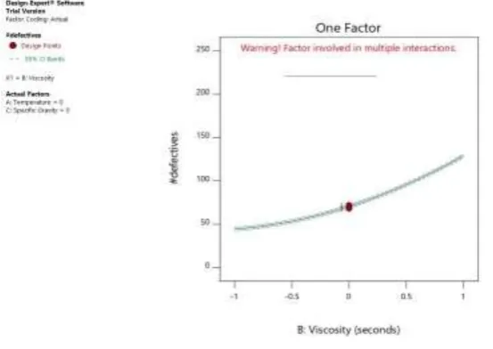
Fig. 4.5: EFFECT OF VISCOSITY ON NUMBER OF DEFECTIVES (#DEFECTIVES)
[image:16.595.153.430.524.720.2]© 2019, IRJET | Impact Factor value: 7.34 | ISO 9001:2008 Certified Journal
| Page 600
the numeric value of the number of defectives. The above graph obtained is of the analysis of the Viscosity factor alone (B) and a replica is generated if we plot the quadratic factor of Viscosity (B2). The curve obtained is a positive slope line curve meaning it’s value increases as the value of x increases.The analysis of the above plot indicates that as we decrease the value of viscosity, there is a reduction in the number of defectives produced or, we can say, that the number of defectives in the process increase with increase in the viscosity value above its optimal value range. This conclusion drawn from the graph is in direct agreement with our original assumptions of the effect of viscosity on the number of defectives. We presumed that having a viscosity figure above the optimal range would create increased number of defectives which is proven through the analysis of the plot.
[image:17.595.169.413.260.435.2]From the above plot, as well as, the ANOVA calculations of the F-value of the Viscosity factor (5575.16), it conclusively proves that Viscosity is a significant factor which controls the process dynamics with a higher degree than the Temperature factor.
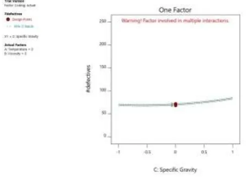
Fig. 4.6: EFFECT OF SPECIFIC GRAVITY ON NUMBER OF DEFECTIVES (#DEFECTIVES)
The graphical representation above displays a One Factor plot which shows the importance of Specific Gravity on the number of defectives obtained in the process. The x axis plots the data values of specific gravity in the coded format of the Response Surface methodology (RSM), originally unit-less since it is a relative measure of density, while the y axis plots the numeric value of the number of defectives. The above graph obtained is of the analysis of the Specific Gravity
factor alone (C) and a replica is generated if we plot the quadratic factor of Specific gravity (C2). The curve obtained is a
positive slope line curve meaning its value increases as the value of x increases.
The analysis of the above plot indicates that as we decrease the value of specific gravity, there is a mild reduction in the number of defectives produced or, we can say, that the number of defectives in the process increase with increase in the specific gravity value above its optimal value range. This conclusion drawn from the graph is in direct agreement with our original assumptions of the effect of specific gravity on the number of defectives. We presumed that having specific gravity above the optimal range would create increased number of defectives but not significantly affect the process which is proven through the analysis of the plot. Specific gravity curve almost has a straight-line display which shows that it has minimal effect on the process outcomes.
© 2019, IRJET | Impact Factor value: 7.34 | ISO 9001:2008 Certified Journal
| Page 601
Fig. 4.7: INTERACTION PLOT OF NUMBER OF DEFECTIVES (#DEFECTIVES) WITH VISCOSITY &TEMPERATURE
The first graph, as can be seen above, is an Interaction plot of the Temperature and viscosity factors and the number of defectives produced. The use of an Interaction plot shows how the relationship between one categorical factor and a response would depend on the value of the second categorical factor. It is a multi factor plot as it takes the combined effect of the two factors (AB) for analysis of the process response. The Temperature is plotted on the bottom axis, the number of defectives on the vertical axis and the Viscosity on the top axis.
The graphical plot signifies the relationship of these two factors with the number of defectives. It can be observed that lower than optimal value of temperature and higher than optimal viscosity would give an increase in the number of defectives. From the ANOVA table, we can see that with an F-value of 79.04 and p-value of less than 0.0001, it can be concluded that it is a significant relationship which affects the number of defectives being produced.
Fig. 4.8: CONTOUR PLOT OF NUMBER OF DEFECTIVES (#DEFECTIVES) AGAINST VISCOSITY AND TEMPERATURE
The second graph, as can be seen above, is a Contour plot of the Temperature and viscosity factors and the number of defectives produced. It is a multi factor plot as it takes the combined effect of the two factors (AB) for analysis of the process response. The Temperature is plotted on the bottom axis, the Viscosity on the vertical axis and the number of defectives on the top axis.
The “response surface” is an adjustment of the real, physical phenomenon by mathematical approximation. The 2D visualization of the response surface, as taken in the form of projections, gives us a Contour plot.
© 2019, IRJET | Impact Factor value: 7.34 | ISO 9001:2008 Certified Journal
| Page 602
From the ANOVA table, we can see that with an F-value of 79.04 and p-value of less than 0.0001, it can be concluded that it is a significant relationship which affects the number of defectives being produced.Fig. 4.9: SURFACE PLOT OF NUMBER OF DEFECTIVES (#DEFECTIVES) AGAINST VISCOSITY AND TEMPERATURE
The third graph, as can be seen above, is a Response Surface plot of the Temperature and viscosity factors and the number of defectives produced. It is a multi factor plot as it takes the combined effect of the two factors (AB) for analysis of the process response.
The Temperature, Viscosity and number of defectives are plotted on the axes as shown.
The “response surface” is an adjustment of the real, physical phenomenon by mathematical approximation. These plots are useful in the regression analysis among a dependent variable and two independent variables.
The graphical plot signifies the relationship of the temperature and viscosity factors with the number of defectives. The response surface gives here a three dimensional representation. The color scheme of the graph defines the relative increase in the defectives on a suitable color scale. The points from the test runs can be obtained on the surface and it allows for interaction by change of perspective. Though it is a 3D representation, they can cause obstruction of data.
From the ANOVA table, we can see that with an F-value of 79.04 and p-value of less than 0.0001, a conclusion can be drawn that it is a significant relationship which affects the number of defectives being produced.
The following three plots are a graphical representation which considers the effect of factors taken two at a time, i.e. Viscosity and Specific Gravity (BC) on the number of defectives produced in the process via an Interaction plot, a Contour plot and a 3D surface plot.
© 2019, IRJET | Impact Factor value: 7.34 | ISO 9001:2008 Certified Journal
| Page 603
Fig. 4.10: INTERACTION PLOT OF NUMBER OF DEFECTIVES (#DEFECTIVES) WITH VISCOSITY AND SPECIFICGRAVITY
The first graph, as can be seen above, is an Interaction plot of the Specific gravity and viscosity factors and the number of defectives produced. The use of an Interaction plot shows how the relationship between one categorical factor and a response would depend on the value of the second categorical factor. The Viscosity is plotted on the bottom axis, the number of defectives on the vertical axis and the specific gravity on the top axis.
The graphical plot signifies the relationship of these two factors with the number of defectives. Figure 4.13 shows the interaction effect of specific gravity and viscosity terms against the number of defective work pieces and shows a sharp increase in the defectives produced as we increase both the variable values greater than the optimal values.
[image:20.595.151.428.276.458.2]From the ANOVA table, we can see that with an F-value of 0.219 and p-value of 0.6499, it can be concluded that it is an insignificant relationship and its effects on the number of defectives being produced will not be considered in the subsequent phases.
Fig. 4.11 CONTOUR PLOT OF NUMBER OF DEFECTIVES (#DEFECTIVES) AGAINST VISCOSITY AND SPECIFIC GRAVITY
The second graph, as can be seen above, is a Contour plot of the Specific gravity and viscosity factors and the number of defectives produced. It is a multi factor plot as it takes the interactive effect of the two factors (AB) for analysis of the process response. The Viscosity is plotted on the bottom axis, the specific gravity on the vertical axis and the number of defectives on the top axis.
The “response surface” is an adjustment of the real, physical phenomenon by mathematical approximation. The 2D visualization of the response surface, as taken in the form of projections, gives us a Contour plot.
Figure 4.14 signifies the relationship of the temperature and viscosity factors with the number of defectives. The plot gives contour lines at equal interval values of defectives. If the lines are spaced close to each other, then the values change rapidly while if they are far apart, the z values change slower. The color scheme of the graph defines the relative increase in the defectives on a suitable color scale.
© 2019, IRJET | Impact Factor value: 7.34 | ISO 9001:2008 Certified Journal
| Page 604
Fig. 4.12: 3-D SURFACE PLOT OF NUMBER OF DEFECTIVES (#DEFECTIVES) AGAINST VISCOSITY ANDSPECIFIC GRAVITY
The third graph, as can be seen above, is a Response Surface plot of the Specific gravity and viscosity factors and
the number of defectives produced. It is a multi factor plot as it takes the combined effect of the two factors (BC) for analysis of the process response. The Specific gravity, Viscosity and number of defectives are plotted on the axes as shown.
The “response surface” is 3D surface plot of the real, physical phenomenon by mathematical approximation. These plots are useful in the regression analysis among a dependent variable and two independent variables.
The graphical plot signifies the relationship of the temperature and viscosity factors with the number of defectives. The response surface here gives a three dimensional, colour scheme representation. The color of the graph defines the relative change in the defectives on a suitable color scale. The points from the test runs can be obtained on the surface and it allows for interaction by change of perspective.
From the ANOVA table, we can see that with an F-value of 0.219 and p-value of 0.6499, it can be concluded that it is an insignificant relationship and its effects on the number of defectives being produced will not be considered in the subsequent phases. The following three plots are a graphical representation which considers the effect of factors taken two at a time, i.e. Temperature and Specific Gravity (AC) on the number of defectives produced in the process via an Interaction plot, a Contour plot and a 3D surface plot.
[image:21.595.176.408.562.727.2]© 2019, IRJET | Impact Factor value: 7.34 | ISO 9001:2008 Certified Journal
| Page 605
The first graph, as can be seen above, is an Interaction plot of the Specific gravity and Temperature factors and the number of defectives produced. The Viscosity is plotted on the bottom axis, the number of defectives on the vertical axis and the specific gravity on the top axis. The use of an Interaction plot shows how the relationship between one categorical factor and a response would depend on the value of the second categorical factor.The graphical plot signifies the relationship of these two factors with the number of defectives. Figure 4.16 shows the interaction effect of specific gravity and temperature terms with the number of defectives and shows a sharp increase in the defectives produced as we increase both the variable values greater than the optimal values.
[image:22.595.160.425.233.409.2]From the ANOVA table, we can see that with an F-value of 7.03 and p-value of 0.0242, it can be concluded that it is a significant relationship and it affects the number of defectives being produced in the process.
Fig. 4.14: CONTOUR PLOT OF NUMBER OF DEFECTIVES (#DEFECTIVES) AGAINST TEMPERATURE AND SPECIFIC GRAVITY
The second graph, as can be seen above, is a Contour plot of the Specific gravity (C) and Temperature (A) factors and the number of defectives produced. It is a multi factor plot as it takes the combined effect of the two factors (AC) for analysis of the process response. The temperature is plotted on the bottom axis, the specific gravity on the vertical axis and the number of defectives on the top axis.
The 2D visualization of the response surface, as taken in the form of projections, gives us a Contour plot. The graphical plot signifies the relationship of the temperature and viscosity factors with the number of defectives. The Contour plot gives contour lines at particular values of defectives with a color coded background. The color scheme of the graph defines the relative change in the defectives on a suitable color scale. The graph above has two added extra contour lines at 63.69 and at 49.11.
© 2019, IRJET | Impact Factor value: 7.34 | ISO 9001:2008 Certified Journal
| Page 606
Fig. 4.15: SURFACE PLOT OF NUMBER OF DEFECTIVES (#DEFECTIVES) AGAINST TEMPERATURE AND SPECIFICGRAVITY
The third graph, as can be seen above, is a Response Surface plot of the Specific gravity and Temperature factors and the number of defectives produced. It is a multi factor plot as it takes the combined effect of the two factors (AC) for analysis of the process response. The Specific gravity, Temperature and number of defectives are plotted on the axes as shown.
The “response surface” plots are mathematical approximations of real phenomena and are useful in the regression analysis among a dependent variable and two independent variables.
The graphical plot signifies the relationship of the temperature and viscosity factors with the number of defectives. The response surface here gives a three dimensional, color scheme representation. The color of the graph defines the relative change in the defectives on a suitable color scale. The points from the test runs can be obtained on the surface and it allows for interaction by change of perspective.
From the ANOVA table, we can see that with an F-value of 7.03 and p-value of 0.0242, it can be concluded that it is a significant relationship and it affects the number of defectives being produced in the process.
4.8 IMPROVE
Upon conducting the six sigma methodology we identified that the major problem encountered that resulted in most of the rework is Excess coating. The major cause resulting in excess coating on fasteners as studied by regression analysis is Temperature and Viscosity. Upon reviewing the detailed process, we suggested the following improvements to the AUM DACRO team.
1. Frequency of checking viscosity of the chemical bath tank should be reduced from the current 3 hours down to 1
hour on a daily basis.
2. The presence of shots increases the chemical viscosity – hence we suggested to conduct Magnetic stirring on an
hourly basis. Magnetic stirring uses magnetism to capture and remove shots. We observed that shots present in the chemical got attached to the magnet and thus could be easily removed. This process can be very effective as it consumes very less investment and low labour time.
3. Frequency of chemical filtration should be reduced from weekly basis to once in every 3 days.
4. Proper cooling of materials before dip sin process. Operator should be trained not to process hot materials.
We suggested following improvements based Lean Manufacturing principle:
© 2019, IRJET | Impact Factor value: 7.34 | ISO 9001:2008 Certified Journal
| Page 607
2. Automatic oven line stop, If curing temperature not reached/out of range. [under implementation]
3. Led indicator for chemical tank temperature. Quick visible detection to production manager if temperature out of
range. [implemented]
The following pages record the data collected after the implementation of the Improve phase. Inferences are then drawn based upon the data values collected. This is done in order to show a relative reduction in the number of work pieces sent for reworking.
[image:24.595.141.456.254.448.2]4.8.1 Inferences
TABLE 4.8.3: INFERENCES DRAWN FROM THE DATA COLLECTED DURING IMPROVE PHASE
If we compare the inferences drawn during the measure phase, we find that the average number of defectives per hour has reduced by about 1 work piece.
5. Conclusion
Our primary purpose for conducting a Lean Six Sigma based quality improvement initiative on the chemical
coating process of Aum Dacro Pvt. Ltd. was to effectively reduce the number of work-pieces sent for rework from the current 20% levels. We discussed the various principles and methodologies of Six Sigma and Lean manufacturing and how it led to a better understanding of the quality improvement process of the business.
Following were the successful conclusions that were drawn:
Excess coating was found to be our primary CTQ.
Human Error was found to be the most important root cause of process variation.
Amongst the technical factors, temperature (with p-value< 0.0001), viscosity (with p-value< 0.0001) and specific
gravity (with p-value< 0.0001) were found as statistically significant.
Interaction effect between temperature-viscosity (with p-value< 0.0001) and temperature-specific gravity (with
p-value= 0.0242) were found to be of statistical significance.
The regression model had a p-value< 0.0001 and F-value= 840.72, implying that the model was statistically significant. There is only a 0.01% chance that an F-value this high could be generated due to noise.
© 2019, IRJET | Impact Factor value: 7.34 | ISO 9001:2008 Certified Journal
| Page 608
Value of R2= 0.9987, adjusted R2= 0.9975, predicted R2= 0.9927 depict that the data is closely fitted to regressionline, thereby making the model highly reliable.
Specialized staff training is our foremost recommendation along with increased automation (the use of LED indicators etc.) and error proofing. These were identified after constant deliberation with the executives of the company based on feasibility, economic viability etc.
REFERENCES
1. Pravin Kumar’s ,Production and Operations Management, Pearson Publications, 2015
2. KPMG Lean Six Sigma green belt certification, January
2017 https://home.kpmg.com/in/en/home/trainings/advisorytrainings/businessexcellencetraini ngs/sixsigmablackbelttrainingprogram.html.
3. Ibrahim Alhuraish*, Christian Robledo, Abdessamad Kobi University of Angers, LARIS Systems Engineering
Research Laboratory (May 2017), A comparative study of lean and six sigma.
4. Six sigma introduction,
https://www.sixsigmainstitute.org/Six_Sigma_DMAIC_Process_Introduction_To_Measure_Phase.php.
5. Design Expert, https://www.statease.com/dx11.html.
6. http://www.vrds.com/
7. https://github.com/mkordas/tips-on-agile/blob/master/presentation/16-leanmanufacturing.md
8. http://www.a3healthcare.com/lean-six-sigma-methodology/
9. http://kbis.co/the-importance-of-business-process-improvement/
10. https://www.isixsigma.com/tools-templates/cause-effect/cause-and-effect-aka-