Visualizations for Real Time
Big Data
Studienarbeit
Technische Universität Darmstadt
Fachbereich Rechts- und Wirtschaftswissenschaften
Fachgebiet Wirtschaftsinformatik - Information Systems & Electronic Services Prof. Dr. Alexander Benlian
Betreuer: Elena Davcheva
Studienarbeit zu dem Thema:
Visualizations for Real Time Big Data
Bearbeitet von: Borja Nicolau Matr.-Nr.: [2928973]
Studiengang: Wirtschafstingenieurwesen Eingereicht am: 22.02.2017
Förmliche Erklärung
Hiermit erkläre ich, Borja Nicolau, geboren am 12.07.1992, an Eides statt, dass ich die vorliegende Master Thesis ohne fremde Hilfe und nur unter Verwendung der zulässigen Mittel sowie der angegebenen Literatur angefertigt habe.
Die Arbeit wurde bisher keiner anderen Prüfungsbehörde vorgelegt und auch noch nicht verö-ffentlicht.
Darmstadt, den 22.02.2017
________________________________ (Unterschrift)
Abstract
We live in a Big Data era in which data are generated every minute at astonishing rates: internet cookies, social networks, all kind of sensors, climate measurements, smartphone GPS systems, etc.
While in the last years the value has moved from possessing the data to knowing how to in-terpret them, now, with all these amounts of data being generated every minute, the value reside in the ability of interpreting them in real time. This can give a competitive advantage to those able to achieve it, providing them the ability of taking advantage of real time opportuni-ties. Visual analytics, a science combining the strengths of machines with those of humans, can be the solution to that.
This work gives a review of existing literature about visualizations of real time Big Data by discussing the main parameters that must be taken into consideration, examining some ap-proaches to perform effective and efficiently and identifying guidelines to evaluate how good a visualization tool is.
Results have shown that, although this science is still in a non-mature phase and little is writ-ten about this concrete case, the implementation of existing strategies – some of them are even obtained from a more generic case –, can be of great help for successfully visualizing real time Big Data.
Table of contents
Förmliche Erklärung ... iii
Abstract ... iv
Table of contents ... v
List of figures ... viii
1 Introduction ... 1 2 Basis ... 3 2.1 Big Data ... 3 2.1.1 Definition ... 4 2.1.2 Main attributes ... 5 2.1.3 Main problems ... 5 2.2 Visualizations ... 7 2.2.1 Definition ... 7 2.2.2 Visual Analytics ... 8 2.2.3 Classifications ... 9
2.2.3.1 End Product vs. Exploratory Tool ... 9
2.2.3.2 Visuospatial vs. Not visuospatial ... 10
2.2.4 Main Problems ... 10
2.3 Visualizations for Real Time Big Data ... 11
2.3.1 Introduction ... 11
2.3.2 Brief examples ... 13
3 Important Visualization Parameters ... 15
3.1 Movement and Transitions ... 15
3.1.1 Motion as a filter or brushing tool ... 16
3.1.2 Designing effective transitions ... 16
3.1.2.1 Transitions taxonomy ... 17
3.1.2.2 Transitions design principles ... 18
3.2 Speed ... 20
3.3 Interaction ... 21
3.3.1 The two levels of interaction ... 22
3.3.3 Real Time Interaction ... 24
3.3.4 More: Touchscreens vs. Touchpads or mouse-mice ... 25
3.4 Screen ... 25
3.4.1 Size and resolution ... 25
3.4.2 Hybrid Reality Environments ... 26
3.4.3 Kinds of landscapes ... 29
3.4.4 More: Screen vs. paper ... 31
3.5 Prediction ... 32
4 Data Abstraction ... 33
4.1 Filtering ... 33
4.2 Sampling ... 34
4.3 Principal Component Analysis ... 34
4.4 Qualitative Data Abstraction ... 35
4.5 Model Fitting ... 35
4.6 Binned Aggregation ... 35
5 Approaches ... 37
5.1 Low precision and partial iterations computation ... 37
5.2 Maximizing data set analysed ... 40
5.2.1 4 layers model ... 40
5.2.2 Moving the computation to the data ... 41
5.2.3 More……….. ... 41
5.3 Event-based visualization ... 42
6 Visualization Methods ... 44
6.1 Previous clarifications ... 44
6.1.1 Frequency of change and data represented ... 44
6.1.2 Time axis ... 45
6.1.3 Data and representation classifications ... 47
6.2 Techniques ... 48
6.2.1 Hierarchical techniques ... 48
6.2.2 Circular network diagram ... 49
6.2.3 Parallel Coordinates ... 49
6.2.5 Flow visualizations ... 51
6.2.6 Flocking boids ... 52
7 Evaluation ... 53
7.1 Understanding Environments and Work Practices (UWP) ... 54
7.2 Evaluating Visual Data Analysis and Reasoning (VDAR) ... 55
7.3 Evaluating Communication through Visualization (CTV) ... 55
7.4 Evaluating Collaborative Data Analysis (CDA) ... 56
7.5 Evaluating User Performance (UP) ... 57
7.6 Evaluating User Experience (UE) ... 57
7.7 Evaluating Visualization Algorithms (VA) ... 58
7.8 Evaluation scenarios’ discussion ... 58
8 Conclusions ... 60
8.1 Main visualization parameters ... 60
8.2 Data abstractions ... 61
8.3 Approaches ... 61
8.4 Visualization methods ... 62
8.5 Evaluations ... 62 Bibliography ... I
List of figures
Figure 1: Evolution of “Big Data” searches in Google since 2004 ... 3
Figure 2: Scope of Visual Analytics (taken from Keim et. al, 2008) ... 8
Figure 3: Process of visual analytics Font: (taken from Keim et. al 2008) ... 9
Figure 4: Usergoals, tasks and interactive visualization’s characteristics of low and high interaction’s level. (taken from Pike et. al, 2009) ... 22
Figure 5: CAVE 2 images (taken from Khairi et. al, 2013 and Febretti et. al, 2013) ... 27
Figure 6: 7 different types of landscapes (taken from Tory et. al, 2007) ... 30
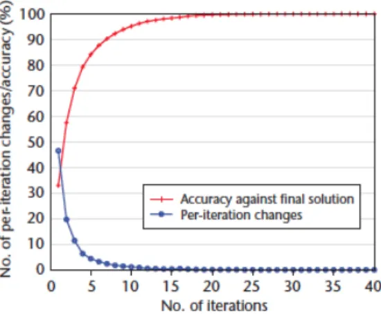
Figure 7: Example of convergence (taken from Choo & Park, 2013) ... 38
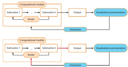
Figure 8: Representation of computational methods in standard approach, above, and in iteration-level interactive visualization, below (taken from Choo and Park ,2013). ... 39
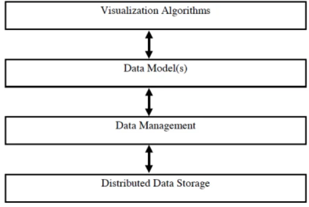
Figure 9: Layered architecture of visualization and data management (taken from Cox & Ellsworth, 1997). ... 40
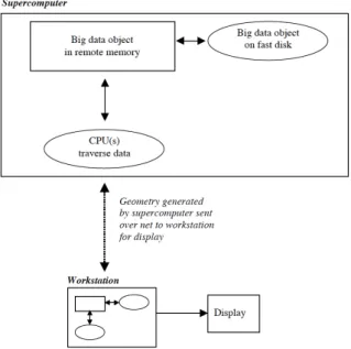
Figure 10: Moving computation to data schema (taken from Cox & Ellsworth, 1997). ... 41
Figure 11: Possible changes and data representations ... 44
Figure 12: Linear vs. cyclic visualization (taken from Aigner et. al ,2008). ... 46
Figure 13: Time structures: linear, cyclic or brunching (taken from Aigner et. al 2007) ... 46
Figure 14: Tree Map, Circle Packing and Sunburst examples. ... 48
Figure 15: Example of Circular Network Diagram. ... 49
Figure 16: Examples of 2D and 3D Parallel Coordinates. ... 50
Figure 17: Example of Streamgraph. ... 50
Figure 18: Examples of image based flow visualization and feature and event flow visualization (taken from Van Wijk, 2002, and Reinders et. al ,2001, respectively). ... 51
Figure 19: Examples of Flocking Boid (taken from Vande, 2004). ... 52
Figure 20: Table with 17 most mentioned evaluation tags and their categorisation into each one of he 7 scenarios (taken from Lam et. al, 2012). ... 53
1
Introduction
Nowadays data are produced at unprecedented rates. More and more data are generated in real-time on the Internet – streams, social networks, weblogs, cookies – and by modern equipment or devices – sensors, GPS systems, satellite cameras –. Nevertheless, while the ca-pacity to collect and store new data grows tremendously, the ability to analyse them increases at much lower rates (Keim et. al 2008).
If analysis is applied appropriately these data can provide very rich information and therefore, improving analytical capability to handle such data is a development opportunity in current business (Zhang et. al, 2012).
Handling these amounts of data in real time, meaning handling them at the same time that they are being produced or that they are constantly changing, poses a major challenge to Big Data science, as it implies making the analysis and the decision-taking process in a continuous changing environment and with a time constraint. Sometimes processing data in real time is the unique option of treating them in a useful way, as the answers or decisions should be tak-en at the same momtak-ent. Moreover, it can give companies a crucial competitive advantage. In this special environment, traditional tools may not be capable enough to perform efficiently and get useful information out of a complicated data set (Wang and Meister, 2010).
Visual analytics, a science to visually analyse large amounts of data, is presented as a possible solution for that. It merges the strengths of computers in processing data mathematically and statistically, with the ones of humans in quickly gain insight through a visual analysis. How-ever, while a lot has been written about Big Data and also about Visualizations or Visual Ana-lytics, very little is written about the concrete case of applying visual analytics to interpret Big Data in real time.
This work pretends to shed light on visualizations of real time Big Data by examining previous literature about the topic and also reasoning what could be useful from existing literature about more general areas, such as Big Data or Visual Analytics alone.
The structure of this article is organised as follows:
After this introduction, chapter two introduces the basic concepts for this work: definition and main problems of Big Data and visual analytics are given, to then introduce the concrete case of visualizing real time Big Data and give some brief introductory examples.
Succeeding that, the important visualization parameters are discussed. It will be treated how factors such as movement, transitions, speed, interaction, screen or prediction can influence in the analysis process and it will be suggested which things have to be taken into account to successfully handle with them.
Important visualization parameters’ chapter is followed by an introduction to some abstrac-tion techniques – techniques that pursue offering simplified representaabstrac-tion of the whole to improve the analysis –.
Chapter 5 offers some concrete approaches that can be useful to visualizing real time Big Da-ta, such as lowering computing precision, event based visualizations or how to maximize the data set analysed.
Then, some concrete visualization methods are introduced and some clarifications about them when representing dynamic data are made.
At last, chapter 7 is dedicated to discussing how to evaluate a visualization tool through a series of evaluation scenarios, in order to know not only how good is it performing, but also what is user’s perception about or which things could make the tool even better.
2
Basis
2.1
Big Data
“Computers teach you something important: it does not make sense to remember everything, what is useful is being able to find things on it.”
Douglas Couplant
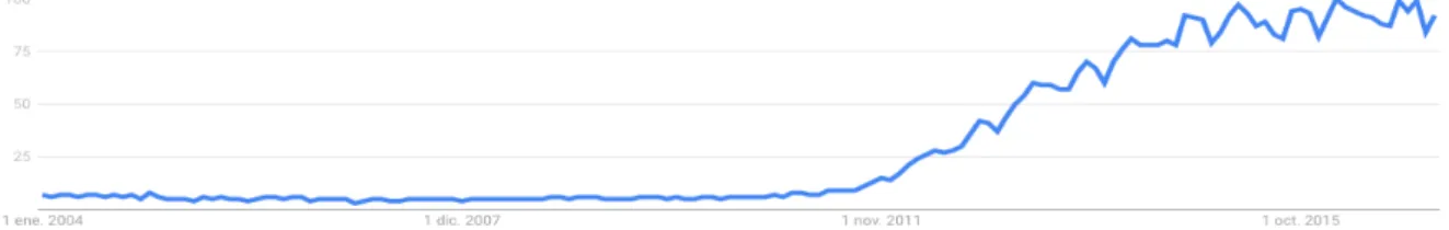
Big Data has become one of the major topics in the last years. What a few years ago seemed to be a specific and technical issue is now a subject about which everyone, at least, has heard. Looking at Google trends one can observe the evolution of the term “Big Data” searches in the whole world since 2004 through the biggest search’s portal.
Figure 1: Evolution of “Big Data” searches in Google since 2004
Figure 1 shows the popularity of the term between 0-100, meaning 100 the maximum popu-larity in a concrete region and time. As it can be seen, the growth has been almost exponen-tial, reaching the top of popularity in the last years.
A data creation explosion occurred in the beginnings of this decade. According to IBM, in 2012 2.5 quintillion bytes of data were generated every day. Moreover, 90% of existing data in 2012 had been created in the previous two years (Zhang et. al, 2012).
A later report by OBS (2014) confirmed this trend as well as showed some astonishing num-bers: on the Internet in 2014, 6 articles were published in Wikipedia every minute; 204 mil-lion emails were sent; 47,000 smartphone and tablet applications were downloaded; more than 100 new accounts were opened on LinkedIn and 320 on Twitter, where about 100,000 tweets were written every minute; 277,000 logins were made on Facebook; 30 hours of video were uploaded to YouTube and 1.3 million videos were viewed.
Furthermore, the report estimated the trend would continue in growth, saying that in the next four years data traffic would grow 63% in smartphones, 87% in tablets, 30% in notebooks and 113% in M2M devices.
For all that it is said we are in the Big Data era (Keim et. al, 2013; Zhang et. al, 2012), an era in which data is generated at an incredible speed everywhere — satellite images, online transactions, scientific experiments, smartphones applications, GPS signals, social media posts, etc.
In the business world a good data culture is something becoming more and more important every day, as it has great importance in companies in the race to gain competitive advantages and exploit its possibilities in favour of an increase in revenue, a reduction of costs or a great-er satisfaction of the usgreat-er who acquires its products or sgreat-ervices (Gallego, 2013).
Big Data analysis pretends to see the big picture and extract conclusions. It’s a process that can condense terabytes of low-value data - for example, all financial data of a company in the last decade - intro a single bit of high-value data - for example, should company X acquire company Y? (Fisher et. al, 2012).
But what is exactly Big Data, how is it defined and which are the main factors that character-ised it?
2.1.1
Definition
Big Data was defined by Yurevich and Vasilevich (2013, page 1) as “a large data set, with vol-ume growing exponentially, which can be too large, to raw, or too much unstructured for classical data processing methods.”
While their definition of Big Data spotlights the characteristics of the set, Gallego (2013, page 1) defines it as a science: “the science that focuses on the treatment of large volumes of infor-mation with mathematical and computer techniques and that allows data collection, processing and visualization, obtaining a great velocity in the analysis, being able to anticipate trends, with the objective of understanding and optimizing certain services depending on user's behaviour, to satisfy needs in real time, and to develop first-order strategies in a given sector.”
Many other definitions of Big Data have been done, as it can be seen in Ward and Barker (2013) and De Mauro et. al’s (2015) compilations of Big Data definitions.
Oracle gives a definition focused upon infrastructure: “Big data is the inclusion of additional data sources to augment existing operations” and Microsoft treats it as a process “of applying serious computing power - the latest in machine learning and artificial intelligence - to seri-ously massive and often highly complex sets of information”.
The survey by Ward and Baker also shows how even small but really complex quantity of data can be considered Big Data, as the Method for an Integrated Knowledge Environment (MIKE2.0) project did: “Big Data can be very small and not all large datasets are big”. This is an argument in favour of complexity and not size as the dominant factor.
After reviewing lots of definitions, De Mauro et. al (page 103) conclude that the consensual definition could be: “Big Data represents the information assets characterized by such a High Volume, Velocity and Variety to require specific Technology and Analytical Methods for its trans-formation into Value.”
2.1.2
Main attributes
The last definition given included terms such as volume, velocity and variety. The main at-tributes of Big Data have also been discussed in previous literature an one of the most agreed visions is precisely the three V’s one, first mentioned by Gartner (Yurevich and Vasilevich, 2013). These are volume, variety and velocity.
• Volume refers to the quantity of data. As the term “big” per se is not quantitative, a number should be defined to express which volume should data reach to be consid-ered Big Data. Previous researchers have regularly used one million or more data cases as a threshold (Liu et. al 2013)
• Multi-source or multi-format data obtainment make up the variety attribute.
• Velocity refers to the increasing rate at which data are produced and the need of High Data Processing Speed.
This classification has had good acceptation. However, others have included more attributes such as Value, Veracity, Complexity or Unstructuredness (De Mauro et. al, 2015).
IBM included veracity as a fourth V (Ward and Barker, 2013) related to questions of trust and uncertainty regarding the data. Ward and Barker, after collating their reviewed definitions, proposed a wider classification through three other factors:
• Size, referring to the volume and therefore being comparable to Volume.
• Complexity, referring to structure, behaviour and permutations. This second factor could include both Variety and Velocity.
• Technologies, encompassing the tools and techniques used to process a sizable or com-plex dataset.
As it can be seen, two first factors encompass the three V’s, while the third one extends Big Data characteristics.
2.1.3
Main problems
The main problems of Big Data are resumed in work done by Cox and Ellsworth (1997) and some of them exposed below. In this section only the problems strictly due to Big Data will be treated. Problems more related with visualizations and problems that appear due to the real time constraint will be treated in further sections.
Before introducing Big Data main problems, a distinction between Big Data Sets and Big Data Collections should be made:
• Big Data Sets, also called Big Data Objects, are “single data sets that are too large to be processed by standard algorithms and software on the hardware one has available. Clear-ly, a data object too large for one installation may be manageable at another. Big Data Sets typically are the result of large-scale simulations.” (Cox and Ellsworth 1997, pages 1-3)
• The aggregation of Big Data Sets gives as a result Big Data Collections.
Below are main Big Data problems. As it will be seen, most of them are strongly related with the factors exposed above (volume or size, complexity and technologies):
• Size and memory: Data may be too big to fit in main memory. Sometimes, even to big to fit in local disk. With this large, it is not possible to rely on virtual memory to man-age the difference between data set size and physical memory size. Thus, special ac-tions must be taken.
• Bandwidth and latency: Due to data large and to the requirement to find alternatives to operating system virtual memory, the bandwidths and latencies between data store and main memory must be managed carefully.
• Technologies and data models: sometimes the multi-dimensional data structures re-quired are not adequately supported by actual database technologies. In addition, sometimes there are no standardized models of the data structures required, or in-versely, there are so many standards to choose from.
• Variety and incompatibility: Data are generally distributed among multiple sites, many times in heterogeneous databases. In addition, there are incompatible data interfaces and representations. Fox and Hendler (2011, page 706), talking about this as the data-scaling problem, added that the data are not only coming from different places, but al-so linked between them: “the challenge is that many of the major scientific problems fac-ing our world are becomfac-ing critically linked to the interdependence and interrelatedness of data from multiple instruments, fields, and sources.”
• Poor metadata: Data are generally not self-describing. The metadata, which facilitate discovery and use with information such as where and when were the data collected, what calibration was applied, what are the units, etc., are often not stored with the da-ta. Often there is no independent definition of the data types in the underlying data and the relationship between them, which would facilitate the construction of higher-level tools to use the data. These problems make difficult the data location. Keim et. al (2008) refer to that as “data provenance”.
2.2
Visualizations
“Vision is the art of seeing what is invisible to others”. Jonathan Swift.
Vision is our dominant sense, with almost a quarter of our brain devoted to processing visual stimuli (Khairi et. al, 2013). In a few tenths of a second, humans can recognize features in megapixel displays, recall related images and identify anomalies (Ahlberg and Shneiderman, 1994).
Because of this human ability to quickly gain insight through a visual analysis, and because of the exponential increase in data complexity, interest in visualizations and visual analytics has increased during the last years (Choo and Park, 2013). A Google search on “data visualiza-tion” led, in 2010, to 1,220,000 links (Wang and Meisner, 2010); nowadays it leads to 8.610.000 results.
In this section, first visualizations will be defined. Then, the concept visual analytics will be introduced and some of its classifications and problems will be exposed.
2.2.1
Definition
Visualization is defined by Manovich (2008, page 127) as “the situations in which quantified data, not visual itself (for example, data captured by meteorological sensors or the set of address-es daddress-escribing the trajectory of a maddress-essage over a computer network) are transformed in visual rep-resentations”
Kornblitt et. al (2000, page 14) use a similar description but refers to it as a variety of tech-niques instead of as a situation: “data visualization (sometimes referred to as scientific visualiza-tion, or just visualization) is a term applied to a variety of techniques and processes for the repre-sentation of, or transformation of, data or information into images— including graphs, pictures, or other graphical forms.”
From both definitions it can be said that visualization, interpreted as a situation or as a pro-cess, is the representation or transformation of data to images.
Lam et. al worked in a classification of kinds of evaluations for information visualizations that will be treated in 7th
chapter. Interest for this section relies on the stages they proposed for data visualization, which can be considered the phases of visualization. In addition, they sug-gest which should be the main goal of each one (2012, page 2):
• Pre-design: understand potential users’ work environment and workflow.
• Prototype: check if a visualization tool has achieved its design goals and compare the prototype with the current state-of-the-art systems or techniques.
• Deployment: see how a visualization performs - how influences workflow and its sup-ported processes – and evaluate its effectiveness and uses in the field.
• Re-design: improve a current design by identifying usability problems.
2.2.2
Visual Analytics
Data analysis is about turning empirical information into conclusions, to reason about data content and show causality. It should be used to describe things and learn about the world (Tufte, 2016). The way of doing it through visualizations is visual analytics, abbreviated as VA.
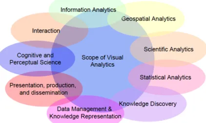
The field of visual analytics focuses on the treatment of massive, heterogeneous, and dynamic volumes of information by integrating human judgement through visual representations and interaction techniques in the analysis process. Visual analytics combines the strengths of ma-chines with those of humans. On the one hand, statistics and mathematics are the protago-nists on the automatic analysis side; on the other hand, human capabilities help in the at-tempt to perceive, to relate, to gain insight, to draw conclusions and to make better decisions (Keim et. al, 2008).
For all that, it can be said that visual analytics is at the confluence of statistics, machine learn-ing, information visualization, human computer interaction, data management, and memory optimization (Zhang et. al, 2012).
The aim to use visualizations is the need to abstract, concentrate or transform a large and difficult amount of data to manageable, but meaningful, proportions (Kornblitt et. al, 2000). With that purpose, visualization tools can be used to extract information rapidly from files with complicated data structures (Wang and Meisner, 2010). For that, visual properties such as position, size, shape and colour can help in users attempt to discern and interpret patterns in data (Heer and Shneiderman, 2012).
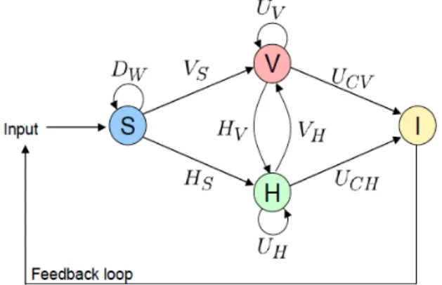
Keim et. al (2008) present a graphic description of the visual analytics iterative process, in-volving information gathering, data preprocessing, knowledge representation, interaction and decision making.
Figure 3: Process of visual analytics Font: (taken from Keim et. al 2008)
S: Data sets V: Visualizations H: Hyptohesis
I: Insight, meaning output of the process.
Dx: Basic data pre-processing functionalities, such as transformations (Dt), cleaning (Dc), selec-tion (Dsl) and integraselec-tion (Di).
Vx: visualization functions, which could be visualizing data (Vs) or hypothesis (Vh)
Hx: hypothesis generation process. Hypothesis can come from data (Hs) or visualizations (Hv) Ux: User interactions. They can affect only visualizations (Uv) or only hypothesis (Uh). When the user interaction is leading to an insight, it can be thanks to visualizations (Ucv) or to hypothesis (Uch).
2.2.3
Classifications
2.2.3.1 End Product vs. Exploratory Tool
The first classification is about if visualization should be treated as an end product or as an exploratory tool. End product refers to a visualization as a simple way to represent some in-formation. On the other hand, the exploratory tool vision expands its purposes to the analysis of information, arguing that visualization has proven effective for not only presenting essen-tial information in vas amounts of data, but also driving complex analyses (Keim et. al, 2013).
If the second vision encompasses also the first one, making it wider, no doubts should be about it and visualization should be considered an exploratory tool that also enables user to represent information as a final step. For this work, in which the purpose of visualizations is helping in Real Time Data Analysis, they will be treated as an exploratory tool.
In that way, Doleisch (2007) says that visualization tools can be used to explore, to analyse and to present. In practice, these three goals are no easy to separate and effective visualiza-tion tools should offer the three of them.
However, visualization still becomes too often an end product of scientific analysis. This hap-pens, according to Fox and Hendler (2011) because visualization analysis has become a bot-tleneck due to continuous decrease in price of new technologies for data generation (in terms of cost per data generated), whereas visualization costs are falling much more slowly. Howev-er, they pointed that new database technologies, coupled with emerging Web-based technolo-gies, may hold the key to lower the cost of visualization generation and allow it to become a more integral part of the scientific process.
2.2.3.2 Visuospatial vs. Not visuospatial
This differentiation, made by Tversky and Morrisson (2002), says that graphic displays can be divided in two bands: on the one hand, those that portray things that are essentially visuospa-tial, like maps, molecules and architectural drawings; on the other hand, those that represent things that are not inherently visual, like organization charts or flow diagrams. The first ones have a clear and obvious advantage over others because of the use of the same language be-tween data and representation. This differentiation suggests that it is possible that, depending on data’s nature, data visualization would be more difficult to understand. Nevertheless, this natural correspondence does not mean that all this kinds of graphics are immediately under-stood.
2.2.4
Main Problems
In this section some visualization problems related with Big Data are presented. Some of them will be more widely treated in upcoming chapters.
• Incompatibility: Some traditional data visualization tools are inadequate to handle Big Data (Liu et. al, 2013)
• Visual clutter and human perception: The high number of data points often makes vi-sualizations too dense to be useful. Getting a larger screen to avoid visual clutter can be inefficient due to human perception constraints (Yurevich and Vasilevich, 2013; Choo and Park, 2013; Khairi et. al, 2013).
• Information loss: when using some methods, such as filtering, to avoid visual clutter or to focus in a concrete area for a visualization, it is possible that some important infor-mation gets lost during the process (Yurevich and Vasilevich, 2013).
• Poor adaptability: Some expert systems have been successfully built for specialized fields, but then only perform reasonably within a limited scope (Keim et. al, 2008). It’s challenging to construct integrative visualizations that can simultaneously and effec-tively work for a variety of data sources (Khairi et. al, 2013).
• High Performance Requirements: To treat with Big Data visualizatons special kills are required (Yurevich and Vasilevich, 2013). This becomes even more significant in dy-namic visualizations, where data are constantly changing.
• Too robust designs: Computational modules in visual analytics can be difficult to un-derstand, depending on the analyst knowledge they can be sometimes even more diffi-cult to understand than the original raw data. Moreover, many visual analytics systems choose a specific computational method, treat it as a black box, and focus on analysis of its output. But if the analysts don’t understand correctly the algorithm and its pa-rameters, a computational method might not perform well enough to analyse data properly (Choo & Park, 2013).
• User acceptability: many novel visualization techniques have been presented without success, primarily due to the users' refusal to change their working routines (Keim et. al, 2008).
2.3
Visualizations for Real Time Big Data
After introducing the two main concepts of this work - Big Data and Visualizations - this sec-tion will introduce the concrete case of visualizing this Big Data in real time, meaning visual-izing it at the same time that they are being generated.
2.3.1
Introduction
During the last quarter of the 20th century data visualization has grown into a mature, vi-brant and multi-disciplinary research area. From the early 70s to middle 80s, many of the advances in statistical graphics concerned static graphs for multidimensional quantitative da-ta, designed to allow the analyst to see relations in progressively higher dimensions. In the 90s, many ideas were brought together to provide more general systems for dynamic, interac-tive graphics, combined with data manipulation and analysis. Since then, the developments have greatly increased computer processing speed and capacity, allowing computationally intensive methods to access to massive data problems and real-time streaming data (Friendly 2006).
Many examples are found in literature about dynamic data or dynamic visualizations. Dynam-ic visualizations are defined as time-dependent visualizations, meaning that they change dy-namically over time (Müller and Schumann, 2003). However, this usually refers to data pre-viously accumulated through a period of time and analysed a posteriori. The extra require-ment to meet the exact characteristics of this work would be that this change occurs in real time, but both cases can be compared to find similitudes in the main characteristics to consid-er or the approaches proposed.
Real Time, therefore, added to the terms Big Data and Visualizations, refers to the way of vis-ualizing Big Data at the same time that these are produced or change. That means that data will be constantly changing and consequently the visualization will also change.
Nowadays data streams are producing new data at astonishing pace - internet and social me-dia, monitoring sensors, smartphone’s location data, transaction files, etc. – and in their anal-ysis time plays a specially important role because data visualization lifespan can be short due to different things: in many cases detailed information is abundant and in the long-term stor-age capacities do not suffice to log all data (Keim et. al, 2008); other times, the change fre-quency itself makes the data visualization time really short. Thus, the value is not anymore the possession of big quantities of information, rather to know what to do with them and how to obtain useful insights from them at the same moment as they are being produced. Accord-ingly, the ability to make timely decisions based on available data is crucial to business suc-cess (Keim et. al, 2013).
When this happens, traditional tools and code writing may not be the best way to extract use-ful information out of a complicated data set. (Wang and Meister, 2010)
In recent years, books and software packages have picked up the pace to provide users with new platforms for dynamic data visualization (Wang and Meister, 2010). But visualizing time-oriented data is not easy, as it is very difficult to consider all aspects involved. In fact, most methods are highly customized for this reason (Aigner et. al, 2007). Even more, most visual analytics’ tools or techniques don’t properly accommodate Big Data, and even more don’t ac-commodate for Real Time Big Data (Choo and Park 2013).
One example of problems with visualizations for Real Time Big Data is that in most cases, once the visualization is created, it is no longer tied to the data, so that it becomes an immu-table information product. The challenge in these cases is that the visualizations are linked to the underlying data and can change dynamically as the data changes (Fox and Hendler, 2011).
Moreover, time-varying information visualization and analysis often differs considerably from traditional static data representations of fixed datasets. Often, users are not concerned about exact data values (for example, the number of total tweets of the day related with a company
or with an advertising campaign), but rather are interested in comparisons such as how data values evolve in time (for example, how has evolved during the last 3 hours or if there is more activity than yesterday), or in the context of the whole dataset (for example, which share quote has it or how better is it performing compared to competence’s advertising campaign). Only a few approaches exist that are capable of representing such time-varying characteristics alterations over time (Vande, 2004).
For all that, visualizations for real time Big Data are still far away from a mature period. The research done for this work has shown the existing scarcity in this concrete field. While there is a lot written about Big Data, about Visualizations and even about Big Data Visualizations, very few articles refer to the concrete case of Real Time Big Data Visualizations. Therefore, in many cases the research method for this work has been reading about a more general aspect, such as Big Data or Visualizations, and extracting from there the useful information for the more concrete case of Real Time Big Data Visualizations.
Before stepping to the next section, one concept that will after appear should be clarified: the distinction between Real Time Big Data and Real Time Interaction. While in Real Time Big Data the representation changes because of changes in the data, in Real Time Interaction the visualization changes due to an action done by the user. Many articles mention “Real Time” referring to the second one and this can lead into a misunderstanding.
2.3.2
Brief examples
One of the most classical examples for referring to visualizations of real time Big Data is social media. Social networks importance in our every day life have become bigger and bigger dur-ing the last decade, even changdur-ing some of our behavioural modes, and the amount of data generated very minute is astonishing.
One of the changes, for example, is that many people use to see television at the same time as commenting what they see through twitter. In USA 38% of people who have a smartphone admits that usually use social networks while watching TV. This has lead into the birth of “So-cial TV Analytics”, a new discipline spe“So-cialized in the measurement and analysis of conversa-tions in social networks about TV topics. This gives TV programs real time information about their emissions, allowing them to evaluate the feedback, interact with audience and create an extra value for active viewers. In the last years Twitter has been acquiring data analysis com-panies to the creation of a standard metric that can offer a real numbers of audience and link TV and Twitter. With these acquisitions twitter has become a SocialTVAnalytics-Company with big projection in the Big Data world (Gallego ,2013).
Another clear example is the use of cookies in internet. Nowadays they provide a huge amount of real time information whose analysis, specially for eCommerce, can be crucial in the business success.
Visualization of real time Big Data cannot only be useful for social media analysis and Inter-net, but also for many other areas:
The financial market with its thousands of different stocks, bonds, futures, commodities, mar-ket indices and currencies generates a lot of data every second. Progresses in the analysis ca-pabilities of these big amounts are really promising (Keim et. al, 2008).
Smart cities are also potential “users” of visualization of real time Big Data. It could help, for example, in monitoring, interpreting and optimizing traffic and parking areas. Beck (2003) talks about Real Time Visualization of Big 3D City Models.
Environmental monitoring can help in improving weather and climate observations and pre-dictions. In extreme situations, new technologies could also being used to deal with disaster and emergency management can help determining the on-going process of an emergency: quantifying the amount of damage, assigning priorities and providing effective coordination in the help. (Keim et. al, 2008).
At last, one concrete example of use is the invention described by Kornblitt et. al (2000) to visualize dynamic data in the field of semiconductor manufacturing processes.
3
Important Visualization Parameters
Neuromarketing lessons from Benartzi & Lehrer (2015) show how nowadays there is so much information at our disposal that sometimes overcomes us. Big amount of information causes inattention blindness, which leads to a decrease comprehension. Therefore, what is useful is not giving lot of information, but getting our attention. The ability of organising or represent-ing the information in the right way, so the user can profit the most from it, has become the core item. And sometimes the way to do it is making it simpler.
A similitude with Big Data visualizations could be made: sometimes there is so many data that people just feel overwhelmed and don’t know what to do with it. Even more when Real Time Big Data appears, as they constantly change.
Visualizations can generate optic effects to make the comprehension easier: for example, topographic lines help to visualize 3D; an image with different intensity in the colours can represent difference in concentrations; also representing trajectories in a static image can help in the understanding of a dynamic action (Tufte, 2016).
Visuospatial characteristics of a dynamic visualization such as size, shape, colour and ar-rangement of its component entities, and also temporal properties such as speed, direction and continuity can affect the relative perceptual salience of displayed information (Fischer, Lowe and Schwan, 2007). Consequently, dynamic visualizations designed in the right way can be strongly effective in data analysis.
Wang and Meisner (2010) used animation and other tools to help discerning clusters and out-liers, helping in pinpointing a specific thing or group, or simply breaking down a huge quanti-ty of information into small pieces that are more manageable.
Visualizations can help in all that but to do it in the right way there are key parameters that play an important role. Most of times these parameters appear in literature as visualizations key factors only. The aim of this work is to evaluate them in real time Big Data visualizations. Sometimes what it is said is also valid for the concrete case of study but sometimes not. Therefore, when needed, some clarifications will be made.
The parameters presented in this section are: movement and transitions, speed, interaction, screen and prediction.
3.1
Movement and Transitions
One of the main implications from analysing Big Data in Real Time is that this data will be constantly changing. Thus, visualizations of this data will have movement. In this chapter some studies about benefits and difficulties of animation will be presented, as well as giving some advices about transitions in order to make them the best understandable as possible.
Most of the articles presented below talk about movement and transitions in designed situa-tions, named animations or motions. This is not the identic case of visualizing Real Time Big Data, because the changes will be imposed by the data and not designed by a designer in or-der to permit a better unor-derstanding of the representation. Still, it is important to have these findings in mind because they can help in the process of visualizing real time Big Data, and of course they can be also applied in some cases.
3.1.1
Motion as a filter or brushing tool
Previous research has shown that animation may increase viewer’s attention, facilitate learn-ing, decision-maklearn-ing, and increase levels of engagement. Motion can give rise to perceptions of causality, helping in the discovering of cause-and-effect relationships (Heer and Robertson, 2007).
Bartra, Ware and Calvert (2001) studied the requirements for how motion can be usefully applied to visualizations with multiple groups of data objects, in order to be used as a filtering or brushing tool. To do that, they conducted an experiment that investigated the effectiveness of different motions in assisting a visual search task.
Results showed that motion can be effectively used to group different visual elements through a mental process of filtering and brushing but also showed that to be effective, it requires co-herence between the elements. Coco-herence, in this case, meant common frequency and phase. In all cases, subjects who participated in the experiment said that once the motion started the static icons fell out from the elements to be searched, automatically restricting the search to the moving groups. Contrarily, unrelated moving objects with close timing and similar paths will be erroneously visually associated.
This hints that moving or appearing objects will be the ones that human’s eye first notices and relates. Therefore, analysts should have this in mind in order to avoid making wrong impul-sive relationships, because random combination of moving icons can cause false perceptual grouping.
3.1.2
Designing effective transitions
This section will be based on Heer and Robertson work (2007), in which they proposed de-sign principles for creating effective transitions and conducted two experiments finding that animated transitions can significantly improve graphical perception, as well as on Simon’s and Rensink’s article “Change blindness” (2005). At the same time, some nuances will be intro-duced from the incredulous point of view of Tversky and Morrisson’s (2008) work “Does ani-mation facilitate?”
3.1.2.1 Transitions taxonomy
First of all, Heer and Robertson propose a taxonomy of transitions and some recommenda-tions to how to do them. It must be noticed that most of them are due to user interaction, so the change is not directly produced by a change of data, rather by an action from user. Any-how, this is something that will also happen during the analysis needed while visualizing real time Big Data: visualizations will change automatically because of data changes, but also can change due to user’s interaction (as it will be seen in 3.3).
The transition types in Heer and Robertson’s taxonomy are:
• View transformation. A change in viewpoint such as zooming or panning.
• Filtering. Specifying which elements should be visible and which not. For this transi-tion, they recommend fading items in and out using alpha blending, rather than other more aggressive techniques such as making new points suddenly appear or appear like falling from sky.
• Visualization change. Changes to the visual mappings applied to the data. For example, changing from a histogram to a streamgraph.
• Data schema change. The data dimensions being visualized change. For example, start-ing from a univariate data chart one might wish to visualize an additional data col-umn, resulting in a number of possible bivariate graphs.
• Ordering. Spatially rearranging ordinal data dimensions. For example, sorting on at-tribute values.
• Time-step. Temporal changes to data values. For example, a transition between data from the current and previous year. This one is the one more directly related with real time data visualizations. It is possible that time-step transitions require axis rescaling. • Substrate transformation. Changes to the spatial substrate in which marks are embed-ded, such as the previous mentioned axis rescaling or log transformations. Heer and Robertson experiments showed that axis rescaling makes change estimation difficult, as they increased overall error and unknown responses. However, the use of anima-tion tempered these effects. To make such changes in a clear way, they recommend axis labels and gridlines move to depict scale changes, again through a fading in and out. For example, when changing from a quantitative to an ordinal scale, old labels and gridlines first fade out and then new ones fade in.
3.1.2.2 Transitions design principles
These are the design principles one should follow and concepts that should be taken in ac-count when building a visualization tool, based on Heer and Robertson (2007) and Simon’s and Rensink (2005).
• Use simple transitions. Complicated transformations with unpredictable motion paths or multiple simultaneous changes result in increased cognitive load and difficult anal-ysis. Although attention can be distributed to 4-5 items at a time, only a single change can be seen at any moment.
However, simplicity is not easy to achieve when it comes to Big Data representations. And what is worse, even when motion is simplified perception of motion may not be accurate. Paths of moving objects, for example, are perceived as closer to horizontal or vertical than they actually are (Tversky and Morrisson, 2002).
• Minimize occlusion. If objects occlude each other during a transition, they will be more difficult to track, potentially harming perception. This is also difficult to achieve be-cause, as it will be seen, cluttering is one of the big problems of Big Data Visualiza-tions.
• Use staging for complex transitions. When transitions are too complex and can’t be sim-plified, one can break up the transition into smaller subtransitions. This allows multi-ple changes to be easily observed through stages. For exammulti-ple, separating axis rescal-ing from value changes may help. Heer and Robertson experiments showed that staged animation was significantly preferred to animation and had lower error rates for object tracking. Again, this staging should be made as simple as possible: the re-sults further discourage the use of complex multi-stage transitions.
The problem in staging is that then animation may be wrongly comprehended dis-cretely (Tversky and Morrisson, 2002)
• Mainain the area of interest in the center. Changes to central items are detected faster than changes elsewhere. More concretely, large, fast-moving entities near the centre are more likely to attract attention than small, slow-moving entities near its periphery (Fischer, Lower and Schwan, 2007). To achieve this, automatic view transformations could be applied to the visualization.
• Maintain valid data graphics during transitions. The objective of this is to avoid wrong attributions to the data. For discrete time steps that are regular in time and close enough one to another, it is common to assume an underlying data model with con-tinuous time. If this is not possible, it can be done through interpolation. Sometimes linear interpolation is not valid and therefore special interpolation techniques have been proposed to overcome this problem (Müller and Schumann, 2003).
• Group similar transitions. “The Gestalt principle of Common Fate states that objects that undergo similar visual changes are more likely to be perceptually grouped, helping viewers to understand that elements are simultaneously undergoing the same operation.” (Heer and Morrisson 2007, page 1243)
• Respect semantic correspondence. For example, marks representing specific data points should not be reused to depict different data points across a transition.
• Avoid ambiguity and randomization. For example, with colors, because studies using suggest that items of similar color can be grouped into a single memory structure. Therefore, if there’s no reason, it is better to not represent different data items with same color.
• Make transitions as long as needed, but no longer. Previous research recommend transi-tion times around 1 second, although transitransi-tions with few changes or short move-ments can be even faster.
To all that, it must be added that when someone is expert in something tends to detect better changes (for example, american football experts tend to better detect meaninguful changes in football scenes). Therefore, a Big Data Analyst will be much better trained for interpreting each transition in a right way.
The experiments conducted by Heer and Robertson provided strong evidence that, with care-ful design, animated transitions can improve graphical perception of changes between statisti-cal data graphics.
Tversky and Morrison (2002), however, question animation benefits because they say that the benefits observed can’t be directed attributed to animation. They say that, in order to know if animation per se is facilitatory, animated graphics must be compared to informationally equivalent static graphics. Consequently, if animations show more details than static graphics, they are not comparable because there is an advantage for one of them.
They also express incredulity about the benefits from animation pointing out that they are due to other facts, such as interactivity or prediction, which report in benefits in learning by them-selves. Both interactivity and prediction, actions that according to Tversky and Morrisson may overcome the disadvantages of complex and discrete-perceived animations, will be treated in upcoming sections.
Once again, it should be considered that all these recommendations are difficult to implement when visualizing real time Big Data because the changes are imposed by data and not decided by the analyst or the visualization tool. Nevertheless, they could be programmed as prefer-ences to, when possible, be applied in data transitions.
3.2
Speed
Movement and transitions have been shown to be an important parameter for visualizations. Of course, the speed at which this movements occur plays also an important role in human perception and understanding of data.
Like in the previous chapter, most studies presented analyse animations in which the speed could be chosen, which, a priori, would not be the case of visualizing Real Time Big Data. Nevertheless, the analyst could chose a transition speed time in order to get a better under-standing of what is represented, even knowing that he might be missing some changes in be-tween.
Tversky and Morrisson (2002, page 258) assert that to accord with the Principle of Apprehen-sion (the principle states that the structure and content of the external representation should be readily and accurately perceived and comprehended), “animations must be slow and clear enough for observers to perceive movements, changes, and their timing, and to understand the changes in relations between the parts and the sequence of events.”
But how much is “slow enough?” Animations that are too slow may prove boring or degrade task times, while those that are too fast may result in increased error (Heer and Robertson, 2007).
Fischer, Lowe and Schwan (2007) conducted an experiment to look into how speed could affect in the understanding of a clock mechanism. They showed participants two animations of the clock’s mechanical operation: one at normal speed and another one speeded up. Results showed that speed affects distribution of attention, being higher and more precise in speeded up version. This led in a better understanding of the information and surprisingly, results showed no cognitive load difference.
However, to achieve these advantages through an increase of speed, it is fundamental that the key functional components are well represented, with some visuospatial characteristics (such as the ones mentioned in the previous section) being considered. This, again, is a condition quite difficult to achieve in visualizing real time Big Data, as the analyst can’t decide the dis-tribution of data.
Fischer, Lowe and Schwan also proved that speed can be used to raise the perceptual salience of thematically relevant aspects of the display. In the concrete case if this work, in which the position of relevant data portions can’t be decided and most of times even can’t be known before visualizing it, this simply implies that depending on the speed it is possible that atten-tion focuses on different places.
Deeper on that, they distinguished two kind of attention behaviours. Top-down attention and processing was influenced by background knowledge about mechanical pendulum clocks, while bottom-up attention and processing was largely influenced by perceptual attributes of the animated display. This means that human’s automatic and non-controlled attention will be more attracted by perceptual attributes and more affected by these speed or visuospatial changes. This makes even more difficult the analysis and decision-making in visualizations for real time Big Data, because many times those should be made under a time constraint and under a non-chosen and even non-known visuospatial distribution.
Although an increase in speed can help in the understanding of changes, it is obvious that more changes will be appreciated if speed is slower. Newtson and Rinder (1979) confirmed that through an experiment in which they showed subjects a filmed problem solving sequence in slow-motion, normal speed or fast motion, requesting them to count how many actions they perceive in the sequence. People perception of the actions was different depending on the speed, being higher in slow-motion.
Results of both previous studies show that a sequence can be mentally divided in more steps when speed goes slower, but this doesn’t mean that the understanding of the sequence will be higher.
After all, it is clear that it doesn’t exist a general ideal speed, as it will depend on other factors such as information display, goals of the analysis or analyst skills. Another important conclu-sion of this chapter is that high speed visualizations can be good interpreted and analysed when information is well distributed and analysts have a good knowledge background about the subject. This sheds light to visualizations of real time Big Data, assuming that with experts in the analysis and good data treatment before visualizing them, the fact of having short time to view them can stop being a major obstacle.
3.3
Interaction
Previous chapters showed how changes in data are difficult to interpret due to changes in position and the speed at which they occur. Notwithstanding, thanks to computer progresses in the last decades, we have the possibility of storing each representation to later allow a re-wind. Change blindness, referred to the changes apparently not noticed by analyst, can some-how been stored in our brain and noticed when viewed for second time (Simons and Rensnik, 2005). This throws us into another main visualization characteristic: Interaction.
Interaction is not only offering the possibility to rewind and go forward in visualizations, but something much more complex and something crucial for the analysis process in visual ana-lytics (Aigner et. al, 2007). It is a way to manually parameterize the visualization and analysis tools, but it is not trivial for users and developers to set all those parameters. (Aigner et. al, 2008).
The importance of interaction in visual analytics has grown to the point that some researchers consider that it is through the interactive manipulation of a visual interface that knowledge is constructed, tested, refined and shared. Consequently, there is a claim that interaction should not be an afterthought – a set of controls in visual display that permit modifications – but the first thing considered in the development of an analysis system (Pike et. al, 2009)
Interaction permits a direct manipulation over the visualization that is essential to treat with the data. It is needed, for example, to filter the data, to drill down to a subset of the dimen-sions or to link and brush different views to see the data from different perspectives. It is also crucial for zooming and changing the focus of view: analysts usually want to see a partial and more detailed data representation from the area of interest. (Zhang et. al, 2012).
In addition, and more concrete to the topic treated in this work, interaction in dynamic data has been proven to improve learning, because it can help to overcome the difficulties of per-ception and comprehension. Tversky and Morrison (2002) studied the effects of interaction in animation and concluded that if learners are in control of the speed of animation and can view and review, stop and start, zoom in and out, then perception problems can be reduced.
3.3.1
The two levels of interaction
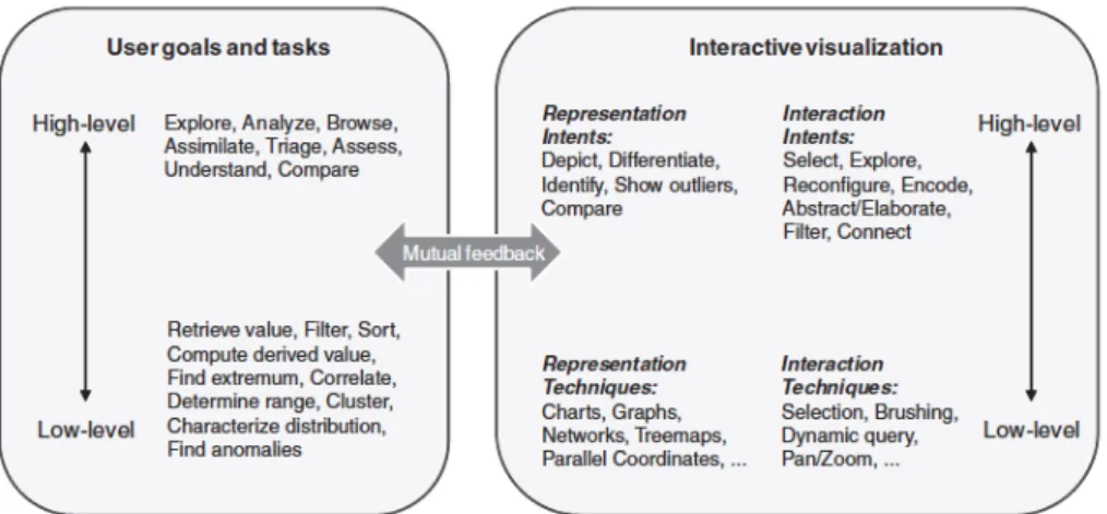
The information visualization community distinguishes between two levels of interaction: low-level and high-level interactions (Pike et. al 2009).
Low-level interactions are considered those between user and software interface, in which user’s goal is simply changing the representation to uncover relationships and trends. High-level interactions are those between the user and the information space, in which user’s goal is to generate understanding. Figure 4 shows deeper information about each level character-istics.
Figure 4: Usergoals, tasks and interactive visualization’s characteristics of low and high interaction’s level. (taken from Pike et. al, 2009)
3.3.2
Interaction Design Principles
As mentioned above, it is not easy to set all interaction parameters in the right way. It is an intangible concept that is difficult to design, quantify and evaluate (Elmqvist et. al, 2011). Confusing widgets, complex dialog boxes, hidden operations, incomprehensible displays, or slow response times can limit the range and depth of information internalized by analysts, may delay the decision taking process or induce to errors. Therefore, to be most effective, visual analytics tools must support the fluent and flexible use and interaction with the pace of human thought (Heer and Shneiderman, 2012).
This section pretends to give some guidance found in previous research about how to design interaction for visualizations.
At first, the principles of direct manipulation are, according to Ahlberg and Shneiderman (1994) and Elmqvist et. al (2011):
• Visual and continuous representation of the world of action, including both objects and actions.
• Quick, incremental and reversible actions, whose impact on the object of interest is im-mediately visible. Visual analysis tools should have the ability of recording and visual-ize analysts’ interaction histories in order to, at least, provide basic undo and redo support. (Heer and Shneiderman, 2012)
• Physical actions instead of complex syntax. For example, selection by pointing and not by typing. Control panels separated from the visualizations should be avoid.
• Immediate and continuous display of results. The immediate feedback should be given for every key press or mouse motion, not just for major events. That means that the visualization must be able to respond in real time. If this is not possible, precomputing should be considered. Real time interaction will be extended in the next section, as it is probably the most important interaction parameter for Visualizations of Real Time Big Data.
• Layered or spiral approach to learning that permits usage with minimal knowledge. These principles were later extended to few others. Below there’s a compilation of them, ex-tracted from Aigner et. al (2008), Pike et. al (2009), Elmqvist et. al (2011), Heer and Shnei-derman (2012) and Zhang et. al (2012):
• Reward interaction. Interaction design should have as objective encouraging users to interact, as a dialogue that should be initiated and maintained. When they do it is rec-ommended to give them a reward, because rewards are effects that trigger a positive user. The purpose of that is to keep the user stimulated while exploring.
• Capture user intentionality. Describes the need to recognize what the user is trying to achieve through the interaction. Knowing why a user is following the steps that he is following is crucial to a visual analytics tool’s ability to modify its presentation, suggest alternatives or identify additional information for the user. In order to do that, some visual analytics systems offer users the possibility of annotating their thought process-es as they work.
• Ensure that interaction never 'ends.' It should always be possible to continue exploring the data; the user should never reach a dead end in which there is no possibility of proceeding.
• Reinforce a clear conceptual model. Means that the user should always have a clear idea of the state of the visualization and interactive operations should be reversible, allow-ing the user to go back to a previous state.
• Avoid explicit mode changes. It is recommended to integrate all operations in the same mode instead of introducing different modes, as it is proven that mode changes may break user's flow.
• Allow collaboration. In visual analytics work, rarely happens that a single person un-dertakes the whole analysis process. Therefore, collaboration, in forms such as shared interactive displays, appears as a crucial feature.
• Assure coordination. Many analysis problems require multiple views that permit ana-lysts a vision of data from different perspectives and also to facilitate comparison. For example, Tufte advocates the use of “small multiples:” a collection of visualizations placed in spatial proximity and typically using the same measures and scales. Provid-ing multiple views simultaneously connected by linkProvid-ing and brushProvid-ing functionality is one of the most effective approaches and a major strength of some tools. Coordination in interaction is basic, understood as the propagation of interaction originated from one view to all other. But the coordination should not only be present in the visualiza-tion step, but also in all the process. For example, “huge investments in time and money are often lost, because of the lack of possibilities to properly interact with databases.” (Keim et. al 2008, page 76)
3.3.3
Real Time Interaction
Most of the tools analysed by Zhang et. al (2012) supported interactive actions such as filter-ing and zoomfilter-ing as well as distortion of views such as changfilter-ing into logarithmic scale. How-ever, Liu et. al (2013) point out that one of visual analytics problems is that most visual ana-lytics tools are not designed to support a real time interaction at large data scale.
Here, it must be remarked that this real time interaction refers to the possibility of interacting with data or visualization and getting a response at the same moment. It should not be con-fused with interacting with dynamic data in real time.
According to Liu et. al (2013), this is one of the biggest problems for interaction with Big Data visualizations. Querying large data stores can lead into high latency, disrupting fluent interac-tion. Even with data reduction methods can be too large to process in real-time.
In Visualizations for Real Time Big Data the area of interest is not static and can dynamically change during research process. Consequently, real time interaction becomes even a more important requirement. If interaction carries latency and data is constantly changing, it is pos-sible that through the process of generating the interaction required, data changes and impos-sibilities it.
3.3.4
More: Touchscreens vs. Touchpads or mouse-mice
An interesting group of studies were conducted by Brasel and Gips (2013), showing that touchscreens create stronger psychological ownership over chosen products in online shop-ping scenarios when compared to touchpads or mice. This increases the endowment effect, an effect saying that people use to give more value to something that they own.
Obviously, the results of these studies can’t be directly related to the topic in treatment in this work. Nevertheless, it can be adverted as an interesting future research challenge, asking if can also touchscreens generate benefits in data analysis through visualizations, compared to other interactive ways.
3.4
Screen
Visualizing data implies a screen in which these data are projected. Many of the problems in visual analytics are related with the size or resolution of the screen. The disposition of data elements across the screen can also be a differentiating factor in the analysis. Hence, screen is also an important visualization parameter that must be studied.
In this section, first of all size and resolution problems will be exposed; after that, a novel visualization tool is introduced: hybrid reality environments; and at last, a study about differ-ent kinds of data landscapes and represdiffer-entations will be remarked.
3.4.1
Size and resolution
“People are familiar with spatial concepts such as distance and height as part of their everyday life. Spatialization takes advantage of this knowledge by using a spatial metaphor to display ab-stract data, promoting understanding of high dimensional relationships by enabling users to easi-ly see similarities, clusters, and outliers.” (Tory et. al 2007, page 1262)