Linköping Studies in Science and Technology Dissertations, No.1400
Algorithmically Guided Information Visualization
Explorative Approaches for High Dimensional,
Mixed and Categorical Data
Sara Johansson Fernstad
Department of Science and Technology Linköping University
Explorative Approaches for High Dimensional, Mixed and Categorical Data Copyright c2011 Sara Johansson Fernstad unless otherwise noted
Department of Science and Technology, Linköping University SE-601 74 Norrköping
ISBN 978-91-7393-056-7 ISSN 0345-7524
This thesis is available online through Linköping University Electronic Press: www.ep.liu.se
A
BSTRACT
Facilitated by the technological advances of the last decades, increasing amounts of complex data are being collected within fields such as biology, chemistry and social sciences. The major challenge today is not to gather data, but to extract useful information and gain insights from it. Information visualization provides methods for visual analysis of complex data but, as the amounts of gathered data increase, the challenges of visual analysis become more complex.
This thesis presents work utilizing algorithmically extracted patterns as guidance during in-teractive data exploration processes, employing information visualization techniques. It provides efficient analysis by taking advantage of fast pattern identification techniques as well as making use of the domain expertise of the analyst. In particular, the presented research is concerned with the issues of analysing categorical data, where the values are names without any inherent order or distance; mixed data, including a combination of categorical and numerical data; and high dimensional data, including hundreds or even thousands of variables.
The contributions of the thesis include a quantification method, assigning numerical values to categorical data, which utilizes an automated method to define category similarities based on underlying data structures, and integrates relationships within numerical variables into the quantification when dealing with mixed data sets. The quantification is incorporated in an inter-active analysis pipeline where it provides suggestions for numerical representations, which may interactively be adjusted by the analyst. The interactive quantification enables exploration using commonly available visualization methods for numerical data. Within the context of categorical data analysis, this thesis also contributes the first user study evaluating the performance of what are currently the two main visualization approaches for categorical data analysis.
Furthermore, this thesis contributes two dimensionality reduction approaches, which aim at preserving structure while reducing dimensionality, and provide flexible and user-controlled dimensionality reduction. Through algorithmic quality metric analysis, where each metric rep-resents a structure of interest, potentially interesting variables are extracted from the high di-mensional data. The automatically identified structures are visually displayed, using various visualization methods, and act as guidance in the selection of interesting variable subsets for fur-ther analysis. The visual representations furfur-thermore provide overview of structures within the high dimensional data set and may, through this, aid in focusing subsequent analysis, as well as enabling interactive exploration of the full high dimensional data set and selected variable sub-sets. The thesis also contributes the application of algorithmically guided approaches for high dimensional data exploration in the rapidly growing field of microbiology, through the design and development of a quality-guided interactive system in collaboration with microbiologists.
P
OPULÄRVETENSKAPLIG
SAMMANFATTNING
A
LGORITMISKT VÄGLEDD INFORMATIONSVISUALISERING FÖR
HÖGDIMENSIONELL OCH KATEGORISK DATA
Den tekniska utvecklingen under de senaste årtiondena har lett till att mer och mer data samlas in i en rad olika forskningsområden, som exempelvis biologi, kemi, medicin och samhällsvetenskap. Idag är inte den största utmaningen att samla in data, utan att förstå och ta fram användbar infor-mation ur komplexa och stora mängder data. Inforinfor-mationsvisualisering är ett forskningsområde som utvecklar metoder för att visuellt analysera komplexa data, men med ökande mängder data blir även den visuella analysen mer komplex och kräver därmed mer avancerade analysmetoder. I den här avhandlingen presenteras forskning där algoritmiska analysmetoder används till-sammans med informationsvisualiseringsmetoder. Med hjälp av algoritmiska metoder kan mön-ster och strukturer i data snabbt identifieras. Genom att kombinera detta med interaktiva vi-sualiseringsmetoder kan även analytikerns domänexpertis uttnyttjas. Avhandlingen fokuserar framförallt på problem som är kopplade till visuell analys av: 1) kategorisk data, vilket är data där värdena är namn och där det inte finns någon naturlig ordning eller avstånd mellan datavär-den; 2) analys av data som består av en kombination av kategoriska och numeriska värdatavär-den; och 3) högdimensionell data som kan innehålla hundratals, eller till och med tusentals, dimensioner. Till att börja med presenterar avhandlingen en metod för kvantifiering av kategorisk data, vilket innebär att kategorisk data representeras av numeriska värden. Med hjälp av en algoritmisk analysmetod så definierar kvantifieringsmetoden avstånd mellan kategorier, baserat på underlig-gande datastrukturer. När datasetet består av en kombination av kategorisk och numerisk data baseras kvantifieringen även på strukturer i den numeriska delen av datan. Kvantifieringsme-toden är en del i en interaktiv analysprocess, där resultaten från kvantifieringen fungerar som förslag på numeriska värden som kan användas istället för de kategoriska värdena. De föres-lagna numeriska värdena kan enkelt och interaktivt ändras av analytikern. Genom att använda denna typ av kvantifierinsprocess kan kategorisk data analyseras med visualiseringsmetoder för numerisk data. Dessa är mer generella och mer vanligt förekommande än metoder för kategorisk data. Inom informationsvisualisering finns det idag två huvudmetoder när man analyserar kate-gorisk data. Den ena metoden är att använda visaliseringsmetoder som är utvecklade speciellt för kategorisk data. Den andra metoden är att representera kategorierna med numeriska värden och
teras i den här avhandlingen tillhör den senare typen. Avhandlingen presenterar även den första användbarhetsutvärderingen där dessa två metoder jämförs med varandra.
I avhandlingen beskrivs dessutom två metoder för att minska antalet dimensioner i högmensionella dataset. Metodernas syfte är att behålla flera typer av mönster samtidigt då di-mensionaliteten minskas. Syftet är också att metoderna ska vara flexibla och helt och hållet kontrolleras av användaren. Med hjälp av en automatisk analys baserad på kvalitetsmått, där varje kvalitetsmått representerar ett, för analytikern, intressant mönster, identifieras dimensioner som verkar särskilt intressanta. Med hjälp av olika visualiseringsmetoder får analytikern ta del av de mönster som identifierats under analysen. På så vis fungerar den automatiska analysen som vägledning för att välja ut ett mindre antal intressanta dimensioner för mer ingående analys. Visualiseringen ger även en överblick av de mönster som finns i det högdimensionella datasetet och kan genom detta fungera som ett hjälpmedel för att besluta vad den fortsatta analysen ska fokusera på. Dessa metoder gör också att analytikern interaktivt kan utforska både det högdi-mensionella datasetet och de dimensioner som bedömts som särskilt intressanta. Avhandlingen visar även hur algoritmiskt vägledd informationsvisualisering kan användas inom mikrobiologi, som är ett snabbt växande forskningsområde. Detta visas genom att presentera ett interaktivt system för analys av högdimensionell mikrobiell data, vilket utvecklats i nära samarbete med mikrobiologer.
De metoder som utvecklats inom ramen för avhandlingen underlättar effektiv dataanalys genom att använda snabba algoritmiska metoder för att identifiera intressanta mönster. Genom att kombinera dessa metoder med interaktiva visualiseringsmetoder blir det möjligt att även dra nytta av användarens domänexpertis. Detta möjliggör en flexibel analys som kan underlätta iden-tifierandet av användbar information ur komplexa data inom en mängd områden.
A
CKNOWLEDGEMENTS
My first thanks go to my three supervisors. To Mikael Jern for introducing me to the field of information visualization and for making this PhD possible. To Jimmy Johansson for indispens-able guidance, feedback and support throughout the years, and for always being a good friend. To Jane Shaw at Unilever R&D, Port Sunlight, UK, for inspiration, support and enthusiasm, and for making our collaboration a fantastic experience. I would also like to thank Matt Cooper for feedback, support and numerous proof-readings throughout, not least during thesis writing.
Furthermore I would like to thank everyone I have met at Unilever R&D, Port Sunlight, UK, for enthusiastic and encouraging feedback and support throughout my PhD studies, and for putting data analysis into interesting and relevant contexts. Particularly I would like to thank Rob Treloar for your enthusiasm and for all interesting questions, Tim Madden for all encouraging feedback and for bringing up relevant questions which have driven the work forward and, not least, David Taylor, Suzi Adams and Sally Grimshaw for all your positive and valuable feedback and for a great collaboration on the microbiomics project. I would also like to thank Phil Helme, Stephen Bennett, Trevor Cox and everyone else that have enthusiastically shown interest in my work throughout these years.
Many thanks also go to my colleagues in the C-Research/Media and Information Technology group, Linköping University, for feedback and support and for making these years a fun experi-ence. Special thanks go to Camilla Forsell for user-evaluation support, to Karljohan Palmerius for providing the LATEX template which this thesis is based on and, not least, to Eva Skärblom for
indispensable help with all practical issues throughout.
Finally, my special thanks go to my family, for always supporting me and believing in me, and to my loving husband Marcus, for being my best friend and for making me laugh at least once a day.
♦
This work was supported in part by a ‘heavy’ grant under the Swedish Knowledge Foundation’s Visualization Programme.
C
ONTENTS
1 Introduction 3
1.1 Multivariate Data . . . 4
1.2 Information Visualization. . . 6
1.3 Data Mining. . . 9
1.4 Algorithmically Guided Visualization . . . 11
1.5 Research Challenges . . . 13 1.6 Overview of Papers . . . 15 2 Background 17 2.1 Categorical Data . . . 17 2.1.1 Visualization . . . 18 2.1.2 Quantification. . . 22
2.2 High Dimensional Data . . . 27
2.2.1 Visualization . . . 27
2.2.2 Dimensionality Reduction and Ordering . . . 28
3 Contributions 35 3.1 Interactive Quantification of Categorical Data . . . 35
3.1.1 Objective . . . 36
3.1.2 Result . . . 36
3.1.3 Summary of Contributions . . . 40
3.2 Evaluation of Categorical Data Approaches . . . 41
3.2.1 Objective . . . 41
3.2.2 Result . . . 42
3.2.3 Summary of Contributions . . . 44
3.3 Quality Based Dimensionality Reduction . . . 45
3.3.1 Objective . . . 46
3.3.2 Result . . . 46
3.3.3 Summary of Contributions . . . 49
3.4 Visual Exploration of High Dimensional Data . . . 49
3.4.1 Objective . . . 50
3.4.2 Result . . . 51
3.4.2.1 Exploration of Microbial Populations . . . 53 ix
3.4.3 Summary of Contributions . . . 57 4 Conclusions 59 4.1 Summary of Contributions . . . 59 4.2 Discussion. . . 60 4.3 Future Work . . . 61 Bibliography 65
Publications Included in the Thesis 73
I Interactive Quantification of Categorical Variables in Mixed Data Sets 73
II Visual Exploration of Categorical and Mixed Data Sets 83
IIIVisual Analysis of Mixed Data Sets Using Interactive Quantification 95
IV A Task Based Performance Evaluation of Visualization Approaches for Categorical
Data Analysis 107
V Interactive Dimensionality Reduction Through User-defined Combinations of
Quality Metrics 119
VI Visual Exploration of Microbial Populations 129
C
OMPLETE
L
IST OF
P
UBLICATIONS
Papers I through VII are included in the thesis and are cited by their respective number through-out. Papers VIII through XI are in part related to the work presented in the thesis, but are not included.
I Sara Johansson, Mikael Jern and Jimmy Johansson. Interactive Quantification of Categor-ical Variables in Mixed Data Sets. In proceedings of IEEE International Conference on Information Visualisation, pages 3–10, London, UK, July 9–11, 2008.
II Sara Johansson. Visual Exploration of Categorical and Mixed Data Sets. In proceedings of ACM SIGKDD Conference on Knowledge Discovery and Data Mining, Workshop on Visual Analytics and Knowledge Discovery, pages 21–29, Paris, France, June 28, 2009. III Sara Johansson and Jimmy Johansson. Visual Analysis of Mixed Data Sets Using
Interac-tive Quantification.ACM SIGKDD Explorations, 11(2):29–38, Dec. 2009.
IV Sara Johansson Fernstad and Jimmy Johansson. A Task Based Performance Evaluation of Visualization Approaches for Categorical Data Analysis.In proceedings of IEEE Interna-tional Conference on Information Visualisation, pages 80–89, London, UK, July 13–15, 2011.
V Sara Johansson and Jimmy Johansson. Interactive Dimensionality Reduction Through User-defined Combinations of Quality Metrics. IEEE Transactions on Visualization and Computer Graphics, 15(6):993–1000 Nov./Dec. 2009.
VI Sara Johansson Fernstad, Jimmy Johansson, Suzi Adams, Jane Shaw and David Taylor. Visual Exploration of Microbial Populations. In proceedings of 1st IEEE Symposium on Biological Data Visualization, Providence, RI, USA, October 23–24, 2011.
VII Sara Johansson Fernstad, Jane Shaw and Jimmy Johansson. Quality Based Guidance for Exploratory Dimensionality Reduction.Submitted to Information Visualization, 2011. VIII Sara Johansson, Kristina Knaving, Amanda Lane, Mikael Jern and Jimmy Johansson.
In-teractive Exploration of Ingredient Mixtures Using Multiple Coordinated Views. In pro-ceedings of IEEE International Conference on Information Visualisation, pages 210–218, Barcelona, Spain, July 15–17, 2009.
Geospatial Datasets. In proceedings of IEEE International Conference on Information Visualisation, pages 362–370, London, UK, July 9–11, 2008.
X Sara Johansson and Mikael Jern. GeoAnalytics Visual Inquiry and Filtering Tools in Par-allel Coordinates Plots.In proceedings of the 15th ACM International Symposium on Ad-vances in Geographic Information Systems, pages 252–259, Seattle, WA, USA, November 7–9, 2007.
XI Mikael Jern, Sara Johansson, Jimmy Johansson and Johan Franzén. The GAV Toolkit for Multiple Linked Views. In proceedings of the Fifth International Conference on Coordi-nated and Multiple Views in Exploratory Visualization, pages 85–97, Zürich, Switzerland, July 2, 2007.
C
HAPTER
1
I
NTRODUCTION
The technological advances of the last decades have led to a rapid increase in the amount of data being collected and stored within a variety of fields, such as DNA-sequencing, simulation, financial and climate research. As a result, the major challenge of today is not the collection of data, but the extraction of useful knowledge and information from the vast amounts of complex data that is available. Although technological advances have multiplied our ability to collect and store data, it is still the insights gained from data that are important, and the gaining of insights is greatly constrained by the limitations of the human perceptual system [23,87]. As a result, efficient techniques for analysis, exploration and identification of interesting structures in data are highly desirable and often necessary to extract useful information and through it gain relevant insights. Visualization and data mining are two fields addressing the issue of extracting and identifying useful information from large and complex data sets, but from different perspectives. Thus, the combination of the two may often be beneficial.
To visualize something means to construct a mental image of it, and thus visualization in its actual meaning has nothing to do with computers but is a purely cognitive activity [79]. Today the term visualization has, however, more and more come to refer to graphical representations of data which are used to support decision making [87] and some define visualization as"The use of computer-supported, interactive, visual representations of data to amplify cognition"[14]. Using the latter definition, visualization can be said to act as a link between the human mind and the computer. The use of a visual representation, such as a diagram, facilitates the creation of a mental image of structures within complex data and is, as such, an important part in the process of gaining relevant insights from data. The usability of visual representations is, however, often decreased as the size and complexity of data sets increase, limited both by display size and resolution as well as by the human visual system and the visual metaphors used [23].
Data mining on the other hand can be defined as an automated process of identification and discovery of useful structures in data [25] or as the process of extracting, or ‘mining’, interesting knowledge from large amounts of data stored in information repositories [40]. Data mining methods may often be successfully combined with visualization approaches, as both focus on the detection of interesting and useful structures and information in data. Due to differences in approaches and methodology their benefits and limitations are, however, different, and as such they may often complement and enhance each other in ways advantageous to the data analyst.
This chapter will provide background on concepts and details of visualization and data min-ing which are relevant to understandmin-ing the contributions of this thesis. It will also describe various aspects of multivariate data and briefly present some of the fundamental issues of vi-sual analysis of multivariate data, as well as providing an introduction to the research challenges motivating the work presented in the thesis.
1.1
M
ULTIVARIATE
D
ATA
A data set can be defined as a collection of data items [81], where an item may, for instance, represent a patient in a medical data base, a municipality in a collection of census data, a test run in a simulation or a sample in a DNA-sequencing study. Various terminologies are used within the literature and data items are sometimes also referred to as objects, records, tuples, points, vectors, observations or samples. Throughout this thesis and the publications included the terms data item and data object are used interchangeably and, in some cases, when referring to biological data, the term sample is also used.
The characteristics of a data item are described by a collection of variables. A variable can be defined as a property, or a characteristic, of a data item that may vary from one item to another or over time [81]. As an example, in a census data set where the data items represent municipalities, the variables may represent various characteristics of the municipalities such as population size, average income, percentage unemployed and the percentage of the population that voted for a specific political party. Variables are sometimes also referred to as attributes, dimensions and features. In this thesis and in the publications included, the terms variable and dimension are used interchangeably.
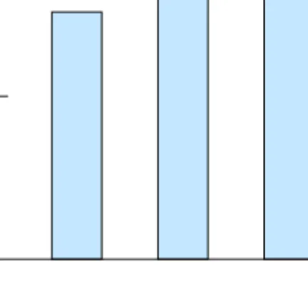
A multivariate data set is simply a data set including two or more variables. The items of a multivariate data set can be thought of as points in a multidimensional space where each dimension represents a variable. A standard format used for structuring multivariate data is to use anm-by-nmatrix includingmrows, usually representing data items, andncolumns, usually representing variables. Table1.1displays a small example of a data matrix including three data items, each representing a film, and four variables, each describing a characteristic of the film.
In terms of data set size, a data set is, in this thesis, referred to as large when it contains either too many variables or too many data items for a chosen visualization method to be usable. Based on this, a moderately sized data set is defined as a data set including a number of variables and data items for which the chosen visualization method is usable. In this context, a visualization method is defined as usable if it, in reasonable time, convey information about data in a clear and interpretable way.
Data variables are often classified into different types, and various classification taxonomies appear in visualization and data mining literature. Tan et al. [81] use the properties of distinct-ness, order, addition and multiplication to describe and classify variables. They initially separate variables into categorical (qualitative) and numerical (quantitative). Categorical data is then de-fined as either nominal, where the data values are different names which only provide enough information to distinguish one value from another, or ordinal, where the values provide enough information to order the items. TheDirector variable in table1.1is an example of a nominal
1.1. MULTIVARIATE DATA 5
Table 1.1: An example of a multidimensional data set including three data items, each representing a film, and four variables of different types, each representing a property of the film.
Director Rating (UK) Length (min) Production year
Ingmar Bergman A 91 1957
Robert Aldrich X 134 1962
Alfred Hitchcock A 128 1958
variable, whereas the Ratingvariable, for which items can take the values ofU (suitable for children), A(children must be accompanied by an adult) andX (suitable only for adults), is an ordinal variable. Numerical data are represented by numbers and can be either continuous or integer values. Tan et al. [81] separate numerical data into interval data, for which the differences but not ratios between values are meaningful, and ratio data, where both differences and ratios between values have a meaning. In table1.1 Production yearrepresents an interval variable whereasLengthis a ratio variable.
Card et al. [14] use a similar but slightly simpler classification by dividing variables into three different types; nominal, which is an unordered set of values, ordinal, which includes an ordered set of values, and quantitative, which represents a numeric range to which arithmetic can be applied. Using this classification theDirectorandRatingvariables would again be classified as nominal and ordinal respectively, whileProduction yearand Lengthwould both belong to the same class of quantitative variables. Hand et al. [41] use a comparable classification of quantitative and categorical variables. A slightly different way of classifying data is to define it as either discrete or continuous, where discrete variables include a finite set of values which can be either categorical or numerical (usually integer values), and continuous variables include values that are real numbers [81]. In table 1.1 Director, RatingandProduction year are all discrete variables whileLengthcan be defined as continuous. Friendly [32] classifies categorical variables into three different types; binary, nominal and ordinal, where binary variables only can take two different values, such astrueorfalse. The number of distinct values that can be taken by a categorical datum is defined as the cardinality of the variable.
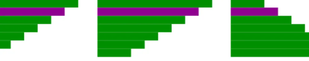
The definition of variable types for a data set is important since various data types may require different analytic techniques since a single technique is rarely appropriate for all types of data. Specifically, techniques used for numerical variables are often based on a numerical difference or similarity between data items. Categorical data on the other hand does not include any distance measure comparable to a numerical distance, and hence other analytical techniques may need to be used. As a simple example based on the data set in table1.1, the length of a film may quite effectively be represented using a bar chart where the height of the bar represents the length of the film, as displayed in figure1.1. Using the same kind of representation forDirectorwould, on the other hand, not be as useful since there does not exist any meaningful relationship between a director name and the height of a bar. Furthermore, the similarity of two categories may often depend upon context and is, hence, not as generalizable as numerical similarity. As an example, figure 1.2displays three colours; dark green, light green and dark purple, which may be the
60
Length (min)
120
Figure 1.1: A bar chart used to display the length of the small example data set of table1.1.
Figure 1.2: An example of the context dependency of similarity between categorical values. In the context of colour hue, the dark green and light green colours are most similar, whilst the dark green and dark purple are most similar in the context of lightness.
categories of a categorical variable. In the context of hue the two green colours are more similar to each other than to the purple colour, but in the context of lightness dark green and dark purple are more similar to each other than they are to light green.
Throughout this thesis data type definitions corresponding to the two basic classes of categor-ical and numercategor-ical data are used, where categorcategor-ical variables may be either nominal or ordinal, and numerical variables are defined similar to the quantitative variables of Card et al. [14]. Ad-ditionally the concept of mixed data sets is also used, referring to a data set including both categorical and numerical variables.
1.2
I
NFORMATION
V
ISUALIZATION
Visualization is often separated into scientific visualization and information visualization, the latter being the focus of the visualization research presented in this thesis. There is not always a clear boundary between scientific visualization and information visualization, since methods from both fields may be combined and used concurrently within many areas. Commonly the two fields are separated based on the properties of the data that are analysed and on how the data is represented. Scientific visualization tends to deal with physically based data and the visual representations used usually relate to the physical properties of the data [79]. A typical applica-tion of scientific visualizaapplica-tion may, for instance, be to use visual representaapplica-tions of molecules, including atoms and chemical bonds, for analysis of molecular data.
1.2. INFORMATION VISUALIZATION 7
A
B
C
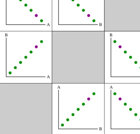
Figure 1.3: Parallel coordinates displaying a data set with three variables, represented by vertical axes, and seven items, represented by polylines.
C
A
B
Figure 1.4: A table lens representing a data set with three variables, represented as columns, and seven items, represented as rows.
Information visualization, on the other hand, usually deals with more abstract data without any obvious spatial mapping. Analysis of these data would rarely require or benefit from a visual representation of the actual physical object, and hence information visualization is mostly concerned with abstract concepts and representations. As an example, analysis of a film data set would hardly benefit from visual representations of celluloid films. The principal task of information visualization is to represent abstract data in a way such that information, in terms of useful and interesting structures, may be derived from it. "The holy grail of information visualization is to make the insights stand out from otherwise chaotic and noisy data."[16]
Information visualization provides a range of visualization methods for analysis of multivari-ate data. Of these, parallel coordinmultivari-ates, scatter plot matrix and table lens, are commonly used within this thesis. Usingparallel coordinates[47,88] (figure1.3) the variables of a multivariate data set are mapped to parallel axes. Data items are represented by polylines intersecting the axes at the values of the variable. Thetable lens[68] (figure1.4) displays each variable as a column and each data item as a row, with values represented by line length. Ascatter plot matrix[8] (figure1.5) is a matrix including a set of two-dimensional scatter plots. Often the set of scatter plots includes plots for all variable pairs in a multivariate data set and is then usually structured as a symmetrical matrix. The example data displayed in figures1.3,1.4and1.5includes three variables (A, B, C) and seven data items. One data item is highlighted in purple in all figures. Some relationships between variables can be identified from the figures, including a positive correlation between variables A and B (meaning that high values in one variable correspond to high values in the other variable as well), and a negative correlation between variables B and C (meaning that high values in one variable correspond to low values in the other variable). In the
C C C A A A A B B B B C
A
B
C
A
B
C
Figure 1.5: A scatter plot matrix representing a data set with three variables and seven items. The cells of the matrix include all two-dimensional scatter plots that can be formed from the data set.
scatter plot matrix, displaying all variable pairs, a negative correlation between variable A and C is also visible.
Today the use of multiple coordinated views is a well established concept in information visualization [6,13,69]. Put simply, the concept of multiple views implies that several windows or views are used concurrently for representing data. Usually different visual representations are used within different views displaying different aspects of data. To enable integration of the separate views operations between views are coordinated, meaning that any changes made in one view are reflected in the other views. The use of multiple coordinated views allows the user to analyse and explore data from different perspectives, and since different visual representations have different limitations and enhance different aspects, this may often facilitate the extraction of useful information and the gaining of insights from data. The concept of multiple coordinated views has been a design base for the visualization systems that have been developed as part of this thesis. Various approaches can be taken as to how the views are coordinated. Approaches relevant for the work presented in this thesis include Overview+Detail [14], where one view
1.3. DATA MINING 9 presents an overview of the whole data set while other views only display some details of the data, and Master/Slave Relationship [69], where the representation in one view acts as a control over the other views.
Interaction is a core part of multiple coordinated views and of information visualization in general. A large variety of interaction techniques may be used within a system. These can be defined as either indirect, manipulating the data using buttons, menus and sliders which are separated from the visual representations, or direct, which indicates that manipulation of data is performed directly in the visual representation itself. The dynamic querying concept, as in-troduced by Shneiderman [77], provides an example of indirect manipulation where sliders and buttons are included in a graphical user interface and used as an interactive and visual alterna-tive to standard database queries. A typical example of direct manipulation is the concept of brushing [8] where objects, such as points in a scatter plot, are selected directly in the display using a ‘brush’. The selected objects are then manipulated through a brushing operation, such as highlighting or labelling. In the context of multiple coordinated views the brushing operation is usually propagated to all views.
As a natural result of the development and growing maturity of the field of information visu-alization, visualization methods will become more commonly available and used in data analysis. Based on this an important research aspect in information visualization is to establish the usabil-ity of new visualization methods. Through user studies the usabilusabil-ity of a visualization may be assessed. User studies can be carried out in different ways and various classifications of studies are available. For example, Plaisant [66] describes the following four main types of evaluation in information visualization:
1. Controlled experiments comparing design elements, where specific elements of visual representations, such as sliders or colours, are compared.
2. Usability evaluation of a tool, which is used to provide feedback on problems and limita-tions of a visualization tool, aiming to refine the design of the tool.
3. Controlled experiments comparing two or more tools, where the performance of mul-tiple tools is compared.
4. Case studies of tools in realistic settings, which is carried out in the users’ natural en-vironment doing real tasks, and hence measures the usability of a tool within its intended context.
Furthermore, a user-centered design process, driven by feedback from the intended end-users may ensure the usefulness of the tool within the analytical context of the users.
1.3
D
ATA
M
INING
Data mining can be defined as the process of discovering or extracting useful information from large amounts of data through the use of automated methods. Another important aspect of data
mining, in addition to extracting information, is to summarize data and identified patterns in ways that are understandable and useful to the data analyst [41]. The field of data mining is closely linked to fields such as statistics, pattern recognition, machine learning and artificial intelligence [25], and it may sometimes be difficult to draw a clear boundary between them. For simplicity all algorithmic and automated methods used will be referred to as data mining methods throughout this thesis, although some methods may originate from other fields.
Some of the most common data mining techniques are clustering, correlation analysis, clas-sification and dimensionality reduction. Clustering is the concept of identifying groups, or clusters, of data items that are similar to each other and different to the items of other clusters. Correlation analysisis the association of two or more variables, and the correlation coefficient extracted through correlation analysis can be seen as a measure of variable similarity. Classifi-cationis the concept of assigning data items to a set of predefined classes. It is partly related to discretization or categorization of continuous variables, which means to transform the continu-ous scale of a variable into a fixed set of categories. Dimensionality reductionis the concept of representing a larger number of variables with a smaller number. A large number of different computational methods are available for any of these techniques, some of which will be discussed in more detail later on in the thesis.
The basic tasks of data mining are often classified as either descriptive or predictive, where descriptive tasks aim to describe and summarize the general properties of the data set, whereas the goal of a predictive task is to predict values based on already known values and variables [40,81]. Hand et al. [41] provide a more detailed classification of data mining tasks, as follows: • Exploratory Data Analysis]represents tasks focusing on exploration of data without any
clear hypotheses or ideas of what to look for.
• Descriptive Modellingrepresents tasks where the aim is to describe the data set and its properties.
• Predictive Modellingrepresents tasks where the goal is to build a model that can be used for prediction of unknown values from already known values and variables.
• Discovering Patterns and Rulesrepresents tasks where the main goal is to detect patterns within data.
• Retrieval by Contentrepresents tasks aiming to identify patterns in a data set that are similar to an already known pattern of interest.
Most of the work presented in this thesis focuses on exploration of data for identification of interesting patterns and the forming of hypotheses. In some sense, large parts of the work, especially in terms of using algorithmic methods, can be defined as descriptive analysis, as it is used for describing patterns or relationships identified in the data. However, as a whole the descriptions of identified patterns are used as support or guidance for the analyst in an exploratory analysis process, a concept which will be described in more detail in the following section.
1.4. ALGORITHMICALLY GUIDED VISUALIZATION 11
Input Data
User Interaction
Insight
Algorithmically Guided Visual Analysis
Data Pre−processing Data Mining Visual
Representation
Analyst
Data Re−collection
Figure 1.6: Description of the interactive and iterative data analysis process of converting raw data into useful insights.
1.4
A
LGORITHMICALLY
G
UIDED
V
ISUALIZATION
An ever increasing amount of data is gathered as new techniques for data collection are devel-oped and as a result many scalability-related issues arise within data analysis. Data sets may typically involve a large number of variables and items and the task of visualizing this data in a usable way may be quite complex. While visual representations and interactive exploration facilitate the process of gaining relevant insights from data, humans are limited in terms of our ability to handle large volumes of data. Data mining can provide fast and automated methods for reducing and representing data, but the use of automated analysis methods distances the data exploration from the analyst. This may limit the analyst’s understanding of structures in the data and of the exploration processes leading to these structures [25]. Furthermore, the prior knowl-edge and domain expertise of the analyst is rarely taken into account in data mining algorithms [41]. Many of these problems may be overcome by combining automated data mining methods with interactive visualization techniques, which is the main approach of the contributions of this thesis.
The positive impact of applying data mining methods in combination with visualization was established by Wen and Zhou [90] through two user studies. Their results indicate an improved performance, in terms of task completion time and error rate, for both single-step and multiple-step tasks when combining visualization and data mining, the benefit being most significant when difficult tasks are performed or when complex visualization tools are used. Additionally, their study indicated that the interaction context of the analysis has a strong influence on the choice of data mining method to use. This implies that the selection of algorithmic transformation to apply to the data should preferably be decided dynamically within the users analytical context.
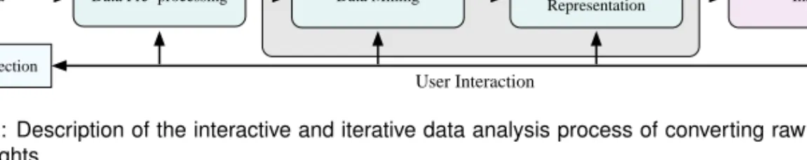
The overall process of converting data into useful and relevant insights is sometimes known as knowledge discovery in databases (KDD). Several descriptions of this analysis process, with varying complexity, are available in, for instance, Tan et al. [81], Card et al. [14] and Han and Kamber [40]. Figure1.6provides an overview of the process, here referred to as the data analysis process, in a manner relevant to the work described in this thesis. The figure describes an iterative process of converting raw data into insights useful to the analyst, which in turn may be used to refine and focus any of the previous steps in the process, or even lead to re-collection of data. The first step of the analysis process is the step of Data Pre-processing which may comprise activities such as combining several data sources into one data set and data cleaning including removal of noise and inconsistent data. The purpose of data pre-processing is to transform the
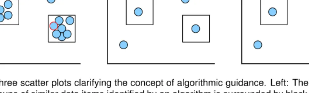
Figure 1.7: Three scatter plots clarifying the concept of algorithmic guidance. Left: The original data set where two groups of similar data items identified by an algorithm is surrounded by black borders. Centre: Result when the identified groups are automatically replaced by a representative data item. Right: The result when the analyst is provided the possibility of excluding from the merging an item known to be of particular interest.
data into a format appropriate for the subsequent analysis steps. This may be followed by the Data Mining step where algorithmic methods are used to identify structures and to reduce the data, for instance by employing dimensionality reduction. The Visual Representation step may follow the data pre-processing step directly or be subsequent to the data mining step. It includes utilizing interactive visual representations to display the data set, either original or manipulated through algorithmic methods, and to highlight potentially interesting structures identified in the data mining step. The analyst is usually very involved in the visualization step by interacting with the visual representations and visually exploring the data to gain insights. The data analysis process, as defined here, is a highly interactive and iterative process where the insights gained by the analyst may be used to further focus the analysis or to refine any of the previous steps, ranging from the collection of new data, to the use of different data mining methods and the employment of a different visual representation or brushing of a different data subset.
This thesis uses the notion of algorithmic guidance. The algorithmically guided visual anal-ysis includes the data mining and visual representation steps of the analanal-ysis process. Utilizing data mining followed by visualization does not, however, necessarily assume algorithmically guided visual analysis as the concept is used here. Algorithmic guidance implies that data min-ing methods are used to aid the analyst in identification of potentially interestmin-ing patterns and in decision-making. Patterns identified during the data mining step of the process can be displayed to the analyst as suggestions of structures which may possibly be interesting to investigate fur-ther. While the analyst is still provided control regarding which analysis paths to follow and which manipulations should be applied to the data. This is the preferable way of combining data transformation and visualization according to the study of Wen and Zhou [90]. Thus, with this approach the judgement of what is actually interesting is made by the analyst during analysis; based on domain knowledge, analytical task and data structures. The analysis process where al-gorithmic guidance takes place is typically an explorative process conducted by a domain expert. A simple example can be used to further highlight the difference between an algorithmi-cally guided analysis process and a process where the exploration is controlled by an automated method. Figure1.7displays three scatter plots. The leftmost plot displays the original data set
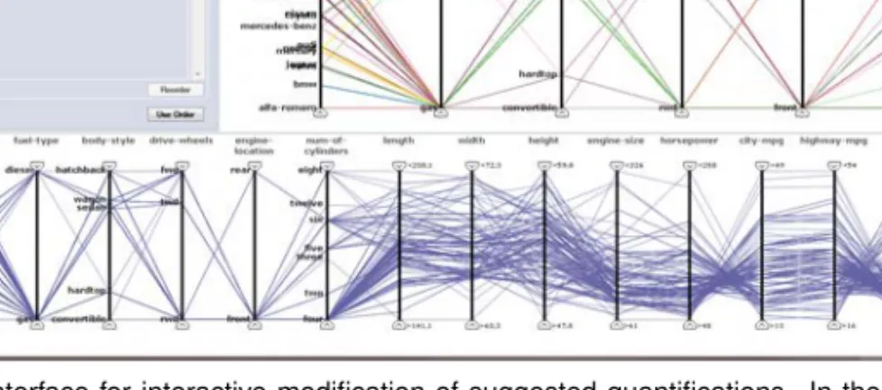
1.5. RESEARCH CHALLENGES 13 where the data items, represented by circles, are somewhat cluttered. One way of dealing with cluttered data is to replace groups of similar items with one representative item. By utilizing a clustering technique, two groups of similar items are identified, as surrounded by black borders in the leftmost plot. Using a purely automated approach each of the identified groups is replaced by a representative item, as in the centre plot. However, in this specific example the analyst is aware that one of the data items, represented by a red border in the leftmost plot, is of particular interest due to some domain-relevant property. Using algorithmic guidance the merging of the identified clusters would be suggested to the analyst, and prior to replacing any of the groups the analyst may, for instance, be offered the possibility of excluding individual items from the groups as well as freely deciding whether or not a group should be replaced by a representative item. The rightmost plot in figure1.7displays the result when the item of interest was excluded prior to merging the clusters.
The core purpose of algorithmically guided visual analysis is to provide analysis processes which are guided but not constrained by automated methods; utilizing the speed of automated methods as well as making use of the knowledge of an expert analyst. The concept of algorith-mically guided visual analysis is a core focus throughout the work described in this thesis and a common denominator of the included publications. The systems and approaches presented in the included publications all employ algorithmic guidance to some extent, although the level of user control varies between the papers.
1.5
R
ESEARCH
C
HALLENGES
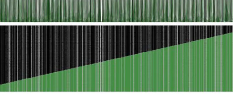
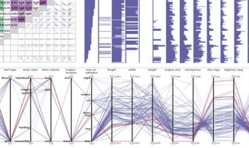
Some of the main research challenges addressed in this thesis approach issues relating to the structure of data. As increasing amounts of data are gathered difficulties involved in analysis of large data sets become more obvious. It is not unusual to deal with data sets including hun-dreds of variables or hunhun-dreds of thousands of data items. Even so, most visualization methods are not designed for representing data of this size and additional methods, such as data mining methods, need to be employed. The scalability of visualization has been defined as one of the top challenges of information visualization today [17]. PapersV,VIandVIIof this thesis ad-dress the issue of scalability in terms of high dimensionality. High dimensionality is not only an issue of importance in information visualization but is also one of the top challenges in data mining [81]. Most data analysis techniques have been designed for data sets of low or moderate dimensionality and do not work as well for high dimensional data. The issues involved relate not only to the increased computation time of algorithms, but also to visual clutter due to over-crowded displays. Figure1.8shows an example of this when parallel coordinates and a scatter plot matrix are used to display a data set including 227 variables. The issue of overcrowding may perhaps partly be solved through larger displays with higher resolution. However, the capacity of human perception is another limiting factor, both in terms of the precision of the eye and of the ability of the human mind to process visual patterns [87]. Large displays may quickly be-come impossible to overview and small patterns, sometimes as small as a single pixel, are often impossible to perceive in a high resolution display. Hence the issue of high dimensionality is not a purely technical issue which can be solved through faster computers or larger screens, but,
Figure 1.8: Example of overcrowded displays when parallel coordinates (top) and a scatter plot matrix (bottom) are used to represent a high dimensional data set including 227 variables.
perhaps most importantly, is a perceptually based problem which, as with all visualization, has to be considered in the context of the human user.
The structure of data is not only a question of size but also of the variable types included in the data set. Most visualization methods have been designed for numerical data, making use of the straightforward numerical similarity of data items in the layout. Nonetheless categorical data is commonly available and calls for specialized analysis methods, although the number of visualization methods designed for categorical data are far fewer than the number of methods for numerical data. The challenge of visualizing categorical data is hence an important issue within visualization which is addressed in papersI,II,IIIandIVin the thesis. An additional challenge related to that of categorical data analysis, is the analysis of mixed data sets including a combination of categorical and numerical data. Traditional data analysis methods, both within visualization and data mining, deal with data sets including only one type of variable. Due to the intrinsic differences between categorical and numerical data, data sets including a combination of both require special attention.
Utilizing automated methods for identification of interesting patterns enables fast analysis, but too much automation may distance the analyst from the analysis process and important knowledge of the analyst may not be taken into enough consideration. Interactive visualiza-tion systems, on the other hand, make use of the domain knowledge of the analyst, allowing the user to fully control the analysis process and open-endedly explore the data. This process may nevertheless be tedious and time consuming for large and complex data sets, and the task of explorative analysis may be overwhelming at the start. For the purpose of properly involving the analyst in the analysis process it is desirable to find an appropriate balance between employing automation and providing interactive visualization whilst combining the two approaches.
The concept of interestingness is addressed in parts of the thesis, where it refers to how interesting different structures in the data are. This could, for instance, be the interestingness of a cluster, a variable or a data subset, indicating the likelihood of the structure being of interest
1.6. OVERVIEW OF PAPERS 15 to the analyst. For algorithmic guidance the notion of interestingness is of high importance, since a main goal of utilizing algorithms in this context is to attract attention to the structures that are most likely to be of interest. However, what actually is of interest to an analyst depends on domain, task and data; hence a difficulty while designing a data analysis system is to define interestingness appropriately. To summarize, the major research challenges addressed in this thesis are as follows:
• the research of usable methods for exploratory visual analysis of high dimensional data; • the research of methods for interactive visual analysis of categorical and mixed data sets; • the definition of interestingness measures appropriate to the analytical context;
• the combination of automated techniques and interactive visualization methods in a well balanced manner.
1.6
O
VERVIEW OF
P
APERS
This section presents a short overview of the publications included in the thesis. A more thorough description of their contributions can be found in chapter3. The author of this thesis is first author of all papers, has implemented all techniques, systems and applications described within them and has designed the user evaluation described in paperIV. Jane Shaw, Suzi Adams and David Taylor substantially contributed to the data and task sections of paperVIas well as to the use case in that paper. Jane Shaw furthermore contributed a major part of the use case in paperVII. The main focus of the included publications are as follows:
PaperI, paperIIandpaperIIIaddress the issues of categorical and mixed data visualization by presenting an approach for interactive quantification of categorical data and an inter-active visualization system incorporating this approach. In difference to most preceding quantification methods, the approach presented in these publications utilize relationships within both categorical and numerical variables for quantification.
PaperIV includes a formal user evaluation comparing the performance of the two main ap-proaches to categorical data visualization when carrying out two basic data analysis tasks. PaperV addresses the issue of dimensionality reduction through a reduction method combining several quality metrics, where the analyst is guided in the selection of an appropriate num-ber of variables by a representation of loss of structure, and where analysis is facilitated by various variable ordering algorithms.
PaperVI presents a system for examination of high dimensional microbial populations, includ-ing explorative dimensionality reduction based on combinations of quality metrics and combining information visualization methods with methods commonly used within the microbiology domain.
PaperVII continues the work on exploratory dimensionality reduction through a generic sys-tem combining flexible and interactive dimensionality reduction with visual overview of structures within the high dimensional data set as well as visual exploration of a subset of variables.
C
HAPTER
2
B
ACKGROUND
This chapter aims to provide a more in-depth background to the contributions of this thesis and to provide an overview of the current state of research in the areas of categorical and high dimensional data analysis. The chapter is divided into two sections, each presenting research within one of the areas and each beginning with a brief motivation as to why these areas are important to address. Since the use of algorithmic guidance is the primary theme of the thesis, the combination of algorithmic methods and visualization in the context of categorical and high dimensional data will be discussed throughout the chapter.
2.1
C
ATEGORICAL
D
ATA
Categorical data is data where the values are names, commonly referred to as categories. In the case of ordinal categorical data an inherent order exists between the categories of a variable, but for categorical data, in general, there does not exist any straightforward order or measure of similarity between categories comparable to that of numerical values. When it comes to measuring the similarity of individual data items in a categorical data set, several measures based on category matching are available. The most simple being the overlap similarity measure, where a similarity of 1 is assigned for identical values and a similarity of 0 to not identical values. Thus, in a multivariate data set the items with highest number of overlapping values are considered most similar [11]. The Jaccard coefficient is related to the overlap measure, but focusing on sparse binary data, providing efficient similarity computation by only considering matches of non-zero values [81].
Similarity measures based on category matching only consider whether two values are equal or not and does not take any other aspects of the data into account. This is a limitation which has been addressed through data-driven similarity measures, which also take into consideration the frequency distributions in a data set. Boriah et al. [11] describes and compares a range of similarity measures for categorical data items in the context of outlier detection. Some of the conclusions drawn from this study are that, in many cases, the overlap measure did not perform well and that no single measure was superior or inferior to the others although some measures consistently rendered better performance. Although a range of similarity measures for categorical data are available, the notion of categorical similarity and the use of these measures is
more complex than for corresponding numerical measures. Furthermore, their performance tends to be more dependent on underlying structures in data, as some assign higher significance to rare category matches whereas others assign higher significance to commonly occurring matches [11]. In terms of visualization, the number of methods designed for categorical data are far fewer than the number of methods designed for numerical data [32]. An explanation of this may be the complexity of similarity measures.
2.1.1
V
ISUALIZATIONMost visual representations used for numerical data are in some way based on the numerical values of data items. Considering a scatter plot as a simple example, each item is represented by a glyph positioned according to its numerical value, usually such that higher values are positioned further to the top right part of the plot than lower values. Through this, items that are similar to each other are automatically positioned closer together than items that are less similar to each other, providing a straightforward and relatively easily interpreted representation of relationships and patterns within the data. This agrees well with the Gestalt law of proximity [87], saying that objects positioned close together are perceptually grouped together and, hence, spatial proximity will usually be interpreted as reflecting similarity. As the concept of similarity is more complex for categorical values, visual representations designed for categorical data often utilize other characteristics than similarity. Quite commonly, as will be described later in this section, the focus of the representation lies on category frequency, meaning the relative number of items in the data set that take a certain categorical value or a certain combination of categorical values.
Comparison of category frequencies within a single variable may be successfully carried out using a histogram or a bar chart where height represents frequency and each bar represents a cate-gory. However, for multivariate data sets these methods are less effective, requiring one chart for each variable and providing very limited possibilities for analysing inter-variable relationships. For analysing relationships within two binary variables, a fourfold display may be used [32]. The fourfold display is reminiscent of a pie chart and represents each combination of categories by a quarter circle whose area is proportional to the frequency of the category combination. The associations between cells are visually represented through confidence rings along the outer boundaries of the circle segments, where the rings of two adjacent circle segments overlap if the variables are independent of each other. The utility of fourfold displays is highly limited since they are only able to display two variables at a time and only variables that are binary. For asso-ciation analysis of two variables with higher cardinality a sieve diagram can be used [32]. The sieve diagram is made up of a grid of rectangular cells where the columns represent categories of one variable and the rows represent categories of the other. The width and height of the columns represent the total frequency of corresponding category. Following this, the area of each cell in the grid corresponds to the expected frequency if the two variables were independent. Within each cell a grid is drawn with density corresponding to the observed frequency of the category combination. Variations in density between cells indicate deviation from independence.
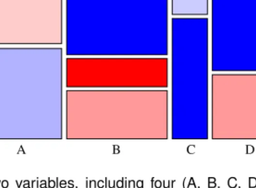
The mosaic plot [32] is closely related to the sieve diagram in terms of representing frequen-cies of category combinations through rectangular cells but, unlike the sieve diagram, the mosaic plot is not limited to displaying only two variables. Furthermore, the cell sizes in a mosaic plot
2.1. CATEGORICAL DATA 19
Z
A B C D
X Y
Figure 2.1: A mosaic plot of two variables, including four (A, B, C, D) and three (X, Y, Z) categories respectively. The frequency of category combinations is represented through rectangle size and the frequency’s deviation from an independence model is represented by colour.
correspond to the observed frequency of categories and not the expected frequency. In a mosaic plot displaying the categories of two variables, as in figure2.1, the columns represent categories of one variable and have width according to the total frequency of corresponding category. The height of the cells corresponds to the relative frequency of the categories of the second variable. Similarly to the grid density of the sieve diagram, the cells of the mosaic plot can be coloured according to deviation from a model of independence. Mosaic plots for three or more variables are achieved by recursively subdividing the cells according to frequency [32]. Another way of representing multivariate categorical data using mosaic plots is to use a mosaic matrix [31,32]. The mosaic matrix, which resembles a scatter plot matrix, is a symmetrical matrix of all two variable mosaic plots. In principle the mosaic matrix is able to display any number of variables but, from a practical point of view, it is limited by display resolution to three or four variables according to Friendly [32]. Additionally one visual representation used for analysing frequencies in multivariate categorical data sets is the cobweb diagram [85]. Visually, a cobweb diagram is reminiscent of a network visualization where each category is represented by a circular node. The nodes are connected by lines whose widths correspond to the fit of the category frequencies to a model of independence, similar to the colouring of a mosaic plot, and where line colours indicate the sign of the deviation. As for mosaic matrices, the cobweb diagram has no theoretical limitation in terms of number of variables to display but, as the number of unique categories in the data set increases as a result of either more variables or higher cardinality, the diagram may easily get cluttered.
A more recent visual representation displaying frequencies of categories is Nested Rings [86], a representation made up of a series of concentric rings. Each ring represents a variable and is divided into a number of slices, representing categories, with size corresponding to cate-gory frequency. The Nested Rings representation is interactive and supports dynamic querying in terms of filtering through selection of a category slice, constraining the representation to only display relative frequencies of items belonging to the selected category. As with mosaic ma-trices a limitation of Nested Rings is its inability to display a larger number of variables in a
usable way; according to the authors five variables seems ideal for display. Shiraishi et al. [76] present a method called granular representation for visual analysis of categorical data, where data items are represented by small circles which are coloured according to some variable. The items can be separated into groups, either manually by dragging category labels which attract items belonging to the category towards the dragging position, or by using an automated cluster-ing approach where items are separated based on their categorical values over multiple variables. This representation is combined with bar charts for examining the relative frequencies of cate-gories. Although the scalability of the granular representation approach was not discussed by the authors, it appears that this representation will also quickly become harder to overview in a multivariate analysis context, as the number of categorical variables and their cardinality, and through that the number of visually represented clusters of data items, increase.
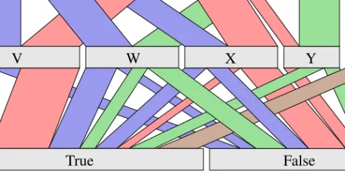
Several of the more recent visualization methods designed specifically for categorical data have a layout based on popular methods for numerical data. One of these is the Hammock plot [71] which utilizes the layout of parallel coordinates. In the Hammock plot the axes of paral-lel coordinates are replaced by univariate descriptors which textually represent category names. The polylines of parallel coordinates are replaced by polygons connecting categories of adjacent variables, with polygon width proportional to the frequency of corresponding category combi-nation. Parallel sets [58], displayed in figure 2.2, is another method built upon the layout of parallel coordinates, which includes frequency representation in the display. Similar to parallel coordinates, the variables of a multivariate data set are represented by parallel axes in paral-lel sets. The axes of paralparal-lel sets are horizontally laid out and instead of displaying individual items, parallel sets focuses on representing categories and category frequencies. Each category of a variable is represented by a box whose width corresponds to the relative frequency of the category. The categories of two adjacent axes are connected through bands whose width corre-sponds to the frequency of the combination of categories. Differently from many visualization methods designed for categorical data, parallel sets includes special features for dealing with the numerical variables of a mixed data set. The numerical variables are categorized into a number of equally sized bins, and bands stretching from a categorical axis towards the bin of a numerical axis have a triangular form, which distinguishes them from the bands between two categorical axes. Parallel sets also includes a range of interactive features for exploring the data and utilizes a histogram-like visual representation to display deviation from independence between adjacent axes.
In addition to parallel coordinates, a visual representation which has several times been adapted to suit the purpose of categorical data visualization is the Tree-Map, introduced by John-son and Shneiderman [51]. A Tree-Map is a space-filling approach for visualizing hierarchically structured data, mapping the hierarchical information to rectangular areas and recursively slicing the rectangles for higher level hierarchies. CatTrees [56] are an extension of Tree-Maps with the ability to create a hierarchical structures from categorical data. The TreemapBar [45] combines Tree-Maps with bar charts and can be described as a bar chart with embedded Tree-Maps. Each bar represents a categorized data subset with height corresponding to a quantifiable value of the subset. For data subsets including hierarchical structures the bars are filled using a Tree-Map layout algorithm. Issues of increasing number of categories and hierarchies are dealt with by providing focus+context through adjusting screen space allocation and widen bars within the
2.1. CATEGORICAL DATA 21
False
C
D
B
W
X
Y
Z
V
True
A
Figure 2.2: Parallel sets displaying a data set with three categorical variables, including four (A, B, C, D), five (V, W, X, Y, Z) and two (True, False) categories each. The width of the axis bars corresponds to category frequency and the width of bands between axes corresponds to frequency of combinations of categories in adjacent axes. Colouring is done according to the categories of the top variable.
focus area. Also related to Tree-Maps, the Attribute Map View [60] utilize a Tree-Map like layout for displaying categorical transaction data. In the Attribute Map View each categorical variable is represented by a horizontal bar. The bars are divided into a number of rectangles, each representing a categorical value of the variable, with size according to category frequency.
Seo and Gordish-Dressman [73] extend the Rank-by-Feature framework [74], which is a tool for exploring multivariate data, with features for analysis of categorical data. These features in-clude ranking criteria for evaluating relationships between categorical variables and possibilities of partitioning the data into groups based on categorical information, by splitting the data set horizontally or vertically. The framework also supports clustering of the categorical partitions for identification of meaningful groups of data and for comparison of partitions.
A data type partly related to categorical data is set-typed data. Set-typed data can be categori-cal in its nature and exists where a data item can take several different values for a single variable. This may, for instance, occur in customer surveys where a set of answers can be selected by a participant for a single question. Issues related to set-typed data have not been addressed in this thesis. However, several categorical variables of low cardinality may, in some cases, be com-bined into one set-typed variable to reduce the dimensionality of the data set [28], and as such the visualization of set-typed data is to some extent relevant for this thesis. Freiler et al. [28] presented the set’o’gram representation for visual analysis of set-typed data. The set’o’gram is based on a histogram layout and represents each value, or category, of a variable by a bar, the height of the bar representing the number of items taking the corresponding value. The bars are divided into a number of blocks of varying width, the height of the widest block representing items taking only the value of the corresponding bar, the height of the second widest block rep-resenting the number of items taking the value of corresponding bar and taking the value of one
other bar as well, the third widest bar representing items taking the value of the bar and the value of two other bars, and so on. The issue of set-typed data is also addressed by Collins et al. [19] through the Bubble Sets approach. Bubble Sets enclose individual and possibly overlapping sets in a standard visual representation using isocontours. This approach retains the original visual representation by drawing Bubble Sets on top of an existing representation and is, therefore, not limited to any specific data type.
Although a range of various visualization methods exist which are designed and modified to deal with the specific characteristics of categorical data, they are less commonly available than methods designed for numerical data [32]. Furthermore, their usability has not been fully examined since very few evaluations have compared visualization methods for categorical data. The main conclusion drawn from the literature reviews carried out in connection with this thesis is that methods designed for categorical data are more special purpose and often not as generic as methods designed for numerical data. In addition, their usability is often more dependent on the structure and size of the data. Some methods, such as the fourfold display, are strictly limited to displaying only a certain number of variables or categories. Others, such as mosaic plots and matrices, are not theoretically limited but are often not as usable for more than a moderate number of variables and categories. Methods such as parallel sets, which are based on the layout of parallel coordinates, seem to be able to display more variables. None the less, it appears as if they have a tendency to get more easily cluttered than standard methods for numerical data as the number of variables and categories increase. Not least since features such as wide polygon bands may take up large amounts of screen-space. The design of other methods are based on a certain structure, such as hierarchical data, and they are hence rarely useful for data not having this structure. Additionally, according to the Gestalt laws, spatial proximity will usually be interpreted as similarity between objects. Although the categories of a categorical variable generally do not have any inherent order, their order in a visual representation will, hence, be interpreted as indicating similarities and, as shown by Friendly [30], the visibility of patterns in categorical data displays are dependent on the internal order of the categories. With the support of this, the usefulness of visual representations for categorical data may be increased by utilizing an appropriate category ordering algorithm in combination with visualization.
2.1.2
Q
UANTIFICATIONAnother approach to visual analysis of categorical data is to employ quantification, which means that each categorical value is represented by a unique numerical value. The quantified data is then treated as if it were numerical and might thus be analysed using algorithms and visual rep-resentations originally designed for numerical data. In this way the generality and availability of these methods can be made use of, as well as their ability to more efficiently and effectively display larger data sets. Furthermore it enables analysis of mixed data sets, including both cate-gorical and numerical data, within a single display. When employing this approach it is highly important to select an appropriate method for mapping the categories to numerical values. The assigned numerical values will, due to the nature of numerical data, imply relationships such as similarity between categories. Unless these relationships reflect existing structures, the quan-tification and subsequent visualization may cause erroneous interpretation of the data. Various