Computational methods for the
analysis of next generation viral
sequences
A thesis submitted to the University of East Anglia for the degree of Doctor of Philosophy.
Student:
Sergey
Lamzin
Registration No:
4966694
Supervisors:
Dr. Mario
Caccamo
Prof. Richard
Morris
Dr. Pablo
Murcia
February 28, 2016
This copy of the thesis has been supplied on condition that anyone who consults it is understood to recognise that its copyright rests with the author and that use of any information derived there from must be in accordance with current UK Copyright Law. In addition, any quotation or extract must include full attribution.
Recent advances in sequencing technologies have brought a renewed impetus to the development of bioinformatics tools necessary for sequence processing and analysis. Along with the constant requirement to be able to assemble more complex genomes from ever evolving sequencing experiments and technologies there also exists a lack in visually accessible representations of information generated by analysis tools.
Most of the novel algorithms, specifically for de novo genome assembly of next genera-tion sequencing (NGS) data, are not able to efficiently handle data generated on large populations. We have assessed the common methods for genome assembly used today both from a theoretical point of view and their practical implementations.
In this dissertation we present StarK (stands for k∗), a novel assembly algorithm with a new data structure designed to overcome some of the limitations that we observed in established methods enabling higher quality NGS data processing.
The StarK approach structurally combinesde Brujin graphs for all possible dimensions in one supergraph. Although the technique to join reads remains in concept the same, the dimension k is no longer fixed. StarK is designed in such a way that it allows the assembler to dynamically adjust the de Brujin graph dimensionk on the fly and at any given nucleotide position without losing connections between graph vertices or doing complicated calculations. The new graph uses localised coverage difference evaluation to create connected sub graphs which allows higher resolution of genomic differences and helps differentiate errors from potential variants within the sequencing sample. In addition to this we present a bioinformatics analysis pipeline for high-variation viral population analysis (including transmission studies), which, using both new and es-tablished methods, creates easily interpretable visual representations of the underlying data analysis.
Together we provide a solid framework for biologists for extracting more information from sequencing data with less effort and faster than before.
Contents
Contents . . . 4
List of Figures . . . 8
List of Tables . . . 10
Preface 13
I.
Viral Population Analysis
15
1. Introduction 16 1.1. Motivation . . . 161.2. Project Objective . . . 17
1.3. Influenza Transmission Studies . . . 19
1.3.1. Influenza A Viruses (IAVs) . . . 19
1.3.2. Experiments & Sequencing . . . 20
1.3.3. Studies Summary . . . 24
1.4. The Analysis Pipeline . . . 28
2. Primary Data Preparation 31 2.1. Introduction . . . 31
2.2. Quality Control . . . 31
2.3. Sequencing Read Trimming . . . 34
2.4. Alignments . . . 37
2.6. Alignment pileup . . . 39
2.7. Consensus Sequences . . . 40
2.8. Sequence Coverage Visualisation . . . 41
3. Within-host population dynamics 43 3.1. Population Diversity Spectrum . . . 43
3.2. Nucleotide Entropy . . . 45
3.3. Sites Of Interest . . . 50
3.3.1. Bayesian statistics . . . 50
3.3.2. Comparison with entropy . . . 50
4. Inter-Host Variation Analysis 54 4.1. Variant Breakdown Tables . . . 54
4.2. Next Generation Phylogenetics . . . 56
5. Discussion 61
II. Sequence Assembly
65
6. Introduction 66 6.1. Motivation . . . 666.2. Genome assembly theory . . . 69
6.2.1. Coverage . . . 70
6.3. Overlap Layout Consensus (OLC) Assembly . . . 71
6.4. De Brujin Graph Assembly . . . 73
6.5. String Graph Assembly . . . 73
6.6. Comparison of the above methods . . . 75
6.6.1. Expressitivity/information loss . . . 75
6.6.2. Time . . . 77
7.2. Formal de Brujin Graph . . . 81
7.3. Observed coverage patterns . . . 84
7.4. De Brujin graph assembly . . . 90
8. StarK – locally adaptive graph assembly 93 8.1. Motivation . . . 93
8.1.1. Limitations of de Brujin graph assemblers . . . 94
8.1.2. Multi-dimensional solution . . . 97
8.2. StarK Theoretical Framework . . . 99
8.2.1. Surface paths . . . 102
8.2.2. Link strength . . . 104
8.2.3. Graph partitioning . . . 107
9. Implementation and parallelisation of the StarK assembler 111 9.1. Introduction . . . 111
9.2. Data structure . . . 113
9.2.1. k-mer representation (starknode_t) . . . 113
9.2.2. Explanation . . . 116
9.2.3. k-mer sequence retrieval. . . 116
9.3. Building a StarK graph . . . 118
9.3.1. Inserting reads . . . 118 9.3.2. Parallelisation . . . 120 9.4. Redundancy cleaning . . . 125 9.5. Assembly . . . 128 9.5.1. Initialisation . . . 128 9.5.2. Merging sub-contigs . . . 131 9.5.3. Exporting contigs . . . 134 9.6. Monitoring . . . 135 9.7. Performance Test . . . 137
9.8. Compressed data structure . . . 140
9.8.1. Design . . . 141
9.8.2. Parallel read parsing . . . 145
9.8.3. Node meta data . . . 146
10.Libraries 149 10.1. Generic Lists . . . 149 10.2. Hash maps . . . 153 11.Discussion 159 References 163 Acronyms 171 Appendices 175 A. Notation 177
List of Figures
1.2. Transmission Study of pandemic H1N1. . . 22
1.3. Ferret Transmission Study of endemic H3N2 sample overview. . . 23
1.6. Flowchart visualisation of our semi-automated analysis pipeline. . . 29
2.1. Quality scores histogram of a failed sample. . . 32
2.2. Quality scores histogram of influenza sample from Pig 3473 day 4. . . . 33
2.3. Side by side comparison of quality scores histograms. . . 36
2.4. Coverage plot of the HA segment of sample from Pig 3473 day 2. . . . 42
3.1. Visualisation of viral genetic diversity . . . 44
3.2. Sample entropy plot for a single sample, HA segment. . . 46
3.3. Entropy plot for the whole experimental infection study, HA segment. . 48
3.4. Combined Shannon Entropy plots for all segments of sample Pig 3473 day 5. . . 49
4.1. Screenshot of the interactive view of mutation sites. . . 55
4.2. Results of NGS resolution phylogeny. . . 58
4.3. Phylogenetic tree of the HA segment in the experimental infection study. 60 6.2. OLC graph during the overlap phase. . . 72
6.3. String graph example . . . 74
7.1. de Brujin graph containing the two-mers of the sequenceTGAC. . . 82
7.3. Coverage plot of influenza virus sample from Ferret 54 day 2 at k-mer
length 37. . . 85
7.4. Coverage plots models. . . 87
7.6. Multi dimensional coverage histogram. . . 89
8.1. The reads GGTGACTAand CTATGACGas 5-mers. . . 94
8.2. The reads GGTGACTAand CTATGACGas 4-mers. . . 95
8.3. The reads GGTGACTAand CTATGACGas 3-mers. . . 96
8.4. Multi-dimensional de Brujin graph assembly. . . 97
8.5. Full StarK graph of GGTGACTAand CTATGACG. . . 100
8.6. StarK link strength histogram sample. . . 107
9.2. starknode_t node – parent – neighbour relation. . . 115
9.3. StarK data structure with the read TGAC inserted. . . 117
9.4. Illustration of a StarK-graph containing only the k-mers of the read GGTGACTA. . . 119
9.5. StarK graph example after redundancy removed. . . 126
9.6. Screenshot of StarK monitoring status web page. . . 136
9.7. StarK profiling charts . . . 138 9.9. Shows node → parents → grandparent relation within the StarK graph. 140
List of Tables
1.1. Influenza A virus genome segments. . . 20
1.4. Summary statistics of the experimental infection study. . . 25
1.5. Summary statistics of transmission experiment. . . 26
3.5. Comparison of sites detected by Shannon entropy and seqmutprobs. . . 51
6.4. Algorithmic complexity for graph based assembly algorithms. . . 77
6.5. Runtime comparison of graph-based assemblers. . . 78
9.1. The starknode_t data structure. . . 114
9.8. StarK run time breakdown . . . 139
9.10. Data layout of struct stark_node_phase1_small_s with up to two offsets. . . 142
9.11. Combined data layout of struct stark_node_phase1_small_s in the extended state with its extension. . . 144
Preface
This dissertation is focused on two approaches for the analysis of Next Generation Sequencing (NGS) data. These two approaches are developed in two parts of the dissertation with a discussion chapter covering each one of them. The first part of this dissertation focuses on our methods for presenting raw and processed sequencing data in visually accessible way. While already many methods for analysis exist, few present their results in a visually accessible way. We demonstrate a full analysis pipeline that, given input data samples, generates various visualisations that aid in determining inter-and intra-host variation within the viral population. The pipeline incorporates both established and newly developed methods, which we detail in the following chapters. In the second part we discuss how similar viral sequencing samples can be assembled de novo. We discuss the theoretical concepts behind modern sequence assembly algo-rithms, putting them into a formal language framework at the same time. We then evaluate their performance on viral sequencing samples and finally present StarK — our own assembler, specifically designed to assemble high-variation viral genome samples and overcome the shortcomings of existing algorithms.
We then discuss the theoretical background of the StarK assembler and how it improves upon the existing de Brujin graph assembly approach. Finally we present in depth details on our implementation of a prototype assembler based on the StarK theoretical framework and our efforts on increasing its performance.
Part I.
1. Introduction
1.1. Motivation
Ribonucleic acid (RNA) viruses constitute a significant source of emerging infections in humans and animals, threatening both public health and food security. They display extremely large population sizes and high mutation rates. This mechanism enables the virus to adapt quickly to new environments and jump host species. The latter has caused various influenza pandemics (epidemics that spread to a large population of humans) throughout history [Bar05] with the Swine Flu pandemic in 2009 being the most recent example [Smi+09]. A better understanding of the dynamics of genetic changes in RNA viral populations is key to gain insight into mechanisms that allow them to jump species barriers, escape host immunity, develop antiviral resistance, or simply become more virulent. The revolution in genomics technologies has resulted in an exponential growth of genetic data at all taxonomic levels. Genetic data can now be generated in most laboratory settings due to the development of powerful and affordable sequencing technologies. The field of virology is one of many areas of research that have benefited from this technological leap: the influenza virus resource (http://www.ncbi.
nlm.nih.gov/genomes/FLU/growth.html) hosts approximately 16 500 whole genome
sequences as of February 2014.
Influenza A viruses (IAVs) are significant pathogens of humans and animals. They have caused four human pandemics since 1918 [Pot01], as well as multiple epizootics (animal/non-human epidemics) with severe mortality, morbidity and socioeconomic costs. Understanding the phylodynamics [HG09] of IAVs is critical in order to
de-vise effective strategies to predict, prevent and/or contain the burden caused by these pathogens. IAVs are members of the Orthomyxoviridae family of viruses, and possess a segmented genome — i.e. it is comprised of multiple pieces of RNA. In the case of IAVs comprising of eight molecules of RNA of negative polarity [BP08], meaning it is negative sense (3’ to 5’) encoded and positive sense (5’ to 3’) RNA must be first produced prior to translation. IAVs evolve principally by single-point mutations and reassortment, the former as a consequence of the lack of proofreading activity of the viral polymerase and the latter due to the segmented nature of the genome. Stud-ies on intra- and inter-host influenza variation [Mur+10] have provided insight on the phylodynamics of IAVs, showing that significant genetic diversity is generated during the course of infection, though this diversity is often ignored, instead summarising the genetic information in the form of a consensus sequence (averaged across the popula-tion). Also, such studies have shown that a proportion of variants are maintained at low levels along the course of infection and are even being transmitted. Most studies on within-host influenza dynamics have relied on the analysis of sequences derived from the hemagglutinin 1 (HA1) region of the HA gene [Gar+09], generated by capillary sequencing [Smi+85] of cloned Polymerase Chain Reaction (PCR) [Mul+87] products. Although informative, a more comprehensive approach at the whole genome level is required to better understand the evolutionary mechanisms at work during influenza infections.
1.2. Project Objective
The Illumina platform is particularly suitable to study the extent and structure of viral populations as it provides ultra-deep coverage and high accuracy. However, analysing and mining such large sequencing datasets in a computationally efficient and biolog-ically meaningful way is challenging, and requires the development of new computa-tional tools. Probably the biggest limitation of within-host viral population studies is the generation of artefact mutations in the laboratory during the reverse transcription
work, our collaborators (Dr. Pablo Murcia and Dr. TJ McKinley) developed a statisti-cal method for screening sequence data for single-site mutations-of-interest [McK+11] based on modelling the observation process rather than the underlying mechanisms driving evolution and/or sequencing error. This method can be used to search and filter for variants that are unlikely to be purely artefacts of the sequencing process. This is particularly important if we consider that a recent study has shown that very few mutations are required to adapt highly pathogenic avian influenza viruses to trans-mit in mammals [Mur+10]. Importantly, this method uses all available information on genetic diversity obtained from multiple within-sample sequences, rather than simply comparing consensus sequences. The efficiency of this screening algorithm is dependent on the degree of heterogeneity in the observed sequences and the number of longitudi-nal samples, and is why the alongitudi-nalysis of Next Generation Sequencing (NGS) datasets can become computationally intensive and in some cases practically unfeasible.
By modelling the observation process directly (i.e. making no assumptions about the possible origin of an observable deviation from the prior) one can capture a wealth of deviations from the mean. This comes though at the cost of having to apply a filter subsequently to distinguish variants of interest from noise/errors introduced by the sequencing process.
Although many tools already exist that facilitate research in this direction (and we have also used several here), their use often requires advanced bioinformatics or computer science knowledge to
• prepare the data to be processed,
• run the tools (possibly on limited hardware),
• interpret the results (which are often provided in binary or text form).
The objective of this project was to create a fully automated pipeline which, given datasets similar to the ones described in section 1.3, runs a series of analyses fully
au-tomated and produce visually accessible results without requiring special bioinformatics training beyond knowledge of a Linux command line from the user. The visualisations provided allow for both quick visual overview (e.g. whole genome variation clustering) of the data as well as more detailed versions (e.g. per-cite nucleotide counts).
In order to achieve this we have both created new tools and incorporated existing ones into a semi automated analysis pipeline. A flowchart visualisation is shown in Figure 1.6, the details are discussed in the following sections.
We applied this pipeline to characterise the mutational spectra of longitudinal intra-host influenza virus populations derived from pigs experimentally infected with the 2009 H1N1 pandemic virus (pdmH1N1) in two studies (described in section 1.3) and present here our methodology along with a small set of results exemplifying the power of our software.
1.3. Influenza Transmission Studies
1.3.1. Influenza A Viruses (IAVs)
IAV is one of six genera of the family Orthomyxoviridae. These are characterised by segmented, negative-sense, single-stranded RNA genomes. Although sharing common ancestry with Influenza B virus, Influenza C virus, Isavirus, Thogotovirus and Quaran-javirus these viruses have genetically diverged throughout evolution. IAVs’ host diver-sity ranges from humans to domestic animals and in rare cases wild poultry. In rare cases recombination between different strains of IAV can cause change in host, which can lead to epidemics as in the case of the 2009 Swine Flu [Smi+09].
IAV genome structure The IAV genome consists of eight negative-sense, single-stranded RNA segments (Table 1.1) [BP08]. Virologists classify different strains of IAVs depending on their variants of HA and NA, as these virus surface proteins are
2 2341 PB1, PB1-F2 Polymerase subunit
3 2233 PA Polymerase subunit
4 1778 HA Surface glycoprotein; major antigen, recep-tor binding and fusion activities
5 1565 NP RNA binding protein; nuclear import regu-lation
6 1413 NA Surface glycoprotein; sialidase activity, virus release
7 1027 M1, M2 Matrix protein
8 890 NS1 Interferon antagonist protein
NEP Nuclear export of RNA
Table 1.1.: Influenza A virus genome segments.
responsible for the antigenicity of the virus (ability to infect their host). This leads to IAV designations like H1N1, H3N2. The virus classes referred to in this thesis are
• H1N1: 2009 Swine Flu [Smi+09], 1918 Spanish Flu [Gat09]
• N3N2: Common Human Influenza [Rus+08].
Throughout this thesis we will be referring to the segments by the name of the longest encoded protein. Most of the search for sites of interest with variation has only been performed within the protein coding region of the segments.
1.3.2. Experiments & Sequencing
All work detailed in this subsection was done by Dr. Pablo Murcia under GB Home Office Licence following full ethical approval.
experiments were performed which we categorise into three studies:
Experimental Infection Study (EI): 8 twelve-week-old piglets seronegative to IAVs of the H1N1, H1N2 and H3N2 subtypes were inoculated with 105.4 EID
50 of
A/Eng-land/195/09. Nasal swabs were collected for up to eight days after infection. All animals were housed in the same cage.
Transmission Study of pandemic H1N1 (TR): Four naïve twelve-week-old piglets were inoculated with 105.4 EID
50 of A/England/195/09. On day two after inoculation
they were housed together with six naïve piglets for 48 hours. At this time point (four days post initiation of the experiment) the recipient piglets were separated from the inoculated donors and further housed together with three naïve piglets. During the course of the experiments nasal swabs were collected on a daily basis. Figure 1.2 shows an overview of the study.
Ferret Transmission Study of endemic H3N2: Two cages, each capable of housing four ferrets, were set up. Two ferrets per virus were inoculated with 1× 10⁴ Pfu
A/Victoria/3/75 or 1×10⁵ Pfu Vic-226-228HA. On day 1 post infection, three naïve sentinel ferrets were co-housed with each inoculated donor. Each day, nasal washes collected from the animals were tested for the presence of virus. These studies have been performed by Kim L. Roberts and are documented in the paper “Lack of transmission of a human influenza virus with avian receptor specificity between ferrets is not due to decreased virus shedding but rather a lower infectivity in vivo” [Rob+11]. Figure 1.3 shows an overview of the study. One of the data sets from this study is used as a training set for StarK (chapter 8).
Viral RNA was extracted from the collected swabs, amplified and sequenced on an Illumina HiSeq 2000. Since this work was done before this thesis, it is not further described here.
Pig da y 1 da y 2 da y 3 da y 4 da y 5 da y 6 da y 7 da y 8 4301 4303 4305 receiv ed ino culum 4295 4298 4309 4317 4302 4306 4310 4314 4315 4297 : T ransmission Study of pandemic H1N1. Columns represen t pig id en tification n um b ers. Filled circles mark da ys for whic h samples of virus ha v e b een successfully sequenced. Bo xes sho w whic h animals w ere housed together at whic h p oin t in time. Da ys are measured in da ys p ost infection.
Ferret 62 Ferret 50 Ferret 51 Ferret 52 infection Day 1 2 3 4 5 6 7 8 9 10 X X X X X X X X X X X X X X X X X Ferret 54 Ferret 53 Ferret 65 Ferret 66 infection 1 2 3 4 5 6 7 8 9 10 X X X X X X X X X X X X X X X X
Figure 1.3.: Ferret Transmission Study of endemic H3N2 sample overview. A tick (X) indicates that enough virus was extracted from a blood sample at that day to carry out sequencing. Ferrets 62 and 54 received the inoculum.
analysis pipeline is capable of generating on the example of the Experimental Infection Study with occasional references to the Transmission Study. Data sets from the Ferret Transmission Study are used as training sets for StarK and referred to in chapters 6 and 9.
1.3.3. Studies Summary
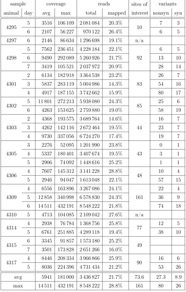
Tables 1.4 and 1.5 summarise the type of reads that were used during development of our analysis methods.
In both studies very high average coverage has been achieved (approximately5000×). Over two thirds of the sequenced reads were not mapped to the National Center for Biotechnology Information (NCBI) [Gee+10] reference genome A/swine/England/453/ 2006. In order to determine the cause we have assembled the unmapped reads with
velvet [ZB08] and used Basic Local Alignment Search Tool (BLAST) [Alt+90] to
de-termine their origin. Most contigs aligned against influenza, which is expected given that this is our intended target. One conting aligned against variousNeisseria menin-gitidis strains with an E-value of 0.0. Among the remaining contigs, top hits (E-values below 0.1) were contaminants: various bacteria, pig (host), human (lab technician). All animals, where more then one sample was acquired, displayed variable sites of in-terest as detected by the Bayesian methodseqmutprobs(described in subsection 3.3.1) and a significantly higher amount of non-synonymous mutations were found in those sites when compared to synonymous ones.
sample co v erage genome reads sites of in terest v aria n ts animal da y min a vg max sites % total mapp ed % nonsyn syn 3467 2 2 2779 69 686 13 136 99.5% 1 856 640 328 828 17.7% n/a n/a n/a 3468 3 2 4562 107 050 13 177 99.8% 2 481 416 563 104 22.7% n/a n/a n/a 3473 2 9 4204 113 992 13 167 99.7% 2 201 764 523 711 23.8% 59 30 27 4 4 4023 52 332 13 165 99.7% 1 544 256 499 860 32.4% 43 38 5 1 3138 48 148 13 138 99.5% 1 146 452 378 840 33.0% 38 24 6 12 6224 97 813 13 171 99.8% 2 471 686 758 099 30.7% 35 11 3474 3 5 4446 88 911 13 149 99.6% 2 091 920 531 943 25.4% n/a n/a n/a 3475 2 3 1229 35 056 13 169 99.8% 641 228 150 806 23.5% 33 20 8 3 2 1390 36 887 13 156 99.7% 1 000 906 171 259 17.1% 21 8 4 1 1410 23 688 13 088 99.1% 605 384 173 024 28.6% 20 9 5 12 7819 104 641 13 172 99.8% 3 261 914 963 106 29.5% 15 8 3480 2 2 1240 24 937 13 171 99.8% 519 318 155 285 29.9% 31 3 1 3 4 1397 27 426 13 161 99.7% 613 438 177 278 28.9% 4 1 4 5 4306 70 535 13 171 99.8% 1 809 068 537 018 29.7% 2 1 4130 3 3 11 752 310 173 13 152 99.6% 6 308 118 1 431 862 22.7% 65 8 5 4 1 5483 173 813 13 092 99.2% 3 522 180 667 898 19.0% 26 10 4131 3 2 6622 141 191 13 172 99.8% 3 370 884 819 396 24.3% 106 16 5 4 1 4433 148 027 12 365 93.7% 2 909 944 538 971 18.5% 44 7 5 6 6018 181 623 13 052 98.9% 3 750 792 746 477 19.9% 38 16 a vg 4.1 4340 97 680 13 106 99.3% 2 216 174 532 461 25.1% 56.8 22.7 11.2 max 12 11 752 310 173 13 177 99.8% 6 308 118 1 431 862 33.0% 106 44 38 T able 1.4. : Summary statistics of the exp erimen tal infection study .
4295 5 3516 106 109 2 081 084 20.3% 10 7 3 6 2107 56 227 970 122 26.4% 6 5 4297 6 2146 86 634 1 296 698 19.1% n/a 4298 5 7562 236 451 4 228 184 22.1% 92 6 5 6 9490 292 089 5 260 926 21.7% 13 10 7 3419 105 521 2 037 972 20.9% 28 14 4301 2 6134 182 918 3 364 538 23.2% 83 26 7 3 5837 283 119 5 004 986 14.3% 54 16 4 4917 187 155 3 742 662 15.9% 80 17 4302 5 11 801 272 213 5 938 080 24.3% 85 25 6 6 4263 153 625 2 759 880 19.0% 58 19 4303 2 4368 193 575 3 689 764 14.6% 44 16 7 3 4262 142 116 2 672 464 19.5% 23 7 4 9730 337 056 6 724 270 17.4% 19 7 4305 3 2276 52 095 1 201 990 23.8% 43 0 1 4 5337 180 401 3 407 674 19.5% 3 1 5 2906 74 092 1 448 616 25.2% 1 1 4306 4 7607 145 312 3 141 228 28.8% 48 10 4 5 2946 94 047 1 613 048 22.1% 57 15 4309 4 6556 163 896 3 267 086 24.1% 161 22 4 5 12 858 340 998 6 578 830 24.3% 36 9 6 14 511 432 191 8 548 222 21.8% 74 18 4310 5 4713 104 085 2 109 042 27.6% n/a 4314 4 2938 76 784 1 368 756 25.8% 77 12 5 5 6761 251 885 4 289 118 19.4% 38 10 4315 6 3345 91 857 1 573 180 25.2% 49 7 3501 173 828 2 651 266 16.0% 4317 4 8446 208 334 3 966 866 25.9% 90 16 6 5 8036 224 396 4 731 434 21.2% 53 26 avg 5941 181 000 3 436 827 21.7% 73.6 27.3 8.9 max 14 511 432 191 8 548 222 28.8% 161 80 26
During the course of this project we have designed and implemented a semi-automated analysis pipeline that both incorporates known tools like the Burrows-Wheeler Aligner (BWA) and the seqmutprobs Bayesian variant analysis package (both explained in section 2.4 and subsection 3.3.1 respectively) and adds novel analysis methods.
The pipeline (flowchart shown in Figure 1.6) requires minimal input from the user. The input reads and some meta data have to be provided though in order to run:
a) The sequencing reads, can be either as paired end (in which case paired end information will be used) or as single reads.
b) Reference genome for the virus in question,
c) Table containing meta data about the experiment:
• Mapping of datasets ↔ animal, day
• Regions/reading frames within the genome that are of interest.
At this point the analysis can be performed with the invocation of only two analysis scripts (one for within-sample and one for intra-sample analysis) and will produce the following analysis results:
1. Quality control charts, 2. Shannon entropy plots, 3. Coverage plots,
4. Diversity plots,
5. Mutations breakdown Hypertext Markup Language (HTML) tables, 6. Hierarchical clustering of the samples by variation.
sample PE reads qualit y stats qualit y charts trim trimmed PE reads wido w reads discarded reads BW A BW A reference samtools rmdup samtools merge alignmen
t alignmen t B AM file div ersit y plots co verage plots en trop y plots seqm utprobs m utation sites candidates translate co dons m utations breakdo wn in ter-host m utations breakdo wn Hierarc hical clustering Other samples Input data Pro cessing step In termediate result Result Figure 1.6. : Flo w chart visualisation of our semi-autom ated analysis pip eline. Detailed explanations of the individual parts of the pip eline are discussed in the follo wing chapters.
rated into the pipeline, as well as present example outputs and their possible interpre-tations.
The source code for the analysis pipeline is currently being further developed and maintained by Dr. George Kettleborough and the current version can be obtained by contacting him via email [email protected].
We have divided the analysis pipeline into three major parts:
1. Primary Data Preparation. Encompasses everything from quality control, reads filtering to alignments and data condensation.
2. Within-host population dynamics. Single sample and single host variation anal-ysis. As the experiments were conducted as transmission experiments the first step is to analyse what variants the virus displays in each sample and then how the virus population changes within a single host.
3. Inter-Host Variation Analysis. Our attempt at trying to piece information to-gether from the entire study and see how the virus populations change between hosts.
2. Primary Data Preparation
2.1. Introduction
Before we can begin variant analysis on raw NGS reads we have to first determine the quality of the obtained reads, align them (ideally to a reference genome of the same species) and perform sanity checks in order to ensure the most accurate data interpretation.
This chapter focuses on our methods for achieving the above and the visualisations that our pipeline provides to the user for understanding the quality of the reads within data samples.
The statistical summary tables (as shown in subsection 1.3.3) are (with the exception of sites of interest) derived from meta data collected during this stage and serve a statistical purpose. Using those we were for instance able to exclude bad samples (bad quality scores or very few reads) or samples with unknown content (less than 1% of reads aligned). Please note that excluded samples are not shown in the summary Tables 1.4 and 1.5.
2.2. Quality Control
Today many more sophisticated NGS quality control tools exist, though at the time this project was started they were not yet available. As such we have designed a simple
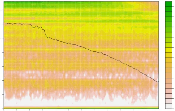
sample and produces a plot as displayed in Figure 2.2.
The plot in Figure 2.2 displays a quality score histogram of a “good” sample. The quality scores’ distribution is what we expected from the sequencers back in 2010. The decay in the quality scores towards the end of the read is normal and follows our expectations. As a comparison Figure 2.1 shows a quality histogram chart of a failed sample. There are far fewer reads in total (as seen by the scale for the heatmap on the right hand side of the plot) than we would expect and the average nucleotide quality
0 1 2 4 8 16 32 64 128 256 512 1 11 21 31 41 51 61 71 81 91 101 111 −1 4 9 14 19 24 29 34 Quality histogram Pig 3468 day 2 read position quality score
Figure 2.1.: Quality scores histogram of influenza sample from Pig 3468 day 2. This is a failed sample. There are far fewer reads in total than we would expect (please note the scale on the right hand side) and the average nucleotide quality scores are below what was “normal” for the technology at the time (2010).
0 1 2 4 8 16 32 64 128 256 512 2^10 2^11 2^12 2^13 2^14 2^15 2^16 2^17 2^18 2^19 2^20 1 11 21 31 41 51 61 71 81 91 101 111 −1 4 9 14 19 24 29 34
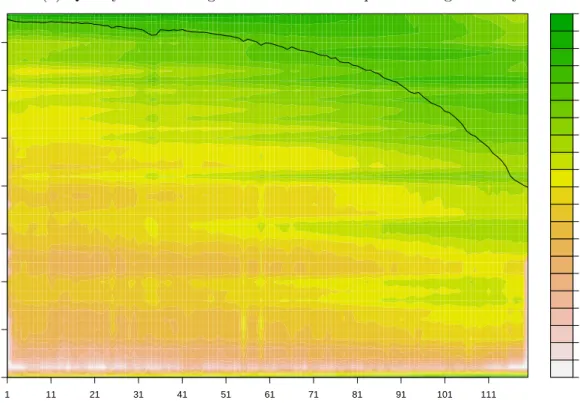
Quality histogram Pig 3473 da
y 4 read position quality score Figure 2.2. : Qualit y scores histogram of influenza sample from Pig 3473 da y 4. The b lac k line sho ws the a v erage qualit y at eac h p osition. The qualit y scores corresp ond to the enco ded Illumina score characters min us ’C’ , i.e. − 1 corresp onds to the Illumin a qualit y score ’B’ . Please notice the abundance of n ucleotides scored − 1 at all p ositions.
can be expected to yield useful results in further down analysis. At the time our Swine Flu samples were sequenced no automatic quality control was being done yet by the sequencing team. And no tool for determining the quality of a sample was available beyond simple statistics (mean quality score, standard deviation). We wanted a tool that will visualise the distribution of quality scores throughout the sample, but also putting it into context of position within a read as quality scores tend to drop towards the ends of a read.
We chose represent this three dimensional data using a heat map to indicate quantity of nucleotides with a given quality score depending on their position within a read. This allows us to assess how they are distributed and whether there are any visual anomalies like certain scores being favoured or sudden jumps. The black line showing the mean quality score per position was added to compare with existing mean quality score plots that scripts produced in 2010. We decided to omit variance information (which can be visually implied by a viewer from the heat map) to increase visibility of the overall plot.
Our pipeline automatically generates a quality score histogram chart for each sample to aid the user in tracking down failed sequencing runs.
2.3. Sequencing Read Trimming
As seen in the quality score histograms (Figure 2.2) there are a number of nucleotides scored at−1(Illumina score’B’) which separate from the remainder of the histogram. Based on our observations these are “filler” nucleotides inserted by the sequencing platform to complete a full 100 base pair read. These nucleotides almost never align against our reference and often cause the entire read to be discarded by the aligner as a result.
In order to aid the downstream aligner we have designed a simple read trimmer that removes those score −1nucleotides from reads following the criteria:
• Remove any continuous leading or tailing sequence of nucleotides that all have a quality score of −1 (’B’).
An aligner will decide whether to align or discard a read based on a score that is determined by the ratio of aligned nucleotides versus unaligned nucleotides. Removing these −1quality scored nucleotides will raise the aligner score for the remaining ones if they align and may make the aligner keep the remainder of the read.
• If the above process removes more than 50% of the read – discard the read. If more than half of the read consists of filler nucleotides then we decided not to trust the remainder either. The underlying aligner does not know that the read was initially more than twice as long as seen by the aligner. We want to reduce the chances of it being misaligned due to short length.
• If the above process discards only one of two reads from a pair (paired end sequencing), then the remaining read is saved as a single widow read.
Sequencing errors affecting one read of a pair have no effect on the other, so there is no harm in keeping only one of a pair, but it needs to be treated as a single read from there on.
After the trimming another quality control step is performed and a second set of quality score histograms is generated. Figure 2.3 shows the quality score histogram plots of sample Pig 3473 day 4 before and after trimming side by side. One can observe a major reduction of nucleotides at score−1and a significant improvement of the average quality score towards the ends of the reads. This leads to more reads being aligned in our runs during the next step than when using untrimmed reads.
The above parameters can be adjusted at the user’s will to have a more strict quality cut-off or preserve shorter widow reads.
0 1 2 4 8 16 32 64 128 256 512 2^10 2^11 2^12 2^13 2^14 2^15 2^16 2^17 2^18 2^19 1 11 21 31 41 51 61 71 81 91 101 111 −1 4 9 14 19 24 29 34 read position quality score
(b) Quality scores histogram of influenza sample from Pig 3473 day 4 after trimming.
0 1 2 4 8 16 32 64 128 256 512 2^10 2^11 2^12 2^13 2^14 2^15 2^16 2^17 2^18 2^19 2^20 1 11 21 31 41 51 61 71 81 91 101 111 −1 4 9 14 19 24 29 34 Quality histogram Pig 3473 day 4 read position quality score
Figure 2.3.: Side by side comparison of quality scores histograms of influenza sample from Pig 3473 day 4 before and after trimming. One can observe a major reduction of nucleotides at score −1 and a significant improvement of the average quality score towards the ends of the reads.
2.4. Alignments
The analysis pipeline presented here requires the reads to be aligned towards a reference genome. The reference genome is not used further down in the analysis, it only provides a means of aligning reads and identifying the necessary read frames for the protein coding regions. Any further references to single nucleotide polymorphisms (SNPs) refer to variants towards the study wide consensus sequence derived from the aligned reads.
For our analyses we have used the Burrows-Wheeler Aligner (BWA) [LD09] (version 0.6.1) with default parameters. The aligner is interchangeable as long as the resulting output is provided in Sequence Alignment/Map (SAM) [Li+09] or BAM format (binary version of the SAM [Li+09] alignment format), i.e. it is simple to replace the BWA [LD09] aligner with the Bowtie aligner [Lan+09] or a more accurate Smith-Waterman based aligner [SW81].
If during the trimming step the reads are split into a set of paired-end reads and a set of single widow reads. samtools [Li+09] is then subsequently used to merge the alignments into a single BAM file.
This requirement for an alignment is a major limitation for this type of analysis. A reference genome may not be available for as yet unresearched viral genomes or may be out of date. A first attempt of using assemblies of food and mouth disease virus was attempted before [Wri+11], but even modern assemblers struggle with high variation data sets.
In order to attempt to tackle this limitation we have decided to create a novel genome assembler that not only assembles a consensus sequence, but also does this type of alignment and/or haplotyping during the assembly process. This eliminates both the need for a reference genome and any bias introduced as a result of alignments. This assembler uses a completely new method for assembly that was designed to be able to cope with high variation NGS data.
created a very fast and accurate general purpose assembler in the process.
2.5. Duplicate removal
NGS data is often polluted by excessive amplification of a few select Deoxyribonucleic acid (DNA) fragments during the library preparation step. This leads to sudden spikes in coverage in these regions of the genome, but does not provide an accurate view of the population diversity.
We often model the selection of fragments from a genome during sequencing using a uniform distribution (compare to subsection 6.2.1). If a genome g is of length |g|, and a fragment was selected at a position x then the probability of selecting a second fragment at the same position is
1
|g|. (2.5.1)
Given n reads on a genome g of length |g| and assuming a uniform distribution of the selection of starting positions for a fragment we will have on average |ng| fragments starting per position.
The viral genome of Influenza, which we have been working with, is only 14 000 base pairs long. If we would have only sequenced one million reads (in most cases we have more, compare Tables 1.4, 1.5) we would on average observe approximately 71
fragments starting per position.
To help us identify reads originating from a fragment which was amplified excessively from fragments that have randomly originated from the same position we will be using paired-end reads.
Paired end reads are generated by a sequencer that takes a longer DNA fragment than its read length (typically between 300 and 600 base pairs) and sequences it from both
ends up to the sequencer’s read length.
Considering this information, in order for two randomly selected fragments to be iden-tical (assuming no repeats of fragment length within the genome) they have to have originated from the same position and have the same length.
Given n reads on a genome g of length |g| and assuming a uniform distribution of the selection of starting positions for a fragment and a uniform distribution of fragment length between 300 and 600 we will have on average |g|·(600n−300) fragments of the same length starting per position.
Again, given our input data this amounts to only a 23% chance of observing such a pair of fragments. This chance is further decreased by the fact that we are dealing with high-variation viral genomes, erroneous reads and longer DNA fragments than estimated above.
In addition to that, identical fragment reads in abundance do not contribute useful information to variation analysis.
In order to deal with this we use thesamtools rmdup (remove duplicates) function to scan the alignment files for potential PCR [Mul+87] duplicate reads and remove them [Li+09]. The result is fewer sudden jumps in coverage and data, that should be less biased by the chemistry used during library preparation.
2.6. Alignment pileup
For all our downstream analysis we do not require the alignments themselves, but rather pileup tables derived from those. A pileup table contains for each position in the reference genome the amounts of the different nucleotides that were mapped there. A program that reads the BAM file (interfacing through libbam [Li+09]) generates tables for counts of appearance of
Those are stored in a SQLite database (https://www.sqlite.org/) and are used by all other scripts for downstream analysis. Since in earlier versions of the pipeline these tables were generated on the fly for each subsequent analysis directly from the BAM file, the latter is still used to represent this in the pipeline flowchart in Figure 1.6.
2.7. Consensus Sequences
To determine the level of genetic fluctuation along the course of infection at the whole genome level, we generate a single full genome sequence from each day of each individual sample where coverage permits. The consensus nucleotide at each site is assigned based on a majority rule (i.e the nucleotide that exhibits the highest count).
In addition to this a study-wide consensus sequence is used for all downstream anal-ysis instead of the alignment reference. This is to compensate for any SNPs that may be present in the inoculum compared to the NCBI [Gee+10] reference genome A/swine/England/453/2006.
2.8. Sequence Coverage Visualisation
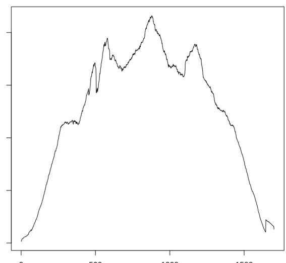
In order to allow for quick visual assessment of read coverage towards the reference genome the pipeline generates a series of coverage plots depicting a simple numeric pileup of the reads. Figure 2.4 shows the coverage plot of the HA segment of sample from Pig 3473 day 2. This allows for additional post-alignment quality control.
These plots are primarily used as another form of quality control. Severe misalignments or other post-alignment anomalies (i.e. coverage in certain areas) can be identified here.
0 500 1000 1500 0 1000 2000 3000 4000 gi|237689564|gb|GQ166661.1| Position Co v er age
Figure 2.4.: Coverage plot of the HA segment of sample from Pig 3473 day 2. One can make two main observations: The coverage drops at the ends of the segment - this has to do with the lower chance of selecting a fragment for paired end sequencing that covers the ends. The coverage has only few sudden jumps allowing us to deduce read connectivity based on coverage differences as described in subsection 8.2.2.
3. Within-host population
dynamics
3.1. Population Diversity Spectrum
Previous studies have shown that IAV within-host populations are highly dynamic even when the consensus sequence remains unaltered [Sta+12]. As such we built our pipeline based around detecting and analysing subtle changes in the viral population that are visible in high coverage deep sequencing data.
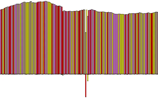
The objective of the analysis pipeline is to identify variants within the population. To allow visual assessment of the diversity spectrum within a sample we generate what we call diversity plots. A cut out of a sample diversity plot is shown in Figure 3.1. These show both the variants exhibited and their magnitude in a graphical bar plot. The colour coding represents the four different nucleotides. The magnitude of the bars corresponds to coverage at that position. Bars going upwards agree with the study-wide consensus nucleotide at the respective position, bars going down (stacked if more then one) represent variants that disagree with the consensus.
In contrast to the bare coverage plots or the entropy plots (as discussed in the next section, section 3.2) these contain more detailed visual information about the variants at the cost of display space. A more compact and filtered version is later generated for variant sites of interest (see section 4.1).
2 6 11 17 23 29 35 41 47 53 59 65 71 77 83 89 95 101 108 115 122 129 136 143 150 157 164 171 178 185 192 199 206 213 220 227 234 241 248 255 262 269 276 283 290 297 304 311 318 325 332 339 346 353 360 367 374 381 388 395 402 409 416 423 430 437 444 451 458 465 472 479 486 493 500 507 514 521 528 535 542 549 556 563 570 577 584 591 598 605 612 619 626 633 640 647 654 661 668 675 682 689 696 703 710 717 724 731 738 745 752 759 766 773 780 787 794 801 808 815 822 829 836 843 850 857 864 871 878 885 892 899 906 913 920 927 934 941 948 955 962 969 976 983 990 997 1005 1014 1023 1032 1041 1050 1059 1068 1077 1086 1095 1104 1113 1122 1131 1140 1149 1158 1167 1176 1185 1194 1203 1212 1221 1230 1239 1248 1257 1266 1275 1284 1293 1302 1311 1320 1329 1338 1347 1356 1365 1374 1383 1392 1401 1410 1419 1428 1437 1446 1455 1464 1473 1482 1491 1500 1509 1518 1527 1536 1545 1554 1563 1572 1581 1590 1599 1608 1617 1626 1635 1644 1653 1662 1671 1680 1689 1698
Diversity in Pig 3473 day 5
gi|237689564|gb|GQ166661.1| Position Co ver age − 500 0 500 1000 1500 2000 − 500 0 500 1000 1500 2000 A C G T Deletions
Figure 3.1.: Visualisation of viral genetic diversity. Section of a diversity plot derived from pig 3473 at day 5 post infection. The plot represents the variation present from nucleotide position 535 to 689 in the HA segment. Vertical coloured bars represent individual nucleotide sites and each colour corre-sponds to a different nucleotide. Bars going upwards are counts of observed nucleotides that agree with the consensus (across all samples), bars going down show those that do not.
for the appropriate protein and thus render the resulting genome non-functional [DSH08] we are not considering short insertions and deletions within our analysis. Longer in-sertions and deletions are difficult to pick up with short reads and even more so to distinguish from sequencing errors when dealing with an entire virus population.
3.2. Nucleotide Entropy
In order to assign a more visually accessible (and compact) graphical representation than the full-pileup diversity plots to the frequency of a variant at any given site within the genome, we compute the Shannon entropy [Sha48] for each position in each sample. Shannon entropy is commonly used in information theory for measuring information content within a message. The basic idea is: the more patterns are needed to describe the data the bigger the entropy. In terms of data compression it can be used to measure the minimum amount of bits needed to encode a message. In our case we measure the amount of variation at any given site. The more variation the more entropy — the more information this site carries within the population.
The Shannon Entropy in this case is computed as follows: let Ai, Ci, Gi, Ti be the counts of aligned respective nucleotides and ci := Ai +Ci+Gi +Ti the coverage at position i. We calculate the nucleotide entropy at position i as
Hi =− Ai ci lnAi ci +Ci ci lnCi ci + Gi ci lnGi ci +Ti ci lnTi ci (3.2.1)
Using this measure we are assigning a single number (for the purposes of visualisation) to the amount of variation at a single position within the genome. Entropy approaches 0 as all contributing reads display the same variant nucleotide and rises with
• the amount of different variants per position,
● ● ● ● ● ● ● ●●●● ● ● ● ● ● ● ● ● ● ● ● ●● ● ●● ● ● ● ● ● ● ● ● ● ● ● ● ● ● ● ● ● ● ● ● ● ●● ● ● ● ● ● ●● ● ● ● ● ● ● ●●●●●● ● ● ● ● ● ● ● ● ● ●● ● ● ● ● ● ● ● ● ● ●● ● ● ● ● ● ●●● ● ●● ● ● ● ● ● ● ● ● ● ●● ● ● ●● ● ● ● ● ● ● ● ● ● ● ● ● ● ● ● ● ● ●●●● ● ● ● ● ● ● ● ● ● ● ● ●● ● ●● ● ● ● ● ● ● ● ● ● ● ●● ● ● ● ● ● ●● ● ● ● ● ● ● ● ● ● ●● ● ● ●●● ● ● ● ● ● ● ● ● ●● ● ● ●● ● ● ● ● ● ●● ● ● ●●●● ● ● ● ● ●●● ●● ● ● ● ● ● ● ● ● ● ● ●●●●●●●●● ● ● ● ● ● ● ● ● ● ● ● ● ● ● ● ● ● ● ● ● ● ●●● ● ● ● ● ●●●● ● ● ● ● ● ● ● ●●●● ● ● ● ● ● ● ● ● ● ● ● ● ● ● ● ● ● ● ● ● ● ● ● ● ● ● ● ● ● ● ● ● ● ● ● ● ● ● ● ● ● ●● ● ● ●● ● ● ●●●●● ● ● ●● ● ● ●● ● ● ●●●●● ● ● ● ● ● ● ●● ● ● ●●●● ● ● ● ●● ● ● ●● ● ● ●●● ● ● ● ● ●● ● ● ● ● ● ● ●●● ● ● ● ● ●●● ● ● ● ● ●●● ● ● ● ● ● ●●● ● ●●● ●● ● ● ● ● ● ● ●● ● ● ● ● ● ●● ● ● ●●● ● ● ● ● ● ● ● ● ● ● ● ● ● ● ● ● ● ● ● ● ● ● ● ●● ● ● ●● ● ● ●● ● ● ● ● ● ● ● ● ● ● ● ● ● ●● ● ●●●●●●● ● ● ● ● ● ● ● ● ● ● ● ● ●● ● ● ● ● ● ● ● ● ● ● ● ● ● ● ● ● ● ●●● ● ●● ● ● ● ● ● ●● ● ● ● ● ● ● ●●●●●● ● ● ● ● ● ●● ● ● ● ● ● ●● ● ● ●● ● ● ●●●● ● ● ● ● ● ● ● ●●●● ● ● ● ● ● ● ● ● ● ● ● ●● ● ● ● ● ● ● ● ● ● ● ● ● ● ● ● ● ● ● ● ● ●● ● ● ●●●●●●●●●●● ●●● ● ● ● ● ● ● ● ● ● ●●●●● ● ● ● ● ● ● ●●●● ● ● ● ● ● ● ● ● ● ● ● ●● ● ●●● ● ●● ● ● ●●●● ● ● ● ● ● ● ● ● ● ● ● ●● ● ● ● ● ● ● ● ● ● ●● ● ● ● ● ● ● ●● ● ●●●●●●● ● ●● ● ● ●●●● ● ● ● ●● ● ● ●● ● ● ● ● ● ●●● ● ● ● ● ● ●●●● ●●● ●●●●● ● ● ● ●●●●●●●●●●●●●● ● ●●●●●●●● ● ● ● ●● ● ● ● ● ● ● ● ● ● ●●●●● ● ● ● ● ● ● ● ● ● ● ● ● ● ● ●●● ● ● ● ● ● ● ● ● ●● ● ● ● ● ● ● ●●● ●● ● ● ● ● ● ● ● ● ● ● ● ● ● ●● ● ● ● ● ● ● ●● ● ● ● ● ● ●●● ● ●●●●●●●● ● ● ● ●● ● ● ● ● ● ● ●●● ●● ● ● ● ● ● ● ●● ● ● ●●●●●●●● ● ● ● ●●●●● ● ● ●●●● ●●● ● ● ● ● ● ● ● ● ● ● ● ● ● ● ● ● ● ● ● ●●● ● ● ● ● ● ● ● ● ● ● ● ● ● ● ● ● ● ● ● ● ● ● ● ● ●●●● ● ● ● ● ● ● ● ● ● ● ● ●●● ●● ● ● ● ● ● ● ●● ● ● ●● ● ● ● ● ● ●● ● ● ● ● ● ● ●● ● ● ● ● ● ●● ● ● ● ● ● ● ● ● ● ● ● ● ● ●●●●● ● ● ● ● ● ● ●●●●●●● ● ●●●●●●●●●● ● ● ● ● ● ● ● ● ●●●●●●●●● ● ● ● ● ● ● ●● ● ● ●● ● ● ● ● ● ● ● ● ● ● ● ● ● ● ● ● ● ●●● ● ● ● ● ● ● ● ● ●● ● ● ●● ● ● ●● ● ●● ● ● ● ● ● ● ●●●●●● ● ●●●●●● ● ● ● ● ● ●● ● ● ●● ● ● ●●●● ●● ● ●●●●●● ● ● ●●●●●●●●●● ● ● ● ● ● ●● ● ● ● ● ● ● ● ● ● ●●● ● ● ● ● ● ● ● ● ● ● ● ● ● ● ● ● ● ● ● ● ● ● ● ●● ● ● ● ● ● ● ●● ● ●● ● ● ●●● ● ●●●●●● ● ● ● ● ● ●● ● ● ● ● ● ● ●● ● ●● ● ● ●●●● ● ● ● ● ●● ● ●●●●●● ● ● ● ● ● ● ●●●●●●● ●● ● ● ● ● ● ●● ● ● ● ● ● ● ●● ● ● ●● ● ●● ● ● ●● ● ● ● ● ● ● ● ● ● ●●● ● ●● ● ● ●● ● ● ● ● ● ● ● ● ● ●●●●● ● ● ● ●● ● ●● ● ● ●●●● ● ● ● ● ● ● ● ● ● ● ● ● ● ● ● ● ● ● ● ●● ● ● ● ● ● ● ● ● ● ● ● ● ● ● ● ● ● ● ● ● ●●●● ●●●● ● ● ● ● ● ● ● ● ● ● ● ● ● ● ● ● ● ● ● ● ● ● ● ● ● ● ●●●●●● ● ●● ● ● ●●●● ● ● ● ●● ● ● ● ● ● ● ●●● ● ● ● ● ●● ● ● ●● ● ● ● ● ● ● ● ● ● ● ● ● ● ●●● ● ● ● ● ● ● ● ● ● ● ● ● ● ● ● ● ●● ● ● ● ● ● ● ● ● ● ● ● ● ● ●● ● ● ● ● ● ● ● ● ● ●● ● ● ●● ● ● ● ● ● ● ● ● ● ● ● ● ● ● ● ● ●● ● ● ●●● ● ● ● ● ● ● ● ● ● ● ● ● ● ● ● ● ● ● ● ● ● ● ● ●●●● ●●●●● ● ● ● ● ● ● ●● ● ● ● ● ● ● ● ● ● ● ● ● ● ● ● ● ● ●● ● ● ●● ● ● ● ● ● ● ● ● ● ● ● ● ● ● ● ● ●● ● ● ●●● 0 500 1000 1500 0.0 0.1 0.2 0.3 0.4 0.5 0.6 0.7
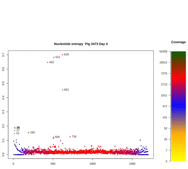
Nucleotide entropy Pig 3473 Day 4
HA Entrop y 1317 1820 192 432 505 511 619 621 716 Coverage 3 7 20 52 141 377 1011 2713 7275 19512 52329
Figure 3.2.: Single sample, single segment Shannon nucleotide entropy plot. The plot shows the entropy levels as computed by Equation 3.2.1 of H1N1 sample from Pig 3473 day 4, HA segment. One can observe clustering of several highly variable mutations between positions 432 and 716. As coverage drops at the ends of the segment, entropy values rise due to the low reso-lution of the underlying alignment data.
giving us an easily accessible visual representation of variation throughout the genome. Examples are depicted in Figures 3.2, 3.3 and 3.4. Please note that using the natural logarithm the theoretical maximum entropy at a single position is −ln1/4 = 1.386.
As entropy is influenced by the resolution of the data (in the case of genomic pileups – coverage), areas with low coverage are likely to display high entropy values due to background noise having a disproportional effect. We incorporated coverage informa-tion to our entropy plots to visualise areas with inflated entropy values. As expected, the ends of the gene segments displayed high entropy due to low coverage (Figures 3.2 and 3.3). In the experimental infection study all but one nucleotide site that exhib-ited a consensus change displayed high entropy values thus reinforcing this value as a valid measurement for the “magnitude” of variation at a position. The one site where a consensus change did not display high entropy had a distribution of the majority (different) nucleotide above 99%.
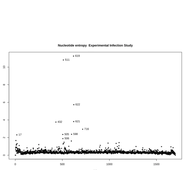
Entropy plots are being generated by our analysis pipeline for each sample/segment (Figure 3.2) in addition to full genome (Figure 3.4) and whole-study/segment (Fig-ure 3.3), the latter being a sum of all entropies across all samples of a study. This allows us to identify prominent sites with significant variation across the whole study.
●●● ● ● ● ● ● ● ● ● ● ● ● ● ● ● ● ● ● ● ● ●● ● ● ● ● ● ● ● ● ● ● ●●● ● ● ● ● ● ● ● ● ● ● ●●● ● ● ● ●● ● ● ● ● ●●● ● ● ● ● ●● ● ●● ● ● ● ● ● ● ● ●● ● ●● ● ● ● ● ● ● ● ● ● ● ● ●●●●● ● ●●●●● ● ●●●●●●● ● ● ●● ● ● ●● ● ●● ● ●● ● ●● ● ●●●● ● ● ●●●●●●●●●●●● ● ● ● ● ● ● ● ● ● ● ● ● ● ● ● ● ●● ● ●●●● ● ● ● ●●● ● ● ● ● ● ● ● ● ● ●● ● ●● ● ●●●●●●●●●● ●●●●● ● ● ● ● ●●● ● ● ● ● ● ● ●●●●●●● ● ● ● ● ● ● ● ● ● ●● ● ●●●● ● ● ● ● ● ● ● ● ●●● ● ● ● ● ● ● ● ●●● ●● ● ● ● ● ●● ● ● ● ● ●● ● ●●● ● ● ● ● ●● ● ● ● ● ●● ● ●● ● ● ● ● ●● ● ● ● ● ● ●●●●● ● ●●● ● ● ● ● ● ● ● ● ● ● ● ● ● ● ● ● ● ● ● ●● ● ●●●●●● ● ● ● ● ● ● ●●●●● ● ● ● ● ●●●●●●●● ● ● ● ● ● ●● ● ● ● ● ●●●●● ● ● ● ● ● ● ● ● ●●●●●●●●●●●●●●●● ● ● ● ● ● ● ● ● ● ●●● ● ● ● ●● ● ● ● ● ● ● ● ●●●●●●●● ● ● ● ● ● ●● ● ●● ● ●● ● ●● ● ● ● ● ● ● ● ●●●●●● ● ● ● ● ● ● ● ●● ● ● ● ● ●● ● ● ● ● ●● ● ● ● ● ●●● ●●●●●● ● ● ● ● ●● ● ●● ● ●● ● ● ● ● ● ● ● ● ● ● ● ● ● ● ● ● ● ● ● ● ● ● ● ● ● ● ● ● ● ●●● ●● ● ●● ● ● ●●● ● ● ● ● ● ● ● ● ● ● ● ● ● ● ● ● ● ● ●●● ● ● ● ● ●●●●●● ● ● ● ●●● ● ● ● ●●●●●●●● ● ● ● ● ● ●●●●●● ● ● ● ● ● ● ●● ● ● ● ● ●●●● ● ● ● ● ● ● ●●●●●●●●●●● ● ● ● ● ●●● ● ● ● ● ● ● ● ●●●●● ● ●●●●●● ● ● ● ● ● ● ● ● ● ●●●●●●●● ● ● ●● ● ●●● ● ● ● ● ● ● ● ● ● ● ● ● ● ● ● ● ● ● ● ●●● ●●●●●●●●●● ● ● ● ● ● ●● ● ● ● ● ● ●●● ● ● ● ● ● ● ● ● ● ● ● ● ● ● ● ● ● ● ●●●● ● ● ● ● ● ● ●●●●●●●●●●●●●●●● ● ● ●● ● ●●●●●●●●●●●● ● ●● ● ● ● ● ●●●●●●●●●●●●●● ● ● ●●●● ● ● ●●●●● ● ● ● ● ●● ● ●●●●● ● ● ●●● ● ● ● ● ● ● ● ● ● ●●●●●●●● ● ●●●●●●●● ● ● ●●● ● ● ● ●● ● ● ● ● ● ● ● ●●● ●●●● ● ● ● ●●● ●●● ● ● ● ●● ● ●● ● ● ● ● ● ● ● ● ●● ● ●●●● ● ● ●● ● ●●●● ● ● ●● ● ● ● ● ● ● ● ● ●●●●● ● ● ● ● ●●●●● ● ● ● ● ●● ● ● ● ● ● ● ● ● ●● ● ● ● ● ● ● ● ● ● ● ● ● ● ●●● ●● ● ● ● ● ●●● ● ●●● ● ● ● ●●●●●● ● ● ● ● ● ● ●● ● ● ● ● ● ●●●●● ● ●●● ●● ● ●● ● ●● ● ● ● ● ●●●●●● ● ●● ● ● ● ● ●● ● ● ● ● ● ● ● ●●●● ● ● ●● ● ●●● ● ● ● ● ●●●●●● ● ● ● ●● ● ● ● ● ● ● ● ●●●● ● ● ● ●●●●●● ●●●●●●●●●● ● ● ●● ● ● ● ● ● ●● ● ●●●●● ● ●●●●● ● ● ● ● ● ● ● ● ● ● ●●●●●●●●●● ●●●●●●●●●● ● ● ●●●●● ● ●●●●●●●●●●●●● ●● ● ● ● ● ●●●● ● ● ●●● ●●●●●● ● ● ● ● ● ● ● ● ● ● ● ● ● ●●●●● ● ●●●●● ● ● ● ● ● ● ● ● ●●● ● ● ● ●●●●● ● ● ● ● ●●●●●● ● ●●●● ● ● ● ● ● ●● ● ●●● ● ● ● ●●● ●●●●●●●●●●●● ● ● ● ● ● ● ● ●●●●●●●●●● ●●● ●●● ● ● ● ●● ● ● ● ● ●●● ●●●●●●●●●●●● ● ● ● ● ●●●●●● ●● ● ●●●●●●●●●● ● ● ● ●●●●●●●●●● ● ● ●●● ● ● ● ● ● ● ●●●● ● ● ● ●● ● ● ● ● ●●●● ● ● ●● ● ●●● ●●● ●●●● ● ● ● ●●●●●●●● ● ●● ● ●●● ● ● ● ● ● ● ●● ● ● ● ● ● ● ● ● ● ● ● ●●●● ● ● ●● ● ● ● ● ●●● ● ● ● ● ● ● ● ● ● ● ● ● ● ● ● ● ●●●●●●● ● ● ●●●● ● ● ● ●●● ●●●●●●●●●● ● ● ● ● ● ●●●● ● ● ● ● ● ● ● ● ● ●●●●●●●●●●●●●●●●● ● ●●●●●● ● ● ● ● ●●● ●●● ● ● ● ●● ● ●●●●●●●●●●●●● ● ● ● ●●● ● ● ● ●●●●●● ●●●●● ● ● ● ● ● ●●●●●●●● ● ● ● ● ●● ● ●● ● ● ● ● ●●●●●● ● ● ● ● ● ● ● ● ● ● ●● ● ● ● ● ●●●● ● ● ●●● ● ● ● ● 0 500 1000 1500 0 2 4 6 8 10
Nucleotide entropy Experimental Infection Study
HA Sum Entrop y 17 432 505 506 511 598 619 621 622 716
Figure 3.3.: Shannon nucleotide entropy plot for the whole experimental infection study. The plot shows the sum of all entropies across the experimental infection study for the HA segment. As with the entropy displayed in Figure 3.2 one can observe clustering of several highly variable mutations between positions 432 and 716 across the entire study.