The Distribution of Wealth, 1983-1992:
Secular Growth Cyclical Stability
John C. Weicher
Working Paper 1996-012A
http://reseach.stlouisfed.org/wp/1996/96-012.pdf
PUBLISHED: Federal Reserve Bank of St. Louis Review, 79(1), January/February 1997.
FEDERAL RESERVE BANK OF ST. LOUIS Research Division
411 Locust Street St. Louis, MO 63102
______________________________________________________________________________________ The views expressed are those of the individual authors and do not necessarily reflect official positions of the Federal Reserve Bank of St. Louis, the Federal Reserve System, or the Board of Governors.
Federal Reserve Bank of St. Louis Working Papers are preliminary materials circulated to stimulate discussion and critical comment. References in publications to Federal Reserve Bank of St. Louis Working Papers (other than an acknowledgment that the writer has had access to unpublished material) should be cleared with the author or authors.
September 1996
Abstract
This article describes the changes in the concentration of wealth among U.S.
households between 1983 and 1992, a period which nearly coincides with the most
recent business cycle. The distribution of wealth has received popular attention
recently, based on reports that it became markedly more unequal during the economic
expansion ofthe 1980s. New data for 1992 indicates that the distribution was about
the same in 1992 as in 1983, or for that matter as in 1962. A modest, insignificant
increase in concentration between 1983 and 1989 was completely reversed by 1992.
While the distribution was stable, total wealth and wealth per household increased
over the cycle; rich and poor households enjoyed an approximately equal gain, in
percentage terms.
Keywords: Wealth; Distribution of Wealth; Inequality
JEL Subject Codes: D3 1
John Weicher
Senior Fellow
Hudson Institute
1015 18th Street, N.E., Suite 200
Washington, DC 20036
Visiting Scholar
Federal Reserve Bank of St. Louis
411 Locust
wealth among U.S. households that occurred between 1983 and 1992, a period which very nearly coincides with the most recent business cycle. It extends a previous paper which discussed changes between 1983 and 1989, the expansionary phase of the cycle (Weicher, 1995) The distribution of wealth has received extended popular attention recently, based on reports that it became markedly more unequal during the economic expansion of the 19805.1 The previous paper
showed that this conclusion depends on technical issues about which statisticians and analysts disagree, and that the apparent changes in the distribution of wealth do not pass conventional tests of statistical significance in most cases. With the availability of new data for 1992, it is now possible to compare the experience during the expansion with the changes during the subsequent recession, and analyze changes over a business cycle with a consistent data series for the first time.
The additional data indicates that the concerns over the purportedly increasing concentration of wealth were unnecessary. Even if the distribution did indeed become more unequal during the expansionary phase of the cycle, that change was fully reversed during the subsequent recessionary period. The distribution was about the same in 1992 as it was in 1983 - or for that matter as it was in 1962. The degree of concentration has fluctuated since the end of World War II, and the measures for the latest cycle generally fall within the postwar range, although the data come
The source of this perception is Wolff (1995), which is a summary of his research on the distribution of wealth, written for a popular audience; this book was the subject of a front-page article in the New York Times (Bradsher, 1995).
from a variety of sources of varying quality, and are available only at irregular intervals of a few years.
While the distribution was stable, total wealth, and wealth per household, increased over the cycle, so that it is appropriate to conclude that rich and poor households enjoyed a more or less equal gain, in percentage terms.
These findings are likely to be surprising. The notion that the distribution of wealth has become more concentrated has seemed plausible to many economists and many laymen. They note the rapid rise in the stock market and the fact that stocks are mainly held by well-to-do individuals, and they also note that income inequality has been steadily increasing. The paper investigates these hypotheses, and finds that they are incomplete. By itself, the rise in the stock market would have contributed to an increase in inequality, but it was offset by increases in the value of other assets that are widely held by middle-income households, especially equity in owner-occupied homes. Income and wealth are indeed correlated, but the correlation weakened between 1983 and 1992, and high-income households had less wealth for any given income level in the later year.
The paper suggests the hypothesis that the distribution of wealth has a cyclical pattern. The paper itself, of course, provides evidence on only one business cycle, and the limited evidence for earlier periods partly supports and partly is inconsistent with the hypothesis.
attributes and net worth of the richest one percent of U.S. households and reaches similar conclusions to the earlier one: most of them appear to be entrepreneurs rather than coupon clippers, and most of their wealth is in the form of assets which they must actively manage, such as unincorporated or closely-held business or investment real estate, rather than stocks or bonds. In addition, the top one percent is comprised of different households in different years, to a perhaps surprising extent.
THE SURVEY OF CONSUMER FINANCES
The data source is the Federal Reserve Board’s Survey of Consumer Finances (SCF) . This is one of the few sources of information on household wealth that reports asset and liability holdings of individual households for a sample of the entire population on a consistent basis over time. The most recent available surveys that are useful for analysis of the distribution of wealth are those for 1983, 1989, and 1992. These dates approximate to the turning points of the business cycle. The trough is dated as November 1982; the 1983 SCF was conducted between February and August 1983, and half the interviews were conducted by April. The peak occurred in July 1990; the 1989 SCF was conducted between August 1989 and March 1990. The next trough occurred in March 1991; the 1992 SCF was conducted between June and November 1992. Thus the 1983-1989 surveys cover a period slightly shorter than the economic expansion, by about six months at either end, while the 1989-1992 surveys cover the last few months of the
expansion, the succeeding recession, and the first 18 months of the next expansion. This dating is not precise. Some of the information reported by individual households, such as income, is likely to refer to the calendar year preceding the survey. Reported house values may also be based on the most recent property tax assessment, rather than the current market. Other data, such as stock valuations and deposits at financial institutions, are probably current. To the extent that the data do have a lag, the 1983-1989 period may start from the 1982 cyclical trough and continue to within a year or so of the peak, while the 1989-1992 period may end around the 1991 cyclical trough. While the correspondence is not exact, it seems reasonable to regard the survey dates as approximating to the turning points of the cycle, and they will be referred to as such in this paper.
An important feature of the SCF is that it includes a special sample of high-income households that can be expected to have unusually large wealth holdings, as well as a cross-section chosen randomly to represent the entire population of households. Because wealth is concentrated among a relatively few households, a national sample of households will give little information about a large fraction of household wealth. The high-income sample has grown in importance from one survey to the next, reflecting an effort to give more equal sampling probabilities to all dollars of wealth, rather than all households.2
2 For more extensive descriptions of these surveys see Avery and others (1984a), Avery and Elliehausen (1986), Avery, Elliehausen and Kennickell (1988), Kennickell and Shack-Marquez (1992), Kennickell and Woodburn (1992), Kennickell
MEASURING WEALTH
Wealth is defined as the value of assets minus the value of liabilities. The SCF contains detailed, though not quite exhaustive, information on both assets and liabilities, most of which is used in this analysis. Table 1 reports the components of wealth as it is defined in this study.
The most important omission is the present value of private
pensions and Social Security benefits that the household will receive in the future. Even though they cannot be converted to cash, they are a substantial part of the portfolio of many households. As noted previously, the SCF provides estimates of the present value of pensions and Social Security for 1983 only. For the later years, there is information on coverage for individual households, but not value. The 1983 data is reported in this article, but omitted from the analysis of changes over time.
The second most important omission is the value of most consumer durables. Automobiles and other vehicles are included; otherwise the debt is reported but not the value of the asset. Durables can be taken into account either by attempting to estimate their value (as in Wolff, 1987), or by the simpler procedure of
excluding the debt incurred to buy them as well as their value, on
the ground that the total value of all consumer durables is likely
to be at least as large as the remaining debt on them, for most
households. This paper reports results using the latter procedure. Both omissions cause the distribution of wealth to appear more
unequal, as is shown later in the paper. It seems less likely that
either affects the changes in the distribution over time.
The miscellaneous assets category is very heterogeneous. It includes 23 categories in 1983, 30 in 1989, and 32 in 1992: many types of collectibles such as coins, stamps, Oriental rugs, and objets d’art; oil and gas leases; various debts owed to the
household; and much more.
The concept in Table 1 will be referred to as “net worth” or Tlwealthfl without further qualification in this article. The same
concept has been used by Federal Reserve Board analysts for 1989
and 1992; for 1983 they exclude miscellaneous assets.3 Wolff’s
preferred concept excludes miscellaneous assets and the value of automobiles, but includes automobile loans; he also reports other
concepts, both broader and narrower (Wolff, 1987, 1994).
WEIGHTING
With a survey design combining a random sample of all U.S.
households and a separate sample of the top few percent of the
income distribution, it becomes important to weight the individual observations appropriately so that the sample households adequately represent the universe of all households. Analysts at both the Survey Research Center and the Board have devoted substantial attention to the issue of weighting. Multiple weights have been published for the 1983 and 1989 surveys, and additional weights for
See Kennickell and Shack-Marquez (1992), and Kennickell and Starr-McCluer (1994). Avery and Elliehausen (1990) warn in the codebook for 1983 that “some estimates [for miscellaneous assets] look to be very dubious.”
1989 and 1992 have been constructed and used in papers published by Board analysts, though they have not been included in the public use data tapes.4 In this paper, two sets of weights are used for both 1983 and 1989, and one for 1992.
The choice of weights can affect the results, as will be seen later in this article. This is particularly true for 1983. For that year, alternative weights were constructed by analysts at the Board and at the Survey Research Center. These are known as FRB and SRC weights, respectively. They differ in the characteristics used to align the cross-section sample to the total population of U.S. households. The FRB weights align on the basis of totals for the four U.S. Census regions, and the SRC weights align on the basis of total households and the division between urban and rural location. A second set of FRB weights was constructed when 1982 individual income tax data suggested that the high-income sample may have been given too much weight. These are known as the “FRB extended-income” weights. In this article, the FRB extended-income weight and the latest SRC weight (the revised SRC composite weight) are used for 1983. (These are variables B30l6 and B30l9, respectively, on the data tape.) Kennickell and Shack-Marquez
(1992) use the FRB extended-income weight.
For 1989, two SRC sets of weights are available: a preliminary weight used by Kennickell and Shack-Marquez (1992) for comparing 1983 to 1989, and a revised weight used by Kennickell and
Starr-~ For a discussion of the 1983 and 1989 weights, see Weicher (1995). More extensive discussions appear in Avery and Elliehausen (1990, pp. 16-24) for 1983
McCluer (1994) for comparing 1989 to 1992 (variables X40l25 and X40l3l) . The difference between them is much less important.
HOUSEHOLD WEALTH
Table 2 reports the total wealth of all U.S. households for each year, mean household wealth, and mean holdings of each of the major components of wealth. Both sets of weights for 1983 and 1989 are used, along with the one publicly available set for 1992.
On any comparison, total wealth and mean wealth increased during the expansion (between 1983 and 1989), declined during the recession (between 1989 and 1992) and increased over the full business cycle. The magnitude of these changes varies markedly, depending on the weights chosen, particularly for 1983. Total wealth in that year varies by almost $1 trillion, and mean wealth by about $11,000. The choice of weights is less important in 1989, but total wealth still varies by $500 billion, and mean wealth by about $4,500.
These differences give rise to substantial variation in the measured change between surveys. For mean household wealth, for example, the 1983-1989 increase ranges from $23,000 to $38,000; the 1989-1992 decrease ranges from $15,000 to $19,000; and the increase over the cycle ranges from $8,000 to $19,000. In percentage terms, mean household net worth increased by 5 percent to 11 percent over the cycle; total wealth increased by 24 percent to 32 percent.
The limited data on wealth makes it difficult to put these changes in any long-term context. The changes in mean wealth are
both larger than the change in mean household income as reported in the SCF (an increase of less than 3 percent by one set of 1983 weights, and a decline of about 2 percent by the other).
The means for individual asset categories in Table 2 are calculated for all households, whether or not they own that particular asset. The most widely held assets are automobiles
(between 83 and 86 percent of all households in various years) checking accounts (75 to 79 percent) , and owner-occupied housing
(63 to 65 percent) . On the liability side, credit card debt was the most common form of debt in each year (37 to 41 percent) but home mortgages were almost equally frequent (37 to 39 percent) and vehicle loans were also common (29 to 35 percent) . Home mortgage debt accounted for over half of all family debt in each year. (The home equity values in Table 2 are net of mortgage debt, as are the values for other asset categories where there is a specific debt against the asset.)
Stocks and other financial assets seem to come first to mind in discussions of “wealth, TI but other assets are at least as
important. Owner-occupied housing is consistently about 30 percent of net worth. Unincorporated business and investment real estate together account for between 35 and 40 percent. These might be termed “entrepreneurial assets;” their owners must actively manage them or hire someone to do so. Financial assets as a whole account for about 30 percent. Stocks declined in importance from 10 percent of total wealth in 1983 to 6 percent in 1989, then rose again to 10 percent in 1992.
Table 2 also reports the present value of future pension and Social Security benefits in 1983. They are larger than the value of any other category of assets, and larger than all financial assets combined. If included in net worth, they would add close to 50 percent to mean household wealth in 1983.
The last line of the table shows mean household income, which is a pre-tax figure reported by the respondent. The SCF asks about total income and also income from various sources; the sum of the latter does not equal the reported total in many cases.
MEASURING THE DISTRIBUTION OF WEALTH
Two types of measures of the distribution of wealth are used in economics: measures describing the entire distribution, and measures describing the concentration at one end of it.
The latter are more common, for several reasons. The ownership of wealth is highly skewed, compared to income or other measures of economic well-being, so the share held by the richest one percent or 10 percent of all households attracts attention. Such concentration ratios are intuitively easy to interpret. They have also been popular because the only time-series measure of wealth is the estate multiplier, which is a method of estimating the wealth of the richest households. It is based on estate tax returns, which are filed mainly for well-to-do individuals, and mortality tables to estimate the holdings of living households.5
Avery, Elliehausen and Kennickell (1987) compare estate tax data with the SCF for 1983.
The main limitation of concentration ratios is that they only describe part of the distribution of wealth. Changes in net worth for the wealthy may not correspond to changes for the middle class or the poor, and conversely changes may occur for these groups without any corresponding changes among the rich.
Since the SCF provides information about all households, not only about the wealthy, it can be used to measure broadly the overall distribution of wealth. The most common quantitative measure of the entire distribution is the Gini coefficient. It is routinely used to measure the distribution of income; the Census Bureau reports a Gini coefficient for the distributions of household income and family income each year.
The Gini coefficient has a range of 0 to 1. If the
distribution of wealth is perfectly equal, the coefficient is zero; if all the wealth in the society is owned by one single household, the coefficient is unity. The greater the concentration of wealth, the closer the Gini coefficient is to unity.6
The advantage of the Gini coefficient is that it measures changes that occur in any part of the distribution. Its main drawback is that it has no intuitive interpretation. A Gini coefficient of 0.5 does not mean that the society is “halfway betweenTT a perfectly equal and perfectly unequal distribution of wealth, and indeed it is not clear what such a statement means. Nor is it possible to explain the meaning of a Gini coefficient in
6 For a more detailed description and explanation of the
Cmi
coefficient, see Weicher (1995), and the sources cited there.terms of any other measure. All that can be said is that higher coefficients imply greater inequality.
CHANGES IN THE CONCENTRATION OF WEALTH
Table 3 reports the concentration of wealth, with particular attention to the share of the richest one percent of U.S. households (hereafter termed “the rich” for convenience)
The importance of weighting is clear from the table, The share of wealth owned by the rich is especially sensitive to the choice of weights in 1983. The resulting concentration ratios are very different, to the point that the pattern of concentration over the entire cycle is qualitatively different, depending on the 1983 weight.
The change in the share of the richest one percent of households tends to be balanced more by changes in the share of the next nine percent than by changes in the share of the remaining 90 percent. Stated alternatively, the share of the remaining 90 percent is apparently more stable over the cycle than the shares of the upper income groups. This pattern also depends to some extent on the choice of weights for comparisons over time.
It should be remembered that, while the shares change over time, total wealth is changing also. As total wealth for all households rose from 1983 to 1989, 50 did total wealth for each group, including those with declining shares. The same is true over the full cycle. Conversely, total wealth for all households declined from 1989 to 1992, and both the richest one percent and
the remaining 90 percent incurred losses in total wealth as well as declines in share.
Table 3 also shows the share of wealth by quintile of the distribution. The pattern of changes by quintile depends very much on the choice of weights. For three quintiles, the 1992 share lies between the two calculated 1983 shares, and for two quintiles the 1992 share lies between the two calculated 1989 shares.7
The wealth share for the poorest quintile is negative because some households report negative net worth. About one-third of these are poor households, measured by income, and over 90 percent are in the lower half of the income distribution. Most do not owe much, but they have still less in the way of assets.
In evaluating these changes, it is important to remember that the data come from sample surveys and therefore have sampling errors. These sampling errors are fairly large relative to the changes from one survey to the next. As shown in Table 3, the standard error for the share of wealth held by the rich is between 1.2 and 2.1 percent depending on survey year and weight, with the largest standard errors occurring for 1983. These standard errors are calculated by the bootstrap technique, with the shares being replicated 1,000 times for each survey and set of weights.5
The 1992 share for the fourth quintile falls just below the lower of the two 1989 shares; the difference does not appear until the fourth digit.
The analysis of statistical significance and the bootstrap replications are based on a program developed by Paul W. Wilson. For an alternative procedure using the jackknife technique, see Yitzhaki (1991), who provided a FORTRAN program that served as a starting point for the analysis. See also Lerman and
The standard errors are large enough that many of the differences over time are not statistically significant. The significance of the differences is reported in Table 4. Whether there was a statistically significant increase in concentration between 1983 and 1989 depends on the choice of weights for 1983; whether there was a statistically significant decrease in concentration between 1989 and 1992 depends on the choice of weights for 1989 (though it should be noted that both are close to meeting the conventional significance test level) . The only unambiguous finding is that there was no statistically significant change in the concentration of wealth over the full cycle from 1983 to 1992, although one comparison comes fairly close to indicating a significant decrease.
The concentration ratio varies markedly with the concept of wealth.~ As Table 5 shows, the narrower the concept, the greater the share of wealth held by the rich. Excluding automobiles from the basic concept consistently raises the concentration ratio by about one percentage point. Excluding owner-occupied housing (both house value and mortgage debt) raises the concentration ratio by about 10 or 11 percentage points.
CHANGES IN THE DISTRIBUTION OF WEALTH
Changes as measured by Gini coefficients show a similar pattern to changes as measured by concentration ratios.
As Table 6 shows, the direction of the change in the
expansion of 1983-1989, again depends on the choice of weights.
The change over the cycle varies from - .008 to +.009, while the
change from 1983 to 1989 varies from - .002 to +.027, The
distribution became somewhat more equal from 1989 to 1992, using either set of 1989 weights.
The standard errors of these Gini coefficients, shown in italics in Table 6, are large enough to cast doubt on whether there was any increase or decrease in inequality over any of these periods. Significance tests for the differences in the Gini coefficients are shown in Table 7. Only one of the four
comparisons between 1983 and 1989 shows a statistically significant
increase, though a second very nearly meets the conventional criterion. Neither of the comparisons for the recessionary period
shows a significant decrease. Nor is either of the comparisons
over the full cycle significant, although one comes close to indicating a significant increase. Whether the magnitude of any of the differences is politically or socially important is a matter for individual judgment.9
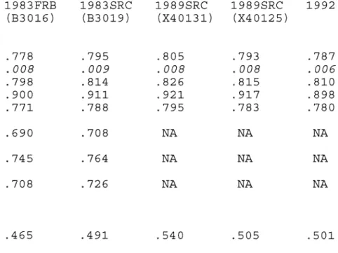
The narrower the definition of wealth, the more unequal is its
distribution, in any year. Merely excluding automobiles from household net worth raises the Gini coefficient by about .02;
excluding home equity raises it by about .10. These assets are
widely held, as previously noted, and they are a large share of the
~ Wolff (1994) refers to an increase of .04 in the Cmi coefficient between 1983 and 1989 as “sharp,” and a difference of .02 between Cmi coefficients for two different measures of wealth in 1989 as “not great.” He does not report Gini coefficients to more than two places.
wealth of relatively low-wealth households. For the narrower concepts of wealth, the pattern of changes over time, and their significance, are similar to the pattern for the basic concept.
Including pensions and Social Security benefits in 1983 lowers the Gini coefficient by about ~l0. Including either by itself also lowers the coefficient. Social Security has a greater effect than private pensions, for either set of weights.
Excluding consumer debt does not have much effect on the analysis. Gini coefficients are consistently lower when consumer debt is excluded, by .01 or less, and most concentration ratios are also lower, by 0.5 percent or less; the one exception (weight B30l9) is higher by 0.1 percent. Since consumer debt is more important for lower-wealth households, these are not surprising. Also, including or excluding miscellaneous assets on a consistent basis does not change the results. Gini coefficients vary by no more than .002, and concentration ratios vary by no more than 0.3 percent. (These results are not shown in the tables.)
Clearly the findings are sensitive to the choice of weights. Indeed, the choice for 1983 is so important that it determines the qualitative conclusions of the analysis. By the weights developed at the Federal Reserve Board, total wealth increased measurably over the cycle while the distribution showed no net change, becoming more unequal during the expansion and more equal again during the recession; this implies that the wealth of the rich and the poor increased proportionately. By the weights developed at the Survey Research Center, total wealth did not increase much but
the distribution became marginally more equal over the cycle. The reason for these conflicting conclusions is that the measured changes in inequality and concentration are small. For most of the topics considered later in this article, the choice of weights does not matter, but it does matter for the analysis of the
changing distribution of wealth.
Unfortunately, since the choice of weights in 1983 matters so much, there is apparently no strong reason for preferring one set to the other. The FRB weights were constructed with a more extensive system of controls for location and demographic attributes of households. The major differences occur for households in the high-income sample, which of course is especially
important for the purposes of this paper.’°
In the remainder of this article, comparisons are based on the weights for 1983 and 1989 used by Kennickell and Shack-Marquez (1992), variables B30l6 and X40l25, respectively. The 1983 weights are chosen primarily because they have been more widely used in recent research; the 1989 weights, for convenient comparison with
my previous paper. The results are systematically checked by using
the alternative weights, and important differences are noted.
10 Conversation with Robert Avery. Avery stresses that the construction
and choice of weights are the biggest issues in the SCF, and that results are sensitive to the choice of weights.
[BOX]
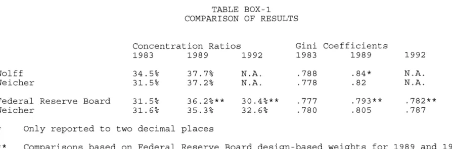
COMPARISONS TO OTHER STUDIES
Table Box-l compares the results in this paper with the reported findings of other analysts, using the same definitions of net worth and weights, as much as possible. The results are generally similar, but never identical. Precise comparisons with the Federal Reserve Board analysts in 1989 and 1992 are not possible because their published measures of inequality use weights
which are not available on the public use data tapes; nonetheless,
my results are consistently closer to theirs than to those reported
by Wolff. My results also show less inequality than Wolff’s, and
more than the Federal Reserve Board analysts’ . All show the same
pattern over time: all have an increase in inequality during the
cyclical expansion and both the Federal Reserve Board analysts and
I show a decrease during the recessionary period. Wolff has not
published an analysis for 1992. The large increase shown for Wolff from 1983 to 1989 partly reflects a difference in the definition of wealth; his 1983 measures include automobiles and miscellaneous assets and his 1989 measures exclude them.
WHY DIDN’T INEQUALITY INCREASE?
The conclusion that the distribution of wealth did not change significantly over the 1983-1992 period runs counter to the expectations of many economists and laymen alike. There are several reasons for this Ilconventional wisdom:”
(1) There was a major stock market boom - the Standard and Poor’s 500 Index doubled during the expansion and rose by a further 30 percent during the recession, for example - and stocks are generally held by people who are well off to begin with. 11
(2) The distribution of
income
became more unequal, continuing a long-term trend that dates back to 1967.(3) The change in the distribution of income is partly the result of demographic changes, which themselves are likely to affect the distribution of wealth.
This section of the paper considers each of these hypotheses in turn.
Changes in Asset Values
As noted earlier, stocks seem to be the first asset that comes to mind when “wealth” is mentioned, but they are not the most important component of wealth in household portfolios. Other assets also experienced changes in value during the period. These changes may have contributed to the change in the distribution of
11 Wolff (1994) suggests that the stock market boom may have contributed substantially to the increase in inequality that he measures between 1983 and 1989.
household wealth. Table 8 reports the changes in value for several major asset categories, as measured by commonly used price indices for the specific assets. These changes are reported over the full cycle and also separately for the expansion and the recession. There is no index for unincorporated business per Se, apart from
the USDA series on average value per acre. For other businesses, the change in value may be approximated by the Russell 2000 and Nasdaq small-stock indices, though this probably does not apply to professional practices or small retailers.
It is possible to measure the effect of these changes in asset values on the distribution of wealth by applying the indices to the 1983 holdings of each household. This can be done both for individual asset categories, such as stocks, and for all assets in the aggregate, which more fully reflects household experience during the period. In behavioral terms, the household is assumed to hold the same portfolio from the beginning to the end of the cycle, neither buying nor selling any assets, nor for that matter moving.
For most assets, the index can be simply multiplied by the reported 1983 value. In the case of owner-occupied housing, the change in the price of the house is not the change in home equity, for two reasons. First, for owners with mortgages, home equity rises in percentage terms by more than the increase in home price. The mean ratio of outstanding mortgage principal balance to house value was 23 percent in the 1983 SCF, and the mean equity was therefore 77 percent of house value. The homeowner’s equity is
increased by the full amount of the increase in house value, so the mean home equity is raised by 39 percent (30/77) instead of 30 percent. Second, it is assumed that the owner continued to make mortgage payments during the nine years; otherwise the household would default on the mortgage and lose the house, and thus change its portfolio. In 1983 the mean remaining life was 15 years, 8 months for first mortgages and 7 years, 10 months for second mortgages. If owners continued to make mortgage payments for nine years between the two surveys, then on average they paid off a substantial share of the first mortgage and all of the second. The mean reduction in the outstanding principal balance was 53 percent, and the mean increase in home equity was 16 percent. This procedure is not used for home equity loans; the assumption is that the principal balance on the loan does not change. The combined net effect of price appreciation and mortgage amortization is to
raise mean home equity by 55 percent.
The same procedure is followed for investment real estate, for the same reason.
In Table 9, the effect of these changes on the Gini coefficient is shown for several individual assets and for all assets combined, over the expansion, the recession, and the full cycle. Changes in asset values have different effects in different periods. The combined change in values for all assets is large enough to account for most of the small (and insignificant) change in inequality over the full cycle, but it clearly does not account
for the change over either the expansion or the recession.12 In each phase of the cycle, the effect of changes in asset prices is
in the opposite direction to the change in inequality. The
aggregate effect of the changes for all assets lowers the Gini coefficient slightly, by much less than its standard error, for the expansion, when inequality actually increased; and raises the Gini coefficient by more than its standard error during the recession, when inequality actually decreased.
Among individual assets, the effect of the change in stock prices is consistent with the change in the Gini coefficient during
both the full cycle and the expansion. In both periods, it is
large enough to account for the full change in inequality. But
there are changes of similar size for other assets, in particular
unincorporated business and owner-occupied housing. The changes go
in both directions and largely cancel each other. The changes in stock prices and unincorporated business both raise the Gini coefficient, but the change in home equity lowers it. Over the
full cycle, the effect of the change in home equity is about
two-thirds as large as the effect of the changes in the other two
assets combined; over the expansion, it is about as large as the
other two combined. Even though stock prices rose more than any
12 Using a preliminary version of the 1992 SCF, Poterba and Samwick (1995) conduct a similar exercise in terms of concentration ratios over the full cycle and find that the share of wealth held by the richest one percent of U.S. households would have risen from 31 to 33 percent, holding 1983 portfolios constant and indexing them for changes in asset prices. They do not examine the subperiods. The direction of change is consistent with the calculated change in the Cmi coefficient shown in Table I for all assets combined. It seems likely that it is not statistically significant.
other asset and stock holdings are concentrated among richer households, the rise in house prices increased the wealth of a broad range of middle-class households to an even greater extent, more than offsetting the effect of the stock market boom. As a result, asset value changes do not affect inequality.
In addition, there was a diffusion in stock ownership over the cycle. Many people who were not rich increased their holdings. In 1983 the richest one percent of all households owned 58 percent of all stock, In 1989, they owned 46 percent; in 1992, 42 percent.13 This diffusion also mitigates against an increase in inequality.
The recessionary period from 1989 to 1992 is more puzzling. Almost all of the indices continued to rise during this period. Changes in asset values alone should have led to an increase in inequality, rather than the decrease which actually occurred.
Taken together, these results suggest that changes in asset values as a whole had little effect on the distribution of wealth, even though the effect of changes for some individual asset categories were large.
To test for the consistency of these results, the Gini coefficients were also calculated using the alternative weights for 1983 and 1989 (variables B30l9 and X40131, respectively) . The results were basically the same. As a further check, 1992 was used as the base year for asset holdings and values were deflated back to 1983, and the same procedure was followed for the expansion and
13 Poterba and Samwick (1995) also find a decline in stock ownership among the rich from 1983 to 1992.
recession periods within the cycle. The results were consistent with those shown in Table 9, except that owner-occupied housing had a much larger effect, in the direction of reducing inequality.
Income and Wealth
The distribution of income among U.S. households became more unequal between 1983 and 1992; the Gini coefficient increased from .414 in 1983 to .431 in 1989 and .433 in 1992 (U.S. Census Bureau, 1993) . For the households in the SCF, the pattern, however, the pattern is different, as shown in Table 6: the Gini coefficient is higher in 1992 than in 1983, but it fell somewhat during the recession period. The decline from 1989 to 1992 may be consistent with the corresponding decline in the Gini coefficients for wealth, but the increase in income inequality over the whole cycle is not consistent with the stability of the wealth distribution.
Wealth is certainly positively correlated with income, but the relationship between income and wealth was not as close at the end of the cycle as it was at the beginning. Table 10 reports a basic statistical analysis of the relationship between income and wealth, in which wealth is regressed against income and the square of income. This is not intended to represent any causal relationship between the two, but rather to show how it is possible that, even though the distribution of income became more unequal, the distribution of wealth did not.
Two results in Table 10 are relevant: both the coefficient of income and the coefficient of determination (R2) were larger in
1983 than in either of the later years. For any given high income level, households in 1983 had on average more wealth than they did in 1989 or 1992. Also, there was more dispersion of wealth among households at any given income level in 1983; income was a better predictor of wealth.
There is undoubtedly a stronger relationship between wealth and income than between wealth and most other characteristics of households, and this is true in each year. But the relationship weakened over time, in two senses. The distributions of wealth and income thus behaved somewhat differently over the 1983-1992 cycle 14
Demographic Changes and Inequality
One reason for the increasing inequality of income is the changing demographic composition of the population, in particular the growing proportion of households consisting of a single, never-married woman with her children (Karoly and Burtless, 1995). This and other changes in the composition of the U.S. population may also have contributed directly to the increasing inequality of the distribution of wealth.
The demographic changes of the period are not fully reflected in the SCF. Table 11 shows the demographic composition for each
14 An alternative explanation is that the change in the distribution of wealth between 1989 and 1992 is a result of sampling differences between either the 1989 or 1992 SCF and the Census Bureau’s Current Population Survey. With a “better” sample, the distribution of wealth might have become more unequal, parallelling the change in the CPS distribution of income, This would still leave unexplained the differences between the wealth and income distributions over the full cycle.
year’s survey. There is a reported decline in the incidence of single women with children, in contrast to the slight increase reported in the Census Bureau’s annual Current Population Survey (CPS), from 6.8 percent in 1983 to 7.4 percent in 1992. The SCF and CPS differ primarily in 1983. (The choice of SCF weights does not affect the household composition.) The SCF also shows a sharp fluctuation over the cycle in the number of single men with children, which is not matched in the CPS. This may occur because the sample size for this small category also fluctuates, from 40 in 1983 to 17 in 1989, and the weighting systems do not compensate for the fluctuation.
Table 11 also shows the age distribution of each SCF, which corresponds more closely to the CPS. Age is highly correlated with wealth; households typically build wealth over the years when their adult members are working, and then draw down their wealth in retirement. The gradual aging of the population could also contribute to changes in the distribution of wealth.
The racial and ethnic composition of the SCF is shown in Table 11 as well. In this instance, however, there are sharp differences between the SCF and the CPS, and between the 1983 and later SCF surveys. The 1983 survey reports much lower proportions of households in the smaller minority groups than does the CPS. This is apparently because race and ethnicity were determined in 1983 by the SCF interviewer, while the CPS respondent was asked to identify himself or herself. In 1989 and 1992, both the SCF and CPS used the self-identification method, which is generally regarded as
preferable. Interviewers identified more people as white, and fewer people as Hispanic, Asian-American, or American Indian. Some 3.7 percent of the 1983 SCF were classified as Hispanic, compared to 7.0 percent of the 1983 CPS, and 7.7 percent in the 1989 SCF. The combined total for Asian and Pacific Islanders, and American
Indians and Alaska Natives, was 1.1 percent in the 1983 SCF,
compared to 2.2 percent in the 1983 CPS; both surveys show much larger proportions in 1989 (4.3 percent in the SCF and 3.7 percent in the CPS) 15 For Hispanics and Asian Americans, the increase
partly reflects immigration.
It is possible to get an idea of the importance of these demographic changes on the distribution of wealth by changing the
weights for each category of household, substituting the
proportions for each group within the category in a later SCF for the proportions in an earlier survey, and calculating the Gini coefficient for the earlier survey with the later weights.
Table 12 shows the results of these calculations. The change in household composition does not contribute much to the change in the Gini coefficient over the full cycle or either phase of it. The effect of changes in the age distribution is consistently in the opposite direction to the change in the Gini coefficient. Changes in race and ethnicity also have the wrong sign for the 1989-1992 recession period, which is the only one where race and ethnicity are measured consistently. They have the right sign, and
~s Asian and Pacific Islander, and American Indian and Alaska native, are reported as two separate categories on the 1983 data tape (with 37 and nine observations, respectively) and combined into a single category in 1989 and 1992.
are about half as large as the change in inequality, for the
periods when they are measured inconsistently.
The same tests for consistency were conducted for the
demographic changes as for the changes in asset values. The results were similar regardless of which weights were used, with the exception that the change in the age distribution over the full cycle is as large as the change in inequality when the 1983 SRC weight (B30l9) is used. This calculation is shown in the last column of Table 12. It occurs because there is a measured
decrease
in inequality over the cycle using the SRC weight, as shown in Table 6. The effect of the change in the age distribution is the same regardless of the choice of weights.In addition, the calculations were performed using the later year as the base year. The results were generally the same in either direction. For several of the household composition comparisons, the signs were inconsistent (the same in both directions, rather than opposite), but the effects were small to begin with.
The differences between the SCF and CPS, and the inconsistent reporting of race and ethnicity in the SCF over time, suggest caution in interpreting the results in Table 12. Alternative weights might be constructed from the CPS, as a further consistency check, but the CPS does not publish cross-tabulations in sufficient detail and does not use the two smallest racial categories as controls 16
The limitations should not obscure the basic conclusion. Virtually none of the results, over the cycle or either phase,
using any set of weights or any year as the base, suggest that
demographic changes contributed to the change in the distribution of wealth. The exceptions are dubious: the age distribution using
the SRC weight for 1983, and the racial and ethnic changes for
periods when the changes are measured inconsistently.
TRENDS AND CYCLES IN THE DISTRIBUTION OF WEALTH
It is very difficult to put these results in a historical context. There is only one similar survey, the 1962 Survey of
Financial Characteristics of Consumers (SFCC), also conducted by
the Federal Reserve Board.17 The SFCC reports a concentration ratio of 30 percent, similar to the ratios in 1983 and 1992. Thus based on these few data points, which are clearly the best available data, it appears that there has been no net change in the distribution of wealth over three decades.
There are also a few surveys for various years since 1962 and two synthetic data bases. These are less useful; they typically lack a high-income sample and do not include as many asset categories. In each case, the data are available only for a single year. The synthetic data bases merge IRS records with Census data for households with similar demographic characteristics.18
‘~ The SFCC combines high-income and cross-section samples, similar to the SCF, but has less detail on some asset categories. It is described in Projector and Weiss (1966)
The only consistent time series on the concentration of wealth comes from estate tax multipliers, which have been calculated at intervals of a few years, going back to 1922 and continuing through 1976. For the postwar period, they show no clear trend. In the most recent calculations, by Smith (1984), the share held by the richest 1 percent of individuals (not households) fluctuates between 26 and 31 percent between 1958 and 1972. For 1962, it is 28 percent, slightly below the figure from the SFCC.19 Wolff (1995) combines Smith’s work with an earlier series created by Lampman (1956) and the various more recent surveys, and estimates the concentration ratios for households; his series shows that the ratio has fluctuated between about 30 and 35 percent since 1945.
During the later 1970s the concentration ratio fell sharply to around 20 percent, then rose again by 1983. If these changes are taken at face value, the most likely explanation is the unprecedented peacetime inflation experienced during the 1970s, when the price level tripled, nominal stock market valuations did not change, and households bought homes as a hedge against
inflation as soon as they possibly could.
It is not possible to infer much about cyclical patterns in the distribution of wealth. The years for which estate multipliers are available generally do not coincide with cyclical turning points. The only reasonable basis for comparison is the long
19 Wolff (1995) calculates a much larger difference: 28 percent from the SFCC vs. 21 percent from the estate multiplier. He calculates the estate multiplier for households rather than individuals, and adjusts the survey data to match national estimates of total household wealth (see Appendix).
expansion from 1961 to 1969, and it does not support the hypothesis of a cyclical pattern. The concentration ratio declined between 1962 and 1969, by about one percentage point. It rose from 1962 to 1965 and then declined from 1965 to 1969. Since inflation began to accelerate around 1965, it is possible that the effect of inflation dominates the effect of the last stage of the expansion, but this is necessarily conjectural. Wolff’s series shows a decline in concentration from 1965 to 1976 or 1979 (depending on the definition of wealth) , but an increase from 1979 to 1981, before
the disinflation of the l980s could have had much effect. Wolff also shows a sharp increase in concentration from 1981 to 1983, which brackets the severe 1981-1982 recession, which is not consistent with the cyclical pattern for 1989-1992.
Before taking any of these estimated changes too seriously, it is useful to remember that the data for 1976, 1979, 1981 and 1983 come from four different sources, and the differences in concentration ratios may reflect the differences in the data instead of differences in reality. The safest conclusion seems to be that we will not be able to provide much further evidence on cyclical patterns of wealth concentration until further surveys have been taken during future cycles.
There is some evidence of cyclicality from an alternative data source, the Flow of Funds Accounts constructed by the Federal Reserve Board for the U.S. economy. Chart 1 shows the total net worth of the household sector from year to year over the postwar period. There are declines during most of the recessions, though
they do not always coincide exactly. This includes the 1990-1991 recession, and indeed the entire 1989-1992 period. The reported total household wealth in the SCF also declined from 1989 to 1992. The decline in the total does not necessarily imply a change in the distribution, but the wealth of the richest 1 percent also declined over the period, as can readily be inferred from Tables 2 and 3, and accounts for most if not all of decline in total wealth.
The fact that total wealth declined in the latest recession as well as most earlier ones does not necessarily imply that the wealth of the rich declined in those earlier recessions even though it also declined in the latest one. But at least the aggregate changes in the Flow of Funds household sector is consistent in the different recessions.
WHO ARE THE RICH?
While the distribution of wealth has apparently not changed over the 1983-1992 economic cycle, nonetheless it is clear that the ownership of wealth is much more concentrated than other measures of economic well-being. The richest one percent of all U.S. households own about one-third of the wealth in this country. Because they do own so much of the wealth, they have attracted
interest among analysts and journalists. This section reports the attributes of these households. The threshold for inclusion is about $1.9 million in net worth in 1983, $2.2 million in 1989, and $2.4 million in 1992.
years. Attitudes toward an increase in inequality may be different if the absolute level of wealth and the relative position within the distribution change frequently for individual households, especially if this occurs at the upper tail of the distribution.
Household Characteristics
Table 13 shows the demographic characteristics of these rich households. The group is basically similar at each date. The median age of the household head was 58 in 1983, 57 in 1989, and 59 in 1992. Most households consist of married couples; fewer than five percent were never married. Over 85 percent have had children, although only 11 percent still have children living at home; this reflects the age distribution. Most rich households are headed by college graduates; nearly all are white.2°
There are some changes over the cycle. The proportion of relatively young households (with head under 45) increased from 1983 to 1989 and then declined during the recession. The proportion of married couples declined from about 90 percent to 82 percent over the cycle; married couples with children accounted for the larger part of this decrease. The proportion with white household heads declined and the proportion in the ~otherTT category increased, but the changes from 1983 to 1989 should not be given much credence because of the difference in surveys mentioned in the previous section.
20 The 1983 pattern is essentially the same when the SRC weights are used, The major difference is that there are more college graduates (72 percent) and fewer high school graduates (6 percent).
Comparison with Table 11 shows that these households are much better educated and quite a bit older than the general population, and are disproportionately white. They are more likely to be married but, because of their age, less likely to have children living at home. However, the precision of the percentages in Table
13 should not be overemphasized. The number of observations in the top one percent of each survey is not large to begin with: 287 in 1983, 459 in 1989, and 644 in 1992. Thus there are not many in some of the smaller demographic categories. Where the surveys have marked differences in the samples and weighted proportions for the smaller categories, as shown in Table 11 and discussed in the previous section, the representation of these categories among the top one percent varies as well, and the proportions in these categories in Table 13 may be suspect.
Assets held by the rich
Table 14 describes the components of net worth for these households. As the top panel shows, unincorporated business consistently constituted the largest share of their wealth, and grew in importance from about one-third in 1983 and to over 40 percent by 1992. Commercial and rental property accounted for about one-sixth to one-fifth. The most surprising finding is the sharp decline in the importance of stock ownership from 1983 to 1989, despite the stock market boom of the l980s.21
21 With the SRC weights for 1983, holdings are larger for unincorporated business (38 percent), investment real estate (18 percent) and trusts (9 percent), and smaller for other asset categories, notably stocks (16 percent).
The second panel shows the importance of the different assets to individual households: What was the most important asset in the portfolio of each rich household? The basic pattern is similar. Unincorporated business was again the most important, although the proportion fluctuated over the cycle, and stocks declined in importance after 1983. Investment real estate was the most important asset for about one-fifth of the richest households in each year. Stocks, bonds, and trusts all fluctuated over the cycle, and farms consistently declined in importance.22
These patterns vary by age. In general, stocks are more important and unincorporated business is less important for older households. In 1983, for households under 65, unincorporated business was the largest component of net worth; for those 65 or over, stocks were. In 1989 stocks were the largest holding only for those 75 or over. In 1992 stocks were not the largest holding for any age group. At the other end of the age distribution, if young households did manage to qualify for inclusion among the very
rich, they did it as owners of real estate or unincorporated business.
Most of the rich are entrepreneurs, and most have earned their wealth. Inheritance accounts for about eight percent of the net worth of these households in the aggregate. More than half have
The pattern over time is about the same, except that the share of unincorporated
business rises more slowly.
22 With the SRC weights for 1983, the pattern is again similar, except that a larger proportion of households have unincorporated business as their principal asset (45 percent) and fewer have farms (3 percent).
never inherited anything, and inherited wealth is less than 10 percent of total wealth for more than two-thirds of those who have.
Miscellaneous Assets
Miscellaneous assets were the most important asset for a remarkably large number of wealthy households in 1989. This apparently results in part from a change in the questionnaire, and in part from random fluctuation. Ten new categories were listed separately in 1989 and two more in 1992, including future proceeds from a lawsuit or an estate, royalties, deferred compensation, futures contracts, non-publicly traded stock, furs, cash, other collectibles, and Tlotherll The additional 1992 categories were
computers and other investments or loans to a privately-held business. The most commonly reported other asset in 1983 - boats
-was moved to the Ilvehiclell category in 1989, along with campers, airplanes and motorcycles; while they are relatively widely held, they are not a large share of the wealth of any rich households.
It is necessary to look at the individual observations to understand the changes in miscellaneous assets. Not many wealthy households reported holding assets in the additional categories in 1989, but some of those who did reported large holdings. One household reported $28 million worth of “other” assets. Seven others reported more than $1 million of Tlother,TT future proceeds,
or deferred compensation. One of these, presumably from the
cross-section sample, had a weight large enough to represent about 4.5 percent of the richest households, and thus by itself to
account for about half of the households for whom miscellaneous
assets were the largest holding. Two others accounted for about 1.5 percent more, combined. In 1992, more households reported holdings in the additional categories, but fewer reported extremely large holdings, and none had such large weights.
When the observations are weighted, the proportion of wealthy households reporting miscellaneous assets doubled between 1983 and 1989, from 33 percent to 68 percent, then declined to 55 percent in 1992. (These changes were parallelled among all households: 11 percent in 1983, 22 percent in 1989, and 18 percent in 1992.) Mean holdings of miscellaneous assets for wealthy households reporting such assets increased from $168,000 in 1983 to $615,000 in 1989 and $320,000 in 1992.
Unincorporated Business
Given the importance of unincorporated business among the richest households, it is worth taking a brief look at the kinds of businesses they own. The SCF asks what the business does, for those in which the household has a management interest. In 1983, the most common classification was “professional practice,TT an
unfortunately broad category including law, medicine, accounting and architecture specifically, and perhaps others as well. Some 22 percent of the richest households owning unincorporated business were in this category. The second most common classification, at 20 percent, was “other wholesale/retail outlets,TT including
direct sales. In 1989, real estate/insurance was much the most common, at 43 percent, but few of the richest households were in these lines of business in 1983. Other outlets was the second most common classification, at 26 percent. In 1992, real estate/ insurance was again the most common, at 27 percent, with manufacturing second at 15 percent.23 In general, there is not a very close correspondence among the kinds of businesses owned from one survey to the next. Taken at face value, the data on unincorporated business suggest that different households were in the top one percent in both years. The shifts in portfolio composition support the same inference.
CONCLUS ION
The previous
Review
article concluded by speculating that the increase in inequality may have been a cyclical phenomenon. The present analysis supports that hypothesis. To the extent that the distribution of wealth became more unequal during the long economicexpansion from 1983 to 1989, it was reversed during the
recessionary period from 1989 to 1992. Over the full economic cycle, the distribution of wealth did not change. More precisely, the measured changes in inequality do not pass conventional tests of statistical significance, and the direction of change depends on which set of weights is used for 1983.
This finding is likely to be surprising; indeed, to the extent
23 These percentages count separately each business of the same kind owned by the same household,
that similar results have previously been reported by Federal Reserve Board analysts, they have been received skeptically.24 These doubts appear to be based on the continuing increase in income inequality and the stock market boom. However, the correlation between income and wealth has become attenuated during the cycle, and the effect of the stock market boom has been offset by changes in the values of other assets, particularly the equity of homeowners, and perhaps by some diffusion of stock ownership.
These results raise a question about the long-term behavior of the distribution of economic well-being. Wealth appears to be no more concentrated in 1992 than it was in 1983 - or for that matter than it was in 1962. Yet over most of that period, since about 1967, the distribution of income has steadily become more unequal. This difference has not attracted attention because there has been so little information on wealth, and because it appeared that the distribution of wealth became more unequal during the l980s (though not between 1962 and 1983) . But divergent trends, over a long period, now are evident.
Future data on wealth may reveal a still different pattern,
but at present there is a paradox that deserves systematic
investigation.
24 See for example Stevenson (1996) and Malone (1996) for reactions to Kennickell, McManus and Woodburn (1996).
TABLE BOX-l
COMPARISON OF RESULTS
Concentration Ratios Gini Coefficients
1983 1989 1992 1983 1989 1992
Wolff 34.5% 37.7% N.A. .788 .84* N.A.
Weicher 31.5% 37.2% N.A. .778 .82 N.A.
Federal Reserve Board 31.5% 36.2%** 30.4%** 777 .793** ,782**
Weicher 31.6% 35.3% 32.6% .780 .805 .787
* Only reported to two decimal places
** Comparisons based on Federal Reserve Board design-based weights for 1989 and 1992
N.A. Not available for Wolff and therefore not comparable
SOURCES: Wolff, 1983: Edward N. Wolff and Marcia Marley, “Long-Term Trends in U.S. Wealth Inequality: Methodological Issues and Results,” in Robert E. Lipsey and Helen Stone Tice, eds., The Measurement of Saving, Investment, and Wealth (Chicago: University of Chicago Press, 1989) , pp. 765-844, Table 15.15; Wolff, 1989: Edward N. Wolff, “Trends in Household Wealth in the United States, 1962-83 and 1983-89,” Review of Income and Wealth (June 1994) pp. 143-174; Federal Reserve Board, 1983 and 1992: Arthur B. Kennickell, Douglas A. McManus, and R. Louise Woodburn, “Weighting Design for the 1992 Survey of Consumer Finances,” unpublished paper, Federal Reserve Board, March 1996; Federal Reserve Board, 1989: Arthur B. Kennickell and R. Louise Woodburn, “Estimation of Household Net Worth Using Model-Based and Design-Based Weights: Evidence from the 1989 Survey of Consumer Finances.” Unpublished paper, Federal Reserve Board, April 1992.
TABLE 1
DEFINITION OF WEALTH (NET WORTH)
Assets Liabilities
Value of Home Mortgages/Home Equity Loans
Value of Cars Auto Loans
Consumer Debt Other Debt
Investment Real Estate* Mortgages on Property Unincorporated Business** Debts of Business Stocks Bonds Mutual Funds Trusts Checking Accounts Savings Accounts Money Market Funds
IRA5/Keoghs
Life Insurance (Cash Value)
Thrift-Type Pensions (Current Value) Miscellaneous Assets
NOTE: Liabilities against specific assets are shown on the same line.
* includes rental housing, office buildings, and other
commercial property
** includes professional partnerships and closely-held
TABLE 2
HOUSEHOLD WEALTH, 1983-1992
1983 FRB 1983 SRC 1989 SRC 1989 SRC 1992
(B30l6) (B3019) (X40l3l) (X40l25)
Total Wealth
$
14.3$
15.2$
19.5$
19.0$
18.9(in trillions of 1992 dollars)
Mean Net Worth $170.9 $181.8 $209.3 $204.7 $190.1
(in thousands of 1992 dollars) Components:
Automobiles 4.6 4.7 6.2 6.2 6.5
Home equity 48.2 47.7 55.5 57.1 48.6
Unincorporated business 31.0 37.8 45.1 41.7 40,1
Investment real estate 24.9 28.0 27.2 27.3 25.8
Farms 7.4 7.1 5.8 5.8 3.4
Stocks 17.5 17.9 13.8 12.9 16.3
Bonds 13.1 12.2 15.9 14.8 12.0
Trusts 5.2 7.3 4,8 4,3 3.7
Checking/savings/MMA5 9.9 10.0 14.4 14.0 11.9
Retirement accounts/life insurance 10.1 10.6 15.9 16.1 19.7
All other assets 2.7 2,8 8.9 8.5 5.1
Consumer debt 2.6 2.6 2.2 2.1 0.9
Other debt 1.1 1.7 2.0 1.9 2.0
Present value of private pensions 80.8 80.7 NA NA NA
and Social Security
Income
$
37.9$
39.6$
43.9$
40.5$
38.9NA - Not available in 1989 or 1992 Survey of Consumer Finances
NOTE: 1983 and 1989 values adjusted to 1992 using the CPI-tJ annual average for the calendar years (1983 values multiplied by 1.4096; 1989 values multiplied by 1.1323)
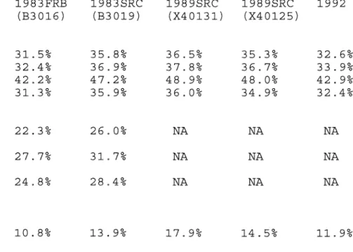
TABLE 3
THE CONCENTRATION OF WEALTH (Alternative weights) Share Held By: 1983FRB 1983SRC 1989SRC
(B30l6) (B3019) (X40l3l) 1989SRC (X40l25) 1992 Richest 1% 31.5% 35.8% 36.5% 35.3% 32.6% Standard Error (1.7%) (2.1%) (1.6%) (1.4%) (1.2%) Next 9% 35.1% 33.4% 32.5% 32.2% 35.8% All Others 33.5% 30.9% 31.0% 32.4% 31.5% Share by Quintile: Highest 79.4% 81.1% 81.6% 80.4% 80.9% Fourth 13.1% 12.1% 12.5% 13.1% 12.5% Middle 5,9% 5.4% 5.0% 5.5% 5.2% Second 1.6% 1.5% 1.1% 1.3% 1.5% Lowest -0.0% -0.0% -0.2% -0.3% -0.0% Percentage of households 5.1% with negative net worth
~3O
TABLE 4
STATISTICAL SIGNIFICANCE OF CHANGES IN CONCENTRATION RATIOS (Share of wealth held by richest 1% of households)
Proportion of bootstrap tests with positive differences
1989 vs. 1983 X40125 vs. B30l6 96.2%* X40l3l vs. B30l6 98.6%* X40l25 vs. B30l9 46.7% X40l3l vs. B3019 60.7% 1992 vs. 1989 X42000 vs. X40125 7.5% X42000 vs. X40131 2.8%* 1992 vs. 1983 X42000 vs. B3016 72.3% X42000 vs. B30l9 10.4%
* - Statistically significant at two tail, 5 percent level
NOTE: Proportions of 95% or more imply statistically significant increases; proportions of 5% or less imply statistically significant decreases
TABLE 5 CONCENTRATION RATIOS FOR ALTERNATIVE
(Share held by richest 1% of
CONCEPTS OF WEALTH households) Net Worth 1983FRB 1983SRC 1989SRC (B30l6) (B30l9) (X40l3l) 1989SRC (X40125) 1992 Basic concept 31.5% 35.8% 35.3% 32.6% Excluding automobiles 32.4% 36.9% 37.8% 36.7% 33.9%
Excluding autos and owner-occupied homes 42.2% 47.2% 48.9% 48.0% 42.9%
Excluding consumer debt 31.3% 35.9% 36.0% 34.9% 32.4%
Basic concept plus present value of 22.3% 26.0% private pensions and Social Security
Basic concept plus present value of 27.7% 31.7% private pensions only
Basic concept plus present value of 24.8% 28.4% Social Security benefits only
NA NA NA
NA NA NA
NA NA NA
TABLE 6 GINI COEFFICIENTS (Alternative weights) 1983FRB 1983SRC 1989SRC 19895RC 1992 (B30l6) (B3019) (X40131) (X40125) Net Worth: Basic concept .778 .795 .805 .793 .787 Standard error .008 .009 .008 .008 .006 Excluding automobiles .798 .814 .826 .815 .810
Excluding autos and owner-occupied homes .900 .911 .921 .917 .898
Excluding consumer debt .771 .788 .795 .783 .780
Basic concept plus present value of .690 .708 NA NA NA
private pensions and Social Security
Basic concept plus present value of .745 .764 NA NA NA
private pensions only
Basic concept plus present value of .708 .726 NA NA NA
Social Security benefits only
TABLE 7
STATISTICAL SIGNIFICANCE OF CHANGES IN GINI COEFFICIENTS (Basic wealth concept)
Proportion of bootstrap tests with positive differences
1989 vs. 1983 X40l25 vs. B3016 92.0% X40l31 vs. B3016 99.2%* X40l25 vs. B30l9 47.9% X40l3l vs. B30l9 79.5% 1992 vs. 1989 X42000 vs. X40125 43.2% X42000 vs. X40131 11.0% 1992 vs. 1983 X42000 vs. B3016 92.4% X42000 vs. B3019 40.9%
* - Statistically significant at two tail, 5 percent level
NOTE: Proportions of 95% or more imply statistically significant increases; proportions of 5% or less imply statistically significant decreases
TABLE 8
INDEX CHANGES IN ASSET VALUES, 1983-1989 (based on annual averages except as noted)
Asset Category Index
Percent Change: 1983-1989 1989-1992 1983-1992 Stocks Taxable Bonds* Tax-Exempt Bonds Owner-Occupied Houses Investment Real Estate** Unincorporated Business*** Unincorporated Business Farms
Standard & Poor 500 Dow-Jones 20-Bond Index Standard & Poor’s Municipal Census One-Family Home Index Frank Russell Property Index Russell 2000
Nasdaq OTC Composite Index USDA average value/acre
101% 29% 159% 21% 10% 34% ‘300 L.3o 110.LJ.0 A’3°‘±30 24% 4% 30% 5% -26% -22% 50% 31% 97% 63% 49% 143% 1I’O .L00 ‘3030 11°
Price Level Consumer Price Index
* Yearly highs
** Compiled from quarterly averages; index for commercial **** Last trading day in December
‘3A 0
~.‘± 0
real estate 1 30
.1.3 0 41%
SOURCES: Statistical Abstract of the United States: 1992 U.S. Bureau of the Census, Price Index of New One-Family Homes Sold Frank Russell Company; U.S. Department of Agriculture.
Asset
TABLE 9
EFFECT OF 1983-1989 ASSET VALUE CHANGES ON 1983 GINI COEFFICIENTS (unadjusted net worth including autos)
Change in Gini Coefficient 1983-1989 1989-1992 1983-1992 Stocks
Bonds
Owner-Occupied Homes Investment Real Estate Unincorporated Business Farms
All Assets Combined
Net Worth (from Table 6)
Standard error (from Table 6)
+,00l32 +.02055 ÷.0005l +,00228 +.00036 - .02922 - .00012 - .00203 +.00994 +,02422 +.00007 - .00072 - .00238 +.00996 ÷.00637 +.01348 +.00147 - .02528 +.00101 +.Ol3ll - .00088 +.0l499 .008 - .00616 +.00883 .008 .006