Swansea University E-Theses
_________________________________________________________________________
High-dimensional glyph-based visualization and interactive
techniques.
Chung, David H. S
How to cite:
_________________________________________________________________________
Chung, David H. S (2014) High-dimensional glyph-based visualization and interactive techniques.. thesis, Swansea University.
http://cronfa.swan.ac.uk/Record/cronfa42276
Use policy:
_________________________________________________________________________
This item is brought to you by Swansea University. Any person downloading material is agreeing to abide by the terms of the repository licence: copies of full text items may be used or reproduced in any format or medium, without prior permission for personal research or study, educational or non-commercial purposes only. The copyright for any work remains with the original author unless otherwise specified. The full-text must not be sold in any format or medium without the formal permission of the copyright holder. Permission for multiple reproductions should be obtained from the original author.
Authors are personally responsible for adhering to copyright and publisher restrictions when uploading content to the repository.
Please link to the metadata record in the Swansea University repository, Cronfa (link given in the citation reference above.)
High-dimensional Glyph-based Visualization
and Interactive Techniques
David H. S. Chung
Submitted to Swansea University in fulfilment of the requirements for the Degree of Doctor of Philosophy.
< e s L
Swansea University
Prifysgol Abertawe
Department of Computer Science Swansea University
All rights reserved INFORMATION TO ALL USERS
The qu ality of this repro d u ctio n is d e p e n d e n t upon the q u ality of the copy subm itted. In the unlikely e v e n t that the a u th o r did not send a c o m p le te m anuscript and there are missing pages, these will be note d . Also, if m aterial had to be rem oved,
a n o te will in d ica te the deletion.
uest
ProQuest 10797984
Published by ProQuest LLC(2018). C op yrig ht of the Dissertation is held by the Author. All rights reserved.
This work is protected against unauthorized copying under Title 17, United States C o d e M icroform Edition © ProQuest LLC.
ProQuest LLC.
789 East Eisenhower Parkway P.O. Box 1346
This work has not previously been accepted in substance for any degree and is not con currently submitted in candidature for any degree.
Signed . (candidate)
Date
..'.9../.
...
Statement 1
This thesis is the result of my own independent work/investigation, except where other wise stated.
Signed .... _ ... (candidate) Date...
Statement 2
I hereby give consent for my thesis, if accepted, to be available for photocopying and for inter-library loan, and for the title and summary to be made available to outside organisations.
Signed ..
Date / . f c / i . J
The advancement of modem technology and scientific measurements has led to datasets growing in both size and complexity, exposing the need for more efficient and effective ways of visualizing and analysing data. Despite the amount of progress in visualization methods, high-dimensional data still poses a number of significant challenges in terms of the technical ability of realising such a mapping, and how accurate they are actu ally interpreted. The different data sources and characteristics which arise from a wide range of scientific domains as well as specific design requirements constantly create new special challenges for visualization research.
This thesis presents several contributions to the field of glyph-based visualization. Glyphs are parametrised objects which encode one or more data values to its appearance (also referred to as visual channels [Ber83]) such as their size, colour, shape, and posi tion. They have been widely used to convey information visually, and are especially well suited for displaying complex, multi-faceted datasets. Its major strength is the ability to depict patterns of data in the context of a spatial relationship, where multi-dimensional trends can often be perceived more easily. Our research is set in the broad scope of multi-dimensional visualization, addressing several aspects of glyph-based techniques, including visual design, perception, placement, interaction, and applications. In partic ular, this thesis presents a comprehensive study on one interaction technique, namely sorting, for supporting various analytical tasks. We have outlined the concepts of glyph- based sorting, identified a set of design criteria for sorting interactions, designed and prototyped a user interface for sorting multivariate glyphs, developed a visual analytics technique to support sorting, conducted an empirical study on perceptual orderability of visual channels used in glyph design, and applied glyph-based sorting to event visual ization in sports applications.
The content of this thesis is organised into two parts. Part I provides an overview of the basic concepts of glyph-based visualization, before describing the state-of-the-art in this field. We then present a collection of novel glyph-based approaches to address chal lenges created from real-world applications. These are detailed in Part II. Our first ap proach involves designing glyphs to depict the composition o f multiple error-sensitivity fields. This work addresses the problem of single camera positioning, using both 2D and
and events “at a glance”. We discuss the relative merits of using metaphoric glyphs in comparison to other types of glyph designs to the particular problem of real-time sports analysis. As a result of this research, we delivered a visualization software, MatchPad,
on a tablet computer. It successfully helped coaching staff and team analysts to exam ine actions and events in detail whilst maintaining a clear overview of the match, and assisted in their decision making during the matches.
Next, we introduce a novel glyph-based sorting framework. The framework focuses on sorting and ordering glyphs as part of an interactive process in visualization. We examine several technical aspects o f glyph sorting and provide design principles for developing effective visually sortable glyphs. Glyphs that are visually sortable provide two key benefits: 1) performing comparative analysis of multiple attributes between glyphs, and 2) to support multi-dimensional visual search. We also describe a system that incorporates focus+context glyphs to control high-dimensional sorting in a visually intuitive manner, and demonstrate its usefulness to a case study of rugby event analysis. We extend the usability of glyph-based sorting through the development of a visual analytic approach. The method incorporates a knowledge-assisted ranking framework to convert a user’s knowledge on ranking using regression modelling. This enables users to analyse and sort multi-dimensional events in a more flexible manner. We apply this approach in the context of sport event data for re-organising key match videos.
In order to investigate the benefits of sorting in glyph-based visual design, we present an empirical study that focus on the perception of orderability for different visual chan nels. We find that some visual channels (for example, value) are perceived to be more ordered than others (for example, hue) than the actual order measured in the data. As a result, some visual channels are more sensitive to noise than others. Two additional studies are presented to investigate its affect on two types of visualization tasks, namely: visual search, and categorical perception. We find that visual channels that tend to be perceived as ordered, improve the accuracy of min and max judgements. On the other hand, visual channels that appear more discrete i.e., those that tend to perceived as less ordered, improve the accuracy of identifying element pairs. Finally, we provide con cluding remarks in this part, and discuss possible directions for future work.
Firstly, I would like to give special thanks to my supervisors Bob Laramee and Min Chen for their tireless guidance, support, patience, and encouragement during the course of my PhD. I am truly grateful to have had the experience of working under their supervision, and the invaluable knowledge I have learnt from them which I will carry with me for the rest of my career. I would like to extend my thanks to Iwan Griffiths and Adrian Morris for their involvement, and giving me the fantastic opportunity to work in the Sports Viz research team. Without this project and the collaborative links to industrial partners, this work would not have been possible. I must also thank the Welsh Government and the Research Institute of Visual Computing (RIVIC) for funding this research.
This thesis would not be finished without the support of a number of people that I wish to sincerely thank. To start with, I want to thank Phil Legg and Matt Parry who have been incredible teammates and a joy to work with both as fellow researchers, and as close friends. I will remember my time at SportsViz as one of my fondest because of you two. I want to thank the great research colleagues that I have had the privilege in working with, in particular to Rita Borgo, Daniel Archambault, and Johannes Kehrer. Special thanks go to Concepta Graphic Design for their artwork, Karl Proctor for his feedback on the user-study design, and Helen Purchase for her help on data analysis. I would also like to thank my peers and friends within the Department o f Computer Science who all understand the mixed emotions and difficulties that a PhD has to offer.
Finally, I would like to thank my family. You have always been behind me in every thing I did, and without your constant love and support, I would not be able to achieve my goals such as this thesis. And for that, I will always be grateful. So to Sau, Lucy, Mum, and Dad - this is fo r you.
f
I
The work contained in this thesis is based on the following publications:
• Rita Borgo, Johannes Kehrer, David H. S. Chung, Eamonn Maguire, Robert S. Laramee, Helwig Hauser, Matthew Ward and Min Chen. Glyph-based Visual
ization: Foundations, Design Guidelines, Techniques and Applications. In
Eurographics State o f the Art Reports, pp. 39-63, Girona, 2013.
• David H. S. Chung, Robert S. Laramee, Johannes Kehrer, Helwig Hauser, and Min Chen. Glyph-based Multi-field Visualization. Book Chapter in C. Hansen, M. Chen, H. Hagen, C. Johnson, A. Kaufman (eds.), Scientific Visualization,
Springer, 2014.
• David H. S. Chung, Matthew L. Parry, Philip A. Legg, Iwan W. Griffiths, Robert S. Laramee and Min Chen. Visualizing Multiple Error-Sensitivity Fields for
Single Camera Positioning. In Computing and Visualization in Science, Vol. 15,
No. 6, pp. 303-317, 2012.
• Philip A. Legg, David H. S. Chung, Matthew L. Parry, Mark W. Jones, Rhys Long, Iwan W. Griffiths and Min Chen. MatchPad: Interactive Glyph-Based Visual
ization for Real-Time Sports Performance Analysis. In Computer Graphics
Forum, Vol. 31, Issue 3pt4, pp. 1255-1264, 2012.
• David H. S. Chung, Philip A. Legg, Matthew L. Parry, Rhodri Bown, Iwan W. Griffiths, Robert S. Laramee and Min Chen. Glyph Sorting: Interactive Visual
ization for Multi-dimensional Data. In Information Visualization, Vol. 1, No. 1,
pp. 76-90, 2015.
• David H. S. Chung, Philip A. Legg, Matthew L. Parry, Rhodri Bown, Iwan W. Griffiths, Robert S. Laramee and Min Chen. Knowledge-Assisted Ranking: A
Visual Analytic Application for Sport Event Data. In IEEE Computer Graphics
Visual Channels. Technical Report, Department of Computer Science, Swansea University, UK, 2014. (Under review)
Note on jo in t works: The work in Chapter 2 based on [BKC*13], is a piece of col laborative work by a team of researchers from five different institutions: Dr. Rita Borgo and my PhD supervisor Dr. Robert S. Laramee from Swansea University, Dr. Johannes Kehrer at the time worked under University of Bergen and Vienna University of Tech nology, Eamonn Maguire and my PhD co-supervisor Prof. Min Chen from Oxford University, Prof. Helwig Hauser from University of Bergen, and Matthew Ward from Worcester Polytechnic Institute. This work presents a state-of-the-art report on glyph- based visualization, where my contributions involved creating the taxonomy, surveying glyph-based visualization papers in a range of application domains, and classifying the literature according to the taxonomy.
Chapter 4 is the outcome of a research project done together with two Research As sistants, Dr. Philip Legg and Matthew Parry, my project supervisor Dr. Iwan Griffiths, and PhD co-supervisor Prof. Min Chen as part of the Sports Viz research group. This research involved collaborating with an industrial partner, namely, Rhys Long - the head of performance analyst at the Welsh Rugby Union to develop a novel, glyph-based visu alization for visualizing sport events [LCP*12]. A senior lecturer in Computer Science at Swansea University, Dr. Mark Jones was also involved in this work. I was the prin cipal researcher concerning the different aspects of glyph-design and the algorithm for interactive glyph positioning, while Dr. Philip Legg did mainly the implementation of the software on a tablet device.
I was the principal researcher with respect to the work described in Chapter 3, Chap ter 5, and Chapter 6. This work was done in collaboration with my supervisor Dr. Robert S. Laramee and the Sports Viz team (same as Chapter 4). And finally, I was also the principal researcher with respect to the work in Chapter 7. This research is a inter department work between Dr. Rita Borgo and Dr. Daniel Archambault from Computer Science, and Dr. Darren J. Edwards from Psychology at Swansea University, in addition to my two supervisors Dr. Robert S. Laramee and Prof. Min Chen.
Supplementary material can be found at: h t t p : / / www. c s . s w a n . a c . u k / ~ c s c h u n g / t h e s i s /
I Background and Motivation
1
1 Introduction 3
1.1 Glyph-based V is u a liz a tio n ... 4
1.1.1 A brief history of the study of s i g n s ... 5
1.1.2 T e rm in o lo g y ... 7
1.1.3 High-dimensional Glyph Representation... 8
1.1.4 C h a lle n g e s ... 10
1.2 C ontribution... 11
1.3 Thesis S tru ctu re ... 13
2 A Survey on Glyph-based Visualization 15 2.1 In tro d u ctio n ... 16
2.1.1 C o ntrib utions... 16
2.1.2 Scope and M e th o d o lo g y ... 17
2.2 Classification and Overview ... 17
2.2.1 Design Aspects for G ly p h s ... 19
2.2.2 Glyph P la c e m e n t... 26
2.2.3 Interaction ... 26
2.3 Glyph-based Multivariate Visualization ... 27
2.3.1 Glyph-based Techniques for Event-based D a t a ... 27
2.3.2 Glyph-based Techniques for Geo-spatial D a t a ... 30
2.3.3 Glyph-based Techniques for High-dimensional D a t a ... 31
2.4 Glyph-based Multi-field V isu a liz a tio n ... 32
2.4.1 Glyph-based Techniques for Multiple Scalar D a ta ... 32
2.4.2 Glyph-based Techniques for Flow D a t a ... 34
2.4.3 Glyph-based Techniques for Tensor D a t a ... 38
2.4.4 Glyph-based Techniques for High-dimensional, Physical Simu lation D a t a ... 42
2.5 Visual Analysis of Multi-dimensional d a t a ... 44
II Research Development
49
3 Designing High dimensional Glyphs for Visualizing MultipleError-Sensitivity Fields 51
3.1 In tro d u ctio n ... 51
3.2 System O v e rv ie w ... 54
3.3 Camera Sensitivity and Error D e riv a tio n ... 55
3.3.1 Snooker R e c o n s tru c tio n ... 57
3.3.2 Homography Sensitivity A n a ly s is ... 58
3.4 Error Sensitivity V is u a liz a tio n ... 59
3.4.1 General Design P r in c ip le s ... 60
3.4.2 Visual Mapping of Multiple Error S e n s itiv ity ... 61
3.4.3 Sample points in 3D v is u a liz a tio n ... 63
3.4.4 Spherical M a p p in g ... 63
3.5 User Consultation - 2 D ... 65
3.6 User Consultation - 3 D ... 70
3.7 D iscussion... 73
3.8 S u m m a r y ... 74
4 Interactive Glyph-Based Visualization for Real-Time Sports Performance Analysis 75 4.1 In tro d u ctio n ... 75
4.2 Requirements A n a ly s is ... 77
4.2.1 Rugby U n i o n ... 77
4.2.2 Rugby Performance Analysis ... 77
4.3 MatchPad P i p e l i n e ... 79
4.4 Glyph-based Visual Mapping ... 80
4.4.1 Data S p a c e ... 80
4.4.2 Design O p tio n s ... 82
4.4.3 Resultant Design for M a tc h P a d... 83
4.5 Visualization I n te r a c tio n ... 85
4.5.1 Interactive V isu a liz a tio n ... 85
4.5.2 Scale-Adaptive L a y o u t... 86
4.6 Case Study: Welsh Rugby U n io n ... 87
4.7 D iscussion... 88
5.2 Sorting: Entities and Sort K e y s ... 96
5.3 Design Principles of Sortable G ly p h s... 97
5.4 Interactive Glyph-based Visual S y ste m ...100
5.4.1 Focus and Context Glyph-based I n te r f a c e ...100
5.4.2 Interactive, Multi-dimensional Glyph P l o t ...102
5.4.3 Hierarchical Axis B in n i n g ...102
5.5 Case Study: Sports Event A n a ly s is ... 105
5.5.1 Visual Mapping of Sort K e y s ... 105
5.5.2 Visual Comparison of Two M a tc h e s ... 107
5.5.3 Domain Expert R ev iew ... I l l 5.6 D iscussion... 112
5.7 S u m m a r y ...113
6 Glyph Sorting: A Visual Analytic Approach 115 6.1 In tro d u ctio n ... 115
6.2 Problem Specification...117
6.3 Visual Analytics for Multivariate S o rtin g ... 118
6.3.1 System O v erv iew ...118
6.3.2 Knowledge-Assisted Ranking F ram ew o rk ... 120
6.3.3 Model V is u a liz a tio n ... 124
6.3.4 Glyph-based V isu alizatio n ... 125
6.3.5 Sorted Event R e p l a y ... 126
6.4 Case Study: “What is a successful strategy to score?” ... 128
6.5 D iscussion ... 129
6.6 S u m m a r y ... 130
7 Glyph Sorting: Perceptual Orderability 131 7.1 In tro d u ctio n ...132
7.2 Orderability of Visual Channels ... 133
7.2.1 Data gen eratio n...134
7.2.2 Noise F u n c tio n ...134
7.2.3 Visual Mapping of E le m e n ts ... 135
7.2.4 Just Noticeable D iffe re n c e ... 136
7.3 Experimental O verv iew ... 138
7.3.1 Interface ... 139
7.3.2 Pilot Studies ...140
7.3.3 Crowdsource C o n s is te n c y ... 141
7.4 Experiment 1: How ordered is i t ? ...142
7.4.1 Results . . . ... 143
7.5.2 Discussion ...150
7.6 Experiment 3: How many p a i r s ? ... 151
7.6.1 R e s u l t s ... 152
7.6.2 Discussion ...154
7.7 L im ita tio n s ...154
7.8 General Discussion and S u m m a r y ...155
8 Conclusion 159 8.1 Future W o rk ...163
Bibliography 167 Appendix A Designing High-dimensional Glyphs for Visualizing Multiple Error-Sensitivity Fields 185 A .l User Consultation: Q uestionnaire... 185
Appendix B Glyph Sorting: A Visual Analytic Approach 187 B .l Empirical Study on Formal R ankings... 187
Appendix C Glyph Sorting: Perceptual Orderability 189 C .l Experimental Stimuli: How ordered is i t ? ...189
C.2 Experimental Stimuli: Which is smallest? Which is largest? ...193
1.1 In philosophy, language studies and psychology, signs may take one of the three forms: icon, index, and symbol. In many other contexts, terms such as visual metaphor, ideogram, and pictogram are also used to de scribe subclasses of signs [BKC* 13]... 5 1.2 Codes provide a framework within which signs assume a meaning. A
symbol, for example (+), can have different interpretations depending on the coding convention such as the symbol for ‘first aid’ in medicine, or the arithmetic symbol for ‘addition’... 5 1.3 The Pioneer plaque on board the 1972 Pioneer 10 Spacecraft [NAS].
The pictorial message displayed information about the origin of the spacecraft in case the Pioneer 10 is intercepted by extraterrestrial life. . 6 1.4 Examples of glyph-based visualizations: (left) visualization of Magnetic
Resonance Spectroscopy (MRS) data using superquadrics [FLKI09], (middle) 2D arrows showing the wind direction and magnitude over Australia [TB96], and (right) 3D arrows to depict the flow on the surface of a ring [LWSH04]. Glyphs vary in appearance from one application to another depending on the underlying data... 8 1.5 Examples of glyph-based visualizations: (left) glyph-based visualiza
tion of 3D data [LKH09], (middle) network activity glyphs [PR08], and (right) 3D fish glyphs for exploring biomedical multi-modal data [MgDN06]... 9 2.1 Examples of visual channels applied to point symbols. [MRO* 12] . . . 22 2.2 Gestalt principles of perceptual organisation. A theoretical framework
that describe the self-organising tendencies in human perception when several visual channels are combined or structured in some form [War08b]. 23
(i.e., each row), with the exchange rate of each U.S. country mapped to the height of the individual bars. The dimensions (i.e., each bar) on the glyph can be ordered to improve the overall effectiveness of the visual ization. Two methods are compared: (left) bars in random ordering, and (right) bars that are sorted based on the first record. Gradual changes and anomalies are much easier to perceive when the dimensions are ordered. 24 2.4 Examples of different glyph placement strategies: Data-driven posi
tions glyphs along some attribute axis or an underlying grid for data with spatial information such as map visualization. Structure-driven
arranges glyphs to show an ordering, hierarchical, or other relation ship of the data variables. Feature-driven places glyphs at local fea tures such as iso-surfaces. User-driven allows users to incorporate their knowledge by interactively placing glyphs at specific regions in the do main... 26 2.5 Visualizing monthly health data consisting of multiple time-dependent
variables using (left) 3D pencil icons, and (right) 3D helix glyphs. The glyphs are placed over a map to show the temporal characteristics of different diseases [TSWS05]... 28 2.6 Glyph-based visualization of sounds. Symbolic icons are used to con
vey the semantic information of sound in movies such as birds chirping, chimes, and the creaking of doors. The icons are positioned along a timeline of the movie [JBM C10]... 29 2.7 Visualization of water-vapor mixing ratio, illustrating the progression of
uncertainty by the use o f spaghetti plots and uncertainty glyphs [SZD* 10]. 30 2.8 Parallel glyphs for visualizing large, high-dimensional data. Each glyph
represents a single high-dimensional object which are arranged along a pivot axis. Polylines are rendered to connect each glyph in order to compare changes in attribute values [FCI05]... 32 2.9 Visualization of a magnetohydrodynamics simulation dataset displaying
vortex tubes with positive vorticity (cuboids and ellipsoid glyphs) and negative voticity (stars) [SEK*98]... 33 2.10 The visualization of vector field clustering of flow around an engine.
A combination of |v|-range and 6-range glyph is used for depicting the
range of vector magnitude and direction in each vector cluster [PGL* 12]. 36 2.11 Shearing barbell glyphs to depict the uncertainty of different integrators
and step-sizes between a pair of streamlines [LPSW96]... 37 2.12 Glyph-based visualization for the diagnosis of coronary artery disease
using a supertorus glyph [MSSD*08]. Data attributes are encoded into its colour, opacity, size, and roundness... 40
to show their quadratic forms [SK10]... 42 2.14 Close up visualization of turbulent flow past a cylinder. Kirby and Laid-
law [KML99] composite multiple visualization layers using a variety of techniques such as glyph-based, colour-mapping, and texture-based en codings. The example shown here depicts two scalar fields, two vector fields, and a tensor field in the same image... 43 3.1 Constraint maps of a sample snooker room wall (Left) and a construction
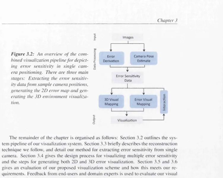
scene (Center) with dynamic constraints (Right). The green region high lights valid camera mounting positions with invalid positions mapped to red. The construction scene images correspond to the right wall of the camera surveillance scene in Figure 3.7.The focus region must be fully in view of the camera for a position to be considered as valid... 52 3.2 An overview of the combined visualization pipeline for depicting error
sensitivity in single camera positioning. There are three main stages: Extracting the error sensitivity data from sample camera positions, gen erating the 2D error map and generating the 3D environment visualization. 54 3.3 A 3D reconstruction o f the camera environment in the snooker scene. A
set of sampled camera positions are shown using grey spherical markers around the region of interest... 55 3.4 (Top) Reconstruction pipeline for extracting ball positions in a snooker
scene using a single camera. The 3D reconstruction is based on a 2D ho- mography. (Bottom) Camera sensitivity analysis of the projective trans form. Error sensitivity fields (or vector fields) are derived to quantify the impact of image distortion from inaccurate feature correspondence. . 56 3.5 Example camera positions around the (First row) snooker table scene
and (Third row) security scene. Below each image is the associated inverse transformation of the camera position to obtain a projected top- down view. It can be seen that the quality of the inverse transformation is greatly influenced by the camera position... 57 3.6 Development of the 2D error visualization using different approaches
is shown, (a) presents a stacked vector glyph design, where magnitude is mapped to the length of the vector. This is extended in (b) to a Co- Planar Star glyph which normalises the vectors and uses a heat map to depict the resultant error, (c) incorporates stacked ribbons (center) and streamlines (right) into the error visualization. Streamline thickness is mapped to vector magnitude, (d) generates a closed Bezier curve based on the vector field. The glyph size is mapped to the resultant error. . . . 62
using spheres, and colour mapped to its error magnitude. The sample points are then projected onto a spherical surface centred at the focus region, giving users an overview of the statistical error. (Left) shows a glyph-based approach for depicting the average vector error and (Right) uses a colour-mapped sphere for illustrating the overall error magnitude. 64 3.8 Comparative evaluation of error visualization designs, (a) uses stacked
vector glyphs, (b) co-planar star glyphs, (c) weighted streamlines. (d) stacked stream ribbons and (e) colour-coded Bezier glyphs... 68 3.9 Comparison of error sensitivity between camera positions B (left) and
position C (right) from Figure 3.11 using colour-coded Bezier glyphs. . 69 3.10 Graph showing the result of users ranking the visual designs from worst-
to-best as a measure from 1-5... 70 3.11 3D visualization showing the 3 candidate camera positions labelled A,
B and C, after filtering. These camera positions are highlighted using opacity... 71 3.12 3D visualization showing the 3 candidate camera positions in the
surveillance scene labelled D, E and F after filtering. These camera positions are highlighted using opacity... 72 4.1 The pipeline used to compute the MatchPad visualization. There are
four key stages: XML processing, event visual mapping, graphical com position, and the combined video, visualization and information pane of
the M atchP ad.... 79 4.2 Some designs of metaphoric pictograms. In (a), initial stickmen designs
were produced to prompt an artist. The artist produced several different designs: (b) a refined stickman design, (c) a contemporary design, (d) a posterized colour design and (e) a silhouette design. In (f) the scrum is depicted using the silhouette design (cf. (a) and (b))... 83 4.3 Components and visual channels of the glyphs... 84 4.4 Scale-adaptive layout for key events. In (a), the key events are shown at
a scale where no overlap occurs. As the user condenses the visualization timeline for an overview, the algorithm determines the most suited lay out for each glyph. In (b), the glyph are stacked horizontally. In (c), the glyph are scaled based on their duration. In (d), the glyph are stacked vertical. Finally, (e) combines two (or more) events to generate a new macro glyph that is used in place... 86 4.5 Pseudo-code for the scale-adaptive layout... 88 4.6 MatchPad being used by the Welsh Rugby Union... 89
using metaphoric pictograms that are instantly recognizable. Home team events are shown in red, above the centre line, and away team events are shown in blue below the centre line. The user can also choose whether to show critical match events such as scoring events and referee decisions on the centre line due to their high importance. Bottom : Zoomed-in view on a region o f the visualization. Phase ball actions are shown using coloured regions sized dependent on duration and phase count. Outcome indicators for positive or negative results are shown using green and amber circles respectively when the information is available. Ball in Play events are shown by the pale green background on the timeline. The information pane at the bottom of the screen provides more in-depth detail for a particular event when selected by the user... 91
5.1 Visual representation of two example multi-dimensional glyphs, namely (a) Star glyphs and (b) Bar chart glyphs when glyphs on the left are unordered, in comparison to glyphs on the right which are ordered to two sorting parameters... 94 5.2 Variations of glyph design in accordance with the design principles of
sortable glyphs (a)-(h). For each principle, the top row depicts a glyph with greater emphasis and the bottom row depicts a glyph with less em phasis... 96 5.3 A graphical pipeline illustrating the glyph sorting framework. It consists
of four key steps: 1) visual mapping of data to glyphs. We propose gen eral design guidelines for creating visually sortable glyphs to support in teractive sorting and multivariate analysis. Alternatively, a default glyph (e.g., Star glyph) is used. 2) integrating a focus and context glyph control panel for selecting multiple sort keys, 3) constructing the glyph sorting tool which enables users to perform high-dimensional sorting and inter actively adjust various display options and 4) visual representation of sorted results on an Interactive, Multi-dimensional glyph plot... 101 5.4 A focus and context glyph-based user interface for selecting sort keys.
Clicking on a visual component o f the glyph highlights that particular sort key in focus...102 5.5 Diagram illustrating hierarchical axis binning along one sorting axis.
Intervals (or sub-regions) at each level of sorting can be sub-divided by different attributes where additional sort functions can be mapped. We note that the axis mapping can be applied along multiple axes...103
in a visual manner, 2) an IMG-plot for displaying the sorted results, and 3) an option panel to support interactive exploration. Additional statistical information and a glyph-based legend is displayed through tabbed viewing panels... 104 5.7 Components and visual channels of the glyph...107 5.8 Swatch chart illustrating the visual sort key parameter space and legends
using focus and context glyphs. Continuous attributes are indicated by and discrete attributes are labelled with their corresponding values. 108 5.9 Visual comparison of two rugby matches using the IMG plot. Top:
Match 1 (M l). Bottom: Match 2 (M2). For each match, the glyphs are ordered using three sort keys: Gain versus Start Event and Tortuos ity. Mean bars are also displayed as a user-option to provide additional statistical information... 110 6.1 The user interface contains four main views. The glyph-based visualiza
tion shows the sorted events of a match, and allows a user to select and import events to the system. Once events are imported, the ranking input view is used to specify a sorting requirement. The model visualization view allows the user to analyse how the current model parameters and accuracy correspond to their ranking input. The ranking model can then be exported to one of the primary axes in the glyph-based visualization for viewing the sorted results. The axes can also be modified by clicking on a component in the glyph control panel... 119 6.2 A knowledge-assisted ranking framework. It consists of five steps: the
user’s ranking input as an example to the system, a knowledge discov ery process to predict a set of sortable attributes combined into a func tion, knowledge externalization to convey the analytical model through visualization, model validation based on ranking analysis, and finally, using the model to interactively analyse, rank and replay match videos
(knowledge application)...120
6.3 Visual comparison of the ranking models using (a) Linear, (b) Polyno mial and (c) Logistic regression in parallel co-ordinates. The contri bution of each attribute is depicted using gauges that correspond along each axis. In order to convey the m odel’s overall accuracy, the ranking model is plotted as an additional axis gauge which encodes the ranking confidence t. Note that each regression model may discover a different set of key performance indicators... 123
ers in the ranking preferences. This example shows how modifying the weights (highlighted in the red circle) can result to an improved model as shown by the larger ranking gauge (see right most axis)... 124 6.5 Brushing glyphs in the glyph-based canvas (a) renders the glyph in fo
cus, while non-selected glyphs are drawn as red markers to indicate their position. Non-selected glyphs can also be interactively scaled by the user (b) in order to reduce the amount of visual occlusion... 125 6.6 Video playback of sorted events. We integrate four different broadcast
ing feeds that recorded the event...126 6.7 Visual comparison of two matches. The events are sorted according to
successful traits that resulted in points scored as defined by the model shown in Figure 6.4, and tortuosity. The analyst observed a group of events highlighted in the green circle (a) where a high percentage of points are scored, which is significantly less in the second match (b). . . 127 7.1 Visualizing an unordered sequence using value and size...133 7.2 The visual stimuli used in our experiments. Each ID plot is mapped
using the visual channels taken from semiology of graphics [Ber83]. . . 135 7.3 Comparing shape similarity
between
a given shape, and its predecessor,to measure the distinctiveness as the number of spikes (star-shape) and edges (elementary-shape) increases...138 7.4 A screenshot of the visual interface for Experiment 1: How ordered is
it? Shape is tested in this example... 143 7.5 Comparing the effects of visual channel against perceived orderedness
(top) and response time (bottom) in Experiment 1. Significant differ ences are listed above each bar, with (mean, median) values indicated below. Error bars show 95% confidence intervals. Bars are colour-coded using ColorBrewer [HB11]... 144 7.6 Comparison o f measured orderedness (or correlation coefficient) versus
perceived orderedness. Points depict the perceived orderedness for each visual channel, organised by power scale of measured orderedness. The average is plotted (dashed line) against visual channels (coloured lines) using a line of best fit... 146 7.7 A screenshot of the visual interface for Experiment 2: Which is small
est? Which is la rg e st? ...149 7.8 Comparing the effects of visual channel against error rate (top) and re
sponse time (bottom) in Experiment 2. Significant differences are listed above each bar, with (mean,median) values indicated below. Error bars show 95% confidence intervals... 150 7.9 A screenshot of the visual interface for Experiment 3: How many pairs? 152
above each bar, with (mean,median) values indicated below. Error bars show 95% confidence intervals...153 7.11 Visual channel ranking for Experiment 1 and Experiment 2 based on
performance (top) and response time (bottom). We also compare this to participants’ perceived ranking collected from our qualitative survey data. The ranking is from worst (7th) to best (1st)...156 7.12 A performance summary of each visual channel in all three experiments.
The ranking in How o rd ered is it? is based on mean orderedness, while the ranking in the other two experiments (W hich is smallest? W hich is largest? and How m any pairs?) is based on mean error...157 B. 1 Table showing the empirical study results for sorting rugby events. Each
sub-row within a task corresponds to five participants along with their optional meta-answer (see Appendix for details). For task 1 and 2, their ranking is shown from the 12 possible events e,-, and are ranked from worst-to-best with 1-5 and 1-10 respectively. A colour-map is applied to emphasise the worst and best events... 188
2.1 A classification of glyph-based techniques for multi-field and multi variate data. Each technique is grouped by application domain along the rows, and the type of visual channels used to construct the glyph along the columns. Entries are ordered in chronological order within each application group. The colours show the visualization chal lenge which each paper address: perception and design challenge, glyph placement challenge, and big data challenge as outlined in Sec tion 1.1.4. ... 18 2.2 A taxonomy of visual channels [CF13]. Each visual channel is classified
into four categories: geometric, optical, topological and relational, and semantic channels. Glyphs are created by mapping data attributes to one or many visual channels... 21 3.1 Comparison of visual mappings shown in Figure 3.8. Each design is as
sessed against a number of set criteria which ideally should be achieved. An asterisk in the table indicates the design satisfies that particular criteria. 66 4.1 A range of events are to be mapped in the visualization. Each event is
augmented with levels of association (i.e., the match, team or player), and additional attributes (i.e., outcome and numerical and enumerative values). We also illustrate four possible glyph designs: metaphoric pic- togram, abstract icon, shape, and colour. We choose to use metaphoric pictogram to represent events in MatchPad... 81 5.1 Table illustrating the set of sort keys in rugby event analysis. Each at
tribute is classified based on typedness, and the visual channel mapped to the glyph. Data attributes are ranked in order of importance from top to bottom...106 7.1 Qualitative survey participants filled after each experiment...140
channels. Significant differences are highlighted in red using a Bonfer- roni corrected a = 0.01...147 C.l The visual stimuli for value (visual channel) under five different noise
levels (measured orderedness) used in Experiment 1: How ordered is it? 189 C.2 The visual stimuli for size (visual channel) under five different noise
levels (measured orderedness) used in Experiment 1: How ordered is it? 190 C.3 The visual stimuli for hue (visual channel) under five different noise
levels (measured orderedness) used in Experiment 1: How ordered is it? 190 C.4 The visual stimuli for texture (visual channel) under five different noise
levels (measured orderedness) used in Experiment 1: How ordered is it? 191 C.5 The visual stimuli for orientation (visual channel) under five different
noise levels (measured orderedness) used in Experiment 1: How ordered is i t ? ... 191 C.6 The visual stimuli for shape (visual channel) under five different noise
levels (measured orderedness) used in Experiment 1: How ordered is it? 192
C .l The visual stimuli for numeric (visual channel) under five different noise levels (measured orderedness) used in Experiment 1: How ordered is it? 192 C.8 The visual stimuli for value (visual channel) under noise levels
N\ , A^2, A/3, and A/4 (measured orderedness) used in Experiment 2: Which
is smallest? Which is la rg e st?... 193 C.9 The visual stimuli for value (visual channel) under noise levels
7V5, , 7V7, and A^ (measured orderedness) used in Experiment 2: Which
is smallest? Which is la rg e st?... 194 C. 10 The visual stimuli for size (visual channel) under noise levels N \, A^, A/3,
and A/4 (measured orderedness) used in Experiment 2: Which is small est? Which is la rg e st? ... 195 C .l 1 The visual stimuli for size (visual channel) under noise levels A/5, A^, A/7,
and N% (measured orderedness) used in Experiment 2: Which is small est? Which is la rg e st? ... 196 C. 12 The visual stimuli for hue (visual channel) under noise levels A?i, A^, A/3,
and A/4 (measured orderedness) used in Experiment 2: Which is small
est? Which is la rg e st? ... 197 C .l3 The visual stimuli for hue (visual channel) under noise levels A/5, A^, A/7,
and N% (measured orderedness) used in Experiment 2: Which is small est? Which is la rg e st? ... 198 C.14 The visual stimuli for texture (visual channel) under noise levels
N \, A/2, A/3, and A/4 (measured orderedness) used in Experiment 2: Which is smallest? Which is la rg e st? ...199
C . l 5 The visual stimuli for texture (visual channel) under noise levels
N s,N ^,N j, an dN% (measured orderedness) used in Experiment 2: Which is smallest? Which is largest?...200 C .l6 The visual stimuli for orientation (visual channel) under noise levels
N \,N2,N i, an dN4 (measured orderedness) used in Experiment 2: Which
is smallest? Which is largest?... 201 C . l 7 The visual stimuli for orientation (visual channel) under noise levels
N5,N(,,Nj, an dN% (measured orderedness) used in Experiment 2: Which
is smallest? Which is larg est?... 202 C . l 8 The visual stimuli for shape (visual channel) under noise levels
N\ , A^2, A^3, and N4 (measured orderedness) used in Experiment 2: Which
is smallest? Which is largest?... ... 203 C . l 9 The visual stimuli for shape (visual channel) under noise levels
TVs, A^6, Nq, and N% (measured orderedness) used in Experiment 2: Which is smallest? Which is largest?... 204 C.20 The visual stimuli for numeric (visual channel) under noise levels
N\ , N2, N3, and N4 (measured orderedness) used in Experiment 2: Which
is smallest? Which is largest?... 205 C.21 The visual stimuli for numeric (visual channel) under noise levels
N5,N6,N i, an dN% (measured orderedness) used in Experiment 2: Which
is smallest? Which is largest?... 206 C.22 The visual stimuli for value (visual channel) under three different noise
levels (measured orderedness) used in Experiment 3: How many pairs? . 207 C.23 The visual stimuli for size (visual channel) under three different noise
levels (measured orderedness) used in Experiment 3: How many pairs? . 208 C.24 The visual stimuli for hue (visual channel) under three different noise
levels (measured orderedness) used in Experiment 3: How many pairs? . 209 C.25 The visual stimuli for texture (visual channel) under three different noise
levels (measured orderedness) used in Experiment 3: How many pairs? . 210 C.26 The visual stimuli for orientation (visual channel) under three different
noise levels (measured orderedness) used in Experiment 3: How many p a i r s ? ... 211 C.27 The visual stimuli for shape (visual channel) under three different noise
levels (measured orderedness) used in Experiment 3: How many pairs? . 212 C.28 The visual stimuli for value (visual channel) under three different noise
Introduction
Contents_________________________________________________
1.1 Glyph-based Visualization... 4 1.1.1 A brief history of the study of s ig n s ... 5 1.1.2 Term inology... 7
1.1.3 H igh-dim ensional Glyph R ep resen tatio n ... 8
1.1.4 Challenges . . ... 10 1.2 Contribution... 11 1.3 Thesis Structure ... 13
I
T is well known today that we are experiencing an overwhelming surge in the volume and complexity of data to which we have ready access. Advance simulations, scientific measurements, business transactions, and even social media are just a few activities which contribute to this growing mass, and our ability to effectively analyse data has become more challenging. Much of this data is multi-dimensional in nature, whether it be from tables, spreadsheets, video multimedia, or complex computations. Each record (or data entity) may contain anywhere between two attributes to several thousand attributes, and with the increasing size of records, the more difficult it is to detect, classify, and extract any meaningful relationships. For example in genetics, scientists are accustomed to studying millions of DNA sequences and their molecular structures in order to understand the behaviour of specific genotypes.Visualization has emerged as a powerful tool for the exploration of such large and complex datasets. The visualization of data is the process of conveying data using graph ical representations. While algorithmic analysis can be used to quickly and accurately process data to identify trends and outliers, it is dependent on having a computational model of the underlying phenomena. The problem is that one may often not know what
one is looking for, and may not have the required knowledge to define model parameters and threshold values to effectively guide the analysis. Visualization, on the other hand, uses the remarkable abilities and reasoning of a human to process visual information and extract meaning from the data such as structural patterns, trends, and anomalies. The famous expression ‘‘I Know It When I See I t ” (IKIWISI) by Potter Stewart [Gew96] implies the notion that we often cannot make sense out of data by solely observing their raw values, but instead rely on our visual pattern recognition system to help us gain knowledge of the data. Overall, there are three main goals of visualization: 1) Visual exploration. To allow users to investigate unknown data characteristics more effectively, 2) Visual analysis. To confirm the existence of data features and stimulate new hypothe ses, and finally 3) Presentation. To disseminate information or findings to others, for example, domain experts, colleagues, and the general audience.
A visualization can be realised in many ways. Technically, the type of visualization approach depends highly on the properties of data that need to be presented. These tech niques can be classified into two general sub-fields: information visualization, and scien tific visualization [PNE02]. Information visualization involves the visual representation of abstract data. In most cases, abstract data do not have an inherent spatial domain, leading to a host of common techniques such as bar charts, pie charts and line graphs, as well as more advanced techniques such as parallel coordinates, histograms, and tree maps [War08a]. Scientific visualization deals with the numerical solution resulting from computational simulations or modelling, and is studied in various disciplines, for exam ple, medicine, weather ensembles, and flow simulations. Such data consists of fields of values (e.g., scalars and vectors) that are coupled with a spatial domain. Examples of techniques used to depict scientific data include colour maps, streamlines, glyphs, and volume rendering [PNE02].
1.1 Glyph-based Visualization
Glyph-based visualization is a popular approach for conveying information visually, where a data set is depicted by a collection of small visual objects referred to as
glyphs. Individual dimensions/attributes of a data point are encoded to various visual features of a glyph (i.e., a shape or symbol) such as its size, colour, and orientation. Since a large number of data dimensions can be incorporated into properties of a sin gle glyph, this makes it a highly suitable technique for communicating and supporting multi-dimensional analysis. Glyphs can be placed and viewed either independently from others, or in some cases, glyphs can be spatially connected to convey the topological re lationships between data points or the geometric continuity of the underlying data space. While glyphs are a form of illustrative graphics in visualization, fundamentally they are dictionary-based encoding schemes. A broader interpretation by Borgo et. al [BKC* 13] describe glyphs as a type of visual sign that can make use o f character istics from of other types o f signs such as icons, indices, and symbols (see Figure 1.1).
ico n in d ex sy m b o l m e ta p h o r id e o g r a m p icto g ra m
Figure 1.1: In philosophy, language studies and psychology, signs m ay take one o f the three fo rm s: icon, index, and sym bol. In m any o th er contexts, term s such as visual metaphor, ideogram , a n d pictogram are also u sed to describe subclasses o f signs [BKC* 13].
Si gn Code
(learn ed rule)
M e a n i n g
Figure 1.2: Codes provide a fra m ew o rk within which signs assum e a m eaning. A sym bol, f o r exam ple (+), can have different interpretations depending on the coding conven tion such as the sym bol f o r ‘first a id ' in m edicine, or the arithm etic sym bol f o r 'a d d itio n '.
We e n c o u n t e r m a n y o f these today, for e x a m p le , traffic signs, m a p sy m b o ls, an d icons to nav ig ate th ro u g h c o m p u t e r sy stem m enus. A lth o u g h the use o f g ly p h s in the c o n te x t o f m u lti-d im e n s io n a l v isu a liz a tio n and grap h ical s y m b o ls m a y seem ra th e r different, they share m a n y in terestin g attributes, such as b e in g “ sm a ll” , b e in g “ v is u a l” , h a v in g “ m e a n ing” , re q u irin g “ l e a r n in g ” , and often b e in g “ m e ta p h o r ic ” . Historically, the use o f visual signs d ates b ack to a lm o s t 4 0 ,0 0 0 years ago, and has h ad a significant role in the in v en tio n o f c u rre n t icons an d glyphs. It is thus interesting to study briefly th eir related history a n d c o n c e p ts.
1.1.1
A brief history o f the study o f signs
S y m b o lis m has p la y e d an im portant part in the d e v e lo p m e n t o f h u m a n cultu re, e s p e cially as a fo rm o f c o m m u n ic a tio n . Since the 16th century, its uses in E n g lis h have b een m o stly a s s o c ia te d w ith ety m o lo g y , archaeo lo g y , to p o g ra p h y an d g r a p h o n o m ic s as a w ay to e x p re s s th o u g h ts , ideas, a n d concepts. T h e Paleolithic A g e ( 1 8 ,0 0 0 B C ) p re se n t h u n d re d s o f e x a m p le s in the fo rm o f cave paintings. It was not until the N e o lith ic A g e w h e re the first f o rm s o f p re -w ritin g s y m b o ls w e re introduced fo r c o m m u n ic a tio n : the P etro- g ly p h s. T h e s e are i m a g e s c re a te d with rock en g rav in g s, w h e re petra ( m e a n in g “ s t o n e ” ),
a n d glyphein ( m e a n in g “ to c a r v e ” ). E ven in current tim es, tribal societies c o n tin u e to
use this fo rm o f s y m b o lic w riting.
Figure 1.3: The Pioneer plaque on board the 1972 Pioneer 10 Spacecraft [NAS]. The pictorial message displayed information about the origin o f the spacecraft in case the Pioneer 10 is intercepted by extraterrestrial life.
the commonality of styles strengthen the hypothesis that the human conceptual system is symbolic in nature as investigated by Jungian psychology and early works from Mircea Eliade [EM91], Psychophysical studies have demonstrated that re-occurring visual pat terns in petroglyphs and cave paintings are “hard-wired” into the human brain, which allows us to decipher diagrams and images more efficiently. As such, petroglyphs is a unit o f knowledge representation. Over the years, petroglyphs have evolved into graph ical symbols known as ideograms that are more illustrative of the signs we see today. The main goal of ideograms is to represent an “idea”, and is sometimes comprehensible only by familiarity, or with prior knowledge. For example, the ideogram shown in Fig ure 1.1 represents “not allowed” in many countries, but this is highly dependant on how
it is interpreted. Such ideograms must rely on a conventional rule (or coding) in order to derive meaning from its signs (see Figure 1.2). However, once a coding is established, this can lead to an efficient form of visual communication. Contemporary examples of ideograms can be found in wayfinding signage, as well as technical notations such as arabic numerals, mathematical notations or binary systems which maintain the same meaning despite the difference in language or environment. Some ideograms however, convey their idea through pictorial resemblance of a physical object, and are referred to as pictograms (see Figure 1.1). One interesting example is the Pioneer plaque on board the 1972 Pioneer 10 spacecraft as shown in Figure 1.3, which features a pictorial message designed to provide information about the origin of the spacecraft.
The use o f glyphs and signs as a means of communication has traversed human gen erations due to their cross-cultural expressive power. A prime example can be seen in written languages. Ideograms and pictograms form the base of early written symbols
such as cuneiforms and hieroglyphs, to sophisticated logographic writing system such as the ones developed in Chinese and Eastern cultures. For example, Chinese charac ters are derived directly from individual pictograms, or combinations of pictograms and phonetic signs that represent logograms (i.e., a word, or a morpheme) in the writing of Chinese, Japanese, and Korean. Glyphs for information display and writing systems are therefore similar to some extent in the way they are formed. Fundamentally, both consist of smaller individual components (or visual mappings) that can be combined to repre sent a piece of information, word, or a sign. It makes sense to consider glyphs as a type of visual language. And as with many languages, they can be learned, or even memo rised to which processing can become effortless, making glyphs a potentially effective approach for communicating data quickly.
With the advent of the computer era, icons have become one of the most popu lar means of conveying messages. In the early 1980s, the CHI community [BSG89, Bly82, Gay89] investigated the use of distinctive sounds to represent specific events or other information, creating a new type of multi-sensory icon known as “earcon”. Since then, icons now appear in most media platforms, and incorporate more sophisticated features such as animation and interactive shading. As highlighted by Marcus [Mar03], specialised communities such as health and medicine, finance, transportation, education and training already possess a well-established visual sign system. The expressive power inherent to such visual sign systems is appealing to media, technology and information visualization alike. The major challenge lies in the development of well-designed sign systems.
1.1.2 Terminology
The definition of the term glyph may have various interpretations across the visualization community. Telea [Tel07] describe glyphs as a ”sign" for ’’associating discrete visual signs with individual attributes". Ward et al. [WGK10] define a glyph as ”a visual rep resentation of a piece of data or information where a graphical entity and its attributes are controlled by one or more data attributes". More generally, we consider a glyph (or sometimes also an icon) to be a parameterised visualization object such that its’ appear ance e.g., shape, colour, size, orientation, texture, etc., encodes the data values which the glyph should represent. It also makes sense to consider composite glyphs as another form of glyph. Composite glyphs are constructed either in 3D by combining basic geo metric shapes such as spheres, boxes, and cylinders that map to data values (for example, the glyphs in [KE01 ]), or in 2D by composing regions (i.e., main body, exterior, and in terior [MPRSDC12]) that use different visual properties such as pictograms, colour, and text to display the data.
A glyph-based visualization is then created by arranging a certain number of these glyphs across the domain of reference (these could be just a few, or just one, or many, even so many that they merge into a dense visualization) such that every glyph becomes a visualization of the data at (or nearby) the location where the glyph is placed. Examples
Figure 1.4: E xam ples o f g lyp h -b a se d visualizations: (left) visualization o f M agnetic R esonance Spectroscopy (M R S) data using superquadrics [FLK I09], (m iddle) 2D a r rows show ing the w ind direction a n d m agnitude o ve r A ustralia [ T B 96], and (right) 3D arrow s to d epict the flow on the surfa ce o f a ring [LW SH 04]. G lyphs vary in appearance fro m one application to a n o th er d epending on the underlying data.
o f g ly p h - b a s e d v is u a liz a tio n s are s h o w n in F ig u re 1.4 an d F ig u re 1.5.
A p ro p e rty o f all g l y p h - b a s e d v is u a liz a tio n a p p r o a c h e s is that a d isc re te v isu alizatio n is c re a te d (in ste a d o f a c o n t in u o u s re p re s e n ta tio n like a c o lo u r m ap). O n ly at certain lo c a tio n s a c ro ss the d o m a in are individual g ly p h s d is p la y e d to rep resen t the data. T h is m e a n s that this a p p r o a c h is o n ly suitable, w h e n it is p o ssib le to a s s u m e a certain m in im al d e g re e o f c o n tin u ity o f the d ata su ch that a m ental re c o n s tru c tio n o f the data, in p a rtic u la r the sp a c e b e tw e e n the g ly p h s, is at least p rin c ip a lly p o ssib le. In d ata v isu alizatio n , this is o ften p o ssib le , m a k in g g ly p h - b a s e d v isu a liz a tio n p a rtic u la rly in te re stin g for this p a rtic u la r h e ld o f a p p lic a tio n . A lternatively, a g l y p h - b a s e d v isu a liz a tio n also m a k e s s e n se fo r d isc re te data, if a o n e - to - o n e relation b e tw e e n every in stan ce o f the data and the g ly p h s is e s ta b lish e d .
1.1.3
H igh-dim ensional Glyph Representation
M u ltip le d im e n s io n s are h a rd to th in k in, a n d s o m e tim e s im p o s s ib le to v isu a liz e du e to the large n u m b e r o f p o s s ib le v a lu e s a s s o c ia te d w ith e a c h d im e n s io n . O u r re se a rc h
fo c u s e s p r im a rily on a d d re s s in g the p ro b le m o f high-diniensional d ata using g ly p h s . A
d a ta s e t is ty p ic a lly c a lle d h i g h - d im e n s io n a l if the d a ta s e t co n ta in s th ree o r m o re attribute d im e n s io n s . T h e definition: m u lti-d im en sio n a l, is m o re b ro a d ly u s e d to d e sc rib e the p r o p e r ty o f such d a ta se ts w ith h i g h - d im e n s io n a lity a lre a d y in m in d . F o r attributes less th a n th ree, the te rm s u nivariate a n d bivariate are f re q u e n tly u sed in ste a d to d e s c rib e d a ta s e ts that c o n ta in o n ly o n e a n d tw o d i m e n s io n s respectively.
H ig h - d im e n s io n a l d ata is p a rtic u la rly c h a lle n g in g w h e n c o u p le d w ith the c o n s tra in ts o f g ly p h - b a s e d visual d esig n , fo r e x a m p le , the relative size o f a g ly p h m a y lim it the a m o u n t o f in fo rm a tio n they can v isu a lly display. N o t o n ly that, but the u n d e rly in g d ata
Figure 1.5: E xam ples o f glyph-based visualizations: (left) g lyp h -b a sed visualization o f 3D data [LK H 09], (m id d le ) network activity glyphs [PROS], a n d (right) 3D fish glyphs f o r exploring b io m ed ica l m ulti-m odal data [M gD N 06].
ty p e an d th eir specific d o m a in context can also h eav ily in flu e n c e the w ay d ata is e n c o d e d in a g ly p h - b a s e d a p p ro a c h . T h e re are two types o f m u l ti- d im e n s io n a l visualization c h a l lenges w h ic h w e c o n s i d e r in this thesis. First, there is m u lt i- f ie ld v is u a liz a tio n w h ic h stu d ie s the v isu a liz a tio n o f data that are given as fields o f n u m e ric a l values. E a c h field o f d ata c o -e x ist w ith in the s a m e spatial dom ain, and is d e p ic te d u s in g a set o f sa m p le data w h ic h are given at specified points along the d o m a in to reveal the u n d e rly in g featu res. rFhis ty p e o f data is c o m m o n l y found in the d o m a in o f scientific visu alizatio n , a n d is the p ro d u c t o f c o m p le x s im u latio n o r modelling. F o r e x a m p le , the m o d e llin g o f e n g in e s in C o m p u ta tio n a l F lu id D y n a m ic s (C F D ) consists o f a v ecto r-field w h ic h d escrib e its flow b eh av io u r, in a d d itio n to o th er fields o f data such as p re s s u re , te m p e ra tu re a n d stress (e.g., s c a la r fields) in the resu ltin g sim ulation [ K M L 9 9 ] . S c ie n tis ts need to e x a m in e the m u ltip le fields s im u lta n e o u s ly in order to fully u n d e rs ta n d the p h y sical p h e n o m e n a , an d the c lo se in te ra c tio n s th at o c c u r betw een fields.
T h e se c o n d ty p e is m u ltiv a r ia te visualization. P re v io u s w o r k s [F L K I0 9 , F H 0 9 ] h ave o ften used the te rm “m ultiva ria te” in te rc h a n g e ab ly to d e s c rib e the c h a ra c teris tic s o f m ulti-field data. In o u r work, we make a c le a r d is tin c tio n b e tw e e n the tw o. F u n d a m entally, d a ta attrib u te s w ithin a multivariate d ataset m a y o r m a y not have an y in h eren t spatial structure. T h e d ata is typically given in the fo rm o f a table, w h e re e a c h c o lu m n r e p re se n ts an attribute, a n d each row is a single entity. T h e s e a ttrib u tes m a y be c a t e go rical o r n u m e ric a l in nature, presenting a different k in d o f c h a lle n g e for v isu a liz a tio n research . M ix e d d a ta ty p es are m o stly found in the d o m a i n o f in fo rm a tio n v isu a liz a tio n su ch as s u rv e illa n c e , stock m arkets, and geo-spatial v is u a liz a tio n . M ultiv ariate d a ta se ts also d iffer in the fact that they can include attributes fro m a v a rie ty o f o th e r d ata so u rc e s (e.g., a video). T h e integration o f different data s o u rc e s a llo w s data a n aly sts to in v es tigate tre n d s in g r e a te r detail, for exam ple in activity re c o g n itio n , security officers will a n a ly se h o w an e v e n t (e.g., a fight) affects the p attern o f p e d e s tr ia n m o v e m e n t [B B S *08].
a hard problem to solve. With the underlying data being very different, the visualiza tion of multi-field and multivariate data using glyphs has led to a wide variety of visual representations. Figure 1.4 (Multi-field glyphs) and Figure 1.5 (Multivariate glyphs) present a few examples illustrating some o f these differences. As the dimensionality of a high-dimensional dataset increases, so does the complexity of finding an effective visual representation that promotes insight into such data. In particular, finding a map ping that enables a large number of parameters to be encoded into a glyph, while still be readily perceived remains a significant challenge. Thus, this thesis aims to address several aspects towards the following primary research goal:
Research goal: “How many variables can we effectively encode using a glyph?”
The answer to this problem is non-trivial, and is heavily influenced by various consid erations in glyph-based visual design such as its size (e.g., the amount of visual space the glyph occupies), or the type o f information the glyph is trying to represent. The next section will discuss some of these potential challenges.
1.1.4 Challenges
Glyph-based approaches share common problems in general when visualizing multiple data attributes. We outline the most important challenges in detail below:
• Perception an d Design. One of the major challenges in glyph-based visualiza tion is how to create a visualization mapping that can reveal multiple fields of data and their correlations at a time. Encoding multi-faceted data can be non-trivial, since each data variable may contain various types of information (e.g., categorical and ratio data) and additional derived quantities (e.g., statistical measurements). Hence, glyphs must carefully be designed in order to convey the relationships be tween these fields effectively. On the other hand, there is also the perceptual chal lenge o f how easy it is to understand and correctly interpret such a visualization. Simply encoding data to different visual features of a glyph does not necessarily lead to a good design, and at worse, may confuse viewers or lead to misinterpre tations. The design of glyphs is also constrained by their size in comparison with an entire visualization (e.g., smaller glyphs versus larger glyphs), which restricts the number of variables that can be physically encoded and displayed on a screen without loss of information.
• G lyph Placem ent a n d Interaction. The placement or layout of glyphs on a dis play can communicate significant information regarding the data values them selves, as well as the relationships between data points. Methods range from using data dimensions as positional attributes, to placing glyphs across a surface of a physical structure such as an engine. In simulation and modelling, the spa tial structure is usually pre-determined, and therefore a sampling method needs
![Figure 1.3: The Pioneer plaque on board the 1972 Pioneer 10 Spacecraft [NAS]. The pictorial message displayed information about the origin o f the spacecraft in case the Pioneer 10 is intercepted by extraterrestrial life.](https://thumb-us.123doks.com/thumbv2/123dok_us/11066657.2993284/33.918.145.534.158.428/pioneer-spacecraft-pictorial-displayed-information-spacecraft-intercepted-extraterrestrial.webp)

![Table 2.2: A taxonomy o f visual channels [ CF13]. Each visual channel is classified into fo u r categories: geometric, optical, topological and relational, and semantic channels](https://thumb-us.123doks.com/thumbv2/123dok_us/11066657.2993284/48.918.171.736.147.592/taxonomy-channels-classified-categories-geometric-topological-relational-semantic.webp)
![Figure 2.1: E xam ples o f visual channels a p p lied to p o in t sym bols. [M R (T 12]](https://thumb-us.123doks.com/thumbv2/123dok_us/11066657.2993284/49.918.49.794.10.1154/figure-xam-ples-visual-channels-lied-sym-bols.webp)
![Figure 2.9: Visualization o f a niagnetohydrodynam ics sim ulation dataset displaying vortex tubes with p o sitiv e vorticity (cuboids a n d ellip so id glyphs) and negative voticity (stars) [SEK*98].](https://thumb-us.123doks.com/thumbv2/123dok_us/11066657.2993284/60.918.92.795.28.466/figure-visualization-niagnetohydrodynam-ulation-displaying-vorticity-negative-voticity.webp)
![Figure 2.11: Shearing barbell glyphs to d epict the uncertainty o f different integrators a n d step-sizes betw een a p a ir o f stream lines [LPSW 96].](https://thumb-us.123doks.com/thumbv2/123dok_us/11066657.2993284/64.918.130.796.0.1173/figure-shearing-barbell-glyphs-uncertainty-different-integrators-stream.webp)