Bachelor’s Thesis
Grau en Enginyeria en Tecnologies Industrials
Design and implementation of an App for the
analysis of kansei engineering data
REPORT
Author:
Ferran Gebellí Guinjoan
Supervisor:
Lluís Marco Almagro
Date:
June 2017
Escola Tècnica Superior
Abstract
The main objective of the project is to create a web App to interactively display the analysis of data from kansei engineering studies. Kansei engineering is a tool used in emotional product design and aims to discover which product features convey a specific set of emotions and feelings.
The project will include the development of analytical tools and the creation of graphics to visualize results. The application will be programmed with the language R together with the extension Shiny, which will create an easy to use interactive platform. The application is primarily directed to the sector of product design, where statistical knowledge is often scarce, so results are displayed in a visually appealing and easy to interpret manner.
The App obtained has been modularised, pursuing a structured code and the possibility to expand it easily in the future. After the upload of data from any kansei engineering study, it helps the user to analyse it. It gives all information necessary to know which product features affect which emotions and gives a measure of how much.
The App has a sequential workflow, and the last step gives the user a suggestion of the features that the product should have, according to his or her requirements. This has been achieved through a multicriteria optimization model that has been specially adapted for kansei engineering studies. The App has also some further settings that can be modified, for example it offers the possibility to stratify all the results (say, by gender), if this information was given in the preliminary data set.
INDEX
1. Introduction ... 5
1.1. Origin of the project and motivation ... 5
1.2. Objectives of the project ... 6
1.3. Scope ... 7
2. Kansei engineering: introduction and model ... 9
2.1. An introduction to kansei engineering ... 9
2.2. Kansei engineering study model ... 10
2.2.1. Choice of domain ... 11
2.2.2. Span of the semantic space ... 12
2.2.3. Span of the space of properties ... 14
2.2.4. Data collection ... 16
2.2.5. Synthesis and presentation of results ... 17
3. Design of the application and statistical methods ... 19
3.1. General philosophy and functions of the App ... 19
3.2. Wireframe of the application ... 20
3.2.1. First step, Data ... 21
3.2.2. Second step, participants ... 22
3.2.3. Third step, Summary ... 23
3.2.4. Fourth step, learning ... 23
3.2.5. Fifth step, optimizing ... 24
3.3. Statistical methods used in the application ... 25
3.3.1. Assessment of confusion in the design matrix ... 25
3.3.2. Automatic detection of outliers ... 27
3.3.3. Mixed effects regression analysis for the synthesis phase ... 30
3.3.4. Multicriteria optimization to detect the best prototypes ... 34
4. Programming tools ... 37
4 Report 4.2. Shiny ... 38 4.2.1. Reactivity ... 40 4.2.2. Bootstrap and CSS ... 41 4.3. Modules ... 42 4.4. Tidyverse ... 43
4.4.1. dplyr, tidyr, tibbles and pipes ... 43
4.4.2. ggplot ... 44
5. The App ... 47
5.1. Data acquisition panel ... 47
5.1.1. Data import ... 47
5.1.2. Summary of participants and independence indexes ... 50
5.2. Participants information panel ... 51
5.3. Summary panel ... 53
5.4. Detailed analysis panel ... 56
5.5. Best prototype panel ... 58
5.6. Evaluation panel ... 62
5.7. Initial testing and feedback ... 63
6. Economic cost ... 65
7. Conclusions ... 67
1.
Introduction
This first chapter will briefly explain how I got involved with the project, but also sets its basis and define both goals and limits.
1.1.
Origin of the project and motivation
Curiously, I had my first approach to this project not by its topic, kansei engineering (of which I had never heard), but by the tools and methodology used: R programming language and its package Shiny, capable of creating interactive apps. In my last semester, I had been enrolled in the course Project II, which consisted in exactly that: creating a Shiny app. This was my link to the Department of Statistics and Operational Research but also my link to start this project. Once I came in contact with this project, there were various reasons that made me decide that it would be my bachelor’s thesis.
First of all, I had found really interesting the Project II subject. I already knew that I liked programming, but discovering R was “surprising” for me. Together with RStudio, I found out that it can be very user friendly, and that both deep and really good looking results could be obtained in a short time.
Moreover, R language is specially designed for data science, a topic that I also really like. Indeed, the two subjects that I had done about statistics in my bachelor's degree had fascinated me. How real information can be revealed from a bunch of data that seems random at first sight really made an impression on me. This knowing out of nothing appeared as something that I find exciting. And one of the techniques to achieve that is design of experiments (DOE), one of the tools that I especially liked, because it goes straight forward to reality, taking some measurements of variables to obtain the best combination that optimizes the solution and giving information on how each variable affects a response. Since kansei Engineering is highly related with DOEs, this was translated into more interest on the subject of this project.
Finally, there was another factor that gave me extra motivation: obtaining a scholarship to collaborate with the Department of Statistics and Operational Research. That meant that I could dedicate more hours to this project, make it complete and for certain with better results.
6 Report
As previous requirements, it was crucial for me to know the basics of R programming, and the usage of its Shiny package. That prevented me to be stuck for too much time in the first stage of any project: the search of information and learning of the basics of the topic and tools to use.
Of course my statistical background was also important, indeed it was crucial for this project. It helped me to figure out what should be displayed on the App in order to lead to a correct analysis and interpretation, but it also provided me the tools to implement all the calculations that lay behind the results.
1.2.
Objectives of the project
It is very important for any project to have clear purposes from the beginning and know what is expected to be accomplished, in order to prevent losing efforts while working in directions that may lead to unnecessary or unwanted results.
This is obviously a study on kansei engineering, but it still bears a great difference from other works in this field. While most of kansei engineering research try to find out which statistical methods are better suited or which is the best methodology to obtain and treat the data, this project is focused on creating a tool that enables a clearer analysis of the results.
Some discussion and bibliographic research to determinate which are proper methods and models to obtain results from the raw data will be carried out in Chapter 3.3. But the focus will be most of the time on what is the main target of this thesis: the displaying of results, how can that help to a better interpretation and the way to implement it. Objectives have been especially designed for that. They have been divided between general (concerning the project, Table 1) and specific (directly related to the App, Table 2):
Table 1. General objectives for this project
General objectives
Provide a tool to analyse interactively data from kansei engineering studies Display clear results difficult to misunderstand
Write a clear code structure easy to read and extend
Table 2. Specific objectives for this project (App requirements)
Specific objectives
Stratification possible User friendly
Real time response
Allow to modify main variables Multiplatform
1.3.
Scope
Already knowing that the main goal is not finding the best models and methods to treat the data, but the creation of an interface to analyse the results, other limits must be set, to have the project perfectly delimitated.
First of all, the App will not be designed for the data acquisition stage. That means that the user will have to upload the data, and this data needs to be in a certain format. Otherwise the App will not work, unable to understand the data provided.
The format required for the data, and also the limitations that this implies, will be explained in detail in Chapter 5.1.
The main potential users of the App must also be stated: those are people working in the design field, more precisely in the design of consumer goods or in the marketing areas. Now the reason for displaying results that cannot be misinterpreted seems clearer, since those users do not necessarily have statistical knowledge.
For this reason, although all the results will be calculated with advanced statistical tools, the app will only show the most straightforward interpretation of them. As a contra, this won’t give the user a full control to change all parameters and to do a deep statistical analysis, but guarantees that the target public can understand the results of the App.
2.
Kansei engineering: introduction and model
This section introduces the concept of kansei engineering, following the model proposed by Lluís Marco in the doctoral thesis Statistical Methods in Kansei Engineering studies [1].
2.1.
An introduction to kansei engineering
Over the last decades, users of products and services have become more and more demanding. People do not only want products that satisfy our needs and work fine, but also products they like.
For many years, designers in general did not pay much attention to the emotional needs of customers, and only translated technical functionalities into parameters. However, this emotional aspects related to products or services cannot be eliminated from the equation. The massive success of some emotional products (such as the iPod, for example) has confirmed this tendency.
Once it has been decided and proved that the emotional part of a product should be taken into account, the problems arise when thinking how to incorporate it to the design of a product. Relying on the designer’s intuition and creativity has been the most used option traditionally, but there are qualitative and quantitative methods to find information on how users perceive and use products and services. Most of these methods are grouped under what is called “emotional design”.
Qualitative methods for emotional design, although they can give a lot of information, normally have several difficulties:
Results from qualitative approaches depend a lot on the person leading the focus group or performing the interview.
Qualitative approaches, especially interviews, require a lot of time. So usually only a few interviews are performed and conclusions are derived from asking a small amount of people.
It can be difficult to obtain product design guidelines due to the fact that users are not typically thinking in a designer’s paradigm.
10 Report
Quantitative approaches such as questionnaires eliminate those difficulties but, obviously, have others. The main one, probably, is that they are by definition reductionists and, therefore, limited.
A quantitative method used in emotional design and mainly based in questionnaires is kansei engineering (KE). Kansei engineering’s most important features are:
In a kansei engineering study, the aim is to connect the physical properties of an object with emotions.
In kansei engineering, there is an attempt to describe the whole range of emotions a product can convey. Not a unique response is modelled (such as the elements that make people prefer a watch over the others, for instance), but several responses (such as the elements that provoke that people perceive a watch as being modern, and elegant, and reliable, and so on). There are as many responses as necessary concepts to cover the whole range of expected emotions.
Another important feature of KE studies is that they are based on collecting and analyzing quantitative data. Statistical or computational methodologies are usually used to find the relationship between properties and emotions.
2.2.
Kansei engineering study model
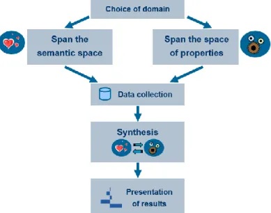
A model to carry on a KE study on a product can be divided in several steps:
In the first place, the product to be analyzed has to be described, as well as the people to whom it is addressed and the market situation.
Secondly, the semantic space has to be defined. This means collecting words that can describe emotionally the product. The initial amount of words (normally relatively large) is then reduced, containing what is called the kansei words.
After that, it is necessary to define the space of product properties. Some design attributes are chosen, and several possible values are considered for each attribute. Prototypes (the products for the KE study) are then built (either physically or in a graphical representation)
Data is then collected, normally asking a group of people using questionnaires. In the synthesis stage, statistical methodologies are used to relate the space of
properties to the semantic space. For every kansei word, product properties that affect it are found.
Results are then presented in a visual manner, easily palatable for designers and technicians with no statistical skills.
Next sections of this chapter will provide a practical example of a kansei engineering model. Each of the steps shown in Figure 1 will be clarified using a real kansei study example (the kansei study done in Lluís Marco’s thesis [1]).
2.2.1.
Choice of domain
Choosing the domain obviously includes deciding which product is the protagonist of the study. In this example, the chosen product for the KE study are fruit juices, and specifically its presentation just before being drunk. But this is not the only task, it also requires:
Defining the target group to which the product is addressed. The example had a rather heterogeneous scope: from 24 participants, there were 13 women and 11 men, with ages ranging from 17 to 59, and different educational levels (from high school to post-graduate studies).
Defining the kind of presentation for the product. Photographs were employed to gather the ratings on several kansei words. It was thought it would be enough since the interest was in the visual impression, but one could argue that this only gives a
12 Report
narrow affective channel, as no smell or taste is involved.
Defining the context for presentation. The atmosphere of the place where the experiment is conducted can have an effect on the emotions elicited by the product, but in this case this fact was not considered, and probably presenting photographs makes the study more robust to potential effects derived by the context of presentation.
2.2.2.
Span of the semantic space
Explained briefly, spanning the semantic space means choosing which kansei words are going to be used in the study. That is the same as finding the exact words to express the emotions to be observed, which is not always an easy task. It comprises three steps:
1. Setting an initial list of kansei words. In the juices experiment the 134 words shown in Table 3 were proposed. These words constitute the initial semantic space.
2. Reducing the initial list of kansei words. First, an affinity diagram was used to group kansei words. Each word was written on a yellow post-it, which was grouped with all words similar in meaning obtaining 33 groups. Each group was then labeled choosing the most representative word in the group. This word was written on a blue post-it and again, groups were made with all blue post-its to further reduce the number of words, and a representative word was chosen for each group and written on a pink post-it. The initial semantic space was reduced to only 14 words. Later, a cluster analysis was conducted to decide on the final kansei words. This required the collection of data, and 6 people were asked to give a rating for 4 juices on the 33 kansei words obtained. A k-means clustering was then performed to modify the groups obtained with the blue post-its. Finally one word from each of the final clusters was chosen to name the cluster.
3. Proposing the final reduced list of kansei words, which in the study were: refreshing, healthy, exotic, seductive, natural, relaxing and tasty.
Table 3. Original list of kansei words in Catalan and English.
Catalan English Catalan English Catalan English
àcid acidic excel·lent excellent refrescant refreshing divertit amusing excitant exciting regenerador regenerative antiestresant anti-stressing exòtic exotic enfortidor reinforcing antifatiga anti-fatigue explosiu explosive relaxant relaxing antioxidant antioxidant exquisit exquisite remineralitzant remineralising aphrodisiac aphrodisiac fabulós fabulous renovador renovative atraient appealing fashion fashionable reconstituent restorative aperitiu appetizer festiu festive restaurador restorer aromatic aromatic fibrós fibrous revitalitzant revitalizing artificial artificial vistós flamboyant ric en ferro rich in iron astringent astringent floral flowery romàntic romantic atractiu attractive espumós foamy saludable salutary dolent bad fresc fresh saciant satiable equilibrat balanced futurista futuristic saborós savory beneficiós benefical golós gluttonous seductor seductive amarg bitter bo good sensual sensual tonificant bracing gratificant gratifying sedós silky genial brilliant sa healthy senzill simple calmant calming casolà home-made aprimant slimming caribeny caribbean ideal ideal suau soft nadalenc christmas spirit infantil infantile sofisticat sophisticated clàssic classical intens intense agre sour fred cold vigoritzant invigorating picant spicy colorit colorful irresistible irresistible estimulant stimulating combinable combinable sucós juicy reforçant strengthening còmode comfortable juvenil youthful fort strong concentrat concentrated laxant laxative substitutiu substitutive consistent consistent lleuger light sabor subtil subtle taste corpulent corpulent luxós luxurious ensucrat sugary cremós creamy madur mature estiuenc summery curatiu curative embafador mawkish dolç sweet refinat dainty mediocre mediocre silvestre sylvan decorat decorated hidratant moisturizing gustós tasty profund deep natural natural temptador tempting delicat delicate bonic nice tropical tropical deliciós delicious nutritiu nutritional lleig ugly espès dense apassionat passionate vellutat velvety desintoxicant detoxifying agradable pleasant versàtil versatile digestiu digestive popular popular vibrant vibrant diürètic diuretic potent powerful vital vital diví divine preventiu preventative vitamínic vitamin-rich sec dry proteic protein-rich càlid warm fàcil de digerir easy to digest pur pure salvatge wild energetic energetic depuratiu purifying amb alcohol with alcohol erotic erotic fi refined
14 Report
2.2.3.
Span of the space of properties
The space of properties lists the physical properties of the product that can have an effect in the elected kansei words. It is similar to choosing factors in a design of experiments. In an experiment conducted in an industrial environment, previous knowledge from the process is used to select the variables (factors) that are more prone to have an effect in the response.
The values that those factors take in the experiment are also carefully chosen to maximize the probability of detecting the factors’ effects, if these effects really exist. In this context, each value a factor takes in the experiment is called a level. It comprises the following steps:
1. Making a list of all possible physical product properties and selecting the ones that apparently have the largest impact in the users. In the juices example, a brainstorming session was conducted to produce as many factors as possible for juices and the properties that could impact in the visual perception of the juices. The ones that were easy to modify when taking the photographs were selected, shown in Table 4.
Table 4. Factors and levels in the juices experiment.
Factor Levels Straw Yes No Decoration Yes No Ice Yes No Container Glass Goblet Color Yellow Orange
2. Preparing the design matrix, a matrix that defines how many products will be used for the experiment, and establishes the level of each factor for each one of the products. In the juice experiment, the prototypes were prepared according to the design matrix (in other studies only already existing products are used). The design matrix (Table 5)
is a 2 5-1 factorial design, which has resolution V. This means that main effects are
confounded with interactions of order four and higher, which are normally not relevant.
Table 5. Design matrix for the fruit juice experiment
Straw Decoration Ice Container Color
1 No No No Glass Orange
2 Yes No No Glass Yellow
3 No Yes No Glass Yellow
4 Yes Yes No Glass Orange
5 No No Yes Glass Yellow
6 Yes No Yes Glass Orange
7 No Yes Yes Glass Orange
8 Yes Yes Yes Glass Yellow
9 No No No Goblet Yellow
10 Yes No No Goblet Orange
11 No Yes No Goblet Orange
12 Yes Yes No Goblet Yellow
13 No No Yes Goblet Orange
14 Yes No Yes Goblet Yellow
15 No Yes Yes Goblet Yellow
16 Yes Yes Yes Goblet Orange
3. Selecting the products (or producing product prototypes) according to the design matrix. The photos in Figure 2 were created.
16 Report
2.2.4.
Data collection
The data collection phase is very important in a KE study, because if it is not done properly, the results obtained will give false interpretations. For this reason, time needed to complete the survey must be short, in order to maintain the focus of the participants. This can only be achieved by having a maximum number of prototypes scored by each participant
Before starting the actual data collection, a definition of each kansei word was given. This has the problem of rationalizing the procedure even more, but is better than discovering that some words were unclear when data collection is over.
To collect the data, there are two main options: each participant is presented with a product and rates it on all the kansei words or each participant is presented with a kansei word and rates all products on it. The first option was elected for the juices example, because the respondent can concentrate better on the product.
After randomizing all products and words, a three dimensional matrix of data was obtained (Figure 3). Usually, this matrix is collapsed following the grey arrow: the subjects’ dimension is lost, and the average for all participants on each stimulus and kansei word is used. However, this is not what we will do in our application, where the idea will be using the raw data coming from each participant, and including the participant as a random factor in a regression model.
2.2.5.
Synthesis and presentation of results
All steps viewed until now were in fact beyond the scope of this work, and were presented to give the full view of a kansei engineering study. The App will just perform the two final steps, the synthesis and the presentation of results. As it has already been stated in the scope of the project, the main target of this project is only the presentation of results. Regarding the synthesis stage, there are lots of studies that try to determinate the best statistical methods to be used to obtain results from the raw data. Anyway, all methods have the same objective: knowing which factors affect each word and give a quantitative measure of how much. Furthermore, in almost all experiments all methods lead to similar results and conclusions.
Since it is not the goal of the project to find the best model, the ones proposed by Lluís Marco in his thesis [1] will be used (or minor modifications of those proposals), except in the creation of a multicriteria optimization, that was not included there and is going to be developed entirely. Section 3.3 explains how all the statistical models work out.
So, as it has already been repeated, the presentation of the results will be the focus of this thesis, being indeed everything that will be seen in the App. Chapter 3 (except section 3.3) is included later to explain how the results should be displayed and the arrangement in the App’s layout. Chapters 4 and 5 also refer to the App, but from the programming perspective.
3.
Design of the application and statistical methods
This chapter will go through the conception and design of the application. At first, the general philosophy will be stated, collecting what guidelines should follow the App. Afterwards a mock-up of the App will be proposed. Finally, a section about statistical tools used in the App is included.
3.1.
General philosophy and functions of the App
This App must follow what have already been said in the objectives, mainly in the specific ones. There are three main issues that should be accomplished:
Interactive App: Users must perceive it and be able to exploit it. To achieve this, the App must have real time updates. Everything in the App must show always the results obtained with the current selected inputs, with no need of clicking on any refresh button. Other interactive tools should be used, to reinforce this idea in the users: tooltips that display extra information, possibility to select or deselect parts in the plots, and many inputs to play with.
Sequential workflow: The way to use the App is going to be sequential, step by step. That means having a specially designed layout that shows the user the order to follow, but that also allows him or her to go back to any of the previous steps, or even to jump forward if he wishes. Moreover, changes on each of the steps must affect all the other ones (for example, if the user decides to stratify by gender, everything must be changed according to that). The different steps must have memory, that is, they do not reinitialize every time the user goes through them.
Easy to interpret results: Conclusions must be clearly obtained from the displayed visualizations, which must have straightforward interpretations that cannot be misleading. All technical complexities are transparent to the user: though the results sometimes come from sophisticated statistical algorithms, the user does not need to know these details. The interface must be user-friendly, which means that everything is well organised and that styles used
20 Report
are appealing, in other words, it looks nice.
After describing the general properties of the App, it is time to decide its functions and how these are going to be implemented and grouped. Below there is a list of everything that the App should perform (calculate or display):
Acquire data
Calculate and display design matrix and confusion indexes Give a summary of the data
Show participants’ information
Calculate and display significant factors Calculate and display possible outliers Exclude desired participants
Calculate and display the influence of the factors for each kansei word Enable to weight desired responses
Calculate and display the best factor combinations Compare results with manual entries
Provide stratification options Provide security level options
Any other minor functions can be included into the previous ones, and the ones that do not appear in the list will not be implemented. The next step is to group or split all these functions, decide where they are going to be visualized in the app, if something must appear twice…
3.2.
Wireframe of the application
As it has already been said, the App will consist in steps allowing a sequential usage. In this section a mock-up of each one of the steps, which are going to be panels, will be explained. This means defining which functions are going to be implemented, how they are going to be arranged, and which are the best plots or other visualisations to show the results.
Apart from what is going to be shown in the wireframe, there should be a place in each panel for extra options. One is the possibility to stratify by gender, age or any other factor stored in the loaded data. The other extra option could be a ”security” indicator, which would change the results obtained by being more or less strict when detecting significant factors. This is the
same as changing the significance level in the statistical tests.
3.2.1.
First step, Data
In this panel (Figure 4) there must be some input that enables uploading data, the one that will be used for the analysis. It must have a specific format. When this data is loaded, some initial basic information appears: a summary of participants, including its number for each stratification options, and also information that indicates how good the data provided is. To do that, information about the confusion among factors is given, and it is proposed to do so in two ways: a matrix that relates them in pairs, and a global indicator. Following the kansei juices experiment, a bad global indicator would mean that the prototypes showed were too similar to each other, so it could not be determined which the real factors that affect the response are. If a cell in the matrix showed a bad index, it would mean that those factors would be very confused, revealing for example that the effect produced by having a straw could not be distinguished from the one produced by having ice. The calculation of the confusion values is explained in section 3.3.1.
22 Report
3.2.2.
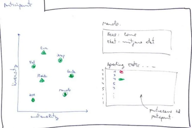
Second step, participants
This is a panel (Figure 5) conceived to allow the user to obtain the raw data in order to examine any specific participant. In the proposed design, this can be easily done by just clicking the corresponding dot in the scatterplot, which will result in a summary of the participant plus a table with all his or her scores.
But this scatterplot with the participants provides further information. The X axis, emotionality, shows the average of the punctuations given, which is a measure of how “emotional” the participants are (high emotionality indicates that the participant gave mainly high scores). On the other hand, the Y axis, called diversity, represents the variety in the scores: for example, a low diversity would mean that the participant gave the same scores to almost all prototypes. Finally, some dots will have a different shape, those are participants detected as outliers, which means that they scored very rare (in a very different way from the rest of participants) and for this reason including them in the study could give misleading results. The algorithm for automatically detecting outliers is detailed in section 3.3.2.
3.2.3.
Third step, Summary
In this panel (Figure 6) there will be two plots. The one on the left will be the same as the previous scatterplot, and the one on the right will be a summary of the results. This last one will be some kind of matrix (heatmap) with axis that are going to represent the kansei words and the factors. If a cell is coloured, that will mean that the corresponding factor affects the kansei word, the response. There should be some colour intensity that indicates the importance of each factor in each kansei word, giving an idea of which factors affect the most and the less for each word. The calculation of the results for the plot on the right is explained in section 3.3.3.
Figure 6. Wireframe of the third step, a summary of the results
3.2.4.
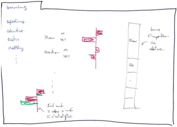
Fourth step, learning
The aim of this panel (Figure 7) is to provide a more exhaustive analysis of the results already seen in the previous step. There will be a tab panel, where each tab will correspond to a kansei word. In each of these tabs, there will be two plots. One will show the variation produced in the response by changing the levels for each factor. Obviously only the factors that in the previous panel where stated as significant will have a repercussion here. The second plot will display the relative importance of each factor for each kansei word. This information has
24 Report
already been given in the previous step with the colour intensity in the heatmap, but here it can be presented with more precision, and in a graphical manner.
Figure 7. Wireframe of the fourth step, an analysis
3.2.5.
Fifth step, optimizing
This is going to be the final panel (Figure 8), and also the one that summarizes everything to give a final and clear result that can be useful for the user to design a new product. The idea is to have one input for each kansei word which will be changed to give each of them the desired importance in comparison with the other words. Then, the optimization will be calculated (details are offered in section 3.3.4 ) and the best factor combinations will be displayed.
The 3 best options will be shown in a radar plot, which will enable an easy comparison to see the strengths and weak points of each proposed solution. It is important to remark that the suggested prototypes may be a combination of factor levels that have never been created or shown to the participants. This panel could have a further option (or maybe it could be implemented with a new panel) that would ask the user to manually enter a factor level combination, and show that new prototype in the radar plot next to the best ones.
Figure 8. Wireframe of the fifth step, optimization
3.3.
Statistical methods used in the application
3.3.1.
Assessment of confusion in the design matrix
Here the statistical method to find the confusion indexes required for 3.2.1 is going to be explained. First, an index that will relate factors one by one will be obtained, and afterwards a global indicator.
The first index will go from 0 (two columns in the design matrix have the same sequence of levels, the main effects of those two factors are totally confounded, this is the worst situation), to 1 (levels are all different in the design matrix, they are completely independent, the best situation). Values in between will give an idea of how far the design is from that extreme situations.
It will be computed using Cramer's V [2], a statistic that measures the strength of association between two nominal variables in a contingency table. It is named after the Swedish mathematician Harald Cramér.
26 Report
Suppose 𝑋 and 𝑌 are two factors. 𝑋 has 𝑀 different levels, labeled 𝑋1, … , 𝑋𝑀. 𝑌 has 𝑁
different levels, labeled 𝑌1, … , 𝑌𝑁. 𝑋 and 𝑌 can be arranged as a contingency table, as shown in Figure 9.
Figure 9. A contingency table with factors X and Y
In this contingency table, cell (𝑖, 𝑗) contains the count 𝑛𝑖𝑗 of occurrences of level 𝑋𝑖 in 𝑋 and
level 𝑌𝑗 in 𝑌. 𝑛 is the total number of pairs that can be done, and 𝑛 = ∑ 𝑛𝑖𝑗.
The chi-squared statistic 𝜒2 can be computed from this contingency table. Then, Cramer's V is defined as:
𝑉 = √ 𝜒
2
𝑛 𝑚𝑖𝑛(𝑀 − 1, 𝑁 − 1)
In a design matrix with 𝑟 factors, there are 𝑘 = (𝑟
2) pairs of factors. For each of these pairs of
factors 𝑝𝑓𝑖, with 𝑖 = 1, … , 𝑘, its correlation 𝑉𝑝𝑓𝑖 (by means of its Cramer's V statistic) can be
computed. In fact, what is going to be shown in the matrix that relate factors by pairs is the complimentary of 𝑉𝑝𝑓𝑖, which will be named 𝑀𝑝𝑓𝑖:
𝑀𝑝𝑓𝑖 = (1 − 𝑉𝑝𝑓𝑖)
Finally, a global index is computed, to have a general indicator that take into account the index of all factors’ pairs, the global independence coefficient (GIC). This GIC is the complementary of the geometric mean of the Cramer's V correlation coefficient of all pairs of factors.
𝐺𝐼𝐶 = ( 1 − √∏ 𝑉𝑝𝑓𝑖 𝑘 𝑖=1 𝑘 ) · 100
The geometric is suitable in this case, because if only one pair of factors are completely correlated, the GIC will give a value of 0% (meaning the structure of the design matrix is completely unsuitable).
3.3.2.
Automatic detection of outliers
Simply looking at the data, it is sometimes possible to detect participants in a KE study who give ratings in a weird way, but the multidimensional nature of KE data (several participants rate different stimuli on a number of kansei words) makes the manual detection of outliers an almost impossible task.
Although studies with large number of participants are quite robust to the presence of outliers, many KE studies are done with few participants. Therefore an automatic detection of outliers is necessary to avoid them, since they often change the results in the synthesis phase. Excluding outliers can give protection from reaching wrong conclusions.
The method to detect outliers will be based on what is explained in H. R. Álvarez doctoral thesis [3], which is about detecting outliers in KE studies. This work presents a methodology based on robust principal component analysis and distinguish to phases.
- Detecting outliers in the so-called simple kansei tables (only considering one response, one kansei word).
- Detecting outliers in the so-called multiple kansei tables (considering all responses, all kansei words, at the same time).
Detecting outliers in these simple kansei tables can be done using the ROBPCA algorithm proposed by Hubert and Rousseeuw [4]. ROBPCA stands for Robust Principal Component Analysis. Although this method require working with continuous variables and data from KE studies is usually ordinal, the procedure can be safely used when using the common 7-point scale response. ROBPCA purpose is twofold: it allows the calculation of principal components resistant to outliers and it gives a diagnostic plot that allows the detection of outliers.
The details of the ROBPCA algorithm are complicated, but the procedure can be summarized in three steps. Consider 𝑛 subjects rate 𝑚 stimuli on a kansei word. A simple kansei table 𝑿 = {𝑥𝑖𝑗}, with 𝑖 = 1, … , 𝑛 and 𝑗 = 1, … , 𝑚 can be created (the rows are subjects and the columns are stimuli). 𝑥𝑖𝑗 is the rating given by participant 𝑖 to stimuli 𝑗:
1. The data is preprocessed by reducing their space to the subspace spanned by the 𝑛
28 Report
The transformed data are then lying in a subspace with a dimension that is, at most,
𝑛 − 1.
2. A measure of outlyingness is calculated for each data point: the data points are projected on many univariate directions, each time the univariate estimator of location and scale is computed and the standardized distance to the center is measured. The largest of these distances is the outlyingness measure of that data point. The data points with smallest outlyingness measures are used to compute a preliminary covariance matrix 𝑺0. This covariance matrix 𝑺0 is used for selecting the number of components 𝑝 that will be retained.
3. The data points are finally projected on the 𝑝-dimensional subspace where their location and scatter matrix are robustly estimated.
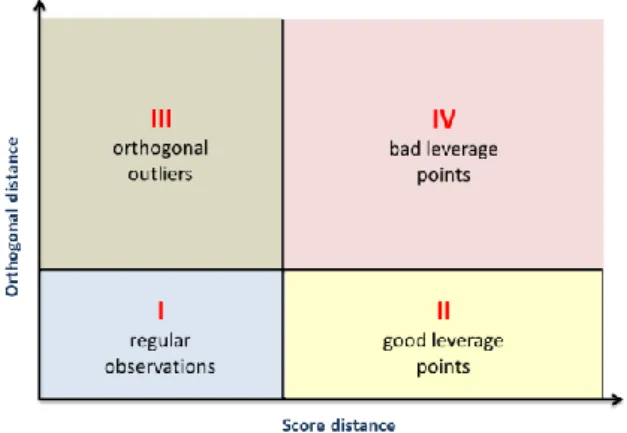
Figure 10. 3-dimensional dataset projected on a robust 2-dimensional PCA subspace
An extremely useful output from a ROBPCA is the diagnostic plot. The diagnostic plot allows the detection of outliers and the determination of its type. Consider the graph in Figure 10, where 𝑚 = 3 and 𝑝 = 2. Four types of observations can be described:
- Regular observations: they form a homogenous group close to the PCA subspace.
- Good leverage points: they fall close to the PCA subspace, but far from the regular observations (points 1 and 4 in Figure 10).
- Orthogonal outliers: they have a large orthogonal distance to the PCA subspace, but cannot be detected as outliers if we just look at their projection on the PCA subspace (point 5 in Figure 10).
- Bad leverage points: they have a large orthogonal distance and its projection on the PCA subspace is far from the typical projections (points 2 and 3 in Figure 10).
axis shows a robust score distance and the vertical axis shows an orthogonal distance. To classify the observations, two lines are drawn that divide the plot in four quadrants.
Figure 11. The diagnostic plot for detecting outliers according to the ROBPCA method
The diagnostic plot can then be used to detect participants in a kansei engineering study that give ratings on a kansei word in a manner very different from the others.
Although it could be possible to detect outlier participants for each kansei word, it would be interesting having a procedure to detect which participants can be flagged as outliers considering all kansei words at the same time. This is done using a multiple kansei table. The multiple kansei table is created juxtaposing 𝑚 tables (one for each stimuli in the study). Each table has 𝑛 rows (participants) and 𝑟 columns (kansei words). Its structure is shown in Figure 12.
Figure 12. Structure of a multiple kansei table.
The method for detecting global outliers combines a multiple factor analysis like the one explained by Escofier and Pagès [5], and the ROBPCA method. Data in the multiple kansei table is centered (columns’ means are subtracted to each element) before starting. These are the two steps of the procedure:
30 Report
1. The multiple kansei table is treated as in a multiple factor analysis. A subtable could have a contribution in the first factorial axis much higher than the others. To avoid this, they should be weighted. This is done through a principal component analysis (with all observations, including outliers) in each subtable. They are then “normalized” by dividing all its elements by the square root of the first eigenvalue from its PCA:
(1 √𝜆11 ⁄ 𝑋1 | … | 1 √𝜆1𝑘 ⁄ 𝑋𝑘 | … | 1⁄√𝜆1𝑟 𝑋𝑟)
2. A ROBPCA is applied to the weighted juxtaposed table. This new table is considered as a simple table with 𝑛 rows and 𝑚 + 𝑚 + ⋯ + 𝑚 = 𝑚 · 𝑟 columns. The diagnostic plot from ROBPCA allows then the detection of global outliers.
Following all that has been explained in this section, the outliers can be detected. However, it is not always recommendable to exclude them directly. It should be seen how much they change the results. Maybe it could be interesting to know more about those participants to take a better decision. This is why this App will detect outliers, but will give the opportunity to include them back to the study at the user needs.
3.3.3.
Mixed effects regression analysis for the synthesis phase
In statistics, regression analysis can be used to model the relationship between a dependent variable and one or more independent variables. In a kansei engineering study, each kansei word acts as a response, whereas each factor is an independent variable. All the well-known techniques from regression analysis can be used for facing the synthesis phase of the study. So the aim in the synthesis phase is estimating the main effects of all factors for each one of the kansei words. The particularity in kansei studies is that the independent variables are categorical factors (having two or more levels), and not quantitative. So all factors must be translated into dummy variables to perform the regression [6].
Dummy variables are built in the following way:
𝛿𝑖(𝑗𝑘)= {
1, if product i has category k in item j
0, otherwise
i = 1, ..., n (with n the number of prototypes) j = 1, ..., R (with R the number of factors)
As an example, we can imagine we have a kansei study with only one kansei word, the word colourful. The prototypes are T-shirts, and the design matrix is the one shown in Table 6.
Table 6. Design matrix and responses for the T-shirts example
Color Sleeves Printing Carla Joan Marc Maria MEAN
1 Red Long Picture 5 6 7 5 5.75 1
2 White Long Picture 3 4 5 3 3.75 2
3 Red Short Picture 7 4 5 6 5.50 3
4 White Short Picture 4 4 4 3 3.75 4
5 Red Long Plain 1 4 5 1 2.75 5
6 White Long Plain 1 3 2 1 1.75 6
7 Red Short Plain 4 5 5 2 4.00 7
8 White Short Plain 2 4 5 1 3.00 8
9 Red Long Text 5 6 6 4 5.25 9
10 White Long Text 1 2 5 1 2.25 10
11 Red Short Text 5 6 7 4 5.50 11
12 White Short Text 2 4 3 2 2.75 12
For this example, the response will be the mean of the ratings given by all 4 participants in the study. The following nomenclature will be used to represent each factor level:
𝑥1: Color: 𝑥11 = white; 𝑥12 = red.
𝑥2: Sleeves: 𝑥21 = long-sleeved; 𝑥22 = short-sleeved.
𝑥3: Printing: 𝑥31 = picture; 𝑥32 = plain; 𝑥33 = text. The design matrix with dummy variables can be seen in Table 7.
Table 7. Design matrix for the T-shirts example with dummy variables
Color Sleeves Printing Red x11 White x12 Long x21 Short x22 Picture x31 Plain x32 Text x33 MEAN 1 Red Long Picture 1 0 1 0 1 0 0 5.75 2 White Long Picture 0 1 1 0 1 0 0 3.75 3 Red Short Picture 1 0 0 1 1 0 0 5.50 4 White Short Picture 0 1 0 1 1 0 0 3.75 5 Red Long Plain 1 0 1 0 0 1 0 2.75 6 White Long Plain 0 1 1 0 0 1 0 1.75 7 Red Short Plain 1 0 0 1 0 1 0 4.00 8 White Short Plain 0 1 0 1 0 1 0 3.00
9 Red Long Text 1 0 1 0 0 0 1 5.25
10 White Long Text 0 1 1 0 0 0 1 2.25 11 Red Short Text 1 0 0 1 0 0 1 5.50 12 White Short Text 0 1 0 1 0 0 1 2.75
32 Report
If a linear regression analysis if performed with this dataset, the equation will not have all levels for each factor. One level for each factor will be missing, as this level acts as a reference level. For instance, the regression equation coming from the T-shirts example is the following:
𝑌̂ = 3.2292 + 1.9167 𝑥11− 0.5000 𝑥21+ 0.7500 𝑥31− 1.0625 𝑥32
This equation is obviously the same as this one, which makes the reference levels for each factor explicit:
𝑌̂ = 3.2292 + 1.9167 𝑥11+ 0 𝑥12− 0.5000 𝑥21+ 0 𝑥22+ 0.7500 𝑥31− 1.0625 𝑥32
+ 0 𝑥33
Although having reference levels is something common in regression, it makes interpretation of results somewhat more complex to people not accustomed to it.
Quantification theory type I (QT1) is a variation of linear regression analysis first proposed by Chikio Hayashi [7], with the aim of facilitating the interpretation of results from a regression analysis with categorical variables.
The idea behind QT1 is having a regression equation that has the mean of the response as the constant, and coefficients for all the levels of the factors in the equation (no reference level). This coefficients are called, in the context of QT1, category scores (CS). So, in the T-shirts example, the final equation should have this form:
𝑌̂ = 𝑏0′ + 𝑏11′ 𝑥11+ 𝑏12′ 𝑥12+ 𝑏21′ 𝑥21+ 𝑏22′ 𝑥22+ 𝑏31′𝑥31+ 𝑏32′ 𝑥32+ 𝑏33′ 𝑥33
How are these CS computed? One should work factor by factor. Consider factor j. The coefficients in the transformed regression are calculated from the following equation:
𝑏𝑗𝑘′ = 𝑏𝑗𝑘+ 𝑄𝑗
𝑄𝑗 is calculated from the formula:
∑ 𝑃𝑘(𝑏𝑗𝑘+ 𝑄𝑗) = 0
𝐶𝑗
𝑘=1
Each factor j will have a different 𝑄𝑗 constant. 𝑃𝑘 is the proportion of appearance of level k
An example focusing on the item Printing (j=3) from the T-shirts example will illustrate the procedure. The item Printing has 3 categories (Picture, Plain and Text). The coefficients in the transformed regression are calculated from the following equation:
𝑏3𝑘′ = 𝑏3𝑘+ 𝑄3
Where 𝑄3 is a constant computed from:
0.333(0.7500 + 𝑄3) + 0.333(−1.0625 + 𝑄3) + 0.333(0 + 𝑄3) = 0 ⇒ 𝑄3 = 0.1042
Table 8 summarizes all calculations for the factor Printing:
Table 8. Calculation of category scores for factor Printing in the T-shirts example
Category Coefficients in original regression
Proportion in
design matrix Coefficients in transformed regression Picture (𝑥31) 𝑏31 = 0.7500 4/12 = 0.333 𝑏31′ = 0.7500 + 0.1042 = 0.8542
Plain (𝑥32) 𝑏32 = -1.0625 4/12 = 0.333 𝑏32′ = –1.0625 + 0.1042 = –0.9583
Text (𝑥33) 𝑏33 = 0 4/12 = 0.333 𝑏33′ = 0 + 0.1042 = 0.1042
The final transformed equation for the T-shirts example is:
𝑌̂ = 3.8333 + 0.9583 𝑥11− 0.9583 𝑥12− 0.2500 𝑥21+ 0.2500 𝑥22+ 0.8542 𝑥31
− 0.9583 𝑥32+ 0.1042 𝑥33
The great advantage of QT1 is that it allows a graphical representation of the results very easy to interpret (Figure 13).
Figure 13. Representation of the category scores in the T-shirts example
The App uses an improved version of the QT1 algorithm that takes into account the following issues:
1. The response is not summarized with the mean of all participants. On the contrary, each participant raw rating is used (although ratings from 1 to 7, the most common
34 Report
scale used in kansei engineering studies, are obviously not continuous, they can be directly used as the response with no further consequences). However, the participant is introduced in the regression model as a random effect. The reason for doing this is that each participant represents a cluster in the data, and analyzing all the ratings without introducing the participant as a random effect will clearly violate the assumptions of the linear regression. Furthermore, the variability among participants is correctly extracted when considering participants as a random effect.
2. A global p-value is computed for each one of the factors in the regression analysis, based on the common likelihood ratio used in statistics. In this way, we can determine if a factor is significant or not with respect to a certain significance level (the default in the App is 0,05, called medium safety level). When a factor is not significant, its category scores are set to 0, in order to give the correct impression that the factor has no effect in that kansei word.
The tab analysis of the App exploits the results from this QT1 analysis for each kansei word in detail.
3.3.4.
Multicriteria optimization to detect the best prototypes
In this section the model for optimizing the response will be explained. A multicriteria optimization method will be required, where each of the responses (each word of each stratification level) will have a different weight but also a direction (minimize or maximize). Before going deeper into this topic, it is important to say that the results of a kansei experiment are not as exact as the ones obtained in an experiment in the industry, where responses are measured and not scored subjectively by people. This is the reason why the exact implementation of this optimization model is not as important as in other cases, and only a gross indicator that takes into account the provided weights will be enough. Following this premise, the clearer and simpler methods will be employed, to provide a better understanding of the code and lower computation times.
After some research, the desirability functions are selected, which were first introduced by Harrington [8] and have the functional forms described by Derringer and Suich [9] shown in Figure 14. It is a very widespread method in design of experiments, robust and easy to use.
Using the formulas in Figure 14 for this application, each of the kansei words response will become a desirability function d, that will give an idea of how far is that response from the best one, the target. The one on the left is to be used when maximizing, and the one on the right for minimizing. Variables are obtained as following:
𝑌̂𝑖 : It is a response for each kansei word and for each prototype. It is calculated as the “mean” for that word plus the scores of its factors levels.
𝐿𝑖 : Is the lower limit, the minimum possible punctuation, usually 1.
𝑈𝑖 : Is the upper limit, the minimum possible punctuation, usually 7.
𝑇𝑖 : Is the target value. When maximizing it is going to be equal to 𝑈𝑖 and to 𝐿𝑖 when
minimizing.
s : It is an exponent that can be set to different values, producing the effect seen in Figure 15. This variable could be changed to give more importance to values that are closer to the target, for example. Long discussion could be hold to determinate its value, but as it has already been said, this project only aims to get a simple approach. For this reason the linear desirability function will be employed, with s=1.
Figure 14. Desirability functions. Left to maximize and right to minimize
36 Report
Although the desirability functions in Figure 14 are generally defined by parts, in this particular use only the central definition will be employed, because it is always true that:
𝐿𝑖 < 𝑌̂𝑖 < 𝑈𝑖 and 𝐿𝑖 < 𝑇𝑖 < 𝑈𝑖
The app will also allow to weight the different kansei words, so each desirability function must also contain that information. The weights used for each kansei word are captured with the
𝑊𝑖 values. Afterwards some “mean” must be performed with all desirability functions for each prototype. All this is done with the formula in Figure 16, obtaining one D function for each prototype. Finally, all the D functions are compared, and the best ones will be the best and optimized prototypes. The value of D itself, can be seen as a percentage of how good that prototype is in front of the best possible one.
Figure 16. Formula for the D function
One last important thing to consider is what happens if the user stratifies for example by gender. Then, a d function will be obtained for each prototype and kansei word, but now also for each level. Again all those functions will be weighted and grouped by prototype in the formula already seen in Figure 16. For example, when only a d function for the word refreshing of the prototype number one was to be computed without a stratification, after stratifying by gender there will be two d functions instead, one for men and one for woman.
4.
Programming tools
This chapter is a brief explanation of the R Programming Language characteristics and its extensions used for this project.
4.1.
R Programming language
R [10] is an open source programming language and software environment for statistical computing and graphics. It is an interpreted language and also highly object-oriented, this last as a consequence of being an evolution of the S language.
The R language (Figure 17) is widely used in the data science field for developing statistical software and data analysis, because it can implement a wide variety of statistical and graphical techniques, including linear and nonlinear modelling, classical statistical tests, time-series analysis, classification, clustering, and many others. One of the main differences it has with other languages is its capability of showing a wide range of user configurable graphics in a very professional way.
R is easily extensible through functions and extensions, which are called packages. The R community is noted to be very active, and now there are packages for lots of specific uses. Packages can be easily obtained downloading them through an online repository named CRAN. Many of R's standard functions and packages are written in R itself, which makes it easy for users to follow the algorithmic choices made, but other languages as C, C++, Fortran, Java or Python can be used for a more advance control (and sometimes faster executions).
Another big difference that R holds is the implementation of data frames, an object specially designed for statistical analysis. Data frames are used for storing data tables, being a list of vectors of equal length. The top line of the table, called the header, contains the column names and each horizontal line afterward denotes a data row, which begins with the name of the row, and then followed by the actual data. Each data member of a row is called a cell. This concept, similar to a matrix, enables an easy access to the data that allows a flexible subsetting in multiple ways by indexes or names.
38 Report
Finally, there are different integrated development environments (IDE) for R that provide the users an interface to program more efficiently. The most commonly used, Rstudio [11], includes a console, syntax-highlighting editor that supports direct code execution, integrated R help and documentation as well as tools for plotting, history, debugging and workspace management. It really makes programming in R much easier and it has been a key for its success.
4.2.
Shiny
Shiny [12] is a package that creates an interactive App from R. To achieve that, Shiny generates the necessary HTML, CSS and JavaScript code (Figure 18) producing in this way a whole website. Thus, the Shiny user does not need to know anything about web programming, although it can help him or her to implement advanced features.
Shiny applications have always both inputs, which users can set and change, and outputs, that change interactively according to the inputs’ state.
As inputs, Shiny already provides a wide range of widgets including sliders, radio buttons, check boxes, text, file uploaders, action buttons, dates and select boxes. It also provides different layouts, so tabs and navigation menus can be implemented.
The outputs can be anything R alone could output, like tables, plots or plain text. However, more and more packages are appearing which extend the range of possible outputs. Some of them, called wrappers, make JavaScript implementations work in R, achieving that now the user can also interact with the outputs (for example, selecting a point in a plot), converting outputs in inputs as well.
An example of a very simple Shiny App is shown in Figure 19 . There is just one input, a slider that controls the number of observations. There is also just one output, a plot of a histogram that automatically changes to match always the number of observations set in the input.
Figure 19. Example of a Shiny App
Furthermore, if the programmer has knowledge of HTML, CSS and JavaScript, he will also be able to customize all these inputs and outputs, or even to create new ones. When this happens, the new output or input is normally wrapped in a package that anyone will be able to use, and this way Shiny is growing more and more.
Shiny applications have two main components: a user-interface definition and a server script. The first one is a function named ui that contains the layout of the page, saying which elements (menus, panels, inputs and outputs) the App will contain and where they are going to be placed. The second one, a function named server, contains the code with the logic that computes what need to be outputted according to the state of the inputs. Those two functions can be in one file called App, or in two .r files.
40 Report
4.2.1.
Reactivity
As said by Joe Cheng [13], this is the heart feature of Shiny, the one that allows its interactivity. As a rule, code in R executes just once (except from loops), but this way detecting when an input is changed would be impossible. A new conception is needed, which will make some parts of the code to recalculate when inputs are changed: that is exactly what reactivity offers. That implies that any part of the server code which needs to rerun due to interaction, will have to be within a reactive object.
What is interesting about reactive objects is that whenever they execute, they automatically keep track of what reactive objects they read. If those “dependencies” become out of date, then they know that their own return value has also become out of date. Then the reactive object will recalculate and update its return value, and this will automatically instruct all reactive objects that depended on that value to re-execute.
The simplest structure (Figure 20) involves just a source (typically a user input, for example a slider) and an endpoint (something that appears, such as a plot or a table of values):
Figure 20. Representation of a reactive source and endpoint
When the source changes, the output invalidates. Once the source is again ready, the endpoint detects it and reruns to produce an updated output.
Just with reactive sources and reactive endpoints, only the simplest examples could be implemented. For more complex Apps, it is necessary to put reactive components in between the sources and endpoints. These components are called reactive conductors.
A conductor can both be a dependent and have dependents, it can be both a parent and a child. Sources can only be parents (they can have dependents), and endpoints can only be children (they can be dependents) in the reactive graph (Figure 21). Reactive conductors can be useful to encapsulate computationally expensive operations that are used more than once. As many conductors as necessary can be created to bind one endpoint with the sources.
Figure 21. Reactive representation with a reactive conductor
Shiny has one class of objects for reactive sources (reactive values), one for reactive conductors (reactive expressions, which always return a value), and one for reactive endpoints (observers, which can access reactive sources and reactive expressions and are used for their side effects, they do not return any values). These class objects are represented in Figure 22.
Figure 22. Summary of the 3 reactive elements
4.2.2.
Bootstrap and CSS
To configure the layout and distribution of all the App panels, Shiny uses Bootstrap grid. It consists of rows which in turn include columns. Rows make sure their elements appear on the same line, and columns define how much horizontal space they occupy within a 12-unit wide scale. It is a responsive design, so their components will always fit in real time the available browser width. They can also be nested, creating other fluid rows (which can be divided into 12 columns as well) in one of the previous columns, as shown in Figure 23.
42 Report
Regarding the styles (font, sizes, colours…) they can be configured from zero, or an already existing theme from Bootstrap can be used. For this application, Yeti theme has been used, which contains all the information in a .css file. Afterwards, a personal customisation has been done by modifying some global parameters (like the background colour of the panels) in this file and some specific ones (like the size of just one header) in the R App code.
4.3.
Modules
Modularizing a Shiny App is a new and powerful feature that allows the programmer to divide an App in different parts. It can be said that an App can have other Aps inside which are independent one from each other. Following Garrett Grolemund [14] definition, a module is a self-contained and composable component of a Shiny App. Modules can also be nested, reaching as many levels as necessary.
A great benefit of a modularized App is that variables inside one module do not affect the other ones, so there will not be any naming conflict. Variables can be passed from one module to another, but it must be explicit.
Another advantage is that one module can be called more than once, so if some part of the App is repeated, there is no need to write the same code more than once, just to call the same module the desired times.
Finally, modules help to have a better organized code, because the App is going to be clearly divided also in the code. Modules can even be saved in separate files (one UI and one server file for each module), which allow an even tidier App.
Our App is going to be a modularized App, each module containing one of the 6 panels. That means that there will be one server.R and ui.R file pair, which are very empty and basically just call all the modules. Modules are stored in the server and UI folders pair. Anyway, the UI file will be quite empty in comparison with its analogue. The reason is that it will only output another UI that will be created in the server through a renderUI command. It is the only way to do it, because the UI depends on the data loaded, and it must also be wrapped in a reactive environment.
There is also a global.R file which imports all the necessary packages, tells the App where to find the modules and contains some constant variables that can be always accessed. Finally,
there is also a www folder that contains some special statistical functions and also the CSS file. Figure 24 is a scheme of the App files distribution.
4.4.
Tidyverse
Tidyverse is a wide set of R packages which offer functions that make data manipulation and visualisation easier, tidier and simpler. It has been developed by Rstudio, and follows the rule the simplier, the better. Hadley Wickham and Garrett Grolemund explain in detail its philosophy in the R for Data Science [15] book. The packages used for this project are listed below:
4.4.1.
dplyr, tidyr, tibbles and pipes
Those are packages used for having a tidier data through manipulating the dataframes.
Tibbles are a new realisation of data frames that allow a clearer way of subsetting and a compacter display when printed. Although mainly tibbles will be used in the coding, they will always be referred as data frames, as this is the general case. Dplyr allows to subset, filter or select parts of a dataframe, but also to compute new data frames or to expand the existing ones. Tidyr is used to change the way the data is saved in the dataframe, being able to spread or gather it depending on the needs. Finally, pipes allow to link one operation to another for the same data frame, resulting in a shorter and clearer code.
Contains server.R files of the modules Contains ui.R files of the modules
Contains functions and the .css file with styles
Sources all the files in the other folders, loads packages and define global Calls the server file of all modules
Creates a tab menu and calls the UI file for each panel
Appended to the app in global.R