Color Appearance Reproduction:
Visual Data and Predictive Modeling
Mark D. Fairchild
Garrett M. Johnson
Munsell Color Science Laboratory Center for Imaging Science
Rochester Institute of Technology 54 Lomb Memorial Drive
Rochester, New York 14623-5604 [email protected]
Corresponding colors data for complex images were obtained using an adjustment method. Experiments were carried out for printed images viewed at a high luminance in a light surround under CIE illuminant D50 simulators that were matched by CRT-displayed images using both CIE illuminant D65 and D50 white points at a lower luminance level in a dark surround. The results show expected chromatic adaptation effects, but indicate little or n o surround and luminance level effects. The data were then used to evaluate
various color appearance models and chromatic adaptation transforms. It was shown that a simple linear transformation of tristimulus values between viewing conditions provided a good description of the data. The recently proposed CIECAM97s model performed among the best models when it was adjusted to account for the lack of a surround effect in these data.
Key Words: Color Appearance, Image Reproduction, Psychophysics
Introduction
The production and reproduction of color images in an ever-widening array of media is challenging for a variety of reasons. Important issues span a range that includes physical limitations of devices, colorimetric calibration and characterization of devices, viewing conditions, intent, and preference. This research focuses on color-appearance issues arising from the changes in viewing conditions encountered in the comparison of printed images with CRT displays. If a simple colorimetric match is made between a printed image and a CRT display, the perceived colors in the image typically will not match. This is due to differences in viewing conditions between the two displays. Such differences include changes in luminance level, white point chromaticity, and surround relative luminance. Color appearance models can be used to account for changes in viewing conditions in the prediction of corresponding colors, colors that match in appearance across changes in viewing conditions, used to generate a reproduction. Data are required to
was to collect and evaluate additional corresponding-colors data using pictorial images presented in well-controlled viewing conditions.
Fairchild and Braun1 have described a technique that allows observers
to adjust the colors of pictorial images on a CRT display to accurately match a printed image. That work focussed on the development and evaluation of the experimental technique and was used to generate a limited set of corresponding colors data for just two scenes and for changes in white point chromaticity at constant levels of luminance and surround relative
luminance. While Fairchild and Braun1 were successful at illustrating the
utility and accuracy of the experimental technique, additional data collected using typical viewing conditions are required. This article describes further experiments in which more images were used and the viewing conditions were set up to match typical CRT (D65 or D50 white point, low luminance, dark surround) and print (D50 white point, high luminance, light surround) viewing conditions.
Levels of Color Reproduction
The various objectives of color reproduction have been described by Hunt2,3
and reworked in a more recent context by Fairchild.4 It is helpful to describe
the hierarchy of color reproduction objectives to set the context for studies of the application of color appearance models to imaging. This hierarchy includes five levels of reproduction: color, pleasing, colorimetric, appearance, and preferred.
Color reproduction simply refers to the availability of imaging devices
with color capabilities. Such devices exhibit little or no control over the colors produced and are exciting to users simply because some color is present. Typically the colors produced on such a device bear little resemblance to another device beyond preserving hue name if possible. Once the excitement of having a color device wears off (usually quite quickly), users demand higher levels of color reproduction.
Pleasing color reproduction refers to systems in which the color
reproduction characteristics have been adjusted to provide satisfying results and controlled sufficiently to produce consistent results. The output of such a system need not be accurate in any sense, however it must be such that customers are happy with the results. Consumer photography provides an example of such a system. Nowhere in the photographic process are colorimetric data available, but the system is designed to produce consistent results that are pleasing to most customers. In achieving this objective, color accuracy is not necessarily desired.
Colorimetric color reproduction is obtained in systems that have been
carefully calibrated and characterized to produce requested colorimetric values or to reproduce the colorimetry of an original image. When the original and reproduction are viewed in identical conditions, the images will match for an average observer. Colorimetric reproduction is often different than pleasing reproduction and it is not necessary to achieve colorimetric
If the viewing conditions (i.e. white point, luminance, surround, and image size) differ between an original and reproduction, then it is reasonable to expect colorimetric reproductions to no longer match in appearance. This is due to a variety of well-documented phenomena such as chromatic adaptation, simultaneous contrast, the Stevens effect,5 the Hunt effect,6 and
the other surround effects.7 In such cases, color appearance reproduction is
required to deliberately modify the colorimetry of images in order to retain apparent matches across changes in viewing conditions. A variety of color
appearance models4 have been proposed to extend CIE colorimetry for such
situations as well as other applications. Colorimetry is a prerequisite for color appearance reproduction. The research described in this article concentrates on issues of color appearance reproduction through the collection and examination of image color appearance matching data across large changes in viewing conditions and media.
Lastly, preferred color reproduction refers to deliberate manipulations in the color appearance of images in order to produce results that will be preferred by the users. This is often done for aesthetic reasons, but might also be the result of gamut mapping algorithms that are necessary since various devices are not capable of producing the same range of colors. Color appearance reproduction is a prerequisite for preferred color reproduction in order to enable the deliberate modification of certain image colors based on preference or intent.
Appearance Parameters Defined
Color appearance can be thought of as the verbal description of how a given stimulus configuration looks to an observer. There are six dimensions of this verbal description of color appearance that have been carefully defined.4,8
Unfortunately, these definitions are not used consistently in the color science literature so they will be briefly reviewed here. Color appearance models aim to provide mathematical formulae that allow colorimetric data about the stimulus and the viewing conditions to be transformed into scale values that correlate with the perception of these color appearance attributes. The six attributes of color appearance are brightness, lightness, colorfulness, chroma, saturation, and hue. These six define five dimensions of color appearance experience since saturation is derived from the others. The definitions are stated briefly here, but readers should seek out primary references for more complete wording.8,4
Each of these parameters is an attribute of a visual sensation and not a direct physically measurable quantity. Brightness is the perceived quantity of light emanating from a stimulus. Lightness is the brightness of a stimulus relative to the brightness of a stimulus that appears white under similar viewing conditions. Colorfulness is the perceived quantity of hue content (difference from gray) in a stimulus and increases with luminance. Chroma is the colorfulness of a stimulus relative to the brightness of a stimulus that appears white under similar viewing conditions. Saturation is the
degree to which a stimulus can be described as similar to or different from stimuli that are described as red, green, blue, and yellow.
This article concentrates on the reproduction of the relative appearance attributes of lightness, chroma, and hue. There are a number of reasons for this. The foremost is that it is impossible to meaningfully reproduce the absolute appearance attributes of brightness and colorfulness across significant
changes in luminance.4 Also, imaging systems are typically limited to three
degrees of freedom in color reproduction. Finally, lightness, chroma, and hue represent the most intuitive dimensions that observers typically use to describe complex colored stimuli. It should be noted, however, that absolute luminance is often of great importance in projection displays and in such cases brightness and colorfulness might become important.
Color Appearance Models
Color appearance models have been developed to extend CIE colorimetry, by including information about viewing conditions, to produce mathematical scales with magnitudes that correlate with the dimensions of color experience defined in the previous section.4 All color appearance models share two
main characteristics: a chromatic adaptation transformation and a perceptual color space. A chromatic adaptation transformation converts tristimulus values to some form of canonical tristimulus values after accounting for adaptation. A commonly cited transform is that of von Kries9 in which
responses are normalized by dividing by the respective cone responses for an adapting stimulus (often a white). An adaptation transform can be used to calculate corresponding colors across changes in adaptation, but it incorporates no capabilities for predicting appearance correlates. Some form of color space is required for that.
The color space component of a color appearance model consists of formulae that transform the adapted cone signals into dimensions representing brightness, lightness, colorfulness, chroma, saturation, and hue. (For some models, only the relative attributes of lightness, chroma, and hue
can be predicted.) The CIELAB10 color space provides a prototypical example
of a color appearance model. In CIELAB, chromatic adaptation is accounted for by the normalization of CIE tristimulus values (X/Xn, Y/Yn, Z/Zn) and a lightness, chroma, and hue color space is constructed using the L*, C*ab, and hab formulae. With this general structure in mind, it becomes easier to understand the structure of more complex appearance models.
A variety of color appearance models and chromatic adaptation transforms are evaluated in this article. Color appearance models include the
comprehensive models of Hunt11 and Nayatani et al.,12 simpler models such
as RLAB13 and LLAB,14 the CIECAM97s15 model recently proposed by CIE
technical committee TC1-34, a simplification of the CIECAM97s model known as ZLAB,16,4 and CIELAB as a simple baseline model. Chromatic
Hunt-and a multi-scale visual model proposed by Pattanaik et al.17 that could form
the basis of an interesting new type of model of color appearance and spatial vision.
Testing Color Appearance Models
The wide variety of available color appearance models has prompted some interest in testing them using available psychophysical data and visual evaluations. CIE committees TC1-3418 and TC1-2719 are actively pursuing
these issues. TC1-27 is particularly interested in the application of color appearance models to the comparisons of hard copy and self-luminous image displays. The research presented in this article was motivated by, and contributes to, the ongoing work of TC1-27.
Two main types of experiments have been performed to evaluate color appearance models. These are direct model tests20 in which the predictions of
various models are visually compared with one another using a
paired-comparison paradigm and magnitude estimation experiments21 in which
patches of color stimuli are visually scaled and assigned numbers corresponding to the perceptions of lightness, colorfulness, hue, etc. The biggest advantage of direct model tests is that they provide very precise data on the relative performance of models using a large number of observers. The disadvantage is that these tests are limited to existent models and the data can not be used to test models developed at a later point or to develop new models. Magnitude estimation experiments have the advantage of
generating data that are independent of models. However these experiments are typically of rather limited precision and use a small number of observers due to the difficulty of the task. The experiments described in this article attempt to bridge the gap between these two classes of experiments by generating corresponding colors data using a short-term memory matching procedure along with an image-adjustment technique.
Experimental Procedure
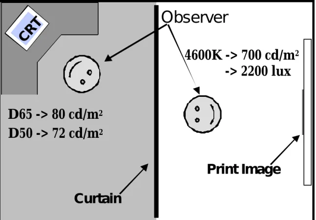
The visual experiment was carried out in a dedicated room specifically designed for comparisons between CRT-displayed and printed images. Figure 1 is a schematic diagram showing a top view of the room. The room is split down the middle by an opaque black curtain that allows the two halves of the room to be completely isolated from each other. Four Macbeth Prooflite PLD 840 overhead luminaires with a total of 32 fluorescent tubes are mounted overhead in the print side of the room. Prints are viewed on either a white drafting table or easels mounted directly under the luminaires. A set of eight light switches control the fluorescent tubes in independent banks of four tubes each. This allows relatively precise control of luminance level and correlated color temperature. Two sets of tubes, illuminant D50 and D75 simulators, are available for the luminaires. Use of the tubes in various combinations allows a range of correlated color temperatures to be obtained. For this experiment, prints were viewed using the D50 tubes at a high
print viewing in the graphic arts industry. The actual measured (at the print location) correlated color temperature of the sources in the room was 4600K
with a white-point luminance of 700 cd/m2 (corresponding to an illuminance
of 2200 lx). Spectral radiance measurements in the viewing room were completed using a PhotoResearch PR-650 spot spectroradiometer. All prints were viewed in the center of a 6-ft. by 4-ft. white drafting table. The wall behind the drafting table was painted black to minimize (in combination with the black curtains) specular reflections off the print surfaces. Prints were viewed at an angle normal to the observers and approximately 45 deg. from the light sources.
The CRT-display side of the room was kept completely darkened with the exception of the display itself. A Sony GDM-2000TC monitor was used. The CRT white point and uniformity was setup using the monitor's internal digital controls. The 20-in. diagonal display was driven by a Silicon Graphics Onyx InfiniteReality workstation to a spatial resolution of 1280 by 1024 pixels with a non-interlaced 72-Hz. refresh. In two phases of the experiment, the display was setup with either an illuminant D65 or D50 white point. The white point setup and colorimetric characterization of the display were completed using an LMT C200 Colormeter. The display had peak luminances of 80 cd/m2 and 72 cd/m2 respectively with D65 and D50 white points.
Colorimetric characterization of the display was accomplished using the techniques of Berns22 with an overall accuracy of about 1.0 CIE94 color
Both the printed and CRT-displayed images measured 18 by 23 cm (with a resolution of 35 pixels/cm) and were viewed from a distance of approximately 100 cm. Thus, the images subtended approximately 10 by 13 deg. of visual angle. During the experiments, observers moved back and forth between viewing the CRT-displayed or printed images by parting the curtains, rolling their chair into the appropriate viewing location, and then closing the curtains behind them. Observers were required to adapt to the change in viewing conditions for 60 sec.23 each time they changed sides of the
room prior to beginning observations (controlled with a count-down timer). For each scene and viewing condition, observers would first view the print to memorize the colors. They would then switch to the CRT display and adjust the rendition of the scene to match the color appearance of the print. Observers were allowed to alternate between the print and CRT as many times as they desired, always allowing for the 60-sec. adaptation period. When the observers were satisfied that they had accomplished a match, the experimenter changed the print to the next scene and the process was repeated. The length of each experimental session was left to the discretion of the observers. The CRT image adjustments were accomplished using Adobe Photoshop® following the techniques developed by Fairchild and Braun.1
Observers were allowed to use any of the color adjustment tools in Photoshop®, but were not allowed to perform spatial manipulations of the images. The CRT images were viewed with a middle gray background filling
the remainder of the display. All images incorporated a white border that the observers could manipulate in color along with the rest of the image.
A total of 10 observers, all experienced in using Adobe Photoshop®, took part in the entire experiment. All of the observers had normal color vision as evaluated by Ishihara plates and a Farnsworth-Munsell 100-hue test. All 10 observers took part in the first phase of the experiment (D65 CRT) and each completed two trials to evaluate intra-observer variability. Due to the time-consuming nature of the task, only five of the observers took part in the second phase of the experiment (D50 CRT) and completed only one trial each. Each of the two trials for the D65 experiment began with a different starting-point image. In one case the images represented raw, uncorrected scans from a typical desktop image scanner while in the other case the images represented the display from a different monitor having different gamma and phosphor characteristics.
Five pictorial scenes were used in each experiment. These are illustrated in Fig. 2 and have been given the names golfer, colorchecker,
pinklady, barn, and fruit for the purposes of this article. The colorchecker
image is a digital scan of a Macbeth ColorChecker® Color Rendition Chart.24
The other images were obtained digitally from Eastman Kodak Company. After observers completed the various matching tasks, the resulting images were saved for later processing. To avoid serious issues with image registration, various perceptual anomalies in color appearance at high-frequency edges, and over-weighting large image areas, the images were
manually segmented into a small number (about 22 per image) of object regions. The RGB pixel values in each region were then averaged and passed through the monitor characterization model to produce CIE XYZ tristimulus values for each image region. Rather than be limited by the accuracy of a printer characterization, the actual prints used in the experiment were measured using a Gretag Spectrolino 45/0 spectrophotometer. Measurements were made on the prints by systematically sampling the same image regions and then averaging the tristimulus values. All tristimulus values were calculated using the CIE 1931 Standard Colorimetric Observer (2°) and the light source spectral power distribution measured in the viewing room. This
is similar to the process used by Fairchild and Braun.1 The image regions
evaluated are shown in Fig. 3. The regions for the colorchecker image were simply defined as the 24 patches of the chart.
The configuration of the room was designed to eliminate the influence of flare when viewing the images. If flare was present when viewing the prints and CRT display that was not present during the colorimetric measurements and characterization, then the analysis of the results with respect to color appearance models would be suspect. The best technique to account for flare is to make measurements of the displays in situ using a telespectroradiometer such that the flare is included in the colorimetry. This was not done in these experiments to allow the use of more accurate and
measurements were made to confirm that viewing flare was reduced to insignificant levels in the experimental apparatus.
The resulting data, after averaging tristimulus values across observers, are 110 pairs of corresponding colors for each viewing condition (D50 print to D65 CRT and D50 print to D50 CRT). The 110 pairs result from approximately 22 color regions in each of the five scenes. In these experiments, the corresponding-colors data represent appearance matches across changes in white point, luminance level, and surround. Since these data might be of value to other researchers and are a bit too extensive for inclusion in this article, they have been made publicly available on the worldwide web at <http://www.cis.rit.edu/people/faculty/fairchild/CAM.html>.
Results
The results of these experiments can be analyzed in a number of ways. This section examines the intra- and inter-observer variability in the experiment, the influence of surround on image tone reproduction, the degree of adaptation to the various displays, and the derivation of simple statistical models to describe the data.
Intra-Observer Variability
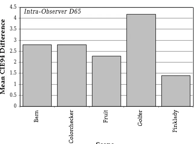
Intra-observer variability can only be examined for the D65 CRT experiment since no replicate trials were performed in the D50 CRT experiment. Figure 4 is a bar chart illustrating the mean CIE9425 color differences between the two
trials for each scene averaged over color region and observer. These data illustrate several points. First, the observers were quite good at the task. Overall, they were able to repeat their matches to within about 2.5 CIE94 difference units. This is just slightly larger than the perceptibility tolerance
for pictorial images.26 Some of the more experienced observers were able to
repeat their results to within 1.0 CIE94 difference unit for all of the images. Figure 4 also shows significant scene dependence. The pinklady scene produced the most repeatable results. This might be expected since the pinklady scene was a close-up portrait with large areas of flesh tone that might be of particular concern to observers. The other significant distinction lies in the golfer image, which produced consistently worse results. This might be because some of the regions were quite small in area and also because there seemed to be some contention between choosing an accurate match and a preferred match for the large areas of foliage and sky. These potential image dependencies differ from the lack of image dependency reported by Stokes et al.26 in that this work examines accuracy of color
matches whereas the Stokes et al. study concentrated on color discrimination, or precision of color matches.
Inter-Observer Variability
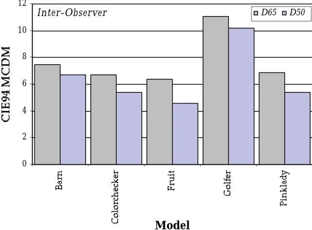
The inter-observer variability for the two sets of experiments is illustrated in Fig. 5, which is a bar chart of MCDMs across all the observers for each image
and is similar to a standard deviation.27 In this case, the MCDM values are
expressed in CIE94 units. Examination of Fig. 5 suggests trends similar to those found in the intra-observer variability (Fig. 4). This is not too surprising since the causes of variability are similar. It should be noted that the inter-observer variability is a little more than two times larger than the intra-observer variability (also not unexpected). The results are similar for the two experiments with the D50 CRT experiment showing slightly less variability. This could be due to the use of a smaller population of more experienced, and perhaps more homogeneous, observers. The pinklady scene remained one of the more precise scenes (although no longer significantly better) and the golfer scene remained the worst. In the case of inter-observer variability for the golfer scene, there was clear evidence that some of the observers were producing matches that more closely represented their preference rather than an accurate reproduction of the printed image. This was particularly evident in the sky regions where some of the responses were significantly more blue (less cyan) in hue and of higher chroma than the mean response. This observation corresponds with classic results on the evaluation of memory colors of sky, foliage, and flesh.3 The results illustrated
in Fig. 5 can be used to gauge how well different observers agree on color appearance across changes in media, white point, luminance, and surround. Therefore, these results provide an aim point for the desired accuracy in model predictions of the mean data.
Tone Reproduction
Given the significant changes in luminance and surround between the printed images and the CRT display, there is reason to expect a significant nonlinear relationship between the luminances of the original prints and adjusted CRT images.7 The expected result is that the printed images, viewed
at a high luminance in a light surround, would have a higher perceived contrast (expressed as the exponent of a power function)7 than the CRT
reproductions. The tone reproduction results are examined in Fig. 6 by plotting the relative luminance values for the CRT matches as a function of the relative luminance values of the corresponding color regions in the printed images. The filled circles in Fig. 5 represent the data for the 110 data points from the D65-CRT experiment and the open squares represent the same data for the D50-CRT experiment. The diagonal line represents a slope of 1.0, which would indicate perfectly linear tone reproduction between the prints and CRT images. The D50 results follow the diagonal line quite closely suggesting that the tone reproduction was indeed linear for that experiment. The D65 results show that the mid-tones on the CRT were adjusted to be of higher relative luminance than the mid-tones on the prints. This is the type of power-function nonlinearity that was expected with one significant exception; the trend is in the wrong direction. The results suggest that the printed images appeared to be of lower contrast (relative to the colorimetry) than the CRT images. The high luminance and light surround of the prints
points should have fallen below the diagonal line in Fig. 6 (indicating that the observers had to boost the contrast of the CRT images to produce a perceptual match). The magnitude of the contrast effects is also very small for the D65 experiment and zero for the D50 experiment.
Why didn't this experiment show the expected surround and luminance effects? (The history of which is reviewed in reference 7.) Perhaps the answer lies in the display configuration and the task. The images were quite large (approx. 10 by 13 deg.) and this might have served to minimize the surround effects. In addition, the act of alternating between the two viewing conditions over fairly short time periods might have reduced both the surround and luminance effects. The task also required the observers to examine the images very closely and concentrate on their adjustments. This might have resulted in more localized adaptation and thus a minimization of the surround effect. In more typical image viewing situations, observers are more likely to spend significant time gazing at the surroundings. Another factor is that the CRT-displayed images in this research were surrounded with a white border and a gray background. The border and background serve to render the CRT viewing conditions as more like typical print viewing conditions. This differs from typical television or motion picture viewing in which the images are immediately enclosed with the dim or dark surrounds respectively. All of these factors, in combination, likely contributed to the unexpected overall results.
Degree of Adaptation
It has been well established that observers tend to completely adapt to hard copy displays through mechanisms of physiological chromatic adaptation and
discounting the illuminant.4,28 However, for self-luminous displays
adaptation is often incomplete since discounting the illuminant can not
occur. 4,28 Previous work has suggested that prints under D50 illumination
and CRTs with D65 white points will appear neutral, while CRTs with a D50 white point retain a yellowish appearance due to incomplete chromatic adaptation.4,28 Figures 7 and 8 were prepared to examine for these incomplete
adaptation effects in the results of this research. Figure 7 shows the CIELAB a* values of the CRT image regions for both experiments plotted as a function of the CIELAB a* values for the prints. For both experiments, the a* data are randomly distributed about the diagonal line indicating no bias in the overall appearance of the display and that CIELAB is a reasonable color appearance model. If CIELAB were a perfect color appearance model and the data had no variability, then all of the points would fall on the diagonal line. Similar results are plotted for the CIELAB b* dimension in Fig. 8. In this case, the results are not so straightforward. The CRT data points for the D65 experiment are scattered slightly above the diagonal line while the data points for the D50 experiment are scattered a significant distance below the diagonal line. Since the b* dimension in CIELAB represent a yellow-blue opponent coordinate, the results plotted in Fig. 8 illustrate a bias in the overall color
D65 data scattered above the diagonal line indicate that the CRT appeared slightly bluish in comparison to the printed images (thus, observers had to make the images more yellow). Assuming that the prints indeed appeared neutral, this suggests that the D65 CRT retained a small amount of bluish appearance. On the other hand, the D50 data show that the CRT with a D50 white point retained a significant yellowish appearance (thus, observers were forced to make the images more blue). The average bias for the D65 results is about five CIELAB units and for the D50 results it is about 20 CIELAB units. This is consistent with previous results4,28 and provides a strong indication
that the practice of setting up CRT displays with D50 white points for comparisons with prints can produce significant differences in the color appearance between the two media. When interviewed, the observers indicated that the D65 CRT display appeared neutral while the D50 CRT display appeared yellowish.
Model Fitting
Fairchild and Braun1 showed that the results of a similar experiment could be
well predicted by a linear matrix transformation from the tristimulus values in one viewing condition to the corresponding colors under a second viewing condition. Their experiment was limited to changes in white point and media with constant dark surrounds and luminance levels. It was of interest to see whether similar models could usefully describe the results of the current experiment in which surround and luminance varied as well. Two
models were explored and statistically fitted to the experimental corresponding-colors data. These were a simple linear model as given in Eq. 1 and a model that incorporated an exponential nonlinearity to account for any potential changes due to surround or luminance level as given in Eq. 2.
X Y ZPRINT = m1 m2 m3 m4 m5 m6 m7 m8 m9 X Y ZCRT (1) X Y ZPRINT = m1 m2 m3 m4 m5 m6 m7 m8 m9 X Y ZCRT γ (2)
For the remainder of this paper, the matrix model of Eq. 1 is referred to as the
linear model and the nonlinear model of Eq. 2 is referred to as the g a m m a
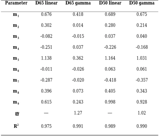
model. The models were fitted using linear regression and a simplex nonlinear optimization respectively. The model fits were quite good. The statistical parameters are given in Table I and further analysis of the models' performance is given in the next section along with tests of other color appearance models. Examination of the parameters in Table I shows that the fit for the D65 results is significantly improved by including the nonlinearity and that the γ term deviates significantly from 1.0. For the D50 data, the linear and gamma fits are virtually identical, which is further illustrated by the fitted γ parameter being nearly equal to 1.0.
Model Tests
A variety of color appearance models and chromatic adaptation transforms were used to predict the results of these experiments. The procedure used was to take the tristimulus values of the image regions on the CRT, along with the necessary measurements of the viewing conditions and apply the models in the forward direction to obtain either adapted signals (for chromatic adaptation transforms) or the lightness, chroma, and hue appearance correlates (for color appearance models). These data were then transformed through the inverse models using the print viewing conditions to predict matches for both the D65 and D50 experiments. These predictions, along with the measured print data, were then transformed to CIELAB using the print white points such that color differences between the observed and predicted results could be obtained using the CIE94 color difference equation.
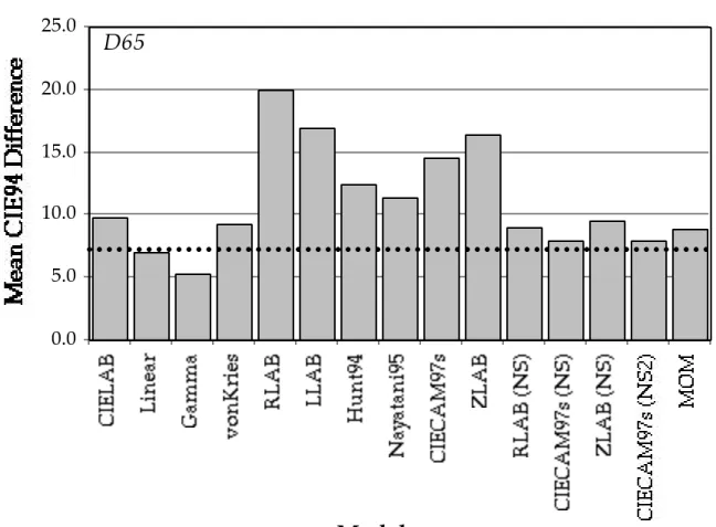
The mean CIE94 results, averaged over color regions and scenes, are illustrated in Fig. 9 for the D65 experiment and Fig. 10 for the D50 experiment. Most of the model designations should be self-explanatory. Linear and Gamma refer to the two statistically fitted models and MOM refers to the multi-scale observer model of Pattanaik et al.17 The NS designations refer to
versions of the models that were applied with no surround compensation. This was performed since the raw data, as illustrated in Fig. 6, indicated that the expected influences of surround on perceived image contrast were not observed. The NS versions of the RLAB, ZLAB, and CIECAM97s models were calculated by keeping the exponential nonlinearities constant rather
than allowing them to vary with surround relative luminance. In the NS version of CIECAM97s the c parameter was held fixed and in the NS2 version
of CIECAM97s the c and Nc parameters were both fixed. The dotted lines in
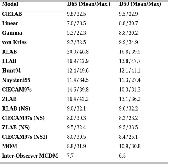
Figs. 9 and 10 are the average MCDMs for the two experiments to represent the level of observer variability. A reasonable interpretation of the MCDM values is to think of them as similar to a single standard deviation. The numerical results are presented in Table II, which also includes the maximum differences for each model. While the maximum differences are quite large, it should be noted that, in all cases, the median values were very close to the means and only a few data points had extremely large CIE94 differences. The largest differences were from a few of the colors in the golfer image. Greater than 95% of the differences fell within the CIE94 range from zero to twice the mean value for all of the models.
Closer examination of Fig. 9 shows that the statistically fitted models performed extremely well. This is to be expected since they were fitted to the data, but might not be expected since the models are extremely simple. This result suggests that very simple models might be adequate for these transformations. The mean errors for the linear model are less than the mean MCDM suggesting that this model is adequate and the gamma model is not required. The models that predict changes due to surround and luminance level, RLAB through ZLAB plotted in the center of Fig. 9 did not perform very well. This is because the surround (or luminance) predictions
the surround compensations are turned off (NS models), performance significantly increases, approaches the MCDM level, and is certainly within the range of observer responses (about 2 times the MCDM). The von Kries, MOM, and CIELAB models also perform fairly well since they include no surround compensation. (Only the adaptation transform of the MOM model was evaluated, so it is essentially an NS model.) The similar performance of the model fits and several of the more complex models is clear indication that there is little to be gained by using a complicated chromatic adaptation model in these practical viewing conditions. A simple von Kries-type model is probably sufficient.
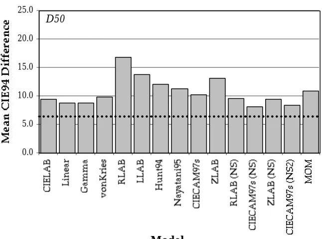
Similar results can be observed for the D50 experiment as illustrated in Fig. 10. In this case, the differences between the models are not as great since the white point chromaticity of the displays was nearly identical. The main differences between the models are in how they treat the luminance level changes, surround changes, and incomplete adaptation to the D50 CRT. Since there was no surround influence observed, the models that predict significant surround effects perform the worst. This is illustrated by the poor performance of RLAB, which has the largest surround compensations.
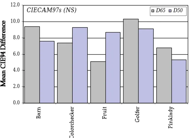
Scene dependence in the results is examined in Fig. 11, a plot of the mean CIE94 differences between the observations and predictions for the CIECAM97s (NS) model averaged over the color regions within each image. Results for both the D65 and D50 experiment are presented in Fig. 11. There is a fairly significant image dependence in the D65 data that is somewhat
correlated with the inter-observer variability results presented in Fig. 5. Again, the golfer image was the worst and this can probably be explained in the same way that the increased observer variability for this image was explained. The D50 results are similar, but not as clearly correlated with the inter-observer variability. The difference between the two results can almost certainly be attributed to the different observer sample populations.
Conclusions
The results of this experiment confirm that the experimental technique previously developed1 is viable for these types of research studies and provide
some interesting insights into the modeling of color appearance transformations in typical cross-media image viewing conditions. The surround effect observed in these experiments was not as expected and this confirms previously reported results suggesting that the surround compensations in various color appearance models need to be fine-tuned, and often lessened, for particular viewing situations and image configurations.7,13,29 The results also confirm that chromatic adaptation is
incomplete to monitors with CIE illuminant D50 white points and that the use of such monitor setups in critical image evaluation tasks should be avoided.4,28 The model evaluation indicates that, once again,1 the
experimental results can be well predicted by a simple linear transformation between tristimulus values for the two viewing conditions. As far as
MOM performed quite well when their surround compensations (if any) were turned off.
This work confirms that CIECAM97s performs among the best of the available color appearance models (as was hoped by TC1-34) for this typical cross-media color reproduction application. While the results of this work cannot be used to directly suggest improvements to CIECAM97s, they do confirm that the surround compensation built into CIECAM97s, and other models, needs to be used with care and it's accuracy will depend highly upon particular viewing configurations and tasks. The results also clearly indicate that more complex models are not required in these applications and simpler models might suffice.
Future Directions
The experimental results and model evaluations suggest that color appearance models that treat colors as simple patches in uniform backgrounds and surroundings are reaching the point where they are making the best predictions possible with such models. It is clear that many of the spatial and temporal influences on color appearance need to be addressed in future visual models aimed at color appearance prediction in complex scenes. The multi-scale model of Pattanaik et al.17 begins to address these issues by
combining insights from the spatial vision, image quality, and color appearance fields into a single visual model for applications in image reproduction. Such a model provides a starting point for improving current
models and applying them to new domains such as gamut mapping, tone-reproduction mapping of high dynamic range images, image quality metrics, and perceptually driven computer image synthesis.
Acknowledgements
This research was supported by a grant from the Eastman Kodak Company. Additional funding was provided through the NYS/IUCRC and NYSSTF-CAT Center for Electronic Imaging Systems and the Munsell Color Science Laboratory. The authors also thank all of the observers who took part in the experiments and Paula Alessi of Eastman Kodak for assisting with the design and implementation of this project.
References
1. M.D. Fairchild and K.M. Braun, Investigation of color appearance using the psychophysical method of adjustment and complex pictorial stimuli, AIC
Color 97, Kyoto, 179-186 (1997).
2. R.W.G. Hunt, Objectives in colour reproduction, J. Phot. Sci. 18, 205-215 (1970).
3. R.W.G. Hunt, The Reproduction of Colour, 5th Ed., Fountain Press, England, (1995).
4. M.D. Fairchild, Color Appearance Models, Addison-Wesley, Reading, Mass. (1998).
5. J.C. Stevens and S.S. Stevens, Brightness functions: Effects of adaptation, J.
Opt. Soc. Am. 53, 375-385 (1963).
6. R.W.G. Hunt, Light and dark adaptation and the perception of color, J. Opt.
Soc. Am. 42, 190-199 (1952).
7. M.D. Fairchild, Considering the surround in device-independent color imaging, Color Res. Appl. 20 352-363 (1995).
8. CIE, International Lighting Vocabulary, CIE Publ. No. 17.4, Vienna (1987). 9. J. von Kries, Chromatic adaptation, Festschrift der
Albrecht-Ludwig-Universität, (Fribourg) (1902) [Translation: D.L. MacAdam, Sources of Color Science, MIT Press, Cambridge, (1970)].
10. CIE, Colorimetry, CIE Publ. No. 15.2, Vienna (1986).
11. R.W.G. Hunt, An improved predictor of colourfulness in a model of colour vision, Color Res. Appl. 19, 23-26 (1994).
12. Y. Nayatani, Revision of chroma and hue scales of a nonlinear color-appearance model, Color Res. Appl. 20, 143-155 (1995).
13. M.D. Fairchild, Refinement of the RLAB color space, Color Res. Appl. 21, 338-346 (1996).
14. M.R. Luo and J. Morovic, Two unsolved issues in colour management — colour appearance and gamut mapping, 5th International Conference o n
High Technology, Chiba, Japan, 136-147 (1996).
15. M.D. Fairchild, Progress report of CIE TC1-34 with an introduction of the CIECAM97s colour appearance model, Proceedings of the CIE Expert
Symposium '97 on Colour Standards for Image Technology, CIE Pub. X014,
77-80 (1998).
16. M.D. Fairchild, The ZLAB color appearance model for practical image reproduction applications, Proceedings of the CIE Expert Symposium '97 on
Colour Standards for Image Technology, CIE Pub. X014, 89-94 (1998).
17. S.N. Pattanaik, J.A. Ferwerda, M.D. Fairchild, and D.P. Greenberg, A multiscale model of adaptation and spatial vision for image display,
Proceedings of SIGGRAPH 98 Proc., 287-298 (1998).
18. M.D. Fairchild, Testing colour-appearance models: Guidelines for coordinated research, Color Res. Appl. 20, 262-267 (1995).
19. P.J. Alessi, CIE guidelines for coordinated research on evaluation of colour appearance models for reflection print and self-luminous display comparisons, Color Res. Appl. 19, 48-58 (1994).
20. K.M. Braun and M.D. Fairchild, Testing five color appearance models for changes in viewing conditions,Color Res. Appl. 22, 165-174 (1997).
21. R.W.G. Hunt and M.R. Luo, Evaluation of a model of colour vision by magnitude scalings: Discussion of collected results, Color Res. Appl. 19, 27-33 (1994).
22. R.S. Berns, Methods for characterizing CRT displays, Displays 16, 173-182 (1996).
23. M.D. Fairchild and L. Reniff, Time-course of chromatic adaptation for color-appearance judgements, J. Opt. Soc. Am. A 12, 824-833 (1995).
24. C.S. McCamy, H. Marcus, and J.G. Davidson, A color rendition chart, J.
App. Phot. Eng. 11, 95-99 (1976).
25. CIE, Industrial Colour-Difference Evaluation, CIE Tech. Rep. 116, Vienna (1995).
26. M. Stokes, M. Fairchild, and R.S. Berns, Precision requirements for digital color reproduction, ACM Trans. Graphics 11, 406-422 (1992).
27. F.W. Billmeyer, Jr. and P.J. Alessi, Assessment of color-measuring instruments, Col. Res. Appl. 6, 195-202 (1981).
28. M.D. Fairchild, Chromatic adaptation to image displays, TAGA 2, 803-824 (1992).
29. C.M. Daniels , E.J. Giorgianni, and M.D. Fairchild, The effect of surround on perceived contrast of pictorial images, IS&T/SID 5th Color Imaging
Tables
Table I. Parameters of the statistical fits for the models given in Eqs. 1 and 2.
Parameter D65 linear D65 gamma D50 linear D50 gamma
m1 0.676 0.418 0.689 0.675 m2 0.302 0.014 0.280 0.214 m3 -0.082 -0.015 0.037 0.040 m4 -0.251 0.037 -0.226 -0.168 m5 1.138 0.362 1.164 1.031 m6 -0.011 -0.026 0.063 0.061 m7 -0.287 -0.020 -0.418 -0.357 m8 0.396 0.073 0.405 0.343 m9 0.615 0.243 0.998 0.928 γ — 1.27 — 1.02 R2 0.975 0.991 0.989 0.990
Table II. Model performance on experimental data. All values are CIE94 color differences between observed and predicted matches. The designations, (NS), indicated that no surround compensation was used in those models.
Model D65 (Mean/Max.) D50 (Mean/Max)
CIELAB 9.8/32.5 9.5/32.9 Linear 7.0/28.5 8.8/30.7 Gamma 5.3/22.3 8.8/30.2 von Kries 9.3/32.5 9.9/34.9 RLAB 20.0/46.8 16.8/39.5 LLAB 16.9/42.9 13.8/47.7 Hunt94 12.4/49.6 12.1/41.1 Nayatani95 11.4/34.5 11.3/27.4 CIECAM97s 14.6/39.8 10.3/31.3 ZLAB 16.4/42.2 13.1/36.2 RLAB (NS) 9.0/32.1 9.6/32.2 CIECAM97s (NS) 8.0/30.3 8.2/23.2 ZLAB (NS) 9.5/32.4 9.5/33.5 CIECAM97s (NS2) 8.0/30.5 8.4/25.1 MOM 8.8/31.9 10.9/30.8 Inter-Observer MCDM 7.7 6.5
Figure Captions
Fig. 1. Schematic top view of the viewing room used for CRT-display and printed image comparisons.
Fig. 2. Scenes used in the visual experiments.
Fig. 3. Representation of the image regions used to derive corresponding-colors data. Each image region is represented as a uniformly colored are in these images. The uniform patches in the colorchecker scene were used directly.
Fig. 4. Intra-observer variability in the D65 CRT experiment. Data are mean CIE94 color differences between the two replicate trials for each observer.
Fig. 5. Inter-observer variability for both experiments. Data represent CIE94 MCDMs (Mean Color Difference from the Mean) across 10 observers in the D65 CRT experiment and 5 observers in the D50 CRT experiment.
Fig. 6. Relative luminance (CIE 1931 Y) for the CRT matches as a function of the printed images across the 110 image regions in both experiments.
Fig. 7. CIELAB redness-greenness, a*, for the CRT matches as a function of the printed images across the 110 image regions in both experiments.
Fig. 8. CIELAB yellowness-blueness, b*, for the CRT matches as a function of the printed images across the 110 image regions in both experiments.
Fig. 9. Mean CIE94 color differences between the observed CRT matches and those predicted by various color appearance models and chromatic adaptation transforms for the D65 CRT experiment. Dotted line represents the overall average inter-observer variability (MCDM).
Fig. 10. Mean CIE94 color differences between the observed CRT matches and those predicted by various color appearance models and chromatic adaptation transforms for the D50 CRT experiment. Dotted line represents the overall average inter-observer variability (MCDM).
Fig. 11. Image dependence represented by the CIE94 color differences between the observations and CIECAM97s (NS) predictions for each scene and both experiments.
Fig. 1.
CRT
Curtain
Print Image
Observer
D65 -> 80 cd/m
2D50 -> 72 cd/m
24600K -> 700 cd/m
2-> 2200 lux
Fig. 4. 0 0.5 1 1.5 2 2.5 3 3.5 4 4.5
Scene
Intra-Observer D65
Fig. 5. 0 2 4 6 8 10 12
Model
D65 D50Inter-Observer
Fig. 6. 0 10 20 30 40 50 60 70 80 90 100 0 20 40 60 80 100
Y (Print)
D65 D50Fig. 7. -60 -40 -20 0 20 40 60 -60 -40 -20 0 20 40 60
a* (Print)
D65 D50Fig. 8. -60 -40 -20 0 20 40 60 -60 -40 -20 0 20 40 60
b* (Print)
D65 D50Fig. 9. 0.0 5.0 10.0 15.0 20.0 25.0
Model
D65
Fig. 10. 0.0 5.0 10.0 15.0 20.0 25.0
Model
D50
Fig. 11. 0.0 2.0 4.0 6.0 8.0 10.0 12.0