Worcester Polytechnic Institute
Digital WPI
Doctoral Dissertations (All Dissertations, All Years) Electronic Theses and Dissertations
2019-04-16
Quantifying, Modeling and Managing How People
Interact with Visualizations on the Web
Mi Feng
Worcester Polytechnic Institute
Follow this and additional works at:https://digitalcommons.wpi.edu/etd-dissertations
This dissertation is brought to you for free and open access byDigital WPI. It has been accepted for inclusion in Doctoral Dissertations (All Dissertations, All Years) by an authorized administrator of Digital WPI. For more information, please [email protected].
Repository Citation
Feng, M. (2019).Quantifying, Modeling and Managing How People Interact with Visualizations on the Web. Retrieved from https://digitalcommons.wpi.edu/etd-dissertations/518
Abstract
The growing number of interactive visualizations on the web has made it possible for the general public to access data and insights that were once only available to domain experts. At the same time, this rise has yielded new challenges for visualization creators, who must now understand and engage a growing and diverse audience. To bridge this gap between creators and audiences, we explore and evaluate components of a design-feedback loop that would enable visualization creators to better accommodate their audiences as they explore the visualizations.
In this dissertation, we approach this goal by quantifying, modeling and creating tools that manage peoples open-ended explorations of visualizations on the web. In particular, we:
1. Quantify the effects of design alternatives on peoples interaction patterns in visu-alizations. We define and evaluate two techniques: HindSight (encoding a users interaction history) and text-based search, where controlled experiments suggest that design details can significantly modulate the interaction patterns we observe from participants using a given visualization.
2. Develop new metrics that characterize facets of peoples exploration processes. Specif-ically, we derive expressive metrics describing interaction patterns such as explo-ration uniqueness, and use Bayesian inference to model distributional effects on interaction behavior. Our results show that these metrics capture novel patterns in peoples interactions with visualizations.
3. Create tools that manage and analyze an audiences interaction data for a given vi-sualization. We develop a prototype tool, ReVisIt, that visualizes an audiences interactions with a given visualization. Through an interview study with visualiza-tion creators, we found that ReVisIt make creators aware of individual and overall trends in their audiences interaction patterns.
By establishing some of the core elements of a design-feedback loop for visualization creators, the results in this research may have a tangible impact on the future of publishing interactive visualizations on the web. Equipped with techniques, metrics, and tools that realize an initial feedback loop, creators are better able to understand the behavior and user needs, and thus create visualizations that make data and insights more accessible to the diverse audiences on the web.
Contents
1 Introduction 1
1.1 Problem Statement . . . 2
1.2 Research Scope, Questions and Tasks . . . 4
1.3 Organization . . . 7
2 Background 8 2.1 Website Design and Clickstream Analysis . . . 8
2.1.1 Behavior-driven Website Design . . . 8
2.1.2 Website Clickstream Analysis . . . 8
2.2 Visualization Interaction Analysis . . . 10
2.2.1 Evaluating Visualizations . . . 10
2.2.2 Understanding User Performance and Characteristics . . . 11
2.2.3 Recovering and Reusing Analytical Provenances . . . 11
2.3 Interactive Visualizations on the Web . . . 13
2.3.1 Narrative Visualizations . . . 13
2.3.2 Social Support . . . 14
2.3.3 Initial Exploration Support . . . 14
3 Quantifying the Effects of HindSight 16 3.1 Introduction . . . 17
3.2 Related Works . . . 20
3.2.1 Wexelblat and Maes’ Interaction History Framework . . . 20
3.2.2 Interaction History from HCI to Visualization . . . 22
3.2.3 Interaction History in Visualization . . . 23
3.3 HindSight Design Process . . . 26
3.3.1 What type of history is important to this visualization? . . . 26
3.3.2 Which visual channels should be used? . . . 27
3.4 Quantifying the Effects of HindSight . . . 29
3.4.1 Procedure and Tasks . . . 30
3.4.2 Measures . . . 31
3.4.3 Pilots, Analyses, and Experiment Planning . . . 32
3.5 Visualization 1: Metafilter . . . 33 3.5.1 Results . . . 35 3.6 Visualization 2: 255 Charts . . . 37 3.6.1 Results . . . 38 3.7 Visualization 3: StoryTelling . . . 39 3.7.1 Results . . . 40 3.8 Discussion . . . 42
3.8.1 Benefits on Exploration, Engagement and Insights . . . 43
3.8.2 Low Technical Barrier . . . 45
3.8.3 Design Tradeoffs . . . 45
3.9 Conclusion . . . 46
4 Quantifying the Effects of Text-Based Search in Visualization 48 4.1 Introduction . . . 49
4.2.1 Search User Interfaces and Visualization . . . 52
4.2.2 Query-Based Interfaces . . . 53
4.2.3 Natural Language Interfaces . . . 53
4.2.4 Design of Search in Visualization . . . 54
4.3 Exploring the Impact of Search . . . 55
4.3.1 Procedure and Tasks . . . 56
4.3.2 Experiment Stimuli . . . 58
4.3.3 Measures . . . 61
4.3.4 Pilots, Analyses, and Experiment Planning . . . 62
4.4 Results . . . 63
4.4.1 Proportion of People who Use Search When Present . . . 63
4.4.2 Search’s Effect on Information Seeking Goals . . . 65
4.4.3 Search’s Effect on Information Seeking Patterns . . . 65
4.4.4 Search’s Effect on Exploration Time . . . 66
4.4.5 Time Examining Individual Data Elements . . . 67
4.5 Discussion . . . 68
4.5.1 Search Encourages Personalized Information-Seeking . . . 69
4.5.2 Search Encourages Diverse Engagement with Data . . . 70
4.5.3 Text-based Search in Visualization Task Taxonomies . . . 71
4.5.4 Search Enables Creative Exploration of Unfamiliar Data . . . 72
4.5.5 Keyboard-based Features for Accessibility . . . 72
4.6 Limitations . . . 73
4.7 Conclusion . . . 75
5 Characterizing Diverse Exploration Behavior with Visualizations on the Web 76 5.1 Introduction . . . 77
5.2 Background . . . 79
5.2.1 Characterizing Website Exploration . . . 79
5.2.2 Characterizing Visualization Explorations . . . 80
5.3 A Requirements Space for Metric Development . . . 81
5.3.1 Visualization Interaction Analysis: Identifying Needs . . . 82
5.3.2 Deriving Features from Visualization Interaction Data . . . 84
5.4 Proposed Metrics . . . 87
5.4.1 Exploration Uniqueness . . . 87
5.4.2 Exploration Pacing . . . 92
5.5 Metric Evaluation . . . 95
5.5.1 Interaction Data from Two Studies . . . 97
5.5.2 Applying Interaction Metrics: Case Studies . . . 98
5.5.3 Metrics for Experiment Analyses . . . 100
5.5.4 Metric Correlation and Independence . . . 103
5.6 Discussion . . . 104
5.6.1 Potential Applications of Interaction Metrics . . . 105
5.6.2 Benefits and Tradeoffs of Interaction Metrics . . . 107
5.7 Future Work & Conclusion . . . 109
6 Modeling Diverse Explorations with Visualizations using Bayesian statistics 110 6.1 Introduction . . . 111
6.2 Background . . . 113
6.2.1 NHST and Bayesian Statistics . . . 114
6.2.2 Reflections on the Current Statistical Paradigm . . . 114
6.2.3 Potential Benefits and Trade-offs of Bayesian Statistics in dataVis and HCI . . . 116
6.2.4 Previous Studies with Open Datasets . . . 117
6.3 Re-examination of Previous Results . . . 118
6.3.1 Previous Analysis based on 95% CI . . . 118
6.3.2 Secondary Analysis based on the Bayesians . . . 119
6.3.3 Comparison and Discussion . . . 121
6.4 Modeling the Diverse Behavior Distributions . . . 122
6.4.1 A Multi-level Model . . . 123
6.4.2 Model Fitting and Comparison . . . 124
6.4.3 Inferences . . . 125
6.5 Discussion . . . 126
6.5.1 Potential Applications in Web Vis Interaction Analysis . . . 127
6.5.2 Other Potential Benefits for Visualization Interaction Studies . . . 127
6.5.3 Tradeoffs . . . 129
6.6 Conclusion . . . 130
7 Towards Managing People’s Interactive Explorations of Visualizations on the Web 131 7.1 Introduction . . . 132
7.2 Background . . . 134
7.2.1 Logging Interactions in HCI . . . 134
7.2.2 Visualizing Interactions in HCI . . . 134
7.2.3 Visualizing Interactions with Visualizations . . . 135
7.3 An Initial Design Space for Re-visualizing Interaction Data . . . 137
7.4 ReVisIt: A Visualization System Prototype . . . 137
7.4.1 System Architecture . . . 139
7.5 Interviews with Visualization Creators . . . 145
7.5.1 Interview Methodology . . . 145
7.5.2 Interview Results . . . 148
7.6 Discussion and Conclusion . . . 150
8 Discussion and Conclusion 152 8.1 Research Contributions . . . 152
8.1.1 Considering RQ1: Quantifying the Behavioral Effects of Design Alternatives . . . 152
8.1.2 Considering RQ2: Characterizing and Modeling Diverse Explo-rations . . . 153
8.1.3 Considering RQ3: Re-visualizing the Low- and High-level Statis-tics of Interaction Data . . . 154
8.2 General Discussion and Future Opportunities . . . 155
8.2.1 Supporting User Exploration of Visualization . . . 155
8.2.2 Interaction Behavior as a Proxy to Insight Generation . . . 157
8.2.3 Generalized Interaction Logging with Formalized Visualization Context . . . 159
List of Figures
1.1 An interactive visualization from the New York Times – “At the National
Conventions, the Words They Used” [1]. (A) is the default view. By clicking a circle at the top, a person sees the dialogs containing the word displayed at the bottom. (B) selecting an annotated circle “Women”. (C)
selecting “Immigration” which is in the middle of the visualization. . . . 2
1.2 We explore and evaluate components of a design-feedback loop that would
enable visualization creators to better accommodate their audiences as
they explore the visualizations. . . 4
2.1 Agapie et al. found that changing the edge color of the search bar as
people type nudges people to typing longer queries [2]. . . 9
2.2 Zhaoet al.[3] re-visualized users’ website interaction logs (a) using Ma-trixWave (c), and found it to scale better than commonly used Sankey
diagrams (b). . . 9
2.3 Boyet al. [4] evaluated the impact of “storytelling” in visualization on
users’ exploration behavior. . . 10
2.4 Ottleyet al. [5] observed that people’s searching strategies of a tree
visu-alization reveal their locus of control. . . 11
2.5 Douet al. [6] showed that interactions with visual analytic systems can
2.6 Endertet al. [7] reused users’ analytical provenances to enable users to
steer the underlying model of visual analytics. . . 12
2.7 Segel and Heer used a spectrum spanning from author-driven to
user-driven structure, to categorize the visualizations on the web [8] . . . 13
2.8 Heeret al. [9] demonstrated through sense.us, that social data analysis can effectively support user explorations through inspirations from each
other. . . 14
2.9 Boy et al. [10] designed and evaluated the perceived affordance tech-niques to invite users to explore visualizations. The figure is the design
condition SI-4 that was shown to be effective. . . 15
3.1 Visually encoding a user’s interaction history – a technique we call
“Hind-Sight” – can be easily implemented in many existing visualizations and is shown to significantly impact both exploration and insights. Here we show the three visualizations from our experiment, encoding interaction history through: a) chart opacity, b) line width and opacity, c) color (red
highlighting), and “shadows” of previous marker positions . . . 16
3.2 With the exception of Gutwin’s implementation of visit wear in fisheye
views, research in data visualization has typically focused on three quad-rants defined by Wexlblet and Maes. HindSight lies in the fourth– a direct
encoding of personal interaction history. . . 21
3.3 The experiment procedure to evaluate HindSight. . . 30
3.4 Experimental results comparing basic HindSight encodings with three
vi-sualizations. Exploration metrics suggest that HindSight generally en-courages more exploration and nudges users towards investigating
4.1 Search mechanisms in interactive data visualizations have been used spo-radically throughout research and in practice. Little is known, however, about how search impacts how people interact with visualizations. We contribute an analysis of search mechanisms in visualization. Our exper-iment results indicate that most users will use search when available, and that search leads to positive increases in measures related to engagement.
(The example on the left is from an interactive visualization Women in
Filmson the web [11].) . . . 48
4.2 In our experiments with five visualizations, participants completed a
train-ing phase before headtrain-ing to the exploration section. When they were fin-ished exploring the interactive (no time limit), they moved to the next section where they describe their insights and strategies of exploration.
In the final section, they provided demographic information. . . 57
4.3 Experimental stimuli used to evaluate the effects of text-based search on
visualization use and exploration. Each stimuli has been augmented to include search. From left to right: “Inside America’s Boardrooms” from the Wall Street Journal- a multi-section visualization exploring company leaders. “How the Recession Reshaped the Economy, in 255 Charts” from The New York Times- showing how industries recovered or fell after the recent US recession. The final two visualizations are used to test
spe-cific hypotheses about the value of visualization, e.g., whether the
gen-eral familiarity of the dataset impacts the likelihood of users making use of search. (Not shown) An identical version of the third chart was also
4.4 Experimental results comparing original visualizations with versions that integrate search. The results suggest that adding search enables a sub-set of users to identify specific data of interest in visualizations, and that in many cases this leads to more time spent with individual data items, an indicator of greater engagement with data. Maps showing items vis-ited during search (orange) versus items visvis-ited when users did not have search (purple) suggest that search leads users to different parts of the
data. . . 64
4.5 Some participants used text-based search to explore the data in creative
ways. In one case, a participant noticed that some planets had common substringsin their names. They arrived at the query ”hat”, and produced a finding about common data features among ”hat” planets. (”HAT”
hap-pens to be the organization that discovered these planets.) . . . 73
5.1 A user’s exploration interactions can be transformed into a time-series
signal with {0,1} representing her visiting status. (Time used to visit
an element is marked as gray.) The signal sequence can further be formed to a 2D wavelet power spectrum through continuous wavelet
trans-form. . . 94
5.2 Four experiment datasets from two previous studies [12, 13] were used for
the metric evaluation: SearchinVis-255Charts, SearchinVis-Boardrooms,
HindSight-255Charts and HindSifght-Metafilter. Each dataset includes the interaction data of two groups of participants. Each group interacted
with either the original or the augmented visualization. . . 95
5.3 We applied the proposedpacinganduniquenessto two previous studies,
with results suggesting that they capture different facets of user
6.1 Typical result outputs of null hypothesis significance testing (NHST) with 95% confidence interval and Bayesian statistics, measuring the difference of means between two groups. . . 112
6.2 Comparison of the analyses based on 95% confidence intervals and on the
Bayesian statistics. . . 119
6.3 The results of the effect of searching on users’ visit duration probability
distribution. Each of the two diagrams on the left shows the posterior distributions of the two conditions (during search and outside searching) and their difference. The middle diagram shows the posterior predictions of the two conditions. The right diagram shows the distributions in real
data. . . 125
7.1 ReVisIt interactive visualization interface. (a) The timeline view of users’
interaction traces. Each row represents a user session. (b) Statistical sum-maries of user sessions, e.g., distribution of exploration times, distribution of uniqueness values, etc. (c) Statistical summaries of visual elements, e.g., distribution of the elements’ visit counts. (d) The other summaries regarding the deployed visualization, e.g., number of user sessions. (e) The overlay view of users’ interactions. If an element is hovered over in the timeline view (a), a circle will display in the overlay view indicating
the position of the visual element in the original visualization. . . 131
7.2 An initial design space for visualizing interaction data. . . 138
7.3 ReVisIt system architecture.ReVisIt enables the visualization creator to
gather passive feedback from the audience, by (1) logging people’s inter-actions with the visualization, (2) processing the raw interaction logs to automatically measure and analyze interaction behavior, and (3) visualiz-ing the raw and processed interaction data. . . 139
7.4 The timeline view (a) and overlay view (b) are linked together. In the overlay view, there is a screenshot of the original visualization, and the visual elements can be mapped to their original positions in the visualiza-tion. . . 143
7.5 Every user session in the timeline view can be expanded or collapsed. The
expanded view shows a single user session, where each row represents a
visual element. . . 144
7.6 ReVisIt Stimuli. Three visualizations 255Charts, Colleges and Games,
together with the collected and re-visualized usage data. . . 146
8.1 There are two design choices for “triggering” HindSight techniques, i.e.,
visited elements can either be “highlighted” or “faded”. . . 156
8.2 Provide users with social information of elements while they are
search-ing. . . 157
8.3 Three users’ interaction traces and recalled insights. . . 159
8.4 The examples illustrating the ambiguity from the low-level interaction
events. . . 161
8.5 Four interaction events with visualization states, visualization results, and
List of Tables
1.1 The organization of this dissertation. . . 7
3.1 We tested HindSight using a between-subjects design on three
visualiza-tions. The table above shows participant numbers for each visualization, which were determined by running effect size and power analyses on pilot
studies. . . 33
3.2 Meta-analysis of HindSight applied to one of the primary visualizations
from Boyet al. , 2015. While the control condition in the present
ex-periment led to generally higher results, HindSight appears to reliably
outperform the other conditions– past and present. . . 42
4.1 Text-based search has appeared in multiple visualizations throughout
re-search and the web. The above are a sample. We categorize each across several dimensions, including the scope of the search, how the encoding changes, and others. Notably, some prior research systems do not contain sufficient detail to determine how text-based search is used in the
4.2 We evaluate the impact of text-based search using a between-subjects de-sign across multiple visualizations. The table shows participant numbers for each experiment, determined by running effect size and power
analy-ses on pilot studies. More participants were added to thesearch present
condition based on proportions of use derived from pilot studies. . . 63
5.1 Notations used to describe user interactions with visualizations, and to
describe the metrics in this chapter. . . 84
5.2 Number of participants in 4 experiments in the previous studies [12, 13].
The control user group in each experiment includes the users randomly assigned to explore original visualizations. The experimental group
in-cludes those exploring augmented visualizations. . . 98
6.1 Model comparison with LOOIC. . . 121
Acknowledgements
This dissertation would not have been possible without the tremendous support from a group of amazing people.
I would like to express my sincere gratitude to my advisor Professor Lane Harrison. It has been my great honor to be his first PhD student. I learned from him how to conduct solid visualization research, so that visualization to me changed from a simple hobby into a field of expertise. He helped me practice writing and presentation over and over again, so that I, a non-native English speaker, can effectively communicate research to people. He encouraged and trusted me when I was facing various kinds of challenges, so that I have become more confident in solving problems and diving into new areas.
I would like to thank my PhD committee members, Professors Elke Rundensteiner, Emmanuel Agu, and Alex Endert. They provided valuable feedback and suggestions that inspired me on the techniques used in our research, and asked many insightful questions that helped me better shape the structure and arguments of the dissertation.
I would like to thank the visualization researchers who acted as my mentors or col-laborators: Evan Peck, Hua Guo, Meg Pirrung, Fumeng Yang, and Cheng Deng; and my labmates: Russ Davis and Hamid Mansoor. It is my honor and pleasure to work with these talented people with excellent research and technical expertise. They provided careful guidance, thoughtful questions and dedicated collaborations throughout my PhD study.
Burke, John Dyer and Luke Gardner, who built the ReVisIt system from the ground up. I am so glad that we worked together, and I am impressed with their phenomenal progress as well as their excellent teamwork.
I would like to thank my friends: Wenzhao Xu, Zetian Zhang, Ruixiang Du, Zhong-fang Zhuang, and many others, who provided valuable comments and suggestions to my work, and shared with me some of their own experiences and lessons on research.
Finally, I would like to thank my dear parents. They pushed me to look beyond the surface, which motivated me to pursue advanced studies. They trained me on engineering and problem-solving skills since I was a child (as both of them were engineers), which helped me along my PhD journey. I am indebted to them for their extensive support and encouragement from home throughout the years.
Chapter 1
Introduction
As interactive visualizations migrate from desktop applications to the web, numerous complex datasets have been made available for general public to freely explore [1, 14, 15, 16, 17]. However, unlike trained data analysts, general audiences may not be as adept at manipulating the vast quantity of information in front of them. Quite often, people do
not explore as much as expected by the creators of these visualizations. Only 10-15% of
people click on buttons, reports Archie Tse, the graphics editor at the New York Times [18].
One of the expectations creators may have when creating interactive visualizations is to empower the users to discover their own insights from complex data [4]. Such benefit for users is hardly achievable through web pages or static infographics. Consider the
example from the New York Times in 2012 “At the National Conventions, the Words
They Used” (Figure 1.1), where each circle represents a word. Without any interaction, one can learn from the annotations that, e.g., the word “Women” is used more frequently by Democrats. However, clicking a circle reveals the dialogues containing the word. One can thus go beyond the surface by clicking other words, such as “immigration”, and finds that Democrats and Republicans used the word an equal amount of times, but in very different contexts.
Figure 1.1: An interactive visualization from the New York Times – “At the National Conventions, the Words They Used” [1]. (A) is the default view. By clicking a circle at the top, a person sees the dialogs containing the word displayed at the bottom. (B) selecting an annotated circle “Women”. (C) selecting “Immigration” which is in the middle of the visualization.
Nevertheless, there appears to be a gap between visualization creators’ expectations
and the reality,e.g., people do not explore through interaction as much as expected.
Peo-ple’s lack of interaction may be due to various reasons [4, 10, 18]: Maybe a user was less interested in the topic, did not have enough time to explore, did not understand the visu-alization, was not aware of the interactivity, could not find what she wanted, or got lost when navigating through the data points, etc. However, apart from these guesses, creators have little evidence to support why the gap between expectation and reality exists, or to inform their future design improvements.
1.1
Problem Statement
Despite the rapid growth of interactive visualizations on the web, there is a gap between the reality and the expectations from visualization creators. For example, creators may
expect their audiences to discover personal insights through actively interacting with a given visualization. Results from our initial studies [12, 13] suggest that visualization creators do not have sufficient evidence-based methods for understanding how their audi-ences engage with the visualizations and for how to improve the design.
One possible solution is to establish adesign-feedback loopfor web visualization
cre-ators to understand and support their audiences’ explorations. As shown in Figure 1.2, such feedback loop enables creators to collect and make sense of their audiences’ inter-action data after deploying the visualization. The promise of this solution is informed by
the positive results from two threads of research: evidence-based website design
work-flow [3, 19, 20] and visualization interaction analysis [6, 21, 22]. However, challenges
still hinder the successful establishment of a feedback loop. For example, it remains un-clear how to make sense of people’s diverse interactions with visualizations on the web.
Evidence-based website design workflow. After deploying a website, designers often utilize people’s usage data to evaluate their design and learn about their audiences. For ex-ample, through A/B testing [19], designers can choose between the design alternatives of a button based on the click-through rates. More advanced techniques have also been used to make sense of people’s website clickstreams through statistical and visual analyses [3, 20, 23]. The evidence-based workflow of website design, including the strategies to
quantify, model and analyze users’ interactions, has inspired our research aiming to assist the creators of visualizations on the web. However, people’s interactions with visualiza-tions are fairly different from their interacvisualiza-tions with websites, which makes it difficult to directly adopt the specific techniques used in the website design workflow.
Visualization interaction analysis. In the visualization field, researchers collect and analyze people’s interactions with visualizations. This collection serves for various
pur-poses [21], e.g., to evaluate a visualization system or technique [4, 24], to recover and
be-havioral patterns and user characteristics [5, 25], etc. This research thread equips us with
useful techniques to analyze people’s interactions with visualizations,e.g., providing
met-rics to quantify a user’s visualization exploration: total exploration time and the number of interacted visual elements. However, this thread mostly focused on data or domain experts, often with specific analytic tasks. In contrast, the web environment is more di-verse – there are users from different backgrounds, visualizations on different topics, and creators with different goals in mind. People’s behavior patterns may be different in every situation. Thus, challenges still exist on how to make sense of people’s interactions with
visualizations indiverse web contexts.
Figure 1.2: We explore and evaluate components of a design-feedback loop that would enable visualization creators to better accommodate their audiences as they explore the visualizations.
1.2
Research Scope, Questions and Tasks
In this dissertation, we explore and evaluate components of a design-feedback loop that would enable visualization creators to better accommodate their audiences as they explore the visualizations. We approach this goal by quantifying, modeling and creating tools that manage people’s explorations of visualizations on the web. We focus on the types of exploration behavior that are relatively unique in web contexts. These are open-ended explorations that may be motivated by people’s diverse goals, instead of traditionally studied visual analytical tasks, such as fraud detection [6].
Given the diverse context of the web, it remains unclear whether small changes to visual-ization designs lead to measurable differences in user interaction behavior.
RQ1: Can we detect behavioral differences of design alternatives from people’s
interac-tions with visualizainterac-tions on the web?
Current metrics quantifying interaction behavior, e.g., exploration time and the number
of interacted elements, are insufficient to fully capture people’s diverse explorations.
RQ2: How can we better express facets of people’s explorations of visualizations on the
web via their interaction traces?
Statistical analysis alone may not be adequate for visualization creators to achieve their goals in a flexible way. Visual explorations may help them understand diverse behavior.
RQ3: How can we help visualization creators to achieve their goals by feeding back
people’s usage data and enabling visual exploration?
We answer each of the research questions through three step-by-step research tasks:
Can we detect any behavioral differences of design alternatives at all from people’s di-verse interactions with visualizations?
T1: Quantifying the behavioral effects of design alternatives to initially demonstrate the
efficacy of analyzing diverse explorations. Namely, we evaluate two interaction tech-niques, and evidence from controlled studies indicates people’s increasing engagement.
T1.A:As reported by creators, general audiences seldom interact with web
visualiza-tions. We develop the technique direct encoding of personal interaction history
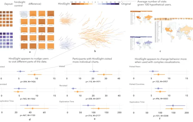
(Hind-Sight) aiming to encourage user exploration. We apply the technique to three existing visualizations, examining its impact through online user experiments. The results show that HindSight impacts users’ breadth of exploration, and nudges them to different parts
of a visualization.
T1.B: Creators occasionally integrate search functionality into visualizations. Yet it
remains unclear how search might impact users’ exploration behavior. We evaluate the
effects of adding text-based search functionality to visualization through a user study
across five visualizations. Quantitative results show that search encourages users’ diverse engagement with data, and that the impact of search is affected by users’ familiarity with the underlying dataset.
How can we fully capture the quality of people’s diverse explorations of visualizations on the web from their interaction traces?
T2: Characterizing and modeling peoples exploration behavior to fully utilize the
infor-mation in their interaction traces. Specifically, we derive new metrics and adopt Bayesian statistics to analyze interactions, and the results show that these techniques are able to capture novel aspects of the visualization exploration process.
T2.A: Current user-centered metrics quantifying interaction behavior, e.g., explo-ration time and the count of interacted elements, suffer from over-aggregating charac-teristics of users’ exploration processes. We capture several facets of people’s exploration behavior by deriving new metrics, such as exploration diversity and pacing. These metrics are shown to uncover additional characteristics of exploration.
T2.B:Interaction data from the web may be noisy, which sometimes makes it difficult to draw useful conclusions. We move beyond the standard practice of making statistical inferences, and adopt Bayesian analysis process to model people’s interactions. We obtain more precise and conclusive results from Bayesian analysis compared with Frequentist analysis.
How can we help visualization creators to achieve their goals by feeding back people’s usage data and enabling visual exploration?
T3: Re-visualizing peoples explorations to provide scalable and low-effort feedback to visualization creators. In the diverse web context, which may include users from different backgrounds, visualizations on different topics, and visualization creators with different goals, statistical analysis only may not be adequate to reveal people’s behavioral patterns in a flexible way. Visual explorations instead, may enable visualization creators to ask
and answer more open questions. We thus develop a visual analytic prototypeReVisIt,
re-visualizing raw interaction data as well as automatically-computed high-level statistics. We evaluate the effectiveness of the visualization system through interviews with creators of visualizations on the web, and the creators express the effectiveness of making sense of their audiences interactions through visual exploration.
1.3
Organization
Research Question Task Chapter
RQ1: Can we detect behavioral differ-ences of design alternatives from peo-ple’s interactions with visualizations on the web?
T1.A §3 Quantifying the Effects of
Hind-Sight
T1.B §4 Quantifying the Effects of
Text-based Search in Visualization
RQ2: How can we better express facets of people’s explorations of visualizations on the web via their interaction traces?
T2.A §5 Characterizing Diverse
Explo-ration Behavior with Visualizations on the web
T2.B §6 Modeling Diverse Interactions
with Visualizations using Bayesian statistics
RQ3: How can we help visualization cre-ators to achieve their goals by feeding back people’s usage data and enabling vi-sual exploration?
T3 §7 Re-visualizing People’s
Interac-tive Explorations of Visualizations on the Web
Chapter 2
Background
We provide in-line discussion of the most related work as we describe each research task. Herein we provide a brief introduction of the related works as background.
2.1
Website Design and Clickstream Analysis
2.1.1
Behavior-driven Website Design
Researchers and practitioners base the design of web interfaces on people’s interaction
behavior. For instance, as introduced by Agapie et al. [2], changing the edge color of
the search bar as people type leads them to input longer searching queries (Figure 2.1.
Willett et al. create scented widgets [26], using visualizations to represent other users’
aggregated navigation history. They find users exploring unfamiliar data make up to twice as many unique discoveries using these widgets imbued with social navigation data.
2.1.2
Website Clickstream Analysis
Clickstream research includes the data processing, analysis and visualization methods
Figure 2.1: Agapieet al. found that changing the edge color of the search bar as people type nudges people to typing longer queries [2].
developed algorithms to extract sequence patterns from clickstreams. Zhao et al. [3]
created a visualization called MatrixWave to compare two clickstream datasets, and found
it to scale better than commonly used Sankey diagrams. Chi et al. [29] quantified the
saliency of a user’s visit to a website when modeling users information needs and actions
on the web. Heer et al. [30] further used this measure to cluster web users. These
efforts influence our work of visualization interaction analysis, in that a user’s open-ended exploration of a visualization containing visual elements can be considered analogous to the exploration of a website.
Figure 2.2: Zhao et al. [3] re-visualized users’ website interaction logs (a) using
2.2
Visualization Interaction Analysis
Researchers and practitioners analyze people’s interactions with visualizations for vari-ous purposes [21], e.g., to evaluate visualizations, to understand user performance and characteristics, and to recover and reuse people’s analytical provenances.
2.2.1
Evaluating Visualizations
One goal of analyzing people’s visualization interactions is to examine the comparative
impact of competing design techniques on user behavior [4, 9, 22, 24, 31]. Boy et al.
[4] evaluated the effectiveness of storytelling by comparing users’ exploration time and raw interaction counts (hovers and clicks) between the experimental and control groups (Figure 2.3).
Figure 2.3: Boyet al.[4] evaluated the impact of “storytelling” in visualization on users’
exploration behavior.
Liuet al. [24] measured the effects of latency on users’ exploration behavior of visual
analytics by using raw interaction counts (drag, brushing and linking, etc). Guoet al. [22]
evaluated visualization design through sequence analysis – extracting the sub-sequences containing specific individual interactions, and then counted the sub-sequences for each
visualiza-tion on users’ interacvisualiza-tion behavior.
2.2.2
Understanding User Performance and Characteristics
Ottley et al. [5] found that people’s searching strategies of a tree visualization reveal
their personality, i.e., locus of control. They used aggregated maps to show different
exploration patterns of two types of tree visualizations. Brown et al. [25] also found
that locus of control affects people’s graph searching patterns. They identified the pattern through classifying the interaction logs using SVM.
Figure 2.4: Ottleyet al. [5] observed that people’s searching strategies of a tree
visual-ization reveal their locus of control.
2.2.3
Recovering and Reusing Analytical Provenances
Visual analytics is “the science of analytical reasoning facilitated by interactive visual
interfaces” [32]. Theprocessof the reasoning, shown to be as important as the reasoning
results [33], can partially be informed by a user’s interactions with a visualization. Thus
there exists the research thread of analytic provenancethat focuses on utilizing a user’s
interactions to understand her reasoning process [6, 7, 34, 35, 36].
Douet al. [6] showed that interactions with visual analytic systems can reveal some
of the reasoning steps taken by users (Figure 2.5 . Blascheck et al. [37] introduced a
[38] studied how users’ interactions can infer their intentions during analysis. Endert
et al.’s[7, 39] semantic interaction reused users’ analytical provenances to enable users
to steer the underlying model of visual analytics. Wall et al. [36] proposed six metrics
to measure cognitive bias during visual analysis process, including data coverage, data distribution and attribute coverage/distribution, etc.
Figure 2.5: Douet al. [6] showed that interactions with visual analytic systems can reveal
some of the reasoning steps taken by users.
Model Application in Text Analysis
Figure 2.6: Endertet al. [7] reused users’ analytical provenances to enable users to steer
the underlying model of visual analytics.
with visualizations. However, this thread mostly focused on data or domain experts, often with specific analytic tasks. In contrast, the web environment is more diverse – there are users from different backgrounds, visualizations on different topics, and creators with dif-ferent goals in mind. People’s behavior patterns may be difdif-ferent in every situation. Thus, challenges still exist in how to make sense of people’s interactions with visualizations in the diverse web context.
2.3
Interactive Visualizations on the Web
Visualization researchers have been seeking ways to engage general audiences with data through certain techniques, including narattive visualizations, social support and initial exploration support.
2.3.1
Narrative Visualizations
One of the techniques used to engage users is letting creators to add pre-defined stories to the visualization to guide their audiences. Segel and Heer used a spectrum spanning from author-driven to user-driven structure, to categorize the visualizations on the web (mostly journalism) [8]. There are three types of visualizations placed in the spectrum, Martini Glass Structure, Interactive Slideshow, and Drill-Down Story. The first two are closer to the author-driven structure, and the last is closer to the user-driven structure.
1. Martini Glass Structure
Author-Driven and Reader-Driven Stories 2. Interactive Slideshow 3. Drill-Down Story
Figure 2.7: Segel and Heer used a spectrum spanning from author-driven to user-driven structure, to categorize the visualizations on the web [8]
2.3.2
Social Support
Heer investigated the role of social data analysis in supporting user explorations. Several techniques have been developed and evaluated through users’ interaction activities and insight generation [9, 26, 40, 41, 42] (see Figure 2.8 for example). Social data analysis can effectively support user explorations through inspirations from each other. In this work,
we are investigating the techniques that support personal explorations. A user should
be able to use them independently from social groups. These techniques should also be simple enough to be quickly understood by general audiences, and of low development costs.
Figure 2.8: Heer et al. [9] demonstrated through sense.us, that social data analysis can
effectively support user explorations through inspirations from each other.
2.3.3
Initial Exploration Support
Users can be supported either before or during their open-ended explorations. Boyet al.
could improve the engagement of users’ open-ended explorations. Boy et al. [10] also designed and evaluated the perceived affordance techniques to invite users to explore visualizations (Figure 2.9). There are also hints from web visualization developments that certain techniques applied to the visualizations appear to engage users by initially situating them in the data [43, 44]. While in this work, we focus on the strategies to
support users to navigate in a pool of visualization elements during exploration. We
believe it is essential to provide people with both a sense of orientation and freedom when they face a large quantity of information in front of them.
Figure 2.9: Boy et al. [10] designed and evaluated the perceived affordance techniques
to invite users to explore visualizations. The figure is the design condition SI-4 that was shown to be effective.
Chapter 3
Quantifying the Effects of HindSight
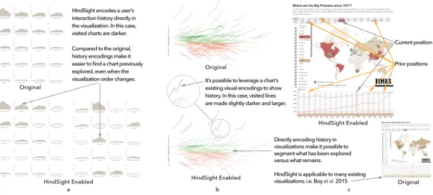
HindSight encodes a user’s interaction history directly in the visualization. In this case, visited charts are darker. Compared to the original, history encodings make it easier to find a chart previously explored, even when the
visualization order changes. It’s possible to leverage a chart’s existing visual encodings to show history. In this case, visited lines are made slightly darker and larger.
Directly encoding history in visualizations make it possible to segment what has been explored versus what remains.
HindSight is applicable to many existing visualizations. i.e. Boy et al. 2015
Current position Prior positions Original HindSight Enabled a b c HindSight Enabled HindSight Enabled Original Original
Figure 3.1: Visually encoding a user’s interaction history – a technique we call “Hind-Sight” – can be easily implemented in many existing visualizations and is shown to sig-nificantly impact both exploration and insights. Here we show the three visualizations from our experiment, encoding interaction history through: a) chart opacity, b) line width and opacity, c) color (red highlighting), and “shadows” of previous marker positions
Physical and digital objects often leave markers of our use. Website links turn pur-ple after we visit them, for exampur-ple, showing us information we have yet to explore. These “footprints” of interaction offer substantial benefits in information-saturated envi-ronments – they enable us to easily revisit old information, systematically explore new
information, and quickly resume tasks after interruption. While applying these design principles have been successful in HCI contexts, direct encodings of personal interaction history have received scarce attention in data visualization. One reason is that there is little guidance for integrating history into visualizations where many visual channels are already occupied by data. More importantly, there is no firm evidence that making users aware of their interaction history results in benefits with regards to exploration or insights. Following these observations, we propose HindSight – an umbrella term for the de-sign space of representing interaction history directly in existing data visualizations. We examine the value of HindSight principles by augmenting existing visualizations with vi-sual indicators of user interaction history (e.g. How the Recession Shaped the Economy in 255 Charts, NYTimes). In controlled experiments of over 400 participants, we found that HindSight designs generally encouraged people to visit more data and recall different insights after interaction. The results of our experiments suggest that simple additions to visualizations can make users aware of their interaction history, and that these additions significantly impact users’ exploration and insights.
3.1
Introduction
During exploratory data analysis (EDA), people navigate through unseen data for an inde-terminate amount of time until an unknown insight is discovered. As a result, EDA aligns with some of the fundamental goals of information visualization. Data Exploration is generally defined in the context of scientific workflows, yet it is quickly becoming a part of peoples day-to-day lives through news organizations and broadly accessible analysis tools.
Exploration takes time, creating a tension with our biological capacity for memory, a tension that is not supported by the visualization itself. Our memory’s capacity to
re-member recent interactions is severely limited in both amount and decay [24, 45]. As a result, even when a visual design is aligned with our perceptual abilities, we struggle to remember and track parts of the data we have encounted, creating a barrier to exploration and engagement. These limitations suggest that a refinement of visualization techniques to support memory in interactive contexts may have broad impact in supporting user ex-plorations.
The call to supporthistoryoperations in data visualization is not new. Many systems
leverage formal representations of visualization state to capture and analyze scientific
provenance [41, 46, 47]. Shneiderman identifiedhistoryas an important visualizaton task
to “allow users to retrace their steps” [48]. Gutwin realized Shneiderman’s hypothesis, showing that indicators of exploration history helped users identify which parts of the data they have seen [49, 50, 51]. Collaborative analysis has also been a focus, where users are shown a history of operations from their collaborators to support situational understanding [52, 53]. Despite these advances, interaction history is not common in visualization systems today. One reason for this scarcity is that there is currently little guidance on how interaction history can be incorporated into the visualization itself. More importantly, however, there is little evidence for the possible benefits making users aware of their history, beyond supporting a user’s ability to retrace their steps.
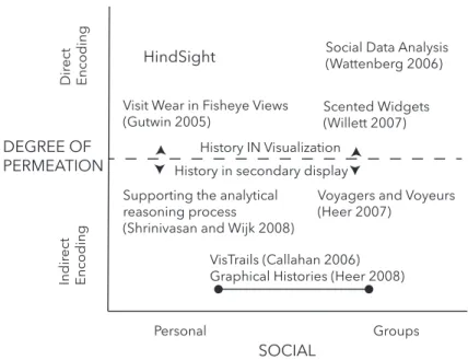
To uncover new opportunities in this space, we applied Wexelblat and Maes’ inter-action history framework [54] to the current state-of-the-art in visualization. Wexelblat
and Maes identified six design properties – proxemic vs. distemic, active vs. passive,
rate/form of change, degree of permeation, personal vs. social, kind of information– that can be used to characterize interaction history systems, or in this case, shed light on un-explored regions of the design space. We focus on two dimensions that expose a hole in
the current design space – how history is directly tied to an object (degree of permeation)
As a direct result of this analysis, we proposeHindSight – a representation of per-sonal interaction history that directly encodes interaction history as a visual variable on the data. At its most basic level, HindSight modifies the saliency of data after a user engages with it, leaving visual markers of interaction history. Given an indication of what they have visited, users can quickly segment what parts of the data they have explored as well as what remains unexplored– using their perceptual system rather than their mem-ory. The technical barrier of integrating HindSight into visualizations is low, requiring only simple modification to existing visualization infrastructure.
Direct encoding of interaction history on data has potential benefits that align with aspects of Shneiderman’s arguments for direct manipulation [55]: increased visibility of object and actions, for example, or rapid and incremental actions with immediate feed-back. Direct encoding puts interaction history right in front of the user, supporting visual recognition of previous interactions rather than relying on recall, short-cutting the men-tal translation of history information. Compared to indirect history encoding techniques common in visualization research [41, 46], direct encoding doesn’t require users to pro-cess spatially separate regions to relate history information back to the data.
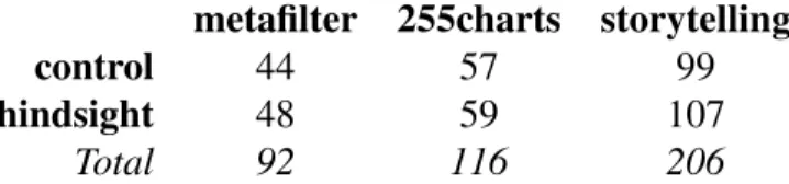
Given these observations, we hypothesized that the combination of direct encoding and personalized histories in HindSight would positively impact user behavior during exploratory analysis. To test our hypotheses, we applied HindSight to three visualizations, analyzing exploration behavior during interaction, as well as user-reported insights after exploring the visualization. Our cases include:
• “The Rise and Decline of Ask MetaFilter” by Jim Vallandingham(N=92): 16 line charts of topic trends over time at MetaFilter that can be reordered by Count or Name.
• “How the Recession Reshaped the Economy, in 255 Charts” by the NYTimes(N= 116): a scatterplot of 255 line charts showing how jobs have changed across
indus-tries over the past 10 years.
• “Where are the Big Polluters since 1971” by Jeremy Boy(N=206): a coordinated view map and line graph showing CO2 emissions that can be filtered by year or country [4].
In controlled experiments of over 400 participants, we found that HindSight designs encouraged people to visit more data and recall different insights after interaction. These results illustrate that the longstanding design principles developed by visualization research– principles that allow us to effectively map data to visual variables– can also be used to encode interaction, allowing us to leverage our perceptual system in interactive explo-ration and sensemaking.
3.2
Related Works
Interaction becomes a key mechanism in exploratory data analysis when the size or com-plexity of the data eclipse what the visual display can handle [48]. To this end, research has historically focused on interaction techniques that empower users to effectively reveal and re-configure data in visualization systems. More recent work addresses the challenges of supporting user exploration and their awareness in the information foraging process. We describe several seminal results and research threads in this area, focusing on how they shape our contributions.
3.2.1
Wexelblat and Maes’ Interaction History Framework
Objects arehistory-richif they contain “historical traces that can be used by people in the
current time” (p. 270, [54]). In the physical world, we note the wear on a tool to help us understand how it has been gripped in the past, or observe footprints in the snow to help us see areas that have previously been already explored. Embedding history rich objects
Personal Groups Dir ect Encoding Indir ect Encoding HindSight
Voyagers and Voyeurs (Heer 2007)
Scented Widgets (Willett 2007)
Social Data Analysis (Wattenberg 2006)
Supporting the analytical reasoning process
(Shrinivasan and Wijk 2008)
Graphical Histories (Heer 2008) VisTrails (Callahan 2006) History IN Visualization History in secondary display
SOCIAL DEGREE OF
PERMEATION
Visit Wear in Fisheye Views (Gutwin 2005)
Figure 3.2: With the exception of Gutwin’s implementation of visit wear in fisheye views, research in data visualization has typically focused on three quadrants defined by Wexlblet and Maes. HindSight lies in the fourth– a direct encoding of personal interaction history.
into the digital realm enables people to either leverage their own experience that they have accumulated over time, or leverage the combined experience of people who have interacted in the same space. Citing results from Pirolli and Card, Wexelblat and Maes argue that without interaction history we are “forced to become information foragers over and over again” [54, 56].
Wexelblat and Maes describe six properties to articulate a design framework for in-teraction history: the extent to which people find a space to be transparent and easily
understood vs. needing background or training to engage with it (proxemic vs. distemic),
the degree of effort needed to record history (active vs. passive), the degree to which an
object is changed by history (rate/form of change), the extent to which history is directly
tied to an object or recorded separately (degree of permeation), whether history is tied to
an individual or a group (personal vs. social), and finally the information we choose to
user behavior as they engage or use their own histories.
Consider the interaction when we click a link on a webpage – an example of an
information-rich environment. The link that I click (high degree of permeation)
auto-matically (passive) turns purple (form: color as history), and indicates whether I (
per-sonal) visited the site or not (kind of information, binary rate of change). Contrast this interaction with how our browser represents visit history. Our browsing history is also
automatically collected (passive), but contains more detailed information than the purple
links (kind of information: time, url, etc.). However, seeing our visit history requires us
to navigate to a history page that is spatially separated from the original data (low degree
of permeation). This shift from a high to low degree of permeation enables focused views of our browsing history, but sacrifices the availability of that information by relegating it to a secondary display.
These design tradeoffs are critical to weigh when designing history-rich tools and have implications for guiding exploration or engagement in any information foraging task. In particular, the change in permeation from the previous example shifts the notion of history from “How did I get here?” to “Where have I been before?” and “What is left to explore?”. In the next sections, we highlight the benefits of reframing history in this manner, and explore whether these same benefits can be translated to data visualization contexts.
3.2.2
Interaction History from HCI to Visualization
The direct encoding of interaction history has been studied in HCI since the early 90s,
when Hillet al. proposed the notion of computational wear (‘read wear’ and ‘edit wear’)
to display authorship history [57]. Alexander et al. later analyzed principles of wear
mechanisms – in this case marks on the scrollbar – to return to previously edited regions of a document. They found that marking the scrollbar with interaction history decreased
visitation time, was highly preferred by participants, and was scalable to a large number of marks [58].
Following these foundational papers, researchers in HCI have applied interaction his-tory to support users in novel ways. Gutwin, for example, visualized the traces of multiple mouse-pointers in a collaborative system to make users aware of where other people were
focusing [49]. They found that a direct representation (orhigh degree of permeation) of
interaction history (the pointer trail) was easy to understand, and helped users understand the context of their collaborators current actions. Bridging the gap from HCI into data visualization, Skopik and Gutwin, introduced the notion of “visit wear” in the context of fish-eye pointers [59]. Using visual indications of history, they show that users were more readily able to trace their previous steps. Building on this work, Gutwin and Anton examined the extent to which users could remember their path after information history was removed [50]. Gutwin also carried some of these findings back to HCI, by integrating a “recency cache” in a list-interface to improve revisitation [51].
Beyond this, however, we also hypothesize that directly encoding interaction history is useful beyond revisitation. As we will demonstrate, even the most simple indications of history not only benefit revisitation, even more so, they impact the exploration patterns and insights of users.
3.2.3
Interaction History in Visualization
Broadly, several threads of visualization research have focused on interaction history. In
formal terms, Jankun-Kelly et al. propose a model for capturing the exploration
pro-cess [47]. This work enabled several extensions, including VisTrails from Bavoilet al. ,
which used formal models of exploration to support scientific provenance in visualization systems [46], and Shrinivasan and van Wijk, who propose methods of transferring these provenance techniques to visual analytics [60]. However, the combination of direct,
per-sonal representations of history in the HCI community has not be suitably transferred and explored in the context of data visualization (see Figure 3.2).
Direct vs. Indirect encoding
In visualization, interaction history widgets typically useindirect encodingto represent
history in secondary displays. This spatial separation from the data allows history to be expressed using a diverse palette of design characteristics that will not interfere with ex-isting visual encodings. For example, textual or graphic representations of history may be spatially organized as a linear sequence of items, on continuous timelines, using branch-ing metaphors, or in network diagrams [41, 61]. In addition, these views support a broad set of operations on historical information such as navigation, editing, annotation, search-ing and filtersearch-ing, and exportsearch-ing [60]. For a more thorough examination of these displays, see [41].
Outside of Gutwin’s “visit wear” study, examples of visually encoding interaction his-tory directly onto the data are more difficult to come by. Since interaction is represented in the same space as the data, the design space is constrained to visual features that are separable from the visual encoding. However, direct encoding of interaction history on data has clear usability benefits because it situates history signifiers directly onto the data.
For example, Willet’sScented Widgets, which places small data visualizations next to
in-terface widgets to guide exploration, found that users exploring unfamilar data make up to twice as many unique discoveries [62]. Instead of relegating interaction history to a sec-ondary display that requires a mental translation, direct encoding leverages preattentive processes to spatially put interaction history next to or on top of the data itself.
Personal History vs. Social History
A second distinction we make is the use of history to communicate personal interactions with the data or group-driven interactions with the data. While most work in this space has focused on facilitating collaboration, we believe that directly encoding interaction
history can improvepersonal data explorationwith a fraction of the overhead.
History-focused interface widgets in data visualization typically appear in the context of asynchronous collaboration [52], or are shown indirectly through secondary displays [41]. A relevant example similar to our proposed work is Wattenberg and Kriss [53] who, when describing the visual encodings used in NameVoyager, briefly mention directly en-coding personal interaction histories (p. 556):
color by history ...causes any visited series to appear in gray... We refer to this as road-less-traveled navigation: Instead of using previous visits as a cue to importance, as in traditional social navigation interfaces, we treat it as a cue to staleness and hope to draw a users eye to new territory, thus suggesting a unique perspective to each user.
We propose that this concept can be broadened into a general design principle for interactive data visualizations: directly encoding personal interaction histories, or Hind-Sight. In the context of exploratory data visualizations and in contrast to indirect displays of history which capture a “moment in time”, encoding history directly on the data frees users to explore new spatial organizations without losing context. We hypothesize that HindSight-inspired techniques will encourage personal exploration of data and yield ben-efits such as higher levels of engagement, more systematic exploration, and as a result, more diverse insights about a particular dataset. While we have included an experiment that targets these measures, we first discuss the design process of building interaction history directly into existing visualizations.
3.3
HindSight Design Process
The core idea of HindSight is that designers can architect visualizations not only by vi-sually encoding data, but also by encoding their users’ interactions in the visualization itself. In this section, we pose questions for designers when they are considering to
ap-ply HindSight – how do we define history, how do we represent history, and is it worth
it? – and share the principles we have developed while applying HindSight to a range of
existing visualizations.
3.3.1
What type of history is important to this visualization?
As we mentioned in the previous section, HindSight shifts our perspective of history from “How did I get here?” to “Where have I been before?” and “What is left to explore?”. As a result, HindSight may be most beneficial for visualizations in which exploration is a design goal. For example, when interactive news visualizations reveal important con-text only after users hover over data, encouraging exploration may lead to more nuanced insights that complement the story.
On the other hand, HindSight is less suitable when it is important for users to retrace their steps. Since spatial encodings are likely already in use by a visualization, it is not able to represent sequence data without interfering with the existing design. While we see this as the primary limitation of direct encoding, designers must generally make informed decisions about framing the user’s mental model of history.
What data entities best represent a ‘unit’ of history?: Since we can refer to data
at various levels of abstraction in a graph (e.g. chart-level vs. data-level), it is important
to carefully weigh the entities we choose when applying HindSight. For example, in the small multiples visualization in Figure 3.1.a, we could consider interaction with each chart as meaningful (encoding history at the chart level) or we could consider interaction
within each chart to be meaningful (for example, highlighting explored regions of the area graph). In this case, because chart reordering was a core interaction mechanism in the visualization, we encoded HindSight at the chart level, enabling visited charts to remain salient even as the data is reorganized. Additionally, encoding HindSight at the chart level encourages exploration of different topics in the MetaFilter visualization rather than secondary trends within a single topic. Choosing an appropriate level of coding for HindSight has the potential to unify exploratory goals with the capabilities of our perceptual system, making user history immediately available for further exploration and discovery.
What duration of user interaction represents meaningful interaction?: Interac-tion history is dynamic. Users may visit charts multiple times, or accidentally visit a chart when en route to another. In our initial pilots, we found that triggering a “visit”
immediately was not ideal, whereas a short delay (i.e. 500ms) led to more predictable
results. While definitive guidance on timing is beyond the scope of this work, a general principle is to delay for long enough that the visit is considered “intentional”.
3.3.2
Which visual channels should be used?
One broadly applicable way of encoding interaction history is changing the opacity of the element after interaction. Opacity is just one of many visual channels that may be used, however. Designers should be aware of the relative efficacy of visual channels such as position and color, as well as concepts such as integral and separable channels [63]. A poor choice of encoding– significantly increasing line size, for example– may severely interfere with the other data in the visualization, especially as the user spends more time interacting. Here we give high-level guidelines for selecting visual channels based on the current design of the visualization and the goals of the designer. We categorize three use-cases for applying HindSight encodings:
• augmentation: when unused visual channels are available, augment existing data with additional visual encodings to the target visualization to show interaction his-tory. For example, we identified opacity as an unused visual channel that could be used to encode interaction history in the area charts shown in Figure 3.1.a.
• addition: There is often empty space available in a visualization that can be repur-posed for interaction history. When history can be represented in unused regions of a chart, modify unoccupied visual layers with interaction data. Transforming the background of a scatterplot into a heat map, for example, could clearly communi-cate regions of the plot that were already explored.
• adaptation:when no visual channels are available but displaying history is deemed important, adapt the target visualization to show interaction history by modifying visual channels that are already occupied by data. If there are no available visual channels, existing encodings can be manipulated to represent interaction history. Note that this approach runs the risk of undermining the perceptual benefits of some visual encodings.
How important is interaction history to the goals of the visualization?: One help-ful way of assessing design tradeoffs is to consider interaction history as an additional data attribute. Weighing interaction history’s impact on understanding in relation to other
data attributes enables designers to use theprinciple of importance ordering to map both
dataandinteraction history onto visual variables. For example, encouraging exploration
in a complex news visualization may be critical enough to the success of a graph that rep-resenting interaction using color will yield stronger results than using that same channel to encode an additional data dimension.
Similarly, in The New York Times “255 Charts” visualization, there are many visual variables which could be used to encode history (see Figure 3.1.b). Line charts are the primary encoding in this visualization, representing the most important information – the
financial growth of the particular industry. Color is also used on each line chart to show whether a particular industry has grown (green) or fallen (red). Since color is a redundant encoding, we may decide that the benefits of representing interaction history outweigh the benefits of aligning multiple visual channels with a single dimension of data.
However, assessing the importance of encoding interaction raises the inevitable
ques-tion: what are the benefits? While prior work such as Gutwinet al.suggest that showing
users where they’ve been can help when revisiting previously visited elements [49, 51], it is not clear from existing research whether making users aware of their interaction his-tory impacts any other aspects of the exploration process. The duration of this work, in particular our three experiments, are dedicated to examining this question.
3.4
Quantifying the Effects of HindSight
The goal of our study was to determine the effect of directly encoding personal interaction history on the following factors:
• exploration behavior: how does HindSight impact exploration behavior such as number of charts visited, total time spent exploring the data, and patterns of explo-ration?
• post-interaction insight:how does HindSight impact the insights that people recall
immediatelyafterinteracting with a visualization?
To this end, we used a between-subjects design to test HindSight principles in three different interactive data visualizations. Two were selected to vary in complexity and
design, and the third was chosen to draw comparisons with recent work by Boy et al.
[4] that evaluates exploration and engagement in visualization. In each visualization, we tested conditions with and without HindSight:
extraneous information
• hindsight: we apply a straightforward encoding of user’s interaction history.
3.4.1
Procedure and Tasks
Participants were recruited through Amazon’s Mechanical Turk (AMT) to participate in a maximum of one of our three studies. AMT is a crowdwork platform where “Workers” select from a range of available tasks, including research experiments [64, 65]. Each
par-ticipant was randomly assigned to either thecontrol (original-visualization) orhindsight
(original with HindSight techniques) condition. Based on time data in pilot experiments, participants were paid $1.00 in order to exceed US Minimum Wage. All participants were shown a standard consent form before continuing.
Figure 3.3: The experiment procedure to evaluate HindSight.
Our procedure consisted of three phases: Training, Exploration, and Insight. In the
Training phase, we provided participants with an instruction page that briefly described their task and the interaction mechanisms in the visualization. For example, for the
![Figure 1.1: An interactive visualization from the New York Times – “At the National Conventions, the Words They Used” [1]](https://thumb-us.123doks.com/thumbv2/123dok_us/809676.2602382/22.918.140.779.108.358/figure-interactive-visualization-york-times-national-conventions-words.webp)
![Figure 2.3: Boy et al. [4] evaluated the impact of “storytelling” in visualization on users’](https://thumb-us.123doks.com/thumbv2/123dok_us/809676.2602382/30.918.239.682.537.742/figure-boy-et-evaluated-impact-storytelling-visualization-users.webp)
![Figure 2.4: Ottley et al. [5] observed that people’s searching strategies of a tree visual- visual-ization reveal their locus of control.](https://thumb-us.123doks.com/thumbv2/123dok_us/809676.2602382/31.918.141.777.402.555/figure-ottley-observed-people-searching-strategies-ization-control.webp)
![Figure 2.5: Dou et al. [6] showed that interactions with visual analytic systems can reveal some of the reasoning steps taken by users.](https://thumb-us.123doks.com/thumbv2/123dok_us/809676.2602382/32.918.203.711.285.589/figure-showed-interactions-visual-analytic-systems-reveal-reasoning.webp)
![Figure 2.8: Heer et al. [9] demonstrated through sense.us, that social data analysis can effectively support user explorations through inspirations from each other.](https://thumb-us.123doks.com/thumbv2/123dok_us/809676.2602382/34.918.270.650.444.767/figure-demonstrated-social-analysis-effectively-support-explorations-inspirations.webp)