Open Access
Proceedings
Visualization techniques and graphical user interfaces in syndromic
surveillance systems. Summary from the Disease Surveillance
Workshop, Sept. 11–12, 2007; Bangkok, Thailand
Kieran M Moore*
1, Graham Edge
2and Andrew R Kurc
2Address: 1Department of Emergency Medicine, Family Medicine, Queen's University, 995 Auden Park Drive, Kingston, Ontario, Canada K7M 7T9
and 2Q.U.E.S.S.T c/o Kingston, Frontenac, Lennox & Addington Public Health, 221 Portsmouth Avenue, Kingston, Ontario, Canada, K7M 1V5
Email: Kieran M Moore* - [email protected]; Graham Edge - [email protected]; Andrew R Kurc - [email protected] * Corresponding author
Abstract
Timeliness is a critical asset to the detection of public health threats when using syndromic surveillance systems. In order for epidemiologists to effectively distinguish which events are indicative of a true outbreak, the ability to utilize specific data streams from generalized data summaries is necessary. Taking advantage of graphical user interfaces and visualization capacities of current surveillance systems makes it easier for users to investigate detected anomalies by generating custom graphs, maps, plots, and temporal-spatial analysis of specific syndromes or data sources.
Background
Although electronic surveillance systems are able to auto-matically detect statistical anomalies in syndromic data, this creates an alert that needs epidemiological investiga-tion. Human interpretation is required to interpret the alerts and raw data to separate statistically significant but epidemiologically unimportant events from real disease outbreaks. To this end, effective syndromic surveillance systems incorporate a graphical user interface and multi-ple data visualization techniques in order to aid epidemi-ologists in deciphering large amounts of data in a timely and cost effective manner. The presence of data tables or line listings allows easy insight into recent system activity. These tables will visually highlight any instances where the data has exceeded the statistically predicted range of
values and allow the epidemiologist to confirm any statis-tical aberration alerts. This allows users to quickly identify potential outbreak situations and also provides them with extra information to further investigate the situation such as the geographic area, population, statistically predicted values, received values, and upper confidence limits. Automatically generated time series plots allow epidemi-ologists to examine recent trends (monthly, yearly, sea-sonal) from incoming data streams.
Geospatial visualization of data helps users to identify the significance of any recent data anomalies. By viewing a map generated by an integrated geographic information system, epidemiologists can identify clusters of increased activity or determine if the increases in data are randomly
from Disease Surveillance Workshop 2007. Disease Surveillance: Role of Public Health Informatics Bangkok, Thailand. 11–12 September 2007
Published: 14 November 2008
BMC Proceedings 2008, 2(Suppl 3):S6
<supplement> <title> <p>Proceedings of the 2007 Disease Surveillance Workshop. Disease Surveillance: Role of Public Health Informatics</p> </title> <note>Proceedings</note> </supplement>
This article is available from: http://www.biomedcentral.com/1753-6561/2/S3/S6
© 2008 Moore et al; licensee BioMed Central Ltd.
dispersed. Such geospatial visualization can also assist public health in tracking an outbreak, by creating maps of received data overlaid with infrastructure, water sources, or hospital locations.
By making it faster and simpler for epidemiologists to analyze large amounts of data, a well-designed user inter-face ensures cost effective surveillance and timely out-break detection.
Discussion
One of the greatest assets of syndromic surveillance sys-tems is their timeliness. These syssys-tems receive data in real-time or near real-real-time, and thus have the potential to detect changes in the public's health more rapidly than traditional reporting methods. Although these systems can automatically gather, parse, and analyze syndromic data sources, for the most part the alerts generated are merely suggestive, and not conclusive [1]. Human inter-pretation is needed to examine the data gathered by sur-veillance systems and to determine when a public health response is warranted. Since these systems can collect data
automatically and in real-time, the timeliness of outbreak detection is largely dependant on how long it takes epide-miologists to survey the gathered data and separate real disease outbreaks from false alarms. Furthermore, real dis-ease outbreaks are scarce, and so for syndromic surveil-lance systems to be cost effective, it is important to reduce as much as possible the time needed for day-to-day mon-itoring by epidemiologists. To this end, effective surveil-lance systems incorporate graphical user interfaces and multiple data visualization techniques to make it easy for epidemiologists to examine large quantities of data and routing alerts in a timely and cost effective manner.
Syndromic surveillance systems are typically available to epidemiologists over a secure Internet connection. Once logged in to the system, a main page provides a summary of recent system activity and any statistical alerts that have been generated. The main screen for the CDC's BioSense system for example, displays the past week of data for each syndrome monitored, allowing the user to easily identify any syndromes which have recently experienced elevated levels [2]. Also on the main page is a list of data sources
ESSENCE Medical Surveillance Site Selection Screen
Figure 1
and what percentage of expected records were received, providing some indication if any data duplication, increase in reporting sites, or incomplete data delivery has occurred. Selecting a specific syndrome displays addi-tional information, indicating which data sources the excess (potential outbreak) occurred in. The ESSENCE sys-tem used by the United States military monitors data from 413 military treatment facilities worldwide, and so users must be able to easily view all regions when accessing the system (Figure 1).
In order for users to effectively distinguish which statisti-cal events are indicative of true outbreaks, the ability to "drill down" from generalized data summaries into more specific data streams is necessary. Surveillance systems
make it easier for users to investigate the statistically detected anomalies by generating custom time series graphs of specific syndromes or data sources. In determin-ing whether or not a statistical event merits a public health response, these graphs allow the user to view the recent activity of any particular data source and visually interpret the magnitude of the increase which triggered the alarm. For example the RODS system provides this functionality from the Epiplot window, easily accessible from the Main window. The Epiplot window (Figures 2, 3) allows users to select a region, syndrome, and time interval to view, and also allows users to view case-level detail for the dis-played time series and to download the selected data as a comma separated file for further analysis [3]. Similarly, ESSENCE provides a "query portal" from which users can
RODS Epiplot Function of Sample Data – threshold, syndromic Counts, and laboratory confirmed cases
Figure 2
select specific data elements to view over a specified time frame, and export selected data elements to Microsoft Excel for offline data analysis [4].
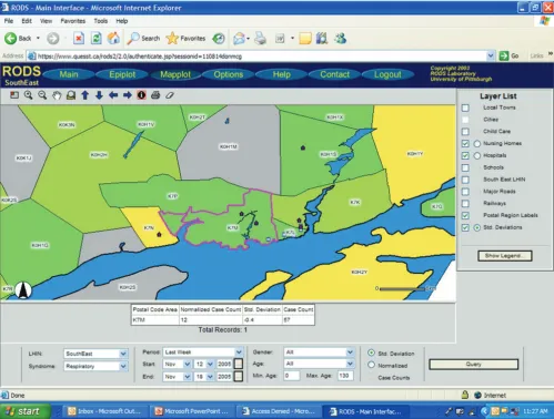
Data submitted to surveillance systems typically includes a geographic identifier such as a ZIP code or in Canada, by postal code. To enhance the interpretation of syndromic data by allowing as special visualization, surveillance sys-tems commonly generate maps with colour gradients denoting the magnitude of received data. If a single data source draws from many smaller regions, it is important to be able to visualize the counts from each region in addi-tion to the whole dataset, so that early cases of an out-break in a single region are not lost to noise [5]. Many surveillance systems incorporate GIS tools which allow
the various data sources to be plotted topographically by a standardized geographical locator and overlaid with other data of interest such as large metropolitan areas, water sources, hospital locations, and highway systems. The mapping layers should include any important infra-structure based on a threat and risk assessment. ESSENCE uses a web-based map view with multiple layers such as emergency room (ER) data, over the counter (OTC) drug sales, and school absenteeism data. These layers can be broken down into sub-layers such as ER data for individ-ual syndromes or absenteeism records from high schools [4]. Accessible from the main window, the RODS Mapplot window (Figure 4) provides an interface to ArcIMS, an internet GIS server developed by ESRI [3]. ArcIMS colours ZIP/postal code regions to show proportions of particular
RODS Epiplot function of sample data – total syndromic counts vs. age-restricted subgroup
Figure 3
syndromes in the data, and can overlay state/provincial boundaries, water bodies, hospital locations, landmarks, streets, and highways on the public health data [6]. The BioSense main screen provides a map view of any syn-drome data selected, or a separate map page can be accessed from the side bar which allows data sources to be transformed before mapping [7].
Certain recently developed surveillance systems have combined temporal and spatial analysis to further facili-tate the investigation of data trends and anomalies. The ability to simultaneously view temporal changes and spa-tial distributions of syndromic data can be helpful in vis-ualizing the propagation of statistically significant events. The SendSS syndrome surveillance module – constructed by the Georgia Division of Public Health – integrates a
spatio-temporal visualization interface, which plots semi-transparent circles on a regional map with the circle radius representative of the magnitude of the data [8]. The data presented on the map can be moved forward or backward in time one day at a time, or can be animated to show all daily changes over an interval. The BioPortal Project pro-totype system includes a Spatial Temporal Visualizer for data visualization [9]. This tool simultaneously presents a periodic spiral graph of user selected granularity (year, month, week, and day), a two-dimensional timeline of data received, and a GIS view of the spatial distribution of the data contained in the selected interval [10]. Presenting all of this data in the same window can make it easier for users to examine seasonal or weekly trends in the data, view temporal trends, and spatially represent a selected interval of data.
RODS Mapplot Function of Sample Data – FSA Counts Colour Coded; Layers Added
Figure 4
The graphical user interfaces (GUI) and visualization tech-niques can be evaluated by the Framework recommended from the CDC working group for Evaluating Public health Surveillance Systems [11]. The user interface should be acceptable to the epidemiologists and this will be directly related to its simplicity of use, functionality and ongoing educational programs for the end user. Roll based access to a hierarchy of epidemiological tools may enhance acceptance. Automated report generation, data export and drill down capability will also enhance functionality.
Flexibility of the GUI will allow for a static interface for some users, while advanced users can access increased functionality and a more dynamic interface. Advanced users may want adaptable modifiable syndrome classifica-tions, multiple anomaly capabilities for each data set, or integration of multiple data streams. The dependability of the system is integral, and hence the GUI must be able to inform and allow investigation by the end user regarding data flow interruption, quality and missing data. Sustain-ability of systems is enhanced if the GUI is part of the nor-mal data access and reporting systems of public health authorities, allowing for integration with reportable dis-ease and laboratory based systems. Hence making the syn-dromic surveillance GUI a module of an integrated public health information system could facilitate acceptance. To ensure representativeness of the system the GUI should be able to allow visualization of complementary data sets such as telehealth, laboratory, emergency department and pharmacy data.
Conclusion
Recent advances in the complexity of syndromic surveil-lance systems allow epidemiologists and other users to receive data in real-time, and provide useful visual inter-faces to assist in interpretation. Both spatial and temporal data are often available, and the ability to simultaneously view temporal changes and spatial distributions of syn-dromic data can be helpful to examine seasonal or weekly trends, view temporal trends, and spatially represent a selected interval of data.
List of abbreviations used
ArcIMS: Arc Internet Map Server; CDC: US Centers for Dis-ease Control and Prevention; ESSENCE: Electronic Sur-veillance System for the Early Notification of Community-based Epidemics; GIS: Geographic Information System; NCEIDI: National Center of Excellence for Infectious Dis-ease Informatics; RODS: Real-time Outbreak and DisDis-ease Surveillance; SendSS: State Electronic Notifiable Disease Surveillance System.
Author contributions
GE did the literature search and initial draft. AK reviewed the figures and refined the literature search. KM reviewed,
edited and modified all drafts and is responsible for final content. KM conceived of the topic and analysis. All authors read and approved the final manuscript.
Competing interests
The authors declare that they have no competing interests.
Acknowledgements
Special thanks to U.S. Department of Defense Global Emerging Infections Surveillance and Response System; The John Hopkins University Applied Physics Laboratory; and Armed Forces Research Institute of Medical Sci-ences.
This article has been published as part of BMC Proceedings Volume 2 Sup-plement 3, 2008: Proceedings of the 2007 Disease Surveillance Workshop. Disease Surveillance: Role of Public Health Informatics. The full contents of the supplement are available online at http://www.biomedcentral.com/ 1753-6561/2?issue=S3.
References
1. Yan P, Zeng D, Chen H: A review of public health syndromic surveillance systems. In Lecture Notes in Computer Science Edited by: Mehrotra S. New York, Springer-Verlag Berlin Heidelberg; 2006. 2. Bradley C, Rolka H, Walker D, Loonsk J: BioSense:
implementa-tion of a naimplementa-tional early event detecimplementa-tion and situaimplementa-tional awareness system. Morb Mortal Wkly Rep 2005, 54(Suppl):11-9. 3. Gesteland P, Gardner R, Tsui F, Espino J, Rolfs R, James B, Chapman
W, Moore A, Wagner M: Automated syndromic surveillance for the 2002 Winter Olympics. J Am Med Inform Assoc 2003, 10:547-54.
4. Lombardo J, Burkhom H, Pavlin J: ESSENCE II and the frame-work for evaluating syndromic surveillance systems. Morb Mortal Wkly Rep 2004, 53(Suppl):159-65.
5. Lombardo J, Burkhom H, Elbert E, Magruder S, Kewis SH, Loschen W, Sari J, Sniegoski C, Wojcik R, Pablin M: A systems overview of the electronic surveillance systems for the early notification of community-based epidemics. J Urban Health 2003, 80:i32-i42. 6. Tsui F, Espino J, Dato V, Gesteland P, Hutman J, Wagner M:
Techni-cal description of RODS: A real-time public health surveil-lance system. J Am Med Inform Assoc 2003, 10:399-408.
7. Sokolow L, Grady N, Rolka H, Walker D, McMurray P, English-Bullard R, Loonsk J: Practice and experience: deciphering data anom-alies in BioSense. Morb Mortal Wkly Rep 2005, 54(Suppl):133-9. 8. Soetebier K, Murray E, Cowell A: Spatio-temporal visualizations
as interface: Constructing geographic animations of disease surveillance data in a syndromic surveillance system. Adv Dis Surv 2007, 2:68.
9. Chen H, Zeng D, Tseng C, Larson C: The BioPortal Project: a National Center of Excellence for Infectious Disease Infor-matics. 2006.
10. Buetow T, Chaboya L, O'Toole C, Cushna T, Daspit D, Petersen T, Atabakhsh H, Chen H: A spatio-temporal visualizer for law enforcement. In Lecture Notes in Computer Science Edited by: Chen H. New York, Springer-Verlag Berlin Heidelberg; 2003.