Aalto University School of Science
Master's Programme in ICT Innovation
Taha Kachwala
Managing Data Visualization Pipeline
with Backbone.js and D3.js
Improving
overall
software
efficiency
using
Automated Build Pipeline with Gulp
Master's Thesis Espoo, 10.10.2016
Supervisor: Prof. Petri Vuorimaa Instructor: Pertti Lounamaa
Aalto University School of Science
Master's Programme in ICT Innovation
ABSTRACT OF MASTER'S THESIS
Author: Taha Kachwala
Title:
Managing Data Visualization Pipeline with Backbone.js and D3.js.
Improving overall software efficiency using Automated Build Pipeline with Gulp
Date: 10.10.2016 Pages: 87
Professorship: Digital Media Technology Code: T-111
Supervisor: Prof. Petri Vuorimaa
Instructor: Petri Lounamaa Ph.D. (Economic Systems)
This thesis studies how a Model-View-Controller (MV*) framework can be integrated into a Data Visualization Pipeline. Specifically, this thesis aims to cover the challenges related in integrating an MV* framework like Backbone.js with D3.js, which is a popular JavaScript based visualization library. Additionally, it also evaluates another sub-topic regarding task runners, which are tools claiming to automate manual tasks as well as streamlining the build process. Data Visualization has become an important aspect for many web applications. Developers need to employ sophisticated mechanisms to provide interactive visualizations. This requires separation of concerns within the visualization pipeline which is achieved with the combination of Backbone.js and D3.js. Evaluation of this methodology indicates that such a combination enables the application to be more versatile and robust while also improving performance. In recent years, client-side web applications have become increasingly complex. A typical web application on average requires between 10-60 external open-source JavaScript libraries. Application development also requires the use of several other tools and performing manual tasks. Managing all these libraries and tools can create a bottleneck, and task-runners like Gulp aim to address these issues. This thesis implements an Automated Build Pipeline that can streamline the build process and automates all the manual tasks. The results prove significant performance and overall efficiency benefits. However, it also highlights a few serious drawbacks. Moreover, this thesis also covers some of the best practices employed by skilled front-end web developers.
Keywords: Data Visualization, JavaScript, MVC, Web Application, Gulp
Acknowledgements
First, I would like to thank my supervisor, professor Petri Vuorimaa, to provide me guidance throughout my internship and thesis.
Furthermore, I would also like to thank my employer Pajat Solutions to provide me with a challenging internship and an interesting thesis topic. I would especially like to thank the CEO Pertti Lounamaa, for providing me with the flexibility and freedom to make decisions regarding the product development of Poimapper.
Espoo, October 10, 2016 Taha Kachwala
Abbreviations & Acronyms
API Application Programming Interface
CSS Cascading Style Sheets
HTML HyperText Markup Language
InfoVis Information Visualization
JS JavaScript or JavaScript file
JSON JavaScript Object Notation
JSP Java Server Pages
MVC, MV* Model View Controller Framework
NPM Node Package Manager
POI Point of Interest
REST Representational State Transfer
SLOC Source Lines of Code
Contents
1. Introduction 7
1.1 Motive for the Research 7
1.2 Research Objectives 9
1.3 Target Group 9
1.4 Poimapper 9
1.5 Structure of Thesis 10
2. Product Description - Poimapper 11
2.1 Form Builder 12
2.2 Data Viewer 13
2.3 Hierarchy Editor 15
2.4 Admin and Scheduler 15
3. Data Visualization and D3.js 16
3.1 Definition 16
3.2 Branches of Visualization 17
3.3 InfoVis 18
3.3.1 Attributes of Visualization 18
3.3.2 Principles of Visualization 18
3.3.3 The Visualization Pipeline 27
3.4 Creating Visualizations using D3.js 27
3.4.1 Chart Object 27
3.4.2 Scalable Vector Graphics (SVG) 28
3.4.3 D3-Scales 29
3.4.4 D3-Axes 30
3.4.5 Legends and Tooltips 31
3.4.6 Bar Charts 31
3.4.8 Line Charts 35
3.4.9 Area Charts 35
4. Backbone.js - An MV* Framework 37
4.1 Need for MV* Frameworks 37
4.2 Model-View-Controller 38
4.2.1 Model 39
4.2.2 Controller 39
4.2.3 Views 39
4.2.4 Routers 40
4.3 More about Backbone.js 40
4.3.1 Underscore.js 41
4.3.2 Agnostic Templating 42
4.3.3 MV* 42
4.3.4 Clean HTML 46
4.3.5 Extensions 46
5. Implementing the Data Visualization Pipeline 47
5.1 Specifications of a Web Report 47
5.2 Architecture of Web Reports Module 48
5.2.1 Models 49
5.2.2 Collections 50
5.2.3 Views 51
5.3 Adding New Features 54
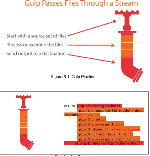
6. Automated Build Pipeline using Gulp 55
6.1 Miscellaneous Tools 56
6.1.1 CSS Preprocessors 56
6.1.2 CoffeeScript 56
6.1.3 Bower 59
6.2 Gulp 60
6.2.1 Installation and Setup 60
6.2.2 Gulp Workflow 60
6.2.3 Helper Plugins 61
6.2.4 Build Pipeline 64
6.2.6 Gulp Tasks 66
7. Evaluation 74
7.1 Evaluation of Data Visualization Pipeline with Backbone.js and D3.js 74
7.1.1 Data-Binding 74
7.1.2 Performance Analysis 75
7.1.3 Loose Coupling and High Cohesion 76
7.2.1 Improved Developer Efficiency 77
7.2.2 Performance Gains using Gulp 77
7.2.3 Page Speed Comparisons 79
7.2.4 Disadvantages of Gulp 79
8. Discussion and Conclusion 81
8.1 Future Work 82
Chapter 1
Introduction
1.1 Motive for the Research
The client-side applications using JavaScript are becoming increasingly complex. One factor contributing to this fact is that there are thousands of libraries available through open-source contributions that help in solving a variety of issues and few even introducing new ones. These libraries depend on other libraries, and in no time a web application might become an explosive cocktail that is impossible to contain. In recent years, Node.js has enabled JavaScript to be used as a server-side language as well, and some libraries like Browserify propose to write1 even the front-end applications with server-side Node.js logic. Furthermore, there are different families of open-source libraries and tools that claim to solve various problems in various stages of software development cycle. One such such family is of JavaScript Task Runners. This family consists of several libraries to choose from, like GRUNT , Gulp , Cake and Broccoli.js . They all claim superiority over 2 3 4 5 others in certain aspects, however the leaders in this race are Grunt and Gulp. These task runners aim to automate various manual tasks like compiling scripts, minification, creating build pipelines, testing and several more and help tackle various issues surrounding JavaScript. Also, a different set of files needs to served for development and production purposes. They claim to handle all theses tasks seamlessly and ease the software development cycle, but the question is, is it really required?
In addition, JavaScript front-end MVCs (Model-View-Controller) is another family of open-source libraries and tools. They aim to address the logical complexities of the Web applications. MVCs is a very powerful software architecture concept and have
1 "Browserify." 2013. 8 Sep. 2016 <http://browserify.org/>
2 "Grunt: The JavaScript Task Runner." 2012. 8 Sep. 2016 <http://gruntjs.com/> 3 "gulp.js - the streaming build system." 2013. 8 Sep. 2016 <http://gulpjs.com/>
4 "cake.coffee - CoffeeScript." 2010. 8 Sep. 2016
<http://coffeescript.org/documentation/docs/cake.html>
5 "Broccoli.js - The asset pipeline for ambitious applications." 2014. 8 Sep. 2016
effectively helped solving a variety of issues on server-side programming languages. Some of the most powerful ones being Spring for Java, Django for 6 7
Python and Express.js for Node. In the past few years, increasing amounts of8 application logic is being implemented on the client-side rather than on the server-side . This has led to the development of many front-end JavaScript based9 MVC frameworks like Backbone.js, Knockout.js, Ember.js, Angular.js and React.js. They too claim to be superior over others in some or the other aspect, and there have been several studies comparing the benefits and downsides of using these frameworks. However, I would like to find out if a MVC can help in tackling the challenges of Data Visualization, that have become an important aspect for front-end web applications. I planned to test this idea while I was working as an intern at Poimapper (see chapter 2). I was given the responsibility to create interactive Web Reports containing visualizations for different types of data. In the past, I have created visualizations and dashboards (figure 1.1) using purely JavaScript with D3.js- A JavaScript based visualization library. However, I soon realised that handling the entire Visualization Pipeline (see section 3.3.3) with such a complex set of data is extremely difficult if not impossible by using pure JavaScript.
6 "22. Web MVC framework - Spring." 2013. 8 Sep. 2016
<http://docs.spring.io/spring/docs/current/spring-framework-reference/html/mvc.html>
7 "Django: The Web framework for perfectionists with deadlines." 2011. 8 Sep. 2016
<https://www.djangoproject.com/>
8 "Express - Node.js web application framework." 2015. 8 Sep. 2016 <https://expressjs.com/> 9 Runeberg, Joakim. "To-Do with JavaScript MV*: A study into the differences between
1.2 Research Objectives
The main purpose of creating Web Reports for Poimapper is to provide our users with the answer of a simple question, “What is happening?”. The user can then dive into more details by interacting with the charts. I knew from my past experience that the process can become extremely complicated when the logic of creating charts (Chart Logic) gets intertwined with the actual application logic. Previously, I have ended in making several flavors of the same type of charts for different types of interaction instead of reusing the code. It would be interesting to test if an MV* framework can effectively handle the challenge of separation of concerns within the Data Visualization Pipeline as described in section 3.3.3. Furthermore, there are several important practices that also need to be followed to develop and manage a web application. JavaScript task runners claim to be an easy to use tool to conveniently implement these practices. Since Poimapper was missing a task runner, I planned to experiment with Gulp and test if it really helps. Therefore, to test these hypotheses, I would like to experiment with two most important families of the JavaScript open-source libraries, namely, Task Runners and MV* frameworks:
RQ1: Does a JavaScript task runner help improve overall software efficiency and productivity?
RQ2: Can a MV* framework like Backbone.js help in separation of concerns within the Data Visualization Pipeline?
1.3 Target Group
The target audiences of this thesis are developers and researchers already familiar to some concepts of Data Visualization, Model-View-Controller frameworks and JavaScript. However, I have provided sufficient background for novice JavaScript developers interested in developing web applications and visualizations with minimal boilerplate.
1.4 Poimapper
During my internship at Pajat Solutions, I was working on their core product,
Poimapper10. Poimapper is a fairly sophisticated product, but to put it simply it is a Mobile data collection platform to cater the needs of on-field teams such as industrial inspection, facility management, market research, inspections, audit, and sales reporting. It allows mobile users to collect, share, and visualize geotagged data in real-time.
1.5 Structure of Thesis
Chapter 1 (Introduction) describes the motivation and the problem statement for this thesis. Chapter 2 (Product Description) briefly introduces the product (Poimapper.com) to the audience to have a better understanding of subsequent chapters and decisions taken. Chapter 3 (Data Visualization and D3.js) consists of a detailed discussion regarding the need for data visualization and crucial concepts. In chapter 4, I elaborate the need for MV* frameworks and introduce the concepts of Backbone.js.
Chapter 5 and chapter 6 have detailed discussion and implementations of Data Visualization Pipeline and Automated Build Pipeline respectively. Chapter 7 (Evaluation) consists of analysis and performance gains using both the pipelines. Finally, conclusions and implications of the thesis are discussed in chapter 8.
Chapter 2
Product Description - Poimapper
As briefly discussed in section 1.4, Poimapper 11 allows its users to collect data through forms. For example, a project manager can create multiple forms and then assign specific forms to various teams. These teams collect data by filling out these forms and the data is reported back to the concerned authorities/users. The main feature of Poimapper is geotagging. This makes Poimapper extremely efficient tool to be used for on-field studies/teams. It is being currently used by a chocolate manufacturing company with an aim to provide 100% slave-free chocolates. To ensure that the chocolates are slave-free, they have to monitor and inspect these farms from where they buy Cocoa. This requires them to have multiple inspection teams spread over a few African nations, and are using Poimapper to manage and process the data collected by them.
Poimapper consists of a Web Application and an iOS and Android app. Currently mobile apps are only used to fill in form data that are mostly used by teams for on-field surveys. All other functionalities are provided by the Web app. The prime aim of Poimapper is simple, users can create forms/surveys and other users can fill them up. However, in principle the product is fairly sophisticated and complex. It can be divided into the following main modules.
1. Form Builder: To create and edit forms.
2. Data Viewer: Users can view the reports of form data collected.
3. Hierarchy Editor: To manage locations and hierarchies of geographical locations. Users can create custom location levels upto four levels such as Continent -> Country -> State -> District.
4. Admin: Users with higher access rights can allocate roles to other users. This helps in managing access controls to different types of users.
5. Scheduler: Users with higher access rights can allocate particular tasks for a particular user to a certain form on a specific date. It helps in scheduling tasks to on field teams.
6. Profile Settings: Generic settings for users like changing passwords etc. Each of these core modules are developed using Backbone.js, which will be discussed in detail in chapter 4.
2.1 Form Builder
Form Builder is used to create new forms and edit existing form templates.
As seen in figure 2.1, on the left a list of existing forms are shown. A user can create a form by giving a name. Then by clicking +, Fields/questions can be added. Poimapper provides plenty of field types which can satisfy most of the survey needs. Every question can have the following types.
1. Text: To enter textual values. eg. Your name, favorite sport.
2. Numerical: Questions that require numeric values to be entered. Can be an Integer or Floating type. eg. Number of people living in a house
3. Boolean: Questions that can be answered in Yes or No.
4. Single-Select: Select one option from a list of options (e.g., Select your age group).
5. Multi-Select: Provides checkboxes to select multiple values from a list of values.
8. Label: Just provides a label. Can be used to elaborate specific instructions or provide some additional information to users while filling up the forms.
9. Dynamic Table: This provides a table where every column can be a specific question of any other basic type. The user answering the form can then add multiple instances of these values. For example, while interviewing workers of a factory, you needs to have their Name, Age and allocated team. SO for every new worker interviewed, a new row can be added.
10. Static Table: Similar to Dynamic Table with the only difference that a predetermined number of rows are available and new rows cannot be added.
11. Skip Logic: Provides a way to skip questions if a particular condition is satisfied. e.g., You might need to avoid asking different set of questions for male and female.
12. Calculated Values: It is used to derive values from previously answered questions. Suppose there are two questions that are needed; What is the respondent's birthdate?
and How old will the respondent be in 10 years .
The second question can be derived from previously answered question.
13. Sub-Form: Another form can be added as a sub-form. This helps in creating a generic forms for specific purposes like demographic data, and then use them as a part in other forms.
14. Lookup Value:This question type provides a way of having extra attributes within a single select like question and being able to access the attributes from Calculated Value Questions. The option attributes will not be visible.This question also enables accessing of values from data collected in another form.
15. Miscellaneous Fields: Some commonly used fields like email, phone number, and Digital Signature.
16. Validation Rule: To add custom form validation rules.
2.2 Data Viewer
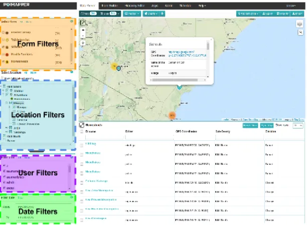
The Data Viewer tab of Poimapper enables users to view the data collected through forms. It provides users with a set of filters that can be used to filter out data collected for specific forms, users, locations and date times. The data collected can be viewed in a Map, Table and through Charts. The Imagetab shows a gallery of images that have been uploaded through forms.
The Web Reports module consisting of interactive visualizations has been developed by me through the course of my internship and is the main subject for this thesis.
Figure 2.2 illustrates the four filters provided. The figure currently has Map and Table modules active. Whenever a user fills up a form, a POI (Point of Interest) is created. As seen above the Map represents the geographical location where a particular POI was collected. The Table view below the Map displays POI's selected using filters in a table.
The entire page is subdivided and managed by different Backbone Views (explained in section 4.2.3) that handle everything within their DOM components.
FormFilterView handles the filter components provided for Form. MapView and TableView handle events and interactions for the Map and Table respectively. There are also few other Views that handle smaller components and are children of other views. In this thesis, the main discussions will be on ChartView, which creates Web Reports containing data visualizations. Figure 2.3 illustrates the Web Reports module created.
2.3 Hierarchy Editor
The Hierarchy Editor is used to set hierarchies among geographical locations. This helps in knowing where the forms were filled and filter data based on specific location hierarchies.
As seen from the figure 2.3, upto 4 levels of location hierarchies can be defined by the user. Their particular locations can be set on the map. In this particular example location hierarchies are defined as Sub-County → Division → Location → Sub-Location.
2.4 Admin and Scheduler
The admin tools allow users with roles set as 'Admin' to manage privileges of other users. It also enables them to create user groups and assigning different form lists and locations accordingly.
Scheduler is just an helper tool, that enables the managers and admins to assign data collection tasks to other users.
Chapter 3
Data Visualization and D3.js
In recent years, the data generated every day is exceeding the total data generated from the dawn of civilization up until 2003 (Schmidt, 2010, in press ). 12
To convert this data into decisions has become an urgent need for many corporations and governments around the world, and this has led to many researchers depend on the field of Data Visualization. The concept of Data Visualization is not new, and has been around for centuries like using maps for navigation for long sea voyages. Human eyes and brains have evolved to easily detect patterns (David McCandless, The beauty of Data Visualization, 2010 ) and 13
this makes visualization a very effective tools to summarize hundreds or even thousands of pages of data into a few graphs and plots. The use of correct visualization techniques can enable decision makers to observe patterns and connections that matter.
3.1 Definition
Data Visualization is the presentation of data in a pictorial or graphical format. It enables decision makers to see analytics presented visually, so they can grasp difficult concepts or identify new patterns. 14
The minimalistic set of requirements for a successful visualizations according to Kosara (2007, chap. 3), are
1. It is based on (non-visual) data 2. It produces an image
3. The results are readable and recognizable
12 "Eric Schmidt: Every 2 Days We Create As Much ... - TechCrunch." 2010. 15 May. 2016
<http://techcrunch.com/2010/08/04/schmidt-data/>
13 "The beauty of data visualization - David McCandless | TED-Ed." 2012. 15 May. 2016
<http://ed.ted.com/lessons/david-mccandless-the-beauty-of-data-visualization>
3.2 Branches of Visualization
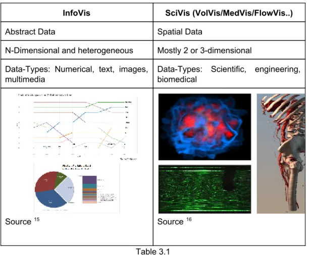
Data Visualization can further be classified as InfoVis (Information Visualization) and SciVis (Volume Visualization-VolVis / Medical Visualization-MedVis / Flow Visualization - FlowVis). InfoVis produces interactive visual representations of abstract data to make it easier for humans to interpret and enabling them to gain knowledge about the internal structure of the data and causal relationships within it. On the other hand, SciVis focusses more on spatial data such as volume visualization (Wolff et al., 1993), Medical Visualization and Flow Visualization . The main differences between the InfoVis and SciVis has been summarized in Table 3.1.
InfoVis SciVis (VolVis/MedVis/FlowVis..)
Abstract Data Spatial Data
N-Dimensional and heterogeneous Mostly 2 or 3-dimensional Data-Types: Numerical, text, images,
multimedia
Data-Types: Scientific, engineering, biomedical
Source 15 Source 16
Table 3.1 This thesis will be focussing more on InfoVis.
3.3 InfoVis
In the figure 3.1, all the 4 datasets have similar mathematical statistics. If only given such a dataset without visualization, it will be impossible to figure out the
15 "Discussion on Modal Survey Word Press Poll, Survey & Quiz Plugin ..." 2015. 15 May.
2016 <http://codecanyon.net/item/modal-survey-wordpress-poll-survey-quiz-plugin/ 6533863/comments?page=4>
differences. This is why it is very crucial to have a visualization of such datasets to easily understand the differences between them.
3.3.1 Attributes of Visualization
Computer-based visualization systems need to provide visual representations of datasets intended to help people carry out some task
more effectively.
The workshop on Visualizing Biological Data (VIZBI 2011) specifies that an effective visualization should have the following attributes.
1. A human that requires details from the visualization. There is no need for a visualization if no one is going to see it.
2. Representation of Data: Perception versus Cognition. Perception deals with how easily a visualization can be organized and processed by our sensory organs, especially eyes. Cognition is more about how the perceived data can generate a thought process in the human brain.This attribute is explained in further detail by Borkin et al., (2016).
3. An intended task. Visualization should avoid catering to multiple tasks at once.
4. Measurable definitions of effectiveness. For a particular type of dataset and a need, some categories of visualization would perform better than the others. There will also be some tradeoffs.
3.3.2 Principles of Visualization
To create an effective visualization, certain aspects also needs to give special attention like,
● Visual channel types and ranks ● Categorical color constraints ● power of the plane
● danger of depth
● resolution beats immersion ● eyes beats memory
3.3.2.1 Data Types
According to Marschner, S., & Shirley, P. (2015, chap. 27.2), the core aspect of visualization design is driven by the type of data it needs to address. Is it a table of numbers, or a set of relations or is it a collection of data points from different geographical locations?
Let us start by considering a table representing a class of students, where the rows (items) represent different students and columns (dimensions) contains attributes such as name, age, student number, height, gender and shirt size. This particular table describes three different kinds of data types. Quantitative
data type such as
age and height, that are numerical and on which arithmetic calculations can be done. Secondly, an Ordinal
data type field like shirt sizes like Small, Medium and
Large. Arithmetic calculations cannot be performed on this type of data, but surely they have a well defined ordering. Quantitative and Ordinal data types can be generalised into Ordered data types. Finally the third type of data is Categorical
data like gender. They do not have an implicit ordering, but they can be distinguished between types, such as Male
and Female. Aforementioned
Categorical and Ordered data types can be generalized into one super category which is Tabular
data types.
Another super category of data type is Relational data. This type of data consists of a graphs
or networks. A graph contains several nodes that are connected to
each other bylinks (edges
). A link between two nodes usually represent a relation
between them. Both nodes and edges can have their own set of attributes.Tree
is
a specific kind of graph, it is typically used to represent hierarchical data.
Finally we have Spatial data type. It contains geographical locations and fields of measurements whose positions are in three-dimensional space such as MRI or CT scans used for medical purposes. Spatial data-type is one of the most difficult
problems of visualization design and falls into the category of Volume Visualization
(VolVis).
The above mentioned data types can be summarised into a chart illustrated in figure 3.2.
Dimension and Item Count
One of the most fundamental aspect of data visualization is the number of dimensions that need to be visually encoded. Visualization techniques that work for a low-dimensional dataset with fewer columns will often fail with very high-dimensional datasets with hundreds of columns. Some data dimensions might even have hierarchical patterns within them such as a time-series dataset which might contain a year, month, day, hours, minutes, seconds and even milliseconds and microseconds.
The number of items also needs to be taken into consideration. A bar chart can work effectively for a few hundred items, but will fail to deliver any results for millions of items. There are several reasons for it to happen such as computation and rendering takes too long; in others it is even a deeper perception problem where the visual clutter makes the representation impossible to cognitively analyse, making the visualization useless as explained by Borkin et al., (2013).
Derived Dimensions
Data can also be derived from one type into another as a part of solving the domain problem. A dataset consisting of temperatures in Celsius, which is a quantitative data type, can be derived into an ordinal data type like cold, warm or hot.
3.3.2.2 Visual Encoding
Visual Encoding consists of graphical elements such as marks and channels as described by Jacques Bertin, a French cartographer in his paper Semiology of
Graphics (1974). Marks use visual channels to convey information. Figure 3.3 indicates different types of marks and channels.
A zero-dimensional mark is a point, a one dimensional mark is a line, a two-dimensional mark is an area and finally a three-dimensional mark is a volume. Visual channels such as spatial position, color, texture, size, shape, orientation and direction encode information. Multiple visual channels can be used on mark to simultaneously encode different data dimensions.
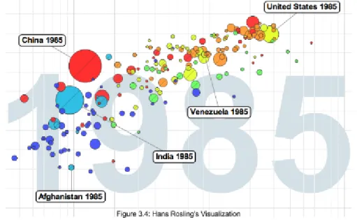
Figure 3.4 illustrates Hans Rosling's Visualization which became very popular after his Ted Talk - The best stats you have ever seen. It uses a single mark which is a 17 point with a combination of several channels like horizontal and spatial position, color, and size to display GDP per capita, CO2 emission levels, geographical regions, and population respectively. He also used to background as an additional channel to convey the year.
Visual Channel Characteristics
Whenever a design decision needs to be taken in selecting marks and channels, the most important characteristics that needs to be considered are distinguishability, separability and pop out. All channels are not equally discernable, so many psychological studies have been carried out to measure the ability of people to make precise distinctions about information encoded by different visual channels. These abilities depend on whether the data type is quantitative, ordered, or categorical. Mackinlay (1986) ranked the priority of these visual channels for the three data types and is shown in the figure 3.5. Theses rankings are based on parameters like Accuracy, discriminability, separability
and
popout
.
17 "Hans Rosling: Global population growth, box by box | TED Talk | TED ..." 2014. 18 Aug.
As seen from the figure 3.5, spatial position is the most precise visual channel for all the three types of data and it dominates the human perception of visual encoding. Therefore, the most important data dimensions should be mapped to horizontal and vertical spatial positions. However, perception of other channels differ strongly between types. Length and Angle provide a better cognition over quantitative data, but provides poor cognition for ordered and categorical data types. An effective rule to follow is to encode the most important attributes with the highest ranked channels.
Visual channel rankings Accuracy
Steven's Power law (2014) proposes the relationship between the intensity of a particular channel against the perceived sensation by humans. As seen from the figure 3.6, Electric Current is the strongest. A small change in the intensity of Electric Current can be easily perceived by a human. Though electric current is not used for the purposes of visualization, the next contender which is Color Saturation is the strongest.
Discriminability
It is crucial that the data dimensions can be easily discriminated within a channel. For example, when encoding with line width, there are a limited number of width steps that can be used. Beyond a particular width, the line will be perceived to be more of a polygon. Lines in figure 3.7 are easy to discriminate between because there are only three levels of thickness used.
Color: Luminance, Saturation and Hue
Color can be divided into three sub channels, i.e. Luminance, Saturation and hue
as shown in figure 3.8. Hue is a very strong channel to encode categorical data types, but should be completely avoided for ordered data types. Luminance or saturation should be preferred for ordered data types because they have an implicit perceptual ordering.
Quantitative data should be shown using a colormap. An example of colormap is shown in the Figure 3.9.a. Unfortunately, many software packages contain rainbow colormaps which uses hue to indicate order. That should be completely avoided and better alternative would be to use luminance. Figure 3.9.b shows the Bernice Rogowitz (1995) diagram. Both the images illustrate the elevation from the sea-level, the only difference is that the one on the left uses rainbow colormap while the one on the right uses luminance. Zero-crossings can easily be spotted from the map on the right in figure 3.9.b, rainbow colormap on the left renders it impossible to spot the difference. The rainbow colormap also creates a false impression about the structure of the surface topography and ocean depth.
Dangers of Depth: 2D vs 3D
When computer-based visualizations began in 1980s, there was a lot of enthusiasm for 3D representations. However, researchers soon began to understand the costs of 3D approaches when using abstract datasets (Ware, chp 5, 2008). Human visual system does not really see in 3D, but 2.05D.
The prime issues involved with using 3D areOcclusion, Interaction complexityand
Perspective distortion
. As seen in figure 3.10, because of occlusion, the objects
that are far behind cannot be determined. Even if interaction is provided, it will be fairly difficult to interact with such a visualization (Carpendale et al., 1996).
Real-world objects do appear smaller when they are far away, however foreshortening makes direct comparison of object difficult (Tory et al., 2006). This effect is called perspective distortion. It is easier to judge the heights of familiar objects in real world based on past experiences, however the same is not true for visual encoding of abstract data. This makes it difficult to interpret the bar heights of a 3D bar charts as opposed to 2D bar charts. Figure 3.11 shows Steve Jobs
using perspective distortion to his advantage. Apple's share of 19.5% appears to be much larger than Other's share of 21.2%.
Text Labels and Tooltips
Text in the form of labels and legends is very important factor in creating visualizations that are useful rather than just being visually appealing. Axes and tick marks should be labelled and are also helpful tools. Legends should be used to indicate the meanings of colors whether it is used as discrete or in a continuous color ramps. In many cases showing all labels at all times would produce a visual clutter. In such cases interaction techniques like tooltip on hover can be used to avoid overlap (Luboschik et al., 2008).
3.3.3 The Visualization Pipeline
The Visualization pipeline describes the stepwise approach for creating visual representations of the data. Figure 3.13 shows the workflow of the visualization pipeline (Nielson et al., 1990).
3.3.3.1 Data Acquisition
Data is prepared for visualization. e.g Measurements retrieved from CT/MRI, flow simulation (Card et al., 1999).
3.3.3.2 Filtering/Enhancement
Data is filtered to select only the portions of the data that need to be visualized. Steps like applying a smoothing filter (noise suppression), interpolating missing values, or correcting erroneous measurements should be done during this step.
3.3.3.3 Mapping
Filtered and focussed data is mapped to geometric primitives like points, lines, or polygons. They are also given attributes like color, position and size.
3.3.3.4 Rendering
Finally the geometric data that is retrieved from the previous step of the pipeline is transformed into and image data. This may also include other sub-steps like visibility calculation, illumination, compositing and animation.
For the application described in this thesis, Backbone.js (chapter 4) will be used for implementing the first two steps of the visualization pipeline i.e. Data Acquisition and Filtering/Enhancement referred asApplication Logic
. D3.js (section 3.4) which
is a JavaScript based data visualization library will handle the Mapping and Rendering steps to the visualization pipeline referred as Chart Logic
previous projects, I have handled the entire visualization pipeline using only D3 and JavaScript. I have noticed that the application becomes quite complex after some implementations. That is why, I decided to test a different methodology by using an MV* framework like Backbone.js along with D3.js.
3.4 Creating Visualizations using D3.js
For building visualizations on the Web, developers and designers have to use multiple tools simultaneously. HTML is used to create page content, CSS for design aesthetics, JavaScript for interaction and processing and SVG for vector graphics. One of the greatest success of Web as a platform is the seamless cooperation of these technologies together by shared representation of the page called the document object model. DOM exposes the hierarchical structure of the page and enables referencing and manipulations (Amr, Tarek el al., 2016).
D3.js is a JavaScript library that exploits all the benefits provided by the DOM to bring data to life using HTML, CSS and SVG. D3 manages complexities of Web standards and provides full capabilities to modern browsers by combining powerful visualization components along with a data-driven approach . 18
There are several other visualization libraries that provide ready-made solutions to many of the commonly used charts and graphs. Some of popular libraries are Highcharts, C3, nvd3, and Plotly.js. All these libraries are amazing and create beautiful visualizations. They are comparatively easier to implement than D3, because all that is required is to call their API, specify the type of chart and provide data in the required format. However, they have limited customization and interactivity. Moreover, implementing customized interactions between different visualizations cannot be accomplished. Libraries like C3 and nvd3 are themselves developed using D3 at its core. Therefore, I chose D3 as it imposes relatively lower restrictions in terms of customizations and provides more freedom.
This thesis will focus more about some chart implementations of D3. To learn more about working of D3 visit http://d3js.org and refer to Maclean, 2014.
3.4.1 Chart Object
Every JavaScript object has a prototype which is also a JavaScript object. All JavaScript objects inherit their methods and properties from their prototypes. Therefore, I created a Chart object that defines all the attributes and methods required to create different types of Chart Visualization using D3. For every chart that needs to be created, the new keyword is used to create a new instance of the Chart Object. The following lines of codes create the Chart Object prototype. This also creates the constructor method that is invoked whenever a new instance of the Chart Object is initialized like var obj = new Chart();
var Chart = function (elId) {
this.margin = { top: 10, right: 10, bottom: 30 , left: 30};
this.width = this.height = 0;
this.svg = null;
this.elId = elId; // HTML element Id where chart needs to be drawn
};
Then the JavaScript's prototype property is used to define new methods to the Chart Object to extend its functionality. The Chart Object defines of the following methods.
Chart.prototype.createSVG = function(width, height, margin){
// Defines a new SVG element for charts to be drawn into
};
Chart.prototype.appendAxis = function(options){
// Generic method used to draw Axis for Bar, Area and Line charts
};
Chart.prototype.renderLegend = function(options){
//Generic method for creating legends for charts
};
Chart.prototype.bar = function (data, xLabel, yLabel , numeric) { // Draws a Bar chart
};
Chart.prototype.groupedBar = function (data, xLabel, yLabel) { // Draws a Grouped Bar chart
};
Chart.prototype.pie = function (data) { // Draws a Pie chart
};
Chart.prototype.line = function (data, xLabel, yLabel , time_param) { // Draws a Line chart
// The time_param specifies type of time-series used
};
Chart.prototype.area = function (data, xLabel, yLabel , time_param) { // Draws an Area chart
// The time_param specifies type of time-series used
};
3.4.2 Scalable Vector Graphics (SVG)
SVG is a language for describing 2D-graphics and graphical applications in XML which is then rendered using the SVG viewer. Most modern browsers like Google Chrome, Mozilla Firefox, Microsoft Edge, Safari and Opera support SVG and can display them as an images just like PNG, GIF, and JPG.
SVG is required by D3, and the following code snippet appends a <svg> tag into the DOM.
Chart.prototype.createSVG = function(width, height, margin){
return this.svg = d3.select(this.elId). append("svg")
.attr({
width: width + margin.left + margin.right, // Width of SVG
x: "0px", // horizontal Position
y: "0px", // vertical Position
height: height + margin.top + margin.bottom, // Height of SVG
xmlns: "http://www.w3.org/2000/svg", // XML namespace version: "1.1" }) .style("font-size", "8px"); };
3.4.3 D3-Scales
Every visualization dataset has values within a domain and this can vary dramatically between different datasets. A dataset specifying number of students studying in a school might be within thousands, while another containing population of a nation might be in millions or even billions. Though the domains can vary drastically, one thing remains constant; the number of pixels available on the screen. These different domains needs to be mapped onto this output range. If the dataset always remains consistent, then it can be hard-coded, but for most practical cases the data changes constantly. This issue is effectively handled by D3-Scales property that maps the input domain to the output range. Once D3 scale function is defined by providing it with input domain and output range of pixels, the scale function can be called by passing the input value and it returns a scaled output value (Murray, chp 7, 2013).
D3 provides different types of scales such as linear, ordinal, logarithmic, square root and so on for different datasets. I will be discussing a simple example of linear scale.
Let's consider a dataset of number of pizzas sold in a store in 6 days that needs to be mapped into an SVG of maximum height of 300px.
dataset = [170, 30, 245 , 173, 486, 395];
A scale's input domain is a range of possible input data values, in this case it might be from 0 to 500. A scale's output range is the range of possible output values in pixels. Out of 300px available, let's keep 100px for margin and labelling, so now only 200px are available. The output range will therefore be from 0 to 200 pixels. This is illustrated in figure 3.14.
This scale can now be defined in D3 using the following code snippet. var scale = d3.scale .linear() // Specify type of scale
.domain([0, 500]) // Input domain
.range([0, 200]); // Output Range
scale(100); // Returns 40
scale(345); // Returns 138
scale(422); // Returns 168.799999
3.4.4 D3-Axes
It is similar to scales, the only difference being that D3-Axes generates visual elements like lines, labels and ticks. Axis also needs to be provided with a scale to operate on (Murray, chp 8, 2013).
The following code snippet defines an axis using the scale defined in section 5.3. var yAxis = d3. svg.axis()
.scale(scale)
.orient('left')
.ticks(5);
The orient attribute specifies where the labels needs to appear relative to the axis itself. Possible orientations for the labels are top and bottom for horizontal axis, and left and right for vertical axis. The orient attribute needs to be defined especially when axis needs to be vertical, else the default value is bottom and the axis will be drawn horizontally. Another attribute is ticks
, which specifies to d3
exactly how many ticks should be shown on the axis. However, the default value is determined by D3 by making informed judgements based on the defined scale which in most cases is ideal.
The above code snippet will not generate a visual element on itself. The axis needs to be called.
svg.append("g")
.attr("class", "axis")
.attr("transform", "translate(40,20)")
.call(yAxis);
The transform attribute specifies the coordinates of the axis where it should be placed within the SVG. This will generate an axis shown in figure 3.15.
3.4.5 Legends and Tooltips
As described in section 3.3.2.2, legends are good indicators to summarize the use of different visual channels used in the visualization. One issue while creating the legends was that for several cases where the text labels had longer strings of characters, the legend box interfered with the visualization. Therefore a hide and show functionality was added for the legend as shown in the figure 3.16.
For now all charts use the same type of legend, and therefore I have generalized the creation of legends in a single method which is called by different charts. The code used to create the legend box is mentioned in Appendix A.
3.4.6 Bar Charts
Bar charts are good indicators for direct comparison of categorical as well as ordered data types. To use appropriate visual channel rankings as described in section 3.3.2.2, categorical datasets should use different hues, while ordered datasets like ordinal and quantitative should use color saturation and luminance respectively. Bar charts should be used when a categorical or ordered datasets needs to mapped against a quantitative dataset. The following figure 3.17 shows an example of a Bar chart using categorical data. This chart as well as all the corresponding charts are build using data from Poimapper application.
As seen in the following figure 3.17.a, color coding is done using different hues for each category. Well on the other hand figure 3.17.b, is using quantitative data and therefore the difference can be easily compared using color saturation. Also it is a good practice to sort bar charts of ordered datasets. These bar charts are drawn using a combination of d3 modules like d3-scales, d3-axes, d3-colors, d3-selections, d3-Collections and d3-shapes 19. Code for creating bar chart is available in Appendix A.
19 "d3/API.md at master · d3/d3 · GitHub." 2016. 30 Aug. 2016
3.4.6.1 Grouped Bar Charts
Grouped bar charts are used to show information about different sub-groups of the main categories. Figure 3.18 shows an example of grouped bar chart where all the numerical questions of a Poimapper form are grouped based on regions. Grouped bar charts require an additional legend as shown in the top right box. This legend provides information about the colors used by different questions while the X-axis displays the regions. Refer to Appendix A for the code to create Grouped Bar chart.
3.4.6.2 Limitations of Bar Charts
Bar charts have several limitations listed as follows.
1. If there are too many domain values to be rendered as bars, the text in x-axis becomes difficult to read due to smudging.
2. Smudging of text labels can also occur if they have more characters as seen in figure 3.19.
3. Colors in categorical datasets loses their perceptive value once there are more than 7-8 different categories in a domain which are rendered with different colors.
4. Bars with extremely high values will make bars with much smaller values look invisible. This happens when one value is in millions while another just in hundreds. The bar showing a value in hundred will be invisible in the chart. D3 does provide log scales which can solve the problem, but then the bar itself will lose its cognitive strength. In figure 3.19, the second bar cannot be seen as it has a value in hundreds while the tallest bar has a value of 240,000.
3.4.6.3 Overcoming Limitations
One way to overcome these limitations is to make sure data is appropriately filtered so that such conditions do not happen. Such type of data filtering can be handled by Backbone and that will be discussed in later chapters. Another way to handle these limitations is by using a very efficient module provided by D3. D3-Brush is a module that can be used by the user to filter out appropriate sections of the data after the chart has been rendered. Figure 3.20 shows a grouped bar chart.
There are several bars that cannot be seen in between every group because the pink bar has a domain value in 30 million. There is another rectangle below the chart in bluish color. That is a brush box. After applying the brush, the values that could not be seen before can now be zoomed in and seen. The scaling of X and Y axis should change as well reflecting the brush selection.
3.4.7 Pie Charts
Pie charts is a circular statistical graphic, which is divided into slices to illustrate numerical proportion. The arc length or area or central angle of each slice in a pie chart is proportional to the quantity it represents (Spence, 2005). It is good choice only for categorical datasets where there are fewer than 7-8 categories. It provides an efficient cognitive value if only a couple of these categories occupy large area in the circle. Figure 3.21 shows an example of a pie chart.
There are a few variants of pie chart such as 3D pie chart, Doughnut chart (Harris, Robert L, 1999), exploded pie chart, Polar diagram and Ring Chart. They all rely on the concept of central angle value being proportional to the quantity. Refer to Appendix A for the code to generate a Pie chart.
3.4.7.1 Limitations of Pie Chart
One obvious limitation of Pie chart is that they cannot show more than a few values without having a clutter. Also when there are a lot of values, it becomes difficult to differentiate colors as well as labelling them becomes a problem. Furthermore, if few values are exponentially smaller than others, they cannot be represented.
There are not many ways to overcome the limitations of Pie charts. Filtering of the data is quintessential to provide good cognitive value. To avoid cluttering of labels, tooltips can be used as explained in section 3.3.2.2.
3.4.8 Line Charts
The primary use of Line chats is to show trends over a period of time such as stock prices over a period of 2 years. The time units such as years, quarters, months, weeks, hours and so on is distributed evenly across the horizontal axis. The magnitude of each data element in the series is represented by its position on the vertical axis. Multiple series can be represented in a single line chart and this makes it easy to compare trends. Refer to Appendix A for the code to generate a Line chart.
3.4.9 Area Charts
Area charts are very similar to line charts. They both require the same type of dataset i.e. quantitative vs quantitative (continuous and ordered like a time-series). The only difference is that the area below the plotted line is filled with color as shown in figure 3.23. Refer to Appendix A for the code to generate an Area chart.
3.4.9.1 Limitations of Area Charts
Area charts suffers from problem of occlusion. Figure 3.24.a shows one such example that suffers from significant interference in visual channel encoding. The
problem of occlusion can be minimized using transparency in different layers as shown in figure 3.24.b, but it still persists and interferes in visual channel encoding.
One solution to overcome this limitation is to represent area plotted under the line as a summation of all the values as shown in the figure 3.25. This eliminates the
Chapter 4
Backbone.js - An MV* Framework
Backbone.js is a MV* framework, and the next section will elaborate this framework.
4.1 Need for MV* Frameworks
In recent years JavaScript has become one of the widely used language especially in context to Web programming. It is the most popular language on Github (see Figure 4.1). JavaScript enables programmers to implement logic to dynamically manipulate HTML DOM elements efficiently. Developing simple Web applications by using JavaScript is easy and along with jQuery , HTML document traversal, 20
handling events, animation, DOM manipulation and Ajax applications become even
more versatile.
However, managing code becomes trickier as the complexity of the Web application increases. Most JavaScript applications end up becoming entangled
piles of jQuery selectors and callbacks as everything tries to keep data in sync between the HTML DOM, client-side logic and server-side data. Therefore, it is crucial to adapt to a more structural approach to create rich client-side applications and make the code manageable and easily adaptable. This is where MV* frameworks such as Backbone.js, Angular.js, Ember.js, and Knockout.js play21 22 23
an important role.24 All of these frameworks have some advantages and disadvantages over each other. All of theses frameworks can get the job done, although choosing the most suitable framework depending on the project requirements would be helpful in the long run. Shaked (Uri. "Angular vs. Backbone vs. Ember." URL: https://www. airpair. com/js/javascript-framework-comparison
),
provides a detailed comparison between some of these frameworks and is a recommended read.
4.2 Model-View-Controller
Model-View-Controller (MVC/MV*) is a software architectural pattern for implementing user interfaces on computers (Coplien, 2014). The software application is divided into three (or in some cases it can be fewer or more) interconnected parts, to make projects manageable through different layers of abstraction and separation of concerns. 25 26, This also helps to create a unified structure between different projects.
21 "Backbone.js." 2011. 12 May. 2016 <http://backbonejs.org/>
22 "AngularJS — Superheroic JavaScript MVW Framework." 2014. 12 May. 2016
<https://angularjs.org/>
23 "Ember.js - A framework for creating ambitious web applications." 2011. 12 May. 2016
<http://emberjs.com/>
24 "Knockout : Home." 2010. 12 May. 2016 <http://knockoutjs.com/>
25 "The DCI Architecture: A New Vision of Object-Oriented Programming." 2009. 14 May.
2016 <http://www.artima.com/articles/dci_vision.html>
4.2.1 Model
Model stores the data required by the application to run and defines the application. It can be perceived as the main actors/classes in the application such as person, or an invoice, or a student. It is a similar concept to an SQL table row 27 or a JAVA class object. A Model contains the data of the application and depending on the framework being used, it can notify the View or the Controller when their state changes.
The roles played by Model are as follows, 1. It validates the attributes of the Data.
2. If certain attributes are changed during the process of the application, it notifies the backend or database or the local storage to persist the model to the same state.
3. View or controller can subscribe to certain Model or its attributes to reflect changes.
4. Models can be grouped into a Collection in Backbone. Collection can be perceived to be synonymous with an SQL table or a JAVA ArrayList of objects. Collections can replicate JOINS
like in SQL between different
models.
4.2.2 Controller
Controller acts as a mediator between the Model and the View components. It receives the user input from the view and notifies the model, on the contrary, it receives an update from the Model, and notifies the corresponding View. Many frameworks like Django ( a Python framework) or Backbone.js have included the concept of a Controller in the View itself, and therefore it is not a completely separated module. It contains the controlling logic of the application, such as deciding which Views need to be updated when the state of the Model changes. The roles played by Controller are as follows,
1. Notify the Model about View change and vice versa. 2. Controls the data flow between the View and the Models. 3. Implement restrictions and access controls if needed
4. Can perform operations of a Router (explained in the following sections).
4.2.3 Views
View module is responsible to present the data contained in the model to the user and manage user interactions.
The roles played by Views are as follows,
27 Patterns, D. "lecture 10 handout." 2010. <http://s290179663.websitehome.
1. Displays an interface to the user.
2. Is responsible for a specific functionality of the application. For example, a LoginView manages login and logout interactions, MainView displays the central component of the app, FilterView can provide interactions for managing filters.
3. It renders the contents of the Model.
4. Updates when it notices a change in the Model.
5. Renders templates, by using JavaScript templating libraries like Underscore.js or Handlebars.js.
4.2.4 Routers
This is an additional module prominently available in both frontend and backend frameworks for developing Web applications. In frameworks like SpringMVC (a JavaEE framework), it is a part of the Controller module servlet. For backend frameworks, routers are used to decide which View to call when a particular URL request is made. It also takes care of the types of request such as GET, POST, PUT, DELETE. In recent years, single page Web applications have become quite prominent. In such applications, the base url always remains the same and content updates depending on the user interactions, but users might require linkable, shareable or bookmarkable URLs for important locations of the app. Until recently, hash fragments (#page) were used to provide these permalinks. Now, by using front-end frameworks like Backbone.js, it is possible to use standard URLs (/page) for the same purpose. Backbone.Router provides methods for routing client-side pages, and connecting them to actions and events.
Also, in any typical JavaScript application, the communication between the client and the server is handled using JSON (JavaScript Object Notation) strings. These JSON strings are exchanged with the help of REST (Representational State Transfer) or SOAP (Simple Object Access Protocol) based services.
4.3 More about Backbone.js
The reason Backbone.js is used for this thesis is that it is a lightweight MV* framework and has very little boilerplate to start with. It only relies on one JavaScript library to run (i.e. Underscore.js). Backbone.js’s code requires only 6KB to load compared to other available frameworks like AngularJS (46KB + many more third party libraries) and Ember (40KB). On the downside, Backbone does not provide structure but instead provides the means for the developer to create his own structure and therefore leaves many blanks for the developer to fill in, but this might be advantageous in some cases. Backbone.js is not strict MVC, but MVC-inspired or MV*.
As mentioned before, Backbone does not have a separate Controller component, but its functionality has been dispersed between the View and Router components. The Controller functionality of bridging between the Model and the View has been
allocated into other components. Backbone.js has six components namely Model, View, Collections, Events, Routers and Sync that are built using JavaScript objects. These components give developers the possibility for customizations. The core features of Backbone include:
● Underscore.js ● Agnostic Templating ● MV* ● Clean HTML ● Synchronous events ● REST ● Backbone.Sync ● Extensions ● Deep Linking
The following sections will take a deeper view of Backbone.js features.
4.3.1 Underscore.js
Underscore.js is the only dependency required by Backbone.js and it provides additional functionality to built-in JavaScript objects without extending them. It has many useful methods that can help dealing with Collections, Arrays, Objects, Functions, and a few other utility functions. The main function of Underscore.js for Backbone is to provide templating framework. This is achieved by Underscore’s _.template function.
_.template(templateString, [settings]) compiles the JavaScript templates into functions that can be evaluated for rendering . The following is a simple example 28 of using _.template
_.templateSettings = {
interpolate: /\{\{(.+?)\}\}/g
};
var template = _.template("<b>{{ value }}</b>");
template({value: 'My Backbone is Strong'});
Output => "<b>My Backbone is Strong</b>"
_.templateSettings changes the default delimiter from <%= ...%> to {{ ...}}, this is done because the server-side scripting language is JSP that uses the same delimiter and can create errors. Then using a the _.template a new template is designed, which when called will replace the field ‘value’ defined within {{ }} tags with the corresponding parameters passed.
4.3.2 Agnostic Templating
Though Underscore.js is the default templating engine, it can be switched with other recommended templating libraries like Mustache.js, Haml-js and Eco. However, developers have the freedom to choose any other templating library they prefer. Backbone also allows the use of multiple templating libraries simultaneously.
4.3.3 MV*
For front-end frameworks, there are several variants of the Model-View-Controller available. It depends on the concepts used by the framework and its strengths. For frameworks like Backbone, the Controller module is integrated in the View itself. This is an architectural pattern derived from MVC called Model-View-Presenter (MVP). Therefore, these front-end JavaScript frameworks are generally referred within the developer community as MV*, where the asterisk* is the REGEX representation of zero or more.
The structure of Backbone.js can be divided into the following components/modules:
4.3.3.1 Backbone.Model
Models store all the data required by a JavaScript application and also a large part of the application logic. Models take care of conversions, validations, computed properties and access control. 29
For the application this thesis is targeting, the following example code is creating a Backbone Model for storing chart data.
ChartModel = Backbone.Model.extend { defaults: {
title: null, # chart Title
no_of_pois: 0, # Number of Data Points
chart_type: "bar", # bar/pie/area/line etc
time_param: "", # area/line etc
location: null, # if charts needs to be grouped by locati