The Medium of Visualization for
Software Comprehension
Inauguraldissertation
der Philosophisch-naturwissenschaftlichen Fakultät der Universität Bern
vorgelegt von
Leonel Merino
von Chile
Leiter der Arbeit: Prof. Dr. O. Nierstrasz
Institut für Informatik Universität Bern
The Medium of Visualization for
Software Comprehension
Inauguraldissertation
der Philosophisch-naturwissenschaftlichen Fakultät der Universität Bern
vorgelegt von
Leonel Merino
von Chile
Leiter der Arbeit: Prof. Dr. O. Nierstrasz
Institut für Informatik Universität Bern
Von der Philosophisch-naturwissenschaftlichen Fakultät angenommen.
Bern, 29.06.2018. Der Dekan:
This dissertation can be downloaded fromscg.unibe.ch.
Copyright ©2018 by Leonel Merino
This work is licensed under the terms of theCreative Commons Attribution
– ShareAlike 2.5 Switzerlandlicense. The license is available at http://creativecommons.org/licenses/by-sa/2.5/ ch/
To Cuqui, my wife.
Acknowledgments
I am immensely grateful to Oscar Nierstrasz who gave me the opportu-nity to join the Software Composition Group. Thanks for giving me the time and freedom to grow as a researcher, and pursue my interests. Thanks Oscar!
I want to express my immense gratitude to Iris Keller who was so friendly from the first moment, and helped me and my family with all the administrative work. Thanks Iris!
I am grateful to Nevena, Andrea, Andrei, Boris, Claudio, Haidar, Jan, Pascal, Manuel, and Yuriy, for being always friendly, and for their support and advice. Thank you!
I want to thank Mircea for motivating me to do research in software visualization, and I thank Mohammad for being critical to the value of software visualization. Thanks Mircea and Mohammad!
I am thankful to Daniel Keim and theDBVISgroup in Konstanz for
hosting me and my family during a lovely winter in 2017. We have great memories from the Christmas party at Daniel’s home. Thank you Daniel! I am grateful to Dominik, Silas, and Mario, who gave me the honor to mentor their bachelor theses. I had a great time discussing with you. Thanks!
I want to thank Alexandre Bergel for being a great host during my stay in the Chilean summer of 2018. Your enthusiasm and positiveness have always been encouraging. I enjoyed our discussions during the lunch in Santiago. Thanks Alex!
I am grateful to Fabian Beck for accepting to be the external examiner in my PhD committee. I would also like to thank Paolo Favaro for chairing the examination.
I want to thank Bettina Choffat for helping me to organize my PhD defense.
I am thankful to Pooja, Nitish, and Reza, for your interest in my work. Thanks!
Last but not least. I want to thank my wife Cuqui, for being always with me. I love to share my life with you, and with Magdalena, Agustín, and Josefina, who are a permanent source of joy. I thank to God for all of you.
Abstract
Although abundant studies have shown how visualization can help software developers to understand software systems, visualization is still not a
common practice since developers (i)have little support to find a proper
visualization for their needs, and once they find a suitable visualization
tool, they (ii)are unsure of its effectiveness. We aim to offer support
for identifying proper visualizations, and to increase the effectiveness of visualization techniques.
In this dissertation, we characterize proposed software visualizations. To fill the gap between proposed visualizations and their practical appli-cation, we encapsulate such characteristics in an ontology, and propose a meta-visualization approach to find suitable visualizations. Amongst others
characteristics of software visualizations, we identify that themediumused
to display them can be a means to increase the effectiveness of visualization techniques for particular comprehension tasks. We implement visualization prototypes and validate our thesis via experiments.
We found that even though developers using a physical 3D model medium required the least time to deal with tasks that involve identifying outliers, they perceived the least difficulty when visualizing systems based on the standard computer screen medium. Moreover, developers using immersive virtual reality obtained the highest recollection.
We conclude that the effectiveness of software visualizations that use the city metaphor to support comprehension tasks can be increased when city visualizations are rendered in an appropriate medium. Furthermore, that visualization of software visualizations can be a suitable means for exploring their multiple characteristics that can be properly encapsulated in an ontology.
Contents
1 Introduction 1 1.1 Software Visualization . . . 2 1.2 Problem Statement . . . 7 1.3 Our Approach . . . 8 1.3.1 Thesis statement . . . 9 1.4 Contributions . . . 91.4.1 A taxonomy of proposed software visualization tools, and a discussion of the need of the explicit inclusion of the medium as a key attribute that pro-motes the communication in software visualizations 9 1.4.2 A discussion of meta-visualization as a means for identifying suitable visualization tools . . . 10
1.4.3 A discussion of the software visualization evaluation 10 1.4.4 A discussion of the architectural design choices and lessons learned from implementing the city metaphor in virtual reality and observing its use . . 11
1.4.5 An experiment to evaluate the impact of the medium in the effectiveness of 3D software vi-sualizations . . . 11
1.4.6 The artifacts of our research are publicly available 12 1.5 Outline . . . 12
2 State of the Art 15 2.1 Introduction . . . 15
2.2 Methodology . . . 17
2.2.1 Data sources and search strategy . . . 17
2.2.2 Included and excluded studies . . . 18
2.2.3 Data Extraction . . . 21
2.3.1 Task . . . 24 2.3.2 Need . . . 25 2.3.3 Audience . . . 27 2.3.4 Data source . . . 28 2.3.5 Representation . . . 30 2.3.6 Tool . . . 32 2.3.7 Medium . . . 33 2.4 Discussion . . . 36 2.4.1 Threats to Validity . . . 43 2.5 Conclusion . . . 44
3 Software Visualization Evaluation 47 3.1 Introduction . . . 47
3.2 Background . . . 52
3.3 Methodology . . . 54
3.3.1 Inclusion and exclusion criteria . . . 54
3.3.2 Quality assessment . . . 54
3.3.3 Data extraction . . . 57
3.3.4 Selected studies . . . 58
3.4 Results . . . 58
3.4.1 Data Collection Methods . . . 62
3.4.2 Evaluation Strategies . . . 62
3.5 Discussion . . . 75
3.5.1 Threats to Validity . . . 82
3.6 Conclusion . . . 83
4 Actionable Software Visualization 85 4.1 Introduction . . . 85
4.2 MetaVis . . . 86
4.2.1 Developer’s Questions . . . 87
4.2.2 Visualization Examples . . . 90
4.2.3 TIC: Tag-Iconic Cloud-Based Visualization . . . . 90
4.2.4 Implementation . . . 91
4.2.5 Analysis Example . . . 92
4.2.6 Discussion . . . 94
4.2.7 Summary . . . 95
4.3 Software Visualization Tools . . . 95
4.3.1 Summary . . . 103
4.4.1 Background . . . 104
4.4.2 Protégé . . . 106
4.4.3 Usage Scenarios . . . 108
4.4.4 Summary . . . 109
4.5 Conclusion . . . 110
5 Gameful Software Visualization 111 5.1 Introduction . . . 111 5.2 CityVR Overview . . . 114 5.2.1 Design . . . 115 5.2.2 Workflow . . . 116 5.3 Formative Experiment . . . 118 5.4 Discussion . . . 120 5.5 Conclusion . . . 121 6 The Medium 123 6.1 Introduction . . . 123 6.2 Related Work . . . 126
6.3 Controlled User Experiment . . . 127
6.3.1 Experiment Design . . . 128 6.3.2 Hypotheses . . . 131 6.3.3 Participants . . . 133 6.3.4 Procedure . . . 134 6.3.5 Data Collection . . . 135 6.4 Results . . . 135 6.4.1 Performance (RQ.1) . . . 136 6.4.2 Recollection (RQ.2) . . . 139 6.4.3 User Experience (RQ.3) . . . 140 6.5 Discussion . . . 144 6.5.1 Performance (RQ.1) . . . 144 6.5.2 Recollection (RQ.2) . . . 146 6.5.3 User Experience (RQ.3) . . . 146 6.6 Threats to Validity . . . 147 6.7 Conclusion . . . 149 7 Conclusion 151 7.1 Contributions . . . 151 7.2 Future Work . . . 152
7.2.2 Software Visualization in Augmented Reality . . . 153
1
Introduction
By automating time-consuming, laborious, and repetitive tasks software systems support humans to be more productive. However, the benefit that a software system brings depends on its quality. While a high quality system can boost the productivity of users, low quality systems can even obstruct their work. There are six main characteristics of the quality of a
software system1. A high quality system not only must include the required
(i) functionality, but it also has to be(ii) reliable. That is, the system has
to be up and running under specified circumstances (e.g.,failures) for a
defined period of time. The system must also be designed to(iii) ease
its use, to encourage adoption. The system must(iv) efficientlyuse the
available resources (e.g.,disk space, memory, network). The system must
encourage(v) portability; that is, being able to adapt to changes in the
operating environment and user requirements. Once the system is being
used in a productive environment, it must facilitate(vi) maintenancetasks,
which can involve fixing an identified fault or adding new functionality. Nonetheless, the quality of software systems varies, and some systems that exhibit low quality are hard to maintain. One reason is that a
prerequi-site to undertake a maintenance task is that developers need tounderstand
the software system. When understanding artifacts of a software system, developers need to analyze various data related to the system. A promi-nent characteristic of such data is their source, which usually restricts the number of available tools. Usually developers start understanding aspects of a system such as the system’s structure by analyzing the source code. Developers also might need to analyze the log of the system’s execution to understand the system’s behavior at run time. The version control sys-tem contains valuable data of the evolution of a syssys-tem, which can help developers, for instance, to identify changes that need to be reverted to remove a bug of the system. Typically, these data are structured in a format intended to be read by machines instead of humans, which also hinders the ability of developers to analyze the data. The complexity of the data
set, which depends on its source and format (e.g.,number of lines of code
and dependencies amongst system components in the source code), makes program understanding a complex task. All in all, analyzing software data requires great effort from developers.
Usually, programming environments used by developers include tools to support the common basic tasks that arise during program understanding such as browsing, editing, and debugging. These tools are mostly based
on text, and programmers spend a lot of time reading data (e.g.,reading
source code). We believe that existing text based tools limit the abilities of developers to analyze software data. In particular, we believe that visual representations of attributes of data can bring great support to developers who can use them to analyze the many attributes and relationships within a data set. Data visualization is the field that focus on proposing tools and techniques to augment the human capabilities to analyze the many attributes and relationships of a data set through a visual representation. The intersection of the software engineering and the data visualization
fields gathers the research onsoftware visualization.
1.1
Software Visualization
“Software visualization is the use of interactive computer graphics, typog-raphy, graphic design, animation, and cinematography to enhance the interface between the software engineer or the computer science student and their programs”[PBS93].
Many software visualization tools have been proposed to tackle
Code-Crawler[LD03] helps developers analyze software metrics during reverse
engineering,Jive[Rei03] supports understanding the runtime of a program,
SHriMP[LMSW03] offers views of the structure of a program,
CVSs-can[VTvW05] enables developers to get insight into the changes of a
system from the Control Version System,Softwarenaut[LLG06] supports
exploring hierarchical decompositions of a system,CodeCity[WL07a]
eases comprehension by mapping a system’s aspects using a city metaphor,
Rigi[KMM07] helps explore dependency relations at the class and
pack-age level of Java systems, Zinsight [DPH10] enables user exploration,
analysis and understanding of traces containing many events,Stench
Blos-som[MHB10] promotes smell detection by an interactive ambient
visual-izations,Code Bubbles[Rei14] supports developers in debugging tasks,
CodeSurveyor[HMA15] supports code comprehension in large codebases by allowing developers to view large-scale software at all levels of
abstrac-tion using a map metaphor,TypeV[FSWH16] helps developers to analyze
the evolution of a software system by visualizing abstract syntax trees,
vizSlice[AJdS+16] supports understanding of large scale software slices, andSoL Mantra[TKII17] helps to identify library update opportunities. While some of the proposed visualization tools do not explicitly target program comprehension tasks, we consider that all of them support in a degree the understanding of software systems, and therefore, can be of help during maintenance.
We list, inspired by a previous taxonomy [MMC02], the main charac-teristics of the proposed software visualization to identify their strengths and limitations. The requirements for a software visualization tool are characterized by the particular needs of developers. The needs involve a
taskthat belongs to anaudiencewho have particulardata. Similarly, the
proposed visualization approach involves a visualizationtechniquethat is
displayed using amedium, which is packaged in atool.
Task
There are many particular software engineering tasks in which vi-sualization has been proposed to support developers. These tasks can be classified using various criteria. For instance, the tasks can
be classified into one of the following three categories:structure,
behavior, andevolution[Die07]. Developers, for instance, can
visu-alize the system’s (i)structure to analyze the dependencies obtained
running system, and(iii)evolution based on the meta data gathered from a version control system.
The tasks can also be categorized into one of multiple problem
domains [LM10]: (i) changessuch as debugging, refactoring, and
testing;(ii) elementssuch as performance, concurrency and intent
and implication; and(iii) element relationshipssuch as dependencies,
architecture, and control flow.
Sometimes tasks are also classified by identifying the cognitive process of moving from questions to answers [SMDV06]. This
clas-sification includes: (i) findinginitial software entities that might
lead developers to formulate a concrete question,(ii) buildingon
those points by identifying relationships between entities,(iii)
under-standinga group of entities and relationships, and(iv) questioning
how various groups relate each other.
Also tasks can be classified by the subject [FM10] of the need:
(i) people(e.g.,, who is working on what),(ii) code(e.g.,, changes to
the code),(iii) progress(e.g.,, work item progress),(iv) build(e.g.,,
broken builds),(v) test(e.g.,, test case analysis),(vi) web(e.g.,, web
related concerns)
The analysis of the tasks using these various classifications can help researchers in the software visualization field to identify tasks with little visualization support. The analysis also can help developers (who are willing to adopt visualization) to find suitable tools. Audience
The expected user of a software visualization tool plays a specific role in the software life-cycle. We observe that a software visual-ization that is effective to support the concerns that arise with a certain audience can be ineffective to the concerns of another one. Therefore, we believe that the role of the user has to be taken into account when looking for a suitable visualization for a particular concern. Although most software visualization tools target the pro-grammer’s audience, there are some tools that target other audiences. For instance, tools in which the expected user plays a role such as project manager or architect.
Data
A software visualization provides developers a tangible
data that relate to a software system. For instance, source code, ex-ecution logs, and meta-data from the version control system can be visualized to analyze the structure, behavior, and evolution re-spectively. Although all these software data can relate to the same
system, they can greatly differ in their characteristics (e.g.,format,
source). The choice of which visualization technique to use partially depends on the characteristics of data. For instance, some
visualiza-tion techniques can represent only certain data types (e.g.,qualitative,
quantitative, nominal, ordinal, discrete, continuous, hierarchical). Technique
The technique used in a software visualization tool defines the graph-ical attributes that are chosen to represent the properties of software data. The many visualization techniques that have been proposed are sometimes referenced using multiple names, which makes track-ing their adoption difficult. Sometimes a proposed technique is the result of combining already known techniques. Some taxonomies have been proposed to classify visualization techniques based on various criteria. However, due the lack of a unified catalog of visu-alization techniques, reflecting on the relationship of visuvisu-alization
techniques with other characteristics (e.g.,tasks, data) is still hard.
A few taxonomies have been proposed to classify visualization tech-niques [Kei02]. In our experience these taxonomies provide a good abstraction that eases the analysis of such relationships.
Medium
The medium corresponds to the means used to display the visual-ization. Commonly, software visualizations are displayed using the standard computer display medium [MGN16a]. The popularity of
the standard computer display can be a consequence of its (i)high
availability in most computers (where most programming is done),
and(ii)high quality graphics available in the current technology.
However, various other media are available for displaying visualiza-tions such as wall-displays, multi-touch tables, immersive virtual reality, and physical 3D models. Only a few software visualization approaches have included a medium different than the computer screen. Though in the past researchers had limited access to these rather extravagant media due their high cost, today many of them have become accessible and are already available in the ecosystem of developers.
Indeed, several studies have shown qualitative evidence of the im-pact of the medium in the information visualization field. One study [Dat02] found that 3D visualizations in immersive virtual reality are “intuitive”, and “easy to use”. Another study [RBLN04] found that they are “useful”. A study [BM07] indicates that key char-acteristics of the success of immersive virtual reality in the gaming industry are its ability to “engage” and “entertain”. Also, a more recent investigation [KJ18] found that users “connect”, and obtain a better “overview” in immersive virtual reality than using 3D visu-alizations displayed on the standard computer screen. Some other studies also have found statistically significant differences through
qualitative evaluations. For instance, one study [SDP+09] found that
users obtain a better experience using 3D visualizations in immersive virtual reality, which users find “intuitive” and “natural”, compared to 3D visualizations displayed on the standard computer screen. An-other investigation [WFRFN] showed that users who visualize data in immersive virtual reality required less “effort” and “navigation” to find information, and “engage” better and perceive themselves to be more “accurate”, than when they used 3D visualizations on the standard computer screen. We conjecture that some of the benefits
reported of using immersive virtual reality ininformation
visualiza-tionscan be transfered tosoftware visualizations.
We hypothesize that the medium, defined as “a means or channel
of communication or expression”2, plays a role in the the
effective-ness of software visualizations. In consequence, we propose that software visualizations take advantage of such media to increase their effectiveness. In a communication the medium is the means
used to send amessagefrom asenderto areceiver. Indeed, amongst
the main usages of visualizations are proposed:discoveryand
com-munication[Mun14]. We observe that when using visualizations for
(1) discovering, the sender is the data, the message is the data’s
insight (that developers are expected to decode), and the receiver is the developer (who is using the visualization to retrieve the message); and
2"medium, n. and adj." OED Online. Oxford University Press, June 2017. Web. 2 August
(2) communicating already discovered insights (the message), the sender is the developer herself, and the receiver is her audience (e.g.,a development team).
We believe that themediumused in a visualization to discover and
communicate insights of a data set plays an important role in the effectiveness of software visualization.
Tooling
Many software visualization prototypes have been proposed to al-leviate various software development concerns [MGN16a, Die07]. These prototypes are heterogeneous by nature. They are written in multiple languages and use various libraries. However, only some of them are publicly available. We ask about the evidence presented
to support the claimed effectiveness of such tools. We ask how
ef-fectivenessis defined in such evaluations and whether the strategies and methods used in them are appropriate.
1.2
Problem Statement
The main drawbacks to adopt a proposed software visualization approach
are the lack of (i)means to find a suitable one for a particular software
engineering task, and(ii)evidence of their effectiveness.
A developer who is willing to adopt a visualization approach to deal with a particular software engineering task might struggle to find a suitable software visualization. There are several variables that must be taken into
account to find a suitable visualization (e.g.,task, data, audience, medium),
however, this is obstructed by the lack of organization amongst proposed software visualizations. Moreover, once a suitable visualization is found, developers are usually unsure of the effectiveness of visualizations.
Effectiveness is defined as having “the power of acting upon the thing
designated”.3Consequently, to assess the effectiveness of software
visual-izations we must know in advance their designated requirements. However, identifying the requirements of software visualizations is difficult due the lack of organization amongst the proposed visualization approaches. For those approaches in which we identify a list of requirements, we investigate how thorough are the evaluations that bring evidence of effectiveness.
3“effective, adj. and n.” OED Online. Oxford University Press, June 2017. Web. 27
We believe that the main strength of software visualizations is that they enable communication. However, the medium designated to transport the message between the sender and the receiver is usually not considered
relevant and limited to a single one (i.e.,the standard computer screen).
Moreover, we ask whether conducted evaluations have assessed this aspect, which could be another reason that hinders software visualization adoption. We believe that a sound evaluation of software visualization tools across multiple media can help us to identify specific tasks, audiences, and data, in which a given visualization technique is particularly effective.
1.3
Our Approach
We present a taxonomy in which we classified proposed software visu-alizations. The taxonomy not only allows practitioners to find suitable visualizations for particular concerns, but also allows researchers in the software visualization field to identify problems domains that require more attention. We observe that many software visualizations have been proposed to deal with multiple development concerns. To ensure their effectiveness, we expand our investigation, and analyze the software visu-alization evaluations.
We found several visualization tools that have proven to be effective in evaluations, however, whether these tools are available, and can be put into action is unclear. To deal with this problem, we curated a catalog of 70 actionable software visualization tools. We report on their execution environment, last date of maintenance, level of maturity, employed visu-alization technique, and the medium used to display them. We observe that most software visualizations are displayed on the standard computer screen, and conjecture that the standard computer screen might not be an appropriate medium to display some visualization techniques.
We argue that the effectiveness to support particular tasks of software visualizations can be increased when displayed on a more appropriate medium. We focus on the 3D city visualization technique (widely used), that we display with immersive virtual reality, and with printed physical 3D models as media. We conduct a controlled experiment and report the results. We found that physical models boost completion time of tasks that involve identifying outliers, however, such tasks are considered the least difficult when the visualization is displayed on the standard computer
screen. Moreover, we observe that immersive virtual reality excels at promoting recollection.
1.3.1
Thesis statement
We formally state our thesis as follows:
To increase the effectiveness of software visualization tools, we need to consider the impact of the medium in user performance and experience.
1.4
Contributions
There are several contributions from the conducted research. The techni-cal contributions include the implementation of prototype tools used for testing hypotheses as well as data sets extracted in literature reviews. The conceptual contributions involve a taxonomy for characterizing software vi-sualization approaches, and a discussion of the impact of the medium in the effectiveness of visualization. The main contributions of this dissertation are:
1.4.1
A taxonomy of proposed software visualization
tools, and a discussion of the need of the explicit
inclusion of the medium as a key attribute that
promotes the communication in software
visualiza-tions
We collected relevant studies in the software visualization field that we clas-sified into dimensions of a proposed taxonomy. Amongst other attributes, we characterized the tasks for which visualizations have been proposed, and the media used to display such software visualizations. When group-ing the tasks into problem domains, we found a disconnect between the problem domains on which visualization have focused and the domains that get the most attention from developers.
Although the medium has been considered as a main attribute since foundational software visualization taxonomies [RC93, PBS93, MMC02], we observe that the medium has not been a main concern among most proposed visualizations. In consequence, we observe that most software visualization approaches use the standard computer screen, and only a
few have included another medium. We believe that there are certain tasks in which the choice of the medium used to display a software visualiza-tion can increase the effectiveness of the tool. In consequence, we think that researchers who propose a visualization tool to deal with software development concerns must explicitly support the medium of choice.
The results of this investigation were published in a full peer-reviewed paper in an international conference [MGN16a], and then extended in a journal [MGN17].
1.4.2
A discussion of meta-visualization as a means for
identifying suitable visualization tools
We investigated means for filling the gap between proposed software visu-alizations and their practical application. We focused on live visualization example objects that are annotated with a set of questions that they can help to investigate. We instrumented a prototype application to monitor the use of the examples in an active community, and found that develop-ers sometimes spend great effort finding suitable examples that they can tailor for their specific needs. To deal with such problem, we proposed a meta-visualization approach. It it, a tag-iconic cloud-based representation connects frequent keywords (extracted from questions) to icons that repre-sent visualization examples. Through usage scenarios we show preliminary results of its usability.
The results of this study were published in a short peer-reviewed paper
in an international conference [MGN+16b].
1.4.3
A discussion of the software visualization
evalua-tion
We also investigated the characteristics of the evaluations used in proposed software visualization approaches. We reviewed the literature to collect attributes of such evaluations. Amongst others, we extracted evaluation strategies, data collection methods, and statistical tests for analyzing results in experiments. We found that even though a fair number of studies used experiments to evaluate a proposed visualization tool, most of the proposed software visualizations do not explicitly include an evaluation. We also found that only a few studies conducted surveys to investigate the needs of practitioners. We observe that due the nature of software visualization tools, they are rather different than usual software engineering tools. In
consequence, experiments focusing mostly on completiontimeand
correct-nesscan offer a limited assessment of a visualization tool. We argue that
an effective software visualization should not only boost time and correct-ness but also other variables such as recollection, usability, engagement, and other impressions that might promote the communicate ability of a software visualization. We conclude by providing researchers in the field with guidelines to design and conduct the evaluation of proposed software visualization tools.
The results of this study were published in a journal [MGAN].
1.4.4
A discussion of the architectural design choices
and lessons learned from implementing the city
metaphor in virtual reality and observing its use
We hypothesized that immersive virtual reality can promote user engage-ment, and therefore benefit the understanding of software systems by making users willing to spend more time on it. We developed a prototype tool to test this hypothesis that uses immersive virtual reality to display a visualization based on the city metaphor. We conducted a formative exper-iment with six participants to identify potential strengths of the medium. We analyzed engagement in terms of navigation, emotions, and time per-ception. We found that this medium boosts the concentration of developers who are able to focus on particular tasks. We investigated whether this medium could boost recollection, and so benefit the understanding of a software system.The results of this study were published in a tool demo peer-reviewed paper in an international conference [MGAN17].
1.4.5
An experiment to evaluate the impact of the
medium in the effectiveness of 3D software
visual-izations
We conducted an experiment to evaluate the impact of the medium in the effectiveness of a software visualization technique. In the experiment, we
compared the visualization technique displayed on three media: (i)
stan-dard computer screens (SCS), (ii)immersive virtual reality (I3D), and
(iii)physical 3D models (P3D). We defined a set of comprehension tasks, and selected a popular software visualization technique which is based
in the city metaphor. We conducted the experiment with 27 participants who were split into three groups. Each of them used the visualization in only one medium. We found that even though developers using P3D re-quired the least time to identify outliers, they perceived the least difficulty when visualizing systems based on SCS. Moreover, developers using I3D obtained the highest recollection.
The results of this study were published in the proceeding of a
confer-ence [MFB+17].
1.4.6
The artifacts of our research are publicly available
Although reproducibility is a key component of science, we observe there are many publications in which involved artifacts are not publicly available. Instead, we decided to ensure the reproducibility of the results of our research by making the involved artifacts publicly available:
• CityVR source code4
• Replication package of the experiment5
1.5
Outline
This dissertation is organized as follows:
Chapter 2 presents an overview of the related work in software
visual-ization. The chapter introduces a taxonomy in which we classify proposed software visualizations, and discusses the gaps found in terms of the tasks on which visualizations were focused, and the
attributes (e.g.,the medium), which we hypothesize might impact
the effectiveness of software visualizations.
Chapter 3 elaborates on the evidence of the effectiveness of proposed
software visualization tools via a systematic review of the literature in which we extracted the main concepts of the evaluations used in each case. We discuss quantitative and qualitative analyses of the results, and propose guidelines for designing and conducting evaluations of software visualization tools.
4http://scg.unibe.ch/research/cityvr 5http://scg.unibe.ch/research/mediavis
Chapter 4 discusses our attempts to fill the gap between proposed soft-ware visualizations and their practical application. We elaborate on
(i)a meta-visualization approach that link live visualization
exam-ples to keywords extracted from questions that visualizations
sup-port,(ii)a curated catalog of 70 actionable software visualizations,
and(iii)an ontology approach to encapsulate the characteristics of software visualizations.
Chapter 5 introduces a prototype:CityVR, a gameful software
visualiza-tion tool displayed with immersive virtual reality for the understand-ing of software systems. We discuss lessons learned durunderstand-ing its design and implementation, and report on a formative experiment in which we assess user engagement as a means to enhance communication.
Chapter 6 describes an experiment that evaluates the impact of the
medium in the effectiveness of 3D software visualization. We discuss how for certain tasks there is a specific medium in which the effec-tiveness of the visualization technique is increased. We also outline complementary attributes that need to be included when evaluating the effectiveness of software visualizations.
2
State of the Art
2.1
Introduction
Software visualization provides enormous advantages for the development process; to name a few, it supports project managers in communicating insights to their teams [TGG08], it guides testers when exploring code for anomalies [DPKM06], it helps analysts to make sense of multivariate data [MLN15], and it aids new developers in open software communities [PJ09]. However, visualization is not yet commonly used by developers.
More than a decade ago researchers wonderedwhy is software visualization
not widely used?[Fal02]. They observed that one of the reasons is that efforts in software visualization are out of touch with the needs of devel-opers [Rei05]. Several attempts have tried to fill in the gap and encourage
developers to adopt visualization. For instance, Maleticet al.[MMC02]
proposed a taxonomy of software visualization to support various tasks
dur-ing software development; Schotset al.[SW14] extended this taxonomy
by adding the resource requirements of visualizations, and providing
evi-dence of their utility; Storeyet al.[SvG05] proposed a framework to assess
visualization tools; Kienleet al.[KM07] performed a literature survey to
visual-ization tools; Paddaet al.[PSM07] proposed some visualization patterns to guide users in understanding the capabilities of a given visualization
tech-nique; Sensalireet al.[SOT08a] classified the features that users require in
software visualization tools; and Merinoet al.[MGN+16b] proposed
meta-visualization of keywords that represent development concerns connected to visualization examples for helping developers to find suitable visualiza-tions. However, the lack of organization among visualization approaches is still an important barrier to finding and using them in practice [SW14]. In fact, developers are still unaware of existing visualization techniques to adopt for their particular needs. A few studies have tried to address this issue by investigating to which software engineering tasks particular visualization techniques have been applied [GHM05, PAM14, SLB14]. Nevertheless, we believe these studies are still too coarse-grained to match a suitable visualization to their concrete needs.
When developers perform a particular programming task they ask
some questions such as“what code is related to a change?”or“where
is this method called?”Several studies have investigated such questions and classified them into groups [SMDV06, KDV07, FM10]. Indeed, such questions reflect developer needs, and we believe that mapping them to existing types of visualization can help developers to adopt visualization in their daily work. In particular, we would like to answer the following research questions:
RQ.1) What are the characteristics of visualization techniques that support developer needs?
RQ.2) How well are developer needs supported by visualization?
We believe answering these questions, (1)helps practitioners to find
suitable visualizations for their specific needs, and(2)assists researchers
in the field to identify needs with little visualization support.
In particular, we review 86 design studies from which we extracted task, need, audience, data source, representation, medium and tool. We char-acterize them according to the subject, process and problem domain that we discuss in relation to the proposed visualization techniques. We found that one third of the studies combined various visualization techniques, but
most of them belong to one of the following three types: (1)techniques
that usegeometric transformationsto explore structure and distributione.g.,
Parallel Coordinates,(2) stackedtechniques that are tailored to present data
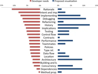
techniques that are suitable for displaying large amounts of datae.g., Ta-ble lens. We found that software visualizations address proTa-blem domains that receive diverse levels of attention from developers. That is, many visualizations have been proposed to tackle problems in domains that are highly important for developers such as history and debugging, but also in domains that are reported less frequently among developers such as dependencies and concurrency. In contrast, there is little support for needs in contract and policy domains, which are fairly important for developers.
The remainder of the chapter is structured as follows: Section 2.2 describes the methodology that we followed to collect relevant literature and select design studies proposed in the software visualization field;
Section 2.3 presents our results by classifying them based on theirtask,
need,audience,data source,representation,tool, andmedium[MMC02]; Section 2.4 discusses our research questions and threats to validity of our findings, and Section 2.5 concludes.
2.2
Methodology
We applied the Systematic Literature Review (SLR) approach, a rigorous
and auditable research methodology forEvidence-Based Software
Engi-neering(EBSE). The method offers a means for evaluating and interpreting relevant research to a topic of interest. We followed Keele’s comprehen-sive guidelines [Kee07], which make it less likely that the results of the literature survey will be biased.
2.2.1
Data sources and search strategy
We sought papers that are relevant to the aim of our investigation,i.e.,that
propose a visualization technique useful to solve a specific problem in software development. Although such papers are expected to be found across multiple software engineering venues, we decided to collect them from the complete set of papers published by SOFTVIS [SOF16] and VISSOFT [VIS16]. We opted for these two venues because we believe their fifteen editions and hundreds of papers dedicated specially to soft-ware visualization offer a sound body of literature reflected in the good
(B) classification that they obtain in the CORE ranking [COR16] (which
considers citation rates, paper submission and acceptance rates among other indicators). Although we observe that publications in better ranked
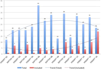
venues might be of higher quality, we believe that analyzing a collection of studies that have been accepted for publication according to fairly similar criteria will support a more objective comparison, and will provide a suit-able baseline for future investigations. Figure 2.1 summarizes the number of papers collected as well as those included in this study.
Figure 2.1: The 86 included papers from the collection of 368 papers published in SOFTVIS/VISSOFT venues.
2.2.2
Included and excluded studies
We searched for problem-driven studies in which we could identify the role of the user, specific development needs, a proposed visualization technique, and an evaluation demonstrating utility. We excluded short papers of one or two pages (like posters, keynotes and challenges) which due to limited space are unlikely to contain enough detail. We also excluded short papers for which a longer version exists. Of the 295 remaining papers we selected design study papers that describe how a visualization is suitable for tackling a particular problem in software development. We included such papers in our study and excluded papers in the other categories proposed by
Munzner [Mun08] (evaluation, model, system and technique) because we considered them unlikely to provide a visualization to tackle a problem in software development. In the proposed categories a visualization paper can be classified into one of five categories:
a) Evaluationsdescribe how a visualization is used to deal with tasks in a problem domain. Evaluations are often conducted via user studies in laboratory settings in which participants solve a set of tasks while variables are measured.
b) Design studiesshow how existing visualization techniques can be use-fully combined to deal with a particular problem domain. Typically, design studies are evaluated through case studies and usage scenarios.
c) Systemselaborate on the architectural design choices of a proposed visualization tool and the lessons learned from observing its use.
d) Techniquesfocus on novel algorithms that improve the effectiveness of visualization. Techniques are often evaluated using benchmarks that measure performance. For instance, edge crossing in graph layout.
e) ModelsincludeCommentarypapers in which an expert in the field
advocate a position and argue to support it;Formalismpapers present
new models, definitions or terminology to describe techniques; and
Taxonomypapers propose categories that help researchers to analyze the structure of a domain.
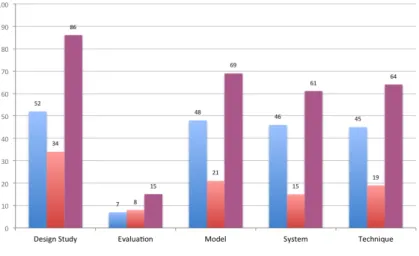
We classified the types of papers by first reading the abstract, second the conclusion, and finally, in the cases where we still were not sure of their main contribution, reading the rest of the paper. Although some papers might exhibit characteristics of more than one type, we classified them focusing on their primary contribution. Figure 2.2 shows the outcome of our classification. We identified 86 design study papers and included them in the study. Although more than two thirds of the papers came from VISSOFT, selected papers that we classify as design studies are moderately balanced.
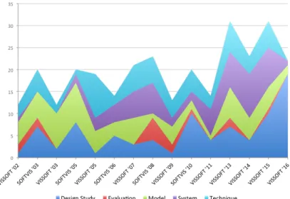
A frequent critique of visualization papers is their lack of evaluation. Indeed, Figure 2.3 shows that papers that take evaluation as their main focus are unusual. The chart also shows an important increment in the number of design study papers in VISSOFT’16, while only a few corre-spond to model and system papers. Traditionally, the number of papers
Figure 2.2: Classification of the 295 SOFTVIS/VISSOFT papers by type.
in SOFTVIS editions (2003-2010) was consistently higher than in VIS-SOFT workshops (2002-2011). The trend of the publications once they merged in the VISSOFT conferences (2013-2016) seems more influenced by SOFTVIS.
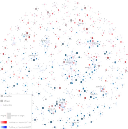
Figure 2.4 shows a visualization of the universe of 368 papers pub-lished in SOFTVIS/VISSOFT [MSGN16]. In this visualization, rectangles represent papers, their height encodes the number of pages (a 5-page paper is depicted by a square), and the color is used to identify its venue (VIS-SOFT in blue, and (VIS-SOFTVIS in red). We used the intensity of the color to represent the publication year, thus the darker the color the newer the paper. Edges connect authors (gray circles) to papers (rectangles). Paper and author nodes are distributed using a force-directed layout. The 86 selected design study papers are distinguished by a black border and a label on top. In the visualization the topology of the community is exposed. A few large groups of collaborators that agglomerate many publications (for which we labeled a main contributor) contrast with the large number of groups that
have few of them. We identify two main groups: (1)a cohesive one where
we labeled the author“Telea, A.”, and(2)another less cohesive but larger
Figure 2.3: Evolution of SOFTVIS/VISSOFT papers by type. From the bottom upwards: Design Study, Evaluation, Model, System, and Technique.
not show the usual topology of a community (due the lack of collaboration), we notice that in VISSOFT’16 both main groups collaborated in a recent publication [SBFB16]. The visualization facilitates the observation that in small groups only one color predominates, thus their publications are not intermingled between SOFTVIS and VISSOFT. Moreover, we observe that the selected papers are scattered among groups of different size, venues and years of publication.
2.2.3
Data Extraction
Table 2.1 presents the attributes that we extracted from each paper: (1)task;
(2)need;(3)audience;(4)data source;(5)representation;(6)medium; and
(7)tool.
We scanned the papers and identified recurrent sections that are likely to contain the data we sought. In our experience, attributes such as task, need, audience and data source are frequently described in the evaluation section, while the representation, medium and tool are typically found in another section dedicated to describe the architectural decisions and
Figure 2.4: Overview of the complete publication record of SOFTVIS/VIS-SOFT. The 86 selected papers (out of 368) correspond to design studies.
implementation of the prototype. Consequently, we extracted the task by identifying frequent terms used to describe development concerns such as programming, testing, debugging, maintenance, reverse-engineering. For the need we looked for questions that are used to specify what can be answered with the visualization. When there were no explicit questions, we extracted the goal that motivated the need for a proposed visualization. The audience was detected by identifying roles that users play in development such as programmer, engineer, tester. We extracted the data source by identifying the origin of the software artifacts that are visualized, such as
Table 2.1: Data extracted from papers.
Attribute Description
Task whythe visualization is needed (e.g.,testing)
Need whichquestions motivated the visualization
Audience whowill use the visualization (e.g.,analyst)
Data source whatsource of data is visualized (e.g.,source code)
Representation whattechnique is used to represent the data
(e.g.,pixel-oriented )
Medium whereto render the visualization (e.g.,wall-disp.)
Tool whichtool is used for evaluation (e.g.,lviz)
source code and running system. For the representation we reflected on the description of visualization techniques, analyzed figures, and looked for their description. We extracted the medium by recognizing in the description the technology required to display the visualization such as wall display, standard monitor. We also extracted attributes of tools from the description of the artifact used in the evaluation such as tool name, and availability. When we were not able to identify an attribute, we searched for common terms already found in other studies. When we still did not
find a description, we reported it asnot identified.
We validated the quality of the extracted data by asking the authors of the included studies to review the data of their papers. In particular, for each study we prepared a message that includes the extracted data and classification. We sent the message to the main author of each study, and when their address was not longer valid or we did not receive an answer after some weeks, we sent the message to co-authors. In the few cases that the same person was the main author of several studies, we only sent the message to the co-authors to balance the workload. Unfortunately, we could not contact the authors of 10 studies as their reported e-mail addresses were no longer valid (dash-marked in Tables 2.2 and 2.3). Among the
76 remaining studies, 43 of them (i.e.,57%) contributed to our survey
(check-marked in Tables 2.2 and 2.3). Eight studies (S1, S3, S19, S30, S55, S62, S67, S68) completely agreed with our classification (we appreciate the rigorous feedback from S30, S55, S67, and S68, which effectively improved this work); nine studies (S5, S17, S31, S37, S46, S47, S48, S57, S81) agreed with the extracted data and also provided further information
e.g.,specified a category for the data that we classified asnot identified; and twenty-six studies (S2, S6, S9, S10, S11, S14, S16, S20, S23, S24, S25, S27, S33, S41, S42, S43, S44, S45, S50, S59, S61, S70, S71, S73, S75, S77) partially agreed and reclassified some attributes. We observe that the
classification of therepresentationused in studies is the greatest source of
disagreement. Most authors were not aware of the proposed classification,
and preferred to specify a category such asgraph,tree,glyph.
2.3
Results
In this section we describe various characteristics of the 86 papers.
2.3.1
Task
Table 2.4 shows the classification of the papers based on the type of tasks [MMC02] they tackled. Figure 2.5 shows the distribution of the types of tasks presented in each edition of the venues. We sorted the venues chronologically starting by SOFTVIS editions followed by VISSOFT ones. We think it provides a better understanding of their various contributions. We observe that even though we selected papers from all editions of SOFT-VIS and SOFT-VISSOFT, we included only few papers from the first editions of VISSOFT. This can be a consequence of the lower percentage of design study papers in VISSOFT than in SOFTVIS (see Figure 2.1). We also detected that papers tackling testing appear for the first time only in the two last editions of SOFTVIS and then reappear in VISSOFT’14. Although most of the reviewed studies tackled programming tasks (as shown in Ta-ble 2.4) they concentrate on SOFTVIS’03 and VISSOFT’15-’16, showing little presence in the rest of the editions. We reflect that the result provides a good overview of the degree of attention that each development concern has had, but since many different visualization techniques are proposed within each type, it provides little help to practitioners to find a suitable visualization for their specific needs. Only the authors of two studies
con-sidered multiple categories to classify the task ([S43],[S61]). The authors
of three other studies proposed to include software comprehension as a
cat-egory ([S67],[S27],[S68]). The authors of one study, while agreeing with
our classification (programming), proposed system design and architecture as subcategories.
Table 2.2: The included papers in the study [S1-S50]. The ones reviewed by their authors have a check mark. The ones for which we did not find a valid e-mail address are marked with a dash.
Id Reference Year Rev.
[S1] Merge-tree: Visualizing the integration of commits into Linux,Wild, E. et al. 2016X
[S2] Visualizing Project Evolution Through Abstract Syntax Tree Analysis,Feist, M.D. et al. 2016X
[S3] Visually Exploring Object Mutation,Schulz, R. et al. 2016X
[S4] Jsvee & Kelmu: Creating and Tailoring Program Animations for Computing Education,Sirkiae, T. 2016 [S5] Towards Visualization of Feature Interactions in Software Product Lines,Illescas, S. et al. 2016X
[S6] Perquimans: A Tool for Visualizing Patterns of Spreadsheet Function Combinations,Middleton, J. et al. 2016X
[S7] Metrics visualization technique based on the origins and function layers for OSS-based development,Ishizue, R. et al. 2016 [S8] DAHLIA 2.0: A Visual Analyzer of Database Usage in Dynamic and Heterogeneous Systems,Meurice, L. et al. 2016 [S9] A Visualization Framework for Parallelization,Wilhelm, A. et al. 2016X
[S10] An Interactive Microarray Call-Graph Visualization,Shah, M.D. et al. 2016X
[S11] On using Tree Visualisation Techniques to support Source Code comprehension,Bacher, I. et al. 2016X
[S12] Visualizing Modules and Dependencies of OSGi-based Applications,Seider, D. et al. 2016 [S13] vizSlice: Visualizing Large Scale Software Slices,Alomari, H. et al. 2016 [S14] Visualization Tool for 3D Graphics Program Comprehension and Debugging,Podila, S. et al. 2016X
[S15] CuboidMatrix: Exploring Dynamic Structural Connections in Software Components.,Schneider, T. et al. 2016 [S16] Walls, Pillars and Beams: A 3D Decomposition of Quality Anomalies,Tymchuk, T. et al. 2016X
[S17] Critical Section Investigator: Building Story Visualizations with Program Traces,Shah, M.D. et al. 2016X
[S18] Visualizing the Evolution of Working Sets,Minelli, R. et al. 2016 [S19] MetaVis: Exploring Actionable Visualization,Merino, L. et al. 2016X
[S20] Kayrebt: An Activity Diagram Extraction and Visualization Toolset Designed for the Linux Codebase,Georget, L. et al. 2015X
[S21] XVIZIT: Visualizing Cognitive Units in Spreadsheets,Hodnigg, K. et al. 2015 [S22] Vestige: A Visualization Framework for Engineering Geometry-Related Software,Schneider, T. et al. 2015 [S23] Hierarchical Software Landscape Visualization for System Comprehension: A Controlled Experiment,Fittkau, F. et al. 2015X
[S24] Interactive Tag Cloud Visualization of Software Version Control Repositories,Greene, G.J. et al. 2015X
[S25] Blended, Not Stirred: Multi-concern Visualization of Large Software Systems,Dal Sasso, T. et al. 2015X
[S26] Pixel-Oriented Techniques for Visualizing Next-Generation HPC Systems,Cottam, J. et al. 2015 [S27] SMNLV: A Small-Multiples Node-Link Visualization Supporting Software Comprehension,Abuthawabeh, A. et al. 2015X
[S28] Live Visualization of GUI Application Code Coverage with GUITracer,Molnar, A.J. 2015 [S29] Advancing Data Race Investigation and Classification through Visualization,Koutsopoulos, N. et al. 2015 — [S30] Visual Clone Analysis with SolidSDD,Voinea, L. et al. 2014X
[S31] Polyptychon: A Hierarchically-Constrained Classified Dependencies Visualization,Daniel, D.T. et al. 2014X
[S32] ChronoTwigger: A Visual Analytics Tool for Understanding Source and Test Co-evolution,Ens, B. et al. 2014 [S33] Visualizing the Evolution of Systems and Their Library Dependencies,Kula, R.G. et al. 2014X
[S34] The visualizations of code bubbles,Reiss, S.P. et al. 2013 — [S35] Visualizing software dynamicities with heat maps ,Benomar, O. et al. 2013 [S36] DEVis: A tool for visualizing software document evolution,Junji Zhi et al. 2013 — [S37] SourceVis: Collaborative software visualization for co-located environments ,Anslow, C. et al. 2013X
[S38] SYNCTRACE: Visual thread-interplay analysis,Karran, B. et al. 2013 — [S39] Automatic categorization and visualization of lock behavior,Reiss, S.P. et al. 2013 [S40] Chronos: Visualizing slices of source-code history,Servant, F. et al. 2013 [S41] Visual support for porting large code bases,Broeksema, B. et al. 2011X
[S42] Visualising concurrent programs with dynamic dependence graphs,Lonnberg, J. et al. 2011X
[S43] Visual exploration of program structure, dependencies and metrics with SolidSX,Reniers, D. et al. 2011X
[S44] MosaiCode: Visualizing large scale software: A tool demonstration ,Maletic, J.I. et al. 2011X
[S45] An interactive ambient visualization for code smells,Murphy-Hill, E. et al. 2010X
[S46] Exploring the inventor’s paradox: applying jigsaw to software visualization,Ruan, H. et al. 2010X
[S47] Towards anomaly comprehension: using structural compression to navigate profiling call-trees,Lin, S. et al. 2010X
[S48] Heapviz: interactive heap visualization for program understanding and debugging,Aftandilian, E.E. et al. 2010X
[S49] Trevis: a context tree visualization analysis framework.,Adamoli, A. et al. 2010 [S50] Dependence cluster visualization,Islam, S.S. et al. 2010X
2.3.2
Need
In Table 2.8 and 2.9 we present the developer needs that we identified from studies. Although some studies tackle more than one need we re-port the most representative one (the complete set of needs is available
online1). On the one hand, we found that 90% of studies (i.e.,77) describe
Table 2.3: The included papers in the study [S51-S86]. The ones reviewed by their authors have a check mark. The ones for which we did not find a valid e-mail address are marked with a dash
Id Reference Year Rev.
[S51] Embedding spatial software visualization in the IDE: an exploratory study,Kuhn, A. et al. 2010 [S52] Visualizing windows system traces,Wu, Y. et al. 2010 — [S53] Zinsight: a visual and analytic environment for exploring large event traces,de Pauw, W. et al. 2010 [S54] Representing development history in software cities,Steinbrückner, F. et al. 2010 [S55] Case study: Visual analytics in software product assessments,Telea, A. et al. 2009X
[S56] Representing unit test data for large scale software development,Cottam, J.A. et al. 2008 [S57] A catalogue of lightweight visualizations to support code smell inspection,Parnin, C. et al. 2008X
[S58] Streamsight: a visualization tool for large-scale streaming applications,de Pauw, W. et al. 2008 [S59] Stacked-widget visualization of scheduling-based algorithms,Bernardin, T. et al. 2008X
[S60] “A Bug’s Life” Visualizing a Bug Database,D’Ambros, M. et al. 2007 [S61] Visualizing Dynamic Memory Allocations,Moreta, S. et al. 2007X
[S62] A Visualization for Software Project Awareness and Evolution ,Ripley, R.M. et al. 2007X
[S63] Experimental evaluation of animated-verifying object viewers for Java,Jain, J. et al. 2006 — [S64] Execution patterns for visualizing web services,de Pauw, W. et al. 2006 [S65] Visualizing live software systems in 3D,Greevy, O. et al. 2006 [S66] Visual exploration of function call graphs for feature location in complex software systems,Bohnet, J. et al. 2006 [S67] Multiscale and multivariate visualizations of software evolution,Voinea, L. et al. 2006X
[S68] CVSscan: visualization of code evolution,Voinea, L. et al. 2005X
[S69] Jove: Java as it happens,Reiss, S.P. et al. 2005 [S70] Methodology and architecture of JIVE,Gestwicki, P. et al. 2005X
[S71] Visual Exploration of Combined Architectural and Metric Information,Termeer, M. et al. 2005X
[S72] Visual data mining in software archives,Burch, M. et al. 2005 [S73] The war room command console: shared visualizations for inclusive team coordination,O’Reilly, C. et al. 2005X
[S74] Visualizing structural properties of irregular parallel computations,Blochinger, W. et al. 2005 [S75] Visualization of mobile object environments,Frishman, Y. et al. 2005X
[S76] Towards understanding programs through wear-based filtering,DeLine, R. et al. 2005 [S77] Program animation based on the roles of variables,Sajaniemi, J. et al. 2003X
[S78] Visualizing Java in action,Reiss, S.P. 2003 [S79] EVolve: an open extensible software visualization framework,Wang, Q. et al. 2003 — [S80] Visualization of program-execution data for deployed software,Orso, A. et al. 2003 [S81] A system for graph-based visualization of the evolution of software,Collberg, C. et al. 2003X
[S82] Interactive locality optimization on NUMA architectures,Mu, T. et al. 2003 — [S83] Graph visualization for the analysis of the structure and dynamics of extreme-scale supercomputers,Zhou, C. et al. 2003 — [S84] KScope: A Modularized Tool for 3D Visualization of Object-Oriented Programs,Davis, T.A. et al. 2003 [S85] Self-Organizing Maps Applied in Visualising Large Software Collections,Brittle, J. et al. 2003 — [S86] Revision Towers,Taylor, C.M.B. et al. 2002
envisioned user needs by explicitly posing questions that can be answered
using the proposed visualization, such as“what is the software doing when
performance issues arise?” [S69],“what does this called method do?” [S76]. On the other hand, in 10% of studies (i.e.,9) there was no explicit question formulation. In such cases, we identified the goals that the
pro-posed visualization achieves, examples of them being“to assist designers
of scheduling-based, multi-threaded, out-of-core algorithms” [S59],“to get a better insight into the control or data flow inside a program” [S20]. Although questions allow users to assess whether a visualization is useful, we observe that uncategorized questions hinder the reuse of a visualiza-tion. We tackle this issue with a classification of needs based on problem domains. A detailed analysis is provided in Section 2.4.
Table 2.4: Classification of papers based on the tasks. Task Reference # Debugging S14, S22, S29, S34, S42, S48, S50, S53, S59, S66, S69-S70, S75, S78, S80 15 Maintenance S2-S3, S5, S8-S9, S13, S30, S33, S35, S37-S38, S41, S43-S46, S57, S60-S61, S64, S67-S68 22 Programming S4, S6-S7, S11, S17-S19, S21, S24, S26, S28, S39, S51-S52, S61, S63, S71, S74, S76-S77, S79, S81-S83, S86 25 Reverse Engineering S10, S12, S15, S20, S23, S25, S27, S31, S40, S43, S47, S54, S65, S67, S72, S84-S85 17 Software Process Management S1, S16, S36, S55, S62, S73 6 Testing S32, S49, S56, S58 4
2.3.3
Audience
Software developers play specific roles such asinteraction designer,
so-lution architect,GUI designer,requirements analyst,release coordinator.
In contrast, as shown in Table 2.5, 85% of the studies (i.e.,73) envisioned
a generic audience described asdeveloper(42),user(19),programmer
(17), orengineer (5). In the remaining studies the role of the user was
more specific such asproject manager(9),architect(7),maintainer(5),
tester(4), ordesigner(2). Less frequent roles werebug triager,HPX de-veloper,operation staff,performance analyst,quality assurance engineer, andreviewer. Some studies envisioned roles of users from other fields such asbusiness ownerandstudent. One study envisioned managers as well
as developers pursuing the same questions“(1) when were the changes
made? (2) what kind of changes have been made? and (3) how does visit / download time vary over time?” [S36]. Another study envisioned that their
tool would be suitable for“everyone involved in software development”
[S62]. We observed that a better understanding of the scope of the role that
an audience plays would (1)help researchers to propose solutions focused
on the particular problems that roles cope with, and(2)facilitate adoption
Figure 2.5: Distribution of papers by task in each venue. Bottom-up: Debug-ging, Programming, Reverse Engineering, Maintenance, Software Process Management and Testing.
2.3.4
Data source
Table 2.6 presents various sources of data that are visualized in the studied
papers. The most frequent data were gathered from (1) running system.
Most studies visualized traces of execution, metrics (e.g.,CPU usage) and
user interactions. Some studies visualized events among applications to analyze operating systems and distributed architectures. A few studies
visualized memory accesses and behavior of live objects;(2) source code
that provided the input to build models of systems for the visualization of dependencies, metrics, structure and inheritance. A few studies visualized annotations used to define features, the scope of variables and program slices. We found that the most frequent language supported was Java, followed by C/C++, which was supported by half of the studies. Other
languages with little support include Smalltalk and Pascal; and(3) version
control system. Most studies visualized meta-data from the commit (e.g.,
author, date, message), and less frequently changes of code (e.g.,added
Table 2.5: Classification of papers based on the audience. Audience Reference # Developer S2, S5, S8-S9, S11-S13, S18-S19, S22-S23, S25-S26, S30-S31, S33, S35-S37, S40-S41, S43-S44, S46-S47, S49-S51, S54, S56-S58, S60, S64-S68, S71, S73, S75-S76, S80 42 User S1, S5, S8, S12-S13, S15, S17-S18, S21, S34, S38, S52, S60, S74, S78-S79, S82-S83, S85 19 Programmer S3-S4, S7, S10, S14, S24, S39, S45, S48, S59, S61, S64, S69-S70, S75, S81, S86 17 Project Manager S2, S12, S32, S44, S54-S55, S57, S68, S73 9 Architect S9, S30, S31, S44, S55, S68, S71 7 Manager S7, S16, S24, S36, S62, S86 6 Student S4, S14, S28, S42, S63, S77 6 Engineer S5, S50, S65, S70, S72 5 Maintainer S13, S33, S50, S68, S80 5 Analyst S13, S16, S53, S75 4 Leader S7, S41, S43, S73 4 Tester S7, SS60, S64, S68 4 Researcher S2, S6, S84 3 Designer S7, S64 2
New Team Member S20, S68 2
Practitioner S6, S28 2
Quality Assurance En-gineer
S29, S60 2
Bug Triager [S2], Business Owner [S64], Coders [S62], End-User [S60], Everyone involved in development [S62], HPX Developer [S26], Linux Kernel Developer [S20], Operation Staff [S64], Performance Analyst [S53], Reviewer [S7], Soft-ware Manager [S36], Test Manager [S32]
1
asspreadsheets,bug tracking systems(e.g.,Bugzilla),build automation tools(e.g.,Maven),databasesanddocumentation.
We observe that visualizations have focused on sources of complex data that are difficult to analyze by other means, but this also shows that
sources of complex data are not limited to the traditional ones. We also noticed that studies focus mainly on describing how they modeled data rather than specifying the source and type of data. We observe that detailed descriptions of data that include not only the source but the format as well as other characteristics can help developers to adopt visualizations. For instance, users who are aware of a technique for visualizing a stack trace gathered from a running system can decide whether their context is similar enough to adopt the visualization.
2.3.5
Representation
Describing the representation used in a visualization is a complex task. Authors proposing a visualization use various strategies to describe the
applied techniques. Some used verbose descriptions[S62, S65]by
specify-ing dimensions, metaphors, marks, and properties of them. Others[S68,
S71]opted for concise but sometimes vague descriptions. We classify the
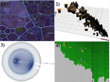
visualization techniques used in the studies according to the popular tax-onomy proposed by Keim [Kei02]. This taxtax-onomy provides a concise list of categories upon which abundant research has relied. In it, visualization techniques can belong to one of four categories (examples are shown in
Figure 2.6): (1) Stackedtechniques that are tailored to present data in a
hierarchical fashion (e.g.,Treemaps and Cone Trees);(2) Iconictechniques
that map the data attributes to the features of an icon (e.g.,CocoViz[S46]);
(3) Geometrically-Transformedtechniques that aim at finding interesting
transformations of data attributes (e.g.,Scatter-plots and Parallel
Coordi-nates);(4) Dense Pixeltechniques that map each data attribute to a colored
pixel and group the pixels belonging to each attribute into adjacent areas (e.g.,Vampir[S7]) ; and(5) Standard 2D/3Dtechniques such as Bar Charts, X-Y Plots;
Table 2.7 presents these categories. We note that approximately half of
the studies (i.e.,44) combine techniques from several categories. The most
frequent combination occurred between Treemaps and Node-link diagrams (Stacked and Geometrically-Transformed). Combinations of other types of techniques occurred with less frequency (less than four studies). Frequent types are Geometrically-Transformed (GT), Dense Pixel (DP) and Stacked (ST). We observe that GT is frequent since node-link techniques, that belong to this category, are commonly used by visualizations that explore relationships. The DP type contains techniques suitable for depicting
mas-Table 2.6: Classification of papers based on the data source.
Data Source Reference #
Running System (41) Trace Execution S3, S9-S10, S14-S15, S17, S20, S22, S28-S29, S38-S39, S42, S49, S56, S59, S65, S69-S70, S74, S78-S80 22 Metric S17, S47, S66, S71 4 Interaction S62, S76 2 Application events S23, S52, S53, S58, S64, S75, S83 7 Memory accesses S9, S20, S48, S61, S80, S82 6 Live objects S9, S18-S19, S63 4 Source Code (31) Dependency S4, S8, S12-S13, S27-S28, S31, S37, S43-S44, S46, S50, S54-S55, S63, S65-S66, S77, S81, S84-S85 22 Metric S3, S12, S30, S37, S41, S43-S46, S51, S55, S71 12 Structure S8, S27, S31, S37, S43, S44, S46, S55, S65-S66, S79 11 Inheritance S81, S84-S85 3
Annotation [S5], Scope [S11], Slice [S13] 1
Version Control System (16) Meta-data S1-S2, S26, S32, S34-S36, S40, S67-S68, S72-S73, S86 13 Code Changes S2, S8, S16, S32, S34-S36, S55, S67-S68 10 Spreadsheet (2) S6, S21 2
Others (4) Bug Tracking System [S60], Build Automatic Tool
[S33], Database [S8], Documentation [S71]
1
sive data sets such as Heatmap. ST also includes popular techniques for hierarchical data such as Treemap.
Figure 2.6: Examples of visualizations for each type (1) Stacked, (2) Iconic, (3) Geometrically-Transformed, and (4) Dense Pixel.
2.3.6
Tool
Tables 2.8 and 2.9 summarize the tools collected from the papers. Normally, they are developed as prototypes to evaluate a proposed visualization. All
studies, among the 77 that explicitly identified a tool (i.e.,90%), introduced
a new visualization tool. Notice that the tool namedJivethat was used in
two studies[S70, S78]corresponds to a different tool. A few (i.e.,26%)
made their tool and source code publicly available. As one can expect, few prototypes were maintained and extended over time. The most notable
cases areJive [S70], and two tools used for teaching programming:jGrasp
[S63]andPlanAni [S77]. If we consider tools for which current
informa-tion is available, their average lifespan is 3.7 years2. We acknowledge that
this value represents only a lower bound, since it does not consider possi-ble earlier presentations of the tools. Various studies often used different
visualization frameworks. The most frequent ones areOpenGL(11) used
over multiple years, andD3.js(9) andRoassal(6) used only recently. Also,
three studies usedJava3Din more than a decade ago.GraphVizwas used
2We measured lifespan as the time between a tools�
![Table 2.8: Visualization tools and needs extracted from papers [S1-S50].](https://thumb-us.123doks.com/thumbv2/123dok_us/810527.2602493/48.629.87.523.121.695/table-visualization-tools-needs-extracted-papers-s-s.webp)
![Table 2.9: Visualization tools and needs extracted from papers [S51-S86].](https://thumb-us.123doks.com/thumbv2/123dok_us/810527.2602493/49.629.109.546.114.576/table-visualization-tools-needs-extracted-papers-s-s.webp)