I. CONCEPT
A. Accessible exhibit design
elements shall include, but not be limited to, font style and size, color contrast between text and/or objects and background, tactile exhibits, interactive exhibits, controls, exhibit
mounting heights and positioning of exhibits on path of travel. The Accessibility Compliance Checklist for Exhibits may be found in the Appendix. This checklist contains the basic elements necessary for accessible exhibit design. Please refer to this checklist when developing or redesigning exhibits. Following the directives in this checklist will help to
ensure that exhibits are fully accessible and legally compliant with all statutes and regulations.
B. Exhibits shall be designed to
allow people with physical and sensory disabilities to access and experience the material presented.
C. Exhibits shall be designed so
that they do not overwhelm visitors of any ability with large blocks of text. Good exhibit design creates a visual balance between text, graphics and white space.
D. Models, touchable, and
hands-on exhibits may be better
teaching tools that reach broader audiences than purely graphical exhibits and should be
considered where possible.
E. Where possible and appropriate,
exhibit contents shall include the experiences and “voices” of persons with disabilities.
II. BASIC ELEMENTS OF
ACCESSIBLE EXHIBIT DESIGN
A. Fonts
1. Typeface or font families used for exhibit text and labels shall be easy to read for persons with varied levels of vision. Preferred typefaces include sans serif fonts or fonts with simple, clean serifs. The number of typefaces in a given exhibit should not exceed two or three.
a. Some examples of legible sans serif fonts include: Arial, Comic Sans, Futura, Optima, Tahoma, Tiresias and
Trebuchet.
b. Some examples of legible serif fonts that work well at large sizes include: Albertus Medium, Bookman, Caslon, Clarendon, Lydian, Novarese, and ITC Tiepolo.
2. Avoid fonts with strokes that are very heavy, thin, light or decorative and those with letters are either very close together or widely spaced.
3. Spaces between lines of type (also known as “leading”) should make it easy to locate the next line. Leading at least 25% taller than the height of the lowercase font is
suggested, and this percentage may increase slightly as the font size increases.
4. Font Styles - Even at panel size text, italics may be somewhat hard to read and shall be limited to book title, foreign names and short quotes. Boldface text should generally not be used for entire sections. Text that uses upper and lowercase letters in typical sentence style is easier to read than all uppercase letters. 5. Font sizes for the main body of
text shall meet or exceed the minimums required for the horizontal viewing distance from the eyes to the object, according to the following chart. Minimum height of characters shall be measured using the uppercase X. Titles and Headings will be larger.
Captions may be smaller, but not smaller than 24-point. Captions briefly describe images; text that may be illustrated with an image but can stand alone is sidebar text and should be as close to main body text height as
possible. Design credits may be small. See chart of Print Height Minimums.
6. Font Height Minimums -
POINT HEIGHT (APPROX.) HEIGHT IN INCHES HORIZONTAL DISTANCE EYE-TO -OBJECT ⅜” Up to 39” ¾” Up to 78” 1⅛” Up to 118” (For measurement purposes, there are 72 points per inch. When taking into account spacing above and below a line of type, when set at 72 points, the line of type will take up approximately 1” of vertical space.)
B. Text and Labels
1. Words are easier to read in horizontal lines. Artistic word shapes must be kept to a minimum or repeated in linear format, if used.
2. Maintaining a line length between 45 and 60 characters with margins flush left and ragged right is optimal. Where columns of text are used, space between columns must be large enough so viewers do not read across columns. 3. Labels pertaining to pictures or
objects shall be placed consistently throughout an exhibit.
4. Exhibit labels in cases or on shelves shall be placed at readable heights and angles for persons who are seated or standing. Avoid placing labels flat on horizontal shelf surfaces. Labels placed at 45 degree angles to front plane of case are generally easier to see. 5. Text must be well balanced with graphics and not overly wordy or technical. It should be straightforward, germane, and easy to comprehend for people of all abilities.
C. Light Levels
1. When not prohibited from doing so by conservation
requirements, provide at least 100 lux (10 foot-candles) of light on an object. This is the minimum light level at which someone with low vision can see an object. If displaying sensitive materials that require a maximum of 50 lux (5 foot-candles), then:
a. Position the items to allow the visitor to approach them as closely as possible.
b. Light the environment with even light; do not spotlight an object.
c. Provide the highest contrasting background possible.
d. Present the object in an alternate format, such as a reproduction or a brochure that can be viewed in a brighter location.
2. Lighting shall be planned to coordinate with conditions of exhibits so that glare from shiny objects can be avoided and so adequate lighting (100 – 300
lux or 10 – 30 foot-candles is recommended) is provided for the entire exhibit.
ADAAG-4.30.8
B. Glare
1. Finishes shall be non-glare, eggshell or matte.
ADAAG-4.30.5
2. Text screened directly onto clear glass or Plexiglas is very difficult to see and shall not be used.
C. Contrast
1. Characters and symbols shall contrast with their background, either dark characters on a light background or light characters on a dark background. A minimum of 70% contrast is a recommended guideline. Contrast percentage is
calculated using the following formula:
([B1-B2]/B1) x 100 = Contrast. B1 = Light Reflective Value (LRV) of the lighter color and B2 = LRV of darker value. ADAAG-4.30.5
Simply stated, “pure” black is the absence of light or 0% LRV, while white is “all” light or 100% LRV. Black and white have 100% contrast. If the
background is white, the text darkness should be nearly ¾ of the way to black. Please
contact the Accessibility Section for more information.
Refer also to Section 30,
Publications.
2. Placing text over images or patterns forces readers’ eyes to constantly adjust to varying contrasts. Use screens or place text over solid
background with 70% contrast to text.
3. For objects that require a high mounting position and/or low lighting, laminated, high-contrast photographs located near the individual exhibits or centrally set within the
exhibition serve those with low vision as well as those who use wheelchairs.
D. Color
1. When choosing colors for fonts and backgrounds, research suggests that visibility for
persons with low vision will be enhanced by considering the following:
a. Differences between
foreground and background colors on labels or panels should be exaggerated. Lighten the lights and darken the darks to increase to 70% contrast.
b. Avoid using red and green against each other as text and background, as persons with red-green color deficiencies (the most common color deficiency) are not able to easily distinguish the two. c. Avoid contrasting colors from
adjacent hue families in the color circle (such as orange and yellow, orange and red, yellow and green, blue and green, blue and violet) as they often lack adequate contrasts. d. Even if they are from different
hue families, colors of similar lightness (such as gray-blue and gray-brown) are difficult for persons with certain color deficiencies to see.
e. If colors from the same hue families (blue and light blue, brown and tan, etc.) are used adjacent to each other,
contrast should be
exaggerated to reach 70%.
III. ALTERNATE FORMATS
A. Exhibits that cannot be made
physically accessible shall have alternatives such as captioned films, slide shows or photos.
B. Exhibits shall be able to provide
alternatives such as large print, audio, Braille, or tactile graphics on request. Large print text handouts shall be readily available for main body text located beyond optimal viewing range for its size or for any handouts printed at less than 18-point size. Verbal descriptions of exhibits may also be provided by docents or staff.
C. Audio or verbal descriptions shall
provide concise, objective, critical information the listener needs but cannot see or read.
D. Electronic versions of exhibits in
TXT or PDF format may be offered as a take home
alternative to Braille for persons with a screen reader.
F. Availability of alternate formats
and contact information shall be included on introductory panel and/or posted in a central area.
IV. HANDS-ON AND INTERACTIVE MATERIALS
A. Provide models, either life-size
or to scale, of rare or fragile objects that may not be touched. If the object is very large, a reproduction of a part of it should be available so that visitors can get an idea of its relative size.
B. Provide magnifiers for visitors to
examine photographs, signs, artifacts, fossils and mounted specimens in the exhibits.
C. In order to be within comfortable
reach ranges, exhibits featuring interactive controls or objects to be picked up and/or manipulated for more than a few seconds shall be located within
accessible reach ranges.
(Figures 18-1 & 18-3).
Contact the Accessibility Section for details
D. Exhibit controls or other items to
be briefly touched, such as push buttons, shall also be placed at a minimum of 28” and a maximum of 48” and within 18” across.
1. Earphones or speaking devices shall be mounted no higher than 40” and volume must be adjustable.
2. Knobs, handles, dials, and controls used on interactive exhibits shall be designed so they can be operated with a closed fist with no tight
grasping, pinching or twisting. CBC-1117B.6.4
V. FLAT MOUNTED DISPLAYS
A. Flat-mounted or table top
exhibits to be touched or closely approached, such as relief maps and tactile exhibits, shall allow for a clear knee space that is a minimum of 36” wide and 27” clear height above the floor surface. Where it does not create a hazard for persons with low vision, 29” high knee space is recommended for wheelchair users (Figure 18-1).
VI. ANGLE MOUNTED DISPLAYS
A. Angle-mounted exhibits featuring
mostly interactive features and/or controls to manipulate must include knee space as described in Part V,
Flat-Mounted Displays (Figure 18-2).
Figure 18-1
Figure 18-2
Figure 18-3
pedestals or supports shall be placed at angles from 30 to 60 degrees to the ground or floor. The lower horizontal edge of the panel must be mounted between 28” and 34” above the ground. The exact distance may vary according to the panel size, and the text size should conform to minimums (Figure 18-3).
Contact the Accessibility Section for more details.
C. Angled exhibits mounted on
posts and located along the prevailing path of travel must not protrude into the path of travel more than 12”, as described in Part VIII, Protruding Objects, Item C.
Figure 18-4
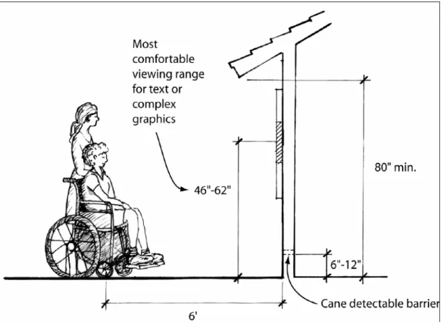
DISPLAYS
A. To allow both a standing and
seated person to read vertically displayed material, the material shall be mounted in accordance with Figure 18-4, “Text Mounting
Height Ranges for Vertical Exhibits” based on the optimal field of vision for sitting and standing adults.
1. The optimal field of vision for standing adults at six feet from
a vertical surface varies from 55” to 69”. The median height is 62”. For seated adults in standard wheelchairs at the same distance, the range is 42” to 50”. The median height is 46”.
B. Vertically mounted exhibits with
the 46” and 62” medians, and with most of the main body text centered around the 54” mid-point of the two medians will be within most viewers’ comfortable range of vision. Actual exhibit panel size may exceed these dimensions.
C. Exhibit shelters that have roofs
must allow vertical clear space of at least 80” between the lowest edge of roof and exhibit viewing surface (Figure 18-4).
Contact the Accessibility Section for more information.
VIII. PROTRUDING OBJECTS
A. Objects projecting from walls
(e.g. telephones, display
cabinets, etc.) with their leading edges between 27” and 80” above the floor surface shall protrude a maximum of 4” into walks, halls, passageways or aisles (Figure 18-5).
CBC-1133B.8.6.1
B. Objects mounted with their
leading edges at or below 27” above the floor surface may protrude any amount.
CBC-1133B.8.6.1
Figure 18-5
C. When freestanding objects are
mounted on posts or supports between 27” and 80” above the floor surface, they may overhang 12” but all edges must be
rounded.
CBC-1133B.8.6.1 – 3
D. Protruding objects shall not
reduce the clear width of an accessible route or maneuvering space.
IX. PATH OF TRAVEL AND CLEAR SPACE
A. Floor and path of travel surfaces
must be firm, stable and slip resistant, along accessible routes, and in accessible rooms and spaces.
CBC-1124B.1
B. Exhibits and displays adequately
allow for approaching and viewing from a wheelchair. A stationary wheelchair requires a clear floor space of 30” x 48”
(Figures 18-6 & 18-7).
CBC-1118B.4.1
C. The clear space in front of any
exhibit or display shall be a minimum of 60” wide to allow for both exhibit viewing and visitor circulation (Figure 18-8).
CBC-1118B.3
D. All visitors viewing an exhibit
shall be given the same
opportunity to turn and leave the exhibit. To turn in any direction a wheelchair requires a minimum 60” diameter circle or a
T-intersection with T-aisle widths of 36” or wider (Figures 8 & 18-9).
CBC-1118B.3
E. Exhibit protective railings shall
not be higher than 36” and shall not obstruct the line of vision of seated persons.
Figure 18-6
Figure 18-8
Figure 18-9
X. EXHIBIT PANELS AND TACTILE DESIGN
A. To provide accessible nature
trails or other educational exhibits for those with vision impairments, exhibits need to follow the guidelines above regarding design, mounting, path and clear space issues and protruding objects (Figures 18-8 & 18-9).
B. Exhibit designers shall also
consider providing raised tactile lettering for short descriptive educational text such as plant names, “station” names (“Quartermasters House”) or numbers (“Stop 6: Valley Oak”) and similar basic concepts or simple graphics (Valley Oak Leaf, egg-and-dart molding). Recommended uppercase letter height for such labels is 5/8” minimum, and 2” maximum; letters should be raised 1/32” above surface.
C. See also the design information
in Section 41, Trails, regarding methods to mark the panel locations so that they are
detectable by persons with vision impairments.
XI. REFERENCES
A. For additional information, see
the following references:
1. Website and other information from Lighthouse International research publications about accessible contrast and print. See online articles below: www.lighthouse.org/color_contr ast.htm and www.lighthouse.org/print_leg.ht m 2. Smithsonian Institute Guidelines for Accessible Exhibit Design, including some information credited to Parks Canada, at:
www.si.edu/opa/accessibility/ex design/start.htm
A. SITE PLAN
1. Have the site drawings or floor
plans been submitted, showing compliant exhibit locations, panel dimensions, mounting heights and angled, viewing distances and turning space?
F Yes F No
F Not Applicable
2. Are the paths of travel through
the exhibit barrier-free, allowing compliant approaches, views and departures?
F Yes F No
F Not Applicable
3. Are the hands-on and
interactive components within prescribed reach ranges, not requiring tight pinching, twisting or grasping?
F Yes F No
F Not Applicable
This document is intended to facilitate in planning accessible exhibits. Refer to Section 18, Exhibits for detailed descriptions of accessible exhibit requirements. Please contact the Accessibility Section at (916) 445-8949 for clarification or assistance.
B. DESIGN ELEMENTS
1. Have panel designs been
submitted on hard copy (at a minimum of 40% of actual size), or electronically in Photoshop or Illustrator? F Yes F No F Not Applicable
2. Is the layout of each panel
visually logical and easy to understand?
F Yes F No
F Not Applicable
3. Are videos captioned for sound
and key visuals? F Yes
F No
2. Is the contrast between text
and background at or near 70%?
F Yes F No
F Not Applicable
3. Are graphics and text shown
against a visually uncluttered background?
F Yes F No
F Not Applicable
D. TYPEFACES AND TEXT
1. Are text and graphics well
balanced, including text content that is clear, concise and
germane to the exhibit graphics?
F Yes F No
F Not Applicable
2. Is the text layout, including the
size of text blocks and the space between lines and columns, appropriately spaced and visually balanced?
F Yes F No
F Not Applicable
4. Are audio components
captioned and include adjustable volume?
F Yes F No
F Not Applicable
5. Are all caption text font styles
and sizes legible? (24 point front is the recommended minimum for captions.)
F Yes F No
F Not Applicable
6. Are alternate format resource
materials, including all text and short descriptions of media and key graphics, available upon request?
F Yes F No
F Not Applicable
C. LIGHTING AND CONTRAST
1. Exhibit finishes and lighting are
free of shadows and glare? F Yes
F No
3. Are exhibit typefaces and font
styles easy to read, meeting legibility standards, with italics only used for foreign terms or short quotes?
F Yes F No
F Not Applicable
4. Do the main body text heights
meet the minimums for viewing distances? Remember that minimum uppercase“ X-height ”for a 40” distance is ⅜” or at least 40 to 48 point
F Yes F No
F Not Applicable
5. Are all labels for graphics or
object created in legible sizes and styles, placed consistently and, if on horizontal shelves, are at readable heights and angles?
F Yes F No