Information Retrieval Perspective to Nonlinear Dimensionality
Reduction for Data Visualization
Jarkko Venna [email protected]
Jaakko Peltonen [email protected]
Kristian Nybo [email protected]
Helena Aidos [email protected]
Samuel Kaski [email protected]
Aalto University School of Science and Technology Department of Information and Computer Science P.O. Box 15400, FI-00076 Aalto, Finland
Editor: Yoshua Bengio
Abstract
Nonlinear dimensionality reduction methods are often used to visualize high-dimensional data, al-though the existing methods have been designed for other related tasks such as manifold learning. It has been difficult to assess the quality of visualizations since the task has not been well-defined. We give a rigorous definition for a specific visualization task, resulting in quantifiable goodness measures and new visualization methods. The task is information retrieval given the visualization: to find similar data based on the similarities shown on the display. The fundamental tradeoff be-tween precision and recall of information retrieval can then be quantified in visualizations as well. The user needs to give the relative cost of missing similar points vs. retrieving dissimilar points, after which the total cost can be measured. We then introduce a new method NeRV (neighbor retrieval visualizer) which produces an optimal visualization by minimizing the cost. We further derive a variant for supervised visualization; class information is taken rigorously into account when computing the similarity relationships. We show empirically that the unsupervised version outperforms existing unsupervised dimensionality reduction methods in the visualization task, and the supervised version outperforms existing supervised methods.
Keywords: information retrieval, manifold learning, multidimensional scaling, nonlinear dimen-sionality reduction, visualization
1. Introduction
It has turned out that the manifold learning methods are not necessarily good for information visualization. Several methods had severe difficulties when the output dimensionality was fixed to two for visualization purposes (Venna and Kaski, 2007a). This is natural since they have been designed to find a manifold, not to compress it into a lower dimensionality.
In this paper we discuss the specific visualization task of projecting the data to points on a two-dimensional display. Note that this task is different from manifold learning, in case the inherent dimensionality of the manifold is higher than two and the manifold cannot be represented perfectly in two dimensions. As the representation is necessarily imperfect, defining and using a measure of goodness of the representation is crucial. However, in spite of the large amount of research into methods for extracting manifolds, there has been very little discussion on what a good two-dimensional representation should be like and how the goodness should be measured. In a recent survey of 69 papers on dimensionality reduction from years 2000–2006 (Venna, 2007) it was found
that 28 (≈40%) of the papers only presented visualizations of toy or real data sets as a proof of
quality. Most of the more quantitative approaches were based on one of two strategies. The first is to measure preservation of all pairwise distances or the order of all pairwise distances. Examples of this approach include the multidimensional scaling (MDS)-type cost functions like Sammon’s cost and Stress, methods that relate the distances in the input space to the output space, and various cor-relation measures that assess the preservation of all pairwise distances. The other common quality assurance strategy is to classify the data in the low-dimensional space and report the classification performance.
The problem with using the above approaches to measure visualization performance is that their connection to visualization is unclear and indirect at best. Unless the purpose of the visualization is to help with a classification task, it is not obvious what the classification accuracy of a projection reveals about its goodness as a visualization. Preservation of pairwise distances, the other widely adopted principle, is a well-defined goal; it is a reasonable goal if the analyst wishes to use the visualization to assess distances between selected pairs of data points, but we argue that this is not the typical way how an analyst would use a visualization, at least in the early stages of analysis when no hypothesis about the data has yet been formed. Most approaches including ours are based on pairwise distances at heart, but we take into account the context of each pairwise distance, yielding a more natural way of evaluating visualization performance; the resulting method has a natural and rigorous interpretation which we discuss below and in the following sections.
This paper extends our earlier conference paper (Venna and Kaski, 2007b) which introduced the ideas in a preliminary form with preliminary experiments. The current paper gives the full justification and comprehensive experiments, and also introduces the supervised version of NeRV.
2. Visualization as Information Retrieval
In this section we define formally the specific visualization task; this is a novel formalization of visualization as an information retrieval task. We first give the definition for a simplified setup in Section 2.1, and then generalize it in Section 2.2.
2.1 Similarity Visualization with Binary Neighborhood Relationships
In the following we first define the specific visualization task and a cost function for it; we then show that the cost function is related to the traditional information retrieval measures precision and recall.
2.1.1 TASKDEFINITION: SIMILARITYVISUALIZATION
Let{xi}Ni=1 be a set of input data samples, and let each sample i have an input neighborhood Pi,
consisting of samples that are close to i. Typically, Pi might consist of all input samples (other than
i itself) that fall within some radius of i, or alternatively Pi might consist of a fixed number of input
samples most similar to i. In either case, let ribe the size of the set Pi.
The goal of similarity visualization is to produce low-dimensional output coordinates {yi}Ni=1
for the input data, usable in visual information retrieval. Given any sample i as a query, in visual information retrieval samples are retrieved based on the visualization; the retrieved result is a set Qiof samples that are close to yi in the visualization; we call Qi the output neighborhood. The Qi
typically consists of all input samples j (other than i itself) whose visualization coordinates yj are
within some radius of yi in the visualization, or alternatively Qi might consist of a fixed number
of input samples whose output coordinates are nearest to yi. In either case, let ki be the number
of points in the set Qi. The number of points in Qi may be different from the number of points in
Pi; for example, if many points have been placed close to yi in the visualization, then retrieving all
points within a certain radius of yimight yield too many retrieved points, compared to how many
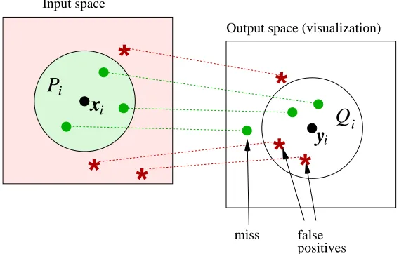
are neighbors in the input space. Figure 1 illustrates the setup.
The remaining question is what is a good visualization, that is, what is the cost function. Denote the number of samples that are in both Qiand Piby NTP,i(true positives), samples that are in Qibut
not in Piby NFP,i(false positives), and samples that are in Pibut not Qiby NMISS,i(misses). Assume
the user has assigned a cost CFP for each false positive and CMISSfor each miss. The total cost Ei
for query i, summed over all data points, then is
Ei=NFP,iCFP+NMISS,iCMISS. (1)
2.1.2 RELATIONSHIP TOPRECISION ANDRECALL
The cost function of similarity visualization (1) bears a close relationship to the traditional measures of information retrieval, precision and recall. If we allow CMISSto be a function of the total number
false positives Input space
miss
Output space (visualization)
*
*
*
i i
Q
P
x
y
i
i
*
*
*
Figure 1: Diagram of the types of errors in visualization.
dividing by ki, the total cost becomes
E(ki,ri) =
1 ki
E(ri) =
1 ki
(NFP,iCFP+NMISS,iCMISS(ri)) = CFP
NFP,i
ki +C
′
MISS
ki
NMISS,i
ri
= CFP(1−precision(i)) +
CMISS′ ki
(1−recall(i)).
The traditional definition of precision for a single query is
precision(i) = NTP,i
ki
=1−NFP,i
ki
,
and recall is
recall(i) =NTP,i
ri
=1−NMISS,i
ri
.
Hence, fixing the costs CFP and CMISS and minimizing (1) corresponds to maximizing a specific
weighted combination of precision and recall.
Finally, to assess performance of the full visualization the cost needs to be averaged over all samples (queries) which yields mean precision and recall of the visualization.
2.1.3 DISCUSSION
query point in the visualization and retrieve a set of points close-by in the visualization, in display
A such retrieval yields few false positives but many misses, whereas in display B the retrieval yields
few misses but many false positives. The tradeoff can also be seen in the (mean) precision-recall curves for the two visualizations, where the number of retrieved points is varied to yield the curve. Visualization A reaches higher values of precision, but the precision drops much before high recall is reached. Visualization B has lower precision at the left end of the curve, but precision does not drop as much even when high recall is reached.
Note that in order to quantify the tradeoff, both precision and recall need to be used. This requires a rich enough retrieval model, in the sense that the number of retrieved points can be different from the number of relevant points, so that precision and recall get different values. It is well-known in information retrieval that if the numbers of relevant and retrieved items (here points) are equal, precision and recall become equal. The recent “local continuity” criterion (Equation 9 in Chen and Buja, 2009) is simply precision/recall under this constraint; we thus give a novel information retrieval interpretation of it as a side result. Such a criterion is useful but it gives only a limited view of the quality of visualizations, because it corresponds to a limited retrieval model and cannot fully quantify the precision-recall tradeoff. In this paper we will use fixed-radius neighborhoods (defined more precisely in Section 2.2) in the visualizations, which naturally yields differing numbers of retrieved and relevant points.
The simple visualization setup presented in this section is a novel formulation of visualization and useful as a clearly defined starting point. However, for practical use it has a shortcoming: the overly simple binary fixed-size neighborhoods do not take into account grades of relevance. The cost function does not penalize violating the original similarity ordering of neighbor samples; and the cost function penalizes all neighborhood violations with the same cost. Next we will introduce a more practical visualization setup.
2.2 Similarity Visualization with Continuous Neighborhood Relationships
We generalize the simple binary neighborhood case by defining probabilistic neighborhoods both in the (i) input and (ii) output spaces, and (iii) replacing the binary precision and recall measures with probabilistic ones. It will finally be shown that for binary neighborhoods, interpreted as a constant high probability of being a neighbor within the neighborhood set and a constant low probability elsewhere, the measures reduce to the standard precision and recall.
2.2.1 PROBABILISTICMODEL OFRETRIEVAL
We start by defining the neighborhood in the output space, and do that by defining a probability distribution over the neighbor points. Such a distribution is interpretable as a model about how the user does the retrieval given the visualization display.
Given the location of the query point on the display, yi, suppose that the user selects one point
at a time for inspection. Denote by qj|i the probability that the user chooses yj. If we can define
such probabilities, they will define a probabilistic model of retrieval for the neighbors of yi.
The form of qj|i can be defined by a few axiomatic choices and a few arbitrary ones. Since the
qj|i are a probability distribution over j for each i, they must be nonnegative and sum to one over
j; therefore we can represent them as qj|i=exp(−fi,j)/∑k6=iexp(−fi,k)where fi,j∈R. The fi,j
should be an increasing function of distance (dissimilarity) between yi and yj; we further assume
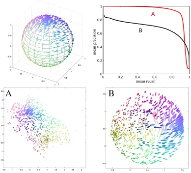
0 0.2 0.4 0.6 0.8 1 0
0.2 0.4 0.6 0.8 1
A
B
mean recall
mean precision
A
B
Figure 2: Demonstration of the tradeoff between false positives and misses. Top left: A three-dimensional data set sampled from the surface of a sphere; only the front hemisphere is shown for clarity. The glyph shapes (size, elongation, and angle) show the three-dimensional coordinates of each point; the colors in the online version show the same information. Bottom: Two embeddings of the data set. In the embedding A, the sphere has been cut open and folded out. This embedding eliminates false positives, but there are some misses because points on different sides of the tear end up far away from each other. In contrast, the embedding B minimizes the number of misses by simply squashing the sphere flat; this results in a large number of false positives because points on opposite sides of the sphere are mapped close to each other. Top right: mean precision-mean recall
curves with input neighborhood size r=75, as a function of the output neighborhood size
fi,j. In general there should not be any reason to favor any particular neighbor point, and hence the
form should not depend on j. It could depend on i, however; we assume it has a simple quadratic form fi,j=||yi−yj||2/σ2i where||yi−yj||is the Euclidean distance and the positive multiplier 1/σ2i
allows the function to grow at an individual rate for each i. This yields the definition
qj|i=
exp(−kyi−σ2yjk2
i
)
∑k6=iexp(−
kyi−ykk2 σ2
i
). (2)
2.2.2 PROBABILISTICMODEL OFRELEVANCE
We extend the simple binary neighborhoods of input data samples to probabilistic neighborhoods as follows. Suppose that if the user was choosing the neighbors of a query point i in the original data space, she would choose point j with probability pj|i. The pj|idefine a probabilistic model of relevance for the original data, and are equivalent to a neighborhood around i: the higher the chance of choosing this neighbor, the larger its relevance to i.
We define the probability pj|ianalogously to qj|i, as
pj|i=
exp(−d(xi,xj)2
σ2
i
)
∑k6=iexp(− d(xi,xk)2
σ2
i
) , (3)
where d(·,·) is a suitable difference measure in the original data, and xi refers to the point in the
original data that is represented by yiin the visualization. Some data sets may provide the values of
d(·,·)directly; otherwise the analyst can choose a difference measure suitable for the data feature vectors. Later in this paper we will use both the simple Euclidean distance and a more complicated distance measure that incorporates additional information about the data.
Given known values of d(·,·), the above definition of the neighborhood pj|ican be motivated by
the same arguments as qj|i. That is, the given form of pj|iis a good choice if no other information about the original neighborhoods is available. Other choices are possible too; in particular, if the data directly includes neighbor probabilities, they can simply be used as the pj|i. Likewise, if more
accurate models of user behavior are available, they can be plugged in place of qj|i. The forms of
pj|iand qj|ineed not be the same.
For each point i, the scaling parameter σi controls how quickly the probabilities pj|i fall off
with distance. These parameters could be fixed by prior knowledge, but without such knowledge it
is reasonable to set theσi by specifying how much flexibility there should be about the choice of
neighbors. That is, we setσito a value that makes the entropy of the p·|idistribution equal to log k,
where k is a rough upper limit for the number of relevant neighbors, set by the user. We use the
same relative scaleσiboth in the input and output spaces (Equations 2 and 3).
2.2.3 COSTFUNCTIONS
The remaining task is to measure how well the retrieval done in the output space, given the visual-ization, matches the true relevances defined in the input space. Both were above defined in terms of distributions, and a natural candidate for the measure is the Kullback-Leibler divergence, defined as
D(pi,qi) =
∑
j6=ipj|ilog
where pi and qi are the neighbor distributions for a particular point i, in the input space and in the
visualization respectively. For the particular probability distributions defined above the Kullback-Leibler divergence turns out to be intimately related to precision and recall. Specifically, for any query i, the Kullback-Leibler divergence D(pi,qi) is a generalization of recall, and D(qi,pi) is
a generalization of precision; for simple “binary” neighborhood definitions, the Kullback-Leibler divergences and the precision-recall measures become equivalent. The proof is in Appendix A.
We call D(qi,pi) smoothed precision and D(pi,qi) smoothed recall. To evaluate a complete
visualization rather than a single query, we define aggregate measures in the standard fashion: mean smoothed precision is defined asEi[D(qi,pi)]and mean smoothed recall asEi[D(pi,qi)], whereE
denotes expectation and the means are taken over queries (data points i).
Mean smoothed precision and recall are analogous to mean precision and recall in that we cannot in general reach the optimum of both simultaneously. We return to Figure 2 which illustrates the tradeoff for nonlinear projections of a three-dimensional sphere surface. The subfigure A was created by maximizing mean smoothed precision; the sphere has been cut open and folded out, which minimizes the number of false positives but also incurs some misses because some points located on opposite edges of the point cloud were originally close to each other on the sphere. The subfigure B was created by maximizing mean smoothed recall; the sphere is squashed flat, which minimizes the number of misses, as all the points that were close to each other in the original data are close to each other in the visualization. However, there are then a large number of false positives because opposite sides of the sphere have been mapped on top of each other, so that many points that appear close to each other in the visualization are actually originally far away from each other.
2.2.4 EASIER-TO-INTERPRETALTERNATIVEGOODNESSMEASURES
Mean smoothed precision and recall are rigorous and well-motivated measures of visualization per-formance, but they have one practical shortcoming for human analysts: the errors have no upper bound, and the scale will tend to depend on the data set. The measures are very useful for compar-ing several visualizations of the same data, and will turn out to be useful as optimization criteria, but we would additionally like to have measures where the plain numbers are easily interpretable. We address this by introducing mean rank-based smoothed precision and recall: simply replace the distances in the definitions of pj|iand qj|iwith ranks, so that the probability for the nearest neighbor
uses a distance of 1, the probability for the second nearest neighbor a distance of 2, and so on. This imposes an upper bound on the error because the worst case scenario is that the ranks in the data set are reversed in the visualization. Dividing the errors by their upper bounds gives us measures that lie in the interval[0,1]regardless of the data and are thus much easier to interpret. The downside is that substituting ranks for distances makes the measures disregard much of the neighborhood structure in the data, so we suggest using mean rank-based smoothed precision and recall as easier-to-interpret, but less discriminating complements to, rather than replacements of, mean smoothed precision and recall.
3. Neighborhood Retrieval Visualizer (NeRV)
output visualization coordinates. It is then easy to use the measures as optimization criteria for a visualization method. We now introduce a visualization algorithm that optimizes visual information retrieval performance. We call the algorithm the neighborhood retrieval visualizer (NeRV).
As demonstrated in Figure 2, precision and recall cannot in general be minimized simultane-ously, and the user has to choose which loss function (average smoothed precision or recall) is more important, by assigning a cost for misses and a cost for false positives. Once these costs have been assigned, the visualization task is simply to minimize the total cost. In practice the relative cost of
false positives to misses is given as a parameterλ. The NeRV cost function then becomes
ENeRV=λEi[D(pi,qi)] + (1−λ)Ei[D(qi,pi)]
∝ λ
∑
i
∑
j6=ipj|ilog
pj|i
qj|i + (1−λ)
∑
i∑
j6=iqj|ilog qj|ipj|i (4)
where, for example, setting λ to 0.1 indicates that the user considers an error in precision
(1−0.1)/0.1=9 times as expensive as a similar error in recall.
To optimize the cost function (4) with respect to the output coordinates yi of each data point,
we use a standard conjugate gradient algorithm. The computational complexity of each iteration
is
O
(dn2), where n is the number of data points and d the dimension of the projection. (In ourearlier conference paper a coarse approximate algorithm was required for speed; this turned out
to be unnecessary, and the O(dn2) complexity does not require any approximation.) Note that if
a pairwise distance matrix in the input space is not directly provided as data, it can as usual be computed from input features; this is a one-time computation done at the start of the algorithm and takes O(Dn2)time, where D is the input dimensionality.
In general, NeRV optimizes a user-defined cost which forms a tradeoff between mean smoothed
precision and mean smoothed recall. If we setλ=1 in Equation (4), we obtain the cost function of
stochastic neighbor embedding (SNE; see Hinton and Roweis, 2002). Hence we get as a side result a new interpretation of SNE as a method that maximizes mean smoothed recall.
3.0.5 PRACTICALADVICE ON OPTIMIZATION
After computing the distance matrix from the input data, we scale the input distances so that the average distance is equal to 1. We use a random projection onto the unit square as a starting point for the algorithm. Even this simple choice has turned out to give better results than alternatives; a more intelligent initialization, such as projecting the data using principal component analysis, can of course also be used.
To speed up convergence and avoid local minima, we apply a further initialization step: we run ten rounds of conjugate gradient (two conjugate gradient steps per round), and after each round
decrease the neighborhood scaling parametersσiused in Equations (2) and (3). Initially, we set the
σi to half the diameter of the input data. We decrease them linearly so that the final value makes
the entropy of the pj|idistribution equal to an effective number of neighbors k, which is the choice
recommended in Section 2.2. This initialization step has the same complexity
O
(dn2)per iteration4. Using NeRV for Unsupervised Visualization
It is easy to apply NeRV for unsupervised dimensionality reduction. As in any unsupervised anal-ysis, the analyst first chooses a suitable unsupervised similarity or distance measure for the input data; for vector-valued input data this can be the standard Euclidean distance (which we will use here), or it can be some other measure suggested by domain knowledge. Once the analyst has
spec-ified the relative importance of precision and recall by choosing a value forλ, the NeRV algorithm
computes the embedding based on the distances it is given.
In this section we will make extensive experiments comparing the performance of NeRV with other dimensionality reduction methods on unsupervised visualization of several data sets, including both benchmark data sets and real-life bioinformatics data sets. In the following subsections, we describe the comparison methods and data sets, briefly discuss the experimental methodology, and present the results.
4.1 Comparison Methods for Unsupervised Visualization
For the task of unsupervised visualization we compare the performance of NeRV with the follow-ing unsupervised nonlinear dimensionality reduction methods: principal component analysis (PCA; Hotelling, 1933), metric multidimensional scaling (MDS; see Borg and Groenen, 1997), locally lin-ear embedding (LLE; Roweis and Saul, 2000), Laplacian eigenmap (LE; Belkin and Niyogi, 2002a), Hessian-based locally linear embedding (HLLE; Donoho and Grimes, 2003), isomap (Tenenbaum et al., 2000), curvilinear component analysis (CCA; Demartines and H´erault, 1997), curvilinear dis-tance analysis (CDA; Lee et al., 2004), maximum variance unfolding (MVU; Weinberger and Saul, 2006), landmark maximum variance unfolding (LMVU; Weinberger et al., 2005), and our previous method local MDS (LMDS; Venna and Kaski, 2006).
Principal component analysis (PCA; Hotelling, 1933) finds linear projections that maximally preserve the variance in the data. More technically, the projection directions can be found by solving
for the eigenvalues and eigenvectors of the covariance matrix Cx of the input data points. The
eigenvectors corresponding to the two or three largest eigenvalues are collected into a matrix A, and the data points xican then be visualized by projecting them with yi=Axi, where yiis the obtained
low-dimensional representation of xi. PCA is very closely related to linear multidimensional scaling
(linear MDS, also called classical scaling; Torgerson, 1952; Gower, 1966), which tries to find low-dimensional coordinates preserving squared distances. It can be shown (Gower, 1966) that when the dimensionality of the sought solutions is the same and the distance measure is Euclidean, the projection of the original data to the PCA subspace equals the configuration of points found by linear MDS. This implies that PCA tries to preserve the squared distances between data points, and that linear MDS finds a solution that is a linear projection of the original data.
Traditional multidimensional scaling (MDS; see Borg and Groenen, 1997) exists in several dif-ferent variants, but they all have a common goal: to find a configuration of output coordinates that preserves the pairwise distance matrix of the input data. For the comparison experiments we chose metric MDS which is the simplest nonlinear MDS method; its cost function (Kruskal, 1964), called the raw stress, is
E=
∑
i,j
where d(xi,xj)is the distance of points xiand xj in the input space and d(yi,yj)is the distance of
their corresponding representations (locations) yi and yj in the output space. This cost function is
minimized with respect to the representations yi.
Isomap (Tenenbaum et al., 2000) is an interesting variant of MDS, which again finds a config-uration of output coordinates matching a given distance matrix. The difference is that Isomap does not compute pairwise input-space distances as simple Euclidean distances but as geodesic distances along the manifold of the data (technically, along a graph formed by connecting all k-nearest neigh-bors). Given these geodesic distances the output coordinates are found by standard linear MDS. When output coordinates are found for such input distances, the manifold structure in the original data becomes unfolded; it has been shown (Bernstein et al., 2000) that this algorithm is asymptot-ically able to recover certain types of manifolds. We used the isomap implementation available at
http://isomap.stanford.eduin the experiments.
Curvilinear component analysis (CCA; Demartines and H´erault, 1997) is a variant of MDS that tries to preserve only distances between points that are near each other in the visualization. This is achieved by weighting each term in the MDS cost function (5) by a coefficient that depends on the corresponding pairwise distance in the visualization. In the implementation we use, the coefficient is simply a step function that equals 1 if the distance is below a predetermined threshold and 0 if it is larger.
Curvilinear distance analysis (CDA; Lee et al., 2000, 2004) is an extension of CCA. The idea is to replace the Euclidean distances in the original space with geodesic distances in the same manner as in the isomap algorithm. Otherwise the algorithm stays the same.
Local MDS (LMDS; Venna and Kaski, 2006) is our earlier method, an extension of CCA that focuses on local proximities with a tunable cost function tradeoff. It can be seen as a first step in the development of the ideas of NeRV.
The locally linear embedding (LLE; Roweis and Saul, 2000) algorithm is based on the assump-tion that the data manifold is smooth enough and is sampled densely enough, such that each data point lies close to a locally linear subspace on the manifold. LLE makes a locally linear approx-imation of the whole data manifold: LLE first estimates a local coordinate system for each data point, by calculating linear coefficients that reconstruct the data point as well as possible from its k nearest neighbors. To unfold the manifold, LLE finds low-dimensional coordinates that preserve the previously estimated local coordinate systems as well as possible. Technically, LLE first minimizes the reconstruction error E(W) =∑ikxi−∑jWi,jxjk2with respect to the coefficients Wi,j, under the
constraints that Wi,j =0 if i and j are not neighbors, and∑jWi,j =1. Given the weights, the
low-dimensional configuration of points is next found by minimizing E(Y) =∑ikyi−∑jWi,jyjk2with
respect to the low-dimensional representation yiof each data point.
The Laplacian eigenmap (LE; see Belkin and Niyogi, 2002a) uses a graph embedding approach. An undirected k-nearest-neighbor graph is formed, where each data point is a vertex. Points i and j
are connected by an edge with weight Wi,j=1 if j is among the k nearest neighbors of i, otherwise
the edge weight is set to zero; this simple weighting method has been found to work well in practice (Belkin and Niyogi, 2002b). To find a low-dimensional embedding of the graph, the algorithm tries to put points that are connected in the graph as close to each other as possible and does not care what happens to the other points. Technically, it minimizes 12∑i,jkyi−yjk2Wi,j=yTLy with respect to
the low-dimensional point locations yi, where L=D−W is the graph Laplacian and D is a diagonal
matrix with elements Dii=∑jWi,j. However, this cost function has an undesirable trivial solution:
suit-able constraints. In practice the low-dimensional configuration is found by solving the generalized
eigenvalue problem Ly=λDy (Belkin and Niyogi, 2002a). The smallest eigenvalue corresponds
to the trivial solution, but the eigenvectors corresponding to the next smallest eigenvalues give the Laplacian eigenmap solution.
The Laplacian eigenmap algorithm reduces to solving a generalized eigenvalue problem because the cost function that is minimized is a quadratic form involving the Laplacian matrix L. The Hessian-based locally linear embedding (HLLE; Donoho and Grimes, 2003) algorithm is similar, but the Laplacian L is replaced by the Hessian H.
The maximum variance unfolding algorithm (MVU; Weinberger and Saul, 2006) expresses di-mensionality reduction as a semidefinite programming problem. One way of unfolding a folded flag is to pull its four corners apart, but not so hard as to tear the flag. MVU applies this idea to projecting a manifold: the projection maximizes variance (pulling apart) while preserving distances between neighbors (no tears). The constraint of local distance preservation can be expressed in terms of the Gram matrix K of the mapping. Maximizing the variance of the mapping is equivalent to maxi-mizing the trace of K under a set of constraints, which, it turns out, can be done using semidefinite programming.
A notable disadvantage of MVU is the time required to solve a semidefinite program for n×n
matrices when the number of data points n is large. Landmark MVU (LMVU; Weinberger et al., 2005) addresses this issue by significantly reducing the size of the semidefinite programming prob-lem. Like LLE, LMVU assumes that the data manifold is sufficiently smooth and densely sampled that it is locally approximately linear. Instead of embedding all the data points directly as MVU
does, LMVU randomly chooses m≪n inputs as so-called landmarks. Because of the local
linear-ity assumption, the other data points can be approximately reconstructed from the landmarks using
a linear transformation. It follows that the Gram matrix K can be approximated using the m×m
submatrix of inner products between landmarks. Hence we only need to optimize over m×m
matri-ces, a much smaller semidefinite program. Other recent approaches for speeding up MVU include matrix factorization based on a graph Laplacian (Weinberger et al., 2007).
In addition to the above comparison methods, other recent work on dimensionality reduction in-cludes minimum volume embedding (MVE; Shaw and Jebara, 2007), which is similar to MVU, but where MVU maximizes the whole trace of the Gram matrix (the sum of all eigenvalues), MVE max-imizes the sum of the first few eigenvalues and minmax-imizes the sum of the rest, in order to preserve the largest amount of eigenspectrum energy in the few dimensions that remain after dimensionality reduction. In practice, a variational upper bound of the resulting criterion is optimized.
Very recently, a number of unsupervised methods have been compared by van der Maaten et al. (2009) in terms of classification accuracy and our old criteria trustworthiness-continuity.
4.2 Data Sets for Unsupervised Visualization
We used two synthetic benchmark data sets and four real-life data sets for our experiments.
The faces data set consists of ten different face images of 40 different people, for a total of 400 images. For a given subject, the images vary in terms of lighting and facial expressions. The size of
each image is 64×64 pixels, with 256 grey levels per pixel. The data set is available for download
athttp://www.cs.toronto.edu/˜roweis/data.html.
The mouse gene expression data set is a collection of gene expression profiles from different mouse tissues (Su et al., 2002). Expression of over 13,000 mouse genes had been measured in 45 tissues. We used an extremely simple filtering method, similar to that originally used by Su et al. (2002), to select the genes for visualization. Of the mouse genes clearly expressed (average
difference in Affymetrix chips, AD> 200) in at least one of the 45 tissues (dimensions), a random
sample of 1600 genes (points) was selected. After this the variance in each tissue was normalized to unity.
The gene expression compendium data set is a large collection of human gene expression arrays
(http://dags.stanford.edu/cancer; Segal et al., 2004). Since the current implementations of
all methods do not tolerate missing data we removed samples with missing values altogether. First we removed genes that were missing from more than 300 arrays. Then we removed the arrays for which values were still missing. This resulted in a data set containing 1278 points and 1339 dimensions.
The sea-water temperature time series data set (Liiti¨ainen and Lendasse, 2007) is a time series of weekly temperature measurements of sea water over several years. Each data point is a time window of 52 weeks, which is shifted one week forward for the next data point. Altogether there are 823 data points and 52 dimensions.
4.3 Methodology for the Unsupervised Experiments
The performance of NeRV was compared with 11 unsupervised dimensionality reduction methods described in Section 4.1, namely principal component analysis (PCA), metric multidimensional scaling (here simply denoted MDS), locally linear embedding (LLE), Laplacian eigenmap (LE), Hessian-based locally linear embedding (HLLE), isomap, curvilinear component analysis (CCA), curvilinear distance analysis (CDA), maximum variance unfolding (MVU), landmark maximum variance unfolding (LMVU), and local MDS (LMDS). LLE, LE, HLLE, MVU, LMVU and isomap were computed with code from their developers; MDS, CCA and CDA used our code.
4.3.1 GOODNESSMEASURES
We used four pairs of performance measures to compare the methods. The first pair is mean smoothed precision-mean smoothed recall, that is, our new measures of visualization quality. The scale of input neighborhoods was fixed to 20 relevant neighbors (see Section 2.2).
Although we feel, as explained in Section 2, that smoothed precision and smoothed recall are more sophisticated measures of visualization performance than precision and recall, we have also plotted standard mean precision-mean recall curves. The curves were plotted by fixing the 20 nearest neighbors of a point in the original data as the set of relevant items, and then varying the number of neighbors retrieved from the visualization between 1 and 100, plotting mean precision and recall for each number.
variants as easier-to-interpret, but less discriminating, alternatives to mean smoothed precision and mean smoothed recall. The scale of input neighborhoods was again fixed to 20 relevant neighbors.
Our fourth pair of measures is trustworthiness-continuity (Kaski et al., 2003). The intuitive motivation behind these measures was the same trade-off between precision and recall as in this paper, but the measures were defined in a more ad hoc way. At the time we did not have the clear connection to information retrieval which makes NeRV particularly attractive, and we did not optimize the measures. Trustworthiness and continuity can, however, now be used as partly independent measures of visualization quality. To compute the trustworthiness and continuity, we used neighborhoods of each point containing the 20 nearest neighbors.
As a fifth measure, when data classes are available, we use classification error given the display,
with a standard k-nearest neighbor classifier where we set k=5.
4.3.2 CHOICE OFPARAMETERS
Whenever we needed to choose a parameter for any method, we used the same criterion, namely the F-measure computed from the new rank-based measures. That is, we chose the parameter yielding
the largest value of 2(P·R)/(P+R)where P and R are the mean rank-based smoothed precision
and recall.
Many of the methods have a parameter k denoting the number of nearest neighbors for con-structing a neighborhood graph; for each method and each data set we tested values of k ranging from 4 to 20, and chose the value that produced the best F-measure. (For MVU and LMVU we used a smaller parameter range to save computational time. For MVU k ranged from 4 to 6; for LMVU k ranged from 3 to 9.) The exceptions are local MDS (LMDS), one of our own earlier methods, and NeRV, for which we simply set k to 20 without optimizing it.
Methods that may have local optima were run five times with different random initializations and the best run (again, in terms of the F-measure) was selected.
4.4 Results of Unsupervised Visualization
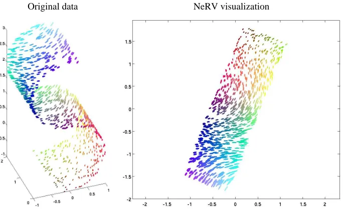
We will next show visualizations for a few sets, and measure quantitatively the results of several. We begin by showing an example of a NeRV visualization for the plain S-curve data set in Figure 3. Later in this section we will show a NeRV visualization of a synthetic face data set (Figure 8), and in Section 4.6 of the faces data set of real face images (Figure 11). The quantitative results are spread across four figures (Figures 4–7), each of which contains results for one pair of measures and all six data sets.
We first show the curves of mean smoothed precision-mean smoothed recall, that is, the loss functions associated with our formalization of visualization as information retrieval. The results
are shown in Figure 4. NeRV and local MDS (LMDS) form curves parameterized by λ, which
ranges from 0 to 1.0 for NeRV and from 0 to 0.9 for LMDS. NeRV was clearly the best-performing
method on all six data sets, which is of course to be expected since NeRV directly optimizes a linear combination of these measures. LMDS has a relatively good mean smoothed precision, but does not perform as well in terms of mean smoothed recall. Simple metric MDS also stands out as a consistently reasonably good method.
Original data NeRV visualization
Figure 3: Left: Plain S-curve data set. The glyph shapes (size, elongation, and angle) show the three-dimensional coordinates of each point; the colors in the online version show the
same information. Right: NeRV visualization (hereλ=0.8).
mean precision-mean recall curves are shown in Figure 5; for NeRV and LMDS, we show the curve
for a singleλvalue picked by the F-measure as described in Section 4.3. Even with these coarse
measures, NeRV shows excellent performance: NeRV is best on four data sets in terms of the area under the curve, CDA and CCA are each best on one data set.
Next, we plot our easier-to-interpret but less discriminating alternative measures of visualization performance. The curves of mean rank-based smoothed precision-mean rank-based smoothed recall are shown in Figure 6. These measures lie between 0 and 1, and may hence be easier to compare between data sets. With these measures, NeRV again performs best on all data sets; LMDS also performs well, especially on the seawater temperature data.
Finally, we plot the curves of trustworthiness-continuity, shown in Figure 7. The results are fairly similar to the new rank-based measures: once again NeRV performs best on all data sets and LMDS also performs well, especially on the seawater temperature data.
4.4.1 EXPERIMENT WITH AKNOWNUNDERLYING MANIFOLD
To further test how well the methods are able to recover the neighborhood structure inherent in the data we studied a synthetic face data set where a known underlying manifold defines the relevant items (neighbors) of each point. The SculptFaces data contains 698 synthetic images of a face (sized
64×64 pixels each). The pose and direction of lighting have been changed in a systematic way to
create a manifold in the image space (http://web.mit.edu/cocosci/isomap/datasets.html;
Tenenbaum et al., 2000). We used the raw pixel data as input features.
−12000 −10000 −8000 −6000 −4000 −2000 −5000
−4000 −3000 −2000 −1000 0 1000 2000 3000
λ=0 NeRV λ=0
LMDS
PCA MDS
LLE LE
IsomapCDA LMVU
MVU
−3000 −2500 −2000 −1500 −1000 −500 −1500
−1000 −500 0 500
NeRV
LMDS
PCA
MDS LLE
LE Isomap
CDA
CCA LMVU MVU
HLLE
−10000 −8000 −6000 −4000 −2000 0 −10000
−8000 −6000 −4000 −2000
λ=1 NeRV λ=0
LMDS
PCA
MDS LLE
HLLE
LE Isomap
CDA CCA
LMVU MVU
−15 −10 −5
x 104 −8
−6 −4 −2 0 2 4
x 104
NeRV λ=0
λ=0.9 LMDS
PCA
MDS
LLE LE Isomap
CDA CCA LMVU
HLLE
−4 −3 −2 −1 0
x 104 −3.5
−3 −2.5 −2 −1.5 −1 −0.5 0
x 104
λ=0
λ=1 NeRV
LMDS
PCA MDS
LLE
HLLE LE Isomap CDA
CCA
LMVU
MVU −6000 −5000 −4000 −3000 −2000 −1000 0 −5000
−4000 −3000 −2000 −1000 λ=0
NeRV
λ=0.9 LMDS
PCA
MDS
LLE
LE Isomap
CDA
CCA
LMVU MVU
Plain s−curve
Noisy s−curve
Faces
Seawater temperature time series
Mouse gene expression
Gene expression compendium Mean smoothed precision (vertical axes) − Mean smoothed recall (horizontal axes)
Figure 4: Mean smoothed precision-mean smoothed recall plotted for all six data sets. For clarity, only a few of the best-performing methods are shown for each data set. We have actually
plotted−1·(mean smoothed precision) and−1·(mean smoothed recall) to maintain visual
consistency with the plots for other measures: in each plot, the best performing methods appear in the top right corner.
−0.2 0 0.2 0.4 0.6 0.8 0
0.2 0.4 0.6 0.8 1
NeRV λ=0.6 LMDS λ=0.1
LE CDA CCA
0 0.2 0.4 0.6 0.8 1 0
0.2 0.4 0.6 0.8 1
NeRV λ=0.3 LMDS
λ=0.1
MDS CDA
MVU
0 0.2 0.4 0.6 0.8 1 0
0.2 0.4 0.6 0.8 1
NeRV λ=0.4 LMDS λ=0.3
Isomap
CDA
CCA
−0.2 0 0.2 0.4 0.6 0.8 0
0.2 0.4 0.6 0.8 1
NeRV λ=0.7 LMDS
λ=0.1
LE Isomap
CDA
MVU CCA
0 0.2 0.4 0.6 0.8 1 0
0.2 0.4 0.6 0.8 1
NeRV λ=0.9 LMDS
λ=0.4
MDS Isomap
CDA
MVU CCA
0 0.2 0.4 0.6 0.8 1 0.2
0.4 0.6 0.8 1
NeRV λ=0.8 LMDS λ=0
PCA MDS
LLE
LE
Isomap CDA MVU LMVU CCA HLLE
Mouse gene expression
Gene expression compendium Noisy s−curve
Faces
Mean precision (vertical axes) − Mean recall (horizontal axes)
Seawater temperature time series Plain s−curve
Figure 5: Mean precision-mean recall curves plotted for all six data sets. For clarity, only the best methods (with largest area under curve) are shown for each data set. In each plot, the best
performance is in the top right corner. For NeRV and LMDS, a singleλvalue picked with
the F-measure is shown.
0.994 0.996 0.998 1 1.002 1.004 0.991
0.992 0.993 0.994 0.995 0.996 0.997 0.998
0.999 NeRVLocalMDS
PCA
MDS LLE
LE HLLE
Isomap
CCA CDA
MVU
LMVU
0.6 0.7 0.8 0.9 0.45
0.5 0.55 0.6 0.65 0.7 0.75
NeRV LocalMDS
PCA
MDS
LLE
LE Isomap
CCA
CDA LMVU
HLLE
0.85 0.9 0.95 1 0.82
0.84 0.86 0.88 0.9 0.92 0.94 0.96
λ=0 NeRV
λ=1 LocalMDS
λ=0.9
PCA
MDS
LLE LE
Isomap CDA
MVU
LMVU
0.975 0.98 0.985 0.99 0.995 1 0.975
0.98 0.985 0.99 0.995 λ=0
NeRV
λ=1 LocalMDS
λ=0.9
PCA
MDS
LLE
LE Isomap
CCA
MVU
LMVU CDA
0.8 0.85 0.9 0.95 0.65
0.7 0.75 0.8
λ=0 NeRV
λ=1 λ=0
LocalMDS
λ=0.9
PCA
MDS
LLE LE
HLLE
Isomap
CCA CDA
MVU
LMVU
0.95 0.96 0.97 0.98 0.99 1 0.95
0.96 0.97 0.98
0.99 NeRV
λ=0
LocalMDS
PCA
MDS
LLE
LE
HLLE
Isomap
CCA CDA
MVU
LMVU Plain s−curve
Mouse gene expression Noisy s−curve
Faces Gene expression compendium
Mean rank−based smoothed precision (vertical axes) − Mean rank−based smoothed recall (horizontal axes)
Seawater temperature time series
Figure 6: Mean rank-based smoothed precision-mean rank-based smoothed recall plotted for all six data sets. For clarity, only a few of the best performing methods are shown for each data
set. We have actually plotted 1−(mean rank-based smoothed precision) and 1−(mean
rank-based smoothed recall) to maintain visual consistency with the plots for other mea-sures: in each plot, the best performance is in the top right corner.
0.96 0.97 0.98 0.99 1 0.965
0.97 0.975 0.98 0.985 0.99 0.995
NeRV
λ=0 λ=1
LMDS λ=0
λ=0.9
PCA
MDS
LLE
LE Isomap CDA
CCA
LMVU
MVU
0.8 0.85 0.9 0.95 0.68
0.7 0.72 0.74 0.76 0.78 0.8 0.82 0.84
NeRV
λ=0
λ=1 LMDS λ=0
λ=0.9
PCA
MDS
LLE
HLLE
LE
Isomap CDA
CCA
LMVU MVU
0.96 0.97 0.98 0.99 1 1.01 1.02 0.955
0.96 0.965 0.97 0.975 0.98 0.985 0.99
0.995 NeRVLMDS
PCA
MDS
LLE
LE
Isomap CDA CCA LMVU
MVU
HLLE
0.94 0.96 0.98 1 0.93
0.94 0.95 0.96 0.97 0.98
0.99 λ=0 NeRV
λ=1 LMDS
λ=0.9
PCA
MDS
LLE
HLLE LE
Isomap CDA
CCA
LMVU
MVU
0.85 0.9 0.95 0.82
0.84 0.86 0.88 0.9 0.92
NeRV
λ=0
λ=1 LMDS λ=0
λ=0.9
PCA
MDS
LLE LE
Isomap CDA
LMVU
MVU
0.8 0.82 0.84 0.86 0.88 0.9 0.92 0.66
0.68 0.7 0.72 0.74
NeRV
λ=0
λ=1 LMDS λ=0
λ=0.9
PCA
MDS
LLE
LE
Isomap CDA CCA
LMVU HLLE
Trustworthiness (vertical axes) − Continuity (horizontal axes)
Seawater Temperature
Mouse Gene Expression
Gene Expression Compendium S−curve
Noisy S−curve
Faces
Figure 7: Trustworthiness-continuity plotted for all six data sets. For clarity, only a few of the best performing methods are shown for each data set. In each plot, the best performance is in the top right corner.
smoothed recall; and local MDS and CDA also perform well. When performance was measured with trustworthiness and continuity, NeRV was the best in terms of trustworthiness while MVU and Isomap attained the highest continuity.
NeRVλ=0.1 MDS
0 0.2 0.4 0.6 0.8 1 0
0.2 0.4 0.6 0.8 1
NeRV λ=0.2 LMDS
λ=0.1 LE
Isomap CDA
CCA
MVU
−15000 −10000 −5000 −8000
−6000 −4000 −2000 0 2000 4000
λ=0 NeRV λ=0
λ=0.9 LMDS
PCA MDS
LLE
LE Isomap CDA
CCA
LMVU MVU
0.8 0.85 0.9 0.95 1 1.05 0.8
0.85 0.9
0.95 NeRV
λ=1 λ=0
LocalMDS
λ=0.9
PCA MDS
LLE LE
Isomap
CDA
CCA
LMVU
MVU
0.85 0.9 0.95 1 1.05 0.85
0.9 0.95
NeRV
λ=1 LMDS λ=0
λ=0.9
PCA
MDS
LLE LE
Isomap
CDA CCA
LMVU MVU
Trustworthiness (vertical axis) − Continuity (horizontal axis) Mean smoothed precision (vertical axis) −
Mean smoothed recall (horizontal axis)
Mean precision (vertical axis) − Mean recall (horizontal axis)
Mean rank−based smoothed precision Mean rank−based smoothed recall
(vertical axis) − (horizontal axis)
Figure 8: Top: Sample projections of the SculptFaces data set (NeRV vs. the best alternative).
Bottom: How well were the ground truth neighbors in pose-lighting space retrieved from
the image data, evaluated by four pairs of measures. The measures were computed the same way as before, as described in Section 4.3, but here taking the known pose and lighting information as the input data. Only the best performing methods are shown for clarity.
4.5 Comparison by Unsupervised Classification
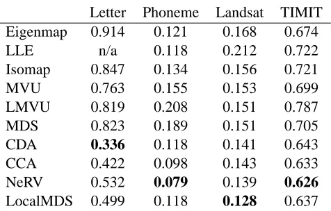
visual-Data set Dimensions Classes
Letter 16 26
Phoneme 20 13
Landsat 36 6
TIMIT 12 41
Table 1: The data sets used in the unsupervised classification experiments.
Here all methods are unsupervised, that is, class labels of samples are not used in computing the visualization. The parameters of methods are again chosen as described in Section 4.3.2. Methods
are evaluated by k-nearest neighbor classification accuracy (with k=5), that is, each sample in the
visualization is classified by majority vote of its k nearest neighbors in the visualization, and the classification is compared to the ground truth label.
We use four benchmark data sets, all of which include class labels, to compare the performances of the methods. The data sets are summarized in Table 1. For all data sets we used a randomly chosen subset of 1500 samples in the experiments, to save computation time.
The letter recognition data set (denoted Letter) is from the UCI Machine Learning Repository
(Blake and Merz, 1998); it is a 16-dimensional data set with 26 classes, which are 4×4 images of
the 26 capital letters of the alphabet. These letters are based on 20 different fonts which have been distorted to produce the final images.
The phoneme data set (denoted Phoneme) is taken from LVQ-PAK (Kohonen et al., 1996) and consists of phoneme samples represented by a 20-dimensional vector of features plus a class label indicating which phoneme is actually represented. There are a total of 13 classes.
The landsat satellite data set (denoted Landsat) is from UCI Machine Learning Repository
(Blake and Merz, 1998). Each data point is a 36-dimensional vector, corresponding to a 3×3
satellite image measured in four spectral bands; the class label of the point indicates the terrain type in the image (6 possibilitities, for example red soil).
The TIMIT data set is taken from the DARPA TIMIT speech database (TIMIT). It is similar to the phoneme data from LVQ-PAK but the feature vectors are 12-dimensional and there are 41 classes in total.
The resulting classification error rates are shown in Table 2. NeRV is best on two out of four data sets and second best on a third set (there our old method LocalMDS is best). CDA is best on one.
4.6 NeRV, Joint Probabilities, and t-Distributions
Very recently, based on stochastic neighbor embedding (SNE), van der Maaten and Hinton (2008) have proposed a modified method called t-SNE, which has performed well in unsupervised exper-iments. The t-SNE makes two changes compared to SNE; in this section we describe the changes and show that the same changes can be made to NeRV, yielding a variant that we call t-NeRV. We then provide a new information retrieval interpretation for t-NeRV and t-SNE.
We start by analyzing the differences between t-SNE and the original stochastic neighbor em-bedding. The original SNE minimizes the sum of Kullback-Leibler divergences
∑
i∑
j6=ipj|ilog
Letter Phoneme Landsat TIMIT
Eigenmap 0.914 0.121 0.168 0.674
LLE n/a 0.118 0.212 0.722
Isomap 0.847 0.134 0.156 0.721
MVU 0.763 0.155 0.153 0.699
LMVU 0.819 0.208 0.151 0.787
MDS 0.823 0.189 0.151 0.705
CDA 0.336 0.118 0.141 0.643
CCA 0.422 0.098 0.143 0.633
NeRV 0.532 0.079 0.139 0.626
LocalMDS 0.499 0.118 0.128 0.637
Table 2: Error rates of k-nearest neighbor classification based on the visualization, for unsupervised visualization methods. The best results for each data set are in bold; n/a denotes that LLE did not yield a result for the Letter data. NeRV attains the lowest error rate for two data sets and second lowest error rate for one data set.
where pj|i and qj|i are defined by Equations (3) and (2). We showed in Section 2.2 that this cost function has an information retrieval interpretation: it corresponds to mean smoothed recall of re-trieving neighbors of query points. The t-SNE method makes two changes which we discuss below.
4.6.1 COSTFUNCTIONBASED ONJOINTPROBABILITIES
The first change in t-SNE is to the cost function: t-SNE minimizes a “symmetric version” of the cost function, defined as
∑
i∑
j6=ipi,jlog
pi,j
qi,j
where the pi,jand qi,jare now joint probabilities over both i and j, so that∑i,jpi,j=1 and similarly
for qi,j. The term “symmetric” comes from the fact that the joint probabilities are defined in a
specific way for which pi,j=pj,iand qi,j=qj,i; note that this need not be the case for all definitions
of the joint probabilities.
4.6.2 DEFINITIONS OF THEJOINTPROBABILITIES
The second change in t-SNE is that the joint probabilities are defined in a manner which does not yield quite the same conditional probabilities as in Equations (3) and (2). The joint probabilities are defined as
pi,j=
1
2n(pi|j+pj|i) (6)
where pi|jand pj|iare computed by Equation (3) and n is the total number of data points in the data
set, and
qi,j=
(1+||yi−yj||2)−1
∑k6=l(1+||yk−yl||2)−1
. (7)
falls off according to a (normalized) t-distribution with one degree of freedom, which is intended to help with a crowding problem: because the volume of a small-dimensional neighborhood grows slower than the volume of a high-dimensional one, the neighborhood ends up stretched in the visu-alization so that moderately distant point pairs are placed too far apart. This tends to cause clumping of the data in the center of the visualization. Since the t-distribution has heavier tails than a Gaus-sian, using such a distribution for the qi,j makes the visualization less affected by the placement of
the moderately distant point pairs, and hence better able to focus on other features of the data.
4.6.3 NEWMETHOD:T-NERV
We can easily apply the above-described changes to the cost function in NeRV; we call the resulting variant t-NeRV. We define the cost function as
Et-NeRV=λ
∑
i
∑
j6=ipi,jlog
pi,j
qi,j
+ (1−λ)
∑
i∑
j6=iqi,jlog
qi,j
pi,j
=λD(p,q) + (1−λ)D(q,p) (8)
where p and q are the joint distributions over i and j defined by the pi,jand the qi,j, and the individual
joint probabilities are given by Equations (6) and (7).
It can be shown that this changed cost function again has a natural information retrieval interpre-tation: it corresponds to the tradeoff between smoothed precision and smoothed recall of a two-step information retrieval task, where an analyst looks at a visualization and (step 1) picks a query point and then (step 2) picks a neighbor for the query point. The probability of picking a query point i depends on how many other points are close to it (that is, it depends on∑jqi,j), and the probability
of picking a neighbor depends as usual on the relative closenesses of the neighbors to the query. Both choices are done based on the visualization, and the choices are compared by smoothed pre-cision and smoothed recall to the relevant pairs of queries and neighbors that are defined based on
the input space. The parameterλagain controls the tradeoff between precision and recall.
The connection between the D(p,q)and the recall of the two-step retrieval task can be shown
by a similar proof as in Appendix A, the main difference being that conditional distributions pj|i
and qj|iare replaced by joint distributions pi,jand qi,j, and the sums then go over both i and j. The
connection between D(q,p)and precision can be shown analogously.
As a special case, settingλ=1 in the above cost function, that is, optimizing only smoothed
recall of the two-step retrieval task, yields the cost function of t-SNE. We therefore provide a novel information retrieval interpretation of t-SNE as a method that maximizes recall of query points and their neighbors.
The main conceptual difference between NeRV and t-NeRV is that in t-NeRV the probability of picking a query point in the visualization and in the input space depends on the densities in the visualization and input space respectively; in NeRV all potential query points are treated equally. Which treatment of query points should be used depends on the task of the analyst. Additionally, NeRV and t-NeRV have differences in the technical forms of the probabilities, that is, whether t-distributions or Gaussians are used etc.
The t-NeRV method can be optimized with respect to visualization coordinates yiof points, by
conjugate gradient optimization as in NeRV; the computational complexity is also the same.
4.6.4 COMPARISON
We briefly compare t-NeRV and NeRV on the Faces data set. The setup is the same as in the previous
to compute the joint probabilities pi,j; this corresponds to the perplexity value used by the authors
of t-SNE (van der Maaten and Hinton, 2008).
Figure 9 shows the results for the four unsupervised evaluation criteria. According to the mean smoothed precision and mean smoothed recall measures, t-NeRV does worse in terms of recall. The rank-based measures indicate a similar result; however, there t-NeRV does fairly well in terms of mean rank-based smoothed precision. The trustworthiness-continuity curves are similar to the rank-based measures. The curves of mean precision versus mean recall show that t-NeRV does achieve better precision for small values of recall (i.e., for small retrieved neighborhoods), while NeRV does slightly better for larger retrieved neighborhoods. These measures correspond to the information retrieval interpretation of NeRV which is slightly different from that of t-NeRV, as discussed above. Figure 9 E shows mean smoothed precision/recall in the t-NeRV sense, where t-NeRV naturally performs relatively better.
Lastly, we computed k-nearest neighbor classification error rate (using k=5) with respect to
the identity of the persons in the images. NeRV (withλ=0.3) attained an error rate of 0.394 and
t-NeRV (withλ=0.8) an error rate of 0.226. Here t-NeRV is better; this may be because it avoids
the problem of crowding samples near the center of the visualization.
Figures 10-12 show example visualizations of the faces data set. First we show a well-performing comparison method (CDA; Figure 10); it has arranged the faces well in terms of keeping images of the same person in a single area; however, the areas of each person are diffuse and close to other persons, hence there is no strong separation between persons on the display. NeRV, here optimized to maximize precision, makes clearly tighter clusters of each person (Figure 11), which yields better retrieval of neighbor face images. However, NeRV has here placed several persons close to each other in the center of the visualization. The t-NeRV visualization, again optimized to maximize precision (Figure 12) has lessened this behavior, placing the clusters of faces more evenly.
Overall, t-NeRV is a useful alternative formulation of NeRV, and may be useful for data sets especially where crowding near the center of the visualization is an issue.
5. Using NeRV for Supervised Visualization
In this section we show how to use NeRV for supervised visualization. The key idea is simple: NeRV
can be computed based on any input-space distances d(xi,xj), not only the standard Euclidean
distances. All that is required for supervised visualization is to compute the input-space distances in a supervised manner. The distances are then plugged into the NeRV algorithm and the visualization proceeds as usual. Note that doing the visualization modularly in two steps is an advantage, since it will be later possible to easily change the algorithm used in either step if desired.
Conveniently, rigorous methods exist for learning a supervised metric from labeled data sam-ples. Learning of supervised metrics has recently been extensively studied for classification pur-poses and for some semi-supervised tasks, with both simple linear approaches and complicated nonlinear ones; see, for instance, works by Xing et al. (2003), Chang and Yeung (2004), Globerson and Roweis (2006) and Weinberger et al. (2006). Any such metric can in principle be used to com-pute distances for NeRV. Here we use an early one, which is flexible and can be directly plugged in the NeRV, namely the learning metric (Kaski et al., 2001; Kaski and Sinkkonen, 2004; Peltonen et al., 2004) which was originally proposed for data exploration tasks.
set-0.93 0.94 0.95 0.96 0.9
0.91 0.92 0.93 0.94 0.95 0.96λ=0
λ=1 t−NeRV
λ=0
λ=1 NeRV
−6 −4 −2 0
x 104 −700
−650 −600 −550 −500 −450 −400 −350
λ=0
λ=1 t−NeRV
λ=0
λ=1 NeRV
−1.5 −1 −0.5
−2 −1.5 −1
−0.5 λ=0
λ=1 t−NeRV
λ=0
λ=1 NeRV
0 0.2 0.4 0.6 0.8 1 0
0.2 0.4 0.6 0.8 1
t−NeRV, λ=0.8
NeRV, λ=0.3
0.9 0.91 0.92 0.93 0.88
0.89 0.9 0.91 0.92
0.93 NeRV
λ=0
λ=1
t−NeRV
λ=0
λ=1
Mean smoothed precision (vertical axis) − Mean smoothed recall (horizontal axis)
Mean rank−based smoothed precision (vertical axis) − Mean rank−based smoothed recall (horizontal axis)
Mean precision (vertical axis) − Mean recall (horizontal axis)
Trustworthiness (vertical axis) − Continuity (horizontal axis)
Mean smoothed precision in the t−NeRV sense (vertical axis) − Mean smoothed recall in the t−NeRV sense (horizontal axis)
A
B
D
C
E
Figure 9: Comparison of NeRV and t-NeRV on the Faces data set according to the four goodness measures described in Section 4.3 (A-D), and for mean smoothed precision/recall corre-sponding to the information retrieval interpretation of t-NeRV (E; first and second terms of Eqn. 8).
tings SNeRV can be seen as a new, supervised version of stochastic neighbor embedding, but more generally it manages a flexible tradeoff between precision and recall of the information retrieval just like the unsupervised NeRV does.
Figure 10: Example visualization of the Faces data set with CDA.
a neural network. Such approximation is not needed for SNeRV. (On the other hand, a trained neural network can embed not only unlabeled training points, but also previously unseen new points; if such generalization is desired, the same kinds of approximate mappings can be learned for SNeRV.) In the next subsections we present the details of the distance computation, and then describe experimental comparisons showing that SNeRV outperforms several existing supervised methods.
5.1 Supervised Distances for NeRV
The input-space distances for SNeRV are computed using learning metrics (Kaski et al., 2001; Kaski and Sinkkonen, 2004; Peltonen et al., 2004). It is a formalism particularly suited for so-called “supervised unsupervised learning” where the final goal is still to make discoveries as in unsupervised learning, but the metric helps to focus the analysis by emphasizing useful features and, moreover, does that locally, differently for different samples. Learning metrics have previously been applied to clustering and visualization.
Figure 11: Example visualization of the Faces data set with NeRV, here maximizing precision
(tradeoff parameterλ=0).
conditional density estimation from labeled samples. Topology preservation helps in generalizing to new points, since class information cannot override the input space topology. In this metric, we can compute input-space distances between any two data points, and hence visualize the points with NeRV, whether they have known labels or not.
5.1.1 DEFINITION
The learning metric is a so-called Riemannian metric. Such a metric is defined in a local manner; between two (infinitesimally) close-by points it has a simple form, and this simple form is extended through path integrals to global distances.
In the learning metric, the squared distance between two close-by points x1and x2 is given by
the quadratic form