277
The Implication of External Constraints on User
Experience (UX): Prioritizing User Experience
Dimensions on Mobile Devices
Joash Kiprotich Bii
Institute of Computer Science and Information technology Jomo Kenyatta University of Agriculture and Technology
Nairobi, Kenya
Dr. Waweru Mwangi (Phd)
Institute of Computer Science and Information Technology Jomo Kenyatta University of Agriculture and Technology
Nairobi, Kenya
Dr. Stephen Kimani (Phd)
Institute of Computer Science and Information Technology Jomo Kenyatta University of Agriculture and Technology
Nairobi, Kenya
ABSTRACT
Abstract – Technological expansion and ICT has seen a quick revolution in development of mobile devices which has facilitated efficiency in mobile related services. The constant expansion on services from mobile devices brings in the complications in terms of utilizing these services. Mobile devices were originally designed for purposes of communication, but the additional provision of data services has posed a challenge; attempting to provide users with powerful computing services through small interfaces. Mobile devices have limited set of resources as compared to desktop computers (PCs), particularly small screens. What has been done to minimize on these limitations, is centralized to achieving better user interfaces but not better user experiences. With user interfaces, more focus is put on the device rather than the user of the device. Hence the main goal of this project was to prioritize user experience dimensions through identifying, and examining the implications of mobile devices’ external constraints on user experience, and proposing an algorithm that enhances data delivery and presentation in small interfaces.
Keywords: Mobile Devices, User Experience, Dimensions of User Experience, Small screens, Page delivery.
I. INTRODUCTION
Mobile devices are capable of offering access to diverse services. A mobile device is a battery-powered, pocket-sized computing system, typically comprising a small visual display for user output and a miniature keyboard or touch screen for user input. Examples include mobile phones, PDAs, wireless tablets and other devices that can connect to mobile telecommunication networks. [1]
Originally, Mobile devices were designed for purposes of communication [2]. The additional rapid provision of data services has posed a challenge; attempting to provide users with powerful computing services through small interfaces. These devices have limited set of resources as compared to desktop computers (PCs), particularly small screens. The change in services and speed of data delivery is meant to quicken man’s ability to solve problems and manage information or knowledge [3]. These rapid changes do not
measure up to the user’s ability to utilize the provided services. Users gain negative experiences while accessing data through small screens. It is against such dynamic technology that the user experience created by mobile devices’ external constraints is examined in this paper. What has been put to minimize device limitations is centralized on achieving better user interfaces but not better user experience. With user interfaces, more focus is put on the device rather than the user of the device. Hence in the light of this shortfall, this research paper seeks to prioritize user experience dimensions on mobile devices narrowing down to better page delivery. The outcome in the end shall be a proposed application that shall seek to prioritize user experience with regards to mobile devices.
II. LITERATUREREVIEW
A. User Experience
User Experience is the experience a user gains when interacting with a system or company [4]. User Experience has several factors that can be categorized into three dimensions: Dimension one; Personal user experience basing on Kankainen’s [5] conceptual model of user experience, Dimension two; types of experience basing on Forlizzi & Ford’s [6] classification of user experience, and Dimension three; ingredients of UX basing on Jaasko’s [7] perspectives on user experience.
278 interaction; hence interaction has a clear start and end. The
user is active, and the experience can be remembered. Finally, a user can experience interaction as story when retelling or when being totally dissolved in the narrative of the system; interaction is predetermined [6]. In dimension three, the ingredients for user experience concerning the system, the context, the user and its activities are stated. Firstly, the core of the product is the technical base that enables the tool’s services. It consists of hardware like processors, displays, logic boards. Secondly, the functionality layer surrounds the core and software provides the reason to use a product in a specific activity as it defines the product functionality. Thirdly, functionality is made available by a control layer providing the overall logic and possibility to trigger functionality. Fourthly, user interface is the part the user gets in contact with [7].
The three dimensions, all focus on three factors that influence user experience, the product, the context and the user factors.
i.) Product factors: The functionality, reliability, usability, and gestalt all sum up the dimensions of a product. All parts must fit together to the intended interaction. [8]. ii.) Context factors: Time-based context, space context, and
social context define how a system is perceived in its context such as time, and place. Contexts change over time especially for the mobile device contexts where it’s always on the move, and environmentally noisy. iii.) User factors: The experiences, expectations, motivation
for use and resources define the way a user perceives and reacts on a product. There is need therefore to understand what users of mobile devices want or feel, the kind of product and the context of interaction within different situations.
B. External Constraints on Mobile Devices
External constraints can be classified as device constraints, environment constraints, and social context constraints. Device constraints describe restrictions on the usage that is a consequence of device characteristics [9]. For example, output devices, such as screens on mobile phones or PDAs and other mobile devices, have limited resolution and a limited number of colours. Environmental constraints describe how the interaction environment influences the user experience. For example, noise, that greatly affects usage. Social context describes the social situation in which the interaction occurs. The three major constraints presented by mobile devices are: small screens, limited bandwidth and limited power.
i.) Small screens: Mobile devices are small in size, there screens even smaller. Accessing pages, for example web pages, which were designed and intended for viewing on powerful PC screens, have to be adapted to meet this severe constraint and users strain or gain negative experiences while accessing them on the mobile devices.
ii.) Limited bandwidth: Although network technology has advanced, download speeds on mobile devices still don’t meet users’ expectations, in comparison to those on computers. Moving mobile devices have bandwidth status varying depending on the location of base stations [10]. This variation degrades user experiences.
Users quickly become impatient when it takes longer for a page to load on mobile device.
iii.) Limited power supply: Mobile devices have smaller batteries that supply power for shorter periods of time. Power consumed by the processor and memory is related to the clock rate, the supply voltage, and the capacitance of the devices being switched [11]. This affects user experience as re-charging take longer hours. For the social context constraints, it is important to keep the complexity of users’ contexts of in mind. Understanding users’ specific needs, then providing a customized and personalized mobile user experience is the key in this research’s design. Both qualitative user research and quantitative analytics data provide insights that are essential to gaining a good understanding of mobile users’ needs. There is need to know which content and tasks are and are not relevant to users on the move. By duplicating all of the traditional or original website’s content on the mobile device website makes no impact as context is critical. There is need to identify what content is of greatest value to users on the go and prioritize its convenient placement on the mobile devices. This would prioritize user experience dimensions in terms of content for context, the product and the users’ expectations in relation to mobile devices.
III. RESEARCH METHODOLOGY
A. Research design
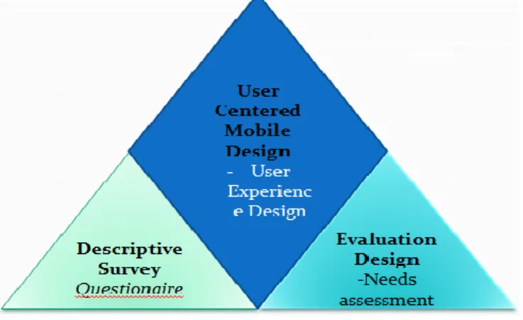
Methodological triangulated design was utilized. Two issues were addressed: finding out what external constraints on mobile devices affected user experience (diagnostic in approach) and using the findings in designing a solution that prioritizes user experience dimensions (prescriptive approach). So as to address the two issues, two research designs were utilized: Descriptive survey; to deal with diagnostic part, and Evaluation research design; to address the prescriptive part; which is basically engineering work - leading to the user centered mobile application design. This is summarized as DEU: Descriptive Survey, Evaluation design and User centered /experience design.
Figure 1: Methodology
279 accurate. The research aimed at gathering accurate information
about user factors with regard to usage of mobile devices, product factors and contextual factors. Evaluation research aims to collect data that will facilitate decision making and that the data should satisfy some important criteria one of which is utility [13]. In this research, evaluation has utility if it is informative, timely and useful to the affected persons. In this case, the researcher aimed to evaluate the success and usage of mobile devices.
B. Sample and Venue
Sampling is the act of selecting a portion of a population for investigation [14]. Purposive sampling technique enables the researcher target a group of people believed to have the characteristics of interest to the research. Purposive sampling technique was used to select 28 mobile device users drawn from 4 institutions of higher learning in Kericho County, Kenya. According to the population census (2009) the people living in Kericho Town (urban) are 30,000 in number, out of which 3,600 is the population in institutions of higher learning. The main reason for choosing respondents from institutions of learning was because this group of users utilized both mobile devices and desktop computers (which fall under the jurisdiction of this study) in their day to day learning and communication. Moreover, every 4 individuals out of 10 have mobile phones; out of which 1 individual has an internet-enabled mobile device [15], and every 4 individuals out of 10 have access to PC [16]. Based on this, 30 individuals in each of the twelve institutions could use both mobile and PC to access online materials from internet, and this formed the target population for the proposed study in Kericho Township. Using a modified table of population sampling [17] and setting the confidence level at 95% (significance level P < 0.05) then the sample size was 28 mobile device users.
C. Data Collection Instruments and Procedure
Questionnaire was used to collect data from mobile device users regarding user experience; covering the product factors, contextual factors and user factors. It had both open-ended and closed ended items. Closed ended questions gave out structured responses, which facilitated the ease of tabulation and analysis, while open-ended questions gathered more in-depth information and were used so as to enable the researcher gather data from a large number of respondents at a particular time [18]. The instruments were administered through visits on appointment with mobile device users. The questionnaires were filled, by the users of mobile devices, and collected by the researcher.
D. Unit of Analysis & Data Analysis Procedure
The unit of analysis was the individual user of the mobile device. Quantitative data was analyzed by use of descriptive statistics, like frequencies, and percentages. Qualitative data was categorized and reported. Qualitative data analysis is a systematic procedure followed in order to identify essential features, themes and categories [19]. All data was then presented in frequencies, percentages and tables.
IV. RESULTSANDDISCUSSION
To examine external constraints faced by mobile device
users, first it was important to examine reasons for using mobile devices so as to find out the areas (domains) and establish the extent to which mobile devices are utilized. This addressed the dimensions and helped in examining the implications of mobile devices’ external constraints on user experience.
A. Extent of Use of Mobile Devices
The response revealed that all the respondents utilized their mobile devices for communication. Additionally, most respondents (85.7%) observed that they use their mobile devices for accessing the internet or browsing. Only 10.7% of the respondents were not sure while 3.6% were of a contrary opinion. The high response 85.7% who agree that they utilized their mobile devices on browsing could be attributed to the fact that a large number of respondents (64.3%) were students and there is possibility that they use their mobile devices in conducting searches in their studies. Moreover, all the respondents pointed out that they use their mobile devices for money transfer with 92.9% strongly agreeing and 7.1% agreeing. A relatively smaller group of respondents were of the idea that they use their mobile device for learning with only 46.4% supporting this idea while the rest 35.7% were not sure. The rest of the respondents (17.9%) refuted this claim.
B. Examining User Experience Dimensions
The UX dimensions with regard to mobile devices were narrowed down to three broad areas, from which various constraints could be established to allow re-designing. This was done in order to examine the implications of mobile devices’ external constraints on user experience. The three broad areas included the product factors, content and context factors, and user factors.
i. Product Factors (Usability)
280 factors. Additionally, navigation from one part of the text to
another was another issue raised by the respondents. This research has shown that irrespective of the type of the input device one has, navigation is a constraint that mobile users face. Only 39.3% supported the notion that their mobile made it easy to move from one part of text to another. On the other hand, 25.0 % of the respondents were not sure while 35.7% refuted claim that it was easy to move from one text to another. Table 1.1 provides this summary.
Table 1.1 Readability of text on small screen
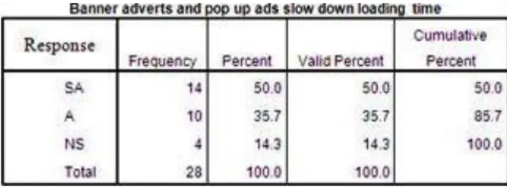
ii.Content and Context Factors (Time/Space/Place) Mobile devices could access web content often cluttered with distracting features around the body of a page; that distracted the users from the actual content they were interested in. These features included pop-up ads, flashy banner advertisements, unnecessary images, logos, copyrights, or links scattered around the screen. Users on the move did not need this information on their screens. This research revealed that 67.9% strongly agreed and 32.1% agreed that their mobile device could load content including banner adverts, pop up ads, links to other sites and images. Moreover, 82.1% of respondents agreed (39.3% strongly agreed plus 42.9% agreed) that banner adverts and pop ups covered most of their mobile device screen space, while 3.6% refuted this claim. Only 14.3% were not sure of this notion. Another 85.7% of respondents (50.0% strongly agreed plus 35.7% agreed) agreed that banner adverts and pop up ads slowed down loading time of content of interest. Again 14.3% were not sure of this notion. 85.7% of respondents felt that images covered most of their mobile device screen space, while 3.6% refuted this claim. Only 10.7% were not sure about this notion. Another 92.9% of respondents found images distracting them from actual content of interest. Only 3.6% disagreed, and another 3.6% strongly disagreed this assertion. Tables 1.2, 1.3 and 1.4 provide this summary of this.
Table 1.2 Advertisements covering most screen space
Table 1.3 Adverts and images slowed loading time
Tables 1.4 Images covered most screen space
It also showed that links lead to other content of interest and others did not as 42.9% strongly agreed and another 42.9% agreed to this assertion. Only 14.2% thought otherwise. This was attributed to the fact that content, related to other content of interest to the user, was provided majorly through the text links of the pages accessed by users, saving them time searching related information.
iii. User Factors (Experience/Expectations/Motivation) User experience is different from user to user based on different motivations, expectations, experience, or perception. Previous experiences are always present, and they create expectations of how things work and produce results. In this research it is revealed that 50.0% of the respondents expected their mobile devices to have all the functionalities and capabilities in them as compared to PCs. 35.7% of the respondents were not sure and 14.3% did not expect their mobile devices to have all functionalities in them. Additionally, 35.7% of the respondents also believed that mobile devices motivated them to be more effective, while 14.2% disagreed. 50% of the respondents were not sure of this assertion.
Motivation Statement
281 issues that were considered pertinent and which in this context
were considered as constraints. How these product factors were determined is a factor of content delivery which was largely affected by content and context factors. The focus of this research in relations to content for context factors was to examine how various contents are delivered in the mobile context with the sole purpose of improving the speed, quality and quantity of content.
The content in context factors that were examined included the speed and quality of loading contents including text, banners, advertisements, links to other sites, and images. In doing so, the researcher examined whether by weeding out some of these contents would improve page delivery. To arrive at this decision, it was necessary to establish if images, banners, advertisements covered most screen space, slowed down loading time and distracted users from actual content of interest. Information on these helped the researcher shape the system solution by weeding out unnecessary images and links so as to improve the text content and speed of delivery for mobile contexts. Such a redesign could not be effectively executed without considering user factors. The user factors considered were those that addressed meeting the users’ expectations, satisfaction, and motivation. In examining this, the researcher aimed at designing a solution without losing the original aesthetic functions which lends itself to satisfaction, and motivation aspects and interest of mobile device users.
V. PROPOSEDDESIGN
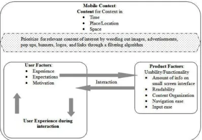
Data collection and analysis indicated the need to prioritize what content is useful for mobile context domain. In light of this, the need for better means of access to relevant content by mobile users guided the proposed prototype of filtering useful content for mobile contexts. The proposed prototype utilized an algorithm implemented by remote procedure calls to provide for better way of content delivery enabling easy readability, navigation and relevance of content, while retaining users’ interests at a mobile domain hence enhancing the three dimensions of user experience as shown in figure 2.
Fig 2: user experience: context, product and user dimensions in a mobile domain
The design of this aspect shall be divided into:
A. The algorithm; implemented for content filtering; and B. A system model of the proposed prototype
A. Proposed content filtering algorithm
The proposed algorithm is implemented as follows:
Step1: Define & Initialize a string buffer (to store all content/nodes of
a page).
Step2: Send Request (HTTP) through client socket to content servers
to obtain a page
Step3: Once page is obtained, via server socket, identify groups of
nodes from page and convert the groups in to a sequence of
tokens (lexical analysis)
Step4: Transform the sequence of tokens into a tree data structure by
balancing opening tags with ending tags to present a
document object model (Parsing)
Step5: Filter page elements:
If (Element = Tag-<, /, >)
Find start and end-tags, append to string buffer If (Element = Comment-<!--, -->)
Determine comment tags, discard elements If (Element = Text)
Find text outside of any tag, or comment, append to string buffer
If (Element = Type image/advert/logo/banner – i.e ext.jpg, .bmp, .gif, .png, tiff, exif, raw)
Find type, discard elements from buffer Else Return
Generate pages
Step6: If node is Html node; means starting node; Then
a. Append html node ("<html>") to string buffer.
b. Proceed to find node-blocks using node and level.
(level is 0, as it is first node of a DOM tree.
c. After returning results, append node ("</html>") to string
buffer.
Step7: If node is Head node; Then
a. Append head node ("<head>") to the string buffer
b. Proceed to find the node-blocks using node itself and its
children. Head content of the original page is added to the
string buffer.
c. After returning results, append node ("</head>") to string
buffer.
Step8: If node is Body node; Then
a. Append node ("<body>") to the string buffer
b. Proceed to find the node-blocks using node itself and its
children; find body content and append to the string buffer.
c. After returning results, append ("</Body>") to the string
buffer.
Step9: If all the steps above succeed then server sends the requested
page via server socket and then to the Mobile device. A vector class
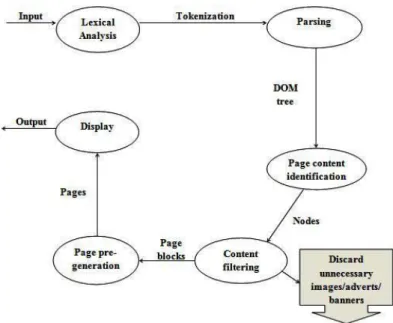
282 Figure 3: flow of filtering of content for mobile
A string buffer is initialized to store all content of loaded page, which becomes input for lexical analysis; a process of converting a group of nodes into a sequence of tokens [20]. For example, a page consisting of:
<Html><Head><Title>JKUAT</Title></Head></Html> ; its result is a sequence of tokens as:
< /
Html Title
> >
< <
Head /
> Head
< >
Title <
> /
JKUAT Html
< >
At the time of analysis it includes start-tags, end-tags, and data and then this becomes input for parsing. Parsing is the process of analyzing a sequence of tokens [21]. It transforms tokens into a data structure tree by balancing opening tags with ending tags and presents a structure of a page. This enables access to tag nodes in a sequential manner. The output is a document object model (Dom) tree. For example, from the sequence of tokens, the output is a tree of nodes as:
<Html> <Head> <Title> JKUAT </Title> </Head> </Html>
Identification of node blocks depends on the properties of Dom node and the children of the Dom node. Filtering of content is then done element by element. Vector class is used for saving streams output. Every index of vector has either a tag or printable string on mobile device. For example if output
of stream reading is:
<a href="http://www.jkuat.ac.ke "> J.K.U.A.T, Nairobi Campus
</a>
Then
Vector 0 = <a href="http://jkuat.ac.ke">
Vector 1 = J.K.U.A.T, Nairobi Campus
Vector 2 = </a>
Different classes are used to filter out content by type for example text, or tags, or comments and/or images. If text, then it is send for display, and other unnecessary content are discarded which includes images, advertisement images, banner images, and links which affect user experience in reference to the context, or time or space.
B. System model of the proposed application
i. Sequence Diagram
This is a graphical representation of system objects on time flows and the connections between the flows. The vertical dashed line is called the objects lifeline and it represents the objects life during the entire interaction. Each message is represented by an arrow between the life lines of two objects. The objects are shown as boxes at the top of the dashed vertical line
Figure 4: sequence diagram showing the flow of information
From the diagram, objects pass information as follows: 1. Mobile device sends HTTP request to the content server
through client socket.
2. Client side socket checks the request whether it is a valid request or not.
3. Content servers respond to requested page or URL and sends HTTP response through server socket.
4. Groups of nodes from obtained page are converted in to a sequence of tokens in a lexical analysis process and transformed into a tree data structure by balancing opening tags with ending tags to present a document object model in a parsing process.
283 then pages are re-generated with only relevant content
in them leaving out unnecessary content like images, image adverts, links to other sites, logo images, that are not priority in a mobile context, and that take time when loading or fill small screen space influencing user experience negatively.
6. Finally the page is sent to the mobile device via webservers client socket.
This procedure is repeated in a way a mobile device user can easily view the content in the small screen.
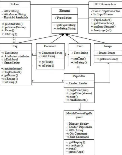
ii. Class Diagram
Figure below shows the class diagram for the proposed application. The class diagram contains the classes: HttpConnection class, which manages the HTTP connection for loading a page by forming the HTTP request. PageFilter class is a MIDlet that extracts all the tags from the start of a page. The user is prompted for a URL by the mobilepagerequest class; the page is loaded and parsed, and the tag values are displayed in a list, which are used for page re-generation for mobile device. The Token class defines a class for holding and parsing the attributes of meta tags. Element class is the maker class –
Figure 5: class diagram
for page elements. The Tag class, Text class, Comment class and Image class all extend class Element and define page elements for holding tags, comments, text and images. Instanceof operator is used to determine if element is a Tag, Comment, Text or image; and filter out only relevant text content for display. It will pass in the attribute string from
inside the tag, for example, if the tag is "<body bgcolor=#ffffff>" it will pass in the " bgcolor=#ffffff" part and then split the attribute string into tokens. If page elements have .gif, .png, .bmp, .jpg extensions they are discarded as they are images and not output for display. The token attributes are stored as name-value pairs in a hashtable.
iii. State Diagram
Figure 6: State diagram
This diagram above helps in describing the behaviour of the system. It will help in showing all the possible states a particular object can get into and how the object’s state will change as a result of events that reach the object. Hence figure 6 shows clearly how a page is requested and filtered for relevant content with regards to the mobile context dimension, time and space, through the use of the proposed application. In the first state, a page is requested for, from content servers, by users of mobile devices, and once the requested page is aquired, it undergoes conversion, a state that results the elements in a sequence of tokens ready for parsing to form a data structure tree, a different state. Content is filtered at another state, a state that only relevant content for the domain are allowed to pass for displaying on mobile device.
VI. EXPERIMENTATION AND EVALUATION
A. The goal of conducting the experiment
284 B. Tools involved in doing the experiment
For this experiment to succeed properly, it was deemed necessary to experiment the proposed application using mobile device emulator or mobile test tools which were provided by Java Micro Edition Software Development Kit V. 3.0. This would represent the reality as the case of actual mobile devices.
The J2ME Wireless Toolkit was used as it runs on devices compliant with the Java Technology for the Wireless Industry specification. It consists of build tools, utilities and a mobile device emulator. It has capabilities exposed through standard APIs defined through the Java Community Process namely: Connected Limited Device Configuration (CLDC), Mobile Information Device Profile (MIDP), and Java Technology for the Wireless Industry (JTWI), Wireless Messaging API (WMA) and J2ME Web Services Specification.
A modem was also needed as this would help in providing internet connectivity to online content servers.
C. Running the developed application
After successful implementation of the application, it was executed to see whether it would achieve the main goal and that was to prioritize user experience dimensions in mobile devices; by loading the relevant content timely, in a context that is mobile, utilizing small mobile device screen space. In the proposed application the mobile device emulator is loaded on laptop and it begins by prompting the user for a Url. Once the Url is entered, Ok command button is pressed to fetch the Url, and the application tries to connect through to the server via sockets. If Url is established, the requested page is loaded and analysed through a lexical process to stream a sequence of tokens. Then parsing process begins and task is displayed on emulator. Tokens are transformed into a Dom tree and used for page regeneration. Content is filtered leaving out images that may not be relevant for mobile domain, hence only loading text which is send for display. To test the product factors, the number of scrolls, and number of clicks to accessing a loaded page are recorded in order to compare the results versus using equivalent devices like the PC, and versus using the mobile device that does not utilize the proposed application. To test on content in context factors, the type of information loaded to screen in a mobile context is recorded. Also the time it takes to load that type of content is recorded, and again compared to equivalent devices loading time and type of content in that context. The results are utilized in explaining the implication of mobile device’s external constraints on user experience.
D.RESULTS OF THE EXPERIMENT
The purpose of this experiment was to demonstrate the prioritization of user experience dimensions on mobile devices, and as proposed, through improving the kind of content in the mobile context, the time in a mobile context, while utilizing effectively the mobile device screen space. From the proposed algorithm discussed in the system design, the aspect of implementing content filtering is tested to see if it influences the three UX dimensions in terms of content in context, product and user factors. The aspect of content in context; was whether the application could load relevant content for the mobile context, in this case leaving out
unnecessary images that distract users. The time aspect, how long it took to have the relevant content loaded in the mobile device as compared to without using the proposed application, or by PC. Another aspect was space. Utilization of screen space was important, thus by having only text for display reducing number of scrolls or clicks while checking content was necessary. From the results below, the objective was achieved because the proposed design’s output indicated a reduction in loading time (in seconds) and number of clicks and scrolls as depicted in tables 1.5 and 1.6 below.
Table 1.5: page loading time
Table 1.6: Scrolls & clicks
User experience is prioritized by content relevance in the mobile context. By loading only text, memory space is utilized, and users can access and store more information hence improving their efficiency. Screen shots of some of the results of this process are explained to elaborate the proposed application.
E. Screen shots of some of the application runs
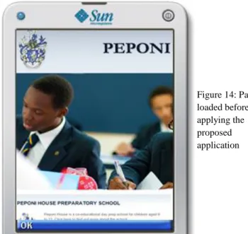
The example below is a page loaded and as viewed on PC, contains a large percentage of it composed of images, logos and also important address information about location.
285 The same page was then loaded through its Url on mobile
device and results observed and the differences before and after noted, and also differences in number of scrolls, loading time and content type recorded while using the proposed application versus not using it.
Mobile device prompting for URL
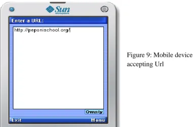
The figure below shows a mobile device prompting for Url from user.
The figure below shows a mobile device accepting Url from the user.
The figure below shows mobile device accepting command from user to source the Url.
The figure below shows mobile device trying to make the HTTP connection.
The figure below shows mobile device parsing tokens after successfully establishing the connection.
After converting the page into a sequence of tokens, the tokens are transformed into data structure tree and stored in a list as shown in figure 13. These tokens are used to regenerate page for display on mobile device. Only allowed content will be displayed after unnecessary information is filtered out hence saving memory space.
Figure 8: Mobile device prompting for Url
Figure 9: Mobile device accepting Url
Figure 10: Mobile device accepting commands
Figure 11: Mobile device making connection
Figure 12: Parsing tokens
286 The page loaded before the proposed algorithm was applied.
The page loaded after applying the proposed algorithm.
F. Implication of mobile devices’ external constraints on UX Mobile devices have limited resources and as they become smaller and lighter, screen sizes and layouts become restrictive, and the power to support applications also shrink. Memory available is also limited. The implication is that efficiency is critical. Device software should have fine-tuned control over product utilization. Application processing should be offloaded from the device to avoid excessive resource consumption. The proposed application filters out information needed before sending for display on mobile device. Since mobile devices are not standardized as PCs, in that hardware and software profiles are less standardized, the implication is that a developers of applications for mobile devices need to target lowest common denominator for screen size, shape, and orientation in order to deploy to a wide variety of handsets. Designers therefore have to optimize both software and hardware together in order to get the best UX. The proposed
application tries to optimize application for prioritization of user experience by page filtering. For several reasons also, mobile devices are always not online and access speeds are not fast enough to support, for example, decision-making at the point of need. The implication is that mobile devices need to be more than just thin client displays; they need to be application platforms in their own and finally, since connectivity is also unstandardized, there should be other ways for a user to access information and services online from their mobile devices. For better UX, faster internet protocols are required. The implication could be to tailor access to the kind of experience being delivered and the market to which it is being delivered to.
VII. CONCLUSION
1. The aspect of user experience dimensions with regard to mobile devices was narrowed down to three areas, from which various constraints could be established. This was done in order to examine the implications of mobile devices’ external constraints on UX dimensions. These dimensional areas included product factors, content and context factors, and user factors.
2. Data analysis aspect showed that mobile devices and their functionality are highly affected by the three factors. It indicated the need to prioritize what content is useful for mobile context domain. In light of this, the need for better means of access to relevant content by mobile users guided the proposed prototype, which would provide for a better way of content delivery enabling easy readability and content relevance, while retaining users’ interests hence improving UX.
3. The algorithm proposed utilized the aspects of lexical analysis and parsing to allow filtering of content. Only text content is send for display leaving out unnecessary images, adverts and links. An experiment was performed to show differences in loading time, number of clicks and scrolls used then to indicate variations in page delivery. 4. Implication of external constraints on user experience
aspect puts efficiency of both applications or software and hardware as critical. It insists developers should target lowest common denominator for screen size, and that mobile devices need not just be mobile client displays but application platforms that prioritize user experience.
VIII. BUSINESSBENEFITS
One aspect of the proposed application is that it gives the developer the freedom to implement content filters used to improve browsers in mobile devices by allowing specific content delivery into different situations depending on context, time or even device type and therefore prioritizing for contextual user experience, and also making the loading of content for such situations to be less costly which is a business benefit to a business owner, especially service providers, that they are able to channel specific type of content or customer requested content in the mobile context timely, hence utilizing and making maximum profit on available bandwidth. This reduces data traffic on mobile channels as different content are channeled on different pipes. Prioritizing for user experience improves user trust on mobile devices, hence more applications becoming more invested.
Figure 14: Page loaded before applying the proposed application
Figure 15: Page loaded after applying the proposed algorithm
287 REFERENCES
[1] Virpi Roto. Web Browsing on Mobile Phones -
Characteristics of User Experience. Helsinki University of Technology, Espoo, Finland, 2006. (URL:
research.nokia.com/people/virpi_roto/dissertation.html) [2] Tom, Farley (2007). The cell-phone revolution: American
Heritage of Invention & Technology. New York: American Heritage.
[3] Gonslaves, A. (2005). Real Network Launches Streaming music on Spirit movers, I. W
[4] Wikipedia, User Experience
http://en.m.wikipedia.org/wiki/user_experience [5] Anu Kankainen. Thinking Model and Tools for
Understanding User Experience Related to Information Appliance Product Concepts. Helsinki University of Technology, Helsinki, 2002. URL
http://lib.tkk.fi/Diss/2002/isbn9512263076/.
[6] Jodi Forlizzi and Shannon Ford. The building blocks of experience: An early framework for interaction designers. Proceedings of the Conference on Designing Interactive Systems, pages 419 – 423, New York, NY, USA, 2000. ACM Press. ISBN 1581132190.
doi:10.1145/347642.347800. URL http://dx.doi.org/10.1145/347642.347800
[7] Vesa Jaasko, Tuuli Mattelmaki, and Salu Ylirisku. The scene of experiences. Helsinki, 2003. University of Art and Design Helsinki. URL http://akseli.tekes.fi/opencm s/opencms/OhjelmaPortaali/ohjelmat/MUOTO_2005/fi/Do kumenttiarkisto/Viestinta_ja_aktivointi/Julkaisut/the_scene _of_experiencesx1x.pdf
[8] Luke Williams. The ipod and the bathtub: How products shape our perceptions, 2006. URL
http://gizmodo.com/gadgets/portable/frog-design-mind-124912.php
[9] Zeljko Obrenovic, Julio Abascal and Dusan Starcevic, (2007) Universal accessibility as a multimodal design issue: Creating adaptable solutions to address diverse users and situations. Communications of the ACM, Vol. 50, No. 5 URL: http://www.idemployee.id.tue.nl/ z.obrenovic /papers/cacm.pdf
[10] Chengming Cai. (2006) Personalized Adaptation Schedule for Iterative Adaptation: University of Toronto. URL:
http://sites.google.com/site/caijim/ut-thesis.pdf [11] Gregory F. Welch. (1995) A survey of power
management techniques in mobile computing operating systems: Operating Systems Review: 47-56
[12] Orodho AJ (2003). Essentials of Educational and Social Science Research Methods. Nairobi: Mazola Publishers. [13] Mugenda, Olive M. & Mugenda, Abel G. (1999).
Research Methods: Qualitative and Quantitative Approaches, Nairobi, Africa Centre for Technology studies: Acts Press.
[14] Akpar A, Angahar P (1999). Essentials of Research Methodology.Lagos: Aboki Publishers.
[15] AudienceScapes National Survey of Kenya. Mobile communications in Kenya. July 2009. URL:
http://www.audiencescapes.org/country-profiles/kenya/
media-and-communication-overview/ mobile-communications/mobile-communications.
[16] Kenya Media Stats, Nationmaster.com statistics, 2011: www.nationmedia.com/country/ke-kenya/med-media [17] Krejcie, R. V., & Morgan, D. W. (1970). Determining
Sample Size for Research Activities. Educational and Psychological Measurement, 30, 607-610.
[18] Ngumbo H (2006). Guidelines on Special Study Paper (SSP). Nairobi: Kenya Institute of Special Education (KISE)
[19] Watson G (1994). Writing a Thesis: A guide to Long Essays and Dissertations. London. Longman Publishers. [20] Wikipedia, lexical analysis
http://en.wikipedia.org/wiki/Lexical_analysis [21] TechTerms.com Parsing
http://www.techterms.com/definition/parse
Main Authors Profile