Christian Richthammer
Department of Information SystemsUniversity of Regensburg Universit¨atsstraße 31 Regensburg, Germany [email protected]
Johannes S¨anger
Department of Information SystemsUniversity of Regensburg Universit¨atsstraße 31 Regensburg, Germany [email protected]
G¨unther Pernul
Department of Information Systems University of Regensburg
Universit¨atsstraße 31 Regensburg, Germany [email protected]
ABSTRACT
Recommender systems provide a valuable mechanism to address the information overload problem by reducing a data set to the items that may be interesting for a particular user. While the qual-ity of recommendations has notably improved in the recent years, the complex algorithms in use lead to high non-transparency for the end user. We propose the usage of interactive visualizations for presenting recommendations. By involving the user in the infor-mation reduction process, the quality of recommendations could be enhanced whilst keeping the system’s transparency. This work gives first insights by analyzing recommender systems data and matching them to suitable visualization and interaction techniques. The findings are illustrated by means of an example scenario based on a typical real-world setting.
CCS CONCEPTS
•Information systems→Recommender systems; Personaliza-tion;•Human-centered computing→Visualization techniques;
KEYWORDS
Recommender systems, interactive visualization, data types ACM Reference format:
Christian Richthammer, Johannes S¨anger, and G¨unther Pernul. 2017. In-teractive Visualization of Recommender Systems Data. InProceedings of SHCIS’17, Neuchˆatel, Switzerland, June 21-22, 2017,6 pages.
DOI: 10.1145/3099012.3099014
1
INTRODUCTION
According to IMDb1, 228,414 movie and TV productions have been published in 2016. On Twitter, 500 million tweets2are sent every
day. Facebook3users post 510,000 comments, update 293,000 sta-tuses, and upload 136,000 photos every 60 seconds. Which ones would you like to see?
Information overload has nowadays become a common prob-lem. It describes the difficulty of effectively making decisions when
1http://www.imdb.com/search/title?release date=2016 2http://www.dsayce.com/social-media/tweets-day/ 3https://zephoria.com/top-15-valuable-facebook-statistics/
Permission to make digital or hard copies of all or part of this work for personal or classroom use is granted without fee provided that copies are not made or distributed for profit or commercial advantage and that copies bear this notice and the full citation on the first page. Copyrights for components of this work owned by others than ACM must be honored. Abstracting with credit is permitted. To copy otherwise, or republish, to post on servers or to redistribute to lists, requires prior specific permission and/or a fee. Request permissions from [email protected].
SHCIS’17, Neuchˆatel, Switzerland
© 2017 ACM. 978-1-4503-5271-0/17/06...$15.00 DOI: 10.1145/3099012.3099014
too much information is available [15]. Reasons for this phenome-non are eclectic but can primarily be attributed to the advances in computer and information technology in the recent decades. The mounting digitalization allows to easily and rapidly create new information and share it over various channels.
In this context, recommender systems have proven themselves to provide a helpful mechanism for information reduction. They aim to reduce an initial data set to those items that may be most interesting for a particular user [8, 9]. When looking for a new movie on Netflix4, for instance, Netflix’s recommender system tries to support the search by presenting a list of movies the user may like.
In the recent years, the quality of recommendations has consider-ably improved. At the same time, the complexity of the algorithms used for the computation of a recommended set of items has no-tably increased. For example, the first progress prize as part of the Netflix Prize5was awarded to a team of researchers combin-ing more than 100 algorithms [4]. Consequently, the computation appears as a “black box” to the end users because they cannot com-prehend how recommendations are computed. This, in turn, leads to high non-transparency [10]. Higher transparency and under-standability, however, may result in a higher level of trust towards recommendations [32].
In this work, we address an alternative approach to improve the quality of recommendations by not providing an enhanced al-gorithm but by involving the user in information reduction using interactive visualizations. Visualizations allow to transparently depict a wide range of information in one picture. Adding inter-action techniques, users may dive into the data through filtering or zooming into particular subsets, for instance. In this way, the quality of a recommendation may be enhanced whilst keeping the system’s transparency.
The remainder of the paper is organized as follows. First we give a short overview of the relevant and related work on recommender systems and visualizations in Section 2. We thereby identify the challenges and clarify the research gap. As the selection of suitable visualization techniques is strongly dependent on the data that are visualized, we conduct a detailed analysis and classification of recommender systems data in Section 3. Based on this classification, we then introduce suitable visualization and interaction techniques for the corresponding data. In Section 4, we demonstrate how interactive visualizations could be used in recommender systems in a real-world environment by means of a practical example scenario. Section 5 concludes the paper by summing up the most important points and discussing aspects for future work.
4https://www.netflix.com/ 5http://www.netflixprize.com/
2
BACKGROUND
2.1
Recommender Systems
The main motivation for the use of recommender systems is to tackle the information overload problem by providing people with only those information and items they are most likely to be inter-ested in [8, 9]. This task has come to be known as the recommen-dation problem [2]. Over the years, several ways of estimating people’s preference values have been proposed, with collaborative, content-based, demographic-based, knowledge-based, and context-based being the basic and generally distinguished recommendation models [3, 8].
Collaborative filtering [13] assumes that people tend to agree with people they agreed with in the past. Thus, users are recom-mended those items that users similar in terms of their rating be-haviors also like. By contrast, content-based filtering [21] assumes that people will like items similar to the ones they liked in the past. It does not rely on any ratings of other users but is solely based on the ratings of the user in focus and the similarities of items in terms of their item features. Demographic-based recommender systems [24] classify users according to their demographic attributes (e.g. age, gender) and generate recommendations based on stereotypes. Knowledge-based recommender systems [7] allow the user in fo-cus to specify preferences in the form of explicit constraints (e.g. “display resolution of at least 1920x1080 pixels”) and provide recom-mendations matching these criteria. Context-aware recommender systems [1] use various situation-specific factors as additional input data for recommendation generation. By incorporating preferences the users have had in the past when similar contextual conditions have been present, context-aware recommender systems are able to adapt to the users’ situational needs.
2.2
Data Visualization and Data Types
Visualizations such as charts or graphs have been successfully used for hundreds of years in order to make sense of rather abstract data [25]. Visualizations help us leverage the human’s ability to see pat-terns and spot trends or outliers [14]. In this way, the understanding of data can notably be supported.
Meanwhile, the “visualization zoo” [14] accommodates a large variety of different visualization techniques. When trying to visual-ize a data set, however, only a very limited range of visualizations may fit the specific purpose. Thus, the selection of suitable visu-alizations is a crucial task in information visualization. To give a structured overview of the many types of visualizations available, several taxonomies have been introduced in literature in the recent years. Thereby, the data type of the input data is considered the main characteristic. Based on the classifications of Shneiderman [31] and Keim [19], we here distinguish between three linear data types (one-,two-, andmulti-dimensional) as well as four additional
data types that can be clearly differentiated from one another (text and hypertext,hierarchies,graphs, andalgorithms and software).
Unlike Shneiderman [31], however, who considers temporal data as an own data type, we argue that every data set can be viewed in both a temporal and a non-temporal context.
2.3
Research Gap: Visualization of
Recommender Systems Data
Most recommender systems currently used in practice provide a list of recommended items as the only output. The selection of these items is usually based on rather complex recommendation tech-niques. This “black box” computation, however, is non-transparent to the end user as it does not provide any information about the nature of the input data. A proper visualization of the input data resulting in a specific selection, in contrast, may allow deeper in-sights for the end user, increase transparency, and thus enhance the user’s trust towards recommendations.
So far, the interactive visualization of recommender systems data has gained only little attention of the community (e.g. [6], [23], [26]). The corresponding publications are limited to one specific use case and/or one suitable visualization technique. A comprehensive and general discussion of interactive visualizations for recommender systems data is missing.
For reputation systems, by contrast, a general discussion of suit-able visualization techniques has been introduced by S¨anger and Pernul [28]. There are also several works that provide a detailed description of how reputation systems data may be interactively visualized (e.g. [22], [27], [29]). Even though reputation systems share some fundamental similarities with recommender systems data [18, 33], however, the simple transfer of their results to recom-mender systems is not possible without further ado because of the high diversity of recommender systems data.
Therefore, we first conduct a detailed analysis and classification of the data base according to the aforementioned classification of data for data visualizations. Based on the results, we then allocate suitable visualization techniques to the different data types and thus aim at giving first insights on how recommender systems data can be interactively visualized. Moreover, we illustrate our findings by means of an example scenario in order to show how the end user can be integrated in the interactive information reduction process.
3
MATCHING RECOMMENDER SYSTEMS
DATA AND VISUALIZATIONS
3.1
Data Classification
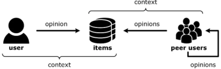
As introduced in Section 2.1, input data and recommendation pro-cesses may vary strongly across different recommendation ap-proaches. Nevertheless, the entities and interactions on online platforms with embedded recommender system can be described in a generic way (cf. Figure 1).
Figure 1: Entities and interactions on online platforms with embedded recommender system
Table 1: Classification of common recommender systems data
information block data data type comment
items multi-dimensional genre, release year, and age rating are exemplary chosen as item features
genre one-dimensional
release year one-dimensional age rating one-dimensional
opinions multi-dimensional opinions typically include ratings, tags, and textual reviews
rating one-dimensional
tag text
review text
actors network
user in focus multi-dimensional peer user multi-dimensional
context multi-dimensional time of day and mood are exemplary chosen as contextual condi-tions, price and genre are exemplary chosen as user constraints
time of day one-dimensional
mood one-dimensional
price one-dimensional
genre one-dimensional
Depending on the application area, users – including both the user in focus and his peer users on the online platform – may consume, visit, use, or just search for different kinds of items such as books, movies, smartphones, restaurants, and web services. For the sake of generality, we refer to this as a transaction. Each transaction happens in a particular context specified by various contextual dimensions (e.g. time of day), and users are able to provide their opinions on transactions and the respective items. This may happen explicitly (e.g. writing a review after a transaction) and/or implicitly (e.g. buying an item). Note that users may not only provide feedback on items but also on other users, for example by assessing the quality of their textual reviews.
From this generalization, the following four information blocks can be derived: items, opinions, actors (including the user in focus and his peer users), and context. These constitute the sources of all input data and are similar to the knowledge sources described by Burke et al. [9] and Felfernig and Burke [11]. Since the selection of suitable visualization techniques depends on the data type of the input, the data considered in each information block need to be further analyzed. The results of the analysis are summarized in Table 1. Subsequently, we discuss the classification in more detail and show how the respective data types can be visualized.
3.2
Visualization Techniques
While the pool of suitable visualization techniques for each infor-mation block is limited to those fitting the identified data type, the selection of the most useful and usable technique is hard to measure and a quite subjective estimate. Therefore, we introduce visualization techniques commonly used to illustrate data of the identified types.
3.2.1 Items: item features.The items that are recommended to the user are the central entity of a recommender system. Items can be characterized by several item features such as genre, release year,
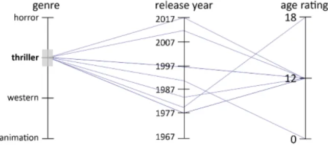
or age rating. This constitutes multi-dimensional data when taken as a whole, but the single features are one-dimensional. Typical visualization techniques commonly used for multi-variate data are parallel coordinates [16, 17] or star plots [5]. In such visualizations, each attribute (or dimension) is depicted by an axis.
Taking parallel coordinates as an example, the axes are laid out in parallel side by side. The items of a data set are represented by polylines connecting vertices on the parallel axes. Figure 2 shows an example. Obviously, the recommended items refer to the four genres “horror”, “thriller”, “western”, and “animation”. The colored polylines furthermore reveal that nearly every movie that has an age rating of 18 is attributed to the genre “horror”, whereas animated movies are all intended for a younger audience. In order to show which polyline belongs to which movie title, a mouse hover effect could be added.
Figure 2: Parallel coordinates visualization of an example item set with one movie highlighted
3.2.2 Opinions: feedback data.For many recommender systems (especially collaborative filtering), opinions constitute the most important data source when calculating a recommendable item
set. Opinions may include numerical ratings (e.g. five-star rat-ings) as well as textual reviews or tags. Numerical ratings, on the one hand, are a typical example for one-dimensional or univariate data6. Here, only one attribute is dependent on one or several inde-pendent attributes. Visualization techniques commonly used for one-dimensional data are bar charts or pie charts. Figure 3 shows an example bar chart visualizing five-star ratings.
Figure 3: Bar chart visualization of example five-star ratings Reviews and tags, on the other hand, are typical examples for textual data. Textual comments are a helpful alternative to numeri-cal ratings which cannot reveal anything about the reasons for a specific rating. A visualization technique to depict the content of textual data in one picture that has become popular in the recent years is the tag cloud [30]. Tag clouds display the most important tags or words of a text. Thereby, the text size of a tag varies in accordance to its importance (mostly based on the frequency of usage). Figure 4 depicts an example tag cloud for feedback towards a horror movie. Here, the color of the tags refers to the related rating value.
Figure 4: Tag cloud visualization of the textual reviews of an example horror movie
3.2.3 Actors: user in focus & peer users.The information block “actors” includes the user in focus and his peer users. The users involved in recommender systems are characterized by several demographic attributes such as age, gender, and occupation (multi-dimensional). As actors may rate each other, the information block as a whole can be considered a network with actors as nodes and rating relations as unidirectional edges. Using this network struc-ture as a basis for computing recommendations, clusters of users related to each other may easily be identified.
When trying to visualize network data, one can choose between a node-link representation, a matrix visualization, or a hybrid ap-proach [20]. While node-link representations are particularly useful
6Note that numerical ratings may not only be provided explicitly but also be derived
from user behavior such as buying an item, which would be mapped to 1 for “has bought” as opposed to 0 for “has not bought”.
Figure 5: Rating matrix visualization of the rating graph be-tween actors
for small graphs, matrix visualizations allow to display large graphs and dense networks [12]. By applying node-ordering, structures and sub-communities can transparently be revealed. Figure 5 shows a rating matrix, where colored fields display a rating relation. Ob-viously, the cluster on the upper-left side only provided positive ratings for each other, which suggests the assumption that those users share the same taste.
3.2.4 Context: conditions & constraints.The information block “context” fills a special role in this analysis as it helps to specify the boundaries of a presented data set. Users, for instance, might be interested in movies of a particular genre or may only want to con-sider ratings that have been created by people having a good mood. Thus, context information is particularly valuable if integrated in item-related or opinion-related visualizations. Figure 6 shows an example parallel coordinates visualization of a set of recommended movies (items). Here, the constraint “category = thriller” has been added by the user through clicking on the corresponding category.
Figure 6: Parallel coordinates visualization of an example item set with contraints added through user interaction
4
EXAMPLE SCENARIO
Having introduced suitable visualization and interaction techniques for the different data types relevant in connection with recom-mender systems, we now illustrate how interactive visualizations may support the information reduction process in a typical real-world setting.
Suppose it is Saturday evening and Bob wants to watch a movie together with a group of friends. In general, Bob is not very knowl-edgeable in the movie domain and does not have any clear pref-erences in terms of favorite genres. Because of the increasingly large number of movie options available through various video on demand providers, finding a movie to watch thus constitutes a problem of information overload for Bob.
Recommender systems are able to determine those movies out of the sheer endless set of available alternatives that Bob is most likely to enjoy. However, the decisions of traditional “black box” recom-mender systems are hard to follow because they do not provide any information on the nature of the input data. This is especially rele-vant if Bob is unsatisfied with the final recommendations. Therefore, our concept of interactive visualizations for recommender systems data uses traditional “black box” computations only to reduce the set of all alternatives to a manageable size (instead of directly re-ducing it to the final set of recommendations). This preparatory step is needed because including all available options in one picture would make the corresponding visualizations unreadable.
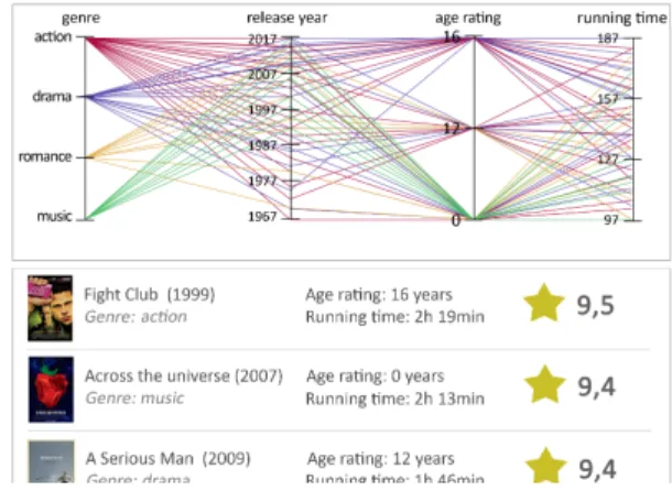
The resulting set of candidate items can then be visualized in terms of the features of the items. As introduced in Section 3.2.1, parallel coordinates are a suitable visualization technique for this task. An example is depicted in Figure 7, where the item features of the movies with the highest predicted ratings are visualized in terms of their genre, release year, age rating, and running time. Moreover, the movies are listed according to their predicted rating (in descending order) below the parallel coordinates. The predicted rating says how Bob would assess a movie according to the recom-mender algorithm.
Figure 7: Parallel coordinates visualizing the movies with the highest predicted ratings in terms of their item features Through this first visualization, Bob gains a quick overview of the items with the highest predicted ratings and their respective item features. In the example, he realizes that all candidate items
belong to one of the following genres: action, drama, romance, or music. Even though Bob indeed likes all of these genres, he thinks that an action movie or a drama is most appropriate for an evening with a group of friends. Moreover, he decides that the movie should be from the last ten years, have an age rating of 16, and have a running time of at least 150 minutes.
Therefore, he interacts with the parallel coordinates visualiza-tion to reduce the set of polylines to those fitting these criteria (cf. Section 3.2.4). We argue that this approach is more meaningful than specifying such criteria upfront, because in the beginning Bob has no idea about how many items are satisfying which constraints. As Figure 8 shows, applying the criteria leads to changes regarding the top recommendations because the ones with the highest predicted ratings do not satisfy the specified constraints. In particular, the list of candidate items is reduced to six movies, which both have a high predicted rating and fit Bob’s criteria.
Figure 8: Interactive specification of constraints with paral-lel coordinates
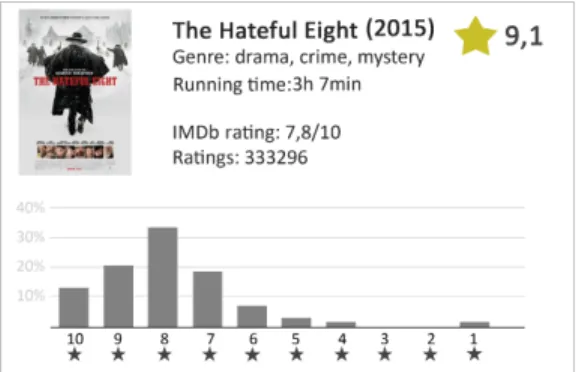
It now makes sense for Bob to have a closer look at the recom-mendations. For this, the movie profile in Figure 9 includes not only all previously considered item features but also the overall IMDb rating, the total number of ratings and a bar chart visualizing the overall rating distribution (cf. Section 3.2.2).
Overall, the example scenario shows that interactive visualiza-tions can support the entire decision process of an end user, starting from the initial state with no specific preferences via getting clear about the available alternatives and meaningful constraints through to the detailed review of the eventually recommended items.
5
CONCLUSION
In the past, researchers have focused on improving recommender systems by developing and optimizing increasingly complex algo-rithms that are supposed to reduce an unmanageably large amount of information to those information the users are most likely to be interested in. Even though these efforts have been successful in terms of higher quality of recommendations, they have led to high non-transparency because end users are no longer able to compre-hend the processes underlying the recommendation generation. Therefore, this paper did not aim at develop yet another recommen-dation technique to improve the quality of recommenrecommen-dations but at involving the end user in the information reduction process using interactive visualizations.
Figure 9: Bar chart visualizing the overall rating distribution of “The Hateful Eight”
As opposed to existing works that are limited to one specific use case and one suitable visualization technique, we wanted to intro-duce this approach in a comprehensive manner and on a general level. To this end, we first classified different kinds of recommender systems data into information blocks and commonly accepted data types. We then matched these data types to suitable visualization and interaction techniques and introduced several example visu-alizations for each information block. Moreover, we discussed an example scenario describing how interactive visualizations can support the user’s entire decision process.
Even though this work constitutes only a starting point, we hope that discussing interactive visualization for recommender systems from the ground up serves researchers as a basis for future work in this area. After all, recommender systems will continue to be an active research field but its focus may be about to turn away from algorithm optimization and towards other ways of enhancing the user experience.
ACKNOWLEDGMENT
The research leading to these results was supported by “Bavarian State Ministry of Education, Science and the Arts” as part of the FORSEC research association (http://www.bayforsec.de/).
REFERENCES
[1] Gediminas Adomavicius, Bamshad Mobasher, Francesco Ricci, and Alexander Tuzhilin. 2011. Context-aware Recommender Systems.AI Magazine32, 3 (2011),
67–80.
[2] G. Adomavicius and A. Tuzhilin. 2005. Toward the Next Generation of Recom-mender Systems: A Survey of the State-of-the-Art and Possible Extensions.IEEE Transactions on Knowledge and Data Engineering17, 6 (2005), 734–749. [3] Charu C. Aggarwal. 2016. An Introduction to Recommender Systems. In
Recom-mender Systems: The Textbook, Charu C. Aggarwal (Ed.). Springer International Publishing, Cham, 1–28.
[4] Xavier Amatriain and Justin Basilico. 2012. Netflix Recommenda-tions: Beyond the 5 Stars. (2012). http://techblog.netflix.com/2012/04/ netflix-recommendations-beyond-5-stars.html
[5] Edgar Anderson. 1957. A Semigraphical Method for the Analysis of Complex Problems.Proc. of the National Academy of Sciences of the United States of America
43, 10 (1957).
[6] Svetlin Bostandjiev, John O’Donovan, and Tobias H¨ollerer. 2012. TasteWeights: A Visual Interactive Hybrid Recommender System. InProc. of the 6th ACM Conference on Recommender Systems (RecSys). 35–42.
[7] Robin Burke. 2000. Knowledge-based Recommender Systems. InEncyclopedia of Library and Information Science: Volume 69 - Supplement 32, Allen Kent (Ed.).
Marcel Dekker, Inc., New York, NY, USA and Basel, Schweiz, 180–200.
[8] Robin Burke. 2002. Hybrid Recommender Systems: Survey and Experiments.
User Modeling and User-Adapted Interaction12, 4 (2002), 331–370.
[9] Robin Burke, Alexander Felfernig, and Mehmet H. G¨oker. 2011. Recommender Systems: An Overview.AI Magazine32, 3 (2011), 13–18.
[10] Michael D. Ekstrand, Daniel Kluver, F. Maxwell Harper, and Joseph A. Kon-stan. 2015. Letting Users Choose Recommender Algorithms. InProc. of the 9th ACM Conference on Recommender Systems (RecSys). 11–18.
[11] A. Felfernig and R. Burke. 2008. Constraint-based Recommender Systems: Tech-nologies and Research Issues. InProc. of the 10th International Conference on Electronic Commerce (ICEC).
[12] Mohammad Ghoniem, Jean-Daniel Fekete, and Philippe Castagliola. 2004. A Comparison of the Readability of Graphs Using Node-Link and Matrix-Based Representations. InProc. of the 2004 IEEE Symposium on Information Visualization (INFOVIS). 17–24.
[13] David Goldberg, David Nichols, Brian M. Oki, and Douglas Terry. 1992. Using Collaborative Filtering to Weave an Information Tapestry.Commun. ACM35, 12
(1992), 61–70.
[14] Jeffrey Heer, Michael Bostock, and Vadim Ogievetsky. 2010. A Tour through the Visualization Zoo.ACM Queue8, 5 (2010).
[15] Paul A. Herbig and Hugh Kramer. 1994. The Effect of Information Overload on the Innovation Choice Process: Innovation Overload.Journal of Consumer Marketing11, 2 (1994), 45–54.
[16] Alfred Inselberg. 1985. The Plane with Parallel Coordinates.The Visual Computer
1, 2 (1985), 69–91.
[17] Alfred Inselberg. 2009.Parallel Coordinates: Visual Multidimensional Geometry and Its Applications. Springer, New York, NY, USA.
[18] Audun Jøsang, Roslan Ismail, and Colin Boyd. 2007. A Survey of Trust and Reputation Systems for Online Service Provision.Decision Support Systems43, 2 (2007), 618–644.
[19] Daniel A. Keim. 2001. Visual Exploration of Large Data Sets.Commun. ACM44, 8 (2001), 38–44.
[20] Tatiana von Landesberger, Arjan Kuijper, Tobias Schreck, J¨orn Kohlhammer, Jarke van Wijk, Jean-Daniel Fekete, and Dieter Fellner. 2011. Visual Analysis of Large Graphs: State-of-the-Art and Future Research Challenges.Computer Graphics Forum30, 6 (2011), 1719–1749.
[21] Pasquale Lops, Marco de Gemmis, and Giovanni Semeraro. 2011. Content-based Recommender Systems: State of the Art and Trends. InRecommender Systems Handbook, Francesco Ricci, Lior Rokach, Bracha Shapira, and Paul B. Kantor
(Eds.). Springer US, Boston, MA, USA, 73–105.
[22] John O’Donovan, Barry Smyth, Vesile Evrim, and Dennis McLeod. 2007. Ex-tracting and Visualizing Trust Relationships from Online Auction Feedback Comments. InProc. of the 20th International Joint Conference on Artificial Intelli-gence (IJCAI). 2826–2831.
[23] John O’Donovan, Barry Smyth, Brynjar Gretarsson, Svetlin Bostandjiev, and Tobias H¨ollerer. 2008. PeerChooser: Visual Interactive Recommendation. InProc. of the 26th SIGCHI Conference on Human Factors in Computing Systems (CHI).
1085–1088.
[24] Michael J. Pazzani. 1999. A Framework for Collaborative, Content-Based and Demographic Filtering.Artificial Intelligence Review13, 5/6 (1999), 393–408.
[25] Darius Pfitzner, Vaughan Hobbs, and David Powers. 2003. A Unified Taxo-nomic Framework for Information Visualization. InProc. of the 2nd Australian Symposium on Information Visualisation (invis.au). 57–66.
[26] Christian Richthammer and G¨unther Pernul. 2017. Explorative Analysis of Recommendations Through Interactive Visualization. InProc. of the 17th Interna-tional Conference on E-Commerce and Web Technologies (EC-Web), Revised Selected Papers, Derek Bridge and Heiner Stuckenschmidt (Eds.). Springer International Publishing, Cham, 46–57.
[27] Johannes S¨anger and G¨unther Pernul. 2014. Visualizing Transaction Context in Trust and Reputation Systems. InProc. of the 9th International Conference on Availability, Reliability and Security (ARES). 94–103.
[28] Johannes S¨anger and G¨unther Pernul. 2016. TRIVIA: Visualizing Reputation Profiles to Detect Malicious Sellers in Electronic Marketplaces.Journal of Trust Management3, 1 (2016), 1.
[29] Johannes S¨anger, Christian Richthammer, Michael Kunz, Stefan Meier, and G¨unther Pernul. 2015. Visualizing Unfair Ratings in Online Reputation Systems. InProc. of the 23rd European Conference on Information Systems (ECIS).
[30] Christin Seifert, Barbara Kump, Wolfgang Kienreich, Gisela Granitzer, and Michael Granitzer. 2008. On the Beauty and Usability of Tag Clouds. InProc. of the 12th International Conference Information Visualisation (IV). 17–25.
[31] Ben Shneiderman. 1996. The Eyes Have It: A Task by Data Type Taxonomy for Information Visualizations. InProc. of the 1996 IEEE Symposium on Visual Languages (VL). 336–343.
[32] Rashmi Sinha and Kirsten Swearingen. 2002. The Role of Transparency in Recommender Systems. InExtended Abstracts on Human Factors in Computing Systems (CHI EA). 830–831.
[33] Mozhgan Tavakolifard and Kevin Almeroth. 2012. Social Computing: An Intersec-tion of Recommender Systems, Trust/ReputaIntersec-tion Systems, and Social Networks.