Story Tracker: Incremental visual text
analytics of news story development
Milos
ˇ Krstajic
´, Mohammad Najm-Araghi, Florian Mansmann
and Daniel A Keim
Abstract
Online news sources produce thousands of news articles every day, reporting on local and global real-world events. New information quickly replaces the old, making it difficult for readers to put current events in the context of the past. The stories about these events have complex relationships and characteristics that are difficult to model: they can be weakly or strongly related or they can merge or split over time. In this article, we present a visual analytics system for temporal analysis of news stories in dynamic information streams, which combines interactive visualization and text mining techniques to facilitate the analysis of similar topics that split and merge over time. Text clustering algorithms extract stories from online news streams in con-secutive time windows and identify similar stories from the past. The stories are displayed in a visualization, which (1) sorts the stories by minimizing clutter and overlap from edge crossings, (2) shows their temporal characteristics in different time frames with different levels of detail, and (3) allows incremental updates of the display without recalculating the past data. Stories can be interactively filtered by their duration and con-nectivity in order to be explored in full detail. To demonstrate the system’s capabilities for detailed dynamic text stream exploration, we present a use case with real news data about the Arabic Uprising in 2011.
Keywords
News stream analysis, topic evolution, dynamic visualization, text analytics
Introduction
Understanding temporal development of unstructured and semi-structured text data streams is becoming increasingly important in many application areas, such as journalism, politics, or business intelligence. At the same time, sources of textual data, such as online news providers, are creating content in constantly growing amounts. While many automated and visual solutions that deal with the snapshots of information space already exist, few interactive systems can provide a user-friendly environment in which temporal context of these growing data collections can be successfully analyzed. The latest information coming from the news data providers prevails in the news landscape very quickly, putting the prior information out of the picture, even when it is necessary to keep the longer temporal context in mind to understand the current
events. News stories that report on real-life events have characteristics that make analysis of this type of data challenging, from both the text mining and visua-lization perspectives. Analyzing the temporal dynamics of the news content has been the focus of data mining and visualization researchers for some time. In the area of text mining, a considerable effort has been put into modeling of topics in evolving document collections. However, little work has been devoted to analyze com-plex relationships that exist between news stories. In the area of visualization, topic evolution is receiving more
University of Konstanz, Konstanz, Germany
Corresponding author:
Milosˇ Krstajic´, Data Analysis and Visualization Group, University of Konstanz, 78457 Konstanz, Germany.
Email: [email protected]
Konstanzer Online-Publikations-System (KOPS) URL: http://nbn-resolving.de/urn:nbn:de:bsz:352-262244
attention recently, although most of the proposed meth-ods do not scale well when working with data streams. We believe that evolutive aspects of news stories cannot be separated from incremental visualization methods and that these methods must be coupled with interac-tion techniques that will allow the user to explore the rich content of text data streams in full detail.
In this article, we propose a novel news stream visual analytics system that integrates topic evolution algo-rithms with interactive visualization methods at three temporal zoom levels. To support effective analysis of the growing news corpora, we combine interactive methods with incremental visualization of story devel-opment to allow exploration of news data streams from a broader temporal overview to fine-detailed level of a single article that belongs to a particular story.
Related work
Research on topic development, visualization, and analysis of temporal dynamics in information streams has strong connections to the fields of text mining, information visualization, and time-series analysis. A well-known initiative in text mining wastopic detection
and tracking(TDT),1 which investigated methods for
discovering events in broadcast news streams. Dynamic topic models2 is another well-known approach in topic modeling, which extends Latent Dirichlet Allocation (LDA) to work with time-stamped data. Although some of the important chal-lenges were described already several years ago by Wong et al.,3 a lot of work in the field of streaming data and text visualization still has to be done. The most popular method to visualize topic trends over time is based on ThemeRiver,4which employs stacked graph visualization.5,6 Fisher et al.7 presented a key-word tracking tool that calculates the co-occurrences of most important terms in blogs. EventRiver8 employs bubble-like visualization of news stories extracted from the broadcast news data, while CloudLines9uses kernel density estimation to visualize interesting episodes in irregular news time-series data. Real-time aggregation of news articles into important threads is presented by Krstajic´ et al.10 Aigner et al.11 recently provided an extensive systematic overview of time-oriented visualization techniques. In the field of visual analytics, the recently published TIARA12 sys-tem integrates interaction methods with text summari-zation and visualisummari-zation based on tag clouds and stacked graphs. The work that is most closely related to ours is the one by Rose et al.,13where a similar text flow visualization metaphor is used to show evolution of daily news themes over time. Our approach extends this line of research with improved interaction and
different levels of detail for different temporal intervals and directly addresses the challenge of working with topics that split, merge, and overlap over time.
News story clustering
Our goal is to enable the analyst to understand tem-poral dynamics of news stories—how the stories develop over time, how they split and merge, and how are they related. The system must be able to process the news articles as fast as possible, and the visualiza-tion should help the user put the new informavisualiza-tion in the context of the past.
Our system uses the news stream generated by the Europe Media Monitor (EMM),14a publicly available online news aggregator (http://emm.newsbrief.eu/), which collects news articles from over 2500 sources in 42 languages. These hand-selected sources include media portals, government websites, and commercial news agencies. EMM processes 80,000–100,000 arti-cles per day, enriching them with various metadata on which we perform our analysis. By using URL meta-data, full text of the article can be easily extracted for further processing. In our prototype, we analyze all sources that publish articles in English (in total, around 10,000 articles per day). Focusing on this sub-set makes the evaluation of the document clustering faster, but the system is designed to easily accommo-date data arriving in larger volumes.
Data processing
The news articles are collected as XML data, as described by Krstajic´ et al.15 Each time-stamped data item contains metadata, such as named entities or tags. Entities identify people or organizations that are mentioned in the document, while tags categorize the news (e.g. earthquake, sports). These significant key-words can be used in addition to full text that can be retrieved from the URL of the article in the document clustering step. The document preprocessing module converts the incoming article information to the inter-nal format and sends it as the input to the Story Creator module.
Creation of daily story clusters
We have developed our system with the goal of work-ing with news streamwork-ing data, that is, a sequence of time-stamped documents that arrive continuously over time. Theoretically, the volume and the speed at which the documents arrive are unbounded, and, therefore, it is desirable that the algorithms process the ment corpora incrementally. In practice, news docu-ments that are similar, that is, report on a particular
real-life event, are usually temporally close. Our sys-tem clusters the documents in consecutive 24-h time windows and then sequentially compares the clusters from neighboring intervals to find similar stories.
The Story Creator module clusters the news articles in 24-h time intervals. Since our news data stream source provides data from a large number of news sources, it is expected to have a lot of similar documents, which report on the same real-world event. Furthermore, news topics are very often characterized by their braided nature,16 where topics overlap, split, and merge. These characteris-tics cannot be easily captured by existing topic modeling methods. We address this challenge by comparing con-tent from clusters in adjacent time intervals to detect overlapping news stories.
The clustering module in our framework is based on Carrot2,17an open-source framework for clustering search results. This framework provides two clustering algorithms whose important advantage is that they do not require a predefined number of clusters and are very efficient in terms of processing time and comput-ing power. The first algorithm is Lcomput-ingo,18 which extracts frequent phrases from documents to produce high-quality cluster descriptions (labels). Lingo is based on singular value decomposition (SVD) and uses vector space model (VSM)19 to create term– document matrix, which is decomposed to create can-didate labels and associate documents with the most similar labels. The second clustering algorithm is the Suffix Tree Clustering (STC) algorithm,20 which assumes that similar documents share identical phrases. In the world of news publishing, this is very often the case since many online news portals publish modified versions of the original article, which was created by a global news agency, such as Reuters. Phrase-based approaches, such as STC, have the advantage over term-based clustering techniques because the phrases are more informative than the rep-resentative (usually, most frequent) set of keywords
and, additionally, they can be used to label clusters. STC has two phases: first, it createsbase clusters, con-taining the sets of documents with an identical phrase, and second, it combines the base clusters to formfinal clusters. The assessment of the quality of clustering results performed by the STC algorithm can be found in the work by Stefanowski and Weiss.21 The evalua-tion of document clustering output can be quite exhausting and, although benchmark sets do exist, the results with our real news data were varying, depend-ing on the selected time intervals and the amount of documents in the corpus. However, our visual analy-tics framework allows easy replacement of the underly-ing clusterunderly-ing technique.
For each news article, we use its title, summary, entities, and tags (categories) as input for the cluster-ing algorithm. The user can refine the input by includ-ing or excludinclud-ing entities or tags in the interaction phase. A short example of a daily cluster output is shown in Table 1, with three identified stories: WikiLeaks’ Assange, Hosni Mubarak, and World Cup. The number of documents assigned to each story is given in parenthesis, followed by the list of document IDs, titles, and URLs.
Story comparison
Major stories can easily span over a period that is lon-ger than 24 h, and understanding the evolution of these stories is one of the challenges that we are deal-ing with in our work. Since we want to be able to pro-cess data incrementally, the stories discovered in each time interval (24 h) can be compared to the stories from the previousnintervals. Rose et al.13usen= 7 in their evaluations. In our case, we compare the stories from the current and the previous days, which helps in dealing with visual clutter that arises when n . 1. Besides, our experiments showed that in most cases, stories appear on consecutive days without long breaks between them.
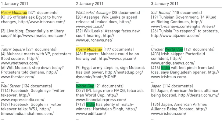
Table 1. Daily cluster output example.
WikiLeaks’ Assange(28 documents)
(20) Assange: WikiLeaks to speed release of leaked docs, http://www.ynet.co.il/ (32) WikiLeaks’ Assange faces new court hearing, http://www.euronews.net/ ...
Hosni Mubarak(197 documents)
(46) Reports: Mubarak could be on his way out, http://www.upi.com/
(9) Egypt army steps in, sign Mubarak has lost power, http://hosted.ap.org/dynamic/fronts/HOME ...
World Cup(21 documents)
(229) IPL bags more FMCG, telco ads than World Cup, http://www.financialexpress.com/ (719) India has plenty of match-winners: Harbhajan Singh, http://www.rediff.com/ ...
The clustering algorithm produces story labels, followed by the number of documents belonging to each story and a list of document IDs, titles, and URLs.
Essential content of each story consists of a set of keywords coming from the story title, description, and document title words. We use Jaccard distance to cal-culate the similarity between stories belonging to neighboring time intervals, which is computed on the extracted set of keywords. An example of the cluster-ing output from three consecutive days is shown in Table 2. The highlighted and colored keywords in the titles show the high similarity between articles and stories.
Merging and splitting of stories
Very often, news stories have braided nature, that is, documents that belong to different clusters can be still highly related. Furthermore, news stories may split into two different topics at some point, when, for example, new information about an event becomes available, or they can dissolve into a single topic (as shown in Figure 1). To address this issue, we have empirically set two thresholds: one for splitting and one for merging of news stories. The calculated cluster similarity values are then used for connecting both the most similar stories between consecutive days and also the stories whose similarities are higher than the given threshold. Therefore, when a story splits, each ‘‘child’’ story cluster that evolves from the ‘‘parent’’ story
cluster will have the same visual encoding as the ‘‘par-ent.’’ In case of merging of two stories into one, the new story will inherit visual features (namely, color) from the most similar story from the previous day. The threshold value can be later adjusted by the user to create more tightly or more loosely connected Table 2. Comparison of daily clusters.
1 January 2011 2 January 2011 3 January 2011
Hosni Mubarak(371 documents) WikiLeaks’ Assange(28 documents) Sidi Bouzid(118 documents) (0) US officials ask Egypt to hurry
changes, http://www.irishsun.com/
(20) Assange: WikiLeaks to speed release of leaked docs, http:// www.ynet.co.il/
(19) Tunisian Government: 14 Killed as Rioting Continues, http:// www1.voanews.com/english/news/ (3) Live blog: Essentially a military
coup? http://www.msnbc.msn.com/
(32) WikiLeaks’ Assange faces new court hearing, http://
www.euronews.net/
(26) Tunisia ‘‘to respond’’ to protests, http://www.aljazeera.com/
... ... ...
Tahrir Square(271 documents) Hosni Mubarak(197 documents) Cricket World Cup(121 documents) (4) Mubarak meets with VP, protesters
flood square, http:// www.ynetnews.com/
(46) Reports: Mubarak could be on his way out, http://www.upi.com/
(403) Irish skipper Porterfield confident, http://
www.antiguanews.com/ (6) Will Mubarak step down today?
Protesters told demans, http:// www.thestar.com/
(9) Egypt army steps in, sign Mubarak has lost power, http://hosted.ap.org/ dynamic/fronts/HOME
(416) India will feel pinch from last loss, says Bangladesh opener, http:// www.irishsun.com/
... ... ...
Wall Street(134 documents) World Cup(21 documents) Japan(114 documents) (114) Facebook, Google eye Twitter
takeover, http:// www.expressindia.com/
(229) IPL bags more FMCG, telco ads than World Cup, http://
www.financialexpress.com/
(5) Japan, American Airlines alliance being boosted, http://thestar.com.my/ (169) Facebook, Google in Twitter
takeover talks: WSJ, http:// timesofindia.indiatimes.com/
(719) India has plenty of match-winners: Harbhajan Singh, http:// www.rediff.com/
(136) Japan, American Airlines Alliance Being Boosted, http:// www.irishsun.com/
... ... ...
For each day, a list of output stories and documents that are assigned to them is produced. The title words, descriptions, and cluster labels are compared to detect stories that span over more than 1 day.
split theme A theme C theme B theme F theme E theme D merge (b) (a)
Figure 1. Splitting and merging of news stories: (a) during its evolution over time, theme A can split into two different topics: theme B and theme C. (b) Similarly, two originally disjoint topics, theme D and theme E, can merge into one main story: theme F.
stories. The details about visual encoding of stories and their evolution are given in section ‘‘Visual Design.’’
Visual design
We have set three basic requirements that our design needs to fulfill in order to support explorative analysis of story development. These three conditions are as follows:
The user needs to understand the passage of time. The user has to be able to differentiate the objects
that evolve over time by their importance (volume, rate of change, temporal patterns, etc.).
The visualization should be able to accommodate new data, without disrupting the user’s mental map of the past.
Well-known techniques that have been used in the past to visualize multiple numerical time series, such as horizon graphs,22 simple line charts, or temporal heatmaps, have a major disadvantage that they require a fixed vertical size for each (predefined) visual object (in our case, a story). However, the stories appear and disappear over time, and we do not know in advance how long a certain story will last. Therefore, these techniques are expensive in terms of real estate space and are inefficient. Another popular technique,
ThemeRiver,4 allows a more efficient screen-space usage for new objects in the visualization. However, the technique is not incremental, that is, the position-ing of the objects (layers) has to be recalculated every time new data are added. We have developed a hybrid technique, which combines the advantages of connected ordered lists and ThemeRiver-like visuali-zations. This allows the user to balance-out disadvan-tages using interaction.
For designing a visualization of news story evolution over time, we have to take into account the following analytical and visualization issues: (1) the user needs to be able to identify, track, and analyze stories and under-stand their relative importance without reading them and (2) the visual stability of the layout has to be main-tained, with minimal clutter. These two basic criteria are conflicting in certain aspects. Therefore, the user needs to be able to control the visualization output and understand the consequences of his interaction steps.
The text processing module of our system analyzes the documents in batches of predefined intervals and produces clusters of documents that represent news stories reporting on a particular real-life event. Each news story is described not only by a story title (label), most important keywords, and people and organiza-tions mentioned in the news but also by thestrengthof the cluster and the number of documents that belong to the story. Figure 2 shows the basic visual elements of our system consisting of cluster representations and Figure 2. Basic visual elements in the visualization: (a) a daily cluster representation and (b) a story evolution flow over consecutive days.
the story evolution flow to connect semantically related clusters of subsequent days.
Overview/monthly view
In order to provide a broader temporal context, we designed a Monthly View, which depicts less detail about particular stories but gives an overview in which the analyst can get the first idea about the evolution of the news stories and their relationships. This view, shown in Figure 3, is enhanced by interactive filtering, which is described in more detail in section ‘‘Explorative analysis of story development.’’
Main view
The fundamental component of our visual design is a representation of the output for a specific time inter-val, as shown in theMain Viewin Figure 4. The visua-lization places days along the horizontal axis, and daily stories are stacked in the single column list and ordered within the list by the strength of the story clus-ter. Each story is represented by a rectangle in the list, whose height is mapped to the number of documents assigned to the story. This allows the story title and the most important keywords to be displayed inside the rectangle. To provide an overview of the temporal evolution of the stories, we are using two visual clues: a story that evolves during several days is connected with shapes based on Be´zier curves and it is colored, while the story that appears for only 1 day remains gray, which serves a dual function: first, the user can easily distinguish between longer and 1-day stories, and second, the flow of the story can be followed more easily when the interpolating shapes of several differ-ent stories overlap. The colors used in our system are selected using ColorBrewer.23
This representation gives a good balance between midrange temporal evolution, level of detail, and importance of news stories. Navigation in this space is possible both in horizontal (time) and vertical (story importance) directions.
Zoomed view and article view
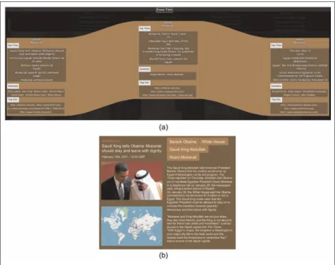
To explore the contents of a particular story in detail, we developed the Zoomed View, which gives detailed information about the documents assigned to the story as details on demand. Figure 5 shows zoomed view for 3 days of a story titled Hosni Mubarak, containing titles of articles that belong to the story, summary, and top URLs for each day. The Article View provides detailed information about each article, including full text, related entities, and images. If geographic loca-tion is detected in the text, the map is also displayed.
Explorative analysis of story development
As a first analysis step, the user can change the input data parameters and the criterion for sorting the daily clusters using the settings window shown in Figure 6. First, the algorithm, which is used for news clustering, can be changed between STC and Lingo. This feature can be easily extended to allow other clustering algo-rithms. Second, the user can select the type of meta-data that is used as the additional input:named entities and/ornews tags. The named entities are found in the news articles using named entity recognition algo-rithms, while the tags are specific categorical keywords that describe the article. Both metadata types are used as weighted keywords to improve the clustering results. Changing the parameters allows the analyst to under-stand the differences between different parameter set-tings and the influence of metadata on the output. Figure 3. Overviewof persistent news themes from 12 January to 10 February 2011.The themes can be filtered by duration and theme connectivity using filtering capabilities of the system. Additionally, the user can reduce clutter in the news landscape by minimizing edge crossings.
Figure 4. Main view: visualization of news stories with default parameter settings. The stacks of recta ngles show daily news clu sters, wher e storie s that span across several day s ar e connecte d and colore d, while the stories that app ear only on a sin gle day are gray. The stories are, by defau lt, sorted by cluster streng th, and the siz e of the recta ngle corre sponds to the num ber of articl e in a stor y. The recta ngles are label ed with the story title and the most imp ortant key words.
Furthermore, the user can select sorting criteria, either by the cluster strength or by the number of articles in the cluster. By default, the daily story clus-ters are ordered by cluster strength score, which determines how tightly the documents that belong to the cluster are connected. Alternatively, the user can choose to sort the clusters by the number of docu-ments that belong to the cluster, which can be con-sidered as another measure of cluster importance. The labels of daily clusters can be created either by the automated labeling algorithm or by using the most important article from the cluster. Finally, the confirmatory analysis is supported by allowing the user to add different filter keywords and a specific time range to focus on a certain part of the dataset.
The explorative analysis of the news landscape starts with the monthly overview, followed by the main (weekly) view and the zoomed view (for details on demand). The visualization of the full month of data is designed to provide a broad overview of the dataset and give the user a basic insight into the major stories and the temporal patterns. Therefore, the textual labels are omitted in this view. Depending on the daily volume and the time range, the visualization can become easily cluttered with daily cluster connections and quickly changing order of the stories within the
Figure 5. (a) The zoomed view provides fine-detailed analysis of each story. Each daily cluster provides the titles of top five documents, short summary of the cluster, and the most important URLs. (b) The article view shows the retrieved text of the article with additional metadata for the story titled ‘‘Saudi King tells Obama: Mubarak should stay and leave with dignity.’’
Figure 6. Input parameter settings: the analyst can choose the type of the algorithm and metadata types for news clustering, the sorting criteria (by cluster strength or by the number of articles), and the cluster labels (by algorithm labeling or by the most important document). Additionally, filtering keywords can be used to focus the analysis on specific topics from the dataset in a specific time range.
daily listings. A large number of short-lived stories, which might not be relevant to the analyst at this level, aggravate the problem. Since we are developing a sys-tem that supports incremental processing and visuali-zation of a data stream, we need a solution that will maintain the layout of the past data regardless of the amount of new information. In order to address these challenges, we developed a filtering mechanism that allows the user to minimize the clutter and detect interesting patterns in this view.
Filtering
The problem of inter-interval connections clutter can be regarded as a graph layout problem. The daily clus-ters are the graph nodes, and the connections between the clusters are the edges directed from the past to the present.
The user can use theconnectivityanddurationsliders to filter weakly connected and short stories. Using con-nectivity filter (Figure 7(b)), we can filter out the stor-ies that do not split or merge and therefore keep only the stories with the most braided characteristics on the
screen, while the duration filter (Figure 7(a)) allows us to keep the stories that span over multiple days.
To minimize the clutter due to the daily cluster con-nections, we have to find an optimal solution for mini-mization of edge crossings. Our goal is to optimize a directed graph, where the direction of the edges repre-sents a hierarchy. The hierarchical layout should 1. Have as few edge crossings as possible; 2. Be presented vertically and in a straight-path; 3. Have uniformly distributed nodes and avoid long
edges.
As an additional remark, we have to consider that the first condition can only be achieved by acyclic graphs, which we have in our case. A possible method for such a layout is based on the Sugiyama algo-rithm.24This method consists of four steps, which are difficult optimization problems:
1. Delete all cycles.Find a minimal number of edges
according to the distance to which the graph is acyclic and switch their direction.
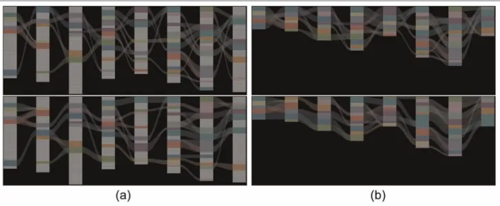
Figure 7. Clearing the visualization clutter by filtering the news stories using connectivity and duration sliders and by resorting the stories to minimize edge crossings: (a) connectivity slider, duration slider, and minimize edge crossings checkbox; (b) connectivity filter applied—stories with high similarity remain displayed; and (c) duration filter applied— stories that evolve over 5 days can be easily filtered.
2. Layer positioning. Calculate a good allocation of the edges in all layers, so that they are directed upwardly. Replace all edges that go beyond one layer. (This step can be skipped, because of our layout.)
3. Minimize the edges.Calculate for each layer a
lay-out so that the number of crossings is minimal.
4. Positioning. Calculate the x-coordinates of the
nodes such that there is no overlapping. (Since our coordinates are fixed, this step can be skipped.)
The third phase is non-deterministic polynomial-time hard (NP hard) because changing one layer affects the next layer. To ensure that the story order for each day is unaffected by the future, we have reduced the problem to a two-layer crossing minimization. This preserves the organization of the topics in the story flow. Therefore, the heuristic starts with the second layer. After sorting the nodes in this layer, we proceed iteratively with the next layer (Figure 8).
Additional visualization/interaction features
Different clustering methods, data input selectors, and sorting criteria allow the user to control the amount of data that will be visualized with our tool, where the data can be shown with three levels of detail (monthly view, main view, and zoomed view). Still, the complex properties of news articles and the conflicting criteria of importance-based sorting and visual stability can make it difficult to track a particular story. Therefore, we have also implemented highlighting of the stories
on mouse hovering and tooltip information, which can be seen in Figure 9.
In the real-world analysis scenario, active explora-tion of the news landscape using presented interacexplora-tion methods and filters can change the order and position-ing of the stories. To help the user in understandposition-ing the changes that different settings cause to the visuali-zation, the animation is used to smoothly transition between two states.
Use case: the Arabic Uprising 2011 and
user study
Our application allows interactive analysis of the large international news landscape with the focus on tem-poral development of news topics. To demonstrate the added value that our tool gives to a news analyst, we focused our use case on the Arabic Uprising in 2010 and 2011. Since 18 December 2010, a revolutionary wave has spread over more than 15 Arabic speaking countries. The Tunisian Revolt was the starting point and devolved, step by step, across other Northern African countries. Even the Arabian Peninsula was not excluded from minor demonstrations up to govern-mental changes.
Riots in Tunisia
Figure 3 gives a visual overview of the persistent themes in the news between 12 January and 10 February 2011. Through filtering and edge minimiza-tion, the otherwise complex media landscape becomes Figure 8. Impact of the connectivity filter and edge crossing minimization on the visualization: (a) default sorting (top) and minimized edge crossings (bottom) and (b) default sorting (top) and minimized edge crossings (bottom) with unconnected stories filtered out.
easier to interpret due to the fact that many short unrelated themes are discarded and the strict theme ordering criteria according to popularity are relaxed. To avoid a loss of possible interesting stories, it is, for example, recommended to filter out all 1-day stories by moving the slider at the top right. The next useful filtering step is to select the ‘‘minimize edges’’ check-box. From now on, the user can follow the flow of stories over 30 days since positioning does not only
depend on a theme’s popularity for each day but also on the theme’s position on the previous day.
After interactive filtering and automatic layout opti-mization, the user can follow the ongoing stories in the main view. By looking at the top keywords and enter-ing the zoomed view, the user can identify from the main view, shown in Figure 10(a), that the green and purple-gray colored themes cover the riots in Tunisia. The growing importance of these events in the news is Figure 9. Highlighting with tooltip information.
coherent to the reports in the Wikipedia’s Current
Events portal (http://en.wikipedia.org/wiki/
January_2011). The portal lists all occurrences in 1 month and also provides a snippet with a short sum-mary of each event. For 12 January 2011, the snippet about the protests states the following: ‘‘Tunisia’s Interior Minister Rafik Belhaj Kacem is sacked by President Zine El Abidine Ben Ali, who also orders the release of most people detained during recent unrest.’’ At this point in time, Zine El Abidine Ben Ali, the President of Tunisia, is in the focus of the event. From now on, the suspension of the Interior Minister becomes an important event and the main view absolutely conforms with the political events. To discriminate between the events that belong to this long story, keywords and phrases are displayed. In this case, ‘‘minister’’ or ‘‘president’’ is the characteristic term. Nevertheless, these topics are still connected because the protests were against the entire govern-ment, including the ministers and Ben Ali.
For detailed analysis, the semantic zoom, as shown in Figure 10(b), reveals more information about both themes. This level of detail shows us clearly what we already briefly identified in the main view. The docu-ments, which were assigned to the ‘‘Interior Minister’’ topic, refer to the event that was mentioned before. The first three titles are about the sack of Rafik Belhaj Kacem in the context of violent protests. In contrast, Zine El Abidine contains documents that refer to him. As we can observe in Figure 10(b), there is still some noise included—the fourth and fifth documents do not belong to the topic but were highly ranked by the ‘‘most important title’’ algorithm.
In the second week of the given time window, Tunisia and Zine El Abidine is still a major topic in the news. TheCurrent Eventsportal reports about Tunisia’s army firing on the citizens, governmental changes, and the dismissal of more ministers from the Constitutional Democratic Rally party that had governed the country. This textual information, represented in a list view where no context is visible, is mapped as an ongoing stream in the main view. Zine El Abidine remains a rep-resentative main phrase, and self-explanatory keywords such as ‘‘government,’’ ‘‘quit,’’ ‘‘minister,’’ ‘‘fallen,’’ ‘‘vic-tims,’’ and ‘‘revolution’’ mirror the actual state.
Riots in Egypt
Figure 11(a) shows a filtered view from 6 to 10 February 2011. We can easily identify that the news were dominated by the riots in Egypt. Several different stories reporting on the same topic appear in this view. Omar Suleiman, a former Egyptian army general and Hosni Mubarak’s Vice President, plays an important
role here. The reason can be identified by reading the top title words. The daily cluster shapes contain the terms about the ‘‘Muslim Brotherhood’’ and a possible opposition. At this stage, Omar Suleiman and the Brotherhood were discussed as possible successors of Hosni Mubarak. Other protagonists, like Hillary Clinton or Barack Obama, were also involved in the discussions. Besides, different topics such as the cricket World Cup and the story about Julian Assange appear among the most important.
By scrolling the main window horizontally back into the past, the user can see that the Tunisia and Yemen protests dominated the streams and built up a large number of stories, similar to what we discovered dur-ing the riots in Egypt. We selected a split of one theme into several ones as one of many interesting patterns of the news flow to demonstrate the effectiveness of our system in describing story splitting patterns. As Figure 11(b) reveals, the Muslim Brotherhood was displayed as a root theme, which leads to Omar Suleiman as a new ongoing theme.
At that point, severe discussions about the opposi-tion and possible successors broke out. Both the Muslim Brotherhood and Omar Suleiman were part of these discussions. Figure 11(c) shows the result of applying the semantic zoom on the two themes. The documents assigned to each topic help to understand the causes for this split. As the user can identify, each of them has individual titles likeDoor opened for Muslim
Brotherhood and Suleiman, in new role, counts cost of
Egypt turmoil. These titles discriminate clearly between topics. However, the discussion about the opposition and the possible successors are connecting points for these events. This mixture causes a split, which is in this case justifiable. As described in section ‘‘News story clustering,’’ the splitting and merging of themes are dependent on previously defined similarity thresh-old. To be more concrete, a split will be defined if the calculated Jaccard similarity coefficient is less than 30%. However, depending on each concrete use case, this parameter needs to be fine-tuned since it is possi-ble that a split or merge is identified, while it should not, or the other way around.
User study
We recruited eight users to test our prototype in order to get an initial feedback on our approach in an infor-mal user study. The participants were experts from social sciences (five) and computer science (three). At the beginning, they were provided a short introductory session, in which the visualization was explained first and then the users were free to explore the interaction capabilities of the system. This phase took about 15
Figure 10. Tunisian Revolt : (a) the filtered main view from 12 to 16 January 2011 reveals stories related to the Tunisian Inte rior Ministry and the Tunisian President Zine El Abidine Ben Ali and (b) semantic zoom (details on demand) shows top titles, brief summary, and most important URLs for each daily story cluster.
min, depending on the questions the users had about the data, visualization, and interaction techniques. Our aim was to understand how the users perform the following tasks: (1) finding important stories, (2) finding the most interrelated stories, and (3) ease of interaction with the system. We encouraged the par-ticipants to openly comment and express their opin-ion on the system and share their findings during the study. At the end, we conducted an interview to get their feedback about the overall experience with the tool. The user study led to the following observations.
Overview first. The users spent considerable amount of time performing analysis in the Overview visualiza-tion. They used this view to filter out the short stories, reorder the long stories, and, in general, to get the basic understanding of the whole dataset. They used this view to significantly reduce the dataset to only the most important stories and then switched to the Main View.
Cluster labels. All participants complained that the daily cluster labels were not informative enough when Figure 11. Riots in Egypt: (a) filtered main view from 6 to 10 February 2011, (b) splitting of a single story into two
the Lingo algorithm was used. They also suggested better use of space within each daily cluster box in the Main View, by adding more detailed cluster descriptions.
Use of color. In the beginning, some participants felt misled by the use of the same color for different stor-ies. After getting used to the color mapping, they did not complain about this feature.
Our limited user study showed us that our approach was well received within the initial user group, regard-less of their professional background. However, we consider doing a more detailed user study in the future.
Discussion
The visualization in our system can be seen as similar
to parallel coordinates,25 which is a well-known
tech-nique for visualizing high-dimensional data. In parallel coordinates, each attribute from the dataset is assigned an axis (coordinate), on which data points are plotted and connected for each record, creating polylines. Although several attempts for visualizing nominal data exist,26,27parallel coordinates are mostly used to visua-lize high-dimensional numerical data. The axes are scaled to the minimum and maximum values for each attribute in order to make detection of patterns easier. The visual similarity between the two approaches exists in terms of using equidistant parallel axes as anchors for data objects; however, there are several key differences coming from the different tasks that are performed and the nature of the data that is being visualized.
Parallel coordinates are usually applied on high-dimensional (usually numerical) datasets, where miss-ing values are rare and the goal is to find patterns of similar polylines from different records. In our case, news stories can last for only 1 day or they can span over several days, with different start and end dates. Besides, the stories can split and merge, creating a more complex data structure than simple data tuples. Theoretically, we could clone each story cluster that splits into two clusters to create separate data records, but this redundancy does not seem practical and bene-ficial. The goal of our visualization is to (1) identify most important news stories in a longer period of time and (2) understand their development over time. This differs from pattern detection in parallel coordinates, where the user expects to find similar records across all axes.
Moreover, our ‘‘axes’’ contain ordinal data, that is, daily story clusters, which are sorted by a predefined ranking criterion (cluster strength or the number of
articles in the cluster). In the interactive exploration phase, the ranking is relaxed by allowing the user to reorder clusters using an algorithm that minimizes edge crossings to improve the legibility of the visualiza-tion. This option provides better story tracking and split/merge detection.
Alternatively, we could have used equidistant points on each axis to encode cluster ranking. Since each cluster’s size is mapped to its height, this would create gaps between the clusters on each axis, and the infor-mation about the absolute number of articles for each day would be lost. Our design provides visually more compact representation of the dataset. Finally, the axes in parallel coordinates can be reordered to make comparison between the neighboring axes easier. This possibility, although feasible, is not supported by the real-world tasks in our case since our attributes (i.e. axes) are days.
Conclusion and future work
In this article, we have presented a visual analytics sys-tem for exploration of news stories development and their relationships. Our approach helps in understand-ing the evolution of long and short stories in a wide time frame, merging and splitting of stories, as well as fine-detailed analysis of story content on three differ-ent levels of detail. The incremdiffer-ental processing and visualization of unstructured and semi-structured text data allow the application of the system on the real-world news data streams. The global overview visuali-zation helps in identifying the major news stories over a long period of time, and it is enriched with the inter-action techniques to filter and re-rank stories on vari-ous user-adjustable criteria in order to provide a clutter-free display. Finer-granulated views that corre-spond to shorter time windows allow analysis of news stories with higher level of detail, up to the textual content of each news article itself. We have demon-strated the effectiveness of our approach on a real-world news stream and described the news stories and their content that were found with our system.
In the future, we plan to refine our document clus-tering module to enhance the informative context of story labels and test the system with sliding and dyna-mically adjustable time windows. Additionally, we plan to replace the splitting and merging thresholds, which are currently based on empirically adjusted values to a more refined and less data-dependent automatic algo-rithm. Our research efforts will continue in the direc-tion of integrating incremental text analysis with novel visualization methods that will enable information ana-lysts to analyze and understand growing document col-lections more effectively and efficiently.
Funding
This work was partially funded by the German Research Society (DFG) under grant GK-1042, ‘‘Explorative Analysis and Visualization of Large Information Spaces.’’
References
1. Allan J (ed.). Topic detection and tracking: event-based information organization. Norwell, MA: Kluwer Aca-demic Publishers, 2002.
2. Blei DM and Lafferty JD. Dynamic topic models. In:
Proceedings of the 23rd international conference on machine learning (ICML ’06), Pittsburgh, PA, USA, 25-29 June 2006, pp. 113–120. New York: ACM.
3. Wong PC, Foote H, Adams D, et al. Dynamic visualiza-tion of transient data streams. In: IEEE symposium on information visualization (INFOVIS 2003), Seattle, WA, USA, 19-21 October 2003, Los Alamitos, CA: IEEE Computer Society.
4. Havre S, Hetzler B and Nowell L. ThemeRiver: visualiz-ing theme changes over time. In:Proceedings of the IEEE symposium on information visualization (INFOVIS ’00), Salt Lake City, UT, USA, 9-10 October 2000, pp. 115– 123. Washington, DC: IEEE Computer Society. 5. Byron L and Wattenberg M. Stacked graphs—geometry
& aesthetics.IEEE T Vis Comput Gr2008; 14(6): 1245– 1252.
6. Do¨ rk M, Gruen D, Williamson C, et al. A visual back-channel for large-scale events. IEEE T Vis Comput Gr
2010; 16(6): 1129–1138.
7. Fisher D, Hoff A, Robertson G, et al. Narratives: a visualization to track narrative events as they develop. In:IEEE symposium on visual analytics science and technol-ogy (VAST ’08), Columbus, OH, USA, 19-24 October 2008, pp. 115–122. Washington DC: IEEE.
8. Luo D, Yang J, Krstajic´ M, et al. EventRiver: visually exploring text collections with temporal references.
IEEE T Vis Comput Gr2012; 18(1): 93–105.
9. Krstajic´ M, Bertini E and Keim D. CloudLines: com-pact display of event episodes in multiple time-series.
IEEE T Vis Comput Gr2011; 17: 2432–2439.
10. Krstajic´ M, Bertini E, Mansmann F, et al. Visual analysis of news streams with article threads. In:StreamKDD ’10: proceedings of the first international workshop on novel data stream pattern mining techniques, Washington DC, USA, 25-28 July 2010, pp. 39–46. New York: ACM.
11. Aigner W, Miksch S, Schumann H, et al.Visualization of time-oriented data. London, UK: Springer, 2011. 12. Wei F, Liu S, Song Y, et al. TIARA: a visual exploratory
text analytic system. In: Proceedings of the 16th ACM SIGKDD international conference on knowledge discovery and data mining (KDD ’10), Washington DC, USA, 25-28 July 2010, pp. 153–162. New York: ACM. 13. Rose SJ, Butner S, Cowley W, et al. Describing story
evolution from dynamic information streams. In: IEEE symposium on visual analytics science and technology (VAST ’09), Atlantic City, NJ, USA, 11-16 October 2009, pp. 99–106. Washington DC, USA: IEEE.
14. Atkinson M and Van der Goot E. Near real time infor-mation mining in multilingual news. In:WWW ’09: pro-ceedings of the 18th international conference on World Wide Web, Madrid, Spain, 20-24 April 2009, pp. 1153–1154. New York: ACM.
15. Krstajic´ M, Mansmann F, Stoffel A, et al. Processing online news streams for large-scale semantic analysis. In:
1st international workshop on data engineering meets the semantic web,ICDE 2010, Long Beach, CA, USA, 5-6 March 2010.
16. Kleinberg J. Temporal dynamics of on-line information streams. In: Garofalakis M, Gehrke J, Rastogi, R (eds)
Data stream management: processing high-speed data streams. Heidelberg, Germany: Springer, 2006.
17. Osinski S and Weiss D. Carrot2: design of a flexible and efficient web information retrieval framework. In:AWIC, Lodz, Poland, 6-9 June 2005, pp. 439–444. Heidelberg: Springer.
18. Osinski S, Stefanowski J and Weiss D. Lingo: search results clustering algorithm based on singular value decomposition.J Intell Inform Syst2004; 4:359–368. 19. Salton G, Wong A and Yang CS. A vector space model for
automatic indexing.Commun ACM1975; 18: 613–620. 20. Zamir OE. Clustering web documents: a phrase-based
method for grouping search engine results. Technical Report, Doctoral dissertation, University of Washington, 1999.
21. Stefanowski J and Weiss D. Carrot2and language prop-erties in web search results clustering. In: AWIC, Madrid, Spain, 5-6 May 2003, pp. 240–249. Heidel-berg: Springer.
22. Heer J, Kong N and Agrawala M. Sizing the horizon: the effects of chart size and layering on the graphical perception of time series visualizations. In:Proceedings of the 27th international conference on human factors in com-puting systems (CHI ’09), 2009, pp. 1303–1312. New York: ACM.
23. Harrower M and Brewer CA.ColorBrewer.org: an online tool for selecting colour schemes for maps. Chichester, UK: John Wiley & Sons, Ltd, 2011, pp. 261–268.
24. Sugiyama K, Tagawa S and Toda M. Methods for visual understanding of hierarchical system structures.IEEE T Syst Man Cyb1981; 11(2): 109–125.
25. Inselberg A and Dimsdale B. Parallel coordinates: a tool for visualizing multi-dimensional geometry. In: IEEE visualization, San Francisco, CA, 23-26 October 1990, pp. 361–378. Washington DC: IEEE.
26. Bendix F, Kosara R and Hauser H. Parallel sets: visual analysis of categorical data. In:IEEE symposium on infor-mation visualization (INFOVIS 2005), Minneapolis, MA, USA: 23-25 October 2005, pp. 133–140. Washington DC: IEEE.
27. Rosario GE, Rundensteiner EA, Brown DC, et al. Map-ping nominal values to numbers for effective visualiza-tion. In: IEEE symposium on information visualization (INFOVIS 2003), Seattle, 19-21 October 2003. Los Ala-mitos, CA, USA: IEEE Computer Society.