Case Report
Data
visualization
of
E
uropean
regional
operational
programmes:
unleashing
the
informative
potential
of
open
data
for
performance
assessment
EmanueleFrontoni1,*andRobertoPalloni2
1 Dipartimento di Ingegneria dell’Informazione (DII), Università Politecnica delle Marche, Via Brecce Bianche,
60131 Ancona, Italy; E-Mail: [email protected]
2 Dipartimento di Ingegneria dell’Informazione (DII), Università Politecnica delle Marche,Via Brecce Bianche,
60131 Ancona, Italy and t33 srl, Via Calatafimi, 60121, Ancona, Italy; E-Mail: [email protected]
* Author to whom correspondence should be addressed; E-Mail:[email protected]; Tel.: +39-071-2204458;
1
2
3
4
5
6
Fax:+39-071-2204224.
Abstract: The implementation of the European Cohesion Policy aiming at fostering regions
competitiveness,economicgrowthandcreationofnewjobsisdocumentedovertheperiod2014-2020
inthepubliclyavailableOpenDataPortalfortheEuropeanStructuralandInvestmentfunds.Onthe
baseofthissource,thispaperaimsatdescribingtheprocessofdataminingandvisualizationfor
informationproductiononregionalprogrammesperformaceinachievingeffectiveexpenditureof
resouces.
Keywords:cohesionpolicy;datavisualization;opendata.
7
1. Introduction 8
The EU Cohesion Policy is one of the western world’s largest local and regional development
9
policy operating under broadly one overall legal and institutional framework. It targets all regions and
10
cities in the European Union and is aimed at fostering regions competitiveness, economic growth and
11
creation of new jobs. The planned resources over the period 2014-2020 by different funds are more
12
than EUR 350 billion, almost one third of the total budget of the Union.
13
Each european regions can access the planned financing in the different funds according to specific
14
investment strategies defined within their Operational Programmes (OP). These documents have
15
a predefined structure for the selection and categorisation of the investment decisions and their
16
reporting each year. In particular, projects selected, expenditure, output and result indicators have to
17
be monitored by the Managing Authorities (MAs) responsible for the management of funds and shall
18
be reported in the framework of the Annual Implementation Report (AIR).
19
In the last years the political context and the financial and economic pressure on countries budgets
20
have imposed a change in term of accountability and justification of public expenditure, a stronger
21
need to inform taxpayers on public investments and to broaden the debate on cohesion policy and its
22
future orientation.
23
At the same time, compared to the previous programming period 2007-2013, the information
24
management capacity and availability of quality data have largely improved with the development of
25
many agile solutions for data usability.
26
Furthermore, the current legislative framework has a stronger focus on result-orientation on the
27
performance of regions in achieving investment objectives defined during the programme design
28
phase in terms of development needs and benefits for citizens.
29
For these reasons, the reported data on financing and achievements under all the ESI Funds 2014-2020
30
are available under the criteria of transparency and accountability at the Open Data Portal for the
31
ESIF1. The inteded users of these data is anyone interested in monitoring the development of the
32
policy and in particular citizens of the Union, Member State administrations, EU Institutions, policy
33
makers, researchers and practitioners in regional development studies. However, the indicators and
34
visualizations currently provided allows only for a broaden and general view of the policy evolution
35
and the structure, size and complexity of data represents a major challange for any user, mainly
36
interested in the progress and performance status of her own area. At this regard, the paper describe
37
the development of an application infrastructure2and the relative algorithms developed in the R
38
language to syntetize and visualize the large sets of data in insightful indicators and statistics. Finally,
39
the paper provides some inputs as regards the main messages and concepts to observe in the data
40
comparison.
41
2. Literature review and other tools for open data analysis 42
The increasing and heterogeneous group of data users debating the implementation of
43
programmes and the use of structural funds require an information dissemination strategy based on
44
generally understandable concepts. At this regard, the use of visualizations as the easiest and fastest
45
tools for human eye perception of patterns and trends recognition appears to be the best solution.
46
However, the vastity of multi-dimensional information available rises the problem of successfully and
47
easily stimulate visual reasoning synthetizing data using relatively simple tools.
48
Researchers are analysing increasingly large economic data sets generated in greater volumes adopting
49
adequate tools and technologies. Big data often offers valuable information to be extracted and
50
interpreted and time when simple bar charts or scatter plots were enough is long gone. Thus, the
51
development of advanced data visualization techniques is becoming a necessary and challenging area
52
of research and interest. Data visualization can help in making sense of large data sets by presenting
53
the contents in an innovative visual format that does not require multiple tables or lots of rows and
54
columns. Furthermore, the connection between several data sources generates newer and larger
55
datasets leading to further discovery and information.
56
However, the increased complexity and volume of data collected, stored and made available by
57
instituions and public bodies does not advance smoothly. Literature shows that open data government
58
datasets still presents several barriers: lacks of adequate collection, classification, processing and
59
presentation tools; non-standardized data description and formats, missingness or inchoerent data,thus
60
poorly usable among different users and analytical approaches;[1].
61
IT investments and skills devoted mainly to storing systems, architecture, software, hardware, security,
62
networks and Web technologies without an explicit purpose of data exploitation adapts poorly to
63
the new paradigm on the use of data as an asset for business intelligence and data science. This in
64
turn affects the benefits of open data initiatives and sharing, especially at even lower level (i.e. local
65
administrations, municipalities, etc).
66
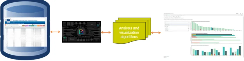
As a response to the challenges of managing vast amounts of government data and making it accessible
67
for different purposes and informational needs, Dawes explains the concepts of stewardship and
68
usefulness. At this regards, among "stewardship proposals" for improvement he suggests to create and
69
improve metadata for each data source, improve the data management system, adopt standard data
70
formats. As "usefulness proposals", he suggests to provide easy-to-use basic features and improve
71
and enhance searching and display of data [2]. Noveck [3] adds that is it also important to own high
72
quality standards for dissemination among different needs and usage across citizens and other social
73
actors. Merino et al. [4] consider the delivery of public data as opportune and reliable for better
74
1 https://cohesiondata.ec.europa.eu/
decisions making in government as well as for government accountability of public decisions and
75
actions. The use of different technology tool for implementing open data initiatives is recognised
76
as a "fit-the-right-tool-for-the-job" situation, i.e. each complex economic, social, political issue and
77
the data it generates relate to different approaches and methods for information production and use
78
[5],[6],[4],[7].
79
Government open data across different end-users are available by the intensive use of technology as IT
80
tools and Web applications [1], [3].
81
IT tools and web applications are currently the engine of the debate based on open data as they allow to
82
both provide the "raw material" to different typologies of users and receive new information and data
83
from the same users, either being decision-makers, analysts, researchers and citizens [8],[9],[10]. There
84
is a wide range of different technological tools available for policy analysis and data visualization. The
85
use of flexible and powerful information technologies and various analytical methods are supported
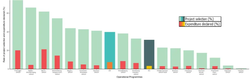
86
by several open data initiatives. This scenario is constantly evolving, but a brief overview of some
87
common tools and platforms used to visualize and analyse open data is as follows:
88
• ESIF - Viewer3is a tool to search planned investments in European Structural and Investment
89
Funds (ESIF) data (ERDF, CF, ESF and YEI). The tool contains data from the ESIF Operational
90
Programmes (OP). The amounts in this tool are presented at regional level and include data
91
from regional OPs, but also shares of national and transnational cooperation programmes. The
92
user can search for planned investments per country, region, OP-type and different categories of
93
intervention;
94
• ICT Monitoring4contains data from the ESIF Operational Programmes (OP) on planned ICT
95
related investments. The amounts in this tool are presented at regional level. Users can search
96
within three broad dimensions, amounts, keywords and financial forms;
97
• Regional Benchmarking5 is an interactive tool for Regional Benchmarking which helps
98
identifying structurally similar regions across Europe through statistical indicators;
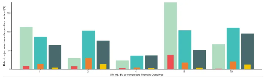
99
• EU Trade6is a fully interactive web-based application for the visualization and the analysis of
100
inter-regional trade flows and the competitive position of regions in Europe. The purpose of
101
this tool is to make possible to assess regional assets and analyse a region’s economic position
102
as a first fundamental step in the process of building place-based and evidence-based regional
103
policies and smart specialisation strategies;
104
• R&I Regional Viewer7allows to visualize and compare Research & Innovation investments under
105
different funding channels and EU programmes across EU Regions, i.e. economic indicators
106
from Eurostat, planned R&I-related investments under ESIF, and Horizon 2020 funding captured
107
by stakeholders;
108
• YDS - Your Data Stories8is a platform that helps make sense of open and social data;
109
• ROUTE-TO-PA9is a multidisciplinary innovation project, that, by combining expertise and
110
research in the fields of e-government, computer science, learning science and economy, is
111
aiming at improving the impact, towards citizens and within society, of ICT-based technology
112
platforms for transparency;
113
• Smarticipate10gives citizens access to data about their city enabling them to better support the
114
decision-making process. Residents will also play an active role in verifying and contributing to
115
data;
116
3 http://s3platform.jrc.ec.europa.eu/esif-viewer 4 http://s3platform.jrc.ec.europa.eu/ict-monitoring 5 http://s3platform.jrc.ec.europa.eu/regional-benchmarking 6 http://s3platform.jrc.ec.europa.eu/s3-trade-tool
7 http://s3platform.jrc.ec.europa.eu/synergies-tool 8 https://yourdatastories.eu/
9 http://routetopa.eu/
• Big Data Europe11undertake the foundational work for enabling European companies to build
117
innovative multilingual products and services based on semantically interoperable, large-scale,
118
multi-lingual data assets and knowledge, available under a variety of licenses and business
119
models;
120
• OpenBudgets12offers a toolbox to everyone who wants to upload, visualise and analyse fiscal
121
data. From easy to use visualisations and high-level analytics to fun games and accessible
122
explanations of public budgeting and corruption practices along with participatory budgeting
123
tools, it caters to the needs of journalists, researchers, policy makers and citizens alike.
124
• OpenCoesione13 shares information on the italian projects financed through cohesion policy
125
resources.
126
3. Data description 127
The data available in the Open Data Portal for the ESIF covers more than 530 Operational
128
Programmes under the five ESI Funds: the European Agricultural Fund for Rural Development
129
(EAFRD), the European Regional Development Fund (ERDF), the European Social Fund (ESF)
130
with distinct data for the Youth Employment Initiative, the Cohesion Fund (CF) and the European
131
Maritime and Fisheries fund (EMFF). Data are available in three financial datasets related to planned,
132
implemented and payed resources and on a single achievement dataset with data on selected common
133
indicators targets and implementation. The two most important financial variables related to the
134
performance of regions in implementing their operational programmes are the project selection
135
(resources allocated to investments) and the expenditure declared (resources actually disbursed
136
to beneficiaries) as reported by the Managing Authorities of the programmes. The progress and
137
performance of each Operational Programme is monitored against the financial planned amount
138
decided during the planning phase at the beginning of the programming period in 2014.
139
These data are available disaggregated by fund, Operational Programme, Priority Axis, Thematic
140
Objectives14 (i.e. the macro priorities of investment of the policy) and category of regions (more
141
developed, less developed, transition). In terms of update, while the financial planned is subject
142
to update only in case of within OP reallocation of resouces, the financial implementation data are
143
updated three times per year in the end of January, July and September. Likewise, disaggregation also
144
applies to common indicators data whose update of implementation data is scheduled at the end of
145
each year whereas targets are not subject to variations unless OPs modifications occurs. Vastity of
146
information, complexity of data structure and timing of update suggests the adoption of agile tools for
147
easily fetch, parse, aggregate and visualize information instantaneously.
148
4. Cohesion open data: API and information management 149
In order to allow the largest degree of accessibility and exploitation by specialists and general
150
public, datasets are accessible and usable in different format from the ESIF portal. Among these, a
151
web service ensures the programmatic and continuous access to programmes information through an
152
API. Data are exposed through several endpoints in a JSON structure that allows a fast fetching and
153
parsing of data. The availability of data as web service has driven the architecture of the visualization
154
application namely requiring the development of specific fetching, parsing and plotting functions. The
155
following figure shows an overview of the application architecture.
156
11 https://www.big-data-europe.eu/ 12 https://openbudgets.eu/ 13 http://www.opencoesione.gov.it/
Figure 1.Web application architecture
When the application loads, data are parsed from the JSON endpoints exposing the database
157
tables and are processed server-side to extract, calculate and plot the OP information based on the user
158
inputs, namely the Member State and the name of the Operational Programme of interest. The simple
159
inputs menu allows to search for specific Member State and Operational Programme but also to access
160
the information of all the other EU programmes for an immediate comparison even beyond national
161
borders.
162
5. Data visualization and interactive statistics 163
As the main objective of the data analysis and visualization shall be to easily compare regional
164
programmes performance to justify EU investment and inform taxpayers on the progress of deployed
165
resources, all visualisations use a benchmarking approach either between different geographical levels
166
(EU, Member State, Operational Programme) or over time, observing the progress since the beginning
167
of the programming period. As regards the design and aesthetic of the figures, four specific features
168
have been taken into account when developing the visualization:
169
1. the barplot has been adopted being one of the most common and easy typology of data
170
visualization, especially for policy makers and general public users;
171
2. the barplot has been improved through the logic of the progress bar and nesting the two
172
main variables, namely the resources allocated for selection and disbured for expenditure: this
173
visualization approach highliths their strict dependence and warns on anomalous progressing
174
patterns (e.g. high ratio of selection and low ratio of expenditure);
175
3. as already discussed, benchmarks either in terms of space or time have been added within the
176
same visualization aiming at emphasising the performance as a relative concept;
177
4. the adoption of dimension-specific patterns for easier concept-insight association, i.e. OPs in
178
descending order for ranking focus, Priority Axis with coordinate flip as a sort of race line,
179
Thematic Objectives as groups of bars to compare specific policy intervention fields.
180
These typology of visualization have received feedbacks and validation by a set of final users.
181
5.1. Developing performance indicators
182
A preliminary aggregation and cumulation of data by geographical level allows to calculate the
183
main magnitudes used to develop the performance indicators. These are mainly represented by ratios
184
of progress on planned, namely the Project Selection as share of Planned Financing (EUR) and the
185
Expenditure Declared as share of Planned Financing (EUR).
186
Rate of selection= ∑
N
op=1Selection
∑N
op=1Planned
∗100 (1)
Rate of expenditure= ∑
N
op=1Expenditure
∑N
op=1Planned
5.2. Informative data visualization
187
The calculation of indicators by itself does not serve the purpose of providing information to
188
the user. For this reason, the visualization should be able to provide as many relevant information
189
as possible without affecting the comprehension of the messsage. Thus, a trade-off between the
190
complexity of the figure in terms of variables and dimensions considered and the informative power of
191
the figure has to be considered when structuring the view. At this regards, depending on the specific
192
information to transfer, each view aggregates and groups spatial or time dimensions as presented in
193
the following figures:
194
• Ranking OPs within the same MS: ratio of selection and expenditure by OP, comparing all OPs
195
in each MS with reference to the EU level in decreasing order;
196
Figure 2.Rate of project selection and expenditure declared of Germany Operational Programmes (share of planned financing)
The algorithm behind the visualization ranks the OPs within a specific MS by rate of selection
197
as well as the MS and EU values. The figure shows that, despite the highest level of selection,
198
the first two regions have lower levels of expenditure. Despite some programmes show a very
199
low level of progress, Germany and the majority of german OPs are above the EU average both
200
in terms of selection and expenditusre. However, in terms of planned resources , percentages
201
of implementation do suggest a slow advancement with only a maximum of 20% of resources
202
disbursed at almost half of the programming period 2014-2020.
203
• Comparing Priority Axes of investment within OP: ratio of selection and expenditure by Priority
204
Axis, comparing all the axis in each OP with reference to the overall OP level, the MS and EU
205
progress;
206
The figure shows a progress of the overall OP under assessment almost in line with the EU and
207
MS progress. Almost all the Priority Axis of the OP are progressing in terms of selection more
208
than the EU and MS level. However, Axis 4 shows a very low rate of selection and absence
209
of expenditure affecting the overall performance of the OP. This warns on possible issues and
210
obstacles in the delivery of resources for the specific type of investments related to the priority
211
and affects the homogeneous progress of the OP.
212
• Comparing progress over time: ratio of selection and expenditure by year between 2014 and
213
2017 with an overall visualization of the OP (left figure) progress and the development over time
214
of the OP specific axes (right figure);
215
Figure 4.Rate of project selection and expenditure declared over time: OP and Axes details
Coherently with the natural progress of OP over the programming period, the left-side figure
216
shows the evolution of selection and expenditure over time with almost absence of resources
217
either allocated or disbursed in 2014 but an almost constant increase over the following years.
218
The right-side view shows the progress over time of each Priority Axis with a similar pattern of
219
development and, as already described, a critical situation in Axis 4 were in the last two years
220
there hasn’t been any change either in selection or expenditure.
221
• Comparing areas of investment: ratio of selection and expenditure by Thematic Objectives of
222
the overall OP with benchmark to the Member State and EU levels.
223
Figure 5.Rate of project selection and expenditure declared by Thematic Objective (share of planned financing)
The goal of these objectives is to focus financial resources on areas that deliver the highest benefits
224
to citizens, fostering synergies between these fields and avoiding an excessive fragmentation of
225
funding. This view allows for two typologies of comparison: comparing levels within TOs and
comparing each level between TOs. The figure shows a relative better selection performance of the
227
OP compared to the MS and the EU level in TO 1 -Strengthening research, technological development
228
and innovationand TO 5 -Promoting climate change adaptation, risk prevention and management. On
229
the contrary, other OPs are doing better with the resources dedicated to the other TOs as MS
230
values are higher. As regards the comparison of the different TOs of the OP, it shows a higher
231
degree of progress variability if compared with the MS and EU variability between TOs.
232
6. Conclusions 233
The main aim of this paper is to describe the functioning of an agile web tool for data visualization
234
of ESI funds to anyone interested in monitoring the development of the regional programmes and
235
in particular citizens of the Union, Member State administrations, EU Institutions, policy makers,
236
researchers and practitioners in regional policy. The political context and the financial and economic
237
pressure on EU countries and regions budgets of the recent years have imposed a change in term of
238
accountability and justification of public expenditure, a stronger need to inform taxpayers on public
239
investments and to broaden the debate on cohesion policy and its future orientation. The analysis
240
developed through the web tool are intended as a way of improving the awareness of regions on
241
their effective management of funds and in informing the decision-making process with real-time
242
available data. The benckmarking approach adopted has several limitations but also possible fields of
243
improvements as it does not refer to measures based on the whole set of regions but only to levels and
244
time comparison. However, beyond the realm of cohesion policy and structural funds, this data-driven
245
approach could be further used for other aspects of regional planning and decision making. Moreover,
246
this methodology could prove to be useful in the context of data-driven evaluation and policy-learning,
247
especially taking into account the evolution of data over time. As regards this last point, it is both
248
useful and productive for regions to put more effort into monitoring and analysis of implementation
249
data to maximise impact of public resources in the current period of financial and economic pressure
250
of countries budgets.
251
Abbreviations 252
The following abbreviations are used in this manuscript: 253
254
CF Cohesion Fund
EAFRD European Agricultural Fund for Rural Development
EMFF European Maritime and Fisheries Fund
ERDF European Regional Development Fund
ESF European Social Fund
MA Managing Authorities
OP Operational Programme
255
References 256
1. Dawes, S.; Helbig, N. Information strategies for open government: Challenges and prospects for deriving
257
public value from government transparency. Electronic government2010, pp. 50–60.
258
2. Dawes, S.S. Stewardship and usefulness: Policy principles for information-based transparency.Government
259
Information Quarterly2010,27, 377–383. 260
3. Noveck, B.S.Wiki government: how technology can make government better, democracy stronger, and citizens more
261
powerful; Brookings Institution Press, 2009. 262
4. Merino, M.A.G.; Cejudo, D.; Sour, G.M.; Santibáñez, L.; Mariscal, L.; Casar, J.; Maldonado, M.A.; Gil-García,
263
C.; Bracho, J.R.; Merino, T. Problemas, decisiones y soluciones: enfoques de política pública. Technical 264
5. Birkland, T.A. An introduction to the policy process: Theories, concepts and models of public policy making; 266
Routledge, 2014. 267
6. McCool, D.Public policy theories, models, and concepts: An anthology; Pearson College Div, 1995.
268
7. Sabatier, P.A. The need for better theories. Theories of the policy process1999,2, 3–17.
269
8. Hood, C.C.; Margetts, H.Z.The tools of government in the digital age; Palgrave Macmillan, 2007.
270
9. Hood, C. Intellectual obsolescence and intellectual makeovers: Reflections on the tools of government
271
after two decades. Governance2007,20, 127–144.
272
10. K˝o, A.; Gábor, A.; Szabó, Z. Policy modeling in risk-driven environment. Proceedings of the 5th
273