Paper Prototyping: The Surplus Merit of a Multi-Method Approach
Stephanie B. Linek & Klaus Tochtermann
Abstract: This article describes a multi-method approach for usability testing. The approach combines paper prototyping and think-aloud with two supplemental methods: advanced scribbling and a handicraft task. The method of advanced scribbling instructs the participants to use different colors for marking important, unnecessary and confusing elements in a paper prototype. In the handicraft task the participants have to tinker a paper prototype of their wish version. Both methods deliver additional information on the needs and expectations of the potential users and provide helpful indicators for clarifying complex or contradictory findings. The multi-method approach and its surplus benefit are illustrated by a pilot study on the redesign of the homepage of a library 2.0. The findings provide positive evidence for the applicability of the advanced scribbling and the handicraft task as well as for the surplus merit of the multi-method approach. The article closes with a discussion and outlook.
Table of Contents
1. Introduction
2. Description of the Multi-Method Approach 2.1 Paper prototyping
2.2 Advanced scribbling 2.3 Handicraft task
2.4 Combining the data: The surplus merit of the multi-method approach 3. Pilot Study
3.1 Background and aims of the study 3.2 Method
3.3 Results
3.4 Empirical insights and combined interpretation 4. Conclusion and Outlook
Appendix: Interview Guidelines (Pilot Study) References
Authors Citation
1. Introduction
Usability and user experience is becoming more and more important. One well accepted method for usability evaluation is paper prototyping (e.g., SNYDER, 2003; STILL & MORRIS, 2010). It is especially useful in early phases of
development. However, sometimes developers and designers want more specific recommendations which go beyond the explanatory power of paper prototyping. Additionally, in the case of inconsistent and heterogeneous findings, clarifying indicators for appropriate interpretations and recommendations are necessary. [1] Key words: paper
prototyping; multi-method approach; usability;
An important point in usability testing is the willingness of the participants to be open and critical. Several practitioners reported about the reluctance of people to express critique and to verbalize negative thoughts (DICKS, 2002; TOHIDI, BUXTON, BAECKER & SELLEN, 2006a; WIKLUND, THURROTT & DUMAS, 1992). There are several possible explanations for this phenomenon. WIKILUND and colleagues (1992) supposed that participants don't want to be negative people. TOHIDI and colleagues (2006a) assumed that participants feel under pressure to impress the experimenter. In their related research they found evidence for this assumption. The parallel presentations of more than one prototype increased negative comments and decreased positive comments. However, they also found evidence that usability testing was not an appropriate vehicle for receiving creative input for new design solutions from the end user (ibid.). For receiving more "reflective" user feedback they advised additional methods beyond traditional usability testing (TOHIDI, BUXTON, BAECKER & SELLEN, 2006b). In the same line of reasoning we developed two additional methods: advanced scribbling and the handicraft task. The aim of both methods is to lower the barriers for critique and to receive more informal and creative feedback from potential end users. Neither of the two methods is a stand-alone. They are conceptualized as supportive methods which could be combined with usability testing in order to receive additional feedback on single design elements and possible alternative design solutions. [2]
The proposed multi-method approach used a triangulation design (CAMPBELL & FISKE, 1959; DENZIN, 1989; FLICK, 2010) by combining traditional usability testing with advanced scribbling and the handicraft task. The use of multiple methods is intended to provide the most appropriate interpretation of the overall pattern of data by a mutual validation and extension. This helps to produce a more holistic view (BRYMANN, 2004; FLICK, 2010; KELLE, 2001). All three methods are applied as mixed methods (BRANNEN, 1992; MAYRING, 2001; SCHREIER & ODAĞ, 2010) by using qualitative data as well as quantitative variables. In this relation, the combination of the three methods is also an integration of qualitative and quantitative data analysis (MAYRING, 2001). [3]
The data analysis for each method makes use of deductive as well as inductive categories. At the beginning of data analysis, deductive categories are defined with respect to the core instructional elements, e.g., the leading questions of the interview or the usability tasks included in the instructions. After a first overview of all data, additional inductive categories are derived (based on the concrete
assessed data). Both, the deductive as well as the inductive categories are partly used to assess qualitative data as well as quantitative data. Details on the derived categories and assessed variables for each of the three methods will be given below. [4]
approach is illustrated by an empirical pilot study that applied the approach for the relaunch of the homepage of a modern library. The article closes with a discussion of the practical application and an outlook on future developments. [5]
2. Description of the Multi-Method Approach
Paper prototyping builds up the basis for the assessment of the first impression of the prototype and for the identification of usability problems. These data are enriched by the method of advanced scribbling and the handicraft task. We advise to apply also the think-aloud method throughout the whole test session. [6]
2.1 Paper prototyping
Since paper prototyping is a well-known methodology we provide only a summary in this article. A much more detailed and very good description of paper
prototyping can be found at SNYDER (2003). Paper prototypes are paper-based sketches of a planned interface. The interface can relate to new software, an Internet page, a mobile device and many more. The paper prototype can be just one single screen or it can include also the subsequent screens that will appear in the course of interacting with the prototype. The method is an appropriate way to receive qualitative feedback and to identify usability problems in very early stages of development. Research on paper prototyping provides evidence for the value of the method (STILL & MORRIS, 2010). According to literature, a rather small sample of about five participants is sufficient to identify circa 80% of the usability problems (NIELSEN, 1993; VIRZI, 1992). Thus, it offers a resource-friendly opportunity to integrate users' recommendations in the target product from the very beginning of development. [7]
points. The main purpose of the interview is the assessment of the participant's subjective view of the paper prototype with its depicted elements. This is in accordance with the first step of the dialogue-hermeneutic method in form of a semi-standardized interview (GROEBEN & SCHEELE, 2000). [8]
By means of concrete usability tasks, the information architecture and handling can be evaluated and usability problems can be identified. When testing a website, not only the starting page but also the subsequent pages associated with the main links and functionalities should be available. Thereby, a "human computer" presents the related subsequent pages. A "human computer" is an assistant of the researcher who simulates the clicking-mechanics. Whenever the participant "clicks" by finger pointing on a field of the paper prototype that shows a link (e.g., FAQ – Frequently Asked Questions), a button (e.g., back button) or another active field (e.g., search entry), the "human computer" takes the print-out of the connected page and puts it (above or instead of the former print-out) in front of the participant. This simulates the "new" screen that would appear on the computer. The usability tasks should be designed in a way that addresses the most important aims and functionalities. Additionally, paper prototypes can be used to produce alternative design versions. For example, single elements can be hidden by tapes or additional elements can be hand-sketched by the participant. [9]
At first sight, the methodology of the paper prototyping and also the multi-method approach as a whole might be judged as a qualitative experiment (BURKHART, 2010; KLEINING, 1986; KLEINING & WITT, 2001). In relation to the four rules of the qualitative experiment the multi-method approach fulfills the first two rules, i.e., openness of the research person and openness of the research topic. This is in line with the aim of the multi-method approach to find recommendations for a (newly developed) "best-off" design. Also rule four, the discovery of similarities and the integration of all data, is in accordance with the combined interpretation of the multi-method approach. However, there are restrictions in relation to rule three, i.e. maximum variations of perspectives. The sampling of the multi-method approach is rather narrow since it concentrates on the concrete target group (i.e., the potential users) of the specific website. Additionally, the presented materials (different versions of the prototype) are very similar to each other by sharing the analogous main elements and following the usual structure of a website.
Furthermore, the method of the advanced scribbling concentrates on given elements, and in the course of the handicraft-task no additional prompts for fostering creativity are given. In this sense also rule two (openness of research topic) is not completely fulfilled, since the recommendations for the "best-off" design should be based on a structure that is usual for web design. [10]
In principle, the multi-method approach could be modified (with regard to the sampling, the used materials and the instruction) in a manner that fits the rules of a qualitative experiment. Such a modified approach might be very useful for innovation research, more precisely spoken for research on a completely
design within the limitations of technical practicability and the common conventions of the web. [11]
Paper prototyping is often combined with the so-called think-aloud method (LEWIS, 1982; SNYDER, 2003). By think-aloud protocols, misunderstandings could be identified easier, e.g., misleading terms or inappropriate placing of buttons. Good general descriptions of options and possibilities of the think-aloud method can be found by e.g., FONTEYN, KUIPERS and GROBE (1993) and VAN SOMEREN, BARNARD and SANDBERG (1994). [12]
The think-aloud method (DUNKER, 1966 [1935]) is close to the method of introspection (KLEINING & WITT, 2001; KONRAD, 2010; WITT, 2010; WUNDT, 1888). Partly, it is differentiated between different versions of think-aloud
(KONRAD, 2010; SASAKI, 2003): immediately in the sense of introspection, or with a time delay in the sense of retrospection. However, also immediately think-aloud is not identical with the method of introspection (DUNCKER, 1966 [1935]; WITT, 2010). The main difference lies in the purpose of verbalizations (as given in the instructions). Whereas introspection aims at a reflected way of verbalizing the participant's thoughts by focusing the attention to the internal mental
processes, the think-aloud method is a spontaneous and immediate verbalization of the unreflected thoughts and impressions. [13]
The main advantage of think-aloud during paper prototyping is to have a more immediate source of information for the reasons and concrete obstacles during the work with the usability tasks. The drawback is that some participants have problems in verbalizing their thoughts. Additionally, think-aloud is an artificial situation and requires time. This might reduce the external validity of the findings and some quantitative indicators (e.g., completion time) are not valid.
Nevertheless, for early phases in development or redesign, think-aloud is a very fruitful method. The additional information is especially helpful for designers and developers and might be inspiring to find more appropriate solutions. [14]
After the first view of all test sessions additional inductive categories will be added with respect to the concrete data. The additional categories aim at a more
detailed and exhaustive assessment of the observations made during paper prototyping. The following examples illustrate how inductive categories can be defined. In relation to the interviews, subcategories for comments on specific aspects of the prototype (e.g., headline or structure of the page) might be useful. Also additional categories for nonverbal behavior or categories for comments not related to the leading questions might be reasonable. For the usability tasks, additional inductive categories might relate to obstacles that are not directly related with the usability tasks, but nevertheless annoy the participants or can be seen as an emotional barrier. Furthermore, one inductive category might address whether the participant recognized his/her failure. Also categories for additional comments which are not related to the usability tasks could be necessary. [16]
The deductive as well as the inductive categories are used partly for a qualitative analysis and partly for a quantitative analysis. For the interview the main
qualitative analysis seeks to produce a differentiated view of the prototype, i.e., the positive and negative aspects as well as the general impressions of the users. Thereby, quantitative indicators can be especially helpful if the participants
verbalize discordant judgments of the prototype. In this regard, the number of persons who commented positively versus negatively on a specific element or the page as a whole might provide a clearer picture. For the usability tasks the main qualitative analysis relates to the obtained usability problems for each task. Additionally, some quantitative indicators are reasonable, e.g., the number of participants who successfully managed the usability tasks, or the number of persons who faced one particular usability problem. These quantitative indicators are useful complements to the qualitative estimation of the severity of the found usability problems. [17]
The think-aloud data serve for clarification, the avoidance of misunderstanding and a more concise interpretation. They enable the accurate identification of the (mental) obstacles in the mastering of the usability tasks. In this sense, the verbal protocols should not be transcribed or coded word by word, but rather used as support for the appropriate data assessment (e.g., clarification of ambiguous behavior) and as basis for an accurate combined interpretation. [18]
2.2 Advanced scribbling
• green should be used for important or often used elements;
• yellow should be used for unnecessary elements that can be skipped; • red should be used for confusing elements;
• additional comments, explanations, and reasons for using different colors can be added with a blue pen. [19]
Sketching and scribbling is quite usual in paper prototyping (see e.g., TOHIDI et al., 2006b). However, the described method of advanced scribbling is a more systematic way of receiving feedback and avoiding ambiguity. It enables the evaluation of single design elements without pressuring the participants to express explicitly negative comments. Thus, the participants might be less concerned about impressing the experimenter. Additionally, color marking has a playful aspect. This is not only helpful when the participants are children, but also when working with adults in rather long test sessions. The playful character of drawing and scribbling should make critique more acceptable. A red marking might be perceived as less severe than giving bad numeric rankings or making negative comments. [20]
Deductive categories for the analysis of the markings and annotations can be defined in a first step by assessing which elements are marked in red, yellow or green. For a more detailed analysis for each of the main elements of the paper prototype there should be a separate category. For these categories it can be coded if the element was marked in red, in yellow, in green or not at all; this procedure allows also the derivation of quantitative indicators (e.g., how many participants marked a concrete element with red color). Inductive categories can be defined with respect to the additional written or spoken comments. Depending on the concrete data a general category for comments might be sufficient.
However, if there are many discordant comments, it is advantageous to define appropriate subcategories, e.g. negative versus positive comments,
recommendations versus pure judgments, or subcategories for comments on the specific elements. [21]
The main qualitative analysis pertains to the single elements marked by the different colors: Which elements are marked in the different colors or is a single element marked consistently by all participants as important, unnecessary or confusing—or not marked at all. If the participants are very discordant with their markings, quantitative indicators might be helpful, for example the frequency of how often (i.e., by how many participants) the different elements are marked in green, yellow, or red. Additionally, the written comments or verbalizations of the think-aloud protocols should be used for clarification (e.g. in the case of mixed markings) and an appropriate interpretation of the found data pattern. [22]
identify from each design variation the important, the unnecessary and the confusing elements: These results can serve as a basis for a "best-of" design. [23]
2.3 Handicraft task
The handicraft task should take place at the very end of a test session when the user is familiar with the design of an interface, its elements and its functionalities. The participants receive a blank sheet of paper in the same size like the paper prototypes. Additionally, the current design version is provided in a printout form so that the participants can cut out elements. Necessary instruments for tinkering are a pair of scissors, glue, and pens in different colors. The participants get the instruction to create their own draft that fits best to their personal preferences and needs: so to say their wish starting page or their wish software. Therefore they can create a completely new draft or use single elements from the given paper prototype. They can integrate or skip whatever they want. [24]
Deductive main categories for the analysis of the data of the handicraft task relate to the used elements (e.g., integration of the search field) and the structure of the tinkered prototype (e.g., fragmentation of the page and location of the menu). Depending on the used materials, subcategories might be reasonable, e.g., given elements (from the original prototype) versus newly created elements or drawings. Inductive categories for the handicraft task are especially helpful with respect to creative ideas of the participants (e.g., animated navigations or direct access buttons instead of a hierarchically structured menu). Additional inductive categories might refer to verbal or written comments or to nonverbal expressions of the participants. In this relation subcategories can be reasonable, e.g., subcategories for comments on the newly created element versus reused elements. [25]
There are several possible modifications of the handicraft task. The following list provides some examples:
• The materials can be limited to a given sample of elements or a selected spectrum of colors.
• The instructions can be modified in a way that the new prototype should be tinkered for a specific group (e.g., young female gamers) instead of the participant.
• Instead of a blank sheet a rough structure could be given (e.g., mask of a smartphone with the main buttons). [27]
As mentioned above, sketching has a long tradition in design and usability testing (TOHIDI et al., 2006b). The proposed method is similar to the blank-page
technique proposed by STILL and MORRIS (2010) as well as the user sketches described by TOHIDI and colleagues (2006b). However, the handicraft task differs in several respects: The participants have more freedom since they can cut out elements from given prototypes as well as developing new design ideas. Contrariwise to the blank-page technique, the participants have a concrete idea and at least one concrete example of what the page is about. In comparison to user sketches the participants can apply the whole spectrum of possibilities: They can make a completely new user sketch, they can cut out elements from the given prototype(s) and they are free to modify or integrate whatever they want. [28]
One main benefit arises out of a combination with the advanced scribbling: The handicraft task shows if and how confusing (red marking) and unnecessary (yellow marking) elements are handled. Thereby, it's also a control check of the green markings. Maybe, a participant judges an element as important (green marking) but wants it at another location or in another context. Thus, the
handicraft task can deliver concrete suggestions for improvement. The handicraft task has a playful character. The possibility to cut out given elements from the presented prototypes might be especially helpful for participants who are afraid of having not enough creativity. Contrariwise to a sketch, the elements can be arranged in different ways before fixing them with glue. This should lower the barrier for thinking about unusual compositions and might foster the creativity of participants. [29]
2.4 Combining the data: The surplus merit of the multi-method approach
One might wonder if there is a substantial benefit to applying different methods for the evaluation of the same prototype and asking the same things in different ways. For example, problematic and confusing elements are addressed in the interview and the usability tasks as well as in the advanced scribbling and handicraft task. However, asking for the same things in different ways could produce different answers (SCHWARZ, 1999). This mirrors the triangulation design of the multi-method-approach (as explored in the introduction).
findings. Accordingly, the proposed multi-method approach provides a pattern of data which offers various benefits compared to a single method. In the following we list exemplarily some important advantages:
• The combined interpretation of multiple answers provides a more precise and holistic picture of the situation and thus, is a better basis for improvements. Contradictory answers are an indicator of a complex problem. Partly, the think-aloud protocols and the written comments in advanced scribbling can provide an explanation for inconsistent data.
• When a usability problem is identified accurately by the data of the usability tasks, the results of the handicraft task might provide a possible solution for this problem.
• If the participant doesn't recognize (during the usability tasks) that he/she misunderstands functionality, then the combination with advanced scribbling provides an appropriate data base for identifying this illusion of
understanding.
• The comparison of the advanced scribbling with the handicraft task can reveal discrepancies, e.g., if the participant integrates an element that is marked as unnecessary or confusing. Vice versa, it can be insightful, if an element is marked as important in the advanced scribbling, but is not integrated during the handicraft task: In this case it should be clarified what "important" means to the user: personally important or does the participant only think that the element is important for others. [30]
After these rather theoretical and abstract considerations, the following section reports an empirical study as a practical example. The pilot study illustrates the practical application and provides empirical evidence for the supposed surplus benefits. [31]
3. Pilot Study
3.1 Background and aims of the study
The described multi-method approach was applied in a usability study on the homepage of a library 2.0 (MANESS, 2006), namely the ZBW – Leibniz Information Centre for Economics. Recently, the homepage of the ZBW was completely redesigned. The presented study was the first part of the
accompanying usability evaluation of the redesign process. The research
question of the presented study was twofold: On the one hand the study aimed at a usability evaluation of three design versions in order to identify problematic elements and to provide the basis for an optimized best-of design. On the other hand, the pilot study served as a first application case of the described multi-method approach, i.e., to test the practicability of the two new multi-methods
3.2 Method
In the presented study the described multi-method approach was used, i.e., paper prototyping was combined with advanced scribbling and the handicraft task. Thereby, the think-aloud method was applied throughout the whole test session. It was an exploratory study with a one-group design. The study was conducted in the usability laboratory of the ZBW at the location in Hamburg, Germany. All test sessions were recorded by video protocols. The participants were recruited randomly (either by flyers or personally in the reading room of the ZBW). The sampling was done with respect to the target group of the ZBW. Thus, the sample was homogenous in the sense that all participants were from the field of economics with an academic background. Furthermore, all
participants were regular customers of the ZBW. However, we addressed at least partly the diversity within the target group, namely gender (equal gender
distribution). [33]
The sample comprised ten persons (five male and five female, age between 21 and 30). The participants were already familiar with the ZBW and the old version of the ZBW's homepage. All participants were students, partly with experience in scientific work (PhD students). Each participant received a 30€ voucher for a popular online shop as a reward for participation. [34]
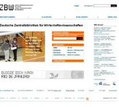
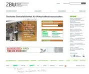
The test material consisted of three different design versions of the planned new homepage of the ZBW that were presented as paper prototypes (DIN A3, color print-out). For each version also a set of subsequent pages was available. The subsequent pages of the three design versions and their linkages with the according starting page were nearly identical. Figure 1, 2, and 3 show the three design versions of the starting page.
Figure 1: Design Version A. Please click here for an increased version of Figure 1.
Figure 3: Design Version C. Please click here for an increased version of Figure 3. [35]
The three versions (shown in Figures 1, 2, and 3) differed mainly in the structure (location of the main menu and the arrangement of the direct access fields) and the layout-style. However, the single elements were quite similar. All three versions had the analogous core elements, namely a navigation menu and three direct access fields. The navigation menu was placed at the left side (Version A and Version C) or at the head of the page (Version B). It had four main categories Recherchieren [Literature search], Ausleihen [Borrowing], Publizieren
[Publishing], and Über uns [About us]. The first three categories were also integrated in form of the three direct access fields whereby the direct access fields were linked to the same subsequent pages like the categories of the navigation menu. The direct access Recherchieren [Literature search] provided a direct linkage (by pressing the button) to the ZBW's search portal for economic literature named EconBiz1. One could also insert search terms in the open field within the direct access field and press on Suchen [Search] for directly starting the literature search in EconBiz. The direct access Ausleihen [Borrowing] was linked with the local literature catalog (named ECONIS2) that comprises the literature available in the library. The direct access Publizieren [Publishing] was linked with the publishing portal of the ZBW (named EconStor3). Additionally, all three versions had a headline at the very top of the page above the direct access fields, a news field ZBW aktuell [ZBW News], connections to the Web 2.0, and a standard footer. Furthermore, all three versions had a special announcement for the users: In Version A and Version B it was a field with a blog competition Blogge dich nach Rio De Janero [Blog yourself to Rio De Janero]. In Version C it was a field with a special announcement of the online help of the ZBW (named EconDesk4) in the form of a question Wer stösst in der EU das meiste CO2 aus?
1 EconBiz is the ZBW's online search portal for economic literature available worldwide (i.e., not limited to the locally available literature of the ZBW). It enables access to millions of online documents, most of them are free. Additionally, also an event search and additional helpful information related to the search terms is provided.
2 ECONIS is the local literature catalog of the ZBW. The search within ECONIS is limited to the locally available literature and offers the possibility to order the found literature for borrowing. Since the completion of the relaunch of the ZBW's website ECONIS is integrated in EconBiz but still exists as a separate search instrument.
3 EconStor is the ZBW's publishing portal and database. As a publishing portal it provides researchers the possibility to upload articles, e.g. first publishing of working papers or second publishing of existing articles. Additionally, the portal offers open access to the database of the published manuscripts.
[Who has the highest CO2 emission in the EU?]. It is important to note, that the participants received the print-outs without any additional explanations or information about the meaning of the depicted fields or the linkages. [36]
Each participant attended a single test session that was guided by an researcher. Additionally, an assistant acted as "human computer." As explained in the general description of paper prototyping, the "human computer" was an assistant of the researcher who simulates the clicking-mechanics. Whenever the participant clicked on an active field, the human computer put the "linked pages" as print-outs in front of the participant. It's important to note that the assistant who acted as "human computer" had no information about the correct clicking path. The assistant had only numbered print-outs and a list that designated which number should be shown when clicking on a specific field. The duration of a single test session was between one and one and a half hours. The test session had three main parts: working with the chosen design version (interview and usability tasks), advanced scribbling, and the handicraft task. Thereby, the participant was explicitly instructed to be honest even if it seems to be impolite. It was pointed out that there were no right or wrong answers; rather the personal opinion of the participants was of interest. [37]
In the first part of the test session, initially all three design versions of the starting page were presented. The participant had to choose spontaneously the one that he/she liked most and wanted to work with. After the selection, the researcher conducted a short interview as outlined above. The interview was semi-structured by four leading questions. The leading questions were also presented in a written format on small cards that were shown in parallel with the spoken instructions. The researcher had a list of optional additional questions, that could be asked in case the participant's answers on the leading questions were too short or not close enough to the topic. That means, the optional questions were mainly for activating the participant and for the concretization of the leading questions. The interview guidelines with the four leading questions and the related optional questions can be found in the Appendix. Subsequently the participant had to manage seven usability tasks with the chosen design version:
• Task 1: starting literature search via the online service EconBiz;
• Task 2: looking for other possibilities to find important literature and related information on a topic (e.g., Google search or using the Web 2.0 channels);
• Task 3: using the online-help EconDesk;
• Task 4: finding information about online book lending;
• Task 5: finding information about opening times and rooms of the ZBW at the location in Hamburg;
• Task 6: publishing via the online publishing portal EconStor;
Each of the usability tasks were also presented in written form on small cards (that served as reminders). [39]
In the second part of the session, the method of advanced scribbling was applied. Therefore, the participant received all three design versions as color print-outs and was instructed to mark the elements of each version with the different colors: green for important, yellow for unnecessary, and red for confusing. Additionally, he/she should write with a blue pen comments or explanations if necessary (e.g., why they marked an element in red). As a reminder, we offered a small card with the meaning of the different colors. There was a time limit of fifteen minutes for the three design versions, i.e., at average, the participant had five minutes per version. [40]
In the third part of the test session, the participant had to manage the handicraft task, i.e., he/she was instructed to tinker his/her wish homepage of the ZBW. Therefore the participant received a blank sheet of paper (DIN A3), colored pencils, markers and pens, print-outs of the three versions (DIN A3), a pair of scissors and glue. The participant could use elements of the given design
versions, create new elements or could also draw something completely different without using any of the given elements. There was a time limit of fifteen minutes for the handicraft task. [41]
As described in the beginning, the combination of the methods (paper
prototyping, advanced scribbling, and handicraft-task) used in the three parts of the test session are conceptualized as triangulation. In this relation, the different results of the pilot study were used for validating each other to avoid
misinterpretations. On the other hand, the results were related to each other in the sense of an extension in order to receive a more holistic view. In the course of the multi-method approach we assessed several qualitative as well as
quantitative indicators for all three parts of the test session, i.e., the paper prototyping as well as for the advanced scribbling and the handicraft task. [42]
The preference for one of the design versions was measured by the number of people who chose a version as favorite. The categories of the paper prototyping were derived from partly deductive and partly inductive methods. In a first step, the video protocols were analyzed with respect to the answers to the three leading questions of the interview and the management of the seven usability task. The answers to the leading questions were structured by the following categories: Spontaneous comments on the page as a whole, on the structure, on the clarity and priorities, on the navigation menu, on the direct access fields, or on other elements of the page. Additionally, there was one category for
solution was still possible. Minor usability problems provided obstacles that were annoying, but not a barrier for the task solution. With respect to the data of the advanced scribbling, for each element a separate category was defined and it was coded, if an element was highlighted and which color was used. As a derived quantitative indicator it was analyzed how many participants marked the single elements in green, yellow, or red (or did not mark it at all). The written comments of the participants were assessed in an additional category and were used to clarify the reasons for the different markings or for clarification of mixed markings. For the handicraft task it was analyzed which rough structure (according to the arrangement of the direct access buttons and the placement of the main
navigation) was chosen and which elements (given versus new) were used. [43]
3.3 Results
3.3.1 Selection of a design version and first impression
Overall, there was no clear preference for a design version. The initial selection showed only a slight tendency that the participants liked Version A less than the other two. The think-aloud protocols revealed that this traced back mainly to the graphics and photos. The abstract graphics of Version A were disliked, especially the stylized numbers of the direct access Publizieren [Publishing]. Even though the researcher explicitly verbalized that the layout and pictures were only thought as first drafts and were not in the focus of the study, the pictures were
commented on rather exhaustively. [44]
The general comments on the first impression of the chosen design version showed a similar pattern for the three design versions: All three design versions were easily identified as the homepage of a library. For all versions the
functionality of the navigation menu and the direct access Recherchieren [Literature search] were correctly identified. The direct access Ausleihen
[Borrowing] was commented on as understandable. The direct access Publizieren [Publishing] was partly confusing to the users (who were mainly students) and they expected tips for writing or publishing their master thesis (and not a publishing portal). Some participants commented on the main navigation as redundant in the face of the three direct access fields. For them it was not obvious that the direct access fields are only a selection and a shortcut whereas the main navigation covered the whole website. The linkages to the Web 2.0 channels were correctly identified. However, the Web 2.0 channels were partly unknown. Interestingly, most participants commented that such presence in Web 2.0 is important for a modern library even though they would not use it for their personal work with the library. [45]
3.3.2 Managing the usability tasks
Starting literature search (Task 1) and publishing via the online publishing portal (Task 6) were accomplished by all participants without any problems. The participants faced only minor difficulties regarding other options of finding additional information (Task 2 and Task 7). It's worth noting that none of the participants used the Web 2.0 linkages for the accomplishment of Task 2 and Task 7 even though these linkages offered partly an alternative solution. The most problematic tasks were Task 3, Task 4 and Task 5. For these three tasks the labeling of the navigation menu was misleading and thus, the participants couldn't find the appropriate page. Especially, for Task 4 there was (for all design versions) a general problem that was not only related to the labeling but also to the architecture of the website. The participants expected book lending as part of the literature search and thus, ignored the direct access as well as the navigation submenu Ausleihen [Borrowing]. Instead, they started with the normal literature search via EconBiz and looked out for a corresponding link in the selected literature. Even the participants who finally accomplished Task 4 criticized that borrowing was not directly embedded in the literature search. [47]
3.3.3 Results of the advanced scribbling
Regarding the practical application of the advanced scribbling, participants immediately understood the task and the use of the colors. All participants mastered the advanced scribbling within the time limit. It is important to note that most participants marked the three versions in parallel (not sequentially) and partly tried to mark the common elements (like the linkages to Web 2.0) consistently. Participants commented on the advanced scribbling with the highlighters as fun and relaxing after the usability tasks. However, we found two noticeable practical problems: First, the participants partly did not immediately remember the spoken instruction of the use of colors and did not recognize the analogy with a traffic light. They looked repeatedly at the small card with the legend, i.e., the written instruction on how to use the colors. Second, the
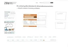
markings were partly mixed. For example, yellow and green were used together for the same element. In these cases, the researcher asked for the meaning and thus, the annotated comments and the think-aloud protocols were necessary to clarify the data. Figure 4 shows a typical example of the advanced scribbling.
Figure 4: Typical example of the advanced scribbling. Please click here for an increased version of Figure 4. [48]
linkages to the Web 2.0 above the footer were marked in yellow (as unnecessary). The photo with a short promotion teaser for the ZBW as well as the field with the blog-competition received mixed marking in red and yellow indicating that these fields were judged as partly confusing and partly unnecessary. For the photo with the promotion teaser one participant commented schlecht lesbar [hard to read] as the main reason for his judgment. The video protocols clarified that the blog-competition was for this participant (and also the others) quite incomprehensible, because he didn't know what was the purpose behind it. [49]
The quantitative results of the advanced scribbling showed similar patterns for the three design versions. Table 1 provides an overview. The numbers in Table 1 indicate for each design version (A, B, and C) how many of the ten participants marked the listed elements in green (as important), in yellow (as unnecessary) or in red (as confusing). It is important to note that the participants were not forced to mark anything at all. Thus, the total numbers can be different from ten. For a better readability of the table, no markings were symbolized as empty cells.
Green Yellow Red
A B C A B C A B C
Logo 1
Headline 1
Slogan 2 2 1 1
Direct access Recherchieren
[Literature search] 7 8 8 1 1 1
Direct access Ausleihen
[Borrowing] 7 8 8 1 1 1
Direct access Publizieren
[Publishing] 6 6 6 2 1 2 1 1
Navigation menu 8 7 7 1 1
ZBW Aktuell [ZBW News] 5 5 2 3 3 4 1
Blog-banner (only in A & B) 2 1 - 3 1 - 2 5
-EconDesk banner (only in C) - - 3 - - 1 - - 5
Web 2.0 linkages 1 3 1 7 4 7 1 2
Website search 3 3 4 2 1 2
Language button 4 5 4
Footer 2 3 2 1 1
Main pictures 1 1 3 1 1
For the common main elements of the three design versions, the data of the advanced scribbling showed a similar pattern. Most participants did not mark the logo, headline and slogan nor the footer. The majority of the participants marked the three direct access fields as well as the navigation menu as important. By think-aloud the participants commented on these elements as the core functionalities. Also the field ZBW Aktuell [ZBW News] as well as the website search and the language button were rated rather positive. [51]
Most participants marked the links to Web 2.0 as unnecessary. The participants commented (in the think-aloud protocols) that the Web 2.0 links were unimportant for themselves. They reported that they never used the Web 2.0 links on the current homepage of the ZBW. Some of the Web 2.0 applications were not even known by the users. [52]
The embedded pictures were rated rather negatively. However, most participants did not mark them with colors. Three participants marked the abstract graphics of Version A in red (as confusing). The think-aloud protocols revealed that these negative judgments traced back mainly to the quality of the graphics. (It is important to note that also in this part of the test session the researcher commented that the pictures were only placeholder and the layout was only a rough draft with minor visual quality.) Similar to the first part of the test session, the think-aloud protocols showed that most participants preferred the photos of Versions B and C compared to the abstract graphics in Version A. Similar to the pictures, also the banner with the blog-competition as well as the banner with EconDesk were judged rather negatively. The think-aloud protocols and the added comments revealed that the banners were partly perceived as advertisement and partly the functionality was not clear. [53]
3.3.4 Results of the handicraft task
For the practical applicability of the handicraft task, no problems in understanding were found. All participants mastered the handicraft task within the time limit of fifteen minutes. At the very beginning some participants claimed that they were not creative and had no talent for handicraft. In these cases, the researcher motivated them by emphasizing that aesthetics did not matter and that they could also use elements from the given design version. After this short motivation, the participants managed the handicraft task without any problems. Figure 5 shows a typical example of the handicraft task.
In the typical example shown in Figure 5, the structure was analogous to Version A (navigation menu on the left and vertical arrangement of the direct access fields), but the participant used the direct access fields of Version B in a modified manner that makes it more similar to the size and the shape of Version A. From the think-aloud protocols it became clear that most participants disliked the abstract graphics of Version A and thus, used the other layout options. The navigation menu was slightly modified by integrating linkages to ECONIS (the local literature catalog) and EconBiz (for the literature search worldwide).
Additionally, the participant integrated a fifth main category Mein Nutzerkonto [My user account]. Below the navigation, the participant placed the field with the special announcement of the online help EconDesk. From the think-aloud protocols it became clear that the participant found this field especially helpful because it enables a quick linkage to the online help EconDesk (needed for the usability Task 3). Headline and logo of the ZBW as well as the footer and the connections to the Web 2.0 were placed in the standard manner at the top and the bottom of the page. As additional important fields Kontakt [Contact] and Aktuelles [News] were integrated. [55]
Table 2 lists the quantitative results of the handicraft task. The numbers indicate how many of the ten participants used a specific structural arrangement or a specific element.
Criteria Number of
Participants
Direct access buttons
Vertical arrangement 7
Horizontal arrangement 3
Navigation menu5 Left side 7
Header 2
Others 1
No menu 1
Used elements Navigation menu 9
Logo 10
Headline 8
Slogan 4
Direct access Recherchieren [Literature search]
10
Direct access Ausleihen [Borrowing] 8
Direct access Publizieren [Publishing] 10
Criteria Number of Participants
ZBW Aktuell [ZBW News] 6
Blog-banner 3
EconDesk banner 4
Web 2.0 linkages 7
Website search 9
Language button 9
Footer 10
Pictures 4
Table 2: Quantitative indicators of the handicraft task [56]
All ten participants included the direct access button Recherchieren [Literature search] and the direct access button Publizieren [Publishing]. Eight participants included also the direct access button Ausleihen [Borrowing]. Seven of them used the extended field of Ausleihen [Borrowing] that had additional explicit visible links, e.g., to the local online catalog ECONIS as well as to the opening times and the ZBW's location. Two participants omitted the field Ausleihen [Borrowing] and commented that they found it confusing and expected the borrowing functionality in the course of literature search. One participant made this very striking in his tinkered wish homepage: He fixed the borrowing direct access under the
literature search, i.e., the field Ausleihen [Borrowing] was not visible, but could be seen after displacement of the literature search field. Seven participants used a navigation menu on the left side, only two participants on the top of the page. Partly, the main navigation was extended by links of the submenu or additional links (e.g., contact, login user account, FAQ). Independent from main navigation and the direct access fields, four participants created a text field with opening times and the ZBW local address on their wish homepage. These participants commented on this information as essential for a library. The logo was included by all ten participants. The headline was included by eight participants. A slogan was only used by four participants. All participants used the footer (partly in a modified way). ZBW News was included by six participants. The linkages to the Web 2.0 channels were included by seven participants. The other elements were used only by a minority of the participants. [57]
navigation menu of Version A: Thus, the overall structure was more similar to Version A. [58]
3.4 Empirical insights and combined interpretation
3.4.1 Practicability of the advanced scribbling and the handicraft task
Overall, the instructions of the advanced scribbling were well understood and most participants liked the color marking. However, participants partly did not immediately remember the spoken instruction of the advanced scribbling and did not recognize the analogy with a traffic light. Thereby, the written legend on a small card was very helpful and should be used as a standard for this method. For mixed markings the think-aloud protocols could be used for clarifying the meaning. Overall, the results provide evidence for the practicability and
suggested a high motivational potential of the advanced scribbling. The time limit of five minutes per design draft was appropriate. [59]
Also the instructions of the handicraft task were clear to the participants. Some participants were partly unassertive in the very beginning. They stated poor skills in creativity and tinkering. However, after a short motivation and clarification about the unimportance of aesthetics, they worked in a straightforward manner. Most participants moved the cut out elements over the white page and fixed it at the very end with glue. Partly, even already fixed elements were replaced and fixed again on another location. This indicated that participants compared different alternatives before developing their personal wish homepage. Overall, the handicraft task showed a good practicability. The time limit of fifteen minutes was appropriate for the prototype's level of complexity. All participants, even the reserved ones, commented on the handicraft task as very refreshing and a welcomed alternative to their usual work. [60]
3.4.2 Identifying an appropriate structure for the planned homepage
For the initial selection, there was a tendency that the participants disliked Version A compared to Version B and Version C. The think-aloud protocols revealed that the objection of Version A was connected with the dislike of the abstract graphics. For the usability tasks only minor differences were found that had no obvious connection to the different structures of the three design versions. The advanced scribbling strengthened the findings of the think-aloud protocols: The pictures of Version A were marked more often as confusing and disliked. Contrariwise, the marking of other elements of the three versions showed only minor differences. In the handicraft task most participants simulated the structure (direct access buttons and main navigation menu) of Version A. However, the abstract graphics of Version A were not used. [61]
versions were found. However, the data of the think-aloud protocols revealed that the abstract graphics were the main reason for the dislike of version A. Similarly, the results of the advanced scribbling led to the conclusion to avoid abstract graphics. Finally, the analysis of the results of the handicraft task led to a changed interpretation compared to the pure results of the first part of the session. Even though Version A was disliked and received more negative comments, most participants simulated the structure of Version A. Thus, the overall recommendation is, to have a structure analogous to Version A. With respect to embedded pictures, realistic photos of people are preferable. [62]
3.4.3 Single elements: Building the basis for a best-off design
Even though the direct access Ausleihen [Borrowing] was initially described as understandable, the findings of the usability Task 4 (finding information about online book lending) revealed that many participants did not associate the according functionalities with the direct access Ausleihen [Borrowing]. They suggested that book lending should be integrated as an option during the
literature search. Nevertheless, most participants marked the direct access field as important in the advanced scribbling and integrated it in the handicraft task. [63]
A contrariwise pattern of results was found for the direct access Publizieren [Publishing]. During the interviews in the very beginning of the test session this label was partly confusing to the participants (who were students): Spontaneously they expected tips for writing or publishing their master thesis and not a
publishing portal. But when confronted with according usability tasks, they intuitively used the correct direct access button. [64]
Logo, slogan and headline were commented on as rather neutral in the first part of the session. In the advanced scribbling they were not marked at all, but nearly all participants integrated logo and headline in their tinkered wish homepage. However the rather long slogan was only used by a minority, whereas several participants commented in the think-aloud protocol that the headline is more slogan-like. This pattern of results suggested that logo and headline are
considered as standard elements and that a meaningful headline could be more apt than a long complicated slogan. [65]
4. Conclusion and Outlook
The proposed multi-method approach was successfully applied in a pilot study. The results of the study showed that the two new methods (advanced scribbling and handicraft task) were understandable for the participants. We found only some minor practical obstacles that could be easily managed by the experimenter and a refinement of the instructions. The method of advanced scribbling and the handicraft task was perceived as playful and thus could be used as a cognitive relaxing phase during long test sessions. [67]
The multi-method approach provided additional insights and the combined interpretation explained the partly contradictory findings and avoided several misinterpretations of the paper prototyping data. Furthermore, the advanced scribbling and the handicraft task provided additional feedback on specific elements and the structure of the planned redesign. [68]
Overall, the supplementary insights and recommendations based on the advanced scribbling as well as the handicraft task were very welcome by the developer team. Additionally, also some heuristic scientific insights (e.g., regarding the influence of pictures in paper prototypes and the impact of Web 2.0 for public institutions) for future research were revealed. We hope that the proposed multi-method approach and the presented practical example stimulate practitioners as well as researchers to find new creative ways for usability studies. [69]
Appendix: Interview Guidelines (Pilot Study)
Leading Question 1: What do you think is this page made for?
Optional questions:
• Which spontaneous associations do you have? • Would you stay at the page? Why (not)?
Leading Question 2: What is your opinion about this page? What do you recognize?
Optional questions:
• Please look a bit closer at the page and tell me what you think about it: What do you recognize, what kind of page is it, what can you do here and what is the aim of the page?
Leading Question 3: Do you think the slogan is appropriate for the ZBW (Central Library of Economics)?
Optional questions:
• What do you think is the aim of the slogan?
• Which spontaneous associations do you have about the slogan?
• What do you think about the combination of the slogan with the website?
Leading Question 4: What can you make with this page? What are the single elements made for?
Optional questions:
• What do you like?
• What you don't like? What is annoying?
• What is incomprehensible? What is confusing? • Do you miss something? If yes, what?
• Is there something needless on the page? If yes, what?
• What would you like to change (e.g., links, slogan, labels, etc.)?
References
Bortz, Jürgen & Döring, Nicola (2006). Forschungsmethoden und Evaluation für Human- und Sozialwissenschaftler [Research methods and evaluation for human and social scientists](4th ed.). Heidelberg: Springer Medizin Verlag.
Brannen, Julia (Ed.) (1992). Mixing methods: Qualitative and quantitative approaches. Aldershot: Avenbury.
Bryman, Alan (2004). Social research methods. Oxford: Oxford University Press.
Burkhart, Thomas (2010). Qualitatives Experiment [Qualitative experiment]. In Günther Mey & Katja Mruck (Eds.), Handbuch Qualitative Forschung in der Psychologie [Handbook qualitative research in psychology] (pp.252-262). Wiesbaden: VS Verlag für Sozialwissenschaften.
Campbell, Donald T. & Fiske, Donald W. (1959). Convergent and discriminant validation by the mutlitrait-multimethod matrix. Psychological Bulletin, 56, 81-105.
Denzin, Norman K. (1989). The research act (3rd ed.). Englewood Cliffs, NJ: Prentice Hall.
Dicks, R. Stanley (2002). Mis-usability: On the uses and misuses of usability testing. Proc SIGDOC 2002, ACM Press (pp.26-30), http://dl.acm.org/citation.cfm?id=584960 [Accessed: March 7, 2013]. Duncker, Karl (1966 [1935]). Zur Psychologie des produktiven Denkens [About the psychology of productive thinking]. Berlin: Springer.
Flick, Uwe (2010). Triangulation. In Günther Mey & Katja Mruck (Eds.), Handbuch Qualitative Forschung in der Psychologie [Handbook qualitative research in psychology] (pp.278-289). Wiesbaden: VS Verlag für Sozialwissenschaften.
Fonteyn, Marsha E.; Kuipers, Benjamin & Grobe, Susan J. (1993). A description of think aloud method and protocol analysis. Qualitative Health Research, 3(4), 430-441.
Greene, Jennifer (2007). Mixed methods in social inquiry. San Francisco, CA: John Wiley. Groeben, Norbert & Scheele, Brigitte (2000). Dialogue-hermeneutic method and the "Research Program Subjective Theories". Forum Qualitative Sozialforschung / Forum: Qualitative Social Research, 2(1), Art. 10, http://nbn-resolving.de/urn:nbn:de:0114-fqs0002105 [Accessed: February 11, 2015].
Research, 2(1), Art. 5,http://nbn-resolving.de/urn:nbn:de:0114-fqs010159 [Accessed: February 11, 2015].
Kleining, Gerhard (1986). Das qualitative Experiment [The qualitative experiment]. Kölner Zeitschrift für Soziologie und Sozialpsychologie, 38, 4, 724-750, http://nbn-resolving.de/urn:nbn:de:0168-ssoar-8631 [Accessed: February 11, 2015].
Kleining, Gerhard & Witt, Harald (2001). Discovery as basic methodology of qualitative and quantitative research. Forum Qualitative Sozialforschung / Forum: Qualitative Social Research,
2(1), Art. 16, http://nbn-resolving.de/urn:nbn:de:0114-fqs0101164 [Accessed: February 11, 2015]. Konrad, Klaus (2010). Lautes Denken [Thinking aloud]. In Günther Mey & Katja Mruck (Eds.),
Handbuch Qualitative Forschung in der Psychologie [Handbook qualitative research in psychology] (pp.476-489). Wiesbaden: VS Verlag für Sozialwissenschaften.
Lewis, Clayton H. (1982). Using the "think aloud" method in cognitive interface design. Technical report, IBM, RC-9265.
Maness, Jack M. (2006). Library 2.0 theory: Web 2.0 and its implications for libraries. Webology,
3(2), Art. 25, http://www.webology.org/2006/v3n2/a25.html [Accessed: March 7, 2013]. Mayring, Philipp (2001). Kombination und Integration qualitativer und quantitativer Analyse [Combination and integration of qualitative and quantitative ananlysis]. Forum Qualitative Sozialforschung / Forum Qualitative Social Research, 2(1), Art. 6,
http://nbn-resolving.de/urn:nbn:de:0114-fqs010162 [Accessed: February 11, 2015] Nielsen, Jakob (1993). Usability engineering. London: AP Professional Ltd.
Rubin, Jeffrey & Chisnell, Dana (2008). Handbook of usability testing (2nd ed.), Indianapolis, IN: Wiley Publishing Inc.
Sasaki, Tomomi (2003). Recipient orientation in verbal report protocols: Methodological issues in concurrent think-aloud. Second Language Studies, 22(1), 1-54.
Schreier, Margrit & Odağ, Özen (2010). Mixed Methods. In Günther Mey & Katja Mruck (Eds.),
Handbuch Qualitative Forschung in der Psychologie [Handbook qualitative research in psychology] (pp.263-277). Wiesbaden: VS Verlag für Sozialwissenschaften.
Schwarz, Norbert (1999). How the questions shape the answers. American Psychologist, 54(2), 93-105.
Snyder, Carolyn (2003). Paper prototyping. The fast and easy way to design and refine user interfaces. San Francisco, CA: Morgan Kaufmann Publishers.
Still, Brian & Morris, John (2010). The blank-page technique: Reinvigorating paper prototyping in usability testing. IEEE Transactions on Professional Communication, 53, 144-157.
Tohidi, Maryam; Buxton, William; Baecker, Ronald & Sellen, Abigail (2006a). Getting the right design and the design right. CH 2006 Proceedings, April 22-27, 2006, Montreal, Quebec, Canada
(pp.1243-1252), http://research.microsoft.com/en-us/um/people/asellen/publications/p1243-tohidi.pdf [Accessed: March 7, 2013].
Tohidi, Maryam; Buxton, William; Baecker, Ronald & Sellen, Abigail (2006b). User sketches: A quick, inexpensive, and effective way to elicit more reflective user feedback. NordiCHI 2006: Changing Roles, 14-18 October 2006, Oslo, Norway (pp.105-114), http://dl.acm.org/citation.cfm? id=1182487&CFID=513621017&CFTOKEN=80951948 [Accessed: May 20, 2013]
Van Someren, Maarten W.; Barnard, Yvonne F. & Sandberg, Jacobijn A.C. (1994). The think aloud method. A practical guide to modeling cognitive processes. London: Academic Press.
Virzi, Robert A. (1992). Refining the test phase of usability evaluation: how many subjects is enough? Human Factors, 34, 457-468.
Wiklund, Michael; Thurrott, Christopher & Dumas, Joseph (1992). Does the fidelity of software prototypes affect the perception of usability? Proc. Human Factors Society 36th Annual Meeting
(pp.399-403). Santa Monica, CA: HFES.
Witt, Harald (2010). Introspektion. In Günther Mey & Katja Mruck (Eds.), Handbuch Qualitative Forschung in der Psychologie [Handbook qualitative research in psychology] (pp.491-505). Wiesbaden: VS Verlag für Sozialwissenschaften.
Witzel, Andreas (2000). The problem-centered interview. Forum Qualitative Sozialforschung / Forum: Qualitative Social Research, 1(1), Art. 22,
Wundt, Wilhelm (1888). Selbstbeobachtung und innere Wahrnehmung [Self-monitoring and inner perception]. In Wilhelm Wundt, Philosophische Studien [Philosophical Studies] 4 (pp.292-310). Leipzig: Wilhelm Engelmann.
Authors
Stephanie B. LINEK works as media psychologist and usability expert at the ZBW – Leibniz Information Centre for Economics in Kiel, Germany. Her research interests are in multiple areas with special focus on evaluation and usability, media psychology, human-computer interaction (HCI), edutainment and infotainment, social media and Science 2.0.
Contact:
Dr. Stephanie B. Linek Postdoctoral Researcher
ZBW – Leibniz Information Centre for Economics
Düsternbrooker Weg 120, 24105 Kiel, Germany
Tel.: +49 (0)431 8814-583 Fax: +49 (0)431 8814-520 E-mail: [email protected]
URL: http://zbw.eu/en/about-us/key-activities/usability/stephanie-linek/
Klaus TOCHTERMANN is the director of the ZBW – Leibniz Information Centre for Economics and has an appointment as university professor for media informatics at the University of Kiel, Germany. His research interests are in knowledge management, Web 2.0 and Science 2.0 semantic technologies, and future Internet.
Contact:
Prof. Dr. Klaus Tochtermann Professor, Director ZBW
ZBW – Leibniz Information Centre for Economics
Düsternbrooker Weg 120, 24105 Kiel, Germany
Tel.: +49 (0)431 8814-333 Fax: +49 (0)431 8814-520 E-mail: [email protected] URL: http://zbw.eu/en/research/klaus-tochtermann/
Citation
Linek, Stephanie B. & Tochtermann, Klaus (2015). Paper Prototyping: The Surplus Merit of a Multi-Method Approach [69 paragraphs]. Forum Qualitative Sozialforschung / Forum: Qualitative Social Research, 16(3), Art. 7,
![Figure 3: Design Version C. Please click here for an increased version of Figure 3. [35]](https://thumb-us.123doks.com/thumbv2/123dok_us/353557.2032269/12.595.292.383.118.194/figure-design-version-c-click-increased-version-figure.webp)
![Table 1: Quantitative indicators of the advanced scribbling [50]](https://thumb-us.123doks.com/thumbv2/123dok_us/353557.2032269/17.595.145.545.343.745/table-quantitative-indicators-advanced-scribbling.webp)
![Table 2: Quantitative indicators of the handicraft task [56]](https://thumb-us.123doks.com/thumbv2/123dok_us/353557.2032269/20.595.145.545.103.310/table-quantitative-indicators-handicraft-task.webp)
