Geospatial Computing: Architectures and
Algorithms for Mapping Applications
Richard William Milton
Submitted in partial fulfilment of the requirements for the degree of
Doctor of Philosophy
The Bartlett Centre for Advanced Spatial Analysis University College London
3
I, Richard William Milton, confirm that the work presented in this thesis is my own. Where information has been derived from other sources, I confirm that this
has been indicated in the thesis.
Abstract
Beginning with the MapTube website,1which was launched in 2007 for crowd-sourcing maps, this project investigates approaches to exploratory Geographic Information Sys-tems (GIS) using web-based mapping, or ‘web GIS’. Users can log in to upload their own maps and overlay different layers of GIS data sets. This work looks into the theory behind how web-based mapping systems function and whether their performance can be modelled and predicted.
One of the important questions when dealing with different geospatial data sets is how they relate to one another. Internet data stores provide another source of infor-mation, which can be exploited if more generic geospatial data mining techniques are developed. The identification of similarities between thousands of maps is a GIS tech-nique that can give structure to the overall fabric of the data, once the problems of scalability and comparisons between different geographies are solved. After running MapTube for nine years to crowd-source data, this would mark a natural progression from visualisation of individual maps to wider questions about what additional knowl-edge can be discovered from the data collected.
In the new ‘data science’ age, the introduction of real-time data sets introduces a new challenge for web-based mapping applications. The mapping of real-time geospatial systems is technically challenging, but has the potential to show inter-dependencies as they emerge in the time series. Combined geospatial and temporal data mining of real-time sources can provide archives of transport and environmental data from which to accurately model the systems under investigation. By using techniques from machine learning, the models can be built directly from the real-time data stream. These models can then be used for analysis and experimentation, being derived directly from city data. This then leads to an analysis of the behaviours of the interacting systems.
Impact Statement
This thesis examines the performance of web-based and real-time mapping systems, developing the theory behind how the systems work at a technical level, while quanti-fying the performance using results from testing in the field. One of the impacts of this work is to provide researchers with a basis from which to design and build their own geographic visualisation systems.
As the work covers the period from 2005 to 2018, the main impact has been in the projects that this research has been used to deliver. The graph in figure 4.3 of Chapter 4 shows that CASA’s original GMapCreator software had 20,928 downloads up to January 2014. This was the first impact from the work which then turned into the contents of this thesis. Following on from this, the MapTube website, presented in Chapter 4 for crowd-sourcing maps online, has 16,898 registered users and 3,446 maps. Given the way that MapTube collects data, a significant part of this thesis deals with how to perform geospatial analysis on sets of maps as a new method of working with Internet data stores containing information.
The crowd-sourcing work is taken a stage further with the ‘mood maps’ in section 4.1, which was a project where CASA collaborated with the BBC. The first experiment had 23,475 responses to a question about the impact of the credit crunch, with a follow-up a few months later having 20,072 responses. Then, Manchester City Council ran a survey with us in conjunction with the public consultation surrounding the introduction of a congestion charging zone, obtaining 15,800 responses from the general public. This led to further funding through ESRC for a dedicated website for crowd-sourcing geographic information called ‘SurveyMapper’.
In terms of the core mapping technologies and theory presented here, the latest project developed the QUANT website, which required the vector tiling technology (section 5.1.4). This was developed out of the need to create a geographic data explo-ration tool to visualise the output of a spatial interaction model. Continuing the pace
of technological development, this has led to a successful commercial bid to supply a map-based visualisation of building energy data for the Greater London Authority in conjunction with UCL’s Energy Institute.
Where the real-time data chapter is concerned, this has enabled a collection of out-reach projects involving visualisation, for example, Steven Gray’s iPad wall, which CASA installed in the Mayor’s office in City Hall, the ‘Grand Designs’ exhibition at the ExCel Centre in London, a three day exhibition at Leeds City Museum and numerous other ‘Smart City’ projects. It currently provides real-time data to the CityDashboard website and is also used for another commercial project with the London Transport museum, as detailed in the Conclusion Chapter. In addition to this, the data has been collected since the London Olympics of 2012, so there now exists an archive of 6 years’ worth of data for researchers to analyse. The twenty publications resulting from this work are listed in the following Preface Chapter.
Contents
Abstract 5
Impact Statement 7
Preface 21
1 Introduction 33
1.1 Motivation and Context for the Work . . . 33
1.2 Research Question . . . 36
1.3 Project Overview Diagram . . . 37
1.4 Timeline . . . 38
2 Literature Review 41 2.1 Presentation of Geospatial Data . . . 41
2.2 Agent-based Modelling for Real-time Data . . . 44
2.3 Analysing Tube and Bus Strikes . . . 45
2.4 Combining Real-time and Static Data . . . 47
2.5 Computer Graphics and Rendering . . . 49
2.6 Automatic Data Store Mining . . . 50
2.7 Linking GIS and Computer Graphics . . . 52
2.8 Comparing Map Data and Correlations . . . 54
2.9 Learning from Real-time Streams . . . 57
2.10 Knowledge Discovery . . . 60
2.11 Relative Scales in Data Comparison . . . 64
3 Technical Background 67 3.1 Hypothesis . . . 68
3.2 Geospatial Computing . . . 70
3.3 Components of Geospatial Systems . . . 74
3.4 Map Projections . . . 74
3.5 Geospatial Libraries . . . 80
3.6 Standards . . . 83
3.7 Procedural Generation . . . 87
3.8 Computing Architectures . . . 88
3.8.1 General Purpose GPU . . . 89
3.8.2 Cloud Computing . . . 89
3.8.3 Parallel Algorithms and Heterogeneous Computing . . . 93
3.8.4 CyberGIS . . . 95
3.8.5 Geocomputation in the Internet Age . . . 96
3.8.6 Websites for Web-Based Mapping . . . 100
3.9 Programmable Maps . . . 101
3.10 Spatial Indexing . . . 104
4 Designing Systems: Algorithms and Work Flows 109 4.1 “A Place to Put Maps” . . . 111
4.1.1 Topicality Index . . . 122
4.1.2 Internet Maps . . . 126
4.2 Tiled Maps . . . 129
4.3 Static Web Maps . . . 136
4.3.1 Tiling Applications . . . 139
4.4 Dynamic Maps . . . 147
4.4.1 Automatic Map Generation . . . 156
4.4.2 Data Store Mining . . . 161
4.5 Real-time and Programmable Maps . . . 164
4.6 Conclusions . . . 171
5 Dynamic Visualisation 175 5.1 Example 1: Data Exploration and Web GIS . . . 176
5.1.1 Storage and Retrieval . . . 177
5.1.2 Points, Lines, Polygons . . . 177
CONTENTS 11
5.1.4 Vector Tilers . . . 191
5.1.5 Conclusion . . . 194
5.2 Example 2: Data Stores . . . 195
5.2.1 Correlation in the Text Domain . . . 205
5.2.2 Pattern Matching . . . 212
5.2.3 Conclusion . . . 218
6 Real-time Mapping and Agent Simulations 221 6.1 Example 3: Real-time Mapping and Agent Simulations . . . 221
6.2 AdaptiveNetworks for complexTransportSystems (ANTS) . . . 223
6.3 Behaviours and Agent Based Models . . . 227
6.3.1 3D Rendering, GeoGL Project . . . 251
6.3.2 Conclusion . . . 260
6.4 Static and Real-time . . . 261
6.5 Conclusion . . . 262
7 Data Exploration: Data Stores and Correlation 265 7.1 Data Stores and Correlation . . . 265
7.1.1 Census 2011 Analysis . . . 266
7.1.2 Spatial Indexing, Distances and Neighbours . . . 277
7.1.3 Not the Census . . . 289
7.1.4 Conclusion . . . 295
8 Data Exploration: Real-time and Data That Moves 297 8.1 Real-time and Data that Moves . . . 297
8.2 Similarity, Feature Detection and Stream Mining . . . 312
8.3 National Rail and Commuters . . . 316
8.3.1 Interactions and Systems . . . 320
8.4 Environment . . . 323
8.5 Unified Data . . . 343
9 Discussion and Further Work 345 9.1 Discussion of Research Questions . . . 346
9.1.1 Q1.1 Web GIS . . . 347
9.1.3 Q1.3 Real-time GIS and Agent-based Models . . . 352
9.1.4 Q1.4 Combined Sources of Data . . . 354
9.2 Key Contributions . . . 356
9.3 Work Presented in this Thesis . . . 357
9.4 Limitations . . . 357 9.5 Further Work . . . 363 10 Conclusion 367 10.1 The Future . . . 373 10.2 Final Thoughts . . . 374 Bibliography 375 Glossary 393 Appendices 401 A NOMIS Census Bulk Upload r2.2 . . . 402
B TfL Underground Station Codes . . . 403
C TfL Underground Destination Codes . . . 412
D AURN Air Quality Sensor Network . . . 413
List of Tables
1.1 Time-line of Work . . . 39
4.1 MapTube automatic map identification column properties . . . 159
4.2 Real-time Transport API Web Services REST Syntax. . . 168
5.1 Met Office DataPoint Observations. . . 185
5.2 Met Office DataPoint Forecasts. . . 186
5.3 MapTubeD Geometry Finder Web Service. . . 198
5.4 Correlation results from the data store miner . . . 203
5.5 Census Table wu01ew msoa . . . 204
5.6 Census PDF description documents and their associated tables. . . 206
5.7 Number of Census 2011 variables classified to each grid cell. . . 215
6.1 Trackernet Real-time API . . . 229
6.2 Victoria Line Destination Codes . . . 243
7.1 RMS error between spatial cross correlation and k-nearest neighbour . . 283
7.2 Correlation statistics for k-nearest neighbour matrices and spatial cross correlation . . . 283
7.3 Matrix correlation formulas . . . 284
7.4 Average degree for k-nearest neighbour matrices and spatial cross cor-relation . . . 287
7.5 Cluster sizes for k-nearest neighbour matrices and spatial cross corre-lation . . . 288
7.6 Labour Percentage of Vote Correlated with Census 2011 Tables . . . 295
8.1 Tube and Bus Number Statistics for 2014 . . . 300
8.3 Missing weather data hours for 2014. . . 326 9.1 Contribution of Work Recorded in this Thesis . . . 357
List of Figures
1.1 Overview of Projects . . . 37
2.1 UK general election maps for 2015 and 2017 . . . 41
3.1 Lake Huron River Levels . . . 71
3.2 Flood warnings around Heathrow airport . . . 73
3.3 Six examples of different map projections . . . 79
3.4 Geotools system diagram . . . 81
3.5 AgentScript test model running on top of Google Maps. . . 103
3.6 Live tube positions, animated using AgentScript, valid for 09:00am on 5 February 2014. . . 103
4.1 MapTube launch at Digital Geography in a Web 2.0 World . . . 111
4.2 MapTube home page . . . 112
4.3 GMapCreator download graph, 2007-2014 . . . 112
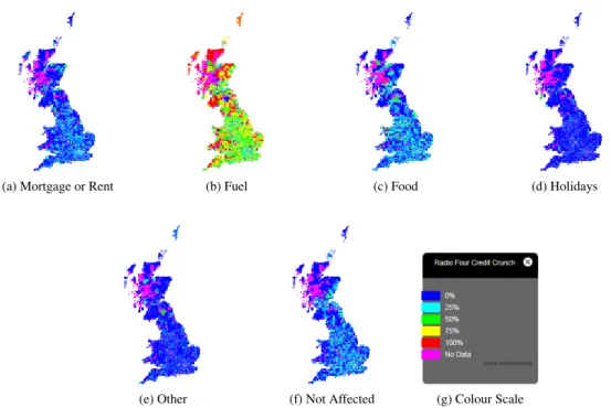
4.4 Radio 4 Credit Crunch Input Form . . . 113
4.5 Radio 4 Credit Crunch Map . . . 114
4.6 BBC News website, credit crunch survey . . . 115
4.7 Radio 4 Credit Crunch results maps . . . 116
4.8 Mood map survey system diagram . . . 116
4.9 MapTube mapping data from a transport scenario model . . . 117
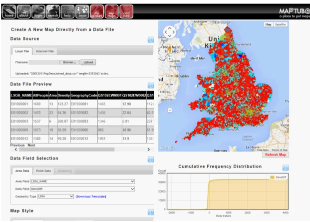
4.10 Maptube automatic map creation from a CSV file . . . 118
4.11 MapTube field and colour scale choice when making a map . . . 119
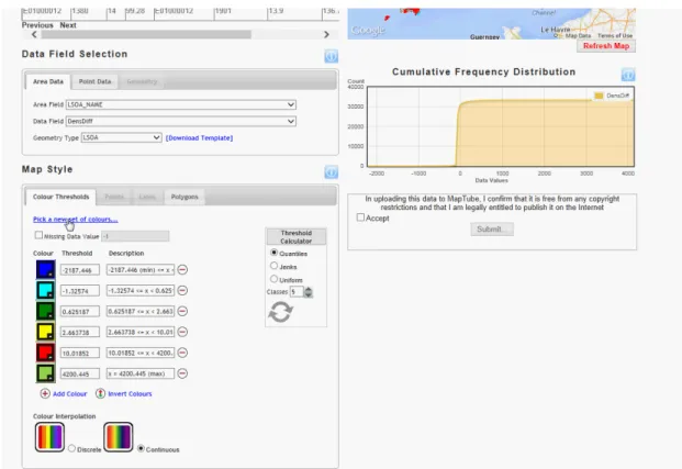
4.12 MapTube, choosing a colour scale for a map . . . 120
4.13 MapTube example map . . . 120
4.14 MapTube breaks ranges and types for a population map example . . . . 121
4.16 Real-time tube and bus positions in Chrome . . . 127
4.17 Mean wait times for London Underground stations . . . 128
4.18 Tiled map recursive sub-division . . . 129
4.19 Plot of the number of tiles required for a map against zoom level and data extents . . . 138
4.20 GMapCreator downloads between 2006 and 2014 . . . 139
4.21 Radio 4 Credit Crunch mood map input form . . . 141
4.22 Radio 4 Credit Crunch system diagram . . . 142
4.23 Radio 4 Credit Crunch answers table . . . 143
4.24 Radio 4 Credit Crunch aggregated districts table . . . 143
4.25 Radio 4 Credit Crunch responses plotted over time . . . 145
4.26 Radio 4 Credit Crunch plot of responses per second during the peak . . 145
4.27 MapTubeD system diagram . . . 148
4.28 UML diagram of the MapTubeD TileRequestor . . . 150
4.29 UML diagram of the MapTubeD TileRenderer . . . 151
4.30 UML deployment diagram for MapTubeD . . . 153
4.31 BBC Look East Broadband survey . . . 154
4.32 BBC Look East Broadband survey tile request over 24 hours . . . 155
4.33 UML activity diagram for the MapTubeD GeometryFinder . . . 158
4.34 UML class diagram for the MapTubeD GeometryFinder . . . 159
4.35 Class diagram for the Data Store Miner . . . 162
4.36 Met Office Datapoint Radar image map . . . 164
4.37 System diagram of the ANTS system . . . 166
4.38 City data source class diagram . . . 167
4.39 Six visualisations of London’s real-time transport data . . . 170
5.1 Searching for ‘E02000001’ with Google . . . 176
5.2 MapTube WebGL system diagram . . . 179
5.3 MapTube WebGL axis system . . . 179
5.4 MapTube WebGL projection calculations . . . 181
5.5 A MapTube WebGL layer inserted into Google Maps . . . 183
5.6 A geographic object with holes and triangulation . . . 184
5.7 Radar rainfall data for the storm on Sunday 27th October 2013 . . . 187
LIST OF FIGURES 17
5.9 World Meteorological Organisation station circle . . . 189
5.10 Synoptic observation plot for the South of England . . . 189
5.11 Data flow diagram for the MapTubeV vector tiling system . . . 193
5.12 The home page of the MapTube website, filtering using the ‘popula-tion’ keyword . . . 196
5.13 MapTube keyword graph . . . 196
5.14 All England and Wales Census maps built automatically by MapTube . 197 5.15 Data flow diagram for automatic mapping . . . 198
5.16 Data flow diagram for spatial cross correlation . . . 199
5.17 Plot of Census 2011 spatial cross correlation timings . . . 202
5.18 Census 2011 spatial correlation frequency histogram . . . 203
5.19 Flow diagram for Data Store Miner natural language processing . . . . 206
5.20 Frequency histogram for text correlation values . . . 207
5.21 Frequency histogram for text correlation values using TFIDF algorithm 208 5.22 NOMIS Census 2011 text domain vs data domain correlation plot . . . 209
5.23 NOMIS 2011 text domain vs data domain correlation plot using TFIDF 210 5.24 Diagram showing where data to be investigated further is located on the plot . . . 210
5.25 Kohonen 4x4 self organised feature map . . . 213
5.26 Kohonen linear classifier training data plot . . . 215
5.27 Kohonen weights plotted as England and Wales maps . . . 216
5.28 Network graph of the NOMIS Census 2011 data release . . . 220
5.29 Overview of the services and software presented in this chapter . . . 220
6.1 Effect of bus strikes on 22nd July 2012 . . . 222
6.2 ANTS system diagram . . . 223
6.3 3D delay surface plot for the London Underground and input data stream225 6.4 Agent Based Modelling meets machine learning . . . 227
6.5 Plot of trackernet weekday destination codes used by line and frequency 231 6.6 Tube counts for 2014 . . . 233
6.7 Plot of total number of weekday tubes . . . 235
6.8 GeoGL ABM class diagram . . . 238
6.9 Plot of average number of tubes created over all weekdays . . . 240
6.11 Ranked plot of the top 75 stations where new tube services are created . 242
6.12 Map of probability of tube creation at a location . . . 242
6.13 Times and number of Victoria Line trains detected between Brixton and Kings Cross as an aggregate of weekdays . . . 243
6.14 Times and number of Victoria Line trains detected between Brixton and Kings Cross as an aggregate between 8am and 10am . . . 244
6.15 Times and number of Victoria Line trains detected between Kings Cross and Brixton using an offset to show timetable points . . . 245
6.16 Times and number of trains detected as being at Kings Cross as an aggregate of all weekdays in January 2014 . . . 245
6.17 Victoria Line track layout and station codes . . . 246
6.18 Total number of times each destination code was used in January 2014 . 247 6.19 Total number of services passing through stations . . . 248
6.20 The MapTube website showing live animated positions of London Un-derground trains . . . 250
6.21 ABM demonstrating bunching in London Underground trains as a con-sequence of track layout . . . 250
6.22 GeoGL system diagram . . . 251
6.23 The packages comprising the GeoGL project . . . 252
6.24 GeoGL graphics engine class diagram . . . 254
6.25 GeoGL class diagram . . . 255
6.26 GeoGL cache class diagram . . . 258
6.27 GeoGL async class diagram . . . 259
6.28 GeoGL plots of data derived by interrogating the ABM as it is running . 260 7.1 Correlation computation time . . . 269
7.2 ONS geographies for MSOA, LSOA and OA levels . . . 269
7.3 Correlation histogram of the NOMIS Census 2011 bulk release . . . 270
7.4 Variables missing from the NOMIS Census 2011 correlation . . . 271
7.5 Correlation histogram of the NOMIS Census 2011 bulk release . . . 272
7.6 Correlation matrix for the 104 Census tables . . . 273
7.7 Graph of correlation coefficient (I) for first three tables (KS101-KS103) against all tables . . . 273
LIST OF FIGURES 19
7.8 Correlation matrix for the 104 tables with the rows and columns ranked
using hierarchical agglomerative clustering . . . 274
7.9 Network graph for the 104 tables with edge weights representing the correlation between tables . . . 276
7.10 Frequency histogram for NOMIS 2011 Census data using the KNN algorithm . . . 279
7.11 Timings for k-nearest neighbour computation . . . 280
7.12 Correlation matrix showing the comparison with k-nearest neighbours . 282 7.13 Overview of correlated variables from the 2001 Census showing graphs from the spatial correlation and k-nearest neighbours methods . . . 285
7.14 Overview of correlated variables from the 2001 Census showing graphs from the spatial correlation and k-nearest neighbours methods . . . 285
7.15 Overview of correlated variables from the 2001 Census showing graphs from the spatial correlation and K nearest neighbours methods . . . 286
7.16 Keyword graph of data.gov.uk showing datasets with the ‘climate’ key-word . . . 290
7.17 Population density map showing MSOA data and 8KM gridded data . . 291
7.18 Labour percent of vote from the 2010 General Election . . . 293
7.19 Frequency histogram showing Labour percent of vote from the 2010 General Election correlated against all the Census 2011 variables . . . . 294
8.1 Real-time data sources containing data about London . . . 298
8.2 Number of tubes, number of buses, the ratio of buses:tubes and corre-lation coefficient, Rxy, throughout the day . . . 301
8.3 Two pictures of a complex transport network . . . 302
8.4 Bus numbers for 2014 . . . 303
8.5 Correlation frequency histogram for tube and bus numbers . . . 304
8.6 Correlation between tube and bus numbers . . . 305
8.7 Hamming filter window used to weight bus and tube numbers for AM and PM . . . 307
8.8 Bus and tube numbers for morning and evening rush hours . . . 307
8.9 Bus Tube Correlation, AM . . . 308
8.10 Bus Tube Correlation, PM . . . 309
8.12 Tube numbers on all the London Underground lines used as a means of
self-calibration . . . 315
8.13 Tube entry and exit figures aggregated for all 2014 weekdays . . . 316
8.14 Network Rail Train Counts for 2014 . . . 318
8.15 Network Rail, average late minutes per train graphs . . . 319
8.16 Plot of percentage of late Network Rail trains . . . 321
8.17 Met Office Datapoint stations and AURN air quality stations . . . 324
8.18 148 AURN Air Quality monitoring sites in the UK . . . 325
8.19 N O2 levels for sites within London averaged over all of 2014 . . . 328
8.20 N O2 levels for sites within London averaged over all of 2014 . . . 329
8.21 N O2 levels for sites within London averaged over all of 2014 . . . 330
8.22 N O2 levels against wind speed and colour coded according to air tem-perature for the Harlington and Hillingdon air quality sites . . . 331
8.23 PM2.5 plotted against PM10 and colour coded according to air temper-ature for the Harlington air quality site . . . 331
8.24 N O2 Frequency Histogram . . . 332
8.25 Wind speed Frequency Histogram (Heathrow) . . . 332
8.26 N O2 levels for the HRL and HIL sites for 2014 . . . 334
8.27 Wind speeds recorded at Heathrow for 2014 . . . 335
8.28 Number of buses passing through the MY1 site on Marylebone Road during January 2014 . . . 337
8.29 N O2 levels averaged over all London sites and based on a 24 hour running mean for January and February 2015 . . . 338
8.30 Bus numbers for January and February 2015 . . . 338
8.31 N O2 levels Marylebone Road, MY1, 0900 (bus strike) . . . 339
8.32 WeekdayN O2 levels Camden, CA1, 0900 (bus strike) . . . 340
8.33 N O2 levels for sites within London averaged over all of 2014, but only using data for Sundays. All graphs use the same scale. . . 342
8.34 Commuter flows from the 2011 Census travel to work data . . . 343
9.1 London Transport Museum live buses and tubes display . . . 345
9.2 All maps uploaded to MapTube between 2007 and 2016 . . . 349
9.3 Graph of correlation coefficient (I) for first three tables (KS101-KS103) against all tables . . . 351
Preface
The central theme running through this thesis is developing new tools and method-ologies for the extraction of knowledge from geospatial data. In the course of this work, many different types of geospatial data are explored, including environmental data, weather data, transport data and archives of data in data stores. Starting with the weather and environmental data in chapters 5.1.3 and 8.4, this work was influenced by the earliest papers I published. Beginning in 2004 with the EQUATOR eScience project2, my work for the paper, “Data Visualization within Urban Models” [Ste+04], involved extending a 3D city modelling system with data from GPS tracked carbon monoxide sensors. Spanning approximately 18 months, this work led to the journal article, “Mapping Carbon Monoxide Using GPS Tracked Sensors” [MS07], in which I published an analysis of the data I had collected around the Clerkenwell area of Lon-don. An updated paper, “Using Tracked Mobile Sensors to Make Maps of Environ-mental Effects”, was published in the journal, “Personal and Ubiquitous Computing” [SM08] in 2008 and the work was the subject of an article in New Scientist [Rei06], being one of the first experiments with mobile, tracked, environmental sensors. In ad-dition to this, “Correcting GPS Readings from a Tracked Mobile Sensor” published in “Location and Context Awareness” [MS05] was a paper specifically focused on the correction methodologies that I used with the GPS tracks. All these publications form the basis of the environmental data analysis in section 8.4 of this thesis where I use the technique of clustering according to weather conditions from [MS07] to analyse air quality data in the context of a year’s worth of public transport data.
Moving to the Centre for Advanced Spatial Analysis (CASA) in 2005, the work on 3D visualisation continued with the Geographic Virtual Urban Environments (GeoVUE) project3. The first GeoVUE paper which I contributed to was “Scaling and allometry
2The EQUATOR work was supported by the UK projects Advanced Grid Interfaces for Environmental e-science in the
Lab and in the Field (EPSRC Grant GR/R81985/01) and EQUATOR Interdisciplinary Research Collaboration (EPSRC Grant GR/N15986/01).
in the building geometries of Greater London” [Bat+08], with my work being to gen-erate the geometric statistics on building perimeter, area, height and volume for the dataset containing all of London’s 3.6 million buildings. The rank size relationships link with my earlier work on pollution, where the street canyon ratio of width to height is a contributing factor for pollution levels. These ideas of using the geometry of the city as a part of the analysis are mentioned again later in this thesis in section 8.4 on environmental data.
Geometric structure aside, the bulk of the GeoVUE work delivered the first release of my MapTube website, which is introduced in the next section and forms the main core of the work in this thesis. Initially conceived as a crowd-sourcing site for geospa-tial data, the first MapTube publications, “Mapping for the Masses, Accessing Web 2.0 Through Crowdsourcing” [Hud+09b], “NeoGeography and Web 2.0: Concepts, Tools and Applications” [Hud+09a] and the “Origins of MapTube” article in Civil Engineer-ing Surveyor magazine (June 2009), focus on my ‘GMapCreator’ software which was used to create the first maps on MapTube. In these three publications and in the later publication, “Map Mashups, Web 2.0 and the GIS Revolution” [Bat+10b], the concept of a ‘Mood Map’ is introduced. These were online spatial surveys, starting with a collaboration between CASA and the BBC’s Radio 4 and Newsnight programmes to run a survey asking about the general public’s opinion to the current financial situa-tion, which the media referred to as the ‘Credit Crunch’. This initial survey received 23,000 responses in total and was followed by a number of others, most notably one about the proposed Manchester city centre congestion charge. This was a collabo-ration between the National Centre for e-Social Science (NCeSS), Manchester City Council, BBC North and CASA, with the publicity from the BBC resulting in 15,902 responses to the survey. This work was carried out as part of the Generative eSocial Science Project (GenESiS)4 and JISC National e-Infrastructure for Social Simulation (NeISS) project. In “Calibration of a Spatial Simulation Model with Volunteered Ge-ographic Information” [Bir+11] and “Elements of a Computational Infrastructure for Social Simulation” [Bir+10], my data from the Manchester congestion charge survey is used to calibrate a land use transport model with MapTube used for the visualisation. This is a new concept, linking volunteered geographic information to the calibration of an urban model. In this publication and in “Map Mashups, Web 2.0 and the GIS
23
Revolution” [Bat+10b], the link is made between urban modelling and web based map-ping, turning visualisation of static geographic data into exploratory visualisation of model outputs. This concept of viewing the web mapping system as analogous to the visualisation layer in a conventional GIS is integral to the dynamic mapping approach proposed in this thesis, with the MapTube ‘vector tiler’ of section 5.1.4 a principle component. The NeISS system architecture in figure 1 of [Bir+11] shows the Map-Tube system used as a web service at the end of a modelling chain. The later GenESiS work delivered a dynamic version of MapTube, as a web service able to make dynamic maps from data on demand in a matter of seconds. This is the critical infrastructure element with MapTube used as the mapping component in a more general tool chain. In the process of building this infrastructure, other avenues were also explored, such as exporting MapTube maps as 3D content into Linden Labs’ 3D online virtual environ-ment, called ‘Second Life’. In “Virtual Cities: Digital Mirrors into a Recursive World” [Hud+07b], maps from MapTube and small parts of Virtual London are shown on Na-ture Magazine’s ‘Second NaNa-ture’ Island. This link between the two dimensional and three dimensional, or immersive worlds, is also covered in the JISC Technology and Standards Watch document (TechWatch), “Data Mash-ups and the Future of Mapping” [Bat+10a]. Here I review the Open Geospatial Consortium, or OGC’s, current stan-dards in relation to the emerging ad-hoc stanstan-dards of the web-based tiled maps. The crowd-sourced surveys of MapTube are also covered, providing a contrast between the OGC’s Web Mapping Standard (WMS) and the new tiled maps which are designed to handle ‘data at scale’. This forms the central argument of chapter 4 where I show how the MapTube architecture evolved between 2008 and 2011 in order to handle surveys where television publicity meant receiving a million responses in an hour (figure 4.31 in chapter 4). The book chapter, “Advances in Crowdsourcing” [GMH15], rounds off the crowdsourcing work with my analysis of how people had tried to manipulate the Manchester congestion charge survey.
Continuing the trend towards making it easier to make maps and so collect more geospatial data, the JISC National e-Infrastructure for Social Simulation (NeISS) project extended the MapTube technology in a novel and unexpected way. The work involved uploading data from the 2001 Census, necessitating the creation of 145 new maps5, which, in turn, required greater automation in the mapping process. Ultimately leading
to the idea of “Data Store Mining”, which forms a central thread of this thesis, section 4.4.1 uses concepts from data mining to automatically make maps.
Following on from the GenESiS grant was the ESRC ‘Talisman’ project6, a research node under the National Centre for Research Methods. The Talisman project turned the method used for bulk uploading Census data into an automatic data mapping system. The work in section 5.2 shows that this technique, when applied to an Internet data store, can show relationships between datasets and give structure to the information, answering the question, “What does a data store look like?”. Text domain correlation (section 5.2.1) and pattern matching (section 5.2.2) complete the tool kit of methods, culminating in the final analysis of all the 2011 Census data in section 7.1, followed by an open source project to compare data based on different geographies.
The automatic mapping work was first published in the book chapter, “Visualizing Spatial and Social Media” [Bat+15], along with the work from another project on real-time transport data. This project was called “Adaptive Networks for complex Transport Systems”, or “ANTS” for short, and was a 2 month project funded by Future ICT’s “Big Data in the City” call. This delivered real-time data about the London Underground system which could be included in MapTube, forming the core of chapter 6. My work on the project is to appear as a book chapter in the forthcoming, “CyberGIS: Fostering a New Wave of Geospatial Discovery. CyberGIS for Analysing Urban Data”, [Che+14] and [MGH13]. A spin-off project was the CityDashboard website [GMH13], which consumes the time data generated by the ANTS project. In addition to this, real-time data about London has been archived since July 2012, providing the archive of data which the analysis in chapters 6 and 8 depend on. Finally, in the book chapter, “Smart London” [Bat+13] and also in “Finding Pearls in London’s Oysters” [Rea+16], this new source of automatically generated data about London is analysed in detail.
The next chapter outlines the development of the MapTube website, demonstrates the automatic map making technology and finishes with real-time data about London’s transport systems.
Finally, due to the number of acronyms and technical terms used in this document, a glossary is included in the appendices at the end for reference.
25
List of Publications
The following lists all my publications from 2004 to the present day.
2019
Accelerating Urban Modelling Algorithms with Artificial Intelligence. MILTON, R., and Roumpani, F.5th International Conference on Geographical Information Systems Theory, Applications and Management, May 3-5, 2019, Heraklion, Crete Greece, (ac-cepted).
Internet of Things of Trees - Conversational Objects via SMS Protocols. de Jode, M.,
Lovett, L., Hay, D., Hudson-Smith, A.,MILTON, R., and Fraser, L.PETRAS Living
in the Internet of Things, Institute of Engineering Technology Trustworthy IoT, May 2019, (accepted).
2018
Talking to GNOMEs: Exploring Privacy and Trust Around Internet of Things Devices in a Public Space.MILTON, R., Buyuklieva, B., Hay, D., Hudson-Smith, A. and Gray, S.,CHI’18 Extended Abstracts, April 21–26, 2018, Montreal, QC, Canada, ISBN 978-1-4503-5621-3/18/04,https:// doi.org/ 10.1145/ 3170427.3188481.
Smart IoT and Soft AI.MILTON, R., Hay, D., Gray, S., Buyuklieva, B. and Hudson-Smith, A.,PETRAS Living in the Internet of Things, Institute of Engineering Technol-ogy Trustworthy IoT, October 2018.
IoT in the Wild: what negotiating public deployments can tell us about the state of the Internet of Things. Hay, D., Buyuklieva, B., Daothong, J., Edmonds, B., Hudson-Smith, A.,MILTON, R., Wood, J.,PETRAS Living in the Internet of Things, Institute of Engineering Technology Trustworthy IoT, October 2018.
2016
Finding Pearls in London’s Oysters. Reades, J., Zhong, C., Manley, E.,MILTON, R.
and Batty, M., Built Environment Volume 42, Number 3, Special Issue: Big Data and the City, October 2016, 365-381
2015
Visualizing Spatial and Social Media. Halfpenny, P. (Editor) and Proctor, R. (Editor), Batty, M., Gray, S., Hudson-Smith, A.,MILTON, R., O’Brien, O. and Roumpani, F., Innovations in Digital Research Methods. SAGE Publications Ltd., (ASIN B012HU8OAS), 1 June 2015, 245-270
Advances in Crowdsourcing: Surveys, Social Media and Geospatial Analysis: Towards a Big Data Toolkit. Gray, S., MILTON, R., Hudson-Smith, A., Advances in Crowd-sourcing. Springer International Publishing, DOI 10.1007/978-3-319-18341-1 13, F.J. Garrigos-Simon et al. (eds.).
CyberGIS for Analyzing Urban Data. Cheshire, J., Batty, M., Reades, J., Longley, P.,
Manley, E. andMILTON, R.(pending). Wang, S. and Goodchild, M. (eds). CyberGIS:
2013
Visualising Spatial and Social Media, CASA Working Paper 190. Batty, M., Gray, S.,
Hudson-Smith, A.,MILTON, R., O’Brien, O. and Roumpani, F. (2013). ISSN
1467-1298.
Visualizing real-time data with an interactive video wall. Gray, S., MILTON, R., Hudson-Smith, A. (2013). NCRM Methods News Spring 2013.
2011
Calibration of a spatial simulation model with volunteered geographical information.
Birkin, M., Malleson, N., Hudson-Smith, A., Gray, S.,MILTON, R.(2011). Interna-tional Journal of Geographical Information Science 25(8) 1221-1239.
2010
Data mash-ups and the future of mapping. MILTON, R., Anand, S., Batty, M., Crooks, A., Hudson-Smith, A., Jackson, M., and Morley, J. (2010). (JISC Techwatch, pp. 1-46). UK: JISC.
2009
MapTube Origins. MILTON, R.(2009). Civil Engineering Surveyor, June 2009, 30-32.
Neogeography and Web 2.0: Concepts, Tools and Applications. Hudson-Smith, A., Crooks, A., Gibin, M.,MILTON, R., and Batty, M. (2009). Journal of Location Based Services, 3 (2), June 2009, 118-145.
The Neogeography of virtual cities: digital mirrors into a recursive world in Handbook of Research on Urban Informatics. Batty, M., Hudson-Smith, A., MILTON, R., and Dearden, J. (2009). M. Foth (Ed.), IGI Global Snippet.
Crowdsourcing Spatial Surveys and Mapping. Crooks, A. T., Hudson-Smith, A. M.,
Milton, R. and Batty, M. (2009). Fairbairn, D. (ed.), Proceedings of the 17th Ge-ographical Information Systems Research UK Conference, Durham University, Eng-land.
2008
Scaling and allometry in the building geometries of Greater London. Batty, M.,
Car-valho, R., Hudson-Smith, A., MILTON, R., Smith, D. and Steadman, P. (2008). In:
The European Physical Journal B 63 (2008), pp. 303314. DOI: 10.1140/epjb/e2008-00251-5.
Using tracked mobile sensors to make maps of environmental effects. Steed, A., and
MILTON, R.(2008). Personal and Ubiquitous Computing, 12 (4), 331-342.
2007
Mapping Carbon Monoxide using GPS Tracked Sensors. MILTON, R., Steed,A. (2007). Environmental Monitoring and Assessment. 124(1-3), 1-19. ISSN: 01676369.
27
2005
Correcting GPS Readings from a Tracked Mobile Sensor. MILTON, R., Steed, A. (2005). Location and Context Awareness 2005, Strang, T., Linnho-Popien, C. (ed.) Lecture Notes in Computer Science series. , 3479, 83-94.
2004
Data Visualisation within Urban Models. Steed, A., Spinello, S., Croxford, B., MIL-TON,R.(2004). Theory and Practice of Computer Graphics, Jones, M. W. (ed.) IEEE Computer Society, 9-16.
Software
The following list contains all the software I have written which is relevant to this thesis. Where code is open source, the repository is listed under ‘Code’, otherwise the intellectual property rights belong to the project and not myself. Where the project provides an open resource available to the general public, either the website, download link or web service is listed in place of the code section. Finally, the ‘Referenced in’ field provides a cross reference to the chapter and section number in this document where the code is referred to, with the bold entry indicating the primary location.
GMapCreator
Date: 2006.
Program: 17,042 lines, Java.
Project: Geographic Virtual Urban Environments (GeoVUE), ESRC RES-149-25-1023.
Purpose: Make a web page containing a Google Map from data in an ESRI shapefile.
Referenced in: 4.1, 4.2,4.3
Publications: [Mil09], [Hud+09a], [Hud+09b], [Bat+10a], [Bat+10b], [Bir+11].
MapTube
Date: 20 February 2008.
Website: http:// www.maptube.org.
Program: 54,061 lines (core), 3,378 (API), 4,101 (js), 7,678 (html), C#, ASP.net, HTML, Javascript.
Project: Geographic Virtual Urban Environments (GeoVUE), ESRC RES-149-25-1023.
Purpose: Website for the online sharing of maps using Google Maps or OpenStreetMap as base layers. The aim is to make it easier for people to upload geospatial information and so collect more data.
Referenced in: 4.1
Publications: [Mil09], [Hud+09a], [Hud+09b], [Bat+10a], [Bat+10b], [Bir+11], [Bat+15], [GMH15].
29
MapTubeD
Date: 2008.
Web Service: http:// shoal.casa.ucl.ac.uk/ TileRequestHandler.ashx.
Program: 13,363 lines, C#.
Project: Generative E-Social Science (GenESiS) ESRC RES-149-25-1078.
Purpose: Renders PNG image tiles for Google Maps from Internet based data. Its function is a render on-demand tile renderer for MapTube. Essential component inhttp:// surveymapper. org.
Referenced in: 4.1,4.4
Publications: [Bir+11], [Bat+15].
GeometryFinder
Date: 1 October 2008 to 30 September 2012
Web Service: http:// shoal.casa.ucl.ac.uk/ GeometryFinderHandler.ashx.
Program: 911 lines, C#.
Project: Generative E-Social Science (GenESiS) ESRC RES-149-25-1078.
Purpose: Automatically detect the spatial context of data contained in a CSV or shapefile and make a map from the data automat-ically. Used by MapTube and relies on MapTubeD for the tile rendering.
Referenced in: 5.2
Publications: None.
MapTubeV
Date: 2016
Code: https:// github.com/ maptube/ MapTubeV.
Program: 1,743 lines, C#.
Project: PhD.
Purpose: Variant of MapTubeD, except that it returns MapBox proto-col buffer format tiles as vectors.
Referenced in: 5.1.4
Publications: None, although it is the technology behind the QUANT web-site:http:// quant.casa.ucl.ac.uk.
Data Store Miner
Date: 2010
Code: https:// github.com/ maptube/ DataStoreMiner.
Program: 2,052 lines, C#.
Project: Talisman, Geospatial Data Analysis and Simulation ESRC RES-576-25-0039.
Purpose: Core library which provides generic functions for writing code to extract and analyse data from data stores or other sources of bulk download (e.g. the NOMIS Census bulk re-lease). This relies heavily on the Geometry Finder project and MapTubeD.
Referenced in: 4.4.1, 4.4.2,5.2, 7.1
GeoGL
Date: 2011.
Code: https:// github.com/ maptube/ GeoGL.
Program: 17,328 lines, C++.
Project: PhD.
Purpose: 3D visualisation and agent based simulation. Used to gen-erate statistics from a year’s worth of transport and environ-mental data collected byCityDB API.
Referenced in: 6.3
Publications: None.
MapTubeExplorer
Date: 2016.
Code: https:// github.com/ maptube/ MapTubeExplorer.
Program: 213 lines, C#.
Project: PhD.
Purpose: Performs spatial correlation between a test map and all the maps currently stored on MapTube.
Referenced in: 7.1.3
Publications: None.
Meteorological Surface Observation Decoder
Date: 2003.
Code: https:// github.com/ maptube/ WxDecoder.
Program: 3,111 lines, C++.
Project: Private.
Purpose: Parsing of coded meteorological bulletins into CSV files. Used for the environmental data exploration section.
Referenced in: 4.5,5.1.3, 8.4
Publications: [MS07], [GMH15, for the snow maps].
Adaptive Networks for complex Transport Systems (ANTS)
Date: 2012.
Program: 27,931 lines, C#.
Project: ANTS (Future ICT).
Purpose: Real-time tracking of 450 London Underground tubes, 900 Network Rail trains, 7,000 TfL buses, 12 TfL river boats, 9,600 bikes and 17,960 traffic sensors7.
Referenced in: 4.5,6.2
31
CityDB API
Date: 2012.
Web Service: http:// loggerhead.casa.ucl.ac.uk/ api/ s/ trackernet/ json.
Program: 6,613 lines, C#.
Project: Talisman, Geospatial Data Analysis and Simulation ESRC RES-576-25-0039.
Purpose: To collect data from real-time sources and provide an
end-point for querying the data. Uses the ANTS library for
transport data processing, adding environmental and weather data. Used by citydashboard.orgfor transport data and by the ‘iPad wall project’ in [Bat+15].
Referenced in: 4.1,4.5
Chapter 1
Introduction
1.1
Motivation and Context for the Work
The context for this work draws on experience with developing web-based mapping systems from when Google Maps was first released in February 2005, up until the present day. During this time, technological innovation has seen web-based mapping evolve from simple cartography and static, tiled, images into handling vector geometry with dynamic data attributes. The ultimate evolution is a fully functional “WebGIS” with spatial analytics capabilities, but, first, there are a number of technological chal-lenges to solve. Part of this thesis explores the fundamental architectures and algo-rithms that are required to make this a reality, while the more applied parts investigate how this can be used by researchers working on real world problems.
In the process of making maps more accessible to the general public, tools for au-tomatically making maps from data are now an integral part of the data preparation pipeline. These emerging, intelligent, tools are one aspect of this research, along with the “Internet quantities” of data available and infinite provisioning. The ability to han-dle complex, inter-related, geospatial data at scale using intelligent tools provides the primary motivation for the research presented in this thesis.
Real-time city data from application programming interfaces (APIs) and perma-nently connected streams are now available for London and other cities, providing in-formation on tubes, buses, trains, bikes, weather and air quality. The move to make cities ‘Smart’, as defined in IBM’s publication, “Smarter Cities Series: A Foundation for Understanding IBM Smarter Cities” [Keh+11], is resulting in data about cities be-coming more open. In city simulation, the concept of the ‘Digital Twin’ originally comes from production engineering, as defined in the article by Grieves, “Origins of the Digital Twin Concept” [Gri16]. He defines the Digital Twin as follows:
“It is based on the idea that a digital informational construct about a phys-ical system could be created as an entity on its own. The digital information would be a “twin” of the information that was embedded within the physical system itself and be linked with that physical system through the entire
life-cycle of the system.” (Grieves [Gri16])
This refers to the digital twin in the context of physical products, or devices, high-lighting a “predictive” and “interrogative” Digital Twin Environment for acting on dig-ital twins. Predictive is an environment designed to predict future behaviour, for ex-ample predictive component failures from specific instances of physical products in the real world, utilising known manufacturing tolerances. Interrogative is closer to the relationship with digital twins of cities, which Grieves describes as follows:
“Irrespective of where their physical counterpart resided in the world, individual instances could be interrogated for their current system state: fuel amount, throttle settings, geographical location, structure stress, or any other
characteristic that was instrumented.” (Grieves [Gri16])
The examples given are all engineering related, though, citing “space exploration”, “next generation fighter aircraft” and “NASA vehicles”. Digital twins of cities are discussed by Batty in his editorial, “Digital twins” [Bat18]. The topic of computer simulation in the context of Digital Twins and Smart Cities is raised, arguing that, “a computer model of a physical system can never be the basis of a digital twin for many elements of the real system are ignored in any such abstraction” [Bat18]. In general, the idea of the digital twin mirroring the original system is a modelling problem, depending on the model builder’s choice of key factors to include.
“Models are, by definition, simplifications of the real thing and in that sense, do not aim to replicate the original system in the same detail as that
system.” (Batty [Bat18])
Where the idea of a digital twin is referenced in the context of real-time city data, this is not so much a functional twin as it is Grieves’ interrogative view of the system. The system here is the unknown element under investigation, with the interrogative view of the “fuel amount and throttle settings” providing the researcher’s only view into its internal operation. A city is also a connected system of systems, which resists the
1.1. Motivation and Context for the Work 35
type of decoupling and isolated analysis which would be a first step in the engineering sciences. City systems cannot ordinarily be decoupled unless one element of the system fails, for example during a tube or bus strike. This is where long-term monitoring of the respective systems via data APIs can be useful in building a normal operating point as an aid to formulating a theory about how the system functions.
Central to this view of connected data systems are the fundamental algorithms which make the analysis possible. Computer architecture plays a role here, with parallelism enabling higher throughputs of data for any algorithms capable of exploiting it. Visuali-sation of the data is a primary aim, so different ways of enabling researchers to see their data in a spatial context are investigated. The quantities of spatial data now available on the Internet and the availability of real-time city data through this medium form the core of this thesis. The term “WebGIS” is used here to describe any form of spatial analysis or spatial visualisation using a web browser, however simplistic this might be. The idea is attractive from the point of view of lowering the bar to entry for non-expert users, while simultaneously simplifying the spatial analysis pipeline for everybody. From a computer architecture and algorithms point of view, this is an application of emerging and fast developing technologies to a real world problem.
1.2
Research Question
Q1. How do automated mapping tools, real-time data and web-based map-ping alter the landscape of geospatial analysis in an era of ever-increasing quantities of Internet data?
This can be broken down into the following sub-questions:
Q1.1 WebGIS
Q1.1 What computer architecture satisfies the “WebGIS” requirement, tak-ing into account storage and performance?
Q1.2 Map Comparisons
Q1.2 The ability to build maps automatically from data and populate a geospa-tial data store raises questions about how connections and similarities be-tween maps can be formed, leading to the discovery of new knowledge about the structure of these relationships.
Q1.3 Real-time GIS and Agent-based Models
Q1.3 Real-time geospatial data is a geospatial agent-based model evolving over time. Can the rules that make the system work be learnt from the real-time stream of data?
Q1.4 Combined Sources of Data
1.3. Project Overview Diagram 37
1.3
Project Overview Diagram
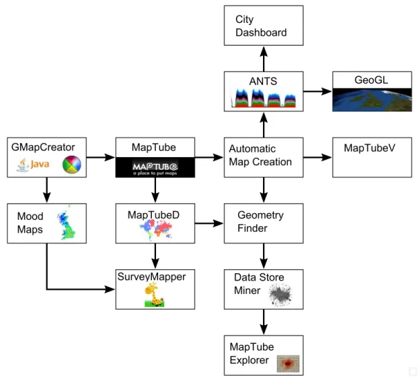
The diagram in figure 1.1 shows an overview of all the elements contributing to the work in this thesis:
GMapCreator MapTube MapTubeD SurveyMapper Mood Maps Automatic Map Creation MapTubeV Geometry Finder MapTube Explorer ANTS GeoGL City Dashboard Data Store Miner
Figure 1.1: Overview of projects contributing to this thesis. These projects link to the descriptions in the “Software” Chapter of the preface.
Starting with the GMapCreator, which was a Java application to create a working Google Maps site from data contained in a shapefile, this is the beginning of the tiled mapping technology. Shortly afterwards, the idea to use this to crowd-source maps was conceived and MapTube was built around the sharing of GMapCreator tile sets. In parallel with this, Prof. Andy Hudson-Smith created the idea of a ‘mood map’ and negotiated with Radio Four’s iPM programme for them to publicise an online ques-tion about the ‘Credit Crunch’ which built a map automatically from their viewers’ responses. The technology behind this was the GMapCreator, but it could only rebuild the map once every 30 minutes, so the MapTubeD dynamic tile rendering service filled this gap, providing a spin-off in the NeISS project called Survey Mapper, which was
an-other website built by Steven Gray for user-created online surveys. The MapTubeD tile renderer gave MapTube the ability to build maps automatically from spatial attribute data contained in CSV files with the inclusion of the automatic map generation code. In addition to this, the ‘Geometry Finder’ part of the MapTubeD code was separated and exposed as a web service with this and the automatic mapping code combining to form the basis for the ‘Datastore Miner’ project for making maps automatically from data in Internet data stores, leading to the map comparison and ‘MapTube Explorer’ projects which form a large part of this thesis. Following the other routes from the automatic mapping technology, ‘MapTubeV’ is a vector tiler which enables greater interactivity with web-based maps, taking a big step towards WebGIS. Real-time data visualisa-tion follows the final path via the ‘Adaptive Networks for complex Transport Systems’ project which I proposed, providing real-time transport data for another spin-off project called “CityDashboard”. Finally, the “GeoGL” project was developed solely for the real-time data processing and visualisation essential for this thesis, providing computa-tionally intensive agent-based modelling and analytics functionality on a virtual globe for quantities of data which could not be processed using the web based MapTube li-braries. Everything stated here is part of this thesis, apart from the SurveyMapper and CityDashboard projects which were developed by other researchers on separate grants. MapTube provides the map rendering infrastructure to SurveyMapper, while ANTS supplies bus and tube data to CityDashboard.
1.4
Timeline
As already stated in the preface, the work in this thesis was conducted while work-ing as a researcher on six different academic projects. The Equator project with UCL Computer Science is only mentioned as it contributed the papers I wrote on air qual-ity monitoring. Then, working for the Centre for Advanced Spatial Analysis (CASA), the GeoVUE, GenESiS, NeISS, Talisman, and ANTS FutureICT projects make sep-arate contributions. The web-based mapping work started with GeoVUE, continuing into GenESiS, and provided the foundation to the project proposal that made the JISC NeISS grant successful, delivering the first Census maps project and SurveyMapper. The NCRM Talisman grant was written around geospatial data mining, real-time city data and visualisation, building on what had been previously started with my data store mining project which began as an idea for a PhD topic while working on GenESiS.
1.4. Timeline 39
Real-time data completes the picture with the FutureICT funded project, ANTS, which I pitched as an idea at a funding meeting and worked on with three other researchers for two months, although all the code development is mine. A time-line of the development is shown in Table 1.1.
Table 1.1: Time-line of Work
2004 · · · •Equator project in UCL Computer Science. This is only mentioned for the papers on air quality which are referenced later.
2005 · · · •GeoVUE project starts in CASA.
2006 · · · •GMapCreator released for automatically building Google Maps websites from data in shapefiles.
2008 · · · •MapTube website released on 20th February at the Barbican Centre in London. The idea behind MapTube is to crowd-source geospatial data.
•GenESiS project starts in CASA.
•Mood Maps, volunteered geographic information project created by Prof. Andy Hudson-Smith and initially trialled on Radio Four’s iPM programme as a “Credit Crunch” question. This is the genesis of the mapping on demand technology.
•MapTubeD, MapTube Dynamic tile renderer. This was built to make the mood maps render immediately from fast changing data, but also has applications for automatic mapping on MapTube.
•Geometry Finder web service included as a spin-off from MapTubeD. This is a piece of infrastructure which allows automatic identification of the spatial context of data.
2010 · · · •Talisman project starts in CASA.
•Data Store Miner, first envisaged following the launch of the London Datastore in the same year. This takes the automatic mapping technology to a new level by mapping all the geospatial data on the website. Map comparisons with Census data follows on from this.
2011 · · · •GeoGL, virtual globe project for 3D rendering real-time data. Used for analysis of large amounts of real-time data not possible with the web based systems. 2012 · · · •ANTS, Adaptive Networks for complex Transport Systems project starts in CASA
(duration 3 months). Provides real-time transport data to other systems.
•CityDBAPI, data downloading and query API for real-time data which is used by other systems. Handles, transport data (via ANTS), cycle hire, weather and air quality data.
2016 · · · •MapTubeV, vector tiler for MapTube. Adds the ability to visualise ‘one-off’ model outputs.
•MapTubeExplorer, provides map comparisons between maps on MapTube where the geometry may not be identical. Built as an experimentation tool for map com-parison techniques.
∨
The audience for this work is split between web infrastructure for mapping and experimentation tools for researchers. The MapTube components are all web-based mapping, with this thesis presenting the theory behind the performance enhancements that make this work in practice. The end result is a system for casual users to find and explore geospatial data, and, hopefully, upload some of their own. The data store min-ing and MapTube Explorer projects are aimed at academic researchers as they address
the problem of how to get more out of web-based maps than simply visualisations of data. These projects come from the idea of handling sets of geospatial data together as a block, where comparisons can be performed between maps to find similarities. Neither project is designed as a fully working package, as, while they do work on the examples shown here, their worth is in showing the methodology which other researchers can pick up and modify to mine different data stores and perform other types of map com-parisons. The value in the code is the generalisation of the problem, so only a small percentage of code is needed to adapt them to a different problem.
Real-time data also falls into the infrastructure category due to the nature of the sys-tems involved. Different logins are needed to access the services for different sources of data. The result presented in this thesis is a system similar to TransportAPI 1, two years before TransportAPI launched. In fact, the ANTS project and subsequent devel-opments in this thesis put forward a more integrated approach to city scale data than just the transport system. This is aimed at researchers, providing simple access to data via an API which also feeds into other real-time visualisations of city data, for example,
http:\\citydashboard.org, the iPad wall installed in the London Mayor’s office in 2012 and an exhibit at the London Transport Museum, along with various other one-off exhi-bitions and conferences. The main aim with the real-time part of this thesis is to make it easier for researchers to access this type of data needed for research, by collecting everything in one place.
Chapter 2
Literature Review
The following chapter presents a brief overview of the literature relevant to this thesis.
2.1
Presentation of Geospatial Data
The first use of the term, “Choropleth” is by Wright in his 1938 article on population mapping [Wri38], although Tobler points out that the terms “Choropleth” and “Car-togram” were used interchangeably around that time [Tob04] and that the first use of choropleth maps is thought to be by Minard, although Wright was the first to use the name. The choropleth map uses coloured areas to represent data and is one of the most common forms of geographic data visualisation in use today. A good example are the political maps of election results, where coloured areas represent the easily identifiable colours of the political parties who won the majority of votes.
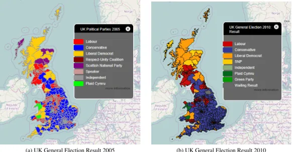
(a) UK General Election Result 2005 (b) UK General Election Result 2010
Figure 2.1: Two choropleth maps of the UK general election. The 2015 and 2017 results could be added to this sequence.
result for 2005 and 2010. Political parties in the UK have standardised colours, so the first problem with the choice of a representative set of map colours is eliminated. People viewing these maps should already be conditioned to accept that red is Labour and blue is Conservative, but this also highlights the main criticism of this type of choropleth. In 2005, red won a clear 50% majority, while in 2010, blue and yellow had to join together to form the required 50%. This is not immediately obvious from the map as the Parliamentary Constituency areas differ in size, giving more visual prominence to those with greater area. Techniques like hexagon maps [Hen10] can avoid this problem, but it is highly dependent on the data being displayed. In the case where the map is used to display outliers on a map that is mainly white, this problem can be turned into an advantage. Also, when displaying Census data, where areas have already been normalised to all contain approximately the same number of people, this might not be an issue.
Openshaw first coined the term, “Modifiable Areal Unit Problem”, or “MAUP” in his article, “The Modifiable Areal Unit Problem” [Ope84], even though the problem of zone aggregation in the correlations of U.S. Census statistics had been published as early as 1934 by Gehlke and Biehl [GB34]. Statistical effects caused by the choice of which electoral wards form the different Parliamentary Constituencies is used as an ex-ample by Openshaw, who comments on how the zonal aggregation choice in Camden can change the result. In his example, there are 520 Parliamentary Constituencies in 1983, but this has now increased to 650 in 2019, which is reflected in the two maps in figures 2.1a and 2.1b. Openshaw’s statement on page 7 of [Ope84] where he says, “the availability of fast super-computers opens up the possibility of seeking approximate numerical solutions” and his comments on “Monte Carlo optimisation methods” in the conclusion both relate to his analysis of MAUP as a combinatorial problem. Hennessy and Patterson state that, “...the highest-performance microprocessors of today outper-form the supercomputer of less than 10 years ago” [HP11, pp2], which needs to be taken in the context of the PDP370 that Openshaw was using in 1983 for his analysis. Current desktop computers are 3.5 decades removed from this, or more than 3 super-computer generations ahead. The graph of processor speeds that the authors use to justify this claim points to a 10,000 times increase in speed between 1983 and 2006. This is significant in the context of this thesis as the aim is to provide a next gener-ation of tools for geographers and spatial analysts to use. With the MAUP problem,
2.1. Presentation of Geospatial Data 43
this amounts to a sensitivity analysis to guard against any zoning bias in the results. Either on the desktop, or in the cloud, the compute power now exists to perform this type of analysis. However, the number of zones of interest has also gone up, often with models of the whole of the U.K. containing many thousands of zones in an attempt to combat edge effects. This is anO(n2)problem due to the combinatorial nature of the
zones, which suggests that compute speed is not keeping up with the requirements if it only increases linearly over time. A robust sensitivity analysis with largenis likely to require a degree of parallelism to compute in a reasonable time.
Presentation of map based data to humans is fraught with numerous difficulties linked to the perception of coloured data. In “ColorBrewer in Print: A Catalog of Color Schemes for Maps” [BHH03], Brewer studies how humans interpret data pre-sented on maps by asking volunteers to answer map-based questions with a variety of colour schemes and under different lighting conditions. This paper forms the basis of the “ColorBrewer” set of colours which is built into numerous GIS systems for example “GeoTools”, “QGIS” and “ArcGIS”.
Before drawing a choropleth map, though, the colour scale needs to be defined, in other words, how the data maps to a discrete set of colours.1 In the work by Brewer, [BHH03], she categorises the data according to three types: ‘sequential’, ‘diverging’ and ‘qualitative’. Sequential data is characterised by continuous real number values, for example a carbonmonoxide sensor value that varies from 0 parts per million upwards. Diverging data is where there is a natural break point, for example, male:female pop-ulation ratio where the break is at zero. Qualitative data is where the data fits a set of distinct classes where there is no ordering relationship, for example types of dwelling classified as detached, semi-detached or terraced.
In addition to the type of data being represented, the number of colours to use in the colour scale and the data breaks also need to be chosen. These are related in that there must be enough colours for the number of breaks chosen, but how the data breaks are distributed over the range of the data is also required. Firstly, though, the question of how many breaks to use must be answered. In “Comparing continuity and compactness of choropleth map classes” [Cal18], Calka analyses six different methods of classifica-tion breaks, identifying the strengths and weaknesses of each. In particular, the inclu-sion of “Head-tail Breaks” for data that is “not normally distributed” is potentially
in-1The colours in the scale could also be defined continuously, for example a linear transition between blue and red based on
teresting when working with scale-free network data. The remainder of the breaks clas-sifications are: Equal Intervals, Quantile, Standard Deviation, Natural Breaks (Jenks) and Geometric Intervals. In addition to this, there is a review of “goodness of fit” measures, including Jenks’ own assessment criteria for his natural breaks classification first published in “Optimal Data Classification for Choropleth Maps” [Jen77]. The pa-per concludes with examples of population density in Poland, measuring the “Tabular Accuracy Index” (TAI) with reference to two new index methods, “Spatial Distance Index” (SDI) and “Spatial Contiguity Index” (SCI). The conclusion made here is that, “depending on the selection of class ranges in mapping population density, rural areas can be made prominent or the focus can be directed at urban areas with small, medium and large town and cities”.
In light of these issues with the visual perception of maps, none of the data store mining (section 4.4.2) or map comparison (section 5.2) actually visualises any maps, though. The only visualisation is as a first guess for humans, which can then be altered. All the map comparisons and data store mining presented in this thesis is visualisation agnostic. All the data is machine to machine, up to the point where a human sees a meta-visualisation of the map comparisons e.g. a graph of linkage.
2.2
Agent-based Modelling for Real-time Data
Chapter 6, “Real-time Mapping and Agent Simulations” uses the technique of agent-based modelling to construct models of real-time transport networks. Crooks and Hep-penstall provide an introduction to agent-based modelling in “Agent-Based Models of Geographical Systems” [Hep+12, Ch5], including geographical systems. Epstein and Parker used agents in a simulation of the global dynamics of disease propagation, which is notable for its use of one agent for every person alive in the real world [PE12] and [EP09]. While this example simulates millions of agents using a custom application, “FlameGPU” [She19] is a GPU implementation of a large-scale agent based modelling library. Similarly, the commercial company “Improbable” also market their “Spatia-lOS” [Imp18], which is targeted at large-scale agent-based modelling for the computer games industry, being based around the “Unity framework” and load-balancing agents on grids using cloud computing. The issue of asynchronous simulations, ordering of operations and conflict resolution needs to be handled. Richmond uses a system of serial transaction processes to mitigate conflicts in “Resolving Conflicts between
Mul-2.3. Analysing Tube and Bus Strikes 45
tiple Competing Agents in Parallel Simulations” [Ric14], thereby solving the problem for his computation of agents on a regular grid structure. Here, the problem is where agents move from one grid to the next as parallel processes could result in two agents moving to the same grid cell, which is not allowed. The solution involves detect-ing where conflicts occur and usdetect-ing a priority orderdetect-ing scheme to repeat the decision process for a lower priority agent that attempts to move onto a grid cell about to be occupied by a higher priority agent. The author makes the point that the performance of the implementation is dependent on the application2and the number of conflicts that occur in what is a transactional based solution.
A more general introduction to the process of modelling can be found in Wilensky and Rand’s “Making Models Match: Replicating an Agent-Based Model” [WR07]. Here, the authors put forward the case for “replication” in models, citing agent-based models used in scientific papers that have never been replicated outside of the original publication. The document can be seen as a set of “best practices” for model authors, designed to ensure the replicability of the models by other researchers using different computer languages, systems and practices. The key point they make is that the rules behind the model should be explicit and open to scrutiny.
The research presented in Chapter 6 outlines an agent-based model of the London Underground and the London bus network. This was influenced by Rand’s work, “Ma-chine learning meets agent-based modeling: When not to go to a bar” [Ran06]. He suggests the idea of learning the rules of the model by observing a running system, an idea which is adapted to “learn” the operation of the London Underground by observing the data available on the real-time stream.
2.3
Analysing Tube and Bus Strikes
In chapter 8 the analysis of bus and tube strikes is used as a worked example to show the general usefulness of the real-time software developed to that point. The London Underground is used as an example by D’Lima and Medda in “A new measure of re-silience: An application to the London Underground” [DM15], where the resilience of the system to shocks is investigated. They adopt the measure of, “the speed at which a system returns to equilibrium after a disturbance away from equilibrium”, us-ing data from the real-time stream on tube positions, along with passenger flow data.
2The application used for the demonstration is Epstein and Axtell’s “Sugarscape” example in their book,Growing Artificial