Smart City data stream visualization using Glyphs
F´elix Jes´us Villanueva, Cesar Aguirre, David Villa, Maria Jos´e Santofimia, Juan Carlos L´opez Department of Information Technologies and Systems
School of Computer Science Ciudad Real, Spain
{felix.villanueva, cesar.aguirre, david.villa, mariajose.santofimia, juancarlos.lopez}@uclm.es
Abstract—Real-time data stream visualization is a challenge in multiple application fields of Smart Cities. Examples of these streams are traffic, pollution, social media activity, citizens dynamic, etc. which show us what, where and when is happening in the city. The purpose of this paper is to apply different types of glyphs for showing real-time stream evolution of data gathered in the city. The use of glyphs is intended to make the most out human capability for outperforming in detecting visual patterns.
Keywords-Smart City, real-time data stream visualization, visualization patterns, instinctive computing.
I. INTRODUCTION
Visualization is the study of the transformation, from data to visual representations, intended to develop effective and efficient cognitive processes to gain insight into that data [1]. Precisely, one of the main issues in smart city develop-ment is to transform the great amount of data streams into information and finally, into strategic and tactical decisions. In a close future, data streams coming from different sources (energy metering, pollution monitoring, mobility, social me-dia, etc.) will provide information in real-time about what is happening and where is it taking place in any smart city of the world.
Analyzing all these data flows represents a big challenge partially addressed by the Big Data paradigm. However, despite producing useful gathered from raw-data provided by sensors, citizen’s smart phones, etc., Big Data fails when unusual circumstances take place. In other words, Big Data can only find what it was originally designed for.
Currently, only human mind can successfully infer new information from raw-data where something unusual is occurring, and only when this raw-data is showed in an appropriate manner. As stated in [2], the way how people perceive and interact with a visualization tool can strongly influence their data understanding as well as the system’s usefulness.
This work is inspired in the Instinctive Computing term developed by Yang Cai [3] and defined as a computational simulation of biological and cognitive instincts. In this work, as it will be exposed later on, we adapt real-time streaming from smart city to help identifying anomalous patterns in such streams.
Our main motivation is to provide an effective visual-ization tool for assessing, in a day to day environment, tactical decisions under the smart city application field. For achieving this goal, we will use the excellent capacity of the human brain to identify visual patterns even under complex scenarios.
Summarily, two are the main contributions of this paper: first, this work proposes a visualization method for real-time data streams using glyphs; and second, this work also pro-poses an object-oriented architecture complying with all the needs of the considered visualization paradigm, including scalability, modularity, etc.
The remainder of this article is organized as follows. Next section describes the state of art in data stream visualization and it also establishes a set of requirements for an appropri-ate visualization method. Section IV thoroughly describes the proposed architecture along with interface specification and data management. Finally, last section describes some of the most relevant aspects of the implemented prototype along with the main conclusions drawn for this work.
II. PREVIOUS WORK
If we analyze current or ongoing methods for monitoring a city, one may find out that most of them are carried out with a forensic perspective. For example, Security cameras are useful, apart from their dissuasion effect, for analyzing the records of an event after it has concluded (figure 1). Pollution-sensor monitoring networks provide with a set of parameters recorded to be analyzed with statistical graphics. Statistical graphics very often summarize very well the historical data but they are more oriented to strategic de-cisions, most of the time showing only two variables. For example, if we want to see the temperature evolution we can show a graphic with the evolution temperature over time. It is easy to elaborate real-time heat maps of the smart city and even programming alerts and warnings according to the temperature evolution.
For geo-localized streaming data, ”heat” maps represents a very common visualization technique, an example of this type of maps is showed in [5] for urban noise. Combining 3D and heat maps also provide a good visualization tool when visualizing one variable. An example of this technique is showed, for urban air pollution, in [6].
Figure 1. CCTV surveillance cameras flood our cities (pictures from mylondonpics.com and [4])
When we have more than two variables to consider and specially if the variables are correlated, 2D graphics are no so useful and 3D graphics also have their limitations. Sometimes if we want to identify a pattern in some real-time stream, the current visualization techniques are very limited. Basically, if we want know the status of traffic flow in a street, a sensor can be deployed in order to detect velocity and separation between cars (e.g. number of vehicles per minute). The more velocity and separation between vehicles, the less collapsed is the street. However, according to the type of the street, the time of the day, the day of the week, etc. a traffic flow can be normal or abnormal.
The cognitive capacity of human being to detect visual patterns and visual shapes are far too complex to be emulated by machines. In the present work we want to improve the use of such capacity in detecting abnormal situations in the smart city.
III. DATA VISUALIZATION
Figure 2 shows the composition of a glyph devoted to represent pollution monitoring. Each variable represented in this graphic is associated to a part of the glyph or lobe with its own scale. The glyph adopts a different form accordingly to the values metered by pollution sensors. The main purpose of this work is to detect abnormal situations even when the surveillance worker does not have specific training. Effectively, as we can appreciate in figure 3, our mind detects easily the different shapes between a mosaic of glyphs in which a dissonant form appears. This is important because
Figure 2. Example of a glyph composition for pollution monitoring
Figure 3. Anomaly in pollution monitoring
detecting an abnormal situation is the first step facing it. The shape of the glyph has been chosen according to the type of data stream and variables involved in such stream. In this paper, we are going to use an asterisk as example of glyph due its simplicity. However, a research in depth is necessary to study which glyph is more appropriate to each data stream.
According to the features of the data stream, we can ”attach” specific glyphs, for example, in the position where the data stream is generated if the data stream is geo-located. There are more similar features to be analyzed:
• Geo-located: Most information requires to be geo-located in order to be useful. For example, traffic flow sensors provide information about velocity and distance between cars at specific points in the smart city. • Granularity: what area represents the data stream shown
through a specific glyph. Some data streams are rep-resentative of small areas whereas other types can represent the whole smart cities.
• Glyph arithmetic: glyph operations need further re-search in order to explore whether a set of operations could be representative of some city phenomenon. • Privacy: probably one of the key issues in smart cities is
privacy of data involved in different processes. Privacy is out of scope of this paper, however, we would like
to point out that data stream distribution is sensible information so the platform should take care about who, when and how is accessing information.
In table I we analyze some of the candidate data streams for our visualization framework. We identify three main sources of information in a smart city, as they are citizens, companies and government, however, as the reader can see, we can fine-tune sources to streets, buildings, etc.
IV. THEARCHITECTURE
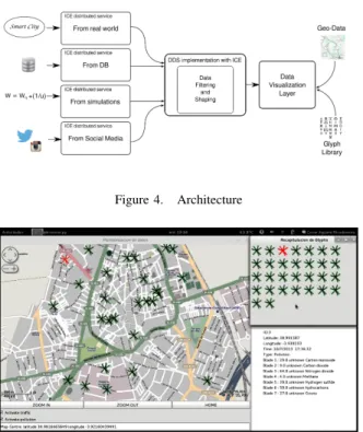
The architecture devoted to support this way of visualiza-tion is showed in Figure 4. Our research project has four main sources of data streams:
• From simulations: We can generate data from simula-tions in order to test the architecture, to explore the evolution/propagation of different parameters, to test different types of glyph or to see the most suitable for analyzing such data stream, etc.
• From databases: Similarly to data streams from sim-ulations, we are using this source of data streams for studying how glyph take different forms according to different data streams recorded. From these records, we are more interested in records with abnormal behaviors in order to see what type of form adopts the glyph. • From sensors: This is the final source of information
and the main purpose of our architecture. Distributed in the smart city, real sensors will provide with data streams related with different physical parameters. We also collect information about logical sensors devoted to get information from different sources. For example, credit-card reader could be an excellent logical sensor, with an appropriate anonimization layer, to analyze and to study economic activity. The surveillance video-cameras are providing real-time information about the number of citizen, the dynamic of the city, traffic, etc., the challenge is to develop algorithms to extract such information.
• From social media: Lately, social media has become an interesting source of information. We believe that we can extract useful data streams for providing valuable information about what is happening in the city at each moment in time and in real-time. For example, the use of hastags associated with a city attached to the messages in Twitter can provide us with a valuable information about events, incidents, etc., in real time. We are modeling the architecture as a service-oriented distributed platform inside Civitas [7]. Civitas is specially devoted to support the service development process for the Smart City paradigm providing, among other mechanisms, methods for integrating devices ranging from small footprint devices to flexible hardware devices (e.g. FPGA) and a set of standards and tools that can be the backbone of the future smart city ecosystems.
So following Civitas design principles, each flow in our platform is an Internet Communication Engine (Ice) service [8], Ice is an object-oriented middleware designed for massive distributed systems. Some issues related with highly distributed systems are mitigated starting from this framework. For example, IceGrid is a location and activation service easing software management. Similar to IceGrid, IceBox makes easy software distribution, deployment and configuration and security issues are also considered using SSL connections.
We agree that the most successful visualization libraries to date have made it easy for programmers to develop and maintain algorithms that work on many data [9]. Our vision layer can be provided, as we will see in the next session, as a Ice service or as a programming library.
A. Vision layer
Every entity in Civitas exposes its functionality as a set of methods regardless its nature. According to this design guideline, our vision layer is composed of a set of distributed services offered to data streams sources. Every distributed service presents an specialized interface for the data stream. In the following lines of code we can see a simplification of the pollution interface:
module P o l l u t i o n { s t r u c t Coord { d o u b l e l a t i t u d e ; d o u b l e l o n g i t u d e ; d o u b l e a l t i t u d e ; }; s t r u c t Gas { l o n g s e n s o r I D ; l o n g t i m e s t a m p ; Coord p o i n t ; d o u b l e CO ; d o u b l e CO2 ; d o u b l e NO2 ; d o u b l e CH4 ; }; i n t e r f a c e P o l l u t i o n L i s t e n e r { v o i d r e p o r t ( Gas m ) ; }; };
The service supporting that interface draws a glyph ac-cording to each received report. In the current implementa-tion, a Gnome/GTK visualization tool shows the data stream received as we can see in the figure 5. Over a map from OpenStreetMap project [10] the pollution service paints and update the glyph associated to each stream identified by a sensorID. Every sensor update its glyph invoking the method report which is possible because every deployed sensor implements a low-footprint version of the Ice middleware developed in our previous work [11].
We define also a federation mechanism to distribute the data stream to several sinks of visualization in a broker-like
source type variables source type variables
citizen e-health heart rate, blood pressure, temper-ature
companies financial billing, expenses citizen dynamic velocity, distance, transport companies transport frequency, passengers government energy power, intensity, phase companies energy power, intensity, phase citizen financial number of operations, amount, type
of expenses
companies water volume per second, amount citizen food consumption type, branch, amount.. government pollution carbon, oxygen, nitrogen
buildings energy consumption power, intensity, phase streets traffic intensity, velocity, separation between cars citizen social media intensity of the activity, location companies social media intensity of the activity, location
Table I
DATA STREAM CHARACTERIZATION
Figure 4. Architecture
Figure 5. Screenshot of the demo app visualizing pollution related glyphs
behavior. We can see the PollutionAdmin interface:
i n t e r f a c e P o l l u t i o n A d m i n{
v o i d a d d L i s t e n e r ( P o l l u t i o n L i s t e n e r∗ l s t ) ; v o i d r e m o v e L i s t e n e r ( P o l l u t i o n L i s t e n e r∗ l s t ) ;
};
By using PollutionAdmin interface, any update in a ser-vice should be communicated to all serser-vices subscribed in-voking the methodreportwith the new data. With this mech-anism we also enable a powerful and flexible mechmech-anism for information federation, filter, processing, composition, etc.
In figure 5, the main frame represents the map, the right lateral frame is divided into two parts. In the top we can see all glyphs together forming a mosaic to detect anomalies meanwhile in the botton we see specific values of a selected glyph, which is highlighted in red in both frames, the map
Figure 6. Glyphs associate with different states of traffic flow
and the mosaic. We are also working now on developing an HTML5-based interface with websockets to have a multi-screen interface.
Finally, our current effort is to periodically match the form adopted by a glyph at a specific moment in time to a set of forms adopted by the same glyph associated with specific states of the data stream. Let’s take an example with a glyph associated with a data stream of traffic flow in a street involving velocity and separation between cars. We can identify several states of the traffic flow (fast, fluent, slow, traffic jam, etc.) with a specific glyph form (figure 6). Then, we use libraries (the libraries used for recognizing handwritten symbols works fine) to match what is happening in a street, or in other words, what form is taking its glyph and what form from recorded data set look like the current
glyph form so we can extract complex states even if the current glyph does not exactly match to any of the previously stored glyphs.
V. CONCLUSION
In this paper, an ongoing work about a framework for data stream information visualization has been presented. Our intention is to assist in visualization of anomalies in data streams. According to [1], massive parallelism and data reduction techniques are two of the main challenges for visualization software for the upcoming years. With our architecture, these two challenges are tackled by developing highly scalable distributed services for representing data streams using glyphs. In our domain, a glyph can be defined as a data reduction technique which uses the human capacity to detect visual patterns.
Our first prototype is going to help us choosing the most appropriate form of glyph according to each type of data stream. This next step would be done interviewing different users as citizens, police officers, firefighters, etc., to analyze the data streams in their domain and to study which glyph is more appropriate for them.
Also as future work, we know that the human factor can be a weak link in a monitoring environment so we are working in different automatic methods of analyze glyph forms. One of the most interesting approaches is to train an automatic optical character recognition (OCR) software to detect specific forms of glyphs associated with specific phenomenons in the smart city.
ACKNOWLEDGMENT
This research was supported by the Spanish Ministry of Economy and Competitiveness under the project DREAMS (TEC2011-28666-C04-03).
REFERENCES
[1] T. Rhyne and M. Chen, “Cutting-edge research in visualiza-tion,”Computer, vol. 46, no. 5, pp. 22–24, May 2013. [2] M. Tory and T. Mller, “Human factors in visualization
re-search,” IEEE Transactions on Visualization and Computer Graphics, vol. 10, pp. 72–84, 2004.
[3] Y. Cai, “Instinctive computing,” inArtifical Intelligence for Human Computing, ser. Lecture Notes in Computer Science. Springer Berlin Heidelberg, 2007, vol. 4451, pp. 17–46. [4] S. C. Blog, “Video ’must haves’ for active surveillance,”
http://security.americandynamics.net/.
[5] H. K. Park, Y. W. Lee, S. I. Jang, and I. P. Lee, “Online visualization of urban noise in ubiquitous-city middleware,” inAdvanced Communication Technology (ICACT), 2010 The 12th International Conference on, vol. 1, Feb 2010, pp. 268– 271.
[6] J. W. Park, C. H. Yun, H.-S. Jung, and Y.-W. Lee, “Visualiza-tion of urban air pollu“Visualiza-tion with cloud computing,” inServices (SERVICES), 2011 IEEE World Congress on, July 2011, pp. 578–583.
[7] F. Villanueva, M. Santofimia, D. Villa, J. Barba, and J. Lopez, “Civitas: The smart city middleware, from sensors to big data,” in Innovative Mobile and Internet Services in Ubiq-uitous Computing (IMIS), 2013 Seventh International Con-ference on, July 2013, pp. 445–450.
[8] M. Henning, “A new approach to object-oriented middle-ware,” IEEE Internet Computing, vol. 8, no. 1, pp. 66–75, 2004.
[9] H. Childs, B. Geveci, W. Schroeder, J. Meredith, K. More-land, C. Sewell, T. Kuhlen, and E. Bethel, “Research chal-lenges for visualization software,” Computer, vol. 46, no. 5, pp. 34–42, May 2013.
[10] M. M. Haklay and P. Weber, “Openstreetmap: User-generated street maps,” IEEE Pervasive Computing, vol. 7, no. 4, pp. 12–18, Oct. 2008. [Online]. Available: http://dx.doi.org/10.1109/MPRV.2008.80
[11] F. Moya, D. Villa, F. J. Villanueva, J. Barba, F. Rincn, and J. C. Lpez, “Embedding standard distributed object-oriented middlewares in wireless sensor networks,”Wireless Communications and Mobile Computing, vol. 9, no. 3, pp. 335–345, 2009. [Online]. Available: http://dx.doi.org/10.1002/wcm.545
![Figure 1. CCTV surveillance cameras flood our cities (pictures from mylondonpics.com and [4])](https://thumb-us.123doks.com/thumbv2/123dok_us/907984.2617043/2.918.107.415.110.466/figure-cctv-surveillance-cameras-flood-cities-pictures-mylondonpics.webp)