Title : A visual analytics approach for visualisation and
knowledge discovery from time-varying personal life data
Name
Farzad Parvinzamir
This is a digitised version of a dissertation submitted to the University of
Bedfordshire.
It is available to view only.
This item is subject to copyright.
A Visual Analytics Approach for
Visualisation and Knowledge Discovery from
Time-varying Personal Life Data
by
Farzad Parvinzamir
in the
Centre for Visualisation and Data Analytics
A thesis submitted to the University of Bedfordshire, in fulfilment of the requirements for the degree of Doctor of Philosophy
“The greatest value of a picture is when it forces us to notice what we
never expected to see.”
A Visual Analytics Approach for Visualisation and Knowledge Discovery from Time-varying Personal Life Data
Farzad Parvinzamir
Abstract
Today, the importance of big data from lifestyles and work activities has been the focus of much research. At the same time, advances in modern sensor technologies have enabled self-logging of a significant number of daily activities and movements. Lifestyle logging produces a wide variety of personal data along the lifespan of individuals, including locations, movements, travel distance, step counts and the like, and can be useful in many areas such as healthcare, personal life management, memory recall, and socialisation.
However, the amount of obtainable personal life logging data has enormously increased and stands in need of effective processing, analysis, and visualisation to provide hidden insights owing to the lack of semantic information (particularly in spatiotemporal data), complexity, large volume of trivial records, and absence of effective information visualisation on a large scale. Meanwhile, new technologies such as visual analytics have emerged with great potential in data mining and visualisation to overcome the challenges in handling such data and to support individuals in many aspects of their life. Thus, this thesis contemplates the importance of scalability and conducts a compre-hensive investigation into visual analytics and its impact on the process of knowledge discovery from the European Commission project MyHealthAvatar at the Centre for Visualisation and Data Analytics by actively involving individuals in order to establish a credible reasoning and effectual interactive visualisation of such multivariate data with particular focus on lifestyle and personal events.
To this end, this work widely reviews the foremost existing work on data mining (with the particular focus on semantic enrichment and ranking), data visualisation (of time-oriented, personal, and spatiotemporal data), and methodical evaluations of such approaches. Subsequently, a novel automated place annotation is introduced with multi-level probabilistic latent semantic analysis to automatically attach relevant information to the collected personal spatiotemporal data with low or no semantic information in order to address the inadequate information, which is essential for the process of knowledge discovery. Correspondingly, a multi-significance event ranking model is introduced by involving a number of factors as well as individuals’ preferences, which can influence the result within the process of analysis towards credible and high-quality knowledge discovery. The data mining models are assessed in terms of accurateness and performance. The results showed that both models are highly capable of enriching the raw data and providing significant events based on user preferences.
An interactive visualisation is also designed and implemented including a set of novel visual components significantly based upon human perception and attentiveness to
the goal of this thesis.
Lastly, three integrated visual analytics tools (platforms) are designed and implemented in order to demonstrate how the data mining models and interactive visualisation can be exploited to support different aspects of personal life, such as lifestyle, life pattern, and memory recall (reminiscence). The result of the evaluation for the three integrated visual analytics tools showed that this visual analytics approach can deliver a remarkable experience in gaining knowledge and supporting the users’ life in certain aspects.
Contents
Abstract v
List of Figures xi
List of Tables xvii
List of Algorithms xix
List of Snippets xxi
List of Publications xxi
Declaration xxv Acknowledgements xxvii 1 Introduction 1 1.1 Background . . . 3 1.1.1 Data mining . . . 4 1.1.2 Data visualisation . . . 5 1.1.3 Human interaction . . . 6
1.2 Motivation of this Work . . . 7
1.3 Research Questions . . . 9
1.4 Aim and Objectives . . . 10
1.5 Scope and Limitation . . . 11
1.6 Contributions . . . 13
1.7 Definitions. . . 14
1.8 Thesis Outline . . . 16
2 Literature Review 19
2.1 Introduction. . . 20
2.2 Data and Knowledge Mining . . . 21
2.2.1 Place annotation . . . 21
2.2.2 Event detection and ranking . . . 28
2.3 Data Visualisation . . . 32
2.3.1 Visual information theory . . . 32
2.3.1.1 Human cognition model . . . 33
2.3.1.2 Visualisation modes . . . 35
2.3.1.3 Visualisation types. . . 36
2.3.2 Time-oriented data visualisation . . . 37
2.3.3 Personal data visualisation . . . 48
2.3.4 Spatiotemporal visual analytics . . . 57
2.4 Evaluation in Visual Analytics . . . 59
2.4.1 Evaluation scope . . . 60
2.4.2 Evaluation methods . . . 60
2.5 Chapter Summary . . . 62
3 Research Methodology 65 3.1 Data Acquisition . . . 65
3.1.1 Potential sources of personal data . . . 66
3.1.2 Personal daily life data. . . 69
3.1.3 Participants . . . 70
3.2 Literature Review and Investigation . . . 71
3.3 Design and Prototyping . . . 72
3.4 Visual Analytics Tools (Platforms) . . . 74
3.4.1 Implementation . . . 74
3.5 Evaluation. . . 75
3.5.1 Data collection . . . 76
3.5.2 Evaluation stages . . . 77
3.5.2.1 Data mining models . . . 77
3.5.2.2 Visualisation design . . . 77
3.5.2.3 Visual analytics tools (platforms) . . . 78
3.5.3 Analysis of collected data . . . 79
3.6 Chapter Summary . . . 80
4 An Automated Place Annotation with Latent Semantic Analysis 81 4.1 Introduction. . . 81
4.2 Challenges and Obstacles . . . 84
4.3 Automated place annotation model . . . 86
4.3.1 Data preparation . . . 91
4.3.2 User profile . . . 92
4.3.3 Retrieve Points of Interest . . . 96
4.3.4 The multi-level place annotation . . . 98
CONTENTS ix
4.5 Chapter Summary . . . 113
5 A Multi-Significance Event Ranking Model 115 5.1 Introduction. . . 115
5.2 Event Detection Model. . . 117
5.2.1 Data pre-processing . . . 117
5.2.2 Event extraction . . . 119
5.3 Event Ranking Model . . . 120
5.4 Evaluation and Benchmark . . . 127
5.5 Chapter Summary . . . 131
6 Visualisation Design Components 135 6.1 Introduction. . . 135
6.2 Design Goals and Requirements . . . 136
6.3 Visual Encoding . . . 139
6.3.1 Visualisation components . . . 145
6.3.2 User interface (UI) . . . 168
6.4 Design Evaluation . . . 176
6.4.1 Colour scheme and highlighting . . . 176
6.4.2 Glyphs. . . 177
6.4.3 Multi-layered timeline . . . 178
6.4.4 Smart legend . . . 178
6.4.5 Tooltip . . . 180
6.4.6 Circular-based layout . . . 180
6.4.7 24-hour event visualisation . . . 181
6.4.8 Bubble chart . . . 183
6.4.9 Storyline . . . 184
6.5 Chapter Summary . . . 185
7 Integrated Visual Analytics Tools – Platforms 187 7.1 ActivityTimeline . . . 188
7.1.1 Introduction . . . 188
7.1.2 Interactive visualisation . . . 189
7.1.3 Evaluation . . . 195
7.1.3.1 Methodology and procedure . . . 195
7.1.4 Result Analysis and Discussion . . . 196
7.2 Visualisation for Life Pattern (LifeTracker) . . . 199
7.2.1 Introduction . . . 199
7.2.2 Summary of related work . . . 201
7.2.3 System overview . . . 201
7.2.4 Data Analysis. . . 203
7.2.5 Interactive Visualisation . . . 204
7.2.6 Evaluation . . . 209
7.2.6.1 Methodology and procedure . . . 210
7.2.7.1 Accuracy . . . 212
7.2.7.2 Time performance . . . 214
7.2.7.3 Usability . . . 215
7.2.7.4 Limitations and future work . . . 216
7.3 Visualisation for Reminiscence (MyEvents) . . . 219
7.3.1 Introduction . . . 220
7.3.2 Summary of related works . . . 223
7.3.3 Definition and data. . . 225
7.3.4 Design goals and requirements . . . 226
7.3.5 System overview . . . 230
7.3.6 User interface . . . 231
7.3.7 Interaction . . . 239
7.3.8 The mRank Event Ranking Model . . . 242
7.3.9 Evaluation . . . 243
7.3.9.1 Methodology and procedure . . . 244
7.3.9.2 Results . . . 247
7.3.10 Result Analysis and Discussion . . . 257
7.3.10.1 Recall and individual reminiscence . . . 259
7.3.10.2 Selection subjectivity (G1) . . . 259
7.3.10.3 Event familiarity (G2) . . . 262
7.3.10.4 Limitations and future work . . . 263
7.4 Chapter Summary . . . 264
8 Conclusions and Future Work 267 8.1 Thesis Summary and Contributions. . . 268
8.2 Reviewing Research Questions . . . 272
8.3 Future Work . . . 274
A Supplementary Materials – Questionnaires 277 B Supplementary Materials – Evaluation Results 285 C Pseudo Codes 291 C.1 Automated place annotation pseudo code . . . 291
C.2 Significance ranking pseudo code . . . 302
List of Figures
1.1 The seminal Visual Analytics framework by Keim et al. [113] . . . 2
1.2 Visual Analytics process for knowledge discovery by Kohlhammer et al. [118, pg. 118] . . . 4
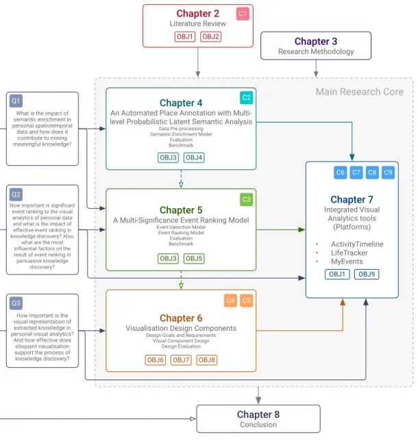
1.3 The structure of this thesis. The research questions are shown with Q, objectives with OBJ, and contribution with C. . . 17
2.1 How the Spinsanti et al. [196] approach works . . . 26
2.2 Last history [25] interface with the colour coded circle depending on the genre and various sizes related to the personal relevance of the song . . 30
2.3 The representation of the streamed songs over the course of a day on the timeline by using different size of stacked dots [60] . . . 31
2.4 Flow map [233] to visualise the dynamics of London’s bicycle hire scheme by indicating the significance with weighted lines . . . 32
2.5 Improved visualisation model with higher cognition by Green et al. [86] 34
2.6 The structure of time defined by Frank [78] . . . 39
2.7 General example of spiral layout [42] . . . 40
2.8 Example of 24-hour spiral layout by Weber et al. [221] . . . 40
2.9 The visualisation uses hours and days to display the power consumption of the Energy Research Centre of the Netherlands (ECN) by Van Wijk and Van Selow [211] . . . 41
2.10 Calendar shows the clusters by distinct colours on the left and patterns on the right with the same colour scheme [211] . . . 42
2.11 TheMail visualisation [214] presents how the particular relationship moves forwards, here, by showing the most frequent words in emails that the user has exchanged with a friend over a period of 18 months. Interaction shows the original email in which the selected keyword has been mentioned. The circle size indicates the length of the email while the colour shows the direction (incoming or outgoing). . . 43
2.12 PatternFinder shows the result of the visual query made by the user. Each line shows a pattern of the patient matched with the query. All the other events which took place in that day are shown by grey slabs followed by the number of events. Interaction provides more details about the events. Note that there is no intensity or any kind of visual encoding
employed to emphasise severity of the patient’s condition [71]. . . 44
2.13 Euler’s life timeline (re-drawn) inspired by this technique . . . 45
2.14 LifeFlow interface shows the sample patient medical data [232] . . . 46
2.15 DecisionFlow interface to analyse the medical data [85]. . . 47
2.16 OutFlow [231] shows the aggregation of a cohort of patients including temporal event data . . . 47
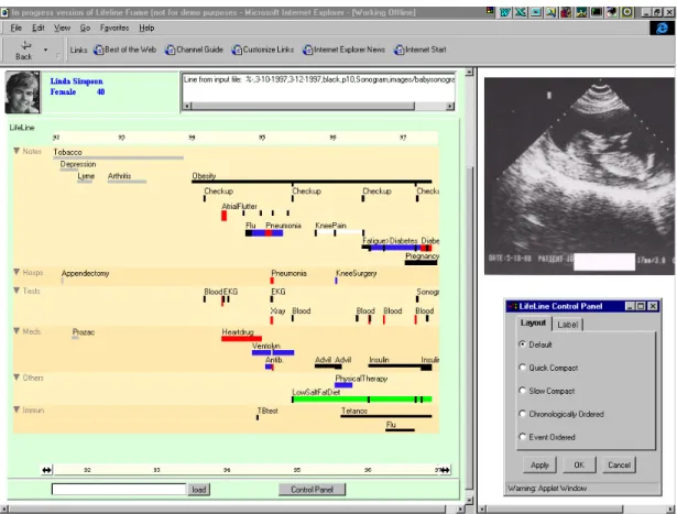
2.17 LifeLine multiple-view interface demonstrates the patient’s medical records on the timeline in several facets with the facilities to zoom and filter. Source: [163] . . . 50
2.18 In LifeLine2 all records are aligned by the first occurrence of the radiology contrast. This feature facilitates comparison as well as determining the diagnosis within the defined days. Ranking, filtering and showing the distribution help to gain better understanding of multiple data. Source: [162] . . . 51
2.19 Stream of Our Lives [25] interface shows its interaction ability. . . 52
2.20 AppInsight [23] interface that shows computer usage over the time . . . 54
2.21 Dias et al. [60] technique uses multi-faceted visualisation to provide statistical or factual information along with the facility to filter and see the result interactively. . . 56
2.22 Visual Mementos [204] main interface with a number of circular maps over the timeline showing the trip history . . . 57
2.23 A temporal view to envisage the temporal daily pattern; Visualisation of frequent destinations including clusters, routes, and POIs on the top [119]. 58 2.24 Cyclist’s commuting journey in London. Flow lines appear with calculated journey frequency weight [26]. . . 59
3.1 Research methodology application . . . 66
3.2 Potential sources of data and their corresponding devices . . . 67
3.3 Two types of participants for the evaluation in this research . . . 72
4.1 Automated place annotation architecture . . . 88
4.2 The result of annotating the unknown place (red marker on the map) compare to the real place (green marker) by using the automated place annotation. . . 90
4.3 The hierarchical category provided by the Foursquare POI service. . . . 97
4.4 The result of the multi-level annotation evaluation . . . 109
4.5 The overall accuracy of the multi-level annotation . . . 109
4.6 A benchmark result of the annotation model and its components with a logarithmic scale time . . . 110
LIST OF FIGURES xiii
4.8 The effect of increasing the data points on each component of the
auto-mated place annotation . . . 111
4.9 The efficiency of the implemented algorithm in JavaScript based on the iterations per second.. . . 112
5.1 The multi-significance ranking model overview . . . 116
5.2 Flowchart for data cleaning and filtering . . . 118
5.3 Data processing time complexity and performance including the data cleaning and event extraction . . . 129
5.4 Multi-significance ranking model time complexity and performance . . . 130
5.5 Efficiency of the data processing and multi-significance ranking model based on operations per second . . . 130
5.6 The accuracy of the results from the multi-significance ranking model . 131 5.7 The quality of the results from the multi-significance ranking model in detail . . . 132
6.1 Preattentive process example . . . 140
6.2 Preattentive features used within the process of visualisation in this research141 6.3 The four-colour scheme selected for the user study in this implementation, with application of different intensities and opacities . . . 142
6.4 The set of 10 distinct colours against the dark and bright backgrounds . 142 6.5 The colour scheme used in this implementation . . . 143
6.6 Highlighting process using motion, line, and opacity . . . 144
6.7 Glyphs designed to reflect the movement and place categories . . . 145
6.8 Multi-layered timeline structure . . . 146
6.9 General structure of the storyline and a real-world example . . . 148
6.10 Two potential circular layouts to visualise the information . . . 149
6.11 Two different circular layouts for representing daily activities . . . 150
6.12 Structure of the circular layout . . . 152
6.13 The circular-based layout shows daily activities by employing the colours and glyphs . . . 152
6.14 Example of representing the events via a line in a 24-hour grid-based layout.154 6.15 Representation of the temporal data via line and circle individually . . . 155
6.16 An event is shown as a circle. The circle’s centre point along the y-axis is half of the length (start and end times). The position on the x-axis is according to the date. . . 156
6.17 Grid design of 24-hour event representation . . . 159
6.18 Bubble chart structure and a visualisation of real daily life data . . . 160
6.19 Linear bubble chart with colour accumulation technique . . . 161
6.20 Visualisation of the statistical analysis results . . . 163
6.21 Different static legends that are used in visualising data . . . 164
6.22 Static and dynamic legend differences . . . 164
6.23 Dynamic legend with the colour-coded categories, different heights to show the influence of each category, badges, and a list of the included subset . . . 165
6.24 Tooltip layout design for three different purposes . . . 167
6.25 Different set of layouts with respect to the design principles and requirements171 6.26 Search box appearance and functionality . . . 173
6.27 Three different layouts for the control panel to reflect the process of exploration. . . 174
6.28 A text-based list that shows the user activities . . . 175
6.29 Ranking result of four sets of colour schemes . . . 177
6.30 Result of the highlighting methods for a particular item or a group of items177 6.31 Glyphs evaluation result . . . 178
6.32 Timeline design evaluation result . . . 179
6.33 Smart legend design evaluation result . . . 179
6.34 Tooltip design evaluation result . . . 180
6.35 Participants’ choice of layout between 24 hours and AM/PM . . . 181
6.36 Evaluation result of the circular-based layout in detail . . . 181
6.37 Ranking result of the 24-hour event visualisation in detail . . . 182
6.38 Result of the 24-hour event visualisation Likert questionnaire in detail . 183 6.39 Result for the bubble chart design . . . 184
6.40 Bubble chart assessment result . . . 184
6.41 Storyline evaluation result . . . 185
6.42 Main visual analytics pipeline in this research . . . 186
7.1 ActivityTimeline user interface . . . 191
7.2 Activity Stack shows a change in the user lifestyle from 2016 onward. Moreover, according to this visual encoding, there is a short period of cycling in the user data. . . 191
7.3 Daily activities including the movements and places on the 24-hour grid-based timeline.. . . 192
7.4 Activity Cloud indicates a sudden change within the daily life in 2016. The dominant activity change is from walking in 2015 to transport in 2016. It also shows the duration of each activity by the size of the circle. The bigger the circle, the longer the activity. . . 193
7.5 The position of each circle represents the date of that activity on the x-axis and the duration of the activity on the y-axis. The personal daily life of the users shows that although the level of user’s transport activity has increased dramatically, this person had a considerable level of physical activity during 2015 and 2016. . . 194
7.6 ActivityTimeline task completion result . . . 197
7.7 ActivityTimeline usability analysis result . . . 198
7.8 The pipeline designed for LifeTracker . . . 202
7.9 The interface designed for LifeTracker – a visual analytics approach to represent the life pattern. . . 205
7.10 Overview of LifeTracker implementation to represent the life pattern.. . 207
7.11 Interaction with the category legend triggers the data filtering function, which can dramatically elevate the level of focus on a particular category.208
LIST OF FIGURES xv
7.13 LifeTracker task accuracy in detail . . . 213
7.14 Completion time range for each task plus the expected minimum and maximum times. . . 214
7.15 Overall usability rated by participants . . . 215
7.16 Usability questionnaire result rated by the participants in detail. . . 217
7.17 MyEvents main interface: A) Search box for event query; B) MyMoment: an interactive presentation of event mementos; C) control panel; D) EventLine: visualisation of events along a timeline with indications of their significance ranking; E) event category legend . . . 226
7.18 MyEvents pipeline overview . . . 231
7.19 MyEvents layout wireframe . . . 232
7.20 The search box suggests the possible events, categories, or time slots based on the user input. The occurrence, frequency, and duration of the events, categories, and actions are also displayed as a hint to facilitate the search process. . . 233
7.21 The control panel with two sections: a) the range sliders to control the number of events on EventLine, the regularity, and the uniqueness of events; b) the toggle button to indicate the categories of interest. . . 234
7.22 This approach in visualising the significant events together with all the available events within the data can assist the visualisation to avoid visual clutter.. . . 236
7.23 A complete overview of a selected place (a supermarket) in the MyMoment panel. . . 237
7.24 All the saved mementos are shown in a grid-based layout. The user can download them to share with friends and family. . . 238
7.25 Interactive Memento Storyline shows all the saved mementos along the timeline, allowing for interaction to present extra details in a compact form.239
7.26 Event category legend shows the classification of the categories within the data, the influence factor of each category, and the events included. 239
7.27 The correlation between events within the same category. Similar events are connected by a solid line whereas nearby events or similar events in different locations are shown via a dashed line. The widths of the lines are related to the geographical distance between two events, of which the closer has thick linkage, whilst the distant ones have thin linkage . . . . 241
7.28 Demographics of participants. . . 249
7.29 User requirements analysis in MyEvents. . . 250
7.30 An individual analysis of the search box and control panel in MyEvents. 251
7.31 Overall result of visualisation analysis including the functionality and effectiveness within the iterative design evaluation. . . 252
7.32 Positive (agree) results of the MyEvents analysis including the event visualisation and informative tooltip based on the current and suggested functionalities. . . 253
7.33 Iterative design task completion result in detail . . . 254
7.34 Overall task completion success rate based on the simulated personal data254
7.36 MyEvents effectiveness profile . . . 256
7.37 MyEvents user interface satisfaction . . . 257
7.38 MyEvents goals and requirement results . . . 260
A.1 Effectiveness profile by Few [75]. . . 281
B.1 SmartSearch design evaluation . . . 285
B.2 SmartSearch rating result . . . 286
B.3 Result of the tooltip as a side panel evaluation . . . 286
B.4 Tooltip and its provided information evaluation . . . 287
B.5 Control panel and SmartSearch comparison . . . 287
B.6 Interaction evaluation for visualising events . . . 288
B.7 Multi-layer timeline and linear timeline comparison . . . 288
B.8 MyEvents second round of interface and functionality evaluation result . 289 B.9 Evaluation result of using glyphs within the circular layout in MyEvents 289 B.10 Evaluation result of MyEvents components and functionalities in second round . . . 290
List of Tables
7.1 ActivityTimeline evaluation tasks . . . 196
7.2 Tasks designed to study how LifeTracker can help the user gain more insight . . . 211
7.3 The third round of evaluation tasks and questions . . . 246
7.4 The final evaluation tasks and expectations . . . 248
A.1 The user demand questions in the iterative evaluation first run . . . 279
A.2 The user profile questionnaire . . . 280
A.3 The evaluation questionnaire for 24-hour event visualisation . . . 281
A.4 The second round of iterative evaluation questions . . . 282
A.5 Questionnaire for User Interface Satisfaction by Chin et al. [47] . . . 283
List of Algorithms
4.1 Data examination algorithm for annotation . . . 92
4.2 The user profile histogram algorithm. . . 95
4.3 Density-based significant clustering algorithm. . . 102
4.4 The place traction vote within each cluster . . . 103
4.5 The automated annotation algorithm . . . 107
5.1 Event extraction algorithm . . . 120
5.2 Significant event ranking algorithm . . . 127
List of Snippets
3.1 An example of JSON data from Fitbit . . . 68
3.2 Example data from Withings . . . 68
3.3 An example of JSON data from MyHealthAvatar tracking application – SmarTracker . . . 70
3.4 Example of personal life data from the Moves application . . . 71
4.1 A list of categories retrieved dynamically from the Foursquare APIs . . 93
4.2 An initial user histogram structure with partially filled data . . . 94
4.3 Weekday histogram matrix . . . 96
4.4 The REST APIs to retrieve the candidate venue . . . 98
4.5 The structure of the data from the Foursquare POI service . . . 99
4.6 Annotation result for the an unknown place . . . 106
5.1 An event extracted by the algorithm . . . 121
5.2 An annotated event with significance score. . . 128
List of Publications
[1] Deng, Z., Zhao, Y., Parvinzamir, F., Zhao, X., Wei, H., Liu, M., Zhang, X.,Dong, F., Liu, E. and Clapworthy, G. [2016],MyHealthAvatar: A Lifetime Visual Analytics Companion for Citizen Well-being, Springer International Publishing, Cham, pp. 345–356.
[2] Parvinzamir, F., Zhang, X. and Dong, F. [2017], ‘An automated place annotation with multi-level probabilistic latent semantic analysis to support knowledge discov-ery of personal spatio-temporal data’, Intelligent Systems and Technology (TIST)– submitted.
[3] Parvinzamir, F., Zhao, Y., Deng, Z., Zhao, X., Ersotelos, N., Dong, F., Liu, E. and Clapworthy, G. [2015], MyHealthAvatar: A case study of web-based interac-tive visual analytics of lifestyle data,in ‘2015 IEEE International Conference on Computer and Information Technology; Ubiquitous Computing and Communica-tions; Dependable, Autonomic and Secure Computing; Pervasive Intelligence and Computing’, pp. 2335–2339.
[4] Parvinzamir, F., Zhao, Y. and Dong, F. [2017], ‘Myevents: A personal visual analytics approach for mining key events in support of personal reminiscence’,
Computer Graphics Forum – submitted.
[5] Zhao, Y., Parvinzamir, F., Deng, Z., Wei, H., Zhao, X., Liu, E., Dong, F., Clapwor-thy, G., Lukoˇseviˇcius, A., Marozas, V. and Kaldoudi, E. [2016], ‘MyHealthAvatar and CARRE: case studies of interactive visualisation for internet-enabled sensor-assisted health monitoring and risk analysis’, IET Networks 5(5), 114–121. [6] Zhao, Y., Parvinzamir, F., Wei, H., Liu, E., Deng, Z., Dong, F., Third, A.,
Lukoˇseviˇcius, A., Marozas, V., Kaldoudi, E. and Clapworthy, G. [2016], Visual Analytics for Health Monitoring and Risk Management in CARRE, Springer Inter-national Publishing, Cham, pp. 380–391.
[7] Zhao, Y., Parvinzamir, F., Wilson, S., Wei, H., Deng, Z., Portokallidis, N., Third, A., Drosatos, G., Liu, E., Dong, F., Marozas, V., Lukoˇseviˇcius, A., Kaldoudi, E. and Clapworthy, G. [2017], ‘Integrated visualisation of wearable sensor data and risk models for individualised health monitoring and risk assessment to promote patient empowerment’, Journal of Visualization20(2), 405–413.
[8] Zhao, Y., Parvinzamir, F., Zhao, X., Deng, Z., Dong, F., Ersotelos, N. and Clap-worthy, G. [2015], Web-based visual analytics of lifestyle data in myhealthavatar,
in‘Proceedings of the 5th EAI International Conference on Wireless Mobile Com-munication and Healthcare’, MOBIHEALTH’15, ICST (Institute for Computer Sciences, Social-Informatics and Telecommunications Engineering), ICST, Brussels, Belgium, Belgium, pp. 139–143.
Declaration
I, Farzad Parvinzamir, declare that this thesis is my own unaided work. It is being submitted for the degree of Doctor of Philosophy (PhD) at the University of Bedfordshire.
It has not been submitted before for any degree or examination in any other University. Name of candidate: Farzad Parvinzamir Signature: Date: xxv
Acknowledgements
I would like to express my sincere gratitude to my Director of Studies, Professor Feng Dong, for his endless support, patience, and constructive advice during my PhD research. His methodical guidance has allowed me to complete this challenging journey.
I would also like to thank my second supervisor, Dr Enjie Liu, for her support and encouragement. I should also thank my friend and colleague Dr Youbin Zhao for many technical and valuable discussions at different stages of my research work. I would also like to thank my friends and colleagues Dr Nigel Mcfarlane and Dr Peter Norrington for all the practical discussions and proofreading my thesis. I would also like to thank Caroline Aird from the Research Graduate School for her kind assistance with the official progress of the PhD programme at the University. Above all, I would like to thank my parents and particularly my partner Eirini for their limitless support and love in all aspects over the recent years, which has enabled me to stay strong and complete my research work successfully.
To my parents Ali & Fereshteh
and my other half
Eirini
CHAPTER
1
Introduction
Today, the importance of big data from lifestyles activities has been the focus of much research with the aim of enhancing quality of life through capturing and analysing users’ everyday activities. Concurrently, new technologies have emerged with great potential to overcome the challenges in systematically acquiring and handling such data, and to help individuals empower their health and lifestyle [6, 73, 118].
Contemporarily, the amount of the practical personal data related to an individual’s fitness, movements, health, and lifestyle have become extensively available at a large scale as a result of widely available sensors in mobile and wearable technology. The data acquired is entirely affiliated with individual lives and contain valuable details for exploring significant and engaging behavioural information in space and time [96, 119, 242]. In order to gain knowledge and empower an individual’s life, this data, given its wide availability, needs to be reachable, comprehensible, and explicable [96]. Nevertheless, given the data size and complexity, gaining insights has until now constituted inevitable challenges which results in the need for novel personal visual analytics to support effective utilisation of such data and related information.
Visualisation
User
Data Analysis Interaction
Human-Computer Interaction Cognitive Psychology Perception Information Retrieval Data Retrieval Data Mining Information Visualisation Scientific Visualisation Computer Graphics
Figure 1.1: The seminal Visual Analytics framework by Keim et al. [113]
Personal visual analytics implies the use of analytical reasoning together with visual representation in making sense of personal life data [96]. In principle, visual analytics embodies: 1) insightful data mining to address scalability and achieve intelligible understanding, 2) human-computer interaction to explore the visual representation further, and 3) visualisation to encode the acquired information into sensible graphical content (Figure 1.1). An effective visual analytic approach is able to take advantage of its arithmetical models, information visualisation, and human perception via expressive and flexible interactions to deliver a best practice [68]. However, there has only been a small amount of visual analytics research on personal life logging data owing to several challenges, such as inefficient visualisation caused by over-plotting and issues of accommodating data from compound sources that need to be considered in order to provide robust interpretation of the data [16, 190, 203].
This thesis strives to conduct a deep investigation into the fundamental visual analytics approaches in order to set out a novel knowledge discovery and effectual information visualisation of multivariate and temporal personal life data based on the research project at the Centre for Visualisation and Data Analytics – MyHealthAvatar – funded by the European Commission. The thesis’s research, correspondingly, contemplates the importance of scalability, rational data mining, human perception, interaction, and effectiveness within its investigation to provide
1.1. Background 3
a user-friendly and walk-up interface and minimise the learning procedure. This chapter provides a brief background on visual analytics, the motivation that drives this work, the research aim and objectives, the scope and limitations, the main research questions, the key contributions, the definition of a number of terms used in this work, and the outline of this thesis.
1.1
Background
Visual analytics, in the main, focuses on turning information overload into an opportunity and providing a transparent data processing [73,113]. This technology points towards incorporating human perception plus analysis capabilities with automatic data exploration to increase the quality of knowledge discovery at different scales, strengthen the data exploration, and provide comprehensible graphical presentation (Figure1.2). There are a number of key features that visual analytics approaches ought to make allowances for, such as:
• enabling real-time data analysis
• supporting real-time creation of dynamic and interactive presentation • versatile interaction options
• holding data in-memory for the processes of data mining and visualisation. Furthermore, much research investigates scalability within their visual analytics techniques to deal with large-scale datasets. Scalable techniques involve the ability to analyse and visualise large-scale data with the properties of growing variety, velocity, volume, and veracity within the display limitation [8, 10, 13, 48, 185]. Many visual analytics techniques have been developed to address different real-world problems by considering the type of dataset, the given tasks, and the users [30,48,86,110,235]. Typically, these techniques include three main components of visual analytics: data mining, data visualisation, and human computer interaction.
Automated Data Analysis Visual Data Exploration
Data Knowledge Visualisation Transformation Mapping User interaction Model visualisation Model building Data mining Parameter refinement Models Feedback loop
Figure 1.2: Visual Analytics process for knowledge discovery by Kohlhammer et al.
[118, pg. 118]
Each component performs a set of functions that can be exploited interchangeably by the other components. In the following paragraphs a brief definition of each component is provided.
1.1.1
Data mining
Data mining is a fundamental key to reduce the complexity of large-scale data, significantly improve system performance, and extract beneficial knowledge. Data mining incorporates a wide range of processing and analytical approaches, such as filtering, dimension reduction, feature extraction, clustering, semantic enrichment, and significance ranking. These methods can be applied to the raw data – personal life logging data in this thesis – in order to eliminate the errors, reducing the size and complexity, attaching additional information, and uncover the important points accordingly towards providing a more concrete environment for scalable data visualisation [98, 102, 111, 112, 152]. There are a number of commonly used data mining methods in visual analytics, particularly, within the field of personal data such as:
1.1. Background 5
• Temporal data abstraction: reduces unneeded value ranges of
multivari-ate data, which are excessively complex and large to manage, to make data much easier to manipulate [21, 55, 115].
• Dimension reduction: decreases the number of dimensions by focusing on
major trends to obtain a feasible analysis of massive, high-dimensional data (e.g. Principal Components Analysis (PCA), Kernel PCA, Multidimensional
Scaling (MDS) [43, 48,54, 166].
• Clustering algorithms (e.g. K-means and Density-based algorithm):
par-titions the data into the different categories based on their similarities or relations by employing efficient heuristic algorithms [26, 54, 99].
• Semantic enrichment: aims at allocating additional contextual
informa-tion to the unlabelled data points (e.g locainforma-tion coordinates) in order to turn such data into a rich asset that can be used in the process of knowledge discovery in personal data visualisation [119,120,156].
• significance ranking: supports the process of visual analytics by
comput-ing the significance score for data points based on the variety of parameters such as frequency in order to address scalability of large-scale datasets with a large amount of trivial detail that cannot be visualised as a whole due to visual clutter and limited visual properties [13, 25, 60,85].
1.1.2
Data visualisation
Data visualisation, in principle, is the process of encoding the data in a graphical format to show the extracted information meaningfully and allow for gaining knowledge. It amplifies human understanding through using the capability of interaction and different visual encoding such as interactive depiction, sensory representation, and typically, visual illustration [25,107, 203,229]. The successful visualisation leads to identifying patterns and potent knowledge discovery by considering scalability and employing suitable visual properties which notably increase the effectiveness.
However, visualising the information extracted from large-scale data is consistently challenging due to limitation of the display’s size and lack of effective visual compo-nents. The most common factors that can partially cover the visual representation are [8, 229]:
• Levels of detail: render the visualisation to an optimum scale by modifying
the resolution of visualised objects, which are not identical on the display;
• Call outs: use a set of annotations in a limited display to show the global
context together with the sub-scale detail;
• Visual properties: employ effective visual encodings within the designed
components in visualisation to facilitate the process of understanding.
Numerous data visualisation techniques are introduced in this regard for different purposes. This thesis strives to present related techniques within the literature review and then demonstrates its own visualisation method by using several inventive visual components.
1.1.3
Human interaction
Interaction is essential in visualisation as it can let users interact with the visual result of the analytical methods to hand. In general, human interaction is denoted as sense-making that allows for exploring possible connections, gaining meaningful insight, and investigating hypotheses [161, 189,203,210,219].
Human interaction includes two fundamental stages, namely, foraging and syn-thesis. Foraging is related to filtering and collecting relevant but interesting information by an individual, whilst synthesis is associated with creating and testing hypotheses about the foraged information. Normally, foraging deals with computational processing, whereas synthesis hinges on human perception for setting out relationships among the collected information. Therefore, this requires
1.2. Motivation of this Work 7
a rigorous integration between the data mining model and visualisation to en-able the user to carry out the interaction [107]. In addition, human interaction can inherently reduce uncertainty; facilitate the data navigation and comparison process; and hence amplify the process of gaining knowledge [68].
1.2
Motivation of this Work
The motivation of this research has three underlying factors:
• the growth of mobile and wearable technology adoption; • the availability of valuable personal data; and
• the lack of well-designed visual analytics approaches for use in the domain of personal daily life.
According to the Fitbit official report 1, the number of commercial devices that
capture, monitor, and store personal life activities has been dramatically increased. Fitbit – manufacturing a wide range of wearables – sold 21.4 million devices during 2015 compared to 9.2 million in 2014. Another well-known company is Withings
2 with a high selling rate of wearables and mobile monitoring devices. Withings
provides more than 10 different devices that record individuals’ activities and vital signs, e.g. heart rate, weight, blood pressure.
Furthermore, smartphone applications such as Moves3, Map My Run4, and
En-domondo5 have become widely popular for tracking and logging activity. These
applications are able to accurately recognise user activity and log relevant details such as date, time, geographical coordinates, activity type, and calories automati-cally or on demand. What is more, the recorded data can be obtained by third
1 https://investor.fitbit.com/press/press-releases/press-release-details/2016 2 https://www.withings.com/uk/en/
3 https://moves-app.com/ 4 http://www.mapmyrun.com/ 5 https://www.endomondo.com/
parties by using provided APIs. This opens up a path for research programmes on acquiring raw data and investigating real-world problems.
The amount of personal daily data has been equally elevated owing to the growing number of wearable and smartphone applications and their adoption. Thus, this results in more demand from individuals to explore and improve their lifestyle. To this end, manufacturers provide services such as standalone desktop software, web services, mobile applications, and the like to make sense of the recorded data. However, they do not use any means of visual analytics including data mining approaches in order to allow individuals to explore and gain compelling knowledge interactively. Instead, they depend on manual annotation from users and use basic visual data exploration for a limited part of this large-scale data.
Meanwhile, a small amount of research makes use of these personal data to deliver beneficial visual analytics solutions to individuals. Although the provided solutions are valuable, most of them are complex, coming with a series of weaknesses (in terms of scalability and effectiveness) and cannot be generalised. This makes the process of gaining meaningful knowledge convoluted and results in decreasing user engagement. The complexity makes the approaches burdensome to use, which leads to users’ refusal. Obstacles such as scalability and effectiveness prevent delivering a meaningful understanding towards knowledge discovery while lack of generalisation results in an incoherent outcome. These challenges mainly hinge on the fact that individuals have different preferences while exploring such data. This has been manifested by a large amount of research showing that lack of consideration of the human during design and implementation leads to an ineffective visual analytics approach. Thus, visual analytics approaches require determining the factors that comprise meaningful and informative outcomes based upon users’ understanding and preference, with the scalability in mind. Hence, in a nutshell, visual analytics needs to consider the following factors:
• Focusing on users’ viewpoints to improve end-user understanding;
• Considering user preferences such as motivation, priorities, expectations, and goals within its underlying data mining components;
1.3. Research Questions 9 • Providing perceptible, coherent, and easy-to-understand results;
• Involving users in the process of designing the visual components and interface (user-centred design).
By considering the aforementioned facts, this thesis endeavours to introduce an effective approach to explore and gain hidden insights from such data via:
• considering users’ sentiments in the process of design and implementation; • rational data processing (e.g. data cleaning, filtering, etc.);
• the strength of data mining to enrich unlabelled data and determine sig-nificant points to deal with large personal life logging data with numerous trivial points;
• an uncomplicated interface to explore and grasp meaningful understanding of data for non-expert users with no need for additional knowledge in programming or visual analytics;
• robust algorithms to achieve real-time analysis;
• innovative visual exploration and visual properties to encode the extracted information;
• concrete human-computer interaction to allow individuals to find and narrow down their own answers by considering users’ preferences.
1.3
Research Questions
This work introduces a visual analytics approach including three main methods to automatically annotate unknown GPS data points, determine the significant GPS data points followed by extracting information, and present the information interactively with an effective aesthetic for personal daily life data towards gaining
meaningful knowledge. The research tries to answer the following questions during an extensive investigation.
Q1. What is the impact of semantic enrichment in personal spatiotemporal data and how does it contribute to mining meaningful knowledge?
Q2. How important is significant event ranking to the visual analytics of personal data and what is the impact of effective event ranking in knowledge discovery? Also, what are the most influential factors on the result of event ranking in persuasive knowledge discovery?
Q3. How important is the visual representation of extracted knowledge in personal visual analytics? And how effective does eloquent visualisation support the process of knowledge discovery?
1.4
Aim and Objectives
This research aims at in-depth investigations into innovative personal visual analytics approaches to support health living and personal life management such as life pattern discovery and personal memory recall through interactive data exploration and knowledge discovery. The thesis introduces a novel automated latent semantic enrichment, an inventive significance ranking model and highly interactive visualisation techniques. The specific objectives are as follow, to:
OBJ1. Review and identify the state-of-the-art research in data-mining,
time-oriented, and spatiotemporal visual analytics with a particular focus on information extraction, semantic enrichment, event ranking and interactive visualisation of cumulative personal data for the purpose of identifying technical gaps and shortfalls.
OBJ2. Identify adequate evaluation methods and metrics within the visual
1.5. Scope and Limitation 11
OBJ3. Address scalability and data quality for the data mining algorithms
through working on data preprocessing such as filtering, aggregation, and density-based clustering.
OBJ4. Design, implement, and evaluate an innovative semantic enrichment
model to address the problem of lack of semantic information within personal data and hence enhance the quality of the extracted knowledge.
OBJ5. Design, implement, and evaluate a multi-significant event ranking
model to reveal significant events from a large number of events in everyday life by involving the user preferences during the process.
OBJ6. Identify the best practice and key requirements for designing an effective
information visualisation including visual encodings and interface.
OBJ7. Design and implement an advanced visualisation technique and visual
components coupled with human-computer interaction to present the extracted knowledge from the daily life logging data.
OBJ8. Conduct a number of iterative evaluations within the process of visual
component design and implementation by involving users in the process and hence enhance usability together with productivity.
OBJ9. Design and develop integrated visual analytics tools to demonstrate
and allow evaluation of the proposed personal visual analytics approach for accuracy, usability, user satisfaction, and effectiveness.
1.5
Scope and Limitation
The scope of this research covers constructive knowledge discovery and effectual visualisation of personal daily life data by using a robust analytical reasoning, inventive information visualisation, and human-computer interaction as a web-based solution. This thesis strives to demonstrate the effectiveness of the proposed visual analytics approach by implementing a number of integrated visual analytics
tools towards supporting certain aspects of life such as daily lifestyle, life pattern, and reminiscence. However, it does not investigate nor suggest any medical terms in any form towards improving lifestyle or memory recall as producing any form of medical result is beyond the scope of this research. Instead, this work may be utilised by other research programmes to facilitate the investigation of such terms. In addition, this work does not investigate any form of data repository and its impact on the proposed visual analytics approach. Of course, in the future, using a discrete database including a novel data retrieval can be considered by other work.
This research comprises a limited number of individuals with recorded life logging data. Acquiring public personal life logging data is not possible owing to the confidentiality of such data. As a result, this places a limit on evaluating the proposed integrated visual analytics tools in Chapter 7 – particularly MyEvents. This is partially addressed during the process of design and implantation by creating synthetic data propagated from real personal life logging data. However, to evaluate an integrated tool such as MyEvents, which implies personal user preferences, only the participants with trackers with at least one year’s data could be recruited.
The process of automated semantic enrichment in this research uses a free Point of Interest (POI) service to retrieve textual information. Although here this uses the most flexible service, the limitation in using such services prevents the process from being used at a large scale unless acquiring a business API account. Also, the popularity of POI services vary within different countries, which may result in varied quality of information (In our case, these services are mostly used to get place information within Europe). Thus, the place annotation outcome may be affected by different geographical regions and the level of information held by the POI service provider.
1.6. Contributions 13
1.6
Contributions
This research decisively contributes to the process of knowledge discovery and interactive information visualisation for personal data. The main contributions are portrayed as follows:
C1. An extensive survey of the foremost existing visual analytics literature about data mining and interactive visualisation in various fields, such as time-oriented and spatiotemporal, with a particular focus on personal data visual analytics.
C2. A novel multi-level probabilistic latent semantic analysis model to automatically determine and attach a prominent level of semantic information to the users unidentified trajectory data assisted by con-textual information (e.g. place of interest), historical location and prior-knowledge.
C3. A novel multi-significance event ranking model to identify significant events in a personal history according to user preferences through ranking, allowing the user to efficiently identify key events over a selected period of time based on their personal preference settings.
C4. A robust visual analytics pipeline that incorporates a novel data mining and interactive visualisation to exhaustively support the process of knowledge discovery and exploration within the personal life logging data.
C5. An interactive information visualisation with inventive visual properties to present personal daily life, such as personal events, along with extracted knowledge and a set of heterogeneous information, involving users in the process of design and extensive evaluation.
C6. Demonstrate and evaluate the proposed visual analytics approaches including the data mining models and the interactive visualisation techniques in integrated platforms.
C7. The ActivityTimeline platform to visualise lifestyle data collected from tracking devices and mobile applications to improve an individual’s lifestyle by offering a set of interactive visualisation techniques.
C8. The LifeTracker platform to support effective exploration of individual lifestyle and patterns from a sequence of self-logging data over years through integration of a range of analytics and visualisation techniques.
C9. The MyEvent platform to support reminiscence with an integrated environment of data analytics, visualisation and human-computer interaction, featuring new data mining techniques (semantic enrichment and significance ranking) to support user involvement and novel visual presentations.
1.7
Definitions
A number of general terms are defined within this work. These terms are utilised in different parts of the research, such as the literature review, data mining, knowledge discovery, and information visualisation. A brief definition of each term is outlined in this section.
• Personal data: as partially mentioned by Huang et al. [96], in all respects,
this is related to the individual and can be used solely for personal exploration along with knowledge discovery by a human with different skills, preferences, and experience.
• Event: an activity that takes place at a physical location at a particular
date and time, for example, shopping at a local shopping centre on 7th July 2016, studying at a local library on 12th April 2016, etc. The event can be
1.7. Definitions 15
repeated by revisiting the same place, e.g. 10 revisits to the local library. Notably, here the concept of event and activity are interchanged by assuming that the related activity takes place at one place, for example, study in a library or eating in a restaurant. Such an assumption, to a certain extent, is reasonable due to lack of information about possible activities within one place.
• Movement: a physical action that connects two or more events comprising
a number of track points as a path within a certain date and time, for instance, walking from home to work, running, transportation, etc. The movement can be also repeated with the same or different path way.
• Point of Interest (POI): complementary information related to various
places and attractions that are considered as interesting points by users, such as restaurants, parks, malls, and the like.
• Category: the classification of the places and attractions according to
their nature. Places, POIs, and any attractions are classified into different categories, such as food, shops and services, university and college, etc. This classification considerably supports the data analysis and visualisation of the events.
• Geographical Coordinate: specifies every location on Earth by a set of
numbers, namely, latitude and longitude. The former represents a vertical line while the latter corresponds to a horizontal line. The tracking devices that are equipped with a GPS sensor are able to collect such data.
• Physical Activity: four types of movement with GPS track point
infor-mation comprising start and end times that are automatically recognised by the application, namely, walking, running, cycling, and transport.
1.8
Thesis Outline
This thesis is organised into eight chapters. The thesis milestones include the relation between each chapter together with the research questions, objectives and contributions as shown in Figure1.3.
Chapter 2 is divided into three parts: data mining and knowledge discovery, data visualisation, and evaluation within visual analytics which addresses [OBJ1,
OBJ2]. In the first part, related work in semantic enrichment and place annotation
is investigated as well as event detection and ranking to determine the current models and algorithms. Within the second part, the theory of visual information is discussed and subsequently the foremost existing work is reviewed on visualisation of time-oriented data, personal data, and spatiotemporal data, respectively. In the evaluation section, the existing and credible evaluation methods are reviewed within the visual analytics context to identify the best practice for evaluating this approach. And lastly, the chapter concludes by summarising the key points derived from the literature.
Chapter 3 describes the methodology undertaken for conducting this research in detail. It includes the underlying structure of data acquisition, literature review, design and prototyping, experiments, and evaluation.
In Chapter 4, the automated place annotation is introduced with multi-level probabilistic latent semantic analysis. This chapter explicitly describes the process of design and implementation of the model in depth. Moreover, the empirical evaluation results of the model are unfolded in this chapter to exhibit accuracy and efficiency [OBJ3, OBJ4].
Chapter 5 depicts the process of designing and implementing the novel multi-significance ranking model and its algorithms in depth. The process of evaluation and results obtained for this model are also illustrated in this chapter to show accuracy and efficiency, respectively[OBJ3, OBJ5].
1.8. Thesis Outline 17
Chapter 4
An Automated Place Annotation with Multi-level Probabilistic Latent Semantic Analysis
Data Pre-processing Semantic Enrichment Model
Evaluation Benchmark
Chapter 5
A Multi-Significance Event Ranking Model
Event Detection Model Event Ranking Model
Evaluation Benchmark
Chapter 6
Visualisation Design Components
Design Goals and Requirements Visual Component Design
Design Evaluation Chapter 7 Integrated Visual Analytics tools (Platforms) • ActivityTimeline • LifeTracker • MyEvents Chapter 8 Conclusion
Main Research Core
Chapter 2 Literature Review Chapter 3 Research Methodology C1 C2 C3 C5 C4 C9 What is the impact of
semantic enrichment in personal spatiotemporal data and how does it contribute to mining meaningful knowledge?
How important is significant event ranking to the visual analytics of personal data and what is the impact of effective event ranking in knowledge discovery? Also,
what are the most influential factors on the result of event ranking in persuasive knowledge
discovery?
How important is the visual representation of extracted knowledge in personal visual analytics?
And how effective does eloquent visualisation support the process of knowledge discovery? Q1 Q2 Q3 OBJ1 OBJ2 OBJ4 OBJ3 OBJ5 OBJ3 OBJ8 OBJ7 OBJ6 OBJ9 OBJ1 C8 C7 C6
Figure 1.3: The structure of this thesis. The research questions are shown with Q,
objectives with OBJ, and contribution with C.
The visualisation technique and its design principles are discussed in Chapter 6
to show how the extracted knowledge from the data mining model are encoded. A handful of visual properties are introduced together with visual components that can encode the knowledge and information to the highest standard with considering preattentive processing and the human perception. These components are evaluated in terms of design and usability and the results are cast accordingly
Chapter 7presents three practical platforms with different purposes that embody the data mining models along with interactive visualisation to show different perspectives of the visual analytics approach. These platform experiments are conducted sequentially during the progress of this research and the lessons learned are used in the succeeding trials. Platforms are described thoroughly within a number of sections, including the design intention, prototype, evaluation result, and discussion. The evaluation process involves task completion, usability, user interface satisfaction, and effectiveness and these are detailed independently within each integrated visual analytics tool (platform) [OBJ1, OBJ9].
And lastly, the thesis concludes with its major outcomes in Chapter 8 by sum-marising the thesis, highlighting the contributions, and identifying the upcoming opportunities from the current work, outlining them as future research directions.
CHAPTER
2
Literature Review
This chapter provides a brief introduction to visual analytics and related visual information theory followed by the literature review of relevant work within the context of personal data for this thesis.
The aim of this thesis is to introduce a novel approach for supporting knowledge discovery from personal life logging data by establishing two data mining models (place annotation and significant event ranking) and interactive visual exploration. Thus, this chapter systematically reviews existing methods in three parts, namely, data and knowledge mining, data visualisation techniques, and visual analytics evaluation. In data and knowledge mining, the related methods to place annotation and significant ranking are demonstrated. In data visualisation techniques, firstly visualisation information theory is described and then visualisation methods for time-oriented data, personal data, and spatiotemporal data (particularly event-based data), are reviewed. And lastly, the closely connected evaluation methods that can be employed to assess the proposed approach in this thesis are depicted.
2.1
Introduction
There is a huge demand for visual analytics in a great number of domains for innovative knowledge discovery as it is very capable of exploring and displaying the burgeoning amount of valuable data. Nowadays, a volume of varied complex data, which are time-varying, heterogeneous and multi-dimensional, has greatly increased to discover new insights and also make appropriate decisions in time-critical situations by means of visual analytics approaches [68, 73, 204]. Visual analytics, in the main, aims at turning information overload into an opportunity as well as providing transparent data processing [108, 112] and address the key challenges within this area by exploiting three main areas, namely, data-mining, information retrieval, and human interaction methods [107, 110, 111]. In fact, incorporating human perception, allowing interaction and analysis capabilities together with automatic data exploration, results in a higher quality of knowledge discovery in visual analytics procedures [151, 198].
In addition, visual analytics has a number of tuning tools, such as filtering, clustering, aggregation, noise or dimension reduction with well-established algo-rithms, and interactive design to reinforce insight discovery, exploring, monitoring, and comprehensible demonstrations to domain experts and the general public [151,165, 207].
The first visual analytics mantra was introduced by Shneiderman [191, pg. 337]:
“Overview first, then zoom and filter, and finally, details on demand.”
However, the mantra was reshaped later to meet prevalent visual analytics criteria by Keim et al. [112, pg. 16]:
“Analyse first, show the important, zoom/filter and analyse further, details on demand.”
2.2. Data and Knowledge Mining 21
The latest mantra, to a great extent, focuses on an assortment of interactive visual interfaces and algorithmic data analyses compared to the information visualisation mantra. The original framework, correspondingly, was introduced by Kohlhammer et al. [118] to describe the process of visual analysis. The process begins with data retrieval and transformation, then an automatic data analysis approach such as data mining is employed to evaluate models and extract the information. Next, information visualisation implies that users collaborate with the visual interface towards exploring and analysing data to a greater extent.
The next section describes the principles of visualisation which have been taken into consideration in this work in order to provide a compelling data visualisation.
2.2
Data and Knowledge Mining
Geospatial data have become important as many visual analytics approaches require finding spatial patterns and relationships between the data points. Never-theless, the key challenge in this field is the great amount of trivial data points and the lack of high level semantic information [173,195,236]. This can lead to an impractical encoding and also prevent the visual analytics approach from discov-ering heuristic knowledge. These challenges are already identified and dealt with accordingly by annotating and calculating the significant data points. Therefore, the pertinent literature is reviewed for both challenges in this section.
2.2.1
Place annotation
There are various works that attempt automated semantic enrichment for trajectory data via using different data mining approaches or supervised machine learning frameworks with a training dataset [9, 45, 83, 119, 120, 156, 172, 195, 236,243]. These methods, typically, include determining the stops, movements, sequences, and episodes before labelling the points. One of the key challenges in this field is to identify unknown points and their characteristics, which have been extracted and
classified into different episodes. In this section, the relevant works are reviewed on semantic enrichment that use POI services to facilitate the process of enriching unknown places.
According to the literature review, semantic enrichment work can be classified into two groups. The first group deals with the preprocessing of trajectories in order to transform these complex data into a consequential series of stops, movements, and episodes and to extract knowledge by using an ontology or the like. The second group attempts to identify the unknown stops along with movements and then attach additional information by means of POI services. In the following, both groups are discussed in detail.
Group 1: Identifying places and movements
Renso et al. [172] present a semantic enrichment knowledge discovery approach to support human behaviour interpretation based on inductive reasoning to analyse the movement pattern and deductive reasoning for behaviour inference. Their method utilises human domain knowledge by creating a behaviour ontology when there is a need for classifying the movement pattern. The process of semantic enrichment in this work has the following steps: 1) data preprocessing, 2) ontology mapping, 3) data mining, and 4) reasoning. The preprocessing identifies the stop, move, and patterns while the ontology mapping including axioms which establish complex concepts such as [172, pg. 341] “a place that the user frequently stops during the night is home” or “a place that the user spends most of his time is work place”. The data mining analyses the data by using a frequent mining algorithm to find the most frequent stops. And, eventually, the reasoning engine assigns the relevant labels to the places that have been defined by the ontology (e.g. assign “work” to all the places that the user stops during the day).
Alvares et al. [9] present a generic idea about preprocessing trajectory data which provides a set of stops and movements, and then appends to the rearranged and simplified data the geographical information provided by the users or prior system knowledge. This method argues that semantic enrichment of trajectories with
2.2. Data and Knowledge Mining 23
geographical information can remove the complexities from further analysis and the data mining process.
Spaccapietra et al. [195] introduce a conceptual modelling method which adds behavioural semantics as well as weather information to the animal trajectory data. This paper discusses that idea that the semantic annotation enables users to understand the trajectories and facilitates the process of data mining.
Group 2: Semantic enrichment
Janssens et al. [100] collected ground truth data for validating the semantic enrichment by providing a tool that annotates GPS information. Although the obtained dataset has been used to validate several approaches in the field of semantic enrichment, it has not been made public for use by many researchers. However, some research, such as [82], uses this data source to assess their model, which is dependent on spatial and temporal rules. They propose an approach to automatically infer the user’s activities by initially detecting the stops, finding the most likely POI category, and inferring the most likely activity. The POI is identified by using a probability algorithm based on the Gravity Model that incorporates the duration and time information of the stop.
According to their evaluation, they achieved mixed accuracy results, e.g. shopping 0%, food 83%, education 3%, and leisure 49%. They identified two main issues within their work, namely, lack of a robust POI service, and mapping issues between the activities and the categories.
Another approach by Reumers et al. [173] attempts to infer the activity type by establishing a decision tree model that considers the activity start and duration. They created a prediction model and a probability distribution based on the decision tree. Their model shows that the time information has a vital impact on the process of semantic enrichment.
![Figure 1.1: The seminal Visual Analytics framework by Keim et al. [113]](https://thumb-us.123doks.com/thumbv2/123dok_us/1453076.2694475/33.893.261.619.163.425/figure-seminal-visual-analytics-framework-keim-et-al.webp)

![Figure 2.4: Flow map [ 233] to visualise the dynamics of London’s bicycle hire scheme by indicating the significance with weighted lines](https://thumb-us.123doks.com/thumbv2/123dok_us/1453076.2694475/63.893.136.741.181.523/figure-visualise-dynamics-london-bicycle-indicating-significance-weighted.webp)
![Figure 2.8: Example of 24-hour spiral layout by Weber et al. [221]](https://thumb-us.123doks.com/thumbv2/123dok_us/1453076.2694475/71.893.135.746.791.1004/figure-example-hour-spiral-layout-weber-et-al.webp)
![Figure 2.9: The visualisation uses hours and days to display the power consumption of the Energy Research Centre of the Netherlands (ECN) by Van Wijk and Van Selow [211]](https://thumb-us.123doks.com/thumbv2/123dok_us/1453076.2694475/72.893.202.716.610.1010/figure-visualisation-display-consumption-energy-research-centre-netherlands.webp)
![Figure 2.16: OutFlow [231] shows the aggregation of a cohort of patients including temporal event data](https://thumb-us.123doks.com/thumbv2/123dok_us/1453076.2694475/78.893.153.767.644.966/figure-outflow-shows-aggregation-cohort-patients-including-temporal.webp)
![Figure 2.19: Stream of Our Lives [25] interface shows its interaction ability](https://thumb-us.123doks.com/thumbv2/123dok_us/1453076.2694475/83.893.128.745.165.513/figure-stream-lives-interface-shows-interaction-ability.webp)