Data Systems and Reports as Active Participants
in Data Interpretation
Jenny Grant Rankin
University of Cambridge (Postdoc Masterclass), UK
Copyright©2016 by authors, all rights reserved. Authors agree that this article remains permanently open access under the terms of the Creative Commons Attribution License 4.0 International License
Abstract Most data-informed decision-making in
education is undermined by flawed interpretations. Educator-driven interventions to improve data use are beneficial but not omnipotent, as data misunderstandings persist at schools and school districts commended for ideal data use support. Meanwhile, most data systems and reports display figures without supporting guidance concerning the data’s proper interpretation, and data reports often do not reflect best design practices for effective communication of data. Yet there are strong evidence data systems and reports, if modified to adhere to research-based best practices, can play an active role in supporting understanding of the data and appropriate use of the data. This paper features examples of how Over-the-Counter Data Standards can be applied to data systems and reports in order to report data to educators in ways most likely to render appropriate interpretation. These standards are derived from a quantitative study of 211 educators and a qualitative study of over 300 studies and other expert sources investigating how to best improve data systems and reports. This paper’s examples involve enhancing data with labels, supplemental documentation, a help system, effective package/display, and adequate content. Educators’ data interpretations were 205 to 436 percent more accurate depending on the standard applied to their data reporting tools.Keywords
Data, Data-driven Decision-making, Data-informed Decision-making, Data System, Data Use, Edtech, Educational Technology, Student Data1. Introduction
Teachers and administrators use data systems to generate different reports to guide decisions[1,2]. Data systems allow educators to access, manipulate, and view data in the form of data reports, and these reports display data for the purpose of assisting educators’ student-impacting decisions. Examples of common data systems include data warehouses, data and assessment management systems, varied educational
technology tools with feedback components, and student information systems (SISs). For example, 95 percent of district information technology leaders reported an SIS is installed for staff, and 93 percent of educators (including 89 percent of teachers) use their SIS at least one time every week[3].
1.1. Problem
Educators have long tried to improve the proficiency with which they and their colleagues use data and data tools. These efforts commonly fall into the categories of professional development (PD) or staff supports, such as strong data leadership, data teams, data experts, and/or instructional coaches. There is extensive evidence ideal implementation of these interventions renders improvements in educators’ data use. However, neither PD nor staff supports renders complete proficiency in educators’ data use. PD has limitations[4,5,6,7,8]. Staff supports also have limitations[9,10,11]. Even in districts where PD and staff supports were appropriately implemented and the districts were considered ideal environments for data use, most of teachers’ inferences from data were nonetheless incorrect[12].
In California school districts representative of nationwide demographic means, the average accuracy rate was 11 percent correct when educators interpreted data displayed within typical data reports [13]. In U.S. districts considered national exemplars of data use, teachers’ accuracy when drawing inferences from data was 48 percent correct[12]. A range of 11 to 48 percent accuracy when teachers and other educators use data to make student-impacting decisions is alarming.
and 47 percent of district leaders were satisfied with their SIS.
1.2. Theoretical Rationale and Purpose
There is much evidence the data systems and reports educators use to understand data have a direct impact on data use. This evidence is detailed by Rankin[13,15], as are best practices to which these tools can adhere to better facilitate correct data use. The purpose of these studies was to determine how data systems and reports can best support educators in accurate use and understanding of data:
The Rankin[13] study involved 211 educators of varied backgrounds, roles, and schools. Participants’ data interpretations were improved by 205 to 436 percent when data was1 made ‘over-the-counter’, meaning usage guidance accompanied data reports (much like usage guidance is embedded within over-the-counter medicine products).
The Rankin[15] study summarized over 300 studies and texts from experts in related fields, involving literature reviewed for and after the Rankin[13] study. Here the researcher identified recurring themes and best practices for effective education data reporting, which comprise the Over-the-Counter Data (OTCD) Standards for the effective reporting of data to educators and other education stakeholders.
The above-mentioned standards are featured at www.overthecounterdata.com/s/OTCDStandards.pdf. When applied to data systems and reports, these standards assist educators in data use by embedding support in the same ways over-the-counter products actively support the proper use of contents[13,15]. This support is provided through five means: label, supplemental documentation, help system, appropriate package/display, and effective content. This paper provides examples of how one OTCD Standard from each of these five areas can be applied to educators’ data reporting environments.
1.3. Terms and Literature Review
The following definitions are provided for significant, unique terms used in this paper:
Data-Informed Decision-Making (DIDM). DIDM refers to the process of garnering information from data and using that information to guide decisions. In the education field, these decisions are typically made with the purpose of improving student learning, behavior, wellbeing, or conditions. The term data-driven decision-making is more commonly used in field literature, yet data-informed decision-making is a preferable term because
1 The Wall Street Journal reflects this paper’s use of “data is/was” (singular) and “data are/were” (plural): “Most style guides and dictionaries have come to accept the use of the noun data with either singular or plural verbs, and we hereby join the majority” [16]. (p. 1)
decisions should not be based solely on quantitative data[12,31].
Data System. Within the field of education, the data system is an example of educational technology. A data system is a computerized means by which student data (e.g., birthdate, test scores, demographics, enrollment information, attendance, etc.) and related data (staff data, school calendar, schedule data, etc.) are housed, managed, and viewed.
Over-the-Counter Data (OTCD) Standards. The OTCD Standards reflect key findings and recommendations from over 300 studies and texts from experts in related fields in relation to how to best report (for example, display) data to educators and other education stakeholders. Thus those who generate data reports (such as educational technology data system vendors) or those who distribute data displays (such as a principal sharing school data at a board meeting, or a teacher leader sharing class score results with his or her department) can follow the OTCD Standards to ensure the data is communicated in a way that will be easily and accurately understood by those using the data. The standards that facilitate this ease of use and understanding are classified within five components: label, supplemental documentation, help system, appropriate package/display, and effective content. The OTCD Standards are comprised of 60 separate research-based standards, and each standard is covered in its own literature review. Given the size of this literature review collection, the literature review comprises the majority of the book Standards for Reporting Data to Educators: What Educational Leaders Should Know and Demand by Rankin[15].
To provide an example from this literature review, the following excerpt from Rankin[15] is a paragraph contained within the literature review for Standard 4.3.01: Format/Components Most Appropriate for Analysis that supports the need to select data reporting format (or design) that supports the report’s purpose and goals:
shift to a focus on steps to better communicate the meaning of assessment report data, such as in ways that invite users to interact with and delve into the information. Data display choice (such as including a graph or chart in a particular section) should depend on a lot of factors, such as the display's purpose and the data's characteristics[35]. (p. 72)
The above paragraph was selected for inclusion here because it pertains to all education data reports and provides a glimpse into how each OTCD Standard is focused on a specific topic that has very specific subtopics. Selecting data reporting format (or design) that supports the report’s purpose and goals is just one necessary design practice within just one of the 60 OTCD Standards. As Harvard Graduate School of Education professor and Center for Education Policy Research faculty director Thomas Kane asserts, data analysis problems relate to the data not being organized in a way that can answer stakeholders’ questions[36]. Thus the above literature review excerpt is highly pertinent to education data reporting.
2. Methodology and More
Study details such as methodology, research questions, hypotheses, materials/instruments, coding and analysis, and findings can be found by viewing Rankin[13,15], as detailed in this paper’s reference list. In short, the quantitative Rankin[13] study involved 211 educators employed at nine schools in six school districts, six cities, and three counties in California. The educators represented all school levels spanning transitional kindergarten (TK) through twelfth grade, all veteran levels, varied roles, and employed at schools with a range of demographics that mirrored nationwide demographic means. The random, cross-sectional sampling procedure based on a priori two-tailed t-test (effect size d = 0.5, α error of probability = 0.05, power = 0.95) indicated a sample size of 210 participants, and a priori F-test linear multiple regression analysis (effect size f² = 0.15, α error of probability = 0.05, power = 0.95, predictors based on independent variables = 7) indicated a sample size of 153 participants. Participants each received two different reports containing the same data based on two state assessments. The control group received these reports with no embedded data interpretation guidance, whereas other participants received the reports with embedded data interpretation guidance in different formats, which represented the study’s primary independent variables. The dependent variable was respondents’ data interpretation accuracy. Participants answered an anonymous,
multiple-choice, web-based survey administered in Google Form concerning the data’s implications. Key findings were featured in this paper’s Examples section. See Rankin[13] for more study details.
The qualitative Rankin[15] study involved a review of more than 300 studies and other expert sources, which were used to inform the OTCD Standards for improved communication of data to educators. These sources were not confined to the field of education, as other field literature is pertinent to best practices for education data reporting. For example, research concerning eyetrack observations and data visualization were paramount to determining which data display practices were most conducive to easy, successful data report use. Source types were varied and included (a) peer-reviewed studies and literature reviews; (b) reports, presentations, statements, and other writings from organizations with reputable involvement in education and related fields, as determined by high profile status, extensive and often non-profit efforts to better the field, backing by individuals with high profile status, or backing by organizations deemed reputable by similar means; and (c) presentations, statements, and writings from experts in the field, as determined by high profile status (for example, frequently-cited, sought for feedback by reputable news sources, etc.), extensive efforts to better the field (for example, regular, unpaid speaking engagements), extensive experience within the field, extensive research within the field, etc. Key findings are featured as the OTCD Standards at www.overthecounterdata.com/s/OTCDStandards.pdf. See Rankin[15] for more study details.
Data systems display data for educators without sufficient support to use these tools’ contents – data – wisely[17,18,19,20,21]. Enhancing education data displays with labels, supplemental documentation, a help system, effective package/display, and adequate content increases the accuracy of educators’ data interpretations by 205 to 436 percent, depending on the OTCD Standard applied[15]. The following examples demonstrate the application of five different OTCD Standards.
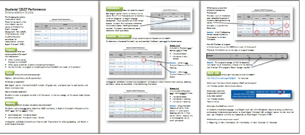
2.1. Label
For education data reporting, a label is defined as text on each data report and on each data report list that helps educators better understand the report’s content. Examples include report titles and report annotations such as footers beneath data displays. This paper’s example relates to the footer.
Student Scores on the State’s English Language Development Test
Student Grade Level Domains Overall
Listening Speaking Reading Writing
Tess Taker 2 3 3 4 5 4
Ike Ann Try 7 3 3 4 4 3
Earl E. Learner 5 4 5 4 5 4
Mark Wong 9 4 2 5 5 5
Average 3.5 3.3 4.3 4.8 4.0
Figure 1. Sample data report display
Which student(s) did NOT score Proficient on the state’s English Language Development Test? When the control group interpreted a similar data display in the Rankin[13] study, only 11 percent of these participants answered the question correctly. The correct answer for the above example is students Ike Ann Try and Mark Wong, who both failed to meet proficiency standards. Imagine how this accuracy would change if the following guidelines were featured as a footer just beneath Figure 1’s data display:
The student's "Overall" score is not the only score that determines proficiency on this test. A student is Proficient only if earning BOTH of these:
performance level 4 or above Overall, & performance level 3 or above in every domain When a similar footer was included for participants in the Rankin[13] study, participants’ accuracy when identifying which students were not proficient on the assessment rose by 307 percent (with a 23 percentage point difference), and those respondents who specifically indicated having used the footer experienced an increase of 336 percent in accuracy (with a 26 percentage point difference). Including a footer or other annotation on data reports in order to guide educators in understanding and properly using the data has a significant, positive impact on that understanding and use.
2.2. Supplemental Documentation
For education data reporting, supplemental documentation is defined as documentation that accompanies each data report to ensure educators read the report properly, understand its data, and are primed to use the data properly. Examples include the reference sheet, which is a single page offering guidance in understanding the data report, and the reference guide, which is a packet of two or more pages that helps the educator more easily use the report. These tools can be accessed online and also used in printed form. This paper’s example relates to the reference guide.
Imagine educators are given a data report with a display like the one in Figure 1 and are asked the same question featured earlier:
Which student(s) did NOT score Proficient on the state’s English Language Development Test? The control group described in the previous example, which had no footer or reference guide when using a similar data display in the Rankin[13] study, answered this question with only 11 percent accuracy. Imagine how this accuracy would change if participants also received the reference guide show in Figure 2, which provides the following details specific to the data report it accompanies:
title, description, and image
focus (content reported, intended audience, and format in which data is reported)
warning (vital, cautionary information an educator would need to avoid the most common errors made when interpreting the particular data being displayed)
purpose (key questions the report will help answer) instructions (how to read the report)
key questions (showing the user where to look on this report – and what to look for – to answer each question listed in the guide’s Purpose)
more information (where to get additional information on related topics)
Figure 2. Sample three-page reference guide
2.3. Help System
For education data reporting, a help system is defined as a searchable, computerized (typically online) system of help lessons educators can access within the data system to find answers to common questions and find help with common tasks. The lessons include illustrated steps, detailed explanations, links to allow users to “drill down” to more specific details when needed, and more. Examples of help lessons include technical lessons, which illustrate how to use the data system (for example, what to click for varied tasks), and data interpretation lessons, which communicate key data use topics and practices (for example, how to determine statistical significance). This paper’s example relates to data interpretation lessons.
Imagine educators are examining students’ English language proficiency, using data reports such as that described in the Label and Supplemental Documentation section examples. These educators might represent a range of data comfort levels and data use proficiency levels. Sample help lessons that might benefit educators within this group (with a separate help lesson devoted to each of the following) explain how to best:
Assess English Language Proficiency Determine Whether an EL Student Should be
Redesignated as RFEP Differentiate for EL Students
Use Multiple Measures to Determine Performance The help system would offer many more lessons than the above, but the above sampling offers insight into how key lessons could address key educator needs when using data. Sample findings over time featured in the Rankin[15] study concerning help system value include:
In a field study of online help systems involving interviews, observations, and focus groups, Chen[22]
found campus-wide online help systems need to be designed with more task-sensitive support.
In an examination of how to best design software instructions, van der Meij[23] found a shorter, targeted manual or user-friendly help system caused users to need 40 percent less training time and to successfully complete 50 percent more tasks than they would have accomplished with only access to a full-sized manual.
Edtech CEO/cofounder and former principal Westendorf[24] described research as showing factors critical for successful PD involve engaging participants in bite-sized tasks they can apply to their own professional practice.
Featuring a help system within a data system can offer educators valuable guidance in using the technology to conduct data investigations and can offer valuable guidance in using data to inform decisions.
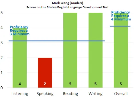
2.4. Package/Display
For education data reporting, package/display relates to the design of the data system and its reports. Examples of effective package/display include (a) maintaining credibility through secure, error-free data and displays; (b) offering key features like summaries and calculations, vital data, appropriate graphs, and clear headers; (c) using effective design practices such as appropriate data visualization; (d) facilitating efficient navigation; and (e) providing useful input controls, which allow users to customize data reports. This paper’s example relates to effective data visualization (c).
Development Test. Notice how the second data column’s red color (which appears as darker shading for colorblind viewers or for viewers of report printed without color), as well as its location beneath the thick proficiency requirement line, immediately alerts you to this “trouble area”. Imagine how the previously-described 11 percent accuracy in the understanding of this data would change if the data was appropriately visualized for participants.
Figure 3 adheres to specific OTCD Standards concerning the best ways to display data. For example, the display’s format and components were selected based on those more likely to encourage accurate understanding of the data based on what educators are most likely to want to understand about the data. In this case, an educator would most likely want to understand in which areas the student scored well and in which areas the student scored poorly.
Sample findings featured in the Rankin[15] study concerning a data display’s format and components include:
Data’s display has to match the needs of the user and what he or she is trying to understand; otherwise the display merely solves something the user does not need to be solved, leaving the true question unanswered[25].
Faxon-Mills et al.[26] noted score reports must provide results in a way that is clear and accessible to educators, or else the measurement being reported will not fulfill its purpose to help educators make decisions and meet individual students' needs. Data should be massaged into an easy-to-read format
that is understandable to non-data scientists, and accomplishing this should not be mistaken for a small task[27].
[image:6.595.69.538.313.650.2]The appropriate and conscientious display of data can help educators quickly, easily, and accurately get what they need from data to inform decisions they need to make in the best interest of students.
3. Content
For education data reporting, content relates to the information contained within each data report, as well as the report suite as a whole. Content should cover all key educator data needs in an efficient manner. Examples of data system reporting content include (a) what you get within each data report once the reports are opened, and (b) the data report offering as a whole (also called the suite of reports). This paper’s example relates to a single data report, which happens to contain a single data display.
Imagine if busy educators who view a display like the one in Figure 1 had the benefit of an additional data column at the end of the table that simply stated Proficient or Not Proficient for each student. Ideally cells reading Not Proficient would also be red (which still appears as shading for colorblind viewers or for viewers of report printed without color). For educators using this report to determine whether or not each student scored Proficient on the state’s English Language Development Test, which is one of the report’s primary purposes, this addition would save educators from having to consider all scores for every student in order to garner an understanding of which students are struggling most.
One example of adhering to OTCD Standards in the area of content involves offering content that is audience-appropriate. Figure 1, which features student-specific results, is intended to be used by teachers rather than by school or district administrators. Teachers are short on time, and they have to be experts in an overwhelming number of areas. Remembering every assessment’s particular guidelines (for example, remembering all the steps to determining proficiency for Figure 1’s assessment, as detailed in this paper’s Label section) is an unnecessary demand on teachers. Thus adding a proficiency column that makes these computations for teachers is recommended.
Sample findings featured in the Rankin[15] study concerning the need for each data report’s content to cater to the unique needs of the report’s specific audience include:
SAS Institute[28] found K-12 and higher education contain a wide variety of data system users (for example, internal users, school board/board of regents, government bodies, media, parents, general public) with vastly different skills and needs that need to be supported.
Sabbah[29] found what Goodman and
Hambleton[20] also found: each report needs to be geared toward a specific audience, with consideration paid to a manageable number of purposes and desired interpretations for the report. Zenisky et al.[30] found student data should be
accompanied by information specific to the audience the report is meant to target, such as educators, parents, or media.
Appropriate content that is comprehensive yet not overwhelming can help each data system’s and report’s
audience easily and effectively use data tools to assist decision-making.
4. Significance
Field literature reflects extensive attention being given to ways educators – through increased and improved efforts – can work to improve data use at schools and school districts. However, little attention in the field is paid to ways data system and report providers can better adhere to best practices for reporting data to educators. The findings of the Rankin[13,15] studies filled a gap in education field literature by containing evidence that can be used to identify how data tools can actively increase educators’ data interpretation accuracy through better data communication. When data system and report providers adhere to the OTCD Standards(www.overthecounterdata.com/s/OTCDStandards.pdf) that stemmed from these studies, these tools have potential to improve the accuracy with which educators use the data these tools display. When data systems and reports become active participants in data interpretation, the improvements will likely benefit students affected by educators’ data-informed decisions.
REFERENCES
[1] Aarons, D. (2009). Report finds states on course to build pupil-data systems. Education Week, 29(13), 6. Retrieved fromhttp://search.proquest.com/docview/202710770?accoun tid=28180
[2] VanWinkle, W., Vezzu, M., & Zapata-Rivera, D. (2011). Question-based reports for policymakers. ETS Research Memorandum, RM-11-16. Princeton, NJ: ETS.
[3] Gartner & Bill and Melinda Gates Foundation (2014). Closing the gap: turning SIS/LMS data into action: Report: Education community attitudes toward SIS/LMS solutions. Retrieved from http://www.turningdataintoaction.org/sites/d efault/files/reports/education_community_attitudes_toward_ sis_lms_solutions.pdf
[4] Lock, J. V. (2006). A new image: Online communities to facilitate teacher professional development. Journal of Technology and Teacher Education, 14(4), 663-678.
[5] Kidron, Y. (2012, April). Strategies click into place: Online resources translate research to practice. JSD: The Learning Forward Journal, 33(2), 44-47. Oxford, OH: Learning Forward.
[6] O'Hanlon, L. H. (2013, March 14). Designing better PD models. Education Week, 32(25), 16-17.
[8] Zapata-Rivera, D., & VanWinkle, W. (2010). A research-based approach to designing and evaluating score reports for teachers (ETS Research Memorandum No. RM-10-01). Princeton, NJ: ETS.
[9] McDonald, S., Andal, J., Brown, K., & Schneider, B. (2007). Getting the evidence for evidence-based initiatives: How the Midwest states use data systems to improve education processes and outcomes (Issues & Answers Report, REL 2007–No. 016). Washington, DC: U.S. Department of Education, Institute of Education Sciences, National Center for Education Evaluation and Assistance, Regional Educational Laboratory Midwest.
[10] Underwood, J. S., Zapata-Rivera, D., & VanWinkle, W. (2008) Growing Pains: Teachers Using and Learning to Use IDMS®. ETS Research Memorandum, RM-08-07. Princeton, NJ: ETS.
[11] Wayman, J. C., Snodgrass Rangel, V. W., Jimerson, J. B., & Cho, V. (2010). Improving data use in NISD: Becoming a data-informed district. Austin, TX: The University of Texas at Austin.
[12] U.S. Department of Education Office of Planning, Evaluation and Policy Development (2009). Implementing data-informe d decision making in schools: Teacher access, supports and use. United States Department of Education (ERIC Document Reproduction Service No. ED504191)
[13] Rankin, J. G. (2013). Over-the-counter data’s impact on educators’ data analysis accuracy. ProQuest Dissertations and Theses, 3575082. Retrieved from http://pqdtopen.proquest.c om/doc/1459258514.html?FMT=ABS
[14] Bill and Melinda Gates Foundation (2015). Teachers know best: Making data work for teachers and students. Retrieved from https://s3.amazonaws.com/edtech-production/reports/G ates-TeachersKnowBest-MakingDataWork.pdf
[15] Rankin, J. G. (2016). Standards for Reporting Data to Educators: What Educational Leaders Should Know and Demand. New York, NY: Routledge/Taylor & Francis. [16] Izzo, P. (2012, July 5). Is data is, or is data ain’t, a plural? The
Wall Street Journal. Retrieved from http://blogs.wsj.com/eco nomics/2012/07/05/is-data-is-or-is-data-aint-a-plural/ [17] Coburn, C. E., Honig, M. I., & Stein, M. K. (2009). What’s
the evidence on districts’ use of evidence? In J. Bransford, D. J. Stipek, N. J. Vye, L. Gomez, & D. Lam (Eds.), The role of research in educational improvement, 67-88. Cambridge, MA: Harvard Education Press.
[18] Data Quality Campaign (2009). The next step: Using longitudinal data systems to improve student success. Retrieved fromhttp://www.dataqualitycampaign.org/find-res ources/the-next-step/
[19] Data Quality Campaign (2011). Leveraging the power of state longitudinal data systems: Building capacity to turn data into useful information. Retrieved from http://www.dataqualityca mpaign.org/files/DQC-Research%20capacity%20May17.pdf
[20] Goodman, D. P., & Hambleton, R. K. (2004). Student test score reports and interpretive guides: Review of current practices and suggestions for future research. Applied Measurement in Education, 17(2), 145–220.
[21] National Forum on Education Statistics. (2011). Traveling through time: The forum guide to longitudinal data systems. Book Four of Four: Advanced LDS Usage (NFES 2011–802). Washington, DC: National Center for Education Statistics, Institute of Education Sciences, U.S. Department of Education.
[22] Chen, Y. (2004). To help helpdesk: A field study of online help systems in campus context. Campus-Wide Information Systems, 21(2), 81-94.
[23] Van der Meij, H. (2008). Designing for user cognition and affect in a manual. Should there be special support for the latter? Learning & Instruction, 18(1), 18-29.
[24] Westendorf, E. (2013, November 4). Professional development is broken: Let's fix it. Education Week. Retrieved from http://blogs.edweek.org/edweek/rick_hess_st raight_up/2013/11/professional_development_is_broken_let s_fix_it.html?cmp=ENL-EU-NEWS3
[25] Munzner, T. (2011). Keynote on Visualization Principles. Visualizing Biological Data (VIZBI) 2011. Retrieved from http://visualoop.com/2654/40-must-see-videos-about-data-vi sualization-and-infographics
[26] Faxon-Mills, S., Hamilton, L. S., Rudnick, M., & Stecher, B. M. (2013). New assessments, better instruction? Designing assessment systems to promote instructional improvement. Santa Monica, CA: The RAND Corporation. Retrieved from http://www.rand.org/pubs/research_reports/RR354.html
[27] Medlock, L. (2014, March 4). Why we've learned so little from big data: Takeaways from SXSWedu panel on data analytics. EdSurge. Retrieved from https://www.edsurge.co m/n/2014-03-04-why-we-ve-learned-so-little-from-big-data/
[28] SAS Institute. (2013). Best practices in information management, reporting and analytics for education. Retrieved from https://fs24.formsite.com/edweek/form15/secure_index .html
[29] Sabbah, F. M. (2011). Designing more effective accountability report cards. ProQuest Dissertations and Theses, AAT 3469488, Retrieved from http://search.proques t.com/docview/893068662?accountid=28180
[30] Zenisky, A. L., Hambleton, R. K., & Sireci, S. G. (1999). At or above proficient: The reporting of NAEP results in the Internet age. Center for Educational Assessment Report No. 710. Amherst, MA: University of Massachusetts, Center for Educational Assessment.
[31] Knapp, M. S., Swinnerton, J. A., Copland, M. A., & Monpas-Hubar, J. (2006). Data-informed leadership in education. Seattle, WA: Center for the Study of Teaching and Policy.
[32] Iliinsky, N. & Steele, J. (2011). Designing data visualizations. Sebastopol, CA: O’Reilly.
[34] Decker, C. (2012, December 20). Building a teacher-friendly education data system in Arkansas. Michael and Susan Dell Foundation. Retrieved from http://www.msdf.org/blog/2012/ 12/building-a-teacher-friendl-education-data-system/ [35] Abela, A. (2008). Advanced presentations by design. San
Francisco, CA: Pfeiffer.