DEMOGRAPHIC RESEARCH
A peer-reviewed, open-access journal of population sciences
DEMOGRAPHIC RESEARCH
VOLUME 36, ARTICLE 21, PAGES 627–658
PUBLISHED 17 FEBRUARY 2017
http://www.demographic-research.org/Volumes/Vol36/21/
DOI: 10.4054/DemRes.2017.36.21
Research Article
Visualizing compositional data on the Lexis
surface
Jonas Sch¨oley
Frans Willekens
c
2017 Jonas Sch¨oley & Frans Willekens.
1 Introduction 628
2 The Lexis diagram and surface 630
3 About colour 634
4 Ternary-balance scheme 635
5 Qualitative-sequential scheme 638
6 Agewise-area plot 640
7 Small multiples 642
8 Comparative evaluation 644
9 Conclusion 647
10 Acknowledgements 648
References 649
Appendix A 653
Visualizing compositional data on the Lexis surface
Jonas Sch¨oley1
Frans Willekens2
Abstract
BACKGROUND
The Lexis surface plot is an established visualization tool in demography. Its present utility, however, is limited to the domain of one-dimensional magnitudes such as rates and counts. Visualizing proportions among three or more groups on a period-age grid is an unsolved problem.
OBJECTIVE
We seek to extend the Lexis surface plot to the domain of compositional data.
METHODS
We propose four techniques for visualizing group compositions on a period-age grid. To demonstrate the techniques we use data on age-specific cause-of-death compositions in France from 1925 to 1999. We compare the visualizations for compliance with multiple desired criteria.
RESULTS
Compositional data can effectively be visualized on the Lexis surface. A key feature of the classical Lexis surface plot – to show age, period, and cohort patterns – is retained in the domain of compositions. The optimal choice among the four proposed techniques depends primarily on the number of groups making up the composition and whether or not the plot should be readable by people with impaired colour vision.
CONTRIBUTION
We introduce techniques for visualizing compositional data on a period-age grid to the field of demography and demonstrate the usefulness of the techniques by performing
an exploratory analysis of age-specific French cause-of-death patterns across the 20th
century. We identify strengths and weaknesses of the four proposed techniques. We
1Max-Planck Odense Center on the Biodemography of Aging, University of Southern Denmark. E-Mail: [email protected].
contribute a technique to construct the ternary-balance colour scheme from within a per-ceptually uniform colour space.
1. Introduction
Demography has always had a close relationship with information visualization: from the display of population numbers by shading map regions, the graphical representation of population dynamics on a grid of age-period-cohort parallels, and the widely recognized population pyramid, to today’s interactive plots of population data on the web.3 The
vi-sual display helps make sense of the data at hand, which in demography, for the most part, are counts, rates, and proportions. Visualisation methods currently used in demog-raphy focus on counts or rates. This paper is about compositional data, represented by proportions, i.e., shares of a whole. Examples of this data type are proportions within a population (e.g., age composition, distribution by occupation, region of residence or level of education), proportions of events (e.g., deaths by cause), proportions of durations (e.g., life expectancy by health status), and proportions within a total rate (e.g., death rate by cause of death).
Period- and age-specific rates and counts provide a single valuezfor each point on
a period-age plane (a Lexis surface) whereas in the case of compositional data avector
of valueshz1,z2,. . .,zkihaving a constant sum, with lengthkequal to the number of
groups in the composition, is given for each surface point. Therefore, existing solutions for the visualization of demographic data by period and age, such as shaded contour maps, fail when confronted with compositions – they simply run out of dimensions. On the other hand, graphs specifically designed to display compositional data such as the ternary diagram (Aitchison 1986) or the biplot (Gabriel 1971; Aitchison and Greenacre 2002) do not address the basic demographic coordinates of age, period, and cohort and are therefore unsuited to show corresponding effects in a single display.
This paper aims to extend the visual repertoire of demography by introducing and discussing different techniques of plotting compositional data on the Lexis surface. Hereby we hope to facilitate the exploratory analysis of compositional data and the communica-tion of research results in visual form. To demonstrate the techniques we use data on age-specific death counts by cause of death in France from 1925 to 1999 (Vallin and Mesl´e 2014).
Four techniques are discussed in this paper. The first is theternary-balance scheme.4 It allows one to embed three attributes in a single colour. Each attribute is mapped to a primary colour, and the mixture of three colours shows the composition of attributes in a population. The second technique is the qualitative-sequential scheme. In that scheme a qualitative or categorical variable (e.g., cause of death) is represented by a colour, and the quantitative variable (e.g., number of deaths due to that cause) is represented by se-quences of lightness steps within each colour. The third visualization, the agewise-area graph, is composed of stacked area charts drawn separately for every age group and as-sembled on a Lexis-like grid. The fourth is a collection of heatmaps portraying different subsets of the data. The resulting visualization is known as‘small multiples’, ‘trellis plot’, ‘lattice chart’, or ‘panel chart’. This conventional technique serves as a benchmark to compare our innovations against. Furthermore, we propose a slight refinement to the small-multiple plot making it more suitable for the display of compositional data.
The four techniques showcased in this paper mark only a tiny spot in the space of possible visualizations concerning proportions structured by period and age. Typi-cally the number of effective visualizations for a given purpose is much smaller than the number of possible visualizations (Munzner 2015) and therefore a strategy is needed to arrive at viable solutions. Our final picks are the result of multiple constraints on the design space: (1) We require the dimensions period and age to constitute a grid. This is to be in line with the Lexis surface plot, an already established visualization tool in demography which highlights patterns along age, period, and cohort time dimen-sions. Demographers have built expertise in the interpretation of Lexis surfaces, and by extending these to the domain of compositional data we hope to transfer the expertise. (2) The techniques have to differ in their strengths and weaknesses. While exploring the design space we did not come across a one-size-fits-all solution. Some visualizations can effectively show proportions among many groups. Others are limited to compositions with few elements. Some techniques will not work for users with impaired colour vision while others will work flawlessly in grey scale print, etc. We strive to select a collection of solutions which cover a wide range of uses. (3) We require techniques to be discussed in the literature and/or commonly used to display compositions. Cartography, statistics, and computer science are fields with a strong research agenda on visualization, and we believe that demography should tie into the existing body of knowledge in visualization research. Furthermore, visualizations are more easily understood if the users are already familiar with the visual encoding.
We compare the different techniques with respect to the amount of data shown, their geometrical preservation of the Lexis surface, their ability to communicate precise values as well as patterns along age, period, and cohort, their space economy, and their accessi-bility to users with impaired colour vision. Some evaluation criteria, such as the amount
of data encoded in the visualization, can be assessed precisely. Other questions, such as the ability of the visualization to show patterns in the data, are ultimately a matter of subjective judgements. We back up our personal assessment of these subjective criteria by references to experiments done in graphical perception and by demonstration of the visualizations using real world data.
The paper comprises nine sections. In section 2 we present the Lexis surface and explain how it is used to understand patterns in data structured by age, period, and cohort. The techniques presented in this paper are extensions of the Lexis surface to the domain of compositional data. Section 3 introduces some colour terminology, which is used in the subsequent demonstration of the techniques, sections 4–7. Finally, we compare the proposed visualization techniques and assess their individual strength and weaknesses according to our evaluation criteria.
2. The Lexis diagram and surface
Between 1860 and 1880 various demographers were developing graphical techniques to better understand population data structured by age, period, and cohort. While one group was using diagrammatic representations of the three time dimensions to illustrate their derivations of lifetable measures and population dynamics, the other group produced vi-sualizations of census data on a period-age plane. These parallel developments culmi-nated in what we today call the ‘Lexis diagram’ and the ‘Lexis surface’.5
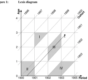
TheLexis diagram(see Figure 1) connects period, age, and cohort via a Cartesian coordinate system with period on the abscissa and age on the ordinate. For each point on this period-age plane the corresponding birth cohort can be calculated by subtracting age from period. This identity is illustrated with a set of 45◦diagonals, each connecting points belonging to the same exact cohort. Age groups and period intervals are separated by horizontal and vertical parallels respectively. The resulting grid of lines helps to keep track of individuals and populations as they progress through period and age. Imagine a child born in the summer of 1900 and dying in the spring of 1903, just a few months short of turning 3 years of age. A corresponding lifeline is shown in Figure 1, originating
at birth and climbing the cohort diagonal until death at pointA. Start and end point
of the line are defined by the events birth and death, both situated at specific points in calendar time, while the line itself measures the duration of the state alive. Even though the term ‘lifeline’ suggests the study of mortality, the Lexis diagram applies to all events and processes situated in calendar time. For example, one can construct cohorts of people having married for the first time during a certain period and measure the duration of the marriage until divorce or the death of a partner. Multi-state processes can be shown by
segmenting the lifeline into sequences of states (e.g., single, married, divorced, remarried, dead; see Willekens (2014) for examples).
Figure 1: Lexis diagram
Period
Age
Cohort
0 1 2 3
1900 1901 1902 1903
1903 1902 1901 1900 1899
1898 1897
1896
A
I
II
III
IV
4
1905
Collecting data on many lifelines gives rise to the study of a population. In order to construct occurrence/exposure rates,6and consequently lifetables, individual lifelines,
and events are aggregated over some area of the Lexis diagram. A Lexis triangle marks an area specified by intervals over period, age, and cohort, e.g., everyone born in 1898 and dying in 1901 at the age of 2 (see Figure 1 shape I). Aggregating over intervals of period and age alone results in a rectangular region on the Lexis diagram, e.g., everyone dying in 1900 at age 0 (see Figure 1 shape II). A parallelogram with vertical lines marks an area over a cohort and period interval, e.g., everyone born in 1900 and dying in 1902 (see Figure 1 shape III), while a parallelogram featuring horizontal lines defines observations aggregated over a cohort and age interval, e.g., everyone born in 1902 and dying at age 0 (see Figure 1 shape IV).
The Lexis diagram as a mosaic of triangles, squares, or parallelograms, each hold-ing some aggregate statisticz, naturally connects to the Lexis surface as a visualization
of population data across period and age.7 However, both tools have been developed in-dependently. The earliest demographic surface plot is a perspective drawing of Swedish population counts by period and age published in 1860 and thus predating Lexis’ pub-lication by 15 years (Caselli and Enzo 1990). This graph was later redrawn and popu-larized by Luigi Perozzo (1880), but it was not until the 20th century that surface plots became popular in the demographic literature. The pioneers Kermack, McKendrick, and McKinlay (2001) and Delaporte (1942) used contour lines to indicate regions of similar mortality levels and improvements on the period-age surface noting the emergence of
regular patterns. Vaupel, Gambill, and Yashin (1987)8 demonstrated the universal
util-ity of period-age surfaces by plotting a wide range of measures such as between-country mortality rate ratios, population numbers, sex ratios, fertility rates, or model residuals as shaded contours across period and age with darker colours indicating higher values. The same technique was used extensively by Andreev (1999) to demonstrate age-heaping over time in data on high-age mortality and to describe the development of Danish mortality throughout the 18thand 19thcenturies. Lexis surfaces have been used outside of demog-raphy as well: Sula (2012) used them to show how publication practices changed over historical time and the length of a researcher’s career. Though concerned with different phenomena, a unifying theme in all these references is the author’s interest in period, age, and cohort effects.
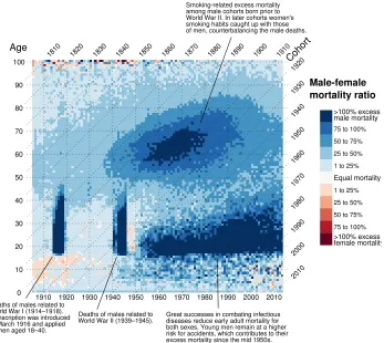
Take for example a surface of the mortality rate sex ratio in England and Wales (see Figure 2). The excess male mortality resulting from military deaths during the World War I and World War II leaves a trail on the Lexis surface in the form of two vertical bands of deep blue colour – a classic example of a period effect where a cross-section of the population is affected by an historical condition. But we also see an interaction between period and age: The high levels of excess male mortality during the wars are limited to the age range of men in active military service. Starting in the mid-1950s we observe the emergence of excess mortality among young men. This age effect is visible as a horizontal corridor of deep blue colour and can be traced back to the effective prevention and treatment of infectious diseases, which in turn put more emphasis on the more male-dominated accidental deaths in early adulthood (Gjonc¸a et al. 2005). The diagonal colour pattern around ages 50–80 and years 1950–1980 marks a cohort effect and can be traced back to those born at the end of the 19thand the beginning of the 20th century. The rising popularity of smoking among men took its toll later in life in the form of lung cancer. Women of the same cohorts smoked less than men and therefore gained
7Arthur and Vaupel (1984) introduce the term ‘Lexis surface’ to describe a period-age plane of population densities. Subsequently it has been extended by Vaupel, Gambill, and Yashin (1987) to visualizations of demo-graphic quantities on such a surface.
a survival advantage. This advantage vanished once women took up smoking as well (Preston and Wang 2006; Beltr´an-S´anchez, Finch, and Crimmins 2015).
Figure 2: Lexis surface plot as a tool to identify age, period, and cohort
effects. Ratio between male and female age-specific mortality rates in England and Wales, 1841–2013
0 10 20 30 40 50 60 70 80 90 100
1910 1920 1930 1940 1950 1960 1970 1980 1990 2000 2010
>100% excess male mortality
75 to 100% 50 to 75% 25 to 50% 1 to 25%
Equal mortality
1 to 25% 25 to 50% 50 to 75% 75 to 100%
>100% excess female mortality Age 1920 1930 1940 1950 1960 1970 1980 1990 2000 2010 Coho rt
Smoking-related excess mortality among male cohorts born prior to World War II. In later cohorts women's smoking habits caught up with those of men, counterbalancing the male deaths.
Deaths of males related to World War I (1914–1918). Conscription was introduced in March 1916 and applied to men aged 18–40.
Deaths of males related to
World War II (1939–1945). Great successes in combating infectiousdiseases reduce early adult mortality for both sexes. Young men remain at a higher risk for accidents, which contributes to their excess mortality since the mid 1950s.
Male-female mortality ratio 1910 1900 1890 1880 1870 1860 1850 1840 1830 1820 1810
Note: Data from Human Mortality Database, own calculations.
3. About colour
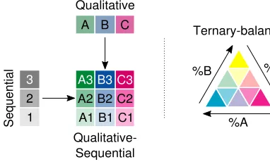
We introduce colour as a multidimensional visual attribute, relate it to the display of compositional data, and introduce the colour terminology used in this paper.
Why use colour to display compositional data on the Lexis surface? (1) Colour can be used to visualize the value of a third variable on a plane. (2) Colour is a visual at-tribute that is both inherently compositional as well as multidimensional. Each colour can be understood as a composition of primary colours mixed in certain proportions. The mixed colour itself is perceived as light or dark, pale or strong, tending to red, blue, or green. Two of our proposed techniques make use of these features: While the ternary-balance scheme employs the compositional nature of mixed colours to encode compo-sitional data, the qualitative-sequential scheme maps perceptional colour dimensions to data dimensions.
Children learn how to produce a wide range of colours by mixing blue, red, and yellow paints. The resulting colour depends on the ratio among these primary colours: Mix yellow with blue to produce green, red with blue to produce purple, and three parts of yellow with one part of red to produce orange. In a case where every unique mixture of primaries resolves into a unique mixed colour, one has effectively encoded a num-ber of attributes (the proportions among the primary colours) into a single attribute (the mixed colour). Assigning a primary colour to each of three groups in the data and mixing the colours according to the proportions among the groups is the basic idea behind the ternary-balance scheme (see Appendix A for its construction).
Another way to look at colour is in terms of perceptional features. When asked to describe a colour it would be a remarkable feat for a person to express it as proportions among primary colours. Instead, one tends to say that a colour is dark or light (lightness:
), pale or pure (chroma: ), and tending to red, blue,
green. . . (hue: ).9 This specification is widely used in visualization
research, as it allows for the construction of colour schemes which reflect the statistical features of the variables one wishes to visualize: Lightness and chroma are perceived as ordered attributes, e.g., a random sequence of lightness or chroma steps can easily be ar-ranged from dark to light, from pale to pure. Both dimensions therefore lend themselves
to the display of ordered data such as proportions (0 % 100 %). Different
hues, on the other hand, do not imply order and therefore signify mere categorical
differ-ence (blueberry cherry). Based on this connection Brewer (1994) proposes
a typology of colour schemes: the sequential and the qualitative schemes encode or-dered and categorical data, respectively. Crossing both leads to the qualitative-sequential scheme – a bivariate colour scheme encoding the order and the category of a data point (see Figure 3 for an illustration of the Brewer schemes employed in this paper).
Figure 3: Colour schemes used in this paper
Sequ
ential
Qualitative-Sequential
Ternary-balance Qualitative
A B C
A3
A2 A1
B3
B2 B1
C3
C2 C1
3
2 1
%B %C
%A
Note: Derived from an illustration in Brewer (1994).
4. Ternary-balance scheme
The idea behind the ternary-balance scheme is to represent the proportions among three groups as a mixture of three basic colours each corresponding to a single group. The basic colours are chosen so that their hues are dissimilar to each other (e.g., magenta, yellow, cyan). They are then mixed in proportions given by the group composition. The resulting colour mixture is unique for every possible combination of proportions among three groups, as can be shown in a colour-coded ternary diagram serving as a legend for the ternary-balance Lexis surface.10
While using colour mixtures to encode multiple data dimensions in a single point
has been proposed several times,11 such techniques are not in widespread use, possibly
due to the use of legends that are not easily memorized (Wainer and Francolini 1980). We seek to alleviate these issues by providing straightforward interpretation guidelines along with a legend that builds upon an already established tool in compositional data analysis – the ternary diagram.
The dominant group at any point in time as well as the overall distribution of the group proportions can be understood keeping two principles in mind:
1. The higher the proportion in a group, the more the mixed colour resembles the base colour for that group, and
10See Appendix A for details on the construction of the ternary-balance colour scheme.
2. the more balanced the proportions among the groups, the more the mixed colour tends to grey.12
The ternary diagram as legend colour-codes all possible proportions among three groups in a structured way, so that each point on the Lexis surface can be decoded into its precise proportions if needed.
Figure 4 shows the ternary-balance scheme applied to age-wise French cause-of-death data across the 20th century. All deaths are divided by cause into the categories Neoplasm (ICD-9 codes 140–239), External (injury, suicide, accident; ICD-9 codes 800– 999 and E–V) and Other (all remaining causes of death). Magenta was chosen as a primary colour for external causes of death, orange for death by neoplasm, and cyan encodes all remaining deaths.
Example: Consider pointAin Figure 4. The proportion of deaths caused by
neo-plasm is given in the legend by the position on a horizontal line through the region with the colour ofA; likewise, the proportion of deaths caused by external causes is indicated by the position on a\line, and the proportions of all other causes is indicated by the posi-tion on a/line. The mixture of magenta, orange, and cyan at pointAindicates that 40% to 60% of the deaths among persons of ages 55–60 in 1990 were caused by neoplasms, 0% to 20% by external causes, and the remainder of 40% to 60% by all other causes of death.
The mid-century marks a turning point. Prior to 1950 external causes of death and cancer were only sporadically found on the death certificates, the prominent exception being World War II. Period effects are visible in 1940, when Germany occupied France and – much stronger – in 1944 after the Allied forces landing in Normandy. In both years the war contributed deaths by external cause, as visible in the age range 5–60. After 1950 two major trends in the distribution of death causes emerged: (1) Adolescent deaths rapidly became dominated by external mortality, and (2) deaths due to cancer gradually became more common in the age range 40–80, dominating the ages 50–70 since 1980. The onset-age of other causes of death as the most prominent increased along the cohort diagonal.
Figure 4: Ternary-balance scheme technique applied to French
cause-of-death data. Age-specific proportions of of people dying from a given cause in France, 1925–1999, total population
A 0 10 20 30 40 50 60 70 80 90 100
1930 1940 1950 1960 1970 1980 1990
Age 1990 1980 1970 1960 1950 1940 1930 1920 1910 1900 Coho rt Cause-of-death distribution
At any given period and age the colour represents the distribution of deaths among three causes. Period % Neopl asm % Externa l % Other Neoplasm Extern al causes Othercauses 0 20 40 60 80 100 0 20 40 60 80 100
0 20 40 60 80
100 1890 1880 1870 1860 1850 1840 1830
In France 1990, ages 55–60, neoplasms were the most common cause of death, accounting for 40–60% of all fatalities within that period-age range. External causes contributed 0–20% and "other" causes 40–60% to all deaths.
Note: Data by Vallin and Mesl´e (2014), own calculations.
shifts in colour.13 The obvious drawback of the ternary-balance scheme is the limitation to three distinct groups. Also, using colour as a quantifier, small changes in the values are hard to detect, and the very nature of the graph makes it unsuitable to use for people with impaired colour vision.
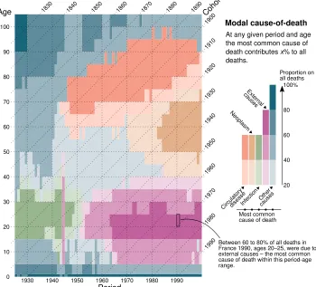
5. Qualitative-sequential scheme
Another form of multivariate colour scheme is the qualitative-sequential scheme (Brewer 1994). The idea is to use a qualitative palette of different hues to signify group member-ship and to construct a sequential palette for every group by varying the lightness of the group colour and thereby encoding group-specific quantities.
See Figure 5 for an example using the same dataset as in Figure 4 but with two additional categories, namely death due to infectious diseases (ICD-9 codes 001–139) and diseases of the circulatory systems (ICD-9 codes 390–459). Each group is assigned its own sequential colour scheme. The values given by the colours on the Lexis surface represent the proportion of deaths from the most prominent cause of death at periodtand agex.
This approach allows one to account for more than three groups in the composition. The downside is an incomplete picture for every point on the Lexis surface: Only infor-mation on the group with the highest proportion is given. However, in a dataset with a lot of variation in the group proportions interesting patterns emerge.
For example, consider age group 60–65 in Figure 5. Prior to 1945 we see a blue colour: ‘Other’ causes of death were dominant. This dominance subsequently declined (a lighter blue) until, post–World War II, circulatory diseases became the main cause of death with a proportion on all deaths of 20–40 %. Around 1970 the main cause of death shifted from circulatory diseases to neoplasms (the hue shifts from red to yellow). The dominance of neoplasms over other causes of death for 60–65-year-old males and females increased with time (the yellow hue gets darker and more saturated).
One new insight this visualization yields is the importance of infectious diseases as a cause of death for people aged 15–40 prior to 1950. In these years and ages, 20– 60% of the deceased died from infection, making this the most likely cause of death in adolescence and middle-age. The pattern abruptly changed after 1950, with external
causes of death taking the top spot. As in Figure 4, we see the proportion of accident mortality on all deaths peaking around ages 15–30.
Figure 5: Qualitative-sequential scheme technique applied to French
cause-of-death data: The most common cause of death by period and age and its proportion on all deaths in France, 1925–1999, total population 0 10 20 30 40 50 60 70 80 90 100
1930 1940 1950 1960 1970 1980 1990
1990 1980 1970 1960 1950 1940 1930 1920 1910 1900 Period Age Coho rt
At any given period and age the most common cause of death contributes x% to all deaths. Modal cause-of-death 20 40 60 80 100% Circu lator y disea se Neop lasm Infection Extern al causes Other causes Most common cause of death
Proportion on all deaths 1890 1880 1870 1860 1850 1840 1830
Between 60 to 80% of all deaths in France 1990, ages 20–25, were due to external causes – the most common cause of death within this period-age range.
Note: Data by Vallin and Mesl´e (2014), own calculations.
circula-tory conditions as the main cause of death moved into higher ages starting at around age 60 in the 1940s to age 75 in the 1990. For people with an extraordinarily long lifespan the causes of death are more diverse, with the group ‘other’ in the lead.
While confined to visualizing proportions only for the most prominent group at any given point on the Lexis surface, the qualitative-sequential scheme still reproduces a lot of the information gained from Figure 4 while adding new insights. In cases where the dominant group does not change across the surface, this style of visualization loses its appeal.
6. Agewise-area plot
The stacked-area plot can be thought of as the continuous version of a stacked-bar chart.
Coloured areas indicate group proportions which change along thex-axis. As the value
of each individual group proportion is indicated by length as opposed to colour, this technique is better suited to detecting slight changes in group composition over time than the previous approaches. Cleveland and McGill (1984) show that people decode visual information into their numerical equivalents (table look-up) more easily when it is represented by length and not by colour.
For the agewise-area plot (see Figure 6) we produce the stacked-area chart sepa-rately for every age group and assemble all of them on a Lexis-like grid. Unlike with the ternary-balance scheme technique, we are able to distinguish more than three groups, and unlike with the qualitative-sequential scheme technique, the full information about the composition is displayed.
Example: One feature of the data that was hidden by the former graphical repre-sentations is the unusual surge of fatal infectious diseases during the 1990s around ages 25–45. Looking at the exact cause-of-death, data we see that HIV-related deaths are the reason for this local phenomenon. Another new insight from this plot is the relative importance of cancer as a cause for childhood mortality.
The plot does not show a true Lexis surface. The period-age grid is non-continuous as it is composed of multiple stacked-area charts, each having a separatey-axis ranging from 0% to 100%. This breaks the plot area into separate sections, making the perception of global patterns harder because the global graphical patterns (the shape of the equal-colour areas across period and age) are interrupted along the age scale.
Figure 6: Agewise-area technique applied to French cause-of-death data: Age-specific proportions of of people dying from a given cause in France 1925–1999, total population
100+
95−99
90−94
85−89
80−84
75−79
70−74
65−69
60−64
55−59
50−54
45−49
40−44
35−39
30−34
25−29
20−24
15−19
10−14
5−9
1−4
<1
1930 1940 1950 1960 1970 1980 1990
Period Age
Other causes (22%)
External causes (40%)
Infection (22%) Neoplasm (11%)
Cardiovascular disease (5%)
Cause-of-death distribution
At any given period and age the distribution of colours represents the distribution of deaths by cause.
In France 1995, ages 30–34, causes of death were distributed as:
7. Small multiples
Small multiples14 are tables of graphs (Wilkinson 2005: 319). Each panel within the
table represents a level of a categorical variable or an interaction level among multiple categorical variables. Small multiples are a fairly common technique and have already been discussed by Vaupel, Gambill, and Yashin (1987) as a way of plotting Lexis surfaces for multiple subpopulations. We discuss this technique in the context of compositional data and propose a small adjustment facilitating cross-panel comparisons.
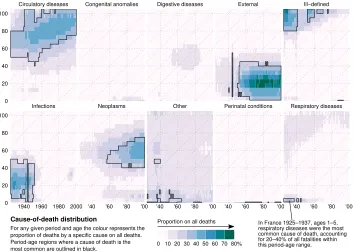
In Figure 7 we see multiple Lexis surfaces displaying cause-specific proportions of deaths in France across period and age. The plots are augmented by border lines around regions within which a given cause of death is dominant.
For example, consider the lower left panel. It shows the proportion of deaths caused by infectious diseases by age and calendar time. PointAindicates that in 1930 infectious diseases are the dominant cause of death for persons aged 30–34, with 40–50% of all deaths caused by infection. Around 1950 external causes start to become the dominant cause of death for persons aged 1–40, increasing their proportion within that age range over time.
Unlike the other visualization techniques described in this paper, the small multiples allow us to display the cause-of-death proportions among each of the ten most prominent categories of ICD-9. This power, of course, comes at a price: The data is not contained in a single graphic. This means that the eye (and the mind) not only have to move between and compare different regions of a plot but make connections between different graphics in order to grasp the whole picture. To make these comparisons easier, we use black outlines to distinguish regions on the period-age surface in which the corresponding cause of death has the highest proportion among all deaths. This way there is no need for cross-panel comparisons in telling if a given cause of death dominates over all others at some point on the Lexis surface.
Figure 7: Small-multiples technique applied to French cause-of-death data: Age-specific proportions of of people dying from a given cause in France 1925–1999, total population
Circulatory diseases Congenital anomalies Digestive diseases External Ill−defined
Infections Neoplasms Other Perinatal conditions Respiratory diseases 0
20 40 60 80 100
0 20 40 60 80 100
1940 1960 1980 2000 '40 '60 '80 '00 '40 '60 '80 '00 '40 '60 '80 '00 '40 '60 '80 '00
Cause-of-death distribution
For any given period and age the colour represents the proportion of deaths by a specific cause on all deaths. Period-age regions where a cause of death is the
most common are outlined in black. 0 10 20 30 40 50 60 70 80%
Proportion on all deaths In France 1925–1937, ages 1–5, respiratory diseases were the most common cause of death, accounting for 20–40% of all fatalities within this period-age range.
Note: Data by Vallin and Mesl´e (2014), own calculations.
Yet again the new visualization technique shines a different light on our data and allows for additional insights. We can see that causes of death in old age are frequently not known: Prior to World War II an ill-defined cause of death was the norm for people dying at ages 80+. Perinatal conditions followed by congenital anomalies were the main causes of death for infants throughout most of the 20thcentury in France. Prior to 1950
simplifying a correct lookup of the colour values but forbidding the exact judgement of small differences.
8. Comparative evaluation
In this section we evaluate and compare the four proposed techniques along the criteria completeness, continuity, group limit, pattern perception, table lookup, colour accessibil-ity, and footprint.
Completenessis the question of whether or not all values of the compositional data
(e.g., all individual group proportions for each period age) are displayed in the visualiza-tion or if only a subset of the group data (e.g., the proporvisualiza-tion of the largest group for each period age) is visualized. Visualizing the complete dataset is desirable during exploratory data analysis.
If the visualization must contain complete information on every group in the com-position, the qualitative-sequential scheme technique is not an option as only the group with the highest proportion at a given period age is considered. The remaining three techniques always show the complete distribution of proportions.
Continuityrequires that the continuity of the Lexis grid is preserved in the
visu-alization, e.g., the period and age axes constitute a rectangular grid unbroken by white space or period-wise/age-wise scales.
The Lexis surface constitutes a continuous grid of period and age. The agewise-area plot breaks this essential feature by fracturing the surface into separate plots by age. As
each age group uses its owny-axis, the surface becomes discontinuous along the age
dimension. From a perceptional standpoint this hinders the identification of period and cohort effects, as these would form continuous patterns along the vertical or diagonal of the plot area but cannot do so in the agewise-area plot. This is not an issue for the remaining visualization techniques.
Group limitdescribes how many groups in the composition can be accommodated
by a given technique. It is precise if limited by technical reasons or approximate if limited by perceptional reasons.
colours which do not resemble each other. Yellow is problematic as a base hue for a lightness sequence as it is already a very light colour (Ware 2013: 127). Orange, still being perceived as distinct from red and yellow, is the better choice here. Adding black, one can construct five sufficiently different lightness sequences. Some few additional hues, such as purple, might also work.
The agewise-area plots contain a lot of information in a small vertical space. The more groups are added, the more crowded this vertical space gets, and information re-trieval will be more difficult.
Pattern perceptiondescribes the visual decoding of physical information
(Cleve-land 1994: 223f.). Within the context of our paper, this translates into the degree at which age, period, and cohort effects in the composition of the data are revealed by the visualization.
The ternary-balance scheme, the qualitative-sequential scheme and the small-multiples techniques all show colour on a continuous surface and differ only in the applied colour scheme. They are particularly suited to showing patterns in the data, such as period, age, and cohort effects or local outliers (as demonstrated for one-dimensional data in Vaupel, Gambill, and Yashin 1987). However, for the small-multiples approach this merit only applies to each group on its own, as the visualization is spread across multiple panels – the intergroup patterns are not directly visually encoded and have to be inferred from a comparison between multiple panels. The marking of modal values eases this task.
The case for agewise-area graphs is more complicated. Owing to the discontinuities across the age dimension, the global pattern perception from these graphs is compara-tively worse, though changes over time within single age groups, even small ones, can be seen very well using this approach.15
Table lookupis the visual ”‘decoding of scale information”’ (Cleveland 1994: 223f.).
It takes place when attempting to extract the exact numbers from a displayed data point. Some visual primitives (such as xy position, height, size, etc.), and therefore some visu-alizations, make this task easier than others. Being able to easily decode the data values from a visualization is desirable as it allows numerical statements (e.g., A is 2.5 times higher than B).
None of the techniques discussed allows for a very efficient table lookup operation, i.e., the quick and accurate retrieval of the underlying data values. Colour, as used by three out of the four techniques as encoding for the group proportions, is generally regarded as the weakest graphical element in terms of table lookup (Cleveland and McGill 1984). The judgement of areas and lengths as used in the agewise-area plots fares better. For the bottom group the value can be directly read from the y axis. For all other areas differences between two points on the y axis equal the data value.
Colour-accessiblevisualizations can be read by people with impaired colour vision.
Most forms of colour blindness affect the ability to discriminate between red and green hues. In Europe the prevalence of inherited red-green colour deficiency is estimated to be around 8% among males and less than 1% among females (Birch 2012). Accessible colour palettes avoid red-green contrast and use lightness contrasts to make the colours distinguishable for people with impaired colour vision. Varying the lightness between colours also improves the legibility of the visualization when printed out in grey scale.
Only the small-multiples technique is truly accessible as it does not rely on differ-ences in hue to encode information but rather uses a sequential colour scale with a strong lightness gradient to express the data. This makes small multiples the best choice if the plot is to be read in grey scale or by people with impaired colour vision. The ternary-balance scheme, on the other hand, is inherently unsuited in that regard, as it relies heav-ily on the ability to distinguish a wide range of hues from each other. The same goes for the qualitative-sequential scheme, which uses hue and lightness as independent channels mapped to different variables. It cannot be reproduced in grey scale without losing in-formation and will be difficult or impossible to read if colour vision is impaired, as one must correctly identify hues across different lightness steps. A simple qualitative colour scheme is used in the age-wise area chart, and one can choose among the many available palettes designed with colour-impaired users in mind.16 Still, a reproduction in grey scale will make it harder to connect the shades of grey to their labels – an issue which can be resolved by using direct annotation.
Table 1: Evaluation of different visualization techniques for compositional
data on the Lexis surface
Ternary- Qualitative- Agewise- Small balance scheme sequential scheme area plot multiples
Completeness yes no yes yes
Continuity yes yes no yes
Category limit 3 ≈5–6 ≈8 unlimited
Pattern perception good good limited good
Table lookup limited limited limited limited
Colour-accessible no no yes yes
Footprint small small small large
The footprintis often of concern when publishing results. Some visualizations gain
their descriptive power by occupying a large area. The footprint of all techniques except the small-multiples is equal to a conventional Lexis surface plot across the same
age range. The small-multiples technique, depending on the number of groups, might be much larger, up to the point of filling the whole page.
9. Conclusion
We demonstrated four different visualization techniques for showing cause-of-death com-positions across period and age, extending the conventional period-age Lexis surface of one-dimensional continuous data (e.g., surfaces of mortality rates) to compositional data. We applied multivariate colour schemes originating from cartography to the Lexis sur-face (ternary-balance scheme, qualitative-sequential scheme), introduced agewise-area plots as a means of visualizing compositional change over time within ages and improved upon the well-known small-multiple technique in the context of compositional data. Each of these techniques serves the cause of making sense of compositional data across period and age, while at the same time these techniques complement each other by differing in their strong points.
The ternary-balance scheme technique is the best candidate for visualizing the pro-portions among three groups. Using colour composition, it produces smooth rainbow-like surfaces immediately indicating period, age, and cohort patterns in the data. The qualitative-sequential scheme technique extends beyond three groups and shows the pro-portions of the most dominant groups on a surface. The agewise-area plots use the power of the line to point out slight, age-specific changes in group composition over time. Draw-ing a separate Lexis surface for each level of a categorical variable is a well-tried tech-nique and still the most practical way to plot compositions featuring a large number of groups. Adding an outline to each panel indicating the regions of dominance of one group over the others reduces the need for cross-panel comparisons and therefore further adapts this proven technique to the display of compositional data.
What proportion of a population experiences attributeiat periodtand agex? The proposed visualizations are tools helping to answer this question. We demonstrated the techniques using data on causes of death. Other possible applications include period-age surfaces of population proportions by labour-market status (unemployed and seek-ing job, unemployed and not seekseek-ing job, employed), distributions of labour force over industries (agricultural, industry, service), or partnership status (single, in relationship and living alone, in relationship and cohabiting, married). The visualizations can also help interpreting the output from estimated models. The Heligman and Pollard model of overall mortality by age (Heligman and Pollard 1980), for example, is written as the sum of childhood, accident, and senescent mortality by age. The relative magnitudes of these components can be clearly visualized using the ternary-balance scheme, producing graphics of quasi-cause-specific mortality from all cause mortality data.
identify relationships between variables. They go hand in hand with mathematical models of the data as both can be checked against the other. We hope to have contributed useful techniques for revealing information about compositions across time and age.
10. Acknowledgements
References
Abel, G.J. and Sander, N. (2014). Quantifying global international migration flows.
Sci-ence343(6178): 1520–1522. doi:10.1126/science.1248676.
Aitchison, J. (1986). The statistical analysis of compositional data. London: Chapman
and Hall.
Aitchison, J. and Greenacre, M. (2002). Biplots of compositional data. Journal of the
Royal Statistical Society, Series C51(4): 375–392. doi:10.1111/1467-9876.00275.
Andreev, K. (1999). Demographic surfaces: Estimation, assessment, and presentation, with application to Danish mortality, 1835–1995. [Ph.d. thesis]. Odense: University of Southern Denmark.
Arthur, W.B. and Vaupel, J.W. (1984). Some general relationships in population dynam-ics. Population Index50(2): 214–226. doi:10.2307/2736755.
Becker, R.A., Cleveland, W.S., and Shyu, M.J. (1996). The visual design and control
of Trellis display. Journal of Computational and Graphical Statistics5(2): 123–155.
doi:10.2307/1390777.
Beltr´an-S´anchez, H., Finch, C.E., and Crimmins, E.M. (2015). Twentieth century surge
of excess adult male mortality. Proceedings of the National Academy of Sciences
112(29): 8993–8998.doi:10.1073/pnas.1421942112.
Birch, J. (2012). Worldwide prevalence of red-green color deficiency. Journal of the
Optical Society of America A29(3): 313–320. doi:10.1364/JOSAA.29.000313.
Brewer, C.A. (1994). Guidelines for use of the perceptual dimensions of color for
map-ping and visualization.Proceedings of the SPIE2171: 54–63.doi:10.1117/12.175328.
Brewer, C.A. and Harrower, M. (2016). ColorBrewer 2.0 color advice for cartography. http://colorbrewer2.org/.
Caselli, G. and Enzo, L. (1990). Graphiques et analyse d´emographique: Quelques
´el´ements d’histoire et d’actualit´e. Population45(2): 399–414.doi:10.2307/1533378.
Cleveland, W.S. (1985). The elements of graphing data. New Jersey: Bell Telephone
Laboratories, Inc.
Cleveland, W.S. (1994). The elements of graphing data. Summit: Hobart Press.
Cleveland, W.S. and McGill, R. (1984). Graphical perception theory, experimentation,
and application to the development of graphical methods. Journal of the American
Statistical Association79(387): 531–554. doi:10.2307/2288400.
con-sideree sous quelques-uns de ses rapports physiques et moraux. Paris: Bourg. http://gallica.bnf.fr/ark:/12148/bpt6k241213q.
Delaporte, P. (1942). ´Evolution de la mortalit´e en Europe depuis l’origine des statistiques. Journal de la soci´et´e statistique de Paris83: 183–203.
Derakhshan, S.H. and Deutsch, C.V. (2009). A color scale for ternary mixtures. Edmon-ton, Alberta: Centre for Computational Geostatistics: 1–8.
Eyton, J.R. (1984). Complementary-color, two-variable maps.Annals of the Association
of American Geographers74(3): 477–490. doi:10.1111/j.1467-8306.1984.tb01469.x.
Fairchild, M.D. (2005).Color appearance models. Chichester: Wiley.
Gabriel, K.R. (1971). The biplot graphic display of matrices with application to
princi-pal component analysis. Biometrika 58(3): 453–467. doi:10.1093/biomet/58.3.453.
http://www.ggebiplot.com/Gabriel1971.pdf.
Gambill, B.A. and Vaupel, J.W. (1985). The LEXIS program for creating shaded contour maps of demographic surfaces. pure.iiasa.ac.at/2609/.
Gjonc¸a, A., Tomassini, C., Toson, B., and Smallwood, S. (2005). Sex differences in
mortality, a comparison of the United Kingdom and other developed countries.Health
Statistics Quarterly26: 6–16.
Heligman, L. and Pollard, J.H. (1980). The age pattern of mortality. Journal of the
Institute of Actuaries107(1): 49–80.doi:10.1017/S0020268100040257.
Keiding, N. (2011). Age-period-cohort analysis in the 1870s: Diagrams, stereograms,
and the basic differential equation. Canadian Journal of Statistics 39(3): 405–420.
doi:10.1002/cjs.10121.
Kermack, W.O., McKendrick, A.G., and McKinlay, P.L. (2001). Death-rates in Great
Britain and Sweden: Some general regularities and their significance. International
Journal of Epidemiology30(4): 678–683.doi:10.1093/ije/30.4.678.
Lexis, W.H.R.A. (1875). Einleitung in die Theorie der Bev¨olkerungsstatistik. Straßburg: K.J. Tr¨ubner.
MacEachren, A.M. and Taylor, D.F. (1994). Visualization in modern cartography.
Ox-ford: Pergamon.
Munzner, T. (2015).Visualization analysis and design. Boca Raton: CRC Press.
Perozzo, L. (1880). Statistica grafica.Annali di Statistica2(12): 1–16.
Preston, S.H. and Wang, H. (2006). Sex mortality differences in the United
doi:10.1353/dem.2006.0037.
R Core Team (2016). R: A language and environment for statistical computing [electronic resource]. https://www.r-project.org/.
Rosling, H. (2006). Gapminder world [electronic resource].
http://www.gapminder.org/world/.
Sch¨oley, J. (2016). The Human Mortality Explorer: An interactive
on-line visualization of the Human Mortality Database. Paper presented
at the 2016 Annual Meeting of the Population Association of America. https://paa.confex.com/paa/2016/meetingapp.cgi/Paper/6383.
Sula, C.A. (2012). Philosophy through the macroscope: Technologies,
representa-tions, and the history of the profession. The Journal of Interactive Technology
and Pedagogy. http://jitp.commons.gc.cuny.edu/philosophy-through-the-macroscope-technologies-representations-and-the-history-of-the-profession/.
Trumbo, B.E. (1981). A theory for coloring bivariate statistical maps. The American
Statistician35(4): 220–226. doi:10.2307/2683294.
Tufte, E.R. (1990).Envisioning information. Cheshire: Graphics Press.
Vallin, J. and Mesl´e, F. (2014). Database on causes of death in France from 1925 to 1999 [electronic resource]. http://www.ined.fr/en/.
Vandeschrick, C. (2001). The Lexis diagram, a misnomer. Demographic Research4(3):
97–124.doi:10.4054/DemRes.2001.4.3.
Vaupel, J.W., Gambill, B.A., and Yashin, A.I. (1987). Thousands of data at a glance – shaded contour maps of demographic surfaces. Laxenburg: International Institute for Applied Systems Analysis.
Wainer, H. and Francolini, C.M. (1980). An empirical inquiry concerning human
un-derstanding of two-variable color maps. The American Statistician 34(2): 81–93.
doi:10.1080/00031305.1980.10483006.
Walker, F.A. (1874).Statistical atlas of the United States based on the results of the ninth census. Lith: Julius Bien. https://lccn.loc.gov/05019329.
Ware, C. (2013).Information visualization. Perception for design. Waltham: Elsevier.
Ware, C. and Beatty, J.C. (1988). Using color dimensions to display data dimensions. Human Factors30(2): 127–142.
Wickham, H. (2009). ggplot2: Elegant graphics for data analysis. New York: Springer.
Wickham, H. (2016). ggplot2: Elegant graphics for data analysis. Cham: Springer.
doi:10.1007/978-3-319-24277-4.
Wilkinson, L. (2005). The grammar of graphics. New York: Springer.
Willekens, F. (2014). Multistate analysis of life histories with R. Cham: Springer.
Appendix A – Construction of the ternary-balance scheme
A.1 The ternary-balance scheme in the CIE-Lch colour space
In the ternary-balance scheme the colour mixtureM of three primary colours encodes the
proportions within a three element compositional vectorp(a ternary composition) with
componentshp1,p2,p3i ∈R≥30|p1+p2+p3= 1.The mixture is computed as a convex
combination (a weighted average) of the three primaries, with weights determined byp. There are multiple ways to construct such a ternary-colour mixture. We derive it from within the CIE-Lch colour space because (1) it is parametrized in terms of the per-ceptual colour dimensions lightnessl, chromacand hueh, (2) its parameters are uncorre-lated with each other, and (3) the colour space is perceptually uniform.17 These features
give us great control over the final look of the ternary-colour scheme.
The geometry of CIE-Lch can be thought of as a cylinder with different hues along the circumference, decreasing chroma along the radius towards the centre, and increasing lightness along the vertical axis (cp. Fairchild 2005: 185ff.). Figure A–1 shows a slice of this cylinder with a fixed lightness level.
Letl be fixed at somel∗ between 0 (black) and 100 (white). Each colour within
that lightness level can now be represented in polar coordinateshr = c,φ = hi. As
a basis for the convex colour mixture we choose three primary huesh = hh1,h2,h3i,
each representing one element of p. The hues are measured in degrees and should be
equidistant from each other, such ash= (210, 90, 330). Given a fixed maximum chroma
valuec∗ >018 we calculate the weights of the convex colour mixture asc=pc∗. This leaves us with polar vectorshc,hirepresenting weighted primary hues (see Figure A–1).
Adding these vectors yields the hue and chroma value of the convex colour mixtureM
(as illustrated in Figure A–1).
17Different colours specified as having the same lightness, hue, or chroma will actually be perceived as equal in the respective dimensions. Furthermore, changes in the parameters of the colour space roughly correspond in magnitude to changes in the perceived colour predicted by the colour space. This property supports a truthful visual representation of the data at hand, where similar compositions will be represented by similar colours and dissimilar compositions by dissimilar colours (cp. Ware 2013: 105).
18CIE-Lch imposes no upper limit on the range of parameter values for chroma. However, not all theoretically possible colours within the colour space can be represented by the output device (printer, monitor).c∗andl∗
Figure A–1: The ternary-balance scheme in the CIE-Lch colour space
90°
270°
0° 180°
0 35 70 105 140
Chroma
Hue
A slice of the CIE-Lch colour space with a fixed light-nessl∗= 80and maximum chromac∗= 140.
0 35 70 105 140
90°
0°
270° 180°
h2=90° c2=0.65*140
h3=330° c3=0.1*140 h1=210°
c1=0.25*140
Given the ternary compositionp=h0.25, 0.65, 0.1i
we construct three polar vectors pointing in directions
h = h210, 90, 330iwith magnitudesc = pc∗ =
h35, 91, 14i.
35 70 105
140 0
90°
0°
270° 180°
hM=105° cM=69
Adding the three vectors yields the coordinates of the convex colour mixtureM=hc= 69,h= 105i.
Group 2
Group 1
Group 3 % group
2 % group
3
% group 1
In order to add the polar vectors, we need the vector components, which are given
in complex form by Euler’s formula: z = ceih.19 Adding the vector components and
converting back to polar coordinates gives the chroma and hue parameters of the convex
colour mixtureM:
M =hc=abs(z1+z2+z3),h=arg(z1+z2+z3)i.
The colour mixtures of all possiblepform a triangular subset of the CIE-Lch slice and can be conveniently labelled with a ternary scale, which allows for the numerical interpretation of each mixed colour (see figure A–1).
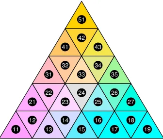
A.2 A discrete ternary-balance scheme
Following Derakhshan and Deutsch (2009), we discretize a ternary composition p by
mapping the set of all possible ternary coordinatesP to a subsetPN ⊂P of sizeN. We
perform this operation by partitioning a ternary diagram intoNregular triangles (regions)
and mapping the ternary compositionpto the centroid coordinatesqof the region with
the closest centroid. Border cases aside, this is the region surroundingp.
Regions in the ternary diagram are indexed by rowjand row memberistarting from
the lower left corner. The diagram is partitioned into rows1,. . .,kand a total ofN =k2
regular triangles. Each rowj has row membersi = 1,. . ., (2k−2j+ 1)(see Figure A–2). The centroid coordinatescof triangle(j,i)in a ternary diagram withkrows are given by
cji=
6k−6j−3i+ 4 +imod2
6k ,
6j−2−2imod2
6k ,
3i−2 +imod2 6k
.
To find the nearest centroidqfor a pointpwe first calculate the distances betweenp and all centroidscjiin the ternary diagram. The distance between pointspandcis given
by
l=p−c
d(p,c) =−l2l3−l3l1−l1l2.
We return the coordinates of the centroid with the lowest distance top.
q=arg min
cij
d(p,cij)
Shouldpbe of equal distance to multiple centroids, we randomly choose among the nearest centroids. The colour mixture at the centroid coordinates is then derived as shown in Appendix A.1.
Figure A–2 shows a colour-coded ternary diagram withk = 5rows andN = 25
regions. The centroid of each region is labelled with row indexjand entry indexi. A
ternary compositionpis discretized by mapping it to the nearest centroid.
Figure A–2: A colour-coded ternary diagram
11 12
13 14
15 16
17 18
19 21
22 23
24 25
26 27 31
32 33
34 35 41
42 43 51
A.3 Increasing contrast between colours
In order to improve the discriminability between colours in the ternary-balance scheme, we increase the lightness and chroma contrast among the mixtures. This is achieved by first rescaling chroma from range[0,c∗]to[1−contrast, 1]and then multiplying the
lightness and chroma of mixtureM with the rescaled chroma value to arrive at the final
Figure A–3: Increasing the contrast between colours of the ternary-balance scheme
Appendix B – Adding mortality contours to a compositional Lexis
surface
Contour lines or spatial representations can be used in combination with the ternary-balance or the qualitative-sequential scheme in order to add an additional data dimension to the surface, such as mortality rates by year and age.
Figure B–1: The ternary-balance scheme technique applied to French
cause-of-death data. Age-specific proportions of of people dying from a given cause in France, 1925–1999, total population. Age- and period-specific mortality rates are overlaid as contour lines
0 10 20 30 40 50 60 70 80 90 100
1930 1940 1950 1960 1970 1980 1990
Age 1990 1980 1970 1960 1950 1940 1930 1920 1910 1900 Coho rt Cause-of-death distribution
At any given period and age the colour represents the distribution of deaths among three causes. Period % Neopl asm % Externa l % Other Neoplasm Extern al causes Othercauses 0 20 40 60 80 100 0 20 40 60 80 100
0 20 40 60 80
100 1890 1880 1870 1860 1850 1840 1830
m(x) = 0.3
.1 .05 .03 .01 .005 .003 .001 .0005 .0003 .0001
Overall death rate
Contour lines show periods and ages of similar mortality levels.