social media
LANFRANCHI, Vitaveska, MAZUMDAR, Suvodeep
<http://orcid.org/0000-0002-0748-7638> and CIRAVEGNA, Fabio
Available from Sheffield Hallam University Research Archive (SHURA) at:
http://shura.shu.ac.uk/16893/
This document is the author deposited version. You are advised to consult the
publisher's version if you wish to cite from it.
Published version
LANFRANCHI, Vitaveska, MAZUMDAR, Suvodeep and CIRAVEGNA, Fabio (2014).
Visual design recommendations for situation awareness in social media. In: HILTZ,
S.R., PFAFF, M.S., PLOTNIK, L. and SHIH, P.C., (eds.) ISCRAM 2014 Conference
Proceedings. Book of papers. 11th International Conference on Information Systems
for Crisis Response and Management. USA, The Pennsylvania State University,
792-801.
Copyright and re-use policy
Visual Design Recommendations for
Situation Awareness in Social Media
Vitaveska Lanfranchi
OAK Group, University of Sheffield
[email protected]
Suvodeep Mazumdar
OAK Group, University of Sheffield
[email protected]
Fabio Ciravegna
OAK Group, University of Sheffield
[email protected]
ABSTRACT
The use of online Social Media is increasingly popular amongst emergency services to support Situational Awareness (i.e. accurate, complete and real-time information about an event). Whilst many software solutions have been developed to monitor and analyse Social Media, little attention has been paid on how to visually design for Situational Awareness for this large-scale data space. We describe an approach where levels of SA have been matched to corresponding visual design recommendations using participatory design techniques with Emergency Responders in the UK. We conclude by presenting visualisation prototypes developed to satisfy the design recommendations, and how they contribute to Emergency Responders’ Situational Awareness in an example scenario. We end by highlighting research issues that emerged during the initial evaluation.
Keywords
Situation Awareness, Social Media, Visual Analytics.
INTRODUCTION
In order to react and respond to crises and emergency situations, involved stakeholders (authorities, emergency services, citizens, communities) have to act quickly, coordinate actions and make decisions that cover a large problem area affected by a multitude of different factors and aspects. A key success factor is to achieve and maintain Situation Awareness, i.e. “accurate, complete and real-time information about an incident” (Winerman, 2009), to understand “the current local and global situation and how this may evolve over time” (Endsley, 1995). Traditional approaches to situation awareness and crisis management tend to rely on official communication channels, which are generally slow in providing information, due to the need of releasing only information that has been verified and approved. However, information spreads very quickly by word of mouth, especially on social networks (e.g. Facebook and Twitter). The sole reliance on formal communication channels, as both the source of information and a way to communicate with the citizens, is becoming increasingly ineffective. On the one hand, the traditional methods promote a passive role for the community, i.e. citizens are traditionally considered target of enquiry and in general at the very end of the information chain, rather than partners in situation awareness. On the other hand, citizens tend to focus on the abundance of up-to-date (although often unreliable) information on social networks rather than on the scarce and potentially out-of-date official information (Sutton, Palen & Shklovski, 2008) The use of new technologies to assist in the management of, and response to, emergencies provide a means for emergency planners to access a wide range of information that has not been available before. This information can be utilised by emergency planners to dramatically improve their understanding of the emergency and will aid them in rapidly assimilating a large amount of information to prevent, contain or respond to a critical situation. It enables emergency managers to quickly assess the best use of, and locate scarce resources and therefore improve service delivery.
support emergency services in gathering and making sense of information, many analytics systems have emerged, that that either directly foster data from citizens through custom apps (Okolloh, 2008) or analyse public data stream to extract real-time knowledge (Lanfranchi, 2012; Abel, Hauff, Houben, Stronkman, Tao, 2012; Hubmann-Haidvogel, Brasoveanu, Scharl, Sabou and Gindl, 2012) but not much emphasis has been placed on how to visually design a system to support acquiring Situation Awareness from Social Media.
Our work has been based on Klein’s Recognition-Primed Decision Model (Klein, 1989) and Endsley Situation Awareness Levels Theory (Endsley, 1995), according to which we define decision making as the process by which domain experts make decisions based on recognising similarities between the current situation and previous experiences. This process is made of two components: recognition and evaluation. The recognition component deals with Situation Awareness, ensuring the decision maker is aware of the situation, its evolution and what happened in past similar situations. The decision maker will use this knowledge to evaluate what may happen if a course of actions is chosen. Endsley famously introduced the idea of designing for SA by creating a set of guidelines derived from a theoretical model of the processes needed for acquiring SA in dynamic complex systems (Endsley, 2003). We based our research on the guidelines she derived and we specified them for supporting decision making with different levels of SA and introduced new guidelines specific to the Social Media scenario. To this end, we have used a participatory design approach where the guidelines were analysed and evaluated with Emergency Responders (ERs) in UK. As a result, we have developed an extended set of visual guidelines for each level of SA and new visualisation prototypes for Social Media information.
This paper presents: (i) the state of the art on the usage of Social Media information for Situation Awareness, with a specific attention for visual solutions; (ii) the participatory design approach that led to the definition of design recommendations for a visual interface for Social Media data; iii) a visual representation for Social Media that meets the design recommendations; iv) reflections on the most relevant challenges when designing for SA and how the effectiveness of the design choices can be evaluated in relation to SA.
RELATED WORK IN VISUAL ANALYTICS FOR DECISION SUPPORT
Understanding and acting upon large–scale data of different nature, provenance, and reliability is a significant knowledge management challenge. The main challenges of decision-making support with Social Media data are (1) Coping with dynamic, evolving, unknown datasets; (2) Providing multi-level, multi-pathways analysis; and (3) Providing exploration across datasets. Applying visualisations on Social Media can assist in reducing the cognitive burden. One of the most common approaches is using tag/word clouds (Phelan, McCarthy, and Smyth, 2009; Bernstein, Suh, Hong, Chen, Kairam and Chi, 2010). Combining several visual approaches such as timelines and geographical maps with tag/word clouds has been proven successful for helping users explore social data from multiple perspectives (Nagarajan, Gomadam, Sheth, Ranabahu, Mutharaju, and Jadhav, 2009; Marcus, Bernstein, Badar, Karger, Madden, Miller, 2011; Hubmann-Haidvogel et al, 2012). This approach has been extended exploiting the semantic of Social Media messages: for example (Diakopoulos, Naaman, and Kivran-Swaine, 2010) visualises tweets and their sentiments on a timeline along with keywords during video playbacks. Paulheim, Döweling, Tso-Sutter, Probst, Ziegert, 2009 provides emergency responders with structural, spatial and temporal views of the current situation for different application such as allocation of force and materials, planning and so on. MacEachren, Robinson, Jaiswal, Pezanowski, Savelyev, Blanford, and Mitra, 2011 presents a multiple coordinated visualisation system for understanding spatial and temporal dimensions of activities, events and attitudes by making use of geo-coded tweets. MacEachren, Jaiswal, Robinson, Pezanowski, Savelyev, Mitra, Zhang, Blanford, 2011 provides means to visualise geocoded twitter data in a multiple coordinated visual approach using heatmaps overlaid on geographical plots, colour coded timelines and twitter posts based on a topic of interest.
DESIGNING FOR SITUATION AWARENESS
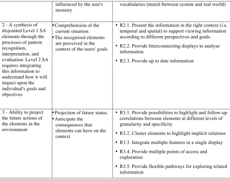
For the purpose of our research we used the definition of Levels of SA and the design guidelines provided by Endsley, 2011, translating them in visual design recommendations for a Social Media interface (see Table 1).
Methodology
Our approach was developed as a part of a wider set of projects (WeSenseIt1, RAnDMS2, TRIDS3) aimed at
1
developing novel techniques for the real-time analysis of Social Media in the Emergency Response domain. The approach was based on established state of the art techniques for participatory design that started from very specific scenarios to derive user requirements and thereby derive generic design recommendations that could be applied to different types of data/users. The first step was to conduct a detailed user and task analysis to derive a series of scenarios accurately reflecting the challenges ERs face while dealing with emergency situations. Interviews and focus groups were conducted with users to understand challenges and their information needs, which were then validated using shadowing sessions during real-life events. The scenarios were then finally validated using stimulated walk-throughs in a series of workshops. A set of tasks was then derived to capture and formalize the broad range of their activities. The next step was to analyse the guidelines proposed by Endsley, 2003 in the light of the specific tasks and datasets. The original guidelines focused on presentation of high level information; goal-oriented and co-located information displays; providing a global overview of the situation at all times, with details for the current focus of interest; and making critical cues explicit.
We analysed these guidelines during an interactive workshop with a group of ERs from England. During the workshop, a dataset of Social Media data relative to a public protest in Manchester4 was used to exemplify the type of messages. The dataset contained images, videos, and textual messages retrieved from Facebook, Flickr and Twitter. ERs were presented with a real-life scenario and the corresponding set of tasks. We also designed a set of low fidelity mock-ups, which were then discussed in details with the users. The process of deriving an extended set of guidelines was as follows: (1) Each guideline was broken down in sub-guidelines that relate to specific levels of SA and subtasks; (2) Each sub-guideline was analysed in the context of the specific Social Media information space; (3) Visual low fidelity mock-ups were discussed for each guideline; (4) The sub-guidelines for each level of SA were ordered in terms of importance by each users and the common top 5 (maximum) were selected; and (5) The top 5 guidelines for each level of SA were qualitatively evaluated during workshops with emergency responders (see Section ‘Evaluation’).
Our final step was to investigate how we could incorporate visual design and usability guidelines into the design recommendations. The ten usability heuristics proposed by Nielsen5 were carefully considered and where appropriate, integrated. Several principles of interface design from aesthetic as well as visual analytics perspectives were considered to assist in designing visually appealing interfaces that can support analytic tasks. Tractinsky’s notion “what is beautiful is usable” plays a significant role in the design of our solution, particularly in Emergency Response and other time-critical application areas - where timely interpretation and quick action is urgently required (Tractinsky, 2000). The role of aesthetic design in perceived usability has been the subject of much research, spanning several fields such as product design, arts as well as interface design in the recent past. Visual Analytic principles, on the other hand provide significant insights into how interactive visual interfaces can be developed for dealing with large datasets. Few Visual Analytic principles have been proposed so far for real time SA, however, we draw inspiration from the work of Green, Ribarsky and Fisher, 2009.
Extended Design Recommendations
Table 1 shows the final extended design recommendations for visualising Social Media data to support SA. These guidelines were then translated into a set of visualisations corresponding to the low-fidelity prototypes presented during our workshop.
SA Level Description Visualisation Design Recommendations
1 - Perceive the status, attributes, and dynamics of relevant elements in the environment.
•Perception of the elements in the environment.
•A user has to clearly perceive the status of the most relevant elements in the context.
•This level is strongly
• R1.1. Provide simple separate displays to focus on one element
• R1.2. Provide filtering mechanisms for focusing on an element of interest
• R1.3. Highlight trends and spikes in the data
• R1.4 Use familiar visual metaphors and standardised
2
http://gow.epsrc.ac.uk/NGBOViewGrant.aspx?GrantRef=EP/J020583/1
3 The TRIDS project was a WeKnowIt follow-up project, under the UK Technology and Strategy SBRI
programme call ‘Have I got ‘Views’ for you?’
4
http://en.wikipedia.org/wiki/2011_England_riots
5
influenced by the user's memory
vocabularies (match between system and real world)
2 - A synthesis of disjointed Level 1 SA elements through the processes of pattern recognition, interpretation, and evaluation. Level 2 SA requires integrating this information to understand how it will impact upon the individual's goals and objectives
•Comprehension of the current situation.
•The recognised elements are perceived in the context of the users' goals
• R2.1. Present the information in the right context (i.e. temporal and spatial) to support viewing information according to different perspectives and goals.
• R2.2. Provide Interconnecting displays to analyse information
• R2.3. Provide up to date information
3 - Ability to project the future actions of the elements in the environment
•Projection of future status.
•Anticipate the consequences that elements can have on the context
• R3.1. Provide possibilities to highlight and follow-up correlations between elements at different levels of granularity and specificity
• R3.2. Cluster elements to highlight implicit relations
• R3.3. Integrate multiple features in a single display
• R3.4. Provide multiple points of access and exploration
[image:5.595.68.525.70.427.2]• R3.5. Provide flexible pathways for exploring related information
Table 1 - This table shows the design recommendations derived from the SA levels during user studies and workshops with ERs. The first column presents the definition of the SA levels provided by Endsley [Endsley, 1995],
the second our interpretation and the third the derived design requirements.
VISUALISATION PROTOTYPES
A set of visualisation prototypes was developed to understand how different design and visualization choices can support SA. The prototypes were implemented as a series of visualisation widgets6 displaying semantic information extracted from Social Media. The widgets operate by retrieving information from a common back-end, where the data and the semantic information are stored, and dynamically creating different views accordingly to the users’ actions. A prototype framework employing a multiple coordinated approach presents the visualisation widgets in a dashboard metaphor, meaning the interaction with one widget changes dynamically all the other related widgets. This approach supports inquiry-based visual exploration, where users can simultaneously visualize multiple perspectives of the same underlying data. All the widgets have been designed with a common theme: the need for different degrees of granularity in the visualised data (Marcus et al, 2011) - users need to visualise data using a mixture of context and detail (Furnas, 1986). Following the Level of Details paradigm (Furnas, 1986) as common framework we devised visualisations for each level of SA.
The visualisation prototypes have been implemented using a two-step approach:
• Data Processing: this step analyses SM data to semantically enrich them and extract the key features to satisfy the information needs and the design recommendations. The structured information thereby generated is stored in a local data store, easily available for future querying.
6 A widget is a small application that resides within a web page, designed to communicate a specific kind of
• Data Visualisation: this step takes as input the semantically enriched SM data and applies the LoD paradigm to multiple dimensions to create visual widgets that meet the design recommendations. In the following sections we will describe the two steps, focusing our attention on the Data Visualisation step, as this is the core subject of this paper.
Data Processing
Social Media messages are typically composed of metadata (e.g. about the users, the equipment used to post, the location, etc.) and content, typically in textual format. Both metadata and content can be analysed to extract information (e.g. keywords, terms, named entities, events, etc.) and to create semantic data (e.g. topic of discussion, concepts, relations, etc.). In our approach, the messages are processed using Natural Language Processing (NLP) techniques which utilise the historic and current data and external knowledge resources (e.g. Wikipedia, OpenStreetMap) to augment the messages with structured metadata. We process the data in two primary ways: using public web services7 and in-house annotation tools (depending on the kind of annotation required e.g. location, user types etc.). Each message is annotated with tags, which resolve to Wikipedia concepts. This creates additional dimensions in the data - extracted tags can be used to establish the context of the message; and semantic concepts have an intrinsic hierarchy that allows exploration at different levels of detail. The following example shows how a tweet is enriched following a data processing stage. The user, date, geolocation and so on are extracted from the metadata of the tweet, whereas the content is analysed to identify ontological concepts (here, Sheffield being an instance of the city concept within the YAGO ontology).
<User>The Star, Sheffield</User> <Date>20/09/2012</Date>
<yago:city>Sheffield</yago:city> <Tweet>
Give your backing to Sheffield venues in running for top awards: Tramlines is encouraging everyone to get behind... http://bit.ly/VfBrM4 </Tweet>
Data Visualisation
From an overall interface perspective, our solution is a dashboard approach that provides multiple visualisation widgets in a well-organized layout. Several principles such as Beck’s (Beck, Burch and Diehl, 2009) (reducing visual clutter, maximize compactness), Tufte’s (Tufte, 1986) (designing well-balanced and proportioned layouts), (McClurg-Genevese, 2005, Kim, 2006) (well-balanced, rhythmic, proportionate, united layout etc.) have contributed toward the adoption of such an approach toward organized visual widgets, spatially segregated into different interface regions. A dashboard layout provides simultaneous views of large sets of information in a limited amount of space. Effective dashboards should be able to provide all the information in a meaningful, correct and intuitive way (Few, 2006). The familiarity of users with dashboard-like well-known interfaces such as iGoogle, BBC and Yahoo was also a motivating factor for employing a similar design. Several visual cues are employed throughout the design, in several visualisation widgets provide highlights and alerts to make users aware of statistically important underlying data. These highlights and alerts are provided by visually encoding hue, color and form of objects, based on design principles proposed by Healey, Booth and Enns, 1993. Examples of such highlights are clustering and color coding of Social Media messages discussing (or originating from) the same geographical regions; color coding nodes on the basis of number of mentions of concepts (as discussed in Level 3), sentiment bar to indicate the positive and negative sentiment surrounding a concept, color coded topic-overlays on geographic map etc.
Level 1
To address Level 1 recommendations, we created high level overview widgets using contextual features extracted from the data such as Authors, Cited users, Date, Location, Source, Language, Tags and Sentiment. Such high level overviews are presented using basic visualisations that are well known and familiar to a typical user (R1.1). An example of high-level overview that enables users to perceive the status of an element in the context is a tag cloud (see Figure 1). In the tag cloud, the relative frequency distribution of a tag associated with a Social Media message is calculated and displayed with differing size and colour accordingly to its frequency. When a tag is selected, the tag cloud visualises all the co-occurring tags, thus contextualising the information. The same visualisation can be applied to different entities extracted from the Social Media information, such as usernames to highlight, for example, the most mentioned users during an event (R1.3). All visualisations are linked, in the dashboard, employing a multiple, simultaneous, coordinated visualisation paradigm. Clicking on
7
visual elements (pie chart sections or tags) can automatically add filters to the existing view, thereby triggering all the visualisations to be updated (R1.2). The high level overviews, in this level incorporate aggregate visualisations such as tag clouds, bar charts, pie charts (Figure 1, right). Most users are highly familiar and conversant with such visualisations and interaction paradigms and therefore, their application in analytic systems is essential, as it reduces the necessity for learning (R1.4). Our continued consultation with experts from emergency response teams ensured that the vocabularies and terminologies were compliant (R1.4) with such teams, and using basic HTML templates simplified the process of porting the visualisations to other teams (as we observed that individual teams have their own terminologies).
Figure 1 - Level 1 visualisation examples: a tag cloud and a pie chart
Level 2
While contextualisation of data can be in many forms such as topical, temporal, geographical, structural, topological etc., the essence of such tasks is to provide surrounding context to a piece of information. In the case of Social Media in ER, to achieve Level 2 recommendations we focused on contextualising the data in the temporal and spatial context (R2.1). The chosen features are highly significant in ER, where two primary questions: where did an incident occur? and when did the incident occur? need to be answered first. An example of such contextualisation is a spatial density map that displays the most relevant locations for a topic, conveying how different regions are affected/involved in an event (see Figure 2). Following from the design of Level 1, these visualisations are integrated in a multiple coordinated visual framework. Hence, each interaction with the visualisations result in triggering queries to update all the connected visualisations (R2.2). Details about provenance and timeliness of information are constantly displayed, thus contributing to maintain an up-to-date awareness of the situation (R2.3).
Figure 2 - Level 2 contextual visualisations: a topic map (left), a density map (top right) and a timeline (bottom right)
Following an unobtrusive approach, the visualisations present the latest information (R2.3) that is available to the system. Users are provided with the flexibility to choose to either automatically rebuild each visualisation if new information is available, or do so on-demand. This provides users with means to visualise the most accurate information, as well as alert them in case any new information is available. A timely pooling mechanism to the backend ensures users are presented with the most accurate and updated information, as well as ensuring that the information is consistent. Similar to typical interaction approaches employed by many popular websites8, the user is alerted of any new content via a button with the text (X new updates available), which when clicked triggers the visualisations to be rebuilt with the new data.
Level 3
In order to achieve Level 3 recommendations, it is necessary to provide views that encourage establishment of correlations between unrelated data. The corresponding visual prototypes utilise semantically enriched Social Media messages. We firstly process the data to extract semantic information: for each SM message we extract a series of tags and we map them to Wikipedia9. This creates a new dimension: depth, which can be combined with co-occurrence to highlight the context of the exploration as well as the ontological structure of the information. We designed a new visualisation, called Context and Hierarchy Chain (see Figure 3), which uses data features such as semantic tags and information co-occurrence to provide flexible pathways to traverse and explore the information space. The Context and Hierarchy chain takes inspiration from the keyword chain, a visualisation widget that is used to encourage serendipitous discovery of information in a digital library (Thudt, Hinrichs, & Carpendale, 2012). The keyword chain visualisation is designed to achieve a set of visualisation goals that are very similar to the ones of our research, in particular (i) Provide multiple visual access points, (ii) Highlight adjacency and (iii) Provide flexible visual pathways. In our approach, a chain visualisation is used to link hierarchies of concepts and co-occurring tags related to a message to enhance contextualisation of data. Multiple features are used to create the Context and Hierarchy chain: co-occurring tags, relatedness of tags and hierarchy of tags. These features are represented using different integrated visual metaphors - arcs (represent a relation between entities); nodes (represent an entity, i.e. a tag or concept in the hierarchy); color-coded labels
[image:8.595.67.574.402.602.2](to differentiate between tags (blue) and concepts (green)). Related tags across categories are visually discoverable: when hovering on a tag, all the related ones are highlighted whilst the non-related ones are greyed out (R3.1). In this way tags are flexibly clustered on the basis of their relatedness (R3.2) and different exploration paths (R3.4) can be followed without losing the context of interaction. The chain visualisation has been integrated with the LoD (level of detail) methodology to allow over viewing a message or a concept from multiple perspectives, zooming in on an area of interest and using it to filter the resulting information or to visualise statistical information about the underlying data. Clicking on individual nodes provide more contextual information – three key pieces of information are provided. The sentiment bar indicates the underlying sentiment behind all the Social Media information that has been indexed as relevant to the concept in question. The distributions of the source of the Social Media posts (mobile, web, API) as well as the type of Social Media posts (image, text, link, video etc.) are presented as concentric unconnected doughnut charts (R3.3).
Figure 3 - Level 3 visualisations: context and hierarchy chain
Clicking on sections of the doughnut chart as well as sentiments trigger filters that rebuild all connected visualisations in the dashboard. This provides multiple ways to explore different dimensions of the underlying data, in a highly visual, interactive and flexible manner (R3.5).
A SCENARIO OF USE
John is an ER working in the City Council. He is monitoring public protests in Manchester10 using Social Media
9 The Semantic annotation maps the SM messages to DBpedia (http://dbpedia.org - a service that provides
querying over structured Wikipedia data) concepts.
10
to keep track of both the official news sources and the unofficial ones. At this level, John is concerned with understanding events surrounding a topic, `protest'. The tagcloud visualisation (Figure 1) alerts him that several hashtags are emerging and increasing in importance: #occupy, #ows (occupywallstreet), #occupylondon, #occupylsx etc. John tries to better understand the #occupy activities in Manchester by looking at their geographical distribution using the spatial density map (Figure 2). This allows him to contextualise the information relatively to his goals. John realises the phenomenon is very distributed therefore uses the Context and Hierarchy Chain visualisation (Figure 3) to investigate the context at different levels of specificity. For example John selects the #Protest tag and immediately the visualisation highlights the different cities where the protest related tags co-occur (London, New York) and the links with other social unrest phenomena like the riots and non-profit associations like #humanrights and #amnestyinternational. Looking at these previously unrelated tags and messages, John hypothesises that the #occupy movement is rising in importance and will be predominant from now on. He is also worried of the potential relation with the 2011 riots, therefore decides to increase the alert state on the public protests in Manchester to avoid them degenerating.
EVALUATION
The evaluation was carried out during a set of three workshops with ER from a large City Council in the UK. The evaluation participants were all experienced ER but with different backgrounds and expertise (e.g. police forces, flood responders etc). Since this was an initial evaluation, part of a full iterative user-centered design approach, we opted for a qualitative analysis of the prototypes to gather feedback that will be incorporated in further versions of the visualization system. During the three workshops participants were shown the prototypes at different levels of fidelity, starting from low-fidelity prototypes sketched on paper during the first workshop, moving on to medium-fidelity interactive prototypes for the second workshop to finish with high-fidelity interactive prototypes on the third workshop. The participants were given a scenario of use and presented the prototypes for the different levels of SA. They were asked to: (1) provide comments on the prototype; (2) judge how well the prototype supported the level of SA for the given task; (3) if unsatisfactory, provide examples on how the level of SA could be better supported, either verbally or by drawing examples; (4) asked to grade the prototypes in terms of personal preference, interestingness and usefulness. During the last workshop, a brief training session was delivered, to ensure participants knew how to use the prototypes.
Results
Preference for simple visualisations
When participants were asked to rank the visualization widgets in order of preference, all the Level 1 visualisation widgets ranked high, with the geographical visualisation coming up at the top. The context and hierarchy level 3 visualisation ranked lower, despite participants defining it potentially very useful. This was mainly due to the unfamiliar and potentially confusing nature of the visualization, given the attempt of displaying both hierarchical and contextual information at the same time: participant 3 said he “could not understand which way I have to look at it and it has too much information”. Moreover the participants seemed wary of the semantic processing of the data, considered difficult to trust. When participants were explained the same semantic processing happened in the level 1 basic interfaces, participant 3 answered “yes but I do not see that so that is OK”. This clearly highlights issues in trustworthiness of interfaces, where trying to automatically relate information may scare users that prefer to use their own judgment for relating the same information. A follow-up experiment will look at comparing automatic and manual correlations of information. Research needs to be undertaken on how to communicate the system confidence in the processing in such a way that it does not interfere with the investigation but provides a clue on how much the user can trust the system at any given stage. Whilst the context and hierarchy visualisations may not rank very high in terms of absolute preference, it ranked high in terms of potential usefulness and of interestingness. One participant ranked the context and hierarchy chain as the preferred widget as it “is different and engaging whilst the others are all the same and I get bored”.
This comment is indicative of the importance of aesthetics when designing an interface as it is fundamental to engage the users, especially when dealing with large masses of information over a long analysis session.
Importance of switching between different visualisations
All the participants commented on how the most important thing for them would be to be able to switch between different visualisations at any point in time, maintaining memory of their search and interactions, i.e. if they are looking for “riots” in London, every visualisation widget should be showing the results of the same search
according to the respective widgets’ visualisation dimensions. This, of course poses an issue where some dimensions may not be available for all search results and the dataset returned by one query to a geographical widget may differ from the dataset returned for a timeline search (e.g. not all messages may have a geo-location). A key issue for future research will be how to visually communicate the difference in the returned dataset whilst maintaining seamless interlinking between the widgets.
Importance of timeliness
A common comment was the need for clear visualization of provenance and time/date of information, to ensure out of date information is not considered during an emergency situation. Participants appreciated that every piece of information was visualized with time/date and provenance but they expressed the need to filter down to the most recent information. This feedback was addressed between the second and third workshop, providing means to select temporal horizons whilst visualizing information, to answer questions like show me what happened during the last X minutes (e.g. 1, 5, 30 minutes).
CONCLUSION
In this paper we describe a participatory design approach to visualise Social Media data for SA, to support rapid exploration and analysis of large scale datasets. We extended Endsley’s Levels of SA and design guidelines for the use of Social Media in Emergency Response and we implemented them in visual prototypes, with a particular attention for finding means to establish correlation and flexible visual pathways between data. Future work will focus on evaluating the recommendations and the resulting designs in a real-life scenario, to prove the added value in our approach. Several SA evaluation techniques have been proposed in literature, mostly focusing on evaluating SA during simulation exercise. SAGAT (Salmon, Walker, Ladva, Stanton, Jenkins & Rafferty, 2007) is a freeze probe technique that involves asking operators pre-defined SA queries during a frozen task and taking measurements (like response time and number of correct answers) to evaluate the effect of a system on SA. Whilst these methodologies are useful to understand SA in a static environment, the Social Media information space is very dynamic: we therefore believe in the need of more interactive evaluations that focuses on evaluating incremental and breakthrough levels of SA during a real-time task. To evaluate the effect of our techniques on SA we plan to use a mixture of objective and subjective techniques complemented by observer notes and conducted in real-time. The evaluation will be performed in a real-life situation with a reduced number of operators, to verify the findings under stress conditions and external influences.
ACKNOWLEDGMENTS
This research was funded by the European Union Seventh Framework Programme FP7/2007-2013 under grant agreement number 308429 (www.wesenseit.eu). We would like to thank the WeSenseIt partners that provided sensors for the case studies, in particular EPFL, STARLAB, AVDANTICSYS.
REFERENCES
1. Abel, F. Hauff, C. Houben, G-I., Stronkman, R., Tao, K. (2012) Twitcident: Fighting Fire with Information from Social Web Stream.In: Proceedings of International Conference on World Wide Web (WWW), Lyon, France.
2. Ashley, H. (2009). Change at hand: Web 2.0 for development (No. 59). IIED.
3. Beck, F., Burch, M., and Diehl, S. 2009. Towards an Aesthetic Dimensions Framework for Dynamic Graph Visualisations. In Proceedings of the 2009 13th International Conference Information Visualisation. IEEE Computer Society, Washington, DC, USA, 592-597. DOI=10.1109/IV.2009.42
4. Bernstein, M. S. Suh, B. Hong, L. Chen, J. Kairam, S. and Chi,E. H. (2010) Eddi: interactive topic-based browsing of social status streams. In Proceedings of the 23nd ACM Symposium on User Interface Software and Technology (UIST), pages 303–312.
5. Diakopoulos, N., Naaman, M., and Kivran-Swaine, F. (2010) Diamonds in the rough: Social media visual analytics for journalistic inquiry. In Proceedings of the IEEE Conference on Visual Analytics Science and Technology, pages 115–122.
6. Endsley, M. R. (1995) Toward a theory of situation awareness in dynamic systems: Situation awareness. Human factors 37, 1.
8. McClurg-Genevese, Joshua D (2005). "Digital Web Magazine - The Principles of Design."Digital Web Magazine - The Principles of Design. Digital Web Magazine, 13 June 2005. Web. 27 May 2013.
9. Few, S. (2006). Information dashboard design (pp. 120-206). O'Reilly. Chicago
10. Furnas, G. W. (1986). Generalized fisheye views (Vol. 17, No. 4, pp. 16-23). ACM.
11.
Tera Marie Green, William Ribarsky, and Brian D. Fisher. Building and applying a human cognition model for visual analytics. Information Visualization, 8(1):1–13, 2009.12. Healey, C. G., Booth, K. S., & Enns, J. T. (1993, May). Harnessing preattentive processes for multivariate data visualization. In Graphics Interface(pp. 107-107).
13. Hubmann-Haidvogel, A. Brasoveanu, A. M. P. Scharl, A. Sabou, M. and Gindl, S. (2012) Visualizing contextual and dynamic features of micropost streams. In Proceedings of the #MSM2012 Workshop, CEUR, volume 838.
14. Kim, N. (2006). A history of design theory in art education. The Journal of Aesthetic Education, 40(2), 12-28.
15. Klein, G. A. Recognition-primed decisions. Advances in man-machine systems research (Ed: W. B. Rouse). 1989.
16. Kwak, H., Lee, C. Park, H. and Moon, S. (2010) What is Twitter, a social network or a news media?. In Proceedings of the 19th international conference on World wide web (WWW '10). ACM, New York, NY, USA.
17. Lanfranchi, V. (2012) Realtime Situation Awareness via Social Media Streams, Demo Session at ISCRAM 2012, Vancouver, Canada.
18. MacEachren, A.M.; Jaiswal, A. Robinson, A.C.; Pezanowski, S.; Savelyev, A.; Mitra, P.; Zhang, X.; Blanford, J. (2011) SensePlace2: GeoTwitter analytics support for situational awareness, Visual Analytics Science and Technology (VAST), 2011 IEEE Conference on , vol., no., pp.181-190.
19. MacEachren, A.M., Robinson, A.C., Jaiswal, A., Pezanowski, S., Savelyev, A., Blanford, J. and Mitra, P. (2011) Geo-Twitter Analytics: Applications in Crisis Management. Proceedings, 25th International Cartographic Conference, Paris, France.
20. Marcus, A. Bernstein, M. S. Badar, O. Karger, D. R. Madden, S. and Miller, R. C. (2011) Twitinfo: aggregating and visualizing microblogs for event exploration. In Proceedings of the 2011 Conference on Human Factors in Computing Systems (CHI), pages 227–236.
21. Nagarajan, M. Gomadam, K. Sheth, A. Ranabahu, A. Mutharaju, R. and Jadhav, A. (2009) Spatio-temporal-thematic analysis of citizen sensor data: Challenges and experiences. In Web Information Systems Engineering, pages 539–553.
22. Okolloh, O. (2008) “Ushahidi, or ‘testimony’: Web 2.0 tools for crowdsourcing crisis information,” Participatory Learning and Action, vol. 59, no. January, pp. 65-70.
23. Paulheim, H. Döweling, S. Tso-Sutter K., Probst F., Ziegert ,T. (2009) Improving Usability of Integrated Emergency Response Systems: The SoKNOS Approach. GI Jahrestagung.
24. Phelan, O. McCarthy, K. and Smyth, B. (2009) Using twitter to recommend real-time topical news. In Proceedings of the 2009 ACM Conference on Recommender Systems, pages 385–388.
25. Salmon, P. M., Walker, G. H., Ladva, D., Stanton, N. A., Jenkins, D. P., & Rafferty, L. (2007). Measuring situation awareness in command and control: comparison of methods study. In Proceedings of the 14th European conference on Cognitive ergonomics: invent! explore! (pp. 27-34). ACM.
26. Sutton, J., Palen, L. & Shklovski, I., (2008) Backchannels on the front lines: Emergent use of Social Media in eth 2007 Southern California Fires. Proceedings of ISCRAM 2008, Washington DC.
27. Thudt, A., Hinrichs, U., & Carpendale, S. (2012). The bohemian bookshelf: supporting serendipitous book discoveries through information visualization. In Proceedings of the 2012 ACM annual conference on Human Factors in Computing Systems (pp. 1461-1470). ACM.
28. Tractinsky, N., Katz, A. S., and Ikar, D (2000). What is beautiful is usable. Interacting with Computers, 13(2):127–145, December 2000.
29. Tufte, E.R. (1986). The Visual Display of Quantitative Information. Graphics Press, Cheshire, CT, USA. 30. Winerman, L. (2009). Crisis communication. Nature 457(22):376-378.