1
Acknowledgements
After seven years the time has finally come to say goodbye to my years as a student. Two years ago I graduated from Communication and Media Design at Hogeschool Utrecht. I was not sure if I was able to do a master and getting my master’s degree but with some encouragement I tried anyway and started the pre-master in February 2014. In September of that same year I started with the master programme ‘Technical Communication’. Now that I am at the end of my master thesis, I am glad that I have started the master programme and I am thankful for the support I had during the last two years.
2
Abstract
Purpose: The purpose of this research was to find out if visual aesthetics have an influence on perceived usability, actual usability, user experience and trust. The results of this study can be used in how user interfaces should be designed to create the most user-friendly interface with a good user experience. The variables colour contrast and visual complexity were used to test what the influence is on perceived usability, actual usability, user experience and trust.
Method: A two by two experiment was conducted to see if visual aesthetics have an influence on perceived usability, actual usability, user experience and trust. Four different versions of a fitness application were created for the experiment. The variables colour contrast and visual complexity were manipulated in three of the four versions of the application. Participants were divided in four groups of twenty participants. The participants were asked to fill out a questionnaire about perceived usability, trust, user experience and visual aesthetics. To measure actual usability participants had to do four tasks with the application.
Results: The results of the experiment showed that the participants who used a version of the application with high colour contrast gave participants a more user-friendly and trustworthy user interface and a better user experience. There were main effects found for the variable colour contrast in actual usability, user experience and trust. There was also a main effect found for the variable visual complexity for user experience. The results showed that neither of the variables had an influence on perceived usability. This means that the variable colour contrast had more influence on how user-friendly the user interface was than visual complexity. The variable colour contrast also had more influence on how trustworthy the participants had found the user interface and how they had experienced the user interface.
Conclusion: Visual aesthetics do have an influence on actual usability, user experience and trust. The variable colour contrast mainly influences the actual usability, user experience and trust. How visually complex a user interface is mainly influences the user experience. User interfaces with high colour contrast will therefore provide a more user-friendly user interface and will give users a better user experience. A user interface that is not visually complex will give users a better user experience. It is therefore important to keep colour contrast and visual complexity in mind when designing a user interface.
3
Content
Abstract ... 2
1. Introduction ... 5
2. Theoretical framework ... 7
2.1 User interface ... 7
2.2 Visual aesthetics ... 7
2.2.1 Measures and guidelines for the visual aesthetics of a user interface ... 8
2.2.2 The theory of processing fluency ... 9
2.3 Usability and user experience ... 10
2.3.1 Usability ... 10
2.3.4 User experience ... 11
2.4 Trust ... 12
2.4.1 Trust in health apps ... 12
2.5 Hypotheses ... 13
3. Method ... 14
3.1 Experimental design and materials ... 14
3.2 Measures ... 16
3.2.1 Perceived usability and trust ... 17
3.2.2 Actual usability ... 17
3.2.3 User experience ... 17
3.2.4 Visual aesthetics ... 18
3.3 Manipulation checks ... 18
3.3.1 Pre-test ... 18
3.3.2 Manipulation check ... 19
3.4 The procedure ... 19
4. Results ... 22
4.1 Perceived usability ... 22
4.2 Trust ... 22
4.3 Actual usability ... 23
4.5 Visual aesthetics ... 30
5. Discussion ... 32
5.1 Hypotheses ... 32
4
5.1.2 Actual usability ... 33
5.1.3 User experience ... 34
5.1.4 Trust ... 34
5.2 Limitations ... 34
5.3 Suggestions for future research ... 35
5.4 Conclusion ... 35
References ... 36
Appendix 1: questionnaire ... 40
5
1. Introduction
In today’s world, technology has become more integrated in people’s everyday life. Especially in the world of mobile applications, for every problem a person could have there is an application. From finding the nearest restaurant to health applications such as training apps or even apps that can help users to manage their illnesses. Now that mobile phones and tablets are so intertwined in our lives it has become more important to users that they enjoy using an application and that they are satisfied with it. Companies realize that nowadays it is all about a good user experience. When designing a mobile application it is important to focus on what the user needs and test the application with the users to check if the application is what they need.
Because of the large quantity of applications that app stores have to offer, the visual aesthetics of these applications play an important part. Users can make a decision on whether or not to use the application just by looking at the user interface. If the aesthetics are not appealing or the interface does not look user-friendly, users can decide not to use the application in a matter of seconds (Tractinsky, Cokhavi, Kirschenbaum, & Sharfi, 2006). Making an application aesthetically pleasing can help to make a good first impression on users and it can help an application distinguish itself from other similar applications.
The findings of marketing studies have shown that attractive looking products are more often purchased than unattractive ones (van der Heijden, 2002). Therefore it is not unreasonable to suggest that visual aesthetics have an influence on usability and user experience. The importance of visual aesthetics is already more recognized. Usability and accessibility used to pay little attention to visual aesthetics but nowadays the visual aesthetics are more considered in the design of a user interface (Jalil et. al., 2012). In the research field of psychology the role of aesthetics has been studied frequently. The findings in psychology imply that the physical attractiveness of a person was correlated with the number of desirable character traits, this also includes perceived social
competence and intellectual competence. These findings can be summarized in the catchphrase ‘what beautiful is good’.
In the past there have been several studies on the topic of visual aesthetics and its influence on perceived usability and they have shown that visual aesthetics have an influence on perceived usability. However there are not a lot of studies on the influence of visual aesthetics on actual usability and even fewer on user experience. The studies that have been done on these topics have inconsistent findings. Some researchers found that aesthetically pleasing user interfaces decreased the user performance because the users were more focused on the aesthetics than on completing their task. Other studies found no effect on the user performance or found that the user
6 health applications because it is about people’s health and the users need to be comfortable that the application can help them and not make their situation worse (Eysenbach & Kohler, 2002).
To better investigate the influence of visual aesthetics on perceived usability, actual usability and user experience, the research question is: what is the influence of visual aesthetics on perceived usability, actual usability, user experience and trust of an application with health related information.
The scientific relevance of this research is that there have been other studies done on the influence of perceived usability, actual usability, user experience or trust. These studies often gave
7
2.
Theoretical framework
This theoretical framework will explain the different concepts of this research. First there will be an explanation of the importance of a well-designed user interface because that is the focal point of this study. After that the variables will be explained. The first variable that will be explained is visual aesthetics. The guidelines and measures for how to design a user interface will also be discussed in this part. Section 2.3 will describe what usability is and what the difference is between perceived usability and actual usability and how they can be measured. Then, the definition of user experience will be discussed and why this concept has gotten more attention lately. The last concept that will be discussed in section 2.4 of this theoretical framework is trust and the importance of trust in fitness and health applications.
2.1 User interface
The user interface is one of the most important parts of an application. A user interface stands between the user and the mobile application. In the user interface users can make the application do what they want by using the menu, buttons and icons displayed on the screen. How the user
interface is designed is important for an application because it can make a difference in whether or not an application is going to be used or not. Important concepts of a user interface are interaction design, visual design and information architecture.
Users use an application because they want to achieve a goal. Designers need to understand that users want to accomplish this goal without having to think too much or have to take much effort, users want to get to their goal fast. It is also important not to distract users with possible technical problems that can occur or present them other goals that they do not want (Johnson, 2010). To help users get to their goal it is important for designers to choose the right elements to help users to achieve their goal and arrange them in a way that is easy to understand and use (Garret, 2011). To let the user know which items are important in the application, designers need to distinguish them. Structure in a user interface can help users to see what items are important. When items are placed on top in the user interface users will know that these items are important. They can focus on these items and not focus on other less important items. Colour can also be used to differentiate particular items and draw the attention from users. Structure can therefore help users to complete their task or find what they are looking for faster and more efficiently.
2.2 Visual aesthetics
8 to the tools that they use to accomplish this goal, this is because ‘our attention has very little
capacity’ (Johnson, 2010). When users focus on their tools their attention is not with finishing their goal (Johnson, 2010). The visual aesthetics of the user interface can help users to stay focused on their goal and lead them in the right direction.
The visual aesthetics can help to improve how usable people find the application and let them have a good experience with the application. In previous studies on the topic of the influence of visual aesthetics on usability they found that visual aesthetics can even have a positive influence on how the users rate the usability of an application. Users rate the usability of an application higher when the design of the user interface is more aesthetically pleasing (Sonderegger et. al., 2014).
Sonderegger et. al., (2014) conducted a study about two functionally identical mobile phones where they manipulated their visual appearance. They made one highly appealing and the other one not appealing, with this study they could determine ‘the influence of appearance on perceived usability, performance measures and perceived attractiveness’ (Sonderegger, et. al., 2014). The results of this study showed that participants who used the highly appealing phone said that phone was more usable than participants who had the unappealing mobile phone. Tuch et. al. (2012) also conducted a study about the effect of an aesthetically pleasing product on perceived usability. For this study they created one webshop that was aesthetically pleasing and one that was not. The elements that were manipulated were background colour, background texture and decorative graphic elements. The navigational elements were not manipulated to avoid a difference in actual usability between the two webshops. Tuch et. al. (2012) focused on usability before and after participants used the webshop. The results of this study showed that there was no difference between the webshops in how the participants had rated usability before they had used the webshops. The participants who had the version of the webshop with low aesthetics rated the usability lower after they had used the webshop.
2.2.1 Measures and guidelines for the visual aesthetics of a user interface
Throughout the years there have been several measures and guidelines developed to help designers design a user interface. Most of the design guidelines for user interfaces are quite similar (Johnson, 2010). This is because ‘the design rules are based on human psychology: how people perceive, learn, reason, remember, and convert intentions to action’ (Johnson, 2010). Most of the authors that created design guidelines for a user interface have at least some background in psychology that they applied to computer system design (Johnson, 2010). The gestalt principles are one of the most well-known design principles and a lot of other design guidelines are based on the gestalt principles. The gestalt principles were developed by a group of German psychologists, under the lead of Max Wertheimer, who wanted to explain how the visual perceptions of humans work. One of their findings was that ‘the visual system automatically imposes structure on visual input and is wired to perceive whole shapes, figures, and objects rather than disconnected edges, lines, and areas’ (Johnson, 2010). The gestalt principles consist of proximity, similarity, continuity, closure, symmetry, figure/ground, and common fate.
9 developed fourteen measures for screen aesthetics, balance, equilibrium, symmetry, sequence, cohesion, unity, proportion, simplicity, density, regularity, economy, homogeneity, rhythm, and order and complexity. By using a mathematical formula the aesthetic level of the interface design can be calculated. Two other sets of user interface measures, which do not involve mathematical
formulae, were developed by Moshagen & Thielsch (2010) and Lavie & Tractinsky (2004). They believed that the complexity and the relationships between the different elements of the user interface were too difficult to be measured by mathematical formulae. Lavie and Tractinsky divided visual aesthetics into two dimensions namely ‘classical aesthetics’ and ‘expressive aesthetics’. The dimension of classical aesthetics is characterized by concepts such as pleasantness, symmetry, clarity and cleanliness. These measures are closely related to the interface design guidelines and emphasize orderly and clean design. The dimension of expressive aesthetics is more about creativity and originality and do not necessarily need to stay between design conventions. This dimension is characterized by concepts such as creativity, fascination, originality and sophistication and they use special effects. Moshagen and Thielsch developed Visual Aesthetics of Website Inventory (VisAWI). Moshagen and Thielsch interviewed experts and end-users and considered factors defined by the literature that influence visual aesthetics to create VisAWI. This approach is based on four facets of visual aesthetics namely simplicity, diversity, colourfulness and craftsmanship. Simplicity is about the balance in the user interface and if the user interface forms a unity and is clear. Diversity is about the visual complexity of the user interface. This facet is also about how creative the design of the user interface is and how novel it is. Colourfulness is about which colours are being used in the interface, how they are combined and are used within the interface. The last facet, craftsmanship, is about the how well the different design dimensions are put together to form the user interface. The design of the application that will be used in the experiment of this study is based on the theory of Moshagen and Thielsch. The variables that will be manipulated in the experiment are visual complexity and colour contrast. Good visual complexity means that the design of the user interface will form a unity and is clear and does not have a lot of elements. The variable colour contrast means that the user interface does not have a lot of bold colours and has high colour contrast.
2.2.2 The theory of processing fluency
10 2.3 Usability and user experience
Usability and user experience are important topics when it comes to user interface design. Usability is a well-established concept in the field of user interface design. Users need to be able to find what they are looking for in the user interface that they are using (Garrett, 2011). User experience is a relatively new concept. Nowadays users expect more than just a product that is easy to use. They want a product that gives them a joyful experience while using it.
2.3.1 Usability
According to ISO 9241, usability is ‘the extent to which a product can be used by specified users to achieve specified goals with effectiveness, efficiency, and satisfaction in a specified context’ (Lee & Koubek, 2010). In simpler terms, usability means that an application should work well and is easy for people to use. The average person needs be able to use the application with its intended purpose without getting frustrated (Krug, 2006). The application needs to be self-explanatory so people should not have to put much effort in finding out how the application works. According to Krug (2006), every question that a user has when using the user interface adds to the cognitive load. It will distract the user from the task that he or she is trying to accomplish, even when the distraction is slight, they will still add up and it does not take much for the user to quit using the application. As mentioned in the previous paragraph the theory of processing fluency can help with the cognitive load. Figure-ground contrast, visual complexity and symmetry can have an influence on processing fluency. When a user interface has high contrasting colours and less visual complexity the user can process the information easily. This could lead to shorter completion time when users do a task and it should take them less effort to complete a task. In the experiment conducted in this study the design characteristics colour contrast and visual complexity will be manipulated to test if users complete their task faster and more efficiently when a user interface is less visual complex and has good colour contrast. According to the article of Herrmann et. al. (2013) people prefer a product that is perceptually fluent. Perceptual fluency can therefore have an influence on perceived usability. To test if this is true the participants will be asked if they perceive the user interface as usable. Making the application usable will also help create trust among users and make them more loyal to the application (Flavia et. al., 2005). To make an application easy to understand it is important that the application is not visually complex. This will show the user what elements in the user interface are important and which are related to each other. The user interface should also be divided in clearly defined areas as this will show the user which part of the user interface they need to focus on (Krug, 2006). Users make quick decisions about what part of the user interface is relevant for them and then they almost never look at the other parts of the user interface. It is important to make the user interface clear and not too busy. It can overwhelm users when there are too many bright colours and adverts that scream for attention.
11 first effect. The reason for this is that the user enjoys the aesthetics and is pays more attention to the aesthetics than on finishing the task. Therefore the user will need more time to complete the task.
Usability can be divided into perceived usability and actual usability. This study will also separate these two concepts. Perceived usability is defined as the user’s perception and judgment of the usability (Mahlke, 2007, cited by Lee & Koubek, 2010). Users will be asked about how useful they think the application is, if they think the application is easy to use, how functional it is and if they are satisfied with the application. Perceived usability can be measured for example before the user starts using the application in a questionnaire. With actual usability the user already has started using the application. It is then about if the user can actually accomplish a goal effectively and efficiently. It is also about if the application is easy to learn and accessible in use (Lew et. al., 2010). Actual usability can be measured while the user is using the application and is performing some tasks with the application. Measurements that can be used to measure actual usability are the completion time, how many mistakes they make and if they were able to complete the task.
2.3.4 User experience
Usability has been researched for several years but user experience has been a rather new concept in the field of research. Several authors of different articles have come up with a definition of what user experience is. Therefore there are a lot of definitions that are all different and it is difficult to make one general concept for user experience. One thing that all these authors agree on is that user experience goes beyond usability and includes the feelings and expectations of the users when using a system or a product (Allam, Hussin, & Dahlan, 2013). Although there are several different
definitions by different authors there is an ISO definition (ISO 9241-110:2010). The definition of user experience according to ISO 9241-110:2010 is: a person’s perceptions and responses that result from
the use and/or anticipated use of a product, system or service (Vermeeren, et al., 2010). However, in
the current research a broader definition of user experience is used. The ISO definition 9241-110:2010 states that user experience consists of the perceptions and responses of users that result from the use or anticipated use from a product, system or service. The definition says nothing however about how the users are feeling during or after the use of a product, system or service and how well they understand it. The characteristics of the product or system are also important. The product has to be easy to use, needs to do what it says it is going to do, is easy to learn and gives the user pleasure when they interact with the product. The product, system or service also has to meet the expectation that users have of the product and how well it serves its purpose. A better definition of user experience has been given by Alben (1996), “All the aspects of how people use an interactive product: the way it feels in their hands, how well they understand how it works, how they feel about it while they are using it, how well it serves their purposes, and how well it fits into the entire context in which they are using it”.
User experience has become more well-known and important lately. More and more companies have become interested in user experience and pay more attention to the user experience of their products, a lot of products are now marketed as experiences and not just products (Hole & Williams, 2007). User experience is not about how a product, website or application works on the inside, it is about the outside where the user comes in contact with the product, website or application (Garrett, 2011). It is about the experience the user has while using for example an application. A user
12 (Väänänen-Vainio-Mattila, Roto, & Hassenzahl, 2008). When designing for user experience it is important that the daily lives of users and the needs of users are understood. User experience can also help a company to differentiate itself from the competition (Garrett, 2011). When a company delivers a better and more usable application, the user probably has a good user experience, users will then have a better impression of the company and is more likely to return to that application rather than search for another application that might fit their needs better. To ensure a positive user experience, it is important for the success of the product or system that the product or system
undergoes a user experience evaluation before and during the usage (Allam, Hussin, & Dahlan, 2013). The product or system is then adapted to the desires of the user. Because the concept of user
experience has become more important it is interesting to do research on this topic. Especially because there are not a lot of studies on the topic of the influence of visual aesthetics on user experience. Therefore this research will also test if visual aesthetics have an influence on user experience. According to the literature, processing fluency can have an influence on how users experience a product. Besides that processing fluency is the ease with which information is
processed in the human mind, it is also how easy or difficult the process feels (Oppenheimer, 2008). A product that can be easily processed will be evaluated more positively and will inspire more favourable attitudes than a product that is difficult to process (van Rompay, Pruyn, & Tieke, 2009). An easily processed product has more chance to be used again than a product that is not easily processed. According to the article of Reber, Schwarz & Winkielman (2004) the more aesthetically pleasing a product is the more pleasurable the experience is. The estimated outcome of the research will therefore be that the version of the application without bold colours and good colour contrast and with good visual complexity will have a more enjoyable user experience than the version where one or both of the variables will be manipulated.
2.4 Trust
Users feel insecure sometimes when visiting a website or application. Trust is needed when people feel vulnerable and are in an environment that has risks (Hankur et. al., 2002 cited by Seckler et. al., 2015). Trust can be created by the trustee with the characteristics that they possess. The
characteristics of the trustee can create a positive perception with users and can benefit them. This perception can reduce the uncertainty and risks among users and can possibly create a relation between the trustee and the users (Li & Yeh, 2010). Trust is further defined by ability, integrity, benevolence and predictability (Mcknight, Choudhury, & Kacmar, 2002). Ability is if the trustee has the competence to do what the user or consumer needs. Integrity is whether or not the trustee keeps their promises they made to the user or consumer and is honest with them. Benevolence is about whether the trustee has the user or consumer’s best interests at heart. The last one, predictability, is if the trustee’s behaviour is consistent.
2.4.1 Trust in health apps
Trust in health/fitness applications or websites is very important because users need to feel secure when they are using them. Mobile health such as medical apps or fitness apps have several
13 user, users do not trust every health application (Seckler et. al, 2015). When users want to start using a health application there are no other people to help them choose a trustworthy app for them to use. Therefore users have to decide for themselves which app they trust and want to use. Previous studies have focused on online trust in e-commerce websites and have found web characteristics that can enhance the feeling of trust among users. There have been more studies done about trust in e-commerce and which characteristics can help users to feel more trustworthy of the site or app. There have not been a lot of studies done about the characteristics of websites or applications that can help the user feel more secure when using a health application or website. The characteristics that were found in the studies on e-commerce are the design of the web page, readability, how the navigation works and the accuracy of the information (Li & Yeh, 2010). The article of Novemsky et. al. (2007) states that processing fluency has an influence on judgement of truth. People can find a product with high fluency more trustworthy than a product that does not have high fluency. One variable that facilitates fluent processing according to Novemsky et. al. is figure-ground contrast. It is therefore likely that products with a high contrast will be considered more trustworthy (Novemsky et. al., 2007). The study of Karvonen (2000) also states that the ‘design quality’ has an influence on how trustworthy the web page or app looks. According to Karvonen (2000), the term design quality means how professional the design looks. This means how well the webpage or app is designed by the designer. The term design quality can also mean pleasantness. When users use a webpage or application that has quality design they experience pleasant feelings towards the webpage or
application. In another study of Karvonen (2001) about designing trust for universal audiences, it was shown that users prefer simple design in whether or not they trust de website or application. There are a lot of studies about the influence of visual aesthetics on e-commerce applications or websites but there are not a lot of studies done about the influence of visual aesthetics on mobile health applications or websites. Therefore this study will besides focusing on the influence of visual aesthetics on usability and user experience also focus on trust in fitness applications.
2.5 Hypotheses
H1 A user interface with high colour contrast will result in higher levels of usability, user experience and trust than a user interface with low colour contrast.
H2 A user interface with good visual complexity will result in higher levels of usability, user experience and trust than a user interface with bad visual complexity.
14
3.
Method
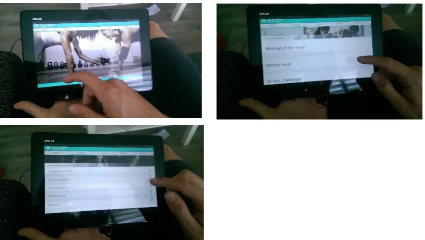
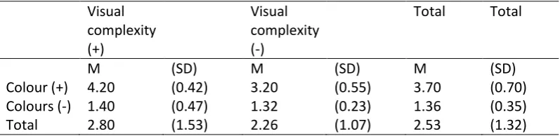
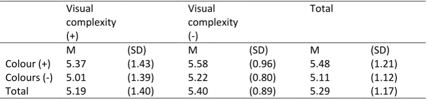
The aim of this study is to investigate whether or not visual aesthetics have an influence on perceived usability, actual usability, user experience and trust through an experiment. For the experiment the user interface of a fictive fitness application was used. The application was designed according to the guidelines and measures mentioned in the theoretical framework.
3.1 Experimental design and materials
The experiment has a 2 x 2 design (colour contrast x visual complexity). The instruments that have been used during this experiment were a questionnaire and a prototype of an application.
Participants were divided into four groups of 20 people. Each group got a different user interface. The user interfaces were designed according to some of the measures that were developed by Moshagen and Thielsch (2010). The measures that were used are simplicity/diversity and
15
Figure 1: User interface 1, high colour contrast and good visual complexity
[image:16.595.76.300.339.576.2]
16
Figure 3: User interface 3, high colours contrast, bad visual complexity
Figure 4: User interface 4, low colour contrast and bad visual complexity
The application that participants used is a fictive application and is a prototype. The prototype contains the different screens that are needed to complete the tasks. Therefore the application is not a complete working application. The screens were designed in Adobe Photoshop and were made clickable using the website www.invisionapp.com. The application is a prototype and therefore some parts of the application did not work. However, all the screens that were necessary to complete the task did work, the only parts that did not work for the participants were the entry fields in the first and third task. These entry fields were filled in for the participants. The participants were informed about which parts of the application they could not fill in and which they had to fill in themselves. Also the tasks were designed in a way that participants only partially had to fill in the entry fields during the task.
3.2 Measures
[image:17.595.70.481.213.456.2]17
3.2.1 Perceived usability and trust
Perceived usability and trust were measured in a questionnaire. The participants needed to fill in this part of the questionnaire before the actual interaction with the user interface. Participants only got to see the user interface and could not interact with the user interface. They only needed to give their first impression of the application in the questionnaire. Participants will be asked to answer questions about what they think of the user interface and if they perceive the user interface as usable. The construct of perceived usability came from the article of Lee & Koubek (2010). The construct of perceived usability contained eight questions. These questions were asked to see if the participants thought that the application was easy to use and if they thought that they could complete a task with the application. The Cronbach’s Alpha was performed to test if the scale was reliable. The Cronbach’s Alpha of the perceived usability scale was 0.95 and is considered reliable. The second construct about trust is retrieved from Sweeney & Swait (2008). The participants were asked whether or not they thought the application is trustworthy and if they thought the application is safe to use. The variable trust was measured in the beginning of the experiment because users can decide if the application is trustworthy just by looking at the application. Both of the constructs were measured by a 7-point Likert scale. The construct of trust contained six questions about if the
participants thought the application was trustworthy and if the application delivers the service that it promises. The Cronbach’s Alpha of this construct was 0.89 and was therefore reliable.
3.2.2 Actual usability
After participants filled out the questionnaire they were asked to do a few tasks to measure their performance with the user interface. The performance of the participants was measured by how many participants were able to complete the tasks. Also the amount of time users needed to complete the task was measured and how many mistakes the users made during each task. During this part of the experiment the participants were filmed. On film, the participants cannot be identified. The filming of the experiment helped the researcher with the data collection during the performance of the tasks by participants. The participants needed to do four tasks. The first task was choose some workout goals in the profile section of the application. The second task was to look up the workout ‘circuit challenge’ on intermediate level, the third task was to set up a challenge for friends. The last task was to look up the progress of the fitness goals.
3.2.3 User experience
18 was not reliable was the one of novelty. One question of this construct was deleted. After the
[image:19.595.72.531.148.244.2]question was deleted the Cronbach’s Alpha was 0.68 and the construct was used with the remaining three questions.
Table 1: Cronbach’s Alpha’s of the construct user experience
Construct Cronbach’s Alpha Number of items
Attractiveness 0.94 6
Perspicuity 0.81 4
Efficiency 0.85 4
Dependability 0.85 4
Stimulation 0.88 4
Novelty 0.68 3
3.2.4 Visual aesthetics
The last construct in the questionnaire was a construct about visual aesthetics. To test whether or not participants found the application that they had tested aesthetically pleasing, they were asked questions about the design of the application. The construct of visual aesthetics was retrieved from the article of Lee & Koubek (2010). This construct was measured with a 7-point Likert scale. This construct contained ten questions about if the design was clear and ordered and if the design was pleasant and enjoyable to look at. The Cronbach’s Alpha of this construct was 0.94 and is therefore considered to be reliable.
3.3 Manipulation checks
3.3.1 Pre-test
Before the experiment started there was a qualitative manipulation check performed. The user interfaces that were used for this study were first tested to see if people did prefer the user interface with high contrasting colours and good visual complexity over the other three versions where the variables colour contrast and/or visual complexity were manipulated. Five people were asked what their opinion was of the user interfaces. They all got to see the four different user interfaces and got to use the applications. All five people found the user interface with high colour contrast and good visual complexity the most aesthetically pleasing. They also thought that the user interface with the good visual complexity and high colour contrast was the easiest to use. When the participants of the pre-test were using the user interface with the bad visual complexity and high colour contrast they seemed a bit confused when they saw the homepage of the applications, they did not know where they had to look. The participants of the pre-test did not find the user interface with low colour contrast and good visual complexity aesthetically pleasing. There were too many bold colours and the contrast was low. Therefore this interface was confusing and hard for them to read the text. The interface that was found least aesthetically pleasing was the user interface with the bad visual complexity and low colour contrast. The participants of the pre-test found this user interface
19
3.3.2 Manipulation check
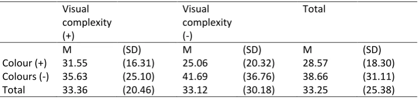
[image:20.595.72.471.420.517.2]After the experiment was done, a quantitative manipulation check was performed to test if the manipulations were done correctly. Twenty additional people were given the tablet with the application and looked at the application. After the twenty participants had taken a look at the application they were given five questions to answer. The questions were about if the participants found the colours that were used in the application attractive, if there was a good contrast between the colours which would help with the readability of the application and if the application was easy to navigate. Questions about visual complexity were about if participants thought the application seemed organized and if the design forms a unity. The analysis of variance was performed to test if there was a main effect and/or an interaction effect. The mean scores of the manipulation check showed that there was a big difference between the mean scores of the versions with low colour contrast and the version with high colour contrast. The mean scores of the versions with high colour contrast are a lot higher than the mean scores of the versions with low colour contrast. The analysis of variance also showed that there was a main effect found for both variables colour contrast (F(1, 16) = 145.63, p = <.01) and visual complexity (F(1, 16) = 7.76, p = .01). The analysis of variance was used to test if there was a main effect for the variables visual complexity and colour contrast. The analysis of variances showed that there was an interaction effect between the variables colour and visual complexity (F(1, 16) = 5.62, p = .03). This means that both variables have an influence in if users find a user interface aesthetically pleasing.
Table 2: Mean scores extra manipulation check, 5-point Likert scale
Visual complexity (+) Visual complexity (-)
Total Total
M (SD) M (SD) M (SD)
Colour (+) 4.20 (0.42) 3.20 (0.55) 3.70 (0.70)
Colours (-) 1.40 (0.47) 1.32 (0.23) 1.36 (0.35)
Total 2.80 (1.53) 2.26 (1.07) 2.53 (1.32)
3.4 The procedure
Before the start of the experiment, the participants were asked to read and sign an informed-consent form. After the participants had signed the informed-consent form, the researcher briefly explained what the participants needed to do during the experiment. After that the researcher showed the application on the tablet. The researcher clicked through the menu of the application on the tablet. After the participants had formed a first impression they could start with the questionnaire. The questionnaire started with a couple of background questions. The questionnaire continued with a construct of perceived usability and trust. When the participants had filled in all the questions about perceived usability and trust, they got to see a screen that said that they had reached the second part of the experiment. The researcher then gave them the tablet with the application. The participants were given four tasks that they needed to perform. The researcher filmed the
20 with the questionnaire. The last part of the questionnaire consisted of two constructs, a construct about user experience and a construct about visual aesthetics. The experiment was conducted in a quiet place and during the experiment the participants were not able to communicate with the researcher. The average time participants needed to do the whole experiment was about fifteen minutes. Some participants finished the experiment quickly within ten minutes. Others needed up to twenty-five minutes and had a harder time finishing the tasks with the application.
3.5 Participants
A total of eighty people participated in this experiment. The participants were divided into four equal groups. The participants were randomly assigned to a group and they did not know to which group they were assigned. Because everyone can use a fitness application it is not necessary to have a specific target group for this experiment. Therefore people from different ages and backgrounds can participate in the experiment. Participants of the University of Twente were rewarded with 0.25 credits if they had registered in the SONA system. The following table will show the comparison of the participants of the four versions. The table shows that the participants were equally divided over the four versions of the applications and are therefore comparable.
Table 3:. Comparing background variables of the participants
Version 1 Version 2 Version 3 Version 4
Age 35.65 (15.54) 35.60 (16.89) 34.65 (17.19) 34.35 (15.52)
Gender Man 8 11 11 12
Woman 12 9 9 8
Educati on
VMBO 0 0 3 1
HAVO 3 1 3 0
VWO 3 4 1 5
MBO 2 5 2 2
HBO 6 5 4 7
WO 6 6 7 5
In possessi on of a tablet
Yes 17 10 12 15
No 3 10 8 5
Tablet use
Daily 8 7 6 7
Weekly 7 3 5 3
Monthl y
1 2 1 2
Less than a month
0 0 1 2
Never 4 8 7 6
Health apps
Yes 4 8 4 5
21 Use of
health apps
Daily 1 9 2 1
Weekly 3 3 1 3
Monthl y
0 4 1 1
22
4.
Results
This section describes the results of the experiment. The results will show the differences between the four versions of the application in perceived usability, trust, actual usability and user experience.
4.1 Perceived usability
[image:23.595.71.490.315.414.2]The descriptives show that the mean scores for the two variables, colour contrast and visual complexity, are similar the four versions of the application. To test if there was a main effect or an interaction effect the analysis of variance was performed. The analysis of variance showed that there was no main effect for the variable colour contrast (F(1, 76) = 1.90, p = .17). There was also no main effect for the variable visual complexity (F(1, 76) = .65, p = .42). The results of the the analysis of variance showed that no interaction effect was found (F( 1, 76 =.01 , p = 1.00).
Table 4: Mean scores perceived usability, 7-point Likert scale
Visual complexity (+)
Visual complexity (-)
Total
M (SD) M (SD) M (SD)
Colour (+) 5.37 (1.43) 5.58 (0.96) 5.48 (1.21)
Colours (-) 5.01 (1.39) 5.22 (0.80) 5.11 (1.12)
Total 5.19 (1.40) 5.40 (0.89) 5.29 (1.17)
4.2 Trust
23
Table 5: Mean scores for the construct of trust, 7-point Likert scale
Visual complexity (+) Visual complexity (-) Total
M (SD) M (SD) M (SD)
Colour (+) 5.11 (1.09) 5.16 (0.76) 5.13 (0.93)
Colours (-) 4.59 (1.15) 4.48 (1.02) 4.54 (1.08)
Total 4.85 (1.14) 4.82 (0.95) 4.84 (1.04)
4.3 Actual usability
Actual usability was measured by how many mistakes the participants made and how much time it took for them to complete the tasks. In version two, three and four there were a few participants who did not complete every task. These participants were omitted in the analysis. In task one eleven participants were omitted, in task two twelve participants were omitted, in task three eighteen participants were left out and in the last task one participant was left out of the analysis. For each task the amount of mistakes and the time of completion was studied. The analysis of variance was used to test if there was a significant difference between the two variables colour contrast and visual complexity. The mean scores for the duration of task one show that the participants who had the versions with low colour contrast needed more time to complete the task. The difference between the mean scores for visual complexity did not differ that much. The analysis of variance shows that no main effect was found for the variables colour contrast(F(1, 65) = 3.27, p = .08) and visual complexity (1, 65) = .34, p = .56). The analysis of variance shows that no interaction effect was measured (F(1, 65) = .13, p = .72) between the two variables.
Table 6: Mean scores of duration of task 1 in seconds
Visual complexity (+) Visual complexity (-) Total
M (SD) M (SD) M (SD)
Colour (+) 31.55 (16.31) 25.06 (20.32) 28.57 (18.30) Colours (-) 35.63 (25.10) 41.69 (36.76) 38.66 (31.11)
Total 33.36 (20.46) 33.12 (30.18) 33.25 (25.38)
[image:24.595.74.490.477.575.2]24
Table 7: Mean scores of duration of task 2 in seconds
[image:25.595.73.489.304.401.2]The descriptives of task three show that the mean scores are quite similar. The analysis of variance shows that no main effect for the variables colour contrast (F(1, 54) = .56, p = .46) and visual complexity (F(1, 54) = .03, p = .96) was found. The results also show that there was no interaction effect (F(1, 54) = .92, p = .34).
Table 8: Mean score of duration of task 3 in seconds
Visual complexity (+) Visual complexity (-) Total
M (SD) M (SD) M (SD)
Colour (+) 33.20 (21.37) 28.36 (22.03) 31.48 (21.39) Colours (-) 32.08 (15.85) 37.53 (19.22) 35.11 (17.69)
Total 32.78 (19.22) 33.65 (20.55) 33.17 (19.66)
The mean scores for the duration of task 4 show that the participants who had a version of the application with good visual complexity needed less time to complete the task. To test if the difference between the two variabes is significant the analysis of variance was used. The analysis of variance shows that there was no main effect for the variable colour contrast (1, 74) = 1.28, p = .26) and visual complexity (F(1, 74) =3.29, p = .07). The results also show that there was no interaction effect (F(1, 74) = .01, p = .93).
Table 9: Mean scores of the duration of task 4 in seconds
Visual complexity (+) Visual complexity (-) Total
M (SD) M (SD) M (SD)
Colour (+) 12.40 (8.98) 16.79 (16.55) 14.54 (13.23) Colours (-) 15.47 (13.16) 21.50 (15.62) 18.56 (14.60)
Total 13.90 (11.17) 19.21 (16.04) 16.55 (13.99)
The mean scores for the amount of mistakes participants made in performing the first task show that the participants who had a version with low colour contrast made more mistakes than the
participants who had a version with high colour contrast. The analysis of variance also shows that there was no main effect for the variable visual complexity (F(1, 65) = .36, p = .55). There was however a main effect for the variable colour contrast (F(1, 65) = 12.77, p = <.01). This means that the participants who had a version with low colour contrast made significantly more mistakes than the participants that had a version with high colour contrast. The variable visual complexity did not
Visual complexity (+) Visual complexity (-) Total
M (SD) M (SD) M (SD)
Colour (+) 45.55 (30.28) 30.19 (26.20) 38.72 (29.19) Colours (-) 40.75 (52.26) 56.06 (46.39) 48.41 (49.23)
[image:25.595.73.489.553.650.2]25 have a significant influence in how many mistakes the participants made. The results show that there was no interaction effect (F(1, 65) = .51, p = .48) between the two variables.
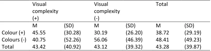
Table 10: Mean scores of how many mistakes the participants made during task 1
Visual complexity (+) Visual complexity (-) Total
M (SD) M (SD) M (SD)
Colour (+) 0.10 (0.48) 0.06 (0.24) 0.08 (0.36)
Colours (-) 1.19 (2.26) 1.69 (2.30) 1.44 (2.26)
Total 0.58 (1.61) 0.85 (1.79) 0.71 (1.69)
The descriptives of the second task show that the mean score of the of the version with high colour contrast and with the good visual complexity was the lowest. The mean score of the version with high colour contrast and with bad visual complexity was a little bit higher. The participant who had a version of the application with low colour contrast made approximately twice as many mistakes during the second task. To test if this difference was significant the analysis of variance was
[image:26.595.72.472.406.504.2]performed. The results show that a main effect was found for the variable colour contrast (F(1, 76) = 9.74, p <.01). No main effect was found for the variable visual complexity (F(1, 64) = .15, = .70). No interaction effect were found (F(1, 64) = .36, p = .55).
Table 11: Mean scores of how many mistakes the participants made during task 2
Visual complexity (+) Visual complexity (-) Total
M (SD) M (SD) M (SD)
Colour (+) 2.50 (2.21) 2.69 (3.42) 2.58 (2.77)
Colours (-) 5.81 (5.22) 4.94 (3.45) 5.38 (4.38)
Total 3.97 (4.14) 3.81 (3.57) 3.90 (3.85)
The mean score for the version with high colour contrast and good visual complexity was the lowest. The mean scores for the other versions show a high degree of similarity. The analysis of variance was performed to test if there was a main effect or an interaction effect. The results of the analysis of variance show that no main effect was found for the variables colour contrast (F(1,58) = 1.65, p = .20) and visual complexity (F(1, 58) = .90, p = .35). Additionally, no interaction effect was found (F(1, 58) = .53, p = .47).
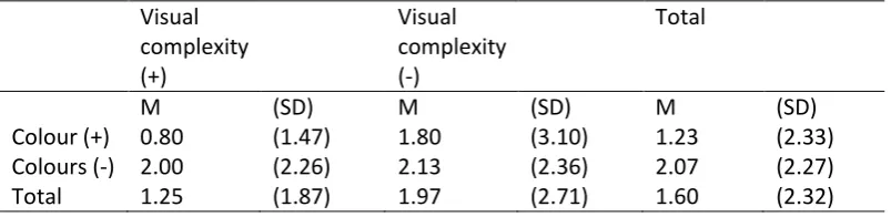
Table 12: Mean scores of how many mistakes the participants made during task 3
Visual complexity (+) Visual complexity (-) Total
M (SD) M (SD) M (SD)
Colour (+) 0.80 (1.47) 1.80 (3.10) 1.23 (2.33)
Colours (-) 2.00 (2.26) 2.13 (2.36) 2.07 (2.27)
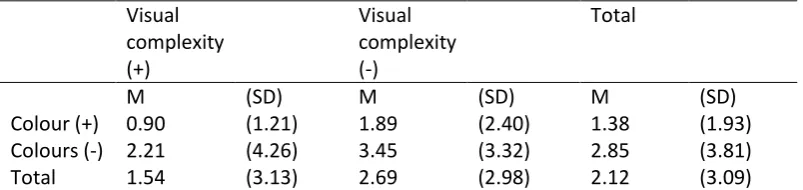
[image:26.595.71.473.646.744.2]26 The descriptives of the last task show that participants who had the version with low colour contrast and bad visual complexity made the most mistakes during the last task. The participants who had one of the other versions made less mistakes and the participants with the version with high colour contrast and good visual complexity made the least mistakes. The analysis of variance was performed to test if there was an interaction effect between the two variables or if there was a main effect for the variables. The results of the analysis of variance showed that there was no main effect for the variable visual complexity (F(1, 75) = 2.70, p = .11). There was a main effect for the variable colour contrast (F(1, 74) = 4.43, p = .04). This means that the participants who had a version of the application with low colour contrast made significantly more mistakes than participants who had a version of the application with high colour contrast. The results of the analysis of variance also show that no interaction effect found between the two variables (F(1, 74) = .03, p = .86).
Table 13: Mean scores of how many mistakes the participants made during task 4
Visual complexity (+) Visual complexity (-) Total
M (SD) M (SD) M (SD)
Colour (+) 0.90 (1.21) 1.89 (2.40) 1.38 (1.93)
Colours (-) 2.21 (4.26) 3.45 (3.32) 2.85 (3.81)
Total 1.54 (3.13) 2.69 (2.98) 2.12 (3.09)
The results of actual usability show that the variable colour contrast had a significant influence in how much time participants needed to complete task two. The variable colour contrast did not significantly influence the duration of the other three tasks. The variable visual complexity did not have an significant influence in the duration of all the four tasks.The variable visual complexity did also not influence the amount of mistakes the participants made during the tasks. The variable colour contrast did however significantly influence the amount of mistakes the participants made during the first, second and last tasks. The results of actual usability show that there was no interaction effect between the variables colour contrast and visual complexity considering the duration of the tasks and how many mistakes participants made during the tasks. This means that the influence of low colour contrast on actual usability did not depend on good or bad visual complexity.
4.4 User experience
27 attractiveness of the application but the variable visual complexity did not have a significant
[image:28.595.70.472.138.234.2]influence. The results also show that no interaction effect was found (F(1, 76) = 1.52, p = .22).
Table 14: Mean scores construct user experience attractiveness, 7-point Likert scale
Visual complexity (+) Visual complexity (-) Total
M (SD) M (SD) M (SD)
Colour (+) 5.15 (1.03) 5.13 (0.98) 5.14 (0.99)
Colours (-) 4.75 (1.03) 1.07 (1.50) 4.41 (1.37)
Total 4.95 (1.03) 4.60 (1.39) 4.77 (1.25)
The mean scores for the construct of perscuity showed that the mean scores for the versions with bad visual complexity were lower than the versions with a good visual complexity. The mean score for the version with bad visual complexity and low colour contrast was the lowest. The analysis of variance was performed to test if there was an interaction effect between the two variables or if there was a main effect. The results show that no main effect was found for the variable colour contrast (F(1, 76) = 3.77, p = .06). A main effect was found for the variable visual complexity (F(1, 76) = 5.44, p = .02). This means that the variable visual complexity had a significant influence on how the participants experienced the perspicuity of the application. The results show that there was no interaction effect (F(1, 76) = 1.17, p = .28).
Table 15: Mean scores construct user experience perspicuity, 7-point Likert scale
Visual complexity (+) Visual complexity (-) Total
M (SD) M (SD) M (SD)
Colour (+) 5.24 (1.42) 4.88 (1.36) 5.06 (1.39)
Colours (-) 4.99 (1.02) 4.00 (1.34) 4.49 (1.28)
Total 5.11 (1.23) 4.44 (1.40) 4.78 (1.35)
[image:28.595.72.473.432.529.2]28
Table 16: Mean scores construct user experience efficiency, 7-point Likert scale
Visual complexity (+)
Visual complexity (-)
Total
M (SD) M (SD) M (SD)
Colour (+) 5.49 (0.89) 5.13 (1.15) 5.31 (1.03)
Colours (-) 4.78 (1.15) 4.06 (1.57) 4.42 (1.30)
Total 5.13 (0.93) 4.59 (1.46) 4.86 (1.25)
The descriptives of the construct dependability show that the mean scores for the versions with low colour contrast were lower than the mean scores of the version with high colour contrast. The version with high colour contrast and with the good visual complexity was rated the best by the participants. The version with the lowest score was the version with low colour contrast and with a bad visual complexity. The analysis of variance was performed to test if there was an interaction effect and if there was a main effect for the two variables. The results of the analysis of variance show that a main effect was found for both of the variables colour contrast (F(1, 76) = 9.16, p = <.01) and visual complexity (F(1, 76) = 7.71, p = .01). This means that both of the variables significantly influenced how the participants had experienced the dependability of the application. The results also show that there almost a interaction effect for the two variables (F(1, 76) = 3.27, p = .08). Figure 5 shows that the lines almost cross.
Table 17: Mean scores for the construct user experience dependability, 7-point Likert scale
Visual complexity (+)
Visual complexity (-)
Total
M (SD) M (SD) M (SD)
Colour (+) 5.16 (1.07) 4.92 (1.14) 5.04 (1.10)
Colours (-) 4.86 (0.86) 3.74 (1.28) 4.30 (1.22)
[image:29.595.77.472.428.524.2]29
Figure 5: Mean scores for the construct user experience dependability
The mean score for the construct stimulation shows that the mean scores of the version with high colour contrast were higher than the mean scores fo the version with low colour contrast. The mean score of the version with the bad visual complexity and low colour contrast was the lowest. The analysis of variance was performed to test if there was an interaction effect and if there was a main effect for the two variables. There was no main effect for the variable visual complexity (F(1, 76) = 3.61, p = .06). There was a main effect for the variable colour contrast (F(1, 76) = 9.93, p = <.01). This means that only the variable colour contrast had a significant influence in how stimulating the participants found the application. The results also show that there almost an interaction effect for the two variables (F(1, 76) = 3.08, p = .08). The lines in figure 6 almost cross eachother.
Table 18: Mean scores for the construct user experience stimulation, 7-point Likert scale
Visual complexity (+)
Visual complexity (-)
Total
M (SD) M (SD) M (SD)
Colour (+) 5.13 (1.09) 5.09 (0.95) 5.11 (0.94)
Colours (-) 4.76 (1.15) 3.81 (1.68) 4.29 (1.41)
[image:30.595.71.472.584.681.2]30
Figure 6: Mean scores for the construct user experience stimulation
The mean scores for the construct of novelty show a high degree of similarity. To test if there was a main effect or an interaction effect for the variables colour contrast and visual complexity the analysis of variance was performed. The results of the analysis of variance show that there no main effect was found for the two variables colour contrast (F(1, 76) = 1.04, p = .31) and visual complexity (F(1, 76) = <.01, p = 9.5) and there was also no interaction effect (F(1, 76) = .03, p = .86).
Table 19: Mean scores for the construct user experience novelty, 7-point Likert scale
Visual complexity (+)
Visual complexity (-)
Total
M (SD) M (SD) M (SD)
Colour (+) 4.37 (0.59) 4.38 (0.52) 4.38 (0.55)
Colours (-) 4.25 (0.52) 4.22 (0.81) 4.23 (0.67)
Total 4.31 (0.55) 4.30 (0.68) 4.30 (0.61)
4.5 Visual aesthetics
[image:31.595.72.471.535.631.2]31 was performed. The results of the analysis of variance show that there was no main effect for the variable visual complexity (F(1, 76) = 1.76, p = .19). This means that participants who had a version of the application with low colour contrast found that the application was less aesthetically pleasing than participants who had a version with bad visual complexity. There was a main effect for the variable colour contrast (F(1, 76) = 7.51, p = .01). The results showed that there was no interaction effect (F1, 76) = 1,52, p = .22).
Table 20: Mean scores visual aesthetic, 7-point Likert scale
Visual complexity (+)
Visual complexity (-)
Total
M (SD) M (SD) M (SD)
Colour (+) 5.15 (1.19) 5.13 (0.97) 5.14 (1.07)
Colours (-) 4.75 (1.15) 4.07 (1.41) 4.41 (1.31)
32
5.
Discussion
Generally, the variable colour contrast had more effect on how users rate perceived usability, trust, actual usability and user experience. An explanation could be that some screens of the application were more visually complex than other screens of the application. The variable colour contrast was manipulated the same way on every screen. It could therefore be that the results for the variable visual complexity showed less significant differences for perceived usability, trust, actual usability and user experience than the variable colour contrast.
5.1 Hypotheses
The first hypothesis states that a user interface with high colour contrast will result in higher levels of usability, user experience and trust than a user interface with low colour contrast. This hypothesis can be confirmed. The results for actual usability showed that a user interface with high colour contrast was more usable than a user interface with low colour contrast. The participants made significantly less mistakes in a user interface with high colours contrast. Also the variable colour did not have a significant influence on how long the participants needed to complete the tasks. The variable colour also had an influence on how the participants had experienced the application. The participants who had a version of the application where colour was not manipulated had a better experience with the application than participants who had a version of the application with low colour contrast. The results also showed that the versions with high colour contrast were
experienced as more trustworthy than the version with low colour contrast. There was no evidence found that the user interface with high colour contrast was perceived as more usable than the user interface with low colour contrast.
The second hypothesis states that a user interface with good visual complexity will results in higher levels of usability, user experience and trust than a user interface with bad visual complexity. This hypothesis could not be confirmed. The variable visual complexity only had an influence on how the application was experienced by the participants. The variable visual complexity had an influence on three of the six user experience constructs. Therefore when a user interface is not visually complex, users will have a better user experience than users who use an application with a user interface that is visually complex. A user interface with good visual complexity was not perceived as more usable than a user interface with bad visual complexity. The results of the experiment also showed that the variable visual complexity did not have an influence on actual usability and how many mistakes were made during the tasks and how long the participants needed to complete the tasks. How visually complex the user interface was did also not have an influence on how trustworthy the user interface looked.
The expectation was that the user interface where both the variables colour contrast and visual complexity are manipulated will be less usable, has a worse user experience and will be less
33 every construct were the lowest for the version with low colour contrast and bad visual complexity, there were just two constructs where there was a main effect for both variables. The user experience constructs, efficiency and dependability, showed that both of the variables colour contrast and visual complexity had an influence in how attractive and efficient the application was. Therefore the results show something different than was expected.
5.1.1 Perceived Usability
People prefer a product that is perceptually fluent (Herrmann et. al., 2013). The variables visual complexity and colour contrast can have an influence in how perceptually fluent users think the product is. When a user interface has high contrasting colours and is not visually complex, users will perceive the user interface as more usable (Herrmann et. al., 2013). The results of the experiment did not confirm this theory. The mean scores showed that there was not a big difference in how usable the participants found the four versions of the application. The mean scores of the versions where the variable colour contrast was manipulated were lower than the scores of the versions where the variable was not manipulated but the effect wasn’t significant. Additionally, no statistical evidence was found in favour of visual complexity influencing usability of the application.
5.1.2 Actual usability
Theory suggests that visual aesthetics can have two effects on usability of a user interface during a task. The visual aesthetics can help a user to complete a task by pointing them into the right direction and making it easier for them to find what they need in an application. The other effect is the
‘prolongation of joyful experience’. This effect states that users need more time to complete a task because they are distracted by how nice the aesthetics look (Lindgaard, 2007 cited by Sonderegger & Sauer, 2010). The ‘prolongation of joyful experience’ was not discovered during the experiment. All of the participants were more focused on completing their tasks than being occupied by visual aesthetics. An explanation for this could be that the participants knew they participated in an experiment and were focused on completing the task because this was asked of them. The results showed that the mean scores for version one of the application were not significantly higher than the mean scores of the other three versions. No statistical evidence was found in favour of participants with version one of the application needing more time to complete tasks. The results of actual usability showed that the variable colour contrast also had more effect on how the participants performed with the application. The participants who had a version with low colour contrast made significantly more mistakes during the first and the last task. The results of the duration of the tasks showed that there were big standard deviations. This is probably due to the fact that some of the participants finished really quickly with the tasks and were well below the average score while a few other participants needed a lot more time than the average time spend on a task. This could also be the explanation for why no statistical evidence was found for the variable colour contrast on
34
5.1.3 User experience
The theory of processing fluency states that a product will provide pleasure if it is aesthetically pleasing. An aesthetically pleasing user interface can help to process information more easily which can help provide the user with a more pleasurable experience (Reber, Schwarz & Winkielman, 2004). The results showed that this is true. Both of the variables had an influence in how the users
experienced the application. Version one of the application had the best scores in five of the six user experience constructs. The only construct where version one did not have the best score was the construct of novelty. The version with high colour contrast and bad visual complexity had a slightly better score. The participants who had the version with low colour contrast and bad visual
complexity had the worst user experience. This version was rated the lowest in all the constructs. The versions where either one of the variables was manipulated were quite similar but the version where the variable colour contrast was manipulated was rated slightly worse. The results also showed that both of the variables colour contrast and visual complexity had an influence on how the participants experienced the use of the application. The variable colour contrast had more of an influence on the constructs of attractiveness and stimulation while the variable visual complexity had more of an influence on perspicuity. Both of the variables had an influence in how the participants rated efficiency and dependability.
5.1.4 Trust
According to the theory, visual aesthetics can have an influence in how trustworthy people will find a user interface. According to the theory of processing fluency, people find a product with high fluency more trustworthy than a product that does not have high fluency (Novemsky et. atl., 2007). The article of Novemsky et. al. (2007) also states that colour contrast is one of the design characteristics that facilitates process fluency. A product that has high colour contrast is therefore more likely to be considered trustworthy. The results of the experiment did confirm this theory. The results showed that the variable colour contrast did have an influence in how trustworthy the participants found the application. The mean scores for the two versions where the variable colour contrast was
manipulated were lower than the versions where the variable colour contrast was not manipulated. In the analysis of variance there was statistical evidence found that colour contrast has an influence in how trustworthy the user interface is found. No statistical evidence was found in favour of visual complexity influencing trustworthiness of the application. There was almost no difference in the mean scores of the versions where the variable visual complexity was manipulated and the versions where the variable was not manipulated. An explanation for the finding that visual complexity was not of an influence could be that the theories about the influence of visual aesthetics on trust mainly focused on e-commerce and not on health related topics. It could be that users look for other elements in the user interface to see if an application or website is trustworthy such as the organisation that is behind the application, website, name or sources that have been used.
5.2 Limitations
Some limitations of the design of the four versions may affect the results. The variable visual
complexity could have been manipulated better. The manipulation of visual complexity was not very clear on every screen of the application. Some of the screens such as the homepage were