In this lesson we’ll learn how to import a bitmap logo, transform it into a vector and perform some editing on the vector to clean it up.
The concepts we’ll learn are how to:
• Import a bitmap image • Transform the bitmap image
into a vector image. (The process is called “vectorize”.
• Edit the vector image • View the vector image in
GravoStyle’s filled viewing mode (Figure 7-1)
• Correct problems which
cause an improper fill. Our job’s design specifications are:
• Job Filename: Finished Colt Logo.gnh • Logo Filename: Colt Logo.bmp
• Plate: 8 inches by 8 inches with a ¼ inch margin
STEP 1: OPEN A NEW JOB AND SET THE MATERIAL DIMENSIONS
We’ll open a new job and set the material size to 8 inches by 8 inches and give it a ¼ inch margin all around. We’ll make sure the our viewing mode is set to “Wire contours”.
STEP 2: IMPORT THE BITMAPPED
LOGO
We’ll click on “File” and then on “Import”. We’ll then see GravoStyle’s file import dialog win-dow. Figure 7-2 shows this window after we’ve navigated to the folder containing our logo (Colt Logo.bmp. We’ll click on “Open” and the
bit-LESSON 7:
IMPORTING AND VECTORIZING A BITMAP IMAGE
Figure 7-1 Finished Vectorized Logo
map will appear on our work area (Figure 7-3).
STEP 3: VECTORIZE THE BITMAP
We’ll locate the “Vectorize bitmap” tool on the left toolbar (Figure 7-4) and click on it. GravoStyle’s “Vectorize” dialog window will pop up (Figure 7-5).
The three slider controls at the top tell GravoStyle how faithfully we want the contours of the vector images to follow the outlines of the bitmap, how to handle small departures from the original path of the outlines and how rounded or angular to make the vector paths.
Our experience is that setting these parameters, as shown, at 0.3, 2 and -1 consistently gives the best results. We’ll use these values for this job.
The button on the lower left tells GravoStyle how we want to handle thick outlines. Should we just make a single vector line down the center of the outline (button down), or should we make vectors that reproduce the entire width of the outline (button up). We’ll keep the button up for this job. The dialog window at the lower right lets us tell GravoStyle to ignore any dis-crete parts of the bitmap which are smaller than our specified size. We’ll enter 0.020 inches;
Figure 7-3 bitmap imported
Figure 7-4 Vectorize Tool
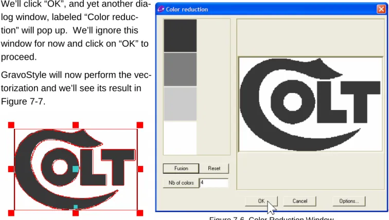
anything smaller will be considered to be unwanted noise. We’ll click “OK”, and yet another
dia-log window, labeled “Color reduc-tion” will pop up. We’ll ignore this window for now and click on “OK” to proceed.
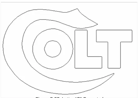
GravoStyle will now perform the vec-torization and we’ll see its result in Figure 7-7.
STEP 4: TROUBLESHOOT THE LOGO
What we’re looking at in Figure 7-7 is two objects superim-posed. They are the vector contours and the original bitmap image. Which one is on top? It doesn’t matter. We’ll simply grab the center handle of the shown selection and move it away to separate the vectors from the bitmap (Figure 7-8). We’ll then make sure that the bitmap is selected and we’ll delete it - we have no further use for it.
(In Figure 7-8, we can see that it was the vector image that we dragged - we’ll merely unselect it, then select the bitmap and delete the bitmap.)
If we look closely at our vectorized image (we can zoom in with the right mouse button for a closer look) we’ll that there is an unexpected and unwanted border all around it.
Figure 7-6 Color Reduction Window Figure 7-7 Vectorization Complete
Figure 7-8 Vector and Bitmap Images Separated
We’ll explore this:
• First, we’ll ungroup the logo. • Next, we’ll click on each
segment of the outside bor-der in turn and drag them away from the rest of the logo. Figure 7-9 shows our job after we’ve dragged the last border segment away.
• Next, we’ll select the three
segments and delete them.
Obviously GravoStyle’s saw them as real objects to be vectorized!
When we’re done, we’ll select all of what’s left by pressing “Control-L” on the keyboard. (Control-L is preferred to dragging a selection rectangle all around the logo at this point; we want to make really sure that we’ve selected everything.) We’ll proceed as follows:
• Let’s change to the “Filled contours” view now.
• Next, we’ll
un-group our selection. This is a matter of good practice; we want to make sure that we start off cleanly for the next step. Our logo will look as it appears in Figure 7-10, with everything filled, including the inside of the letter “O”.
• Next, we’ll group the selection and see the result in Figure 7-11. There’s a prob-Figure 7-9 Segments of Outside Border Dragged Away
Figure 7-10 Logo Ungrouped, Filled Contours Viewing mode
Figure 7-11 Logo Grouped, Filled Contours Viewing mode
lem. Only the “C” is filled!
We’ve previously learned that ungrouping and then regrouping a logo causes GravoStyle to order contours so that they fill correctly. What happened? Let’s investigate.
• First, we’ll once again ungroup the entire
logo so that we can deal with individual vector contours.
• We’ll next click on the letter “T” and drag
it away. When we do, we’ll find that there were two of them (Figure 7-12). We’ll delete the one we dragged.
• We’ll next drag the letter “L” away, and
we’ll find the same thing. We’ll delete the extra “L”.
• We have one more to go. We’ll select
the letter “O” and drag and delete it too. (Don’t forget - these letters are not text - they’re really a collection of curves and lines that happen to look like text. The outside and the inside circles of the “O” are ungrouped, and therefore separate, contours. We’ll have to select both of them.)
We’ll now select everything (Control-L), ungroup and then group the logo. The logo is now correctly
filled, as shown
in Figure 7-15.
Figure 7-12 Ungrouped Letter “T” Dragged Away
Figure 7-13 Ungrouped Letter “L” Dragged Away
Figure 7-14 Ungrouped Letter “O” Dragged Away Figure 7-15 Logo Ungrouped Then
STEP 5: EDIT THE LOGO
Now we’ll look critically at the logo, and we’ll do this in wire view mode.The letters “C” and “O” look like they need some work. The two contours of the “O” are not smooth circles and the left side of the “C” is flattened. These two letters are shown in a zoomed-in view in Figure 7-16.
Look Further
When GravoStyle groups a vector object, the program sorts the contours for filling purposes. It starts with the outermost one and marks it for fill until the next inner contour is reached. The fill stops until the next inner contour is reached and then filling resumes. This goes on until all of the object’s contours are similarly sorted.
What went wrong with our logo? When GravoStyle does its sorting, it doesn’t know how we want it to treat contours that are identical and that are exactly on top of each other.
They’re certainly two separate contours, but there isn’t any space between them to fill.
We can check this, if we want, by clicking on GravoStyle’s “Geometrical shapes” tool and selecting, say, the “circle” tool from the pallet that then
opens. Draw a circle by clicking anywhere on the work area of the screen and drag the mouse with the left mouse button still held down. When we’re through, we can copy the circle and paste it in place by clicking the top toolbar’s “Paste” icon. We’ll now have two identical circles on top of each other. We can then select both of them group them and view them in GravoStyle’s filled con-tours mode to see if they’ll fill.
They won’t!
We’ll edit the letter “O” first:
• We’ll select one of the contours of the “O”. (We’ll start with the inner one, but it
doesn’t really matter which one we do first.)
• We’ll next click on the “Special effects tools” icon on the left
toolbar (Figure 7-17), and the “Special effects” tool pallet will open.
• We’ll click on the
tool whose tool tip reads “Convert to Circle/Ellipse/ Rectangle” (Figure 7-18).
• A new dialog
win-dow titled “Convert to a shape” will open and it will let us convert the se-lected contour to either a circle, an
ellipse or a rectangle. We’ll choose the circle by clicking on it’s button, and then we’ll click “OK” (Figure 7-19).
Figure 7-17
Look Further
Notice that the “Special effects” tool is one of nine tools on the left toolbar that have a small blue triangle at the lower right corner of their icons. The triangles signal that a tool pallet will open when these tool icons are clicked.
Figure 7-18 “Convert to Circle/Ellipse/Rectangle” Tool
The inside of the “O” will now be converted to a perfect circle as shown in Figure 20!
We’ll similarly convert the outer contour of the “O” and the completed letter is shown in Figure 21.
We’ll now correct the flattened left side of the “C” (Figure 7-22):
• We’ll make sure that our logo is entirely
ungrouped and select the “C”.
• Next, we’ll click on the “Point mode” tool
(Figure 7-23) and open its pallet.
Figure 20 Inside of “O” Converted to Perfect Circle
Figure 21 Outside of “O” Converted to Perfect Circle
Figure 22 Left Side of “C” Flattened
Figure 7-24 shows the point editing tool pallet opened. Note that the selected contour (the “C”) is now shown with the points that define its contours and lines.
The point editing pallet has no less than 25 power-ful tools that let us edit vector contours in many ways. We’ll just use two of them on this job.
The first tool that we’ll use is the one whose tool tip reads “Convert to arc” (Figure 7-24). This tool lets us select two points on a contour and convert the segment between them to a perfect arc of a circle. Here’s how it works:
• First, we’ll click on the “C’s” contour near
one side of the flattened area (Figure 7-25). Notice that the cursor shape has changed, indicating that we’re in point edit mode, and that the cursor now has a small graphic added near its bottom to indicate the function of the tool that we’re now using.
• Next, we’ll click on the other side of the flattened part of the contour (Figure 7-26). • We’ll notice that an arc now
ap-pears between the two points. We can change the arc’s radius by dragging the mouse cursor along the path of the arc. If we go too far, the arc will reverse to the other side of the contour.
• When the arc looks OK, we’ll let
go of the mouse button.
Figure 7-24 Point Editing Tool Pallet
Figure 7-25 Convert To Arc Tool
First Point Placed
Figure 7-26 Convert To Arc Tool Second Point Placed
• We’ll click on the selection
tool’s arrow to exit the point edit mode so that we can see the result more clearly, and our logo will look as it appears in Figure 7-27.
Figure 7-27 Letter “C” Corrected
Look Further
There is a special case which may occur when we use the “Convert to arc” tool. In the figure to the right, the cursor is near a point on the contour on the bottom of the “C”. This particular point is differ-ent from any of the other points on the contour. It has a small
rec-tangle inside a larger recrec-tangle. This point is called the “Start Point” and it’s literally the place on the contour where our cutting tool will begin (and end) the machining of this outline.
The “Convert to arc” and several other point editing tools work with the rule that they will not in-clude the start point in any segment that they are modifying. If we select our two anchor points for these tools so that they bridge the start point, the tool will do its work in an unexpected way. Instead of modifying the smaller segment that we think we chose, the larger length of the contour that does not include the start point will be modified.
How then to apply these tools to a segment that contains the start point? Just hold down the shift key on the keyboard while we select the two points. A red dot will appear in the center of the start point to indicate that all is OK and we can release the shift key when we’ve selected the sec-ond point. When the edit is completed, the start point will be seen to be moved to one side of the modified segment.
We’ll now look at the letters “L” and “T”. Their corners are slightly rounded, but these corners in the original logo are square. We’ll use one of the point editing tools to quickly correct the left corner of the bottom of the “T” (Figure 7-28). Here’s how:
• We’ll zoom in on the bottom-left corner of the “T”
and select the contour.
• We’ll re-enter the point edit mode by clicking on
its icon on the left toolbar.
• Next, we’ll select the tool whose tool tip reads
“Convert to angle” (Figure 7-29).
• In similar fashion to the “Convert to arc” tool, we’ll
se-lect two points. Any two near the corner will do (Figure 7-30).
We’ll drag the mouse cursor until we see the corner we want (Figure 7-31) and release the mouse button.
Our completed squared corner is shown in Figure 7-32. We can similarly square the re-maining corners of the “T” and the “L”.
Figure 7-32 Completed Square Corner
Figure 7-29 Figure 7-30
Convert to Angle Tool
Figure 7-31 Corner Squared Off
Figure 7-28 Bottom Left Corner of the “T”
Look Further
We can move points on a contour directly with the point edit mode cursor. We have only to grab a point with this cursor and drag it to wherever we want. This is a sim-ple way to edit if our contour has only a few errant points that require changing.
We’re now finished and our logo will look and fill as it’s shown in Figure 7-1.
REMEMBER TO SAVE YOUR WORK!
WHAT WE’VE LEARNED
In this job we’ve learned:• How to import a bitmap graphic • How to vectorize a bitmap graphic
• Some steps to troubleshoot a vectorized image • How to enter the point edit mode
• How to use some of the point edit mode tools • How to use one of the special effects tools