Novice-Centric Visualizations for
Machine Learning
by
Yunjia Sun
A thesis
presented to the University of Waterloo in fulfillment of the
thesis requirement for the degree of Master of Mathematics
in
Computer Science
Waterloo, Ontario, Canada, 2016
c
I hereby declare that I am the sole author of this thesis. This is a true copy of the thesis, including any required final revisions, as accepted by my examiners.
Abstract
This thesis focuses on visualizations for machine learning tasks. More specifically, we create a taxonomy for existing machine learning visualizations, and design a system to help machine learning novices perform labelling tasks.
There are many mature visualizations to help people understand the performance of current classifiers, including scatterplots, confusion matrices and ROC curves. However, most machine learning researchers are unaware of the visualization possibilities that exist, and many published visualizations are too task-oriented or dataset-oriented to be easily applied to other tasks. This thesis defines a taxonomy for machine learning visualizations in three dimensions: the data displayed, the advanced features to add for a specific task, and the goal of the visualizations. This taxonomy seeks to help machine learning researchers select a better visualization method to analyze their data.
Previous machine learning tools focus on presenting comprehensive information to ex-perts, treating machine learning as a black-box for end-users, or explaining the reason behind the prediction in a simple and clear way. However, to build a machine learning system, one needs to label data first, and a lot of machine learning novices want to build a classifier themselves simply by labelling data. This inspired our idea to design and imple-ment the Label-and-Learn system, which includes five visualizations to help users better understand their data, the likelihood of the classifier’s success, and to improve their user experience.
To evaluate the utility of our Label-and-Learn system, we ran user studies to compare the visualization system and traditional system in the quality of the labels, the user’s mental model about the task, and the user experience. The results from the experiment show that visualizations have no negative effect on the quality of the labels, but do improve the user’s mental model and the user experience. The success of the Label-and-Learn system should inspire further research in using visualizations to improve the user experience of data labelling in machine learning tasks.
Acknowledgements
This thesis cannot be completed without the help from many people. I would like to take this opportunity to thank them all.
First, I would like to thank my first and primary supervisor, Michael Terry. You intro-duced me to the academic research area, taught me how to come up with a research idea and how to carry it out. You also guided me through the process of visualization design, a completely new area for me. Your personality of being bold, innovative, enthusiastic and optimistic inspired me, excited me and supported me through the course of my graduate study. I still remember clearly the scene where we brainstormed dozens of ideas and finally concentrated on five, and the scene where I questioned about the value of my research and you kindly discussed with me from the perspective of industry. Thanks for introducing me the world of HCI.
I would also thank Ed Lank and Edith Law, who supervised me through the user study, data analysis and thesis writing part. Your advice and suggestions helped me efficiently go through the process. I would also thank the members of my committee: Parmit Chilana and Pascal Poupart. I appreciate your time in reading my thesis and offering suggestions to make it complete.
I would also say thanks to all my lab mates in the HCI group: Adam Fourney, Jingjie Zheng, Qifan Li, Qifeng Liu, Hemant Surale, Jeff Avery, Alix Goguey, Bahar Sarrafzadeh, Mingyu Liu, Mathiu Nancel, William Saunders, Keiko Katsuragawa, and all those people who helped in piloting my study and offered valuable suggestions on my system design. I would specially thank Adam Fourney for providing theOnline Documentation dataset and code. The Named Entity Recognition part of my system was implemented based on this resource.
Last but not least, I want to thank all the participants who expressed interest in my research and devoted two hours to my task. I cannot complete my research without your help.
Dedication
This thesis is dedicated to my dear parents, Kuiqiang and Jianxin, whose enduring love and guiding advices supported me through my thesis writing, graduate study, and my life.
Table of Contents
Author’s Declaration ii Abstract iii Acknowledgements iv Dedication v List of Tables x List of Figures xi 1 Introduction 1 1.1 Motivation . . . 1 1.2 Contributions . . . 31.2.1 Taxonomy for Machine Learning Visualizations . . . 3
1.2.2 Label-and-Learn . . . 4
1.3 Thesis Outline and Terminology . . . 5
2 Related Work 8 2.1 Black-Box Interactive Machine Learning . . . 8
2.1.2 Effective End-User Interaction with Machine Learning . . . 10
2.1.3 Summary . . . 12
2.2 Transparent Interactive Machine Learning . . . 13
2.2.1 IDES for Machine Learning . . . 13
2.2.2 Classifier Personalization by Building Mental Model . . . 14
2.2.3 Interactive Desktop for Visual Classifier Training . . . 17
2.2.4 Summary . . . 18
2.3 Tools for Labellers . . . 18
2.3.1 Structured Labelling . . . 18
2.3.2 Active Learning . . . 19
2.3.3 Summary . . . 20
3 Taxonomy for the Machine Learning Visualizations 21 3.1 Data Displayed . . . 21
3.1.1 Selected Information vs All Information . . . 21
3.1.2 Labelled Data vs Unlabelled Data . . . 23
3.1.3 Classified Data vs Unclassified Data. . . 24
3.1.4 Feature-Centric vs Instance-Centric . . . 25
3.1.5 Dimensionality Reduction . . . 25
3.2 Advanced Features . . . 26
3.2.1 Supporting Interaction vs Static View. . . 26
3.2.2 Data Abstracted as Shape vs Data Shown as it is . . . 27
3.2.3 Prediction Confidence . . . 28
3.2.4 Classifier’s Assessment . . . 29
3.2.5 Highlighting Interesting Information . . . 30
3.3 Goal . . . 31
3.3.1 Target Users. . . 31
3.3.2 Task Goal . . . 32
4 Label-and-Learn 36
4.1 Task . . . 36
4.2 The Backend Classifier . . . 37
4.2.1 Naive Bayes classifier with Bag-of-Words Model . . . 37
4.2.2 Active Learning . . . 38 4.2.3 Evaluation . . . 39 4.3 Traditional Interface . . . 39 4.3.1 Labelling Window . . . 40 4.3.2 Statistics Window. . . 40 4.4 Visualization Interface . . . 41 4.4.1 Current Prediction . . . 42 4.4.2 Influential Terms . . . 44
4.4.3 Test Set Distribution . . . 45
4.4.4 Labelling Progress . . . 45 4.4.5 Information Gain . . . 49 4.5 Summary . . . 49 5 Evaluation 51 5.1 Experiment Design . . . 51 5.1.1 Measures . . . 52 5.1.2 Participants . . . 53
5.1.3 Machine Learning Tasks . . . 53
5.1.4 Procedure . . . 55
5.2 Result . . . 56
5.2.1 Quality of the Labels . . . 56
5.2.2 Mental Model . . . 57
5.2.3 User Experience . . . 60
5.2.4 Helpful Information . . . 63
5.2.5 Other Feedback . . . 66
6 Conclusions 69
6.1 Discussion . . . 69
6.1.1 Bias of the Tasks . . . 71
6.1.2 Bias of the Quiz . . . 71
6.2 Future Work . . . 73
6.2.1 Possible Improvements in the System . . . 73
6.2.2 Possible Improvements in the Experiment Design . . . 75
6.2.3 Possible Research Directions . . . 76
6.3 Final Remarks. . . 77
References 79
APPENDICES 84
A Quizzes for Mental Model 85
B Questionnaire for Utility of the Visualizations 88
List of Tables
4.1 Visualizations under the taxonomy . . . 50 6.1 Visualizations and their utility . . . 72
List of Figures
1.1 Machine Learning Pipeline . . . 2
2.1 Interactive Machine Learning with Crayons . . . 9
2.2 Using CueFlik to create a rule and apply that rule to image search. . . 11
2.3 Black-Box Interactive Machine Learning Pipeline . . . 12
2.4 Prospect: Scatterplot of different configurations’ results . . . 14
2.5 Hindsight: Comparing the result of different visualizations . . . 15
2.6 Toolkit that Generate Explanations for End-Users . . . 15
2.7 EluciDebug: Using Multiple Views to Explain . . . 16
2.8 An Interactive Desktop for Visual Classifier Training . . . 17
2.9 Active Learning selects the best instance to query for label . . . 19
3.1 Selected Information vs All Information . . . 22
3.2 Document Clustering . . . 23
3.3 Classified vs Unclassified Data . . . 24
3.4 Different ways to project a 10-dimensional dataset onto 2-dimensional space 25 3.5 An interactive visualization where user can circle an interesting area and view the summary of that area. . . 26
3.6 A nomogram for prediction of survival probability of a passenger on HMS Titanic [21] . . . 28
3.7 A multi-class visualization for image classification . . . 29
3.9 Highlighting the points closest to the decision boundary in 2D space[20] . . 31
3.10 Gestalt [24]: Finding features from confusing instances . . . 34
3.11 Ensemble Matrix allows users to build an ensemble classifier(left) by adjust-ing the weight of each component classifier(right). . . 35
4.1 Traditional Interface: (a) Labelling Window (b) Statistics Window. . . 40
4.2 Visualization Interface: (a) Labelling Progress (b) Labelling Window (c) Test Set Distribution (d) Information Gain (e) Current Prediction (f) Influ-ential Terms . . . 41
4.3 Current Prediction. This figure is a close-up of Figure 4.2(e) . . . 42
4.4 Influential Terms. This figure is a close-up of Figure 4.2(f) . . . 44
4.5 Test Set Distribution. This figure is a close-up of Figure 4.2(c) . . . 46
4.6 Labelling Progress. This figure is a close-up of Figure 4.2(a) . . . 47
4.7 Information Gain. This figure is a close-up of Figure 4.2(d) . . . 48
5.1 Labelling errors in each condition . . . 57
5.2 Mistakes in Test Set after next 50 labels. Lower difference means better prediction. . . 58
5.3 Success of the Classifier. . . 59
5.4 Knowledge about Current Classifier. Higher score means more correct answers. 59 5.5 NASA-Task Load Index. Low score means low workload. . . 61
5.6 Utility of the Visualizations . . . 64
Chapter 1
Introduction
1.1
Motivation
Machine learning tools are quickly becoming accessible to non-experts. Given a labelled dataset, they can produce classifiers with little-to-no-effort on the part of the user. These systems include research systems such as Crayons[6] and CueFlik[7], but also include recent systems such as Google’s Prediction API and Amazon’s machine learning service. They provide an interactive, accessible interface for people to adjust the input or parameters and see immediate feedback so they are very easy to manipulate. They hide the implementation details such as feature engineering, model selection, parameter tuning and basic evaluation in the backend, so people can train a personalized classifier without a machine learning or even a computer science background.
However, while libraries and toolkits lower the barrier of using machine learning, cre-ating a system that successfully solves a novel problem is still non-trivial, and can require a fair amount of expertise to solve well. Information Visualization has the advantage of effective expression of a large amount of data. Numerous visualizations have been devel-oped to help individuals understand the performance and current state of the classifiers. Existing visualizations range from scatterplots representing a classifier’s confidence scores for labelled or unlabelled data, to confusion matrices representing how the misclassified data is distributed. These visualizations provide a compact summary of a particular view of the classifier and its likely performance with new, unlabelled data. With more devel-opment in machine learning, we also have more complicated visualizations such as ROC curve to assist parameter tuning and 2d projection to assist feature selection.
Figure 1.1: Machine Learning Pipeline
The visualizations mentioned above are expert-oriented and require some expertise in machine learning to understand well. Recently we also have a number of tools to assist non-experts in understanding and debugging classifiers. For example, Kulesza’s work[17] provides natural language descriptions of why a classifier makes the prediction that it does. He shows that by explicitly explaining the feature values and each value’s influence and distribution, non-experts can easily build up a mental model of how the classifier works. The mental model actually helps them personalize their classifiers. However, he primarily focuses on explaining the reasons for the classifier’s performance and prediction.
Kulesza’s work has done much to make machine learning accessible to non-experts, but a number of open issues remain. The machine learning pipeline contains the process of data labelling, feature engineering, model selection, parameter tuning, evaluation, and real-world application(Figure 1.1). Non-experts participate not only in the real-world application, but also in initial data labelling, which directly affects the classifier’s quality. Researchers have typically focused on making the data labelling process efficient. In Settles’ Active Learning[35], a system selects the instances that have the highest information gain and query their labels. The task load for the labellers is significantly reduced by applying this scheme. However, little work has been done to make the labelling process informative for the labellers.
We generalize that there are two classes of labellers: uninterested third parties hired by the classifier builders, and labellers who are directly invested in the outcomes (i.e., they are the people who will use the classifier). For the latter, the labelling period provides the first opportunity to gain an understanding of the data, and they hope to get answers for the following questions:
1. Can the classifier learn the desired concept well enough, given the data and features they have? As an example, if we identify that, for some reason, the data cannot be separated no matter how many labels we provide, meaning a concept cannot be learned, we should immediately try another model, extract more features, or even
collect more data. If all of these attempts fail, it is better to transfer the task to more expert researchers.
2. When can I stop labelling? When the classifier is unlikely to learn much more, or a lot of labelling effort would be required to gain appreciable performance, it is better to realize this situation as soon as possible to avoid wasting time on data labelling. 3. How will this data affect my classifier? Active learning keeps selecting the most
informative data to query for label. It might be useful to understand the reason behind the classifier’s choice, because sometimes the classifier might have bias on a certain branch of data, and sometimes there might be several data that make it hard for the classifier to make a decision. It is better to realize these situations to ensure that the most informative data is labelled, and quickly identify the uncertain data. 4. How stable is my classifier? For systems incorporating online learning, in which new
labelled data is continually added to the system, it is useful to know the stability of the classifier to decide whether to accept more labelled data, and whether the current performance is acceptable.
In this thesis, we present a series of visualizations useful for labelling, and for predicting the likely performance of the classifier. More specifically, we present visualizations that 1) explain to users why this data needs to be labelled, 2) show users the change a label will bring to the classifier, 3) show users their progress in building the classifier so far, 4) show users the stability of the classifier, 5) show users the current state of the classifier, and 6) show users why the classifier makes a certain prediction.
1.2
Contributions
1.2.1
Taxonomy for Machine Learning Visualizations
Numerous visualizations have been developed to help individuals understand the perfor-mance and current state of the classifiers. They range from scatterplots representing a classifier’s confidence scores for labelled or unlabelled data, to confusion matrices repre-senting how the misclassified data is distributed. As we review previous visualizations to design our own, we realized that while these visualizations are designed for different tasks and datasets, show different aspects of data, and are drawn using different marks and
channels, they still share quite a lot similarities; some of the visualizations are actually telling the same story.
Although research has been done on machine learning visualizations, machine learning researchers still stick to WEKA[41], or simply draw the most basic bar graphs, scatter plots by themselves to better understand their data. Part of the reason may be that they are unaware of the visualization possibilities in the field. Part of the reason may be that the visualizations published in research papers are too task-oriented or dataset-oriented, so it is hard to directly apply them to their new problem. Finally, part of the reason may be that it is hard to find the desired visualization from the numerous, unsorted existing work.
In this thesis, we define a taxonomy for machine learning visualizations with respect to its target users, whether the visualization shows selected data or all information, shows labelled data or unlabelled data, shows classified data or unclassified data, supports inter-action or not, is feature-centric or instance-centric, is data abstracted as point or shown as it is, has dimensionality reduction or not, shows prediction’s confidence or not, includes classifier’s assessment or not, and highlights interesting information or not.
This taxonomy is able to classify existing visualizations with several tags, helps users understand the information it shows. We hope that with this taxonomy in mind, informa-tion visualizainforma-tion researchers can better understand their design target and existing work so they can design more expressive visualizations and avoid repetitive work. We also hope that this taxonomy will guide machine learning researchers to realize the possibilities of visualizations and help them choose the one that best solves their problem. They may not directly apply the existing visualizations to their data, but they can at least learn from them as a way to show certain aspects of data.
1.2.2
Label-and-Learn
Previous work on machine learning tools focus on (1) machine learning experts, (2) taking machine learning as a black-box, or (3) explaining the reason behind the prediction. We designed our Label-and-Learn system, which focuses on non-expert machine learning users who want to create a classifier themselves, and especially on their labelling experience. We hypothesize that the Label-and-Learn system will help non-expert users leverage the unavoidable process of labelling to develop insights into their data and the classifier.
The Label-and-Learn system includes six windows: five visualization windows and a labelling window. The visualizations update whenever the user labels a new piece of data. Some of the visualizations borrow ideas from existing works; the rest are designed by
ourselves. All of them serve to help answer four questions: (1) Can the classifier learn the desired concept well enough, given the data and features they have? (2) When can I stop labelling? (3) How will this data affect my classifier? (4) How stable is my classifier?
To assess the effectiveness of Label-and-Learn, we designed a traditional version of Label-and-Learn which removes all the visualizations. We ran user studies on both versions to validate the usefulness of the visualizations. The results showed the success of the visualizations, which could largely improve the user’s mental model about the classifier’s performance. Users also reported a better experience when using the visualization interface. Meanwhile, our new design has no negative effect on the quality of the labels.
1.3
Thesis Outline and Terminology
The thesis is organized as follows:
• Chapter 2 describes previous work in human-in-the-loop machine learning, including applications of interactive machine learning that treat machine learning as a black box, interactive applications that make the machine learning process transparent to the end user, and tools for labellers.
• Chapter 3 defines the taxonomy for the visualizations on machine learning. We also review the most representative existing visualizations and classify them with our taxonomy.
• Chapter 4 describes our Label-and-Learn system in detail. It explains the machine learning task the system is designed for, design principles and mathematics behind each visualization.
• Chapter 5 describes the experiment we conducted to validate the usefulness of the Label-and-Learn system. It also presents the result from the study.
• Chapter 6 discusses the system’s advantages, summarizes the contributions of the thesis, and suggests the future research to be done.
However, before continuing, it is worthwhile to precisely define some terminology that is used throughout this dissertation.
machine learning experts: Machine learning researchers who design algorithms to solve problems. They know the mathematics and rationale of the machine learning classifier such that they can program a classifier themselves.
machine learning novices: Machine learning novices are practitioners who want to build a classifier, but only know how a machine learning classifier works generally, and may not know the detailed mathematics. They should at least know that machine learning is a process that learns the patterns from the features of the data, and make predictions from the patterns.
concept: The general description of the information we want the system to learn. For example, whether an email is spam, which class this document belongs to, whether this “he” means a specific person.
instance: A piece of data in the dataset that has been labelled or is to be classified. For example, it can be an email, a document, or the word “he” in a specific context.
feature: An individual measurable property of an instance. For example, whether this email is from an address ended with “uwaterloo.ca”, how many instances of “computer” this document contains, or the word that follows “he”.
positive / negative: Match / Mismatch of the concept. If the concept is “Check if the email is spam”, then a spam email would be a positive instance. On the contrary, a non-spam email would be a negative instance. If the concept is “Check if this document is computer-related”, then a computer-related document would be a positive instance, and a non-computer-related document would be a negative instance.
confidence: The probability that an instance or a feature will be predicted by the classifier as positive. If it is predicted as 80% to be negative and 20% to be positive, then it’s confidence is 20%.
stability: The likelihood that the classifier’s decision will be little affected by a new label. Furthermore, we define thestability of the feature, which is the likelihood that an instance or a feature’s confidence will be little affected by a new label with the same feature value. A classifier is more likely to be stable when it has more stable features.
For example, before we label the featuref for the first time,f’s confidence was 0.5. After labelling one as positive, it suddenly changes to 0.9. Then we label another one as negative, it suddenly changes back to 0.5. At this moment,f’s confidence changes significantly with a new label. We say it is unstable. However, when we have 70 f as positive, and 30 as negative, after labelling a new instance as positive, the confidence changes from 0.7 to 0.703. Then if we label another one as negative, it slightly changes back to 0.696. Becausef
only changes slightly with a new label, we say it is stable. Generally, the more information, or labels, we have about a feature, the more stable it is.
Chapter 2
Related Work
To build a machine learning system, one needs to go through the pipeline of data labelling, feature engineering, model selection, parameter tuning, evaluation, and real-world appli-cation. Although a large part of this pipeline can be automated thanks to work by statis-ticians and engineers, there are still parts of the process that cannot be done without the involvement of human beings, especially data labelling and real-world application. For the past decade, researchers from the area of Human-Computer Interaction, Machine Learn-ing and Information Visualization have been lookLearn-ing into approaches to bridge the gap between humans’ mental models and the system’s statistical framework. In this chapter, we will review research from Human-Computer Interaction (HCI) and Machine Learning. Chapter 3 will define a taxonomy and review visualizations in detail.
2.1
Black-Box Interactive Machine Learning
With the hope that everyone, including experts and novices, can use machine learning to solve their problems, many HCI researchers are devoted to making it more accessible to novices, those who have little knowledge about machine learning. To help novices understand the classifier’s performance without knowing the mathematics, researchers have designed systems that hide the machine learning implementation details in the backend as a black-box. Users can interact with the frontend interface to provide input, examine the output, and modify the input as the feedback loop. This section describes four applications which demonstrate this paradigm of black-box interactive machine learning: the Crayon system and three systems by Amershi: CueFlick, ReGroup, and CueT.
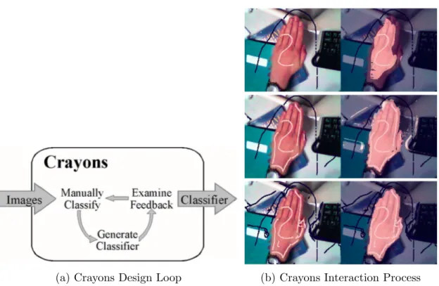
(a) Crayons Design Loop (b) Crayons Interaction Process Figure 2.1: Interactive Machine Learning with Crayons
2.1.1
Crayons
Fails and Olsen’s Crayon[6] is the first interactive machine learning system designed for end users. Its goal is to help UI designers who do not have detailed knowledge of image processing and machine learning to create image classifiers. A user first provides some labelled images as training data, and the system returns the current result. The user examines the result and provides more training data to correct and improve the model, forming a feedback loop(Figure 2.1a). Figure2.1bis an example of a user interacting with the system. He first paints very little data that represents the skin, examines the result, and corrects by painting more. The system lowers the barrier of machine learning and fastens the classifier building process by hiding the implementation detail in a black box. User’s responsibility is reduced to simply providing data and examining the result. The trade-off is that, users will never know the reasoning inside the black box, thus cannot decide whether this black box is suitable for this task, whether it will succeed, whether this black box can be generalized to other data or tasks, how much resource is needed, or
whether this black box is stable.
2.1.2
Effective End-User Interaction with Machine Learning
Amershi advanced the domain of interactive machine learning in two ways. First, she pro-posed a design space for such systems[1]. When designing an interactive machine learning system, one should consider two design factors: (1) the interaction goals and contexts, and (2) the constraints of the data, user experience, and environment. One should also consider three design dimensions: system feedback, end-user control, and temporal factors. Second, to demonstrate that, she designed three systems:
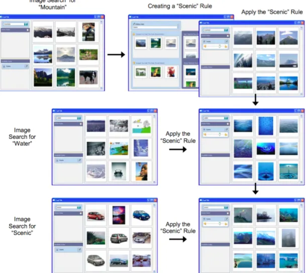
• CueFlik[7] is a web image search application. It allows end-users to create their own rules for re-ranking images simply by dragging mouse. A user can first search images using a query, and select some images that match the rule, and when he searches images using another query, he can apply the rule to the new set of images to re-rank them. Figure 2.2 is an example of how a user creates the “scenic” rule from the search for “mountain” by dragging scenic related pictures to the designated area. The system learns the rule, and then the user can apply the rule to the search “water” and the search “car” so that the scenic related images are ranked at top. • ReGroup[2] is an application that helps people create custom groups on demand
in social networks. First, the user selects several friends he wants to add to the group. The system learns about the group and presents the user with relevant group characteristics to use as filters. This helps the user by reducing the number of people that need to be considered when creating the group.
• CueT[3] is a stream-based interactive machine learning engine for making triage rec-ommendations. With the interface, it can assist the operator in inspecting and inter-preting those recommendations and feeding operator actions back into the learning engine.
Amershi’s design space is the first to summarize all the existing interactive machine applications. It could be a good guide for future researchers to design the system that best satisfies their need, as well as end users to choose the system. Our work is similar to hers in terms of summarizing previous work using a design space, but we focus on visualizations for both machine learning experts and novices. Furthermore, while her applications extended Crayons by applying interactive machine learning in more real-life systems, the reasoning
Figure 2.2: Using CueFlik to create a rule and apply that rule to image search. of the classifier is still a black box. Users may know what features are influencing the classifier, but may be unsure of the way and the degree of the influence. It is also difficult for Machine Learning novices to determine whether the classifier is stable, where it is going to fail, and whether it can be generalized. Without this knowledge, users must trust that the system works as promised.
Figure 2.3: Black-Box Interactive Machine Learning Pipeline
2.1.3
Summary
Crayons is the first interactive machine learning system that applies human-in-the-loop to the classifier building process. It has the advantage of being accessible to everyone regardless of their background, has good performance on the designated task, and exhibits simplicity of interaction. Crayons has inspired researchers to develop similar systems for other tasks. These systems include Amershi’s ReGroup[2], where users can input training samples as well as the features to classify friends. They also include Patel’s Hindsight[26], where users can use the input from a dataset or even create the data themselves directly with the application, then examine the result on these inputs.
The challenge with the interaction machine learning systems described in this section is that, such systems encapsulate most part of the machine learning pipeline in a black-box, leaving only data labelling, evaluation, and real-world application to the user (Figure2.3). They only show the output of the classifier’s decisions and do not include visualizations that show the classifier’s performance. Users know nothing about the implementation of the system so they do not know whether it is applicable for all of the dataset, just as we do not know what kind of email will be misclassified as spam. Moreover, such systems are task and dataset oriented, since the features and models are built-in. Crayons only works for image processing. CueFlik only works for image reranking. ReGroup only works for filtering, and CueT only works for alarm triaging. Users can only use the products, without the ability to build a classifier that works on a new problem. In brief, these systems are built for users who want to use an already-built classifier on a problem for which it has been a priori designed.
2.2
Transparent Interactive Machine Learning
Traditionally in the field of machine learning, we would tend to think of developers as those few talents who create magical classifiers by writing code and inspecting command line output, and think of end users as customers who happily use the magical classifier to solve their problems. With machine learning being used everywhere in our life, more classifiers are needed than being built, and the builders are no longer limited to a small number of highly talented developers. A system that integrates feature engineering, model selection, parameter tuning, and result inspection in one graphical user interface can improve the efficiency and lower the experience required to build a classifier. At the same time, with different applications that produce different outputs, the end users start to question the reasoning behind machine learning inferencing: Why does the classifier consider this email as spam? Why does it recommend this song to me? Users want the one and only classifier that can best solve their problem. To satisfy their needs, researchers have begun to build interactive machine learning systems that show the reasoning of the classifier, and let users adjust the classifier by manipulating the features, their weights, the input, or even the model from the classifier’s interface.
In this section, we first focus on Patel’s work simplifying the development of machine learning systems. We also describe work in enhancing classifier’s transparency.
2.2.1
IDES for Machine Learning
Patel focused his research on improving the developer’s experience. He has examined difficulties developers encounter in the adoption of statistical machine learning[27]: 1) difficulty following an iterative and exploratory process, 2) difficulty understanding the relationships between data and models, 3) difficulty evaluating the performance of models in the context of an application. He also implemented three systems to help developers overcome these difficulties:
1. Gestalt[24] integrates the implementation and analysis of the classification pipeline into one system. By separating the machine learning pipeline into several steps with input and output, Gestalt provides general support for all machine learning problems. The developers only need to follow the steps to read in the data, edit the code, and inspect the visualized result. It also provides connected visualizations to help users understand relationships between data, features and results.
Figure 2.4: Prospect: Scatterplot of different configurations’ results
2. Prospect[25] is a system that uses multiple models to detect label noise and aid in generating new features. For each task to be solved, it generates several configurations and applies them to the data. This is to avoid the bias of a single configuration. The user can then inspect the result through visualizations(Figure 2.4) such as scatter plots and confusion matrices to detect outliers. These outliers may result from label noise, or from areas of uncertainty that can help developers generate new features. 3. Hindsight[26] is a system that focuses on comparison between configurations. A user
can choose between loading data from files or drawing data directly on the system. To build a satisfactory classifier, users can try different configurations through code or through the interactive components of the system. Hindsight keeps track of all the configurations, and provides comparison on the single instance level and the whole dataset level(Figure 2.5).
2.2.2
Classifier Personalization by Building Mental Model
While Patel’s research focused on developers, other research has focused on transparency for users. For example, Lim[19] and Kulesza[17] focused their research on helping users build a mental model of the classifier so that they can better personalize their application. Lim and Dey implemented a toolkit[19] which helps users better personalize their ap-plication by answering the following questions such as: Why did it do X? Why did it not do Y? What if I did W, What will it do? How can I get the application to do Y? Their
Figure 2.5: Hindsight: Comparing the result of different visualizations
(a) Decision Tree (b) Naive Bayes Figure 2.6: Toolkit that Generate Explanations for End-Users
toolkit supports the visual explanation of rules, decision tree, naive Bayes, and HMM clas-sifiers(Figure 2.6). They used their toolkit on three intelligible applications: IM (Instant Messaging) Autostatus, Mobile Physical Activity Recognizer and Home Activity Recog-nizer. They also ran user study on an intelligible mobile context-aware application. The result suggested a need for streamlining explanations while maintaining access to the rich explanation capabilities, and for integrating domain knowledge in explanations.
Figure 2.7: EluciDebug: Using Multiple Views to Explain
Kulesza’s EluciDebug[17] uses different views(Figure 2.7) to explain to novices how the classifier makes each prediction. It helps them build a mental model of the classifier by highlighting the features in each instance, showing them the overview of features and prediction, and showing them how their modification of the system changes the result. The system supports the interaction of labelling instances, picking up features and adjusting their weights. Their experiments show that users can build a better mental model and create better classifiers using the system, and users feel the system is accessible and are confident using it. However, in the user study, Kulesza only measures the mental model of how the classifier makes a prediction and how to make the classifier perform better, which are under the assumption that a workable classifier can be built. He does not examine
whether users can realize the weakness of the classifier and the dataset, so that they can switch to a better strategy to solve their problem at an early stage.
Figure 2.8: An Interactive Desktop for Visual Classifier Training
2.2.3
Interactive Desktop for Visual Classifier Training
Heimerl et al.[11] implemented a system(Figure 2.8) to improve the efficiency of active learning. The system includes a 2D scatterplot showing how each instance is distributed according to the features and the classifier’s prediction. The horizontal axis of the 2D plane is the confidence that the instance is classified as a positive example, and the vertical axis represents the diversity of the documents closest to the decision boundary. Whenever the user labels an instance, the view updates to reflect the current state of the classifier. The users can also choose the instances they think might be useful. Users can select an instance or an area of instances to view their feature distributions and then label them. Hovering in the interface over input documents, it displays at most ten terms sorted according to their document frequency. The system also has a Cluster View, which puts special emphasis on representing document similarity. A progress bar is displayed at the top right corner informing analysts about the impact of their labelling. However, according to experiments, their system did not improve active learning efficiency. Users need more time to understand how to use the system, what each view means, and some views were not used by some
participants. Heimerl et al. also did not measure users’ understanding of the dataset and classifier. Our aim is to show that a similar system can help people identify classifier’s performance at early stage. We also hope to see that such a system would improve the user experience in labelling.
2.2.4
Summary
Transparent machine learning systems improve the efficiency and experience for develop-ers to build a classifier. They also lower the barrier for the end usdevelop-ers to unddevelop-erstand and personalize their system. These systems give us some experience on how to tackle visu-alization problems: We could show the multi-dimensional data in limited space, support effective interaction, help end users build mental model by explaining the rationale of the classifier, and avoid overwhelming the users with too much information by only visualizing the important features, among others.
However, these systems are designed for developers who want to quickly build a classifier using existing models, and for novices who want to understand the reasoning behind an already-built classifier so that they can better adjust it to their own problem. Our research aim is to support novices who want to quickly prototype a new classifier for a new task. We hope to help novice machine learning users quickly understand the weakness of the classifier and the dataset so that they can select the best strategy to approach their problems.
2.3
Tools for Labellers
To aid novice users in applying machine learning, we focus on the labelling task. Today, machine learning has matured to a point where we have many theories and algorithms to solve different kinds of problems. The bottleneck is the quality and quantity of labelled training data, a time-consuming and costly process in the pipeline. Researchers have done work to improve the quality of labels, or to reduce the number of labels needed by the classifier. This includes work in structured labelling (to improve quality) and active learning (to reduce labels needed).
2.3.1
Structured Labelling
When labellers label a large amount data for a long time, concept evolution may happen. They may label the same data in a different way in a later stage. This phenomenon will
affect the quality of their labels and introduce noise to the classifier. Kulesza et al.[16] tried to solve this problem with structured labelling, where users can group their data based on their concept. This is extremely helpful for the data they are unsure about, so they could revisit them later and follow the same rule to label them. Result from user study shows that structuring was preferred by participants and helped them label more consistently.
2.3.2
Active Learning
Figure 2.9: Active Learning selects the best instance to query for label
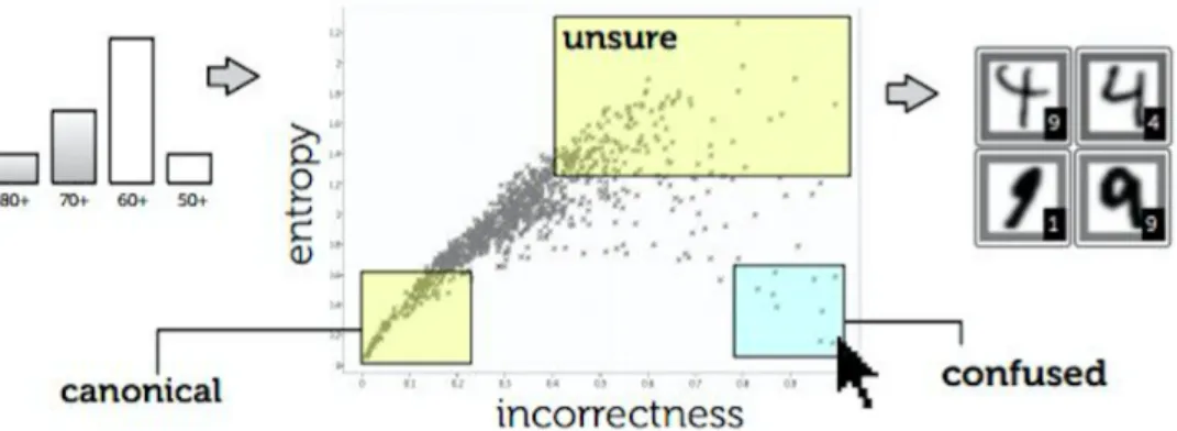
In many modern machine learning problems, data may be abundant but labels are scarce or expensive to obtain. Such problems include speech recognition[43], informa-tion extracinforma-tion[36], and computational biology[39]. Active learning attempts to solve this problem by selecting the unlabelled instances for the labellers to label. The instances are selected according to their informativeness calculated by the backend algorithm. In this way, the system can still achieve high accuracy with few labelled instances, thereby minimizing the cost of obtaining labelled data, as is shown in Figure 2.9.
Active Learning is a field that has been well studied (see [34]). Depending on the dataset, we have different frameworks to query the label, such as uncertainty sampling[18], query-by-committee[37][8], expected error reduction[30] and density-weighted methods[35], among others. In this work, we use a density-weighted method to select the instances for the labellers. Chapter 4will go into the detail of our framework.
2.3.3
Summary
While active learning can reduce the labeller’s workload, and structured labelling can improve the quality of the labels, it cannot help improve the labeller’s understanding or user experience. During the labelling process, the labellers, who have to constantly respond to the queries from the system by providing labels, are still in a passive mode. Their motivation may be to finish the task as soon as possible so that they get paid, or to start building the classifier. Boredom, distraction, and irritation with the task can set in, which will affect their efficiency as well as the quality of the labels.
Rather than reducing the quantity of labels required, our work focuses on improving the quality of labeller’s user experience. We hope a well-designed visualization system can help users gain insight into their data and classifier, see the effect of each new label, get motivated by their inner curiosity about the data, and experience a sense of achievement as classifier performance improves. In this way, not only the system is doing active learning, but the labellers are also actively labelling and learning. Understanding the complicated math is not required; users can understand much about the classifier just by peeking at the visualizations while doing the unavoidable labelling needed to create their machine learning system.
Chapter 3
Taxonomy for the Machine Learning
Visualizations
In this chapter, we define a taxonomy for existing machine learning visualizations. The taxonomy is further generalized in two dimensions: data displayed and advanced features. This taxonomy seeks to guide classifier builders or visualization experts to design better visualizations that meet their requirements. In the final section, we provide suggestions on how to choose the right visualization based on target users and design goals.
3.1
Data Displayed
3.1.1
Selected Information vs All Information
The dataset for a machine learning problem can be as huge as terabytes, or as small as kilobytes. But even with the large screen interaction, we still cannot show all the data in a single visualization: We have the choice of showing only selected data with detail, or the whole dataset when we have enough space.
Figure 3.1a from [11] shows a visualization for an SVM document classifier’s features. The features for this problem are the dataset’s whole vocabulary, which cannot fit into the graph. The system shows the top ten most interesting data in three sets: most changed, most positive, and most negative. This strategy usually shows the most informative data, helping users quickly locate the influencing factors, or skeleton of the classifier. Another strategy is to show the sampled data, so we can preserve the overall distribution of the
(a) A visualization showing the most influential features of a SVM classifier
(b) A visualization showing all features of a naive bayes classifier Figure 3.1: Selected Information vs All Information
data. When the size of the data we want to show is small, we can put all data in the visualization. As in Figure 3.1b from Becker et al.’s work[4], the naive Bayes classifier has limited features and feature values, which can be visualized in one graph. The influencing data still stand out since they have the larger area or brighter color. Users can identify the less influencing features and consider removing them from the classifier.
This branch allows users to go beyond the dataset size limitation when designing visu-alizations. When the dataset size is too large to fit in the screen, we can always show the most representative data, whether by random sampling or by frequency ranking.
Figure 3.2: Document Clustering
3.1.2
Labelled Data vs Unlabelled Data
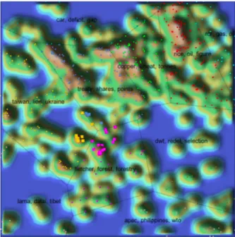
In most cases, classifiers are built on labelled data by supervised machine learning, and most visualizations serve to inspect the classifier’s performance. However, when the cost of labelling is high, we may want to have a rough understanding of the data before spending effort on labelling. It is useful to know whether there are certain patterns in the data or whether they can be clustered. Thanks to unsupervised learning, we have techniques for clustering such as k-means and hierarchical clustering[29]. Figure 3.2 from Seifert et al.’s work[33] shows a visualization for documents clustering. Documents are represented as points on a 2D plane. They are clustered according to their topic, and the polygonal areas are generated by the Voronoi area subdivision. Regions populated by a large number of topically related documents are represented as hills to stand out on the graph.
This branch gives users the opportunity to visualize the data even before they begin labelling. Users can determine whether the data has certain patterns or clusters by visually exploring the dataset.
(a) A Confusion Matrix from Prospect[25] (b) Word Cloud Explorer[12] Figure 3.3: Classified vs Unclassified Data
3.1.3
Classified Data vs Unclassified Data
Another dimension of the data is whether the data has been classified or not. Classified instances are always shown with their original labels for users to compare and locate the mistakes the classifier makes. A confusion matrix(Figure3.3a) is a representative example. One of the two axes (horizontal and vertical) represents the original class and the other represents the predicted class. All the instances not on the diagonal are misclassified. Users can quickly find out classes and the instances that the classifier cannot correctly distinguish, and seek ways to solve these classifier errors. Visualizations for unclassified but labelled data also aims at showing the feature distribution in a same class, and the comparison among different classes, helping users further understand the dataset and quickly generate useful features before actually implementing the classifier. Figure3.3b shows a word cloud that can be applied to both labelled and unlabelled data. Users can easily identify the most influential words in the dataset.
By studying this branch of taxonomy, users could realize the opportunities to find features with visualizations on both classified and unclassified data. They could find the first several features using the unclassified data, and discover more features once they could examine the result of the classified data.
Figure 3.4: Different ways to project a 10-dimensional dataset onto 2-dimensional space
3.1.4
Feature-Centric vs Instance-Centric
Visualizations on instances help us better understand the dataset, while visualizations on features help us better understand the classifier. For example, Figure 3.2 and Figure 3.3a are instance-centric, as the finest element on the graphs represent an instance. Figure 3.1a and Figure 3.1b are feature-centric; they inform us what the classifier relies on to make predictions. Viewing these features can tell us whether the classifier is overfitted or does not yet have enough knowledge about the data.
Traditionally we consider data as each instance in the dataset, but data can also be the features extracted from the dataset. These feature-centric visualizations highlight the importance of features. They provide additional information on the internal reasoning of the classifier.
3.1.5
Dimensionality Reduction
The bottleneck of the visualization is not only the size of the dataset, but can also be the length of the feature vector, which is the number of features. When we want to visualize the instances distribution across the feature values and we have more than three features, there is no way to display the multi-dimensional data in a single visualization. To tackle this problem, we have to select the features that are important, or perform dimensionality reduction on the data to combine several features into one. Research exists in feature engineering on this topic, such as Principle Component Analysis[14]. Figure 3.4 from
Figure 3.5: An interactive visualization where user can circle an interesting area and view the summary of that area
Migut et al.’s work [20] shows a 10-dimensional dataset of two Gaussian distributed classes for the SVM projected to 2D space. The visualization shows that the decision boundary separates the data well.
With dimensionality reduction, users can design instance-centric visualizations even when the data has many dimensions. Dimensionality reduction places the data on a 2d plane, and gives users a perspective on how the data is distributed and how the features are correlated.
3.2
Advanced Features
In the previous section, we discussed ways to show different kinds of data most effectively. In this section, we will introduce the advanced features added to the traditional visualiza-tions to enhance understanding, make them interactive, and highlight useful information.
3.2.1
Supporting Interaction vs Static View
Interactivity is crucial for building visualization tools that handle complexity [22]. Visu-alizations are not only static graphs or plots; they are also visualization systems. For a
specific task, we may design a visualization system that allows users to perform more spe-cific actions to understand data in more detail. This is the overview first, zoom and filter, then detail-on-demand strategy[38]: view the data in general, find an interesting area, and explore the interesting area. A real-life example is Google Map. Unlike traditional paper maps that either show the overview of an area without detailed street, or shows only a small area with every road, Google Map allows users to see the overview of the city first, then enlarge the area in which they are interested. They can also click on the shops or restaurants to view detailed information. Figure3.5 in Heimerl’s system[11] is an example of an interactive visualization. Users can click on a point to view the data it represents, or circle an area to see the summary of the points inside. However, if all the information is equally important, and there is enough space to show them all, we could simply use the static view so that users can easily get all the information without the interaction method. Whether to include interaction in the system depends on the amount and the granularity of the data we want to show.
Using interaction techniques, we can visualize large datasets without losing informa-tion. Users can explore the dataset by viewing both the overall distribution and detailed information. However, there is a significant cost to the implementation of interactivity.
3.2.2
Data Abstracted as Shape vs Data Shown as it is
In visualizations, data can be shown as abstract points or as it is. When we have large amount of data and the goal is to see how the data are distributed, we can use scatter plots, bar graphs or line charts that abstract the data as shapes, as shown in Figure3.5and 3.2. In this condition, distributions and statistical numbers are the important information we care about and are used to choose the best data processing strategy. When we have dozens of data, or all the data can be represented as dozens of data which need to be studied thoroughly, it is more important to show the original data and let the users explore them as much as they can. For a machine learning problem, the scale of the dataset is usually thousands, millions, or billions, but the feature values may be limited to dozens. A thorough study of the features can give us a quick and general understanding of the properties of the real data. The nomogram in Figure3.6, the pie chart in Figure3.1b, and the word cloud in Figure 3.3b are all examples of visualizing the concrete features.
In visualizations, data are not necessarily abstracted as shapes. We can directly display the original data on the screen if we want to quickly know what the representative data look like, whether they are images or pieces of text.
Figure 3.6: A nomogram for prediction of survival probability of a passenger on HMS Titanic [21]
3.2.3
Prediction Confidence
The prediction confidence is the probability calculated by the system of the data being classified as one class. When there are only two classes, the confidence can be easily visualized as a point on a line, e.g., 70% positive and 30% negative. When there are multiple classes, we can project it to a 2D radar chart, and the closer the points are to the center, the less confident is the system’s prediction. Figure 2.8 is an example of 2-class confidence visualization, and Figure3.7 from Seifert and Granitzer’s work [32] is an example of multi-class confidence visualization. The information about confidence can tell users how much they can trust the system. A 99% accurate classifier where most data have confidence of 60% is less trustful than a classifier with the same accuracy, but most of the data have confidence of 90%.
Confidence can tell more about the classifier’s performance than simple accuracy. The data that the classifier is uncertain about can stand out in the visualization. Users can also know whether there is still room for improvement. However, adding this information may result in information overload. If the visualization keeps updating, or users have difficulty understanding the concept of confidence, this information can only distract users from their task. Designers should take user’s expertise and time into account when adding this information.
Figure 3.7: A multi-class visualization for image classification
3.2.4
Classifier’s Assessment
All visualizations are tools for users to assess the current classifier. A visualization that shows the actual score of the classifier’s performance can make this process even more convenient by helping users focus their attention only on the results and numbers. Those visualizations showing confidence only provide an indirect way to assess the classifier’s performance. Figure 3.8a shows a detection error tradeoff (DET) graph that indicates how the parameters could affect the false positive and false negative rate, and users can directly select the desired score pair and tune the parameter to achieve that. The receiver operating characteristic (ROC) curve is a more popular alternative that plots true positive against false positive. Figure 3.8bis a progress bar that shows the margin size of the SVM model so that users can understand how their classifier performs with just one peek at the visualization.
If users have more time to explore the visualization, simply showing the confidence is enough to describe the classifier’s performance. If users just want one number representing the performance, it is better to directly show the score. When considering this feature, designers should look at the goal of the visualization users.
(a) A detection error tradeoff graph showing the false positive and false neg-ative rates achieved by different parameter configurations [20]
(b) A progress bar for an SVM classifier [11] Figure 3.8: Classifier’s Assessment
3.2.5
Highlighting Interesting Information
When the task is to identify interesting information, highlighting in the visualization can be a useful feature. Figure3.5highlights the data whose predicted class has changed in red, so that the user understands the influence of his label, and can examine the reason why classification changed. Figure3.9 highlights the points closest to the decision boundary so that users can quickly focus on the instances that the classifier is unsure about. Whether to highlight data, and what data to highlight depends on the actual task. If the task is to explore, the visualization should allow the users see as much data as possible. If the task is to identify, the visualization should help users quickly focus on salient data.
Figure 3.9: Highlighting the points closest to the decision boundary in 2D space[20]
When considering this visualization feature, designers must be clear about the goal of the visualization: to help explore or to help identify. Adding this feature can also create a more user friendly interface, reduce the effort of finding the target in the visualization, and reduce the chance of missing a target.
3.3
Goal
The first two questions one must answer before designing a visualization are: who will use it, and why do they want to use it. Understanding these two questions is fundamental to choose what data to show and how to show them.
3.3.1
Target Users
The first question to answer is who will use the visualization. We posit that there are two kinds of users that may be interested in machine learning visualizations: machine learning novices and experts.
Novices
As we note in1.3, novices are practitioners who want to build a classifier, but only know how a machine learning classifier works generally, and may not know the detailed mathematics. We need to consider novices’ limited technical background when designing visualizations for them, so it is better to avoid using too many academic terms and processed data. Natural language and examples of the actual data or features are usually used to make the classifier more approachable to people. The channels to show the data should also be simple and generally easy to understand, such as the traditional scatter plot, bar graph, and pie chart to lower their effort to understand them. In Kulesza’s system [17], we can see several demonstrations of the principle. Figure 2.7-D uses natural language and the real features to explain a the classifier’s prediction. And Figure 2.7-F shows the current classifier’s feature values using a bar graph and mark each feature on the axis.
Experts
Alongside novices, we also note machine learning experts in 1.3. They are users who know the mathematics and rationale of the machine learning classifier such that they can program a classifier themselves. Since experts who know all the terminologies and can understand the abstract data, we have more options to avoid using our limited space for explanation and displaying real data, but help them gain insight about the whole dataset in the shortest time. So our goal would be showing them as much as information, and allowing them to explore their interest in detail. These can be achieved by abstracting the data with channels such as points or even pixels to save space, using dimensionality reduction or other statistical values to show only the interesting data points and aggregated results, and use the overview first, zoom and filter, then detail-on-demand strategy to let them explore their interest. For example, ROC curve uses true positive rate and false positive rate to illustrate the performance of the classifier with different threshold. Figure3.5 abstracts the documents as points and focus-plus-context strategy to save the space and let developers explore the data in detail.
3.3.2
Task Goal
The second question (beyond users) involves task. Munzner[22] summarizes three actions that define user goals for the general use of visualizations: analyze, search and query. In this thesis, however, the goals for machine learning tasks are more specific, and we
generalize them according to the process of machine learning pipeline. They are data labelling, feature engineering, model selection and parameter tuning.
Data Labelling
Traditionally, the data labelling process is considered as time and effort that must be in-vested before actually building the classifier. It can be performed by anyone and is not related to getting insight into the data. The only research to improve the labelling expe-rience is Heimerl’s system. Here he presents two visualizations for the labellers: a scatter-plot(Figure3.5) for them to choose the next data to label, and a progress bar(Figure3.8b) indicating how much they have done. In this thesis, we emphasize utilizing the labelling process and Chapter 4 introduces our work on improving the labelling experience.
Feature Engineering
Feature engineering can be generalized as four parts [5]: brainstorm features, devise fea-tures, select feafea-tures, and evaluate models. The evaluation of models can motivate us to brainstorm more features, forming an iterative loop.
The first set of features comes from an initial brainstorm, which is our general perception of the data. This general perception can be the expert knowledge about the problem when it has been well studied, or a summary based on the data’s distribution. As we have no classifier built yet, we can simply use visualizations for unclassified data to find the clusters and view its distribution to discover the features.
Once we have possible features brainstormed, programmers can be employed to devise and extract features. Although many algorithms [9] can be employed to select features, using visualizations to show the feature’s performance can tell the users which ones are influencing the classifier’s decisions and which ones are confusing the classifier’s decisions. For this task, we could use feature-centric visualizations to focus on a feature’s performance. Dimensionality reduction may also be needed to see the data distribution across different features when the feature vector is long.
Finally, we need to evaluate the features and identify deficiencies. To support this, the visualization system should help users discover uncertain areas where the classifier is likely to make mistakes, as well as provide interaction for users to inspect the data in detail. To achieve this task, it is better to use visualizations that have labelled data, support interaction and show the prediction confidence. Figure3.10 is an example of helping users
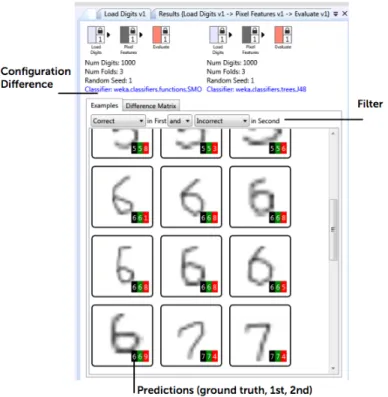
Figure 3.10: Gestalt [24]: Finding features from confusing instances
discover features. Users can click on the mistakes in the confusion matrix to identify the features that could help distinguish the two classes.
Model Selection by Evaluation
Suppose we already have a set of valuable features for the classifier. The next step is to select the best model that can make the best use of the features. Today we have a number of toolkits and libraries that contain different machine learning models and algorithms to choose from. To analyze the efficacy of these existing models, all we need is to compare their performance and select the best. To best evaluate the classifier’s performance, we need labelled and classified data, prediction result and the confidence, and the whole dataset if resources allow. This information can help us see which model best aligns with the data’s underlying structure by looking at which model can classify the data with the highest confidence.
Parameter Tuning by Evaluation
At this time, we may have already focused on one model and a set of features according to the data or feature’s properties. The last thing is to tune the parameters. Similar to model selection, we need to compare the performance of different configurations so we need labelled and classified data, prediction result and the confidence, and ideally the whole dataset. Different from model selection, we have unlimited configurations of the parameters, so it is impossible to compare them all at the same time. One solution is to simply show the trend line of the accuracy across different configurations as in the DET curve in Figure3.8a so that users can choose the best configuration by the score. Another solution is to allow users to explore different configurations by supporting interactions.
Figure 3.11: Ensemble Matrix allows users to build an ensemble classifier(left) by adjusting the weight of each component classifier(right).
This helps users see how each possible configuration affects the classifier’s decision. It also helps users feel control over the classifier’s performance. Talbot et al.’s Ensemble Matrix [40] (Figure 3.11) allows users to try different configurations to best assemble different classifiers.
3.4
Summary
This chapter summarizes previous machine learning visualizations by defining a taxonomy and tagging previous visualizations with the taxonomy. There are two dimensions in the taxonomy: the data displayed, focusing on the visualization’s content; and the advanced features, focusing on the techniques to make the visualization usable. In the last section, we also provide a guide to design visualizations based on target users and design goals. We leverage this taxonomy to design our Label-and-Learn system, which we describe in Chapter 4.
Chapter 4
Label-and-Learn
One task necessary to develop any machine learning system is the provision of labelled data, i.e. data that has been pre-classified typically by a person who examines and labels data to generate a sufficient dataset for the classifier to learn from. Data labelling is tedious, yet it is an unavoidable task in building a machine learning classifier. As well, it can be expensive, with a cost either in designer/user’s time (if the developer labels data) or in money (if paying someone else to label data). On the other hand, we believe that labelling can serve as the first opportunity for developers to get insight into their dataset.
Label-and-Learn is a system designed for machine learning data labellers who want to train a machine learning algorithm to solve a specific problem without involvement of a machine learning expert. It can users get a better understanding of the data while labelling. In this chapter, we will introduce the system by describing the specific kind of labelling tasks addressed, the machine learning model used, the traditional interface for labellers and our innovative visualization interface.
4.1
Task
The machine learning task our system helps to solve is Named Entity Recognition [23]. More specifically, given a string that matches one of the named entities, the classifier should identify whether it actually refers to the named entity. For example, the classifier should identify “US” refers to “United States” in the context “I’m studying computer science in the US”, but not in the context “He teaches us English”. The classifier uses the features from the context of the matched string: the two words before the matched string, the
matched string itself, and the two words after the matched string. The features in the second context are “he”, “teaches”, “us”, “english”, and empty.
There are several reasons that we choose Named Entity Recognition as our task: (1) It is used in many real-world systems (identifying date, time and location in an email, or identifying celebrities, companies, events in the news), (2) It usually requires a large amount of human labelling work that is boring and error-prone, (3) The features are easy to identify and understand (unlike features in audio or image data that are numbers or vectors that are only understandable by a computer).
4.2
The Backend Classifier
The idea of a Label-and-Learn system is to help users understand the data, as well as help them predict whether a satisfactory classifier can be built on the current dataset and features. To achieve that, we implemented a classifier in our system’s backend to give our users some information on the performance of the baseline method: where it is good, and where it will fail.
4.2.1
Naive Bayes classifier with Bag-of-Words Model
We choose naive Bayes as our model because it has competitive performance in text catego-rization, and it is easy to implement, understand and visualize compared to other methods such as SVM. Using the traditional naive Bayes and bag-of-words model to classify a doc-ument, the order of the words in the text does not affect the decision. As our problem is Named Entity Recognition, we add a small modification: In our model, we have the prior probability, which is the ratio of positive instances in the training data, and three sets of dictionaries:
• pevious dictionary, containing the tokens before the matched string, • current dictionary, containing the strings of named entities, and • next dictionary, containing the tokens after the matched string.
To identify whether the stringt3is actually the named entity in the context [t1][t2][t3][t4][t5], the system uses the following formula to calculate its positive probability:
p(+|[t1][t2][t3][t4][t5]) = p(positive)