Practical Assessment, Research, and Evaluation
Practical Assessment, Research, and Evaluation
Volume 24 Volume 24, 2019 Article 9
2019
A Plot for the Visualization of Missing Value Patterns in
A Plot for the Visualization of Missing Value Patterns in
Multivariate Data
Multivariate Data
Pedro Valero-Mora Maria F. Rodrigo Mar Sanchez Jaime SanMartinFollow this and additional works at: https://scholarworks.umass.edu/pare
Recommended Citation Recommended Citation
Valero-Mora, Pedro; Rodrigo, Maria F.; Sanchez, Mar; and SanMartin, Jaime (2019) "A Plot for the Visualization of Missing Value Patterns in Multivariate Data," Practical Assessment, Research, and Evaluation: Vol. 24 , Article 9.
DOI: https://doi.org/10.7275/94ra-1y55
Available at: https://scholarworks.umass.edu/pare/vol24/iss1/9
This Article is brought to you for free and open access by ScholarWorks@UMass Amherst. It has been accepted for inclusion in Practical Assessment, Research, and Evaluation by an authorized editor of ScholarWorks@UMass Amherst. For more information, please contact [email protected].
A peer-reviewed electronic journal.
Copyright is retained by the first or sole author, who grants right of first publication to Practical Assessment, Research & Evaluation. Permission is granted to distribute this article for nonprofit, educational purposes if it is copied in its entirety and the journal is credited. PARE has the right to authorize third party reproduction of this article in print, electronic and database forms.
Volume 24 Number 9, November 2019 ISSN 1531-7714
A Plot for the Visualization of Missing
Value Patterns in Multivariate Data
Pedro Valero-Mora, María F Rodrigo, Mar Sanchez, and Jaime SanMartin
University of Valencia, Spain
Missing data patterns are the combinations in which the variables with missing values occur. Exploring these patterns in multivariate data can be very useful but there are few specialized tools. The current paper presents a plot that includes relevant information for visualizing these patterns. The plot is also dynamic-interactive; so, selecting elements in it permits the highlighting of those that are more relevant according to certain criteria. An example, based on college data, is used for the purposes of illustrating the capabilities of the plot.
One of the most pleasing foods for thought in data analysis is probably pondering why certain information is not available to the researcher. Determining if there is a hidden intention behind missing data can be very juicy: Do poor performers prefer not to answer rather than report a poor score? Is somebody trying to hide something? Why did this institution choose to report this indicator and not another? Asking such questions is often a pre-requisite for starting to understand the real possibilities of data analysis. Are the missing data causing biases in the datasets? Is it possible to describe the biases? Can I arrive at satisfactory conclusions if the data are incomplete? Indeed, it can be very exciting to investigate who is not providing all the information and why.
Missing values in data are both a problem and an opportunity, but these two opposing statements have not been treated equally. On the one hand, viewing this as a problem has garnered more attention, which, in
1 ViSta would not have been possible without the work of
Forrest W. Young. Forrest was the creator and designer of ViSta, both in terms of its look and feel, and in terms of its internal software architecture. He also implemented the design
return, has yielded fruitful results. Thus, over the past two decades imputation techniques have been developed to fill in the blanks with appropriate estimations that make the statistical analysis of data with missing values much more accurate than before (Little,1988; Little & Rubin 2002, Schafer, 1997). In addition, many statistical packages have incorporated these advances, significantly facilitating their application.
On the other hand, methods for drawing insight from missing values are seldom discussed in the literature. For instance, graphics for missing values are given only a cursory examination in important references on missing data (Little, 1988, Little & Rubin, 2002, Schafer 1997) and applied books (e.g., Enders, 2010), do not even discuss them. Commercial statistical packages have included some simple graphics but they are not very sophisticated. In fact, it is non-commercial packages, such as MANET (Unwin et al. 1996), Ggobi (Cook & Swayne 2007), ViSta1 (Mora et al., 2003;
Valero-and wrote much of the documentation. He worked on the ViSta project from 1990, receiving help from students and
Practical Assessment, Research & Evaluation, Vol 24 No 9 Page 2 Valero-Mora, et al. Missing Value Patterns in Multivariate Data
Mora & Ledesma 2011; Valero-Mora & Udina 2005; Young et al.; 2006) and VIM (Templ et al., 2012), that provide a wider range of tools. The importance of methods for missing data visualization has been pointed out recently (e.g. Fernstad, 2019; Kandel et al., 2011).
The aforementioned packages for visualizing missing data in statistical graphics are based on two main strategies: namely, modifying standard graphics to include missing values that would otherwise be left out, and imputing missing values and marking them on the plots. The first approach was pioneered by MANET— as denoted in its acronym, Missing Are Now Equally Treated-and consisted of modifying bar-charts, histograms, scatterplots and so forth, in order that missing values in the raw data could also be visible in them. The second approach, used, for example, by ViSta, involved imputing the missing values in the dataset but marking them so they would be visible in the plot. An example of this approach is shown in Figure 1, which depicts a scatterplot of two variables that pertain to a hypothetical multivariate dataset. The blue points are fully observed cases (i.e., complete data). The green points are those that are observed in the two variables in the scatterplot but not in other variables of the dataset–
so that they could have been used for computing the pairwise correlations but not the listwise correlations. Finally, the red points would be the values imputed with the EM algorithm and the information in all the variables in the dataset. Note that the red points are located mainly on the upper right-hand side of the cloud of points, suggesting that a specific mechanism is responsible for producing them.
A relevant aspect of multivariate data with missing values is missing data patterns (i.e., the combinations in which the variables with missing values occur). Observing if two variables are missing in many cases, and if those missing values are associated with specific values for the other observed variables, can be very useful for exploratory data analysis (Fernstad, 2019). Actually, a plot of all the cases in a dataset using 1s or 0s for the observed or missing values is included in several statistics packages. However, such a graphic can be excessive for large datasets and, therefore, tabulated summaries of the patterns may be more useful in practice. Additionally, plots of the summaries of the patterns, especially if estimations of the missing information are computed, may facilitate the task of exploring the patterns enormously.
Hesterberg (1999) describes a plot for visualizing Little’s test (Little 1988) of the homogeneity of missing data patterns. Hesterberg’s plot is closely related with the work described here but only focuses on this specific aspect. We will use the ideas from Hesterberg in our plot and will add some other aspects so that it offers a more complete picture of the problem at hand.
The objective of this paper is to describe numerical and graphical summaries appropriate for the exploration of the patterns of missingness in multivariate data with missing values. In order to achieve this, we will use an example described in the next section. Then we will introduce a static plot designed to visualize the patterns and an interactive- dynamic version of this graphic that is more adequate for larger datasets. We conclude with a section on future research.
An example of data with missing
values: Colleges in the United States
For our example, we will use data taken from the repository of the Journal of Statistics Education at www.amstat.org/publications/jse/jse_data_archive.ht m. The data are from the 1995 U. S. News report on Figure 1: Example of how ViSta marks imputed and
missing values. Blue points are complete observations; green points are cases with missing values for the other variables not in the plot; and red points are imputed values.
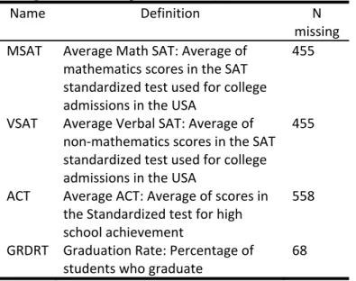
American colleges and universities and include demographic information on several variables. The dataset was prepared for the 1995 Data Analysis Exposition, sponsored by the Statistical Graphics Section of the American Statistical Association and was submitted by Lock (1995). There are 1,302 cases in this dataset (colleges) and 35 variables, but for the purpose of this example, we will only consider the four variables listed in Table 1: The first three variables correspond to standard tests widely used for college admissions in the U.S.; the fourth is a measurement of student success at university-the percentage who actually graduate. Although the admissions tests mentioned here are not necessarily required by all colleges, most do request them.
Table 1. Definition, name and number of the missing values observed for four variables selected from the college data file example (Lock 1995)
Name Definition N missing MSAT Average Math SAT: Average of mathematics scores in the SAT standardized test used for college admissions in the USA 455 VSAT Average Verbal SAT: Average of non‐mathematics scores in the SAT standardized test used for college admissions in the USA 455 ACT Average ACT: Average of scores in the Standardized test for high school achievement 558 GRDRT Graduation Rate: Percentage of students who graduate 68
In Table 1, we can see that ACT is the variable with the most missing values (43%). The VSAT and MSAT variables have the same number of missing values (35%). Lastly, GRDRT has the lowest number of missing values (5%). The missing SAT and ACT are probably attributable to some colleges requiring only one, or neither, of these test scores. The causes for not reporting the graduation rate are unknown and we can only speculate. When analyzing the data, some questions to consider with respect to the missing values include: Are those colleges that only report the SAT score have the same graduation rates as those only reporting the ACT score? What is the graduation rate for colleges not reporting any test scores? Are the colleges with higher graduation rates notifying both, only one, or even none,
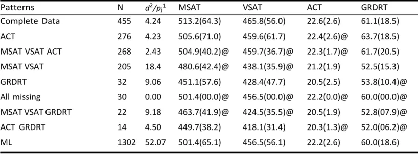
of the standardized tests? Ascertaining the answers to these questions can be challenging when values are missing. Additionally, even with only four variables, the number of different patterns can be rather large, which complicates the obtaining of a general picture. Moreover, the number of cases varies considerably in the different patterns—as can be observed in column N in Table 2—making it difficult to get a global overview. Table 2 illustrates these points by depicting the mean and standard deviation of the data as they might be displayed in many statistical packages. For example, it can be observed at a glance that mean scores in MSAT and VSAT variables are higher for the complete dataset than for the incomplete patterns of data.
Table 2. Descriptive statistics for college data (means and standard deviations of observed cases present in each of the missing data patterns). N=Number of cases in each of the missing data patterns.
Patterns N MSAT VSAT ACT GRDRT Complete Data 455 513.2(64.3) 465.8(56.0) 22.68(2.6) 61.1(18.5) ACT 276 505.6(71.0) 459.6(61.7) 63.7(18.5) MSAT VSAT ACT 268 61.7(20.5) MSAT VSAT 205 21.29(1.9) 52.5(15.3) GRDRT 32 451.1(57.6) 428.4(47.7) 20.5(2.5) All missing 30 MSAT VSAT GRDRT 22 20.5(1.9) ACT GRDRT 14 449.7(38.2) 418.1(31.4)
The usefulness of this table can be enhanced by also displaying summaries of missing value estimations. Table 3 does just that with means and standard deviations by pattern for missing values computed from imputed values. Statistics computed from imputed values are indicated with a @. Notice that by inserting these estimations, it is now easier to have an overview of the problem. In this case, the imputation was carried out using single imputation via the EM algorithm (Little & Rubin 2002, 1987; Rubin 1987), a method that has the disadvantage of underestimating variability so that the values for standard deviations are smaller than they
Practical Assessment, Research & Evaluation, Vol 24 No 9 Page 4 Valero-Mora, et al. Missing Value Patterns in Multivariate Data
should be. A better alternative in this case would be to use multiple imputation (Rubin 1987; Schafer & Olsen, 1998) as this method does a better job of incorporating the uncertainty stemming from missing data.
Notice that the pattern without missing values is the one with the most cases, followed by the pattern with missing ACT. Notice that we have also listed the pattern with all the variables missing for the sake of completeness—it has 30 cases, all of which were imputed with the EM mean. The last line of the table displays the Maximum Likelihood means and standard deviations calculated using the EM algorithm.
This table makes it possible to evaluate whether there are differences between the patterns and, consequently, whether the patterns with missing values in some variables are different from the others. A statistical test of the significance of the differences among patterns can be carried out using Little’s test (Little, 1988). In this test, we have p variables, J patterns of missing values, mj observations in pattern j, pj the number of variables observed in pattern j, µ and Σ the maximum likelihood estimates of the parameters obtained using the EM algorithm, µˆobs,j and Σˆ obs,j the subsets of the parameters corresponding to non-missing observations for pattern j, and y¯obs,j the p-dimensional vector for the sample average of observed data in pattern
j. Little’s test equation is as follows:
T j obs j obs J J j obs j obs j obs j J j j m y y d d , , 1 1 , , , 1 2 2
ˆ ˆ ˆ This test has a χ2 distribution with
Jj1pj
p degrees of freedom under fairly general assumptions (Little, 1998). Rejection of the null hypothesis indicates that there is a substantial deviation of one or more patterns of data with respect to the maximum likelihood estimates computed using the EM algorithm. This is interpreted to mean that the data missing values are not MCAR (missing completely at random).Using Little’s test as a starting point, Hesterberg (1999) suggested examining individual contributions to the test to find out which patterns are the most influential. For instance, the value of d2/p
j has an expected value of 1, so values above 1 indicate a pattern that contributed more than expected to the total test.
In this case, the MCAR test was significant with χ2
(12) = 114, 29, p < 0.001 and it would be appropriate to examine which patterns contributed most to this result. As an example, the pattern with missing MSAT and VSAT may be identified as interesting because it has the highest value in terms of its contribution to the test. Given that the averages, estimated and observed, of the variables in this pattern are relatively low, we may suspect that colleges relying solely on ACT for admissions purposes could have a clearly distinct profile. Table 3. Descriptive statistics for college data with means and standard deviations computed from imputations carried out with the EM algorithm.
Patterns N d2/pj1 MSAT VSAT ACT GRDRT
Complete Data 455 4.24 513.2(64.3) 465.8(56.0) 22.6(2.6) 61.1(18.5) ACT 276 4.23 505.6(71.0) 459.6(61.7) 22.4(2.6)@ 63.7(18.5) MSAT VSAT ACT 268 2.43 504.9(40.2)@ 459.7(36.7)@ 22.3(1.7)@ 61.7(20.5) MSAT VSAT 205 18.4 480.6(42.4)@ 438.1(35.9)@ 21.2(1.9) 52.5(15.3) GRDRT 32 9.06 451.1(57.6) 428.4(47.7) 20.5(2.5) 53.8(10.4)@ All missing 30 0.00 501.4(00.0)@ 456.5(00.0)@ 22.2(0.0)@ 60.0(00.0)@ MSAT VSAT GRDRT 22 9.18 463.7(41.9)@ 424.5(35.5)@ 20.5(1.9) 52.8(07.9)@ ACT GRDRT 14 4.50 449.7(38.2) 418.1(31.4) 20.3(1.3)@ 52.0(06.2)@ ML 1302 52.07 501.4(65.1) 456.5(56.1) 22.2(2.6) 60.0(18.6) 1 d2 =Individual contributions to Little’s test; pj=number of variables observed in pattern j https://scholarworks.umass.edu/pare/vol24/iss1/9
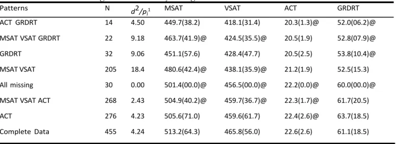
Table 3 is sorted according to the number of cases in each pattern. Whereas this provides a simple way to examine the patterns, it may sometimes be useful to sort the table according to other criteria, such as the contribution to Little’s test, the pattern of missingness, or the first principal component (Friendly & Kwan 2003) of the averages displayed in Table 3. As an example, the last sorting is shown in Table 4 and discussed below.
Ordering the rows of the tables according to the eigenvector has the effect of bringing together the patterns with similar averages in all the variables. Notice that, in this case, those with generally small average values in the four variables are set at the beginning and those with larger values come at the end. This way, for example, the last two rows in the table, the one with Complete Data and the one with missing values in only the ACT variable, would be colleges with high test values and graduation rates, whereas the first two rows would be the opposite, i.e., colleges with low tests values and low graduation rates. As what the colleges of these first three rows have in common is the fact that they do not provide the graduation rate, we might conclude that not offering this information is a reason for dubiousness.
Although Tables 3 and 4 may be sufficient for many purposes, displaying the numbers as a plot may be even more interesting. We will tackle this idea in the next section.
A plot for exploring the patterns of
missing values
Figure 2 shows the information in Tables 2 and 3 using what is basically a modification of the parallel lines plot (Inselberg 1985). Notice that the EM computational algorithm starts by standardizing the variables using the mean and the standard deviation of the observed values and consequently the imputed values are generally within z-scores range. Although these scores can be transformed back to direct scores, the plot in Figure 2 shows the imputed values as originally outputted by the EM algorithm. The rectangles are vertically centered on the variables’ averages by pattern (if observed, the mean of the observed values and, if imputed, the mean of the imputed values). Each pattern corresponds to one rectangle for each variable, colored blue if the pattern has observed values for that variable, and red if missing; these rectangles are connected by lines. The horizontal size of the rectangles is proportional to the number of cases in the pattern and their vertical size approaches 95% confidence intervals for the mean. Note, however, that because we used single imputation, the standard error when calculated with missing values is underestimated (Little & Rubin 2002).
Additionally, the plot shows diamonds centered at the ML means of a height equal to two standard deviations calculated using the EM algorithm. Note that the difference between the central line of each diamond Table 4. Patterns of missing values ordered by the eigenvalue of the table of means.
Patterns N d2/p
j1 MSAT VSAT ACT GRDRT
ACT GRDRT 14 4.50 449.7(38.2) 418.1(31.4) 20.3(1.3)@ 52.0(06.2)@ MSAT VSAT GRDRT 22 9.18 463.7(41.9)@ 424.5(35.5)@ 20.5(1.9) 52.8(07.9)@ GRDRT 32 9.06 451.1(57.6) 428.4(47.7) 20.5(2.5) 53.8(10.4)@ MSAT VSAT 205 18.4 480.6(42.4)@ 438.1(35.9)@ 21.2(1.9) 52.5(15.3) All missing 30 0.00 501.4(00.0)@ 456.5(00.0)@ 22.2(0.0)@ 60.0(00.0)@ MSAT VSAT ACT 268 2.43 504.9(40.2)@ 459.7(36.7)@ 22.3(1.7)@ 61.7(20.5) ACT 276 4.23 505.6(71.0) 459.6(61.7) 22.4(2.6)@ 63.7(18.5) Complete Data 455 4.24 513.2(64.3) 465.8(56.0) 22.6(2.6) 61.1(18.5) 1 d2 =Individual contributions to Little’s test; pj=number of variables observed in pattern j
Practical Assessment, Research & Evaluation, Vol 24 No 9 Page 6 Valero-Mora, et al. Missing Value Patterns in Multivariate Data
and the reference line set at 0 indicates the difference in the estimation of the mean carried out using EM and the one calculated using the data observed. For variables without missing values, the diamonds will be between 1 and -1, whereas those with missing values may be shorter or higher depending on the EM estimation of their variances. An inspection of Figure 2 reveals two groups of missing data patterns. The first group features three patterns with high average values in both test scores and graduation rates-either observed or imputed. These three patterns accumulate most of the cases. The second group comprises patterns with low average values in test scores and graduation rates. This second group has several patterns with few cases, but it also includes the one with missing MSAT and VSAT, which is of a more substantial size.
We think that Figure 2 is useful as a graphical representation of the values in Table 2. However, it can be argued that, as often happens with parallel line plots, its usefulness declines as the number of cases represented increases and the lines connecting them multiply. In such cases, it may be better to use dynamic-interactive versions of parallel line plots rather than static plots because they allow the data analyst to manage the cases to be displayed, allowing for a step-by-step exploration that can yield a fuller picture of the data. Such a dynamic-interactive version is presented in the next section.
A dynamic-interactive version of the
plot for patterns of missing values
Dynamic-interactive versions of parallel line plots are useful when the number of cases is large and the lines
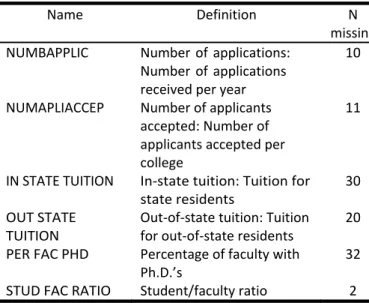
overlap significantly. In order to discuss a situation where this happens, we will again use the college data, this time considering six additional variables. Thus, the variables in this example will include those already described in Table 1 plus those described in Table 5.
The dataset considered in this case has ten variables-4 variables in Table 1 plus 6 variables in Table 5- generating 37 different missing-values patterns. This is too many to be visualized comfortably in a static plot like the one displayed in Figure 2. As discussed in section 3, two possible criteria for identifying which patterns might be interesting are the contribution to Little’s test and the number of cases. These two criteria are displayed in the scatterplot shown in Figure 3. This is a scatterplot
Figure 2. Plot of the missing-values patterns in college data. The significance of the elements in the plot is explained in Section 3.
Table 5. Six additional variables from college data.
Name Definition N
missing NUMBAPPLIC Number of applications:
Number of applications received per year 10 NUMAPLIACCEP Number of applicants accepted: Number of applicants accepted per college 11 IN STATE TUITION In‐state tuition: Tuition for state residents 30 OUT STATE TUITION Out‐of‐state tuition: Tuition for out‐of‐state residents 20 PER FAC PHD Percentage of faculty with Ph.D.’s 32 STUD FAC RATIO Student/faculty ratio 2 https://scholarworks.umass.edu/pare/vol24/iss1/9
for the 37 missing data patterns in our example, with the four patterns with the most cases labelled individually.
Focusing on the patterns that are labelled in the scatterplot in Figure 3, we can see that the pattern with the missing MSAT VSAT variables makes the greatest relative contribution to Little’s test, and that the pattern missing the MSAT VSAT ACT variables makes the least. Finally, the Complete Data and ACT patterns have intermediate values. This plot can also make it easy to identify patterns with few cases that make the greatest contributions to Little’s test; however, for the sake of simplicity, we will not delve into that here.
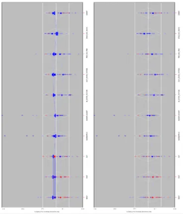
In ViSta, the program used to create our plots, Figure 3 is linked with the graphic in Figure 2 using a spreadplot (Young et al. 2003): a multiplot arrangement that is similar to dashboards in Tableau or corkboards in Datadesk. In this spreadplot, selecting a point in Figure 3 displays the rectangles and the lines corresponding to the pattern associated with it in Figure 2. By selecting these points one by one, we can draw a general view of the missing data patterns in our dataset. Figure 4 is an illustration of this process. The left plot shows the four patterns from Figure 3 and the right plot shows the pattern with the missing MSAT VSAT variables, that is, the pattern which makes the greatest relative contribution to Little’s test. The interpretation of Figure 4 is congruent with what we saw previously. Whereas three of the patterns have average values that are positive (i.e. above average) for all variables except the STUD FAC RATIO, the pattern with missing values only in the
SAT test is below average for all the variables but the Student Faculty Ratio, which is above average. Therefore, we conclude that colleges not using SAT scores for admissions purposes have distinctive features, such as fewer applicants, lower tuition costs, fewer faculty members with PhDs, more students and lower graduation rates. Additionally, predicted SAT scores for the colleges in this pattern are below average.
Summary and Discussion
The visualization of missing value patterns is an important aspect of statistical work. Thus, considerable time is commonly devoted to understanding the quality of the data available and the consequences of its deficiencies. Generating missing data values may require a great deal of preparatory effort, but, as we have seen in the example discussed herein, doing so may provide interesting insights that are a valuable outcome of the analysis. The plot discussed above offers an overview of the center and the dispersion of the values of variables in each pattern, using both observed and imputed values.
Figure 3. d2/p
j versus number of cases by
pattern for college data example with ten variables. The points selected correspond to the patterns with the most cases.
Figure 4. Pattern plots for variables in the college data example. The left plot displays the four patterns in Figure 3. The right plot displays the pattern with the missing MSAT VSAT variables.
Practical Assessment, Research & Evaluation, Vol 24 No 9 Page 8 Valero-Mora, et al. Missing Value Patterns in Multivariate Data
These approximations lay the groundwork for exploring what might be the mechanism that has produced the missing values.
One limitation of the approach discussed here is that it only takes into consideration the center and the dispersion of the patterns. Little (1988) mentioned a test for evaluating the homogeneity of covariances across different patterns, but he did not study it. Similarly, a plot for visualizing the differences among covariances in different patterns may be useful and should be studied. Scatterplot matrices with linear regressions by pattern and different symbols/colors for points in each pattern might work well in this situation. Other interesting aspects of the patterns, such as their size or dissimilarity, could be included in the plots, as well. Again, dynamic-interactive features might be used to remove clutter or pinpoint patterns that stand out. A multiplot arrangement linking the plots discussed in this paper with the aforementioned scatterplot matrix would probably also be useful.
Brillinger (2002) mentions that of the 14,000 books that were donated to Brown University from Tukey’s personal library, most of them were his extensive collection of detective, adventure and science fiction stories. It is also well known that Tukey referred to Exploratory Data Analysis as detective work. Indeed, we think that the tools discussed herein continue this tradition by shedding light on the most obscure parts of datasets and clarifying the mysteries that may lurk there. These are tools that any data detective would want to have readily available to solve the big mystery of missing data.
Software
The plots discussed here can be recreated with ViSta. This program can be downloaded at the following internet address: www.uv.es/visualstats/Book/ DownloadBook.htm.
Instructions on its installation and use are available at the same web address. Once ViSta has been installed, use the Open Data command in the menu file to open the data examples, which are in the Data/missing directory. Once the right file is opened, use the Impute Missing Data command in the Analyze menu. At the conclusion of the process, visualize the model using the command Visualize in the Model menu (select visualize patterns).
References
Brillinger, D. R. (2002). John W. Tukey: his life and
professional contributions. The Annals of Statistics, 30(6), 1535–1575.
Cook, D., & Swayne, D. F. (2007). Interactive and Dynamic Graphics for Data Analysis, Springer.
Enders, C. K. (2010). Applied missing data analysis. Guilford Press.
Fernstad, S. J. (2019). To identify what is not there: A definition of missingness patterns and evaluation of missing value visualization. Information Visualization, 18(2), 230-250.
Friendly, M., & Kwan, E. (2003). Effect ordering for data displays. Computational Statistics and Data Analysis, 43(4), 509–539.
Hesterberg, T. (1999). A graphical representation of Little’s test for MCAR, Technical report, MathSoft, Inc. Inselberg, A. (1985). The plane with parallel coordinates.
The Visual Computer, 1, 69–97.
Kandel, S., Heer, J., Plaisant, C., Kennedy, J., van Ham, F., Riche, N. H., ... & Buono, P. (2011). Research directions in data wrangling: Visualizations and transformations for usable and credible data. Information Visualization, 10(4), 271-288. Little, R. J. A. (1988). A test of missing completely at
random for multivariate data with missing values.
Journal of the American Statistical Association, 83(4), 1198– 1202.
Little, R. J. A. & Rubin, D. B. (2002). Statistical Analysis with Missing Data, 2nd edn. Wiley.
Lock, R. (1995). U.S. news college data [data set].
http://www.amstat.org/publications/jse/datasets/usne
ws.txt
Rubin, D. (1987). Multiple imputation for nonresponse in surveys. Wiley.
Schafer, J. L. (1997). Analysis of incomplete multivariate data. Chapman and Hall/CRC.
Schafer, J., & Olsen, M. (1998). Multiple imputation for multivariate missing-data problems: A data analyst’s perspective. Multivariate Behavioral Research, 33, 545– 571.
Templ, M., Alfons, A., & Filzmoser, P. (2012). Exploring incomplete data using visualization techniques. Advances in Data Analysis and Classification, 6(1), 29–47.
Unwin, A., Hawkins, G., Hofmann, H., & Siegl, B. (1996). Interactive graphics for data sets with missing values: MANET. Journal of Computational and Graphical Statistics, 5(2), 113–122.
Valero-Mora, P. M., & Ledesma, R. D. (2011). Using interactive graphics to teach multivariate data analysis to psychology students. Journal of Statistics Education, 19(1), 1–19.
Valero-Mora, P. M., & Udina, F. (2005). The health of lisp-stat. Journal of Statistical Software, 13(10), 1–5.
Valero-Mora, P. M., Young, F. W., & Friendly, M. (2003). Visualizing categorical data in ViSta. Computational Statistics and Data Analysis, 43(4), 495–508.
Young, F., Valero-Mora, P., Faldowski, R., & Bann, C. M. (2003). Gossip: The architecture of spreadplots. Journal of Computational and Graphical Statistics, 12(1), 80–100. Young, F. W., Valero-Mora, P. M., & Friendly, M. (2006).
Visual Statistics: Seeing Data with Dynamic Interactive Graphics. Wiley-Interscience
Citation:
Valero-Mora, P., Rodrigo, M.F., Sanchez, M., SanMartin, J. (2019). A Plot for the Visualization of Missing Value Patterns in Multivariate Data. Practical Assessment, Research & Evaluation, 24(9). Available online:
http://pareonline.net/getvn.asp?v=24&n=9
Corresponding Author
Pedro Valero-Mora
Department of Behavioral Sciences Methodology University of Valencia
Av. Blasco Ibañez, 21 46010-Valencia (Spain)