Mobile MC
Guidelines
Table of contents
ABBREVIATIONS
4
USER AND PLATFORM
6
Guidelines usage
6
Role of the interface
6
User
6
Usage environment
6
User interface interaction
8
Hardware
8
General User interface guidelines
10
DESIGN
12
Handling different screen sizes
12
Assets
12
Fonts
12
Screen layout
12
Hardware features
14
General layout
14
Input&Output
14
Gestures
16
OS
16
Navigation
16
Colours
16
Text
16
Naming conventions
16
Android SPECIFIC
16
Handling different screen sizes and resolutions
18
Programming for Android
18
Android OS
18
Screen Lay-out Application level
18
Android 4.0 Design
20
Interface input/output elements
22
MC DESIGN
24
MC Interface Gatekeeper
26
Faults screen
26
Navigation tab
26
Infra & Processing status tabs
26
ABBREVIATIONS
MC
Maintenance Centre
dpi
Device Independent Pixels
sp
Scale independent pixels
OS
Operating System
OLM
Operational Level Maintainer
GUI
USER AND PLATFORM-6
USER AND PLATFORM
Guidelines usage
This document covers the new guidelines for the mobile MC. First the global guidelines for mobile devices with multiple
screen size/densities are described. Secondly, the guidelines for a specific mobile platform OS: Android 4.0 ice cream
sandwich are described. Although this document covers the MC design for the most part, this document should always
be used in combination with the most recent OS specific guidelines and the most recent desktop MC guidelines. When
an item is not described in this guidelines document, it is already defined in the desktop MC guidelines. Only the altera
-tions or addi-tions to the current desktop MC guidelines are described in this document.
Role of the interface
The MC-User Interface allows the user to access maintenance services. Maintenance services are system specific but are generally classified as follows:
Service Description
State Management Monitor and control system states and modes
Health Management Monitor the system health, diagnose problems, and consult technical manuals
Configuration Management Identify hardware and software parts, monitor and control parameters
The mobile MC is an addition to the desktop MC. The Operational Level Maintainer still has access to a desktop MT for irregular tasks(i.e software instalment and sensor calibration) which require a features that are not included in the mobile MC. When a error or fault arises and the OLM needs to be physical present at the system location. For this event, he uses the mobile MC to provide on-spot fault identification en validation. The mobile MC also supports the OLM with
replacement manuals and to navigate to the problem location. The mobile MC has to be designed to provide only the essential information and functionality the OLM needs when he is physically present at the system location. Though it is inadvisable to leave less used features out of the mobile MC, because it is really harmful for the user-interface
inter-action experience if the OLM needs to go back to desktop version of the MC to get access to addition information or functionality. The less used features of the mobile MC could be emerged into deeper levels of the mobile MC. While still
staying accessible, the total overview of the MC is not affected. Then again, mobile MC needs to be surveyable, easy to
overlook and accessible. To overcome this antithesis, this document can be used as guideline though a expert guided
assessment is vital.
User
The Maintainer is the main user of the Interface. Its characteristics are further defined in the MC desktop guidelines.
Characteristics Typical
Skills At least the skills needed for Operational Level Mainte
-nance (OLM) see Desktop Guidelines.
Experience Experience with todays mobile devices
Usage environment
The Interface is used in a variety of environments: System environment, Office environment, dimmed Office Environ
-ment and Travel route between System and Office environ-ment. These environ-ments have different characteristics. The
GUI shall allow the user to use the MC in the above stated environments.
Environment Type Description
System environment Protected environment with 3 meters distance of the system that needs to be maintained. The user may or may not have a chair and table available. There may be
relatively much noise (> 60 dB), and many blinking lights.
Office environment A typical normal office environment, with a desk, chair,
fair lightning
USER AND PLATFORM-8
Travel route between system and office environment Varying environment factors: Temperature, Humidity,
Light, Noise, working space(ladders), world orientation.
User interface interaction
The following user interaction shall be available at the mobile application: Check system status and availability, sys
-tem health, sys-tem environment parameters, connection status with external interfaces, sys-tem processing rate, and
system configuration. The user open manuals, opens help dialogues for specific screens. Make fault reports and event
logs.
The GUI shall support the following user tasks for maintenance purposes:
-Monitor system health&status
-Provide help and manuals to understand the interface and solve the problem
-Display the system processing rate, system environment parameters and system component parameters -Display and manipulate the system connection with other interfaces
-Make event logs and fault reports
-Manipulate the status and availability of the system
Hardware
The mobile MC must support various screen sizes and screen density’s for it is used on smart phones, tablets and
products alike. This support could cover the smallest smart phone and the largest high- resolution/size tablet . Conse
-quently no specific screen size/density requirement can be set. The mobile MC should be designed for a large range of
screen resolution and densities. The mobile MC needs to be flexible. How the MC application supports the large range of screen sizes and density’s, is explained in the next paragraph.
The MC-User Interface shall use the following:
-Display visual output.
-Support a large variety of screen resolutions and densities.
-Support a different screen orientation(landscape/portrait)
-Allow physical input for navigation&control -Touchscreen
-Finger or Stylus input(optional)
-Gestures(explained in a later chapter)(optional) -Haptic feedback by device(vibration)
GENERAL USER INTERFACE GUIDELINES-10
GENERAL USER INTERFACE GUIDELINES
The following section describes general already established user interface guidelines. These guidelines can be used by designing the GUI for the MC if the other sections of this document don’t cover the needed information. Several
impor-tant guidelines are listed below. The number behind each guideline links to the appendix complete general guidelines.
For the complete list of available guidelines see the appendix section: General Guidelines.
Be consistent{1}
Ensure that the same terminology is used within an application and that the same terminology is used between hand-held applications. In the absence of guidelines, try to borrow ideas from applications that have been well designed and have a high degree of usability.
Consistency and standards {4}
User should not have to wonder whether words, situations, or actions mean the same thing. Follow platform conven-tions
Consistency between platforms {1}
While the same terminology can be used between handheld applications, you will need to think carefully when adapt
-ing an application from a desktop to a handheld device. It is not necessarily the case that terminology that works for a desktop will work for the smaller screened handheld device.
Provide feedback {1}
The system should support the user with feedback regarding what the application is doing. Feedback in relation to, say, the use of an application or navigation within it could be provided via an assigned information key.
Use metaphors {1}
Real-world metaphors in line with the size of the display should be used. For example, while a desktop metaphor would be inappropriate for a cell phone, the use of an address book for storing telephone numbers would be okay.
Recognition rather than recall {4}
Make objects, actions and options visible. The user should not have to remember information from one part of the dia
-logue to another. Instructions or use of the system should be visible or easily retrievable whenever appropriate.
Clickable graphics should look clickable {1}
-If a graphic is clickable, then I should have defined border and the graphic should have high contrast with the back
-ground colour. Conversely graphics that are static should not appear to be click able.
Use icons to clarify concepts
-Icons should be meaningful and representative of the concepts they are meant to convey.
Effective{2}
Accuracy, Consider how many places in the interface are opportunities for error, and protect against them. Look for op
-portunities to provide feedback and confirmations
Efficient {2}
Operational speed: Place only the most important information in the front of the user. Work on navigation that moves as directly as possible through a task. Be sure the interaction style minimizes the actions required
General{3}
-Follow conventions if your users are familiar with these
Tabs {3}
Tabs should not be used for sequential steps, as this does not fit the metaphor. Menus
-The menu structure should be organized around the needs of the users rather than around the underlying software.
List boxes {3}
-Combine the list box with a text box if appropriate.
Text boxes {3}
-Grey-out the text box if you want to show that, in a particular context, the content of the box cannot be changed.
Visibility of system status{4}
The system should always keep users informed about what is going on, through appropriate feedback within reason
-able time.
Match between system and the real world {4}
The system should speak the users’ language, with words phrases, and concepts familiar to the users, rather than system-oriented terms. Follow real-world convention, making information appear in a natural and logical order.
Aesthetic and minimalist design {4}
Dialogues should not contain information that is irrelevant or rarely needed. Every extra unit of information in a dialogue competes with the relevant units of information and diminishes their relative visibility.
Help and documentation {4}
Even though it is better if the system can be used without documentation, it may be necessary to provide help and
documentation. Any such information should be easy to search, focus on the user’s tasks, list concrete steps to be car
DESIGN-12
DESIGN
Handling different screen sizes
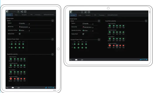
The MC interface has to support a wide range of devices with differing screens resolutions and sizes(See Figure 1). For
handling those varying screens, the following guidelines section has been established.
Generally the total range of screen size and densities for tablets and smart phones can be put into 4 different size buckets:
Size Resolution
small(2-3 inch) dpi(100-120 dpi)
normal(3-5 inch) mpdi(120-160 dpi)
large(4-7 inch) hdpi(160-240 dpi)
xlarge(7-10 inch) xhdpi(240-320 dpi)
>xlarge >xhdpi
Assets
For each bucket, a different asset(image, icon, gradient) should be provided to ensure the display quality of those assets on total above described range of device screen and resolutions. They could, i.e, become blurry. The assets which are provided for a specific bucket, should be defined with Device Independent Pixels(dp or dpi). This ensures the MC assets scale well within a specific bucket. For icons used in the mobile MC, see appendix section Icon Size(blz 38) where the minimal icons asset size is defined.
Fonts
Fonts should be defined in sp. Sp stand for scale independent pixels .It means that is the interface is scaled, the text
size and proportions stays the same. If the size of the text is not scale-independent, the text could become unreadable.
Size sp
micro 12
small 14
normal 16
large 18
Screen layout
For each bucket, the MC application developer should test if the MC fits well onto the screen and, where needed, change the screen lay-out for a specific bucket. The MC shall also provide an alternate layout for the two screen
orientations(See Figure 2). I.e. When in the landscape orientation, information can be displayed more horizontally.
The interface should be first designed for a mid range 7 inch size hdpi screen in portrait orientation to establish a base
-line application. Next, the designer should research how well the interface scales across the targeted size en resolution
screens. Because all images, input elements, buttons, layout and their relation are defined in dp or dip(device independ
-ent pixels), the interface should scale between differ-ent buckets. However, the following problems could arise when scaling the MC:
1. The screen elements are to o small to interact with or the text/indicators/images becomes unusable small 2. Inefficient use of the available space
The first problem can be solved by giving the intractable content a minimum size to ensure the buttons are large
enough to be clicked and text stay readable. Both Google Android and Apple IOS set the minimum button size to around 48dp. With this size, a button has a minimum size of 7X7 mm and is still clickable even on the smallest screen with normal fingers. This size should be increased if MC should be operable with gloves.
To counter the second problem the interface should be made up of dynamically building blocks. Whenever there is room, fit as many building blocks into one screen. When it is not possible, make multiple screens. A good example of
this approach is the Google gmail app(See Figure 3.). When in portrait mode, the app display a list of the inbox emails.
DESIGN-13
4:00Faults Navigation Infra Processing Software&Parameters
Overview
States
Overview
Health&Availability
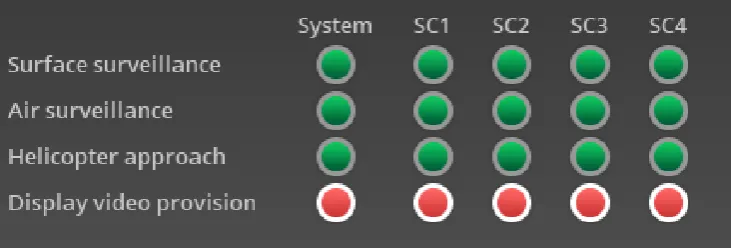
Camera Power State
System SH1 SH2 SH3 SH4
System SH1 SH2 SH3 SH4
System SH1 SH2 SH3 SH4
System SH1 SH2 SH3 SH4 Video Proportions Helicopter Approach Air surveillance Surface surveillance 4.7 inch 4:00
Faults Navigation Infra Processing Software&Parameters
Overview 2 GATEKEEPER States Overview Health&Availability Camera Power State
System
Mastership Operational setting Replay Mode
SH1 SH2 SH3 SH4
TV IR Standby Maintainance Online
System SH1 SH2 SH3 SH4
System SH1 SH2 SH3 SH4
System SH1 SH2 SH3 SH4
System SH1 SH2 SH3 SH4 Video Proportions Helicopter Approach Air surveillance Surface surveillance 2 GATEKEEPER
SH1 SH2 SH3 SH4
[image:13.595.73.361.126.325.2]TV IR System Mastership Operational setting Replay Mode Standby Maintainance Online
Figure 1
. Variation in screen sizes{
5
}
[image:13.595.35.559.461.780.2]DESIGN-14
the previous selected email. When is landscape mode, the screen is divided into two sections. The right side is the list of email present in the inbox. The left side displays the content of the selected email which updates whenever the userselects another email. When the information covers only one interface level, the content could be distributed over dif
-ferent tabs, grouping the most relevant information per tab. This level appliance is only desirable when multi- levels are present in the interface. For instance, in the MC Faults screen, a capability has to be selected which leads to a fault se-lection and finally to cause of the selected fault. For this sese-lection sequence, a 3 level tab can be used with appropriate navigation between this tabs or, if there is enough space, it can be displayed onto one screen with a sequential indicator.
When a certain tab has to contain more information then there is room on screen, a scroll view can be used. A scroll view can be navigated with a swipe gesture explained in section Design(pp. 18).
For the layout design of the MC, the following steps can be used:
1. Group the indicators, parameters, images and input elements, whom have the greatest correlation into sub groups. These subgroups make up the building blocks of a specific tab.
2. Group the subgroups per tab, when there is not enough space on a tab for all the sub groups, group the subgroups into a sub-tab which belong to a main tab. The subgroups can also be displayed in a scroll-able window tab when it is really necessary that the subgroups are displayed onto one screen. I.e in the Overview tab, the different sub tab are States, Camera&Power States and Health&Availability. If there is not enough room, these subgroups can be listed inside a scroll-able Overview screen. Or when that approach is not an option, list the subgroups in the needed sub tabs which in their turn belong to the main Overview Tab. If the application in programmed correctly, it searches for the best pos-sible listing of the subgroups with the main goal of displaying all the subgroups into one tab with no sub tabs.
3. Add special navigation between the tabs if necessary. I.e. hyperlinks.
4. Add the tabs to the navigation bar in a logical order, starting with the most important tab on the left.
Hardware features
There are extra features which the GUI could use the further support the user, like gps, compass, gyro meter. These
features could prove useful for the MC interface I.e. The Maintainer could use a camera for annotation, a compass/gps
for navigation on deck and shake the device for undoing current user input. These features should only be implemented when necessary, because it makes the interface harder to learn, more complex to use and most important: more time
consuming to design/develop. Also, the user always needs extra training to use these feature. The benefits of imple
-menting these features are less obvious. It could improve the users experience of the interface and add features to the
interface that otherwise would not be possible(i.e augmented reality and in-world navigation).
General layout
The main layout of the mobile is not very different from the desktop MC. How it could look for Android OS is described in the chapter Gatekeeper MC. On a mobile device, a vertical swipe gesture can be used to scroll quickly trough a list of
items without losing the total overview completely, but the horizontal space is limited to the screen dimensions.
There-fore, screen elements(buttons, tables, groups buttons, etc.) have to be redesigned to make the most use of a vertical alignment(taking the readability into consideration). I.e for Android, the Health&Availability table is redesigned so the
capability name is positioned below or above the component indicators(See Figure 4). For other Android specific adjust
-ments see section Android Specific(pp. 20). This redesign of screen elements can be done using the OS specific guide
-lines and the current desktop MC guide-lines.
The menu bar and the body pane are still the same for the mobile MC to ensure recognizability between the two
plat-forms. The status bar and several less important screen are removed or merged to keep the interface clean and simple.
The essential items from the status bar have moved to the menu bar.
Input&Output
User can interact with the GUI trough a touchscreen and physical buttons. The user can use his finger or stylus for this interaction. User can rotate, pitch or shake the device. These input options should be taken into account while designing
the MC. The input can be used for better and more intuitive navigation inside the application. The output can be used to
provide the user with more feedback, increasing its usability and reducing the errors the user makes. The output feed
-back can be animation in the GUI, or haptic feed-back due vibration, sound, ‘affordances’ of certain graphical elements.
For Android, the feedback is described in section Android Specific(pp. 24-25)
Globally, four types of input can be distinguished: Tap a button, fill a text field, check boxes and pick a value out of a
select range.
Globally several types of visual output can be distinguished: Status/health /state indicator, critical value indicator(i.e. heath sensor value), process progress indicator, range of input value’s([10, 15]), user input feedback(i.e. highlighting of a
button/text input field), edibility indicator, help indicator, help documentation and several parameters values(like pro
DESIGN-15
System SH1 SH2 SH3 SH4System SH1 SH2 SH3 SH4
System SH1 SH2 SH3 SH4
System SH1 SH2 SH3 SH4 Video Proportions
Helicopter Approach
Air surveillance
Surface surveillance 4:00
4:00
Email 1 Email 2 Email 3
Email 4
Selected Email
Email 6 Email 7 Email 8
Email 9 Email 10
Email 1 Email 2 Email 3
Email 4 Email 5 Email 6 Email 7 Email 8
Email 9
Email 10
Email 11 Email 12 Email 13
Email 14
Email 15
Email 16
[image:15.595.36.353.34.233.2]Content selected email
Figure 4
. Difference in element layout of the Health and Availability widget
[image:15.595.104.470.625.750.2]DESIGN-16
The GUI shall give the user feedback to confirm an important action. This feedback can be visual, physical or audible.The user shall use the device possibilities to navigate in the MC.
The different input and output types must be distinguishable by the user.
The GUI could give the user feedback for every action taken the usability of the interface into account.
Gestures
To improve the navigation throughout the MC, the GUI should provide the user to make so called “gestures”. A gesture is a typical finger movement with a related action. Below the most used and known gestures:
Swipe, tap, Long press, pinch-out, pinch-in, drag and double touch(See Figure 5).
Swipe can be used to navigate back and forth between screens, like a back button or scroll trough a list view.
Tap is used to press buttons. Pinch-open/Pinch-close is used to zoom in/out in a view. Long press enters data selec-tion mode. Opens up a contextual dialogue acselec-tion bar to interacted with the current data. Drag is used to rearrange data inside a view.
OS
The operating system used to run the MC influences the interface. The interface must follow the existing conventions of the running platform OS as well the previous guidelines. Because the interface has to be intuitive, OS conventions have
to be followed. This document contains a specific section guideline for Android OS 4.0 Ice Cream Sandwich on pp 20.
Navigation
The User needs to know what he is looking at and where he can navigate to, this is especially important on a smaller
screen.
The menu bar of the MC Interface shall contain menu items, which may be decomposed into submenu items. Each sub menu item shall correspond with the name of the corresponding page. At selection of a sub menu item, the concerning page shall be displayed in the Body pane.
The global navigation between the different menu screens should be as much as possible the same for the different
system MC’s and the existing desktop MC. For the navigation between the different tabs in a MC, the horizontal “swipe“
gesture can be used. For scrolling through a list of items, the vertical swipe gesture can be used. These gestures should only be used for the above described navigation actions.
Colours
The colour usage is defined in the desktop MC guidelines. For additional highlighting, the colour blue #33B5E5 should
be used.
Text
Text on the MT-User Interface shall be presented in font familiar to the other applications of the platform selected for
readability. If required, text can be replaced with a icon representing that text i.e a button with a text indicator “undo changes“ can be replaced with a smaller button with a icon representing that action. But this is not recommendable, and should only be used when it is really necessary. When it is used, it should be used consistently.
Naming conventions
If there are several MC’s for the different systems, the naming of the screens should be the same if the screen contains
the same sort of information. The naming of the screens and items shall be the same in comparison with the desktop
MC where possible.
ANDROID SPECIFIC
DESIGN-17
ANDROID SPECIFIC-18
Handling different screen sizes and resolutions
For the support of different screen sizes, the application should be programmed with “fragments”.{5} In these
frag-ments the different previous described subgroups are defined. With fragfrag-ments, the MC can be programmed in such a
way, the application itself decides how many fragments should be displayed dependent on the screen size, resolution and orientation. Each fragment has its own layout with corresponding parameters. These fragments can in real-time be added to a tab layout. For tablets i.e. there could be 2 panels, but for a smaller smart phone, only one panel is displayed
in which the user can navigate one level “deeper” inside the MC. This levels should only be applied when there exist a sequential step based user input.
All the graphics elements that need to be resolution/size scalable, with a static proportion, should be draw9patched{5}. Draw9patched is a program that embed information into a graphic shape which tells the program which dimensions can be scaled, and which dimension must stay the same. This has to be done for a good support of all the different
screen sizes for the screen elements that are not totally defined with dp, i.e the background of a button, which scales depending of the content. The general assets should be made with a vector based program like Adobe Illustrator. From
this vector graphic one .png asset should be created for each resolution/screen size. These different assets can be used for draw9patching.
For grouping tabs inside the action bar, android has a widget called a spinner. A spinner can be used in the tab bar when there is not enough room to display all the available tabs in one screen.
For the different size buckets Android established minimal icon sizes. These icon sizes are listed appendix sectionIcon
Size(pp.38).
Programming for Android
Google has released a free to use plugin for Eclipse. With this plugin, an Android application can be developed.{5} This
plugin features custom Android libraries, documentation, quick fixes, style able widgets, debugging feature(emulator and real device) and a emulator. The programming language is java. The plugin support both Windows and Linux OS.
The Android development website offers help support and recourses.
Android OS
Android OS comes with a standard package of applications, like a web-browser, pdf reader, photo tool and etc. These
standard application should be utilised and merged in the MC whenever possible. The MC can link to these external ap
-plication and send information to that external ap-plication.
Screen Lay-out Application level
The interface screen is subdivided into 3 panes as is illustrated in Figure 6. The MC interface screen shall consist of a navigation bar, a action bar, and body pane. The contents of the body pane shall depend on the selected page. The content of the navigation bar a shall be independent of the selected page.
The Content pane contains the most important controls and indicators. Because all controls and indicators will not
likely fit on the window, the mobile MC is organized into tabs. A tab is a set of related controls and indicators that are needed for a particular maintenance task. The controls and indicators on a page may be grouped into sub sections.
Action bar. The Action bar contains the MC system logo, ancestral level navigation, number of faults, system name,
sys-tem time and action bar icons depending on the selected page. The action bar icons link to specific actions which can
be preformed on the page, i.e the undo/redo button.
Content pane. The content pane of the mobile MC interface shall contain the controls and indicators of the currently selected page.
Tab bar. The tab bar contains all the available tabs of the MC. Starting on the left with the most important tab. It can
also contain tab groups, which are accessible trough a drop-down menu when the tab is clicked. Their should at least be a Overview and a Diagnostics: Faults tab.
The most important screen: Overview and should be first viewed when the application is opened.
System navigation bar. This is a OS provided bar and is always visible. It contains information about the
device(smartphone/tablet) status and navigation between the active applications. The user has via the system naviga
-tion bar access to the notifica-tion screen. Here the most important system notifica-tions are displayed, i.e when there
are new messages and completed or started events. These system notification can also be used as a historical refer
ANDROID SPECIFIC-19
4:00
Tab2 Tab5 Tab6 TabXXX
Tab1 Selected Tab Tab4
Actionbar
Tabbar
Content pane
Platform provided system navigation bar.
[image:19.595.39.561.439.711.2]2 TITEL
ANDROID SPECIFIC-20
Android 4.0 Design
On the left is an selected overview of the different screen elements android uses in its interface(See Figure 7). For
ANDROID SPECIFIC-21
ANDROID SPECIFIC-22
Interface input/output elements
ANDROID SPECIFIC-23
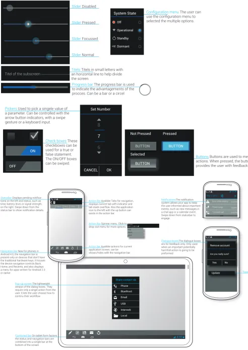
BUTTONBUTTON
Not Pressed Pressed
Selected BUTTON OK CANCEL Set Number System State Off 8 7 6 Pickers Used to pick a singele value of
a parameter. Can be controlled with the arrow button indicators, with a swipe
gesture or a keyboard input.
Buttons Buttons are used to mediate
actions. When pressed, the buttons
provides the user with feedback
Progress bar The progress bar is used to indicate the advantagements of the procces. Can be a bar or a circel
Check boxes These
checkboxes can be
used for a true or false statement. The ON/OFF boxes can be swiped.
Slider Disabled
Titels Titels in small letters with an horizontal line to help divide the screen
The user can
selected the multiple options.
Slider Pressed
Slider Focussed
Slider Normal
Operational
Standby
Dormant
ON Titel of the subscreen
OFF
z
z z
Statusbar
-tions on the left and status, such as time, battery level, or signal strength, on the right. Swipe down from the
Action Bar Availible Tabs for navigation,
displays current tab with indicator and tab stack overflow. Also the application icon to the left with the up button can exists in the action bar.
Action Bar Spinner menu. Click to
drop-out menu for more options.
Navigation Bar New for phones in
Android 4.0, the navigation bar is present only on devices that don't have the traditional hardware keys. It houses the device navigation controls Back, Home, and Recents, and also displays a menu for apps written for Android 2.3 or earlier.
Pop-up screen The lightweight
version of the dialog boxes. They require only a singel action from the user. It lets the user choose how to continu their workflow
Combined Bar On tablet form factors
the status and navigation bars are combined into a single bar at the bottom of the screen
4:00
4:00 TAB 2 TAB 3 TAB 4
Action bar Availible actions for current
application screen, can be shown/hides with the navigation bar.
Wensday
MAY 2, 2012 Day Week Moth
4:00
system allows your app to keep the user informed about important events, such as new messages in a chat app or a calendar event. Swipe down from statusbar to engage.
Dialogue boxesThe dialogue boxes
are for feedback only. Only used when an important potentially harmfull action is going to be preformed.
Toast
May 2, 2012 Error while loading
Power surge
1 missed call 3:22 PM
3:60PM
2:44 PM
4:00
Remove account
Are you really sure?
Share contact via
[image:23.595.34.527.74.771.2]Yes No Update Phone Bluethoot Email USB Interweb Local
ANDROID SPECIFIC-24
MC DESIGN
ANDROID SPECIFIC-25
4:00Tab2 Tab5 Tab6 TabXXX
Tab1 Selected Tab Tab4
Number of Tabs which provide the central navigation. Can be switched between by thouch or swipe gesture
Platform provided system navigation bar.
MC titel&Icon Number of Faults
System heartbeat Action Bar Icons
4:00 Selected Tab Titel
Spinner selected item
Tab 2 Tab 5 Tab 6 TabXXX
Tab 1 Selected Tab Tab 4
Titel of current selected page
System status/health indicator Titel of the List
First item of the List
expansion indicator
Spinner with titel en icon of current selected item
System health indicator button
Table Titel
Selected row
Table row
Informatio Dialogue Button
Titel 1 Titel 2 Titel 3
Description Description Description Description Description Description List Title
List item 1
List item 2
Exspandable List Title 1 item 1
Exspandable List Title 1 item 2
Exspandable List Title 1 item 3
Expandable List Title 1
Expandable List Titel 2
Expandable List Titel 3
Critical vaulue indicator of child expandable list item
2
TITEL
2
TITEL
SH2
Figure 9.
MC Interface Design
ANDROID SPECIFIC-26
MC Interface Gatekeeper
In the following section a complete overview can be seen of how the mobile Gatekeeper MC could look like. There are 6 tabs: Overview, Faults, Navigation, Infra, Processing, Software&Parameters. In each tab, several sub groups can be
found. These sub groups consist of relevant information and functionality about the group. For the navigation between
tabs, a horizontal swipe gesture is used. In portrait mode, the content alignment changes and where needed, makes a
listview of the subgroups or creates a different tab with a deeper level navigation.
The contextual help button pop-ups a dialogue window with a semi transparent background over the currently selected
tab.
Faults screen
In the screen, a erroneousness capability can be selected. This updates the right side of the Fault tab. Here a fault can be selected which leads to a dropdown menu in which a cause of the selected fault can be selected. In the cause of
fault list item, different actions can be selected. When the navigate to icon is pressed, the MC loads the cause of fault location in the Navigation Tab. If the available space is insufficient, the MC will organize the System health and the Fault
selection sub groups in different tabs with a navigation switch button between the tabs.
Navigation tab
In the navigation tab, with the previous selected cause of fault, the maintainer can navigate to the fault trough pressing the red flashing highlighted area on the schematic I-mast view. This actions can be preformed several times before the
maintainer reaches the deepest level of the sub group of the navigation tab. The maintainer can go back and forth in de I-mast levels with the back and forward buttons.
Infra & Processing status tabs
RFERENCES-27
REFERENCES
1. Weiss, S.(2002).
Handhelp Usability
. Chichester:Wiley
2. Quesenbery, W. (2003). “The Five Dimensions of Usability“ In Albers, M. J., and Mazur, B. (Eds.),
Content and Complexity:Information Design in Technical Communication.
Mahwah, NJ:Lawrence
Erlbaum Associates.
3. Nielsen, J. (1994). “Heuristics evaluatuin.“ In Nielsen, J., and Mack, R.L(Eds.), Usability Inspection
Methods(pp. 25-62). New York:Wiley.
4.Stone, D., Jarrett, C., Woodroffe, M., Minocha, S. (2005). User Interface Design and Evaluation.
El-sivier:, Inc, pp. 411-412
APPENDIX-28
APPENDIX
31-
MC DESIGN
36-
General Design Guidelines
APPENDIX-29
4:00
States
Overview
Health&Availability
Camera Power State
System SH1 SH2 SH3 SH4
System SH1 SH2 SH3 SH4
System SH1 SH2 SH3 SH4
System SH1 SH2 SH3 SH4
Video Proportions Helicopter Approach Air surveillance Surface surveillance 2 GATEKEEPER
SH1 SH2 SH3 SH4
TV IR System Mastership Operational setting Replay Mode Standby Maintainance Online Faults
Overview Navigation Infra Processing Software&Parameters
4.7 inch
4:00 Faults Navigation Infra Processing Software&Parameters Overview
States
Overview
Health&Availability Camera Power State
System
Mastership
Operational setting
Replay Mode
SH1 SH2 SH3 SH4 TV IR Standby Maintainance Online
System SH1 SH2 SH3 SH4
System SH1 SH2 SH3 SH4
System SH1 SH2 SH3 SH4
APPENDIX-30
4:00Faults Navigation Infra Processing Software&Parameters
Faults
Overview
System Health
System SH1 SH2 SH3 SH4
System SH1 SH2 SH3 SH4
System SH1 SH2 SH3 SH4 System SH1 SH2 SH3 SH4
Video proportions Air surveillance Surface surveillance Helicopter Approach Faults selection 1
Priority Part description Part Location Possible Actions
PC / E / 20
Ethernet Switch
2 Part A PC / E / 21
2134568 05-04-2012 10:00:00
05-04-2012 10:00:00 2134562
FAILED
Both CMS Interfaces Heartbeat Timeout
Something is wrong with Part B
05-04-2012 10:00:00
2134562 Something is wrong with Part A
Fault id Time Fault description Worst Condition
CRITICAL CRITICAL 2 GATEKEEPER
4:00
System HealthSystem SH1 SH2 SH3 SH4
System SH1 SH2 SH3 SH4
System SH1 SH2 SH3 SH4 System SH1 SH2 SH3 SH4
Video proportions
Air surveillance
Surface surveillance
Faults selection
1
Priority Part description Part Location Possible Actions
PC / E / 20
Ethernet Switch
2 Part A PC / E / 21
Helicopter Approach
2134568 05-04-2012 10:00:00
05-04-2012 10:00:00 2134562
FAILED
Both CMS Interfaces Heartbeat Timeout
Something is wrong with Part B
05-04-2012 10:00:00
2134562 Something is wrong with Part A
Fault id Time Fault description Worst Condition
CRITICAL
CRITICAL 2
GATEKEEPER
Faults
APPENDIX-31
4:00
Faults NavigationNav gat Infra Processing Software&Parameters
i
o
n
Overview
Causes of Fault id 2134568
1
Priority Part description Part Location
PC / E / 20 Ethernet Switch
2 Part A PC / E / 21
Both CMS Interfaces Heartbeat Timeout
2
GATEKEEPER
Navigation
4:00
Causes of Fault id 21345681
Priority Part description Part Location
PC / E / 20
Ethernet Switch
2 Part A PC / E / 21
Both CMS Interfaces Heartbeat Timeout 2
GATEKEEPER
Navigation
Faults
APPENDIX-32
4:00Faults Navigation InfraInfra Processing Software&Parameters Overview
IR Camera Power state
TV Camera Power state
Cleaner Fluid
Door status 25
[ 10, 75 ]
Air Humidity(%) 60
[ 0, 80 ]
80
[ 10, 75 ]
Air Humidity(%) 60
[ 0, 80 ]
Blower Rate(RPM) 3200
SH1
SH4
Sensor Heads
SH2
2 GATEKEEPER
Processing cabinet
SH3
Infra: Power&Climate status
4:00
IR Camera Power state TV Camera Power state
Cleaner Fluid 25
[ 10, 75 ]
Air Humidity(%) 60
[ 0, 80 ]
Blower Rate(RPM) 3200
SH1
SH2
SH3
SH4
SH5 SH6
Sensor Heads
2
GATEKEEPER
Infra: Power&Climate status
Faults
APPENDIX-33
4:00Faults Navigation Infra Software&Parameters Overview
2 GATEKEEPER
Processing Status
Number of Tracks per frame to CMS
Number of surf tracks 4
[ 0, 4]
Number of air tracks 7
[ 0, 8]
Number of plots
Number of tracks
Total number of tracks
242 243 76 968 742 SH1
Number of plots
Number of tracks
SH3
Number of internal plots/tracks
SH4
Processing
4:00
Processing Status
Number of Tracks per frame to CMS
Number of surf tracks 4
[ 0, 4]
Number of air tracks 7
[ 0, 8]
Number of plots
Number of tracks
Total number of tracks
242 243 76 968 742 SH1
Number of plots
Number of tracks
SH3
2
GATEKEEPER
Number of internal plots/tracks
SH4
Faults
APPENDIX-34
4:00
Faults
Overview Navigation Processing
Software and Parameters
System software carrier
Name GATEKEEPER Carrier part number ID
Carrier version REV
4251 5246 63256
2.0
Serial number
HMS Holland Version number
Software&Parameters
2
GATEKEEPER
Infra
4:00 Faults Navigation Infra Processing
Overview
2 GATEKEEPER
Name GATEKEEPER
4251 5246 63256
2.0
Serial number
HMS Holland Version number
System software carrier
Carrier part number ID
Carrier version REV
APPENDIX-35
UI Design Guidelines for Handhelp Devices{1}
Be consistent
Ensure that the same terminology is used within an application and that the same terminology is used between hand-held applications. In the absence of guidelines, try to borrow ideas from applications that have been well designed and have a high degree of usability.
Consistency between platforms
While the same terminology can be used between handheld applications, you will need to think carefully when adapt
-ing an application from a desktop to a handheld device. It is not necessarily the case that terminology that works for a desktop will work for the smaller screened handheld device.
Design stability
In the event of, say, a connectivity failure, the system should allow the user to pick up from where he or she left when
the connection is restored. For example, if the user is completing some sort of form and a wireless connection goes
down, the data in the field form previously should not be lost and have to be re-entered.
Provide feedback
The system should support the user with feedback regarding what the application is doing. Feedback in relation to, say, the use of an application or navigation within it could be provided via an assigned information key.
Forgiveness
The UI should be tolerant of user errors and provide an Undo function by, where feasible, a specially designated Back key.
Use metaphors
Real-world metaphors in line with the size of the display should be used. For example, while a desktop metaphor would be inappropriate for a cell phone, the use of an address book for storing telephone numbers would be okay.
Clickable graphics should look clickable
-If a graphic is clickable, then I should have defined border and the graphic should have high contrast with the back
-ground colour. Conversely graphics that are static should not appear to be click able.
Use icons to clarify concepts
-Icons should be meaningful and representative of the concepts they are meant to convey.
Usability guidelines{2}
Effective
Accuracy, Consider how many places in the interface are opportunities for error, and protect against them. Look for op
-portunities to provide feedback and confirmations
Efficient
Operational speed: Place only the most important information in the front of the user. Work on navigation that moves as directly as possible through a task. Be sure the interaction style minimizes the actions required
Engaging
Draw users in: Consider what aspects of the product are most attractive and incorporate them into the design Error tolerant
Look for places where selection can replace data entry. Look for places here calculators can support data entry. Make error messages include opportunities to correct problems.
GUI Design guidelines{3}
General
-Follow conventions if your users are familiar with these
-Most users read from left to right and from top to bottom, you should order widgets to reflect this.
Primary windows
-To identify primary windows, start by looking at the main task objects in the conceptual design
-A launch pad window can be a useful way to organize primary windows.
Secondary windows
-Message boxes should be worded so that the user understands the message. Avoid unnecessary jargon.
-Avoid using unnecessary text boxes.
-Use dialog boxes if additional information is required to carry out a task Tabs
-The information on different tabs should be independent, avoid using too many tabs.
-Tabs should not be used for sequential steps, as this does not fit the metaphor. Menus
-Menu items should be named so that their names indicates their purpose.
-The menu structure should be organized around the needs of the users rather than around the underlying software.
Toolbars
APPENDIX-36
-Design icons that are informative
-Design icons that can be easily distinguished
-Design icons that represent concrete objects
-Design icons that are easy to perceive
Command buttons
-Commands should be worded so that they clearly indicate the action that the button carries out
-The button on a dialog box should be the same size and shape. Different-width buttons are acceptable if the labels are different lengths and the buttons are in a row.
Option buttons and check boxes
-Use option buttons when the user needs to choose one option form a selection
-Limit the number of options or check boxes on the screen according to the amount of space available. -Use check boxes when the user needs to choose more than one option from a selection.
List boxes
-Use list boxes when there are a large number of options.
-Use a list box, rather than option buttons or check boxes, if the options are likely to change
-Use a drop-down list where there is only limited space. -Combine the list box with a text box if appropriate.
Text boxes
-Use a text box if it is not possible to anticipate the user input.
-Dot not use a text box without a list box if the GUI requires standardized information. -The size of the text box should indicate how much information is required.
-The text box should be scrollable if it is not possible top anticipate the quantity of user input
-If the text box is scrollable ensure that sufficient lines are visible to give sufficient context for the person entering the
text.
-Grey-out the text box if you want to show that, in a particular context, the content of the box cannot be changed.
Heuristic user interface evaluation{4}
These rules should be honoured during the design of the user interface. They can be used to evaluate the user interface
Visibility of system status
The system should always keep users informed about what is going on, through appropriate feedback within reason
-able time.
Match between system and the real world
The system should speak the users’ language, with words phrases, and concepts familiar to the users, rather than system-oriented terms. Follow real-world convention, making information appear in a natural and logical order. User control and freedom
Users often choose system functions by mistake and will need a clearly marked “emergency exit” to leave the unwanted
state without having to go through an extended dialogue. Supports undo and redo.
Consistency and standards
User should not have to wonder whether words, situations, or actions mean the same thing. Follow platform conven-tions
Error prevention
Even better than a good error message is a careful design that prevents a problem from occurring in the first place Recognition rather than recall
Make objects, actions and options visible. The user should not have to remember information from one part of the dia
-logue to another. Instructions or use of the system should be visible or easily retrievable whenever appropriate.
Flexibility and efficiency of use
Accelerators—unseen by the novice user—may often speed up the interaction for the expert user such that the system
can cater to both inexperienced and experienced users. Allow user to tailor frequent actions. Aesthetic and minimalist design
Dialogues should not contain information that is irrelevant or rarely needed. Every extra unit of information in a dialogue competes with the relevant units of information and diminishes their relative visibility.
Help users recognize, diagnose, and recover from errors
Error messages should be expressed in plain language(no codes). Precisely indicating the problem, and constructively
suggesting a solution.
Help and documentation
Even though it is better if the system can be used without documentation, it may be necessary to provide help and
documentation. Any such information should be easy to search, focus on the user’s tasks, list concrete steps to be car
APPENDIX-37
ACTION BAR DIALOG ICONS ListView ICONS STATUSBAR ICONS TAB BAR ICONS
Full Asset Icon
18X18 px
24X24 px
48X48 px 36X36 px
18X18 px
24X24 px
48X48 px 36X36 px 24X24 px
32X32 px
64X64 px 64X64 px 48X48 px
24X24 px
32X32 px
48X48 px
22X22 px
28X28 px
42X42 px
64X64 px 54X54 px 24X24 px
32X32 px
48X48 px 120dpi
160dpi
240dpi
340dpi