Demographic Research a free, expedited, online journal of peer-reviewed research and commentary
in the population sciences published by the Max Planck Institute for Demographic Research
Doberaner Strasse 114 · D-18057 Rostock · GERMANY www.demographic-research.org
DEMOGRAPHIC RESEARCH
VOLUME 1, ARTICLE 2
PUBLISHED 14 JULY 1999
www.demographic-research.org/Volumes/Vol1/2/
DOI: 10.4054/DemRes.1999.1.2
Evaluation of U.S. Mortality Patterns
at Old Ages
Using the Medicare Enrollment Data Base
Allan M. Parnell
Cynthia R. Owens
Evaluation of U.S. Mortality Patterns at Old Ages Using the
Medicare Enrollment Data Base
Allan M. Parnell†, Ph.D. and Cynthia R. Owens‡, M.P.H.
†McMillan and Moss Research, Inc., Mebane, NC ‡
Program on Population, Policy, and Aging Sanford Institute of Public Policy
Duke UniversityDurham, NC
Abstract
We evaluate the consistency of age-specific mortality patterns for older Americans using the Health Care Financing Administration’s (HCFA’s) Medicare
Enrollment Data Base (EDB), a data set that includes over 30 million records. To do this, we compare the mortality curves across regions within race and sex groups, and we compare national mortality curves of white men and women relative to African American and Puerto Rican men and women. The Medicare EDB is a promising source of age-specific mortality data at oldest ages. Both the period and cohort age at death data for whites in the Medicare EDB appear to be very consistent, at least up to age 95, perhaps higher for women. Above age 100 the patterns become extremely inconsistent.
However, questions remain about the age-specific mortality patterns of African
Americans, especially the rates for men. The African-American mortality crossover is found in every period and cohort comparison of the national population. This crossover pattern is remarkably consistent, occurring at ages 85 or 86 in every cohort and period comparison. This data set is not sufficient to determine whether the African -American mortality crossover is real or due to age misreporting. And the considerable
inconsistency across regions also creates concern about these data. When aggregated at the national level, the mortality curves for African American women may be okay up to age 90. In general, we conclude that further examination of the African American data is necessary before using them for substantive analysis
1 Introduction
Mortality rates among the oldest old population have dropped significantly in developed countries during the last half of this century [27]. Our understanding of declining mortality rates and variations in patterns of decline are based on, for the most part, death registration and census data. However, there are questions about the quality and consistency of these data, especially the quality of age-specific data [25]. Data collected for the administration of social support and health care programs for the elderly offer a new and potentially significant source of information on mortality at older ages. In this paper we evaluate the consistency of age-specific mortality patterns for older Americans using the Health Care Financing Administration’s (HCFA’s) Medicare Enrollment Data Base (EDB), a data set that includes over 30 million records. We evaluate the consistency of cohort and period age-specific mortality patterns across regions of the United States by sex and race.
thus setting the context for the importance of this data set. We discuss the black mortality crossover and the various interpretations and implications of this pattern. We then
describe the Medicare EDB and discuss previous research using it as well as evaluations of it for further research. The methods for estimating mortality rates and the strategy for evaluating consistency are then presented. Lastly, we present and evaluate the cohort mortality patterns, followed by the period mortality patterns.
2 Background and Significance
Mortality rates among the oldest-old population have declined in most of Europe and in developed countries in Asia and the Pacific since the middle of the 20th century. However, significant differences persist among these populations in oldest-old mortality rates [3; 7; 16]. Using high-quality data for 28 developed countries, Kannisto [7]
estimates mortality rates between ages 80 and 99 and other age-specific morality rates, the rates of change in mortality between the late 1950s and the late 1980s, and estimates the dates at which sustained morality declines at these ages began. While the mortality rates in all of these populations are declining, the rate of decline and the point at which sustained decline began differ considerably. Kannisto’s estimates of data of sustained decline in mortality for women between ages 80 and 99 in Western Europe vary from the early 1950s for France to the early 1970s for Austria and West Germany. Similar
variation is found for men, but the sustained decline generally began later.
Oldest-old mortality in the United States has also declined significantly [9; 26], with the most significant declines coming during the 1970s [3]. These declines placed mortality among the oldest old in the U.S. lower than elsewhere. Manton and Vaupel [14] compare female mortality between ages 80 and 99 in the U.S., England and Wales, France, Sweden and Japan. Female mortality rates in the U.S. were lower from 1950 until the mid-1960s. However, in the mid-1960s, female mortality rates in the U.S. dropped notably below the rates in the other countries, a pattern that held until the mid-1990s.
Analyses of age-at-death data for whites at oldest ages from various data sources has shown greater consistency than is the case for blacks [25], including some Medicare data [9]. For the black data, questions persist about the accuracy and consistency of the age distribution of mortality at oldest ages. The question of the accuracy of age-at-death data for blacks has been raised primarily in the literature on the mortality crossover. Mortality is higher for blacks relative to whites at every age up to the oldest old, when mortality falls below whites. Explanations for this pattern focus on the selection processes at earlier ages that affect population heterogeneity, leaving a healthier
population at oldest ages [12; 13; 18]. Kestenbaum [10] reports evidence that the cross-over is real before age 90 using the Medicare EDB. Others argue that this crosscross-over is an artifact of poor data that comes from systematic over-reporting of age at oldest ages [1; 2].
accurate knowledge of their age. However, these factors would not necessarily result in systematic overstatement of age.
Age overstatement may be associated with the perceived higher social status that comes with extreme age. Myers [17] documents a case of a supposed centenarian who had greatly overstated his age in Pennsylvania, and there are other well-known cases of populations of supposed centenarians that prove to be false [6], and this may be the case with blacks. Indeed, Hendricks and Hendricks [5] maintain that systematic age
overstatement among blacks is a result of the “greater prestige” of the very old in black families.
Age overstatement may occur when there is a direct benefit to being old, for example at the beginning of Social Security. The original process of attaining a Social Security card was not particularly stringent, only requiring documentary proof-of-age since the end of 1974, while entitlement to Medicare, established in 1965, required age verification [10]. Indeed, Elo and Preston [4] report concerns over the validity of the age data for both Medicare and Social Security for those who did not have birth certificates.1
Preston et al. [21] raised the issue of systematic understatement of age by blacks, especially women, citing a small study by Peterson [19] on active-church women who suggests that understatement is due to vanity on the part of these older women. Preston et al. [21] linked death certificate data with Census records from 1900, 1910 and 1920. They conclude that the result of systematic understatement of age at death data for Blacks (and especially for women) results in an excess of reported deaths above age 95. They correct for the resulting shift of the age distributions that results, reporting no evidence of a crossover between ages 85 and 95, but uncertainty after that age. They note that their corrected mortality rates are higher than Kestenbaum’s [9] estimates using Social Security data.
3 The Medicare Enrollment Data Base
The data we propose to evaluate are from the Medicare Enrollment Data Base (EDB), collected by HCFA. This data base potentially provides the most reliable information attainable regarding the size and age of the population of older Americans, much more so than data collected through periodic censuses [22]. According to HCFA, Medicare covers 95% of the population aged 65 and older. This percentage may be higher for people aged 75 years and older.
From HCFA we requested data for all Medicare beneficiaries born before 1916 who are not, or were not at death, Railroad Retirement Board beneficiaries, and approximately thirty million records were provided from their Medicare EDB. Records from the EDB are not created by HCFA, but are transferred from the Social Security Administration (or from the Railroad Retirement Board). Enrollment in Medicare is done through a
Medicare-specific application process with the Social Security Administration, which includes an age-validation component.
Based on Kestenbaum’s [9] analysis of the oldest-old using Medicare enrollment data, it was determined that the most reliable data are from records indicating SSA and
1
Medicare Part B insured - Railroad Retirement Board beneficiaries are not included as they were determined to degrade the data. Kestenbaum determined that records
indicating enrollment in Part B, or Supplemental Medical Insurance, provided the most reliable mortality data, as opposed to records for those enrolled in both Part A, or Hospital Insurance, and Part B. This is due to the fact that Part A is generally
automatically provided and at no extra expense, while Part B requires the payment of a premium. For those who are enrolled in Part B, they are billed, and enrollment is terminated automatically if there is no payment made. Part A terminations are less frequent and are not automatic. According to Kestenbaum, an unknown though probably significant proportion of those enrolled in Part B terminated for not responding are deaths. This provides an important death verification element to the data set.
Other data elements acquired were the Medicare beneficiary claim number - the number assigned to each beneficiary based on their Social Security number (SSN) of an associated primary beneficiary; full name; prior surname(s); birth date; death date (if dead); race code; sex code; state and county of residence; prior residence(s) and date(s) of residence change(s); current SSN; SSA benefit payment status and history (code and date); full Part B history (start and stop date(s), status code(s) indicating entitlement or not entitled).
Social Security numbers were included, not only because they provide a discreet identification number for each record, but because the first three digits indicate the region in the U.S. from where the number was attained. Based on the SSNs alone, regional comparisons of mortality could be made. And because the data includes information about the current residence of each record-holder, comparisons can be made between current residence and the region where the number was acquired.
Kestenbaum [10] estimated age-specific probabilities of death above age 85 by race and ethnic groups for 1991 using the enhanced2 Medicare Enrollment Data Base. These were compared with the official 1989-1991 decennial life tables. In addition, a matching study was conducted with the 1993 National Mortality Followback Survey. Kestenbaum noted that procedural improvements had improved the EDB, concluding that, “The enhanced Medicare enrollment file supports the reliable description of the mortality and size of the extreme aged population.”
There are limitations of the EDB. According to McKinley and Frase [15], during the initial registration drive for SSNs that took place during 1936 and 1937, there were major flaws to the procedure. The bulk of the responsibility for the registration process fell on the United States Postal Service, which did not have the manpower to see to the accuracy of the process. One aspect of this was confusion regarding the assignment of the area numbers, or the first three digits of the SSN, when large employers would send their employees’ application forms not to their local postmasters, but to post offices of their corporate headquarters often located in major cities. The authors state “this seriously decreased the usefulness of the area number scheme”, but we do not know to what extent.
The EDB does not include full records for those individuals who died prior to 1975. Historical information for Part B enrollment, place of residence and SSA benefit payment
2
status data elements was not included in the EDB until 1991, therefore any changes in status on these data elements are only from 1991 on.
In July of 1994, HCFA replaced the race data, which had previously been limited to the categories white, black, other and unknown. To these categories were added Asian, Hispanic, and North American Native. The race data were only replaced for active records and not for persons who died prior to July 1994. In addition, Lauderdale and Goldberg [11] argue that the method by which HCFA revised their race data was incomplete and biased. However, analysis using data for whites and data for Blacks should be relatively unaffected by the 1994 change (Kestenbaum, personal
communication w/Owens).
There was a recent initiative at HCFA to repopulate the SSN field so that 99% of the SSNs would be a person’s own, not that of a beneficiary a record holder may be
associated with, but examination of the data indicates closer to 1.5% of records have missing or duplicate SSNs.
4 Methods and Design
The data in this analysis are for events between 1976 (the earliest possible date with this data set) and 1993.3 For each of these years, we can identify an individual’s age, whether (s)he entered the data base, died, or was lost from the data base for some other reason and censored. We can calculate the number alive in each year-long interval at their birthday, and the number dying before their next birthday. With these life table functions, we calculate age-specific mortality rates.
The logic of the evaluation of the age specific mortality rates is that consistent mortality rates across regions for the same races and sexes is evidence that the age-at-death data are consistent. Regions referred to here are the regions where SSNs were received. We assume that the regions represent more homogeneous populations than if the country as a whole were to be considered, especially for the older population. At the time when most of this population received their SSNs, the U.S. population was much less mobile, and regional ethnic compositions and economic conditions were well
differentiated. One problem of note with using the region where the individuals obtained their card is that the populations of the west and southwest were small at this time, and this is reflected in the stability of mortality rates at the oldest ages.
Age-specific mortality rates are estimated using the following equation: Mx = Dx / ((Kx + Kx+1)/2)
where Kx = the number of persons alive at the beginning of interval x and Dx = the number of deaths in age interval x.
5 Cohort Patterns
Age-specific mortality rates are plotted for the birth cohorts 1895-1899, 1900-1904, and 1905-1909. The mortality rates begin at different ages, since data collection did not begin until 1976, with the oldest age being that attained in 1993. Comparisons among all 14 regions are made for white males and white females. Fourteen regions are
3
too many to plot in a single figure, so three sets of regions are plotted with the region with the lowest mortality rates (Minnesota, North Dakota and South Dakota) used as the standard in all figures.
Figures 1-3 present the cohort mortality patterns for white males. The mortality rates in all of these figures appear to be consistent, with no signs of a crossover. For the oldest cohort--those born between 1895 and 1899--there is instability in the rates from the mid-90s on, especially for regions in the west. For the middle cohort--1900-1904--the mortality rates again appear to be consistent. Again, the mortality rates at older ages become unstable in the west, especially for Region 12 (Arizona, New Mexico and
Nevada), and, to a lesser degree, for Regions 13 (California) and 14 (Oregon, Washington and Alaska). Recall that these regions are where SSNs were obtained, and these regions had relatively low populations in the 1930s. Mortality rates for the youngest cohort are also consistent, with less instability. There are notable regional differences, most notably the lower mortality rates in Region 8 relative to the Southern regions. Mortality rates in Region 8 are also lower than in the northeastern regions.
Figures 4-6 present the cohort mortality patterns for white females. As was the case with white males, the mortality rates in all of these figures appear to be consistent, with no signs of a crossover. There is notably less instability at the older ages among the females relative to the males, and the regional differences in mortality rates do not appear to be as large. Some variability is seen at the oldest ages in some of the western regions. In addition, for the middle cohort (1900-1904) there is a notable increase in mortality rates between ages 73 and 74 for Region 2 (NY, NJ and PA) for reasons that are not clear.
The cohort morality curves for white men and women are consistent for the three cohorts examined. Two patterns require comment. First, there is notable variation in the mortality rates at older ages in the western regions, again, probably a function of
population size when Social Security cards were issued. These variations are greater for the men than for the women. Second, there are regional differences, especially for men. The South and the Northeastern regions appear to have higher mortality than Region 8 and other western regions. We estimated no formal test of difference between the mortality curves. The primary finding of this examination of mortality curves is the overall consistency and lack of crossover.
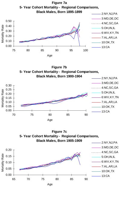
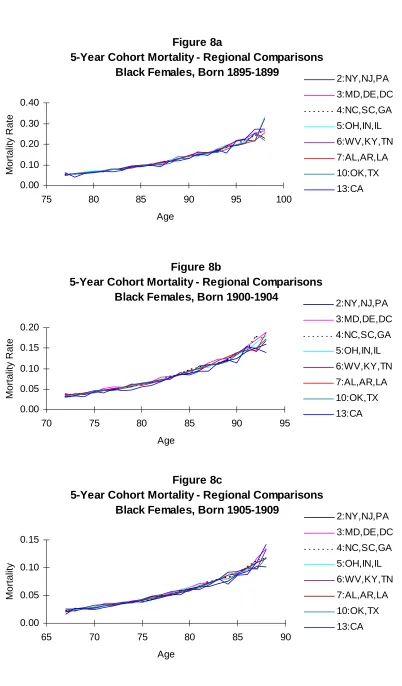
Mortality curves for black men and women are presented in Figures 7 and 8, with one figure for each cohort. We plot the mortality rates for the eight regions with
substantial black populations.
There is considerably less consistency in the mortality rates for black males in all three cohorts. The inconsistency increases at oldest ages, but is apparent throughout. Mortality rates for black men who obtained their Social Security cards in California vary considerably in all three cohorts, but variations are notable for other regions as well, especially from the mid-80s and older.
Inconsistencies in cohort mortality rates are not as great for black women. The pattern for all three cohorts shows some variability among regions, with mortality rates for those obtaining their Social Security cards in California showing the greatest variability. The variability between regions may not be significant for the youngest cohort of black women, at least until the mid-80s and older.
Regional morality rates rise and fall, even at relatively young ages. Above age 80, the mortality rates for men are highly inconsistent. This appears to be less of a problem for black women, especially for the youngest cohort. However, the black female mortality rates are not as consistent as their white peers.
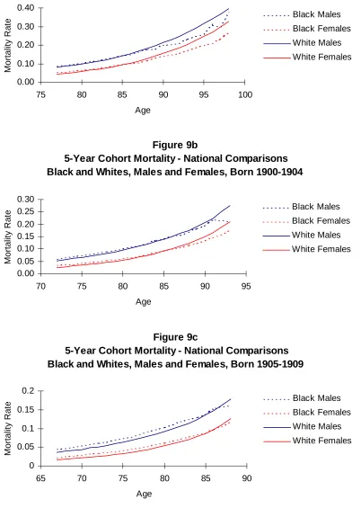
Figure 9 compares national cohort morality rates for white men and women and black men and women for the three birth cohorts. The black mortality crossover occurs in every cohort, and in every race-sex-cohort group, the crossover occurs at ages 86-87. Whether the crossover is due to selection processes or to age misreporting, the
consistency across cohorts in the age at which the crossover occurs is remarkable. We also compare the mortality rates of the white populations of the U.S. with the mortality rates in Puerto Rico. Preston and Rosenwaike [20] report evidence of age misreporting in Puerto Rico. If this is the case, one indication would be a crossover in mortality rates similar to the pattern found for the black-white crossover. Another indication would be substantially lower mortality rates. As is shown in Figure 10, no clear crossover is found. Puerto Rican female mortality rates are very close to those of white American women. However, the mortality rates of Puerto Rican men are
substantially lower than rates for white American men from the same three cohorts. This is consistent with Shai and Rosenwaike’s [24] estimates of mortality rates at ages 65-71 for the years 1979-1981. Mortality rates at these ages for men born in Puerto Rico were substantially lower than the same age group of white men in the U.S. Mortality rates of Puerto Rican women born on the island and white women from the U.S. were essentially the same. Rosenwaike [23] comments on the lower old age mortality rates of all
Hispanics relative to white Americans, reviewing possible measurement reasons for the differences as well as the “healthy migrant” hypothesis. He came to no firm conclusion for the differences, but suggests that they are indeed real.
6 Period Mortality Rates
We now turn to estimates of period age-specific mortality rates. The figures presented follow the same procedure as the cohort figures: regional comparisons are made with the white results split into three sets. Rather than estimate the mortality experience of three cohorts, we estimate the mortality rates for the periods 1980-84, 1985-1989, and 1990-1993. The only limiting factor is the youngest age at which we can estimate mortality corresponds to the youngest members of the cohort.
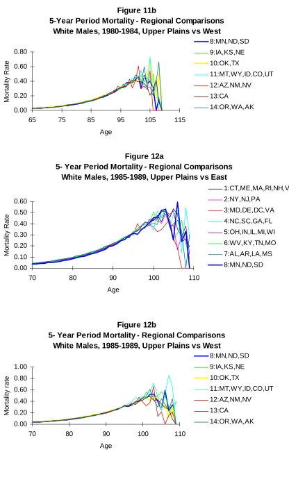
The white male period mortality rates for the three periods are shown in Figures 11-13. In all of the figures, the mortality curves are consistent and stable until the mid-90s. After age 95, there are fluctuations in the mortality rates of all of the regions, doubtless due to the small number of survivors in each region. As in the cohort estimates, Region 12 (AZ, NM, NV) has more variation, due probably to the small population in the 1930s. There are modest regional differences, with western regions having slightly lower mortality rates.
Figures 14-16 show the age specific mortality rates for white women by region for the three periods. As was the case with the men, the mortality rates are consistent.
regional differences are small.
These period age specific-mortality rates support the conclusion in our examination of the cohort age-specific mortality rates that the Medicare EDB data produce consistent rates for white men and women. Variations occur primarily when there are relatively small numbers of individuals in each region and age. Figure 17 plots the national age-specific mortality rates for men and women, respectively. Mortality in the most recent period is slightly below the rates of the earlier periods. The mortality rates increase steadily until between ages 100 and 105, and drop at older ages. These national figures reduce the regional variation at oldest ages.
We turn now to the period mortality rates for older blacks. We plot the mortality rates for same three periods (1980-84, 1985-89 and 1990-93) that we used for the white period rates. As with the cohort rates for blacks, we confine our examination to the eight regions with substantial black population.
Period age-specific mortality rates for black men are plotted in Figure 18. No regular or smooth curves appear for any region for any of the three periods. Year-to-year fluctuations are readily apparent. These fluctuations begin during the 70s in some regions (e.g. Region 13--CA), and become pronounced in all regions by the mid-80s. This is the general pattern in all three periods.
Such year-to-year fluctuations are not evident in the period age-specific mortality rates for black women, shown in Figure 19. For the 1990-93 estimates, fluctuations begin in the 80s for Regions 13 and 6 (WV, KY, TN), but they are not pronounced. In general, the mortality curves are consistent, with little regional variation well into the 90s for the 1980s, with some more variations for the 1990-93 rates.
As with the whites, we plotted the national age-specific mortality rates for the three periods. Figure 20 shows the national period mortality for black men and women. The increase number of cases smoothes the curves noticeably, but the year-to-year variations for the men are still apparent, beginning in the late 80s. By age 95, the rates for men fluctuate significantly. As expected, the mortality rates for the black women are more stable, with some variations in the 90s, but no significant variations until after age 100.
Figure 21 compares the national period age-specific mortality rates of white and black men and women. As was the case with the cohort comparison, there is a crossover of mortality. Both male and female black mortality rates drop below the white rates at age 86, and they do this in each period. This was the same age for the crossover in the cohort rates. Further, in the mid-90s, mortality rates of black men drop below the mortality rates of white women. Recall that Kestenbaum [9] argued that the age data for blacks in selected years of the Medicare EDB appeared to be accurate, and that he thought that the mortality crossover was real, not an artifact of age misreporting. The mortality patterns of these older black women are consistent in both the cohort and period comparison. This is certainly not a conclusive test of the crossover, but the pattern appears to be credible. However, the regional and national inconsistencies of both cohort and period mortality rates of black men, and the decline below the rates for white women raise questions about these data.
female period age-specific mortality rates of Puerto Rico and the white population in the U.S. Figure 22 covers the three periods, 1980-84, 1985-89 and 1990-93, respectively. As was the case with the cohort rate comparisons, the mortality rate for Puerto Rican men is lower than the rate for white men on the mainland. This pattern occurs in all three period, with the mortality rate of Puerto Rican men approaching and appearing to drop below the mortality rates of white women in the 90s. However, this may be due to the instability in the rate estimates. There is clearly considerable year-to-year fluctuation in the rates, especially after the mid-80s. As noted earlier, this pattern has been found in other data. One complicating pattern in interpreting this difference is the regular and easy migration between Puerto Rico and the mainland. The EDB regional identifier is based on the location where the individual received a Social Security card, not where they lived.
The relationship of mortality rates between the Puerto Rican women and the white women is also similar to the pattern found in the cohort estimates. For 1980-84, the mortality rate of Puerto Rican women appears to fall below white women, before beginning to fluctuate in the 90s. For the other two periods, the rates are very similar.
7 Discussion
Age-specific mortality data for the elderly in the United States is generally considered to be of poor quality [8]. The primary sources for this data are the decennial census and death registration. The census data have been inconsistent, though Shrestha and Preston [25] identify underreporting in 1970 as the primary source of problems. In this paper we examined sets of cohort and period age-specific mortality rates calculated from the Medicare Enrollment Data Base, an extremely large administrative base. We compare the mortality curves across regions within race and sex groups, and we compare national mortality curves of white men and women relative to black and Puerto Rican men and women. The Medicare EDB is a promising source of age-specific mortality data at oldest ages, but questions remain about the age-specific mortality patterns of blacks, especially black men.
We compared mortality curves across regions and among cohorts for evidence of consistency. There has been a debate focused on the black crossover in age-specific mortality at older ages, a pattern found in these data. There are two primary arguments. The first holds that this pattern is real and reflects the selection of less frail blacks relative to white Americans by age 80 or so [10]. The second argument is that the crossover is an artifact of age misreporting [2]. Any crossover pattern between regions within the same race and sex would also suggest age misreporting.
Both the period and cohort age at death data for whites in the Medicare EDB appear to be very consistent, at least up to age 95, perhaps higher for women. Above age 100 the patterns become extremely inconsistent.
Both cohort and period mortality curves of white women and men showed great consistency across regions. Some regions had lower mortality rates, but there was little year-to-year variation and no mortality crossover. Where inconsistencies occurred, they were primarily from the western regions of the U.S. that had small populations when social security numbers, which is the regional identifier, were issued to this population.
occurring at ages 85 or 86 in every cohort and period comparison. Recall that
Kestenbaum [10] examined this issues using the EDB for specific years, concluding that the pattern was real and that the age data were accurate. However, mortality rates by the mid-90s for black men drops below the mortality rates of white women, a pattern that is unlikely.
The regional patterns for both black men and women show considerable variation over time. This is especially so for men. While we limited this regional comparison to regions with significant black populations, the variations could have been a function of size. Indeed, at the national level, the period mortality patterns of black women are smoothed considerably. The patterns for men remain inconsistent.
This data set is not sufficient to determine whether the black mortality crossover is real or due to age misreporting. And the considerable inconsistency across regions also creates concern about these data. When aggregated at the national level, the mortality curves for black women may be okay up to age 90. In general, we conclude that further examination of the black data is necessary before using them for substantive analysis.
The mortality curves of Puerto Rican men and women are not smooth. That is, they are not consistent from year to year, but rise and fall. However, these year-to-year variations are not large and may simply reflect the relative size of the population. The comparison of the pattern of white American with Puerto Ricans does not reveal a cross-over, but indicates that Puerto Rican mortality rates for both men and women are
basically the same or lower than the rates for whites. Again, reasons for these patterns are not clear, but this is a pattern reported in previous research. The annual variations and the relatively low mortality patterns lead us to conclude that these data should be used with caution until further examinations can be conducted.
Considering the magnitude of size of the Medicare EDB, that it captures the majority of the elderly population of the U.S., and that it contains birth and death information, it is clearly a valuable resource for evaluating the age patterns of mortality among older Americans, particularly for older white Americans. It is unlike any other database currently available for research of this kind and its value cannot be
overemphasized. However, we recognize the limitations of the database, in particular the concerns it has raised over the black age-at-death data. Certainly, more research can be done to investigate these concerns to determine the nature of the mortality patterns that emerge for black Americans. Given its limitations, the Medicare EDB should be only one of many tools included in further investigations.
8 Acknowledgments
References
1. Coale, Ansley J. and Ellen E. Kisker. 1986. Mortality Crossovers: Reality or Bad Data? Population Studies. 40: 389-401
2. Coale, Ansley J. and Ellen E. Kisker. 1990. Defects in Data on Old-Age mortality in the United States: New Procedures for Calculating Mortality Schedules and Life Tables at the Highest Ages. Asian and Pacific Population Forum. 4:1-31.
3. Condran, Gretchen A., Christine L. Himes, and Samuel H. Preston. 1991. Old-Age Mortality Patterns in Low-Mortality Countries: An Evaluation of Population and Death Data at Advanced ages, 1950 to the Present. Population Bulletin of the
United Nations. 30: 23-60.
4. Elo, Irma T. and Samuel H. Preston. 1994. Estimating African-American Mortality from Inaccurate Data. Demography. 31:427-458.
5. Hendricks, Jon and Carol Davis Hendricks.1979. Dimensions of Aging. Cambridge, MA. Winthrop Publishers.
6. Jeune, Bernard and James W. Vaupel (eds.). 1998. Validation of Extraordinary Longevity. Odense Monograph on Population Aging. Odense University Press. Odense, Denmark. (pending).
7. Kannisto, Vaino.1994. Development of Oldest-Old Mortality, 1950-1990: Evidence from 28 Developed Countries. Odense Monographs on Population Aging 1. Odense University Press. Odense, Denmark.
8. Kannisto, Vaino.1996. The Advancing Frontier of Survival. Odense Monographs on Population Aging 3. Odense University Press. Odense, Denmark.
9. Kestenbaum, Bert. 1992. A Description of the Extreme Aged Population Based on Improved Medicare Enrollment Data. Demography. 29: 565-580.
10. Kestenbaum, Bert.1997. Recent Mortality of the Oldest Old, From Medicare Data. Paper Presented at the 1997 PAA Meeting. March 26-28 1997, Washington D.C.
11. Lauderdale, Diane S. and Jack Goldberg.1996. The Expanded Racial and Ethnic Codes in the Medicare Data Files: Their Completeness of Coverage and Accuracy.
American Journal of Public Health. 86: 712-716.
Biology 53: 47-67.
13. Manton, K.G., C.H. Patrick, and K.W. Johnson. 1987. Health Differentials between Blacks and Whites: Recent Trends in Mortality and Morbidity. Milbank
Memorial Fund Quarterly, Suppl. 1, 65:129-199.
14. Manton, Kenneth G. and James W.Vaupel.1995. Survival After the Age of 80 in the United States, Sweden, France, England, and Japan. New England Journal of
Medicine. 333:1232-1235.
15. McKinley, Charles and Robert W. Frase.1970. Launching Social Secuirty, A Capture-and-Record Account 1935-1937. Madison, WI. The University of Wisconsin Press.
16. Myers, George C.; Barbara B.Torrey, and Kevin G. Kinsella. 1992. The Paradox of the Oldest Old in the United States: an International Comparison. In: The Oldest Old. Richard M. Suzman, David P. Willis, and Kenneth G. Manton (eds.). 58-85 pp. Oxford University Press: New York.
17. Myers, Robert J. 1978. An Investigation of the Age of an Alleged Centenarian.
Demography. 15(2): 235-236.
18. Otten, Mac W.; Teutsch, Steven M.; Williamson, David F.; Marks, James S. 1990. The Effect of Known Risk Factors on the Excess Mortality of Black Adults in the United States. Journal of the American Medical Association. 263:6, Feb 9:845-50.
19. Peterson, J.W. 1990. Age of Wisdom: Elderly Black Women in Family and Church. Pp. 213-228 in The Cultural Context of Aging J. Sokolowsky (ed.) Bergin and Garvey: New York.
20. Preston, Samuel H. and Ira Rosenwaike. 1984. Age Overstatement and Puerto Rican Longevity. Human Biology. 56:503-525.
21. Preston, Samuel H., Irma T. Elo, Ira Rosenwaike, and Mark Hill.1996. African-American Mortality at Older Ages: Results of a Matching Study. Demography. 33: 193-209.
22. Rosenwaike, Ira and B. Logue.1985. The Extreme Aged in America: A Portrait of an Expanding Population. Greenwood Press: Westport, CT.
24. Shai, Donna and Ira Rosenwaike.1991. An Overview of Age-Adjusted Death Rates among the Hispanic Populations in their Home Countries and in the United States. Pp. 193-201. In Ira Rosenwaike (ed.) Mortality of Hispanic Populations:
Mexicans, Puerto Ricans, and Cubans in the United States and in Home Countries. Greenwood Press: Westport, CT.
25. Shrestha, Laura B. and Samuel H. Preston.1995. Consistency of Census and Vital Registration Data on Older Americans: 1970-1990. Survey Methodology. 21:167-177.
26. Taeuber, Cynthia M.; and Ira Rosenwaike. 1992. A Demographic Portrait of
America’s Oldest Old. Pp. 17-49. In: The Oldest Old. Richard M. Suzman, David P. Willis, and Kenneth G. Manton (eds.). Oxford University Press: New York.
Figure 1a
5-Year Cohort Mortality - Regional Comparisons White Males, Born 1895-1899, Upper Plains vs East
0.00 0.10 0.20 0.30 0.40 0.50 0.60
75 80 85 90 95 100
Age
Mo
rt
a
lity Ra
te
1:CT,ME,MA,RI,NH,VT
2:NY,NJ,PA 3:MD,DE,DC,VA
4:NC,SC,GA,FL
5:OH,IN,IL,MI,WI 6:WV,KY,TN,MO
7:AL,AR,LA,MS
8:MN,ND,SD
Figure 1b
5-Year Cohort Mortality - Regional Comparisons White Males, Born 1895-1899, Upper Plains vs West
0.00 0.10 0.20 0.30 0.40 0.50 0.60
75 80 85 90 95 100
Age
Mo
rt
a
lity Ra
te
8:MN,ND,SD 9:IA,KS,NE
10:OK,TX
11:MT,WY,ID,CO,UT 12:AZ,NM,NV
13:CA
14:OR,WA,AK
Figure 2a
5-Year Cohort Mortality - Regional Comparisons White Males, Born 1900-1904, Upper Plains vs East
0.00 0.05 0.10 0.15 0.20 0.25 0.30
70 75 80 85 90 95
Age
Mo
rt
a
lity Ra
te
1:CT,ME,MA,RI,NH,VT
2:NY,NJ,PA
3:MD,DE,DC,VA 4:NC,SC,GA,FL
5:OH,IN,IL,MI,WI 6:WV,KY,TN,MO
7:AL,AR,LA,MS
Figure 2b
5-Year Cohort Mortality - Regional Comparisons White Males, Born 1900-1904, Upper Plains vs West
0.00 0.10 0.20 0.30 0.40
70 75 80 85 90 95
Age
Mo
rt
a
lity Ra
te
8:MN,ND,SD 9:IA,KS,NE
10:OK,TX
11:MT,WY,ID,CO,UT
12:AZ,NM,NV
13:CA
14:OR,WA,AK
Figure 3a
5-Year Cohort Mortality - Regional Comparisons White Males, Born 1905-1909, Upper Plains vs East
0.00 0.05 0.10 0.15 0.20
65 70 75 80 85 90
Age
Mo
rta
lity Ra
te
1:CT,ME,MA,RI,NH,VT 2:NY,NJ,PA
3:MD,DE,DC,VA
4:NC,SC,GA,FL 5:OH,IN,IL,MI,WI
6:WV,KY,TN,MO 7:AL,AR,LA,MS
8:MN,ND,SD
Figure 3b
5-Year Cohort Mortality - Regional Comparisons White Males, Born 1905-1909, Upper Plains vs West
0.00 0.05 0.10 0.15 0.20 0.25
65 70 75 80 85 90
Age
Mo
rt
a
lity Ra
te
8:MN,ND,SD 9:IA,KS,NE
10:OK,TX
11:MT,WY,ID,CO,UT 12:AZ,NM,NV
13:CA
Figure 4a
5-Year Cohort Mortality - Regional Comparisons White Females, Born 1895-1899, Upper Plain vs East
0.00 0.05 0.10 0.15 0.20 0.25 0.30 0.35
75 80 85 90 95 100
Age
Mo
rt
a
lity Ra
te
1:CT,ME,MA,RI,NH,VT 2:NY,NJ,PA
3:MD,DE,DC,VA
4:NC,SC,GA,FL 5:OH,IN,IL,MI,WI
6:WV,KY,TN,MO
7:AL,AR,LA,MS 8:MN,ND,SD
Figure 4b
5-Year Cohort Mortality - Regional Comparisons White Females, Born 1895-1899, Upper Plain vs West
0.00 0.10 0.20 0.30 0.40
75 80 85 90 95 100
Age
Mo
rt
a
lity Ra
te
8:MN,ND,SD 9:IA,KS,NE
10:OK,TX
11:MT,WY,ID,CO,UT 12:AZ,NM,NV
13:CA
14:OR,WA,AK
Figure 5a
Cohort Mortality - Regional comparisons
White Females, Born 1900-1904, Upper Plain vs East
0.00 0.05 0.10 0.15 0.20 0.25
70 75 80 85 90 95
Age
Mo
rt
a
lity Ra
te
1:CT,ME,MA,RI,NH,VT
2:NY,NJ,PA 3:MD,DE,DC,VA
4:NC,SC,GA,FL 5:OH,IN,IL,MI,WI
6:WV,KY,TN,MO
Figure 5b
Cohort Mortality - Regional comparisons White Females, Born 1900-1904, Upper Plain vs West
0.00 0.05 0.10 0.15 0.20 0.25
70 75 80 85 90 95
Age
Mo
rta
lity Ra
te
8:MN,ND,SD
9:IA,KS,NE 10:OK,TX
11:MT,WY,ID,CO,UT
12:AZ,NM,NV 13:CA
14:OR,WA,AK
Figure 6a
5-Year Cohort Mortality - Regional Comparisons White Females, Born 1905-1909, Upper Plains vs East
0.00 0.02 0.04 0.06 0.08 0.10 0.12 0.14
65 70 75 80 85 90
Age
Mo
rt
a
lity Ra
te
1:CT,ME,MA,RI,NH,VT 2:NY,NJ,PA
3:MD,DE,DC,VA 4:NC,SC,GA,FL
5:OH,IN,IL,MI,WI
6:WV,KY,TN,MO 7:AL,AR,LA,MS
8:MN,ND,SD
Figure 6b
5-Year Cohort Mortality - Regional Comparisons White Females, Born 1905-1909, Upper Plains vs West
0.00 0.05 0.10 0.15
65 70 75 80 85 90
Age
Mo
rt
a
lity Ra
te
8:MN,ND,SD
9:IA,KS,NE 10:OK,TX
11:MT,WY,ID,CO,UT
12:AZ,NM,NV 13:CA
Figure 7a
5- Year Cohort Mortality - Regional Comparisons, Black Males, Born 1895-1899
0.00 0.10 0.20 0.30 0.40 0.50
75 80 85 90 95 100
Age
Mo
rt
a
lity Ra
te
2:NY,NJ,PA
3:MD,DE,DC 4:NC,SC,GA
5:OH,IN,IL 6:WV,KY,TN
7:AL,AR,LA
10:OK,TX 13:CA
Figure 7b
5- Year Cohort Mortality - Regional Comparisons, Black Males, Born 1900-1904
0.00 0.05 0.10 0.15 0.20 0.25 0.30
70 75 80 85 90
Age
Mo
rt
a
lity Ra
te
2:NY,NJ,PA
3:MD,DE,DC
4:NC,SC,GA 5:OH,IN,IL
6:WV,KY,TN
7:AL,AR,LA 10:OK,TX
13:CA
Figure 7c
5- Year Cohort Mortality - Regional Comparisons, Black Males, Born 1905-1909
0.00 0.05 0.10 0.15 0.20
65 70 75 80 85 90
Age
Mo
rt
a
lity Ra
te
2:NY,NJ,PA
3:MD,DE,DC 4:NC,SC,GA
5:OH,IN,IL 6:WV,KY,TN
7:AL,AR,LA
Figure 8a
5-Year Cohort Mortality - Regional Comparisons Black Females, Born 1895-1899
0.00 0.10 0.20 0.30 0.40
75 80 85 90 95 100
Age
Mo
rt
a
lity Ra
te
2:NY,NJ,PA
3:MD,DE,DC 4:NC,SC,GA
5:OH,IN,IL 6:WV,KY,TN
7:AL,AR,LA
10:OK,TX 13:CA
Figure 8b
5-Year Cohort Mortality - Regional Comparisons Black Females, Born 1900-1904
0.00 0.05 0.10 0.15 0.20
70 75 80 85 90 95
Age
Mo
rt
a
lity Ra
te
2:NY,NJ,PA
3:MD,DE,DC 4:NC,SC,GA
5:OH,IN,IL
6:WV,KY,TN 7:AL,AR,LA
10:OK,TX
13:CA
Figure 8c
5-Year Cohort Mortality - Regional Comparisons Black Females, Born 1905-1909
0.00 0.05 0.10 0.15
65 70 75 80 85 90
Age
Mortality
2:NY,NJ,PA 3:MD,DE,DC
4:NC,SC,GA
5:OH,IN,IL 6:WV,KY,TN
7:AL,AR,LA 10:OK,TX
Figure 9a
5-Year Cohort Mortality - National Comparisons Black and Whites, Males and Females, Born 1895-1899
0.00 0.10 0.20 0.30 0.40
75 80 85 90 95 100
Age
Mo
rt
a
lity Ra
te Black Males
Black Females White Males
White Females
Figure 9b
5-Year Cohort Mortality - National Comparisons Black and Whites, Males and Females, Born 1900-1904
0.00 0.05 0.10 0.15 0.20 0.25 0.30
70 75 80 85 90 95
Age
Mo
rt
a
lity Ra
te Black Males
Black Females
White Males
White Females
Figure 9c
5-Year Cohort Mortality - National Comparisons Black and Whites, Males and Females, Born 1905-1909
0 0.05 0.1 0.15 0.2
65 70 75 80 85 90
Age
Mo
rt
a
lity Ra
te Black Males
Black Females
Figure 10a
5- Year Cohort Mortality - U.S. vs Puerto Rico Whites, Males and Females, Born 1895-1899
0.00 0.10 0.20 0.30 0.40
75 80 85 90 95 100
Age
Mo
rt
a
lity Ra
te US Males
US Females PR Males
PR Females
Figure 10b
5- Year Cohort Mortality - U.S. vs Puerto Rico Whites, Males and Females, Born 1900-1904
0.00 0.05 0.10 0.15 0.20 0.25 0.30
70 75 80 85 90 95
Age
Mo
rt
a
lity Ra
te US Males
US Females PR Males
PR Females
Figure 11a
5-Year Period Mortality - Regional Comparisons White Males, 1980-1984, Upper Plains vs East
0.00 0.10 0.20 0.30 0.40 0.50 0.60 0.70
65 75 85 95 105 115
Age
Mo
rt
a
lity Ra
te
1:CT,ME,MA,RI,NH,VT 2:NY,NJ,PA
3:MD,DE,DC,VA 4:NC,SC,GA,FL
5:OH,IN,IL,MI,WI
6:WV,KY,TN,MO 7:AL,AR,LA,MS
Figure 11b
5-Year Period Mortality - Regional Comparisons White Males, 1980-1984, Upper Plains vs West
0.00 0.20 0.40 0.60 0.80
65 75 85 95 105 115
Age
Mo
rta
lity Ra
te
8:MN,ND,SD
9:IA,KS,NE
10:OK,TX
11:MT,WY,ID,CO,UT
12:AZ,NM,NV
13:CA
14:OR,WA,AK
Figure 12a
5- Year Period Mortality - Regional Comparisons White Males, 1985-1989, Upper Plains vs East
0.00 0.10 0.20 0.30 0.40 0.50 0.60
70 80 90 100 110
Age
Mo
rt
a
lity Ra
te
1:CT,ME,MA,RI,NH,VT
2:NY,NJ,PA 3:MD,DE,DC,VA
4:NC,SC,GA,FL 5:OH,IN,IL,MI,WI
6:WV,KY,TN,MO
7:AL,AR,LA,MS 8:MN,ND,SD
Figure 12b
5- Year Period Mortality - Regional Comparisons White Males, 1985-1989, Upper Plains vs West
0.00 0.20 0.40 0.60 0.80 1.00
70 80 90 100 110
Age
Mo
rt
a
lity r
a
te
8:MN,ND,SD 9:IA,KS,NE
10:OK,TX
11:MT,WY,ID,CO,UT 12:AZ,NM,NV
13:CA
Figure 13a
4- Year Period Mortality - Regional Comparisons White Males, 1990-1993, Upper Plain vs East
0.00 0.10 0.20 0.30 0.40 0.50 0.60 0.70
75 85 95 105 115
Age
Mo
rt
a
lity Ra
te
1:CT,ME,MA,RI,NH,VT
2:NY,NJ,PA 3:MD,DE,DC,VA
4:NC,SC,GA,FL 5:OH,IN,IL,MI,WI
6:WV,KY,TN,MO
7:AL,AR,LA,MS 8:MN,ND,SD
Figure 13b
4- Year Period Mortality - Regional Comparisons White Males, 1990-1993, Upper Plain vs West
0.00 0.20 0.40 0.60 0.80
75 85 95 105 115
Age
Mo
rt
a
lity Ra
te
8:MN,ND,SD
9:IA,KS,NE 10:OK,TX
11:MT,WY,ID,CO,UT 12:AZ,NM,NV
13:CA
14:OR,WA,AK
Figure 14a
5-Year Period Mortality - Regional Comparisons, White Females, 1980-1984, Upper Plains vs East
0.00 0.10 0.20 0.30 0.40 0.50 0.60
65 75 85 95 105 115
Age
Mo
rt
a
lity Ra
te
1:CT,ME,MA,RI,NH,VT
2:NY,NJ,PA
3:MD,DE,DC,VA 4:NC,SC,GA,FL
5:OH,IN,IL,MI,WI
6:WV,KY,TN,MO 7:AL,AR,LA,MS
Figure 14b
5-Year Period Mortality - Regional Comparisons, White Females, 1980-1984, Upper Plains vs West
0.00 0.20 0.40 0.60 0.80 1.00
65 75 85 95 105 115
Age
Mo
rta
lity Ra
te
8:MN,ND,SD
9:IA,KS,NE 10:OK,TX
11:MT,WY,ID,CO,UT
12:AZ,NM,NV 13:CA
14:OR,WA,AK
Figure 15a
5-Year Period Mortality - Regional Comparisons White Females, 1985-1989, Upper Plains vs East
0.00 0.10 0.20 0.30 0.40 0.50 0.60
70 80 90 100 110
Age
Mo
rt
a
lity Ra
te
1:CT,ME,MA,RI,NH,VT 2:NY,NJ,PA
3:MD,DE,DC,VA
4:NC,SC,GA,FL 5:OH,IN,IL,MI,WI
6:WV,KY,TN,MO
7:AL,AR,LA,MS 8:MN,ND,SD
Figure 15b
5-Year Period Mortality - Regional Comparisons White Females, 1985-1989, Upper Plains vs West
0.00 0.20 0.40 0.60 0.80
70 80 90 100 110
Age
Mo
rt
a
lity Ra
te
8:MN,ND,SD
9:IA,KS,NE 10:OK,TX
11:MT,WY,ID,CO,UT
12:AZ,NM,NV 13:CA
Figure 16a
4-Year Period Mortality - Regional Comparisons, White Females, 1990-1993, Upper Plain vs East
0.00 0.10 0.20 0.30 0.40 0.50 0.60
75 85 95 105 115
Age
Mo
rt
a
lity Ra
te
1:CT,ME,MA,RI,NH,VT 2:NY,NJ,PA
3:MD,DE,DC,VA 4:NC,SC,GA,FL
5:OH,IN,IL,MI,WI
6:WV,KY,TN,MO 7:AL,AR,LA,MS
8:MN,ND,SD
Figure 16b
4-Year Period Mortality - Regional Comparisons, White Females, 1990-1993, Upper Plain vs West
0.00 0.10 0.20 0.30 0.40 0.50 0.60
75 85 95 105 115
Age
Mo
rt
a
lity Ra
te
8:MN,ND,SD 9:IA,KS,NE
10:OK,TX
11:MT,WY,ID,CO,UT 12:AZ,NM,NV
13:CA
14:OR,WA,AK
Figure 17a
5-Year Period Mortality - National Comparisons White Males, 1980-1984, 1985-1989, 1990-1993
0.00 0.10 0.20 0.30 0.40 0.50
65 75 85 95 105
Age
Mo
rt
a
lity Ra
te
1980-1984
Figure 17b
5-Year Period Mortality - National Comparisons White Females, 1980-1984, 1985-1989, 1990-1993
0.00 0.10 0.20 0.30 0.40 0.50
65 75 85 95 105 115
Age
Mo
rt
a
lity Ra
te 1980-1984
1985-1989
1990-1993
Figure 18a
5-Year Period Mortality - Regional Comparisons Black Males, 1980-1984
0.00 0.20 0.40 0.60 0.80 1.00
65 75 85 95 105 115
Age
Mo
rt
a
lity Ra
te
2:NY,NJ,PA
3:MD,DE,DC
4:NC,SC,GA 5:OH,IN,IL
6:WV,KY,TN
7:AL,AR,LA 10:OK,TX
13:CA
Figure 18b
5-Year Period Mortality - Regional Comparisons Black Males, 1985-1989
0.00 0.50 1.00 1.50 2.00
70 80 90 100 110
Age
Mo
rt
a
lity Ra
te
2:NY,NJ,PA
3:MD,DE,DC 4:NC,SC,GA
5:OH,IN,IL
6:WV,KY,TN 7:AL,AR,LA
Figure 18c
5-Year Period Mortality - Regional Comparisons Black Males, 1990-1993
0.00 0.50 1.00 1.50 2.00
75 80 85 90 95 100 105 110
Age
Mo
rt
a
lity Ra
te
2:NY,NJ,PA
3:MD,DE,DC 4:NC,SC,GA
5:OH,IN,IL
6:WV,KY,TN 7:AL,AR,LA
10:OK,TX 13:CA
Figure 19a
5-Year Period Mortality - Regional Comparisons Black Females, 1980-1984
0.00 0.20 0.40 0.60 0.80
65 75 85 95 105 115
Age
Mo
rt
a
lity Ra
te
2:NY,NJ,PA 3:MD,DE,DC
4:NC,SC,GA 5:OH,IN,IL
6:WV,KY,TN
7:AL,AR,LA 10:OK,TX
13:CA
Figure 19b
5-Year Period Mortality - Regional Comparisons Black Females, 1985-1989
0.00 0.20 0.40 0.60 0.80
70 80 90 100 110
Age
Mo
rt
a
lity Ra
te
2:NY,NJ,PA
3:MD,DE,DC 4:NC,SC,GA
5:OH,IN,IL 6:WV,KY,TN
7:AL,AR,LA
Figure 19c
5-Year Period Mortality - Regional Comparisons Black Females, 1990-1993
0.00 0.20 0.40 0.60 0.80
75 85 95 105 115
Age
Mo
rt
a
lity Ra
te
2:NY,NJ,PA
3:MD,DE,DC 4:NC,SC,GA
5:OH,IN,IL 6:WV,KY,TN
7:AL,AR,LA
10:OK,TX 13:CA
Figure 20a
5-Year Period Mortality - National Comparisons Black Males, 1980-1984, 1985-1989, 1990-1993
0.00 0.10 0.20 0.30 0.40 0.50
65 75 85 95 105 115
Age
Mo
rt
a
lity Ra
te 1980-1984
1985-1989 1990-1993
Figure 20b
5-Year Period Mortality - National Comparisons Black Females, 1980-1984, 1985-1989, 1990-1993
0.00 0.10 0.20 0.30 0.40
65 75 85 95 105 115
Age
Mo
rt
a
lity Ra
te 1980-1984
1985-1989
Figure 21a
5- Year Period Mortality - National Comparisons, Blacks and Whites, Males and Females, 1980-1984
0.00 0.10 0.20 0.30 0.40 0.50
65 75 85 95 105 115
Age
Mo
rt
a
lity Ra
te White Males
White Females Black Males
Black Females
Figure 21b
5- Year Period Mortality - National Comparisons, Blacks and Whites, Males and Females, 1985-1989
0.00 0.10 0.20 0.30 0.40 0.50
70 80 90 100 110
Age
Mo
rt
a
lity Ra
te White Males
White Females
Black Males
Black Females
Figure 21c
5- Year Period Mortality - National Comparisons, Blacks and Whites, Males and Females, 1990-1993
0.00 0.10 0.20 0.30 0.40 0.50
75 85 95 105 115
Age
Mo
rta
lity Ra
te
White Males
White Females
Figure 22a
5- Year Period Mortality - U.S. vs. Puerto Rico Whites, Males and Females, 1980-1984
0.00 0.10 0.20 0.30 0.40 0.50 0.60 0.70
65 75 85 95 105 115
Age
Mo
rt
a
lity Ra
te US White Males
US White Females
PR Males PR Females
Figure 22b
5- Year Period Mortality - U.S. vs. Puerto Rico Whites, Males and Females, 1985-1989
0.00 0.10 0.20 0.30 0.40 0.50 0.60
70 80 90 100 110
Age
Mo
rt
a
lity Ra
te US White Males
US White Females PR Males
PR Females
Figure 22c
5- Year Period Mortality - U.S. vs. Puerto Rico Whites, Males and Females, 1990-1993
0.00 0.20 0.40 0.60 0.80
75 85 95 105 115
Age
Mo
rt
a
lity Ra
te US White Males
US White Females PR Males