GONG Xinyu*
Department of Land Surveying & Geo-Informatics, The Hong Kong Polytechnic University. Email: [email protected]
* Corresponding author
Abstract: To promote sustainable development, United Nations General Assembly (UNGA) has adopted “The 2030 Agenda for Sustainable Development”, which consists of 17 Sustainable Development Goals (SDGs) (e.g., “No poverty” and “Zero hunger”) with a set of 169 targets. To measure and track the progress, 230 indicators have been developed. It has been recognized by many international communities (e.g., ICA and ISPRS) that effective visualization of SDG indicators so as to communicate the SDG status to the public and decision-makers is one of the key issues. In this study, a web-based visualization system called “SDG Viz” has been developed for such a purpose. This system has two main components: visual representation and visual interaction. For visual representation, it has the capacity of producing thematic maps such as choropleth maps, proportional symbol maps, 3D maps and animated maps. For visual interaction, the framework of three stages cartographic interaction proposed by Roth was adopted as the basic for design of system functions. Some interaction functions have also been developed, such as identify, compare, rank, associate and delineate. It is believed that this system is potentially valuable for visualizing SDG indicators.
Keywords: Sustainable development goals (SDGs), Web-based visualization, Cartographic interaction,
1. Introduction
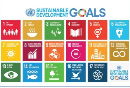
“Transforming Our World: The 2030 Agenda for Sustainable Development” was adopted by the UN General Assembly on 25 September 2015 (UN, 2015). On this agenda, there are 17 Sustainable Development Goals (SDGs), as shown in Figure 1. Each SDG goal has a set of specific targets (169 targets in total) to be achieved during the time from 2015 to 2030.
Figure 1. The 17 UN Sustainable Development Goals (SDGs) (UN, 2015)
The UN member states are required to report their progress in the implementation of SDGs at certain stages during the 2015-2030 period, which provide an annual account of environmental, social and economic performance of sustainability objectives and targets. This challenging
issue has attracted attentions from many international communities, including the International Cartographic Association (ICA), International Society for Photogrammetry and Remote Sensing (ISPRS), the Group on Earth Observations (GEO), and Future Earth (FE). Visualization, which has been identified as one of the four main concepts for learning and decision-making in sustainable development (Siekierska, 2018), plays an important role in enabling people to understand the sustainable status. From the reports of some significant meetings (GEO, 2016; IAEG-SDGs, 2016; Chen and Li, 2018), the need for effective approaches to visualize the SDG indicators so as to communicate the SDG status to the end users and policy-makers was identified.
In this paper, we briefly introduced the design, architecture and implementation of a sustainable development map atlas system software tool called SDG Viz. Besides the introduction, this paper is organized into four sections. In the next section, we will introduce system framework of SDG Viz. The third section describes the design of corresponding functions. The forth section introduced design of user-friendly interface of web-based SDG visualization system. Some conclusions are made in final section.
2. Design of the System
Most information visualization systems have two main components: representation and interaction, similar with rendering and manipulation (Yi et al., 2007). The representation component concerns the mapping from data to representation and how that representation is rendered on the display, while the interaction component, the roots of which lie in the area of human computer interaction (HCI), involves the dialog between the users and the system.
User interaction in visual analysis is critical to enable visual data exploration and transforms people from mere viewer to active participants in the process of analysing and understanding data (Endert, 2016). Our visualization system has incorporated both visual representation component and interaction component.
2.1 Typical Scenarios
Some typical scenarios were proposed for the development of basic representation capacity. For the SDG indicators, the potential information needs identified by Peuquet (1994) is that it directly relates tasks to components of data. Data reported by UN members includes three elements, namely(place), when(time), and what (attribute). These three elements form the triad representational framework for spatial-temporal data (Peuquet, 1994). With different emphases, various graphic symbols or representations are required.
Visualizing SDG data under different conditions enables users to observe their dependence on space and time, or we say, scenarios. Siekierska (2018) mentioned that visualization tools can be used to develop sustainability
scenarios to assist decision makers in understanding key spatial and temporal information by facilitating the exploration of multiple data sets over both time and space. Li et al. (2018) put forward a where-when-what-how system and his preliminary research suggests that it is necessary to develop effective approaches to visualize the status and trend in indicators and to communicate with end users and policy makers.
In different scenarios, users could acquire different information. This need can be described by what is given (time, space or attribute) and what is to be found (time, space or attribute). We summarized some typical scenarios users may explore:
y Under “where”, the user selects a particular UN member state, more UN member states or default for all states.
y Under “when”, the user selects a particular time
(year), time period or default for all years.
y Under “what”, the user selects a particular SDG indicator or default for all.
y Under “How”, the user selects a particular type of map for display, with a single color choropleth map as the default choice.
2.2 Requirements of Basic Representation Capacity
In scenarios analysis system, alternative kinds of graphic representations are required with different emphasis (Li et al., 2018). For example, a static choropleth map can represent the variation of attributes at a particular time across the world; an animated map can represent the change of attributes over time. A highlighted symbol can represent a particular attribute at a particular location. To meet the basic representation capacity requirement, we designed a series of maps for users to choose.
Design of visual representation is in terms of a cartographic perspective. In web-based visualization era, computer technology offers a variety of choices, including tables, graphs, charts, maps and animated map. Web-based visualization (Figure 2) is no longer limited to 2D static maps but includes dynamic and 3D representations (Li and Kraak, 2002; Peterson et al., 2009; Sun et al., 2012, Amirebrahimi and Rajabifard, 2012). The internet and the wide use of “rich Internet applications” enable users change map symbols dynamically according to their wishes (O’Rourke, 2004). Map application programming interface (APIs) were released by third parties to meet the demand for interactive mapping. For example, the Environmental System Research Institute (ESRI) offers various APIs for web application development on various platform (Zhang and Zhu, 2015). Each of these APIs can enable users to create highly interactive visually rich, and expressive web mappings (Schnabel and Hurni, 2009). Li and Kraak (2002) proposed that cartographic representation has undergone a process of evolution from analogue map, through digital map to web-based visualization. In this process, map functions have changed as illustrated in Figure2. Accordingly, representation variables have also gradually expanded. Through analysis, it’s found that the representational variables are used for different purposes: the visual screen and interaction variables can be taken into considerations in design of map symbols, while visual, screen, dynamic, and view variables can present the map as a whole (Bertin et al, 1983; Li et al., 2018). Some variables can be used for both symbol design and presentation design.
associated with the representation of attribute change over time (Peterson, 1993).
Figure 2. Change of variables set at different stages for cartographic development (Li and Kraak, 2002)
Apart from representing when, where, what, SDG Viz also consider how to visualize sustainable development indicators. The fundamental duality within cartography between representation and interaction provide a systematic way of varying representations when users examining which representations work the best (Roth, 2012).
2.3 Requirements of Basic Analysis Capacity
For visual interaction, Norman (1988) suggested the use of seven stages interaction approaches as requirements of the whole cartographic interaction process. We adopted the interaction approaches proposed by Norman (1988) as a basis for the development of basic interaction capacity. In cartographic interface, most extant taxonomies of cartographic interaction focus upon one of three dominant approaches: (1) an objective-based approach, compartmentalizing cartographic interaction according to the kinds of tasks the user may wish to complete with a cartographic interface, (2) an operator-based approach, compartmentalizing cartographic interaction according to the unique cartographic interfaces that make manipulation of a cartographic representation possible, and (3) an operand-based approach, compartmentalizing cartographic interaction according to characteristics of the digital/virtual object with which the user is interacting (Roth, 2013). In this paper, we regarded Norman’s taxonomy of cartographic interaction primitives as the analysis requirements of analysis capacity. We designed corresponding web pages and functions to meet the requirements.
For cartographic interaction, objective-based approaches emphasize the kinds of tasks the user may wish to complete with the cartographic interface (Roth, 2013). The five basic “objective primitives” are identify, compare, rank, associate and delineate (increasing in sophistication). Operator-based approaches focus upon the cartographic interfaces that make manipulation of the representation possible. At this stage of interaction, operator was identified to support objective, rather than execute the operator itself using available input devices (Roth, 2012). Despite a large number of primitives are used in operator-based taxonomies, most of primitives align with one of three general themes: (1) operators that manipulate the
symbolization in the cartographic representation, (2) operators that manipulate the user's viewpoint of the cartographic representation, and (3) enabling interaction operators.
The users will plan a sequence of operations in order to find the needed information. To complete tasks with a spatiotemporal cartographic interface, Andrienko (2003) suggested that the operational task taxonomy includes three dimensions across which map use tasks vary: (1) cognitive operation (the visual analytic process applied to the representation), (2) search target (the component of the spatiotemporal information under investigation), and (3) search level (the percentage of all map features under consideration). Andrienko also described two kinds of search level: elementary search level (exploration of a subset) and general search level (studying a whole). Regarding the operand, Roth proposed that what the people most emphasis in map-based visualizations is the search target, which includes location, time, and objects as operand primitives. Many users emphasize the spatial search targets in their category names, resulting in a definitive cartographic three-part operand classification: (1) space-alone; (2) attribute-in-space and (3) space-in-time. Therefore, we designed some functionalities applied for representing when (time), where (place) and what (attribute) separately to help users understand the relationship between these three dimensions. However, this paper does not focus the geographic distribution of objects, so there is no corresponding functionality of space-in-alone in this prototype system.
3. The Functions of the system
3.1 Visual Representation Functions
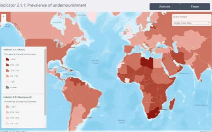
Based discussed before, different types of maps were designed for users to choose in this system: single/multi color choropleth maps, proportional symbol map, pattern area map, 3D map and animated map. When user switch the map style, the legend will automatically update. Both single color area map (Figure 3) and multi-color area map (Figure 4) visualize features based on numeric or density data by using class breaks. The method of classification and the color of each category are determined by professional mapping experts to ensure that distinguishing symbols are set for each class break.
Figure 4. The single color area map (upper) and multi-color area map (lower)
The proportional symbol map (Figure 5) visualizes features along a continuous size ramp based on data in a numeric field. Through altering visual variables, we alter the size of each feature based on the value of indicators and assigned the open street map as the base map and a marker symbol whose size can be altered based on a numeric attribute on the centroid of each country.
Figure 5. The proportional symbol map
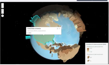
In 3D map (Figure 6), the height of each cylinder indicates the value of the indicator. The height size variable using the value of attribute field, is of range from 0 to 100 kilometers. Because of non-perspective, it’s difficult to distinguish the spatial size difference between two 3D symbols that are far from each other. Thus, it’s reasonable to add a color visual variable for the same field when extruding features. In addition, the view can be navigated via mouse, keyboard or touch inputs. Touch interactions are working on any touch enabled monitor or laptop screen.
Figure 6. The 3D map
The goal of visualization is to provide an effective graphic representation of geospatial information. Visualization of geospatial information refers to the visual perception of various types of graphic representation of data ranging from static to dynamic presentation (cartographic visualization) to exploratory data analysis (scientific visualization) (Siekierska, 2018). In a single static map, specific graphic variables are symbols are used to show changes in order to represent an event.
Many visualization systems include supporting functions for viewing time. One common method is to show discrete time slices. Users can choose to progressively steps through time, to show the content only with each specified period. Another method is to show time as an attribute of data (Havre et al., 2000). SDG Viz can show discrete time slices, users can display the associated time by simply selecting the time in menu. The single static map only presents a single snapshot. However, the SDG data have time component. Peterson (1993) mentioned that cartographic animation is predominantly associated with the representation of change over time. In cartographic animation, you see the change by displaying several snapshots after one frame. Two types of temporal use of cartographic animation are identified in this prototype: the first one was depicted with choropleth maps, and the second one is depicted with 3D maps. In the cartographic animation (Figure 7), users can adjust the dynamic variable (time interval) to watch the animation.
Figure 7. The animated map
In addition to maps, charts are also a form of data visualization. The bar chart is a common way to represent the changes of attributes over time, while the box plot is a very useful tool when showing the statistical distribution. Parallel coordinates graph (Figure 8) is very useful for analysing multivariate data.
Figure 8. The parallel coordinates graph
Only using static different representations to communicate properties and entities still has shortcoming. We assume that the general public are the target users, they may be confused to understand latent information. For example, the similarities or differences of the attribute value between two countries in a particular time can’t be gained directly from the map representation. Therefore, a completed web-based visualization system requires the analysis capacities and interaction functionalities.
3.2 Visual Interaction Functions
As mentioned before, using only static representation or cartographic animation has shortcomings. For example, interaction in the cartographic interface may activate a change in representation; without interaction, the visualization system becomes static representation or animation. If this visualization system only has visual representation functionality, users may be confused to understand latent information.
To compensate for some of the limitations of static representations, SDG Viz also provides supports for users’ actions by means of computer interactions. Interactions enable the information representations better suited to the individual and contextual needs of users, which can potentially enhance users’ ability to explore, navigate, and transform different elements and features of visual representations (Buchel and Sedig, 2011). The user interacts with SDG Viz via a GUI with series functionalities. SDG Viz provides users with three types of interactions: the first is to enter a query in widget. Second, users can directly select the filter condition in menu, then the system will respond by highlighting the feature. Third, users can use the mouse to zoom, pan, or move around the map display.
The interaction techniques in SDG Viz are designed and developed for not only adjusting visual representation format, but also supporting analysis capacities. The analysis capacities are highly relevant to the user's intention in using the interface. Therefore, we follow the five basic “objective primitives as Roth suggested as the requirements of analysis capacity: “identify”, “compare”, “rank”, “associate” and “delineate”. We designed five different web pages with analysis functionalities corresponding to these five objective primitives
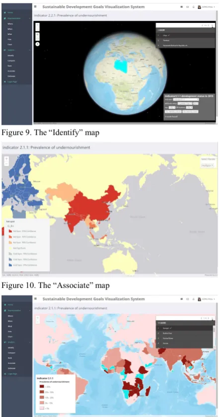
The “identify objective” originally describes the process of spatial search and attribute search in GIS. Once a query expression is set, click Query button (Figure 9), the results will be displayed in map content. For example, top 10% of
countries ranked by a specific indicator can be identified and represented in the map. The compare objective describes the interactions that determine the attribute differences between two countries in the same time or between two year in the same country. In the compare page, the countries selected by users would be highlighted and the compare results would be represented in the widget panel. The rank objective describes interaction to determine the order of all countries according to the attribute value. For the rank page, we designed an animated map, a bar graph, and a timeline to show the attributes variation over time. The associate objective describes the existence of clusters in the spatial arrangement of a given attribute. In the associate page, we design hot spot map (Figure 10) and local indicator spatial association map. As shown in Figure 11, a legend-driven functionality was designed for delineate page. If users click the legend (mouse-over function), the corresponding symbols in map will be highlighted.
Figure 9. The “Identify” map
Figure 10. The “Associate” map
4. User-friendly Interface of the System
Besides functional requirements, some other non-functional requirements also need to be considered, such as system performance and user interface (Hou et al., 2015) According to Roth’s consideration, a primary way to improve the cartographic interaction, is to reduce the interface complexity, thus prevent suboptimal interaction strategies. In a short, once the data is represented, the means of interaction that allow the user to manipulate variables to create different scenarios must be considered. The primary purpose of SDG Viz is to provide support to data visualization and analysis.
SDG Viz has a primary interface similar to most website GIS programs with the addition of tools and forms specifically related to time series data visualization and analysis. This visualization interface includes a ribbon-style main menu, widgets, and a main map display. The map display is the main visualization element, while the other portions of the interface provide tools for searching and visualizing data. The visualization capabilities are powered by the open source ArcGIS API (see www.esri.com), which supports a variety of vector, raster, and images GIS data types, and includes functionality for navigating the map as well as many other GIS tools and features.
With the regard to interface design requirements, flexible filtering and visualizing the SDG data is of great importance. The map display is the main visualization element, while the other panels of the interface provide tools for searching, obtaining, and managing data.
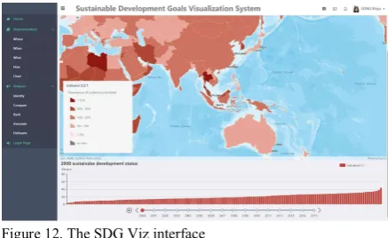
Figure 12. The SDG Viz interface
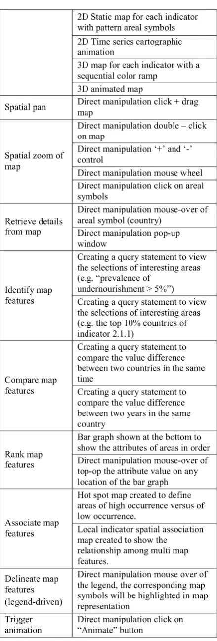
Following the discussion of need assessment from users, we organized the functional requirements into three categories based on the explicit delineation of space, time, and attribute information. In order to support identified functional requirements, we organized the whole interface into three interface panels in the partially-functional prototype (Table 1).
(1) the menu panel: the menu bar provides the interface control for SDG visualization and analysis. The menu panel in prototype support three forms of interaction and three sets of options to filter the data by time, space and attributes. The drop-down menu is loaded with icons and each section is categorized properly in the navigation menu. The dropdown menu bar ensures ease of find and use and it can prominently fit in any
types of web page design.
(2) the map panel: In this section, we have designed a variety of different representations, each of which represents a collection from a different perspective. Current visualization tools start with an assumption that a user’s task will involve visualization primarily. SDG Viz supports visualization of both spatial and temporal data through an interactive GIS map using the open source ArcGIS API for JavaScript.
Regarding the map style requirements, SDG data were represented using single color area map colored by SDG indicator or time. The users without cartographic background were more familiar with Openstreetmap; for this reason, we maintain the Openstreetmap as the base map for all map types. The base map supported basic “slippy map” interactivity, including panning, zooming, and overlay of different map layers. Selection of an area symbol activates an information window containing the available information for the associated attribute. In addition, a pair of buttons at right top was included to toggle between start and stop animated map.
(3) the chart panel: data visualization is a procedure of mapping data into visual elements. A series of tabs corresponding to each year or continent is provided for users to select. In every tab, we designed general line charts, histogram, box plots for statistics, maps for geographic data visualization, and parallel coordinates for multidimensional visualization. We also designed many interaction components besides chart. For example: legend, title, visual map, as well as timeline.
In cartographic animation page, we described the web interface in order to facilitate intuitive and powerful temporal querying via its time slider, as well as details of the time slider’s implementation that enables interactive temporal querying. Users can move the slider along the timeline to control the temporal range in which query results are shown in the map. We used ESRI’s public API to facilitate the implementation of our slider.
Requirement Interface solutions Server-Side
Spatial database ArcGIS Server Geocoding
script ArcGIS API for JavaScript Chart script Echarts API for JavaScript
Map Panel
Map
representation
2D Static map for each indicator with pattern areal symbols 2D Time series cartographic animation
3D map for each indicator with a sequential color ramp
3D animated map
Spatial pan Direct manipulation click + drag map
Spatial zoom of map
Direct manipulation double – click on map
Direct manipulation ‘+’ and ‘-’ control
Direct manipulation mouse wheel Direct manipulation click on areal symbols
Retrieve details from map
Direct manipulation mouse-over of areal symbol (country)
Direct manipulation pop-up window
Identify map features
Creating a query statement to view the selections of interesting areas (e.g. “prevalence of
undernourishment > 5%”) Creating a query statement to view the selections of interesting areas (e.g. the top 10% countries of indicator 2.1.1)
Compare map features
Creating a query statement to compare the value difference between two countries in the same time
Creating a query statement to compare the value difference between two years in the same country
Rank map features
Bar graph shown at the bottom to show the attributes of areas in order Direct manipulation mouse-over of top-op the attribute value on any location of the bar graph
Associate map features
Hot spot map created to define areas of high occurrence versus of low occurrence.
Local indicator spatial association map created to show the
relationship among multi map features.
Delineate map features (legend-driven)
Direct manipulation mouse over of the legend, the corresponding map symbols will be highlighted in map representation
Trigger animation
Direct manipulation click on “Animate” button
Stop animation Direct manipulation click on “Pause” button
Menu Panel
Select “When” Menu selection for specific year Select “Where” Menu selection for specific country
Select “What” Menu selection for specific indicator
Minimize menu
panel Direct manipulation click of minimize button Switch the web
pages Menu selection for specific page
Chart Panel
Chart representation
Bar chart designed for each year Bar chart designed for each continent
Box plot designed for each continent
Parallel coordinated for each goal Select “Where” Tab selection for specific area Select “When” Tab selection for specific year Select “What” Tab selection for specific goal Table 1. Functional Requirements for SDG Viz
5. Conclusion
In this study, we designed a web-based visualization system for visualizing sustainable development goals data. Our contribution is two-folds: (1) an approach that combines two cartographic representation frameworks (Li and Kraak, 2002; Roth, 2012) for visualizing SDG indicators was designed. (2) a web-based SDG visualization system for visualizing SDG indicators was produced.
To meet the requirements of representation capacity, different types of maps were designed for users to choose in this prototype: single color area map, multi-color area map, proportional symbol map, pattern area map, 3D map and animated map. To meet the requirements of interaction capacity, we designed and implemented the basic corresponding interactive functions for analysing SDG indicators. The interaction functions enable users to analysis. Following the cartographic interaction framework proposed by Roth, five types of analysis functions based on the five “objective primitives” were designed, i.e. identify, compare, rank, associate and delineate. The analysis functions potentially enable users to have multiple perspectives and gain insight on the data set.
6. Acknowledgement
This paper is supported by a project funded by the Hong Kong Polytechnic University and the ISPRS Scientific Initiatives project on GlobeLand30 data for monitoring UN Sustainable Development Goals. We thank Professor Li Zhilin for helpful discussion.
7. References
Amirebrahimi, S., & Rajabifard, A. (2012). An integrated web-based 3D modeling and visualization platform to support sustainable cities. ISPRS.
Andrienko, N., Andrienko, G., and Gatalsky, P. (2003). Exploratory spatio-temporal visualization: an analytical review. Journal of Visual Languages & Computing, 14(6), 503-541.
Bertin, J., Berg, W. J., & Wainer, H. (1983). Semiology of graphics: diagrams, networks, maps (Vol. 1, No. 0). Madison: University of Wisconsin press.
Buchel, O. and Sedig, K. (2011). Using map‐based visual interfaces to facilitate knowledge discovery in digital libraries. Proceedings of the American Society for Information Science and Technology, 48(1), 1-5. Chen, J. and Li, Z. (2018). Chinese pilot project tracks
progress towards SDGs.
https://www.nature.com/articles/d41586-018-07309-w. Endert, A. (2016). Semantic interaction for visual analytics:
inferring analytical reasoning for model steering. Synthesis Lectures on Visualization, 4(2), 1-99. GEO. (2016). Earth Observations in Service of the 2030
Agenda for Sustainable Development. https://www.earthobservations.org/activity.php?id=52. Hou, D., Chen, J., Wu, H., Li, S., Chen, F. and Zhang, W.
(2015). Active collection of land cover sample data from geo-tagged web texts. Remote Sensing, 7(5), 5805-5827. IAEG-SDGs. (2016). Report of the Inter-Agency and Expert Group on Sustainable Development Goal Indicators. http://unstats.un.org/unsd/statcom/47th-session/documents/2016-2-SDGs-Rev1-E.pdf.
Klinger, V., Wehrmann, T., Gebhardt, S., & Kuenzer, C. (2012). A Water-Related Web-Based Information System for the Sustainable Development of the Mekong Delta. In The Mekong Delta System (pp. 423-443). Springer, Dordrecht.
Li, Z., Chen, J., Mills, J., Li, S.N., Gong, X.Y, Xu, Z., Ti, P. and Wu, H. (2018). Dynamic Atlas for Visualization of the UN Sustainable Development Goal indicators: A Framework and a Prototype. Manuscript submitted for publication.
Li, Z. and Kraak, M. J. (2002). Web-based exploratory data analyis, WEB-EDA: visualisation meets spatial analysis. In ISPRS 2002 proceedings of Commission II WG II/6, Xi'an, August 20-23. International Society for Photogrammetry and Remote Sensing (ISPRS).
Norman, D. A. (1988). The design of everyday things, New York, NY, Basic Books.
O'Rourke, C. (2004). A Look at Rich Internet Applications: Lookinq at technoloqies for going beyond the aging HTML standard. Oracle Magazine, 18(4), 59-60. Peterson, M. P. (1993). Interactive cartographic animation.
Cartography and Geographic Information Systems, 20(1), 40-44.
Petersson, H., Sinkvist, D., Wang, C. and Smedby, Ö. (2009). Web‐based interactive 3D visualization as a tool for improved anatomy learning. Anatomical sciences education, 2(2), 61-68.
Peuquet, D.J. (1994). It’s about time: A conceptual framework for the representation of temporal dynamics in geographic information systems. Annals of the Association of American Geographers, 84(3), 441-461. Pucihar, A., Malešič, A., Lenart, G., & Borštnar, M. K.
(2014). User-centered design of a web-based platform for the sustainable development of tourism services in a Living Lab context. In Smart Organizations and Smart Artifacts (pp. 251-266). Springer, Cham.
Roth, R. E. (2012). Cartographic interaction primitives: Framework and synthesis. The Cartographic Journal, 49(4), 376-395.
Roth, R.E. (2013). An empirically-derived taxonomy of interaction primitives for interactive cartography and geo-visualization. IEEE Transactions on Visualization and Computer Graphics, 19(12), 2356-2365.
Schnabel, O. and Hurni, L. (2009). Cartographic web applications–developments and trends. In Proceedings of the 24th international cartography conference, Santiago. Siekierska, E., Williams, P. and Mueller, A. (2018)
Visualization and Sustainable Development Decision Making.
Sun, X., Shen, S., Leptoukh, G. G., Wang, P., Di, L. and Lu, M. (2012). Development of a Web-based visualization platform for climate research using Google Earth. Computers & Geosciences, 47, 160-168.
Thomas, J. J. and Cook, K. A. (2005). National V, Analytics C. Illuminating the path. Los Alamitos. CA: IEEE Computer Society.
UN. (2015). Sustainable Development Goals: 17 Goals to
Transform Our World.
http://www.un.org/sustainabledevelopment/ last accessed on 20 Aug 2017)
Yi, J. S., ah Kang, Y., Stasko, J. T. and Jacko, J. A. (2007). Toward a deeper understanding of the role of interaction in information visualization. IEEE Transactions on Visualization & Computer Graphics, (6).