Introduction to GIS
Sarah Watson – [email protected] University of Kentucky Libraries
Outline
• Overview of various terms
• Quick overview of ArcGIS and QGIS
• Geocoding Activity
• Considering Map Design
What is a Map?
• Simple Definition: A spatial representation of reality
• Why are maps useful?
• Maps can simplify & make “reality” easier to understand
• Less is Sometimes More
• Maps can help us see new realities
• Maps can show us what we cannot easily see with our eyes
In 1996, J.H. Andrews compiled 321 definitions of “map” (“What Was a Map?” Cartographica 33:4, pp. 1-11).
After editing out all the source information/miscellaneous stuff, you have a bunch of words that can be pumped into a word cloud generator
The word cloud visualization does help to make some sense out of the 8106 words in the 321 definitions….
What is a Map?
• The map has a narrative• Elements and information are framed for the viewer
• Consider how they depict cause and effect
• Maps actively construct new knowledges and serve as interventions into our understandings of the world
Requires mapmakers and map readers to consider:
• What counts as data?
What is GIS?
• Geographic Information System (GIS) is “A set of tools that captures, stores, analyzes, manages, and presents data that are linked to a
location”
• Spatial or Data Analysis: “Study of the spatial visualization of patterns, properties, and relationships. Examples of variables that are often
analyzed include population demographics, quality of life indexes, illness distributions, and business sales (Camera et al. 2001)
Map Features
• Title – Is there a label describing what the map shows?
• Scale – Is there a scale to read distances?
• Explanatory Text – Text blocks to communicate information (map content, goals, etc.)
• Legend – Is there a legend (key) to aid readers?
• Necessary in helping readers “unlock” the map symbols
• Orientation – Which way is North?
• Border – Helps to draw/unite all the information
• Date – Is there a date?
• Sources, Credits, Etc. – date, author, map series, organization
Explanatory text Title
Locator Map
Legend Directional Indicator Scale bar Explanatory Text Title Inset
Santa Fe
If you have to know the rules, before you can break them!
www.mathworks.com The convention of orienting maps with North at the top is
so widespread, that maps often lack a directional indicator (aka “North Arrow”) unless it is oriented differently.
Map Features: Latitude & longitude
Latitude and longitude are imaginary lines encircling the globe, intersecting each other to form a grid that helps us pinpoint location—our "global address.”
Latitude lines (also called "parallels") run east-west,
parallel to the Equator and measure distance north and south, from 0 degrees at the Equator to 90
degrees at the North and South Poles.
Longitude lines (also called "meridians") run
north-south and meet at the poles, measuring distance east and west of the Prime Meridian, from 0 degrees at
Map Features: Scale
The scale of a map shows how much you would have to enlarge your map to get the actual size of the piece of land you are looking at.
Typically, represented in one of three ways on a map:
• Verbal - scale is expressed in words: 1 inch = 1000 mi
• Visual – bar line that graphically depicts the relationship between map distance and ground distance
Representative Fraction:
• Ratio – 1:1,200,000
• First number of the scale is always one. It's your unit of measurement, usually an
inch.
• The second number is the ground distance.
• For example, if your U.S. Geological Survey (USGS) map has a scale of 1:24,000,
it means that one inch on the map is equal to 24,000 inches (2000 feet or
Map Features: Scale
The terms 'large scale' and 'small scale' are used to describe different scales. However, they can be confusing :
Large scale maps have low number in the scale, such as 1: 1250.
• The features are shown are large or are “zoomed in”
Small scale maps have a high number in the scale, such as 1: 250 000.
Map Features: Projections
• A map projection is:
• The systematic transformation of the latitudes and longitudes of locations on the surface of a sphere or an ellipsoid into locations on a plane.
• Map projections are necessary for creating maps.
Winkel Tripel Projection
Standard projection for world maps made by the National Geographic
Types of GIS File Formats
• Vector - geographical features are often expressed as vectors
• Points
• Lines
• Polygons
• Popular File Formats
• Shapefile – Very Common, developed by Esri
• Tiger – Topologically Integrated Geographic Encoding and Referencing
Types of GIS File Formats
• Raster – Pixels. Can be digital aerial photographs, digital pictures, scanned maps
• Popular GIS file formats
• GeoTiff – Tiff variant enriched with GIS relevant metadata
• JPEG2000
Map Data
• Discrete:
Data only found at fixed locations or when the data represent only specific values.
Buildings and roads are features that have distinct boundaries Can be shown as a point, line, or a polygon.
• Points could be cities
• Lines could be roads
Map Data
Continuous data – does not have well-defined boundaries and sometimes has no boundaries.
• It is typically seen throughout the mapped area and smoothly transitions from one value to another.
• Temperature measurements
• Atmospheric pressure
Don’t reinvent the wheel
• https://www.census.gov/geo/maps-data/
Esri (ArcGIS Products) & QGIS
• ArcGIS Online – cloud based mapping platform.
• ArcMap – Desktop application (does not work with Macs)
• Consult UKY GIS Campus Support for access information
QGIS
• Free and Open Source GIS Platform
ArcMap Interface
Table of Contexts
The Data Frame
View Toolbar
Geocoding
• The conversion of addresses into geographic coordinates
• “GeoSearch” When converting one address
• “Batch Geocoding” When converting many
• BatchGEO (http://www.batchgeo.com) a free online tool that geocodes addresses, maps them and creates a KML file
• Reverse Geocoding Take coordinates and change into address
• http://noc.to/geodecode
Map Communication/Design
Map Communication oftentimes deals with the fusion of:
• Intellectual Hierarchy – what are the different elements around the map, and what are their relative importance to the overall communication
• Visual hierarchy – choose your visual hierarchy that reflects the intellectual hierarchy
Map Communication is shaped by how the map features, visual arrangements, and symbolization interact with one another
Good design enhances map communication Poor design inhibits communication
Important to remember that communication is linked to the audience: • Know who you are talking to
• Experts or Novices
• How will maps be displayed: • Printed or Web
• Size
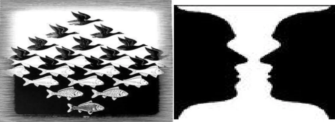
Visual Hierarchy (figure-ground)
• Figure-ground effect:
• Figures on maps are seen as separate from the rest of the map
• Can be used to emphasize what is important in the map
• The main focus of the composition (positive space)
• Ground: The secondary portion of the composition (negative space)
• Elements of Foreground and Background
Visual Arrangement
Key Elements
• Visual Center – slightly above the actual center
• Balance – some map pieces are ‘heavier’ than others so you want to move pieces around to keep the visual
balanced
Map Symbolization
• Everything on a map is a symbol
• Symbol - A thing representing something else because of relationship, association, convention, or resemblance
• Map symbols are tied to data and concepts
• Choose symbols that best match your data Oftentimes:
• Symbolize by shape/unique symbol or color hue for qualitative data
Enhancing Visual Difference
Overview Visual Difference Detail
• Edges
• Texture
• Layering
• Shape & Size
• Closure • Proximity • Simplicity • Direction • Familiarity • Color Weaker Stronger Weaker Stronger
Visual Hierarchy
• Design choices effect visual order
• Separate and layer information in rough proportion to their relevance
• Important information sits on top of the visual hierarchy
• Push supporting elements to the back
• Discard what is not relevant
Visual Hierarchy (visual difference)
• Visual contrast emphasizes figure-ground relationship
• Darker or brighter features stand out
• Features with less contrast appear to belong together
Visual Hierarchy (Separation)
• Defined edges between features
Visual Hierarchy (layering)
• Proper layering enhances visual order
Color on Maps
• Does your map need to be in color?
• Gray scale maps can be very effective • Avoid cultural associations
• Best for b&w reproductions
• Color
• Use color sparingly
• Spot colors on muted field emphasize data
• Color on muted background draws the eye to your data • Connect color choice to your data
Common Colors
• Blue - lakes, rivers, streams, oceans, reservoirs, highways, local borders
• Red - major highways, roads, urban areas, airports, special interest sites, military sites, place names, buildings, borders
• Yellow - built-up or urban areas
Representing Data
Different visual variables are more effective for showing
qualitative or quantitative differences
Some Questions to ask Yourself:
• Map Title – is it brief and directly related to the map?
• Map scale – is it correct?
• Do legend symbols match the map?
• Does your map include source(s) and author information?
• Does it reproduce ok in b&w?
Additional Resources
Great Site to Search for Answers: http://gis.stackexchange.com/
Google!!!
Or me!