Benford, Steve and Koleva, Boriana and Quinn, Anthony
and Thorn, Emily-Clare and Glover, Kevin and Preston,
William and Hazzard, Adrian and Rennick-Egglestone,
Stefan and Greenhalgh, Chris and Mortier, Richard
(2017) Crafting Interactive Decoration. ACM
Transactions on Computer-Human Interaction (TOCHI),
24 (4). pp. 1-26.
Access from the University of Nottingham repository:
http://eprints.nottingham.ac.uk/45001/7/TOCHI-Craft-authorversion.pdf
Copyright and reuse:
The Nottingham ePrints service makes this work by researchers of the University of
Nottingham available open access under the following conditions.
This article is made available under the University of Nottingham End User licence and may
be reused according to the conditions of the licence. For more details see:
http://eprints.nottingham.ac.uk/end_user_agreement.pdf
A note on versions:
The version presented here may differ from the published version or from the version of
record. If you wish to cite this item you are advised to consult the publisher’s version. Please
see the repository url above for details on accessing the published version and note that
access may require a subscription.
Crafting Interactive Decoration
STEVE BENFORD, University of Nottingham, Nottingham, UK
BORIANA KOLEVA, University of Nottingham, Nottingham, UK
ANTHONY QUINN, Central St Martins College of Art and Design, London, UK
EMILY-CLARE THORN, University of Nottingham, UK
KEVIN GLOVER, University of Nottingham, Nottingham, UK
WILLIAM PRESTON, University of Nottingham, Nottingham, UK
ADRIAN HAZZARD, University of Nottingham, Nottingham, UK
STEFAN RENNICK-EGGLESTONE, University of Nottingham, Nottingham UK
CHRIS GREENHALGH, University of Nottingham, Nottingham, UK
RICHARD MORTIER, University of Cambridge, Cambridge, UK Abstract.
We explore the crafting of interactive decoration for everyday artefacts. This involves adorning them with decorative patterns that enhance their beauty while triggering digital interactions when scanned with cameras. These are realised using an existing augmented reality technique that embeds computer readable codes into the topological structures of hand-drawn patterns. We describe a research through design process that engaged artisans to craft a portfolio of interactive artefacts including ceramic bowls, embroidered gift cards, fabric souvenirs and an acoustic guitar. We annotate this portfolio with reflections on the crafting process, revealing how artisans addressed pattern, materials, form and function and digital mappings throughout their craft process. Further reflection on our portfolio reveals how they bridged between human and system perceptions of visual patterns and engaged in a deep embedding of digital interactions into physical materials. Our findings demonstrate the potential for interactive decoration, distil craft knowledge involved in creating aesthetic and functional decoration, highlight the need for transparent computer vision technologies, and raise wider issues for HCI’s growing engagement with craft.
CCS → Human-centered computing → Human computer interaction (HCI) → Interaction paradigms → Mixed / augmented reality
General terms: Design
Additional keywords and phrases: Craft, hybrid-craft, tangible, embedded, material, maker, DIY, fabric, wood, lifespan, sustainability, obsolescence, augmented reality, tangible and embedded interfaces, computer vision, seamful design, ambiguity
1. INTRODUCTION
We are surrounded by beautiful decorative patterns. From motifs and borders, to swathes of colour and texture, almost every object that we value is embellished with a pattern that has been carefully designed to enhance its beauty and value. We apply decorative patterns to our homes, furnishings and possessions and even to our own bodies, expressing our personalities and tastes by mixing and matching the materials that surround and cover us. Decorative patterns are an essential and ubiquitous feature of everyday life – quite literally ‘part of the furniture’.
2005). These various visual codes are carefully engineered to be robust and scalable. They are also inherently recognizable for what they are – there is no mistaking a barcode or QR code once you have encountered one. While this enables users to readily identify them, it comes at the cost of a limited aesthetic (Costanza 2009). In short, they are designed to be robust, not to look good. There have been attempts to redress this aesthetic. Companies such as Bar Code Revolution (2003) and D-Barcode (2013) embellish barcodes to create playful personalised designs. Some AR systems employ image processing to recognise naturalistic markers, for example Google Goggles (Google 2013), Blippar (2013), String (Powered by String 2013), Embedded Media Markers (Liu et al 2010), reacTIVision (Bencina et al 2005), ARTag (Fiala 2004) and d-touch (Constanza and Robinson 2003). Rather than focus on the underling technology, our interest lies in understanding how skilled artisans learn to embed such markers into wider decorative patterns.
In turn, TEI has a longstanding interest in embedding the digital into the physical, from early graspable interfaces (Fitzmaurice et al 1995) and proposals for tangible bits (Ishii and Ullmer 1997) to recent notions of transmaterials (Bronwell, 2006), composite materials (Vallgarda and Redstrom, 2007) and textures (Robles and Wirberg, 2010). This reflects a growing interest in making and crafting, including embedding digital technologies into traditional craft practices such as knitting (Rosner and Ryokai 2009) and bookbinding (Rosner and Taylor 2005) and discussions of the relationship between the material and digital (Rosner et al 2012, Gross et al 2013, Vasiliki et al 2014). Our interest lies in revealing the craft practices of artisans as they learn to apply interactive decoration to material artefacts.
Our argument unfolds as follows. We begin by situating our research within the wider context of craft and its relationship to digital technologies in Section 2 before summarising our Research Through Design process in Section 3. We then present our portfolio of artefacts in Section 4 and annotations on design rationale and lessons learned in Section 5. Finally, Section 6 discusses wider implications for HCI in terms of bridging between human and system interpretation of images and accommodating the materials, form, structure and function of artefacts.
2. CRAFT AND DIGITAL TECHNOLOGIES
The nature of crafting has evolved over thousands of years through antiquity, medieval guilds and the industrial revolution to contemporary studio crafts. Unsurprisingly, the term ‘craft’ has acquired many commonplace meanings, from the relatively narrow sense of the practices of trained artisans working traditional materials, to a more everyday usage that encompasses nearly any practice that involves elements of skill and dedication. From an academic standpoint, the meaning and nature of craft is contested, not least in its relationship to its sibling disciplines of art and design, and especially its relationship to technology. We therefore take a little time to frame our own position.
While precise definitions differ, scholars broadly associate craft with a common set of features. Metcalfe, writing in Dormer (1997, p70), emphasizes the importance of craft objects as being substantially made by hand, a view emphasised by Ingold (2013). There is a widespread sense of craft involving high-levels of skill and craft knowledge, acquired through repetitive practice. Dormer (1997, p14) identifies a core value as being the freedom that comes through possessing skill and control over process. In a more practical vein, one can catalogue examples of studio craft that involve working traditional materials such as textiles, clay and glass.
technology. Reactions to the deskilling of artisans ranged from the machine-smashing Luddites to the ‘arts and crafts’ movement that celebrated a return to a preindustrial ideal of crafting, inspiring a golden age of the decorative arts in the early 20th
century. By the middle of the century, however, the status of craft was in decline, as both art and design turned away from the material towards the conceptual. The latest technologies to challenge craft are digital, with the combination of Computer Aided Design and Computer Aided Manufacturing – CADCAM – speeding up mass production and raising questions whether computers may ultimately render computer-designed products indistinguishable from the handcrafted.
This brings us to HCI. Given its core concern with digital technologies, our field might possibly be seen as being part of this latest technological wave to threaten the values and practices of craft. However, the emergence of embedded electronics, tangible interactions and even augmented reality may in fact herald something of a return to the material. Consequently, there is also a growing interest within HCI in maker and hacker cultures and in revisiting handcrafting. Cheatle and Jackson (2014) consider the subtleties of how a highly skilled artisan employed CNC machinery in furniture making. Tsaknaki et al (2014) report how digital technologies can be ‘worked’ into the traditional material of leather. Rosner and Taylor (2005) explore HCI in support of bookbinding, while Rosner and Ryokai (2009) consider knitting and Rosner, Ikemiya and Regan (2015) explore the application of conductive inks to ceramics. Finally, McCullough (1998), writing from outside of HCI, argues the case that the digital can itself be crafted.
Against this broad backdrop, we clarify our own interest. First, we are focused on digitally augmenting material artefacts that are substantially handmade from traditional materials. As noted above, we anticipate that connecting such artefacts to digital records and services might potentially enrich their provenance, utility and personal meaning. Second, rather than seeking to emulate or replace hand crafting with digital technologies, our goal is to better marry the digital – in our case AR and TEI – with traditional materials and practices by developing digital technologies that are open and malleable to artisans and that respect their craft values of skill, knowledge, hand-making and close control by humans. Ultimately, this may be one step on a longer journey towards a deeper merging of the physical and digital in craft, one in which the two are no longer seen as separate, or as representing opposing values of handcrafting versus mass-production, but rather jointly become new forms of ‘transmaterials’ (Bronwell, 2006) or ‘composite materials’ (Vallgarda and Redstrom, 2007) as we discuss later.
3. FOLLOWING RESEARCH THROUGH DESIGN
We follow the approach of Research Through Design, relating the craft activities of artisans to generalizable principles and knowledge that constitute HCI theory. The essence of the approach lies in being practice-led, with designers creating specific artefacts that embody opportunities or problems. Beyond this, however, there is divergence within HCI as to precisely what constitutes research through design and especially how its outcome might best be evaluated.
how HCI might recognise and evaluate the outcomes of research through design, offering the four criteria of: process, invention, relevance and extensibility.
Others have argued for a more relaxed and exploratory view. Gaver (2012) celebrates the diversity of approaches, arguing that this provides opportunities for creative and playful engagements with the world and advising the community to be “wary of impulses towards convergence and standardisation and instead, take pride in its aptitude for exploring and speculating”. He argues that the kind of theory that emerges from research through design is inherently provisional, contingent and aspirational. He further proposes that the outcomes of research through design might usefully take the form of portfolios of artefacts and systems that are annotated with “topical, procedural, pragmatic or conceptual” insights, from reflections on use in the field to conceptual frameworks.
Our own interpretation leans towards the creative and exploratory. We are not so much concerned with tackling a known wicked problem as we are with supporting the creative craft practices of artisans. We therefore undertake and document an exploratory research process. While we recognise the importance of process, invention, relevance and extensibility and hope that they are to be found in our work, we find it especially useful to present our outcomes as a portfolio of artefacts that are annotated with design insights as Gaver suggests.
Practically speaking, we engaged professional artisans with skills in visual design and material craft, briefing them to create a portfolio of beautiful and reliably1
scannable artefacts. A particular focus of this paper is on how our artisans tackled the visual and material aspects of crafting these artefacts.
Our artisans included ceramicists; the proprietor of a craft shop who created bespoke gift cards, textile designers working with a local lace museum to create souvenirs, and a professional luthier at a school of guitar making. We worked closely with them to create a diverse portfolio of artefacts including tableware, gifts and musical instruments from ceramics, paper, fabrics and wood. Along the way – a journey that took three years – we documented their practices as annotations to this portfolio. The resulting portfolio comprises four kinds of decorated artefact:
Ceramics and tableware – we engaged five ceramicists to create a collection of interactive tableware for a restaurant. This comprised bowls, placemats and menus displaying decorative patterns that linked to interactive services to deliver an enhanced dining experience. The main focus here revolved around creation of an extended pattern book and the possibilities and challenges of applying these patterns to ceramics.
Mixed-media gift cards – we engaged a local craft shop to explore the possibilities of interactive gift cards, handmade from card and fabrics. Two artisans ran workshops to teach customers how to make their own gift cards, focusing on techniques for cutting, layering, stitching together and otherwise combining card and
embroidery to create interactive decorative patterns.
Fabric souvenirs – we engaged textile designers and a historic lace archive to create an interactive souvenir for a museum shop. The focus here was on the application of interactive decoration to textiles, including the challenges of dealing with different finishes, stretch and drape.
1 By reliable we mean that the patterns should be readily scannable by a reasonably
A wooden acoustic guitar – we engaged a professional luthier and a graphic designer to create a hand-made acoustic guitar with interactive patterns inlaid into its wooden surfaces so that both players and audiences could scan it to learn about its history. The focus here was on inlaying interactive patterns into a complex wooden
structure.
Before presenting our portfolio in detail, it is first necessary to introduce the underlying technology that was used to create interactive decorations. As noted earlier, various image recognition technologies might potentially be employed to recognize aesthetic decorations. We chose to build on the d-touch approach proposed by Costanza et al (2009) that recognizes topological structures in images. Key to d-touch is the idea that people who learn its relatively simple topological rules can draw their own scannable designs from scratch. We illustrate this idea by way of a simple example. Topologically speaking, Figure 1 (left) comprises five white regions that are joined up with black lines to form an overall connected shape. These regions then contain different numbers of solid blobs within them – one, one, one, one and two blobs respectively. Provided that the regions are all connected by an unbroken solid line and that the blobs themselves are solid, then this will be recognized as the code 1:1:1:1:2 (the ordering of the regions is not significant and by convention codes are presented in ascending order). In principle there might be far greater numbers of regions and blobs, opening up the potential for working with a very large code-space thought this will be subject to the practicalities of camera resolutions.
[image:6.612.202.424.448.536.2]The d-touch algorithm does not consider the shapes or ordering of the regions and blobs as being significant. Consequently, Figure 1 (right) shows a second visual representation of the same code that adheres to the same topology of five connected regions containing the required numbers of solid blobs. While this ambiguous relationship between visual imagery and embedded codes may not be appropriate for all applications (those that require images to map to unique addresses), we were drawn to its creative potential, sensing the possibility that it might provide skilled visual designers which an expressive medium for creating interactive decorations.
Figure 1. Two representations of the d-touch code 1:1:1:1:2
We implemented the d-touch algorithm in a mobile app called Artcodes2 that
supports scanning interactive decorations and their mapping to digital content, releasing this on Google Play and iTunes so that other practitioners and researchers could also experiment with the approach. We iteratively refined the implementation of the algorithm and also extended the functionality of the app as the project
unfolded, resulting in the final version presented in Section 4.5 below as being a key part of our portfolio.
We have found it challenging to present the details of our annotated portfolio in the linear form of an academic paper. Our solution is to present it in two parts. In Section 4 we document the artefacts within the portfolio, summarising how and why they were made. In Section 5, we present key insights into the crafting process as annotations, grouped under the four themes of: pattern material, form and function, and process. Section 5.6 presents a visual summary of both artefacts and annotations in the style of Gaver (2012).
4. A PORTFOLIO OF INTERACTIVE DECORATED ARTEFACTS
We introduce our portfolio of artefects, sketching out the broad context of each artisan’s work, the design process they followed and they artefacts they ultimately produced. However, we first offer a general account of how we set about recruiting them and the basis on which they worked with us. Overall, recruitment was an iterative process, following a snowballing approach that led to a total of eleven different visual designers becoming involved in various ways. We began by recruiting one initial artisan, a graduate in design with a particular expertise in ceramics. She engaged closely with the technology development process throughout, eventually assuming the mantle of lead-designer as a core part of the development team with responsibility for recruiting and training others and for feeding design insights back into technology development. She has since become a salaried researcher on the project and is an author of this paper.
Our first engagement was the ceramics and tableware example for which we recruited a further six graduate designers who were trained in drawing and using the Artcodes app during a day-long workshop. This training followed a studio-style approach that involved ‘learning by drawing’, beginning with copying simple designs similar to those in Figure 1 before moving on to create their own more complex designs. There was a particular emphasis on creating multiple visual representations of the same code as well as appreciating the “dos and don'ts” of how to draw valid markers (e.g., that the technology is very sensitive to lines properly joining up or to small white spaces appearing in otherwise solid blobs).
Five of our six workshop recruits then accepted a commission to produce an initial pattern book (Figure 2). This required roughly a week of effort from each of them to iteratively work up a series of five designs each. This involved frequent debugging conversations with our lead designer to make their designs fully functional and reliable (which inspired the introduction of debugging interfaces into the app that we discuss later). One of this team proved to especially skilled in the approach and went on to work on a series of further projects, including designing the Celtic patterns for the acoustic guitar.
The fabric souvenirs project involved recruiting and training two textile designers from the fashion and textiles department of a nearby University that hosted a local lace archive. The mixed media gift cards project was undertaken by two independent artisans who ran public craft sessions in a commercial craft shop and who had encountered the Artcodes app at a design fair.
such as the intricacies of ‘debugging’ complex designs as we discuss later. Online tutorial material is also available at our community website (artcodes.co.uk).
Once trained, the designers tended to work independently in their own studios, though typically used email and occasional face-to-face meetings to resolve problems. With the three exceptions of our lead designer, the salaried researcher in the lace archive and craft the shop owner who each brought their own source of funding, we engaged our designers on a freelance basis, paying appropriate daily rates. They retained ownership of their copyright, with us having a license to use the designs for research and an agreement to negotiate future terms for any commercial use that might ensue.
In terms of the eventual fates of the artefacts, the pattern books and tableware sets, the lace sample sets were distributed for publicity, the gift cards were kept by their makers and the guitar was used as a travelling technology probe (Benford et al, 2016). We also invited our artisans to take part in project feedback meetings and interviews at which we captured their accounts of the design process and opportunities and challenges that they had encountered when using the technology.
4.1. Ceramic tableware
[image:8.612.111.502.434.684.2]These designs also reveal how our artisans exploited the ambiguous nature of the mapping between visual patterns and embedded codes that is inherent in the topological approach. For example, Figure 3 shows three very different patterns all of which contain the Artcode 1:1:1:1:2. Conversely, Figure 4 shows three very similar visual designs for different underlying codes in which the artisan has deliberately varied the numbers of blobs in the penguins in order to change the code while also varying the number scattered around the penguins so as to distract the eye from this.
Figure 3. Three distinct visual designs for the Artcode 1:1:1:1:2
Figure 4. Three similar looking designs for different codes
[image:9.612.139.465.306.452.2]Figure 5. Artcode decorated place settings being demonstrated at Busaba
4.2. Mixed-media gift cards
[image:11.612.124.501.68.386.2]
Figure 6: Hand-crafted gift cards
The workshop concluded with a discussion of potential applications of augmented gift cards focusing on how they might become associated with digital media. Three principle perspectives appealed to participants here. The first was as a gift for others – embedded Artcodes might link to digital media that augmented the meaning of the card as a gift, for example personal messages or photographs. The second was promoting the artisan – the pattern might link to promotional material highlighting the work of the craftsperson who had produced it. Last, was as a souvenir of the workshop – the card might link to further training material on how to craft cards and Artcodes.
4.3 Fabric souvenirs for a museum gift shop
Our third engagement focused on applying Artcodes to fabrics. For this we engaged a team of fashion and textile designers based at nearby Nottingham Trent University and curators from Newstead Abbey, a local museum that was exploring how to engage visitors with its historic lace collection. Early discussions raised he idea of creating souvenir packs of interactive lace samples for the museum shop based on historic designs from the collection. A team comprising two experienced fabric designers who specialized in lace, an experienced graphic designer who had previously worked with the Artcodes app, and the collections access officer from the museum then embarked six month exploration of applying Artcodes to fabrics, with a particular focus on designing and manufacturing scannable patterns inspired by traditional lace designs.
materials, stitch types (running stitch, satin stitch, blocks of stitches), stitch lengths, widths, densities and colours at this stage.
[image:12.612.137.470.187.525.2]Following early explorations, the next step involved selecting examples from the historic lace archive and adopting them as inspirations for Artcode patterns. Figure 7 shows how this process unfolded. First, a historical design was chosen (top left). This was then adapted to fit the topological drawing rules, producing a drawn design that could be reliably scanned (top right). This new design was digitized using the Wilcom Software (bottom left). Finally, appropriate parameters were set and instructions sent to the Barudan embroidery machine to fabricate a sample (bottom right).
Figure 7. Embroidered souvenir for a lace museum
Figure 8. The souvenir gift pack
4.4. A wooden acoustic guitar
Our final artefact is handmade acoustic guitar that was built as part of a project to create musical instruments that can be queried to reveal their life stories, from how they were made to who has played them. From the perspective of this paper, this unusual artefact offered an opportunity to explore the inlay of decorative visual codes into a complex wooden structure. The initial concept and design of the guitar was presented in (Benford et al, 2015). The following briefly summarises the relevant aspects its design and construction for completeness.
Figure 9. early Celtic knotwork sketches (left) and scannable designs (right)
Figure 10. Photomontage of Carolan guitar
Figure 11. Laser-etching the Artcode outlines into the soundboard (left) and manually fitting and finishing the darker inlay into this (right)
Following its completion, Carolan was released ‘into the wild’ to visit different players. As documented in Benford et al 2016, over the course of a year it travelled to 6 homes, was played at 3 gigs and 2 recording sessions, visited 8 clubs or jam sessions, hosted an ‘open mic’ event, resided in a shop and undertook an international road-trip, during which more than 30 players contributed materials to its digital history. This experience shed light on the nature of the mappings between Carolan’s six interactive surfaces and its growing digital record, revealing how three surfaces retained a more or less constant associations throughout (the headstock to the official maker’s certificate, the sound hole with the user guide and the fretmarker with the technical specification) while the remaining three tended to be more freely appropriated, being mapped to different content (e.g., playlists, personal websites, video recordings) to suit each new player or context that the instrument visited.
4.5. The Artcodes app
We conclude this overview of our portfolio with a brief overview of the Artcodes app itself. The app evolved considerably as a result of crafting these artefacts and the following is a snapshot of its functionality as it stood at their completion.
codes on the video view and/or show how colour thresholding works. These features are shown in Figure 20 below and discussed in Section 5.2.
A distinctive feature of the Artcodes app is the concept of experiences. The app allows the user to select a particular experience through which to view a marker. An experience is a particular mapping between a set of markers and some digital content. Selecting an experience defines both which codes are deemed to be valid at the present time and the content that they will lead to. By selecting among different experiences the user might therefore choose to interpret the same markers in different ways at different times. On opening the Artcodes app, the user is presented with a list of recommended experiences that have downloaded from a server (Figure 12, top left). Recommendation is done on the basis of featured, favourites, recently used, and valid at this location and time as specified by the experience creator. The label in Figure 12 (top centre) shows that the user is currently scanning the Carolan guitar using the “Carolan at IDC” experience that was created when the Carolan guitar was taken to the Interaction Design & Children conference.
Although the focus of this paper is on the drawing of markers and their application to various physical materials, we note that the app provides menus for authoring an experience from scratch, giving it a name, image, description, specifying a list of valid code values and associated URLs. The user can also copy and edit an existing experience, changing any of these properties. Figure 12 (top right) shows the “Carolan at IDC” experience opened up and ready for editing. On selecting the ‘edit’ option the user is presented with the list of currently valid codes for this mapping (Figure 12, bottom left). They can then select and edit specific code mappings (Figure 12, bottom middle) changing its URL and also adding more codes that will also trigger this URL. Finally, they can specify the valid time and map location for this experience as shown in Figure 12 (bottom right). Once edited and saved, they can share the new experience with other Artcodes users using the share button visible in Figure 12 (top right). In this way experiences can be edited and appropriated as described further in Benford et al, 2016. The remainder of this paper continues with our discussion of crafting the interactive patterns.
[image:17.612.101.497.450.681.2]
Figure 12. A tour through the Artcodes app. Selecting an experience (top left). Scanning a marker through a selected experience (top middle). Opening an experience for editing (top right). The current list of valid codes for this experience (bottom left). Editing a specific code
(bottom middle). The current availability of the experience (bottom right).
5. ANNOTATIONS ON THE NATURE OF THE CRAFT
Having introduced the artefacts in our portfolio, we now turn to the annotations. We reflect across the portfolio, delving more deeply into the examples so as to unpack the ‘craft knowledge’ involved in creating interactive decorative patterns that were both beautiful and reliable. We focus on five aspects of the craft:
Pattern – how our artisans set about embedding recognisable visual codes within wider decorative patterns;
Materials – how they learned to accommodate the material qualities of the different surfaces to which patterns were applied;
Form and function – how their designs also responded to the form and function of artefacts;
Mappings and interaction – how an artefact becomes mapped to digital content and how users discover and interact with codes as part of an overall digital user experience.
Process – how our artisans draw on traditional craft processes and techniques but also integrated these with mechanised approaches,
5.1. Pattern
• To decorate a large artefact that the user cannot easily scan in its entirety (think
of upholstering a large piece of furniture or designing wallpaper);
• To deliver an experience in which the user needs to discover hidden codes by
exploring the artefact;
• To create a narrative where the user successively scans codes within the pattern
to reveal a story;
• To increase reliability through redundancy, ensuring a reasonable chance of
scanning at least one code from several that are ‘in shot’ at a given time. Our artisans found that the topological nature of the d-touch rules provided a powerful scaffold for creative visual design. Perhaps surprisingly, they were largely positive about the constrained nature of the rules. Not only were these evidently comprehensible, but the constraints appeared to provide a framework for playful creativity (“I found though that the more you played with the codes the more versatile you realised the formula is – and really a huge scope of imagery can already be created within the existing structures”). Other constraints however, were less appreciated such as requiring a necessary thickness of line or limitations on colours, both of which were seen to limit visual aesthetic.
[image:19.612.121.487.346.623.2]By interviewing our artisans about their designs, we were able to uncover how they set about disguising codes within patterns. Their tactics are neatly illustrated by the single complex design shown in Figure 13 in which the same Artcode (1:1:2:2:6) is replicated three times within a single image.
Figure 13: A complex pattern containing three embossed Artcodes
Figure 14: Example of disguising codes in a wider pattern
Disconnected elements – our artisans soon realised that they could add all manner of embellishments outside of d-touch regions without affecting the validity of the code (“Like a Morrison picture but with loads of background detail … so it was camouflaged ... I’d have loads of foliage or background imagery and then just have the code hidden inside”). Visual elements that fall outside of the regions of an Artcode such as the black foliage above the purple bird are ignored by the scanning software, but may form a coherent part of an overall picture for the viewer. Such additional elements may also serve to make the image more complex and so discourage close inspection by the viewer to work out the locations of codes.
Extended and thickened lines – even where they form part of the Artcode, dark lines can be embellished in many ways, including being thickened into solid regions that may appear to be visually significant to the user (the neck, beak and wing of the purple bird). Equally lines can bend, curl and branch into very fine detail but provided that they remain joined up will be treated as equivalent to a simple line by the system: “Initially you think ‘I can only put one mark in that region’ but then you realize you can put as many as you want as long as you connect them to the outside line.”
(thresholded out) by the system, greatly enriching the aesthetics of their patterns. By way of example, Figure 15 shows how the image of the two birds appears to the system after thresholding has been applied.
Figure 15: The pattern after thresholding
Our artisans also discovered that this thresholding was dynamic, being determined according to the range of colours visible in the image at any moment. On the one hand, this made it trickier to predict whether coloured codes would behave consistently as the camera panned across a complex pattern, leading to requests for greater feedback from the software as we discuss below. On the other, it opened up new creative possibilities including the idea of ‘panning and zooming’ patterns. As the camera pans and zooms across a large pattern so the range of colours its sees – and hence the greyscale threshold – dynamically changes. A skilful artisan can exploit this to create codes that appear or disappear according to whether other elements of the wider pattern are currently in view or not. Figure 16 shows an early example of a zoomable pattern in which the lighter codes are removed by thresholding when any of the darker lines are visible in the frame but become visible when they are not.
Figure 16: An early zoomable pattern created by using colour
Between them, these various techniques gave our artisans great latitude over the extent to which they chose to hide or reveal the presence of individual Artcodes within decorative patterns. This is neatly illustrated by the example of Figure 13, with the entirety of the purple bird on the left being an Artcode, explicitly framed for the viewer through the use of colour and surrounding whitespace in the image, while the same code is reproduced in only part of the second bird in the middle, and is then very heavily disguised in the foliage on the right.
5.2. Materials
It is one thing to design an effective decorative pattern. It turns out to be quite another to apply it to such varied materials as paper, card, fabrics, ceramics and wood. In this section, we reflect on the complex relationship between the visual design of interactive patterns and the materials to which they were applied. Our portfolio reveals a range of important material concerns as we now discuss.
Figure 17. Challenges of reflections, shadows and food
Texture and translucency – the natural textures of many materials could also interfere with recognition. This was evident in the careful choice of guitar woods, most notably the flamed maple used for the back and sides (see the back of the guitar in Figure 10). Through a process of trial and error using small samples, the desire for aesthetically pleasing natural figuration in the grain was ultimately balanced against the possibility of accidentally introducing new visual artefacts into the design. A second important aspect of texture was the underlying coarseness of the material, for example the weave of a fabric, which in combination with choice of stitching would affect the resolution of an embroidered Artcode. Similarly the grain of wood in combination with the fineness of routing and cutting, would constrain the resolution of wooden inlay. Dense areas of embroidery standing proud of a base fabric would cause small but noticeable (to the system if not always to humans) shadows, while the depth of the soundboard on the guitar meant that the edges of the cut-out sound-holes appeared as dark shadows under some lighting conditions.
Texture however, is also an aesthetically desirable feature, and so effort was sometimes invested into adding texture, albeit without compromising scanning. This was particular evident in the design of the gift cards. Figure 18, shows how a texture composed of white embroidery thread was first sewn into a blank white card (left), a black template was attached over the top of it and blobs were then sewn on using a darker thread (right). The idea was that the white thread would add visual interest to the design without being visible to the Artcodes app’s scanning software.
Figure 18: Adding texture and translucent layers
We observed the use of layering and translucency to create new aesthetic and interactive possibilities in which more or less transparent materials were overlaid on an Artcode design (Figure 18 middle and right). One creative possibility was to layer a translucent pattern over an Artcode to temporarily prevent scanning – for example a transparent window in the front of a card so that the Artcode inside can only be scanned once the card was opened.
[image:23.612.111.498.455.584.2]rules naturally accommodates a degree of deformation in the image, stretching could open up gaps in rendered designs, for example as embroidered threads separated from one another. The wrinkles produced by backing materials such as silk and mesh (Figure 19) created further shadows, which could cause recognition problems. In contrast, Artcodes printed on lycra could be stretched far more and still remain scannable, with the topological approach of Artcodes proving resilient to spatial warping and distortions.
Figure 19. Fine silk and a coarse lace mesh as backing material
5.3. Form and function
The application of interactive decoration to an artefact involved looking beyond ‘surface’ concerns to also consider form and function. Our annotations here reveal how designers wrestled with dependencies between surface decoration and the deeper structure and the intended usage of artefacts.
Both the external and internal structure of artefacts as complex three-dimensional forms impacted on the design and application of interactive patterns. Externally, it was important to consider the various surfaces that an artefact might present for scanning. Cards have fronts and backs and insides and outsides; the Carolan guitar has a front back, sides, headstock, fretboard and cutaway; while garments and furnishings may have complex and even shifting surfaces due to fastening, draping and folding. The various surfaces of an artefact may offer different sized areas for decoration that in turn determines how intimate or public scanning needs to be. For example, the decoration of the Carolan guitar involved placing a large, relatively simple pattern on its back – the largest available surface – so that it might be scanned from several metres away. In contrast, the detailed code in the cutaway required careful scanning from just a few centimetres during close examination of the instrument.
Carolan guitar that can only be read when the occluding strings are removed – an action indicating a particular relationship with the instrument.
Fabricating a solid object typically involves joiningseparate parts together and we saw how the inevitable presence of joins, seams and stitches needed to be taken into account. Embroidered fabrics and cards employed stitching and typically required the careful choice of threads that would remain invisible to the Artcodes software. As is typical of acoustic guitars, the back of Carolan was made from two ‘book matched’ pieces of wood that were carefully aligned and glued together to create a pleasing symmetrical visual texture from the natural flaming of the maple. Careful attention had to be paid to the finishing of this critical join so as to ensure that it would be invisible to the software.
The design of patterns also needed to respect the structural integrity of the artefact. Too much stitching and cutting of cards weakens them to the point that they cannot stand up while the soundboard of the guitar is an especially sensitive structure as we discuss below.
Our designers also needed to consider the intended function of an artefact. As well as offering different sized areas for decoration, the various surfaces of an artefact have different functional uses and associations. The top of a bowl is the main surface that is seen and used for eating while the bottom is typically reserved for a maker’s-mark and other provenance information. The front of a card presents its public visible message, the inside provides space for the addition of a personal message, and the back again provides space for provenance information. Clothes have different decoration and more or less publicly visible labels on fronts, backs, insides and outsides. The guitar has a headstock where the maker’s logo appears, a public front and various other features. Scanning these surfaces may potentially connect to different kinds of information which might in turn be reflected in the designs of the patterns; some might look more like formal logos (the pattern on the headstock of the Carolan guitar) while others might offer more hidden opportunities for interaction.
Finally, we saw how the design of interactive patterns needs to accommodate the dynamic aspects of how an artefact will be held and used, including recognizing the presence of external objects; we saw how chopsticks and cutlery threw shadows onto ceramic bowls in case of Busaba.
5.4. Mappings and interaction
We now turn to the digital experience of interacting with decorated artefacts. Our artefacts served as technology probes to engage various stakeholders in conversations about potential content and applications. The Busaba restaurant suggested services from ordering specials and tracking one’s order to accessing menu cards (Section 4.1). The gift shop owner suggested attaching personal messages and craft lessons to gift cards (Section 4.2). The lace museum suggested attaching information about traditional designs to the lace souvenirs (Section 4.3). The Carolan guitar was associated with a wide variety of information from a thorough documentation of its making, to a detailed user guide including recommendations for studio recording equipment and settings, to recordings of gigs, new songs, personal repertoires and guitar stories (Section 4.4). Referring back to (Benford et al, 2016), we group these into three broad classes of content: information that enhances provenance (e.g., Carolan’s history); information that enhances utility (e.g., restaurant ordering services); and information that enhances personalmeaning (e.g., personal messages on gift cards).
The front of a gift card, for example, might link to a digital gift (perhaps a music track), the inside to a personal message created by the customer who purchases it, and the back to information about the design and other products provided by the maker or retailer. Carolan provides six points of linkage that were used for different purposes – the headstock pointing to the maker’s certificate, the sound-hole to the user guide and other surfaces being more freely appropriated by current players (Benford, 2013). Collectively, as a family or artefacts, the Busaba tableware provided multiple links to restaurant services. In response, we extended the Artcodes app to allow the creation, editing and sharing of mappings comprising multiple links as described in section 4.5.
A further concern is how users discover codes, especially when they are deliberatelydisguised within wider patterns. Our portfolio demonstrates that there is no universal approach to this. Some situations require codes to be immediately obvious (scanning a menu to learn about today’s ‘specials’) while others may allow time to become intimate with an artefact (gradually discovering Carolan’s more hidden codes). One can also envisage applications that feature the playful discovery of hidden codes such as a children’s treasure hunt around a museum. Our portfolio reflects Meese at al’s (2013) various strategies for dealing with this challenge of discovery. First, the codes themselves may be made more or less visually obvious, as illustrated by Figure 13 in which three versions of the same code vary from being visually distinct (the purple bird) to disguised (the foliage). Second, additional cues and instructions may be provided on first encountering an artefact, including physical instructions (included with the lace souvenir) or digital ones delivered via the app (each experience in Artcodes comes with a description that may cue the user, more or less overtly, as to what to scan). In these ways, designers can configure the level of support that is provided for discovering the interactive parts of patterns.
Finally, we note split opinions among designers and users as to the appropriateness of using commodity mobile phones and tablets to scan beautiful and bespoke hand-crafted artefacts. In some contexts where we expected this to be problematic, the Busaba restaurant for example, it transpired to be acceptable, with customers routinely using phones in the restaurant, including to take and share photos of the food. In others it proved more controversial. Some, though by no means all, users of Carolan observed that it felt somewhat disjointed to scan a traditional guitar with a mobile phone. Some suggested that it might be more appropriate to query the instrument by playing it which inspired us to create a first prototype musical equivalent of Artcodes, called Muzicodes, in which musicians can specify short musical codes as sequences of pitches and rhythms that can be recognized by a computer and then performed so as to trigger digital media and effects (Greenhalgh, 2016). Another possibility to be explored in future work is to design more aesthetically appropriate forms of camera. Might digital cameras be embedded into companion products that do the scanning, or more simply, might phone cases might be decorated with matching patterns so that they become a more harmonious part of the overall experience?
5.5. Process
might be support for the rapid creation of large numbers of distinct codes around a common design by quickly (maybe even automatically) introducing subtle variations.
We observed two broad strategies for creating visual designs. Most designers began by first creating a workable outline structure of regions and blobs (“I find it easier to start developing an idea based on I know how many regions and I know how many blobs …”) and then gradually embellishing this to introduce more and more visual subtlety (“… so adding these little bits it becomes more of a pattern”). A second strategy involved sketching an overall pattern in a drawing style that involved many separated marks on the page before then working out which of these could be joined up to create the required numbers of regions and blobs: “Actually I just start drawing it out how I naturally just draw like this with lots of little lines. So I just started drawing it out and then started kinda thinking which bits should I join so as to make them into regions”.
However, our artisans rarely began with a blank page, but instead turned to existing designs for inspiration. Several designers working on the pattern book noted how they drew inspiration from existing designs ranging from “traditional patterns on plates like fleur-de-lis”, to the works of the famous arts and crafts designer William Morris, to “very simplified Japanese drawings which is a good resource to work from because they work from those outlines”. Exiting designs could provide more than inspiration however, and in several cases, were used as a source of template shapes for Artcode designs, an approach clearly demonstrated in the use of art deco designs in the gift cards and historic lace designs in the museum souvenir.
Working with diverse materials and physical forms brought Artcodes into contact with a variety of traditional craft techniques including cutting, routing, embroidering, stitching, dyeing, glazing, inlaying, varnishing, layering, book matching, distressing and others. While applying these techniques often involved handcrafting using traditional tools, we also saw the extensive use of machinery including for example the Barudan embroidery machine and a laser cutter, requiring Artcode designs to be imported into their control software, often a fiddly process.
A particular challenge lay in debugging designs. In general, debugging – meaning figuring out and removing the errors in the design of an Artcode or in its application to a specific material – was a complex business. Bugs could arise from various sources. First, a designer might misunderstand the topological drawing rules, a problem that tended to be encountered and usually rectified during the early stages of training. Second, the execution of a drawing might contain defects such as a fine lines that didn’t quite connect or small white regions appearing in an area that was not properly filled in. Such problems could be more difficult to spot, especially in complex patterns. Trickier challenges arose from the application of designs to specific materials when reflections, shadows, textures and deformations could cause problems with scanning as described earlier in this section. Finally, bugs could arise from misunderstandings about the operation of cameras, especially about differences in resolution and sensitivity to lighting between different models. One particularly counterintuitive problem could arise from upgrading mobile phones, as higher resolution (i.e., better) cameras might ‘see’ breaks in lines and gaps in regions that had not been visible to lower resolution (i.e., worse) cameras. Upgrading a camera might therefore potentially cause an existing pattern to cease working. This might lead to backward incompatibilities and led to the idea of including ‘camera profiles’ with in experiences so that the app could be set to an appropriate camera resolution in software.
working at a distance so as to share and build up craft knowledge. Especially tricky cases would also be referred to the software design team for further investigation. An especially difficult challenge for debugging involved ‘seeing as the camera sees’, meaning being able to understand how the image would appear after key stages in the image processing pipeline, especially colour thresholding. In order to support this, we extended the app with several optional debugging modes that can be toggled on or off, including various combinations of revealing the outlines of detected codes (Figure 20, left) and showing the image after colour thresholding (Figure 20, right).
Figure 20. Two debug modes in the Artcodes app: showing the outlines of detected codes (left) and showing the image after thresholding (right)
5.6. Carolan’s soundboard as an integrating example
We now delve into one detailed example to illustrate how these various factors – pattern, material, form, function and process – impacted on one another and needed to be addressed in a holistic manner. Our chosen example is Carolan’s soundboard, a delicate, complex and visually and functionally important surface of the guitar whose design involved an extensive dialogue between graphic designer and luthier.
The soundboard is the most sensitive part of an acoustic guitar, being highly influential in shaping its voice. Ideally, it is fashioned from an expensive tonewood (Spruce in Carolan’s case), fashioned to be as thin as possible, placed under great tension so as to vibrate in response to the striking of the strings, and consequently supported by bracing from underneath so as to prevent its collapse. Its lower fatter bout (the wider part of the body) is especially sensitive and should not be cut through or heavily inlayed. The central and upper areas are more workable and typically feature one or more sound-holes (traditionally one in the middle) with an area sufficient to project the voice of the instrument.
of the guitar so that they may not show as totally black. We debated staining the inside of the guitar black to mitigate this problem but ultimately elected to leave it in a natural finish and rely on the user to get the feel of how to position the guitar in the light to read this particular pattern for aesthetic reasons.
[image:29.612.199.451.211.432.2]Thus, the production of the soundboard became the critical point to which graphic design, woodcraft, structure, form and interaction were all brought together in a single moment of design. Balancing these various factors involved an extensive dialogue between the luthier and graphic designer during which they exchanged CAD images such as the one shown in Figure 21 in which the cut out areas of the patterns are coloured in red and are carefully positioned to avoid the underlying bracing (dashed lines).
Figure 21. Design of the Spruce soundboard. Black areas were to be inlaid with darker Mahogany while the red areas were to be cut through to form mini-soundholes
Finally, we note how the design of the soundboard had profound implications on the wider structure and making of the instrument. The presence of many small sound-holes makes it impossible to ‘get inside’ the guitar to carry out routine maintenance, a problem that was resolved by a further innovation of creating the removable sound-hole on the top-side, held in place using magnets. Moreover, not only did the design push back at the form of the instrument, but it also altered the luthier’s traditional craft practice through the extensive use of laser cutting that was then combined with hand inlay and finishing techniques to render the final surface. Thus, what was initially seen as an opportunity to decorate the surface of a traditional guitar with interactive codes ultimately drove deeper innovation in the structural design of the artefact.
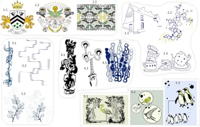
5.7. Summary of artefacts and annotations
our portfolio and a powerful way of drawing together the key contents of Sections 4 and 5 into a single visual summary. In our case, there are four example artefacts:
[image:30.612.123.480.181.428.2]ceramic tableware, mixed media gift cards, fabric souvenirs and the Carolan guitar, each of which is annotated under the four themes of hiding codes in patterns, accommodating material properties, fit to form and function, mapping patterns to digital content, and integration with tools and process.
Figure 22. Visual summary of our annotated portfolio in the style of Gaver (2012)
6. DISCUSSION
6.1. Bridging between human and system interpretation of visual patterns
There is a longstanding understanding in HCI that interacting with invisible sensing systems – including the kinds of vision-based augmented reality that we are dealing with here – can be challenging. As far back as 2002, Bellotti and colleagues articulated five key questions for the designers of invisible sensing systems:
1. When I address a system, how does it know I am addressing it? 2. When I ask a system to do something, how do I know it is attending? 3. When I issue a command, how does the system know what it relates to? 4. How do I know the system understands my command and is correctly
executing my intended action? 5. How do I recover from mistakes?
At first glance, the answers to these questions would appear to concern the design of the interface to the Artcodes app. Considering questions 1 and 2, the user addresses the system by pointing the sensor – camera – at an artefact (or part of an artefact) that they believe may contain a scannable code. They are guided in this by a live camera feed and a message that confirms that the system is currently in the mode of ‘detecting’ codes. Questions 3 and 4 are addressed by popping up a button labelled with the linked content whenever a valid code is detected. Question 5 is dealt with by having back buttons that allow the user to cancel the button and return to the scanning state. However, while the operation of the scanning interface should be clear and transparent, the same need not be true of the patterns themselves. As noted in section 5.4., the legibility or otherwise of a given design, by which we mean the immediately visibility of its embedded codes compared to any surrounding non-interactive elements, is a conscious design choice.
Determining whether and how to make a given pattern immediately legible or more playfully exploratory, while still maintaining an appropriate aesthetic, required our artisans to bridge between two quite different views of the world – the human view and the system view. While computer vision systems, as their name implies, in some sense ‘see’ images through cameras, they do not see them in the same way that humans do. Cameras have their own fields of view, colour images may be reduced to greyscale and then thresholded, contours are detected and matched to topologies and so forth. The challenges of enabling users to see as the computer sees have been previously reported by Morrison et al (2014) following a study of using Kinect depth-sensing cameras to help perform clinical assessment of the movements of patients with Multiple Sclerosis. Our portfolio also reveals how humans – in our case the designers of interactive patterns – need to be able to see as the computer sees.
As obvious starting point was to understand how the Artcodes app interprets images through its implementation of the d-touch topological rules. It ‘sees’ nothing other than these structures and looks for them everywhere. An interesting feature of the app is that these drawing rules are open and comprehensible to designers. Other aspects of how the system sees, however, only came to be appreciated through experience. Appreciating the relationship between camera resolution, fineness of line, and likely viewing distance was important to balancing aesthetics and reliability and tended to emerge through experience. We reported above how artisans discovered the effects of thresholding for themselves and how ultimately this led to additional feedback being implemented in the app. Finally, artisans learned the particular sensitivities of the technology to reflections and shadows. In short, in order to successfully create interactive patterns artisans needed to understand much of the ‘vision pipeline’ through which the system captures and processes images.
image as being something meaningful. This idea is taught as a fundamental aspect of graphic design (Zakia, 2002) and in turn, relies on a series of principles explained through Gestalt psychology. When interpreting images, humans appear to employ principles such as similarity, proximity, grouping, alignment and closure to help separate figure from ground. Our examples of how designers disguise codes within wider patterns reveal how they relied on these same principles. Closure, for example, might lead a human to join up the gaps to form a region where the system would see none (the wing of the middle bird in Figure 13). Similarity and symmetry might lead them to connect up disjoint parts of the image to form a larger whole (e.g., the grey cliff behind the tree on the right of Figure 13) and proximity might lead them to associate disconnected embellishments with a significant structure (e.g., the foliage).
These examples reveal that, not only do designers appreciate how humans and the system interpret images, but that they also learn to manage and even exploit the differences between these two perspectives. On the one hand, these differences can be a source of problems that need to be solved. While the system may be highly sensitive to specular reflections and shadows, humans may be less so, learning to ‘see through’ them to the image beneath (just because part of the image is temporarily obscured by a reflection, we still remember that it is a bird and can fill in the gap). These differences in visual interpretation may make it difficult for untrained people to comprehend why the system appears to fail requiring designers to learn to become more sensitive to them – to see more like the system sees. On the other hand, these differences can be a source of creativity, enabling designers to ‘trick’ humans and disguise codes within patterns.
This line of argument builds on previous work in HCI into interactions with invisible sensing systems in the form of the Expected, Sensed & Desired (ESD) design framework (Benford et al, 2006). This encouraged the designers of sensing-based applications to compare and contrast three distinct perspectives on interaction:
• Expected interactions –movements of an interface that users might
naturally be expected to perform compared to those that might be possible but unusual versus those that are impossible.
• Sensed interactions – movements that can be sensed by the system versus
those that cannot.
• Desired interactions – movements that are desired for a given application
versus those that are not.
The framework invites designers to explore the partial overlaps between these categories so as to reveal potential problems (e.g., naturally expected and desirable interactions that cannot be sensed, or naturally expected interactions that can be sensed but are not desirable) as well as new opportunities (unusual interactions that can be sensed and might lead to surprising though desirable interactions).
any artefacts of common interest. A systematic analysis and comparison of the two then informs Desired Interactions, either revealing problems that need to be resolved or suggesting new design opportunities. Figure 23 shows the resulting revised framework – with the revised name Human-System-Desired (HSD). The top part of the figure summarises the overall approach of systematically analysing and comparing human perception and action with system perception and action in order to reveal both design challenges and opportunities. The bottom-left draws on our findings to illustrate an example of applying the framework to identify an interactional problem while the bottom-right illustrates an example of a identifying a creative opportunity.
[image:33.612.112.501.219.647.2]
Figure 23: The Human-System-Desired Interactions framework
Artcodes app being relatively open to artisans. This brings us to another relevant area of HCI theory, the notion of seamful design that argues for the benefits of revealing and even exploiting the seams (gaps and imperfect joins) in invisible sensing and communications systems. Seamful design originated from experience with sensing systems such as GPS and WiFi, leading to examples of mobile games that employed limited coverage as a resource rather than a problem (Galani, 2004; Barkhuus, 2005). Our findings here reinforce the notion of exposing seams in vision systems, for example the effects of lighting and shadows on vision system (which effectively cause gaps in coverage analogous to GPS canyons) and in places quite literally relates them to the seams in underlying materials such as the stitching in textiles and joins in woods. While the examples above treat these as problems to be solved, the principle of seamful design suggests that we might adopt them as opportunities to be exploited. Might we design interactive patterns that rely on casting shadows in a particular way (like a sundial) or only become interactive under certain lighting conditions?
We saw earlier how our artisans appeared to appreciate the constrained nature of the topological rules, citing this as an inspiration for creativity. This mirrors findings from other creative fields such as music where the imposition of constraints has been seen as a spur to creativity rather than a hindrance. Boden (1990) argues that constraints are a vital source of creativity: “Far from being the antithesis of creativity, constraints on thinking are what make it possible. . . . Constraints map out a territory of structural possibilities which can then be explored, and perhaps transformed to give another one”. Building on Boden’s arguments, Magnusson (2010) notes the common strategy of designing constraints into instruments so as to avoid creative paralysis arising from the “practically infinite expressive scope of the environment” while Gurevich at al (2012) demonstrated how the construction of a highly constrained simple electronic instrument with apparently minimal capabilities led to musicians exploring diverse performance techniques and styles in practice. In a similar vein, we suggest that the’ highly constrained d-touch rules underpinning Artcodes may be an important factor in stimulating creativity and inspiring the wide range of designs and styles are evident in our portfolio.
Not only are these rules constrained, but they also open up a degree of ambiguity in terms of the relationship between visual patterns and underlying topological structures. Our designers positively celebrated the ability to create different designs for the same underlying code, or alternatively to make very similar looking designs map to quite different codes. This mirrors a longstanding discussion in HCI of the role of ambiguity in interaction design, specifically how ambiguity of information, context or relationship can provoke interpretation during interaction (Gaver et al., 2003). Here we report a new form of ambiguous information, an ambiguous relationship between the appearance of an image and underlying codes that are embedded within it, that allow designers to create a range of interpretations.
6.2. Deep embedding, materiality and craft