Introduction to Multivariate Data Analysis and Visualization
By Dmitry Grapov
This is an accompanying text to the introductory workshop in multivariate data analysis and visualization, taught at University of California Davis, August 2012.
Introduction to Multivariate Data Analysis and Visualization by Dmitry Grapov is licensed under a Creative Commons Attribution-NonCommercial-ShareAlike 3.0
1. Introduction... 1
2. The Prevalence of Large Data... 2
3. The Big Picture... 5
4. Correlation and Regression... 7
4.1. What is Correlation?... 7
4.2. Pearson’s, Spearman’s and Kendall’s Coefficients of Correlations... 7
4.3. What is Regression?... 8
4.4. Limitations... 9
4.5. The Correlation Matrix... 12
4.5.1. Heat Map Visualizations of the Correlation Matrix... 13
4.5.2. Scatterplot Matrix Visualizations... 15
4.6. Ordination of Variable Similarities... 17
4.6.1. Hierarchal Cluster Analysis... 18
4.6.2. Non-hierarchal Cluster Analysis... 22
5. Complexity or Dimensionality Reduction... 24
5.1. Principal Components Analysis... 24
5.2. Visualizing the Variance Explained: Screeplots... 26
5.3. Interpreting PCA Results: Scores and Loadings... 27
5.4. Limitations of PCA Results... 32
5.5. Data Pre-treatment... 33
5.5.1. Missing Values... 36
6. Partial Least Squares Projection to Latent Structures (PLS)... 38
6.1. Permutation... 39
6.2. Cross-Validation... 41
6.3. Feature Selection... 44
Index of Figures
Figure 1. A selection of publicly available databases [1]... 3 Figure 2. Example of the biological Atlas proposed by Vidal 2001 [3]. The x, y and z dimensions constitute experimental conditions, biological samples and their differing modes of measurement using various biological tools... 4 Figure 3. Example of an n of one study, integrative personal omics profiling (iPOP) [2]. ... 5 Figure 4. Example of a multivariate data analysis work flow... 6 Figure 5. A) Histograms of two random variables and B) a scatterplot visualizing their relationship... 7 Figure 6. Values for the Pearson’s correlation coefficient for a variety of variable
relationships... 8 Figure 7. Differences between Pearson’s and Spearman’s correlation coefficients... 9 Figure 8. Unlike correlation which only encodes magnitude and direction; regression is used to identify A) the best fit line to the relationship between two variables. Analysis of variance of a linear model B) can be used to test for the significance of the
relationship. In this example the fit of the linear model or the adjusted R2 can be
alternately expressed as the square of the Pearson’s r, correlation coefficient... 10 Figure 9. The maximum information coefficient (MIC) is can be used to detect of A) non-linear associations [5]. Comparison of the Pearson’s correlation coefficient to MIC can be useful tool for detecting novel associations in large data that would otherwise be missed or hidden using only a single tool... 12 Figure 10. Properties of a square symmetric matrix... 13 Figure 11. A heat map visualization of a correlation matrix... 14 Figure 12. Simple scatterplot matrix visualization of bivariate relations among the 4 variables in the Iris data set... 15 Figure 13. Enhanced scatterplot matrix visualization of the Iris data set... 16 Figure 14. Making sense of the correlation matrix... 19 Figure 15. Example of a clustering process using A) the single linkage algorithm and, B) how this relates to the dendrogram visualization, here showing 3 main groups... 20 Figure 16. Dendrogram displaying Iris flowers’ measurements which were hierarchally clustered using Minkowski’s distances between raw values linked by the centroid linkage algorithm... 21 Figure 17. Example of the k-means clustering algorithm’s performance on the species classification of the Iris data set... 23 Figure 18. Principal components are linear combinations of the original variables which maximize the variance of the hyper-dimensional data object. In the case of a 3 variables the first PC will be the linear combination producing the eigenvector parallel with the longest axis in the data cloud... 25 Figure 19. The first two PCs produce the principal plane which explains the maximum amount of the variance in the original data by the PCA transformation. The PCs provide an estimate of the original data determined by the points’ projection onto the plane. The complexity of the data determines how many PCs are necessary
Figure 20. The three main results from principal components analysis: variance
explained, sample scores and variable loadings. Image adapted from [10]... 26 Figure 21. Screeplots of PCA eigenvalues displaying total and cumulative variance explained by each PC. These can be used to determine the number of PCs to retain in the model based on A) the cumulative variance explained or B) contribution to
variance explained by each PC. In A we see that 3 PCs explain 99% of the original variance in the Iris data set, but we may be satisfied with only 92% explained variance and thus choose to retain 1 component. Alternatively in B) we may choose to only retain 2 components because every component beyond the second explains less than 1% of the total variance which doesn’t make a meaningful contribution to the total variance explained... 27 Figure 22. Principal components approximation of the Iris data set using A) 3 and B) 2 components... 28 Figure 23. PCA is often used as an encoding method in Machine-learning tasks
concerned with facial feature recognitions... 30 Figure 24. Sample scores can be outliers due to their A) perceived locations in the principal plane or B) orthogonal distance to the principal plane. Image courtesy of Craig Wheelock... 33 Figure 25. Examples of widely used data pretreatments and their advantages and disadvantages [13]... 34 Figure 26. Visualizing the effects of column (variable) scaling and centering. Scaling can be used to normalize the variable ranges, while centering places the mean at zero. The combined technique of mean centering and scaling by the standard
deviation is called autoscaling... 35 Figure 27.Large differences in variable magnitudes can alter the PCA models
perception of the data complexity. Note the how principal plane in A) is influenced by variables with larger IDs which have larger means and standard deviations... 36 Figure 28. Non-normality can compound the effects of unequal magnitudes in variable ranges. Note that normalization and then autoscaling useful for interpreting the
contribution of variables whose effects were previously masked... 37 Figure 29. Examples of permutation testing used to validate PLS model performance. ... 40 Figure 30. Example of a relationship between in and out of sample error with
increasing model complexity. The goal of well fit predictive model is to generalize well and simultaneously minimize in and out of sample errors of prediction... 41 Figure 31. Probabilistic principal components analysis used to guide the effects of variable transformation on the selection of test and training sets for two classes of samples... 42 Figure 32. Comparison of three main approaches to feature selection [15]... 44 Figure 33. Classification of the major approaches in predictive modeling [16]... 46 Figure 33. The Seven Bridges of (over the river Pregel in the city of) Königsberg problem asks: is there such a path that each section of the city is visited and all
1. Introduction
This is a companion text to the introductory workshop for multivariate data analysis and visualization. Over the course of the next week you will be participating in a
dynamic human-machine-learning experiment. You will be undertaking a journey through the unknown of multivariate data space. To prepare, you will be provided with a data survival pack which contains: nourishing concepts and methods, maps of likely paths through the wilderness, advice from seasoned adventurers and multivariate data analysis survival essentials, Excel, R and imDEV.
As lead instructor, I, Dmitry Grapov, will be your guide on this journey. My duties are to plan our daily treks and help warn you of potential pitfalls I’ve personally encountered. I will help you in your time of need, but the will to go on must come from within you as I do not know your specific destination.
We will learn how to make sense of the night sky, with its multitude of shining stars, by using correlation analysis to coalesce the many disparate shinning points into recognizable patterns and known constellations to help us maintain direction in feature rich surroundings. Along our exploration we will be tempted by many paths promising false shortcuts, but these will not confuse us because we will have learned the principals of unsupervised projection, which we will use to map the direction promising us the most variance of sights along our trek. At other times we may pass through stagnant swamps where stars and road markers lie hidden, blocked by many gnarled data variates. Here we will use our machete of supervised projection to cut a swath of covariance and clear the path to our goals. Along the way we will visit many locations and see many sights, and to keep ourselves from wandering in circles we
will use graph theory to map our progress. Eventually we may find our way to edge of human habitation, there we will look onward to the land of the machines and seek their learning’s to help us move even further into the unknown of the data jungle.
The following sections are a companion text to the lectures and tools you will be exposed to, and learn to apply for your self. For rigorous mathematical
explanations of the techniques discussed herein the reader is directed for further reading in book by Niel H. Timms titled, Applied Multivariate Analysis.
2. The Prevalence of Large Data
Sheer data magnitude, and our ability to generate it, is increasing at an
exponential rate. In many ways this wealth of knowledge is a harbinger of the golden age of biology, but with massive knowledge come massive challenges. In academic settings, proper data management is an integral aspect of grant proposals. In addition to the experimental design, how the data will be stored, depersonalized and the results disseminated for public access need to be considered. More broadly, data storage and access is a major challenge for all informaticians. As of more recently, cloud storage and relational data bases have been instrumental in increasing researcher’s ability to absorb massive amounts of analytical and personal data.
However even the most advanced of these platforms have only diverted the oncoming flood of data from personal hard drives into cloud containers.
Figure 1. A selection of publicly available databases [1].
To fully meet the challenge of large data researchers will need to embrace next generation multivariate data analysis (MDA), visualization and machine-learning tools. No matter the domain, basic understanding of MDA principles and simple
programming skills will greatly benefit researchers by allowing them to customize tools and approaches to fit their needs and thereby increase their productivity, capability and speed to discovery. As data size increases it will be necessary to develop creative methods for data integration so we can meet the challenges of the complex systems analyses.
Not only is the size of the data changing, but so its shape. Classical statistics were developed to deal with long data structures. Long data is comprised on many
statistics (e.g. normality and independence). However, the same is not true for the majority of multivariate data which are wide instead of long. Wide data types are those with few samples, but many measurements. In some extreme cases there could literally be an n of one with hundreds of thousands of measurements [2].
Figure 2. Example of the biological Atlas proposed by Vidal 2001 [3]. The x, y and z dimensions constitute experimental conditions, biological samples and their differing modes of measurement using various biological tools.
Classical statistical methods would balk at the n of one, but as we will see multivariate statistics can be used to make sense of even these unbalanced designs. Not only that, but the n of one studies will likely proliferate in the future with the adoption of personalized medicine.
Figure 3. Example of an n of one study, integrative personal omics profiling (iPOP) [2].
3. The Big Picture
Multivariate data analysis (MDA) involves investigation of many variables simultaneously. MDA techniques are useful in many exploratory or supervised
applications. The strengths of these methods lie in their ability to combine and model many covariates and encode their inherent complexity by fewer and often simpler representations such as clusters, principal components or latent variables. These approaches can allow faster, deeper and clearer understanding of the original data trends.
The power of MDA is also one of its weaknesses. The problem lies partly in the difficulty of visualizing complex multivariate data and instead relying on complex algorithms to finds solutions which may be difficult to interpret or validate. In some cases the sheer magnitude of the data may hamper exploratory data analyses such
as outlier detection, transformation or scaling, which would otherwise greatly improve the performance multivariate approach.
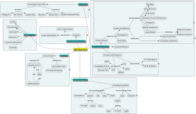
This manual will briefly introduce and discuss common multivariate techniques useful for processing and interpreting large data. The main topics covered will include concepts in: 1) correlation analysis, 2) projection pursuits 3) predictive modeling and 4) networks. These methodologies are widely utilized and have gained popularity among researchers partly due to their ease of implementation, interpretation and interface to multidimensional visualization. Herein, examples of these techniques applied to various types of data will be used to discuss their strengths and weakness and help develop a flexible workflow for dealing with large data (see Example in Figure 4).
4. Correlation and Regression 4.1. What is Correlation?
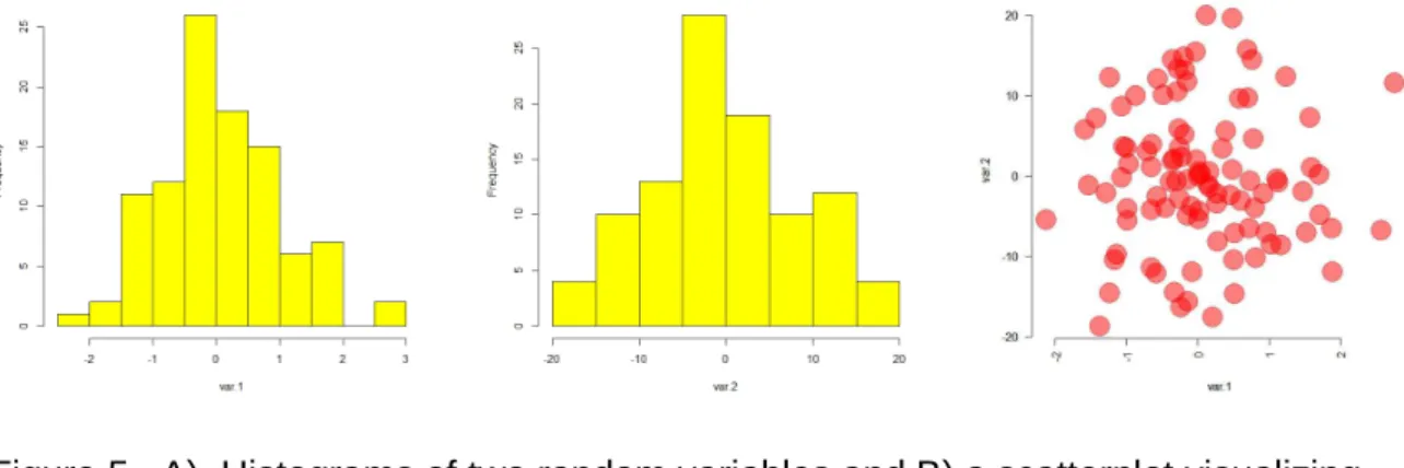
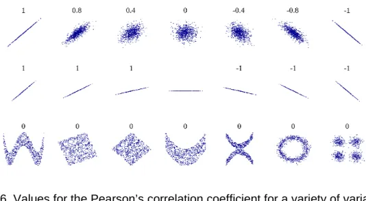
This section will briefly introduce the concept of correlation which is a fundamental property of multivariate analysis. Bivariate correlation is a measure of the association or similarity in change between two variables. This property can be best visualized by a scatterplot (Figure 5 C). The correlation coefficient is the covariance between two variables, scaled between -1 and 1, and expresses the strength and direction of the relationship. Magnitude refers to the strength of relationship with regards to following linearity or monotonocity, while the sign of the coefficient expresses the direction of relationship (Figure 6). Large positive or negative correlation coefficients represent strong positive or negative (i.e inverse) relationships between two variables.
4.2. Pearson’s, Spearman’s and Kendall’s Coefficients of Correlations
There are three widely used measures of correlation, the parametric Pearson’s r, and the non-parametric Spearman’s rho and Kendall’s tau. Pearson’s r can be
A) Histograms of two random variables B) Scatterplot
Figure 5. A) Histograms of two random variables and B) a scatterplot visualizing their relationship.
alternatively expressed as the square root of the coefficient of determination or R2 for linear models or regressions. Spearman’s and Kendall’s methods measure the
similarity of the orderings of the data when ranked by their values.
Figure 6. Values for the Pearson’s correlation coefficient for a variety of variable relationships.
Image Source: http://en.wikipedia.org/wiki/Pearson_product-moment_correlation_coefficient
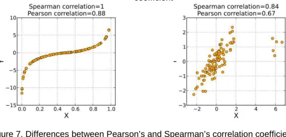
The Pearson’s r is a widely used measure of correlation which is sensitive to outliers and weakly detects monotonic variable associations (Figure 7).
4.3. What is Regression?
Regression or the linear model is concept closely related to correlation. However, regression goes beyond describing the strength and direction of the associative relationship to identify the least squares or “best fit line” (Figure 8).
For the case displayed in Figure 8, the equation for the best fit line to the two variables relationship is expressed in slope intercept form, and can be used to predict one variables value given the others. The difference in the predicted or fitted value and the variables actual value is the residual error. Minimization of residual error in
the form of residual sum of squares (RSS) or the root mean squared error of prediction (RMSEP) are widely used objective function for identifying linear model best fit lines.
4.4. Limitations
A strong correlation or linear dependence between two variables does not necessarily imply causation. For instance metabolites which are at biological
equilibrium typically display positive correlation, but these species concentrations are not directly influenced by one another’s changes. Correlations may also arise
spuriously due to random effects which can lead to false conclusions.
Multiple linear regression is an extension of the bivariate linear model, wherein many independent variables (X’s) are used to model a single dependent variable (Y). The effectiveness of this approach is highly sensitive to correlations or multicollinearity among the independent variables. Multicollinearity inflates the error or standard
A) Monotonic relationship B) The effects of outliers on the correlation
coefficient
Figure 7. Differences between Pearson’s and Spearman’s correlation coefficients. Image source: http://en.wikipedia.org/wiki/Spearman%27s_rho
deviation in the model weights (i.e slope). This can lead to unstable predictive models of limited utility for ranking or interpreting individual variable contributions to the
observed linear relationship. Another pitfall is over parameterization or overfitting. This leads to poor model performance on future samples because the predictive model was fit to random noise in original data.
The following sections will highlight how these limitations can be minimized or avoided through the application appropriate multivariate techniques. For an in-depth discussion of the linear model and its extensions to multivariate hypothesis testing the reader is directed to Applied Multivariate Analysis, section 3.6, The General Linear Model, for further reading [4].
A) Best fit line between Variable 1 and 2
B) Statistics associated with a regression analysis
Figure 8. Unlike correlation which only encodes magnitude and direction; regression is used to identify A) the best fit line to the relationship between two variables. Analysis of variance of a linear model B) can be used to test for the significance of the
relationship. In this example the fit of the linear model or the adjusted R2 can be alternately expressed as the square of the Pearson’s r, correlation coefficient.
It is important to note that the correlations and regressions we have discussed up to now are only useful for describing linear relationships. We can imagine that
complex data sets will contain many non-linear (e.g. exponential, sinusoidal, bi-linear), and yet meaningful relationships that will be missed using the conventional measures of variable association. A workaround for this issue, not involving actual inspection of all bivariate scatterplots is to apply novel measures of correlation, which are not dependent on the assumptions of linearity. The maximum information coefficient (MIC) [5] is a recent advancement of the concept of correlation, which is capable of quantifying many non-linear relationships between variables.
B)
Figure 9. The maximum information coefficient (MIC) is can be used to detect of A) non-linear associations [5]. Comparison of the Pearson’s correlation coefficient to MIC can be useful tool for detecting novel associations in large data that would otherwise be missed or hidden using only a single tool.
4.5. The Correlation Matrix
The correlation matrix is a fundamental unit of many MDA methods. It is a square matrix comprised of all the possible correlations between variables. For row or column correlations the matrix will have dimensions of n x n or m x m (where n= number or samples and m = the number of variables, given that the data is arranged with samples as rows and variables as columns). The row and column identities of this matrix are simply the original variable names. To get the correlation coefficient
between any two variables is simply a matter of identifying the column for one variable and row for another, and then finding their intersection (Figure 10). For instance the intersection the first column and first row is the correlation of the first variable to itself, which is equal to 1. Similarly, the diagonal of the correlation matrix (left to right) will contain all 1’s, as theses are the correlations of the remaining variables to themselves.
If we split the correlation matrix along the diagonal we are left with two triangles, upper and lower.
Figure 10. Properties of a square symmetric matrix
The upper and lower triangles are mirror images of one another. Another way of saying this is that the upper contains the correlation of variable 1 to variable 2, while the lower will contain the correlation of variable 2 to variable 1. This is the feature makes the matrix symmetric. Note the indexing scheme shown in Figure 10, in each cell the first number refers to row number and the second to column. This is the same convention used for indexing non-vector objects in the R statistical programming language.
4.5.1. Heat Map Visualizations of the Correlation Matrix
A relatively simple and yet highly informative multivariate visualization is the heat map visualization of the correlation matrix. A heat map is produced when the values of the correlation matrix are encoded as colors. This is done by choosing two pure colors (e.g blue and orange) to represent the minimum and maximum values of the matrix, and then the rest of the values are assigned to some interpolated color transition between the two starting colors (Figure 11).
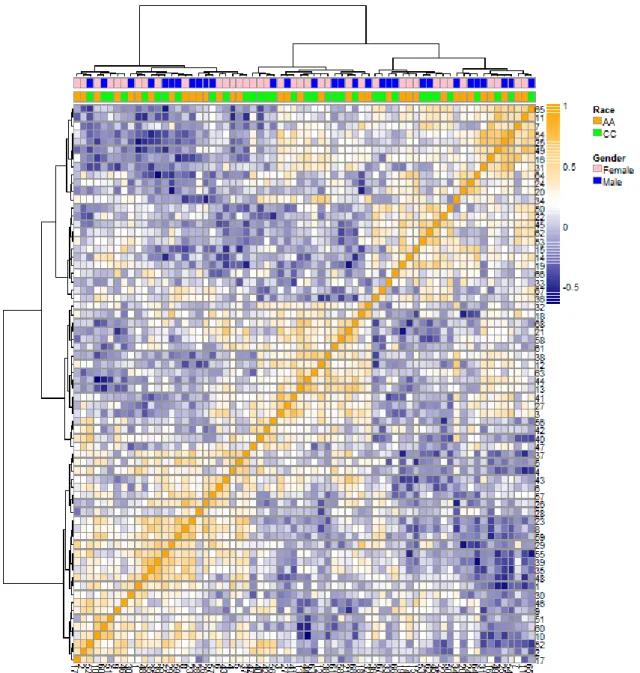
Figure 11. A heat map visualization of a correlation matrix.
The direction and magnitude of the Spearman’s correlation coefficient was encoded using orange and blue colors. The correlation was ordered using hierarchal cluster analysis carried on row-wise (sample) correlations. The top of the heat map is
annotated to display study participants race and gender. This visualization can be used to rapidly look for patterns of similarity which through annotation is guided by the
4.5.2. Scatterplot Matrix Visualizations
Scatterplot matrix (SPLOM) visualizations are generated from many individual plots that are arranged according to the properties of a square symmetric matrix. Simple SPLOMS are useful for simultaneously visualizing multiple bivariate relationships (Figure 12). The different pieces of information and their graphs are placed in the three regions of the SPLOM (diagonal, upper and lower triangles).
Figure 12. Simple scatterplot matrix visualization of bivariate relations among the 4 variables in the Iris data set.
SPLOMs take advantage of the symmetric properties of the square matrix to
simultaneously display many dimensions of bivariate relationships (e.g. correlations, Figure 13. Enhanced scatterplot matrix visualization of the Iris data set.
Diagonal: Histograms for the 4 variables in the Iris data set (sepal length, sepal width, petal length and petal width)
Lower triangle:
Column 1) displays box and wiskers plots (box plots) for each of the three Iris species (I.setosa, red; I.verginica, green; I.versicolor, blue)
Columns 2-3) scatterplots for each 4 variables bivariate relationships with the confidence interval for best-fit-line in gray.
Upper triangle:
Row 1) strip chart for each of the 4 variables colored by species color
Rows 2-4) the coefficients of correlation for the 4 variables (sepal length & width, petal length& width) colored by their sign and magnitude .
best-fit-line properties). These objects are further enhanced by the inclusion of univariate graphs used for comparing the levels within a discreet variable (e.g. boxplots, stripcharts, and barcode plots). For example, in Figure 13, box plot
visualizations for each of the four variables and the threes Iris species are combined with the bivariate scatterplots displaying the confidence intervals for the linear model best-fit-lines for all of the bivariate relationships. This combination can be used to visually determine the effects of the species covariate on the relationship between sepal length and width. This information would be integral to constructing an species independent model for petal and sepal characteristics given the other Iris data variates.
Due to the limitations of finite white space of the plotting device, readable SPLOMs typically contain < 10 variables. Generating multiple SPLOMs can increase the
number of variables visualized, but this strategy is eventually limited by the finite space of the viewing screen. An alternative to not display variables, but instead their surrogate objects which simultaneously encode information about the entire variable set (e.g. PCA principal components, PLS latent variables). For example, a principal components approximation of the Iris data trends (Figure 22) can be used to represent the relevant in formation in Figure 12 in 1-2 graphs. Importantly, this approach can be scaled to visualize 10-10,000 variables with relative ease.
4.6. Ordination of Variable Similarities
One way to further reduce the complexity of the correlation matrix and its
ordering the outer dimensions (rows and columns) of the correlation matrix. We can think of this as similar to a rubik’s cube, wherein changing the positions of whole rows or columns can achieve internal structure of the individual cells. This ordination can be achieved using hierarchal cluster analysis. Its worth to note that, the process of
ordination can be used to enhance all other visualizations using the square symmetric matrix layout.
4.6.1. Hierarchal Cluster Analysis
Hierarchal cluster analysis (HCA) [6] is an unsupervised method for identifying groups of related samples or variables. The goal of HCA is to partition the full data into smaller units of increased similarity [7]. HCA can be carried on the data values or its column and or row wise correlations. HCA of column-wise or row-wise
correlations can be used to identify patterns of similarity among variables or samples, respectively.
B) Example of hierarchal cluster analysis used to organize the correlation matrix
Figure 14. Making sense of the correlation matrix.
In this visualization significant positive (orange), negative (blue) and non-significant (white) Spearman’s correlations are visualized as heat map to analyze column-wise (variable) group structure.
For this approach to yield useful information measurements for related samples should be more similar to each other than to those of unrelated samples. Performing HCA involves the organization of a proximity matrix, calculated based on similarities or dissimilarities of data values or correlations into sequential clusters. A
dendrogarm is created by joining clusters based on their proximity matrix using various linkage or agglomerative algorithm. This approach performs well when related samples have smaller distances between them than unrelated samples resulting in homogenous and thus easily interpretable clusters (see Figure 15 for example). Widely used measures of dissimilarity or distance include: Euclidean, Minkowski,maximum, manhattan, canberra and binary algorithms. Cluster linkage is often calculated using the Ward, Mcquitty, single, complete, average, median and centroid linkage or agglomerative algorithms.
A) Step-by-step construction of clusters by the single linkage algorithm
B) Relationship between a cluster and dendrogram
Figure 15. Example of a clustering process using A) the single linkage algorithm and, B) how this relates to the dendrogram visualization, here showing 3 main groups. Image source: adapted from James Hardy, The University of Akron.
For instance HCA achieves clear clusters when applied to Iris Data values linked using, Wards linkage of Minkowski’s distances (Figure 16).
This visualization displays both the individual sample values and the overall group structure of the data determined in an unsupervised manner. By comparing the known Iris species identities (annotated at the top of the heat map) to the
determined clusters it is evident that the species measurements are all on the same scale and there are no any obvious outliers. The species I.setosa has a well defined group structure which is easily resolved from the two more closely related,
I.verginica and I.versicolor, species. Moreover, it is evident that the relationship
between petal length and width is the best discriminant to individually classify all Figure 16. Dendrogram displaying Iris flowers’ measurements which were
hierarchally clustered using Minkowski’s distances between raw values linked by the centroid linkage algorithm.
three species. For further reading, the reader is directed to Applied Multivariate Analysis, section 9.3, Cluster Analysis [4].
4.6.2. Non-hierarchal Cluster Analysis
HCA and non-hierarchal cluster analysis (nHCA) are complimentary methods. Wherein, HCA can be used in an unsupervised manner to identify potential groups and then nHCA used to refine the sample class assignments among them. A popular nHCA method is k-means clustering. K-means is carried out by initializing k cluster centroids or seeds, by logic or at random. This is followed by assignment of samples to nearby centroids. This is repeated until all samples have been assigned to
clusters or changes in cluster membership remain small between iterations of the algorithm. See example in Figure 17 for k-means applied to the Iris data set.
A) B
Figure 17. Example of the k-means clustering algorithm’s performance on the species classification of the Iris data set.
Other related techniques which maybe of interest to the reader include: k-nearest neighbor, Hybrid Hierarchical Clustering, Expectation Maximization (EM),
Bayesian Hierarchical Clustering, Density-Based Clustering, K-Cores, Fuzzy Clustering - Fuzzy C-means, RockCluster, Biclust, Partitioning Around Medoids
(PAM), CLUES, Self-Organizing Maps (SOM), Proximus, and CLARA (see detailed examples in Data Mining Algorithms In R [8]).
We will be covering additional types of clustering using projection pursuits, including multidimensional scaling, in the sections below. The interested reader is directed to Section 9.6 [4] for more details.
5. Complexity or Dimensionality Reduction
The complexity of multivariate data sets can be characterized by their variable number, but as we will see this may be a deceiving measure of the true complexity or dimensionality of the data set. Dimensionality refers to the number of unique pieces of information. We can think of it as the property of both samples and variables, which are combined in abstract ways to form patterns, clusters and trends.
5.1. Principal Components Analysis
Principal components analysis (PCA) [9] is a powerful method for non-supervised dimensionality reduction. The goal of PCA is to calculate principal components (PCs) which are uncorrelated representations of the original variables, and are organized by their explanation of the variance in the original data. While there are a variety of algorithms for calculating PCs, they all share the same goal: take a set of correlated or uncorrelated variables and transform them to a smaller set of PCs which are ordered by their contribution to the explanation of the variance in the original data (see Section 8 [4] for more details).
Figure 18. Principal components are linear combinations of the original variables which maximize the variance of the hyper-dimensional data object. In the case of a 3 variables the first PC will be the linear combination producing the eigenvector parallel with the longest axis in the data cloud.
Given a hypothetical data set comprised of three variables, the first PCs would
correspond to the variable combination which produces an eigenvector parallel to the longest axis of the three dimensional data cloud (Figure 18).
Figure 19. The first two PCs produce the principal plane which explains the maximum amount of the variance in the original data by the PCA transformation. The PCs provide an estimate of the original data determined by the points’ projection onto the plane. The complexity of the data determines how many PCs are necessary
We can think of PCs as encodings of the original data points onto new coordinate systems. The plane produced by the first two PCs is also called the principal plane (Figure 19).
The output of a PCA produces three main results for each PC: 1) variance explained or eigenvalue 2) sample scores and 3) variable loadings.
5.2. Visualizing the Variance Explained: Screeplots
A useful first step in the analysis of PCA results is an overview of the explained variance by each PC which can represented in the form of a screeplot (Figure 21). Screeplots are useful for identifying the total number of components to retain the PCA model and give an estimate of data’s dimensionality.
Figure 20. The three main results from principal components analysis: variance explained, sample scores and variable loadings. Image adapted from [10]
Scores
Explained
Loadings
variance
n x PC n = # samples m = # variables PC = # principal components PC x PC m x PCOriginal Data
5.3. Interpreting PCA Results: Scores and Loadings
The interpretation of PCA scores and loadings is a little tricky at first, but its ability to simultaneously relate variances in variables to sample similarities is well worth the effort. For instance take the simple case 4 variable Iris data set. The PCA results for the first three dimensions are presented in the form of a scatterplot matrix (Figure 22 A).
A) B)
Figure 21. Screeplots of PCA eigenvalues displaying total and cumulative variance explained by each PC. These can be used to determine the number of PCs to retain in the model based on A) the cumulative variance explained or B) contribution to variance explained by each PC. In A we see that 3 PCs explain 99% of the original variance in the Iris data set, but we may be satisfied with only 92% explained
variance and thus choose to retain 1 component. Alternatively in B) we may choose to only retain 2 components because every component beyond the second explains less than 1% of the total variance which doesn’t make a meaningful contribution to the total variance explained.
A) The first 3 principal components of the Iris data
B) The scores and loadings bi-plot for the first two PCA dimensions
Figure 22. Principal components approximation of the Iris data set using A) 3 and B) 2 components.
Sepal.Length Sepal.Width
Petal.Length Petal.Width
Herein the variance explained by each PC is plotted on the diagonal as a percent of the total variance explained by the PCA model. The three possible scatterplots for each of the PC bivariate relationships for the model scores and loadings are plotted in the lower and upper triangles respectively. Inspecting the diagonal we see that 2 PCs are enough to capture 97% of the information in the data, which suggest that we do not need any more PCs in the model and could even use just 1 PCs if we were satisfied with 92% variance explained. A rule of thumb for retaining PCs is to accept some cut off for variance explained, or to not include PCs which explain some low percent of the variables like <1%. However, the variance explained does not
necessarily have to be related to the hypotheses in the insignificant PCs may actually be useful.
The scores and loadings bi-plot (Figure 22 B) display the PCA reconstructed sample space or scores and how the variables are linearly combined or their loadings (weighted by the eigenvalues) are used to achieve the scores for the first two PCs. The scores are annotated by point or glyph color and similarly colored polygons are drawn around the three Iris species. The variable loadings are represented by the gray network. In order to interpret this plot we need to relate the position of the sample scores to the position of the variable loadings, which is facilitated by the overlaid bi-plot, but we will see later that with larger data it is often easier to view the scores and loadings separately as shown in Figure 22 A. Inspecting the scores we see a familiar pattern, I.setosa is a clearly resolved from the two more closely related I.versicolor and I.verginica species. Looking at the individual points can helps us identify within species outliers.
A) original image A) principal component
Figure 23. PCA is often used as an encoding method in Machine-learning tasks concerned with facial feature recognitions.
Image source:
http://jeremykun.wordpress.com/2011/07/27/eigenfaces/
To interpret the loadings we need relate their positions to the sample scores. For instance, sample scores which are in the same positions of the plot as a given
variable’s loading will have a higher value for this variable than a sample which farther away. For example, we see that the petal length has the largest loading of all
variables on the first PC (it is right most point in the loadings plot), looking at the scores we see that the I. verginica (green) has the right most position of all the groups and is closest to the loading for petal length. Based on this observation, we know that that this species will have the longest petals. Alternatively, I. setosa is the farthest group from the loading for petal length, but closest to sepal width. This informs us that while I. setosa will have shortest petals; it will also have the longest sepals. This is confirmed in Figure 13, which is also useful for identifying that petal length is weakly inversely correlated with sepal width. Lastly, looking at the loadings for the last two
variables, petal width and sepal length, we see that their relative positions are orthogonal or (perpendicular) to the axis of the separation between species or intra-group scores separation, but parallel to the within species or inter-intra-group separation. This informs us that these variables will display relatively low intra-species and high inter-specie variation.
One aspect to consider is that to fully investigate the complexity of the original data we need to investigate all of the principal components we used to encoded the data. However unlike the initial variables, the calculated PCs by virtue of the algorithm, are uncorrelated and thus each provide some measure of non-redundant information. This quality of PCA, can be used to avoid multicollinearity in simple regressions by
replacing variables with uncorrelated PCs. However this technique suffers in difficulty of interpretation due to the need interpret a linear combination of PCs which are already linear combinations of variables.
It is also worth noting that PCA is but one of many methods for matrix factorization. The goal of PCA is to decompose the original variable set into new components which maximize variance. Alternative non-supervised techniques such as independent components analysis (ICA) [11] can be used to extract statistically independent components. This is useful for identifying systematic modes of variance such as analytically derived or machine error. Another variant which we will discuss in detail below is the supervised method of partial least squares (PLS) [12]. Instead of PCs, PLS seeks to calculate latent variables (LVs) which are projections of the data which are also correlated with some object of interest, like for instance class labels.
5.4. Limitations of PCA Results
Like the majority of statistical or mathematical approaches, the utility of PCA suffers with decreasing sample size. In cases of small sample size and many variables with high variability, PCA may only be useful for identifying interesting modes of variance in pure noise. However this is the reality of the data, and the true limitation of PCA would be the ease of misinterpreting the strength of its results. We will discuss this issue further in the section on predictive modeling. Other aspects related to the calculations used in the projection method or matrix factorization (read more in Section 8 [4] ) may lead to unstable PCA interpretations. Sample outliers may either cause unfavorable projections (Figure 24 A) or destabilize the interpretation of the scores and loadings. The prior is far easier to spot than the later. For instance some samples my not look like outliers within in the principal plane, but may be far from the group in an orthogonal direction (Figure 24 B, this distance is sometimes referred to as DmodX). This is to say that their scores would fall nicely into the cluster of other scores, but they would not share the greater trends present with in the group. A)
B)
Figure 24. Sample scores can be outliers due to their A) perceived locations in the principal plane or B) orthogonal distance to the principal plane. Image courtesy of Craig Wheelock.
5.5. Data Pre-treatment
By definition data pretreatment is a processing such as scaling, centering or transformation carried out on the data to make it more amenable to following analyses. However, when to apply, what to do and how this effects the data is far easier to determine having learned the concepts of PCA.
Pretreatment are used to minimize the effects of differing variable distributions, magnitudes and means on the analysis results (Figure 25).
Centering is used adjust the centers of variable distributions (i.e. means) to zero. This eliminates the offset between in means based on differences in variable ranges and makes all changes relative to zero. Centering can be used in combination with other techniques such as scaling (Figure 26).
Figure 25. Examples of widely used data pretreatments and their advantages and disadvantages [13].
Scaling involves the division of variable values by a scaling factors, which is typically specific to each variable specific. Scaling is used to equalize fold change differences between variables by scaling their magnitudes relative to some variable specific factor such as the standard deviation (unit variance) or square root of the standard deviation (pareto scaling). While scaling is useful for eliminating the effects of variable magnitudes on their importance in analyses results, this can lead to inflation of error for low magnitude values.
Normalization is the transformation of variable distributions to normality or normal distributions. The logarithm, exponential and power transformations are used to compress variable distributions from tailing or skewed to those more closely matching the normal distribution. This can improve the interpretation of group means and their symmetry in projection methods. The three techniques are often used in combination. Figure 26. Visualizing the effects of column (variable) scaling and centering. Scaling can be used to normalize the variable ranges, while centering places the mean at zero. The combined technique of mean centering and scaling by the standard deviation is called autoscaling.
A) raw normally distributed data
B) normally distributed data scaled to unit variance and centered
Figure 27.Large differences in variable magnitudes can alter the PCA models
perception of the data complexity. Note the how principal plane in A) is influenced by variables with larger IDs which have larger means and standard deviations.
5.5.1. Missing Values
Missing values are present in the majority of data sets. There are a variety of univariate and multivariate methods for their imputation. Which technique should be used will often depend on the reason for why the value is missing. Herein we will only consider methods for imputing non-systematic missing values or those due to random experimental or analytical error.
A) raw non-normally distributed data
B) normalized, scaled and centered data
Figure 28. Non-normality can compound the effects of unequal magnitudes in variable ranges. Note that normalization and then autoscaling useful for interpreting the contribution of variables whose effects were previously masked.
Popular methods for imputation include single value substitution, or deterministic imputation. Variables missing due to lack of observation because their valued fall below some instrumental detection limit are often imputed as 2/3 the minimum
observed value for the variable. Deterministic imputation is achieved by predicting the missing values based on relationships between known variables. This can be done by predicting missing values based on a regression relationship or on a multivariate level on a PCA model. Whatever the chosen technique the imputation method should never
cause trends in the data, but merely provide a place holder to allow analyses which would otherwise be prevented by missing values.
6. Partial Least Squares Projection to Latent Structures (PLS)
Multivariate predictive modeling can be used to reduce data complexity through the segregation of informative from non-informative data dimensions and variables. This can be achieved by fitting, validating and optimizing partial least squares
regression (PLS) and classification models (PLS-DA). As previously mentioned, PLS is a special case of PCA wherein linear combinations of variables, latent variables (LVs), are calculated to simultaneously maximize the variance in the independent variables (X’s) and their covariance with the dependent variables (Y’s). PLS can calculated using a variety of algorithms: NIPALS, SIMPLS, and kernel methods, each of which have their own computational strengths and weaknesses. The results and their interpretation of sample and variable scores and loadings are same as discussed for PCA. Additional information includes: the projections explained variance in Y (R2Y) and X (R2X), fit of encoded X on Y (Q2), and variable coefficient weights which are summarized variable contributions given all calculated LVs. The model’s predictive performance can be calculated as the root mean squared error (RMSEP) calculated, which are calculated from the residuals of the model fit to the test data (more on this below). PLS-DA is a special case of PLS where the Ys are sample classes. PLS-DA can be interpreted in a manner similar to other classification models using Receiver Operator Characteristic Curve (ROC) to summarize performance.
Table 1. Example of PLS-DA model diagnostic statistics.
OPLS-DA Models Variables LVb R2Xc R2Yd Q2e AUROCf
Model 15 1(2) 0.52 ± 0.1 0.71 ± 0.01 0.61 ± 0.1 0.97
a- Reported model statistics showing the mean ± SD for three training and testing iterations b- Number of predictive and (total) latent variables
c- Variance in parameters explained by model d- Variance in class assignment explained by model e- Discriminatory capability (fit) of the model
f- Area under the receiver operator characteristic curve for model based predictions
6.1. Permutation
The PLS methods’ ability to focus on the plane of separation even in randomly generated data is often used to criticize this technique. However this criticism is not valid given proper model validation. The first level of validation is done by comparing the generated model’s performance for prediction of Y to its prediction of a randomly permuted (reordered) Y. This it process is called permutation testing. The idea is that we should not interpret the models performance in a vacuum given only its statistics, but instead compare them to a special randomized case of itself. The permutations can be repeated many times to produce a distribution of permuted model statistics. A similar distribution can be produced for the model of interest using a permutation of testing and training assignments, which are discussed in detail below. We can then use simple univariate statistics to compare the two distributions and validate that the found fit has some low probability to be observed by random (Figure 29).
6.2. Cross-Validation
Model validation is the process used to estimate model performance for future samples. There are two major types PLS model cross-validation (CV), internal and external.
Internal cross-validation is a technique used during PLS model construction to calculate performance statistics in a non-biased manner. Common internal CV methods include fold and leave-one-out. fold involves splitting the data into k-subsets, iteratively holding out one subset, fitting the model to the remaining k-subsets, and then calculating the model performance on the hold out set. Leave-one-out is an extreme case of k-folds where k = the number of samples in the data. Internal CV is used to simulate the model performance on future samples.
The goal of predictive modeling is model optimization for the prediction of future sample properties. The difference in model predictions (fitted values) and actual values is the residual error. The residual error for the prediction of samples not used Figure 30. Example of a relationship between in and out of sample error with
increasing model complexity. The goal of well fit predictive model is to generalize well and simultaneously minimize in and out of sample errors of prediction.
A B
C D
Figure 31. Probabilistic principal components analysis used to guide the effects of variable transformation on the selection of test and training sets for two classes of samples.
A) non-transformed (raw) sample scores, B) raw variable loadings, C) transformed sample scores and D) variable loadings. Scores are annotated to display the two classes and loadings by the variable p-values for a one-way analysis of variance for the class label.
to fit the model is the out of sample error. Ideally out of sample error is estimated using multiple experiments, wherein a predictive model is developed using one set of experimental data and then validated by predicting a metric of interest for a follow up experiment. A predictive model is expected to display higher out of sample than in sample error (Figure 30). This is because the in sample error is calculated form the data used to fit the model.
The goal of external model CV is to use the techniques of model training and testing to develop a model which both displays low in and most importantly low out of sample error. This is often accomplished by splitting the data into (2/3) training and (1/3) test sets, using the training set to develop and optimize a model which is then used to predict the values in the hold out set. Selection of the test set is very important and can greatly influence the perception of the final models performance. The DUPLEX method [14] is often used to identify training and test samples such that the test set lies inside the variance cloud of the training samples among all principal component (Figure 31). Given data outliers, which can not be explained or excluded, their inclusion in the training set would lead to higher than average model in sample error but lower out of sample error. Alternatively their inclusion in the test set would produce the opposite (low in sample and high out of sample error). If theses outliers are believed to be truly representative of the population at large they should probably be included in the training data; otherwise, some kind of compromise can be made by splitting the outliers between both training and test sets.
6.3. Feature Selection
Feature selection is the process of ranking variables based on their performance in predictive task. This is used to reduce the complexity of the full variable or feature set to only the highest ranked parameters or those best satisfying the conditions of the predictive model. We can think of univariate tests such as multiple hypotheses testing for difference in class means given many variables as feature selection.
Variable means are labeled significantly or non-significantly different based on some test cutoff criteria (e.g. p-value). This is then typically followed by the exclusion of non-significant results from further interpretation. This is a type of feature selection; however, we do not know the rank among selected features as the concept of “more significant” does not exist. Alternatively the p-value can be used as a filter in a recursive feature selection routine, to optimize a multivariate predictive model. There are three main types of feature selection approaches: filter, wrapper or model embedded [15]. Each one has its strengths and weaknesses (Figure 32). Filter methods are fast, but produce suboptimal models and don’t fully investigate the full feature space. Wrapper methods are intuitively simple, but slow and prone to overfitting. Embedded or penalized feature selection approaches are appealing for their resistance to overfitting and relative speed, however these techniques are often difficult to implement. We can grossly classify the majority of feature ranking methods into the aforementioned subcategories (Figure 33).
If feature selection is carried out, it should be validated using model training and testing procedures described above. Otherwise this method is an excellent way to produce overfit models or those with low in sample but high out of sample errors
Figure 33. Classification of the major approaches in predictive modeling [16].
7. Networks
Networks are used to represent relationships. They are widely used in many scientific applications, for example to represent: evolutionary relationships, metabolic pathways, molecular interactions and mathematical abstractions. Graph theory is the formalization of mathematical concepts which are used to describe and enumerate the properties of networks (also called graphs). Using graph theory, variables are
represented by nodes or vertices and their relationships by connecting lines or edges. The framework for the concept of graph theory was famously formulated by
Figure 34. The Seven Bridges of (over the river Pregel in the city of) Königsberg
problem asks: is there such a path that each section of the city is visited and all bridges are crossed only once?
Image source: http://en.wikipedia.org/wiki/Seven_Bridges_of_K%C3%B6nigsberg
The framework laid by Euler has been since extended and can be used to
represent and analyze most any scientific or mathematical concept. However the logic behind the vertex placement and formation of edges needs to have a mathematical basis to make them useful beyond purposes of data visualization.
References 1. Marcotte E, Date S (2001) Exploiting big biology: integrating large-scale biological data for
function inference. Brief Bioinform 2: 363-374.
2. Chen R, Mias GI, Li-Pook-Than J, Jiang L, Lam HY, et al. (2012) Personal omics profiling reveals dynamic molecular and medical phenotypes. Cell 148: 1293-1307. 3. Vidal M (2001) A biological atlas of functional maps. Cell 104: 333-339.
4. Timm NH (2002 ) Applied Multivariate Analysis. New York: Springer-Verlag. 693 p.
5. Reshef DN, Reshef YA, Finucane HK, Grossman SR, McVean G, et al. (2011) Detecting novel associations in large data sets. Science 334: 1518-1524.
6. Anderberg MR (1973) Cluster Analysis for Applications. New York: Academic Press. 7. Murtagh F (1985) Multidimensional Clustering Algorithms. Wuerzburg: Physica-Verlag
COMPSTAT Lectures.
8. WikiBooks (2010) Data Mining Algorithms In R.
9. Wold H, editor (1966) Estimation of principal components and related models by iterative least squares. New York: Academic Press. 391-420 p.
10. Wall ME, Rechtsteiner A, Rocha LM Singular value decomposition and principal
component analysis. A Practical Approach to Microarray Data Analysis. MA: Kluwer: Norwell. pp. 91-109.
11. Marchini J, L., Heaton C, Ripley B, D. R package version 1.1-13., http://CRAN.R-project.org/package=fastIC (2010) fastICA: FastICA Algorithms to perform ICA and Projection Pursuit.: R package version 1.1-13.
http://CRAN.R-project.org/package=fastICA
12. Wold S, Sjostrom M, Eriksson L (2001) PLS-regression: a basic tool of chemometrics. Chemometrics and Intelligent Laboratory Systems 58: 109-130.
13. van den Berg RA, Hoefsloot HC, Westerhuis JA, Smilde AK, van der Werf MJ (2006)
Centering, scaling, and transformations: improving the biological information content of metabolomics data. BMC Genomics 7: 142.
14. Kennard RW, Stone LA (1969) Computer aided design of experiments. Technometrics 11: 137-148.
15. Saeys Y, Inza I, Larranaga P (2007) A review of feature selection techniques in bioinformatics. Bioinformatics 23: 2507-2517.
16. Ma S, Huang J (2008) Penalized feature selection and classification in bioinformatics. Brief Bioinform 9: 392-403.
![Figure 1. A selection of publicly available databases [1].](https://thumb-us.123doks.com/thumbv2/123dok_us/902494.2616250/8.892.127.803.162.547/figure-selection-publicly-available-databases.webp)
![Figure 2. Example of the biological Atlas proposed by Vidal 2001 [3]. The x, y and z dimensions constitute experimental conditions, biological samples and their differing modes of measurement using various biological tools](https://thumb-us.123doks.com/thumbv2/123dok_us/902494.2616250/9.892.218.706.324.689/biological-dimensions-constitute-experimental-conditions-biological-measurement-biological.webp)
![Figure 3. Example of an n of one study, integrative personal omics profiling (iPOP) [2]](https://thumb-us.123doks.com/thumbv2/123dok_us/902494.2616250/10.892.291.642.152.507/figure-example-study-integrative-personal-omics-profiling-ipop.webp)
![Figure 9. The maximum information coefficient (MIC) is can be used to detect of A) non-linear associations [5]](https://thumb-us.123doks.com/thumbv2/123dok_us/902494.2616250/17.892.136.763.181.459/figure-maximum-information-coefficient-mic-detect-linear-associations.webp)