University of Stuttgart Universitätsstraße 38
D–70569 Stuttgart
Master Thesis No. 10250005
Visual Correlation Analytics of
Event-based Error Reports for
Advanced Manufacturing
Iqbal NazirCourse of Study: M.Sc. in Information Technology
Examiner: Prof. Dr. Thomas Ertl Supervisor: Dipl.-Inf. Dominik Herr
With the growing digitalization and automation in the manufacturing domain, an increasing amount of process data and error reports become available. To minimize the number of errors and maximize the efficiency of the production line, it is important to analyze the generated error reports and find solutions that can reduce future errors. However, not all errors have the equal importance, as some errors may be the result of previously occurred errors. Therefore, it is important for domain experts to be able to find out the correlations among the errors. A visual analytics approach may help visualize and understand how the errors relate to each other. The goal of this thesis is to develop a concept that helps the analysts understand the cause-effect relations of reported errors. The concept of this thesis is based on Markov model, which helps to find that relations from a production line data. At first, to understand the source of the errors and position of that source in the production line, data overview visualizations like treemap, block diagram are initiated. Then, for the purpose of detailed analysis for any source of the errors and to show the correlations among them, visualizations like heatmaps, rooted trees, and bar charts are used. The adapted visual analytics approaches show that it is possible to visualize the cause-effect correlations among the errors with an appropriate model and thus may help reduce the number of errors in the production line.
1 Introduction 15
2 Theoretical Fundamentals 17
2.1 Stochastic Process . . . 17
2.1.1 Stochastic Process and Deterministic Process . . . 17
2.2 Markov Process and Markov Chain . . . 18
2.2.1 Markov Process Definition . . . 19
2.2.2 Markov Chain Definition . . . 19
2.3 Transition Probabilities . . . 20
2.3.1 First-Order Transition Probability . . . 21
2.3.2 m-Order Transition Probability . . . 21
2.3.3 Transition Matrix and Transition Diagram . . . 22
2.4 Information Visualization . . . 22
2.4.1 Visualization Definition . . . 22
2.4.2 Information Visualization Definition . . . 24
2.4.3 Visualization Variables . . . 24
2.4.4 Interactive Visualization . . . 25
2.5 Hierarchical and Comparative Data Visualizations . . . 25
2.5.1 Tree Visualization . . . 26
2.5.2 Treemap . . . 27
2.5.3 Treemap Generation Algorithm . . . 28
2.5.4 Matrix Diagram . . . 30
2.5.5 Heatmap . . . 31
2.5.6 Color Theory and Mapping . . . 33
2.6 Visual Analytics . . . 34
4.3 Visualization . . . 44
4.3.1 Data Overview Visualization . . . 44
4.3.2 Visualization for Pairwise Analysis . . . 47
4.3.3 Visualization for In-depth Analysis . . . 49
5 Implementation 53 5.1 Architecture and Models . . . 53
5.1.1 Adaption of Frameworks . . . 53
5.1.2 Database Fields and View . . . 54
5.1.3 Core Models . . . 55
5.2 Implementation of Visualizations . . . 56
5.3 Implementation of Data Overview Visualizations . . . 57
5.3.1 Electronic Circuit Block Diagram . . . 57
5.3.2 Treemap . . . 57
5.4 Pairwise Analysis Visualizations . . . 61
5.4.1 Generation of Transition Matrix . . . 61
5.4.2 Analysis with Heatmap for First Order Transition Matrix . . . 61
5.4.3 Analysis with Heatmap for Second Order Transition Matrix . . . . 62
5.5 In-depth Analysis Visualizations . . . 63
5.5.1 Generation of Fault-Code Tree . . . 63
5.5.2 Analysis with Fault-Code Tree . . . 63
5.5.3 Analysis with Multi-Circuit Fault-Code Tree . . . 64
5.5.4 Generation of Bar Charts from Fault-code Tree . . . 65
5.5.5 Analysis with Fault-Code Duration Bar Chart . . . 65
5.5.6 Analysis with Inter Fault-Code Delay Bar Chart . . . 66
6 Evaluation and Discussion 69 6.1 General Information . . . 69
6.1.1 Reading the User Manual . . . 69
6.1.2 Performing a List of Tasks . . . 70
6.1.3 Answering the Questionnaire . . . 70
6.2 Evaluation for Data Overview Visualizations . . . 70
6.2.1 ELC Block Diagram . . . 70
6.2.2 Treemap . . . 71
6.3 Evaluation for Correlation Analysis Visualizations . . . 71
6.3.1 Heatmaps . . . 72
6.4 Result and Discussion . . . 81
6.4.1 Discussion for Data Overview Visualizations . . . 81
6.4.2 Discussion for Pairwise Analysis Visualizations . . . 81
6.4.3 Discussion for In-depth Analysis Visualizations . . . 82
7 Summary and Future Work 83 7.1 Summary . . . 83
7.2 Future Work . . . 84
Appendices 85 A Class Diagrams 87 A.1 Back-end Models . . . 87
B Evaluation Appendices 89 B.1 How-to Used for the Evaluation . . . 89
B.2 Task List . . . 99
B.3 Evaluation Questionnaire . . . 102
2.1 Jumping frog example of Markov Chain by Howard . . . 20
2.2 Example of transition diagram . . . 23
2.3 Information visualization pipeline . . . 24
2.4 Different visual variables . . . 25
2.5 Example of a simple depth-3 tree . . . 26
2.6 Example of treemap generated from a tree diagram . . . 27
2.7 Slice and dice algorithm for treemap . . . 28
2.8 Subdivision problem of the slice-and-dice algorithm, which may create many thin and elongated rectangles. Figure is taken from Bruls [BHV00]. 29 2.9 Squarified Treemap procedure . . . 30
2.10 Example of a matrix diagram . . . 31
2.12 Heatmap for 1st and 2nd order transition matrix . . . 32
2.11 Heatmap representation of transition matrix . . . 32
2.13 5-class color scheme by Brewer . . . 33
2.14 Color theory . . . 33
2.15 Visual analytics model by Keim . . . 34
3.1 Event-based data discovery by Cook and Wolf . . . 35
3.2 Screenshot of Outflowvisualization tool by Wongsuphasawat and Gotz . 36 3.3 Screenshot of Frequencevisualization tool by Perer and Wang . . . 37
3.4 A use-case example of Plaisant’s Lifelines . . . 38
3.5 Screenshot of Viztreevisualization by Lin et al. . . 38
3.6 A use-case example ofLifelinesby Burch et al. . . 39
4.1 Production line hierarchy . . . 42
4.2 Core idea of the thesis . . . 44
5.3 Home page of the prototype . . . 56
5.4 All visualizations in one figure . . . 58
5.5 The screenshots of implemented ELC block diagrams . . . 59
5.6 Screenshot of the production line treemap at depth-0 . . . 60
5.7 Context-menu and navigation bar of treemap . . . 60
5.8 Station and Fault-code view of treemap . . . 61
5.9 Hetmaps for first and second order transition matrices . . . 62
5.10 Implemented fault-code (FC) tree . . . 64
5.11 Multi-circuit fault-code tree . . . 65
5.12 Fault-code duration bar chart . . . 66
5.13 Inter fault-code delay bar chart . . . 67
6.1 Evaluation of ELC Block Diagram with Circles . . . 71
6.2 Evaluation of ELC Bar Chart . . . 71
6.3 Analysis of a faut-code . . . 72
6.4 Analysis of a faut-code pattern from heatmap-2 . . . 72
6.5 Analysis of a faut-code in STN-2 and ELC-4543 from FC Tree . . . 73
6.6 Analysis of a faut-code pattern in multi-circuit FC Tree . . . 75
6.7 Analysis of a faut-code pattern with FC duration bar chart . . . 76
6.8 Analysis of a faut-code pattern with inter FC delay bar chart . . . 77
6.9 Use case analysis with overview visualizations . . . 78
6.10 Use case analysis with heatmpas . . . 79
6.11 Use case analysis with FC tree and bar charts . . . 79
6.12 Use case analysis with multi-circuit FC tree and bar charts . . . 80
A.1 Class diagram of production line elements. . . 87
2.1 Slice and Dice Algorithm . . . 28 2.2 Squarified Treemap Algorithm . . . 29
CSS Cascading Style Sheets
DB Database
D3 Data-Driven Documents
ELC Electronic Circuit
FC Fault-Code
HTML HyperText Markup Language
JS JavaScript
MVC Model View Controller
OS Operating System
SQL Structured Query Language
STN Station
To cope with the ever improving competitors, there have been growing digitalization and automation in the domain of manufacturing. To smoothen the operation and to improve the analysis process of the production line, all the errors that occur are stored in the database. This growing number of error reports are important to study the actual causes of the errors and find effective solutions, which could minimize similar future problems. However, all the error reports do not have the equal importance, as some error reports may be the result of previously reported errors or there could be an error, which could have resulted because of broken machine or malfunction of some part of a machine. Hence, it is important for domain experts to understand, how the reported errors are correlated to each other. Finding a suitable model and implementing a visual analytics approach to that model may help to understand these relations and thus may reduce the number of errors in a significant amount.
The objective of this thesis is to develop a concept to visually analyze the correlation of errors across a production line. In the first step, a Markov model is built according to the likelihood of the correlation of the reported errors. The resulting likelihood of correlations is then visualized with the help of a web application to provide an analyst with a few means to find and interactively inspect the correlations of errors.
The web application is implemented with three major types of visualizations. The data overview visualizations help visualize the overview and location of the errors. These visualizations also help filter and sort the errors based on their sources in the production line. The pairwise analysis visualizations help find one-to-one correlations, while in-depth analysis visualizations show the cause-effect correlations among the errors.
The evaluation of the developed concept was done along with some tasks related to error analysis. A use case along with discussion and result is provided after the evaluation,
This chapter discusses some of the key topics that are necessary to build a conceptual foundation for the evolution of this thesis. This thesis work is largely developed with the concept of Markov model. This chapter summarizes the theories related to the Markov model and fundamental concepts of information visualization.
2.1 Stochastic Process
Markov chains and Markov processes are stochastic processes. To better understand Markov process, the stochastic process should be defined first.
According to J.L. Doob, any process in nature whose evolution can be analyzed success-fully in terms of probabilistic rules can be termed as stochastic process [Doo42].
According to Cinlar,
A stochastic process with state space E is a collection {Xt;t ∈ T} of random variablesX, defined on the same probability space and taking values in E. The set T is called its parameter set. If T is countable, especially if T = N = {0,1, ...}, the process is said to be discrete parameter process. Otherwise, if T is not countable, the process is said to have a continuous parameter [Cin13, p. 7].
2.1.1 Stochastic Process and Deterministic Process
Stochastic models can be defined as the opposite of deterministic models. The difference between a deterministic process and a stochastic process is that in a deterministic process,
partially random and for several runs of a process, the paths are also random, which are often termed as realizations of the process.
2.2 Markov Process and Markov Chain
This section shortly describes the Markov process and Markov chain theory. According to Howard, "The Markov process is a probabilistic model useful in analyzing complex systems" [How12, p. 1–5]. He also expressed the importance of having the concepts of state and state transition to understand Markov process. In his book "Dynamic Probabilistic Systems", he explained the concept of the state and state transition as follows:
Definition of State
Howard in his book "Dynamic Probabilistic Systems" said that usually the present situation in a physical system can be described by specifying the values of a number of variables that describe the system [How12, p. 1–5]. That is, the variables of a system, which describe that system are called state variables. According to Howard, temperature, pressure, and volume are the state variables for a chemical process; in the same way, variables like position, mass, and velocity are state variables for the spacecraft. These crucial variables, which define a system are termed as "state" variable. To clarify specify a system’s state, the value of each state variable for that system has to be determined first. In Figure 2.1, each pad occupied by the from is a state.
Definition of Transition
Transition is the process or a period of changing from one state or condition to another. According to Howard, transition happens when a system passes from one state to another state as the time goes on and hence shows dynamic behavior [How12, p. 1–5]. For example, the change in the chemical system can be caused by applying heat or by increasing volume etc. On the other hand, a spacecraft might experience a change of state if it burns fuel or even when it coasts under the earth’s gravitational force. According to R.A. Howard, such changes of state are termed asstate transitionsor more specifically, transitions. The most specific state transition model would allow states described by continuous variables and transitions that could occur at any time. But for
2.2.1 Markov Process Definition
A process that can stay in more than one state, can switch positions or make transitions among those states is called Markov process. In other words, the future state depends on the most recent past state(s).
There can be multiple order of Markov processes, which is further discussed in Sec-tion 2.3.
First Order Markov Process
A first order Markov process depends only on the most recent previous state.
m-Order Markov Process
An m-order Markov process depends on the most recent previous m states. Form = 2, the processes depend on two preceding ones. This is called second order Markov process in that case.
2.2.2 Markov Chain Definition
A Markov chain is a statistical model of a system that moves sequentially from one state to another. A Markov process is said to be a Markov chain if the state space is discrete and finite.
According to Levinsion [LRS83],
A probabilistic function of a (hidden) Markov chain is a stochastic process generated by two interrelated mechanisms, an underlying Markov chain having a finite number of states, and a set of random functions, one of which is associated with each state. At discrete instants of time, the process is assumed to be in some state and an observation is generated by the random function corresponding to the current state. The underlying Markov chain then changes states according to its transition probability matrix.
Figure 2.1: Markov chain explained by Howard with a picture of a frog jumping through lily pond, taken from Howard [How12].
which is described in Section 2.3. This probability from a present state to a future state depends only on the current state (2.2.1). Howard provides the description of a Markov chain with a picture 2.1 as a frog jumping on a set of lily pads [How12, p. 1–5]. The frog starts on one of the pads and then jumps from lily pad to lily pad with the appropriate transition probabilities. A Markov chain can be described by a transition probability matrix
2.3 Transition Probabilities
Transition probability is the probability of transition from one state to another. The one-step transition probability is the probability of transitioning from one state to another in a single step. If the transition probabilities are not dependent on time indexn, the Markov chain is said to be time homogeneous. There can be multiple orders of transition probabilities as explained below:
2.3.1 First-Order Transition Probability
If the transition probability is P, then the first-order transition probability matrix,pij, can be expressed as
pij =P r{Xn=j|Xn−1 =i}
In Figure 2.2, the weight of each edge is the associated probability, which is shown next to it. For example, the first order transition probability from state 2 to state 1, p21={
pn = 2|pn−1 = 1} = 0.5 and in the same way, the loop from state 1 to state 1 represents
the probabilityp11=pn = 1|pn= 1, which is equal to 0.4 and so on.
2.3.2
m
-Order Transition Probability
The m-order transition probability p(ijm) is the probability of transition from state i to statej inmsteps.
p(ijm) =P r{Xn+m =j|Xn=i}
In this case, them-order transition matrix is simply denoted asP(m)whose elements are
them-order transition probabilitiesp(ijm).
m-order transition probability can also be determined from transition matrix as well as from transition diagram. In Figure 2.2, if m= 2, then2nd-order transition probability from state 2 to state 1 can be calculated from the following formula:
p(2)12 =p1+p2
where: p1 = 1 × 0.5 = 0.5 is the probability of edge sequence 3,2,1 and
p2 =0.4×0.4= 0.16 is the probability of edge sequence 1,1,1.
Ifiis the current state of a process andj is the state, which is going to be occupied by that process in the next transition, thenpij is the transition probability and this always satisfies the following two conditions [How12, p. 4],
2.3.3 Transition Matrix and Transition Diagram
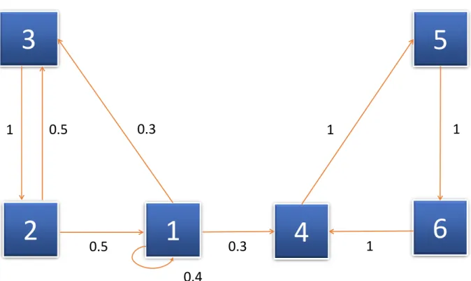
According to Kachapova, a homogeneous finite Markov chain can be determined by its initial state distribution and its transition matrix and can be graphically represented with the help of a transition diagram. Both the transition matrix and transition diagram are equivalent to each other. The transition diagram of a Markov chain is a single weighted directed graph. If the transition probability pij > 0, then each vertex of this graph represents a state 2.2 of the Markov chain and there is a directed edge from vertex j to vertexi. This edge has the weight or probability ofpij [Kac13]. There is no edge for pij = 0. Figure 2.2 is an example of transition diagram, whose corresponding transition matrix is explained with the following example.
For example, if a Markov chain has states 6 states namely: 1, 2, 3, 4, 5, 6 and their first order transition probabilities are as shown in Figure 2.2, then the corresponding transition matrix can be presented as the following [Kac13]:
S = 0.4 0.5 0 0 0 0 0 0 1 0 0 0 0.3 0.5 0 0 0 0 0.3 0 0 0 0 1 0 0 0 1 0 0 0 0 0 0 1 0 (2.1)
In Figure 2.2, the weight of each edge is the corresponding probability, which is shown next to it. For example, the transition probability from state 2 to state 1,p21={pn= 2 |pn−1 = 1} = 0.5 and in the same way, the loop from state 1 to state 1 represents the
probabilityp11=pn = 1|pn= 1, which is equal to 0.4 and so on.
2.4 Information Visualization
This section summarizes the definitions of some basic terms related to information visualization.
2.4.1 Visualization Definition
3
5
2
1
4
6
1
0.5
1
1
0.3
0.3
0.5
0.4
1
Figure 2.2: The transition diagram of the Markov chain explained in Subsection 2.3.3, where the squares with the numbers 1, 2, 3, 4, 5 and 6 are the states, and values by the arrow lines are the respective transition probabilities. This figure is adapted from Kachapova [Kac13].
mind or imagination internally and taking a decision on the basis of that imagination externally. Visualization helps people understand both spatial and non-spatial data. According to Munzner, augmenting human capabilities in different situations where, for a computer, it is not adequately well defined to handle the problem with some algorithm is the goal of visualization [Mun14].
The major sub-fields of visualization are: – Information Visualization
– Scientific Visualization – Visual Analytics
Data
Analytical Abstraction
Visual
Representation View User Data Transformation Visualization Transformation View Transformation
Figure 2.3:Information visualization pipeline proposed by Card [CMS99].
2.4.2 Information Visualization Definition
Information visualization is the technique that helps visually represent information. In the world of ever increasing information volumes, information visualization quickens un-derstanding and inner meaning of data by amplifying cognitive performance [CARD08]. According to Manovich, it is sometimes difficult to come up with an acceptable common definition of information visualization. He described information visualization provision-ally as the mapping between discrete data and a visual representation [Man10].
According to Stuart Card,
"Information visualization is a set of technologies that use visual computing to amplify human cognition with abstract information [CARD08]."
Card described different stages of information visualization with a block diagram 2.3. According to Card, after the initial transformation, data becomes ready for analytical abstraction, which is again transformed for visual representation [CMS99].
2.4.3 Visualization Variables
Every picture tells a story. —Rod Stewart, 1971
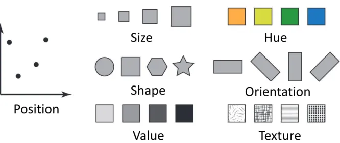
There exist a few parameters and variables, which need to be considered to design information visualization. As shown in Figure 2.4, proposed by Bertin [Ber83], these variables are namely: position, size, shape, value, hue, orientation, and texture.
Size
Hue
Position
Orientation
Shape
Value
Texture
Figure 2.4: Different visual variables like position, size, shape, value, hue, orientation, texture etc. that are used in information visualization and visual analytics, taken from Zhao [Zha15].
2.4.4 Interactive Visualization
Interactive visualization is one of the major fields in the visualization world that enables the analysis of data via the manipulation of different kinds of chart images, with the visual variables described in Subsection 2.4.3 and motion of visual objects representing various aspects of the dataset being analyzed [gartner20]. Interactivity plays a very important rule to create visualization tools that handle complex and large datasets. Interactive visualization minimizes the limitations of both user and display in the scenario where it becomes very difficult to show everything at once [Mun14]. This technique provides a good number of visualization options, which extend the ability of conventional bar, line, pie charts, including tree and heatmaps, geographic maps, scatter plots and other sophisticated visuals. Users are able to explore and analyze the data by playing around and interacting with a visual representation of it by these tools. Figure 2.3 shows the role of user interaction in information visualization as described by Card.
h
R
a
b
g
i
j
k
l
d
c
f
e
o
n
m
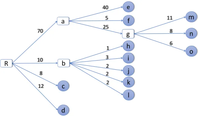
40 5 11 8 6 25 2 2 3 1 2 10 8 12 70Figure 2.5: Traditional depth-3 tree structure where lower case letters indicating the leaf nodes and numbers indicating the weight of each leaf node, circles are end-level leaf nodes, while rectangles are the roots of corresponding sub-trees. The image is adapted from Shneiderman [Shn92].
2.5.1 Tree Visualization
Tree visualization is one of the most common and well-known techniques to represent hierarchical data. This visualization technique can also be used for non-hierarchical data elements to represent additional relations between different data items [Hol06]. Trees can be visually represented in different ways like node-link, stacking, nesting etc. Again, node-link representation of the rooted trees can have multiple layouts like top-down, left-to-right etc. The left-to-right layout is shown in Figure 2.5.
The advantage of rooted tree visualization is that if an appropriate layout is chosen, the hierarchical structure becomes obvious and the links can also be easily followed. But the problem with this visualization is that it is not very space-efficient for the large datasets and there are scalability problems too.
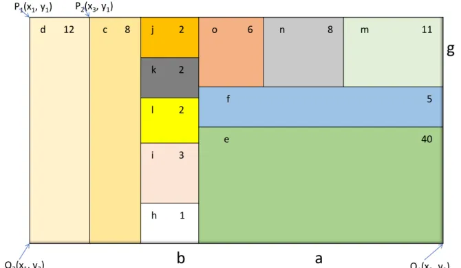
d 12 c 8 j 2 o 6 n 8 m 11 k 2 f 5 l 2 e 40 i 3 h 1
b
a
g
P1(x1, y1) P2(x3, y1) Q2(x1, y2) Q1(x2, y2)Figure 2.6: Treemap generated from the tree diagram of Figure 2.5, where each rectan-gle represents a leaf node. Some rectanrectan-gles have sub-rectanrectan-gles representing their corresponding leaf nodes. Nodes of the tree are shown by letters, while associated weights are represented by numbers. This image is modified from Shneiderman [Shn92].
2.5.2 Treemap
Treemap is a visualization technique that is used to represent hierarchical data and the contribution of the corresponding data element as shown in Figure 2.6. The treemaps can either be static or dynamic. In the static treemaps, data are usually rendered as static pictures in acceptable formats. In dynamic or interactive treemaps, data are displayed in applications that provide the facility of user interaction. For example, a user might be able to zoom into the deeper elements of the overall hierarchy [SDC04]. Sometimes, color and annotation can also be used to provide with extra information about the nodes and the children nodes.
2.5.3 Treemap Generation Algorithm
Slice and Dice Algorithm
Shneiderman used slice-and-dice algorithm to generate treemap. This procedure is defined in Algorithm 2.1 and explained in Figure 2.7. The disadvantage of this algorithm is that it may create many thin and elongated rectangles. It also suffers from poor aspect ratio problem. Thus the labeling of child nodes and interaction with them becomes difficult as shown in Figure 2.8.
Treemap(root, P[0..1], Q[0..1], axis, color)
Paint_rectangle(P, Q, color) -- paint full area
width := Q[axis] - P[axis] -- compute location of next slice for i := 1 to num_children do
Q[axis] := P[axis] + (Size(child[i])/Size(root))*width Treemap(child[i], P, Q, 1 - axis, color) -- recur on each
slice, flipping axes P[axis] := Q[axis];
endfor
Listing 2.1:Slice and Dice Algorithm
A D E F C B 4 2 2 4 A E F 2 4 A D E F C B 4 2 2 4 B C D A D C B 4 2 B C D E F
Step - 1 Step - 2 Step - 3
Figure 2.7: Slice and dice algorithm to generate treemap is explained with this figure. In step-1, an area is defined for the whole tree. In step-2, the root node is subdivided horizontally or vertically according to the weight of child nodes.
Figure 2.8: Subdivision problem of the slice-and-dice algorithm, which may create many thin and elongated rectangles. Figure is taken from Bruls [BHV00].
Squarified Treemaps
Squarified Treemapsmaintain better aspect ratio and approximate square shape of the rectangles [BHV00]. Bruls et al. explained the squarified treemap generation algorithm (Listing 2.2) with an example of a rectangle with width 6 and height 4. The rectangle is subdivided either horizontally or vertically into seven more rectangles with areas 6, 6, 4, 3, 2, 2, and 1. Thus thin rectangles appear, with aspect ratios of 16 and 36, respectively as shown in Figure 2.9.
procedure squarify(list of real children, list of real row, real w) begin
real c = head(children);
if worst(row, w) <= worst(row++[c], w) then squarify(tail(children), row++[c], w) else layoutrow(row); squarify(children, [], width()); fi end
Figure 2.9: Squarified Treemap generation procedure proposed by Bruls [BHV00], where subdivision is chosen based on the aspect ratio of the remaining rectangles. In this way, a better aspect ratio is maintained throughout the procedure.
2.5.4 Matrix Diagram
According to Burge, a matrix diagram is a visualization technique that allows identifying the presence and contribution of relationships between two or more lists of items or sometimes between the items in a single list. Matrix diagram is a useful tool in informa-tion visualizainforma-tion to represent complex many-to-many relainforma-tionships of varying strengths in a simple straightforward way. It also helps enable interactions and correlation between the items and understand complex dependencies [Bur13].
A B C D E F 2 3 4 1 List 1 Lis t 2
Figure 2.10: A simple matrix diagram, where the different shapes of symbol indicate the relationship between respective row and column and white cell indicates no relation, adapted from Burge [Bur13].
According to Burge, there can be various types of contents expressed in a matrix diagram if there is something common between them, which could be data, information, functions, concepts, actions, people, materials, equipments etc.
According to Burge, there can be a few basic types of matrix diagrams like L-type, T-type, Y-Type, X-Type, C-Type etc. Figure 2.10 shows an example of L-type matrix diagram.
2.5.5 Heatmap
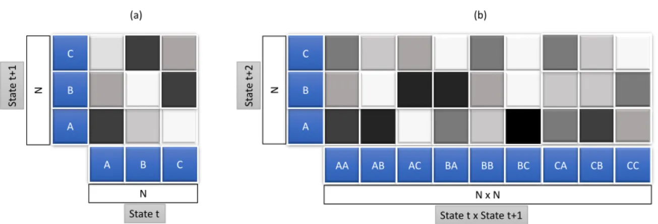
A heatmap is a visualization technique where the value of individual data element contained in a two-dimensional image is represented with color. There can be different types of heatmaps used in different disciplines and each uses different visualization techniques. Heatmaps can be used with the combination of other visualization tools like treemaps, matrix diagrams, grid maps, geographic maps, histograms, process flow diagrams etc. Figure 2.12 shows a general example of heatmaps for first and second transition matrix and Figure 2.11 shows the heatmap representation of transition matrix used in Subsection 2.3.3. Both the example figures are drawn with single color hue proposed by Brewer as shown in Figure 2.13.
C A B A B C AA AB AC BA BB BC CA CB CC N N (a) (b) C A B N x N N State t x State t+1 State t St at e t+ 1 St at e t+ 2
Figure 2.12: An example of single color hue heatmap representation for first (a) and second (b) transition matrix. For (a), the x-axis represents the states occurring at timestampt, while the y-axis represents the corresponding states at timestampt+ 1. Similarly for (b), the x-axis carries the states occurring at the successive timestampstandt+ 1, whereas the y-axis has the values of corresponding states at timestampt+ 2.
1 2 3 4 5 6 5 4 3 6 1 2 State t St at e t+1
Figure 2.11: Single color hue heatmap representation of transition matrix used in Subsection 2.3.3, where darkness level of the cell indicates the transition probability between the respective states and white cell indicates zero transition probability.
#fecc5c
#ffffb2 #fd8d3c #f03b20 #bd0026
#636363
#252525 #969696 #cccccc #f7f7f7
Single hue 5-class grey hex value
Multi-hue 5-class yellow-orange-red
with hex value
Figure 2.13: 5-class single hue grey and multi-hue yellow-orange-red color scheme for sequential data, provided by colorbrewer21, and adapted from Brewer et al. [BHH03] (a) (b) (c) Critical value 1 2 3 4 5 Low High Data Class
Figure 2.14: Three types of color schemes, sequential schemes (a), diverging schemes (b) and qualitative schemes (c), adapted from Brewer et al. [BHH03]
2.5.6 Color Theory and Mapping
There are three types of primary color schemes for mapping data [BHH03] as shown in Figure 2.14. Namely:
1. Sequential schemes: suitable for ordered data that change from low to high or high to low. Figures 2.13 and 2.14 (a) show the examples of this color scheme. 2. Diverging schemes: extreme values are put at both ends of data range, while
equal emphasis is put on the mid-range values.
3. Qualitative schemes: individual color-coding is chosen for different data classes. This scheme is mostly suitable for categorical data.
Data Visualization Models Knowledge User Interaction Transformation Mapping Data mining Parameter refinement Model visualization Model building
Visual Data Exploration
Automated Data Analysis
Feedback loopFigure 2.15: The visual analytics model proposed by Keim. According to him, visual analytics is the process of human interaction between data, visualizations, data models and the users in order to explore knowledge, adapted from Keim [KKEM10].
2.6 Visual Analytics
Visual analytics process is the whole knowledge gathering process supported by vi-sual analytics, which is evaluated and measured in terms of efficiency or knowledge gained [KAF+08]. According to Thomas, visual analytics is the science of analytical rea-soning, which is facilitated by interactive visual interfaces [TC05]. Keim et al. describe that the automatic analysis techniques are improvised by visual analytics with the help of interactive visualizations to make them effective, easily understandable, reasoning and decision making based on very big and complex data sets [KAF+08]. Figure 2.15 depicts a theoretical overview of various steps, which are represented by ovals and also their transitions, which are depicted by an arrow in the visual analytics process [KKEM10].
In this section, similar works related to this thesis will be briefly outlined.
There are various domains where event-based sequence data is very common. Collecting this type of data is very crucial for analysis and future development of the respective domain. There have been researches in this field for more than a decade. This section briefly discusses a few of them.
Cook and Wolf developed a technique named Process Discovery [CW98] to analyze event-based data. The process events that describe the data are logged from a continuous process at the first step under this technique. That data are then used to create a formal model of the behavior of that process. Along with Markovmodel, they also used two more methods called RNetandKtail and shown comparative results among them. As this uses Markov model too, it should help better understand the problems defined for this thesis. Figure 3.1 shows the the capturing process of sequential and event-based data.
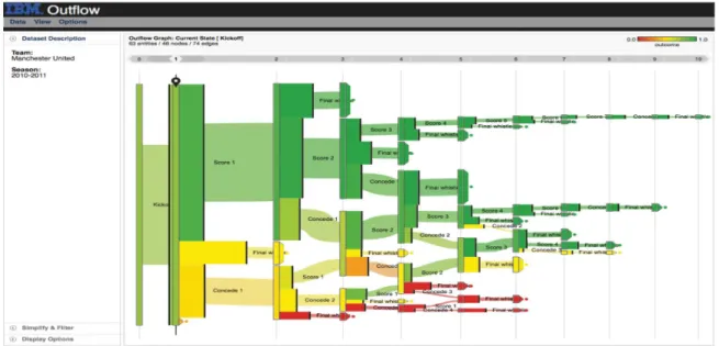
Outflow[WG12] is another visualization tool that deals with the sequential events and helps find the correlations among them. It can be used to accumulate multiple sequences of events by visualizing the accumulated pathways through different states of events
Figure 3.2: Outflowworks with event-based data and graphically represents the progress of events with pathways along with some other information like the outcome, duration, and cardinality. Outflow is an interactive visualization tool that enables its users to explore the paths via which different entities arrive and depart different states. This particular screenshot visualizes football club Manchester United’s 2010-2011 season where wins are shown with green pathways while losses are with red [WG12].
with cardinality and timing. It also summarizes the results of pathways and enables user interaction to explore external factors that may be correlated with specific pathway state transitions. Figure 3.2 is a screenshot of Outflow that visualizes football club Manchester United’s 2010-2011 season where wins are shown with green pathways, while losses are with red.
Frequence [PW14] is an intelligent user interface that is used for data mining and interactive data visualization that helps explore the hierarchical information system and finding most occurring patterns from the sequences of longitudinal events. By using a novel frequent sequence data mining algorithm, it can work with several levels of data, temporal context and concurrency to analyze the outcomes. It also comes with an interactive visual interface that visualizes data insights and users can explore through the different patterns of the level-of-detail data. Figure 3.3 is a screenshot of this application that shows an exploration process of one of the use-cases. Frequenceis related to this thesis work as this thesis also works with hierarchical data and different patterns of errors to find the correlations among them.
different symptoms can lead to lung disease and heat failure are shown here [PW14].
data [PMR+96] as shown in Figure 3.4. It can visualize different factors of an individual’s key events, for example, relationships, legal cases or health conditions, physician or lawyer consultations etc. Lifelines helps minimize the chance of missing important information and enable the users to spot exceptions or trends. Although Lifelinesworks only with life events, it is also related with this thesis work as it helps find useful trends and patterns from sequential events.
VizTree[LKL05] is a visualization system that helps discover pattern and trends from time series data sets based on augmenting suffix trees. VizTreeenable users interactively explore most and least frequent patterns by visually summarizing the data and encoding them with color and other visual properties. Figure 3.5 is a screenshot of this application. Since this thesis work is also related to finding the different patterns of the time-series error events and visualize them with color encoding and other means of visual analytics process, adapting the tree-like visualization technique might help.
Figure 3.4: One of the use-cases of Plaisant’sLifelinesis Juvenile Justice records. Cases, locations, employees assigned and available reviews are shown in this screenshot [PMR+96].
Figure 3.5: A screenshot ofViztreewhere the input time series is shown in the top panel and the subsequence tree for the time series is shown in the bottom left panel. Parameters can be set on the very right top. The zoom-in feature
actors as items. Movies are grouped by Academy Award wins and as well as nominations [BBD08].
There are an increasing number of errors that occur in the manufacturing line every day. Finding the correlation among those errors and representing them with some visual analytics approaches are the main goals of this thesis. This chapter outlines the core concept and approach to achieve that goal.
4.1 Data Analysis
This section describes the core structure and preliminary filtering process of data. This section also outlines the concept of data analysis and preparation process.
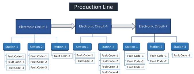
4.1.1 Structure and Hierarchy of Data
The data consisting of the error reports, which are generated in the production line are structured in hierarchical order. The manufacturing line itself has a tree-like structure whereelectronic circuits being its leafs placed in series. Eachelectronic circuit consists of stations placed parallel to each other as shown in Figure 4.1. Whenever there is an error during the operation in any parts of the manufacturing line, it gets logged automatically in the central data source. There are different kinds of errors, which can be identified byfault-code. Fault-codesare the children ofstations. The goal is to find out the dependencies and correlations among thosefault-codesand visually represent that relations with the theory of Markov model.
Production Line
Electronic Circuit-1 Station-1 Electronic Circuit-4 Station-3 Station-2 Station-2 Fault Code -1 Fault Code -2 Fault Code -3 Fault Code -1 Fault Code -2 Fault Code -3 Fault Code -4 Fault Code -1 Fault Code -2 Fault Code -1 Fault Code -1 Fault Code -2 Fault Code -3 Station-1 Electronic Circuit-7Station-1 Station-2 Station-3
Fault Code -1 Fault Code -2 Fault Code -3 Fault Code -1 Fault Code -1 Fault Code -2
Figure 4.1: Basic structure of production line hierarchy consisting of electronic circuits, stations and fault-codes, where an electronic circuit is the parent of stations and a station is the parent of fault-codes.
4.1.2 Preliminary Filtering of Data
Although the number of errors logged from the production line is huge, not every error has the same importance. After the calculation of durations the fault-codes from the timestamp, it was noticed that a big portion of errors last for less than a few seconds or sometimes even less than a second. On the other hand, because the same error may cause itself, there may be some errors, which are recorded occurring forever, which is also not realistic. At the same time, there may be some errors, which get generated because the associated station or circuit may be broken, or sometimes the error reports are not even actual errors rather minor warnings or some basic status information. So, as a part of preliminary filtering, all these types of error reports could be discarded as per the recommendations from the domain experts.
The data could be filtered in two phases. Initial filtering could be done in the raw data source itself before sending them for further calculation and final preparation. The following parameters from the data source are useful to calculate the correlation and dependency among the errors:
• Electronic Circuit: the electronic circuit is the top most element in the production line. Each electronic circuit has itsID,nameand physicalpositionin the production line.
• Station: as shown in Figure 4.1, each electronic circuit consists of a few stations. The most important information about station is its ID and corresponding electronic circuit.
• Fault-Code: each error occurs in the production line is termed as fault-code. Each fault-code has its ID, corresponding station and electronic circuit.
• Fault-Code Duration: the occurring duration of a fault-code meaning how long a particular error lasted.
• Timestamp: the exact time of an error when it initiated.
4.2 Design and Architecture Concept
This section briefly describes the main design and architecture concept. To implement the desired prototype for analyzing the correlation of errors, there are two main areas need to be considered namely BackendandFrontend. These areas are briefly discussed in the following subsections.
4.2.1 Calculation and Preparation of Data
Retrieval, calculation, and preparation of data could be done in theBackendas shown in Figure 4.2. After the initial filtering, data source could be connected to the calculation and preparation process. Markov chain and transition matrix algorithm as discussed in Sections 2.2 and 2.3 could be applied on the data to calculate the correlations and multi-order dependencies. Various models could be developed to prepare the data for different types of visualizations.
Data Source Data Retrieval & Calculation Visualization Data Overview Pairwise Analysis In-depth Analysis Block Diagram Matrix Diagram Heatmap Treemap Tree Diagram Bar Chart Stacked Bar Chart Backend Frontend
Figure 4.2: This is the core idea of this thesis work. After the calculation and retrieval process, there can be three main types of data visualization. (1) Data overview visualization could provide quick insights about the data. Then to analyze the data further, (2) pairwise visualization like matrix diagram and (3) in-depth visualization like tree diagram could be used.
4.3 Visualization
Frontend could deal with all the visualization concepts. This section outlines different visualization proposals and concepts that might help find the correlations and depen-dencies among the errors in the production line. There can be three major types of visualizations namely:
1. Visualization for data overview.
2. Visualization for pairwise analysis and 3. Visualization for in-depth analysis.
4.3.1 Data Overview Visualization
Data overview visualizations might help get insight about the retrieved data. One overview visualization might be a simple block diagram and another could be used to
Block Diagram
As discussed in Subsection 4.1.1, there are several electronic circuits in a production line placed in series. A simple block diagram might help realize their actual position where each block might indicate an electronic circuit labeled with information like its ID and corresponding position, the number of errors associated with this circuit etc.
ELC-1
ELC-7
Electronic Circuit ID
Position
1
2
3
ELC-4
Figure 4.3: The concept of a block diagram to visualize the positions of electronic circuits, where each block indicates an electronic circuit along with its ID and position. Blocks can also be color-coded based on the amount of errors associated with the respective electronic circuit. Color-coding can be applied based on the theory described in Subsection 2.5.6.
A histogram or bar chart could also help visualize the positions of electronic circuits. The height of each bar could show the number or percentage of errors for the respective electronic circuits. Figure 4.4 shows the bar chart representation of block diagram shown in Figure 4.3.
1
2
3
Number o r per ce n tag e of e rr or s 0 20 40 60 80 ELC-1 ELC-4 ELC-7Position of Electronic Circuits
Figure 4.4: The concept of a block diagram with bar chart to visualize the positions of electronic circuits, where the height of each bar might show the amount of errors associated with the respective electronic circuit. Bars can be placed according to the actual position of the electronic circuit.
Treemap
A treemap described in Subsection 2.5.2 could solve the problems related to the shortage of space and visual clutter for the bigger datasets. It could also be useful to exhibit insights about the elements of the production line. In limited space, treemap can be implemented with a few levels depending on the depth level of the production line. For this thesis work, it could be implemented up to level 4 as explained below:
• at depth level-0, the production line itself could be visualized, while electronic circuits being its children.
• at depth level-1, the electronic circuits could be parents, while associated stations could be shown as its children.
• at depth level-2, the stations could be parents, while corresponding fault-codes being its children.
Figure 4.5: The concept of a treemap to visualize the overview of production line elements like electronic circuits and stations. Size of each cell may define the amount of errors associated with the respective electronic circuit and station.
The size of each rectangle could be determined by the number of errors associated with the elements of production line i.e., electronic circuits, stations or fault-codes. To visualize the elements efficiently some scaling technique could be applied so that even if the difference between the largest and the smallest element gets higher, they could still be identified. Another advantage of using treemap would be using it for filtering and zooming into a particular element of the production line, which might help analyze the error correlations for that particular element. Figure 4.5 shows an example of a conceptual treemap, where stations (STN) are the children of electronic circuits (ELC).
Transition Matrix Diagram and Heatmap
Heatmaps described in Subsection 2.5.5 could be useful to visualize the probability of transition from one fault-code to another, which can be calculated using Markov chain and transition probability algorithm described in Subsection 2.2.2 and Section 2.3. It is possible to draw heatmaps both for first and m-order transition matrix. Each cell of heatmaps could be populated with transition probability value of corresponding causing fault-code and caused fault-code. Color-coding could also be applied to the cells reduce space related complexities. Figure 4.6 shows the concept of heatmaps for first (a) and second (b) order transition matrix with three fault-codes i.e., FC-1, FC-2 and FC-3.
FC 3 FC 1 FC 2 FC 1 FC 2 FC 3 FC 3 FC 1 FC 2 FC 1>1 FC 1>2 FC 1>3 FC 2>1 FC 2>2 FC 2>3 FC 3>1 FC 3>2 FC 3>3 Causing or source fault-codes
Cau se d or af fect ed f ault -c ode s
Causing or source fault-codes
Cau se d or af fect ed f ault -c ode s (a) (b)
Figure 4.6: The concept of the heatmaps for first (a) and second (b) order transition matrix to visualize the correlations of fault-codes.
Heatmap for first order can haveN ×N number of cells in the transition matrix, while for the second order,N2×N, for third orderN3×N and so on i.e., the number of cells in one dimension increases exponentially, which, for bigger datasets, might increase the complexity.
4.3.3 Visualization for In-depth Analysis
To minimize the problem to visualize the correlations for the errors from the bigger datasets and for in-depth analysis, tree diagram could help.
Rooted Tree Visualization
Rooted tree visualization as described in Subsection 2.5.1 could visualize the correlations among the different fault-codes, where root node can be shown as the source or cause of errors, while the children nodes can be shown as the caused or affected fault-codes. The tree could be expanded up to a few levels with user-interaction. Markov chain algorithm could be used here too for tree expansion. The edges of the tree can be color-coded based on the number of error for the respective transition. Sequential color-coding can be applied based on the theory described in Subsection 2.5.6. Figure 4.7 shows an idea of a tree visualization to show multi-order dependencies and correlations.
Root FC 1 FC 2 FC 3 FC 2 FC 3 FC 2 FC 3
Figure 4.7: The concept of the tree visualizations to visualize the correlations among the fault-codes. The parent nodes are the causing or source fault-codes and the children nodes are the caused or effected fault-codes.
Intervals of duration or delay of fault-code Number o r per ce n tag e of e rr or s
Time interval 1 Time interval 2 Time interval 3 Time interval 4 Time interval 5 Time interval 6
0
20
40
60
80
Figure 4.8: Concept with bar chart to visualize the amount of the fault-codes for a specific time interval or delay between successive fault-codes.
Bar Chart
Each fault-code has a corresponding duration field in the data source as mentioned in Subsection 4.1.2. A histogram or bar chart could be used to visualize the number of errors for a specific interval of time, which might help an analyst realize how long the errors last as shown in Figure 4.8.
A bar chart could also visualize the distribution of time delay between successive fault-codes. Timestamp information of the successive fault-codes could be collected from the nodes of the tree diagram mentioned in Figure 4.7.
Intervals of time could be defined based on the theory related to Choropleth Maps of graded color series and nominal data [ilstu17]. According to this theory, there can be the following three types of intervals [CS11]:
1. Equal Interval Classification: the whole data range is equally divided into n intervals.
2. Quantile Classification: interval size depends on the instances of data, so that each interval has approximately equal amount of data.
3. Natural Breaks Classification: intervals are made based on the natural peaks of the value distribution.
One of the classifications can be adapted for the bar chart interval distribution after observing the output of the given data.
Stacked Bar Chart
Stacked bar chart could also be used to show the fault-code distribution for a particular station or electronic circuit. Time intervals of fault-code durations could also be shown using this chart. Figure 4.9 shows the concept of analysis of fault-code distribution with stacked bar chart. The main disadvantage of this type of chart is that only the values closer to the x-axis are easily comparable observing their value in the y-axis. The other values in the same bar are difficult to compare because of their variable starting positions. 4.3 2.5 3.5 4.5 2.4 4.4 1.8 2.8 2 2 3 5
TIME INTERVAL 1 TIME INTERVAL 2 TIME INTERVAL 3 TIME INTERVAL 4
Fault-code 1
Fault-code 2
Fault-code 3
Amoun t or per ce n tag e of err or s Time intervals
Time interval 1 Time interval 2 Time interval 3 Time interval 4
0 20 40 60 8 0
fault-This chapter discusses the implementation details of this thesis work, which includes most of the concepts discussed in Chapter 4. To visualize the correlations and higher order dependencies among the errors in the production line, a web application named Correlation Analyzer is implemented. This chapter describes what visualizations are implemented and how they are implemented. This chapter also outlines the analysis and interaction process of the errors of the production.
5.1 Architecture and Models
This section states the core models and architecture of the thesis. Figure 5.1 shows the core model and architecture of the web application implemented for the thesis.
5.1.1 Adaption of Frameworks
The core frameworks and libraries adapted in this thesis are as the following:
• ASP.NET MVC:The web application implemented for this thesis was developed in C Sharp (C#) with ASP.NET MVC (.NET version 4.5.2), which is a web application framework developed by Microsoft and implemented with Model-View-Controller (MVC) pattern.
• MS SQL Server: A copy of a database from the production line of a manufacturing company is the data source for the thesis, which is hosted in Microsoft SQL Server. The database fields and view are discussed in Subsection 5.1.2.
Backend (ASP.NET MVC Application)
Frontend
Database
Controller
HTML
JavaScript
CSS
Model
View
Figure 5.1: The core model and architecture of the web application implemented for the thesis. The prototype is implemented in ASP.NET MVC Application pattern.
5.1.2 Database Fields and View
A database-view is created with the fields only required for the thesis, which is shown in Figure 5.2. The related columns are briefly discussed below.
• ID: the primary key of the database, determines an occurrence of error.
• ElCircuitNo: this is the identifier of an electronic circuit associated with the error. • Position: determines the physical position of corresponding electronic circuit in
the production line.
• Station: this is the identifier of station corresponding to electronic circuit. • TimeStamp: the exact time of an error when it initiated.
• FaultCode: the identifier of the error itself.
Figure 5.2: A Screenshot of the database view. The columns that are used for the thesis areID, ELCircuitNo, Position, Station, TimeStamp, FaultCode, FaultCodeDura-tionInSeconds.
5.1.3 Core Models
There are a few core models implemented in the back-end, which create the foundation of the prototype implemented for this thesis. The models are as the following:
• Production Line Elements Model: defines the architecture, fields and the be-havior of different elements of the production line. The three most important elements of the production line are the electronic circuit, station, and fault-code. As they have some common characteristics and are used very often in different implementations, they are included in this model.
• Electronic Circuit Position Model: defines the overview of the electronic circuits and their positions. Additional information like the number of errors for the respective electronic circuits and contribution percentage to the total amount is also defined in this model.
• Markov Chain Transition Matrix Model: calculates the values required to create transition matrix based on the Markov chain algorithm. The values include the
Figure 5.3: The home page of the Correlation Analyzer with two data overview visu-alizations. User interactions displays the analysis of error with the other visualizations.
5.2 Implementation of Visualizations
All three main types of visualizations discussed in Section 4.3 are implemented in this thesis. This section describes how these visualizations are implemented and how they can be used to analyze the correlations and dependencies among the errors. Figure 5.4 shows the complete view of the implemented web application with all the visualizations displayed.
5.3 Implementation of Data Overview Visualizations
This section describes the generation, implementation, and exploration of the data overview visualizations. All three data overview visualizations i.e., electronic circuit block diagram, electronic circuit bar chart, and treemap as discussed in Subsection 4.3.1 are implemented. Figure 5.3 shows the home page of the implemented web application with two data overview visualizations.
5.3.1 Electronic Circuit Block Diagram
As discussed in Subsection 4.1.1 and shown in Figure 4.1, the electronic circuits are placed in certain order in the production line. To better understand the physical position of electronic circuits in the industrial production line, two simple block diagrams are implemented. Both the diagrams make use of back-endElectronic Circuit Position Model as discussed in Subsection 5.1.3.
One of them is drawn with circles as shown in Figure 5.5 b). TheElectronic Circuit Block Diagram panel on the home page of theCorrelation Analyzerdisplays this visualization. Circles are placed sequentially according to the actual position data from database where each of the circles indicates an electronic circuit. Yellow-orange-red sequential colors schemes as described in Subsection 2.5.6 visualizes the contribution of errors to the whole production line. A legend is placed on the right side of the visualizations to display the scale of the used color-code. The tooltip provides additional information like the number of errors, its contribution percentage etc.
Another visualization that helps visualize the positions and error contribution is created with a bar chart. A click on theShow ELC Bar Chartradio button, which is also on the Electronic Circuit Block Diagram panel on the home page of the Correlation Analyzer displays this visualization. As shown in Figure 5.5 c), each bar indicating the position of an electronic circuit is placed vertically in the x-axis based on its position, while the height of the bars in y-axis indicates the number or percentage of errors for the associated electronic circuit. Like the block diagram with circles, the tooltip provides with information like the number of errors and its contribution percentage.
Figure 5.4: The Screenshot of complete view of the web application with all the visual-izations displayed. The top most visualization is the ELC block diagram and
(a)
(b)
(c)
Figure 5.5: The screenshots of the implemented electronic circuit block diagrams to display the positions of the electronic circuits. Part (a) shows the radio buttons to select one of them, part (b) is a partial screenshot the block diagram with circles and part (c) shows the ELC bar chart. The tooltip provides with additional information in both the visualizations.
Treemap generation code is adapted and customized d3 code by Mike Bostock1. Pro-duction Line Treemappanel in the Correlation Analyzerdisplays this visualization. Only the rectangles corresponding to the electronic circuits are visible on top-most level or at depth-0 as shown in 5.6. The circuits can be distinguished with the size, color, and label of the associated rectangle. Users can explore a circuit further by clicking anywhere on them. One click exposes the stations associated with the respective circuit, while clicking again on a station reveals all the fault-codes under the respective circuit and station as shown in Figure 5.8. To visualize each and every element efficiently, logarithmic scaling is applied so that even if the difference between the largest and the smallest element gets higher, they are still visible in the treemap. At every level, the total number of errors for that level is shown in the upper-left corner of the rectangle, while the
treemap, which shows the options to initiate analysis of errors with more visualizations like i.e., heatmap for first and second order transition matrix diagram, fault-code tree, multi-circuit fault-code tree as shown in Figure 5.7, which are described further in the following subsections.
Figure 5.6: The screenshot of the production line treemap at depth-0, where only the rectangles corresponding to the electronic circuits are visible. The other elements can be explored with user-interaction.
(a) (b) (c)
Figure 5.7: The navigation bar (a) and the available options in the context-menu (b, c) of the treemap at different hierarchy levels.
(a)
(b)
Figure 5.8: (a) Station (b) Fault-code view of the treemap that can be explored at depth-2 and depth-3.
5.4 Pairwise Analysis Visualizations
This section describes the generation, implementation, and exploration of the visualiza-tions for pairwise analysis.
5.4.1 Generation of Transition Matrix
To find out the pairwise correlations among fault-codes, heatmaps both for first and second order transition matrix as defined in Subsection 4.3.2 are implemented with the help of Markov Chain Transition Matrix Modelas described in Subsection 5.1.3.
(a) (b)
Figure 5.9: The screenshots of the implemented heatmaps for first (a) and second (b) order transition matrix. The tooltip provides with additional information.
Order Transition Matrix panel ofCorrelation Analyzer displays this visualization. The associated electronic circuit ID, station ID, and fault-codes are displayed in the panel header. The source or initiating fault-codes, which are labeled ascausingfault-codes are placed on the x-axis, while the affected or following fault-codes, which are labeled as causedfault-codes are placed on the y-axis. The probability of occurrence of a caused fault-code (y-axis) after a causing fault-code (x-axis) is color-coded by yellow-orange-red sequential schemes as described in Subsection 2.5.6 i.e., the darker the color, the higher the co-occurrence probabilities. The tooltip provides with more information like x-axis value (causing fault-codes), y-axis value (caused fault-codes), z-value (the percentage of probability), the number of error counts. Legend for the heatmap is displayed on the right side of the diagram that shows the scale of color coding.
5.4.3 Analysis with Heatmap for Second Order Transition Matrix
Heatmap for second order transition matrix can be created in the same way described above. X-axis, in this case, represents two consecutive fault-codes, the earlier one occur-ring at timestampt and the second one occurring at timestampt+ 1. Y-axis represents the fault-code, which followed them i.e., at timestamp t+ 2. The tooltip and legends provide with similar information as described above. Figure 5.9 (b) shows a heatmap for second order transition matrix.
5.5 In-depth Analysis Visualizations
This section describes the generation, implementation, and exploration of the in-depth analysis visualizations. The tree visualization is implemented to show the transitions of the and their correlations. Besides, to show the duration and occurrence delay distribution, two bar charts are implemented. This section discusses these visualizations in details.
5.5.1 Generation of Fault-Code Tree
Based on the concept discussed in Subsection 4.3.3, tree visualization, named fault-code tree, is implemented with the help of back-end Production Line Elements Modelas described in Subsection 5.1.3. There are two tree visualizations implemented in the application. One of them is for a single production line element i.e., electronic circuit, station or fault-code, while with the other can be created for multiple electronic circuits. D3 collapsible tree code by Mike Bostock2 is adapted and customized according to the needs of the thesis to generate this visualization.
5.5.2 Analysis with Fault-Code Tree
Fault-Code Treepanel in the correlation analyzer displays the fault-code tree visualization that can be generated from the"Show FC Tree"option of the context menu of the treemap. Upton initial creation, this tree automatically expands up to first children element, which is an FC. Continuous click on any node expands the tree until the depth from the parent FC node is 3. The children of any parent node correspond to the number of fault-code caused by the parent node. The edges of this tree visualization are color-coded based on the contribution of the associated transition of fault-codes. The color of the nodes corresponds to the type of production line. The tooltip provides with this information in the text. New analysis can be initiated from the context-menu of any FC node of the fault-code tree, which replaces the current tree and generates a new tree for the selected elements in the same panel. Legends both for the production line elements and color-scale are placed at the top-right corner of the Fault-Code Treepanel. To distinguish
Figure 5.10: The screenshot of the implemented fault-code tree. Additional analysis process can be started from the context-menu of the nodes of the tree. Corresponding color and element legend have also been displayed on the top-right corner of the fault-code tree.
5.5.3 Analysis with Multi-Circuit Fault-Code Tree
To analyze errors with the multi-circuit fault-code tree, at first, one is to select the electronic circuits one by one by clicking on "Add to Multi-Circuit FC Tree"option from the context-menu of treemap at depth 0. The selected electronic circuit IDs are displayed in a text-form which is displayed on top of the treemap. There are two buttons on the right side of the text-form,"Show FC Tree"button displays fault-code tree for the selected electronic circuits in theMulti-Circuit Fault-Code Treepanel of theCorrelation Analyzer and"Clear" button resets this process. Figure 5.11 shows the different steps to display this visualization.
(a)
(b) (c)
(d)
Figure 5.11: The screenshot of the multi-circuit fault-code tree (a), which can be launched from the context-menu of the treemap (b), (c), (d). Like the fault-code described above, additional analysis process can also be started from the context-menu of the nodes of the tree. Corresponding color and element legend have also been displayed on the top-right corner of the tree.
5.5.4 Generation of Bar Charts from Fault-code Tree
Based on the concept discussed in Subsection 4.3.3, two bar charts are implemented withFault-Code Modelas described in Subsection 5.1.3. One of them helps analyze the duration distribution of any fault-code in the tree, while the other helps analyze the delay distribution between the occurrences of root-causing fault-code and affected fault-code i.e., how and when a specific error could cause another. Both the visualizations can be initiated from the context-menu of FC nodes of any fault-code tree and are displayed on the right-side panels ofFault-Code Treepanel.
Figure 5.12: The screenshot of the implemented fault-code duration bar chart. The tooltip shows the number of errors for the respective interval.
than 5 second and more than 20 minutes are discarded from the calculation and also from visualization. It is observed that the durations of most fault-codes are less than a minute. Therefore,quantile classificationis adapted for the intervals as described in Subsection 4.3.3. Figure 5.12 is a screenshot of this visualization.
5.5.6 Analysis with Inter Fault-Code Delay Bar Chart
Another bar chart namedInter Fault-Code Delay Bar Chart is implemented that can be created from any children fault-code node whose parent is also a fault-code tree. This visualization shows the distribution of the timestamp difference between the correlated errors. The x-axis in this visualization displays the delay distribution between the children and root FC, while the y-axis shows the amount of error in that particular interval of time. Figure 5.13 is a screenshot of this visualization.
Figure 5.13: The screenshot of the implemented fault-code delay bar chart. The tooltip shows the number of errors for the respective interval.
![Figure 2.1: Markov chain explained by Howard with a picture of a frog jumping through lily pond, taken from Howard [How12].](https://thumb-us.123doks.com/thumbv2/123dok_us/1453072.2694471/20.892.244.693.157.552/figure-markov-chain-explained-howard-picture-jumping-howard.webp)
![Figure 2.15: The visual analytics model proposed by Keim. According to him, visual analytics is the process of human interaction between data, visualizations, data models and the users in order to explore knowledge, adapted from Keim [KKEM10].](https://thumb-us.123doks.com/thumbv2/123dok_us/1453072.2694471/34.892.134.809.150.560/figure-analytics-proposed-according-analytics-interaction-visualizations-knowledge.webp)
![Figure 3.4: One of the use-cases of Plaisant’s Lifelines is Juvenile Justice records. Cases, locations, employees assigned and available reviews are shown in this screenshot [PMR+96].](https://thumb-us.123doks.com/thumbv2/123dok_us/1453072.2694471/38.892.148.803.151.480/plaisant-lifelines-juvenile-justice-locations-employees-available-screenshot.webp)