Document downloaded from:
This paper must be cited as:
The final publication is available at
Copyright
http://link.springer.com/article/10.1007/s10994-013-5328-9#
http://hdl.handle.net/10251/38999
Springer Verlag (Germany)
Hernández Orallo, J.; Flach ., P.; Ferri Ramírez, C. (2013). ROC curves in cost space.
Machine Learning. 93(1):71-91. doi:10.1007/s10994-013-5328-9.
(will be inserted by the editor)
ROC Curves in Cost Space
Jos´e Hern´andez-Orallo · Peter Flach ·
C´esar Ferri
the date of receipt and acceptance should be inserted later
Abstract ROC curves and cost curves are two popular ways of visualising classifier performance, finding appropriate thresholds according to the operating condition, and deriving useful aggregated measures such as the area under the ROC curve (AUC) or the area under the optimal cost curve. In this paper we present new findings and con-nections between ROC space and cost space. In particular, we show that ROC curves can be transferred to cost space by means of a very natural threshold choice method, which sets the decision threshold such that the proportion of positive predictions equals the operating condition. We call these new curvesrate-driven curves, and we demonstrate that the expected loss as measured by the area under these curves is lin-early related toAUC. We show that the rate-driven curves are the genuine equivalent of ROC curves in cost space, establishing a point-point rather than a point-line cor-respondence. Furthermore, a decomposition of the rate-driven curves is introduced which separates the loss due to the threshold choice method from the ranking loss (Kendallτdistance). We also derive the corresponding curve to the ROC convex hull in cost space; this curve is different from the lower envelope of the cost lines, as the latter assumes only optimal thresholds are chosen.
Jos´e Hern´andez-Orallo
Departament de Sistemes Inform`atics i Compui´o. Universitat Polit`ecnica de Val`encia
Spain
E-mail: [email protected] Peter Flach
Department of Computer Science University of Bristol
UK
E-mail: [email protected] C´esar Ferri
Departament de Sistemes Inform`atics i Compui´o. Universitat Polit`ecnica de Val`encia
Spain
Keywords cost curves·ROC curves·cost-sensitive evaluation·ranking perfor-mance·operating condition·Kendall tau distance·Area Under the ROC Curve (AUC)
1 Introduction and motivation
ROC curves [15, 6] constitute a popular and highly useful graphical representation of classifier performance. A point on a ROC curve visualises the true and false posi-tive rates achieved by a particular decision threshold. A monotonic curve is obtained by sweeping through all possible decision thresholds, and the area under the curve (AUC) corresponds to the proportion of correctly ranked pairs of positive and nega-tive examples. ROC curves can be used to identify optimal thresholds that yield points on a ROC curve’s convex hull, as well as regions where one classifier dominates an-other. Operating conditions (class and misclassification cost distributions) manifest themselves as straight isometrics in ROC space.
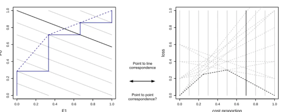
Classification loss at a particular decision threshold is not visualised directly in ROC curves, but has to be inferred from the true and false positive rate and operating condition. Cost curves were proposed by Drummond and Holte [3, 4] as an alterna-tive to ROC curves that explicitly visualise loss on they-axis against the operating condition on thex-axis. For example, if we fix the decision threshold and the class distribution and vary the relative misclassification costcof one of the classes, then loss will vary linearly withcand we obtain a cost line. Since a fixed threshold cor-responds to a point in ROC space, this suggests a point-line duality between the two representations as noted by Drummond and Holte [4] (see Figure 1). Further corre-spondences include that between the ROC convex hull and the lower envelope of a classifier’s cost lines, which both arise from optimal decision thresholds. Thus, cost curves allow us to not only identify regions of dominance, but quantify exactly the advantage in classification loss of the dominating classifier over the dominated one at a particular operating condition.
However, the correspondence between ROC space and cost space is incomplete to date. In particular, Drummond and Holte in [4] did not propose a cost space equiv-alent of a ROC curve. Furthermore, while linear interpolation between points in ROC space has a clear interpretation as a random choice between two decision thresholds, no similar construct has been proposed for cost space.In this paper we solve these and related open problems by deriving the exact equivalent of a ROC curve in cost space.
The missing link here is a particular way of translating operating conditions into deci-sion thresholds that is well-suited for models that are good rankers but do not neces-sarily produce well-calibrated scores. Thisrate-driven threshold choice methodsets the decision threshold such that the proportion or rate of positive predictions equals the operating condition. This leads to a piecewise cost curve where each segment in a ROC curve corresponds to a quadratic cost curve segment. We show how this curve is the real equivalent in cost space to ROC curves. The area under thisrate-driven curve
can be easily shown to be linearly related toAUC. A decomposition of the rate-driven curve is also derived, leading to a new curve, which we callKendall curve, because it depicts ranking performance (Kendallτdistance to the perfect ranker) in cost space.
● ● 0.0 0.2 0.4 0.6 0.8 1.0 0.0 0.2 0.4 0.6 0.8 1.0 F1 F0 Point to line correspondence Point to point correspondence? ● ● 0.0 0.2 0.4 0.6 0.8 1.0 0.0 0.2 0.4 0.6 0.8 1.0 cost proportion loss
Fig. 1 Point-to-line correspondence between ROC curves and (optimal) cost curves (some of the terms
used in this figure are defined in Sections 2 and 3). Left: A ROC curve corresponding to the ranking 0 0 1 0 0 0 1 0 1 0. The diagonal lines are rate isometrics (lines connecting points with the same predicted
positive rater; these have slope−π1/π0and interceptr/π0, whereπ0andπ1are the class priors), one for
each possible split point in the ranking. The isometric (bold line) going through the top left-hand corner has
rateπ0. Other rates can be achieved in expectation by means of a random choice between the two bordering
split points. Right: the corresponding optimal cost curve (shown for cost proportions instead of skews). Each of the 11 points on the ROC curve corresponds to one of the 11 cost lines (dashed). Furthermore, points on the ROC convex hull correspond to segments in the optimal cost curve. In particular, ROC point (0/3, 0/7) corresponds to the top cost line emanating from the origin (which only touches the optimal cost curve in the origin), ROC point (0/3, 2/7) corresponds to the ascending diagonal in cost space (which intersects with the first segment of the optimal cost curve), ROC point (1/3, 5/7) corresponds to the bottom cost line emanating from (0, 0.2) (which contributes the second segment of the optimal cost curve), point (2/3, 6/7) —not strictly part of the convex hull since it connects two segments with the same slope— corresponds to the bottom cost line emanating from (0, 0.4) (which touches the optimal cost curve at cost = 0.5), and ROC point (3/3, 7/7) corresponds to the bottom cost line emanating from (0, 0.6) (which
establishes the final segment of the cost curve). The vertical line in bold represents the rateπ0=0.7.
Thus, rather than an incomplete point-line duality as suggested by Drummond and Holte in [4], we show a complete point-to-point correspondence between ROC space and cost space for classifiers employing the rate-driven threshold choice method. Un-der this interpretation ROC curves and cost curves are truly two sides of the same coin.
The paper is organised as follows. Section 2 introduces basic notation and defini-tions. Section 3 introduces a new threshold choice method based on rates, which leads to the rate-driven curves, showingclassification performance, and its area is shown to be a linear function ofAUC, as shown in Section 4. Section 5 investigates how these curves can be decomposed, introducing a new curve ofranking performancecalled Kendall curve. Section 6 illustrates the point-point correspondence between ROC space and cost space. This applies also to the convex hull, whose equivalent curve in cost space, theconvex skull, is discovered, and its relation with the lower envelope of the cost lines is analysed in Section 7. Section 8 shows how rate-driven cost curves and Kendall curves can be used in practice, especially focussing on screening appli-cations and other classification settings where partial areas might be useful. Section 9 closes the paper with a discussion of the results.
2 Notation and basic definitions
In this section we introduce some basic notation and the notions of ROC curves, cost curves and the way expected loss is aggregated using a threshold choice method.
Examples or instances are taken from an instance space. The instance space is denotedXand the output spaceY. Elements inXandY will be referred to asxandy
respectively. For this paper we will assume binary classifiers, i.e.,Y ={0,1}, where 0 is thepositiveclass and 1 is thenegativeclass. A crisp or categorical classifier is a function that maps examples to classes. A model or scoring classifier is a functionm:
X→Rthat maps examples to scores on an unspecified scale, such that a higher score
expresses a stronger belief that the example is negative.1In order to make predictions in theY domain, a model can be converted to a crisp classifier by fixing a decision thresholdton the scores. Given a predicted scores=m(x), the instancexis classified in class 1 ifs>t, and in class 0 otherwise.
For a given, unspecified model and population from which data are drawn, we de-note the score density for classkby fkand the cumulative distribution function byFk.
Thus,F0(t) =R−t∞f0(s)ds=P(s≤t|0)is the proportion of class 0 points correctly classified if the decision threshold ist, which is the sensitivity or true positive rate att. Similarly,F1(t) =R−t∞f1(s)ds=P(s≤t|1)is the proportion of class 1 points incorrectly classified as 0 or the false positive rate at thresholdt; 1−F1(t)is the true
negative rate or specificity. Given a data setD⊂ hX,Yi, we denote byDkthe subset
of examples in classk∈ {0,1}, and setπk=|Dk|/|D|. We will use the termclass
pro-portionforπ0(other terms such as ‘class ratio’ or ‘class prior’ have been used in the
literature). Given a model and a thresholdt, we denote byR(t) =π0F0(t) +π1F1(t)
the predicted positive rate, i.e., the proportion of examples that will be predicted pos-itive if the decision threshold is set att.
2.1 Operating conditions and overall loss
When a classification model is applied, the conditions or context might be different to those used during its training. In fact, a model can be used in several contexts, with different results. A context can imply different class proportions, different cost over examples (either for the attributes, for the class or any other kind of cost), or some other details about the effects that the application of a model might entail and the severity of its errors.
One general approach to cost-sensitive learning assumes that the cost does not depend on the example but only on its class. In this way, misclassification costs are usually simplified by means of cost matrices, where we can express that some mis-classification costs are higher than others [5]. Typically, the costs of correct classifi-cations are assumed to be 0. This means that for binary classifiers we can describe the cost matrix by two valuesck≥0, representing the misclassification cost of an
example of classk. We can normalise the costs by settingb=c0+c1andc=c0/b;
1 We use 0 for the positive class and 1 for the negative class, but scores increase with ˆp(1|x). That is, a
ranking from strongest positive prediction to strongest negative prediction has non-decreasing scores. This is the same convention as used by, e.g., Hand in [11].
we will refer tocas thecost proportion. We setb=2 so that loss is commensurate with error rate (which assumesc0=c1=1).
The loss which is produced at a decision thresholdt and a cost proportion cis then given by the formula:
Qcost(t;c),c0π0(1−F0(t)) +c1π1F1(t) (1)
=2{cπ0(1−F0(t)) + (1−c)π1F1(t)}
We often are interested in analysing the influence of class proportion and cost propor-tion at the same time. Since the relevance ofc0increases withπ0, an appropriate way
to consider both at the same time is by the definition ofskew, which is a normalisation of their product: z, c0π0 c0π0+c1π1 = cπ0 cπ0+ (1−c)(1−π0) (2) From Eq. (1) we obtain
Qcost(t;c)
c0π0+c1π1
=z(1−F0(t)) + (1−z)F1(t),Qskew(t;z) (3)
We will assume that the operating condition is either defined by the cost proportion (using a fixed class distribution) or by the skew.
2.2 Threshold choice methods
A key issue when applying a model to several operating conditions is how the thresh-old is chosen in each of them. If we work with a crisp classifier, this question van-ishes, since the threshold is already settled. However, in the general case when we work with a model as a scoring or probabilistic classifier, we have to decide how to establish the threshold. The crucial idea is the notion of threshold choice method, a functionT(c)or T(z)which converts an operating condition (cost proportion or skew) into an appropriate threshold for the model. There are several reasonable op-tions for the functionT: we can set a fixed threshold for all operating conditions; we can set the threshold by looking at the ROC curve (or its convex hull) and using the cost proportion or the skew to intersect the ROC curve (as ROC analysis does); we can set a threshold looking at the estimated scores, especially when they represent probabilities; or we can set a threshold independently from the rank or the scores. For a comprehensive account of threshold choice methods, we refer to [13]. The way in which we set the threshold may dramatically affect performance.
In many real-world problems, when we have to evaluate or compare classification models, we do not know the cost proportion or skew that will apply during deploy-ment time. One general approach is to evaluate the model on a range of possible operating points. From this interpretation, Adams and Hand [1] suggest to set a dis-tribution over the set of possible operating points and integrate over them. In this way, we can define the overall or average expected loss in a range of situations as follows:
Lc,
Z 1
0
whereQcost(t) is the expected cost for thresholdt as defined in Eq. (1),Tcost is a
threshold choice method which maps cost proportions to thresholds, andwcost(c)is a
distribution for costs in[0,1]. We can define a similar construction for skews instead of cost proportions:
Lz,
Z 1
0
Qskew(Tskew(z);z)wskew(z)dz (5)
In the rest of the paper we will assume the uniform distribution forwcostandwskew,
usingU(c)andU(z)as subscripts.
2.3 ROC curves and cost curves
The ROC curve [15, 6] is defined as a plot ofF1(t)(i.e., false positive rate at decision
thresholdt) on thex-axis againstF0(t)(true positive rate att) on they-axis, with both
quantities monotonically non-decreasing with increasingt(remember that scores in-crease with ˆp(1|x)and 1 stands for the negative class). The area under the ROC curve is denoted byAUC.AOC=1−AUCdenotes the area above the ROC curve. Figure 1 (left) shows a ROC curve withAUC=13/21 andAOC=8/21. This model will be a running example for the rest of the paper. An important concept in ROC analysis is the notion of ROC isometrics [8]. A ROC isometric is a line (or curve) that represents the points with the same value for a given measure. If we focus onlossisometrics, we have that they only depend on the skewz, leading to straight lines (called iso-cost lines) whose slope equals 1−zz. Consequently, given a skew, we just slide a straight line with the corresponding slope from the top-left corner (0,1) until we touch the ROC curve. This point gives the optimal threshold for that skew and leads to optimal decisions in case the ROC curve reliably represents the behaviour of the classifier for the data at hand.
Cost space, as defined by Drummond and Holte [4] hasQskew(t;z)on they-axis
against skewzon thex-axis (Drummond and Holte use the term ‘probability cost’ rather than skew). We can plot cost space for cost proportionscinstead of skews on thex-axis, as shown in Figure 2. In cost space, loss isometrics are horizontal lines. This simplifies the procedure of determining the loss resulting from a given cost proportion or skew. In particular, finding the classifier that minimises the loss for a given skew on thex-axis amounts to finding the lowest cost line or cost curve at that
x-value.
While ROC curves arise from varying the classifier’s thresholds (interpolating be-tween the resulting points in the empirical case), curves in cost space are established by considering a range of skews or cost proportions. So a cost curve as a function of
zin our notation is:CCskew(z),Qskew(T(z);z) =z(1−F0(T(z))) + (1−z)F1(T(z)),
and similarly for cost proportions usingQcost.
The threshold choice methodT is what characterises the cost curve. If we choose a functionTwhich sets a fixed thresholdtregardless of the operating condition, then we have that the loss varies linearly in cost space. For the interval of thresholdst
that give the same class assignments we clearly have the same line, which is called thecost line(not to be confused with loss isometrics in ROC analysis). A cost line
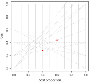
● ● 0.0 0.2 0.4 0.6 0.8 1.0 0.0 0.2 0.4 0.6 0.8 1.0 cost proportion loss ● ●
Fig. 2 The cost space of the model in Figure 1 (again, we use cost proportionscinstead of skewsz).
The dashed lines represent all possible cost lines. The two red points correspond to two possible crisp
classifiers evaluated with cost valuesc=0.4 andc=0.6 respectively. The point atc=0.4 is the result
given by a classifier withF1=1/3 andF0=5/7, leading to a cost line from 0.2 to 0.4. This gives a cost
of 0.28 forc=0.4. The point atc=0.6 is the result given by a classifier withF1=1/3 andF0=4/7,
leading to a cost line from 0.2 to 0.6. This gives a cost of 0.44 forc=0.6.
visualises how loss at a fixed thresholdtchanges betweenF1(t)forz=0 and 1−F0(t)
forz=1, when using skews. Using cost proportions the cost lines run from 2π1F1(t))
forc=0 to 2π0(1−F0(t)forc=1. This is illustrated in Figure 2. From all cost lines
we can choose line segments (depending on where we change the threshold) and by piecewise connecting them we have a ‘hybrid cost curve’ [4].
One way of choosing these segments is by considering the optimal threshold, which is defined as follows:
Tskewo (z),arg min
t
{Qskew(t;z)}. (6)
The optimal or minimum cost curve is then thelower envelopeof all the cost lines. The cost curve for this optimal choice is defined asCCskewo (z),Qskew(Tskewo (z);z).
Similar expressions are obtained for cost proportions. Figure 1 (right) shows the op-timal cost curve (using cost proportions) for the running example.
Note that our notation makes it explicit that other curves can be obtained in cost space by changing the threshold choice methodT.
3 The rate-driven threshold choice method
In Section 2.2 we mentioned that there are several ways to choose a threshold given a soft or probabilistic classifier. One of the differences between ROC curves and cost curves is precisely that the former is independent of the threshold choice method,
while the cost curve completely depends on this choice. As mentioned above, classi-cal cost curves represent how the loss of a classifier changes with the operating con-dition assuming theoptimalthreshold choice method. However, there is in general no guarantee that we will be able to find the optimal threshold choice at deployment time. Furthermore, on many occasions, even assuming that the optimal choice on the plot could ultimately match the optimal choice in the deployment data, we have to consider that ROC analysis and cost curves are not always used, and decisions may be made by choosing the threshold in a different way.
An alternative option is the score-driven threshold choice method, which assumes a probabilistic classifier outputting scores between 0 and 1 and just sets T(c) =c. An assumption of equal misclassification costs might thus justify a threshold of 0.5 on naive Bayes’ estimates of the posterior probability. If the probability estimates are well-calibrated this is a reasonable choice from the point of view of risk minimisation. The score-driven threshold choice method leads to a different curve in cost space, which has been termed the Brier curve [12] since its area equals the Brier score, a very common metric for evaluating probabilistic classifiers. This threshold choice method is particularly sensitive to how the probabilities are estimated. If estimated probabilities are highly concentrated (e.g., if half of them are in the range [0.4,0.6]) and we use a probability in this range as a threshold (e.g., 0.55), a minor variation in the estimated probabilities will change predictions and hence loss dramatically. This problem also affects the optimal threshold choice method, because we may determine the optimal threshold on a ROC curve plotted with a validation data set and then take the score (or estimated probability) that leads to this optimal choice. Clearly, the score-driven threshold choice method and the optimal threshold choice method are equivalent when the model is perfectly calibrated.
A third way of determining a decision threshold is by considering the proportion of positives that we want to predict. If we find a point on the ROC curve (plotted with a training or validation data set) that we want to use to set the threshold, we can just calculate the predicted positive rate (the proportion of positive predictions) and use this rate as the reference for the deployment data set. The only limitation of using rates instead of a numerical score is that rates only make sense when we have a batch of predictions. Nonetheless, this is a very common situation. This idea of making decisions based on the rate instead of the scores leads to the rate-driven threshold choice method below.
Recall that the predicted positive rate, abbreviated to rate, is defined as R(t) =
π0F0(t)+π1F1(t). For skews we haveRz(t) = (F0(t)+F1(t))/2. The following
thresh-old choice method sets the threshthresh-old to achieve a rate equal to the operating condition.
Definition 1 Therate-driven threshold choice methodfor cost proportions is defined as
Tcostrd (c),R−1(c) (7)
Similarly, for skews:
Tskewrd (z),R−z1(z) (8)
We can achieve any rate, providedF0andF1are continuous. In the empirical case this
rate that is between two split points of a ranking, we randomly choose between the split points in such a way that the desired rate is achieved in expectation. Figure 1 (left) illustrates this graphically.
Example 1 Following the running example in Figure 1, and assuming that we have
scores {−3.20,−2.13, −1.15, −0.18, 0.21, 0.45, 1.47, 1.49, 1.93, 4.72} we can explain how this threshold choice method works to make decisions, especially in the empirical case. If we are given, e.g., a cost proportion of c=0.725, and we only have ten examples in our data set, the rate 0.725 cannot be achieved with a single split point. So, the rate which corresponds to cost proportion 0.725 must be achieved
in expectationby stochastic interpolation between the closest rate isometrics. In this case, we have isometric Awith rate 0.7 (making 7 positive predictions out of 10) with any threshold 1.47≤t<1.49, and isometricBwith rate 0.8 (making 8 positive predictions) with any threshold 1.49≤t<1.93. We stochastically choose between these by tossing a biased coin with probability 0.75= (0.8−0.725)/(0.8−0.7)of choosingA. Note that this is quite different to choosing just the closest rate isometric, which in this case would be to choose 0.7 as the rate, leading to a (somewhat simpler but) biased decision rule. In any case, we see that the magnitudes of the scores are irrelevant for the rate-driven threshold choice method. Only the ranks of the scores matter.
Under this threshold choice method the loss at thresholdt =Tcostrd (c)and cost proportionccan be entirely expressed in terms ofc:
Qcost(t;c),2{cπ0(1−F0(t)) + (1−c)π1F1(t)}
=2{cπ0+π1F1(t)−c[π0F0(t) +π1F1(t)]}
=2{c(π0−R(t)) +π1F1(t)}
=2{c(π0−c) +π1F1(R−1(c))} (9)
In the last step we have usedt=R−1(c)and soc=R(t). The notationF1(R−1(c))
stands for ‘the false positive rate at the decision threshold which achieves rate c’, usually achieved by interpolation between two classifiers.
It will be useful to derive an alternative expression forQcostin terms ofF0rather
thanF1:
Qcost(t;c),2{cπ0(1−F0(t)) + (1−c)π1F1(t)}
=2{cπ0−π0F0(t) + (1−c)[π0F0(t) +π1F1(t)]}
=2{(1−c)(R(t)−π0) +π0(1−F0(t))}
=2{(1−c)(c−π0) +π0(1−F0(R−1(c)))} (10)
whereF0(R−1(c))means ‘the true positive rate at the decision threshold which achieves
ratec’.
The rate-driven threshold choice method is a natural way of choosing the thresh-olds, especially when we only have a ranking or a poorly calibrated probabilistic classifier. While in this paper we use this method to make the connection between ROC space and cost space, it is a credible threshold choice method in itself, as
an alternative to other methods. Clearly there are pros and cons for each threshold choice method. In particular, it is worth pointing out that the optimal threshold choice method utilises a ROC curve (and hence labelled data) to translate an operating con-dition into a threshold, unlike the score-driven and rate-driven methods. The ability to utilise this extra information provides the main appeal of the optimal threshold choice method, but also introduces the danger of overfitting if the ROC curve on which the optimal thresholds are determined is not representative. There is no guarantee that the optimal thresholds on the training or validation data are also optimal in the de-ployment context. Since in this paper the analysis concentrates on the case that the true probability distributions are known, this drawback of the optimal method may not always be apparent. Conversely, the score-driven and rate-driven methods can be expected to be more robust against overfitting the decision threshold. The connection between these threshold choice methods has been thoroughly explored in [13], by comparing the aggregated cost for all possible cost proportions.
However, the definition of a curve from the rate-driven threshold choice method (including the interpolation of points between rates) and the analysis of the exact meaning of each point (and each region) of the curve is yet to be explored. This is the aim of this paper.
4 The rate-driven cost curve
We now introduce a new kind of cost curve that allows us to establish a one-to-one correspondence between cost space and ROC space.
Definition 2 Therate-driven cost curve is defined as a plot ofQcost(Tcostrd (c);c) =
2{c(π0−c) +π1F1(R−1(c))} on the y-axis against con the x-axis. We can
anal-ogously define a version for skews as Qskew(Tskewrd (z);z) =z(1−2z) +F1(R−z1(z))
againstz.
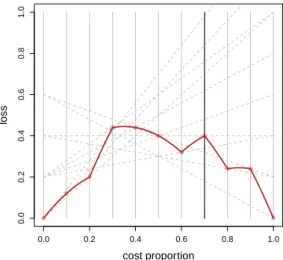
Figure 3 shows the rate-driven cost curve corresponding to the model in Figure 1. Note that the rate-driven cost curve is continuous if the ROC curve is; if the ROC curve is piecewise linear (e.g., because of linear interpolation in case of an empirical curve), the rate-driven cost curve is piecewise parabolic because of the quadraticc
term inQcost. Figure 3 demonstrates this.
We now show that the area under the rate-driven cost curve is related to theAUC. The expected rate-driven loss for a range of cost proportions is:
Lrdwcost ,
Z 1
0
Qcost(Tcostrd (c);c)wcost(c)dc (11)
If we use the uniform distribution forwcost(c)the expected loss is equal to the area
under the rate-driven cost curve.
Theorem 1 [13] Expected loss for uniform cost proportions using the rate-driven threshold choice method is linearly related to AUC as follows:
● ● 0.0 0.2 0.4 0.6 0.8 1.0 0.0 0.2 0.4 0.6 0.8 1.0 cost proportion loss ● ● ● ● ● ● ● ● ● ● ●
Fig. 3 The rate-driven cost curve corresponding to the model in Figure 1. Thex-axis shows cost proportion.
The plot also shows the rate isometrics in cost space, as vertical lines.
Proof LUrd, Z 1 0 Qcost(Tcostrd (c);c)U(c)dc = Z 1 0 2{c(π0−c) +π1F1(R−1(c))}dc = Z 1 0 2c(π0−c)dc+ Z 1 0 2π1F1(R−1(c))dc
The first integral evaluates tohc2π0−2c 3 3 i1 0=π0−2/3. By a change of variable we havec=R(t)anddc=R0(t)dt: Z 1 0 2π1F1(R−1(c))dc= Z +∞ −∞ 2π1F1(t)R0(t)dt =2π1 Z ∞ −∞ F1(t){π0f0(t) +π1f1(t)}dt =2π0π1 Z ∞ −∞ F1(t)f0(t)dt+2π12 Z ∞ −∞ F1(t)f1(t)dt =2π0π1(1−AUC) +2π12 Z 1 0 F1(t)dF1(t) =2π0π1(1−AUC) +π12
Summing both expressions and rearranging gives: LUrd=π0−2/3+2π0π1(1−AUC) +π12 =2π1π0(1−AUC) +π1(1−π0) +π0−2/3 =π1π0(1−2AUC) +1/3 u t
Corollary 1 Expected rate-driven loss for uniform skews is Lrd
U = (1−2AUC)/4+
1/3.
So the expected rate-driven loss for a random ranker is 1/3. This reflects the fact that the threshold choice method takes advantage of knowingcor z: this lifts classification performance above that of a random classifier. On the other hand, the expected loss for a perfect ranker is non-zero (actually 1/12), because rate-driven thresholds are not always optimal. As we discussed in Section 3, this ‘non-optimality’ is the price we pay for using a method that is less prone to overfitting the decision threshold.
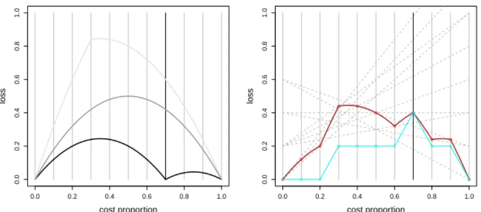
To illustrate, Figure 4 (left) shows the rate-driven curve for the worst ranker pos-sible (top), a ranker where all scores tie (middle) and a perfect ranker (bottom). We see that for the perfect ranker the rate-driven threshold choice method makes optimal choices forc=0,c=π0=0.7 andc=1 but sub-optimal choices for other operating
conditions, which explains the non-zero area under the rate-driven curve. The reason why we can only have 0 loss atc=π0(apart from the two extremes) is because this
is the only point where the predicted proportion of positives (the rate) matches the actual proportion of positives (π0). So, the rate-driven curve for a perfect ranker
us-ing the rate-driven threshold choice method can only be optimal in these three points. In order to be optimal for other points the only possibility is to change the threshold choice method.
5 Decomposing the expected rate-driven loss: Kendall curves
We note that the terms 2c(π0−c)in Eq. (9) and 2(1−c)(c−π0)in Eq. (10) can be
positive as well as negative. Combining their positive parts results in the rate-driven cost curve of a perfect ranker. An example of this curve was shown in Figure 4 ( left, bottom curve).
Lemma 1 The rate-driven cost curve for a perfect ranker is defined as follows2:
Q∗cost(Tcostrd (c);c) =
2c(π0−c) if c≤π0
2(1−c)(c−π0)if c≥π0 with area1/3−π0π1.
2 Note that both conditions overlap forc=
π0, but this does not lead to ambiguity since both expressions
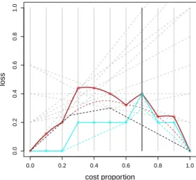
● ● 0.0 0.2 0.4 0.6 0.8 1.0 0.0 0.2 0.4 0.6 0.8 1.0 cost proportion loss ● ● 0.0 0.2 0.4 0.6 0.8 1.0 0.0 0.2 0.4 0.6 0.8 1.0 cost proportion loss ● ● ● ● ● ● ● ● ● ● ● ● ● ● ● ● ● ● ● ● ●
Fig. 4 Left: The worst rate-driven curve in clear grey, a classifier assigning the same score to all instances
in grey, and the optimal rate-driven curve in black (π0andπ1 as in the running example). Right: The
Kendall curve for the running example (in light blue) after subtracting the dark red curve at the top from the rate-driven cost curve at the bottom (also in dark red).
Proof The threshold where a perfect ranker achieves perfect classification isR−1(π0),
i.e. the left upper-hand corner in the ROC space. It follows thatF1=0 forc≤π0and F0=1 forc≥π0. We obtain the final expression if we considerF1=0 forc≤π0in
Eq. (9) and we considerF0=1 forc≥π0in Eq. (10). The area comes from Theorem 1
withAUC=1 . ut
Subtracting the expected rate-driven loss of a perfect ranker, which is the expected loss due to the rate-driven threshold choice method choosing non-optimal thresholds, from the expected loss given by Theorem 1 gives 2π0π1(1−AUC) =2π0π1AOC: this
is theexpected classification loss attributable to the model’s ranking performance. Since the decomposition is pointwise for eachc, we can construct a curve whose area can also be interpreted as the expected classification loss due to ranking performance. We call this new curve aKendall curve,because, as we will see, its area is related to the Kendallτdistance [14] to the perfect ranking:
Definition 3 TheKendall curve is defined as follows:
Qτ(c) = Qτ 0(c) =2π1F1(R−1(c)) ifc≤π0 Qτ 1(c) =2π0(1−F0(R−1(c)))ifc≥π0
The Kendall curve shows,for each cost proportion c, the expected loss of the model, once the loss of a perfect ranker is discounted. This second loss is shared by all models.
Theorem 2 Any rate-driven cost curve can be decomposed into the rate-driven cost curve of a perfect ranker and theKendall curve:
Qcost(Tcostrd (c);c) =Q
∗
cost(Tcostrd (c);c) +Qτ(c)
Proof This follows from Lemma 1 and Eqs. (9) and (10). The area is obtained from
Theorem 1 and Lemma 1. ut
It is important to stress that the Kendall curve is the difference between two cost curves (Qτ=Q
cost−Q∗cost) but not itself a cost curve: notably, it does not intersect
with cost lines as the rate-driven cost curves do. In other words, we can distinguish between the loss shared by all models – since it originates from the rate-driven thresh-old choice method – and the loss originating from the model itself (expected classi-fication loss attributable to the model’s ranking performance). Figure 4 (right) shows a Kendall curve (in light blue). If we focus on this curve, we see that some segments are horizontal and some others are diagonal. It is very easy to see where positives and negatives are. Given its ranking (0 0 1 0 0 0 1 0 1 0), we can match this ranking to the curve (from left to right), and see that 0s are shown horizontally and 1s are shown diagonally, until the rateπ0is reached (0.7 in the figure), where things swap,
and 1s are shown horizontally and 0s are shown diagonally. Since the perfect ranking would be (0 0 0 0 0 0 0 1 1 1), the Kendall curve shows how manydiscordant pairs
will need to be swapped to get the perfect ranking (8 in total). This is precisely the Kendallτdistance to the perfect ranking, denoted byKτ. It is then easy to see that
Kτ=π0nπ1nAOC, of which the area under the Kendall curve is just a normalisation
with a factor 2/n2. This relation between the Kendallτdistance andAUCis not new. However, Kendall curves show this in a much more explicit way.
6 Pointwise equivalence between ROC space and cost space
The construction of the rate-driven curves and the derivation of the Kendall curves suggests that the correspondence between ROC space and cost space is much more direct than previously thought. The geometrical connection is given by the distance between the ROC curve and the ROC space square on one hand, and the height of the points in the rate-driven curve on the other hand. In what follows, we will work with empirical distributions. We will focus on the rate isometrics, which for the rate-driven threshold choice method are given by the costs which match a rate, i.e.,c=i/nfor
i=0. . .n.
We return to ROC curves to see that the area under the ROC curve can be obtained in a diagonal way and not horizontally, as the following two propositions show.
Proposition 1 Given a point in ROC space (F1(R−1(c)),F0(R−1(c))), the segment of the rate isometric connecting this point with the corresponding point of a perfect classifier has length:
D0(c), F1(R−1(c)) π0 q π02+π12if c≤π0 D1(c), (1−F0(R−1(c))) π1 q π02+π12if c≥π0
Proof Ifc≤π0, the perfect classifier goes withfpr=0 and increasingtprreaching
the ROC heaven point(0,1)forc=π0. So, the length of the diagonal can be
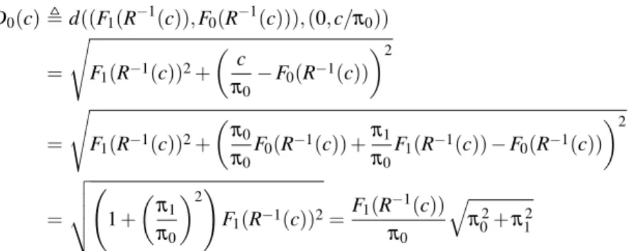
for the rate-driven threshold choice method leads to c=R(t) =π0F0(R−1(c)) + π1F1(R−1(c))): D0(c),d((F1(R−1(c)),F0(R−1(c))),(0,c/π0)) = s F1(R−1(c))2+ c π0 −F0(R−1(c)) 2 = s F1(R−1(c))2+ π0 π0 F0(R−1(c)) + π1 π0 F1(R−1(c))−F0(R−1(c)) 2 = v u u t 1+ π1 π0 2! F1(R−1(c))2= F1(R−1(c)) π0 q π02+π12
Ifc≥π0, the perfect classifier goes from the heaven point(0,1)to(1,1)withF0(R−1(c)) =
1 constant and increasingF1(R−1(c)), fromc=π0toc=1. So, the length of the
di-agonal can be calculated as follows:
D1(c),d((F1(R−1(c)),F0(R−1(c))),( c−π0 π1 ,1)) = s F1(R−1(c))− c−π0 π1 2 + (1−F0(R−1(c)))2 = v u u t 1+ π0 π1 2! (1−F0(R−1(c)))2 =(1−F0(R −1(c))) π1 q π02+π12 u t
Note that whenc=π0thenD0(c) =D1(c).
Figure 1 shows a ROC curve and the rate isometrics. Proposition 1 calculates the length of the segment of each of these lines from the enclosing square (perfect classifier) to the actual ROC curve. TheAOC=1−AUCcan be calculated from these diagonal segments as follows.
Proposition 2 Given a model with n examples,
AOC= nπ0 ∑ i=0 D0(i/n) + n ∑ i=nπ0+1 D1(i/n) n q π02+π12
Proof The proof can be constructed geometrically by summing diagonal “units”. It is easy to see geometrically that it is tantamount to sum diagonal “unit” segments than
squares, as follows: AOC= nπ0 ∑ i=0 FP(ni) + ∑n i=nπ0+1 nπ0−T P(ni) π1π0n2 Given thatF1(R−1(c)) =FPnπ(c)
1 we obtain, from Proposition 1, that, forc≤π0:
FP(c) =nπ1F1(R−1(c)) =
nπ1π0 q
π02+π12
D0(c)
Similarly, withF0(R−1(c)) =T Pnπ(0c), we have, forc≥π0: nπ0−T P(c) =nπ0(1−F0(R−1(c))) =
nπ1π0 q
π02+π12
D1(c)
Using these equivalences we get:
AOC= nπ0 ∑ i=0 nπ1π0 √ π02+π21D0 (ni) + ∑n i=nπ0+1 nπ0−√nπ1π0 π02+π12D1 (ni) π1π0n2 = nπ0 ∑ i=0 D0(ni) + n ∑ i=nπ0+1 D1(ni) n q π02+π12 u t
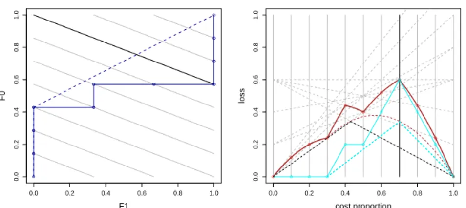
For the example in the left part of Figure 6, we see that we have 8 squares above the curve, soAOC is 8/(7·3) =8/21. If we look at the diagonals, we have 0 + 1 + 1 + 2 + 1 + 1 + 1 + 1 + 0 + 0 + 0 = 8 unit segments, withqπ02+π12/(π1π0n) =
0.762/(0.3·0.7·10) =0.363 length each. So the sum of the length of the diagonal isometrics from the ROC square to the ROC curve is 8·0.363. Dividing this value by
n q
π02+π12=10·0.762 we get 8/21.
Now we obtain a straightforward but important result which shows this exact cor-respondence between the two spaces (the length of the segments of the rate isometrics in ROC space and the loss value in cost space):
Theorem 3 D0(c) = Qτ 0(c) 2π1π0 q π02+π12 D1(c) = Qτ 1(c) 2π1π0 q π02+π12
Corollary 2 AOC can be calculated by a summation over Qτ: AOC= nπ0 ∑ i=0 Qτ 0(i/n) + n ∑ i=nπ0+1 Qτ 1(i/n) 2π1π0n =(2/n)Kτ 2π1π0n
Proof From Theorem 3 and Proposition 2.ut
This shows that AOC can be computed efficiently and exactly by adding the heights of the points on the Kendall curve in cost space. The advantage of this calcu-lation on cost space is that it connects this area to expected loss and it also provides a way to calculate ‘partial’ areas by considering particular cost ranges. Also, it can lead to different metrics by changing thex-axis to a different (non-uniform) distribution, if we are given (or we assume) some information about what costs proportions are more likely.
7 Convex skull of the rate-driven curve
One useful construction over ROC curves is the notion of convex hull, which high-lights the issue that some points in the ROC curve can never be chosen as optimal points, since there are at least two other points in the curve for which an interpolation leads to a better point. This convexification of the ROC curve accounts for the idea that hybrid classifiers can also be constructed by interpolating between points which are not at consecutive rate isometrics.
Drummond and Holte in [4] state that the “ROC concept of upper convex hull also has an exact counterpart for cost curves: the lower envelope”. While a correspondence between these two constructs can be established, this is only part of the story. First, the correspondence assumes optimal thresholds, and it is important to stress that the convex hull by itself does not imply that thresholds will be chosen optimally (as the lower envelope does). Second, and as a consequence of this, the area under the lower envelope is not even monotonically related to the area under the convex hull of the ROC curve. Clearly, the lower envelope of cost lines cannot be considered the “exact counterpart” of the ROC convex hull. The discovery of the rate-driven curve, which relates ROC space and cost space in a pointwise manner, suggests that the exact counterpoint of the ROC convex hull in cost space does indeed exist.
Definition 4 Theconvex skullof a rate-driven curve of a modelmis defined as the rate-driven curve of the convexified modelConv(m)(its convex hull in ROC space). Theconvex skullof a Kendall curve of a modelmis defined as the Kendall curve of
Conv(m).
An example is shown in Figure 5. The solid dark red line is the counterpart of the ROC curve while the dashed dark red line is the counterpart of the convex hull. We call this counterpart theconvex skull, since it is geometrically related to the notion of convex skull, which is the biggest convex polygon which fits inside a non-convex polygon [2]. The difference in our case is that we do not really have polygons, since
● ● 0.0 0.2 0.4 0.6 0.8 1.0 0.0 0.2 0.4 0.6 0.8 1.0 cost proportion loss ● ● ● ● ● ● ● ● ● ● ● ● ● ● ● ● ● ● ● ● ●
Fig. 5 The rate-driven curve is shown in solid dark red, its convex skull in dashed dark red, the Kendall
curve in solid light blue and its lower convex hull in dashed light blue. The lower envelope is shown in dashed black.
the segments are parabolic. Fortunately, there is no need to apply any complex algo-rithm to calculate the convex skull. There are two options for calculatingConv(m)in Definition 4 above.
One option is to calculate the convex hull geometrically in ROC space. A second option is to apply thePair Adjacent Violators(PAV) algorithm [7] directly to the rank-ing. Given a set of training cases ordered by the scores assigned by a classification model, the PAV algorithm first assigns a probability 0 to each positive instance and a probability 1 to each negative instance creating a group for each instance. The al-gorithm then looks, at each iteration, for “adjacent violators”: adjacent groups whose probabilities locally decrease rather than increase. In these cases, the algorithm pools the groups and replaces their probability estimates with the average of the group’s val-ues. This process stops when the entire sequence is monotonically non-decreasing. The result is a sequence of instances, each of which has a score and an associated probability estimate, which can then be used to map scores into probability estimates and recalculate the rank (with ties). The equivalence of these two ways of calculating
Conv has been recently shown in [7], where the algorithm is directly linked to the convex hull.
In fact, this second option is very easy to apply if we work with the Kendall curve (in solid light blue in Figure 5). As we discussed in previous sections, horizontal segments correspond to positives or negatives (depending on which side of the rate isometricπ0we are). This convex hull of the Kendall curve (which is lower convex
for two portions, one from cost 0 toπ0and the other one from costπ0to 1) is shown
The first clear outcome is that the area under the convex skull follows the same linear relation to the convex hull in ROC space as established by Theorem 1. The second outcome is that we can now better understand what the lower envelope means and its relation to the convex hull. Specifically, the lower envelope is an optimal cost curve, showing the loss for optimal decisions. This is an idealistic situation, since it assumes that the optimal thresholds in the training or validation data set for each operating condition will be valid as well for any future test set. The convex skull, on the other hand, shows the loss for the rate-driven threshold choice method after applying the PAV algorithm to the ranking. It gives a new interpretation of the convex hull in ROC space as a measure of classification performance of a model which has been processed by the PAV algorithm.
In the example in Figure 5, the convex skull and the lower envelope only match for
c=0.2. For this cost proportion, the rate leads to split the ranking: 0 0 1 0 0 0 1 0 1 0 after the two first 0s. This gives the lowest loss forc=0.2 for this ranking (5 zeros misclassified as ones, with cost 0.2 each makes a total loss of 1.0, which cannot be improved at any other split). We can see that the lower envelope can be attained by shifting the points of the convex skull along their corresponding cost line, to the right or to the left depending on their position. This shows that the convex skull does not represent optimal choices with respect to the operating condition.
8 Partial areas and illustrative examples
Screening is one of the most common applications in data mining. The goal of screen-ing is to rank the instances in terms of the probability of an event (e.g. purchase, failure, disease, etc.) in order to find the greatest percentage of positive cases with the minimum percentage (orrate) of data inspected. Typical examples of screening applications are offer/mailing campaign design (e.g., in e-commerce, customer rela-tionship management, etc.) or prevention policies (e.g., in medicine). Since ranking quality is crucial for this task, one common evaluation metric for the evaluation of ranking classifiers in these applications is theAUC.
However, it is almost never the case that we are interested in the performance of a model from an inspection rate of 0% to an inspection rate of 100%. Typically, we work with some economic constraints about the minimum and maximum rates that are sensible in the application domain. In other words, we may be interested in the
partialperformance in arange of inspection rates.
Let us consider again the running example we introduced in Figure 1, which had the ranking: 0 0 1 0 0 0 1 0 1 0 over a training or validation set. Let us call it model
A. ItsAUCwas 13/21. This ranking is neatly represented by the Kendall curve (solid light blue) in Figure 5. Now consider another model (B) with the following ranking: 0 0 0 1 0 1 1 0 0 0 over the same data set. The ranking is represented by the ROC curve and Kendall curve in Figure 7. TheAUCis 11/21. While the overall quality of modelBis worse than modelA, both ROC curves cross at some points, so we cannot say that one model dominates the other for the whole range of operating conditions. However, current practice in screening applications would just simply choose model
● ● 0.0 0.2 0.4 0.6 0.8 1.0 0.0 0.2 0.4 0.6 0.8 1.0 F1 F0 1 2 3 4 5 6 7 8 ● ● 0.0 0.2 0.4 0.6 0.8 1.0 0.0 0.2 0.4 0.6 0.8 1.0 cost proportion loss ● ● ● ● ● ● ● ● ● ● ● ● ● ● ● ● ● ● ● ● ●
Fig. 6 ModelA. ROC curve (left) and Kendall curve (right). The shadowed polygons represent partial
areas over the ROC curve (left) and under the Kendall curve between rates 0.1 and 0.5. This area is (0.1 +
0.2 + 0.2)/10 = 0.05. The numbers on the ROC curve (left) from 1 to 8 represent the diagonalsD0andD1
as for Proposition 1.
Imagine that we want to use this model to plan a mailing campaign for a new set of customers. The existence of constant costs for the mailing campaign suggests that the offer should be sent to no less than 10% of the customers. Also, according to budget limitations, the number of offers cannot exceed 50%. These two constraints imply that we are interested in the quality of the ranking between 10% and 50% predicted positives. Which model is best in this situation? The problem of this question is that we are not asking what model is best in a specific operating condition (e.g., a rate equal to 40%), but in a range of operating conditions. Interestingly, Kendall curves are the right plot to answer this question, because we can calculate partial areas in a straightforward way. In Figure 6, we can see that thepartial area under the Kendall curvebetween rates 0.1 and 0.5 is exactly 0.05 for modelA((0.2/2 + 0.2 + 0.2)/10). However, in Figure 7 we see that this partial area for modelBis just 0.03 ((0.2/2 + 0.2)/10). Consequently, for this range of contexts, modelBis preferrable over model
A.
It can be argued that these values can be calculated analytically. Of course they can, but it is much easier to see this in a plot with the Kendall curves, especially when we have thousands of examples (and not ten such as here). We can see the regions where each model dominates, and we can quantify the ranking loss for every possible region. In addition, the convex skull gives us information about the cutpoints that are sub-optimal. For instance, for modelA(Figure 5), we know that in the range of rates between 0.1 and 0.5, we should never choose 0.1, 0.3 and 0.4, because the ranking is 0 0 1 0 0 0 1 0 1 0, and one can get more positives (0) further right on the ranking (e.g., 0.1 makes just the first example a true positive, while 0.2 makes the two first examples true positives). Note that this is just seen as horizontal segments in the Kendall curves. Similarly, for modelB(Figure 7), we should never choose 0.1, 0.2 and 0.4.
● ● 0.0 0.2 0.4 0.6 0.8 1.0 0.0 0.2 0.4 0.6 0.8 1.0 F1 F0 ● ● ● ● ● ● ● ●● ● ● ●● ●● ● ● ● ● ● ● ● 0.0 0.2 0.4 0.6 0.8 1.0 0.0 0.2 0.4 0.6 0.8 1.0 cost proportion loss ● ● ● ● ● ● ● ● ● ● ● ● ● ● ● ● ● ● ● ● ●
Fig. 7 ModelB. Left: ROC curve for the ranking 0 0 0 1 0 1 1 0 0 0. Right: Kendall curve with its convex
skull in light blue, and rate-driven cost curve with its convex skull in dark red. Optimal cost curve in dashed black.
This information can also be obtained in the ROC space, especially with the equivalence we derived in Theorem 2. This way we can calculate that thepartial AOC(between rates 0.1 and 0.5) for modelAis 0.119 while it is 0.071 for modelB. We can even show this area between two isometrics in the ROC curves. However, this procedure is certainly much more difficult than in the cost space.
This application of Kendall curves is related to their interpretation in terms of the screening applications we are considering now: the area under the Kendall curve between two ratesr1andr2represents how many screening mistakes one would make
on average if all the cutpoints betweenr1andr2were considered equiprobable. This
is the same approach as in [9], but now we show it graphically and for partial regions. In fact, if one has further information about the distribution of the rates (e.g., if one thinks that a 20% for an inspection rate is more likely than 30%), then we could just ‘warp’ thex-axis of the plots using this information (as a distribution) and calculate the area accordingly.
While we have illustrated this for ranking models, this can also be shown for classification models using the rate-driven threshold choice method. For instance, if we have a spam filtering model, we can have information (or make the assumption) that a false positive (predicted spam being actual ham) will always have higher cost than a false negative (predicted ham being actual spam), i.e.c1>c0 (and clearly c<0.5). This means that we could compare models by looking at their partial rate-driven cost curves. In this case, we would just calculate the area under the rate-rate-driven cost curve between rates 0 andπ0. This would tell us which model is best for that
range of operating conditions using the rate-driven threshold choice method. We can see all this in practice for a more realistic example. We chose the Ger-man credit data set [10] because it is illustrative for screening applications and cost-sensitive problems. Class 0 represents good customers (profitable customers for a credit) while class 1 represents bad customers. Figure 8 compares two models (ak
-● ● 0.0 0.2 0.4 0.6 0.8 1.0 0.0 0.2 0.4 0.6 0.8 1.0 cost proportion loss
Fig. 8 Two Kendall curves for the German credit data set usingk-nearest neighbours, in yellow, and a
decision tree, in dark red. The solid vertical line showsπ0=0.69. The vertical dotted lines show the
region of interest.
nearest neighbours,kNN, in yellow, and a decision tree, J48, in dark red) using cost space and their rate-driven cost curves.
If we want to use these two models for classification using the rate-driven thresh-old choice method, we can see that, depending on the operating condition, one model can be better than the other. Typically, bad customers classified as good customers (false positives) have much higher cost than false negatives (the German credit data set sets this ratio to 5:1). Since the prior distribution may vary and the particular cost matrix may depend on other circumstances, it is reasonable to analyse both models in a range of operating conditions. Let us assume that we are given a region of, say, rates between 0 and 0.35. With this region, which is shown with dotted vertical lines in Figure 8, we can calculate the partial areas of the rate-driven cost curves (between 0 and 0.35), which are 0.093 for the J48 model, and 0.091 for thekNN model. Con-sequently, thekNN model is better for the range of rates we want to consider. This contrasts with the total area, which, in this case, is lower (better) for the J48 model (0.27) than thekNN model (0.29).
Interestingly, the samechoicewould be obtained for any partial calculation using the rate-driven cost curve or the Kendall curve. However, if we want to calculate the expected misclassification loss, then it is the rate-driven cost curve we need to look at. If we want to calculate the expected number of misclassifications for a screening application, then it is the Kendall curve we would look at.
9 Concluding remarks
The definition of cost curve in the literature has been partially elusive. While it is clear what cost lines are, it was not clear what the options are for drawing different curves in cost space, which of them were valid and, more importantly, whether they correspond to curves or representations in ROC space. In this paper we have clarified the relation between both spaces, by defining the rate-driven cost curve as the true companion of ROC curves in cost space. We have furthermore demonstrated that it is possible to visualise classification performance and ranking performance in the same plot by means of the Kendall curve.
Our main instrument was the rate-driven threshold choice method, which leads to a point-point correspondence between the ROC curve and the rate-driven curve, and also between the ROC convex hull and the convex skull. This provides a richer view of cost space, since different cost curves arising from different threshold choice methods can be contrasted and compared.
While cost curves were initially introduced for skews, we have worked with cost proportions in this paper, but a generalisation to skews should be straightforward. We plan to work on the use of rate-driven curves to choose among models and construct hybrid classifiers.
Another interesting avenue for further work is a comparison with the recently proposed Brier curves [12], especially because it has been shown in [13] that the rate-driven threshold choice method is equal to the score-rate-driven threshold choice method when scores are evenly spaced (however, Brier curves do not interpolate and their exact equivalence in this particular score disposition would only be asymptotical). By comparing different curves in the same space we should be able to decide which threshold choice method is best for a particular operating condition, leading to a new dimension of dominance. This comparison of several curves (using different thresh-old choice methods) would usually be carried out for different data sets. For instance, we could plot the curves using a labelled training data set, from which the threshold choices could be derived for each operating condition, and then these choices could be used to represent curves on a different labelled validation data set. This would show that some curves may be too optimistic on the training data set and may lead to worse choices on the validation data set.
The source code in R for plotting rate-driven curves and Kendall curves can be found athttp://users.dsic.upv.es/˜flip/RDC/.
Acknowledgements We would like to thank the anonymous referees for their helpful comments. This
work was supported by the MEC/MINECO projects CONSOLIDER-INGENIO CSD2007-00022 and TIN 2010-21062-C02-02, GVA project PROMETEO/2008/051, the COST - European Cooperation in the field
of Scientific and Technical Research IC0801 AT, and theREFRAMEproject granted by the European
Coor-dinated Research on Long-term Challenges in Information and Communication Sciences & Technologies ERA-Net (CHIST-ERA), and funded by the Engineering and Physical Sciences Research Council in the UK and the Ministerio de Econom´ıa y Competitividad in Spain.
References
1. Adams N, Hand D (1999) Comparing classifiers when the misallocation costs are uncertain. Pattern Recognition 32(7):1139–1147
2. Chang J, Yap C (1986) A polynomial solution for the potato-peeling problem. Discrete & Computational Geometry 1(1):155–182
3. Drummond C, Holte R (2000) Explicitly representing expected cost: An alterna-tive to ROC representation. In: Knowl. Discovery & Data Mining, pp 198–207 4. Drummond C, Holte R (2006) Cost curves: An improved method for visualizing
classifier performance. Machine Learning 65:95–130
5. Elkan C (2001) The foundations of Cost-Sensitive learning. In: Nebel B (ed) Proc. of the 17th Intl. Conf. on Artificial Intelligence (IJCAI-01), pp 973–978 6. Fawcett T (2006) An introduction to ROC analysis. Pattern Recognition Letters
27(8):861–874
7. Fawcett T, Niculescu-Mizil A (2007) PAV and the ROC convex hull. Machine Learning 68(1):97–106
8. Flach P (2003) The geometry of ROC space: Understanding machine learn-ing metrics through ROC isometrics. In: Machine Learnlearn-ing, Proceedlearn-ings of the Twentieth International Conference (ICML 2003), pp 194–201
9. Flach P, Hern´andez-Orallo J, Ferri C (2011) A coherent interpretation of AUC as a measure of aggregated classification performance. In: Proc. of the 28th Intl. Conference on Machine Learning, ICML2011
10. Frank A, Asuncion A (2010) UCI machine learning repository. URL http: //archive.ics.uci.edu/ml
11. Hand D (2009) Measuring classifier performance: a coherent alternative to the area under the ROC curve. Machine learning 77(1):103–123
12. Hern´andez-Orallo J, Flach P, Ferri C (2011) Brier curves: a new cost-based vi-sualisation of classifier performance. In: Proceedings of the 28th International Conference on Machine Learning, ICML2011
13. Hern´andez-Orallo J, Flach P, Ferri C (2012) A unified view of performance met-rics: Translating threshold choice into expected classification loss. Journal of Machine Learning Research (JMLR) 13:2813–2869
14. Kendall MG (1938) A New Measure of Rank Correlation. Biometrika 30(1/2):81–93, DOI 10.2307/2332226, URL http://dx.doi.org/10. 2307/2332226
15. Swets J, Dawes R, Monahan J (2000) Better decisions through science. Scientific American 283(4):82–87