Jan Wilkening
a,*, Keni Han
b, Mathias Jahnke
ba Esri Deutschland GmbH, [email protected]
b TU München, [email protected], [email protected]
*Corresponding author
Abstract: In this article, we present a method for visualizing multi-dimensional spatio-temporal data in an interactive web-based geovisualization. Our case study focuses on publicly available weather data in Germany. After processing the data with Python and desktop GIS, we integrated the data as web services in a browser-based application. This application displays several weather parameters with different types of visualisations, such as static maps, animated maps and charts. The usability of the web-based geovisualization was evaluated with a free-examination and a goal-directed task, using eye-tracking analysis. The evaluation focused on the question how people use static maps, animated maps and charts, dependent on different tasks. The results suggest that visualization elements such as animated maps, static maps and charts are particularly useful for certain types of tasks, and that more answering time correlates with less accurate answers.
Keywords: spatio-temporal data, geovisualization, empirical evaluation
1. Introduction: Visualizing multidimensional
spatio-temporal data
The increasing volume, variety and resolution of spatial data provide an inexhaustible foundation for different visualization tasks (Schiewe 2018). In addition, political initiatives to make administrative data publicly available1
emphasize the need for creating visualizations for knowledge discovery.
The visualization of spatio-temporal data has always been a challenging task for the cartographic community and plays an important role in visual analytical and knowledge discovery processes (Bruggmann and Fabrikant 2016). Change acts as an inherent feature in many time-dependent datasets and expresses the dynamic nature of data. Typical spatio-temporal application scenarios include the visualization and analysis of trajectories of moving objects to understand the behavior of car drivers (Andrienko et al. 2013), or the visualization of long-term landscape changes covering multiple centuries (Bogucka and Jahnke 2018). Multidimensional data, a subset of multivariate data (Fuchs and Hauser 2009), are ubiquitous in many other disciplines like climate research (Kehrer and Hauser 2013). While the independent dimensions of space and times might be treated as any other attribute (Keim et al. 2010, Aigner et al. 2007), in many applications scenarios these dimensions have an inherent semantic meaning and play a pivotal role.
1https://www.dwd.de/DE/leistungen/opendata/opendata.html
(accessed Dec 5, 2018)
1.1 Methods for presenting multidimensional spatio-temporal data
To meet user demands for exploring spatio-temporal data, Roberts (2007) coined the concept of linked views, where different data attributes are visualized and analyzed side by side. These linked views include maps, scatterplot matrices parallel coordinate plots or graphs (Kehrer and Hauser 2013).
To express the dynamic of spatio-temporal phenomena in cartographic products, Koussoulakou and Kraak (1992) proposed three different visualization methods: a single static map, a static map series, and an animated map. Several authors (e.g., Monmonier 1992, Jenny et al. 2006, Opach et al. 2011) have shown how these map-based methods can be combined with other visualization types, such as graphs and charts, for an efficient and effective communication of multi-dimensional spatio-temporal phenomena. Andrienko et al. (2003) suggest that charts are especially suitable for addressing questions about “what, where and when”.
For both map view and attribute visualizations, typical means of interaction for data exploration are zooming, panning, linking, brushing and view reconfiguration (Yi et al 2007). When designing spatio-temporal visualizations, the information seeking mantra of “overview first, filter and zoom, then details on demand” (Schneiderman 1996) is still relevant and should thus be considered.
The display medium and the data itself have impacts on the visualization. Since datasets that need to be processed and visualized are growing ever larger these days, data can no longer “speak for itself”. In fact, data visualization needs to apply a pattern to convey information (Andrienko et al 2008). Therefore, it is of high importance for authors of visualizations to carefully choose the right attributes and visualization techniques.
1.2 Evaluation methods
A data representation cannot be successful without integrating the user. Therefore, user issues play an essential role in developing spatio-temporal visualizations (Nielsen 1994, Nivala et al. 2007). User studies, surveys, benchmark tasks and eye tracking are common methods within a usability engineering lifecycle to evaluate the usability of spatio-temporal visualizations (Mayhew 1999, Roth 2013, Roth et al 2015). Kveladze et al. (2013 and 2018) evaluated spatio-temporal applications to improve the cartographic design and data exploration processes, while Bogucka and Jahnke (2018) combined benchmark tasks and eye tracking to evaluate the differences of different visualization scenarios (2D and 3D) of spatio-temporal datasets.
2. Creating an interactive geovisualization of
multi-dimensional spatiotemporal data
Based on the design considerations mentioned in the previous section, we created a web-based application for the visualization of a multidimensional spatio-temporal dataset, featuring static and animated maps, a chart, a legend, and descriptive text.
As a prime example for spatio-temporal multidimensional data, we chose a dataset from the DWD (Deutscher Wetterdienst) Climate Data Center for this contribution. The dataset covers different weather attributes measured over 137 years.
The raw data is publicly available in raster format at the website of the DWD Climate Data Center2. This dataset
covers more than 100 years of different weather parameters such as temperature and precipitation for Germany in a raster. The raster values have been interpolated from the point-based measurements of around 400 weather stations spread over the whole country. The spatial resolution of the interpolated data is a 1x1 km rectangular grid. In order to make this dataset usable for our visualization, several processing steps had to be taken.
2ftp://ftp-cdc.dwd.de/pub/CDC/ (accessed Dec 5, 2018)
2.1 Data preparation
Within the scope of this contribution, we focused on seven weather parameters: temperature, precipitation, ice days, snow cover days, hot days, July temperature and precipitation in winter. All measurements from the raw data were aggregated to a temporal resolution of one value per year for each weather parameter.
The measurements for ice days, snow covers days and hot days go back to 1951, while the remaining parameters are available since 1881.
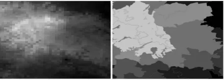
After downloading and structuring the original raster data from the CDC servers with several Python packages (ftplib, gzip, folders), further processing steps were carried out in a desktop GIS (ArcGIS Pro) using Python scripts. The most important processing task consisted of aggregating the raster data to vector data for each county (see Figure 1). We used the Zonal Statistics tool to calculate the average weather parameters for each county. The geometries of the counties of Germany are freely available on the website of the Federal Agency for Cartography and Geodesy3.
The main reason for the raster-vector conversion was to achieve a better performance in terms of loading times, since the data should be disseminated via web services. Moreover, we chose to present the data in a choropleth map, because having weather data per county was more suitable for the design of our evaluation (see section 3) than raster or isarithmic representations.
Figure 1: Aggregation from raster to vector data per county
After the conversion, the next step was to create a web map service from our local desktop GIS data. We used the cloud-based service ArcGIS Online, as data from ArcGIS Pro can easily be uploaded with a few clicks to ArcGIS Online without setting up and running additional web servers. Using the ArcGIS Online REST API, GIS web services like Map and Feature Services were created. These services could easily be integrated into any kind of web application.
2.2 Building the web application
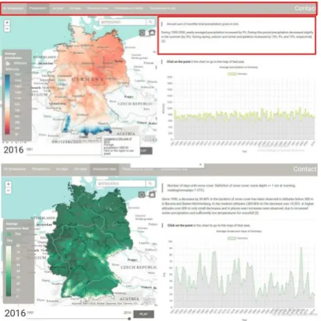
After creating the web services, the next step consisted of creating a web application with the following elements: static map, animated map, chart, legend and descriptive text.
We used a combination of different APIs and frameworks for our application:
3http://www.geodatenzentrum.de/geodaten/gdz_rahmen.gdz_
The ArcGIS API for JavaScript 3.234 was used for the
main element, the map container. This JavaScript API provides useful classes for web mapping, such as displaying base maps, creating symbologies like choropleth maps, loading operational layers, pop-ups with additional information, search widgets, legends and animations.
The animated map was implemented using standard
JavaScript methods such as windows.
requestAnimationFrame(), setTimeout() and
setRenderer().
For integrating the chart in the web application, the library Chart.js 5 was used. Chart.js is a powerful data
visualization library, focusing on displaying data in different types of charts. We used a line chart to visualize the seven different weather parameters mentioned in section 2.1, in two different spatial resolutions.
Finally, some parts of the front-end and Interactivity were designed using the CSS framework Materialize6.
Figure 2 shows two screenshots of the final web application with the map container featuring a choropleth map of weather parameters in the left half, and the line chart in the lower right half. A “Play/Pause” button is featured at the bottom of the left half to start and stop the animation.
Figure 2: Web application with map container (left) and line chart (bottom right)
3. Evaluation
The main goal of the evaluation was to identify which elements of the visualization people use to retrieve information about weather phenomena, and to which extent the usage of elements is task-dependent. Moreover, we were interested which factors determine participants’ accuracy. To answer these questions, we conducted
4https://developers.arcgis.com/javascript/3/ (accessed Dec 5,
2018)
controlled user experiments including eye-tracking technology in a computer lab at the TU Munich.
Following a within-subjects design principle, we divided the experiment into two different tasks, a free-examination task and a goal-directed task. In the goal-directed task, three different types of question were asked, which are described in section 3.2.
3.1 Setup and participants
The experiments were conducted in a university eye-tracking lab using Gazepoint Analysis and Gazepoint Control as eye-tracking software. This setup allows for basic screen capture with gaze overlay, heatmap visualization and raw data export.
The experiments were conducted on a Windows 10 operating system, using Chrome as a web browser. Twenty-four participants took part in the experiment, of which 11 were male and 13 were female. (Due to technical problems, we had to exclude three of the participants from the analysis).
The age of the participants ranged from 20 to 30 years. Seventeen participants were Cartography students, while the professional background of the rest of the other participants varied as well as their nationalities. All participants were fluent in English, the language in which the experiment was conducted.
3.2 Procedure
At the beginning of the experiments, participants were provided with instructions about the study for approximately five minutes.
After this introduction procedure, the participants were given another five minutes to view our web application without any task or indication (see Figure 3).
Figure 3: Starting page for the experiment
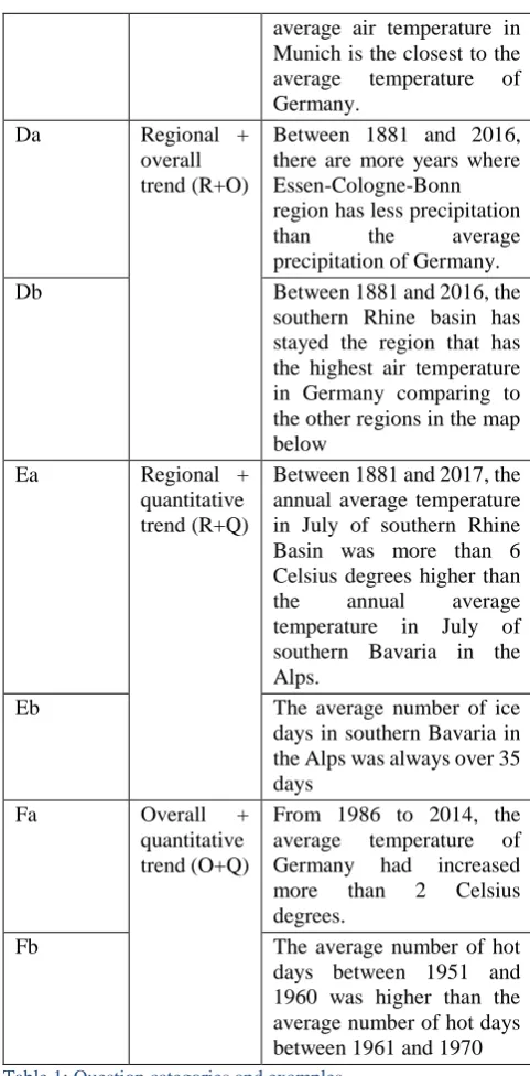
After this free eximination task, participants continued with the goal-directed task. Participants were provided with 15 questions in three different major question categories (regional, overall and quantitative trend), which they should answer as true or false. There was no time limit for answering these questions. The order of the questions was randomized. For each question, they also had to rate their confidence on a level between 1 (not confident) and 5 (very confident). The questions and categories are shown in detail in Table 1.
The question type of “regional trend” indicates how the weather parameters vary between regions. Questions about the “overall trend” are related to how weather phenomena change in the whole country. The difference between these two types is that the former concentrates more on regional changes, while the latter emphasizes the changes over time in a large picture. The third type “quantitative trend” focuses on statistical changes regionally or as a whole. Combinations of two questions types were used as well. Theoretically, all these questions could be answered using only the static map (including the pop-ups of the counties), the map animation, the chart or a combination of these elements.
Number Type Question
Aa Regional
trend
Between 1881 and 2000, there were more years where southern Bavaria in the Alps has less average precipitation than south-western Germany.
Ab Between 1881 and 2000,
there were more years where north-western
Germany has more
precipitation than north-eastern Germany.
Ac In comparison to the other
four regions in the map below, the air temperature in southern Bavaria in the Alps had increased the most.
Ba Overall
trend
Between 2000 and 2016, 2007 was the year with the lowest number of snow cover days.
Bb Between 1974 and 1984, the
average number of ice days in Germany increased every year.
Bc Between 1881 and 2017,
2014 is the year with the highest air temperature in Germany.
Ca Quantitative
trend
Between 2007 and 2017, Stuttgart always had more hot days than the average hot days of Germany.
Cb Between 1881 and 2017, the
annual average temperature in July in Berlin was not always over 17 Celsius degree
Cc Between 1881 and 2016,
among the cities of Berlin, Kiel, and Munich, the
average air temperature in Munich is the closest to the average temperature of Germany.
Da Regional +
overall trend (R+O)
Between 1881 and 2016, there are more years where Essen-Cologne-Bonn region has less precipitation
than the average
precipitation of Germany.
Db Between 1881 and 2016, the
southern Rhine basin has stayed the region that has the highest air temperature in Germany comparing to the other regions in the map below
Ea Regional +
quantitative trend (R+Q)
Between 1881 and 2017, the annual average temperature in July of southern Rhine Basin was more than 6 Celsius degrees higher than the annual average temperature in July of southern Bavaria in the Alps.
Eb The average number of ice
days in southern Bavaria in the Alps was always over 35 days
Fa Overall +
quantitative trend (O+Q)
From 1986 to 2014, the average temperature of Germany had increased more than 2 Celsius degrees.
Fb The average number of hot
days between 1951 and 1960 was higher than the average number of hot days between 1961 and 1970
Table 1: Question categories and examples
Figure 4: The geographical features were clearly marked in additional material.
There was no time limit for answering the questions in the goal-oriented task but the answering time was recorded. The overall duration of the experiment was between 30 and 50 minutes.
4. Evaluation results
While several other parameters were recorded within the experiment (see Han 2018), within the scope of this contribution we focus on the fixation times for the different elements of the web application, related to different tasks and question types, and on the relation between accuracy and fixation time.
4.1 Free examination task
On average, people spent 94 seconds gazing at the static map, 45 seconds on the chart, 40 seconds on the animated map, 11 seconds on the description and 6 seconds on the legend. Overall, during 43% of the whole task duration participants focused on the map container (see Table 2). Only one participant did not use the animation at all. We calculated the ratio between the duration time to the whole duration to ensure that the fixation duration was not determined by the size of each component. Hence, the higher the ratio, the more appealing the element is to the participants.
% of duration
% of monitor
Ratio between the two Map overall 43.1 34.8 1.24
Animated map 13.0 34.8 0.37
Static map 30.1 34.8 0.87
Chart 14.6 23.9 0.62
Legend 2.1 4.5 0.48
Description 3.6 9.6 0.37
Table 2: Fixation per visualization element
The distribution of the gaze points is shown in the heatmap of the gaze points in Figure 5, where warmer, reddish colours represent longer fixation times. Most of the attention focuses on the centre of the map (on the left), followed by the animation button and the chart (on the right).
Figure 5: Heatmap of the free-examination task
In terms of gender differences, it is worth noting that females on average spent eight seconds more gazing at the map container than males, while males on average spent two seconds more than females gazing at the line chart.
4.2 Goal-directed task
The fixation durations for the goal-directed task are displayed in Figure 6.
Figure 6: Percentage of total fixation duration by visualization element and question type
However, for quantitative trends participants favoured static maps.
This picture becomes even clearer when focusing on the three major question categories and omitting the combinations in Figure 7.
Figure 7: Percentage of total fixation by visualization element and question type
In other words, each of the three main map elements (static map, animated map, charts) was preferred for a certain task category (quantitative, regional and overall trend, respectively).
4.3 Accuracy
On average, participants answered 79% of all questions correctly. A detailed overview per category is shown in Table 3. Comparing fixation duration and accuracy of the answers, it is striking that correct respondents spent less time interacting with the visualization than incorrect respondents. This pattern is consistent throughout each of the six question categories.
Question category
Correct Answers Incorrect Answers Duration N Duration N
Regional 101.1 17.0 108.6 4.0
Overall 49.8 18.7 56.0 2.3
Quantitative 69.8 16.0 74.5 5.0
R+O 82.9 16.5 102.0 4.5
R+Q 83.2 12.5 88.7 8.5
O+Q 70.2 18.5 82.8 2.5
Table 3: Average fixation duration and number of answers (N), grouped by correct and incorrect answers.
The pattern of the most dominant visualization element described in section 4.2 (regional trend – animated map, overall trend – chart, quantitative trend – static map) is identical for both correct and incorrect answers (see Figure 7). Furthermore, Figure 7 shows that the chart is the only visualization element for which longer fixation times correspond rather with correct than with incorrect answers.
Figure 7: Average fixation duration in seconds per map element, grouped by correct (above) and incorrect (below) answers
5. Summary and discussion
In this contribution, we have shown how to create a web-based application for multi-dimensional spatiotemporal datasets, using a combination of Python scripts for data retrieval and processing, desktop GIS tools for data preparation and uploading, JavaScript/HTML/CSS frameworks for designing the web application, and cloud services for data hosting. This application was designed to visualize spatio-temporal change in weather phenomena, and to aid users in retrieving information from a complex, multi-dimensional dataset.
The high percentage of correct answers in our evaluation suggests that our geovisualization can help participants in answering questions about regional, overall and quantitative trends in multidimensional spatio-temporal datasets.
Eye-tracking analysis yielded several insights into the effectiveness of the different elements of the visualization. Our participants drew more of their attention on the map container than on any other visualization element. As our maps are more colourful and salient than the line charts, this is in accordance with studies of Wolfe and Horowitz (2004), who suggested that motion and colour are the visualization attributes that most attract the viewers’ attention.
memory (Ayres et al., 2005), since they are constantly changing and thus contain more information than static maps. When using animated maps, users often need to go back to previously viewed scenes to understand the current one.
However, the fixation time participants contributed to the different elements of the visualization (animated map, static map, charts) was highly task-dependent. Based on area of interest analysis, we found that the animated map was mainly used for answering regional questions, while the static map was mainly used for retrieving quantitative information, and the charts for overall trends. Without testing how accuracy is affected by the viewing strategies, it is somewhat unclear whether the participants’ preferences actually indicate the actual effectiveness of each visualization.
While there was no time limit for answering the tasks, we found a consistent negative relationship between correct answers and answering time. This might suggest that people do not make better map-based decisions with longer answering times, but that - on the contrary - longer answering times often lead to less accuracy (Wilkening and Fabrikant 2011).
In particular, participants who used animations to a large degree were less accurate in answering the questions. More than a decade ago, Harrower (2007) stated that when it comes to designing animated maps, the bottleneck is no longer the hardware, the software, or the database – it is the human user. Our user study suggests that this “human bottleneck” is still plausible after many years of enormous technological progress regarding the creation and performance of animations. More precisely, our results do not provide any evidence that animated maps support users in retrieving information from multidimensional spatio-temporal datasets. A potential reason for this is the cognitive overload when using the animation. In a similar evaluation that Opach et al. (2013) conducted, it was also observed that animation usage impaired participants’ accuracy. However, the efficiency of an animation might indeed depend on the fact whether salient features are thematically relevant or not (Griffin et al. 2006, Fabrikant 2005).
In general, the chart was the only visualization element that was used more within correct answers than within incorrect ones. This pattern was particularly strong in the category of overall trends, where a) participants’ accuracy was generally highest, and b) charts were generally used most, especially by participants who gave correct answers. This might suggest that while charts are not the most salient features in the visualization, they might still support users in finding correct answers more than maps.
5.1 Potential for future work
Future work should focus on the robustness of our results regarding the benefits of animated maps, static maps and charts for certain tasks, and also try to explain why certain visualization parts are more used for certain tasks. Overall, it remains an open question if and in which respects animated or static maps are more suitable (see also Midtbø and Larsen 2005).
It should be stated that while cartographers are often very good at testing the relative effectiveness of various map designs (e.g., different color schemes, different number of data classes, different symbol sizes, different animation speeds), they often struggle to identify why those designs worked best from a cognitive or perceptual standpoint (Harrower 2007, Fabrikant 2005). The relationship between map user preferences and the performance of the visualizations should be targeted in future work and considered in designing efficient visualizations for multi-dimensional spatiotemporal scenarios.
In this context, eye-tracking experiments can help identifying from which elements of the visualization users actually gather the necessary information for answering spatio-temporal questions.
6. References
Aigner, W., Miksch, S., Müller, W., Schumann, H. and Tominski, C. (2007). Visualizing Time-Oriented Data: A Systematic View. Computers and Graphics (31)3: 401-409.
Andrienko, N., Andrienko, G. and Gatalsky, P. (2003). Exploratory Spatio-Temporal Visualization: An Analytical Review. Journal of Visual Languages & Computing, 14(6): 503-541.
Andrienko, G., Andrienko, N., Dykes, J., Fabrikant, S. I. and Wachowicz, M. (2008). Geovisualization of Dynamics, Movement and Change: Key Issues and Developing Approaches in Visualization Research. Information Visualization, 7(3-4): 173-180.
Andrienko, G., Andrienko, N., Schumann, S. and Tominski, C. (2013). Visualization of Trajectory Attributer in Space-Time Cube and Trajectory Wall. In: Buchroithner, M., Prechtel, N., Burghardt, D. (eds.): Cartography from Pole to Pole. Selected Contributions to the XXVIth International Conference of the ICA, Dresden 2013. Springer, Berlin/Heidelberg.
Ayres, P., Kalyuga, S., Marcus, N. and Sweller, J. (2005). The conditions under which instructional animation may be effective. Paper presented at the International Workshop and Mini-conference, Open University of the Netherlands: Heerlen, The Netherlands.
Bogucka, E. P. and Jahnke, M. (2018). Feasibility of the space-time cube in temporal cultural landscape visualization. International Journal of Geo-Information 7, 209.
Bruggmann, A. and Fabrikant, S. I. (2016). How does GIScience support spatio-temporal information search in the humanities? Spatial Cognition & Computation, 16(4): 255- 271.
DWD Climate Data Center (CDC). Annual grids of monthly averaged daily air temperature (2m) over Germany, version v1.0. Available at https://www.dwd.de/DE/klimaumwelt/cdc/cdc_node.ht ml (accessed Dec 5, 2018).
Using Scatterplot Matrix Navigation In: IEEE Transactions on Visualization and Computer Graphics, 14 (6): 1148-1539.
Fabrikant, S. I. (2005). Towards an Understanding of Geovisualization with Dynamic Displays: Issues and Prospects. American Proceedings, Association for Artificial Intelligence (AAAI) 2005 Spring Symposium Series: Reasoning with Mental and External Diagrams: Computational Modeling and Spatial Assistance. Stanford University, Stanford, CA, Mar. 21-23, 2005: 6-11.
Fuchs, R. and Hauser, H. (2009). Visualization of Multi‐ Variate Scientific Data. Computer Graphics Forum, 28(6): 1670-1690.
Griffin, A., MacEachren, A., Hardisty, F., Steiner, E. and Li, B. (2006). A Comparison of Animated Maps with Static Small-Multiple Maps for Visually Identifying Space-Time Clusters. Annals of the Association of American Geographers, 96(4): 740–753.
Han, K. (2018). Online visualization of multi-dimensional spatio-temporal data. Master Thesis at TU München. (Available at http://cartographymaster.eu/wp-content/theses/2018_HAN_Thesis.pdf, accessed Dec 5, 2018)
Harrower, M. (2007). The cognitive limits of animated maps. Cartographica: The International Journal for Geographic Information and Geovisualization, 42(4): 349-357.
Jenny, B., Terribilini, A., Jenny, H., Gogu, R., Hurni, L. and Dietrich, V. (2006). Modular web-based atlas information systems. Cartographica: The International Journal for Geographic Information and Geovisualization, 41(3): 247-256.
Kehrer, J., and Hauser, H. (2013). Visualization and Visual Analysis of Multifaceted Scientific Data: A Survey. IEEE Transactions on Visualization and Computer Graphics, 19(3): 495-513.
Keim, D., Kohlhammer, J., Ellis, G. and Mansmann (2010). Mastering the Information Age: Solving Problems with Visual Analytics. Eurographics Association.
Kossoulakou, A. and Kraak, M.-J. (1992). Spatio-temporal maps and cartographic communication. The Cartographic Journal, 29(2): 101-108.
Kveladze, I., Kraak, M.-J. and Van Elzakker, C. P. J. M. (2013). A Methodological Framework for Researching the Usability of the Space-Time Cube. The Cartographic Journal, 50(3): 201-210.
Kveladze, I., Kraak, M-J. and Van Elzakker, C. P. J. M. (2018). Cartographic Design and the Space-Time Cube. The Cartographic Journal (accepted/in press).
Mayhew, D. J. (1999). The Usability Engineering Lifecycle: A Practitioner's Handbook for User Interface Design. Morgan Kaufmann, San Francisco.
Midtbø, T. and Larsen, E. (2005). Map animations versus static maps – When is one of them better? Joint ICA
Commissions Seminar on Internet-based Cartographic Teaching and Learning, Madrid, Jul 6-8: 1-6.
Monmonier, M. (1992). Authoring graphic scripts: Experiences and principles. Cartography and Geographic Information Systems, 19(4): 247-260.
Nielsen, J. (1994). Usability engineering. Morgan Kaufmann, San Francisco.
Nivala, A.-M., Sarjakoski, L. T. and Sarjakoski, T. (2007). Usability methods’ familiarity among map application developers. International Journal of Human-Computer Studies, 65(9): 784-795.
Opach, T., Midtbø, T. and Nossum, A. (2011). A New Concept of Multi-Scenario, Multi-Component Animated Maps for the Visualization of Spatio-Temporal Landscape Evolution. Miscellanea Geographica. Regional Studies on Development, 15(1): 215-229. Opach, T., Gołębiowska, I. and Fabrikant, S. I. (2013).
How Do People View Multi-Component Animated Maps? The Cartographic Journal, 51(4): 330-342.
Roberts, J. C. (2007). State of the Art: Coordinated and Multiple Views in Exploratory Visualization, Proceedings of the Fifth International Conference on Coordinaten and Multiple Views in Exploratory Visualization (CMV): 61-71.
Roth, R. E. (2013). Interactive Maps: What We Know and What We Need to Know. Journal of Spatial Information Science (6): 59-115.
Roth, R. E., Ross, K. S. and MacEachren, A. (2015). User-centered Design for Interactive Maps: A Case Study in Crime Analysis. International Journal of Geoinformation 4(1): 262-301.
Schiewe, J. (2018). Task-Oriented Visualization Approaches for Landscape and Urban Change Analysis. ISPRS International Journal of Geo-Information, 7(8), 288.
Shneiderman, B. (1996). The Eyes Have It: A Task by Data Type Taxonomy for Information Visualizations. Proceedings of the IEEE Symposium on Visual Languages: 336-343.
Wilkening, J. and Fabrikant, S. I. (2011). How do decision time and realism affect map-based decision making? In: Egenhofer, M. et al. (eds.): Spatial Information Theory. 10th International Conference, COSIT 2011, Belfast, Maine, USA. Lecture Notes in Computer Science. Springer, Berlin/Heidelberg: 1-19.
Wolfe, J. M. and Horowitz, T. S. (2004). What attributes guide the deployment of visual attention and how do they do it? Nature Reviews Neuroscience, 5(6): 495-501.