University of Pennsylvania
ScholarlyCommons
Publicly Accessible Penn Dissertations
2017
Statistical Methods For Whole Transcriptome
Sequencing: From Bulk Tissue To Single Cells
Cheng Jia
University of Pennsylvania, [email protected]
Follow this and additional works at:
https://repository.upenn.edu/edissertations
Part of the
Biostatistics Commons
, and the
Genetics Commons
This paper is posted at ScholarlyCommons.https://repository.upenn.edu/edissertations/2365
Recommended Citation
Jia, Cheng, "Statistical Methods For Whole Transcriptome Sequencing: From Bulk Tissue To Single Cells" (2017).Publicly Accessible
Penn Dissertations. 2365.
Statistical Methods For Whole Transcriptome Sequencing: From Bulk
Tissue To Single Cells
Abstract
RNA-Sequencing (RNA-Seq) has enabled detailed unbiased profiling of whole transcriptomes with
incredible throughput. Recent technological breakthroughs have pushed back the frontiers of RNA expression
measurement to single-cell level (scRNA-Seq). With both bulk and single-cell RNA-Seq analyses, modeling of
the noise structure embedded in the data is crucial for draw- ing correct inference. In this dissertation, I
developed a series of statistical methods to account for the technical variations specific in RNA-Seq
experiments in the context of isoform- or gene- level differential expression analyses. In the first part of my
dissertation, I developed MetaDiff (https://github.com/jiach/MetaDiff), a random-effects meta-regression
model, that allows the incorporation of uncertainty in isoform expression estimation in isoform differential
expression anal- ysis. This framework was further extended to detect splicing quantitative trait loci with
RNA-Seq data. In the second part of my dissertation, I developed TASC (Toolkit for Analysis of Single-Cell data;
https://github.com/scrna-seq/TASC), a hierarchical mixture model, to explicitly adjust for cell-to-cell
technical differences in scRNA-Seq analysis using an empirical Bayes approach. This framework can be
adapted to perform differential gene expression analysis. In the third part of my dissertation, I developed,
TASC-B, a method extended from TASC to model transcriptional bursting- induced zero-inflation. This
model can identify and test for the difference in the level of transcrip- tional bursting. Compared to existing
methods, these new tools that I developed have been shown to better control the false discovery rate in
situations where technical noise cannot be ignored. They also display superior power in both our simulation
studies and real world applications.
Degree Type
Dissertation
Degree NameDoctor of Philosophy (PhD)
Graduate GroupEpidemiology & Biostatistics
First AdvisorMingyao Li
Second AdvisorHongzhe Li
KeywordsSubject Categories
STATISTICAL METHODS FOR WHOLE TRANSCRIPTOME SEQUENCING: FROM BULK TISSUE TO SINGLE CELLS
Cheng Jia A DISSERTATION
in
Epidemiology and Biostatistics
Presented to the Faculties of the University of Pennsylvania in
Partial Fulfillment of the Requirements for the Degree of Doctor of Philosophy
2017
Supervisor of Dissertation
Mingyao Li
Associate Professor of Biostatistics
Graduate Group Chairperson
Nandita Mitra, Professor of Biostatistics
Dissertation Committee
Hongzhe Li, Professor of Biostatistics
Nancy Zhang, Associate Professor of Statistics Blanca Himes, Assistant Professor of Informatics
STATISTICAL METHODS FOR WHOLE TRANSCRIPTOME SEQUENCING: FROM BULK TISSUE TO SINGLE CELLS
c
⃝COPYRIGHT
2017 Cheng Jia
This work is licensed under the Creative Commons Attribution NonCommercial-ShareAlike 3.0 License
To view a copy of this license, visit
ACKNOWLEDGEMENT
Firstly, I would like to express my sincere gratitude to my advisor Dr. Mingyao Li for her continuous support of my Ph.D study, for her motivation, guidance and immense knowledge. She has been absolutely indispensable for my research and writing of this thesis, and one cannot ask for a better mentor and advisor.
In addition to my advisor, I would like to thank the rest of my dissertation committee: Dr. Nancy Zhang, Dr. Blanca Himes, and Dr. Hongzhe Li, for their insightful comments and consultation, without which this thesis would not be possible.
Last but not least, I would like to thank my family and friends for their unwavering support throughout my Ph.D. study and my life in general.
ABSTRACT
STATISTICAL METHODS FOR WHOLE TRANSCRIPTOME SEQUENCING: FROM BULK TISSUE TO SINGLE CELLS
Cheng Jia Mingyao Li
RNA-Sequencing (RNA-Seq) has enabled detailed unbiased profiling of whole transcriptomes with
incredible throughput. Recent technological breakthroughs have pushed back the frontiers of
RNA expression measurement to single-cell level (scRNA-Seq). With both bulk and single-cell RNA-Seq analyses, modeling of the noise structure embedded in the data is crucial for draw-ing correct inference. In this dissertation, I developed a series of statistical methods to account for the technical variations specific in RNA-Seq experiments in the context of isoform- or gene-level differential expression analyses. In the first part of my dissertation, I developed MetaDiff (https://github.com/jiach/MetaDiff), a random-effects meta-regression model, that allows the
incorporation of uncertainty in isoform expression estimation in isoform differential expression anal-ysis. This framework was further extended to detect splicing quantitative trait loci with RNA-Seq data. In the second part of my dissertation, I developed TASC (Toolkit for Analysis of Single-Cell
data;https://github.com/scrna-seq/TASC), a hierarchical mixture model, to explicitly adjust for
cell-to-cell technical differences in scRNA-Seq analysis using an empirical Bayes approach. This framework can be adapted to perform differential gene expression analysis. In the third part of my dissertation, I developed, TASC-B, a method extended from TASC to model transcriptional bursting-induced zero-inflation. This model can identify and test for the difference in the level of transcrip-tional bursting. Compared to existing methods, these new tools that I developed have been shown to better control the false discovery rate in situations where technical noise cannot be ignored. They also display superior power in both our simulation studies and real world applications.
TABLE OF CONTENTS
ACKNOWLEDGEMENT . . . iii
ABSTRACT . . . iv
LIST OF TABLES . . . viii
LIST OF ILLUSTRATIONS . . . xviii
CHAPTER 1 : INTRODUCTION . . . 1
1.1 RNA . . . 1
1.2 RNA-Sequencing . . . 2
1.3 Transcriptional Bursting . . . 7
CHAPTER 2 : Computational Tools for Bulk RNA-Seq . . . 9
2.1 Differential Expression: Genes . . . 9
2.2 Differential Expression: Isoforms . . . 21
2.3 Differential Alternative Splicing . . . 23
CHAPTER 3 : Computational Tools for Single-Cell RNA-Seq . . . 35
3.1 Normalization . . . 35
3.2 Differential Expression: Genes . . . 37
CHAPTER 4 : Generalized Linear Mixed-effects Models for Detecting DE Isoforms and Splicing Quantitative Trait Loci (sQTLs) from bulk RNA-Seq Data . . . 43
4.1 MetaDiff . . . 43
4.2 Splicing QTL . . . 55
CHAPTER 5 : Accounting for technical noise in single-cell RNA sequencing analysis . . . 66
5.1 Motivation . . . 66
5.2 Generative model of single-cell RNA sequencing . . . 67
5.3 Evaluation of Performance and Comparison with Other Methods . . . 85
CHAPTER 6 : Modeling transcriptional bursting with scRNA-seq data . . . 127
6.1 Motivation . . . 127
6.2 Generative Model Incorporating Transcriptional Bursting . . . 127
6.3 Evaluation of Performance and Comparison with Other Methods . . . 134
6.4 Application to Real World Dataset . . . 174
6.5 Computational Details . . . 191
CHAPTER 7 : Discussion and Concluding Remarks . . . 193
7.1 MetaDiff . . . 193 7.2 sQTL . . . 195 7.3 TASC . . . 196 7.4 TASC-B . . . 197 7.5 Concluding Remarks . . . 199 APPENDIX . . . 201 CHAPTER A : SOFTWARE . . . 201 BIBLIOGRAPHY . . . 201
LIST OF TABLES
TABLE 2.1 : Notations and Parameters in Trapnell et al., 2010 . . . 20
TABLE 2.2 : Covariates and explanations for Anders, Reyes, and Huber, 2012 . . . 29
TABLE 4.1 : Components and Interpretations in Jia et al., 2015 . . . 44
TABLE 4.2 : Number of isoforms detected in heart failure data. . . 55
TABLE 5.1 : Sample sizes of the sub-sampled Zeisel data(Zeisel et al., 2015) sets for two group comparison. Numerical labels are used to approximate the sample sizes in plotting. Text labels are used to distinguish analyses during discussion.109 TABLE 5.2 : Top 20 GO terms discovered for differentially expressed genes called by TASC.112 TABLE 5.3 : Top 20 GO terms discovered for differentially expressed genes called by SCDE. . . 113
TABLE 5.4 : Top 20 GO terms discovered for differentially expressed genes called by MAST. . . 114
TABLE 5.5 : Top 20 GO terms discovered for differentially expressed genes called by DESeq2. . . 115
TABLE 5.6 : Top 20 GO terms discovered for differentially expressed genes called by SCRAN. . . 116
TABLE 5.7 : Top 20 GO terms discovered for differentially expressed genes called by SCRAN.SP. . . 117
TABLE 5.8 : Proportion of DE genes identified by each method in SCAP-T data at varying significance levels. Filter 1 keeps the top 25% of genes in total read account across all the cells. Filter 2 keeps all the genes with non-zero counts in 5 cells or more. Nave SCRAN without the use of spike-ins is not included in this comparison, for the package fails to run due to there being “not enough cells in each cluster for specified ‘sizes’ ”. . . 122
TABLE 6.1 : Bias and estimation error ofθ^g,p^Bg andσ^gusing TASC-B from all simulated scenarios. For each parameter, the bias is estimated by subtracting the true value of the parameter from the mean of all estimates from 100 simulations, and the estimation error is the standard deviation of the 100 estimates. . . . 137
TABLE 6.2 : Estimated false positive rates from the null simulation with TASC-B Test #2. For each simulated scenario, the fraction of genes with raw p-value smaller than or equal to a specific significance level among all 5000 genes is computed. The estimated FPR using five different significance levels (0.1, 0.05, 0.01, 0.005, 0.001) are listed. . . 140
TABLE 6.3 : Estimated false positive rates from the null simulation with TASC-B Test #3 subsection 6.2.5. For each simulated scenario, the fraction of genes with raw p-value smaller than or equal to a specific significance level among all 5000 genes is computed. The estimated FPR using five different significance levels (0.1, 0.05, 0.01, 0.005, 0.001) are listed. . . 143
TABLE 6.4 : Estimated false positive rates from the null simulation with TASC-B Test #4 subsection 6.2.6. For each simulated scenario, the fraction of genes with raw p-value smaller than or equal to a specific significance level among all 5000 genes is computed. The estimated FPR using five different significance levels (0.1, 0.05, 0.01, 0.005, 0.001) are listed. . . 148
TABLE 6.5 : Estimated false positive rates from the null simulation with SCRAN coupled with DESeq2. For each simulated scenario, the fraction of genes with raw p-value smaller than or equal to a specific significance level among all 5000 genes is computed. The estimated FPR using five different significance
levels (0.1, 0.05, 0.01, 0.005, 0.001) are listed. . . 151
TABLE 6.6 : Estimated false positive rates from the null simulation with MAST Contin-uous Test. For each simulated scenario, the fraction of genes with raw p-value smaller than or equal to a specific significance level among all 5000 genes is computed. The estimated FPR using five different significance
lev-els (0.1, 0.05, 0.01, 0.005, 0.001) are listed. . . 153
TABLE 6.7 : Estimated false positive rates from the null simulation with MAST Discrete Test. For each simulated scenario, the fraction of genes with raw p-value smaller than or equal to a specific significance level among all 5000 genes is computed. The estimated FPR using five different significance levels (0.1, 0.05, 0.01, 0.005, 0.001) are listed. . . 156 TABLE 6.8 : Estimated false positive rates from the null simulation with MAST Hurdle
Test. For each simulated scenario, the fraction of genes with raw p-value smaller than or equal to a specific significance level among all 5000 genes is computed. The estimated FPR using five different significance levels (0.1, 0.05, 0.01, 0.005, 0.001) are listed. . . 159 TABLE 6.9 : Estimated false positive rates from the null simulation with the original TASC
package. For each simulated scenario, the fraction of genes with raw p-value smaller than or equal to a specific significance level among all 5000 genes is computed. The estimated FPR using five different significance
levels (0.1, 0.05, 0.01, 0.005, 0.001) are listed. . . 162
TABLE 6.10 : Fraction of genes with FDR adjusted p-values smaller than or equal to the given false discovery threshold from Test #2 in all comparisons. For each comparison, the names of the cell types compared, the total number of genes in this comparison, as well as seven different false discovery
thresh-olds (α∈{0.1, 0.05, 0.01, 0.005, 0.001, 0.0005, 0.0001}) are included. . . 180
TABLE 6.11 : Fraction of genes with FDR adjusted p-values smaller than or equal to the given false discovery threshold from Test #3 in all comparisons. For each comparison, the names of the cell types compared, the total number of genes in this comparison, as well as seven different false discovery
thresh-olds (α∈{0.1, 0.05, 0.01, 0.005, 0.001, 0.0005, 0.0001}) are included. . . 184
TABLE 6.12 : Fraction of genes with FDR adjusted p-values smaller than or equal to the given false discovery threshold from Test #4 in all comparisons. For each comparison, the names of the cell types compared, the total number of genes in this comparison, as well as seven different false discovery
LIST OF ILLUSTRATIONS
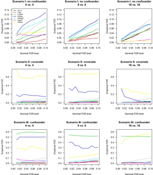
FIGURE 4.1 : 3 Simulation Scenarios. Scenario I: 15% up-regulated in cases; 15% down-regulated in cases; 70% non-DE. Scenario II: 5% non-DE but influenced by age; 2.5% up-regulated in cases and influenced by age; 2.5% down-regulated in cases and influenced by age; 12.5% up-down-regulated in cases but not influenced by age; 12.5% down-regulated in cases but not influenced by age; 65% non-DE and not influenced by age. Scenario III: same as Scenario II, except that age follows different distributions between cases
and control. . . 47
FIGURE 4.2 : Empirical FDR vs nominal FDR. Empirical FDR was computed as the frac-tion of the true non-DE features among those declared to be DE by the specified software package. Nominal FDR level was the FDR threshold
given to the specified package to determine the set of DE features. . . 49
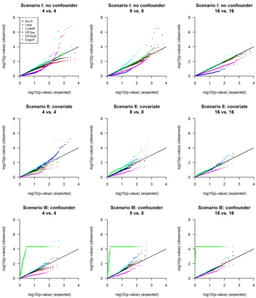
FIGURE 4.3 : Q-Q plot of log-transformed raw p-values of true non-DE transcripts un-der the null hypothesis. The raw p-values exported by each method for transcripts that are not differentially expressed in each scenario are
log-transformed, and then plotted against a log-transformedUniform(0, 1)
dis-tribution. . . 50
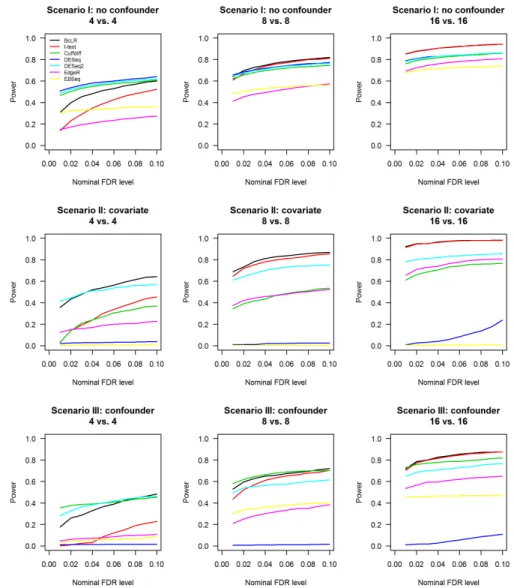
FIGURE 4.4 : Power comparison. Power is calculated as the fraction of the correctly identified DE features among all true DE features. FDR-adjusted p-values from each method are subject to filtering with various nominal FDR thresh-olds, the features passing each threshold will be counted, and divided by the total number of true DE features to arrive at the estimated power for this method at this threshold. Estimated power is plotted against the nom-inal FDR threshold level for each method with three different sample size
settings in all three scenarios. . . 52
FIGURE 4.5 : Zoomed in ROC curves. . . 54
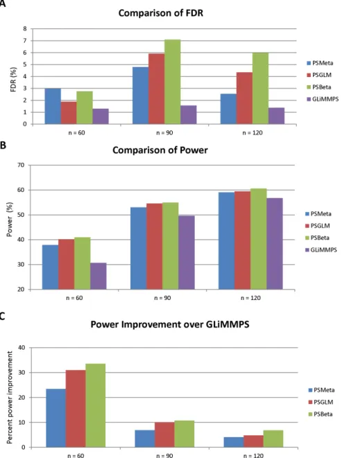
FIGURE 4.6 : FDR and Power of PSMeta, PSGLMM, PSBeta and GLiMMPS. 60 and 90 subjects were randomly chosen from the pool of 120 subjects to form the experiment groups with smaller sample size. From each experiment, PSMeta, PSGLMM, PSBeta and GLiMMPS were used to test for significant association between the given genotype and the exon inclusion level esti-mates. P-values exported by these methods are FDR-adjusted using the BenjaminiHochberg procedure. Genes with FDR smaller than the thresh-old level 0.05 are labeled as significant. FDR is computed as the fraction of the true non-significant genes among genes labeled “significant” by each method. Power is computed as the fraction of the genes labeled “signif-icant” by each method among all the true significant genes. Power im-provement is computed as the percent imim-provement for the power of the
FIGURE 4.7 : FDR and Power of PSMeta, PSGLMM, PSBeta and GLiMMPS for low-coverage genes. 60 and 90 subjects were randomly chosen from the pool of 120 subjects to form the experiment groups with smaller sample size. Only genes ranked at the bottom third in terms of sequencing cov-erage are included. From each experiment, PSMeta, PSGLMM, PSBeta and GLiMMPS were used to test for significant association between the given genotype and the exon inclusion level estimates. P-values exported by these methods are FDR-adjusted using the BenjaminiHochberg proce-dure. Genes with FDR smaller than the threshold level 0.05 are labeled as significant. FDR is computed as the fraction of the true non-significant genes among genes labeled “significant” by each method. Power is com-puted as the fraction of the genes labeled “significant” by each method among all the true significant genes. Power improvement is computed as the percent improvement for the power of the specified method over the
that of GLiMMPS. . . 62
FIGURE 4.8 : Quantile-quantile (Q-Q) plot for the negative log10 transformed raw p-values of each method. The raw p-values generated from the CEU population were transformed with a negative log function with base 10. The formed p-values were sorted and plotted against the negative log10
trans-formed expected value of the same quantile from aUniform(0, 1)
distribu-tion. . . 64
FIGURE 5.1 : Proportion of cells with non-zero read count (in a) and mean across cells
of log read count (inb) versus log true molecule count for ERCC spike-ins
in Zeisel et al. data. Included in the plot are the best logistic curve fit (ina)
and the best linear fit (inb). . . . 68
FIGURE 5.2 : Schematic of TASC model for a single genegacrossncells, withµcgbeing
true absolute expression, Ycg being observed read count, and Zcg, λcg
being intermediate variables that model dropout and amplification, capture,
and sequencing biases. . . 71
FIGURE 5.3 : Comparing the maximum likelihood estimators of cell-specific technical
pa-rametersΨc with their true values. Left panel: scatter plot comparingαc
(upper) andβc(lower) estimated with maximum likelihood methods (y axis)
to their true values (x axis). Middle panel: scatter plot comparingκc(upper)
andτc(lower) estimated with maximum likelihood methods (y axis) to their
true values (x axis). Right panel: scatter plot comparingκc(upper) andτc
(lower) estimated with maximum likelihood methods (y axis) to their true values (x axis), zoomed in view. Identity line (dotted) is plotted for ease of
comparison. . . 74
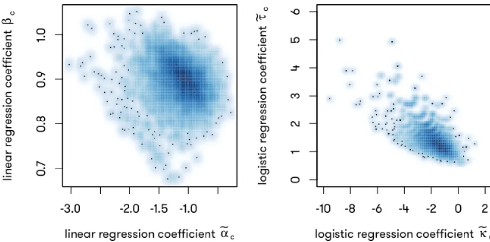
FIGURE 5.4 : Scatter plot describing the correlation betweenαc andβc, andκcandτc.
Left panel: α˜c (y axis) compared to β˜c (x axis); both estimated from
lin-ear regressions. Right panel: κ˜c (y axis) compared to τ˜c (x axis); both
estimated from logistic regressions. . . 75
FIGURE 5.5 : Comparing the estimated α^c, β^c to the true values of αc and βc. Left
panel: α^ estimated from linear regressions (y axis) compared to their true
values (x axis). Right panel: β^ estimated from linear regressions (y axis)
compared to their true values (x axis). Both panels: dotted lines represent
the unit lines with intercept equal to0, and slope equal to1. . . 78
FIGURE 5.6 : Comparing the estimatedκ^c,τ^cto the true values ofκcandτc. Dotted line
FIGURE 5.7 : Distributions of empirically estimated values of(^αc,β^c)and(^κc,^τc)across
all cells in Zeisel data. Four cells are selected from each plot to represent
the distribution, and the line (ina) and logistic curve (inb) corresponding to
the technical parameters estimated for these cells are shown in matching
colors. . . 81
FIGURE 5.8 : Venn diagram showing the overlapping of genes detected to be differen-tially expressed between comparisons with and without cell size adjustment. 85
FIGURE 5.9 : Distribution of achieved p-values (in a) and the corresponding
quantile-quantile plots (inb) for four methods applied to CA1Pyr2 cells from Zeisel
et al. data, split randomly into two groups, thus emulating a case where all
p-values should be uniformly sampled from[0, 1]. . . 87
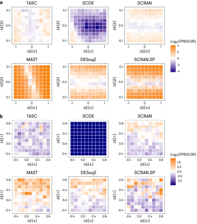
FIGURE 5.10 :Accuracy of false positive rate control under mild to severe batch effects for TASC, SCDE, MAST, and DESeq2. The batch effect severity takes the form of between-group difference in the expected values of the technical
parameters, denoted by∆E[κ]and∆E[τ](ina), and∆E[α]and∆E[β](in
b) in the axes of the heatmaps. The color scale of the heatmaps reflects deviation of achieved false positive rate from the target value of 0.05 used
in the tests. . . 89
FIGURE 5.11 :The scheme of simulation for power comparisons. Simulations differ by
their sample sizes,i.e.the number of cells in each group. This is achieved
by downsampling each group to the desired number of cells from the com-plete data (447 cells in total). One simulation contains 100 datasets, gener-ated by repeating the sampling process from the same parameters. Each dataset contains the counts of 5018 genes in specified number of cells.
1000 genes are differentially expressed while the rest are not. . . 92
FIGURE 5.12 :Distribution ofηgin the simulation study. . . 92
FIGURE 5.13 :Scatter plots for 9 randomly picked pairs of cells in simulated data. For each panel, two cells are randomly chosen from the a total of 447. With
two cells indexed asiandj,log(Yig+1)is plotted againstlog(Yjg+1). . . 93
FIGURE 5.14 :a. Achieved power of TASC, SCDE, MAST, DESeq2, SCRAN, and SCRAN.SP for detecting varying fold changes in mean in the simulated data set within 100 cells in each group. Results both with (SCRAN.SP) and without (SCRAN)
the use of ERCC are included for SCRAN.b. Power differences between
TASC and the other methods in the simulated data set. . . 94
FIGURE 5.15 :Relationship between the estimated power and the effect size. Each DE
gene is plotted with the x axis indicating their ηg. Y axis represents the
proportion of datasets in which TASC has called this gene significantly dif-ferentially expressed (p is less than or equal to the specified significance
level). The sample size of this simulation is 100 vs 100. . . 96
FIGURE 5.16 :Power comparison between TASC and with various effect sizes. Each panel contains the power curve of TASC and under the specified signifi-cance level. This plot is generated from the simulation 100 vs 100
(Fig-ure 5.11). . . 97
FIGURE 5.17 :Power improvement of TASC over with various effect sizes. Each panel contains the power improvement curve of TASC and under the specified significance level. Y axis represents the difference in absolute not relative
values in estimated power between TASC and ,i.e. ωT ASCg −ωg. This plot
FIGURE 5.18 :Compare power between TASC and MAST(Finak et al., 2015) with various effect sizes. Each panel contains the power curve of TASC and MAST(Finak et al., 2015) under the specified significance level. This plot is generated
from the simulation 100 vs 100 (Figure 5.11). . . 99
FIGURE 5.19 :Power improvement of TASC over MAST(Finak et al., 2015) with various effect sizes. Each panel contains the power improvement curve of TASC and MAST(Finak et al., 2015) under the specified significance level. Y axis represents the difference in absolute not relative values in estimated power
between TASC and MAST(Finak et al., 2015),i.e. ωT ASC
g −ωMASTg . This
plot is generated from the simulation 100 vs 100 (Figure 5.11). . . 100 FIGURE 5.20 :Compare power between TASC and DESeq2(Love, Huber, and Anders,
2014) with various effect sizes. Each panel contains the power curve of TASC and MAST(Finak et al., 2015) under the specified significance level. This plot is generated from the simulation 100 vs 100 (Figure 5.11). . . 101 FIGURE 5.21 :Power improvement of TASC over DESeq2(Love, Huber, and Anders, 2014)
with various effect sizes. Each panel contains the power improvement curve of TASC and DESeq2(Love, Huber, and Anders, 2014) under the specified significance level. Y axis represents the difference in absolute not relative values in estimated power between TASC and DESeq2(Love,
Huber, and Anders, 2014),i.e. ωT ASC
g −ω
DESeq2
g . This plot is generated
from the simulation 100 vs 100 (Figure 5.11). . . 102 FIGURE 5.22 :Compare power between TASC and SCRAN(Lun, Bach, and Marioni, 2016)
with various effect sizes. Each panel contains the power curve of TASC and SCRAN(Lun, Bach, and Marioni, 2016) under the specified significance level. This plot is generated from the simulation 100 vs 100 (Figure 5.11). . 103 FIGURE 5.23 :Power improvement of TASC over SCRAN(Lun, Bach, and Marioni, 2016)
with various effect sizes. Each panel contains the power improvement curve of TASC and SCRAN(Lun, Bach, and Marioni, 2016) under the spec-ified significance level. Y axis represents the difference in absolute not relative values in estimated power between TASC and SCRAN(Lun, Bach,
and Marioni, 2016), i.e. ωT ASCg −ωSCRANg . This plot is generated from
the simulation 100 vs 100 (Figure 5.11). . . 104
FIGURE 5.24 :Compare power between TASC and SCRAN(Lun, Bach, and Marioni, 2016) with various effect sizes. Each panel contains the power curve of TASC and SCRAN(Lun, Bach, and Marioni, 2016) under the specified significance level. This plot is generated from the simulation 100 vs 100 (Figure 5.11). . 105 FIGURE 5.25 :Power improvement of TASC over SCRAN(Lun, Bach, and Marioni, 2016)
with various effect sizes. Each panel contains the power improvement curve of TASC and SCRAN(Lun, Bach, and Marioni, 2016) under the spec-ified significance level. Y axis represents the difference in absolute not relative values in estimated power between TASC and SCRAN(Lun, Bach,
and Marioni, 2016), i.e. ωT ASC
g −ωSCRANg . This plot is generated from
the simulation 100 vs 100 (Figure 5.11). . . 106
FIGURE 5.26 :Power curves for TASC from simulations with different sample sizes. In
each panel, the estimated power ωg of each gene for TASC is plotted
against the effect size (fold change) assigned for this gene simulated at
FIGURE 5.27 :Power curves for TASC, SCDE, MAST, DESeq2, SCRAN and SCRAN.SP for sample sizes of 50 vs 50 and above. In each panel the smoothed power curves for all methods from specified sample size are plotted. X axis
indi-cates the fold change ηg for each gene. Y axis represents the average
power for each method after smoothing with GAM as described. . . 108
FIGURE 5.28 :Number of DE genes identified by each method between two level-2 classes in Zeisel et al. data at the 0.0001 significance level, under varying sample sizes. . . 110
FIGURE 5.29 :Scatter plots describing the distribution ofΨc of the SCAP-T data. . . 118
FIGURE 5.30 :Histograms forR2computed from SCAP-T data. . . . 119
FIGURE 5.31 :Histograms forR2computed from Zeisel et al. data. . . . 119
FIGURE 5.32 :Histograms for normalized cell size factors computed from SCAP-T data. 120 FIGURE 5.33 :Histograms for normalized cell size factors computed from Zeisel et al. data. . . 120
FIGURE 5.34 :Histograms describing the distributions of raw p-values from various meth-ods in the null comparison with SCAP-T data. . . 123
FIGURE 5.35 :Q-Q plots describing the distributions of raw p-values from various methods in the null comparison with SCAP-T data. . . 124
FIGURE 5.36 :Comparison of Laplacian approximation and Adaptive Integration . . . 125
FIGURE 5.37 :Comparison of run time of Laplacian approximation and Adaptive Integra-tion, using 24 cores. . . 126
FIGURE 6.1 : Illustration of sources of zeros in scRNA-seq data. . . 128
FIGURE 6.2 : Scatter plots illustrating the relationship between the estimated values and the true values of θg andpBg. The dotted line is the unit line with slope equal 1, and intercept equal to 0. . . 136
FIGURE 6.3 : Histograms of estimatedθ^gusing TASC and TASC-B. Different rows repre-sent simulations with variouspG g, and different columns represent simula-tions with variousθg. In each panel, two histograms are plotted with distinct colors, representing the distribution of estimatedθ^g from TASC (blue) and TASC-B (red). The vertical dotted lines indicate the true values ofθg. . . . 138
FIGURE 6.4 : Histograms of estimatedσ^gusing TASC and TASC-B. Different rows repre-sent simulations with variouspGg, and different columns represent simula-tions with variousσg. In each panel, two histograms are plotted with distinct colors, representing the distribution of estimatedσ^g from TASC (blue) and TASC-B (red). The vertical dotted lines indicate the true values ofσg. . . 139
FIGURE 6.5 : Q-Q plots of −log10(p) comparing the p-values extracted from Test #2 (subsection 6.2.4) performed with TASC-B model, and the expected quan-tile drawn from a uniform distribution on (0, 1). Dotted line indicates the unit line, with intercept equal to 0, and slope equal to 1. Methods with well-controlled type I error should generate a line overlapping the unit line. θg andpB g used to simulate the scenario is labeled on the right and top side of the graph, with rows differing inθgand columnspBg. . . 141
FIGURE 6.6 : Histograms of raw p-values extracted from TASC-B Test #2 results (sub-section 6.2.4). With 5000 genes in 50 bins, each bin is expected to have a density of50/5000 =1%, which is indicated with the dotted line. Methods with well-controlled type I error should generate a histogram that evenly distributed between(0, 1). θg andpBg used to simulate the scenario is la-beled on the right and top side of the graph, with rows differing inθg and columnspB g. . . 142
FIGURE 6.7 : Q-Q plots of −log10(p) comparing the p-values extracted from Test #3
(subsection 6.2.5) performed with TASC-B model, and the expected
quan-tile drawn from a uniform distribution on (0, 1). Dotted line indicates the
unit line, with intercept equal to 0, and slope equal to 1. Methods with
well-controlled type I error should generate a line overlapping the unit line. θg
andpB
g used to simulate the scenario is labeled on the right and top side
of the graph, with rows differing inθgand columnspBg. . . 144
FIGURE 6.8 : Histograms of raw p-values extracted from TASC-B Test #3 results (sub-section 6.2.4). With 5000 genes in 50 bins, each bin is expected to have a
density of50/5000 =1%, which is indicated with the dotted line. Methods
with well-controlled type I error should generate a histogram that evenly
distributed between(0, 1). θg andpBg used to simulate the scenario is
la-beled on the right and top side of the graph, with rows differing inθg and
columnspBg. . . 145
FIGURE 6.9 : Q-Q plots of −log10(p) comparing the p-values extracted from Test #4
(subsection 6.2.5) performed with TASC-B model, and the expected
quan-tile drawn from a uniform distribution on (0, 1). Dotted line indicates the
unit line, with intercept equal to 0, and slope equal to 1. Methods with
well-controlled type I error should generate a line overlapping the unit line. θg
andpB
g used to simulate the scenario is labeled on the right and top side
of the graph, with rows differing inθgand columnspBg. . . 146
FIGURE 6.10 :Histograms of raw p-values extracted from TASC-B Test #4 results (sub-section 6.2.4). With 5000 genes in 50 bins, each bin is expected to have a
density of50/5000 =1%, which is indicated with the dotted line. Methods
with well-controlled type I error should generate a histogram that evenly
distributed between(0, 1). θg andpBg used to simulate the scenario is
la-beled on the right and top side of the graph, with rows differing inθg and
columnspBg. . . 147
FIGURE 6.11 :Q-Q plots of −log10(p) comparing the p-values extracted from SCRAN
coupled with DESeq2, and the expected quantile drawn from a uniform
distribution on(0, 1). Dotted line indicates the unit line, with intercept equal
to 0, and slope equal to 1. Methods with well-controlled type I error should
generate a line overlapping the unit line. θg andpBg used to simulate the
scenario is labeled on the right and top side of the graph, with rows differing
inθgand columnspBg. . . 149
FIGURE 6.12 :Histograms of raw p-values extracted from SCRAN coupled with DESeq2. With 5000 genes in 50 bins, each bin is expected to have a density of 50/5000 =1%, which is indicated with the dotted line. Methods with well-controlled type I error should generate a histogram that evenly distributed
between(0, 1). θg andpBg used to simulate the scenario is labeled on the
right and top side of the graph, with rows differing inθgand columnspBg. . 150
FIGURE 6.13 :Q-Q plots of−log10(p)comparing the p-values extracted from MAST
Con-tinuous Test, and the expected quantile drawn from a uniform distribution
on(0, 1). Dotted line indicates the unit line, with intercept equal to 0, and
slope equal to 1. Methods with well-controlled type I error should generate
a line overlapping the unit line.θg andpBg used to simulate the scenario is
labeled on the right and top side of the graph, with rows differing inθgand
columnspB
FIGURE 6.14 :Histograms of raw p-values extracted from MAST Continuous Test. With
5000 genes in 50 bins, each bin is expected to have a density of50/5000=
1%, which is indicated with the dotted line. Methods with well-controlled
type I error should generate a histogram that evenly distributed between
(0, 1). θgandpBg used to simulate the scenario is labeled on the right and
top side of the graph, with rows differing inθgand columnspBg. . . 154
FIGURE 6.15 :Q-Q plots of−log10(p)comparing the p-values extracted from MAST
Dis-crete Test, and the expected quantile drawn from a uniform distribution on
(0, 1). Dotted line indicates the unit line, with intercept equal to 0, and slope
equal to 1. Methods with well-controlled type I error should generate a line
overlapping the unit line. θg andpBg used to simulate the scenario is
la-beled on the right and top side of the graph, with rows differing inθg and
columnspBg. . . 155
FIGURE 6.16 :Histograms of raw p-values extracted from MAST Discrete Test. With 5000
genes in 50 bins, each bin is expected to have a density of50/5000=1%,
which is indicated with the dotted line. Methods with well-controlled type
I error should generate a histogram that evenly distributed between(0, 1).
θgandpBg used to simulate the scenario is labeled on the right and top side
of the graph, with rows differing inθgand columnspBg. . . 157
FIGURE 6.17 :Q-Q plots of−log10(p)comparing the p-values extracted from MAST
Hur-dle Test, and the expected quantile drawn from a uniform distribution on
(0, 1). Dotted line indicates the unit line, with intercept equal to 0, and
slope equal to 1. Methods with well-controlled type I error should generate
a line overlapping the unit line.θg andpBg used to simulate the scenario is
labeled on the right and top side of the graph, with rows differing inθgand
columnspBg. . . 158
FIGURE 6.18 :Histograms of raw p-values extracted from MAST Hurdle Test. With 5000
genes in 50 bins, each bin is expected to have a density of50/5000=1%,
which is indicated with the dotted line. Methods with well-controlled type
I error should generate a histogram that evenly distributed between(0, 1).
θgandpBg used to simulate the scenario is labeled on the right and top side
of the graph, with rows differing inθgand columnspBg. . . 160
FIGURE 6.19 :Q-Q plots of−log10(p)comparing the p-values extracted from the original
TASC package, and the expected quantile drawn from a uniform distribution
on(0, 1). Dotted line indicates the unit line, with intercept equal to 0, and
slope equal to 1. Methods with well-controlled type I error should generate
a line overlapping the unit line.θg andpBg used to simulate the scenario is
labeled on the right and top side of the graph, with rows differing inθgand
columnspBg. . . 161
FIGURE 6.20 :Histograms of raw p-values extracted from the original TASC package. With
5000 genes in 50 bins, each bin is expected to have a density of50/5000=
1%, which is indicated with the dotted line. Methods with well-controlled
type I error should generate a histogram that evenly distributed between
(0, 1). θgandpBg used to simulate the scenario is labeled on the right and
FIGURE 6.21 :Q-Q plots of −log10(p) comparing the p-values extracted from TASC-B
Test #2, and the expected quantile drawn from a uniform distribution on
(0, 1) under a series of alternative hypotheses. Dotted line indicates the
unit line, with intercept equal to 0, and slope equal to 1. Methods with
well-controlled type I error should generate a line overlapping the unit line.∆θg
and∆pB
g used to simulate the scenario is labeled on the right and top side
of the graph, with rows differing inθgand columnspBg. . . 165
FIGURE 6.22 :Heat maps illustrating the estimated power of the TASC-B Test #2 under various simulated scenarios. Empirical power is represented by the frac-tion of the genes with LRT p-values smaller than the specified significance
levels (α∈{0.1, 0.05, 0.01, 0.005, 0.001}) among all genes simulated. Darker
color represents higher power. Scenarios that are omitted from the
simu-lation are filled with grey. ∆θg and∆pBg used to simulate the scenario is
labeled on the left and bottom side of the graph, with rows differing in θg
and columnspBg. . . 166
FIGURE 6.23 :Q-Q plots of −log10(p) comparing the p-values extracted from TASC-B
Test #3, and the expected quantile drawn from a uniform distribution on
(0, 1) under a series of alternative hypotheses. Dotted line indicates the
unit line, with intercept equal to 0, and slope equal to 1. Methods with
well-controlled type I error should generate a line overlapping the unit line.∆θg
and∆pB
g used to simulate the scenario is labeled on the right and top side
of the graph, with rows differing inθgand columnspBg. . . 168
FIGURE 6.24 :Heat maps illustrating the estimated power of the TASC-B Test #3 under various simulated scenarios. Empirical power is represented by the frac-tion of the genes with LRT p-values smaller than the specified significance
levels (α∈{0.1, 0.05, 0.01, 0.005, 0.001}) among all genes simulated. Darker
color represents higher power. Scenarios that are omitted from the
simu-lation are filled with grey. ∆θg and∆pBg used to simulate the scenario is
labeled on the left and bottom side of the graph, with rows differing in θg
and columnspBg. . . 169
FIGURE 6.25 :Q-Q plots of −log10(p) comparing the p-values extracted from TASC-B
Test #4, and the expected quantile drawn from a uniform distribution on
(0, 1) under a series of alternative hypotheses. Dotted line indicates the
unit line, with intercept equal to 0, and slope equal to 1. Methods with
well-controlled type I error should generate a line overlapping the unit line.∆θg
and∆pB
g used to simulate the scenario is labeled on the right and top side
of the graph, with rows differing inθgand columnspBg. . . 171
FIGURE 6.26 :Heat maps illustrating the estimated power of the TASC-B Test #4 under various simulated scenarios. Empirical power is represented by the frac-tion of genes with LRT p-values smaller than the specified significance
lev-els (α ∈ {0.1, 0.05, 0.01, 0.005, 0.001}) among all genes simulated. Darker
color represents higher power. Scenarios that are omitted from the
simu-lation are filled with grey. ∆θg and∆pBg used to simulate the scenario is
labeled on the left and bottom side of the graph, with rows differing in θg
and columnspB
FIGURE 6.27 :Bar plots illustrating the estimated power of the TASC-B tests (Tests #2, 3 and 4), and existing methods (SCRAN coupled with DESeq2, MAST and the original TASC package) under various simulated scenarios. Empirical power is represented by the fraction of genes with p-values smaller than
the specified significance level (α=0.05) among all genes simulated.∆θg
and∆pB
g used to simulate the scenario is labeled on the right and top side
of the graph, with rows differing inθgand columnspBg. . . 175
FIGURE 6.28 :Histograms illustrating the distribution of logit-transformed probability of bursting in all seven level-1 classes from the Zeisel et al. data. . . 176
FIGURE 6.29 :Histograms illustrating the distribution of log read counts (log(Ycg+1)) of
the most significantly bursty genes in interneurons of the Zeisel et al. data. 177
FIGURE 6.30 :Histograms illustrating the distribution of log read counts (log(Ycg+1)) of
the most significantly bursty genes in endothelial mural of the Zeisel et al. data. . . 178
FIGURE 6.31 :Histograms illustrating the distribution of log read counts (log(Ycg+1)) of
the most significantly differentially bursting genes called by Test #2 in en-dothelial mural compared to interneurons of the Zeisel et al. data. . . 178 FIGURE 6.32 :Histograms illustrating the distribution of the FDR-adjusted p-values from
Test #2 comparing cell types from the Zeisel et al. data. Names of the two groups compared are labeled to the left (group 0) and top (group 1) of the
panel. . . 181
FIGURE 6.33 :Histograms illustrating the distribution of the difference in level of
transcrip-tional bursting (∆pB
g =pBg1−pBg0) in any two cell types from the Zeisel et al.
data. The difference is computed with fitted values from Test #2. Names of the two groups compared are labeled to the left (group 0) and top (group 1) of the panel. The dotted lines indicate zero. . . 182
FIGURE 6.34 :Histograms illustrating the distribution of log read counts (log(Ycg+1)) of
the most significantly DB genes called by Test #3 in endothelial mural com-pared to interneurons of the Zeisel et al. data. . . 183 FIGURE 6.35 :Histograms illustrating the distribution of the FDR-adjusted p-values from
Test #3 comparing cell types from the Zeisel et al. data. Names of the two groups compared are labeled to the left (group 0) and top (group 1) of the
panel. . . 185
FIGURE 6.36 :Histograms illustrating the distribution of the difference in positive mean
expression (∆θg = θg1−θg0) in any two cell types from the Zeisel et al.
data. The difference is computed with fitted values from Test #3. Names of the two groups compared are labeled to the left (group 0) and top (group 1) of the panel. The dotted lines indicate zero. . . 186
FIGURE 6.37 :Histograms illustrating the distribution of log read counts (log(Ycg+1)) of
the most significantly DB genes called by Test #4 in endothelial mural com-pared to interneurons of the Zeisel et al. data. . . 187 FIGURE 6.38 :Histograms illustrating the distribution of the FDR-adjusted p-values from
Test #4 comparing cell types from the Zeisel et al. data. Names of the two groups compared are labeled to the left (group 0) and top (group 1) of the
panel. . . 189
FIGURE 6.39 :Histograms illustrating the distribution of the difference in level of
transcrip-tional bursting (∆pBg =pBg1−pBg0) in any two cell types from the Zeisel et al.
data. The difference is computed with fitted values from Test #4. Names of the two groups compared are labeled to the left (group 0) and top (group 1) of the panel. The dotted lines indicate zero. . . 190
FIGURE 6.40 :Histograms illustrating the distribution of the difference in positive mean
expression (∆θg = θg1−θg0) in any two cell types from the Zeisel et al.
data. The difference is computed with fitted values from Test #4. Names of the two groups compared are labeled to the left (group 0) and top (group 1) of the panel. The dotted lines indicate zero. . . 191
CHAPTER 1
I
NTRODUCTION1.1. RNA
The central dogma of biology describes the flow of genetic information from deoxyribonucleic acid (DNA) to ribonucleic acid (RNA), and subsequently from RNA to protein. As a courier from genomic DNA to cellular protein synthesis machinery (ribosomes), RNA ultimately affects the phenotypes of all cellular organisms on planet earth.
Tremendous discrepancy in complexities and dynamic ranges of genome and protein exists. As an example, human genome contains approximately 21,000 distinct protein-coding genes, much less than previously estimated (Lander, 2011), while a recent survey of the human proteome discovered approximately 293,000 non-redundant peptides (Kim et al., 2014). In addition, human genome is generally diploid, with two copies of every gene present. The level of protein expression on the other hand has a large dynamic range from the most prevalent such as hemoglobins in red blood
cells and insulin in pancreaticβcells, to the most rare (e.g., certain transcription factors of which
the expression needs to be carefully regulated to avoid malignant growth).
This discrepancy can be partly explained by RNA. Eukaryotic genes are organized on the genome as links of protein coding regions (exons) interwoven with non-coding sequences (introns), which are spliced out during post-transcriptional processing of pre-mRNA (Crick, 1979). Alternative splic-ing of pre-mRNA molecules can create an arbitrarily large number of isoforms codsplic-ing for distinct protein products, by including different subsets of exons or even different parts of an exon, in the mature messenger RNA (mRNA), bridging the gap in structural complexities between DNA and protein. Many copies of RNA can be produced from a single genetic locus through transcription, and regulation of its speed directly affects the amount of mRNA present in the cell, thus influenc-ing the level of the particular protein encoded by this mRNA. A large portion of quantitative and sequence complexity of human proteome is attributable to the transcription and alternative splicing (AS) of RNA.
Due to the critical roles played by RNA in cellular processes, mis-regulation of mRNA transcription or post-transcriptional modifications can be extremely detrimental. Therefore, identification of differ-entially expressed mRNA is a standard part of analysis when comparing controls and cases for any
disease. In addition, mis-regulation of alternative splicing is cause for numerous known diseases,
such as β-thalassemia (Cao and Galanello, 2010), spinal muscular atrophy (Cho and Dreyfuss,
2010), etc.
1.2. RNA-Sequencing
The quest for accurately measuring the amount of specific mRNA molecules has witnessed several leaps of technology which has gradually allowed the scientific community to investigate more num-ber of genes simultaneously with greater details and accuracy. Early methods such as Northern blot and real-time quantitative polymerase chain reaction (RT-qPCR) could only detect the expres-sion of several candidate genes with known sequence at a time.
The advent of microarray technology enabled simultaneous quantification of thousands of putative transcripts. This brought about new fields of transcriptomic studies such as non-coding RNA, single nucleotide polymorphisms (SNPs) and alternative splicing events. Despite its popularity, microarray suffers from the following shortcomings. First, it fails to discover novel transcripts that have yet to be annotated. Second, it does not reveal the sequences of the molecules detected outside the hybridization probes. These caveats were eventually addressed by RNA-sequencing technology. Massive parallel sequencing was first applied to measure mRNA concentration in 2007 (Weber et al., 2007). While early adopters primarily employed pyrosequencing technology (Sugarbaker et al., 2008; Torres et al., 2008; Weber et al., 2007), Illumina sequencing became immediately popular
after its introduction (Marioni et al., 2008), and several methods (e.g.Bloom et al., 2009; Tang et al.,
2009; Wang et al., 2010) were proposed to identify differentially expressed genes using the Illumina platform. Currently, the Illumina platform dominates the market. We henceforth define RNA-Seq (RNA Sequencing) as the technology to profile a cross-sectional snapshot of the presence and quantities of mRNAs in a specific transcriptome with massive parallel sequencing, including but not limited to Illumina sequencing.
1.2.1. Illumina Sequencing
Illumina systems employ a sequencing-by-synthesis method. The basic procedure of an Illumina sequencing experiment involves:
[i] Library preparation.
DNA molecules, either from directly extracted genomic DNA (DNA-Seq) or from cDNA re-verse transcribed from a pool of purified mRNA (RNA-Seq), are fragmented and ligated with adapters on both end of the molecule.
[ii] Cluster amplification. The prepared library is loaded onto a chip, and the fragments hybridize to the surface of the chip through the adapters. Each bound fragment is then amplified into a clonal cluster. This step is necessary because current CCD technology is not able to cap-ture the emission from one single fluorescent molecule. A cluster of fragments with identical sequences intensify the signal for it to be detectable by CCD.
[iii] Sequencing. Fluorescently labeled nucleotides are added on to the chip, and throughout the last round of synthesis, the nucleotides are allowed to be incorporated one at a time. High-sensitivity CCD is used to capture the wavelength of the emitted fluorescent signals after incorporation of each base, revealing the underlying sequence of each cluster.
After sequencing, the raw reads obtained will serve as the starting material for downstream com-putational analysis. Usually, the following steps are needed before any study of substance can be performed on the raw reads (Conesa et al., 2016).
[i] Quality assessment of raw reads. This step mainly aims to determine the overall quality of the sequencing protocol up to this point, by computing parameters such as sequence-specific quality scores, GC content, N content, distribution of sequence length, duplication levels,
sequence over-representation and k-mer content, etc (Andrews, 2010). Reads or samples
of lower quality should be excluded from downstream analyses to avoid biases introduced by sequencing artifacts.
[ii] Read mapping/transcriptome assembly. Alignment of reads on a reference genome or tran-scriptome must be completed before any other statistics can be computed. In the case of
RNA-seq, reference transcriptome can be assembled de novo, or be derived from an
an-notated reference genome. After this step, another QC step is usually performed to control the quality of the assembled transcriptome, from parameters such as percentage of mapped
RNA-seq has a number of advantages over microarray:
[i] RNA-Seq is capable of sequencing the genes targeted to single-nucleotide resolution. This has effectively eliminated the cross-hybridization of transcripts with similar sequences, suf-fered by many array-based assays.
[ii] Microarray technology limits the researcher to detecting transcripts that have already been annotated. RNA-seq is more suitable for exploratory experiments that aim to discover novel transcripts and isoforms.
[iii] RNA-seq delivers higher dynamic range compared to microarray, and significant improvement on signal-to-noise ratio.
1.2.2. Applications of RNA-Seq
The information acquired through RNA-seq can be analyzed to generate complicated insights of the target transcriptomes, either by itself, or combined with corresponding genomic or proteomic data (Han et al., 2015). Some of the basic applications of RNA-seq include:
[i] Gene and transcript quantification. One of the most common applications of RNA-seq is to characterize the expression profile of the entire transcriptome in a sample of interest, by measuring the amount of all genes/transcripts in that sample. This process involves counting the number of reads mapped to each gene or transcript. While gene-level quantification is relatively straightforward, as genes are largely non-overlapping discrete genomic regions, transcript-level quantification on the other hand requires probabilistic modeling, for one read can be mapped to multiple transcripts from the same genetic locus. Tools used for transcript-level gene quantification include Cufflinks (Trapnell et al., 2012) RSEM (Li and Dewey, 2011)
and PennSeq (Hu et al., 2013),etc.
[ii] Differential expression analysis. The power of RNA-seq can also be harnessed for comparing the transcriptomes of samples from two or more different pharmacological treatments, bio-logical tissues, developmental stages or other grouping factors. Due to over-dispersion intro-duced in the sequencing protocol and non-canonical mean-variance curves, careful modeling of read counts is required to control the false positive rates in the discovery of differentially expressed genes using RNA-seq data. Many packages were developed in addressing this
issue, and a detailed review for these methods can be found in section 2.3.
[iii] Alternative splicing. RNA-seq provides the detailed sequences of the transcripts detected in addition to their quantities. This has made possible the investigation of the structural differ-ences in transcriptomes, such as exon skipping, intron retention, alternative 3’/5’ splice sites,
etc. A detailed review of available methods for studying alternative splicing using RNA-seq
data can be found in section 2.3.
1.2.3. Single-Cell RNA-Sequencing
Traditional bulk RNA-seq measures the average mRNA levels in the target cell populations, which can be heavily influenced by a relatively small proportion of cells that exhibit extreme expression for certain genes (Bengtsson et al., 2005). With the detection threshold of RNA-seq being pushed lower, profiling of entire transcriptomes on the single-cell level has been made possible, thus paving the way to characterizing gene expression heterogeneity among individual cells (Bacher and Kendziorski, 2016; Eberwine et al., 2014; Kolodziejczyk et al., 2015; Sandberg, 2014). Briefly, the protocol for single-cell RNA-seq usually includes the following steps:
[i] Cell capture. The first step of any single-cell RNA-seq protocol invariably involves isolating
individual cells from the tissue or in vitroculture of interest. Several considerations need to
be addressed in order to acquire a suitable sample for downstream procedures:
(a) Cell viability. The isolated cells must be minimally disturbed and highly viable in the final suspension.
(b) Sampling bias. The isolated cells must be a representative sample of the target tissue, without significant bias for any specific subpopulations.
Disassociation can be performed by either enzymatic digestion or mechanical techniques such as laser-capture micro-dissection(Emmert-Buck et al., 1996). Due to the potential differ-ence in disassociation kinetics between different sources of tissues and cell types, biochem-ical digestion might introduce substantial sampling bias. Laser-capture micro-dissection on the other hand suffers from its low throughput as well as compromised cell viability. After disassociation, several approaches are available to further separate suspended cell clumps into individual cells, including serial dilution (Ham, 1965), micropipetting(Zong et al., 2012),
microwell dilution (Gole et al., 2013), optical tweezers (Landry et al., 2013) and FACS (Navin et al., 2011). Recently, microfluidics-based systems have become mainstream due to their commercial availability (White et al., 2011). Even higher throughput up to hundreds of thou-sands of cells per assay can be achieved through droplet-based automanipulation methods (Macosko et al., 2015).
[ii] Reverse transcription and pre-amplification. Isolated cells are subsequently lysed with sur-factant in their own individual containers. For experiments performed with microfluidics, cell membranes are bursted with surfactant added to the integrated fluidic circuits (IFCs). For droplet-based systems, the cells are lysed immediately after it is injected into a droplet, which contains surfactant in the enclosed solution. Reverse transcription, bar-coding and
pre-amplification is then performed in situ. Reverse transcription produces complementary
DNA from the RNA released from lysed cells. Usually only a minute amount of cDNA can be produced from a single cell, hence the fidelity and efficiency of pre-amplification is vital to the quality of the RNA-seq data.
Many different protocols exist for the procedures following cell lysis, employing distinctive sets of enzymes and varying choices of reaction parameters. These can be roughly categorized into two classes according to their choice of pre-amplification method. SmartSeq, and its up-dated version SmartSeq2, STRT-seq, the Tang protocol, and SC3-seq use polymerase chain reaction (PCR), which could result in nonlinear amplification. CEL-Seq and MARS-Seq on the other hand choose IVT (in vitro transcription), which in theory linearly amplifies the cDNA, however, IVT could lead to additional 3’-end coverage biases due to the extra reverse tran-scription step involved.
Protocols like SMART-seq and SMART-seq2 achieve relatively uniform coverage of the en-tire transcript, which is ideal for discovering novel isoforms and studying structural variants in the transcriptome. Protocols like CEL-seq and STRT-seq focus on tag-counting, generating reads covering only a portion of the transcript. The latter is capable of incorporating bar codes such as unique molecule identifiers (UMIs) to directly measure the number of RNA molecules (Gr ¨un and Oudenaarden, 2015).
[iii] Library preparation and sequencing. Amplified cDNA is then subject to fragmentation, sequencing-specific barcoding, and other steps of library preparation. This step is identical to bulk
RNA-seq, except for the multiplexing of cells prior to library preparation in order to increase through-put.
1.3. Transcriptional Bursting
Profiling the cell-to-cell heterogeneity in gene expression has enabled a plethora of new venues of research for molecular biologists. One of the most classic, also the most important areas of study, is the investigation of transcriptional dynamics in cellular systems, which is essential for understanding how gene activity is regulated, thus answering the most fundamental question in molecular biology. From bacteria and yeast to mammalian cells (Blake et al., 2006; Chong et al., 2014; Fukaya, Lim, and Levine, 2016; Suter et al., 2011), transcriptional bursting has been reported in a wide range of organisms spanning the evolutionary tree.
There has been overwhelming evidence that gene transcription is discrete, occurring in bursts of activity between intervals of inactivity. (Chubb et al., 2006; Raj et al., 2006). Two models arise from the observed data to describe these transcriptional fluctuations, one-state and two-state models. In the one-state model, transcription is a Poisson process with a constant mean. This produces a somewhat uniform distribution of transcripts in the cell population (Zenklusen, Larson, and Singer, 2008). While in the two-state model, the cells randomly switch between the “on” and “off” states of transcription for a specific gene. This produces a distribution of mRNA counts with higher variance and inflated zeros.
Characterizing this dynamic process relies on real-time accurate measurement of mRNAin vivo.
Prior to the popularization of scRNA-seq technology, one must rely upon microscopic imaging to study transcriptional dynamics, using reporter assays (Fiering et al., 1990) or fluorescence in situ hybridization (FISH) (Femino et al., 1998). These technologies, while vital for directly observing the transcriptional dynamics, also suffer from some serious disadvantages.
Reporter assays monitor the expression pattern of artificially constructed protein products with a short half-life such as green fluorescent protein (GFP). Levels of transcription activity is indirectly inferred from the level of enzymatic activity (or fluorescent intensity in the case of GFP) of the
reporter protein. This has enabled real-time observation of the transcriptional activityin vivo.
How-ever, several caveats of this method include:
translation and protein folding, rate of protein degradation, threshold and sensitivity of imaging
etc.
• Some reporter protein such as GFP is shown to be toxic to certain cellular functions when
over-expressed (Ansari et al., 2016), which could potentially alter the transcriptional activity of the promoters or enhancers under observation.
• Reporter protein is different from the natural product of the targeted promoter or enhancer.
It may not perfectly recapitulate the dynamics of transcriptional activity due to the lack of negative feedback from the natural product.
• It is infeasible to scale the reporter assay to tens of thousands of genomic sites
simultane-ously.
FISH directly observe the amount of transcripts by measuring the intensity of fluorescent signals emitted by probes hybridized to specific target sequences (Raj et al., 2006). Live-cell imaging using alternative methods of probe delivery and live-cell-compatible probes has also been made pos-sible for continuously monitoring the dynamics of gene transcription (Martin and Ephrussi, 2009; Santangelo et al., 2009; Tyagi, 2009). Similar issues of throughput and scale also plague FISH experiments.
Single-cell RNA-seq is a promising new technology to study transcriptional bursting. In 2013, Kim and Marioni, 2013 first investigated the possibility of inferring kinetic parameters of gene transcrip-tion by fitting a Beta-Poisson model with a Gibbs sampler. However, this method failed to address the technical noise intrinsic in scRNA-seq data. The authors also failed to incorporate any testing procedures, in order to compare the differential bursting properties across biological conditions.
CHAPTER 2
C
OMPUTATIONALT
OOLS FORB
ULKRNA-S
EQ2.1. Differential Expression: Genes
Methods of detecting differential expression from bulk RNA-Seq data can be roughly classified into the gene-centric and isoform-centric methods. In terms of statistical modeling, two major patterns of approaches arose in the past seven years, count-based methods and read-based methods. Count-based methods model the number of reads mapped to each feature, while read-Count-based methods consider the mapping ambiguity of each read by building a likelihood model that takes the raw reads as input.
2.1.1. Na¨ıve Count-based Methods
Several methods proposed at the early stage of the RNA-Seq technology were na¨ıve count-based methods reliant on certain stringent assumptions of the underlying distribution of the RNA-Seq
sampling process. For example, Bloom et al. applied Fisher’s exact test on a 2×2table whose
rows represent the experimental conditions, and whose columns correspond to the numbers of reads that fall within and outside the open reading frame of the targeted gene (Bloom et al., 2009).
Marioni et al. modeled the number of reads from genej, sampleiand lanekas a Poisson random
variable with the rate parameterλijk(Marioni et al., 2008), and exploited the LRTs for the standard
generalized linear models to test the hypotheses
H0:λijk=λj
H1:λijk=λAj, for Group A
λijk=λBj, for Group B
DEGSeq
distribution ofMgivenA, defined as
M=log2C1−log2C2
A=log2C1+log2C2
2
whereCiis the number of reads that are mapped to a specific gene in samplei. Usingδ−method
repeatedly, the conditional distribution ofMgivenAcan be approximated with a Normal
distribu-tion. A simple Z-test was proposed to test the differential expression of a specific gene by testing
the null hypothesisE(M|A) =0. DEGSeq requires restrictive, often impractical assumptions, such
as the normality of the distribution ofM|A. Moreover, DEGSeq failed to handle the over-dispersion
of the RNA-Seq data.
These early methods suffered from several caveats, the most prominent of which was the assump-tions with regards to the distribution of the read counts. All of them assume that the RNA-Seq read counts follow a binomial distribution or Hypergeometric distribution, which is subsequently approx-imated by a Poisson distribution. These assumptions are rarely satisfied in real-life practice, and ergo can potentially lead to Type I error inflation (Anders and Huber, 2010). Since then, much effort has been invested in building powerful and flexible statistical models that fit the RNA-Seq data more appropriately.
2.1.2. GLM Modeling of Counts
edgeR
GLMs (generalized linear models) incorporating over-dispersion parameters and additional linear covariates are a natural extension to the na¨ıve count-based methods. Many methods were pro-posed in the framework of negative-binomial modeling, such as edgeR, baySeq, DESeq, ShrinkSeq, etc. In their method edgeR, Robinson and Smyth extended the Poisson model to a negative-binomial model with a common dispersion factor across all genes (Robinson and Smyth, 2008).
random variable follows a negative-binomial distribution parametrized as
µij =mijλi
Yij ∼NB(µij, ϕ)
E(Yij) =µij
Var(Yij) =µij(1+µijϕ)
where mij denotes the library size of sample j, and λi denotes the true relative abundance of
reads mapped to the target gene. The dispersion parameterϕis estimated with conditional
max-imum likelihood, and testing for differential expression events is equivalent to testing the following hypotheses:
H0:λ1=λ2
H1:λ1̸=λ2
McCarthy and Smyth later modified the original edgeR model with the common dispersion param-eters, introducing an empirical Bayes shrinkage estimate using a weighted conditional maximum log-likelihood method. This new approach shrinks the dispersion estimates towards a locally com-mon prior instead of setting them to a comcom-mon value (McCarthy, Chen, and Smyth, 2012). Using Cox-Reid adjusted profile likelihood (APL, which was later used in DESeq2),
APLg(ϕg) =ℓ ( ϕg;yg,β^g ) − 1 2log detIg Ig =XTWX
McCarthy and Smyth defined the APL ofGgenes, among which the dispersion parameter is shared.
APLS(ϕ) = 1 G G ∑ g=1 APLg(ϕ)
In order to shrink the entirely individual gene-wise dispersion parameterϕgtowards a local shared
dispersion parameter by maximizing the following weighted APL.
APLg(ϕg) +G0APLSg(ϕg) (2.1)
The numberG0is a tuning parameter indicating the number of genes used to generate the prior,
i.e., the local shared dispersion parameter.
This trended-by-mean estimate of the dispersion parameter borrows information across a few genes that have similar mean expression level. Later Zhou et al. from the same group robustified the model by iteratively reweighting the Poisson residuals as well as the dispersion estimation by the
deviation of an observation from the current fit. The Pearson residuals of an observed countygi
from the NB GLM can be computed at the end of each iteration:
rgi= ygi− ^µgi √ ^ µgi ( 1+ ^ϕgµ^gi )
whereµ^giis the fitted value calculated fromβ^, andϕ^is the estimated dispersion parameter with the
above trended-by-mean method. The Pearson residuals are converted to weights using a Huber function: wgi=w(rgi) = k |rgi| for|rgi|> k 1 for|rgi|⩽k
The newβ^ can be estimated with the above weights,
βnewg =βoldg +[XT(WgΣg)X ]−1 XTWgzg APLWg (ϕg) = ∑ i wgiℓ ( ϕg;yg,β^oldg ) −1 2log det [ XT(WgΣg)X ]
And new ϕ^ can be estimated by maximizing the linearly weighted APL as in (2.1) based on the
weightedAPLWg . This iterated weighting algorithm increases the robustness of the edgeR method
by down-weighting the observations greatly deviant from the fitted model, forfeiting some power to control the false discovery rate in extreme cases.
DESeq
The negative-binomial model was expanded by Anders and Huber in DESeq (Anders and Huber, 2010), by allowing the dispersion parameter to be a smooth function of the mean, effectively allow-ing variation of the dispersion parameters for genes with different means in different experimental groups.
Yij ∼NB (
µij, σ2ij )
Fitting the above model without constraining the number of parameters will not result in meaningful estimates, due to the usually small sample size of each group in RNA-Seq experiments. Conse-quently, the following assumptions were proposed by Anders and Huber,
[i] The mean parameter is the product of a condition-dependent valueqi,ρ(j)(whereρ(j)is the
condition of samplej), and the library sizesj.
µij =qi,ρ(j)sj
This is the same as the assumptionµij=mijλiin Robinson and Smyth’s method.
[ii] The varianceσ2
ij can be decomposed to the sum of two terms, ashot noise term(µij) and a
raw variance term(s2jvi,ρ(j)).
σ2ij =µij+s2jvi,ρ(j)
[iii] The parameter in the raw variance term can be written in the form of a smooth function of qi,ρ(j).
vi,ρ(j)=vρ(qi,ρ(j))
Assumptions [ii] and [iii] have effectively reduced the parameters and enabled pooling of the data from genes with similar expression strength for the variance estimation.
In order to eliminate the influence of a few highly expressed genes on the total number of reads, Anders and Huber suggested a read depth estimator normalized by the geometric mean of the
numbers of reads across all genes, ^ sj=median i kij (∏m v=1 kiv )1 m
qiρ for gene i and condition ρ is estimated by the average of the normalized counts from the
samples corresponding to conditionρ:
^ qiρ= 1 mρ ∑ j:ρ(j)=ρ kij ^ sj
wheremρis the number of replicates under conditionρ.
To estimate the smooth function vρ that links the qiρ to the raw variance s2jvi,ρ(j), first find an
unbiased estimator of the raw variance parameterviρ.
^
viρ=wiρ−ziρ
wiρ= 1 mρ−1 ∑ j:ρ(j)=ρ [ kij ^ sj − ^qiρ ]2 ziρ= ^ qiρ mρ ∑ j:ρ(j)=ρ 1 ^ sj
Local regression with a generalized linear model of the gamma family on(^qiρ, wiρ)was used to
smooth out the curve and obtain the smooth functionwρ(q)
^
vρ(^qiρ) =wρ(^qiρ) −ziρ
The local regression step combines the information across genes to estimate the smooth function,
^
vρ(q).
In order to test for the differential gene expression, define the joint distribution ofKiA=
∑ j:ρ(j)=A Kij andKiB = ∑ j:ρ(j)=B
Kijasp(KiA= a, KiB = b). Denote their sum as KiS =KiA+KiB, the author
suggested the following p-value,
Pi= ∑ a+b=kiS,p(a,b)⩽p(kiA,kiB) p(a, b) ∑ a+b=kiS p(a, b)