City, University of London Institutional Repository
Citation
:
Henkin, R. (2018). A framework for hierarchical time-oriented data visualisation. (Unpublished Doctoral thesis, City, University of London)This is the accepted version of the paper.
This version of the publication may differ from the final published
version.
Permanent repository link:
http://openaccess.city.ac.uk/20611/Link to published version
:
Copyright and reuse:
City Research Online aims to make research
outputs of City, University of London available to a wider audience.
Copyright and Moral Rights remain with the author(s) and/or copyright
holders. URLs from City Research Online may be freely distributed and
linked to.
City Research Online: http://openaccess.city.ac.uk/ [email protected]
Time-oriented Data Visualisation
Rafael Henkin
Department of Computer Science
City, University of London
A thesis submitted for the degree of
Doctor of Philosophy in Computer Science
I declare that this thesis titled and the work presented in it are my own. I confirm that:
• This work was done wholly or mainly while in candidature for a research degree at this University.
• Where I have consulted the published work of others, this is always clearly attributed.
• Where I have quoted from the work of others, the source is always given. With the exception of such quotations, this thesis is entirely my own work.
• I have acknowledged all main sources of help.
• The University Librarian may exercise his powers of discretion to allow this thesis to be copied in whole or in part without further reference to the author.
I would like to thank my supervisors Aidan Slingsby and Jason Dykes for the support throughout the PhD journey, especially the short and sometimes very long meetings that at times left my head spinning while looking for the right path ahead. I also thank the rest of the giCentre, staff and students that helped me over the years and that I hope to have helped a bit too.
I thank my sponsor CAPES for the financial support.
The research presented in this thesis would not have happened without the complete support of my family, in particular my parents Hélio and Ida Mariza. Big thanks to my brother Marcelo and the rest of the family for the long distance and the occasional close distance support.
The paradigm of exploratory data analysis advocates the use of multiple perspectives to formulate hypotheses on the data. This thesis presents a framework to support it through the use of interactive hierarchical visualisations for the exploration of temporal data. The research that leads to the framework involves investigating what are the conventional interactive techniques for temporal data, how they can be combined with hierarchical methods and which are the conceptual transformations that enable navigating between multiple perspectives.
The aim of the research is to facilitate the design of interactive visualisations based on the use of granularities or units of time, which hide or reveal processes at various scales and is a key aspect of temporal data. Characteristics of granularities are suitable for hierarchical visualisations as evidenced in the literature. However, current conceptual models and frameworks lack means to incorporate characteristics of granularities as an integral part of visualisation design. The research addresses this by combining features of hierarchical and time-oriented visualisations and enabling systematic re-configuration of visualisations.
List of figures xiii
List of tables xix
Nomenclature xxiii
1 Introduction 1
1.1 Motivation . . . 1
1.2 Research question . . . 5
1.3 Research contributions . . . 6
1.4 Scope . . . 7
1.5 Thesis outline . . . 8
1.6 Chapter summary . . . 9
2 Background and related work 11 2.1 Background . . . 11
2.1.1 Concepts and theories of temporal data . . . 11
2.1.2 Temporal data visualisation . . . 16
2.1.3 Hierarchical visualisations & composition methods for visualisation 23 2.2 Further related work . . . 30
2.2.1 Interaction taxonomies . . . 32
2.2.2 Notations and description languages for information visualisation 34 2.2.3 Tools and environments for visual exploration . . . 36
2.3 Chapter summary . . . 37
3 Methodology 39 3.1 Addressing the primary research question . . . 39
3.2 Context . . . 40
3.2.2 Research Question 2 . . . 44
3.2.3 Research Question 3 . . . 45
3.3 Chapter summary . . . 46
4 Composition: conceptual model 49 4.1 Addressing the research questions . . . 49
4.2 Data and visualisation models . . . 50
4.2.1 The data model . . . 50
4.2.2 The visual model . . . 52
4.3 Types of mapping . . . 54
4.4 Hierarchical relationships . . . 56
4.5 Hierarchical composition methods . . . 58
4.5.1 Same level composition . . . 58
4.5.2 Between level composition . . . 60
4.6 Framework context and definitions . . . 64
4.7 Discussion . . . 65
4.8 Chapter summary . . . 66
5 View: visual encodings 67 5.1 Addressing the research questions . . . 67
5.2 Organisation of the literature . . . 68
5.3 Description of the literature . . . 68
5.3.1 Types of variables and visual channels . . . 68
5.3.2 Layouts and shapes . . . 70
5.4 View specifications . . . 74
5.4.1 Visual mappings . . . 77
5.5 Within level composition . . . 78
5.6 Examples . . . 79
5.7 Framework context . . . 84
5.8 Discussion . . . 85
5.9 Chapter summary . . . 86
6 Transformation: interactions 89 6.1 Addressing the research questions . . . 89
6.2 Survey of time-based interactions . . . 90
6.3 The transformation component . . . 93
6.3.2 Segmentation operators . . . 96
6.3.3 Granularity operators . . . 101
6.3.4 Temporal extent and bounds operators . . . 109
6.4 Framework context . . . 113
6.5 Discussion . . . 116
6.6 Chapter summary . . . 117
7 Framework overview 119 7.1 Framework summary . . . 119
7.2 View and Transformation interplay . . . 121
7.2.1 Time mapped to Position . . . 121
7.2.2 Time mapped to Size . . . 122
7.2.3 Time mapped to Colour . . . 123
7.3 Composition and Transformation interplay . . . 123
7.3.1 Conditioning with temporal variables . . . 124
7.3.2 Composition with segmentation operators . . . 125
7.3.3 Composition with granularity operators . . . 128
7.4 Chapter summary . . . 129
8 Case study 133 8.1 The dataset . . . 133
8.2 Applying the framework . . . 135
8.2.1 Relating conditioning variables to tasks . . . 135
8.2.2 Specifying the visual encodings . . . 137
8.2.3 Transforming time . . . 139
8.3 Visual exploration . . . 140
8.3.1 Summarising the answers . . . 157
8.4 Visual exploration paths . . . 158
8.5 Chapter summary . . . 162
9 Conclusion 163 9.1 Contributions . . . 163
9.1.1 Addressed gaps . . . 164
9.2 Benefits, limitations and future work . . . 165
9.2.1 Benefits . . . 165
9.2.2 Limitations . . . 166
9.3 Conclusion . . . 170
References 173 Appendix A Survey and specifications of encodings 183 Appendix B Composition grammar 225 Appendix C Pseudocode descriptions of temporal transformations 227 C.1 Segmentation operators . . . 227
C.2 Granularity operators . . . 229
C.3 Extent operators . . . 232
C.4 Utility functions . . . 234
Appendix D Survey of interactions in time-oriented visualisations 237
1.1 Time visualisation examples . . . 2 1.2 Example of a calendar lattice. Although lattices are not intrinsically
hierarchical, the paths between the time units in the calendar enables a hierarchical structure to be extracted from it, as highlighted in the figure. 3
1.3 GROOVE visualisation (Lammarsch et al., 2009), which enables users
to reconfigure grid-based views based on calendar units. . . 3
2.1 Visual representation of intervals . . . 14 2.2 Schematic representation of temporal order . . . 15
2.3 Five patterns of combinations for time-oriented data visualisations
by Daassi et al. (2005): (a) dynamic visualisations, (b) static visu-alisations, (c) mutual dependency of temporal and non-temporal data, (e) partially dependent encodings and (f) fully independent encodings. According to the authors, (d) and (f) are illogical within their taxonomy. 19 2.4 Design space for timeline visualisation with representation, scale and
layout dimensions (Brehmer et al., 2017). . . 21 2.5 Implicit hierarchical representation methods from Schulz et al. (2011):
(a) inclusion, (b) overlap and (c) adjacency. . . 26
2.6 Visual composition methods from Javed and Elmqvist (2012): (a)
jux-taposition, (b) integration, (c) superimposition, (d) overloading and (e) nesting. . . 27
2.7 Visual composition methods proposed by Munzner (2014): (a) different
encoding, all data, (b) different encoding, one subset, (c) same encoding, one subset, (d) same encoding, multiple subsets. . . 28 2.8 Stages of action model by Norman (1988), with the inclusion of
Visuali-sation by Roth (2012). . . 33
3.2 Information visualisation reference model . . . 41
3.3 The merged Card-Norman model . . . 42
3.4 Comparison between the framework and Card-Norman’s model . . . 47
4.1 Steps in conditioning data . . . 51
4.2 Example of a hierarchical structure . . . 52
4.3 Example of conditioning with multiple items . . . 53
4.4 Visualisation model example . . . 53
4.5 Types of mapping . . . 55
4.6 Types of hierarchical relationships for composition . . . 57
4.7 Example of same level juxtaposition with different encoding . . . 60
4.8 Example of same level superimposition with different encoding . . . 61
4.9 Example of between level juxtaposition . . . 62
4.10 Example of between level superimposition . . . 63
4.11 Example of between level nesting . . . 64
5.1 Example of 1-to-1 layouts . . . 71
5.2 Example of 1-to-2 layouts . . . 71
5.3 Example of n-to-1 layouts . . . 72
5.4 Example of n-to-2 layouts . . . 72
5.5 ThemeRiver . . . 73
5.6 ClockMap . . . 73
5.7 Shapes supported in the framework . . . 75
5.8 Layers of Kaleidomaps . . . 78
5.9 Heatmap example . . . 80
5.10 Bar chart example . . . 81
5.11 Line chart example . . . 81
5.12 Multiple line chart example . . . 82
5.13 Spiral example . . . 83
5.14 Connected scatterplot example . . . 84
6.1 Illustration guide for the description of the operators . . . 95
6.2 Types of instant-matching relations . . . 96
6.3 Application of the Segment at Instants operator . . . 98
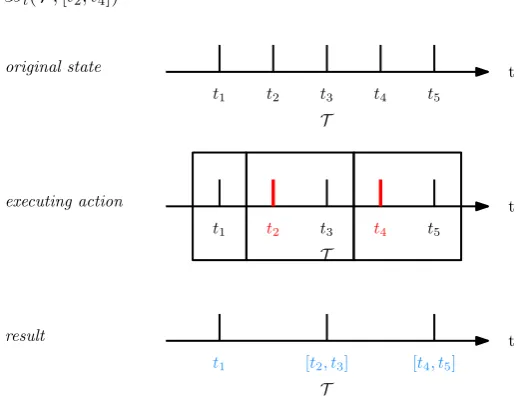
6.4 Application of the Segment by Duration operator . . . 99
6.5 Application of the Segment Matching Granularity operator . . . 100
6.6 Application of the Segment Relative To operator . . . 101
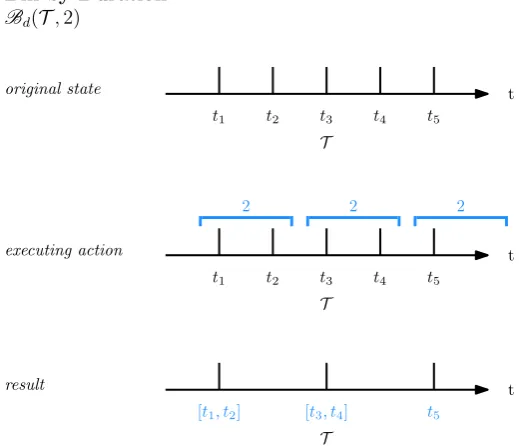
6.8 Application of the Bin at Instants operator . . . 103
6.9 Application of the Bin by Duration operator . . . 104
6.10 Application of theBin Relative To operator . . . 105
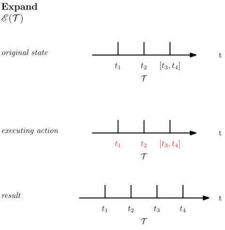
6.11 Application of theExpand operator . . . 106
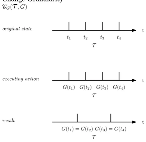
6.12 Application of theChange Granularity operator . . . 107
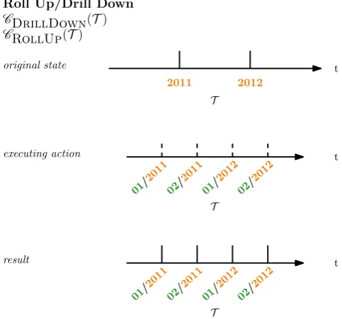
6.13 Application of theDrill Down operator . . . 108
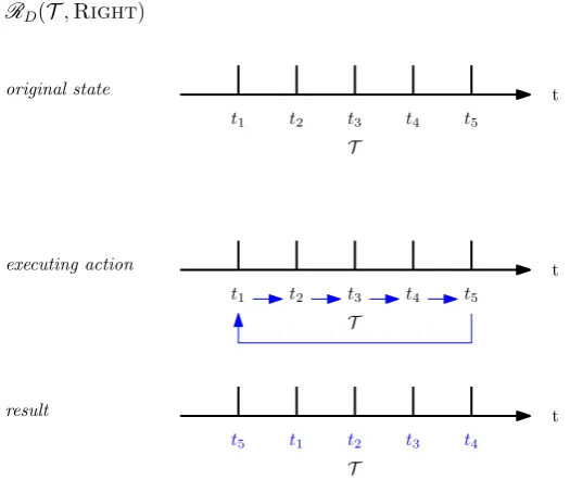
6.14 Application of theRotate operator . . . 109
6.15 Application of theAlign operator . . . 110
6.16 Application of theTrim At operator . . . 111
6.17 Application of theTrim By operator . . . 112
6.18 Application of theExtend To operator . . . 112
6.19 Application of theExtend By operator . . . 113
6.20 Example of a visualisation of time domainT. . . 115
6.21 Example of a segmentation result . . . 116
7.1 Effects of extent transformation on position . . . 121
7.2 Effects of extent transformation on size . . . 122
7.3 Example of mapping time to colour . . . 124
7.4 Example of conditioning after segmenting the time domain . . . 125
7.5 Example of segmenting and juxtaposing . . . 126
7.6 Example of segmenting and superimposing . . . 127
7.7 Example of segmenting and nesting . . . 127
7.8 Example of changing granularity and juxtaposing . . . 129
7.9 Example of changing granularity and superimposing . . . 130
7.10 Example of changing granularity and nesting . . . 131
8.1 Example 1 of conditioned tree for visualisation challenge . . . 136
8.2 Example 2 of conditioned tree for visualisation challenge . . . 137
8.3 Example 3 of conditioned tree for visualisation challenge . . . 138
8.7 Stacked bar chart of hourly gate usage . . . 146
8.8 Heatmap for GateType, GateName and Hour . . . 147
8.11 Total number of records per month . . . 151
8.12 Ineffective view in case study . . . 151
8.13 Triangular model view for CarId . . . 153
8.14 Highlighted region in triangular model view . . . 154
8.15 Triangular model for CarGroupType . . . 155
8.18 Case study exploration strategy for instant time . . . 160
8.19 Case study exploration strategy for instant time . . . 161
9.1 Summary of the research agenda . . . 170
A.1 Continuum . . . 184
A.2 Time Curves . . . 185
A.3 Flowstrates . . . 187
A.4 Timeline Trees . . . 188
A.5 Instants spiral . . . 189
A.6 Interval spiral . . . 190
A.7 Cycle plot . . . 191
A.8 ClockMap . . . 192
A.9 ThemeDelta . . . 193
A.10 VIS-STAMP . . . 194
A.11 CareCruiser . . . 195
A.12 Connected scatterplot . . . 196
A.13 Point chart . . . 197
A.14 Bar chart . . . 198
A.15 Line chart . . . 199
A.16 Polar point chart . . . 200
A.17 Polar line chart . . . 201
A.18 Angular bar chart . . . 202
A.19 Radial pie chart . . . 203
A.20 Dot plot . . . 204
A.21 Timeline . . . 205
A.22 ThemeRiver . . . 206
A.23 Circle View . . . 207
A.24 Cloudlines . . . 208
A.25 GROOVE . . . 209
A.26 QTrade . . . 210
A.27 Time Wave . . . 211
A.28 LiveRAC . . . 212
A.29 GeoTM . . . 213
A.30 MobiVis . . . 214
A.31 Two-tone spiral . . . 215
A.33 Interval timeline . . . 217
A.34 Temporal summaries . . . 218
A.35 Spiral 2 . . . 219
A.36 Calendar cluster view . . . 220
A.37 Similan . . . 221
A.38 KronoMiner . . . 222
A.39 TimeSlice . . . 223
2.1 Table of models for time visualisation . . . 24
2.2 Table of hierarchical and composition methods . . . 31
2.3 Table of support for composition methods . . . 36
4.1 Summary of types of mapping . . . 56
4.2 Table of hierarchical composition methods . . . 57
5.1 Distribution of visualisation techniques and systems over the two classi-fication criteria . . . 68
5.2 Description of visual mappings of Kaleidomaps . . . 77
5.3 Flowstrates specification . . . 80
5.4 Bar chart specification . . . 80
5.5 Single line chart specification . . . 81
5.6 Multiple line chart specification . . . 82
5.7 Spiral specification . . . 83
5.8 Connected scatterplot specification . . . 83
6.1 Survey of the properties of time modified by interactions in the literature 92 6.2 Categories of interactions related to the properties of time . . . 97
6.3 Summary table of operators . . . 114
6.4 Specification of a visualisation of segmented a time domain. . . 115
8.1 Bar chart for group of vehicle and hour . . . 142
8.2 Specification of stacked bar chart of hourly gate usage . . . 145
8.3 Heatmap specification . . . 145
8.4 Multi-line chart specification . . . 148
8.5 Triangular model case study specification . . . 152
8.6 Triangular model case study specification . . . 153
A.1 Continuum graph specification . . . 184
A.2 Time curves specification . . . 185
A.3 Kaleidomaps specification . . . 186
A.4 Flowstrates specification . . . 187
A.5 Timeline Trees specification . . . 188
A.6 Instants spiral specification . . . 189
A.7 Interval spiral specification . . . 190
A.8 Cycle plot specification . . . 191
A.9 ClockMap specification . . . 192
A.10 ThemeDelta specification . . . 193
A.11 VIS-STAMP specification . . . 194
A.12 CareCruiser specification . . . 195
A.13 Connected scatterplot specification . . . 196
A.14 Point chart specification . . . 197
A.15 Bar chart specification . . . 198
A.16 Line chart specification . . . 199
A.17 Polar point chart specification . . . 200
A.18 Polar line chart specification . . . 201
A.19 Angular bar chart specification . . . 202
A.20 Radial pie chart specification . . . 203
A.21 Dot plot specification . . . 204
A.22 Bar chart specification . . . 205
A.23 ThemeRiver specification . . . 206
A.24 Bar chart specification . . . 207
A.25 Cloudlines specification . . . 208
A.26 GROOVE specification . . . 209
A.27 Scatterplot specification . . . 210
A.28 Time Wave specification . . . 211
A.29 LiveRAC specification . . . 212
A.30 Triangular model specification . . . 213
A.31 MobiVis specification . . . 214
A.32 Two-tone spiral specification . . . 215
A.33 Stacking-based horizon graphs specification . . . 216
A.34 Interval timeline specification . . . 217
A.35 Temporal summaries specification . . . 218
A.37 Calendar cluster view specification . . . 220 A.38 Similan specification . . . 221 A.39 KronoMiner specification . . . 222 A.40 TimeSlice specification . . . 223
Acronyms / Abbreviations
AVO Abstract Visualisation Objects
EDA Exploratory Data Analysis
Introduction
1.1
Motivation
Exploratory data analysis (EDA) (Tukey, 1977) calls for the use ofmultiple perspectives on data to help formulate hypotheses before proceeding with other analytical methods. Interactive data visualisation supports this approach with the use of various visual encodings that form these perspectives and the interactions that enable navigating between them. The resulting visual exploration process is empowered by enhanced pattern recognition through abstraction and aggregation and the visual organisation of data based on structural relationships (Card et al., 1999).
These benefits of visualisations are particularly related to temporal or time-oriented data – that is, datasets containing records observed or measured over time. Recent advances have greatly increased the capability of recording and storing such type of data; analysing it requires appropriate visual methods that consider the various aspects of temporal data. One such aspect is the linearity or periodicity of time, which depends on the use of certain granularities or the units of time. Figure 1.1 shows an example of two visualisations of temporal data: on the left side, the bar chart emphasises the
linear order for months of the year, whereas the chart on the right side emphasise the cyclic aspect of the months.
Time Attribute
Attribute
Time
(a) (b)
Fig. 1.1 Examples of visualisations emphasising: (a) linear aspect, (b) cyclic aspect.
This reflects the temporal resolution at which the data was captured and can be used in the visual organisation of the data. For example, data collected at a scale of minutes can also be visualised using coarser granularities such as hours – this, however, requires the use of aggregation methods to represent non-temporal data. More complex arrangements can be visualised by extracting parts of the granularity lattice and combining granularities.
The need for encodings and interactions for effective visual exploration, given these aspects of time, resulted in a number of techniques for interactive visualisation of temporal data from many domains (Aigner et al., 2011). Although many of the techniques used to show temporal data predate the use of computers, from a few centuries to thousands of years (Funkhouser, 1936), the design of modern visualisations is driven by the aspects of time. For example, Lammarsch et al. (2009) (fig. 1.3) and Van Wijk and Van Selow (1999) designed visualisations that use the hierarchical aspect of granularities. Others, such as Carlis and Konstan (1998), displayed temporal data inspirals that emphasise both the linear and cyclic aspects of time.
Fig. 1.2 Example of a calendar lattice. Although lattices are not intrinsically hierarchical, the paths between the time units in the calendar enables a hierarchical structure to be extracted from it, as highlighted in the figure.
Fig. 1.3 GROOVE visualisation (Lammarsch et al., 2009), which enables users to reconfigure grid-based views based on calendar units.
intelligence (Allen and Hayes, 1985), databases (Dyreson et al., 2000) and geographic information systems (Peuquet, 1994). These concepts were later used to develop lower level, generative approaches that improve the process of visualisation design, such as taxonomies (Daassi et al., 2005), conceptual (Aigner et al., 2007a) and descriptive (Bach et al., 2016a) frameworks and design spaces (Brehmer et al., 2017).
and design spaces defined are limited to describing only data and visual aspects of interactive visualisation. For instance, although the conceptual framework by Aigner et al. (2007a) includes aspects such as the dimensionality of the visualisation (2D or 3D) and the related temporal data (such as the number of granularities represented in a visualisation), it does not discuss what are changes in the temporal data when users click on some visual object or drag a slider to manipulate the granularities. Another example is the design space by Brehmer et al. (2017), which describes visual arrangements based on temporal aspects but does not describe the conceptual meaning of the changes between the arrangements. Enumerating the transformations of time that can be triggered as interactions facilitates the analysis of exploration strategies and their replication (Ragan et al., 2015), through logging as steps that lead to the various perspectives in the visual exploration process. It also enables systematic exploration of the transformations and associated parameters.
At the same time, in these works, temporal granularities are included as simply an aspect to consider in the visualisation design process, rather than a central aspect that drives this process based on their characteristics. Examples from the literature (Lam-marsch et al., 2009; Van Wijk and Van Selow, 1999) showed, in isolation, that various arrangements of temporal granularities can be effectively explored with hierarchical visualisations. In this category of visualisations, hierarchical structures are represented through visual encodings that highlight, explicitly or implicitly, the relationship be-tween the different levels in the hierarchies. For time visualisation, this means exploring the relationship between the different granularities and also non-temporal dimensions contained in the data.
A considerable body of research in this area includes models for hierarchical visualisation design (Elmqvist and Fekete, 2010) and composite visualisations (Gleicher et al., 2011; Javed and Elmqvist, 2012), design spaces for implicit hierarchy visualisation (Schulz et al., 2011) and notations for describing visualisations (Slingsby et al., 2009). These theoretical works help design general hierarchical and composite visualisations, yet there is no theory or model linking them with the established theories for time-oriented visualisations that would facilitate including the multitude of combinations between temporal granularities in the visualisation design process.
exploit-ing the various characteristics of time through encodexploit-ings and interactions, therefore facilitating visual exploration of temporal data.
1.2
Research question
In order to address the gaps identified in the previous section, the following question guides the research presented in this thesis:
• Primary research question: How can interactive hierarchical visualisations help explore temporal data?
In order to answer the question, three secondary questions are defined and drive the methodology applied in the research:
• RQ1: What are the interactive visualisation methods used for tempo-ral data? This question is connected to the second part of the primary research question — visual exploration of temporal data, which defines the scope of the research. To answer this question, a survey of interactive visualisation methods is presented and organised following criteria that emphasise characteristics of encodings that are related to hierarchical visualisations.
• RQ2: How can hierarchical composition techniques be combined with the surveyed visualisations? This question connects RQ1 with the first part of the primary question — hierarchical visualisations, the area of information visualisation research that is investigated within the defined scope. Concepts of hierarchical visualisations and composite visualisations are defined and applied for use with the surveyed methods.
1.3
Research contributions
Combining the answers to each secondary question enables answering the primary research question and arriving at the following primary contribution of this thesis:
• Primary contribution: Framework for Hierarchical Time-Oriented In-teractive Visualisation
The framework presented in this thesis addresses the research gaps identified in the first section. It comprises three components based on the enumerated research questions: view, composition and transformation. The view component defines properties for specifying visualisations based on the combination of the answers to RQ1 and RQ2.
The composition component defines the visual composition methods for structuring
the views into hierarchical visualisations, which are the answer to RQ2. Lastly, the transformation component defines temporal operators that transform the properties of time and alter the characteristics of time in visualisations – the effects of these transformations is explored further in the thesis.
Additionally, two of the components are also presented as self-contained research contributions:
• Secondary contribution 1: Layered specifications of interactive visual-isations for temporal data
The specifications of surveyed visualisations techniques are presented as a novel contri-bution to the literature. In contrast with existing surveys and overviews (see chapter 2), the visualisations found in this thesis’ survey are presented in the form of decomposed layers, where each layer forms a view that is hierarchically structured using any of the suggested visual composition methods. The decomposition into layers allows comparing the use of these basic blocks across visualisation techniques and the formation of a multi-dimensional design space for exploringmultiple perspectives.
• Secondary contribution 2: Temporal transformations for supporting visual exploration
These are operators that are part of the transformation component of the framework. These operators are transformations of properties of the time domain, that is, the
state-of-the-art literature presented in this thesis, it is the first complete specification of the temporal transformations that can be implemented as interactions in temporal data visualisations.
1.4
Scope
An ambitious goal would be to develop a framework that encompasses all visualisation methods and types of data that are related to time. However, there were time and technical constraints that prevented that goal from being achieved. Therefore, a realistic scope was set, being limited, first of all, to two-dimensional techniques that do not include animation. In these techniques, the visualisation itself only changes through user interaction (Muller and Schumann, 2003); the alternative would be visualisations where any aspect of the visualisation changes automatically with animation. Designing such visualisations includes a host of other design decisions, such as the speed of animation and interaction techniques for controlling animation, for which this thesis can serve as a starting point. The restriction to two-dimensional visualisations is done on a similar basis: including an additional dimension has different design challenges, such as dealing with object occlusion and deciding how to make transformations of 2D visualisations compatible with 3D visualisations and vice-versa. Additionally, there is evidence that viewers are better when comparing positions of objects in 2D and better when comparing shapes in 3D (St. John et al., 2001); as it will be seen throughout the thesis, position is the most common way of representing changes over time.
context of further work to extend the framework or applying the framework in other contexts.
1.5
Thesis outline
The rest of this thesis is organised as follows:
Chapter 2 introduces the main concepts and related works in the areas of time-oriented visualisation and hierarchical visualisations, as well as other related research areas. The characteristics of time that are explored in the are described in detail and the terminology used in the literature is clarified. A critical view of the theories and models mentioned in section 1.1 is introduced, contrasting the models and frameworks with the work presented in this thesis and describing how they inform the research. The major works in the areas that support this research, interaction for visualisation and notations and languages for describing visualisations, are summarised.
Chapter 3 describes the methodology used to answer the primary research question. An overview of the framework is given, along with justifications for the choices and methods used to answer each secondary question. The components that are the answers to each secondary question are then described in detail across three chapters. In chap-ter 4, the data and visualisation models that support the framework are introduced; visual composition methods are described in relation to hierarchical approaches and characteristics of time, resulting in the composition component. In chapter 5, the
view component is presented as the answer to the question that enables specifying
visual encodings for temporal data visualisation. Finally, in chapter 6, the temporal transformations included in thetransformation component are described.
Chapter 7 combines the three components in the framework presented as the primary contribution of this thesis. An overview of the complete framework is presented, followed by a detailed description of the interplay between each component and their effects and uses for visual exploration.
Chapter 9 concludes the thesis, reflecting on the research question outlined in the first chapter and placing the contributions of the thesis in this context. The limitations set by the scope are revisited and directions for further investigation of hierarchical time-oriented visualisations are explored. The gaps identified in the classification of visual encodings and interactions are also revisited to map future research directions.
1.6
Chapter summary
Background and related work
As stated in the first chapter, the work presented in this thesis is positioned at the intersection of two areas of information visualisation research: temporal data visualisation and hierarchical visualisations. This chapter introduces the main concepts from these areas that support the work, the related works where the addressed research gaps were identified and other relevant supporting literature.
2.1
Background
2.1.1
Concepts and theories of temporal data
Exploring the temporal dimension enables understanding and explaining past events, analysing actions in the present and predicting future outcomes. Time has been thor-oughly explored across many areas, with different ways of perceiving and representing
time. For instance, chronobiology (Halberg, 1969) is concerned with the temporal
For example, describing the multipleunits of time as granularities is relevant to both geography and artificial intelligence.
As temporal data visualisation is closely related to the lower level aspects of representa-tion of temporalinformation, some areas of study are more relevant than others. Aigner et al. (2011) highlighted in particular the works of Goralwalla et al. (1998), in databases, and Frank (1998), in geographic information systems. Goralwalla et al. described an object-oriented model of time based on four aspects of temporal data: the structure of time, the representation of time, the order of time and the history of time. The following sections introduce these four aspects and relate them to data visualisation.
Temporal structure
The temporal structure contains the basic temporal features of a model of time. Three components are defined by the author: the type of time primitive, the type of time domain and thedeterminacy of time. The time primitives represent the different ways that observed time can be described: anchored primitives can have a temporal location (e.g. November 23rd), while unanchored primitives refer toquantities of time (e.g. 3 days). Anchored primitives are divided into instants, which are single anchored times, and intervals, which are pairs of anchored times. The only unanchored primitive is a span or duration.
Thedomain refers to the mathematical structure that is used to describe the primitives: in discrete domains, time primitives are modelled after integers: 0 second is always followed by 1 second ands this applies to every unit of time. In continuous domains, time can be infinitely divided: 0 second can be 0.1 second,0.2 second and so on. Bettini et al. (1998) also introduced the idea of lower and upper bounds of a time domain; as, in practice, very often data is collected over a certain period of time instead of infinitely, the bounds define the starting and ending times of the collection period.
Finally, determinacy refers to the uncertainty that is inherent to the relationship between the different time units and the non-temporal observations: an event that occurred on November 23rd is indeterminate in relation to the hours of that day.
are appropriate for representing instants. Intervals, on the other hand, require the representation of both its starting and ending times; durations can also be derived from intervals. This leads to the following design choices, illustrated in fig. 2.1:
• Anchored visual mark: thelength property of visual marks can be used to display the temporal interval by mapping time to one positional visual channel and anchoring the visual mark at the appropriate starting and ending times;
• Unanchored duration: when there is no need to display time in a positional visual channels, the interval duration can be calculated instead. In this case, the duration ceases to be a reference and becomes a non-reference attribute;
• Mixed approach: a cartesian representation called triangular model (Qiang et al., 2012) uses both methods to display interval data. In this type of visualisation, the temporal domain is mapped to the horizontal axis, while a scale of duration is mapped to the vertical axis. In this case, point-based visual marks are used to represent intervals and anchored in the calculated midpoint of the interval. Vertically, the point is positioned in the corresponding value of the duration. This combination severely limits the choices of visual encodings for non-temporal attributes and is discussed again in later chapters. Another mixed approach is the representation of set of possible occurrences (SOPO) proposed by Rit (1986) which emphasises the uncertainty of events happening during an interval.
Temporal representation
This aspect is concerned with human readability and usability with regard to time; it relates to the multiple units of time (or granularities) that humans use to represent the passage of time and the temporal scales that result from the organisation of these units, primarily in the form of calendars. The relationship between different granularities and how to manage them has also been explored in areas such as databases; Bettini et al. (1998) introduced the formal concept of a calendar, while Dyreson et al. (2000) described a model to efficiently support granularities in databases based on these concepts. Goralwalla et al.’s concept of calendar is a set of granularities, with definitions of labels and number of time points in each granularity, and conversion functions between the granularities.
t
t1 t2
t
t1 t2
I1
I1 (a)
(b)
(c)
| {z }
I1
d d
Fig. 2.1 Visual representations of intervals. In (a), an anchored visual mark is used to represent interval I1 in a temporal horizontal axis. In (b), the duration of the interval
is derived and displayed as the length of an unanchored bar; in this case, the horizontal axis may contain a distribution of intervals, for example, for comparing their duration. In (c), the mixed approach is used; the point corresponding to I1 is placed on the
midpoint of the interval in the horizontal axis and on the corresponding duration in the vertical axis.
used to visualise the data, which must be configured to facilitate addressing the tasks that are related to the granularity. In interactive visualisations, the support formultiple granularities must also be considered; this is further discussed in this chapter and is one of the direct motivations for this research.
Temporal order and history
time where viewpoints on the data diverge. One example is a measurement that is consistent up to a certain date; from that date on, different measurements are taken and share the same temporal reference. Order is also closely related to the characteris-tics of granularities such as the cyclical nature of months, days, etc. In fact, Frank (1998) provided an alternative classification of time in which he considered linear and cyclic time separately from branching time: in this case, branching is considered as a characteristic of all attributes of the dataset instead of only the temporal domain.
Order and visualisation: the order is an informing characteristic of time that guides the design of visualisations. Visualisation can emphasise linear, cyclic or both aspects of time (see fig. 2.2). For instance, circular arrangements can be used with cyclical time, such as months of the year, where January and December are contiguous in the visualisation; months of the year can also be visualised through charts from left to right, where the cyclical aspect of months is not emphasised. Lastly, spirals are an example of visualisation that emphasise both aspects, as the spiral grows linearly and yet time points are visually aligned in cycles.
t
t
t
(a) (b) (c)
t
Fig. 2.2 Schematic representation of temporal order. In (a), linearity is emphasised. In (b), cyclicity is emphasised. In (c), the visualisation emphasises both linear (blue arrow) and cyclic (red arrow) aspects.
Thehistoryaspect refers to data management issues, such as deciding how non-temporal variables are related to temporal variables in observed records. As such, it does not have particular effects on the visualisations.
Summary
describes how frameworks and theories in the visualisation literature employ these concepts to facilitate visualisation design.
2.1.2
Temporal data visualisation
Evolution in temporal data visualisation resulted in the development of theories and models to lay out foundations for further efforts, allowing researchers to share knowledge through a common language, facilitating the application of existing techniques and identifying future research paths. In this section, the works that are directly related to the research presented in this thesis are critically analysed. These are the works that are most similar to this thesis regarding aim and content. The order used to describe them is based on the evolution in generative power, from more descriptive to more generative. These are not strict categories, but they convey the power of each work to describe existing literature or help generating new visualisations. In this survey, strong generative works may also be strong in their descriptive power, but, as it will be clear afterwards, the opposite is not true for the earlier works. This categorisation also helps to clarify the gaps that this research addresses.
Surveys and overviews
The first important work in the literature was the survey of visualisation of linear time-oriented data by Silva and Catarci (2000). The authors suggested a classification of methods following the framework specified by Goralwalla et al. (1998). The following four categories are used: slice visualisation, in which a single granularity of time is used in the representation; periodic slice visualisation, in which the multi-scale structure of granularities is used in the representation; multi-slice visualisations, in which multiple versions of events of a slice visualisation is represented — for example, simulations that produce different results beyond a certain point; andsnapshot visualisation, in which only a single instant or interval of time is represented at any time. Within each category, the authors enumerate and describe sources from the literature that fit into that category.
the visualisation and use of the focus+context (Card et al., 1999) design principle. The second table contains categories derived from the general taxonomy of interactions by Shneiderman (1996) (see section 2.2.1) and temporal filtering, the only category of interaction directly related to time.
The classification was an initial investigation of the techniques used for representing temporal data and is an example of work that brings concepts developed in other areas - in this case databases - into information visualisation. It provides a general idea of how some characteristics of temporal data influence visualisation design, without discussing how this influence translates into the choices of visual encodings for each category of visualization.
Muller and Schumann (2003) also presented a general overview of visualisation methods
for temporal data. While the authors use the taxonomy of types of time by Frank
(1998), the criteria used to classify visualisations is based on aspects of representation rather than the taxonomy, which is only used to give context to the descriptions in each category. The classification contains three categories: static, dynamic and event-based representations. The first two are opposite categories, where static contains an explicit representation of the temporal domain. Dynamic representations, on the other hand, contain representations of time-oriented data that are similar to the snapshot category of visualisations suggested by Silva and Catarci (2000), where time isimplicitly represented by animation (automatic or user-controlled). The third category contains visualisations that rather than showing changes in values of attributes, represent the point in time where a significant change happen. The authors do not provide clear criteria that define unique properties of event-based visualisation in relation to visual encodings.
level of abstraction, concerns the need for visual encodings that efficiently support visual analysis when the number of items is too large to be displayed without some level of aggregation being used. The representation aspect repeats the distinction between static and dynamic representations and also includes the dimensionality of the visualisation: 2D or 3D.
In terms of visualisation design, the classification maps out somechoicesfor visualisation design — it does not include considerations about how one aspect limits choices in another aspect, for example. The authors note the fact that their classification is useful for single views — that is, designing a single perspective on a dataset — and call for the development of a general framework for time visualisation that considers all the enumerated aspects of timewith multiple perspectives. While their work was succeeded by other frameworks that make advances towards that objective, as evidenced in next section, this call is still relevant as a research motivation.
Taxonomies, frameworks and design spaces
Moving towards generative works that provide structured approaches to facilitate
designing visualisations, Daassi et al. (2005) introduced patterns of temporal data visualisation design (see fig. 2.3) by adapting the steps of the visualisation model by Chi (2000). The original model describes visualisation design as a pipeline of transformation steps from data modelling to rendering. In the proposed adaptation, the visualisation process is separated into non-temporal and temporal pipelines, which are merged at different stages of their pipelines.
Fig. 2.3 Five patterns of combinations for time-oriented data visualisations by Daassi et al. (2005): (a) dynamic visualisations, (b) static visualisations, (c) mutual dependency of temporal and non-temporal data, (e) partially dependent encodings and (f) fully independent encodings. According to the authors, (d) and (f) are illogical within their taxonomy.
on the temporal domain pipeline. One example is using the time to position the
visual marks of the non-temporal domain. Modifications of the visual marks of the non-temporal domain, such as changing an attribute that is being visualised, do not alter the temporal domain. The last combination, fully independent encodings, is where temporal and non-temporal domain are simply rendered at the same time, completely independently from each other. The authors define as impossible the patterns that would represent multiple views of a dataset, for example, one non-temporal view and one temporal view – although such combination is logical, it is likely that it is out of scope within the context of their taxonomy.
The equivalence of some of these combinations to composite visualisation methods is discussed in the next section. The taxonomy brings to light the differences between preparing temporal data for visualisation compared to non-temporal data, however, it does not describe in the detail these differences, such as what transformations are suitable for temporal data, or the details about the choices in each stage of the visualisation pipeline.
systems, most of the concepts apply to general interactive visualisations for time. The framework has three aspects: internal data structures, visualisation and interaction components and analytical and mining components. Internal data structures contain the same categories defined in the previous work, with the addition of different types of temporal scale (ordinal, discrete and continuous), granularities (none, single and multiple) and viewpoints (ordered, branching and multiple perspectives). It is the first conceptual work to explicitly consider temporal granularities as an important factor in designing visualisations. It also includes concepts related to anchored or unanchored time and distinction between event and states — the first involves data points representing changes in a state (e.g. event signalling that a plane has switched state from flying to landed), while, in the second, data points represent continuous measurements of the state (e.g. all the time points when a plane was flying and all the points when the plane was landed).
The visualisation component refers to the previously defined categories of static or dynamic representation, the type of non-temporal data (qualitative or quantitative) and dimensionality (2D or 3D). It also includes broadly the concept of visualisation parameters as part of visual analytics systems, referring to parameters of the analytical component, which relates to data mining algorithms such as clustering or forecasting. As it is a conceptual framework, it is yet another example of work that covers the surface of visualisation design for time, without delving deep into the variety of choices of visual encodings and interactions.
The choices of encodings is the focus of a recent work by Brehmer et al. (2017), who introduced a design space for timeline visualisation (fig. 2.4). Even though their scope is data-driven storytelling instead of exploratory interactive visualisations, the design space maps temporal concepts directly to characteristics of visualisations that are not exclusive to storytelling visualisations.
Fig. 2.4 Design space for timeline visualisation with representation, scale and layout dimensions (Brehmer et al., 2017).
interim duration where the temporal distance between marks is emphasised by different symbols. Finally, layout refers to the organisation of the data and the temporal domain. They include four possibilities: unified, faceted, segmented and faceted+segmented. Unified timelines refer to the visualisation of a single timeline; faceted timelines are multiple copies of timelines representing different objects or entities — effectively, it corresponds to the multivariate category of visualisation by Aigner et al. (2007a); segmented timelines are those in which a timeline is visually broken down based on time units — reflecting the existence of multiple granularities. Faceted+segmented represents the case where a timeline is broken down visually and also duplicated for multiple objects.
Lastly, another similar work is the descriptive framework of temporal data visualisations by Bach et al. (2016a). The authors use the space-time cube (Kraak, 2008) as an abstraction from which visualisations can be derived, describing operations on the cube that lead to conceptually different visualisations. It is important to note that the framework is titled descriptive as opposed to prescriptive rather than opposed to generative. In this thesis, this work is classified towards the generative end of theories and models due to the fact that it can be effectively used to design visualisations rather than only classifying existing works, even if it does not includerecommendations of the operations for specific tasks or datasets — there are no general theories in temporal data visualisation with such aim. Four large categories of operations are defined: extraction, flattening,geometry transformation and content transformation. Extraction operations are related to filtering and projecting parts of the space-time cube to a visualisation. Flattening operations are related to changing the aggregation level of one dimension of the space-time cube and projecting it. Geometry transformations alter the internal structure of the cube without modifying the contents of it (for example, not removing or adding points). Content transformations, on the other hand, involve operations like adding labels or colours. In total, forty-two operations are defined, including space and temporal variations of some operations — for example, interpolating points in time versus interpolating points in space.
Compared to this thesis and the works described so far, it has a stronger focus on the conceptual aspects of relating visualisation techniques through an abstraction rather than relatingvisual aspects. Visually dissimilar techniques are grouped together from the perspective of transformations of the space-time cube, while some visually similar techniques are shown to be conceptually dissimilar. The framework is also useful to decompose visualisations in the same perspective and to allow the analysis of different paths for designing visualisations. However, as acknowledged by the authors, while the transformations seem to be suited for an interactive approach, there is no discussion about how to use the transformations as part of an interactive visualisation. With the exception of the time scaling operation, that defines a general aggregation on the temporal axis following a numeric scaling factor, there are no other transformations that make use of temporal granularities and how the other transformations might be affected by the use of multiple time units.
multiple temporal elements to temporal objects and realising this mapping through an object-oriented model. The objective is to explicitly separate the time primitives as entities on their own, acknowledging that manipulating time is a complex operation that should not require reprogramming. For this research, this conceptualisation is an inspiration for describing the temporal transformations in chapter 6; however, in this thesis, the focus is to expose the properties of time that are required for the transfor-mations rather than to formally define the relationship between the time domain and the non-temporal attributes or objects.
Summary
There is a clear evolution in theories for time visualisation, from early works with stronger descriptive power to recent works with stronger generative power, as sum-marised in table 2.1. While both types of work are desirable, there are still gaps in the generative literature that can be addressed. Notably, support for the effective use of temporal granularities is lacking, as well as time-centred interactions. Temporal granularities are acknowledged in descriptive models rather than generative ones, sug-gesting that it is important to investigate how to include support for granularities in generative models. At the same time, interaction is a secondary aspect in all of the reviewed works. The only reviewed model that contains some temporal transformations (the framework by Bach et al. (2016a)) does not describe them as transformations that could be triggered by users through interactions in visual exploration. As the remainder of this chapter shows, other areas of information visualisation can help to address these gaps.
2.1.3
Hierarchical visualisations & composition methods for
visualisation
Power Authors Year Type Visual aspects Time Interac-tions Granularities
Descriptive Silva and Catarci
2000 Survey x x
Muller and Schumann
2003 Overview x
Aigner et al. 2011 Systematic view x Daassi et al.
2005 Taxonomy x
Aigner et al.
2007a Conceptual framework
x x x
Bach et al.*
2016a Descriptive framework
x x x
Generative Brehmer et al.
2017 Design space
x x
Hierarchical visualisations are those that represent parent-child types of relationship from hierarchical structures such as trees. These hierarchical structures can be formed by true or explicit hierarchical information or byfalse or implicit hierarchical information, which are formed arbitrarily. The explicit type of hierarchy comprises of information such as organisational structures, spatial hierarchies (eg. countries, states, cities) and temporal granularities (e.g. year, month, day of month). False hierarchies are formed by combining non-hierarchical information through conditioning: arranging data points in hierarchies matching selected attributes (e.g. year and region). Both types can be visualised through two categories of hierarchical visualisations (Schulz et al., 2011): explicit or implicit. Explicit visualisations encode the relationship between nodes in different levels of the hierarchies using marks such as lines or arcs between them. Implicit visualisations use positional variables to encode this relationship — positioning nodes from the highest level of the hierarchy near the top of the screen, for example, or placing children nodes inside representations of parent nodes. Although explicit visualisations are out of the scope of this thesis, they will be referred in this section as a type of composition method.
Schulz et al. described a design space for implicit visualisation of hierarchies, with dimensions that define the representation of the nodes themselves (node representation), the representation of the relationship between the nodes (edge representation) and the method for visually laying out the nodes (either starting from theroot of the hierarchy, via subdivision, or with the leaves, via packing). They also include a dimensionality category, which can be 2D or 3D. The most important dimension related to this work is edge representation. Three types of representation are described:
• inclusion, in which a representation of a child node isfully rendered inside the representation of a parent node (fig. 2.5 (a));
• overlap, in which a representation of a child node partially overlaps the represen-tation of a parent node (fig. 2.5 (b));
• adjacency, in which a representation of a child node is positionedimmediately outside the representation of a parent node, without overlapping it (fig. 2.5 (c)).
Fig. 2.5 Implicit hierarchical representation methods from Schulz et al. (2011): (a) inclusion, (b) overlap and (c) adjacency.
applicable to the hierarchical structure as a whole — there are no ways to apply the design space at different levels of hierarchies as it is described. The authors acknowledge that as part of an issue inimplementing the design space. The fact that instances of the design space can be combined for different levels, which the authors call as mixing design choices, relates heavily to the concept of composite visualisations. These are visualisations containing multiple perspectives on the data, based on various types of visual arrangements. Javed and Elmqvist (2012) proposed five methods that generalise the previously existing coordinated multiple views paradigm (Roberts, 2007) and the juxtaposing and superposition methods proposed by Gleicher et al. (2011). They are:
• Juxtaposition (fig. 2.6 (a)) positions views side-by-side, in a similar way to the adjacency method suggested by Schulz et al.. This method is also conceptually similar to the idea offully independent encodings by Daassi et al., without the requirement that encodings are different;
• Integration (fig. 2.6 (b)) also position views side-by-side, however, these also include explicit links between views, such as lines connecting marks representing the same data point in different views. Juxtaposed views, on the other hand, rely on shared visual variables as implicit links, such as the same colour scale being used in both views to identify data points across views;
• Superimposition (fig. 2.6 (c)) defines views rendered on the same space and
Fig. 2.6 Visual composition methods from Javed and Elmqvist (2012): (a) juxtaposition, (b) integration, (c) superimposition, (d) overloading and (e) nesting.
view is different, even though thecoordinate system and boundaries of it are the same. One example is multiple line charts drawn on top of each other, where each line chart is considered a separate view.
• Overloading (fig. 2.6 (d)) is a variation of superimposed views, but, in this case, all the views share the same underlying data structure. This composition method describes visualisations where a different encoding, called client is overlaid on top of another one, called host, using thevisual structure of the host. The examples given concern the case when a host visualisation can be enhanced by the addition of a client visualisation. This is conceptually similar to the mutually dependent encodings case with separate visual marks by Daassi et al..
• Nesting (fig. 2.6 (e)) defines a client-host relationship where the client visualisation is rendered nested inside visual marks of the host visualisation, replacing the original visual mark. While the authors do not require that the encodings of the client and the host are different for nested views, the examples they give are all based on this idea. Conceptually, the nesting defined in this design space can be seen as a case of mixing design choices in the implicit hierarchy design space. The notion of an implicit hierarchy is embedded in the fact that each client visualisation is replacing a visual mark of the host, therefore it contains only the data that is associated with the data point it is replacing.
(b)
(a) (c) (d)
Fig. 2.7 Visual composition methods proposed by Munzner (2014): (a) different encoding, all data, (b) different encoding, one subset, (c) same encoding, one subset, (d) same encoding, multiple subsets.
as the decision about what parts of the dataset are shown in each view: the same data, a subset of the original dataset or disjoint subsets (facets) of the original dataset. Coupled with the option of using the same ordifferent encodings, four combinations of data and encodings are defined:
• Same encoding, one subset of data: this combination describes visualisations where the same encoding that is used for the whole dataset is also used to provide adetailed view of part of the dataset, which is the overview+detail principle for visualisation (fig. 2.7 (c));
• Same encoding, multiple subsets: sometimes called faceting, this combination describes the the general concept ofsmall multiples Tufte (1983), in which several views of disjoint parts of a dataset are shown side-by-side (fig. 2.7 (d));
• Different encodings, all data: this combination describes the concept ofmultiform or multiple views, which is the general term used for composite visualisations (fig. 2.7 (a));
• Different encodings, one subset: this describes the combination of the overview+detail principle with multiform visualisations (fig. 2.7 (b)).
datasets hierarchically. Elmqvist and Fekete (2010) also used this notion of partitions and expanded it into a framework for hierarchical aggregation by introducing lower level concepts for implementing hierarchical visualisations, which are based on a direct representation using visual aggregates. The authors discuss how to perform the aggregation, what type of information can be conveyed through aggregated items (such as the average value of an attribute), rendering strategies and visual interaction mechanisms that allow the hierarchical structure to be explored without modifying the underlying structure. Yet again temporal data visualisation is not mentioned in this framework.
TheHierarchical Visualisation Expression(HiVE) notation by Slingsby et al. (2009) also has a model for hierarchical visualisations based on false hierarchies. The motivation for this model is to support answering research questions about a dataset using different configurations of false hierarchies and different perspectives on these configurations. The use of implicit hierarchies does not mean, however, that the visualisation must also be of the implicit type. While examples given by the authors use the treemap category of visualisations and are thus based on thenesting method, the method of composition itself is absent from the notation. This thesis uses the model reconfiguration of hierarchies used by HiVE as a motivation for applying hierarchical visualisations to temporal data. HiVE primary concern, however, is providing the notation to describe the arrangement of hierarchies. Visualisation aspects such as layouts and shapes are not specified or investigated by the authors. Additionally, the model only includes interactions in the form of operators that rearrange the hierarchies or modify visual mappings.
which mix juxtaposition with nesting. Because of the focus on displaying counts and probabilities, none of the primitives are point-based or connected with lines and temporal variations are not considered.
Summary
This section examined the various composition methods, summarised in table 2.2, that can be used to display hierarchies, including methods not originally described for such purpose. The table highlights the similarity between the methods described in the literature that were not proposed with the same aim or even derived from each other, suggesting that the concepts of hierarchical and composite visualisations are highly related. Besides the notion of explicit and implicit hierarchy visualisation, the concept of explicit or implicit hierarchies was also described, as well as the various alternatives for combining encodings and data in multiple views. The surveyed methods, however, do not generalise the idea of partitioned or conditioned datasets for all composition methods; this is explored in chapter 4 as part of the contribution of this thesis.
Two other aspects that are missing in these works are time and interaction. The
fact that, in some cases, temporal granularities are a natural match for hierarchical
and composite views raises the question about how these methods can be used with
temporal data, which motivate this thesis. With the exception of the HiVE notation, interaction is at most considered as part of the navigational aspects of exploring hierarchies that have already been defined, such as focussing on some parts of the hierarchy, but not as a means to enable users to interactively reconfigure hierarchies.
2.2
Further related work
Source Implicit Explicit
Javed and Elmqvist (2012)
Juxtaposition Superimposition Overloading Nesting Integration
Gleicher et al. (2011)
Juxtaposition Superposition - - Explicit
encoding Schulz et al. (2011) Adjacency; Overlap
- - Inclusion
-Daassi et al. (2005) Fully independent encodings
- - Mutually
dependent, separate marks -MacNeil and Elmqvist (2013)
Juxtaposition - - -
-Wickham and Hof-mann (2011)
Juxtaposition - - Nesting
visual encodings and interactions that they support are given in relation to temporal data and hierarchical visualisations.
2.2.1
Interaction taxonomies
Understanding how users interact with visualisations is essential to choose which method of interaction that is appropriate for the variety of tasks and visual encodings. While the field of human-computer interaction is concerned with most of the research
on the methods that allow users to input their actions in computers, research in
information visualisation also investigates the science of interaction (Pike et al., 2009) that helps with understanding the role of interaction in visualisation. Yi et al. (2007) and Roth (2012) argued that there is a large variation in the nature of taxonomies proposed within the scope of this science of interaction: some taxonomies focus on low-level interactions (Buja et al., 1996; Chuah and Roth, 1996; Dix and Ellis, 1998; Shneiderman, 1996), while others focus on high-level tasks (Heer and Shneiderman, 2012; Zhou and Feiner, 1998). Both also suggested that the variation can be explained by the stages of action model by Norman (1988). Roth, examining it in the context of cartographic visualisation, named it as as stages of interaction; between this author and Norman, the only difference is the name of the object being interacted with: the former refers to visualisations, the latter refers to any object in the real world.
The model, displayed in fig. 2.8 contains seven cyclical stages that describe how a user interacts with a system by: (1) forming a goal, (2) forming an intention, (3) specifying an action, (4) executing an action, (5) perceiving the state of the system, (6) interpreting the state of the system and (7) evaluating the outcome. The steps in the direction of the visualisation are named by Norman as thegulf of execution, whereas the steps in the direction of the user are named as thegulf of evaluation; in the science