City, University of London Institutional Repository
Citation
: Andrienko, N. and Andrienko, G. (2013). A visual analytics framework for
spatio-temporal analysis and modelling. Data Mining and Knowledge Discovery, 27(1), pp. 55-83. doi: 10.1007/s10618-012-0285-7This is the unspecified version of the paper.
This version of the publication may differ from the final published
version.
Permanent repository link:
http://openaccess.city.ac.uk/2851/Link to published version
: http://dx.doi.org/10.1007/s10618-012-0285-7
Copyright and reuse:
City Research Online aims to make research
outputs of City, University of London available to a wider audience.
Copyright and Moral Rights remain with the author(s) and/or copyright
holders. URLs from City Research Online may be freely distributed and
linked to.
A Visual Analytics Framework for
Spatio-temporal Analysis and Modelling
Natalia Andrienko and Gennady Andrienko
Fraunhofer Institute IAIS (Intelligent Analysis and Information Systems), Sankt Augustin, Germany
Abstract. To support analysis and modelling of large amounts of spatio-temporal data having the
form of spatially referenced time series (TS) of numeric values, we combine interactive visual techniques with computational methods from machine learning and statistics. Clustering methods and interactive techniques are used to group TS by similarity. Statistical methods for time series modelling are then applied to representative TS derived from the groups of similar TS. The framework includes interactive visual interfaces to a library of modelling methods supporting the selection of a suitable method, adjustment of model parameters, and evaluation of the models obtained. The models can be externally stored, communicated, and used for prediction and in further computational analyses. From the visual analytics perspective, the framework suggests a way to externalize spatio-temporal patterns emerging in the mind of the analyst as a result of interactive visual analysis: the patterns are represented in the form of computer-processable and reusable models. From the statistical analysis perspective, the framework demonstrates how time series analysis and modelling can be supported by interactive visual interfaces, particularly, in a case of numerous TS that are hard to analyse individually. From the application perspective, the framework suggests a way to analyse large numbers of spatial TS with the use of well-established statistical methods for time series analysis.
Keywords: spatio-temporal data, interactive visual techniques, clustering, time
series analysis
Introduction
It is now widely acknowledged that complex real-world data cannot be properly and/or efficiently analysed using only automatic computational methods or only interactive visualizations. Visual analytics research strives at multiplying the analytical power of both human and computer by finding effective ways to combine interactive visual techniques with algorithms for computational data analysis and by developing new methods and procedures where visualization and computation interplay and complement each other (Keim et al. 2008).
techniques capable of effectively exposing various patterns to analyst’s visual perception. However, the perceived patterns exist only in the analyst’s mind. To preserve the findings from decay and loss and to be able to communicate them to others and use in further analyses, the analyst needs to represent the patterns in an explicit form. Annotation tools, which allow the analyst to supplement visual displays with text and/or audio notes and drawings, may be sufficient for
supporting recall and communication, but they do not enable the utilization of the patterns in further computerised analyses. For the latter purpose, the patterns need to be represented in the form of computer-processable models. Interactive visual interfaces can effectively support the process of creating such models. Hence, visual analytics methods and tools should enable not only discovery of patterns in data but also building of formal models representing the patterns.
Our research focuses on spatio-temporal data, i.e., data with spatial (geographic), temporal, and thematic (attributive) components. While there are visual analytics systems supporting the exploration of previously built spatio-temporal models (e.g. Maciejewski et.al. 2010, 2011), the process of deriving such models from observed spatio-temporal data has not been yet supported by existing visual analytics methods and tools. The framework presented in this paper partly fills this gap. Our approach to spatio-temporal analysis and model derivation can be briefly described as follows.
Spatio-temporal data often have or can be transformed to the form of numeric time series (TS) referring to different locations in space or different geographical objects; such TS will be further referred to as spatial time series, or spatial TS.
Time series analysis and modelling is a well-established area in statistics. The existing variety of methods and tools can be applied to spatial TS, and we support this by interactive visual interfaces. However, analysing and modelling each spatial TS independently from others ignores relationships and similarities that may exist among spatial locations or objects. To allow these relationships to be discovered and explicitly represented in the resulting spatio-temporal model, we employ clustering and interactive grouping, so that related locations or objects can be analysed together.
The following statements summarise our contribution:
We suggest a comprehensive framework to support the whole process of analysis and model building. It includes (a) a set of interactive visual tools that embed existing computational analytical methods and (b) a clearly defined analytical procedure in which these tools and methods are applied.
In the next section, we give an overview of the related literature. After that, we introduce our framework for spatio-temporal analysis and modelling and describe the interactions among the components and the analysis workflow. Then we present two possible use cases of the framework by example of analysing real datasets. This is followed by a discussion and conclusion.
Related literature
Linking visual analytics and modelling
There are many works where interactive visualisation is designed to help users to explore, understand, and evaluate a previously built formal model. Thus, Demšar et al. (2008) employ coordinated linked views and clustering for exploration of a geographically weighted regression model of a spatio-temporal phenomenon. Matković et al. (2010) support users in exploring multiple runs of a simulation model. Visualisation and interaction can reduce the overall number of simulation runs by allowing the user to focus on interesting cases (Matković et al. 2011). Migut and Worring (2010) visualise a classification model, particularly, the decision boundaries between classes. Interactive techniques allow the user to update the model for achieving desired performance.
Evaluation of a model often requires testing its sensitivity to parameter values and/or input data. Visual and interactive techniques are used for exploring the sensitivity of an artificial neural network model to input data (Therón and De Paz (2006), the impact of parameter choice on LSA (latent semantic analysis) models as well as models using the results of the LSA in the further analysis (Crossno et al. 2009), and the effects of different assumptions on a model of estimated losses due to a natural disaster, particularly, assumptions about the spatial distribution of the disaster exposure (Slingsby et al. 2010).
cumulative summation for time series modelling. The user can view and explore the model results represented on a map and time series display, respectively. In the latter work, the authors suggest an interactive visual interface allowing the user to explore the results of a pandemic simulation model and investigate the impact of various possible decision measures on the course of the pandemic. In both cases, the user does not participate in model building.
Among the works where interactive visual techniques support the process of model building, several papers focus on classification models. Xiao et al. (2006) describe a system visualising network events where the user can select a sequence of events as an instance of a pattern and describe this pattern by logical predicates (the system aids the user by suggesting candidate predicates). Then the system uses this description to find other instances of this pattern in the data. Garg et al. (2008) suggest a framework where a classifier is built by means of machine learning methods on the basis of positive and negative examples (patterns) provided by the user through an interactive visual interface; the user finds the patterns using visualisations. Garg et al. (2010) describe a procedure in which clusters of documents are built by combining computational and interactive techniques, then a classifier for assigning documents to the clusters is
automatically generated, and then the user refines and debugs the model. This is similar to what is suggested by Andrienko et al. (2009) for analysis of a very large collection of trajectories: first, clusters of trajectories following similar routes are defined on the basis of a subset of trajectories, second, a classification model is built and interactively refined, and, third, the model is used to assign new trajectories to the clusters.
Visual analytics techniques can also support building of numeric models. Thus, Guo, Z., et al. (2009) suggest techniques that help an analyst to discover single and multiple linear trends in multivariate data. Hao et al. (2011) describe an approach to building peak-preserving models of single time series. However, the process of deriving spatio-temporal models from multiple spatially referenced time series has not been addressed yet in the visual analytics literature.
Modelling of spatial time series
extension of the ARIMA methodology (autoregressive integrated moving average) widely used in TS analysis. STARIMA expresses each observation at time t and location i as a weighted linear combination of previous observations and neighbouring observations lagged in both space and time. This requires prior specification of a series of weight matrices where the weights define the impacts among the locations for different temporal lags. The specification of the weights, which is crucial for the performance of the model, is left to the analyst.
Kamarianakis and Prastacos (2005, 2003) used STARIMA for modelling traffic flow in a road network based on time series of measurements from 25 locations and compared it with other approaches applied to the same data. The comparison showed that a set of univariate ARIMA models built independently for each location gave better predictions than a single STARIMA model capturing the entire spatio-temporal variation. The authors attribute this to their simplistic way of specifying the weight matrices. Although a set of local temporal models (like ARIMA) is much easier to build and can give better results than a single global spatio-temporal model, the authors note that excessive computer time may be needed for building local temporal models in case of hundreds of TS.
We see two disadvantages in modelling by means of STARIMA or similar methods producing a single global model of the spatio-temporal variation. First, while the quality of the model critically depends on how well the impacts among the locations are represented by numeric weights, these impacts may be not fully clear to the analyst and/or may be hard to quantify. Second, from the user’s viewpoint, a global spatio-temporal model is a kind of “black box” whose behaviour is very difficult to understand.
spatially smooth phenomena where attribute values change gradually from place to place.
Generalising from the approaches found in the literature, we can conclude that spatio-temporal variation can be modelled using methods for TS modelling in combination with some way of reflecting the spatial variation of the TS. We suggest clustering of locations or spatial objects by similarity of their TS as a possible way to represent the spatial variation. It is especially suitable for representing spatially abrupt phenomena.
An orthogonal approach to decomposing the spatio-temporal modelling task is to model the spatial variation separately for each time step and then somehow combine the resulting spatial models to represent also the temporal variation. We did not find an example of modelling a single spatio-temporal variable in this way but Demšar et al. (2008) use this idea to model a dependency between several spatio-temporal variables. Geographically weighted regression (GWR) models are built separately for several consecutive time steps and then clustering is applied to the time series of values of the GWR parameters associated with each location. In this way, the locations are grouped and coloured on a map display according to the similarity of the respective TS of the parameter values.
Generally, clustering of TS is often used in geovisualisation and visual analytics for dealing with large numbers of TS.
Visual analysis of multiple (spatial) time series
them practically utilizable. As a proof of concept, the authors made an experiment on building models for clusters of time series. However, the model building process was not supported by visual and interactive techniques. Our current work aims at developing this kind of support.
Presentation of the framework
It is not our goal to develop new methods for TS analysis and modelling since there are many existing methods and tools, which are widely available in statistical packages such as R or SAGE or in software libraries such as
OpenForecast or IMSL. Our implementation uses the open-source OpenForecast library (http://www.stevengould.org/software/openforecast/); however, this should be considered as just an example.
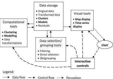
Components of the framework
The suggested system consists of the following main components:
Cartographic map display, in which spatio-temporal data can be represented by map animation or by embedded diagrams;
Time series display, shortly called time graph, in which multiple TS can be represented in summarised and/or detailed way;
Interactive tools for clustering based on one or more of existing clustering methods, for example, from the Weka library
(www.cs.waikato.ac.nz/ml/weka/) or the SOM Toolbox (http://www.cis.hut.fi/somtoolbox/);
Methods for TS modelling from a statistical package or library such as OpenForecast;
An interactive visual interface around the methods from the model library. Besides these main components, the analysis is supported by tools for interactive re-grouping (allowing, in particular, modification of computationally produced clusters), data transformation (e.g., absolute values to relative with respect to the mean), data filtering (including spatial, temporal, attribute-based, and cluster-based filters), and display coordination by simultaneous highlighting of corresponding graphical elements in multiple displays.
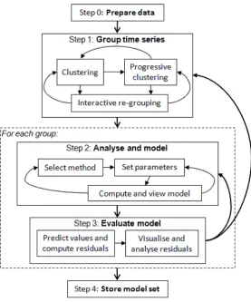
Figure 1. The main components of the framework and links between them.
Analysis workflow
The framework is meant for analysing data having the form of multiple numeric TS associated with different spatial locations or objects. A time series is a sequence of values of a numeric attribute referring to consecutive time moments or intervals, for example, monthly ice cream sales over several years. Each TS is associated with one location or object in space, for example, a town district or a café. There are two possible use cases of the framework: (1) analysis of the spatio-temporal variation of a single space- and time-related attribute, such as the ice cream sales; (2) analysis of dependencies between two space- and time-related attributes, for example, sales of ice cream and average air temperature. The two attributes need to be defined for the same places or objects in space and the same moments or intervals in time. The analysis workflow is schematically represented in Figure 2.
Computational
tools
Clustering
Modelling
Data
transformations
Data storage
Original data
Transformed data
Clusters
Models
Residuals
Data selection/
grouping tools
Filtering
Direct selection
(Re)grouping
Interactive controls Visual tools
Map display
Time series display
User
Legend:
Figure 2. The analysis workflow.
Step 0: Data preparation. When necessary, the analyst transforms the data so as
to make them suitable to the goals of the analysis. For example, the analyst may divide the amounts of the sold ice cream by the population of the respective districts and then analyse the ice cream consumption per person.
Step 1: Grouping. The set of TS is divided into groups based on similarity of the
temporal variations of the attribute values. This is supported by the tools for clustering and re-grouping. The results are controlled using the time graph display and the map display. The time graph allows the analyst to view the TS of each group, assess the degree of homogeneity within the group and decide whether it needs to be subdivided. Two or more groups can be shown in the time graph together using different colours so that the analyst can compare the groups and decide whether the differences are high enough or some of the groups should be united. In the map display, the places or spatial objects characterised by the TS are painted in the colours of the groups. The analyst can see whether the colours form meaningful spatial patterns. For example, the places with high ice cream
children and young people in the population. An explainable spatial distribution is an indication of good grouping.
Step 2: Analysis and modelling. The analyst investigates the temporal variation of
the attribute values in each group of TS by means of the time graph. By visual inspection, the analyst gains an understanding of the character of the temporal variation, particularly, whether it is periodic and whether there is a long-term trend. Thus, ice cream sales may periodically (seasonally) vary reaching higher values in the summer months and lower values in winter. Besides this seasonal variation, there may be an overall increasing or decreasing trend.
After gaining an idea in the mind, the analyst externalises it in the form of a curve that expresses the generic characteristics of the temporal variation within the group. For this purpose, the interactive interface to the library of modelling methods is used. The analyst selects the suitable modelling method; for example, triple exponential smoothing (Holt-Winters method) can be chosen to express periodic variation with or without a trend. The sequence of input values for the modelling tool is created, according to the user’s choice, from the median or mean values taken from all time steps, or from arbitrary percentiles (e.g., 60th
percentiles). When choosing to use the mean values, the analyst may decide to exclude a certain percentage of the highest and/or lowest values in each time step. This diminishes the impact of outliers on the mean values.
The generated input sequence, further called representative TS (it represents the
temporal variation in the group), is shown on the time graph and passed to the modelling tool for building a model. The tool tries to find the best fitting model (according to statistical criteria such as minimal mean squared error) by varying the model parameters. After the model is created, the sequence of model-predicted values for the same time steps as in the original data plus several further time steps is obtained and shown on the time graph so that the predicted values can be compared with the representative TS and with the individual TS. The
automatically selected parameters of the model are shown to the analyst. It is not guaranteed that the automatic selection gives the best possible result. First, the modelling tool may be trapped in a local optimum. Second, not only the statistical criteria of fitness are important. Particularly, the model needs to
parameter selection. Therefore, the analyst is given the possibility to iteratively modify the parameters of the model, re-run the modelling tool, and immediately see the result as a curve on the time graph. When the curve corresponds well to the analyst’s idea of the general characteristics of the temporal variation in the group, the model is stored in the data storage.
Step 3: Model evaluation. To evaluate the quality of the model, the analyst
examines the model residuals. The temporal distribution of the residuals is
explored by means of the time graph display and the spatial distribution by means of the map display. The absence of clear temporal and spatial patterns in the distribution of the model residuals (in other words, the distributions appearing as random noise) signifies that the model captures well the general features of the spatio-temporal variation. If this is not so, the analyst may decide to modify the model (i.e., return to step 2) or to subdivide the group (i.e., return to step 1) and refine the analysis.
Step 4. Storing the models externally. Descriptions of the generated models are
stored externally in a human- and machine-readable form such as XML. The descriptions include all information that is necessary for re-creating the models, namely: the modelling method, the values of the parameters, and the values needed for the model initialisation. Besides, the descriptions contain information about the group membership of the objects or places. The descriptions can be loaded in another session of the system’s work. The user will be able to view the models and to use them for prediction. For example, the user may predict the amounts of the ice cream consumption per person in the next year.
Using the models for prediction
According to our framework, one TS model is built for a group (cluster) of similar TS associated with different places or spatial objects. If this model were
membership of the places or objects. Besides that, the statistics of the model-predicted values for the same time steps as in the original data is computed and stored together with the description of each model.
The adjustment of the predicted values is done in the following way. Let Q1i, Mi,
and Q3i be the first quartile, median, and third quartile, respectively, of the value
distribution in the original TS for the object/place i. Let Q1, M, and Q3 be the first
quartile, median, and third quartile, respectively, of the distribution of the model-predicted values for the group containing the object/place i. We introduce level
shift S and two amplitude scale factors Flow and Fhigh as
; ; .
Let vt be the model-predicted value for an arbitrary time step t (this value is
common for all group members). The individual value for the object/place i
and time step t is computed according to the formula:
∙ ,
∙ ,
The adjustment according to this formula preserves the quartiles of the original value distribution for each object/place. In the model evaluation step, model residuals are computed as the differences between the original values and the individually adjusted predicted values.
Use of the framework
In this section, we describe the analysis workflow in more detail by examples using two different datasets referring to approximately the same territory (Milan, Italy). The first dataset, provided by the Italian telecommunication company WIND, consists of records about 2,956,739 mobile phone calls made during 9 days from 30/10/2008 till 07/11/2008. The second dataset, provided by Comune di Milano (Municipality of Milan), consists of GPS tracks of 17,241 cars during one week starting from April 1, 2007. Both datasets have been transformed to spatial TS by means of spatio-temporal aggregation.
We shall demonstrate two use cases of the visual analytics framework:
1. Analysis and modelling of the spatio-temporal variation of a single space- and time related variable (by example of the phone calls data).
Use case 1: Analysing the spatio-temporal variation of a single variable
Step 0: Data preparation
For the spatio-temporal aggregation of the phone calls data, we divided the underlying territory into 307 compartments (cells) by means of Voronoi tessellation using the positions of the WIND cellular network antennas as the seeds. Then the call records were aggregated into hourly counts of calls in each cell, which gave us 307 time series of the length 216 time steps (hours).
Step 1: Grouping
In our example, we use the k-means clustering method from the Weka library, but other methods can be applied as well. K-means uses the Euclidean distance between points in the abstract n-dimensional space of attribute values, where n is the number of the attributes and the points represent the combinations of the attribute values characterising the objects to be clustered, as the measure of object dissimilarity. In the case of clustering time series, each time step is treated as a separate attribute. We run the k-means method with different values of k (number of clusters) in order to find the most suitable grouping. The results of the
Figure 3. The lines on the time graph represent the time series of phone call counts clustered by similarity and painted in the colours of the clusters.
Figure 4. The map display shows two variants of k-means clustering of the mobile phone cells in Milan according to the time series of the call counts. A: k=7; B: k=9. The legends ((A) and (B)) show the absolute and relative sizes of the clusters.
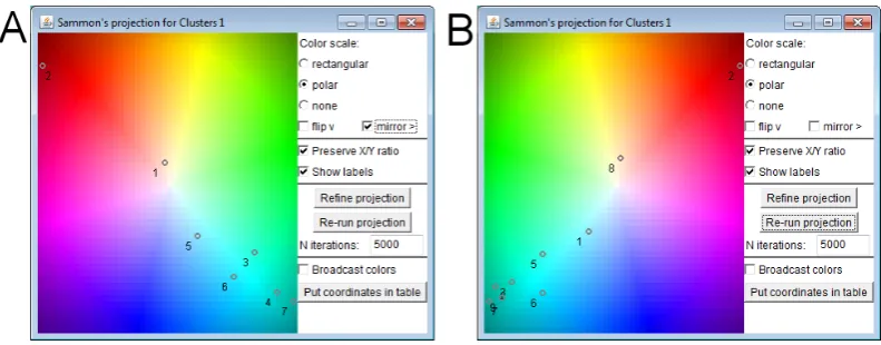
A good choice of colours for the clusters can facilitate understanding of clustering results. Our system automatically chooses the colours based on the relative
for mapping between colours and positions on a plane, rectangular or polar. In the former, four base colours are put in the corners of a rectangle and the colours for the remaining positions are produced by mixing the base colours proportionally to the distances from the corners. In the latter, a polar coordinate system is used in which the colour hue is mapped onto the angular coordinate and the colour lightness onto the radial coordinate. Figure 5 demonstrates the polar scheme. The projection of the cluster centres onto the colour space is done using Sammon’s mapping (Sammon 1969). It is a heuristic iterative algorithm. The user may refine its result by running additional iterations. The user can also modify the colour mapping by applying operations ‘flip’ and/or ‘mirror’, which stand for the symmetric reflection of the colour space along the horizontal and vertical axes, respectively. In this way, the user can obtain similar colour assignments for sets of clusters produced in different runs of the clustering algorithm with different parameters (in our example, different values of k in k-means). This is demonstrated in Figure 5.
Figure 5. For assigning colours to clusters, the cluster centres are projected on a two-dimensional colour map. The user can refine the projection and adjust the colours. A: 7 clusters; B: 9 clusters.
On the left is the projection of the cluster centres for k=7 and on the right for k=9. Obviously, the cluster labels are not the same in the two cluster sets (the labels are produced automatically from the ordinal numbers of the clusters in the output of the clustering algorithm). However, the two projections of the cluster centres look quite similar. They are nearly symmetric with respect to the vertical axis;
colours look very similarly for k=7 (A) and k=9 (B). The colouring of the lines on the time graph also looks almost the same for k=7 and k=9. This means that increasing the number of the clusters introduces only minor changes in the grouping. The projection display and time graph allow us to examine the changes in more detail. We see that the changes occur in the dark cyan area, where there are clusters with the lowest values of the call counts (see Figure 3). Increasing k leads mainly to dividing these clusters into smaller clusters, which do not differ much from each other (this can be seen, in particular, from the projection of the cluster centres). Hence, we choose 7 as the reasonable number of clusters. The map display not only supports comparison of different clustering results but also allows the analyst to judge the goodness of the grouping based on the
interpretability of the spatial patterns. Unfortunately, we have no local knowledge of Milan allowing us to interpret the patterns. We can observe that the clusters are not contiguous in space and that the clusters corresponding to high calling
activities (red, yellow, and light blue) are located at the street ring around the downtown as well as some of the radial streets connecting the ring to the periphery. We have also compared the distribution of the clusters to the Milan map of metro and tram lines, which could be found in the Internet, and found that many of the hot spots of the calling activities are located at crossings of two or more transportation lines. Hence, the observed spatial patterns can be partly related to the transportation network topology. We can speculate that the patterns can also be related to the areas of business activities in Milan, but we have no information for checking this.
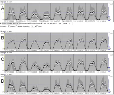
After testing the impact of the clustering parameter and choosing the suitable value, we review the resulting clusters one by one to judge their internal
quintiles, or deciles, according to the user’s choice) in consecutive time steps. The screenshots in Figure 6 show the quintiles. The thick black line connects the positions of the average values.
Figure 6. A selected cluster with high internal variability (cluster 6) has been subdivided into 3 clusters by means of progressive clustering. A: The time series of the original cluster in a summarized form. B, C, D: The time series of the resulting three clusters (clusters 6, 8, and 9).
the values for the weekend. The spatial pattern on the map has remained almost the same since the colours assigned to the new clusters are very close to the original colour of cluster 6.
[image:19.595.130.527.183.261.2]As a summary of the grouping results, Figure 7 shows the time series of the mean values of the final nine clusters.
Figure 7. The temporal variation of the mean values in 9 clusters of cells.
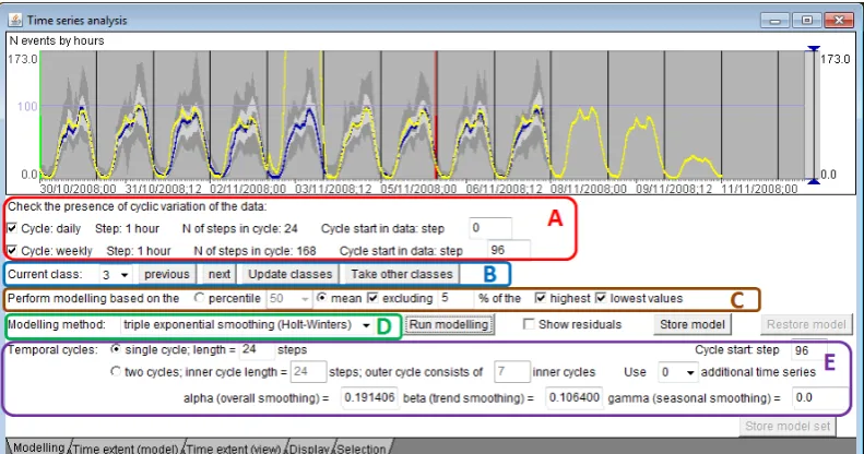
Figure 8. An interactive visual interface for the temporal analysis and modelling: A) Check automatically detected time cycles in the data. B) Select the current class (cluster) for the analysis and modelling. C) Build the representative TS. D) Select the modelling method. E) View and modify model parameters (this section changes depending on the selected modelling method).
Step 2: Analysis and modelling
[image:19.595.130.526.303.511.2]mean or percentile values, as described earlier, according to user’s choice. The user selects one of the available modelling methods from the library. Depending on the selected method, a set of controls for specifying model parameters appears. The user can limit the time range of the values to be used for deriving the model. In Figure 8, the beginning and end of the selected time range are marked by green and red vertical lines, respectively.
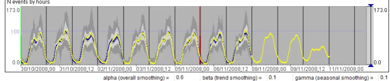
The user can run the modelling tool without specifying values for the model parameters. The modelling tool will try different values or value combinations, in case of two or more parameters, to come to the best fitting model. The resulting model is represented in the time graph by a curve (as the yellow-coloured curve in Figure 8). To build the curve, the model is used to predict the values for the time steps originally present in the data plus several further time steps. It is possible to see if the model captures well the shape of the input curve and if the prediction for the further time steps is plausible. The automatic procedure for finding the best fitting model does not necessarily produce a good result. The current model parameters are shown to the user, who can modify them and run the model-building tool repeatedly until the result is satisfactory. Thus, the model presented in Figure 9 has been obtained after some modifications of the smoothing
[image:20.595.124.527.473.557.2]parameters. It fits much better the input data than the one in Figure 8.
Figure 9. A result of modifying model parameters.
Some modelling methods, such as triple exponential smoothing (Holt-Winters method), assume periodic (cyclic) variation of the data. For building a model, it is necessary to specify the length of the cycle, i.e., the number of time steps. To help the user to deal with cyclic variation in the data, the tool tries to detect
method assuming cyclic variation in the input data, the tool automatically fills the required information about the cycle length and cycle start in the relevant fields for specifying model parameters (Figure 8E). The user can modify these
automatically filled values if needed.
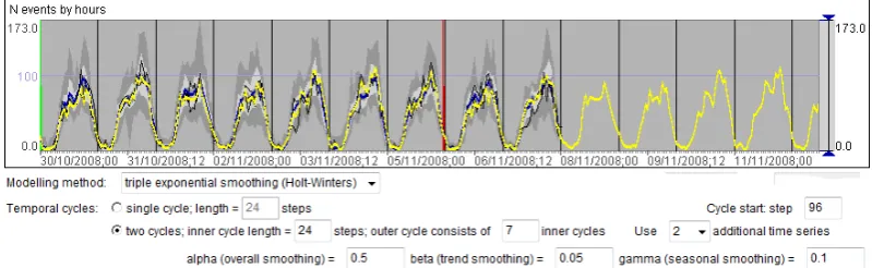
The data may involve more than one temporal cycle. This is the case in our example dataset, where the values vary according to the daily and weekly cycles. As can be seen in Figure 8, the tool has automatically detected the daily cycle consisting of 24 time steps of one hour length and the weekly cycle consisting of 168 time steps (i.e., 7 times 24 hours). The time period of the data starts from 0 o’clock on Thursday but we want to use 0 o’clock on Monday as the beginning of the weekly cycle. Therefore, we specify that the weekly cycle starts from step 96. To our knowledge, there is no time series modelling method that can deal with two or more time cycles, or, at least, there is no such method in the openly available libraries we have investigated. In our tool, we have enabled two approaches that can be used for data with two cycles:
a) Ignore the larger (outer) cycle and build a model assuming that the data varies only according to the smaller (inner) cycle. In our example, we would ignore the weekly variation and consider only the daily variation.
b) Build a combination of models with a separate model for each position of the smaller cycle within the larger cycle. Thus, for the case of the daily and weekly cycle, separate models are built for Mondays, Tuesdays, ..., Sundays, i.e., the variation is represented by a combination of seven models.
[image:21.595.127.527.595.718.2]Figures 8 and 9 correspond to approach a. Figure 10 shows a model obtained with approach b. The latter model is better in representing the differences between the working days and weekend and in giving plausible predictions for the future.
One note should be made here. For building a model representing cyclic variation in the data, it is necessary to have an input TS with at least two full cycles. For example, to build a model for each day of the week, we need data from at least two Mondays, two Tuesdays, and so on. If the time span of the available data is shorter, our tool allows the user to construct a longer input TS for the modelling method either by doubling the representative TS of the group or by concatenating several specific TS selected from the group. In the latter case, the tool selects the TS that have the closest values to the representative TS. The number of the specific TS to use is chosen by the user.
Step 3: Model evaluation
Besides the visual inspection of the curve representing the result of the modelling, the quality of the model is assessed by analysing the residuals, i.e., the differences between the real values and the model-predicted values. The tool automatically computes the residuals for each of the original TS.
In evaluating a model, the absolute values of the residuals are not important, i.e., high residual values do not necessarily mean low model quality. The model needs to capture the characteristic features of the temporal variation but not reproduce all fluctuations present in the original data. The residuals are expected to reflect the fluctuations. The goal is not to minimise the residuals but to have them randomly distributed over time, which means that the model captures well the characteristic, non-random features of the temporal variation.
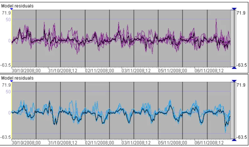
To see how the residuals are distributed over time, we look at the time graph representing the time series of the residuals for the cluster that is currently under analysis. Representing the individual TS as lines results in a highly cluttered display; therefore, we look at summarised representations. In Figure 11, the TS of the residuals of one cluster (cluster 3) are summarised in two ways. The upper part of the graph shows the quintiles of the frequency distributions. The lower part is a temporal histogram with a bar for each time step divided into segments
Figure 11. The model residuals for one cluster of TS (cluster 3) are summarised in a time graph display in two different ways.
[image:23.595.130.527.455.689.2]Both summarised representations show us that there is some non-random feature in the residual values: in the evenings of the working days negative values are more frequent than positive values. To find the reason for this undesired feature, we need to take a closer look at the TS of the residuals. To reduce the workload, we do not analyse each individual TS but group them by similarity, as we did for the original TS, and look at the groups. Figure 12 shows two of the groups. The thick black lines connect the average values in the consecutive time steps.
Figure 12. Two groups of TS of model residuals.
does not capture well enough the pattern of the temporal variation in the corresponding subgroup of cells. More specifically, the model consistently
overestimates the evening call counts in these cells. To improve the model quality, we need to subdivide the cluster so that the cells with non-random residuals are separated from those with random residuals and then build new, more accurate temporal models for the resulting clusters. The division can be done again by means of clustering or simply by interactive grouping (classification). In our case, we subdivide cluster 3 into two clusters according to the residuals. After building models for these clusters, we find that the undesired regular pattern has been eliminated.
After the modelling is done for all groups of cells, the descriptions of the models are stored externally together with information about the group membership of the cells, the statistics (minimum, maximum, and quartiles) of the distribution of the original values for the cells, and the statistics (mean and standard deviation) of their residuals. At any time, the descriptions can be loaded in the system and the models displayed in a graphical form, i.e., as curves representing the generic features of the temporal variation in the groups.
Use of the models
The descriptions of the models and objects can be used for predicting values for new time steps that were not present in the original data. When there is no
the original values. Note that the predicted TS start on Monday unlike the original TS starting on Thursday (Figure 3). The statistics (means and quartiles) of the distribution of the predicted values coincide with those for the original values.
Figure 13. The time graph shows the predicted call counts for the period from 09/01/2012 (Monday), 0 o’clock to 15/01/2012 (Sunday), 23 o’clock. A: The prediction without introducing noise. B: The prediction with introduced Gaussian noise.
Figure 14. The use of the model for detecting anomalies. Black: two cells at the San Siro stadium.
[image:25.595.128.529.423.530.2]east-northeast (increases up to 848 at 10 o’clock on Sunday). We have no local knowledge or additional information sources to explain these anomalies. However, by searching in the Internet, we could explain smaller anomalies occurring in two cells at the San Siro stadium. The corresponding lines are highlighted in black in Figure 14. The deviations of the real values from the predicted ones are between 140 and 330 in the evening of 02/11/2008 (Sunday), especially at 19:00 (330) and 22:00 (262). This corresponds to a football game attended by about 50,000 spectators. A smaller increase of values in these cells is observed in the evening of 06/11/2008 (Thursday); the deviations from the predicted values range between 49 and 92. This corresponds to another football game attended by 11,000 spectators.
Use case 2: Analysing the dependence between two spatio-temporal variables
Step 0: data preparation
Figure 15. Flows between cells are represented by directed symbols (half-arrows) with the widths proportional to the total counts of objects that moved. For a better display legibility, minor flows (with counts less than 150) have been hidden. Left: the whole territory; right: the northern part enlarged.
Figure 16. The temporal variation of the flow magnitudes (top) and average speeds (bottom) are shown in a summarised form. The graphs represent the deciles of the frequency distributions (stripes in light and dark grey) and the mean values (thick black lines).
For this modelling task, we do an additional transformation of the data. The system allows the user to transform two time-dependent attributes A and B defined for the same time steps into series of values of B corresponding to
there is a sequence of values corresponding to the chosen value intervals of attribute A. These sequences are similar to time series except that the steps are based not on time but on values of attribute A. We shall call these sequences
dependency series (DS) since they are meant to express the dependency between
attributes A and B. In this transformation, attribute A is treated as the independent variable and B as the dependent variable.
In our example, we take the flow magnitude as the independent variable and the average speed as the dependent variable. The values of the flow magnitude range from 0 to 69. We divide this range into intervals of length 3: 0-2, 3-5, 6-8, and so on; 23 intervals in total. From the attributes the system has computed, we take the attribute “Maximum of average speed” in order to analyse what speed can be potentially reached depending on the flow magnitude. Before the analysis, we filter out the flows where the maximum magnitude is below 5, which means that there is not enough data for identifying any dependency. We shall deal with 1186 flows out of the original 2155.
Step 1: Grouping
We group the dependency series of the attribute “Maximum of average speed” by similarity using one of the available clustering tools. The clustering is applied only to the objects that satisfy the current filter. Figure 17 shows the results of the grouping. We have clear and easily interpretable spatial patterns, which
Figure 17. The flows have been clustered according to the similarity of the dependency series of the attribute “Maximum of average speed”. Left: the spatial distribution of the clusters. Right: the DS are represented by lines on a line chart.
Step 2: Analysis and modelling
Modelling of dependencies is done almost in the same way as modelling of temporal variations except that temporal cycles are not involved. The analyst is expected to select the range of the values of the independent variable that will be used for building the model. This needs to be done separately for each cluster (in the previous use case the same time range was suitable for all clusters). As can be seen from Figure 17 (right), not all lines representing the DS have the same horizontal extent. This is because there are many flows where high values of the independent variable are not reached and, hence, there are no corresponding values of the dependent variable. Therefore, to build a dependency model for a group, the analyst needs to select a subsequence of values of the independent variable for which there are enough values of the dependent variable. An
additional reason for limiting the value range for model building is the reliability of the data. Thus, in our example, the first value interval of the flow magnitude is from 0 to 2. The corresponding average speeds have been computed from
Figure 18. To build a dependency model for a group of DS, the analyst needs to select a valid subsequence of values of the independent variable. The beginning and end of the subsequence are marked by green and red vertical lines, respectively.
There are modelling methods that are only applicable to time series and cannot be used to model dependencies. In the OpenForecast library, the methods suitable for dependency modelling are linear regression and polynomial regression. When polynomial regression is chosen, the analyst needs to specify the order of the polynomial that will be generated.
Step 3: Model evaluation
and the range limits of the independent variable. The residuals are immediately re-computed and the display of the residuals is updated as soon as the model
changes. By observing the display, we see that our attempts do not bring
sufficiently good results. We decide to refine the model by dividing the group into smaller groups, as shown in Figure 19A-C. Figure 19E shows the temporal
[image:31.595.129.528.265.386.2]histogram of the residuals after the refinement. The sizes of the yellow segments, which represent residual values close to zero (more precisely, from -2 to +2), have increased, and the prevalence of the blue segments (negative values) has been removed.
Figure 19. A,B,C: Based on residual analysis, a group of DS has been divided into 3 subgroups, for which separate dependency models have been built. D, E: The temporal histograms of the distribution of the residuals before (D) and after (E) the division and model refinement.
Use of the models
In Figure 20, the dependency models that have been built are represented as curves on a line chart. This representation of the models can be obtained at any time after loading the stored description of the model set in the visual analytics system. Hence, the models can be reviewed by the creator and communicated to others.
[image:31.595.128.529.605.713.2]Figure 21. The maximal average speeds of the flows predicted on the basis of the actual flow magnitudes.
Figure 21 demonstrates the use of the dependency models for prediction. By means of the models, the maximal average speeds have been predicted based on the actual flow magnitudes by hours in the original TS. The predicted values also form time series defined for the same sequence of time steps as the original TS. As can be seen, the character of the temporal variation of the predicted values is the same as in the original TS of the average speeds (Figure 16 bottom) while the fluctuations have been reduced. The predicted values are generally higher than the original values. This is explainable since the modelling has been built on the basis of the maximal average speeds. We have also repeated the model building
experiment for the means and medians of the average speeds. The resulting models, when applied to the original TS of flow magnitudes, also convey well the character of the temporal variation; however, the predicted values are lower than in the original TS of average speeds. The choice of the suitable attributes for dependency modelling may depend on the analyst’s goal. Thus, the dependency models based on the maximal average speeds can be used for estimating the required travel time for a given route depending on the current or predicted traffic conditions.
Discussion
places or objects can substantially differ by their characteristics. Phone calls and traffic flows are examples of such phenomena. The same character of the spatial variation can also be observed for other phenomena related to human life and activities, for example, voting during elections or housing prices.
To model spatially smooth phenomena, such as atmospheric pollution (Kyriakidis and Journel 2001), it is valid to apply modelling methods that involve spatial smoothing of the available data, which is not supported by our framework. On the other hand, it is not valid to apply models involving spatial smoothing to spatially abrupt phenomena. Most of the available methods for spatial modelling assume smooth spatial variation. Dealing with spatially abrupt phenomena requires other approaches, and clustering is one of the possibilities. Our framework includes flexible and easily steerable tools for clustering that allow the user to represent the spatial variation in accord with user’s understanding of the data and background knowledge of the underlying phenomena.
The temporal variation, according to our framework, is modelled by means of existing methods for time series modelling. This field of statistics is well
developed, and the methods are widely available and commonly used. We do not limit the framework to a particular set of methods present in this or that library or package but propose a generic set of interactive controls and operations suitable for different methods. In our paper, we have demonstrated how temporal models and dependency models can be built using these controls and operations.
A very important step in model building is model evaluation. Our framework supports this step by (a) immediate visualisation of model results (predicted values) as soon as a model is built, (b) immediate computation and visualisation of model residuals, and (c) providing possibilities for applying various analysis methods to the residuals in order to examine their spatial and temporal
distributions. Besides interactive analysis, as demonstrated in this paper, it is possible to compute and analyse distribution statistics and apply the available TS analysis methods to the TS of residuals. In case of unsatisfactory residuals, the analyst can easily find the reason and the way to improving the model.
We do not claim that our framework guarantees better quality of generated models than other tools. The quality of a model can only be ensured by diligent work of the analyst. However, the flexibility in choosing modelling methods and
analyst to build high quality models. The framework also allows the analyst to control the degree of data abstraction and generalisation and achieve a suitable trade-off between the model quality and model complexity, i.e., the number of different statistical models that represent the entire spatio-temporal variation. Kamarianakis and Prastacos (2003) compared several methods for modelling spatio-temporal data and found that a global spatio-temporal model does not necessarily perform better than a set of local temporal models. One of the arguments in favour of a global model was the excessive computational time needed for building multiple local models in case of a very large dataset. Clustering makes our approach suitable for large collections of spatial TS. It reduces not only the required computational time but also the analyst’s effort as compared to building either a global spatio-temporal model (which requires tedious specification of weight matrices) or individual local models for all locations. Besides, clustering is a way to account for spatial relatedness among locations or objects and to represent patterns of spatial variation.
The suggested approach is sufficiently generic to be applicable to various spatio-temporal phenomena that can be characterised by spatial time series, such as sensor measurements, economical data, aggregated spatial events, aggregated movements, and many others. There is a potential for extending the approach to spatially smooth phenomena by involving spatial modelling methods.
Conclusion
The suggested framework is based on visual analytics wrapping around
computational methods taken from the areas of machine learning and statistical analysis. The framework is intended for analysis and modelling of spatio-temporal data representing spatially abrupt dynamic phenomena. The result of the analysis is an explicit parsimonious description of the spatio-temporal variation, i.e., a description involving data abstraction and generalisation. The result is represented in a form allowing both human and computer processing. The framework is designed to deal with large amounts of spatial TS that cannot be analysed individually.
predictions. From the statistical analysis and modelling perspective, we suggest a combination of visual, interactive and computational techniques supporting model building and evaluation. From the perspective of spatio-temporal analysis, we suggest an approach to spatio-temporal modelling by decomposing the overall modelling task into spatial and temporal modelling subtasks. We accommodate the statistical methods for time series and dependency modelling, which are well established and widely available, for spatio-temporal analysis. For this purpose, these methods are combined with interactive clustering and visual techniques. As noted by our colleagues practicing statistical analysis of various types of data, our visual analytics approach to modelling increases analyst’s trust in the resulting models as the analyst fully controls the process and can make well-informed decisions in each its step.
Acknowledgments
This work was supported by the European Commission within the international cooperation project ESS – Emergency Support System (contract No 217951) and by DFG – Deutsche Forschungsgemeinschaft (German Research Foundation) within the Priority Research Programme "Scalable Visual Analytics" (SPP 1335). We are thankful to our colleagues who discussed with us our work and gave us helpful comments.
References
Andrienko, G. L., Andrienko, N. V. 2005. Visual exploration of the spatial distribution of temporal behaviours. In 9th International Conference on Information Visualisation IV2005, 6-8 July 2005, London, UK, IEEE Computer Society, pp. 799–806.
Andrienko, G., Andrienko, N., Rinzivillo, S., Nanni, M., Pedreschi, D., Giannotti, F. 2009. Interactive Visual Clustering of Large Collections of Trajectories. In Proc. IEEE Symposium on Visual Analytics Science and Technology VAST’09, pp. 3-10
Andrienko, G., Andrienko, N., Bremm, S., Schreck, T., von Landesberger, T., Bak, P., Keim, D. 2010a. Space-in-Time and Time-in-Space Self-Organizing Maps for Exploring Spatiotemporal Patterns. Computer Graphics Forum, 29(3), pp. 913-922.
Andrienko, N., Andrienko, G. 2011. Spatial generalization and aggregation of massive movement data. IEEE Transactions on Visualization and Computer Graphics, 17(2), pp.205-219
Crossno, P.J., Dunlavy, D.M., Shead, T.M. 2009. LSAView: A tool for visual exploration of latent semantic modelling. In Proc. IEEE Symposium on Visual Analytics Science and Technology VAST’09, pp. 83-90
Demšar, U., Fotheringham A.S., Charlton M. 2008. Exploring the spatio-temporal dynamics of geographical processes with Geographically Weighted Regression and Geovisual Analytics. Information Visualization, 7, pp.181-197
Garg, S., Nam, J.E., Ramakrishnan, I.V., Mueller, K. 2008. Model-driven Visual Analytics. In Proc. IEEE Symposium on Visual Analytics Science and Technology VAST’08, pp.19-26 Garg, S., Ramakrishnan, I.V., Mueller, K. A 2010. Visual Analytics Approach to Model Learning. In Proc. IEEE Symposium on Visual Analytics Science and Technology VAST’10, pp.67-74 Guo, D. 2009. Multivariate Spatial Clustering and Geovisualization. In Geographic Data Mining and Knowledge Discovery, edited by H. J. Miller and J. Han. London and New York, Taylor & Francis, pp. 325-345.
Guo,Z., Ward, M.O., Rundensteiner, E.A. 2009. Model Space Visualization for Multivariate Linear Trend Discovery. In Proc. IEEE Symposium on Visual Analytics Science and Technology VAST’09, pp.75-82
Hao, M. C., Janetzko, H., Mittelstädt, S., Hill, W., Dayal, U., Keim, D. A., Marwah, M., Sharma, R. K. 2011. A Visual Analytics Approach for Peak-Preserving Prediction of Large Seasonal Time Series. Computer Graphics Forum, 30 (3), pp. 691-700.
Kamarianakis, Y., Prastacos, P. 2003. Forecasting Traffic Flow Conditions in an Urban Network: Comparison of Multivariate and Univariate Approaches. Transportation Research Record-Journal of the Transportation Research Board, No. 1857, pp. 74-84.
Kamarianakis, Y., Prastacos, P. 2005. Space - Time Modeling of Traffic Flow. Computers and Geosciences, 31, pp. 119-133
Kamarianakis, Y., Prastacos, P. 2006. Spatial Time-Series Modeling: A review of the proposed methodologies. Working Papers of the University of Crete, Department of Economics, No. 0604, http://ideas.repec.org/p/crt/wpaper/0604.html, last accessed September 19, 2011
Keim, D., Andrienko, G., Fekete, J.-D., Görg, C., Kohlhammer, J., Melançon, G. 2008. Visual Analytics: Definition, Process, and Challenges. In: Kerren, A., Stasko, J.T., Fekete, J.-D., North, C. (editors). Information Visualization – Human-Centered Issues and Perspectives. Lecture Notes in Computer Science, Vol. 4950, Springer, Berlin, pp.154-175
Kohonen, T. 2001. Self-Organizing Maps. Springer, Berlin
Kyriakidis, P.C., Journel, A.G. 2001. Stochastic modeling of atmospheric pollution: a spatial time-series framework. Part I: methodology; Part II: application to monitoring monthly sulfate deposition over Europe. Atmospheric Environment, 35, pp. 2331-2337; 2339-2348.
Maciejewski, R., Livengood, P., Rudolph, S., Collins, T.F., Ebert, D.S., Brigantic, R.T., Corley, C.D., Muller, G.A., Sanders, S.W. 2011. A Pandemic Influenza Modeling and Visualization Tool. Journal of Visual Languages and Computing, 22, pp.268-278
Matković, K., Gračanin, D., Jelović, M., Ammer, A., Lež, A., Hauser, H. 2010. Interactive Visual Analysis of Multiple Simulation Runs Using the Simulation Model View: Understanding and Tuning of an Electronic Unit Injector, IEEE Transactions on Visualization and Computer Graphics, 16(6), pp.1449-1457
Matković, K., Gračanin, D., Jelović, M., and Cao, Y. 2011. Adaptive Interactive Multi-Resolution Computational Steering for Complex Engineering Systems. In Proceedings of EuroVA, Bergen, Norway, pp. 45-48
Migut, M., Worring, M. 2010. Visual Exploration of Classification Models for Risk Assessment. In Proc. IEEE Symposium on Visual Analytics Science and Technology VAST’10, pp. 11-18 Rinzivillo, S., Pedreschi, D., Nanni, M., Giannotti, F., Andrienko, N., and Andrienko, G. Visually– driven analysis of movement data by progressive clustering, Information Visualization, 7(3/4), 2008, 225-239.
Sammon, J. W. 1969. A nonlinear mapping for data structure analysis. IEEE Transactions on Computers, 18, pp.401–409
Schreck, T., Bernard, J., von Landesberger, T., Kohlhammer, J. 2009. Visual cluster analysis of trajectory data with interactive Kohonen maps. Information Visualization, 8(1), pp.14–29 Slingsby, A., Wood, J., Dykes, J. Clouston, D., Foote, M., 2010. Visual analysis of sensitivity in CAT models: interactive visualisation for CAT model sensitivity analysis, In Proceedings of Accuracy 2010 Conference, Leicester, UK, 20-23 July 2010.
Therón, R., De Paz, J.F. 2006. Visual Sensitivity Analysis for Artificial Neural Networks In: Lecture Notes in Computer Science. IDEAL 2006, vol. 4224, pp. 191-198, Berlin: Springer Xiao, L., Gerth, J., Hanrahan, P. 2006. Enhancing Visual Analysis of Network Traffic Using a Knowledge Representation. In Proc. IEEE Symposium on Visual Analytics Science and Technology VAST’06, pp. 107-114